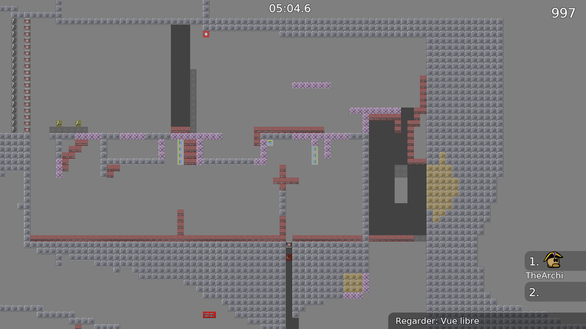
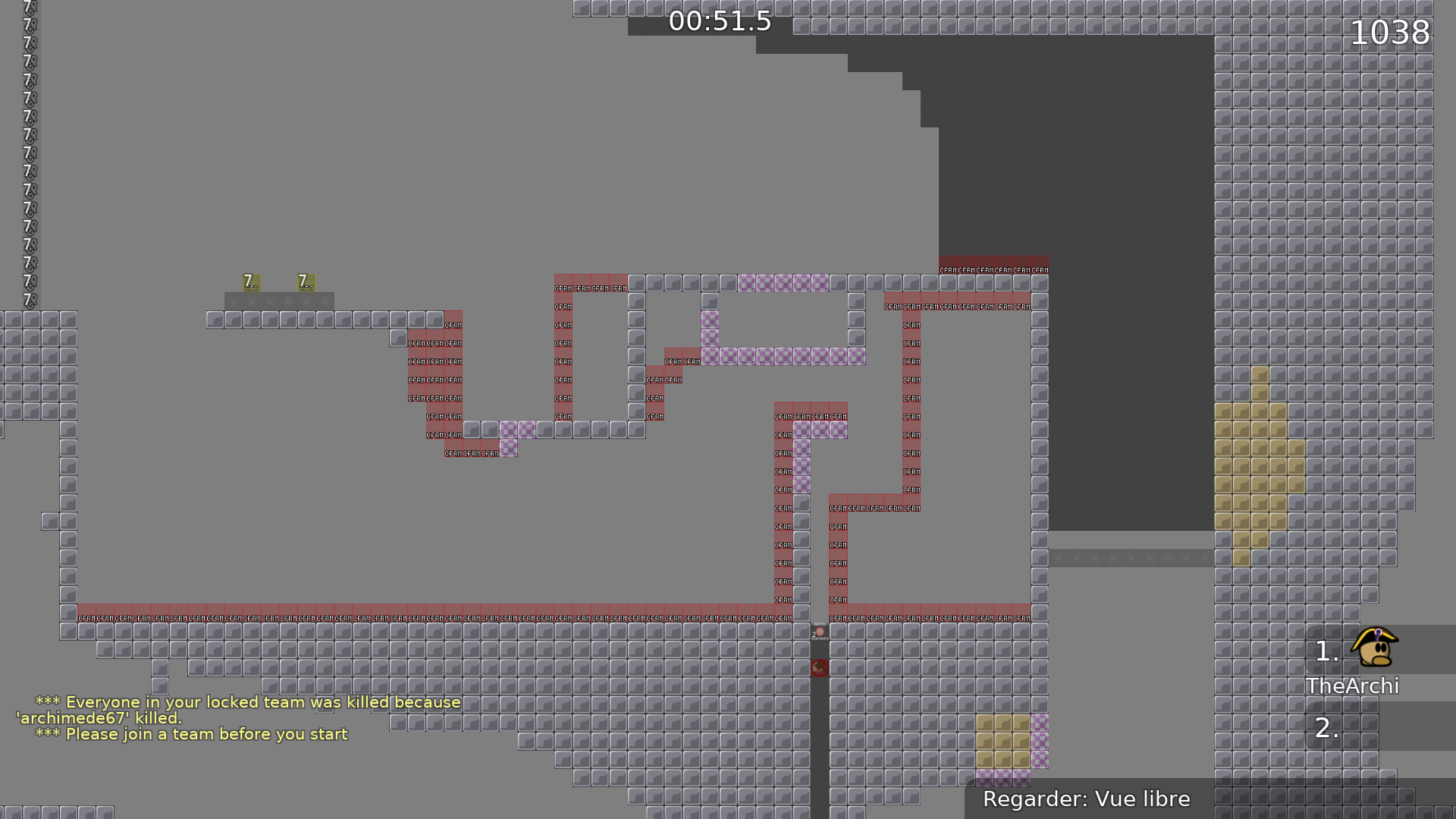
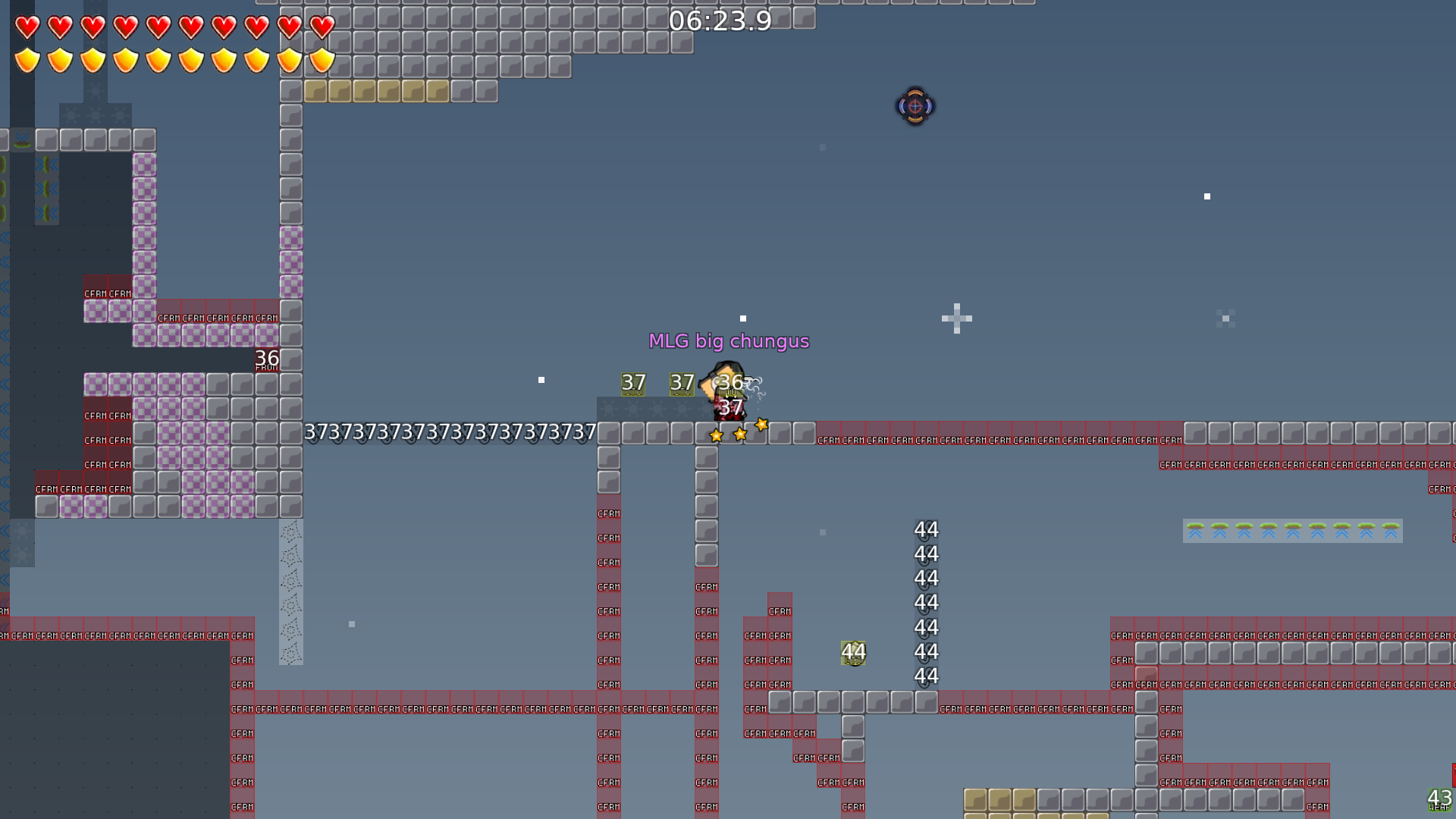
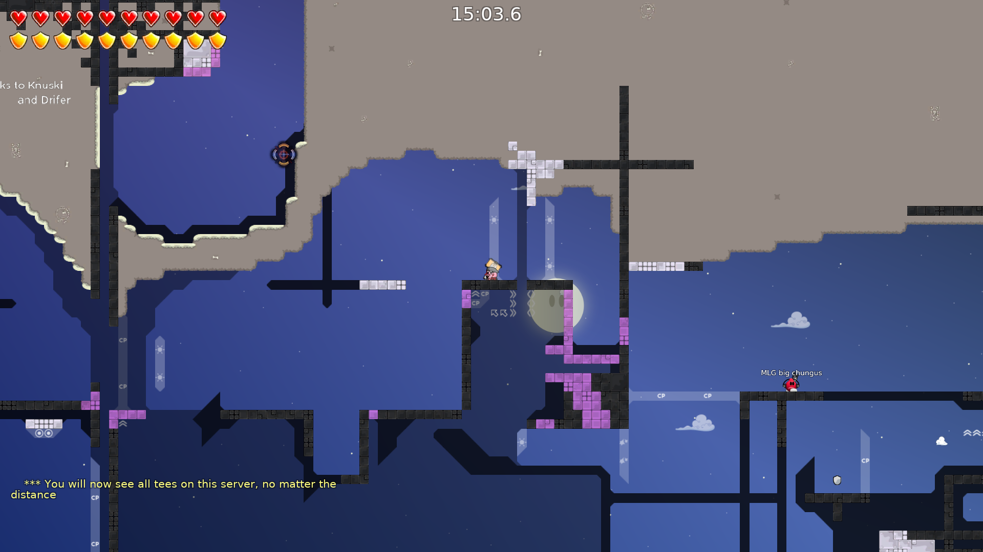
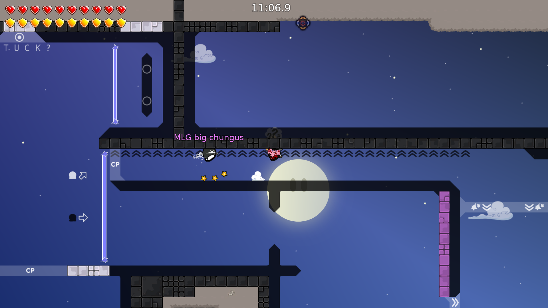
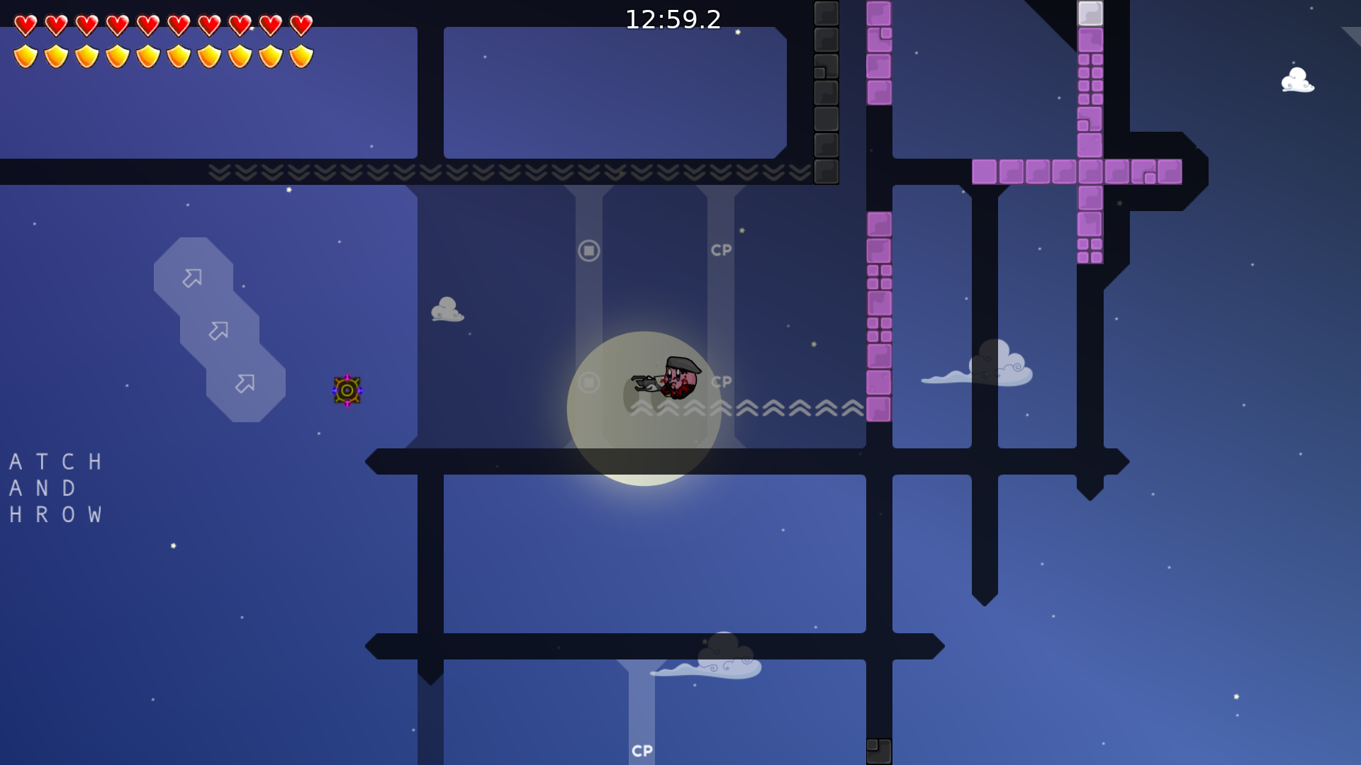
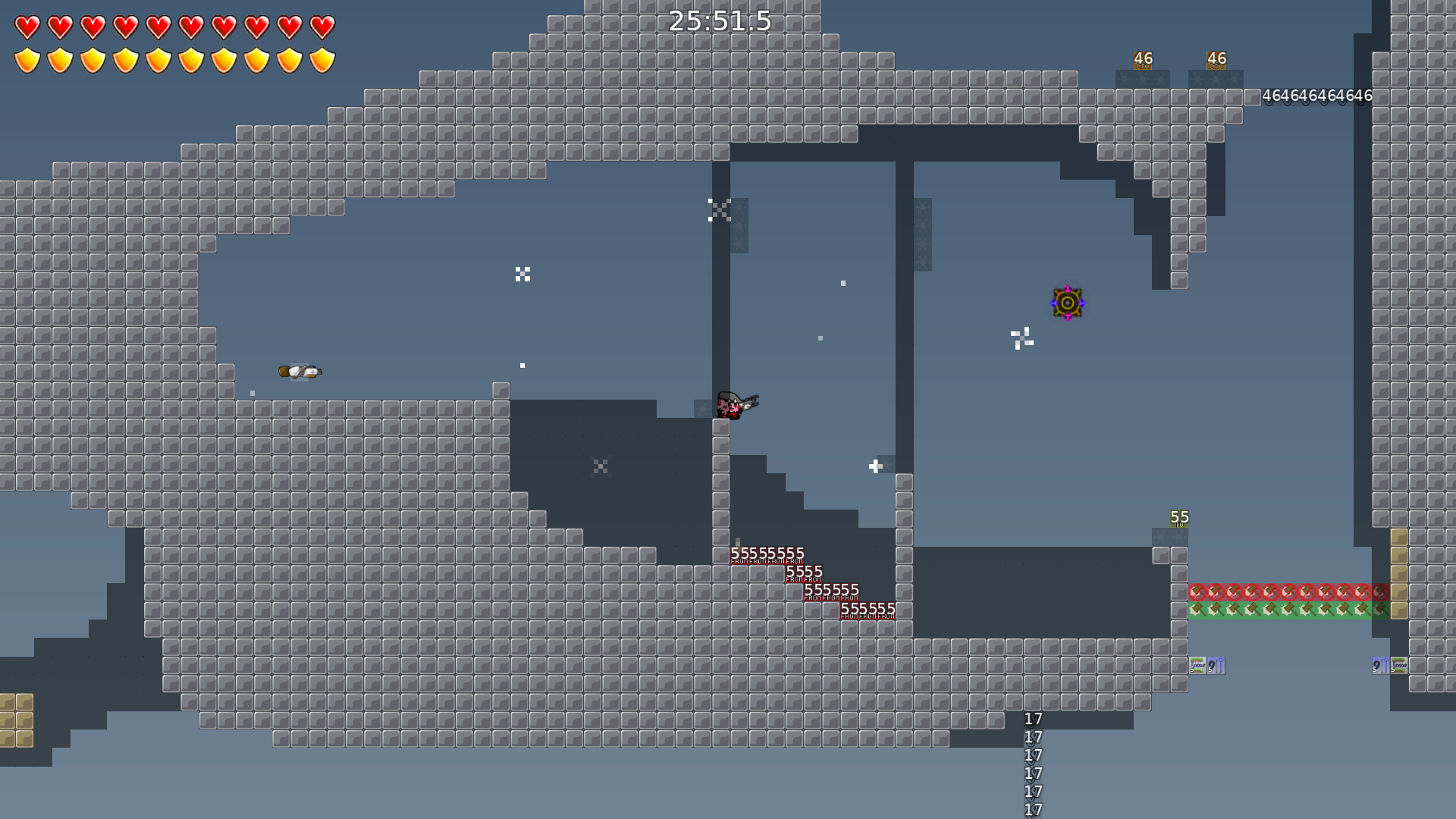
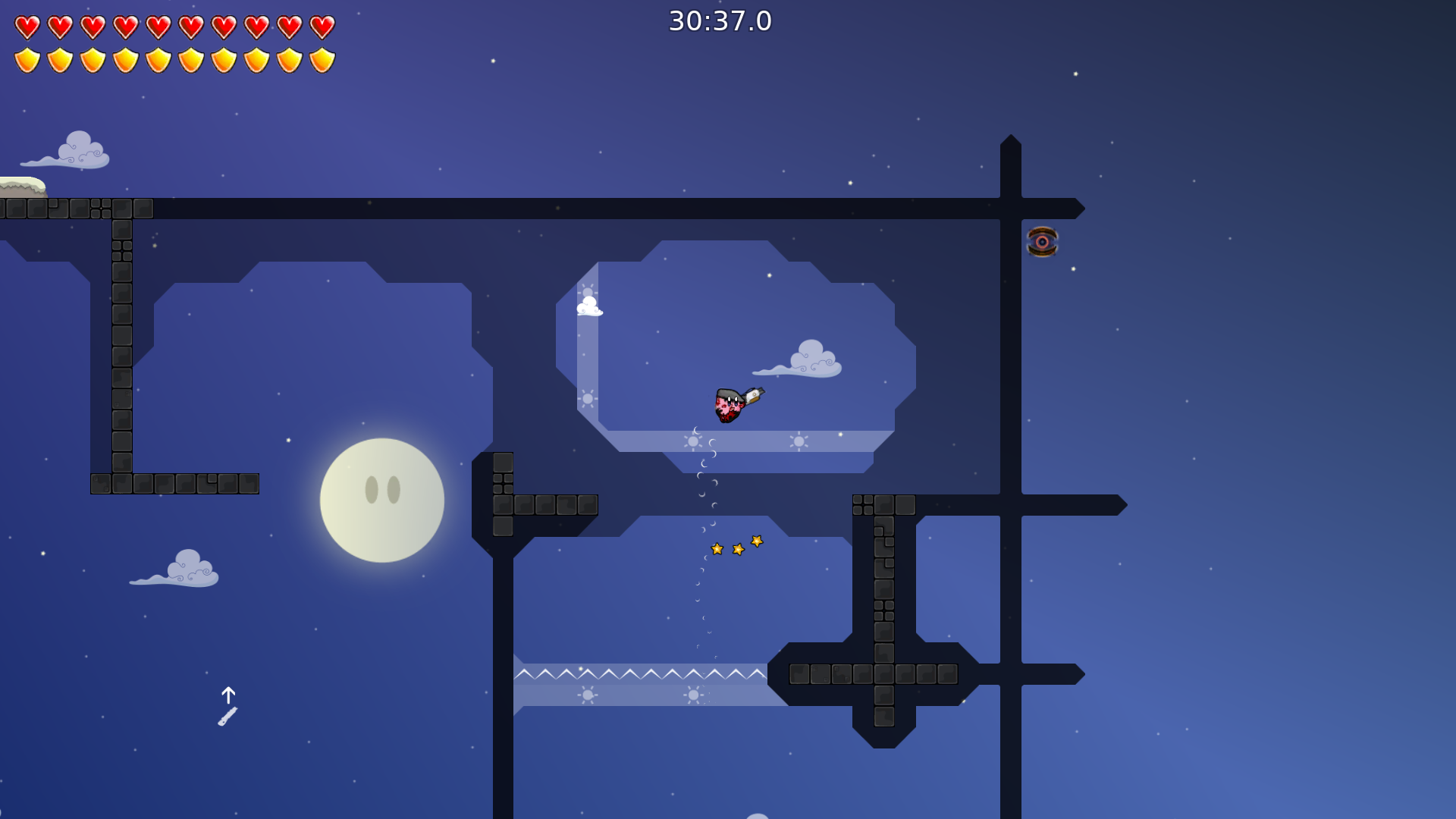
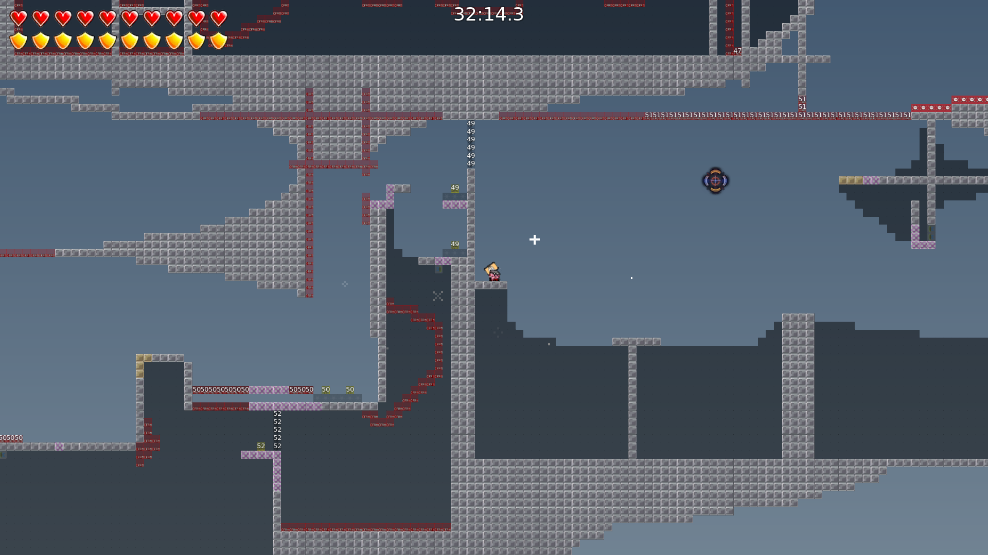
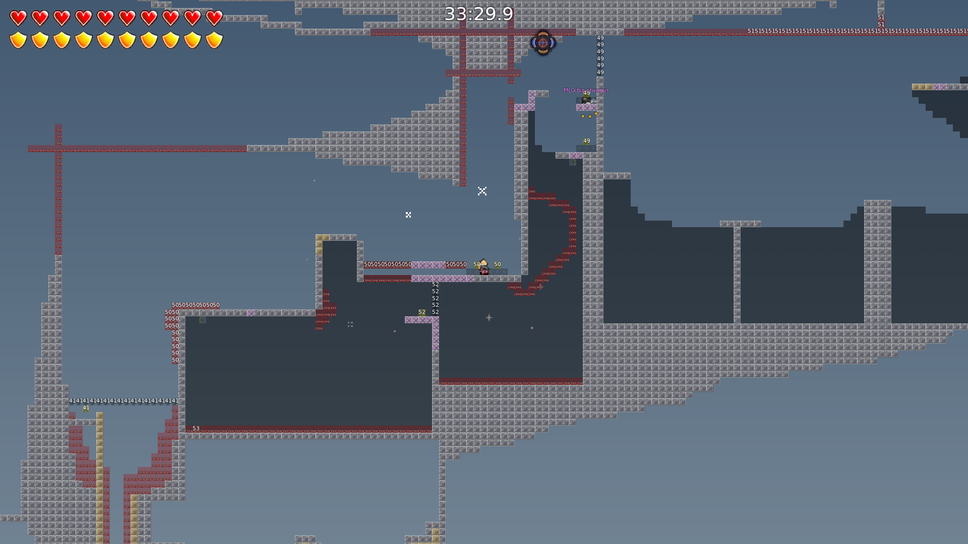
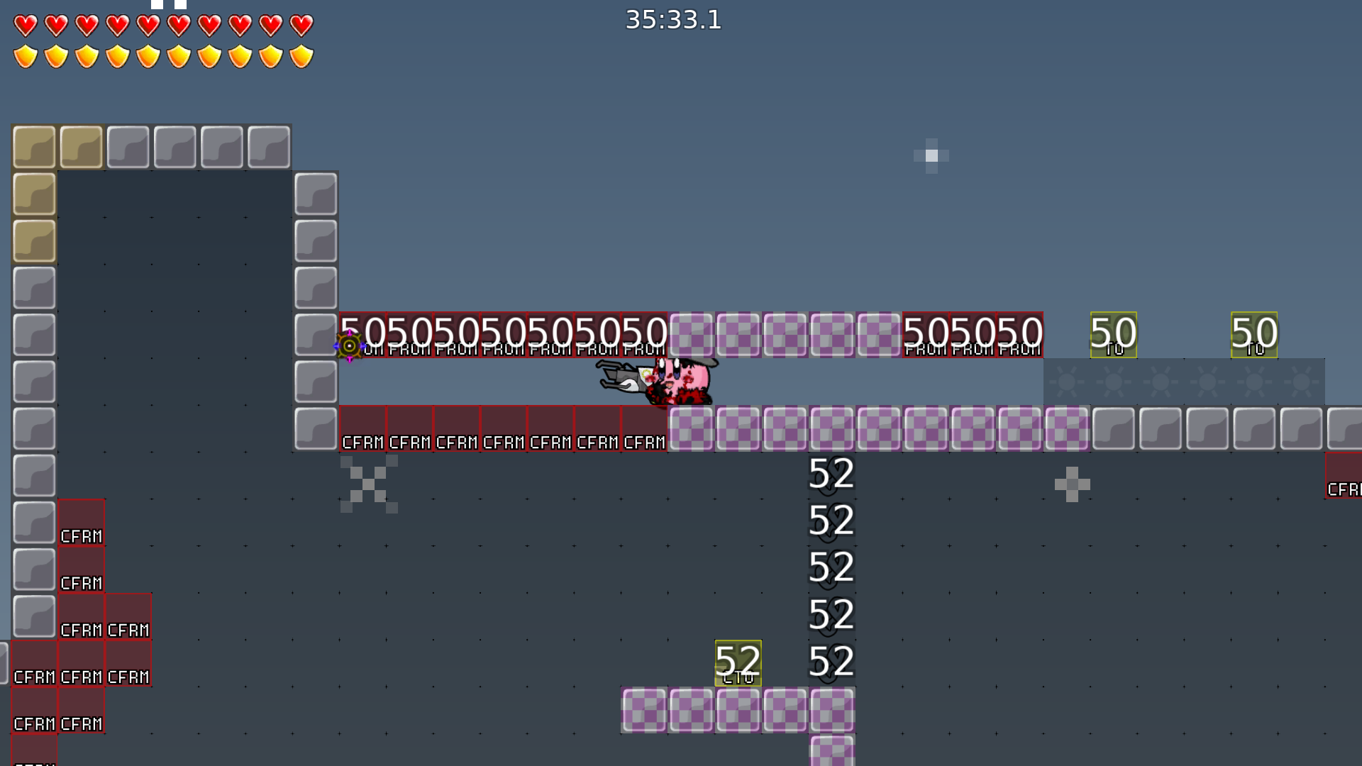
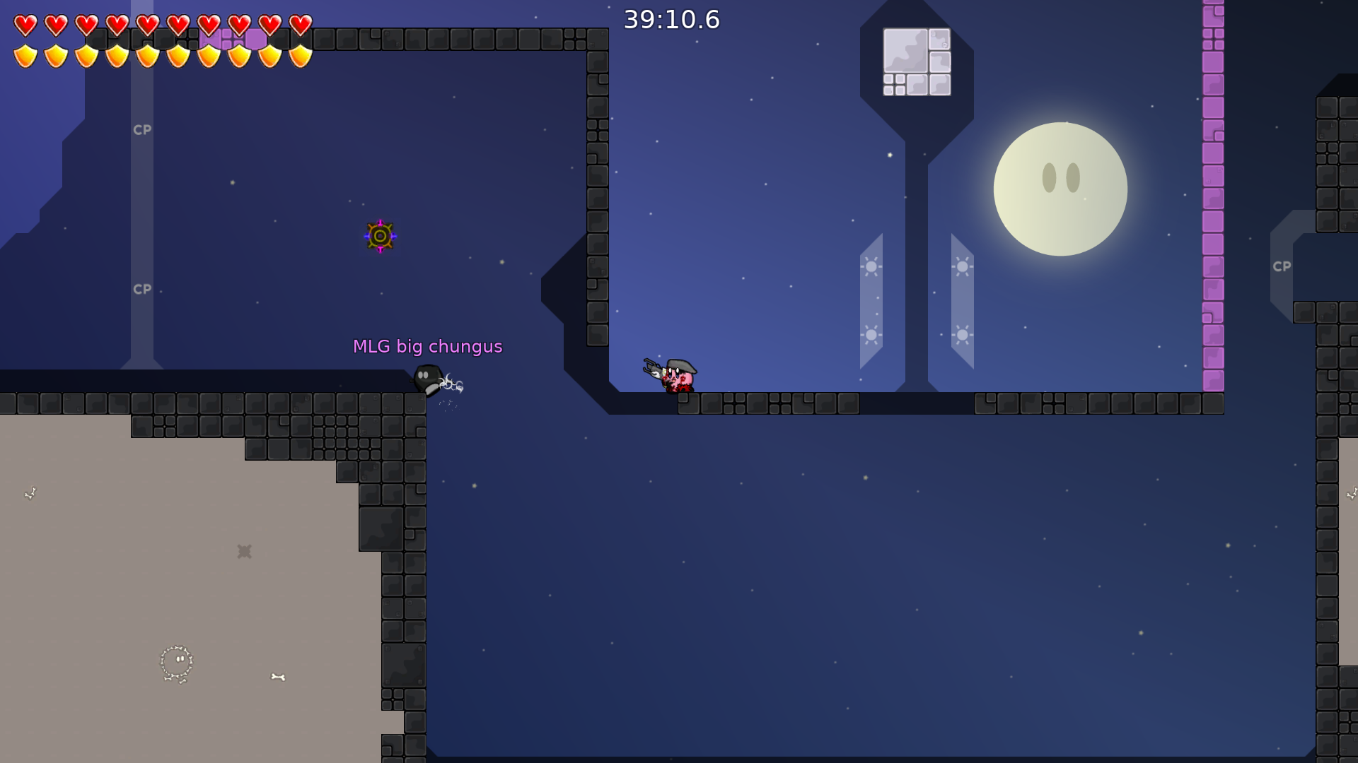
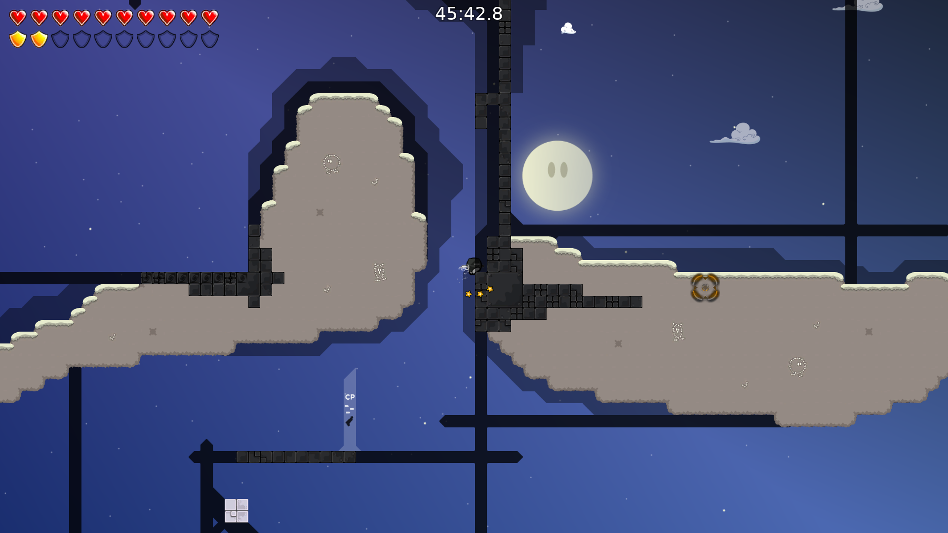
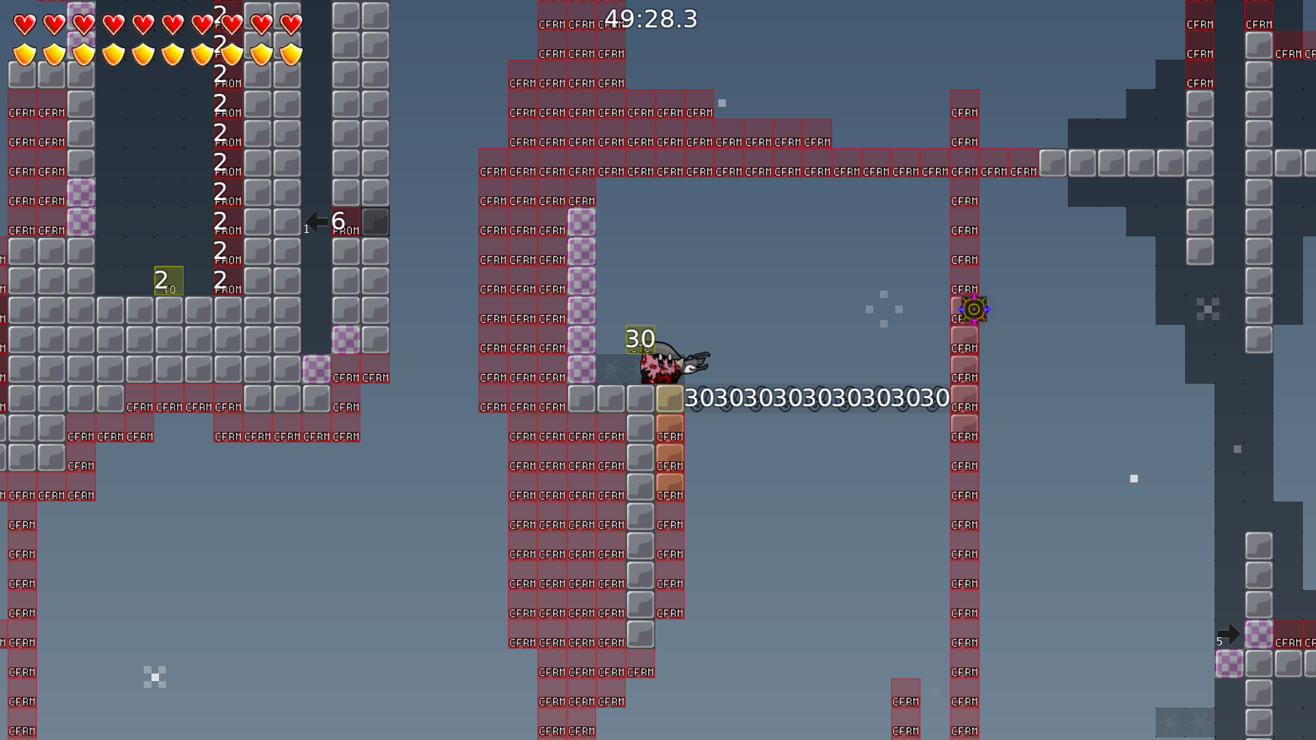
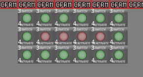
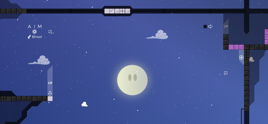
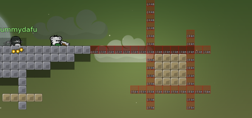
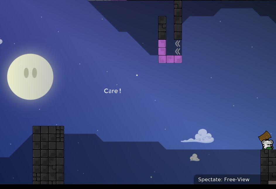
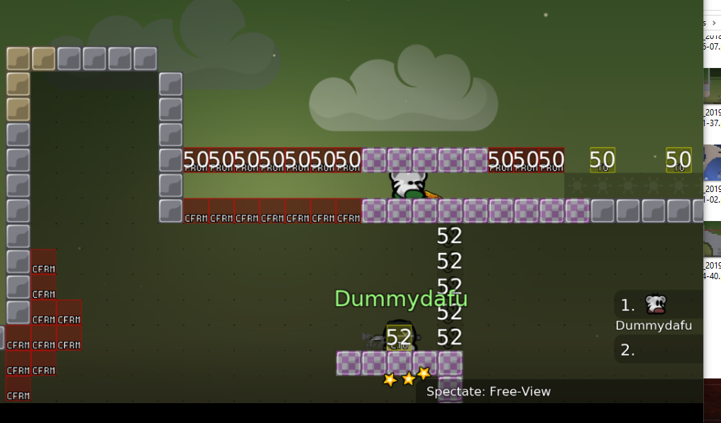
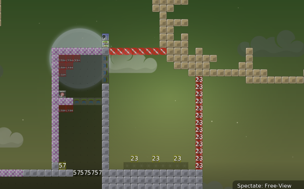
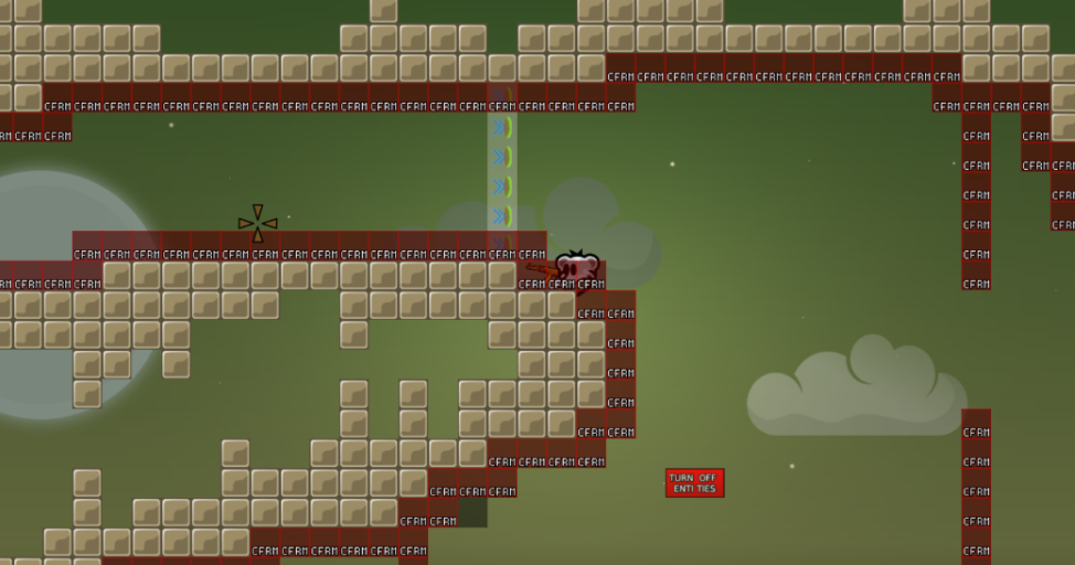
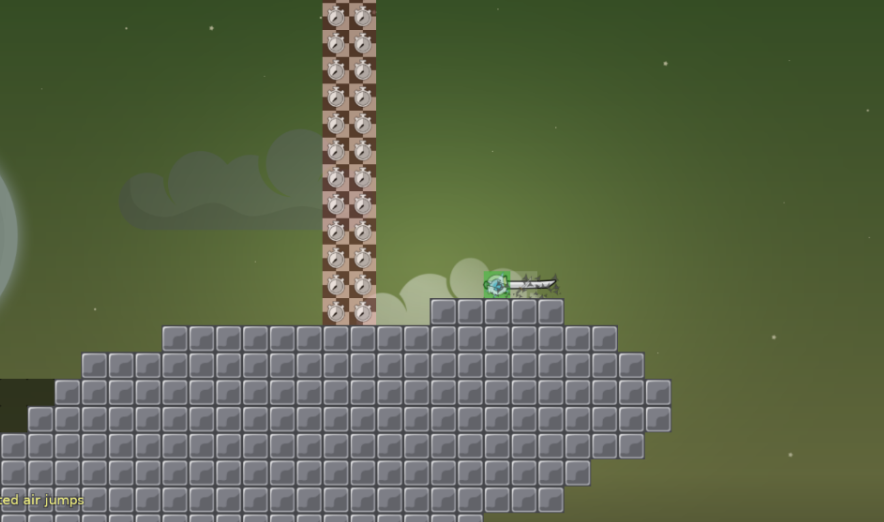
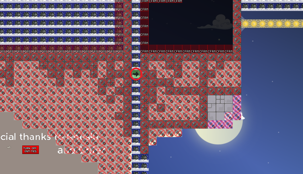
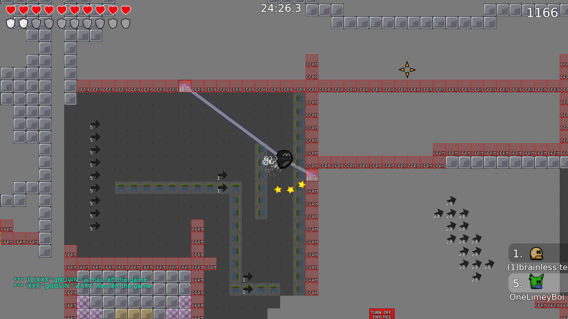
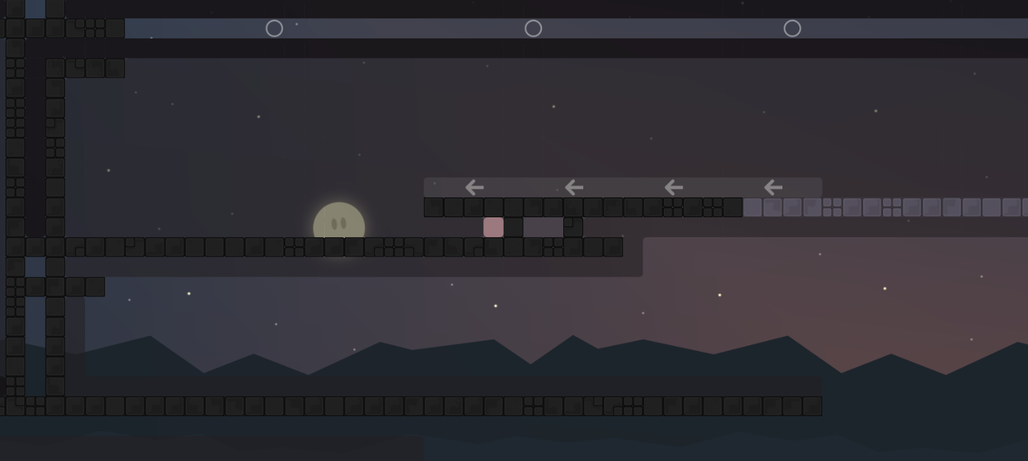
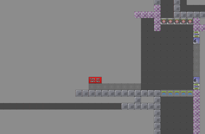
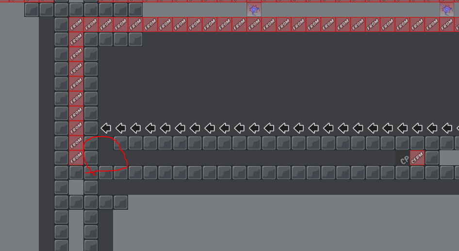
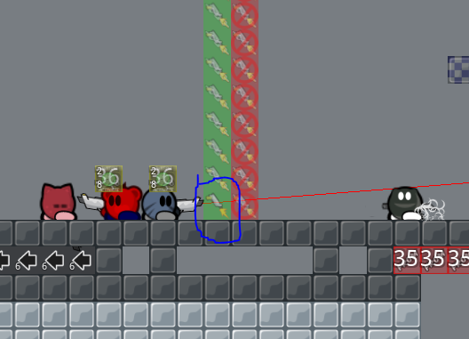
good map
<3<3
did you read the mapper rules?
sum up is:
- less gay shit
- make parts more understandable without texts
- apply mapper rules
ah yea
is this ok now for first part?

if you aim for "ok", then yea
if you aim for "good", then no
Imo first parts should be spacy easy and handle much tees so there is no Chaos in Team 0
Or is it a teamgorce nobo map?
Its dummy xD
its dummy yeah xd
new version
ofc i didn't put the freeze down
does it seems good to you?
looks messy mapped
but its okay
messy mapped?
what do you think ? 😄
idk it’s a very basic part
yeah
like that everyone can do it right?
so nobody won't give up instantly
but my question is : is it better than the other one?
yes
ok good thanks 😄
I think i've fixed the problems
Update 1 - Changed parts and applied mappers rules
What do y mean by second part ? ^^
nevermind , i was afraid to go more left :/
Ah okay ^^
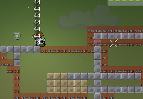
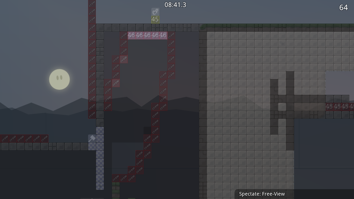
and cp44 part looks like part from tee swap xD (simular)
Is it?
Whats CP 44 already?
Ah
Yea
I didnt know there was somethin like that in teeswap ^^
How
dummy teleported i fall down before getting cp
Ahh shit fail xd
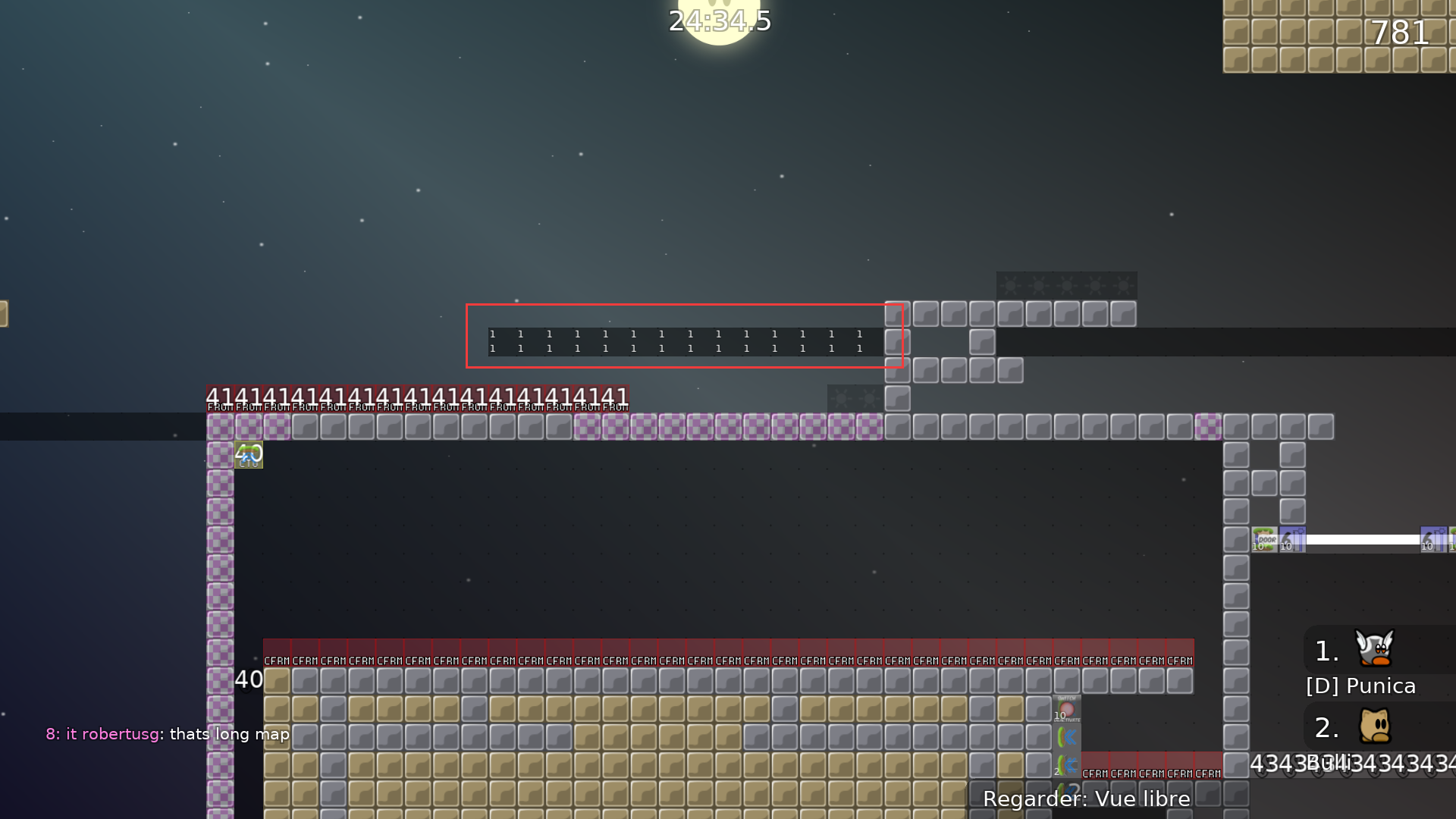
Yeah some lettres are weird idk why
how to get back ?
how they need to know to hook go left or tele down ?
Wow thank you for having testing that much :D
Ok so i didnt get ur second screen
And the last one i cannot do anything
I dont have this prob
And I bet on the official DDNet server there isnt this problem
And where you are "flying" you can just sg down
But thank you
@texnonikfor the other bugs, it helps a lot ! 😄
Ok, new update, fixed things
@texnoniktold me (except some)
after that teleport gun glitch ( maybe becuase i used super ) i dont wanted to test :/ it confused me
what?
xd
didn't understand
@texnonik
i used F2 super and unsuper maybe thats why i get glitched teleport gun
yeah probably
Ok
New update
fixed things that have been discobered in Open Test yesterday and changed a part that was skippable
Sould i put doodas ?
Tiles fix
?
just to make sure u see ^^
Fixed a useless thing
don't embed vanilla tilesets
and remove unused ones
(which is technically possible)
btw design and structure is really messy. it doesn't necessarily make the gameplay worse but it makes the map less attractive to play
you can skip first part (and thus hammer-off for dummy, you can use
to disable deepfly)
I think you have parts that require switching to dummy; should be avoided if possible
thank you so much
@jaofor testing
so
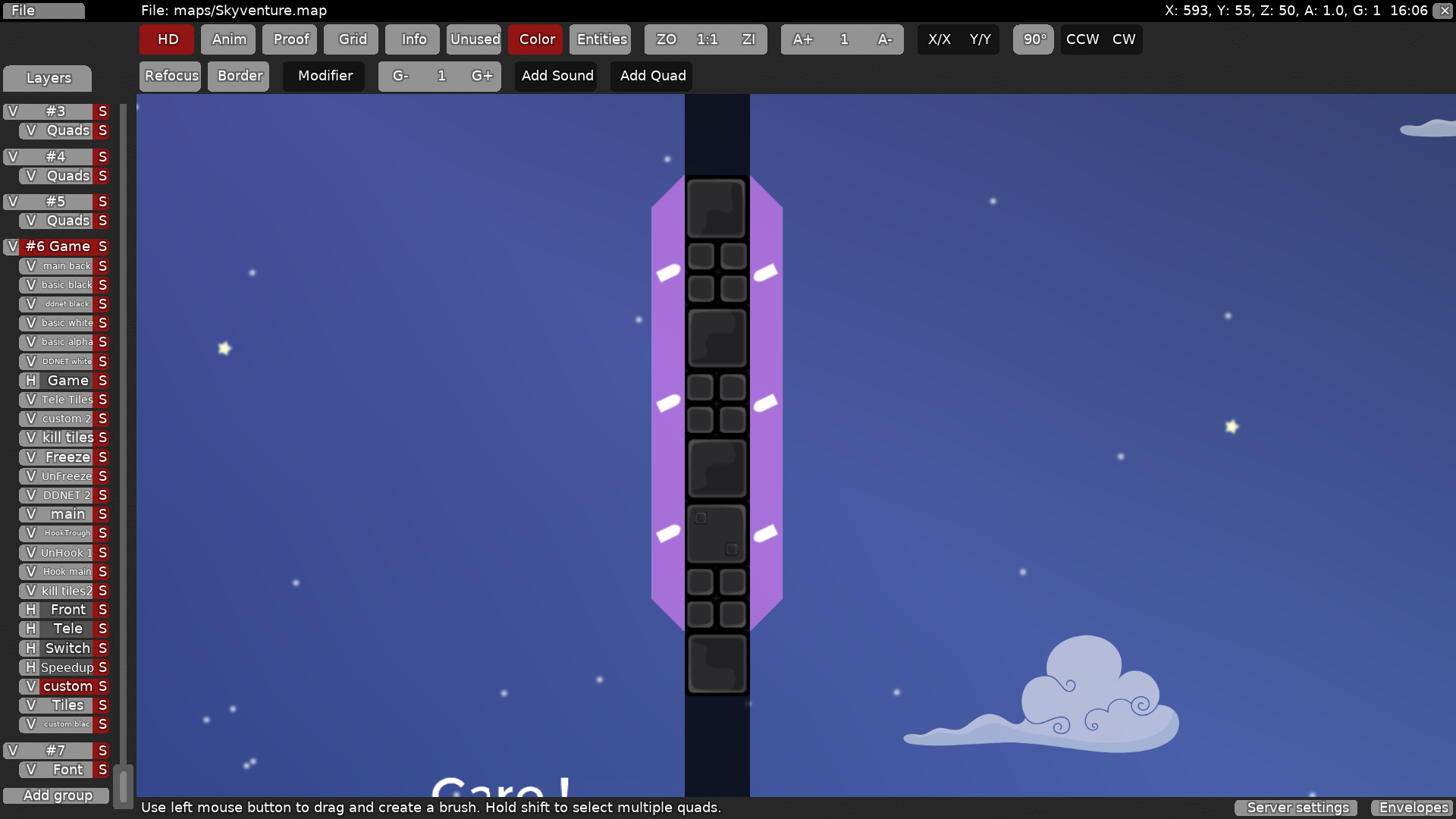
i don't have good graphics to show that the wall is teleport wall
i tried to create them but i'm not a good graphist xd but i'll look arround how I can fix the fact that we don't see them (mayb put them white?)
on pure telegun maps using a different colored unhook/hook seems to be the way to go
i don't think there's any part where you need to switch to dummy; i changed every part that required dummy to press any key
if you only use it in single parts, that might be confusing tho
ok i'll do that then
ah yea
not sure what's best
and thanks for the
tip
maybe put a glow effect on top of the unhooks
oh yea thats a good idea ^^
but i don't get what do you mean by "design and structure is really messy"
I should keep the "where to aim " right? https://cdn.discordapp.com/attachments/532640575908741141/534362672158867486/unknown.png
dunno, haven't played it
if it's something that you can't figure out yourself, then yes
btw this part is only an example
yeah
you can figure out by yourself, you just need brain to know where to shoot xd
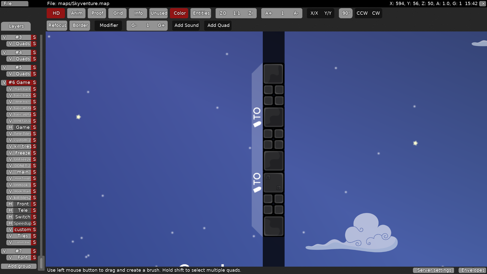
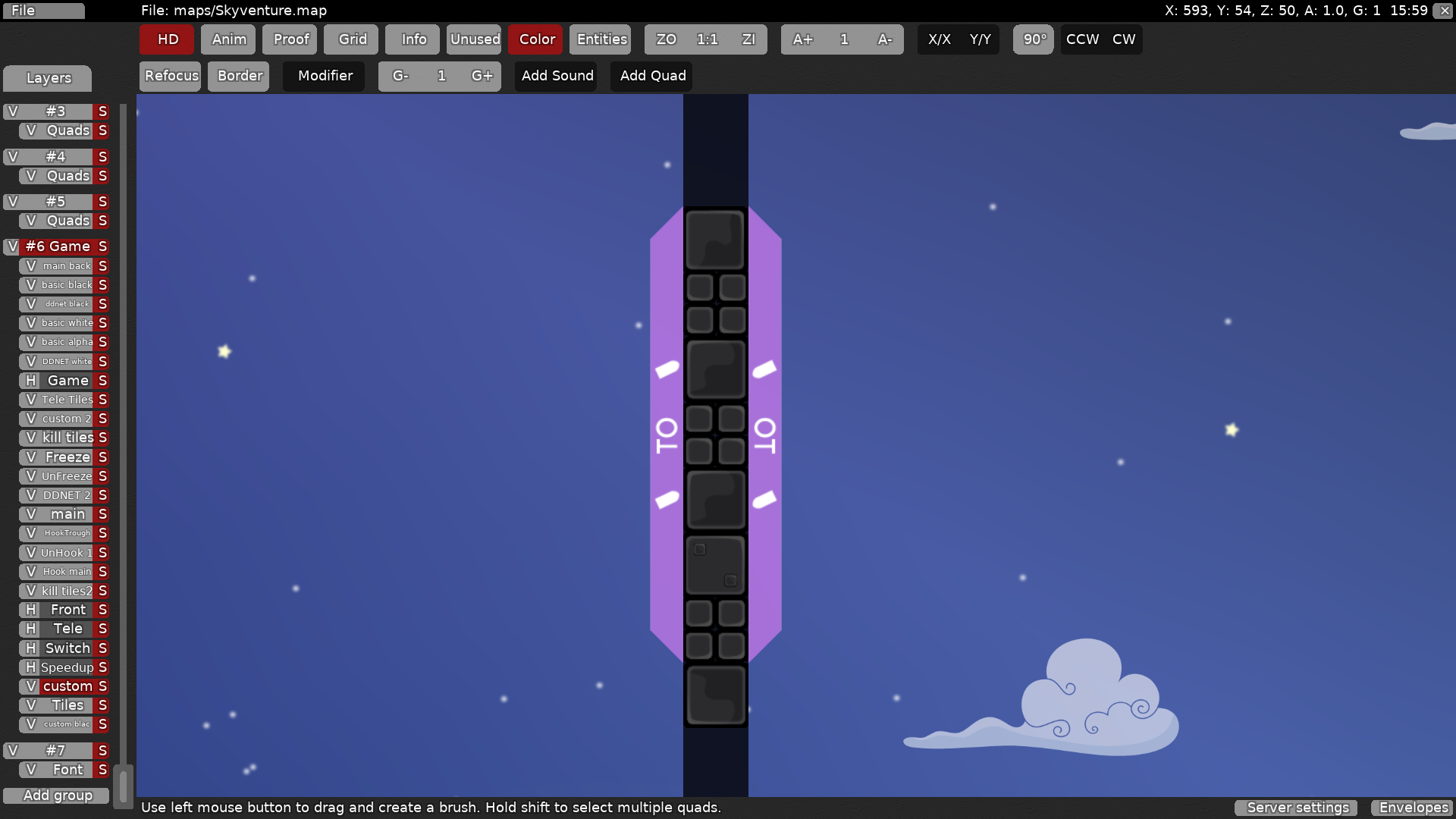
I think the "TO" is reduntant
and I would give it a flashier color
but not a bad idea
flashier color to the text, the back or both?
to the shadow
ok
thanks!
Does this looks better?
I think the "TO" is redundant and not intuitive
color is not my thing but works
ah but how to make it more intuitive than "TO" ?
maybe TP ?
not sure if you need to make it more clear
it's ok for me
someone should make a nice telegun marking
yeah, someone good at design 😂
ok good for that, now does it really matter if the first part is skippable ? Because since now i'm using
I don't think its a big deal, furthermore its not that simple to skip cauz you need to put dummy right wall and go left wall
so
@jaoi still don't get "design and structure is really messy"
you didn't follow a clear design philosophy, shapes aren't natural, generic unhook is just spammed weirdly, tight spots containing a lot stuff
wow
so i should make more organic shapes with more space?
you should look at other maps to get an idea of whats good
i thought I made enough space
I think aurora is similar style
ok
oh ok i see
pretty sure there are some more points than that, i just briefly looked over the map
some really great parts, but also some kinda annoying parts, all in all with a little bit of rework it could be a great dummy map, good job :P
ok so first of all thank you so much
@Rixi!
said that if you are at this state there's no need to put an entities off sign since you should know that its faily
but for the rest I pretty much agree 😄
but
@Rixii don't get ur first screen ^^
Ok, so
Almost everything that
@Rixisaid is fixed Fixed everything that
@jaosaid Changed the shapes to be more organic and added doodads Added a logo + mapper name
just a minor thing tho^^
Ooh ok thanks ^^
fixed
Oops, forget to add the secret way at the end
Should be fixed
small fix
fixed bugs at last part and changed it a bit
release ? xD
want to play it released
😄
still waiting ^^
release faster i want to play new maps ! Release my maps too !
😂
||hoya||

Any updates?
|| zero ||
Nice 😂
update incoming
new stuff
( many fixes thanks to
@triki)
fixed graphics
some fixes again
did you used super ?
Oh i see problem xD
This is no more in updated version ^^
but thanks
@OneLimeyBoi^^
i did before but the jumping in and stuff was not with super, my dummy fell in and touched the switches so i got dragged weirdly
Can it be put on TEST Server pls? 😄
should be up
thanks 😃
pretty cool map. maybe it needs some more balancing but i already told archimede what i dont like. rls when
Ok, so new update:
- some fixes thanks to
- changed bits of parts
so basically i need to recreate the map, but better mapped, shorter and smaller?
you don't need to
but if you redo it with a clear structure and everything, it would improve the map a lot
Yea but if I need to redo it then its recreating it
But i'll make it shorter and everything
tu dois fix tout ce que je t'ai montré aussi eh
Btw i played the map with the mapper and I liked it , even if balance is kinda bad as corneum said
3* would be ok i think
just a question, where can I find the tune zone parameters ? Like hammer strength etc?
thanks!
new version incoming
new everything
- new parts
- clear structure
- clear design
- better mapped i guess?
- not that long
and a big thanks to
@KnuskiVery good map, much better than the old version imo i found some mistakes i think
we can just swing dummy in and let him fall down
i hope my english is understandable >.>
Thaaannnkss
@DarkOort!
Your advices are good ones, thanks a lot 😀
fixed bugs
@DarkOortsaid + some others 😄
stoppers next to start are skippable with enough speed
logo isn't dilated
why grass_main_0.7? you can't really see much of it anyways
you can probably just use 1 section of the unhook tileset, make it white and then get rid of the other 2
Hmmm
what is the pb with grass_main_0.7? Unused tiles or something?
And what is a logo dilated?
I agree for the unhook, i didnt think of that :)
I'll see for the stoppers
grass_main_0.7 adds size because you have to embed it
to dilate the logo drag and drop the image on dilate.exe (in ddnet folder)
rework is a lot more clean, but still has quite some problems
Oh yea i forgot about it
Thanks
And i'll try to use the default grass ^^
In fact, what are the skippable stoppers ?😅
next to spawn on the left
horizontal ones
Ah
Ok
you need to use a distinct marking for hook tele
unused + selected
ohh 😂
thanks xd
did u notice other bugs?
didn't look for bugs
i fixed the ones u told me
upload fixed version then
fixed stuff 😃
wut
nice map !

working on some fixes
- reduced file size a bit
- fixed telegun off skip
- changed unhook color to be a bit brighter
- fixed some other bugs
fixed 2 little bugs
- fixed infinite corner design bug
- fixed another design bug
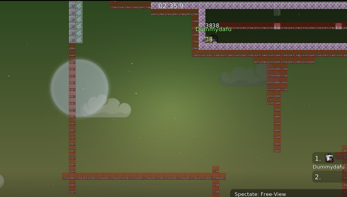
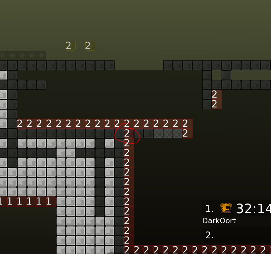
cp 33 is too long
would remove shield on cto 37
nvm there is a shield below
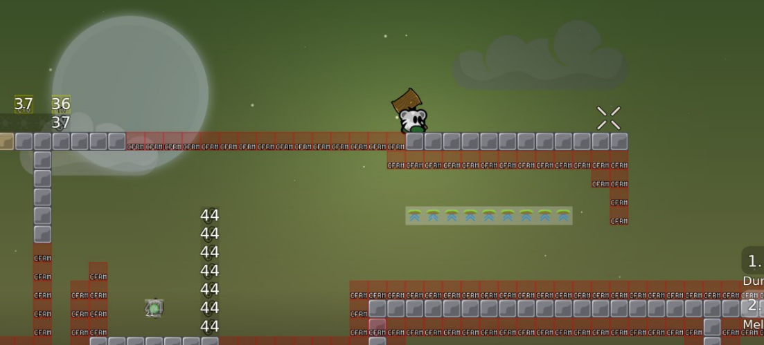
which means the shields below cp 43 are superfluous
don't mark good to teles
pretty cool map and part ideas. but as jao already said some parts are a bit too long
actually better use hookthrough instead of stopper
Hellooooo! Thanks for having tested :)
The only thing i do not understand really is the "laser easy to keep"?
But for the other things I pretty much agree and will fix them this evening 😀
ignore the laser thing
Okay ^^
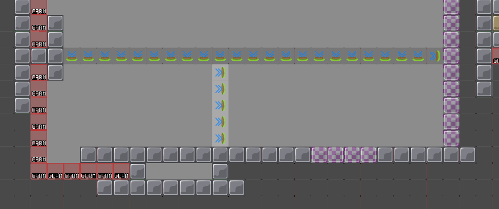
"all these stoppers" are to force the player to use laser when he needs to drag the dummy up (right part)
and what's "don't mark good to teles" for?
why would they be marked
which one?
can you show me an example ? :x
before finish
ah yea ok
but i think its the only one?
ah no
there's another
- fixed jao's screens
(except the stoppers thing)
- fixed design bug
- added some tele's
- fixed the stuff
told me
- should be ready 😄
okay
@jao, i'm free from today until this weekend, tell me when you wanna test to see if there's still some things to fix 😄
- changed normal freeze in laser part to 1s freeze
- fixed the freeze inside the "no shoot area" in telegun part
pls dont delete
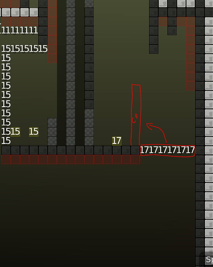
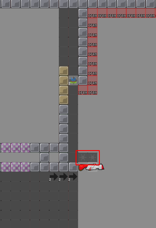
Nice map, I liked playing it. I only spotted a few little things that should be fixed: checkpoint #17 should not be skippable, "back" teles should be made with normal tele and not checkpoints
Thank you a lot
@Ravie😄 I'll work on these fixes as soon as possible ^^
i need to put the back tele with CP's because if he falls into the tele of the previous part he needs to go back again so its a bit boring no?
No, it's just a bit weird if you get checkpoint without touching cfrm and then go touch another cfrm somewhere else
oh ok
its all fixed then
- fixed bugs that Ravie find out
oh yes of course i didn't see them xd
- fixed entity bugs
$ready 3
fuuck there's a bug
this is not working 😦
- fixed freeze (sorry about that 😦 )
When does that happen
And why
xDD
Oops

- fixed this lil bug
and
@Baconnormally the telegun makes you tp on the tee so you bumb up
Yea
I did exactly that
Yet it failed me like that 1/3 times
you have to do it while the dummy is mid air?
It wasn't midair
But the 2 times it worked it wasn't midair either
I actually did manage to replicate it on test
For example if you dj before your gun hits
But on my screenshot I still had dj
this is strange
i guess you really need to do it carefully
Also if you fall down and shoot the feet
You bounce off to the right
xD
sounds more like a telegun bug than a bug with the map
Yup
Tried like over 200 times on test could only get the same fail once
you can send the demo if you have it
- fixed a stupid failable thing
which is?
y map not well tested xd
map very well tested
u crazy
i tested it once
so yeah it is very well tested
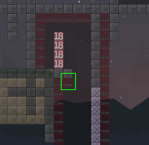
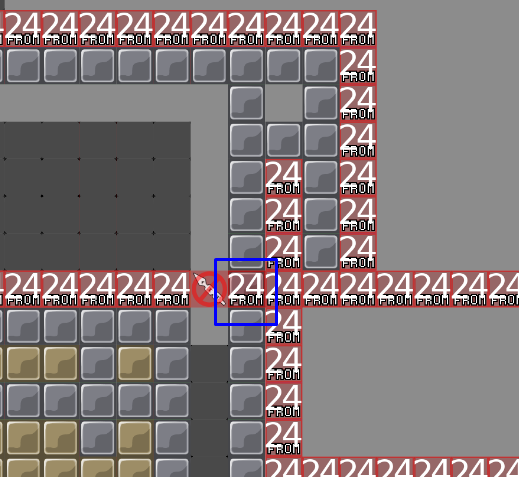
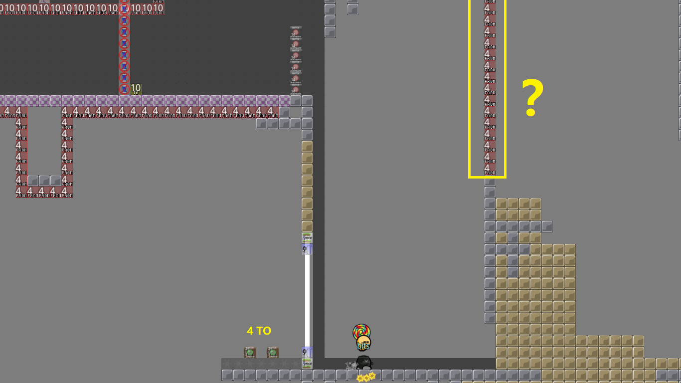
- fixed '4 FROM' tele and replaced them by stoppers
dang it - we cannot see everything
- fixed an entities mistake
did you take the live ver?
looks like no
please fix it in the version on the servers
Okay, just why is it different ?
Or how?
I fixed something too
Oh ok, what was it,? ^^
a missing cp
Oh ok
- fixed from live version
wtf is happening here
Skyventure has been released a little bit fast>.>
There's just little bugs that we do not necessarily see right away
?
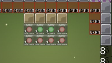
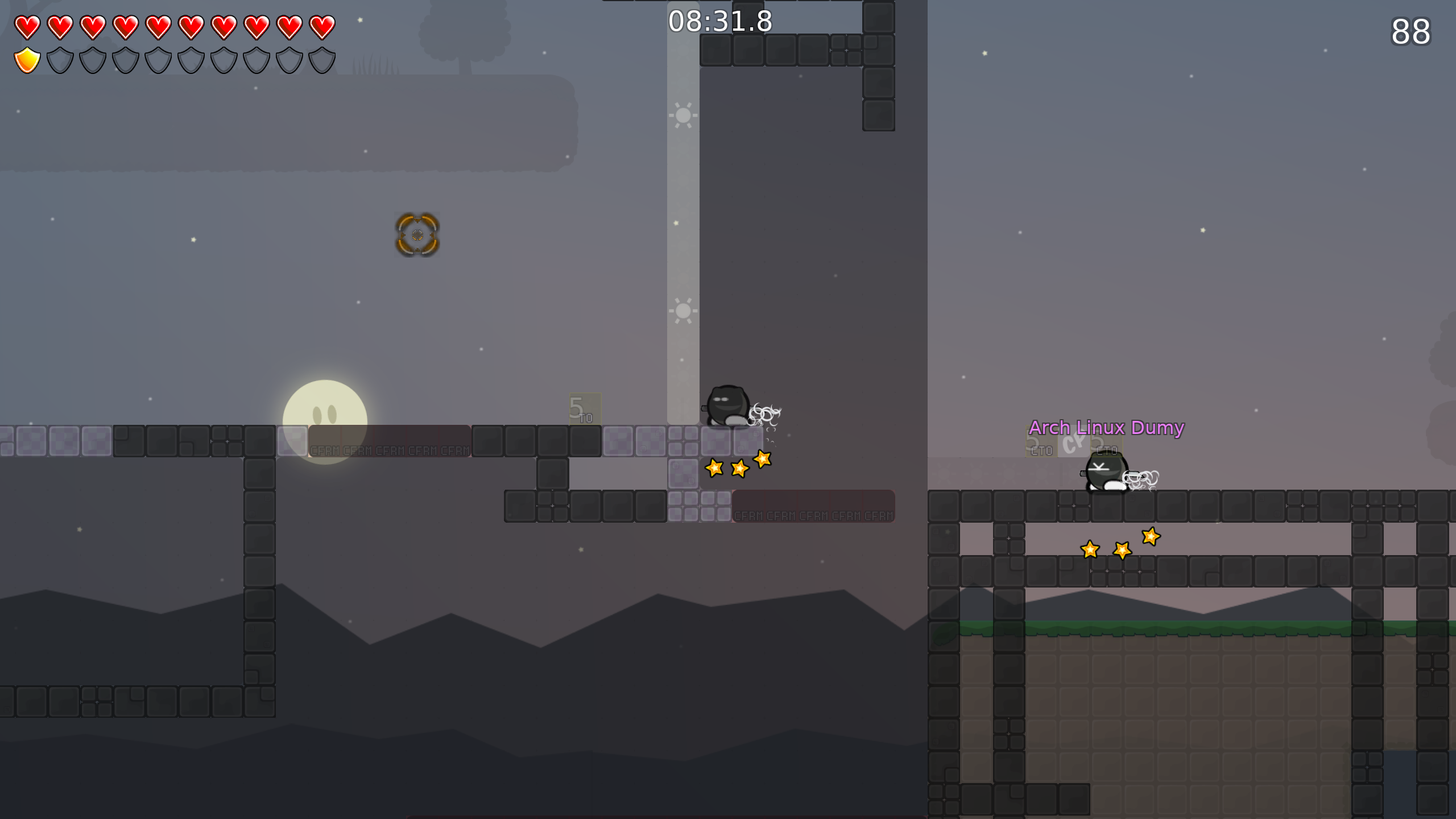
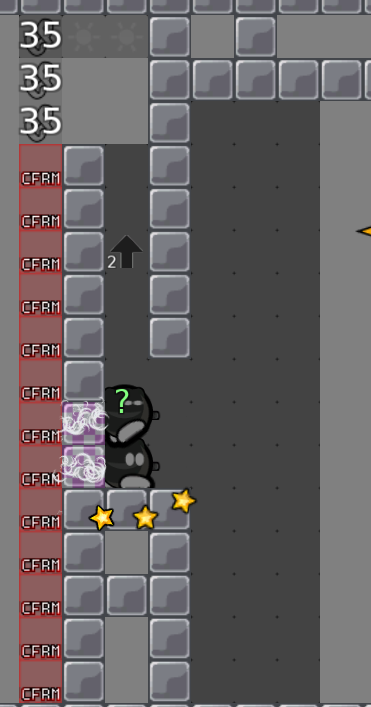
what is the point of this screen ?
i cant see a ll tees on the picture. distance matters
oh
my dummy is too far
why you jumped in tele lol
where is ur dummy ??
if you are here that means that you wanted it
there's no other way to get to this situation, unless it's a bug then you need to tell me
what about switch ?
just look when its open or not?
waited too long :/
that's ur fault
not map's fault
u dumb then
