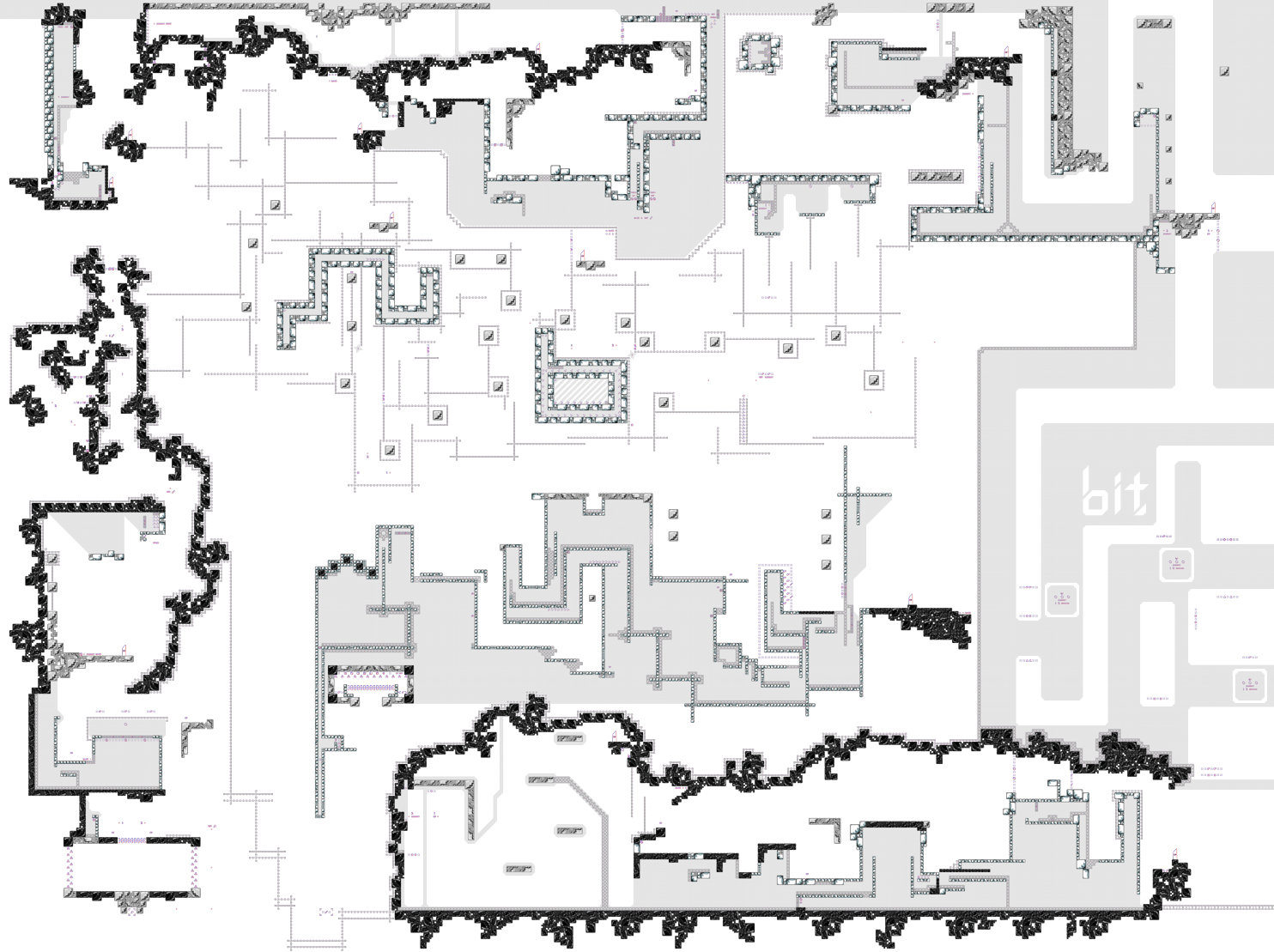
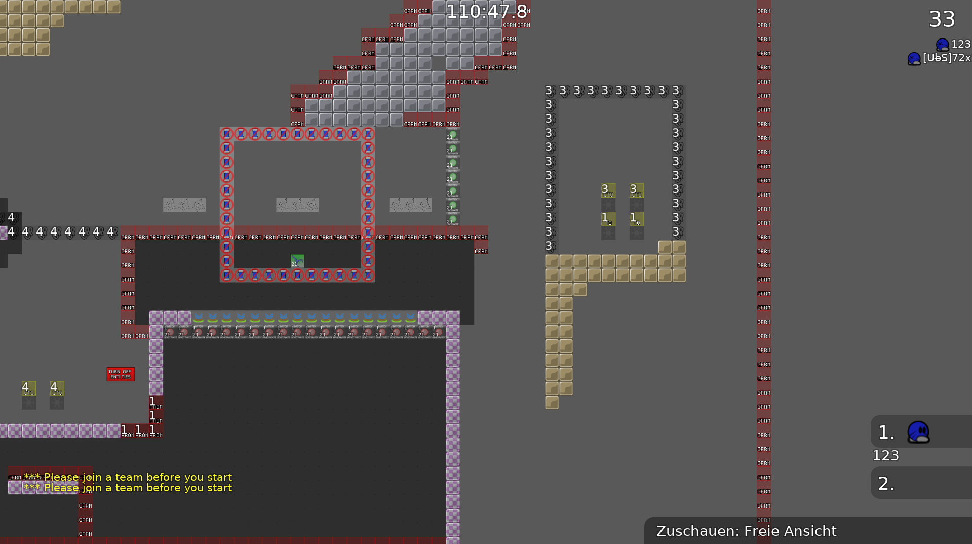
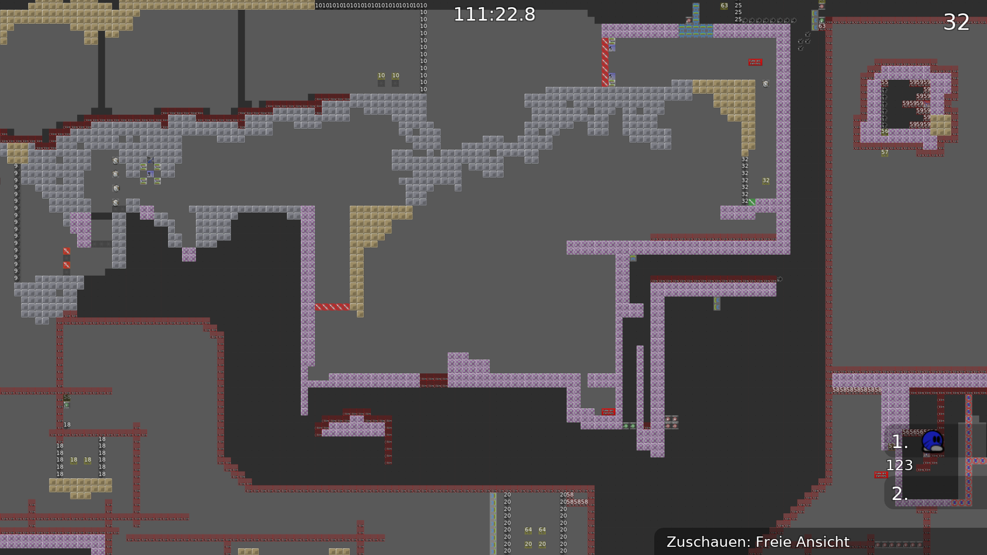
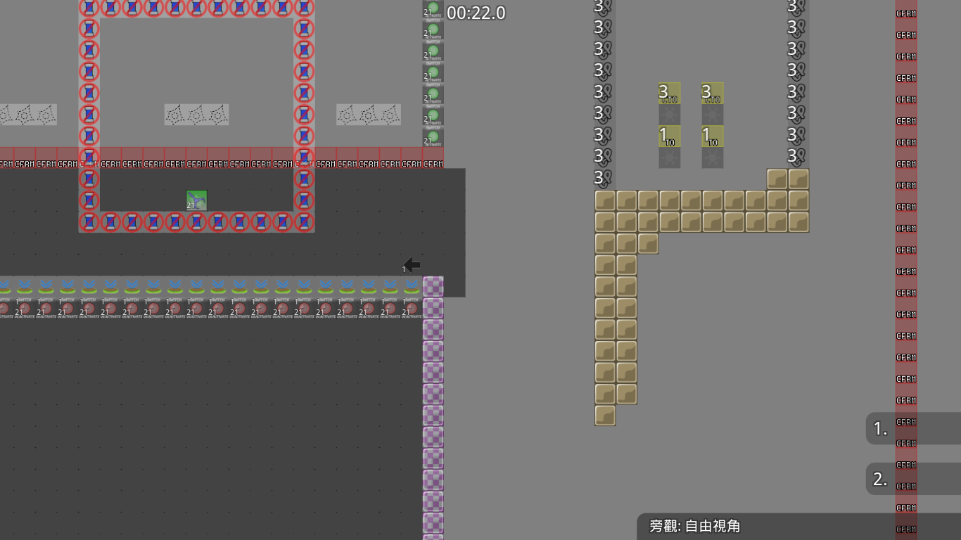
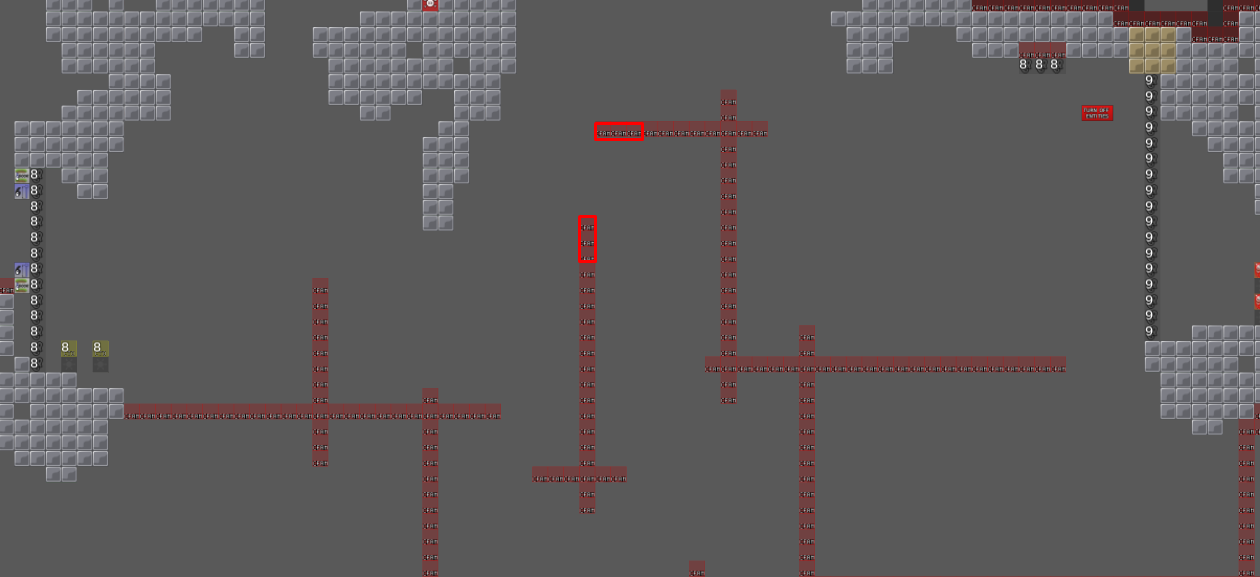
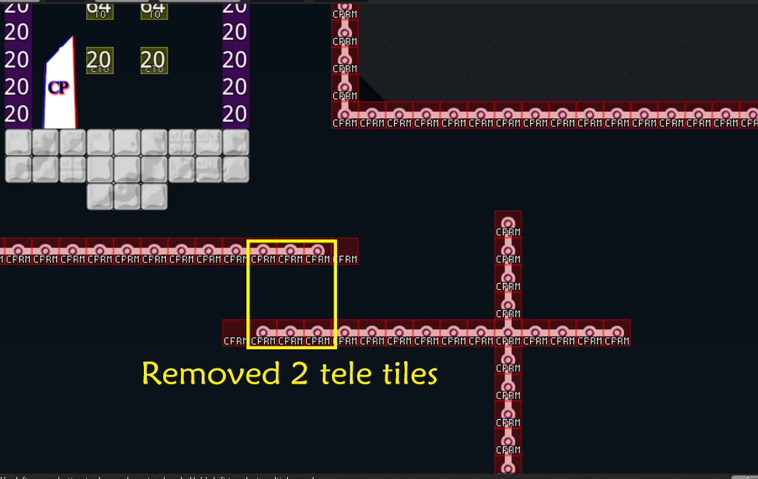
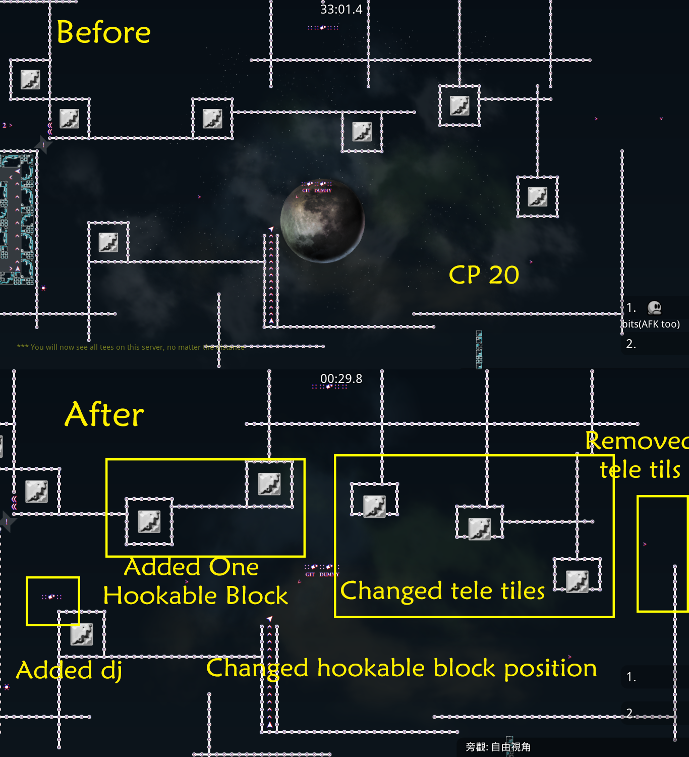
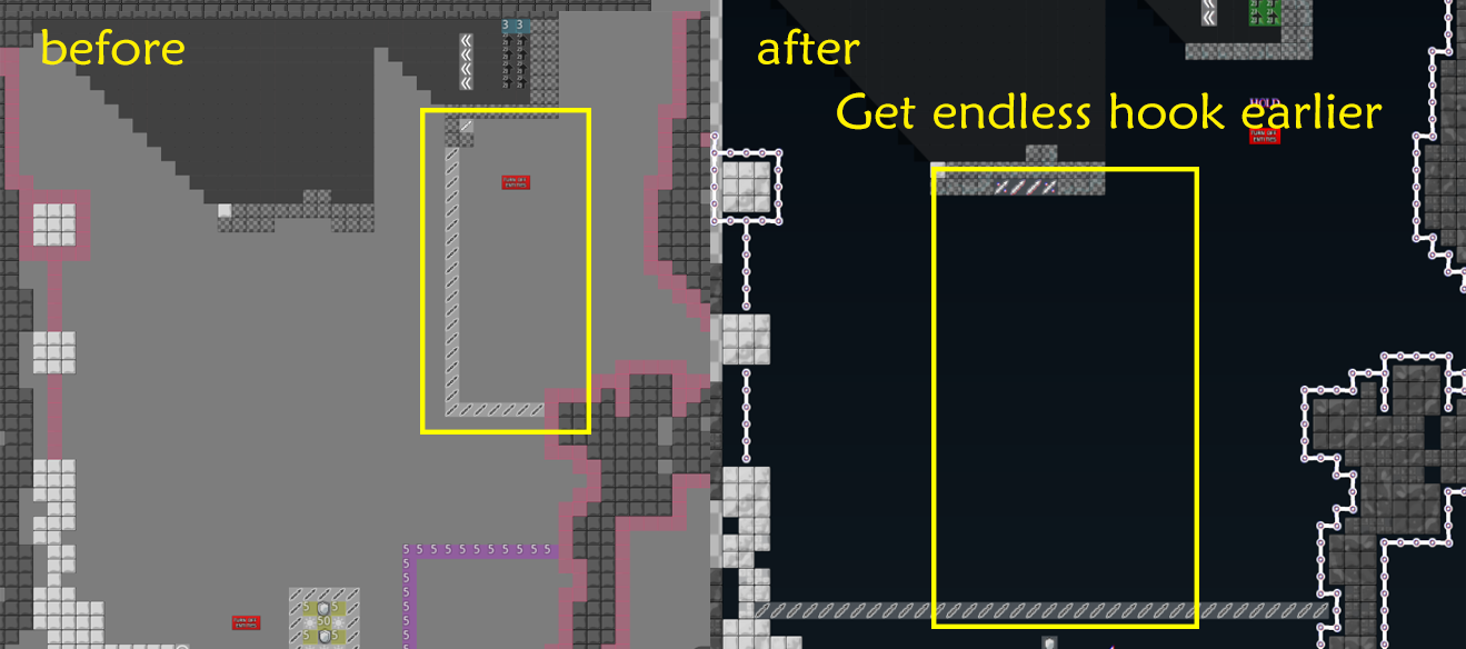
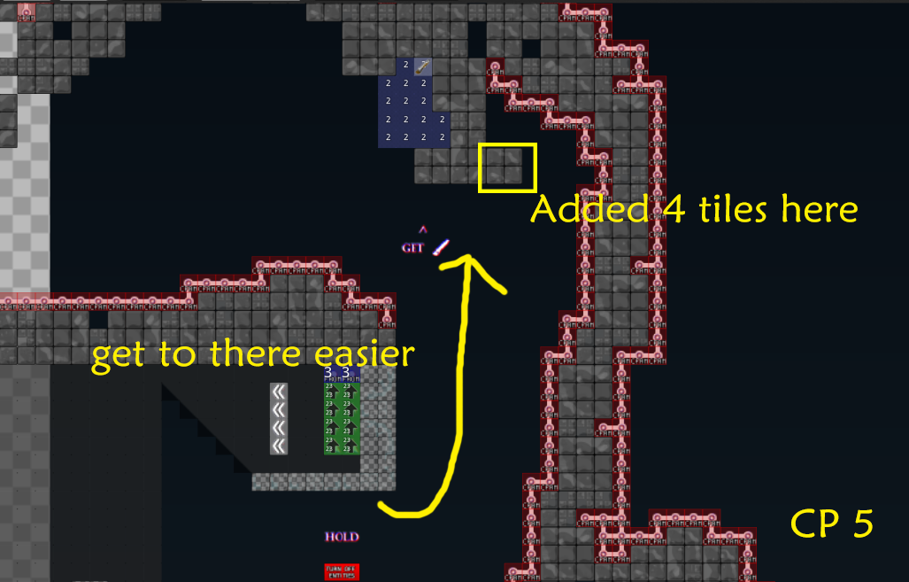
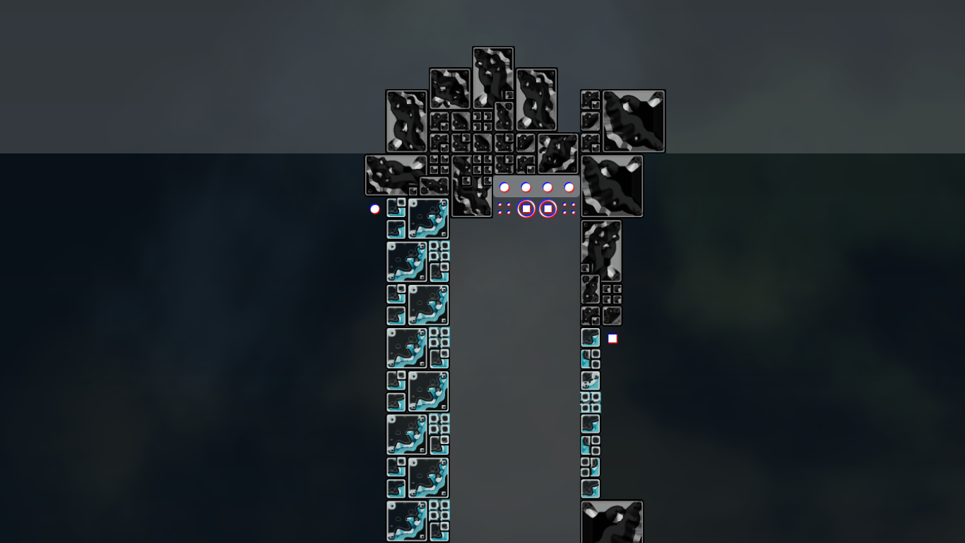
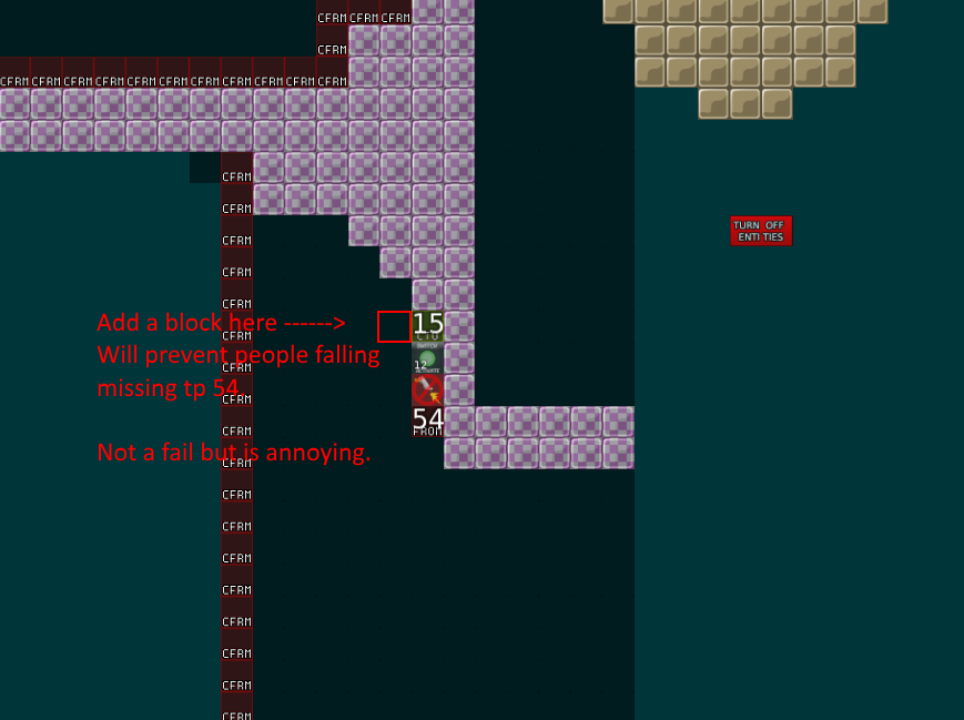
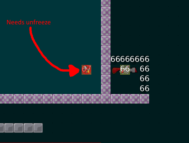
wow, so fast.
good job, you are the best bot
$rate balance=6 flow=7 creativity=9 playability=6 fun=2 design=1 bonus=0
wut
you tested so fast
xD
I really like the map. Maybe I can't finish it, but it's really cool. 😄
thank you !
Nobody is forcing you to use high-res bitmap images, they drastically increase the file size. They also look really un-teeish.
$rate balance=5 flow=6 creativity=8 playability=6 fun=2 design=1 bonus=0
Nice map
thank you so much!
😃
i will fix it now :3
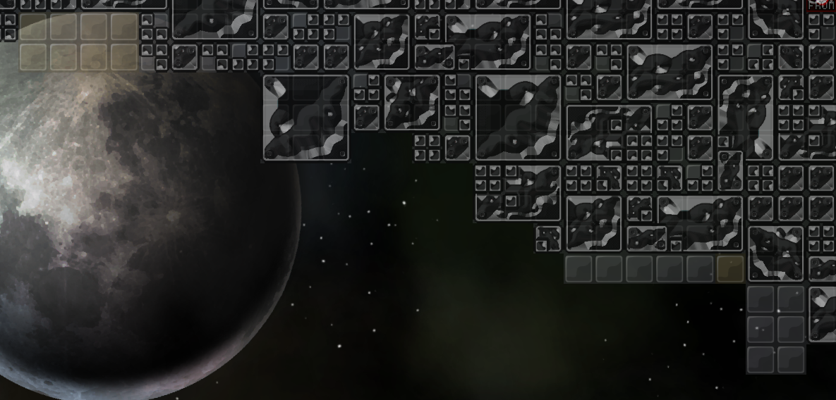
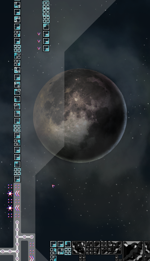
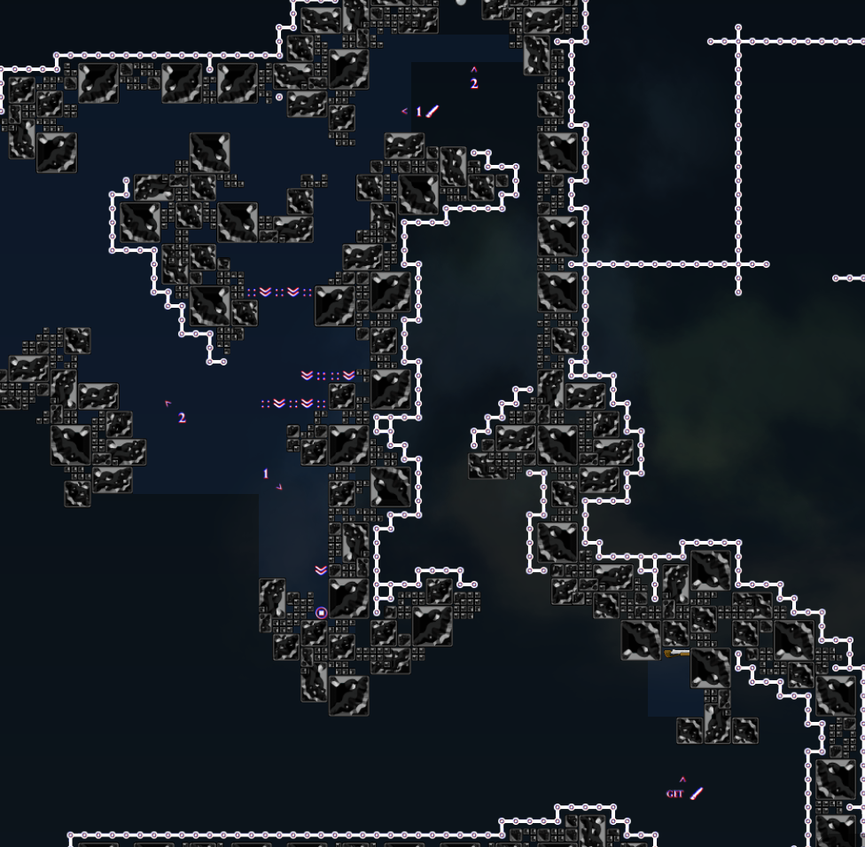
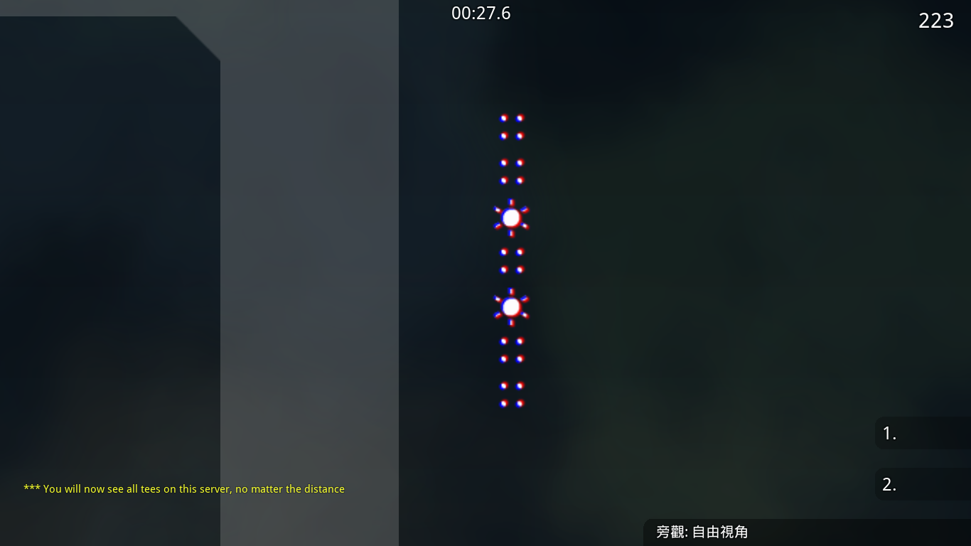
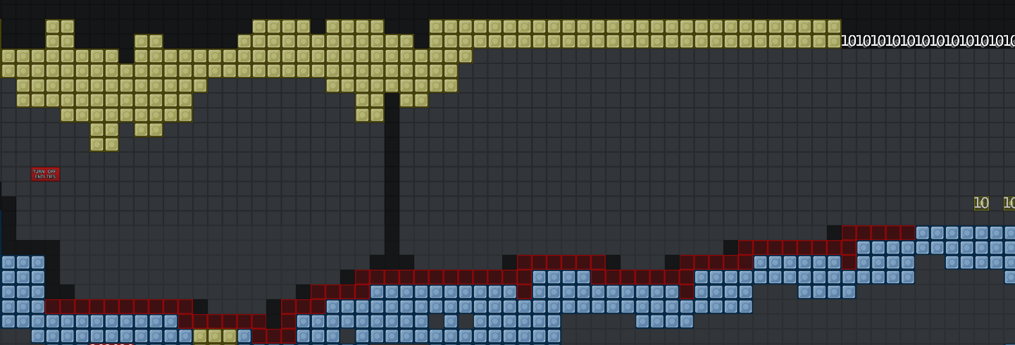
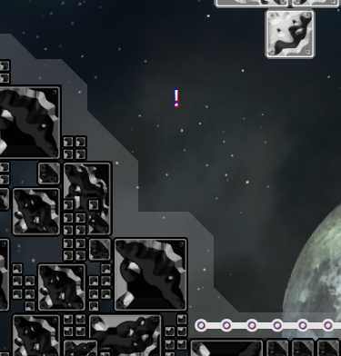
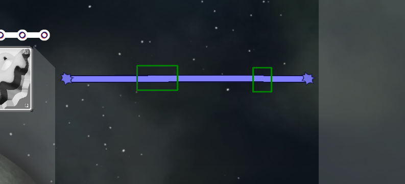
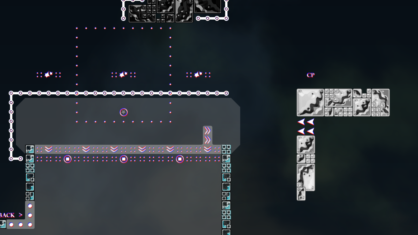
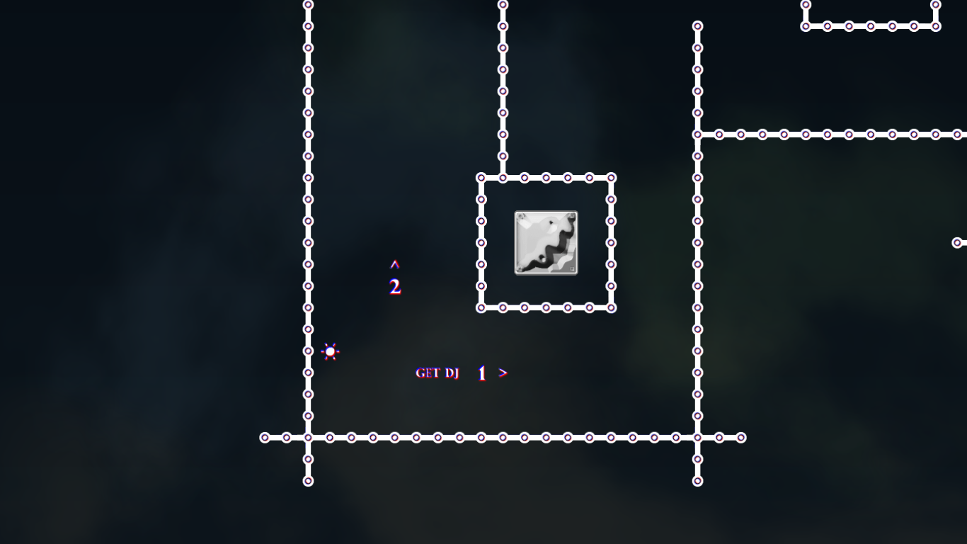
The background looks great even tho it's not teeish, the tiles don't fit at all and I can handly tell the difference between hookable and hookthrough, maybe you could have made it look like a space station. I think by "fog" you mean nebula. Why are there 2 waves if only 1 is moving ? Can't you make the map lighter ?
oh, i can rework the tile to make they look more different. the wave is bug i will fix. 😅 and thanks a lot for your careful testing 🌸
yea, i have made it lighter now, a bit
@Pipou😅
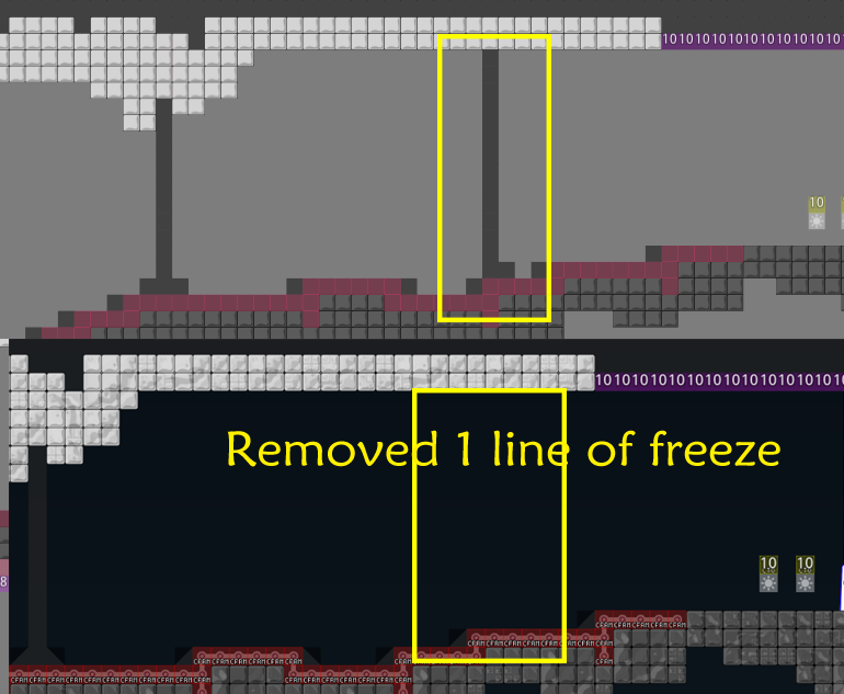
- fixed skip
and
fixed wrong tile , lighter bg , lighter hookthrough, and other small changes for good gameplay
$rate balance=6 flow=6 creativity=6 playability=6 fun=3 design=3 bonus=0
I think "map & designed by" is not good english, should probably be "map & design by" or "mapped & designed by" ?
and "thanks to" not "thanks for"
ah no nvm
xd
lol, my English is bad, I will change it😅
thank you !
fixed lanuage bug 😬
$rate balance=7 flow=8 creativity=7 playability=6 fun=2 design=2 bonus=0
thx~
Its a very nice map Design is on point but a bit laggy or it's just my pc idk parts are very interesting good to play
☺ Thanks a lot for your testing! this map has some animations and complex background, it may cause the laggy in some pc. maybe turn off the 'high_detail' in setting will help.
Well I will try it^^
i just opened map and at start you can out of here with out getting start the race ... ( but its perfect pixel movement and speed ) but its possible so its easy to finish in some seconds this map
Do you mean skipping startline?
yes
$rate balance=8 flow=8 creativity=7 playability=7 fun=2 design=3
Realy good map like the parts and the design is awesome
fix startline skip

i want a demo of you going through the kill tiles in the old version. You cant go trough vertical kill tiles afaik under any circumstances.
I cant do that.
@texnonikdid it
i didnt did that in your map but i remember i did special part ( to do that )
with tp is a lot easyer
oh ok, i am not very clear what you did 😅 , but whatever there are no skip at startline now. 😄
fixed a tile bug and did a bit change 😅
a bit change about logo
$rate balance=6 flow=6 creativity=7 playability=6 fun=4 design=2
Fixed
Thank you!!!

bit most weird design award winner

so true omg
You finally started testing this map.😂
mark arrows
Emmm, Kicker told me that it doesn't need make arrows, idk

i saw him doing the part on the second screen and he was confused why his dummy was pulled
Emm
is there any problem marking these arrows?
They told me that not evey where need the arrow mark. Anyway, OK I will mark it

i will fix it tomorrow, now i have to sleep

$rate balance=6 flow=5 creativity=8 playability=6 fun=3 design=2
only few parts which i liked much, map is okay.. some unbalanced parts(if u wanna know more about balance flow etc, pm me)
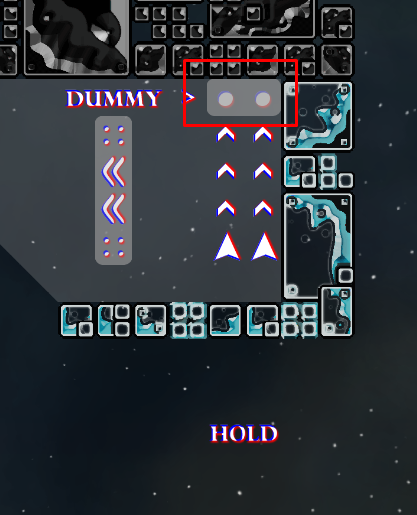
i dont understand ur first screen "there is also the way to let ur dummy hold "A", but that shouldnt be the only way to do the part in an easier way" it was planned like this, and why it should be the only way to do the part
if it is planned like this, then i dont like the idea of switching to dummy and let him hold A. and how couldnt u understand? i think the way to hammer your dummy in the hole, then catching him is the right way and the other way is only intended. i even asked Broke to show me how to do it and he started by hammering his dummy in the hole. i just wanna say that i dont like the 2nd way + there could be more space to hammer the dummy in
Thank you so much for your testing and detailed comments. But I am very sorry that there are some things to deal with at home in the next few days, i can't modify the map these days.
@jaoYou can delay the test of this map for a while.
im back

i changed the first part
i agree syltoox that the 'hold a & hammer' is bad to flow
😃
the 3rd screen is long, but its not hard i think. so i decided to keep this
i have tried the first part, its much easiernow
you mentioned that there are some unbalanced parts, i wanna know that🤔
i can do some change
agree with 1st part its better now. will tell u unbalanced things
ok, when you are free


ok
hmmm
so if u reached it once, u dont have to do it from beginning which makes less annoying
its the cp after u did the part.
isnt it?
you can get cp63 first , then do next part
well u can get him up there. but hm
wait
yea
u have to hook him every time again in the speeders
if he falls in tele
also btw
weellll
why does it open laserroom?
maybe i misunderstood the part
oh, it should be the close laserroom
hmm
well, i dont want to change this part. i think its not tooo long and its not too faily

okay
changing the deactivate 7?
yea
i did the change
can u join my server quick ?
name 72x
olk
oh, i cant join that server, bad network
okay i try to explain
okay explained in privatechat and it is a skip 😄
skip fixed
seems rdy for me
fixed a little skip near the beginning
disable deepfly
$rate balance=6 flow=6 creativity=9 playability=6 fun=2 design=2
thanks for your testing ! Do you have any advices about the balance and flow? So I can improve it.
sure. ill show u tomorrow
Ok , thank u!☺
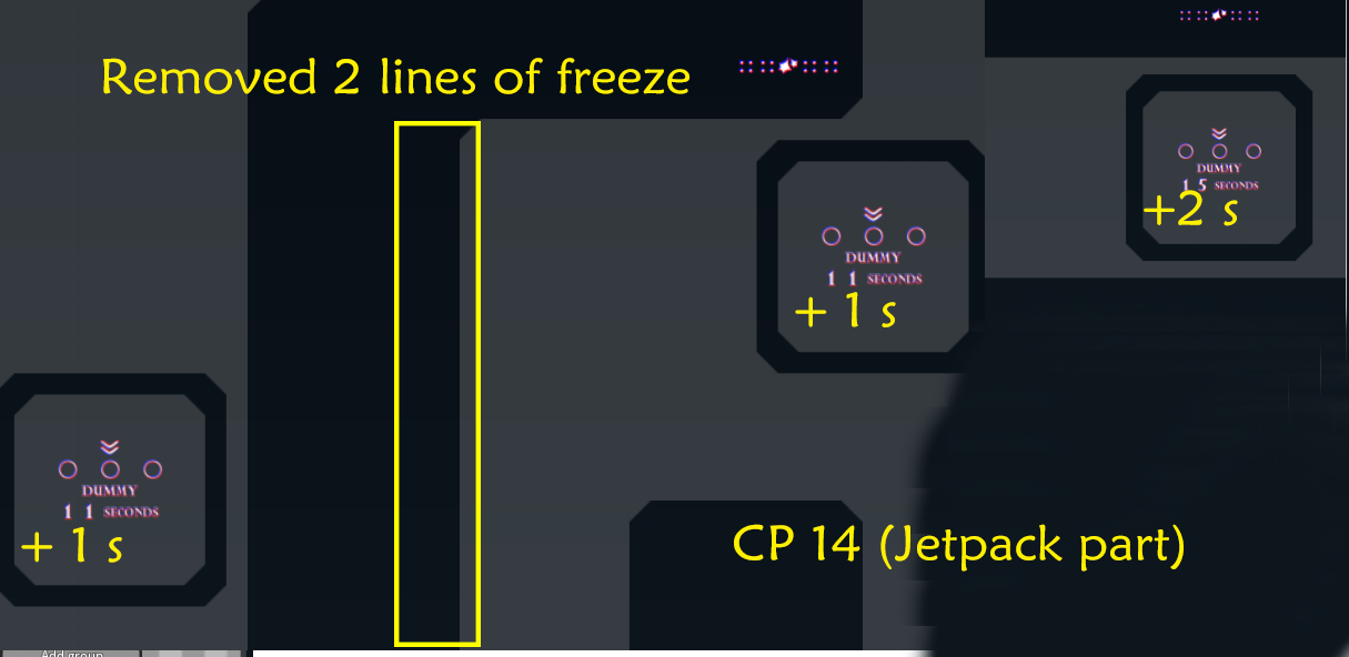
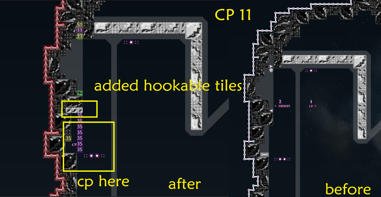
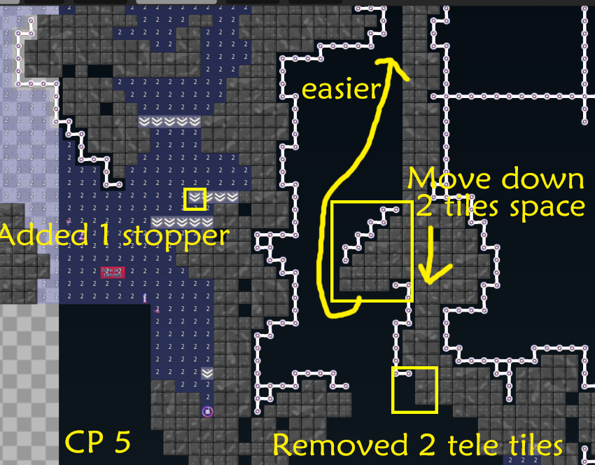
rated balance that bad bcuz many drag parts are very unbalanced. some parts are much longer than other but have the same difficult. also rated that low bcuz cp 10 and 20 looking a bit hard than others (idk maybe its just me but it looks like u cant balance deep drags very well) also cp 14 is a bit too long
cp 5, 10, 11, 14 dont flow very well. drag parts are breaking the flow a bit (again maybe its just me) also jetpack part breaks the flow rlly hard
$rate balance=4 flow=5 creativity=8 playability=5 fun=1 design=1
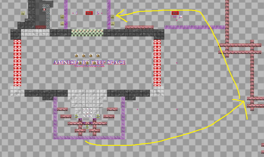
thank you ! i have changed something in these parts you mentioned. here the preview:
so i really hope that you can test it and rate again.thanks!
if you have idea about improving these part, plz tell me, i need it
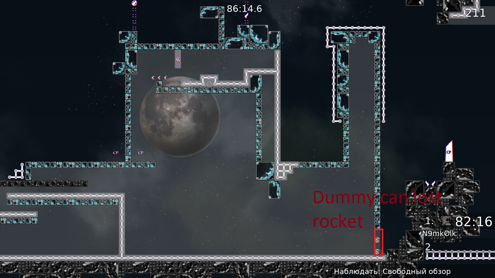
hi thanks for your testing ! i have added the rocket at cp 66. I want to know your opinion about the balance , flow and playbility. i hope i can rework on it to get higher score from you
add unfreeze
ook~
i dont understand the low balancing
atm it is on 5
do u have any reason for low balancing ?
Ofc
Maybe you update ur map
Idk if you changed something
Y, I have updated it...
changed gay part
as i said. disable deepfly
Emm
Deeply is disabled now I think
$rate balance=6 flow=6 creativity=9 playability=6 fun=5
thank u ! Jesus Christ
bug fixed
$rate balance=6 flow=6 creativity=8 playability=6 fun=2
flow=6
$rate flow=6
thank u!
$rate balance=6 flow=6 creativity=8 playability=6 fun=3
thank U
@Amu~Cookieapproved
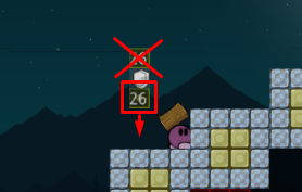
switch 2 activator looks superfluous, switches are activated by default
u forgot about it
cp30 pls
☺ oh,i will fix it soon
fixed
fixed a bug
this map is so messy in entities
generally, use normal tele everywhere you can
don't place TO-teles high above the ground please. 1 tile above it when both tees might be ported to the TO-tele, otherwise directly one the ground
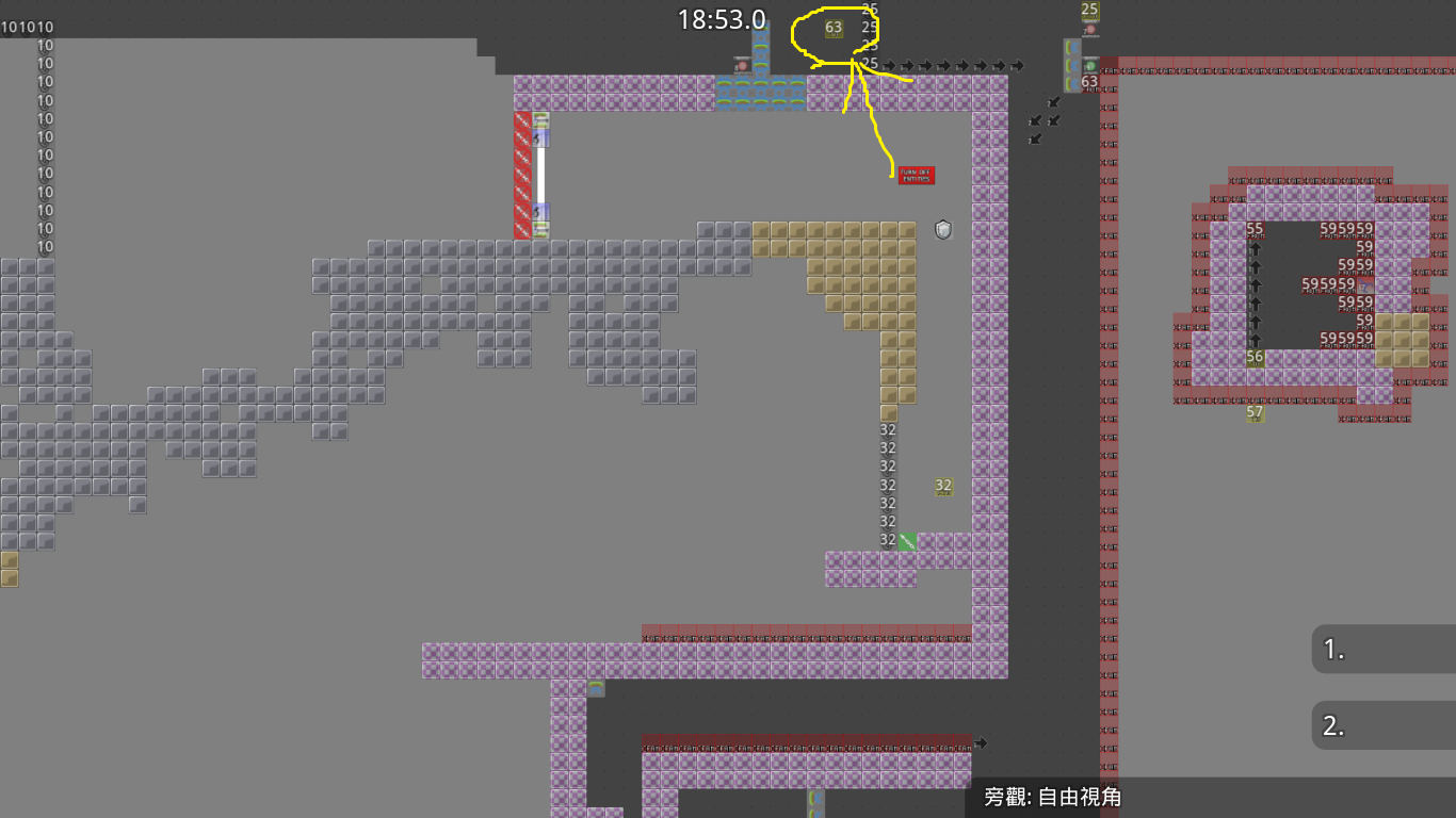
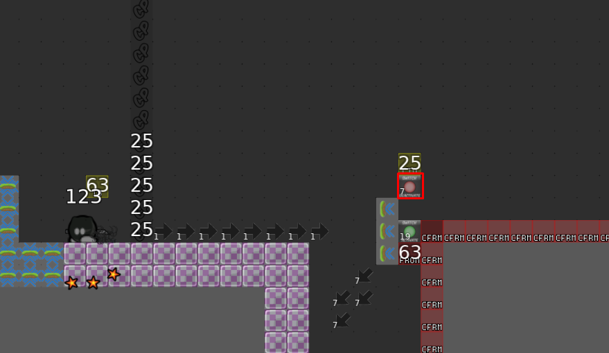
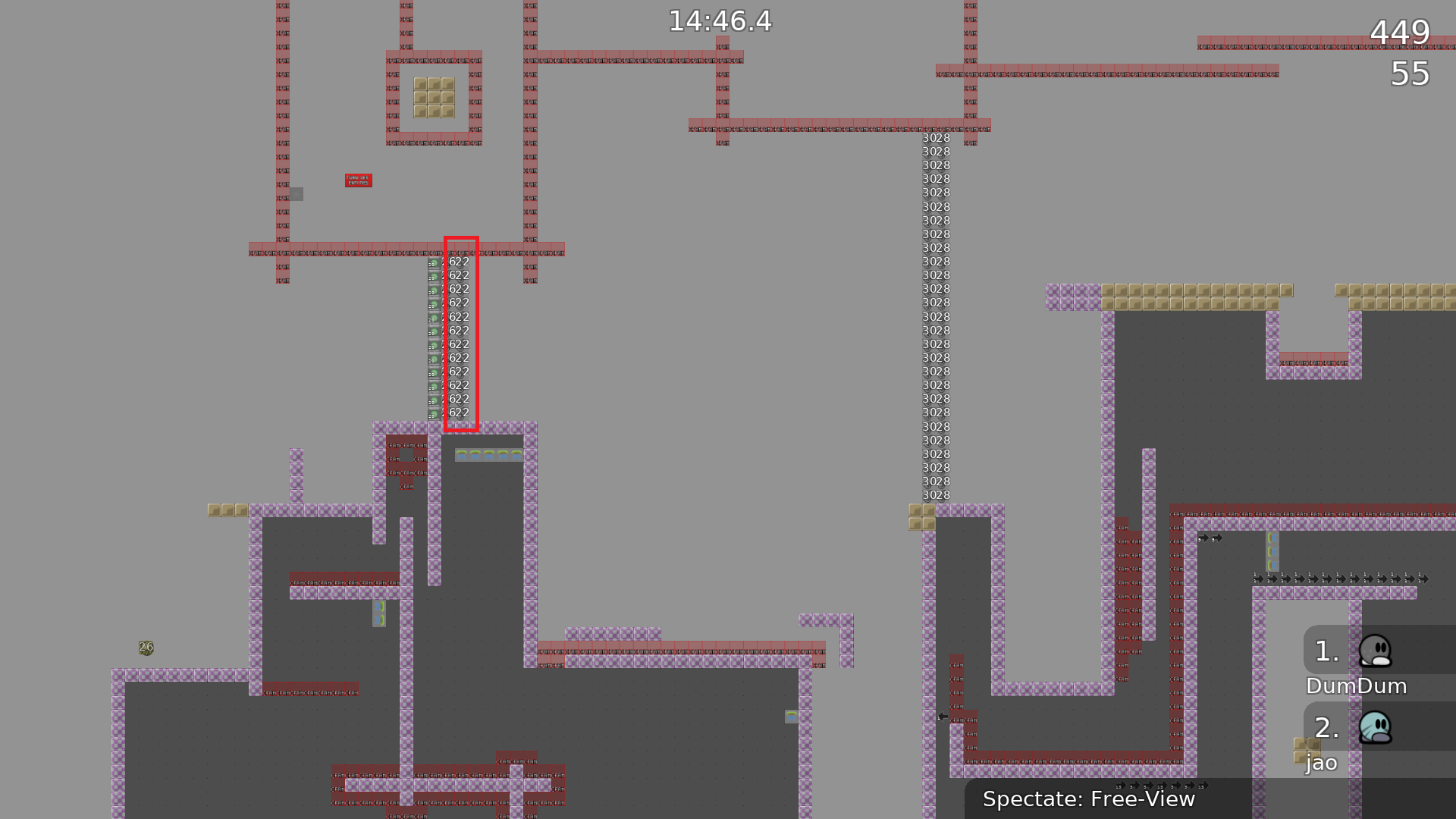
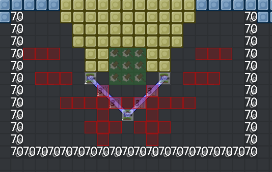
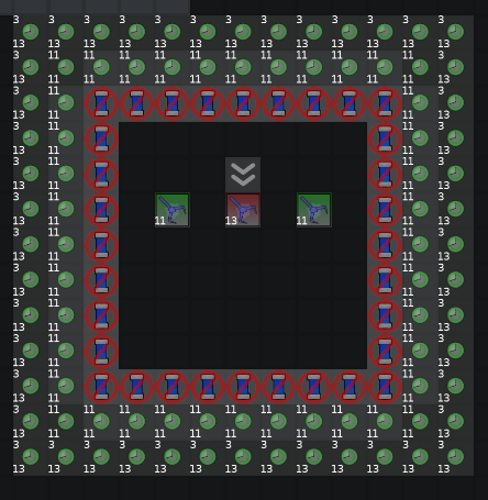
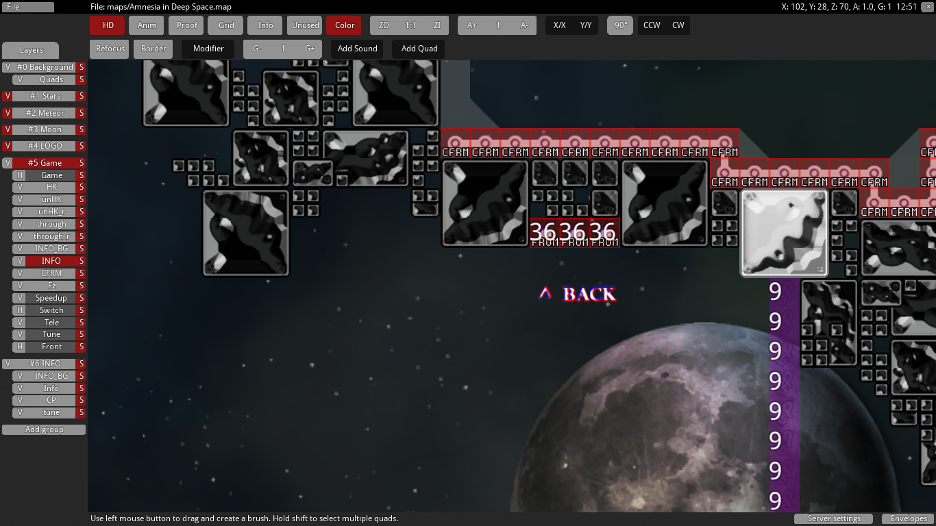
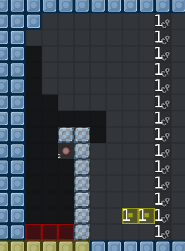
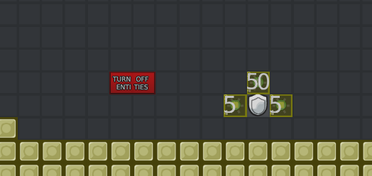
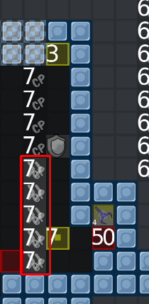
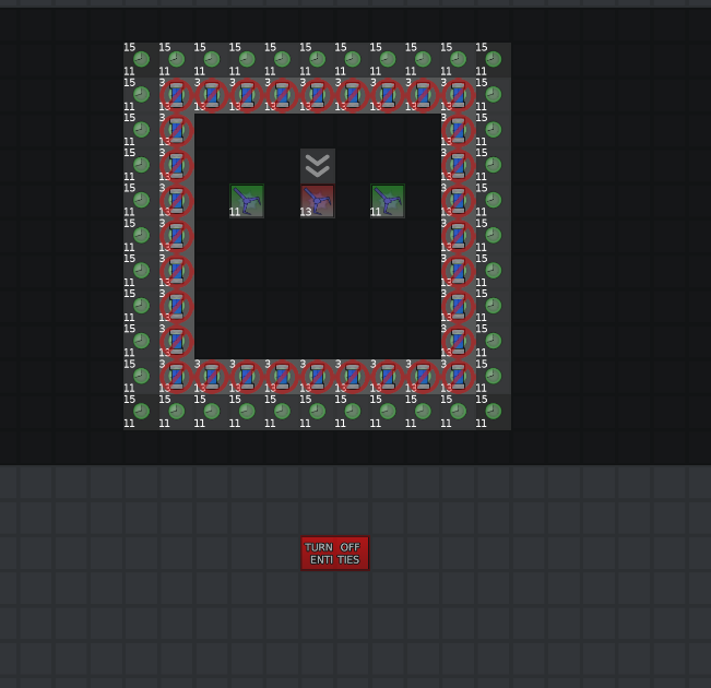
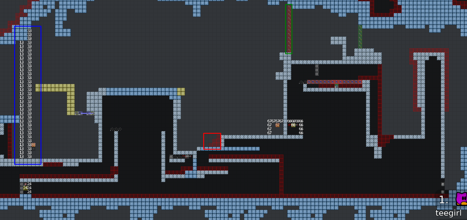
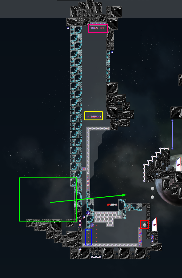
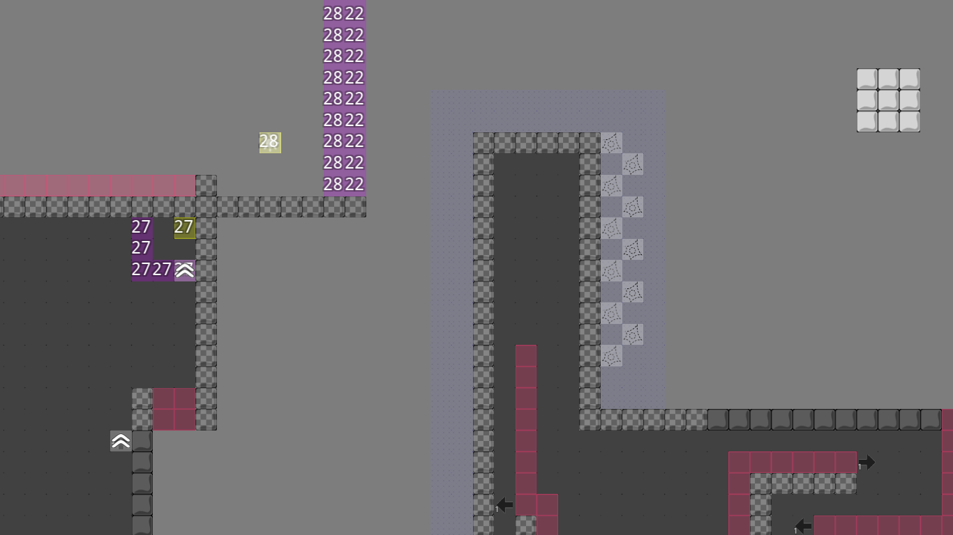
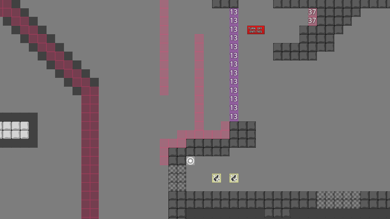
red-marked speeder doesn't really make sense + it's not marked. green-marked switches are redundant - switches are activated by default. you should probably hint the laser blockers. in general that part is not well implemented. you have to resort to switches as an anti-cheat, an extra CP to prevent stupid failing, a back-tele + entities-off-sign because of that extra CP.. could probably get rid of half of the game-tiles with a bit smarter mapping
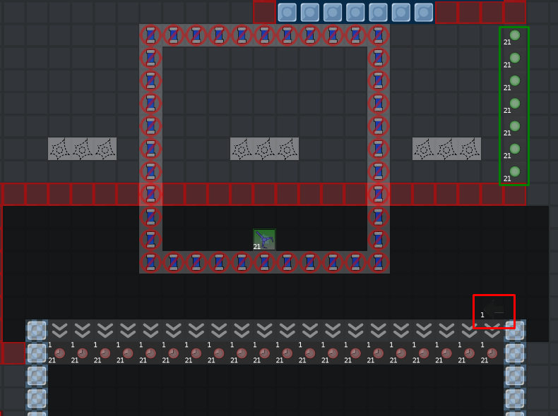
green-marked switches should be removed and replaced by a
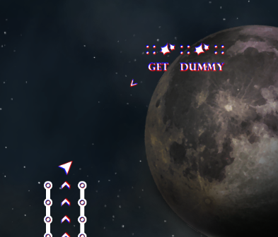
server settings. red-marked switch should be moved onto the TO-teles, or even better onto the FROM-teles. blue-marked endless-off should be marked, or better removed. there is no advantage in having endless there so it effectively just spams chat. yellow-marked tele should be marked in an obvious way, then you can get red of the info text
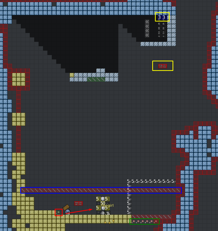
speeder, stopper, etc markings should be above the game-layer
observant jao xD
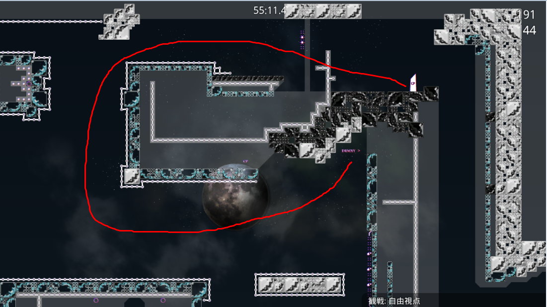
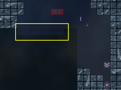
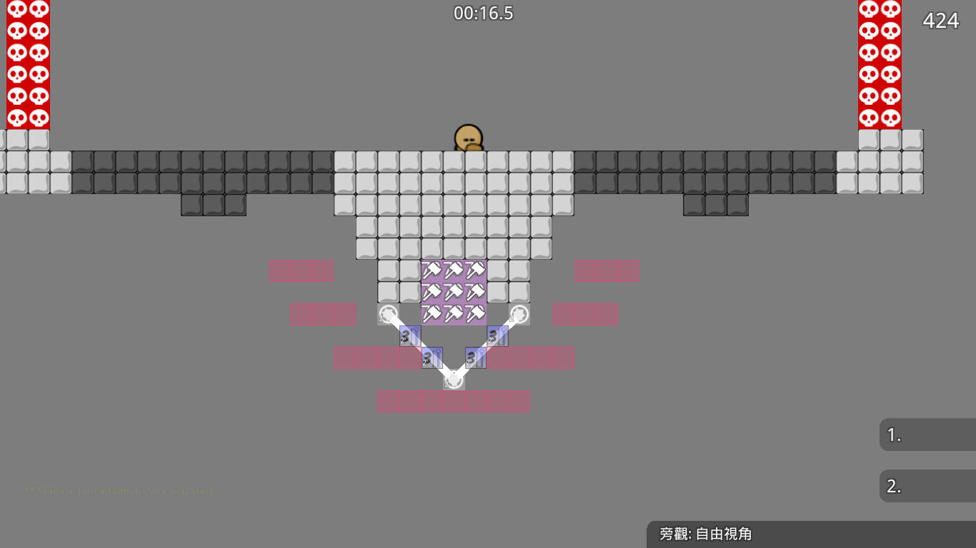
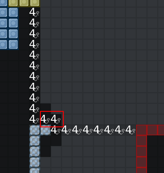
cp tele in first screen is to avoid a skip like this:
red and green pull is both necessary. when player hammer his dummy, the dummy may get a big speed and fly out of the pull area, the red pull is for slow down the dummy and it will open for 3 seconds. the green pull keeps dummy in the area and player can drag it out easily(if i use all red pull then play cant drag dummy out )
the stopper is for making dummy not shake

i will fix others soon
Fixed all
ah I see.. CP-70 you can still map less messy by placing it on the hammer-on tiles
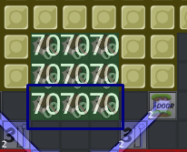
have you tried placing the switch-activator-13 tiles where the laser-blocker tiles are? should still work, but requires less tiles
good idea xd, it works
fixed
I would like if you apply fixes for the issues I showed with examples on the whole map
would save me a good amount of time 🙂
tile bugs , useless instructions , switches and other small things were fixed like you said
every TO-tele moved down
marking things moved to the above of the game-layer
omg jao
apparently this doesn't work because of the green-marked stoppers
iam fixing
ohhhh
Fixed
going back for laser at CP-9 part is way too tiresome, that should be shortened a lot
☺ thxjaoiwillfixitsoon
When will this thread revive ?
Ouch
30 oct xd
We need more maps released !
heyyyyy, i am back. i was busy with some school things these months. when will this map be released?
oh
idk
no motivation to test
ah
that's a rip, but we only have 2 testers
@jao?
yes
that's tough considering the amount of maps in test rn
add more testers !!! there are so many pro players xd
become a tester
The first part is annoying to test xD
oh
i think this map was tested before
tested by kicker starkiller and Jesus Christ, about 3 months ago
oh ye i saw starkiller did it easy testing xD the map was easy for him
xD hes insane
this map was tested before, why not release it

He needs to make sure everything is ok i guess
oh!

if we released every map mappers claim that it's tested and ready and they fixed everything and we don't have to check it.... xd
scroll up
?
he means that the map already've been checked by many players
@Lady Saavikand even by Ravie i think
Not really, annoying map to test
Maybe delete 1st so that we would able to test the map and release it ?
Hard map XD Apparent from the parts i struggled it seemed good XD. Few things:
Other than that I think maybe the nebula quad layer should be high detail?
And maybe its just me but I hate the waves that move across the screen. I find them distracting and annoying every time I see them.
Perhaps if they were more faded it would be better for me or a lot less frequent.
thank you
@Soapy Sandwich😋
added block on left of cto15
added a unfreeze on cto 67
set nebula to high detail
changed the opcity of wave from 0.8 to 0.25
slowed down the waves
i dont think the first part has problem

no he means first map in test aka <#462934008427184138>
oh 😂
$decline
@jao$decline
