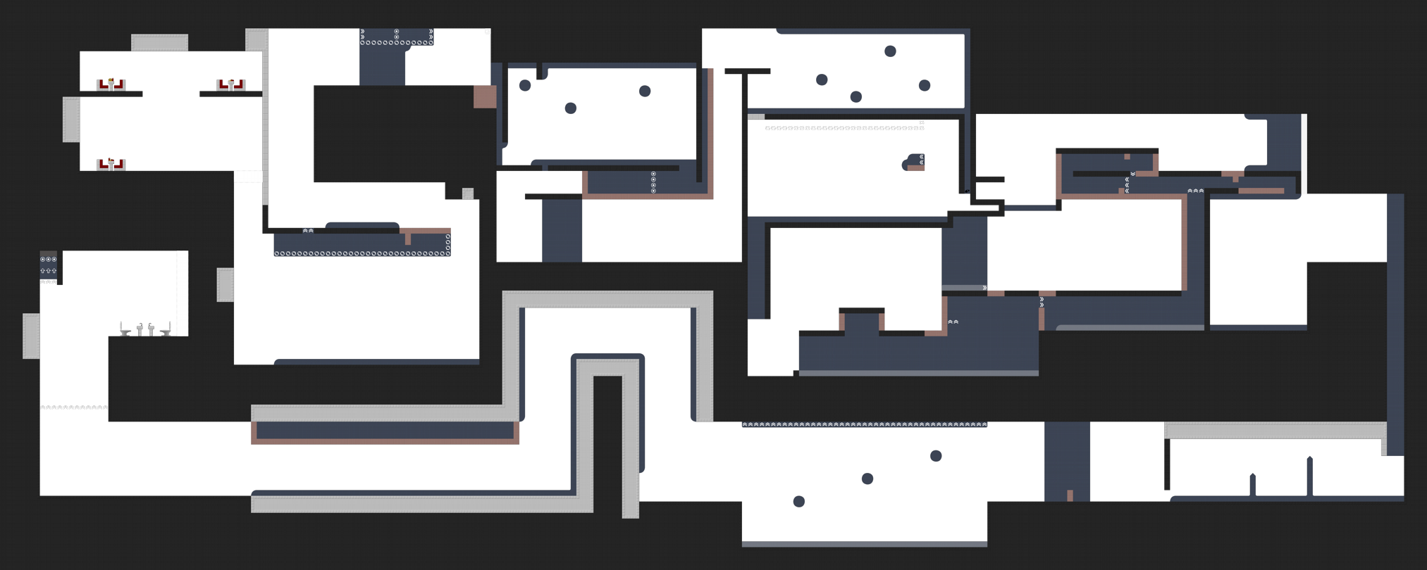
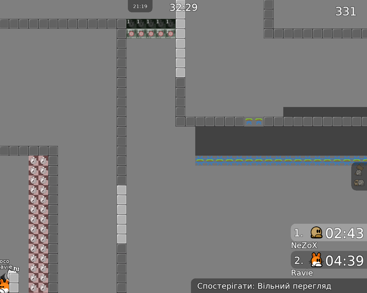
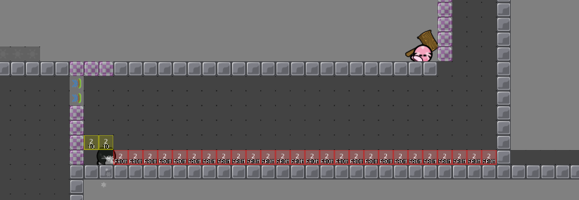
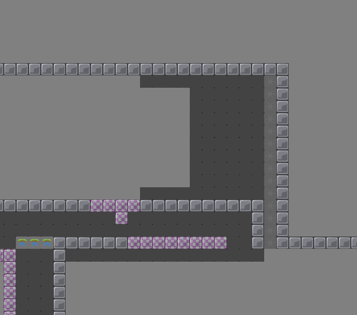
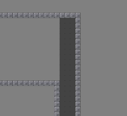
this is your map's testing channel! Post map updates here and remember to follow our mapper rules: https://ddnet.org/rules
Im agree with Steinchen, very boring map
What makes it boring? It’s a simple map and theres barely any easy maps on dummy server that are doable for the majority or players 🤔
Personally I find dummy chamber 1-3 pretty fun this map feels like a dummy map from ciniminix thats not really finished (like the "try it" maps if they are called like that)
I just don’t see a problem with releasing maps, seems unnecessary to decline maps just because some people dislike it, there will always be people who dislike each map that gets released but that doesn’t mean that every map is bad 🤷🏻♀️ I like simple mapping styles instead of crazy new shit with tons of ddnet features xd Would also be nice if testers could stop being so biased in their testing depending on who made the map 😅 Should be able to release perfectly fine maps even if you don’t like the map personally 🙃
skip
easy maps are harder to make easy and interesting . (for me) my first map dummy map that i finished was caventure , it was a bit harder , but parts are there interesting (my opinion) . But don't make simular , it is old map . insperation yes , but also need to make parts new and intersting ! Hope it helps with new map creation , i had mapping novice maps before , it's hard i know ...
But there are people who do it, and for whom it is more difficult to do something difficult than something easy but interesting
I'm personally not a big fan of the map either but many simple maps are so popular because the majority loves just that. I'd make some spots less faily and more intuitive (and ideally a more pleasant design) but then, I think it'll bring as much joy to the community as all the unique and creative maps (even though I cheer for them)
didn't know that , well now i know then xD .
You should look at some of the declines maps sometime
It’s fairly obvious why we decline maps it’s not for no reason
If you post your map on the testing channel it will be tested simple as that you cannot complain about that 🥳
i randomly decided to join a test map, i did in no means do a "test" i just played the map. Once on entities and one without. Very easy map, i do think for the dummy server there isn't too many maps to get you into doing the dummy maps.
Notes: i) I enjoyed the simplicity of it, i would like to see it a bit longer 3-4 parts or so. I got like 4 min on a slow-ish run
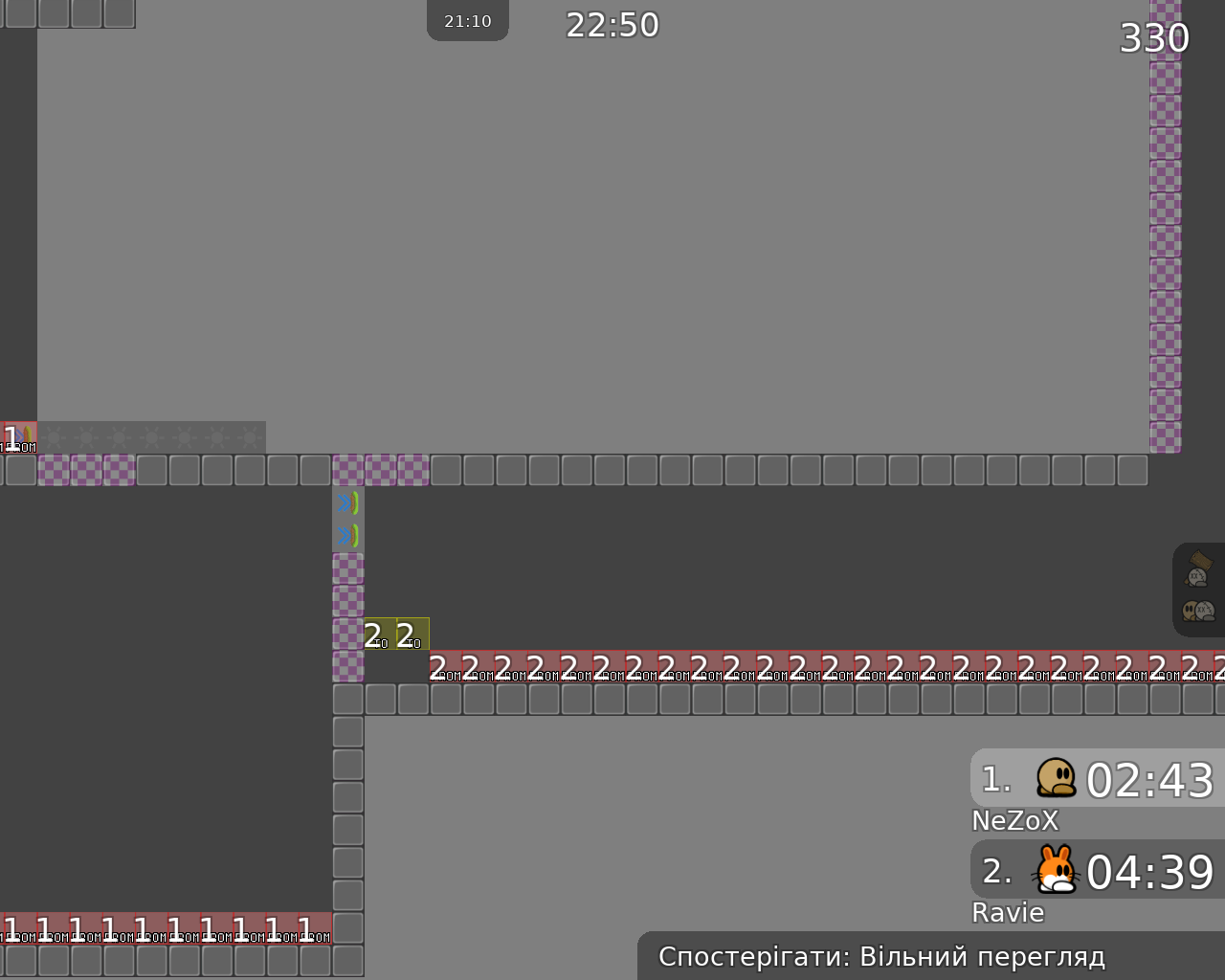
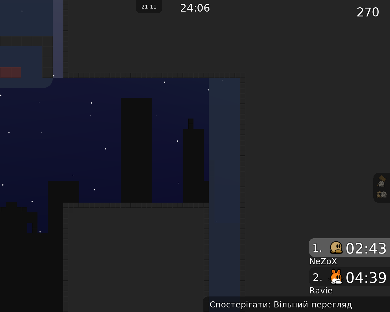
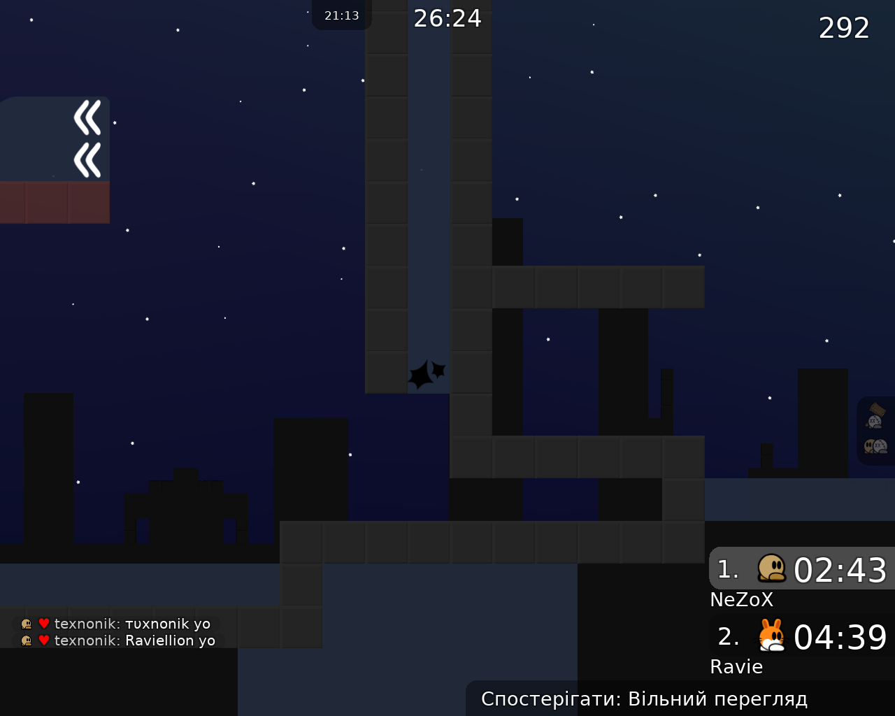
ii) *see screenshot. The contrast of the design i feel sometimes its a bit hard to see my dummy, maybe thats just me.

Just my 2 cents 😛
just do unhookabel here
a couple blocks too difficult
add warning sign
give a bit better space here
warning sign here
both warning signs need turn entities off as well
not a bad map imo
fix the design background, its too dark
try adding a couple parts as well, its very short
$waiting
ohhh i didn’t see that you tested it! i will look into it later and see what changes i can make 🙂
