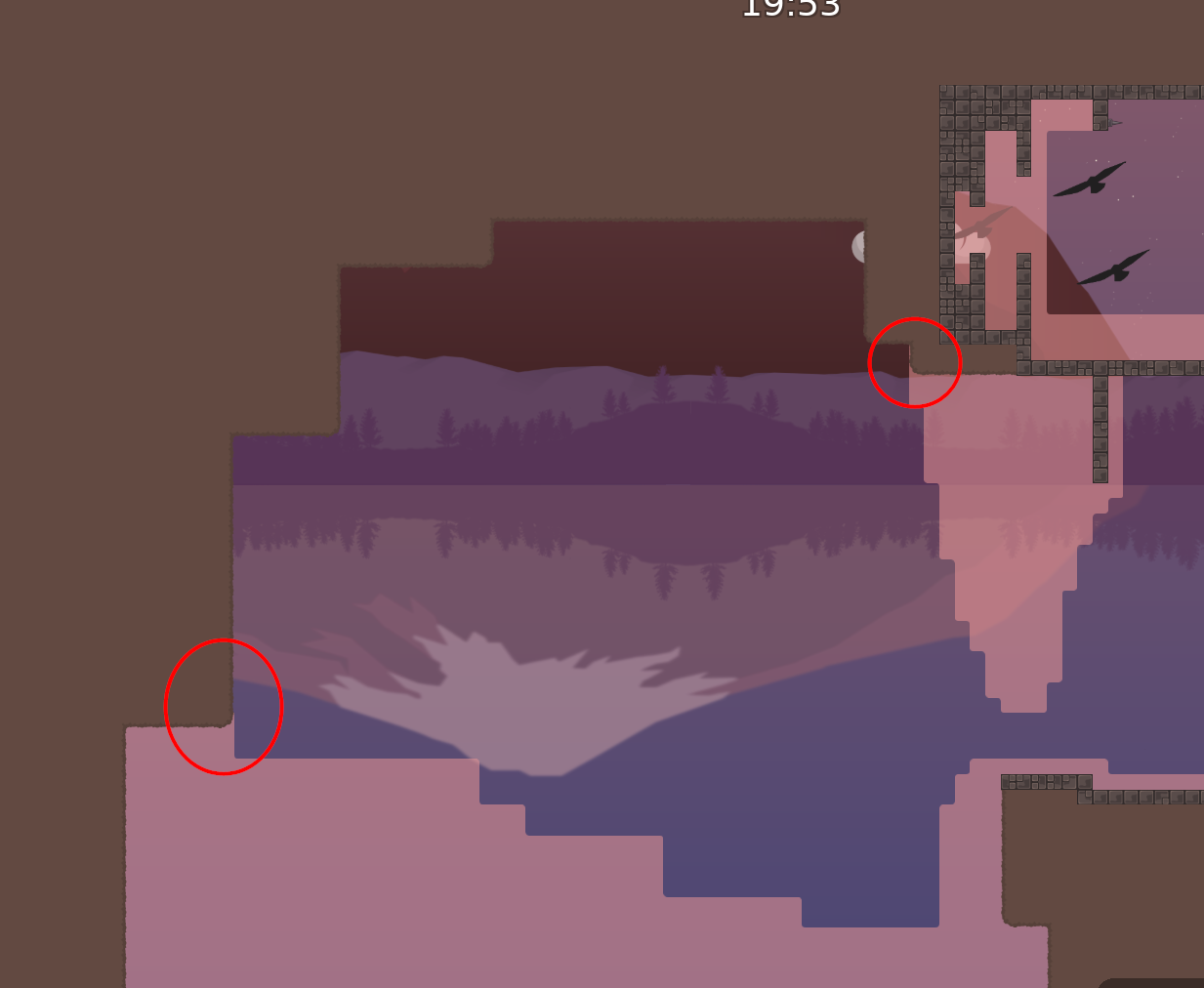
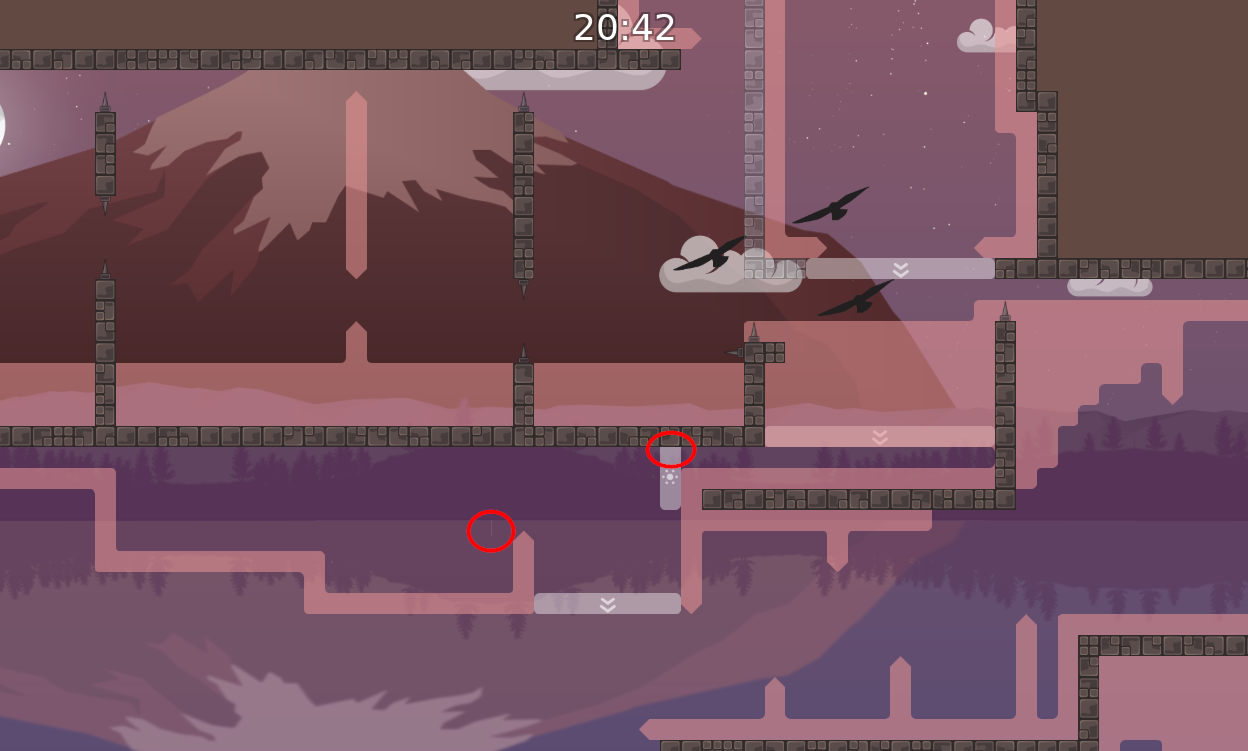
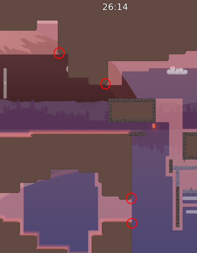
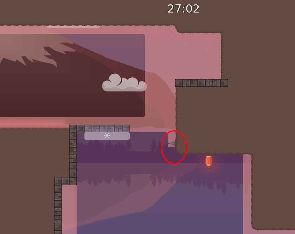
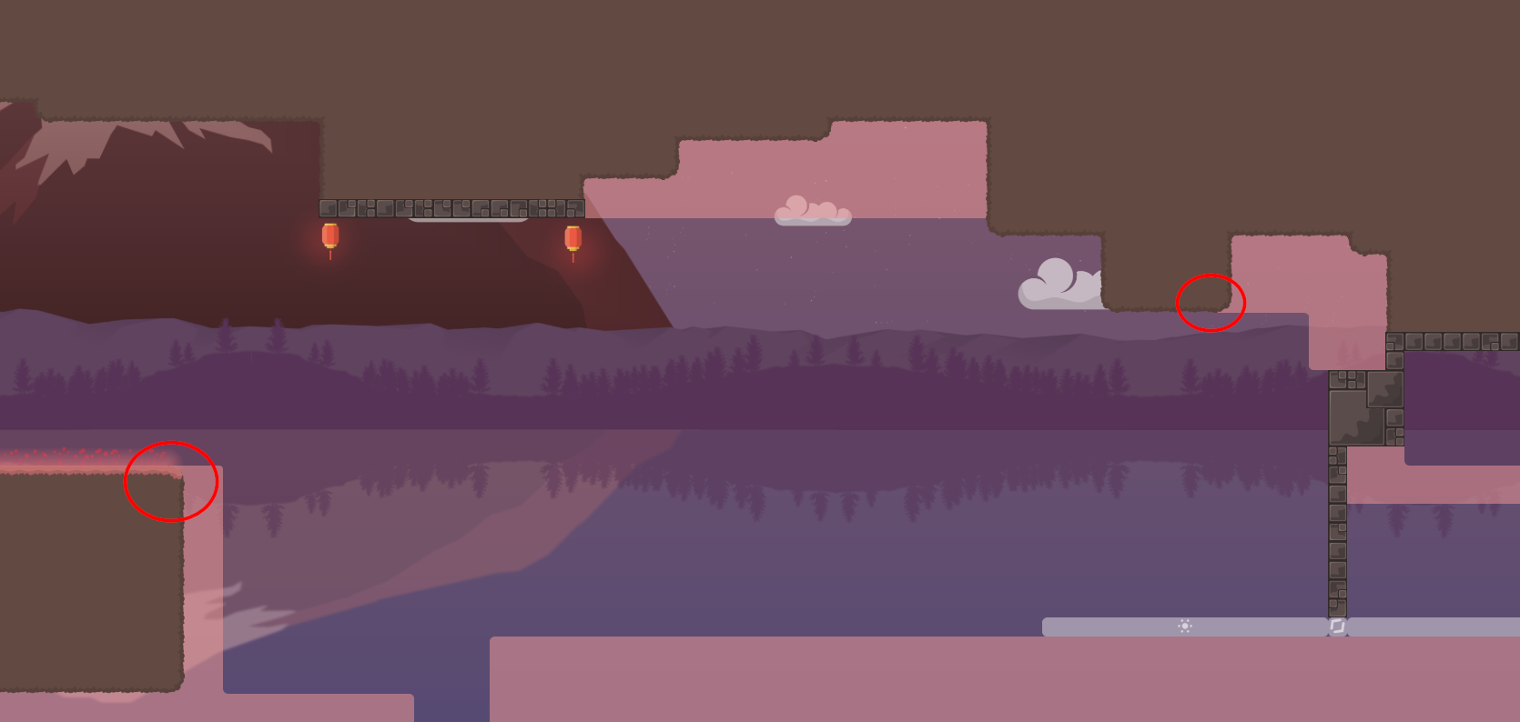
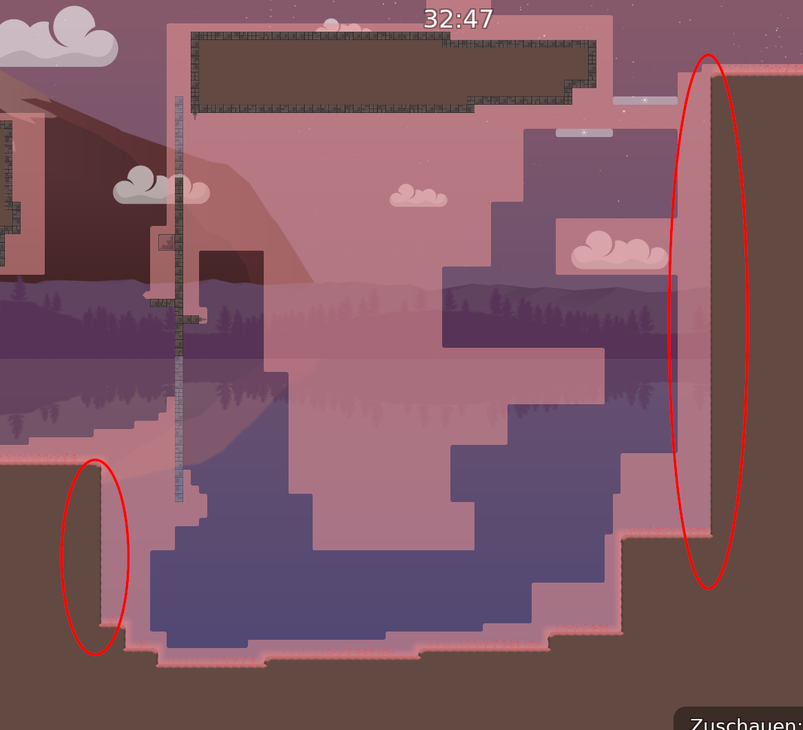
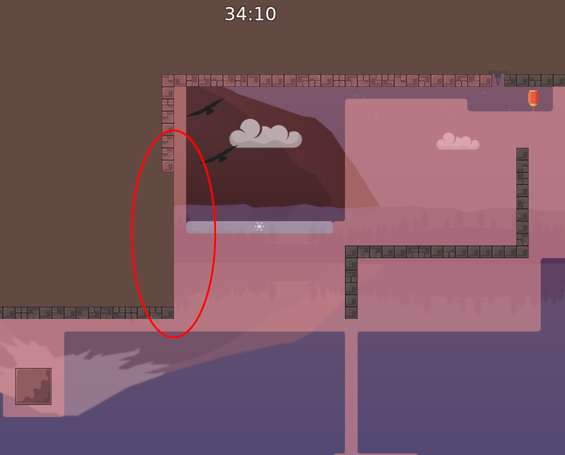
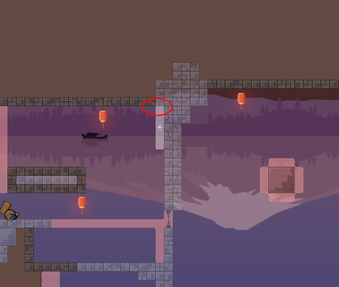
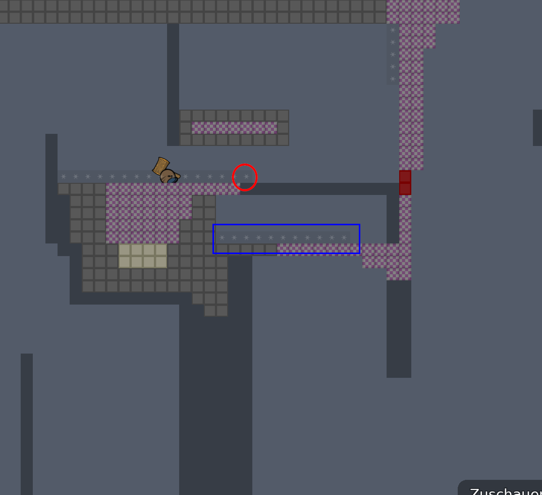
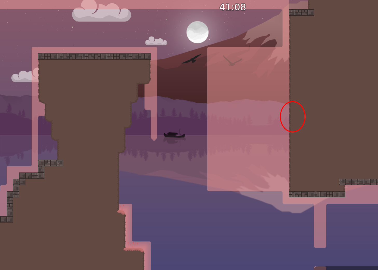
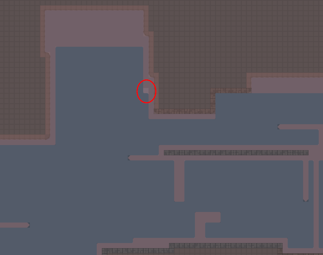
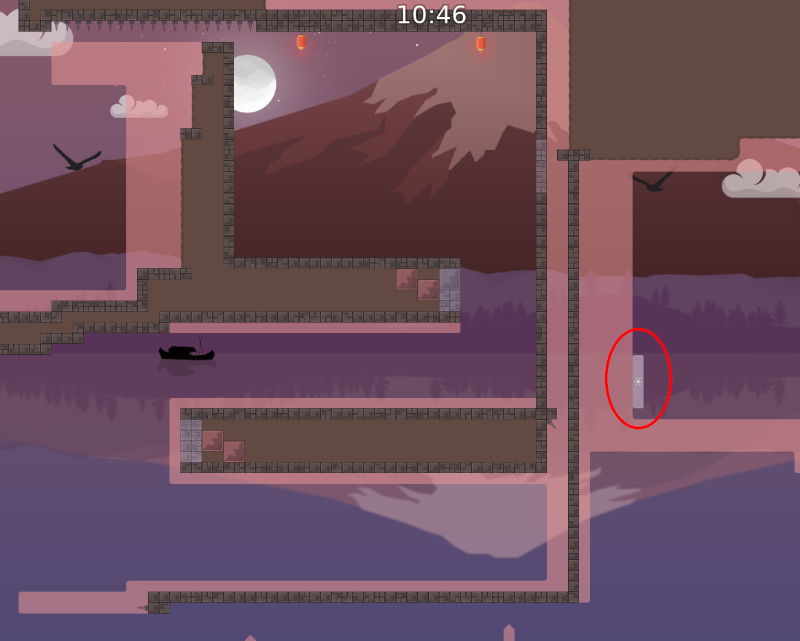
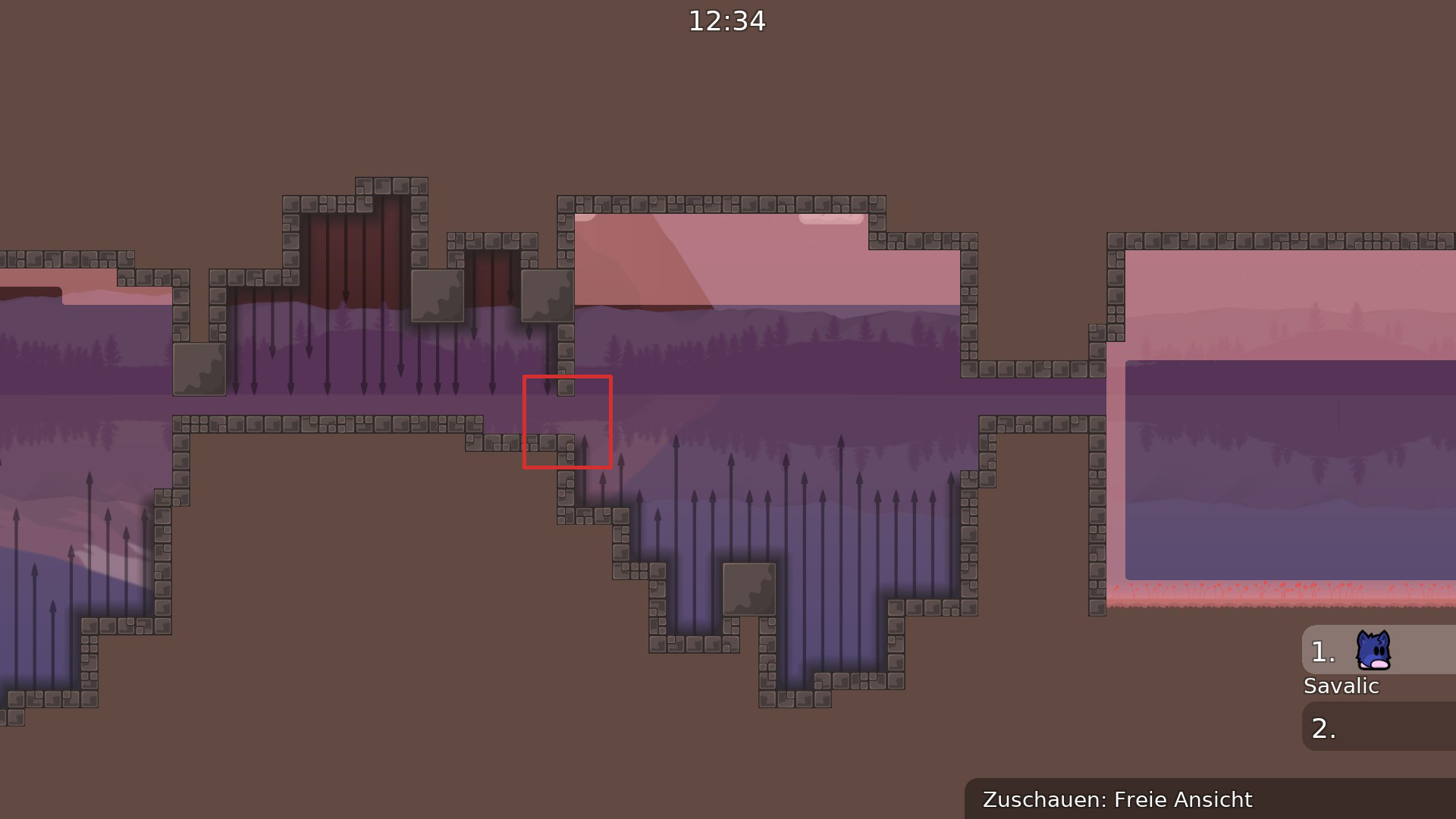
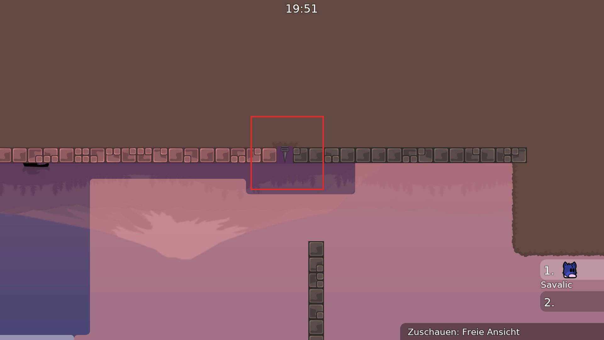
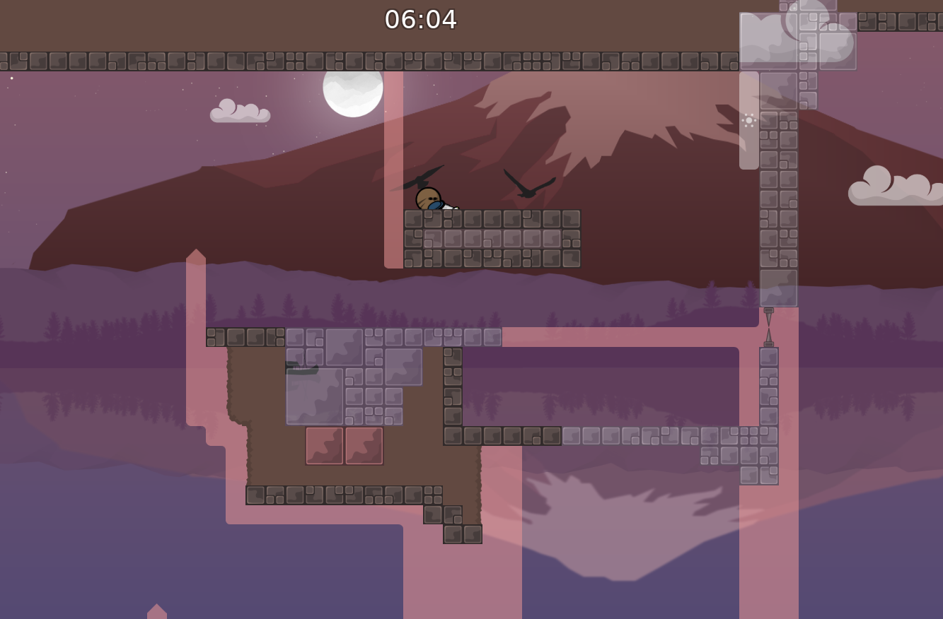
this is your map's testing channel! Post map updates here and remember to follow our mapper rules: https://ddnet.org/rules


gud map
It is to reduce the crowdedness
all the signs
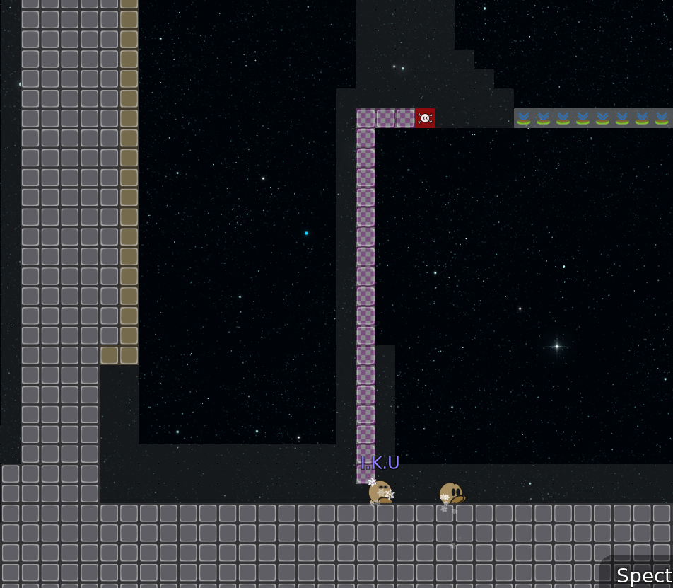
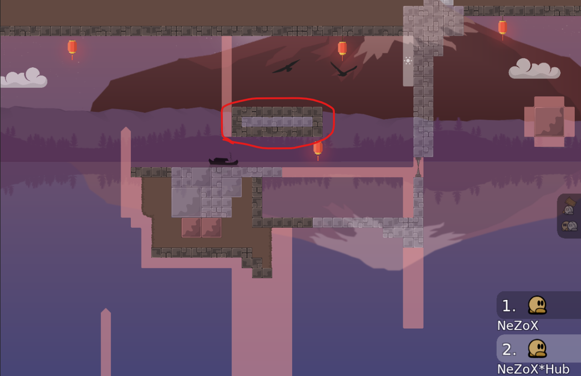
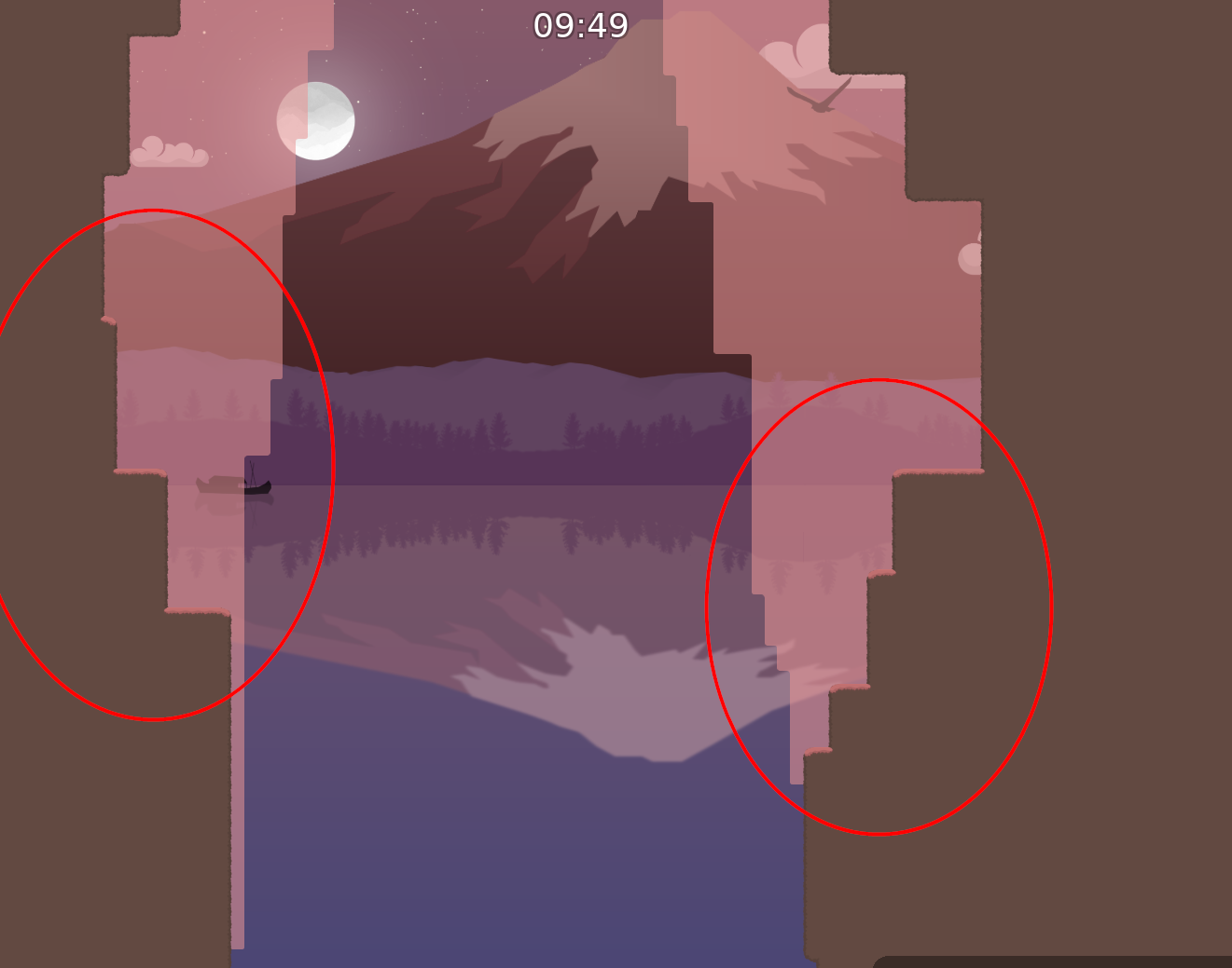
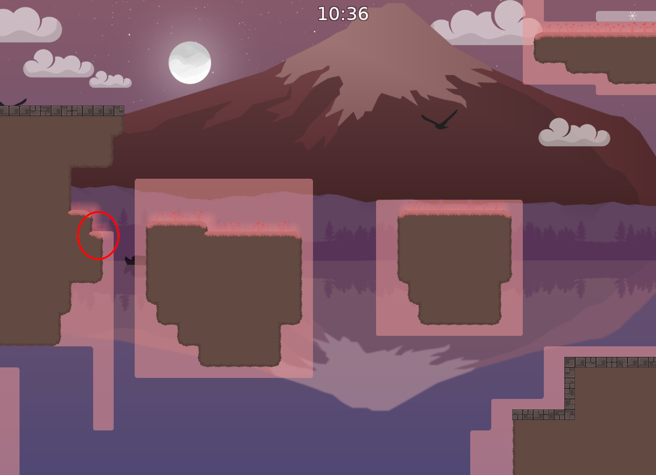
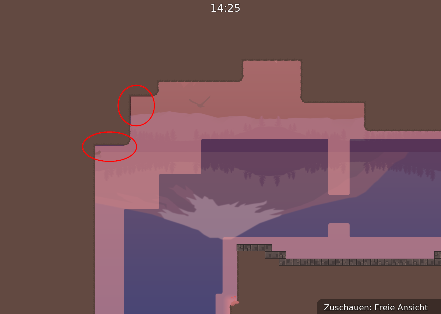
Don’t want to put inner corners connected to the unhooks or walls
its entity bug
aah okay
$waiting
unfortunately yes D:
I think is not relevant, but if you don’t agree or care 🤷🏻♂️
should be good now, i catch some other stuff too
👍
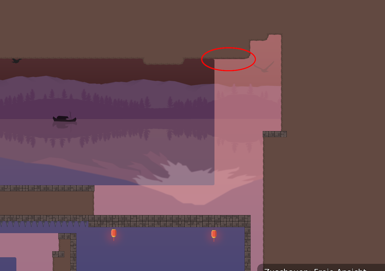
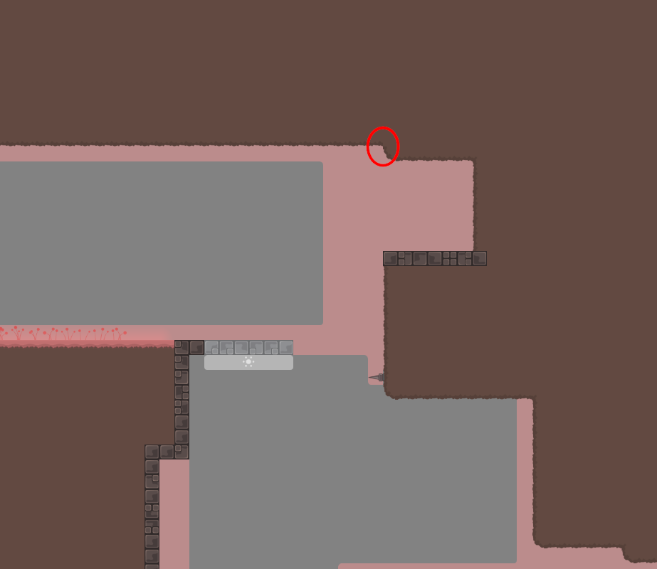
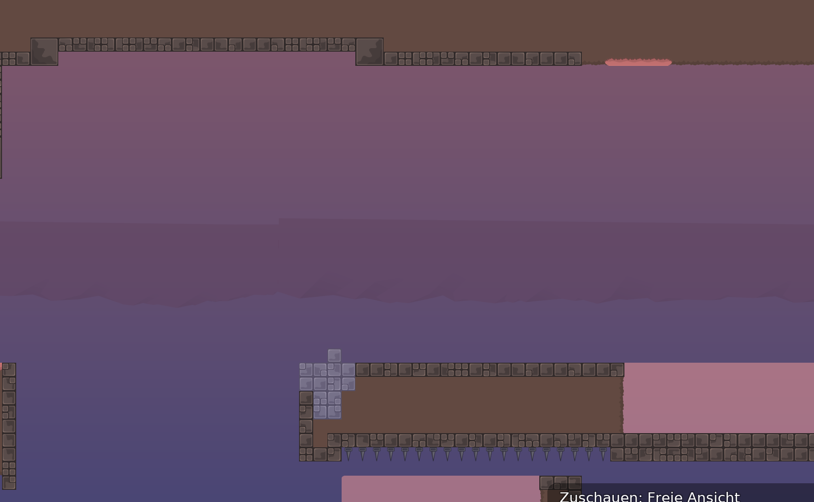
I feel that the dirt on the roof looks a bit shitty, and idk what to put there D: any suggestions?
generic tileset no1?
Maybe
🤷♂️
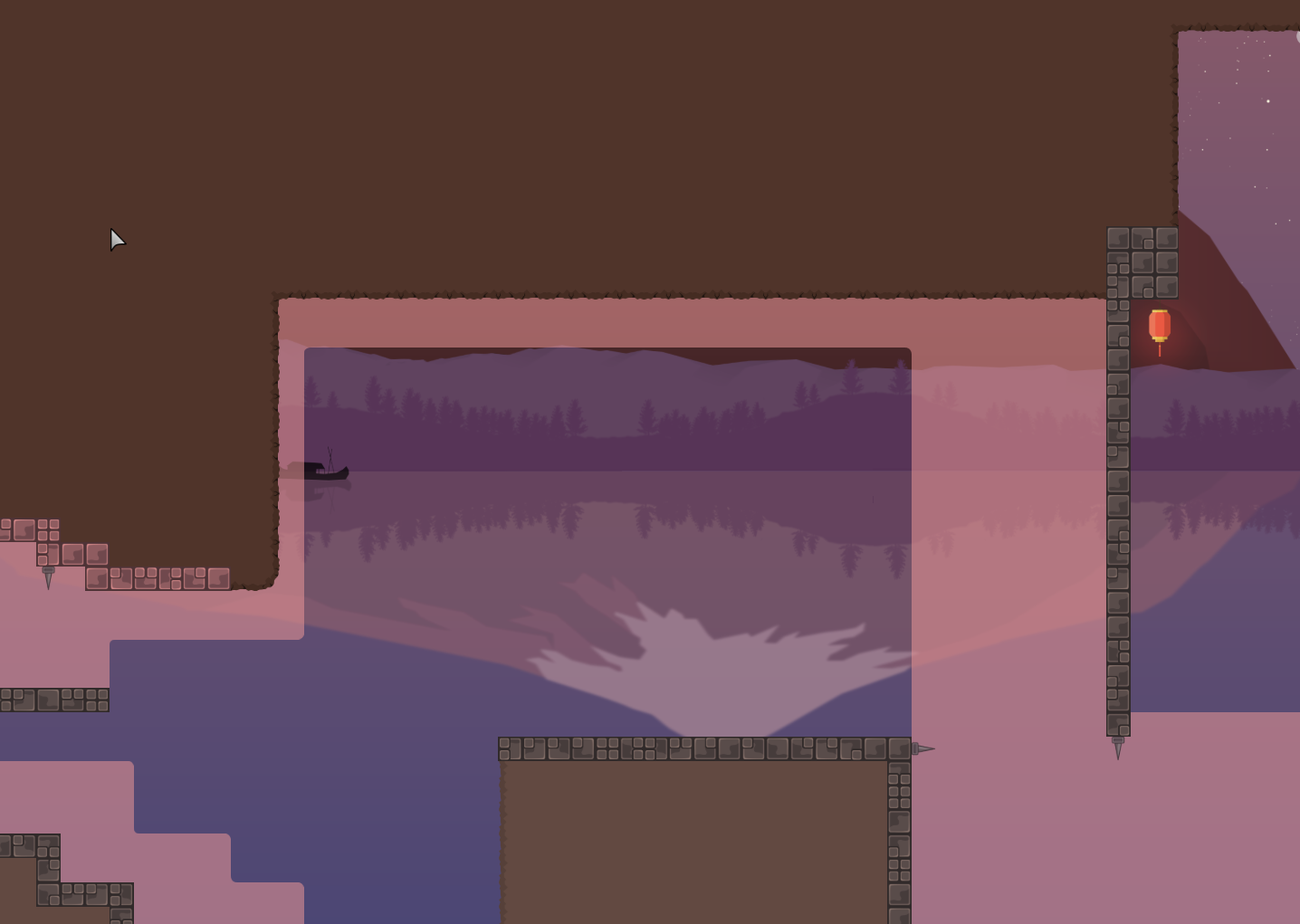
upside new downside old
🤷♂️
I rather the old one, blue looks it doesn’t fit
purple touch bcs backgound
me mispelling this maps name and getting sent to a novice map
like should have the pink grass too or the brown one is decent
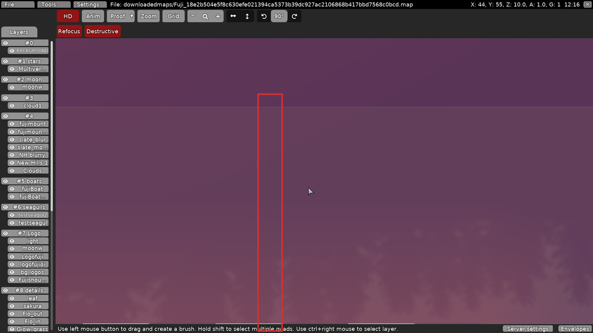
@coke1465@iku123U should press zoom in the editor to have a better look at it
Choose what u like 😁
i like both

I mean the zoom on left side, the background will then be as big as if you are ingame
Looks better
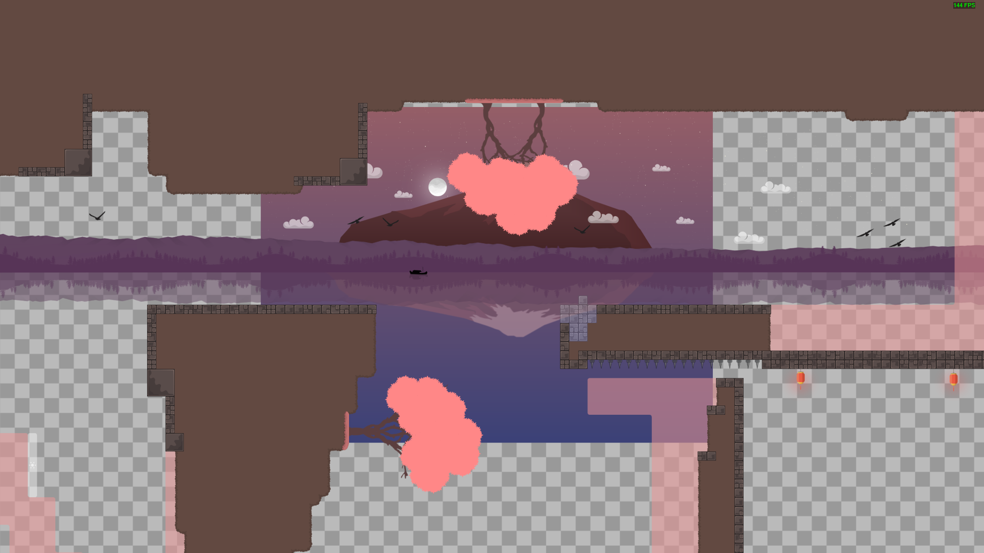
changed the trees
and the trees are blurry af
Yeah 😫 I couldn’t scale it, I was trying to use nightmare ai but it doesn’t work
thx to voxel for the help on the trees
hope everything is okay now

All wrong. $decline

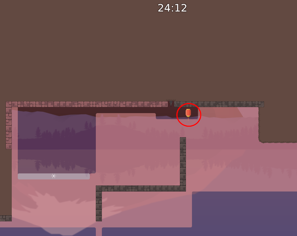
idk if its me but the lamps doesnt fit into the design
- i would remove the trees (left side from start) and just set the others, they look better
Nah the other trees look better
mmm is to give a chinesco ish touch
nah, you were right
$optimize
some lilttles fixes
otherwise good map
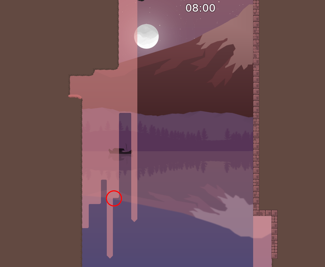
Known issue, it’s hard to avoid that so when I join the mountains together I just let it as good as i can do :/
Yeah I just want to create panic
Agree, I’ll add more alpha
Ty
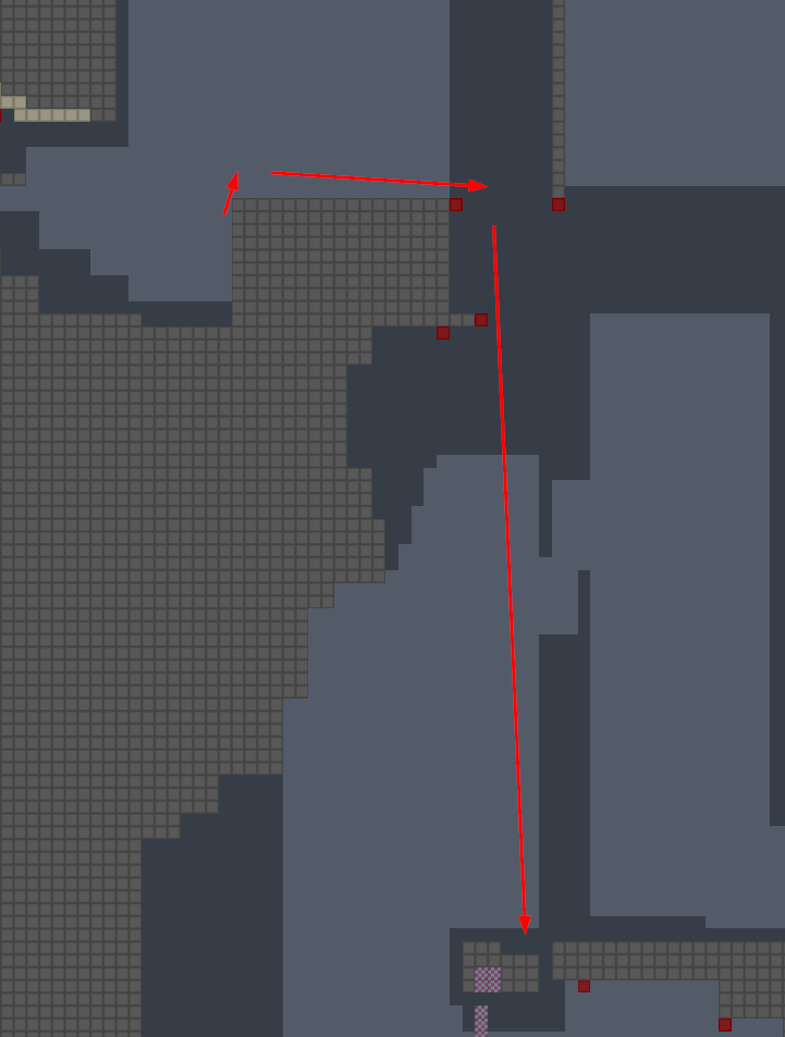
easy way is ur mate hooks and u help with hook to get around
I’ll join the sv
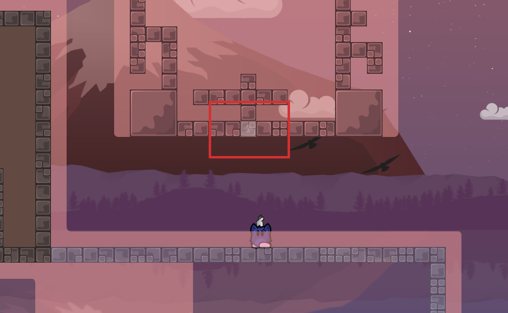
thats why i asked for the unfreeze marking
$waiting
hope is okay now
looks better 👍
talked in pm
$waiting
$ready 3
$optimize

