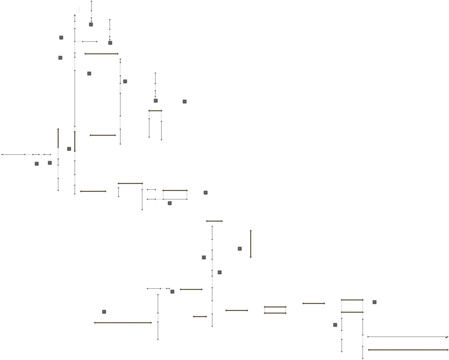
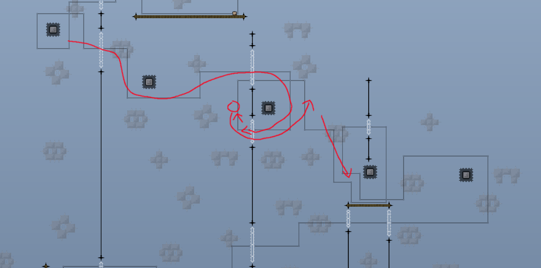
this is your map's testing channel! Post map updates here and remember to follow our mapper rules: https://ddnet.tw/rules
well your finish isnt marked i can tell you that
what?
oh
f
thx to rqza ❤️
I dont know if its on purpose but it seems that its quite annoying to find the way you have to go. You made the map, so you know but imo some hints or direction where to go would be nice
yea in an old version i used some arrows to show where u have to go. but it was more confusing than helpfull to me xd
looks cool
Cool gameplay but the problem is, it's unplayable without memorizing the whole map or using zooz. You need to add a meaningful guide where to go (something better than arrows pointing in vague directions)
sort of agree, it's cool to figure out what direction to go but the memorization aspect would probably be a little annoying
especially since the whole map is just straight lines and 2x2 blocks
maybe if you added more "decor" in the entities it would be easier to memorize or know where to do what move
(idk if that makes sense to you)
hm. i dont rlly know how to design it/mark it tbh. u guys know i suck at designen maps xd
anyone can help me? just show me what should i use for marking and ill just finish it
u have to add blocks so ppl know when to jump or hook. maybe not making it so open, and instead outlining the general path with kill borders could work
You could also try to close the map so you have a straight way
pls dont make it a straight path, ty
cinimix thougth about adding numbers in the big blocks. dunno what u guys think about this idea
i think that could be really useful, good idea
what about a line indicating the way in the background?
like the arrows from need for speed
not sure it works on this map. one part of the map have to be passed multiple times
i don't think it'd change a thing? except if there's a loop
but the idea works imo even if u need to pass on old path
well ive just mark the whole way. for me its actually helpfull but i dont think u guys will agree with me. only end is confusing (as i said) but dunno how to mark it better there. made it hd so u can turn the way off. im still up for better solutions if u dont like this one
spawn shouldnt be on a single block its annoying when dying while holding a key
sun is too distracting in design btw
u ok with small cheats like that?
because the switches aren't timed right
also whole map needs some structure fix because i dont think the paths in design will cut it
take ephemeral, its a similar ish map
maybe try to do smth like that
$waiting
smth like ephemeral would mean to close the whole map and i dont like that idea tbh. when i do this design paths would be very useless then
perhaps u can make it floating then?
or like kill in places where u don't need to be so its obvious where to go instead of requiring design
Please put the see through blocks in the background on a slightly smaller parallax. (like 90 maybe) Kind of dislike it static like that it makes me personally confuse it with the main static layer and distracts from the gameplay. To clarify pathing you could use a mix of color/alpha animation. That way they fade from left to right depended on which direction you need to land on said path. If you land on the same platform twice from both directions make it so it fades from left to right and right to left and meets in the middle. This in combination with some well placed arrows could do the trick. But that is just an idea, not too sure about it myself.
added a kill border around the map
looks cool but wont help cuz 80% of this map is air time xd
I mean, yeah. But thats the point with most of the map and design tho. xD To figure out the correct path people must spec, how to clarify that via design is extremely hard in maps like yours
in my opinion marking the way is useless. ppl can figure out the way by themself. not that complicated and everyone can test whole map in practice
thats a pretty bad argument
people want comfort and not going on test servers just to finish a map, they want to have fun. Sure its possible to do so but its annoying af.
its literally an argument for being too lazy to add a good solution for that
Teeworlds or better ddrace (even more a solo map) is still a jump and run and no puzzle game
testserver? what? just use practice lol
its not harming your map if you make this so just do it
lazy mf

I partially disagree, some puzzle elements can be cool especially figuring out correct setups for consistent ways, yet I believe (like you said) In a solo map, that its sole purpose is the fluid motion of swings and momentum needs to have markings for the path.
To elaborate on the entirety of the map: Nobody will want to sit there and write an entire scientific paper on where to even go, at least not with the current approach you took. Where the only goal is to focus on smooth transitions of pressing left and right. (a mechanic that has by the way been seen for ages at this point) Yes you can claim the idea of the map was indeed for players to figure out pathing. But sorry to pop that bubble this way ain't it chief. If you stick with minimalistic gameplay your design should represent that in minimalistic design, instead of the old overused generic = unhookable kill tiles here and there, fall down = death ah and btw: be fast.
The map itself is cool, looks satisfying, don't get me wrong. But literally anybody with a slight amount of knowledge, can sit there, place a hookable make a platform to land on, place another hookable, make a platform to land on, rinse and repeat. Add some doors with timers at the end and you done. At this point it feels like you didn't put much effort gameplaywise to create the map, nor did you put much effort in design, you stuck to that design for ages and don't get me wrong. There is maps where this can work, yet overall it just seems like you want to release another map in the wide ocean of unplayed uncreative sea of releases past their times.
Looks like the issue of having to memorize the entire map is still there, putting a border around it doesn't really help much. Honestly I can't even think of a nice way to fix it without splitting the map into smaller parts which isn't really possible here. While the gameplay looks very cool on video, it's just not very fun to play and not innovative enough to try to fix at any cost.
$decline


