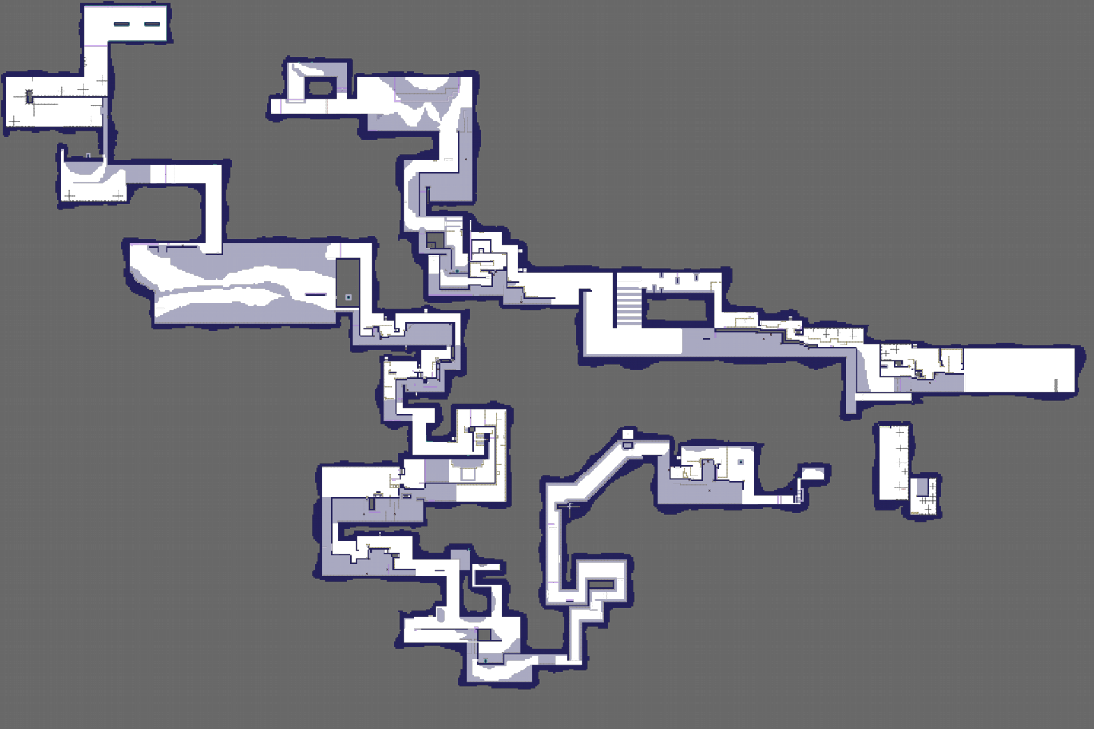
this is your map's testing channel! Post map updates here and remember to follow our mapper rules: https://ddnet.org/rules
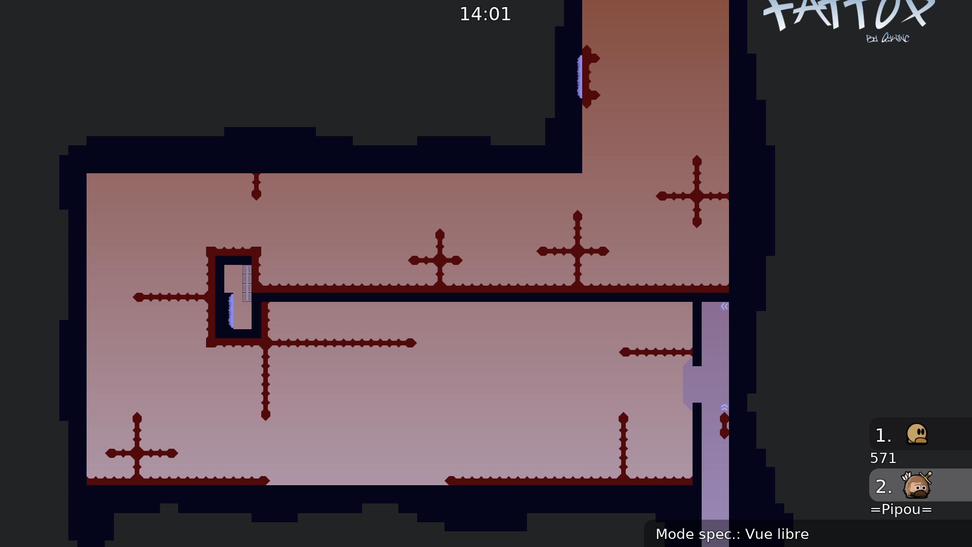
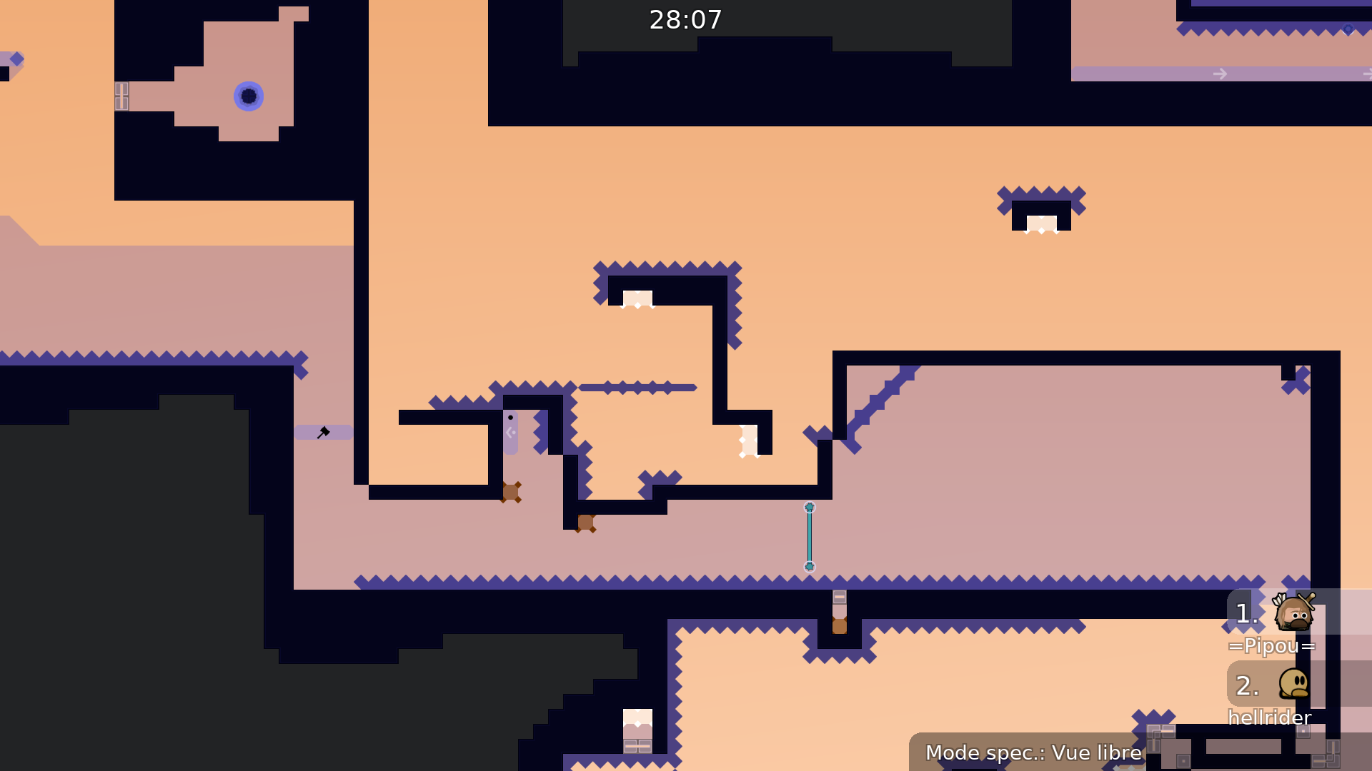
The main problem that occurs when you try to play the map is the design, especially the color choices
You can solve that problem by using monochromatic (or bichromatic) color schemes
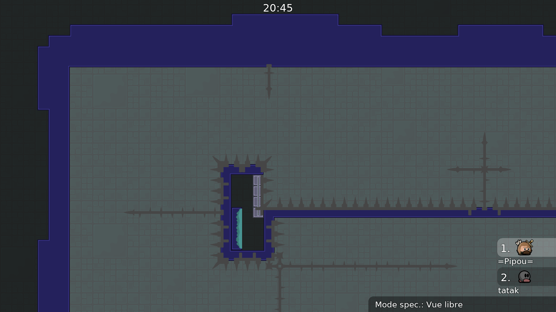
Too many visual details
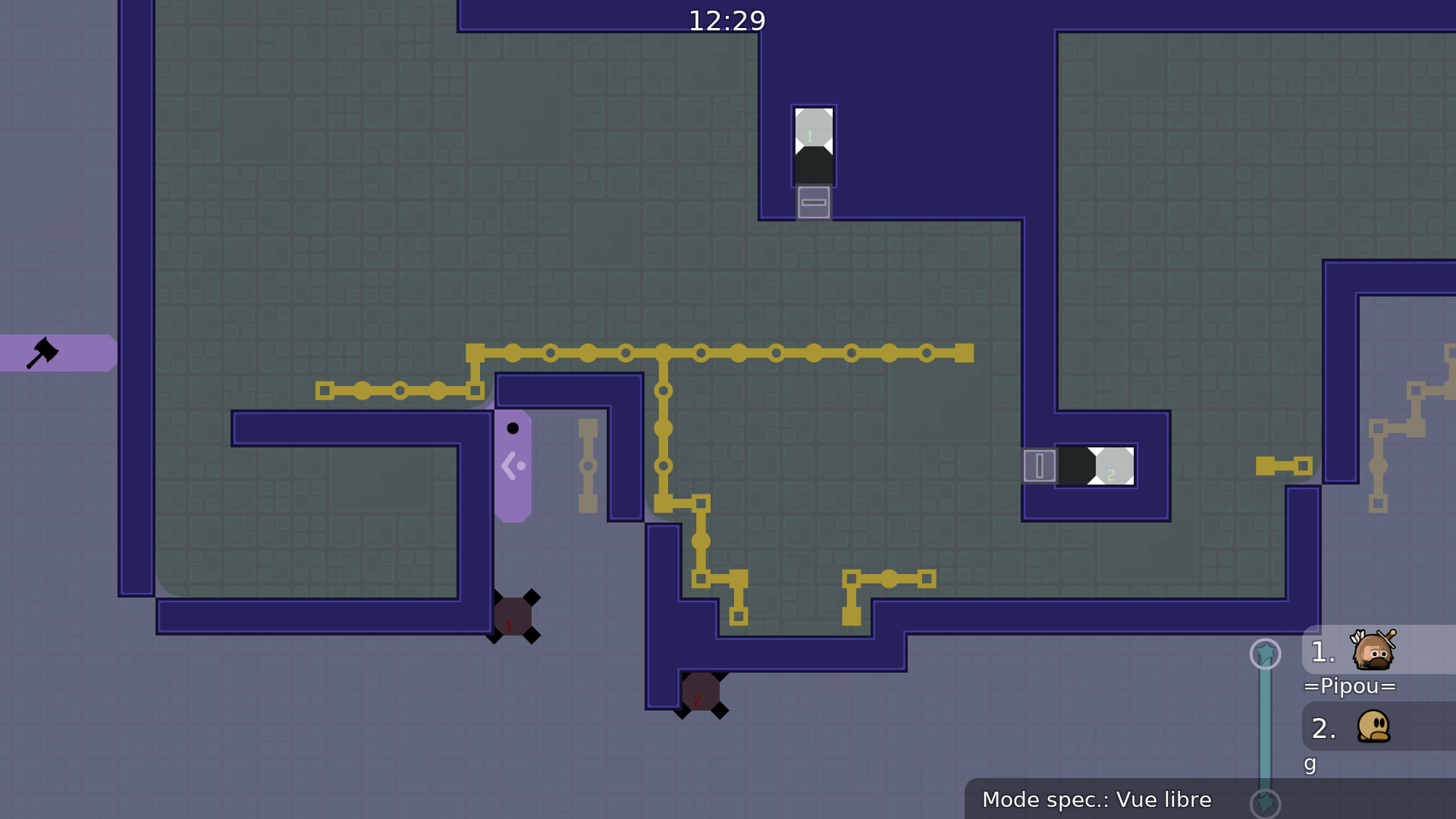
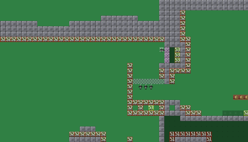
Try making the symbols and signs more obvious and noticeable. To do so, you need to remove the details. Furthermore, use simple standard "freeze tiles" for the teleport tiles instead of those nodes to keep the design clean
1MB is too much for such a simple and minimalist design
Remove the images you don't use, or crop them, scale them
I won't give my opinion on the general gameplay, not my cup of tee 🙂
I'm against all sorts of filters, they are outdated, unnecessary
(noob filters)
I will remake the design if gameplay is tested. At the end the map is not good enough or some other problems appear and I would do the rework for nothing. Furthermore for me nf are there for ppl who join this map to see how hard the map is. If you barely get the nf you probably wont be good enough for the map to play (and nobody hurts a quick little nf). But thats just my opinion.
If it is absolutely necessary, I can simply delete the nf.
Not that big of a deal.
You can clearly see the difficulty of the map very early so it's not a problem
Also, the rating should help people know if they have the (skill required for the map
I think people would play solo maps if they wanted to have a solo, I agree that it doesn't hurt but it's useless
About the gameplay, you can send a video or play it later today
Full demo
Cut playthrough
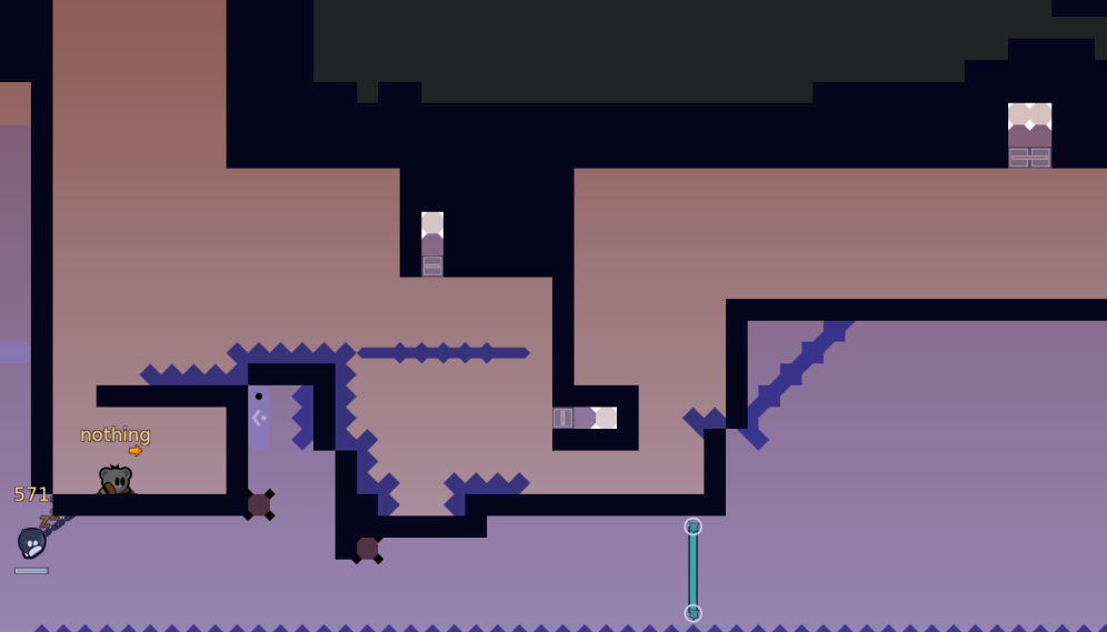
Map looks really cool and unique but very hard to read (understand) the parts. Not necessarily a bad thing but something to understand. I agree with Pipou that the design needs a fix, teleports especially should be changed imo. The numbers in the teleport are basically invisible, so I would just remove them and go for something simpler and cleaner than the weird box thing. Really like the parts though 💪
left is from, right is to
can a tester confirm that i dont have to use numbers?
It depends on the map's overall design, if it's messy entity-wise, if there are other teleporters
Numbers can be a good solution if it's not hard to read, and doesn't make the design heavier visually
You can always find different ways to display weapon/hook teleporters such as :
i think in this way it would make it even more confusing tbh
i will think and try out some solutions
but would like to have a gameplay test if possible
Changed the design here and there and make the map smaller. Unfortunately i am not that good in design so I probably have to fix it even more.
I thought about making each further telehook a bit brighter instead of a number. Would this be a good solution?
small visual fixes while i was going through map again
512x256 should be more than enough for your logo
If it's blurry, double the size
Don't use so many colors, they are difficult to work with
Try 1 color, 2 if you are confident
Anybody interested in testing the gameplay of that map ? Hook teleport maps are not my cup of tee and it doesn't appear to be an enjoyable one
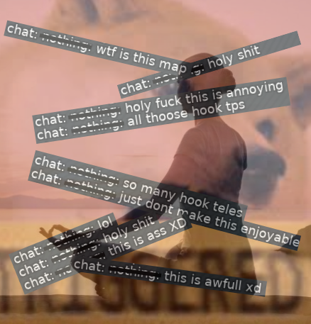
Most people rq at the first part
Here are some of the reactions I encountered
$waiting
ye lets wait for actually good players who test the map, maybe nothing didnt saw its brutal
I actually asked more than 1 person to test
But we'll wait for more opinion on the gameplay
before anyone gets mad -> it was a joke
I mean ddnet has not much (or even any) kind of that style of a map so its probably weird if you play it for the first time
"Most people rq at the first part" so i know why ppl rq cus it is shit mapped. its not about hook tp. or etc. if just switch it to "no hook tp map" it will still be bad. so now why ur map so bad and so unfriendly. and why its just annoying to play it.
Ok lets see what happens if u skip "hidden rules" . We got this. what we see: speed up, hook block, and hook tp. With hook tp no issue cus it is idea of map. So other stuff u use for what? for jump > rehook> dj> hook tp?U really think u cant do it just with wall on right place? its ez. u need to know for all this stuff brain, eye need attention and it is just tired faster, but it's ok if u get bounty from pass hard part . but this is just simple and .... so i think u got me.

So i tired to write all this stuff, that all cus my eng bad and i rewrite 3 times every line for to be clean.
and yes, imagine that you forgot the map and you need to go through it, and also imagine that it is not yours map. I think that you would have dropped it yourself. Just imagine it. Dont lie to yourself. i really wanna help u. if u have questions u can ask.
Thanks for the test triki
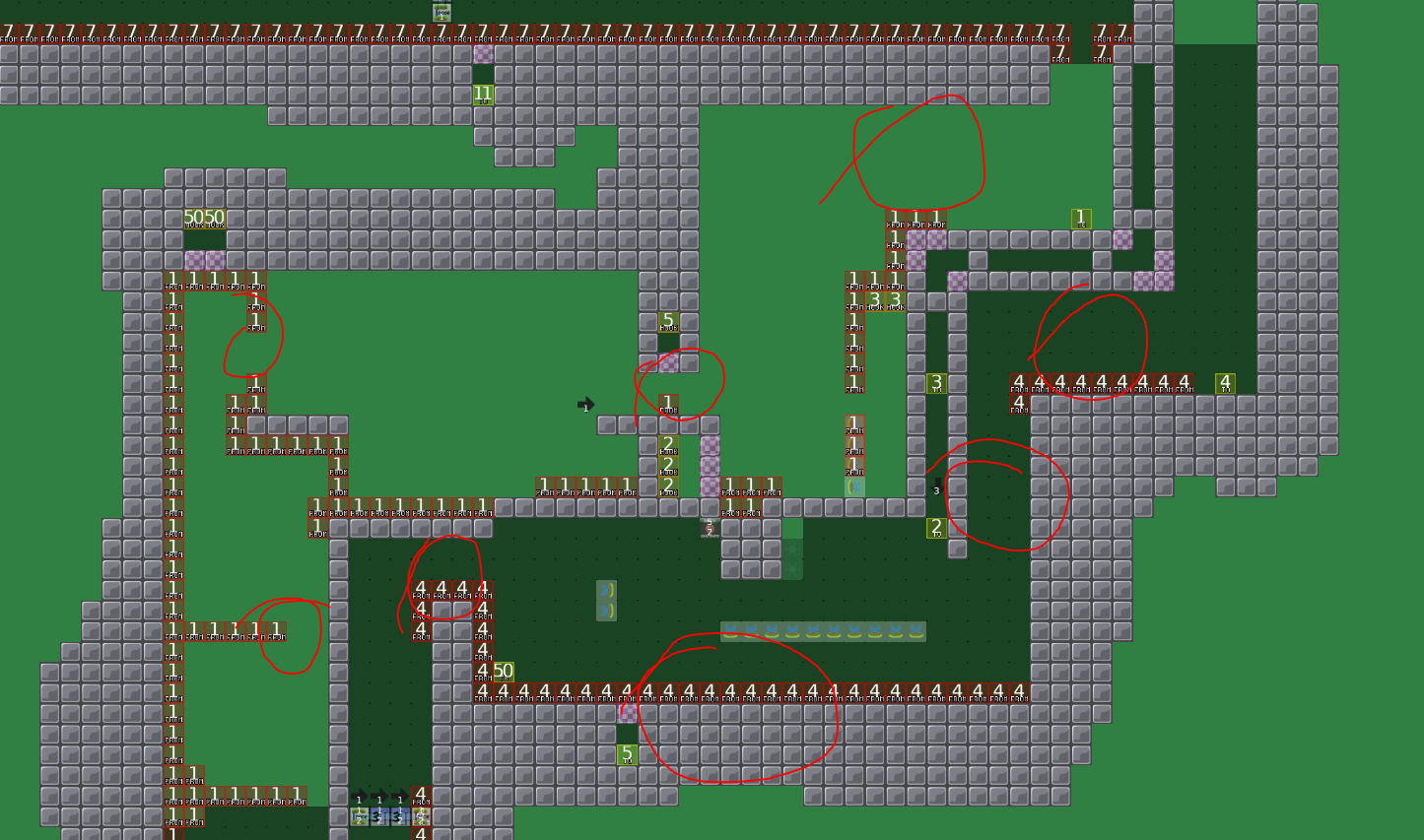
Thanks for the test, I think I get what you want me to tell but I still think the points you make do not really attach to the screenshots you made, so here are my questions:
To your first point: The map is a bit "tight" yes, but it does not change the gameplay at all. All the circles you made can be made a bit wider but the way you play it wont change. The reason behind, why it is so "tight" is that you dont have to wait so long for you partner to fall in teleport (thats why i made it more "tight" so you can redo the part faster.
Some parts are "tight" to prevent from skipping. So if you take the circle to the top right the teleport is there to prevent you do the part but fail the end but you can just jump through and your partner can just wait at the bottom -> so you do not really do the part how it is thought to be.
If you do the part the "tight" sites do not effect your gameplay because if you do the part you would never touch the teleport what i mentioned before anyways, so what does it matter?
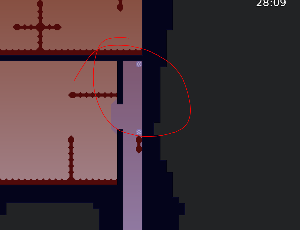
To your second point: Yes i could do it like you do but think about it. It is not just "useless circle of hell". If you do it the way I do you have a consistent swing at the bottom because of the speeders up (you always will fall from the top left corner). If I would do it your way every swing you make is a bit different and sometimes its just luck if you get the swing or not, because you will always fall from a different height. I mean its just the nf and I could delete it but I think you get my point why I placed the speeder there.
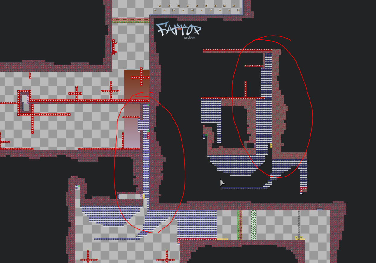
At final to your 3 point: Yes it might be a bit confusing and there is a way without speeders and hookblocker (the hookblocker is only there to prevent to cheat the part its not the part itself). I could do it without it I agree. BUT if I would do it without the speeders, the downside about it would be the first point you criticized. The part would be hella tight and annoying to play because you are not able to jump that high. So i thought about a solution to make it more comfortable to play.
To your final statement: All this ideas where just in my head and i freestyled it in mapping -> optimised them and tried out myself. For some parts even myself needed some more time to figure out how to play them. So I know the feeling of playing the parts tons of times (maybe the parts are even on insane level). The map concept is not mapped like you are used to it in other maps. The timings are a bit off, there are some moves you did not do before etc. but does that mean the map is bad? If you play the map for the first time it might be confusing and even a bit annoying because the map forces you to get out of your concept zone you used to be when you play other maps, but that's not exactly the appeal who makes up the map?
Maybe it is only me liking such things but I would not consider it as "bad" just because you have to think for a minute about the part. After I tested all so much times for me it is so much fun but I think its not fair making out some points which are maybe not normal but imo not bad mapped.
You can see in my gameplay video if you once understand the parts they work smooth and have more than enough space to feel comfortable about.
But if good mapping means you can turn of your brain to do the part once you watched it then this map is really bad mapped I agree.
edit: I would love it when some other mapper would do such a map btw.
but sadly there is none
it.s like food . 40% of taste it,s how it look.
i think .0.5 sek no big deal for better looking.
But is it worth to make gameplay more bad just to make it look better?
do u think idk for what u did circle of hell, ofc i iknow and ofc i sure it,s possible without. if u cant avoid speedups on simple part idk what about hard
no remove it , it.s okay cus autopath, its just example which problem can be on nexts parts
no speedups = tight , dont get it
the speedups are there that you can jump higher
if i remove them
i will have to put the wall where you jump lower so you can reach it
so all in all the part has to be smaller so its doable
all about bounty. just get my point, nobody like 1tile hook 10x time with 1tile hole .
i like puzzle, and ur map not a puzzle. it.s about play-trough
i saw it before test it. this is dont change my mind
I mean what is aimbot then?
There are some spicy hooks too
Its the nature of edgehooks
For me it sounds like: "I do not know how to move/do the part so make it more easy"
Cause all you want does not affect the gameplay
Even if I would change all you said the parts would not change at all
and at the end you would still say: it is annoying
even with more space etc.
for me it sounds like YOU do not like edgehooks or hard hooks but this does not mean all people dislike it. Maybe it is not even the majority but some (like me) enjoy it.
And then you test a map where you dislike the concept and call it bad because you do not like the concept.
I can understand when a map is tight, you hitting everything everywhere you can barely move or some things are just there to annoy you but this is not really the case (in my map).
You have plenty of space to move around but not that much that you can do the part in another way like it is meant to be
If there are really tight spots where its just annoying and not helpful i can work on that but the screens you send are not a good example for that. I mean I never put smth anywhere when its not necessary.
Yeah this map feels very tight and I am not a fan of hook teles map feels very cramped and it makes me not enjoy it
+
not easy. enjoyble.
for u yes. cus u alredy know map. for new it's mush have.
hey

of course you can make it worse. cus u dont know how to map good.But one i say with 100% if u will use only wall, hook tp and tele. it will better cus cleaner. Dont try on one part 100500 stuff be clear and clen. ps Hey
@Cøkeso dont try do all part, start from one and try change. and ask us.
i like challenge and etc.but if it enjoyble.
I dont like map like binary. but i know its mapped good and no have usless stuff and i dont wanna change at all. when i play ur map i wanna change everything for improve it. so i know how good map looks. dont think i dont like ur map cus i cant pass it. No i dont wanna pass it cus i dont wanna play it.
Made overall more space so it is not "tight" (should not effect gameplay too much). Tried to fix logo -> there is still a little bug but i am using a generator for that and this was the best solution with the least bugs. It now should have at least a decent format. For the colours I only used 2 templates from the web pages you send me.
I did not fix the nf because I think it is fine + did not fix part with tele 52 because just the part is more complex and not "clean" is for me no reason to change it (just because a part combines some mechanics does not mean it is bad mapped imo), if it is really necessary I will think about it
change of colour + giving each telehook a unique symbol so you know which telehooks belongs together
Design is awfull on this map why dont u use tele cp on the whole map at start it just hurts eyes, hook teles arent market for ppl that play with design u can easily do that with just changing colors of them, i dont think u should u se so many speeders to make parts work im pretty sure u can find an alternative speeders arent the best way to fix something that doesnt work since sometimes u get more speed sometimes u get less speed, at cp 46 u should make the line of tile to get dj mid air a thicker line since u can pass through it between tiles. Hook tele 61 why is it even vertical it makes part unnecessary hard u can just place it horizontal.
Telehooks are actually marked open your eyes -> i think speeders are good precisely because they make things work which do not work before, I made sure that every speeder works 100 out of 100 times so you always have the same speed (of course only if you do it right -> of course I do not mean that there is 1 exact way -> i mean the basics like not moving left or right in a speeder when you go up). Furthermore I made the mid air jump 1 thicker even if I do not think it is necessary. And the last point do not even make sense -> it makes no difference if I have to hook in 90° up or 45° to the bottom left, just another direction does not make it more ez or hard. Edit: I like those cookies so why should it be bad? P.S. Some more small design/gameplay fixes.
its really hard to see thoose tele hooks is it that hard to make them marked with colors ?
Yes it is when i already have like 10 colours I would have to add like 6more colours
-> too much colours
you only have to know which telehooks are connected after you know what to do you do not need them anymore
when I make numbers you do not always read the numbers while playing the part or am I wrong?
well its just my opinion that this is hard to see
i anyways play on entities 24/7
it is true that they are not THAT obvious I agree but I can not find a better solution
All other solutions I came up with have a stronger downside
like too much colours/ugly etc.
Ah and I do not know if I really have to use 1 style of teleports (telecps or normal tele) so maybe a tester can make a statement to this?
I can change it but imo sometimes normal teles are better and sometimes telecps
but did the "tight" problem get better?
After I made more space?
well it is better than it was before
I mean it is a step forward right
I don't know what to do with that map
Nothing and Chrona played the map. It's not a concept that people would enjoy playing. It has some good ideas but it's not polished enough to make it a good map. The design isn't on point either.
$decline
ye i like the change too.
for wall and etc
change 1-3 parts and show us
I will search someone for design go through all parts try to make them better
But still wondering why you dislike speeders cause they work as well as just holding d
just that you go faster
imo makes no difference
you can prevent to make them rdm with max speed
if I do this part without speeders i would have to atleast add some more hooks which makes the part longer
and the parts are hard so they should not be too long
Since I have a lot to do it will take a while
pplz hate speedup
WARNING not trying to do all map just parts. u can waste so much time cus it will be bad changes.
