3* novice
$rate balance=8 flow=6 creativity=5 playability=10 fun=1 design=1 bonus=0
$rate creativity=6
$rate balance=7 flow=6 creativity=6 playability=9 fun=1 design=1 bonus=0
$rate balance=7 flow=6 creativity=5 playability=8 fun=1 design=1 bonus=0
thanks for testing^^ I don't think that need to be fixed, it's way harder than the normal way.
ye
$rate balance=7 flow=4 creativity=4 playability=9 fun=1 design=1 bonus=0
the map is at a weird spot as its aimed for newer players with some "tutorial indications" while requiring actual knowledge and tricks (i.e "undeep" "dummy drag" doesnt mean anything to a new player) all in all its kinda confusing but i think that would be a good addition to novice server, i remember when i was new i enjoyed having to figure out what to do and where to go
Something wrong in the given arguments (too many spaces, missing rating)
$rate balance=7 flow=5 creativity=7 playability=8 fun=1 design=2 bonus=0
$rate balance=6 flow=5 creativity=3 playability=8 fun=1 design=1 bonus=0
Fixed some graphic bugs, made one part bigger, and some small stuff^^
Thanks for testing guys! 😄
$rate balance=7 flow=6 creativity=4 playability=8 fun=1 design=0 bonus=0
$rate Design=1
$rate balance=5 flow=5 creativity=4 playability=6 fun=1 design=1 bonus=0
What did you change?
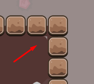
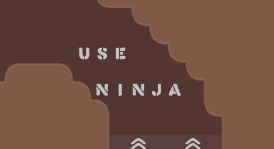
changed a text from "here ninja" in "use ninja", added an sign, removed 2 blocks freeze to make it look better, 1 graphic bug and changed the tune zone text at start.
$rate balance=6 flow=4 creativity=1 playability=7 fun=1 design=1 bonus=0
i know making a creative novice map is hard..., btw some parts might be confusing for some newcomers, and this design doesnt help much, specially with the hookthrough
this map is worse than gold mine, atleast for me
(and this map is kinda gold mine 2 right?)
1/10 in creativity why? Have you played the map? I know that some mechanics repeat like the "dummy drag" but in 90% of the map are two or more ways to do the parts. It's planed to be kinda confunsing, I tought the novice server need something new/different, some people like confusing maps. Gold Mine 2 would be less confusing.
i don't find it creative in any way
$rate balance=6 flow=6 creativity=5 playability=7 fun=1 design=0 bonus=0
$rate balance=1 flow=1 creativity=1 playability=1 fun=1 design=0 bonus=0
is my rate changing total result or its only testers can do
only map release squad, other‘s votes are separated (public result)
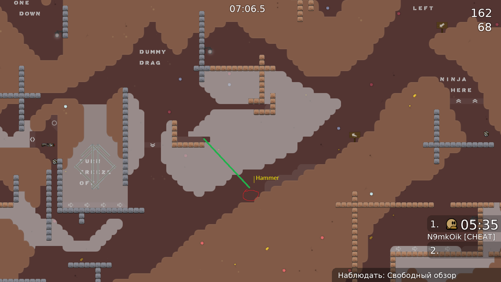
Fixed a lot design stuff like half freeze tiles behind walls and made a bigger spawn "room"
Many areas of this map are still very tight and the map is still very confusing
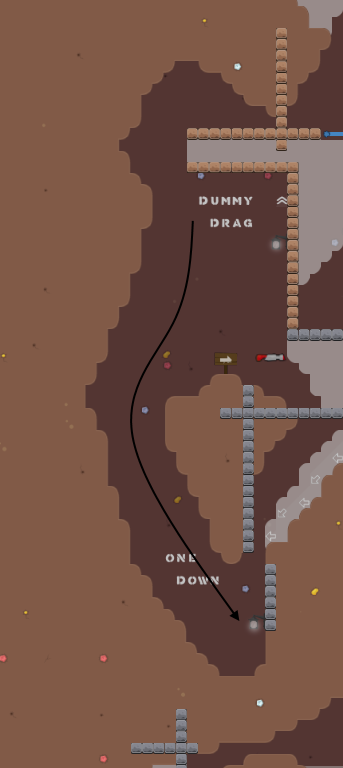
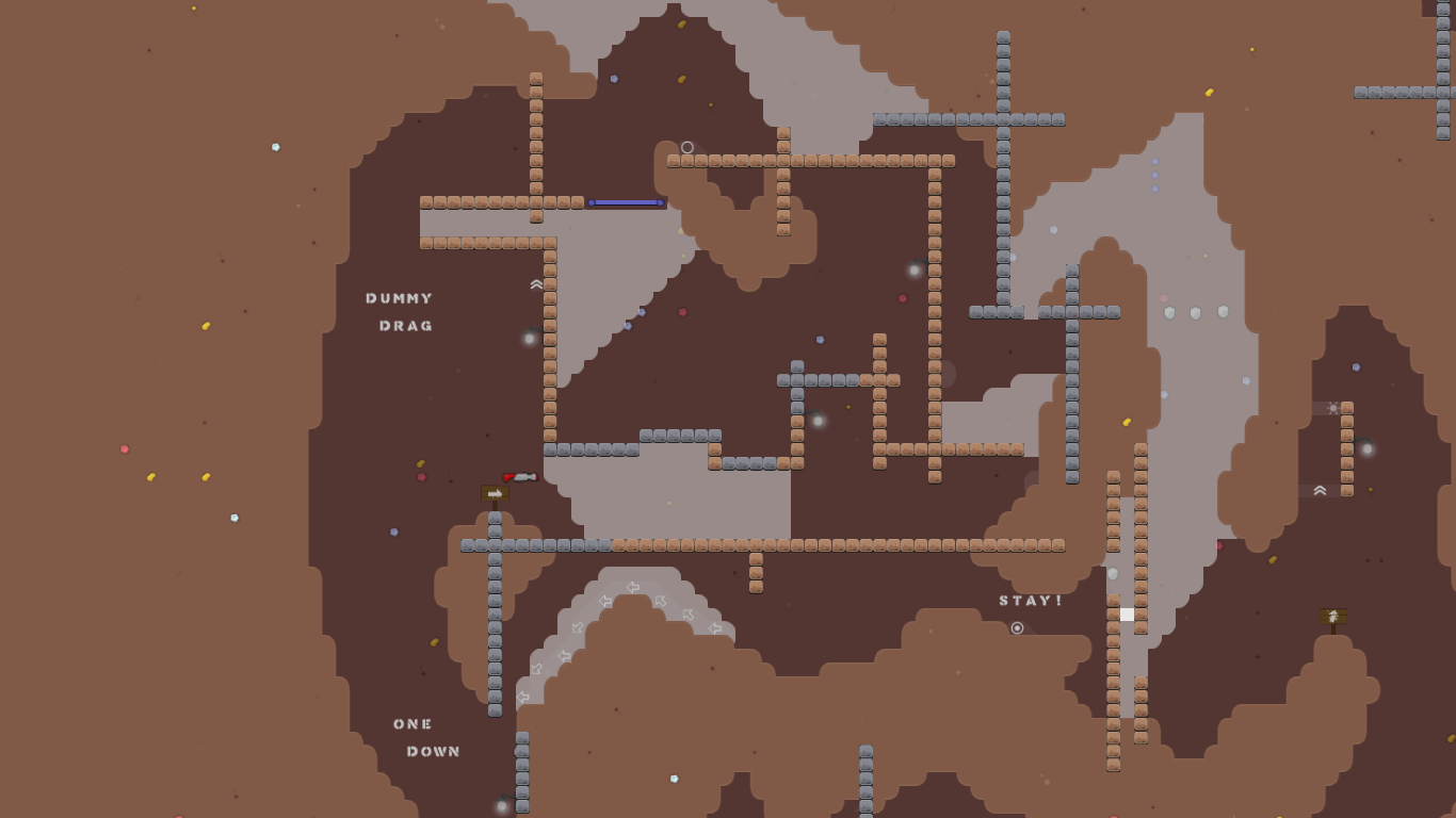
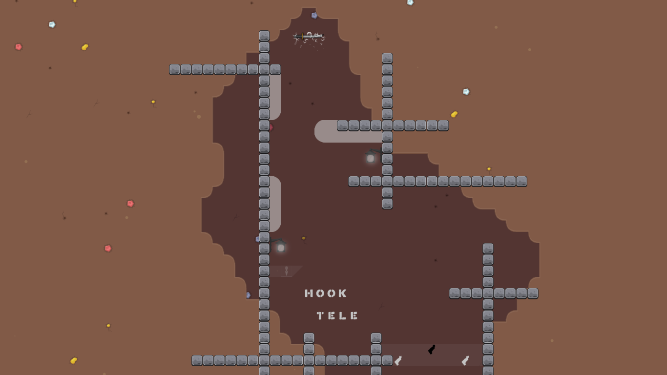
Fixed first screenshot and made the start of the dummy drag a bit easier
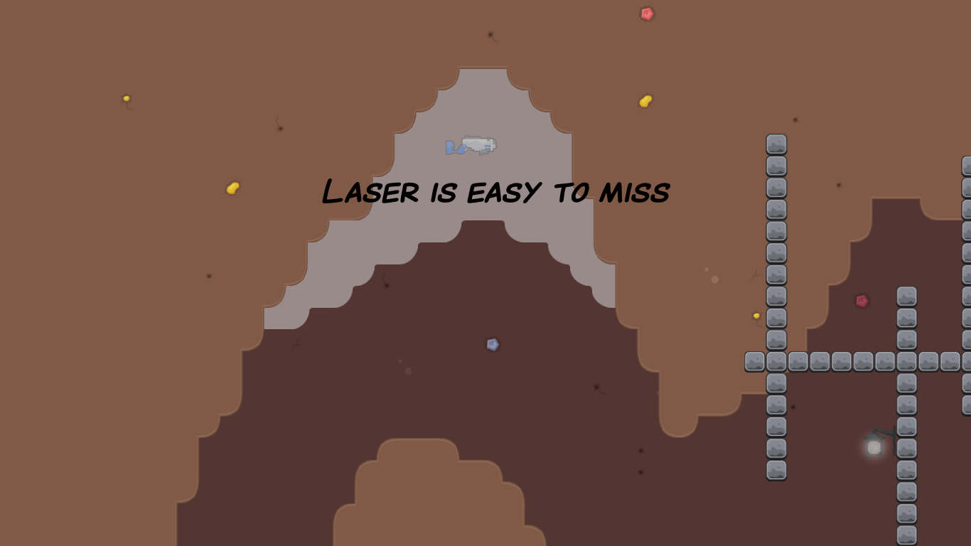
You dont need the laser it's just for speedrunners
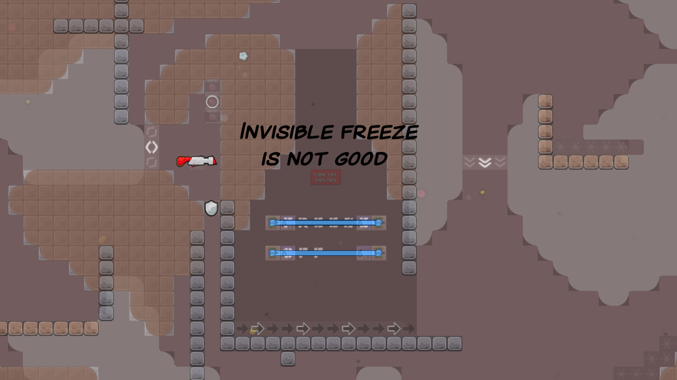
Idk how to fix the invisible freeze part, but I think it can stay like this
Maybe just use a door instead of weird stuff with freeze
I think he wants to introduce new players to the feature. however, that's ultra rarely used and where it is, you already have enough gameknowledge to understand it. so I guess you are right
also, it doesn't really explain the feature well IMO. rather stuff like hiding text with doors will draw the attention of players
XDXD
$rate balance=7 flow=4 creativity=4 playability=7 fun=1 design=1 bonus=0
u need to do without bonus
$rate balance=7 flow=4 creativity=4 playability=7 fun=1 design=1
👍
$rate balance=8 flow=4 creativity=4 playability=8 fun=1 design=1
your rating is missing
Just got home. Ill do it later
changed background
$rate balance=7 flow=5 creativity=6 playability=8 fun=0 design=2
A bit too short for my taste but its fine for a novice map i guess. Creativity 6 bcs for a novice map you did a good job on making different parts and not plain simple stuff.
design 2?
Ya. I like it. Its simple but cool for me. Personal liking i suppose
thanks everyone for testing 😄
The map scored all required points! It only needs to be checked by a
now to be released

the 'turn off freeze' is very counterintuitive and unneeded, just use a door
yea xd especially since the animation is still going on, giving the impression that it's still freeze
fixed everything
removed animation
made the drag easier
added unfreeze
thx for testing
"text messages" in the start text sounds like whatsapp or smth xd I would probably go with "info texts" or something similar
it's also not really connected to the marking
u should put some stuff in HD, namely some doodads/bg at the start + the cave filter
if u have info texts at every dummy drag, you also have to add it at the first one
u should dilate the signs tileset
Put
in HD and make
cover the whole cave area, that way with HD disabled you don't see moving details on the cave background
Additionally you can use this very simple automapper to randomize the unhooks and ht, it's boring with just 1 tile
fixed everything except the "info texts" I like the "info" more xd
missing entities-off at first "DUMMY DRAG" text, other than that looks fine from my side
fixed
entities-off at first dummy drag is still missing
you messed something up
(just take a look at the map)
fixed
ready 4*
u cant just post a new version after release and after ranks have been made without saying what has been changed lol
changed logo
k

