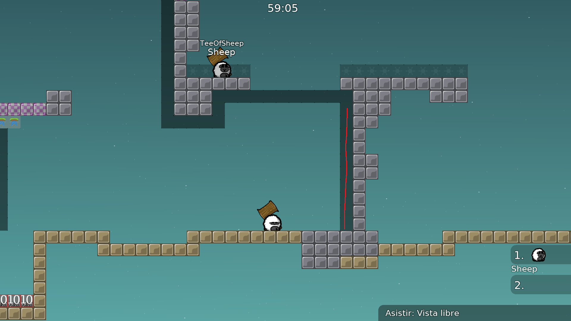
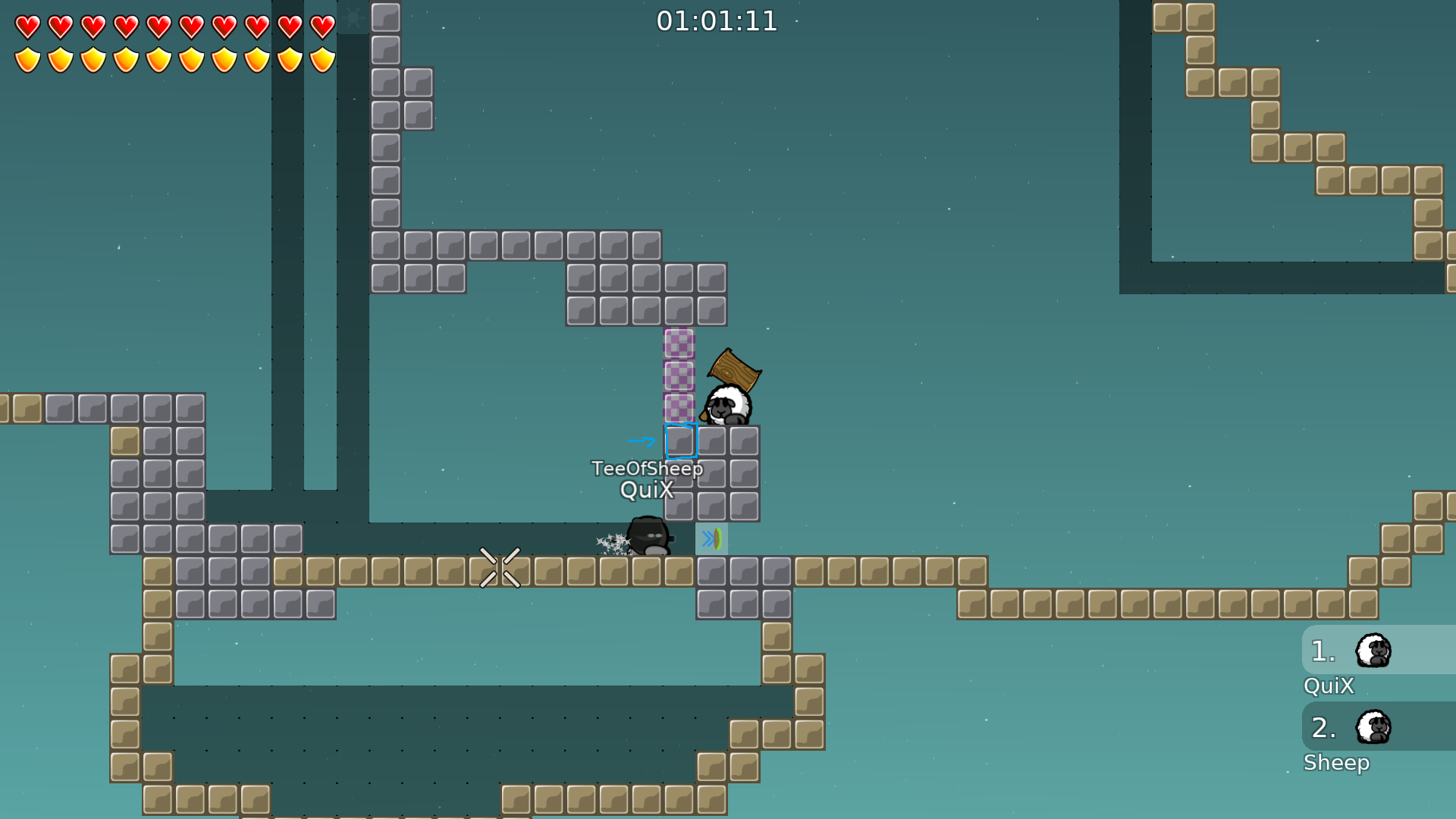
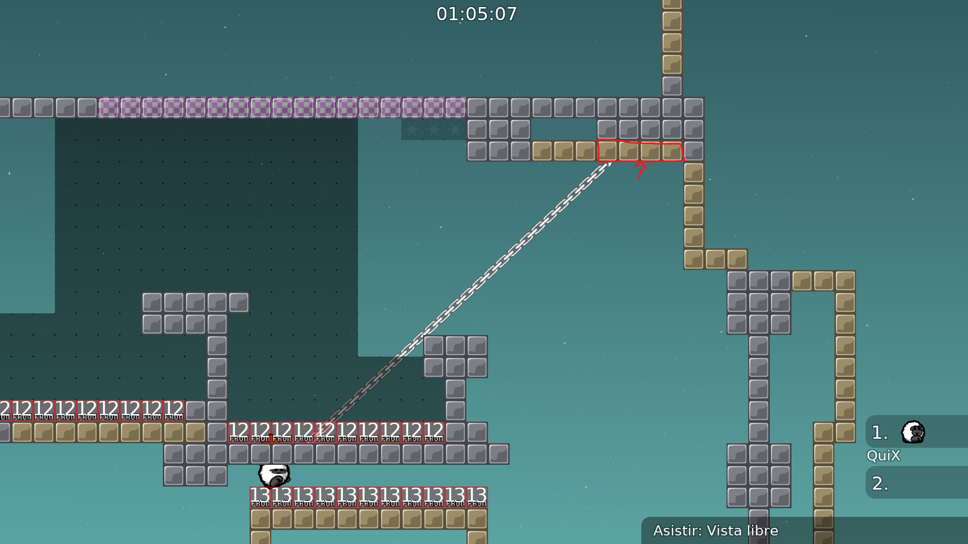
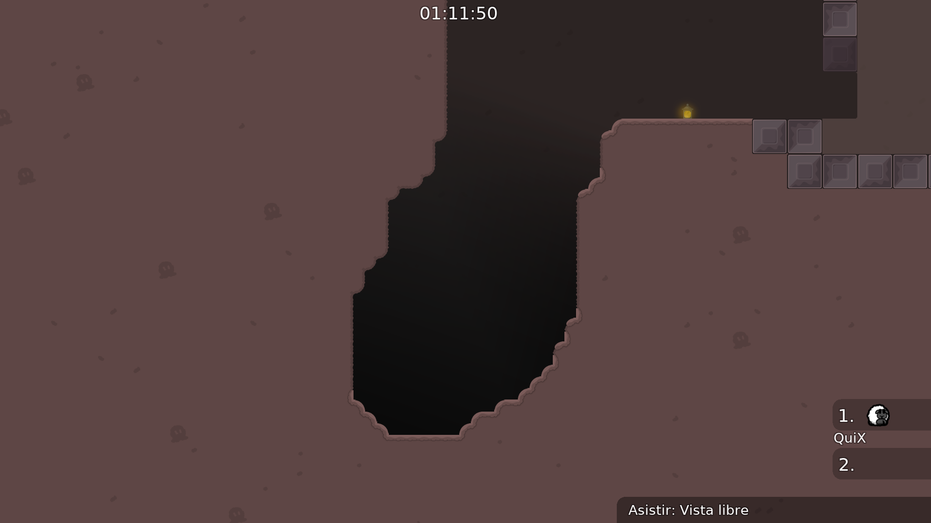
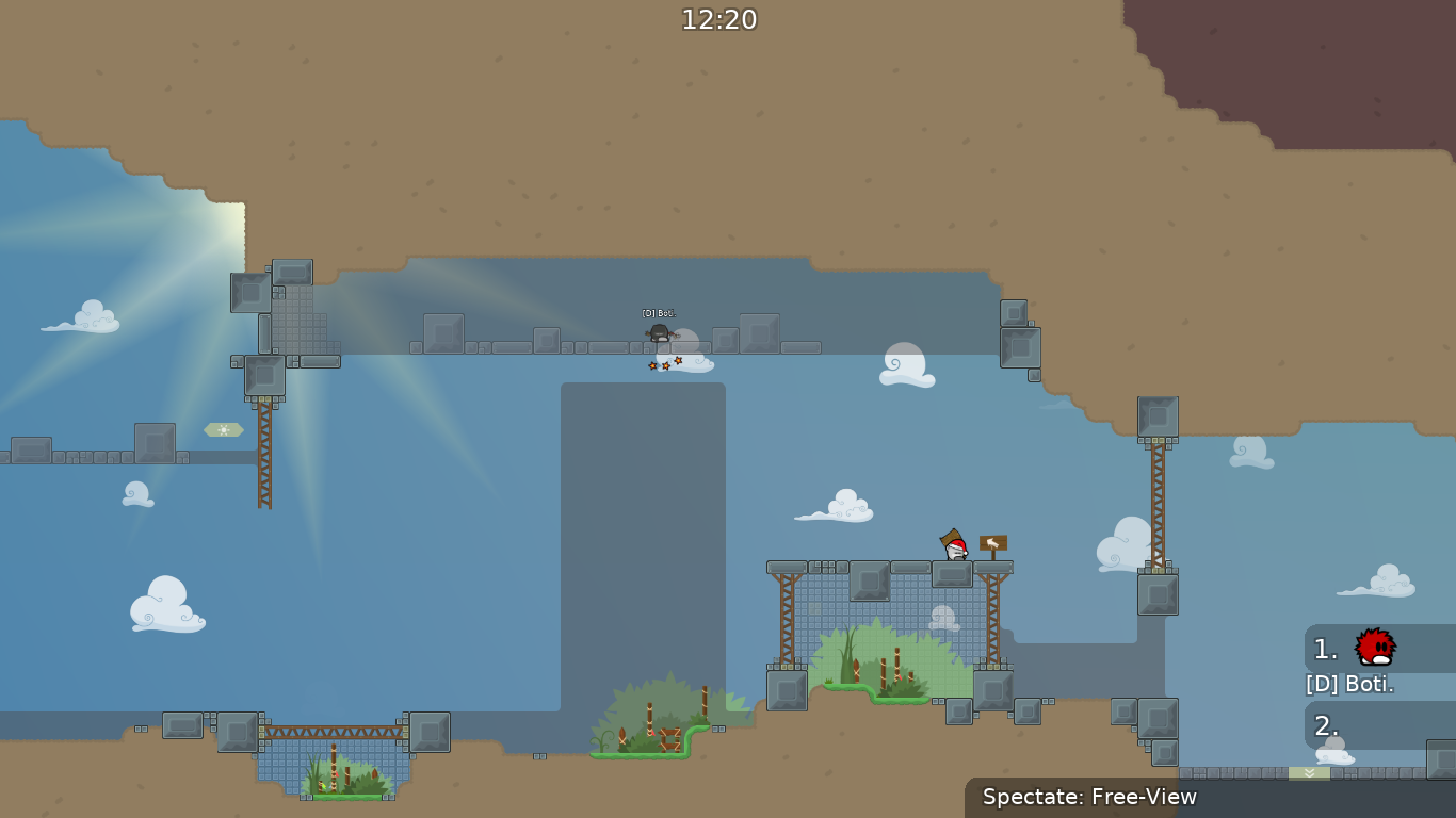
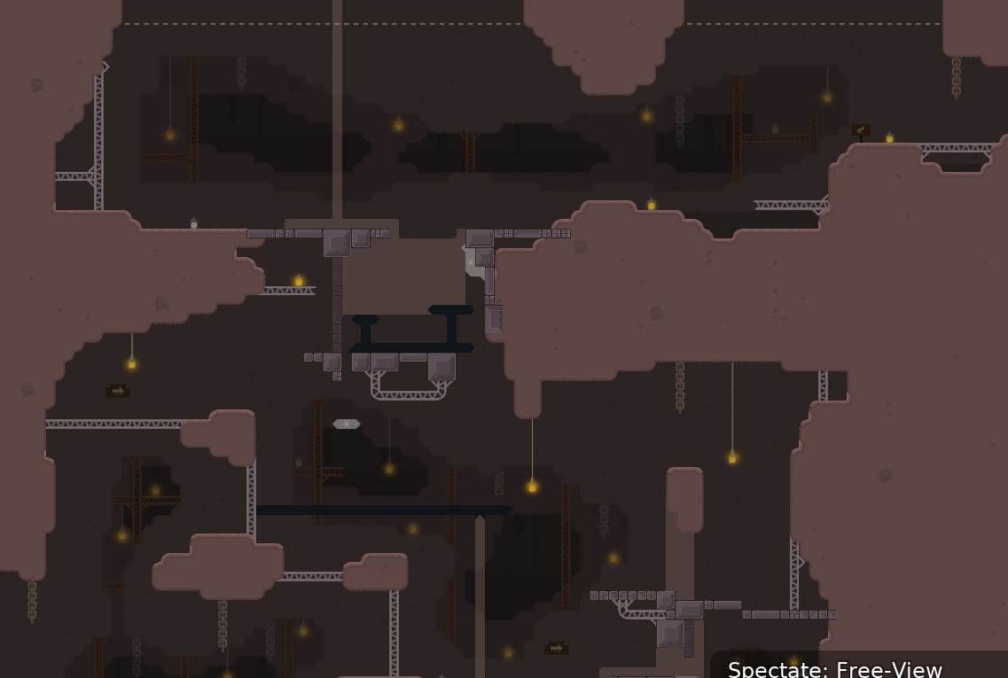
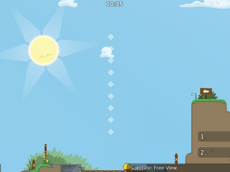
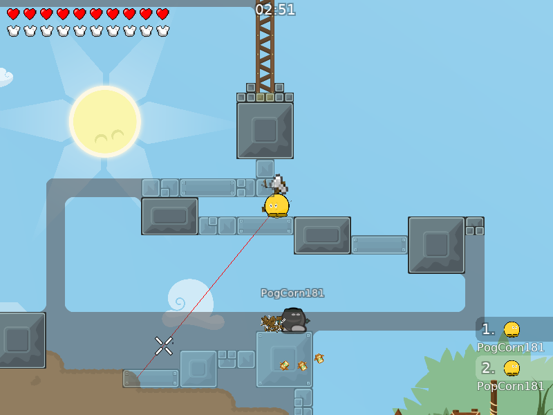
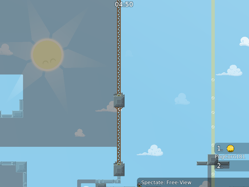
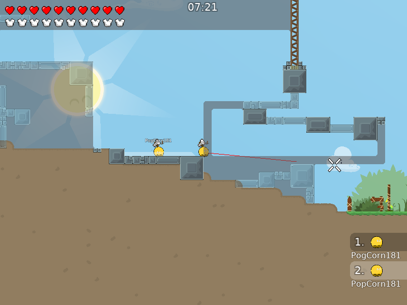
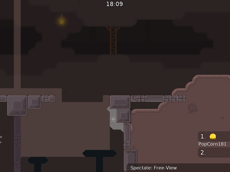
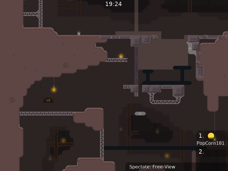
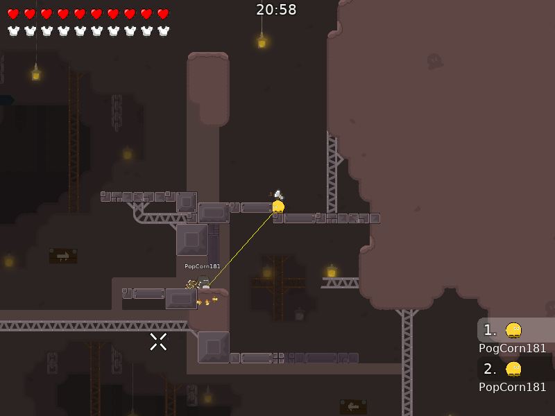
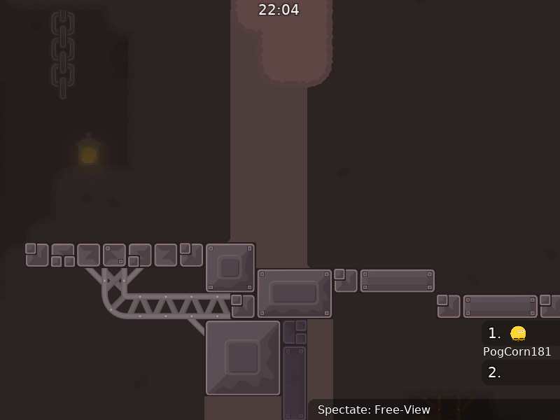
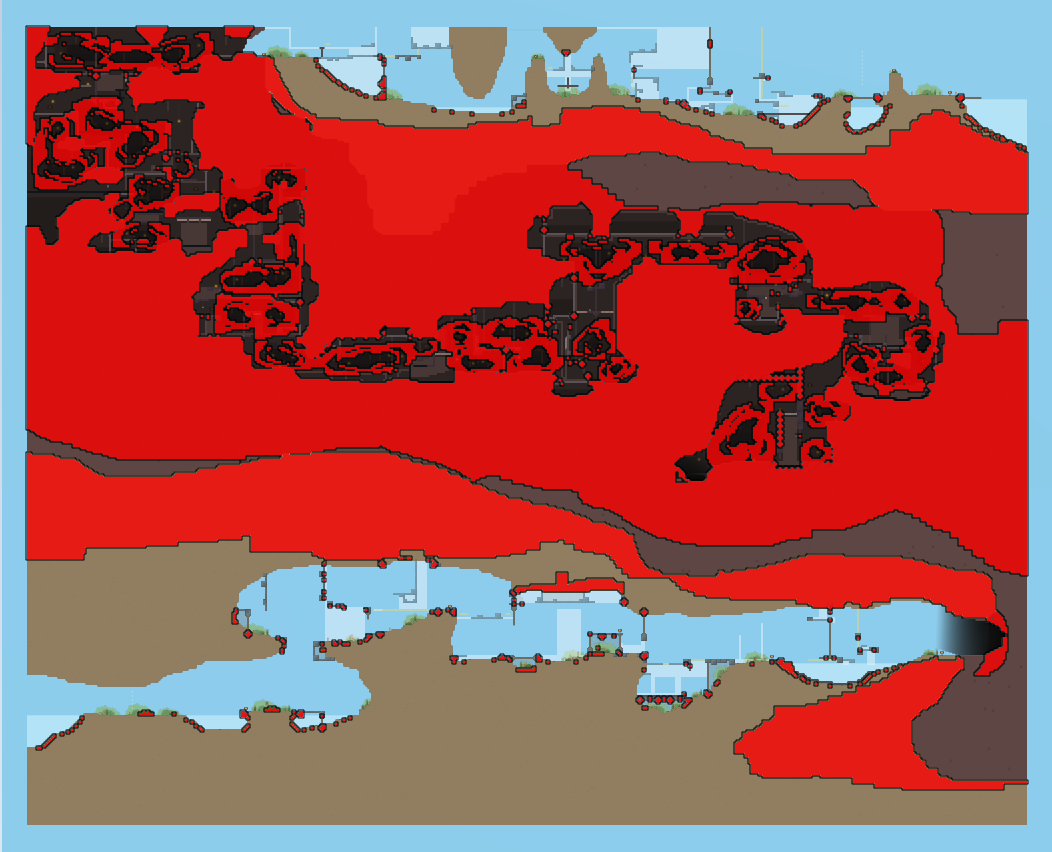
this is your map's testing channel! Post map updates here and remember to follow our mapper rules: https://ddnet.tw/rules
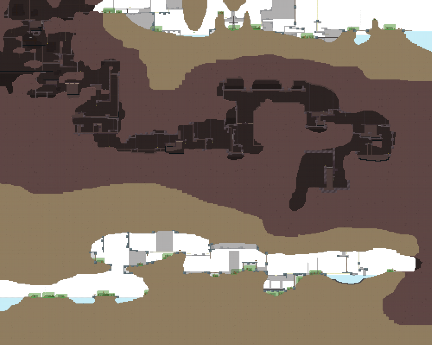
tryed to make a 5* novice xd
thanks to SUKA (design help), Lady Saavik (forum thread with bgs) 😅
this looks like tropica but novice :o
yeah i was inspired by design of Tropica and Maui Wovie series
hope thats ok xD
ofc
added time cp's
freeze missed at end
added unfreeze at some parts
the map its cool
what for unfreeze there? i putted unfreeze only where i thought it's needed
it is common for a noob to err in parts like this , waiting 3 seconds is boring
Make ht different, is too similar to the unhook
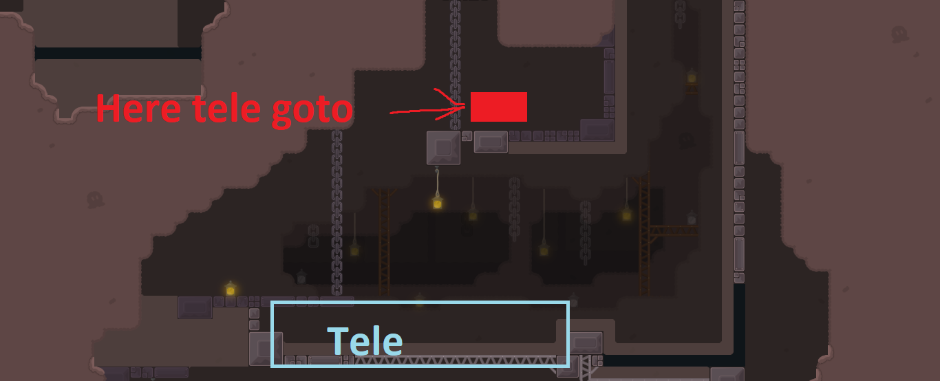
Maybe add teleport down and make a platform up with toteles there. Noobs will fail hook kinda alot and having to go down and up all time is tiring. Also some of them or alot of them forgets to hammer the other tee to unfreeze him so some of them have to wait 3 seconds.
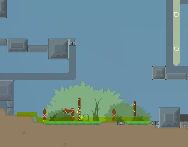
Yellow: the teleports Blue: where the platform "could" be green: the toteles (if you make it there ofc)
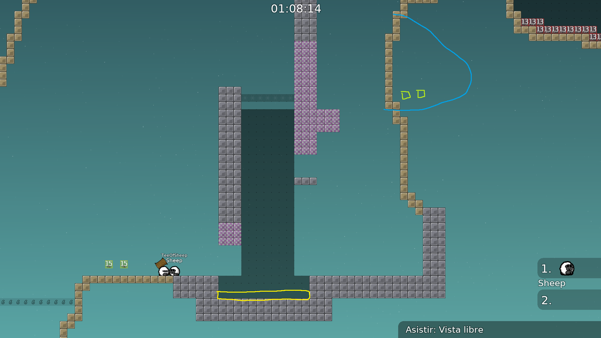
Also check clouds. Some of them respawns really harsh.
Map not bad at all, but i felt some unbalance between parts specially the cave parts but overall its nice map. Maybe a tester will go with you through some of the parts that are hard. Good luck to you ^-^
looks amazing
i'll play tommorow probs
Ty will try to do smt today
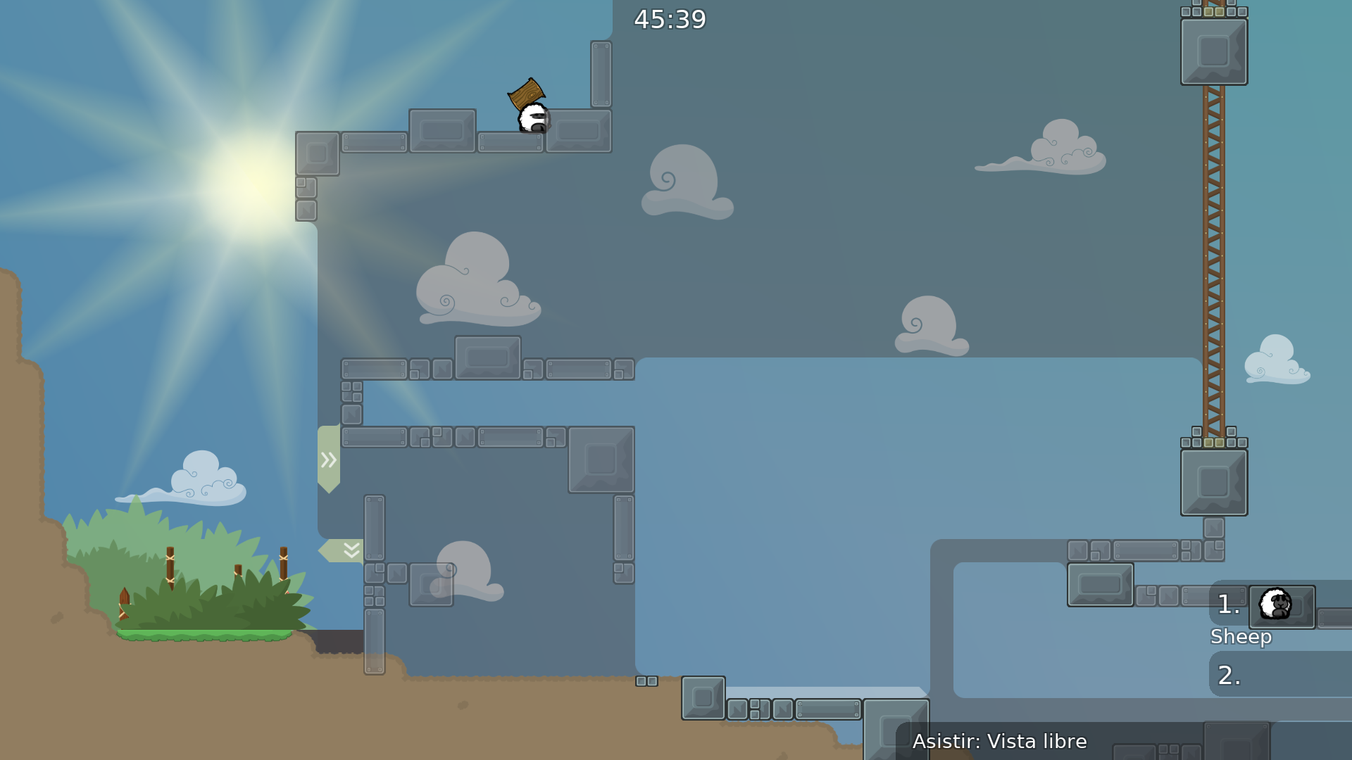
remove this part
hard af and makes no sense
or add tele at the freeze down
and the map doenst really fit for a novice map maybe 5/5
thats not how you do it ^-^
for faster doing you just do hook from down
but i kinda think different icons markings wouldn't really fit design 😅
Maluco
- added unfreeze at first screenshot mentioned by Maluco
QuiX
- changed a bit first screenshot by QuiX and made it easyer
- added unhook to every wall which allows you to die by climbing up, beside balk one as it's first part and i guess it wouldn't be that terifying
- removed freeze wall from screenshot as mentioned by QuiX
- changed a bit 4 screenshot
- changed cp 12 and 13 a bit, as mentioned by QuiX did remove 3 unhookables to make less confusing for players
- changed the transition a bit from cave to beach
- changed the part with laser unfreeze and tried to make it less boring
Boti.
- seems like you got confused at first screenshot, instead of removing the part i did remove 1 layers of freeze, made the hookable wall easyer to get, closed the space so people don't suddenly throw other players into it XD
thanks for test QuiX, Fluffy Unicorn, Boti. and Maluco 😳
decided to wait a bit for that suggestion as some nobos I did ask liked that part. If more people agrees on changing it - I will.
Balanced a bit cave parts (I hope

)
Tried to fix clouds animations, as seems i did fk up them at appending
signs with arrows shouldn't be HD
a lot of fixes thanks to Lady Saavik

fixed cheats, also some more tiles errors thanks to Qed
changed a bit some parts, design fixes thankz to DarkOort and Archimede
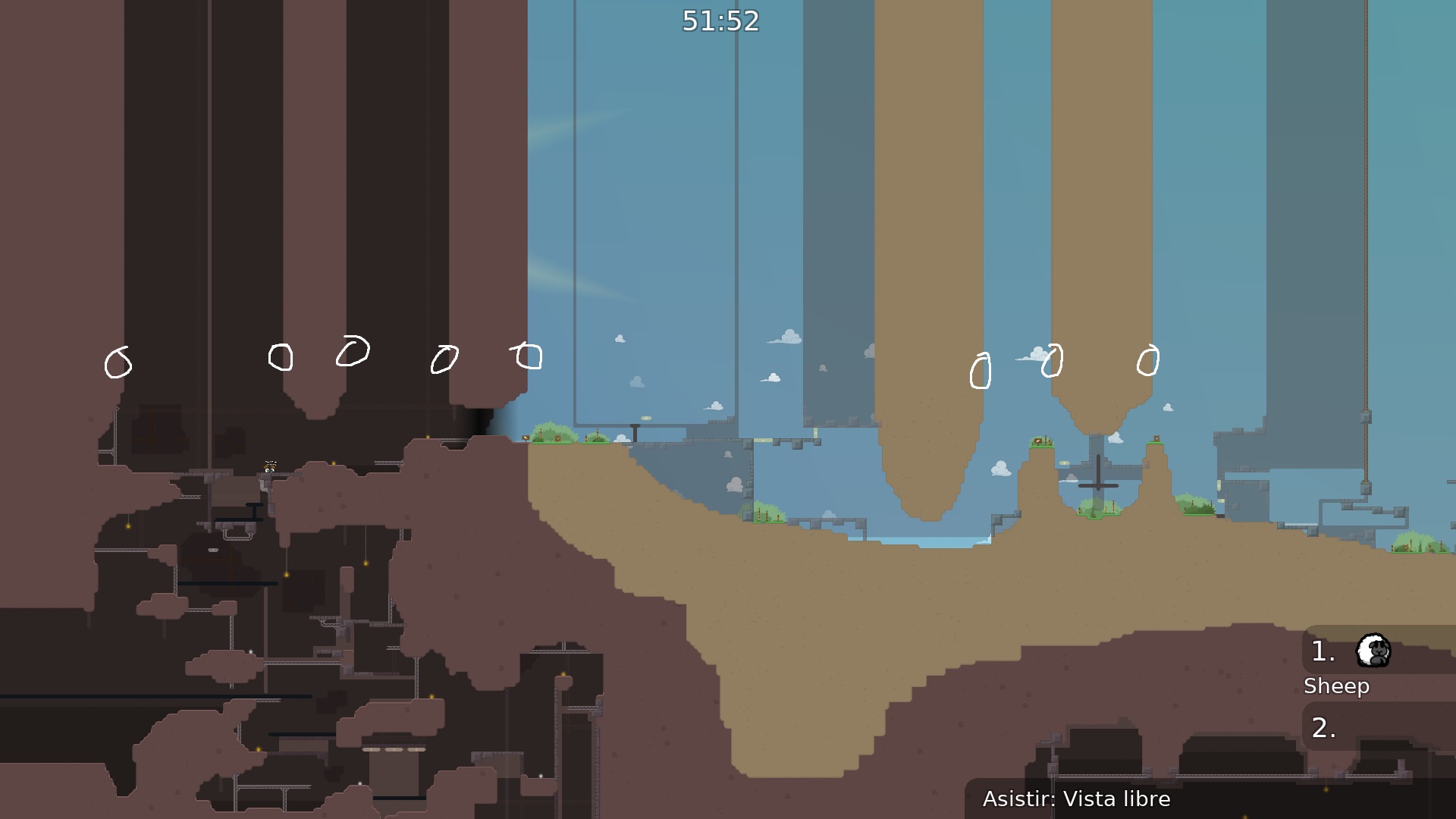
corners
went throught map with Cinimix and hopefully fixed all corners and made them more incosistent
put a speeder or idk
want to make it a bit more tricky and harder

but i don't find it as a big problem as it's on beggining of map
🇹
changed some parts and made em smoothier thanks to ReD
changed color of ht/corners/some fixed
entitie bugs and removed unused groups
thanks to ReD for massive test

change sun to teeish sun pls
this sun is abomination
i think it's fine

блевотина а не солнце
ну если тебе нравится то норм, я не заставляю
went throught map and realised cave design sucks and tried to improve it
солнце не хочу менять т.к во первых не умею этим всем пользоваться, а научится сейчас лень. А во вторых мне дефолт солнце не особо нравится

mmm idk about freeze design in cave. Everything is brown so is freeze, maybe white or black freeze would fit better?
idk i like that color

ill look maybe dark will look better
nah dark doesn't really fit there due to bg, white doesn't too bcs of marks. I'll just sit on brown
i kinda think contrast is fine now

i downloaded teeworlds 0.7 and looked in mapres folder, there was generic lamps and light, do i make them external?
things that should be made external will be automatically categorized as external iirc

didn't knew, ty
changed ht color and fixed one cheat i found
nah won't do that, i don't think thats need and will just broke part
the design is nice, the parts are original. but some parts could have done more work the map isnt really big group friendly but at all its a nice map
make a bigger spawn, maybe add a nice boat in the water, add tele in the water
the map start too close to spawn i think
and the spawn isnt really a thing you just spawn next to water and there is signs
the spawn not gonna fit 64 players i think
maybe add a afk stuff
well coming up with decent parts is a bit hard for novice maps as you are limited, so i leaved more parts for my next maps if i will continue mapping after this
and the spawn i think is fin
e
just add more space or something, think if they mapvote the map and 40 players just spawns in that small space
or atleast add a title to remember the map name
i don't like adding logos to my maps
thanks for feedback tho
but aren't Logos or at least a title a map requirement?
Alright then it's okay ofc
Now I will never make one again

its a requirement only for u

made 3 parts easier and a lot of micro fixes thanks to qed and sorah

replaced sun and some more fixed i did forget >.<
better sunrays
improved colors a bit
hopefully last changes, thanks to Sorah for finding million microbugs and to Ravie for help with bg and some stupid bugs

added more light envelopes for cave
That'a a 5* star novice xD
It looks fine in my opinion
It's right in the part, how?
That's beggining of the map, if they do once they will realise that they shouldn't
To hook your mate you go up and get him through ht
Cp will be useless and out of place
If i do and someone falls in this they will swim up and block others = more fails
Cp is useless
I don't want adding tunezone's
No, it's a 5*
Will look tmrw into that
I'm ok with that cheat
It's right into the part, obvious
It's 5* and i wanted it to be faily so it's not vraindead map, i think we need more new faily maps
Will fix
Thanks for the test😄
fixed cheat, fixed the hookable+ht and made tele a bit prettier where it looked weird, thanks to PopCorn181
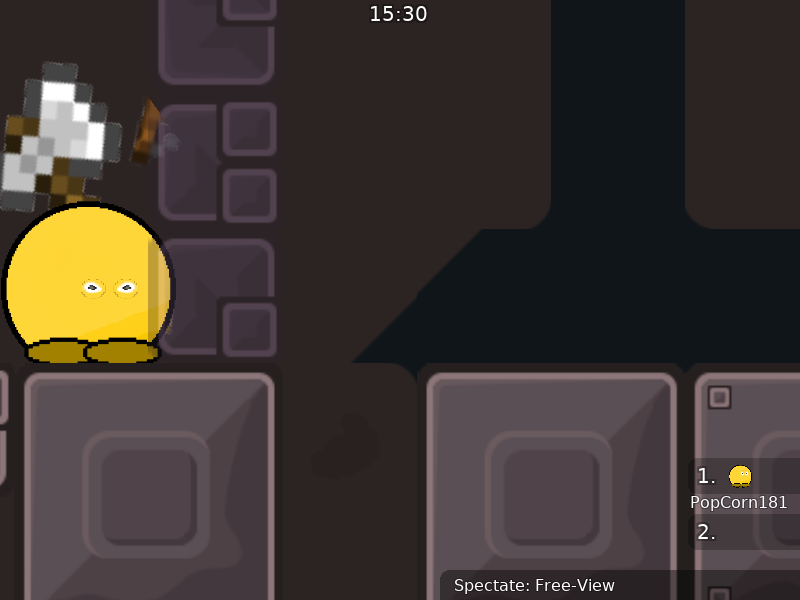
cave design is unplayable, too much detail and bad contrast
gameplay is kinda lame, nothing exciting
i can simplify cave design
but if gameplay is garbage in ur opinion as a novice, you can decline this :) i won't bother about changing design untill i get a clear answer
Design is realy cool ! Wtf
sned unfrezee in tp 4
imo gameplay is alright "bit hard in cave section" but its ok
added unfreeze and made cave parts easier, made cave less messy and changed color of freeze outside cave
if it's still roughly shit consider declining it, i won't continue wasting other's time
moved blue totele a bit, made chains a bit more transparent and extended platform at finish
micro fixes
more micro fixes
97232 invisible design tiles removed


$ready 5




gz
@wsikethenks

Congrats
could your program maybe produce output on which tile it removed how many times?
i dont understand how a mapper couldve accidentally placed that many invisible design tiles in those very distinct places
cave background probably
or freeze
etc
i think it comes by selecting multiple tiles and drawing large segments. especially for cave, you want to draw the cave and remove space inside for parts
here most are cave background which makes sense, you don't want to accidentally miss background pixels so you draw a big rectangle first to cover it all. and than layers ontop
yeah, before map was planned as cave only, but then decided to add and beach design in, before it was fully covered with cave bg so i don't had to change between layers to put them everytime as it were pissing me off a bit. And after i added beach i dind't really bothered about cleaning stuff as they were invisible so i thought they don't have any impact there rather than +5-10 KB xD
thanks
@174:D
i think i misunderstood what you delete
ah maybe not, but you tell me:
do you delete tiles that use a part of an image that is blank
or do you delete tiles that are completely hidden behind other tiles?
for each tile I check if any pixel is actually visible. I do this by adding all 255 alpha pixels of the tiles above into one array. if each visible pixel (>0 alpha) of the tile I am checking is covered by the above tiles array, I declare the tile as invisible, and I remove it. the whole process considers, para, position of group, HD as this all matters.
and yeah this will also remove blank image tiles

the benefit is not map file size, but fps gain. less visiblity checks for OpenGL. I get about +5% +10% fps in the client after removing alot of them (50k+). also the map file size can actually increase (like on
#✅💪stormwind), because the tiles of the layers are compressed and removing tiles can yield a bigger compression size if the algorithm has trouble finding patterns or whatever it exactly does
yeah i realised that after one of our convs before map got ready, thanks for your work on that tool

no problem, it's fun work for me. 🙂 and the goal is to have more focus on the important things, like gameplay. so now it's all automatic. and in future maybe even the client can do it automatically when it's implemented there
nice to hear that

i'll move to
#mapping, this is getting out of hand :p
