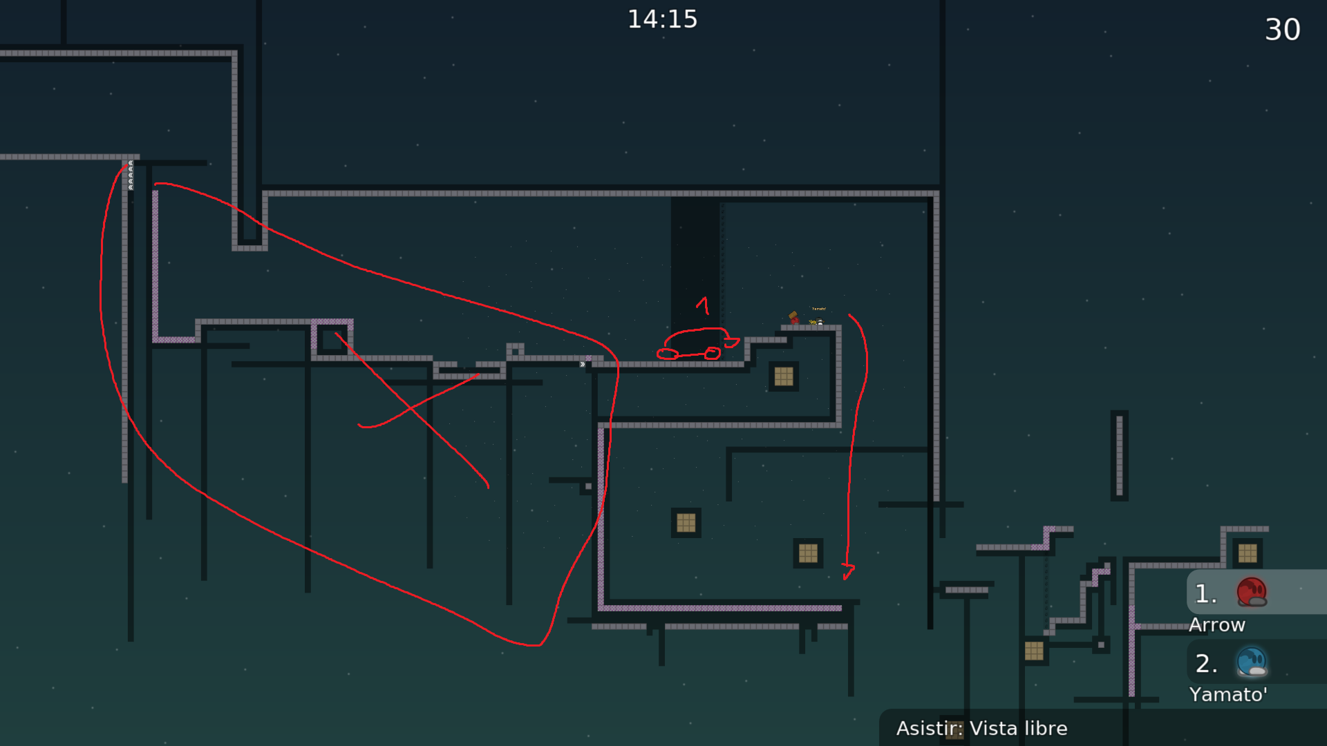
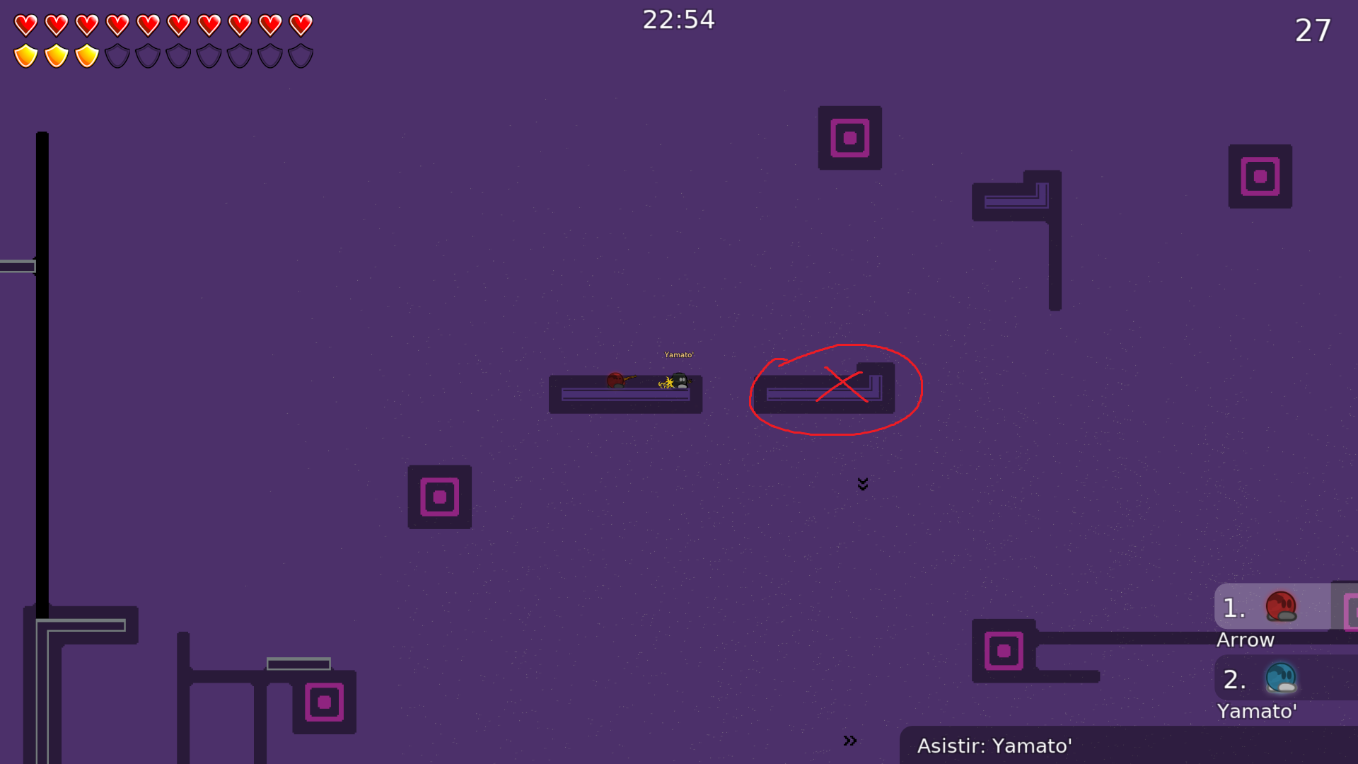
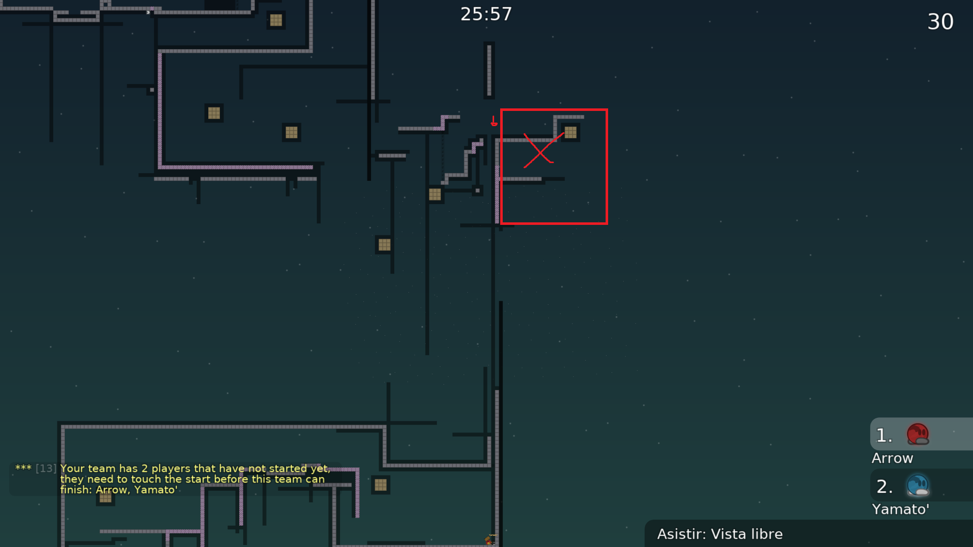
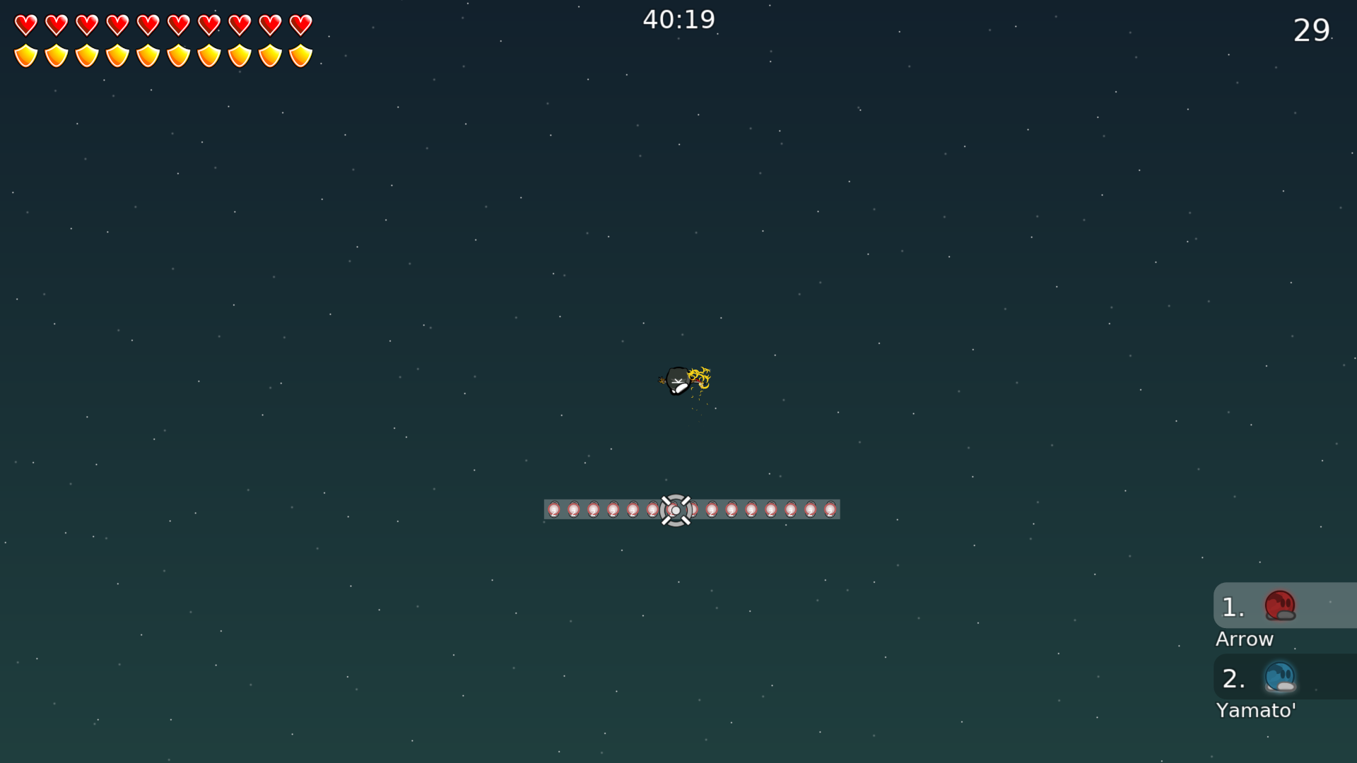
this is your map's testing channel! Post map updates here and remember to follow our mapper rules: https://ddnet.tw/rules
May be a bit too short, but might as well try
fixed stopper
cool 1 star dummy 👍

Maps alright but I’m not a fan of the design
no one play map with design
we still need to account for the people that do play with design !
I’m not good at design I know

I am proud of the jetpack tho so B)
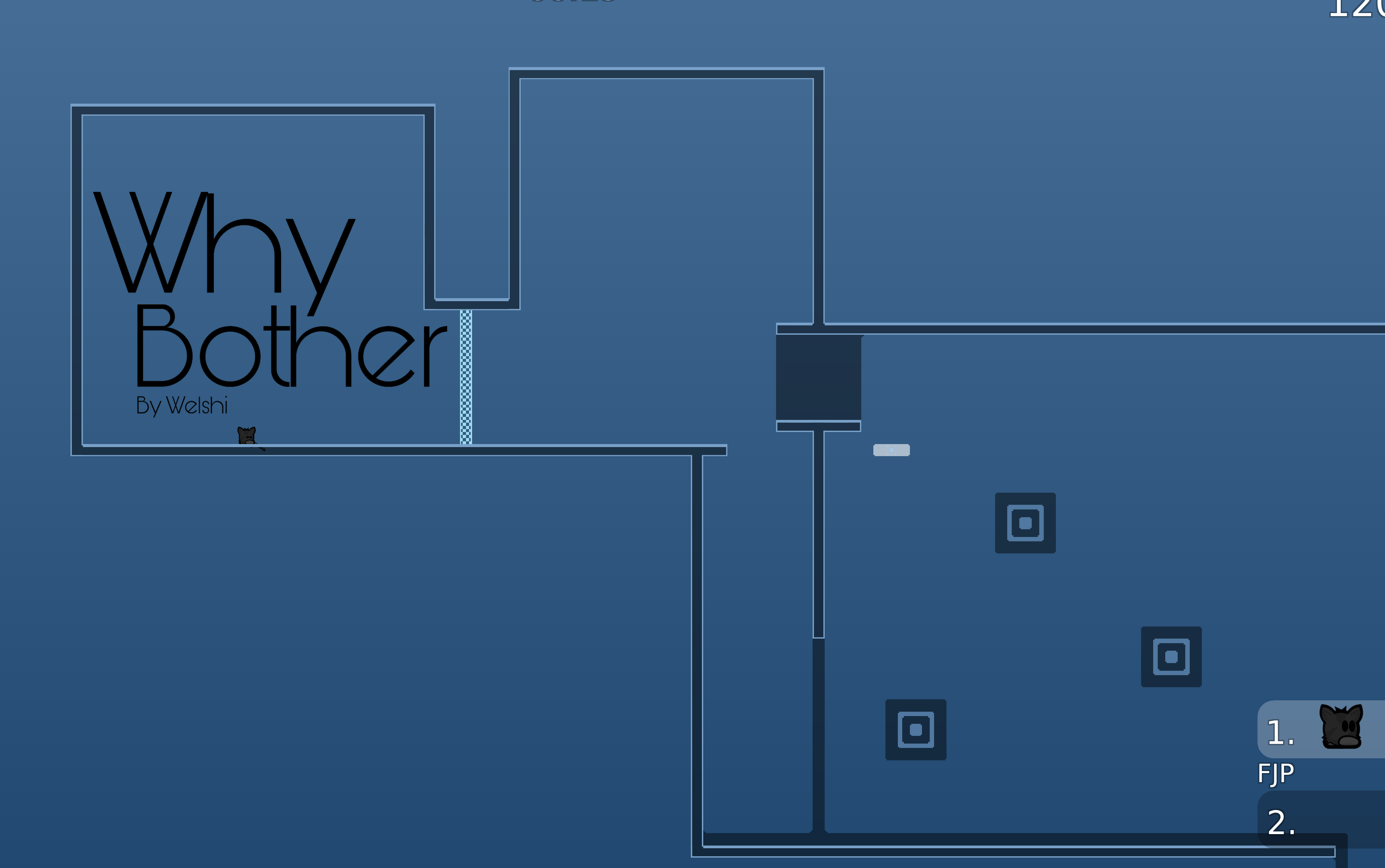
tbh i think the main problem is just the color contrast
try having a consistent scheme that doesnt hurt the eyes
💛 👍
I do like the blue
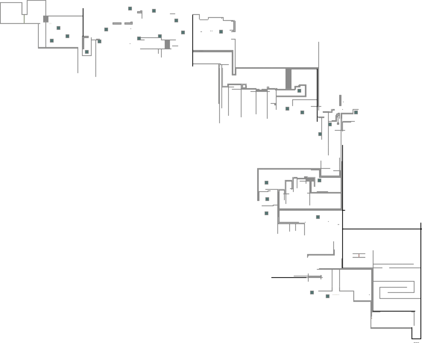
This map feels pretty repetitive, moving dummy to a location to hook later, hooking dummy through a simple drag, pretty basic jetpack solo at the end (also unmarked to let go of dummy there)
Maybe I should move it up tho
And hm
I'm not personally a fan of it, it's certainly a good map for beginner dummy players but I think much of the map can be reworked to have more unique parts/interesting gameplay
Some of the drags are nice, some of the parts are maybe cheatable
it should be where they are moving to
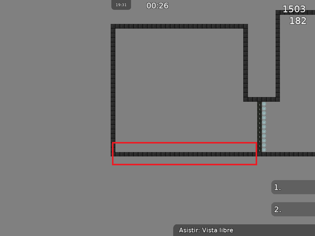
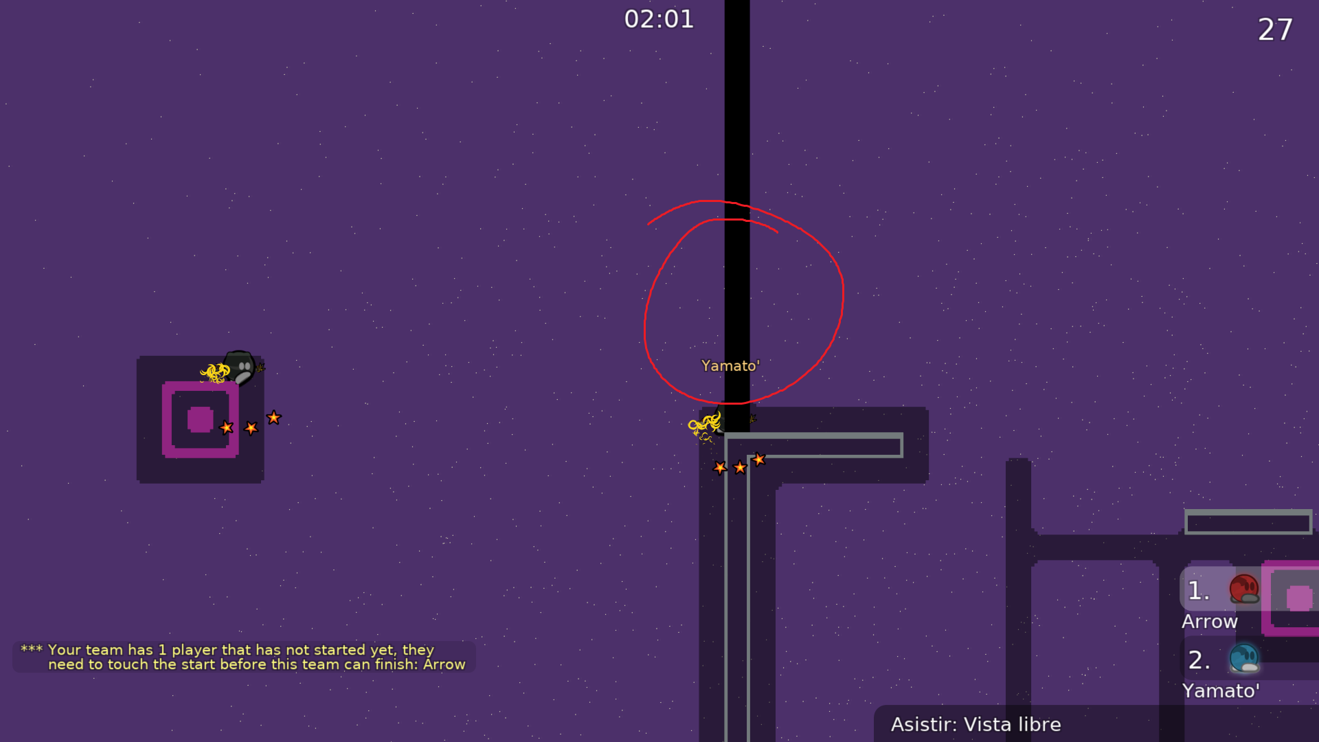
also there is a hookable where you fall after throwing dummy
no player is going to know that hookable is there before specing first
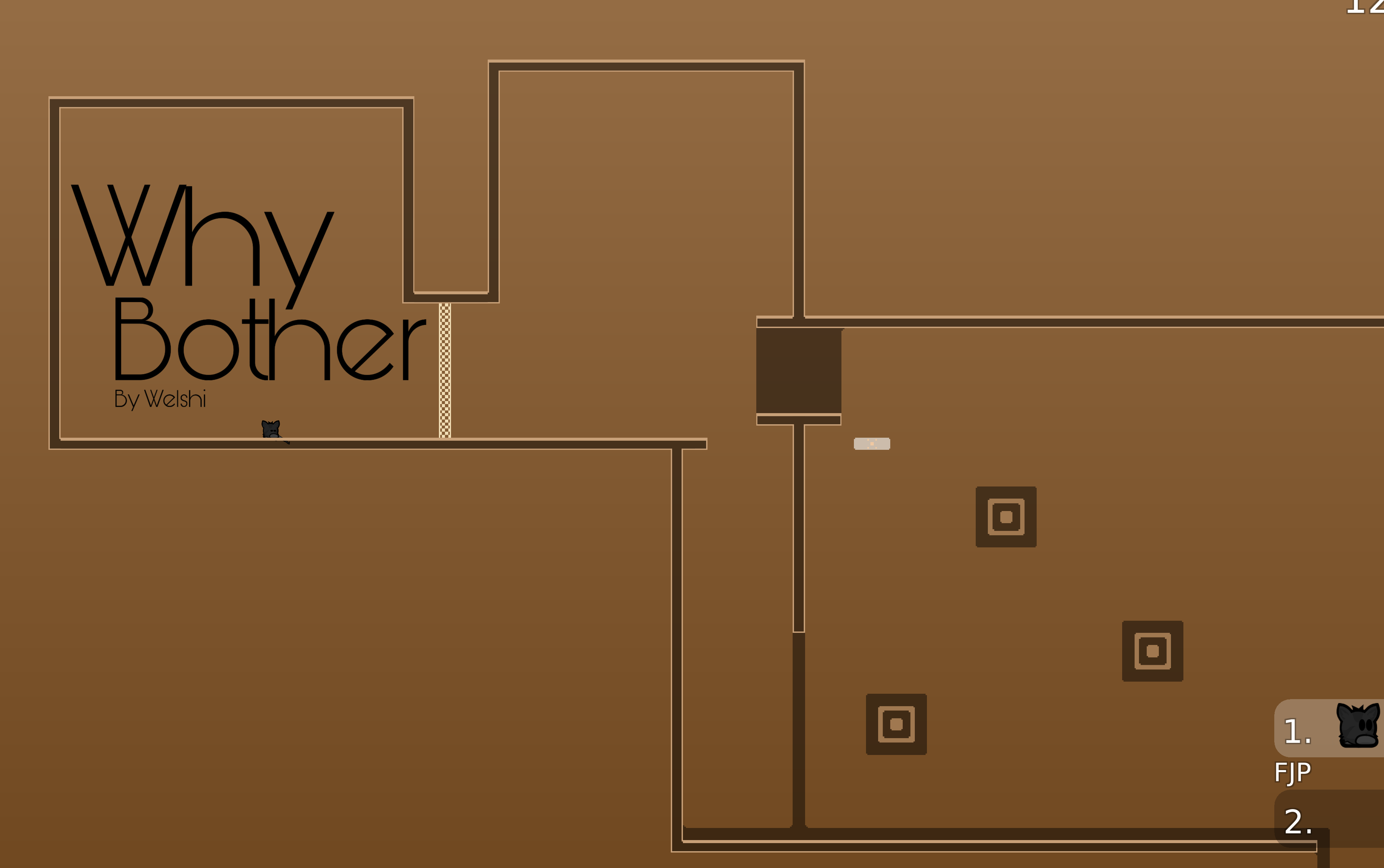
personally like this color more
we have enough "blue only" maps
2:50 is the part I'm talking about
they probably know to go down, but maybe not the hookable
maybe not a big deal, not sure
I’ll try adding some like, tells for ppl to know what to do
and I’ll also try skme other colors
my biggest concern is with repeated moves, or replacing the edge hooks with something better
Hm
Creative mind gotta work
I think that's more worth your time
I can’t really think of an alternative off the top of my head rn
this map is fine but I'm just saying it may get declined on a more subjective basis
if testers see it as uninteresting or uncreative
Tbf I think that would still make it my best map tk date
Have you looked at Stellar much?
I actually don't know if it's 1* or not
or ofc the dummy chamber maps
Stellar is 1*
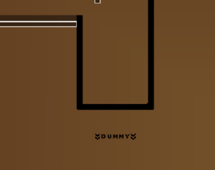
changed the way it looks and nerfed a few parts, as well as tried adding labelling. labelling might be a bit cringe so give me opinions on it plez
not sure how I feel about the labeling
i think it might look cleaner if you could portray what you want through symbols instead of text
the "hook" text is definitely not necessary
for the "dummy" text, I might just put a little tee icon
and arrow spam looks bad imo
once again the contrast of the white walls with the bg just hurts the eyes. might an off-red to match would be better. the hookables work well though
I agree with lynn that the map that getting creative is to your benefit. as it stands, the map is really 3 drag parts with filler in between, and a jetpack solo at the end. If your map is going to be that short, the creativity needs to balance that fact. Don't get me wrong, I think some of the ideas are good, I just think because there aren't many, they should be expanded upon.
only did the off-color red here
will do the other parts
later
corners and tried to fix the labelling
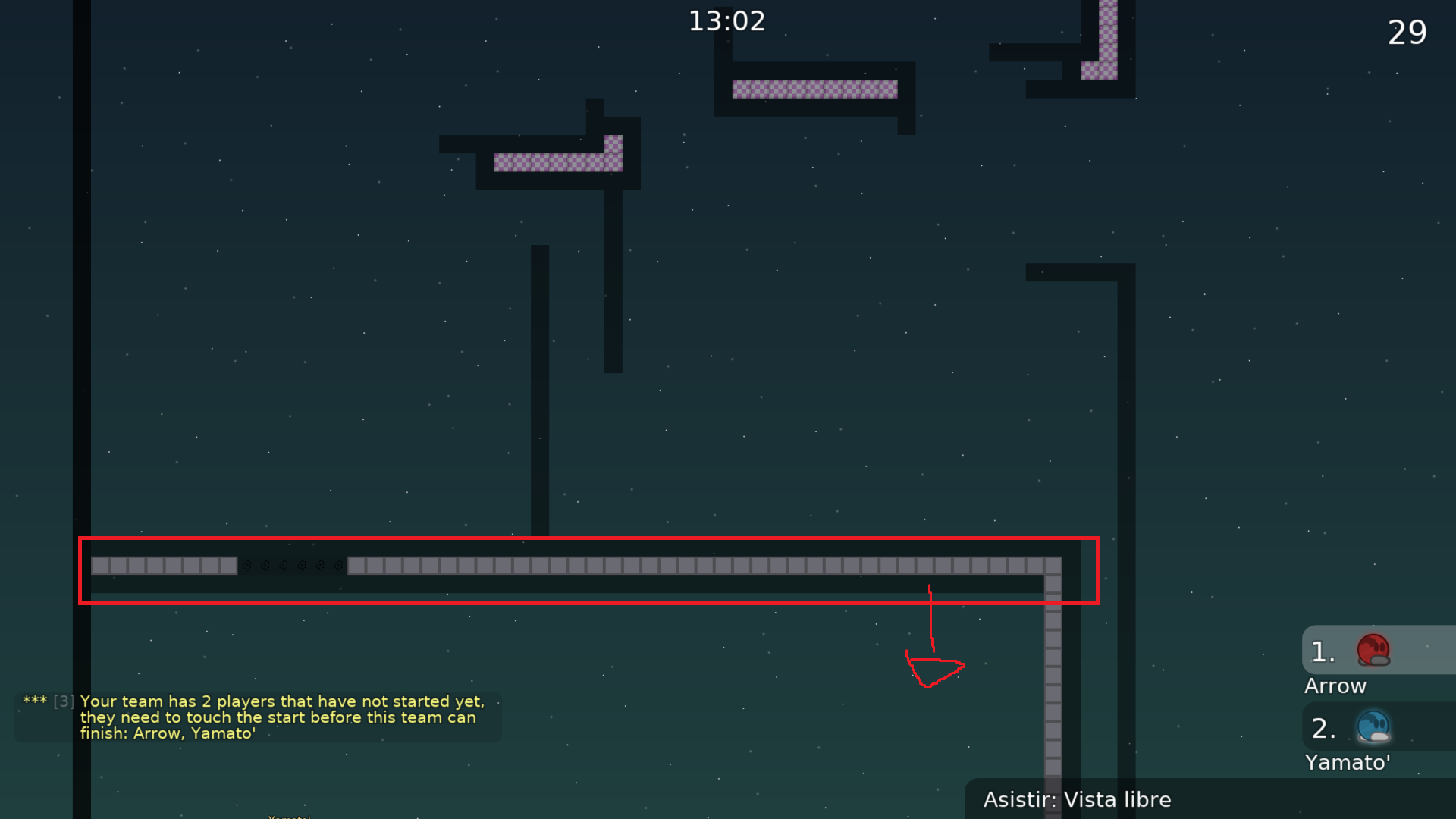
replaced one edge with (while still pretty generic) a put under the block and run right for increased height. Not that much more creative yet but it flows a lot better, still have to work on it tho
WAIT No
I forgot the entities
fixed
yea and i think this point is made more difficult when you consider the difficulty, so i can understand why the map is like this, but other 1* dummy have some solutions
Any changes you make removing the parts where you're just sticking the dummy on a hookable would help a lot
Big oopsie
gimme a sec lmao
ahi ta
ya
essentially added a part, so as to avoid so much putting the tee on hookable blocks, still room for improvement in that part but it is a bit better. New backdrop courtesy of
@mastialso changed the colors so as to fit in better with said quads. Fixed a very tiny skip too

added time checkpoints whihc might be abhorrent, and fixed a skip
also I think I misspelled abhorrent
welshi
lynn
ello
did I do a dumb
changed one of the hooks into hookthroughs to avoid repetition
also tested to make sure it's possible and fluid and I think it is
but I also don't wanna overuse hookthroughs, so future changes will probably be different in some way
im talking something like this
srry if it looks laggy the editor from windows its bad
wall)
oh right xd, well i like to complicate my life for free
In general the map is not that creative is really simple actually, and has some lack of content will be hard to get released
Try to fix this things above and make it more creative in some way
$waiting
