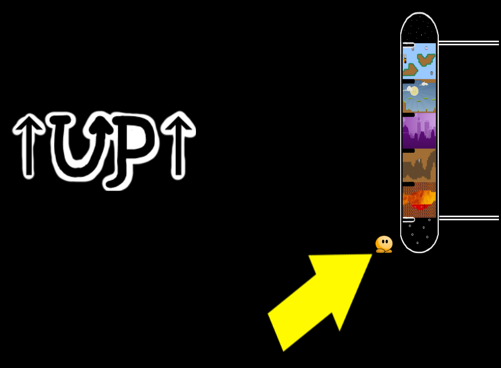
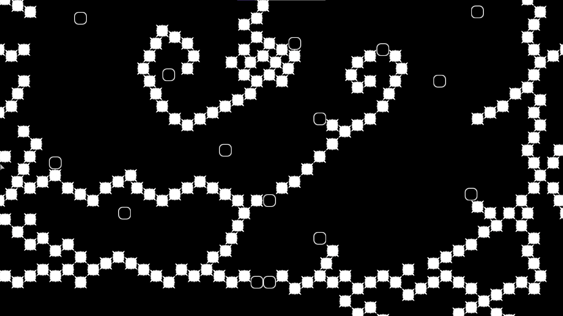
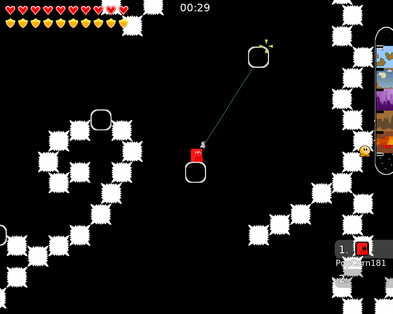
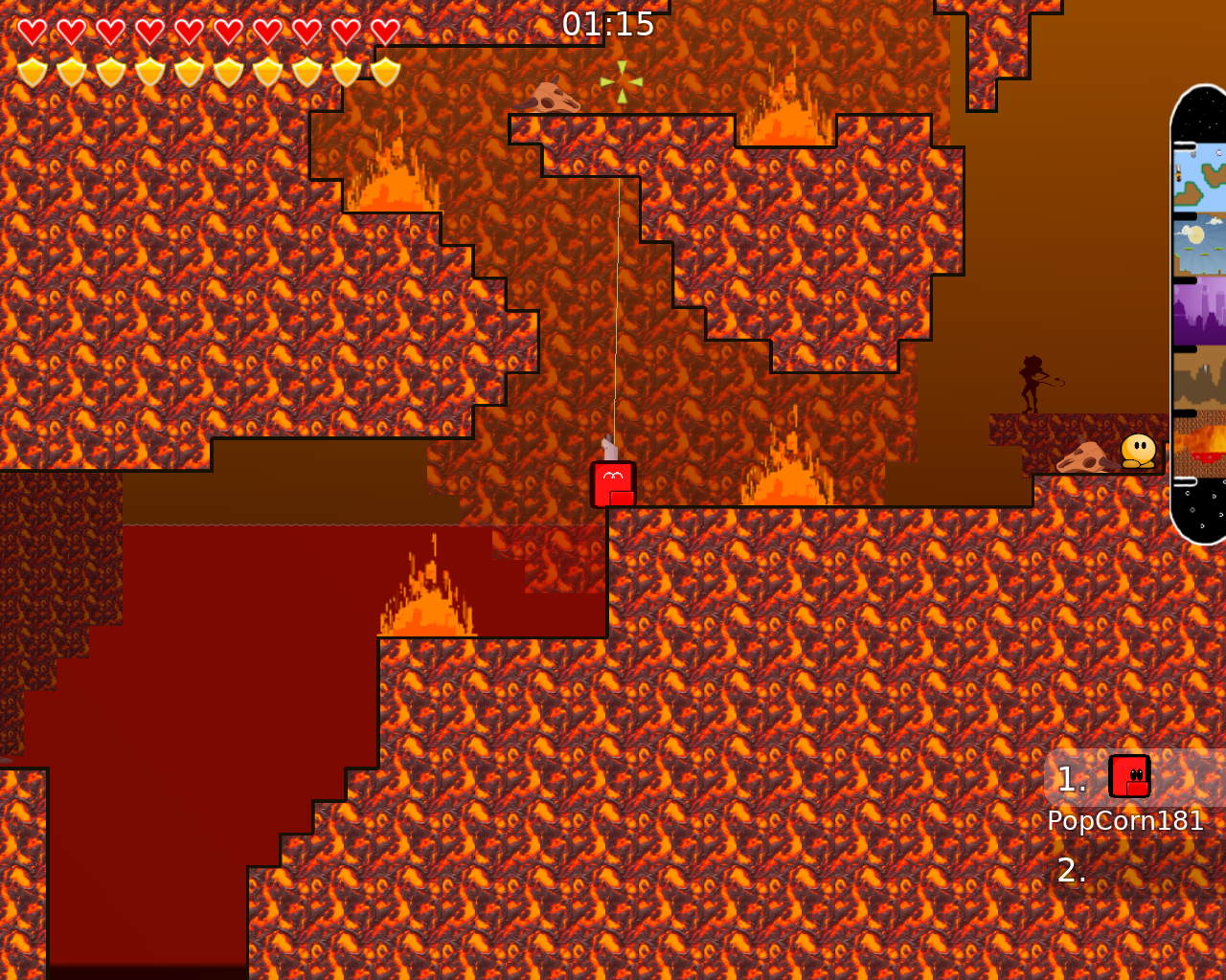
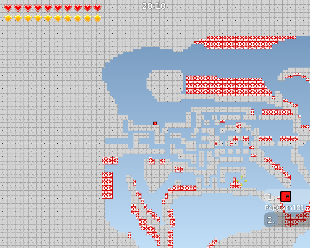
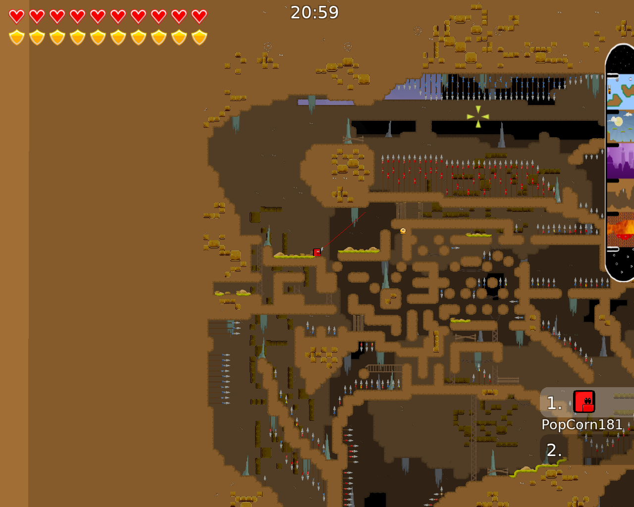
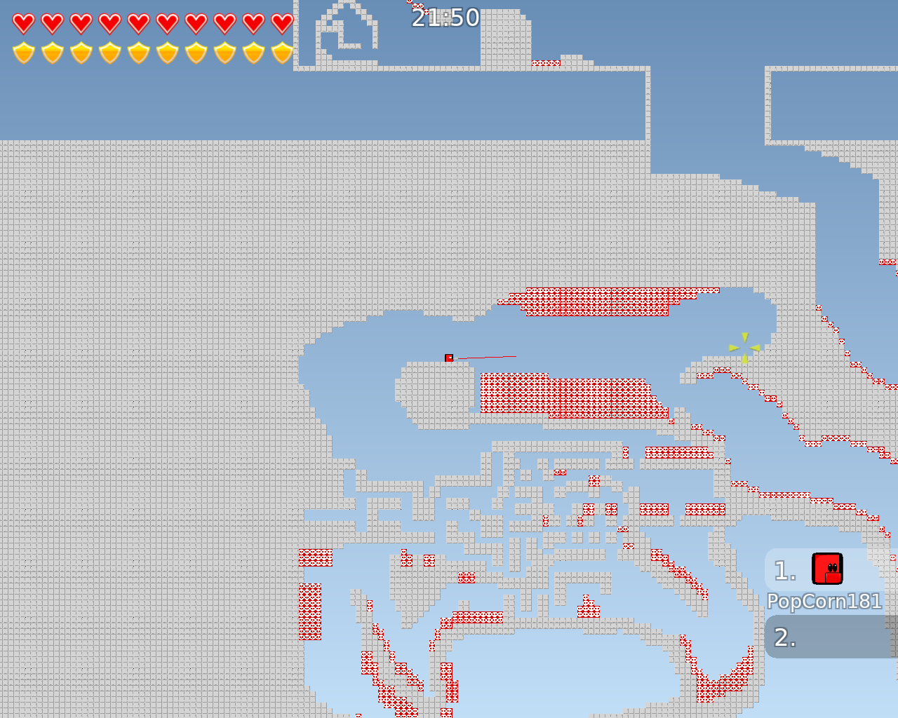
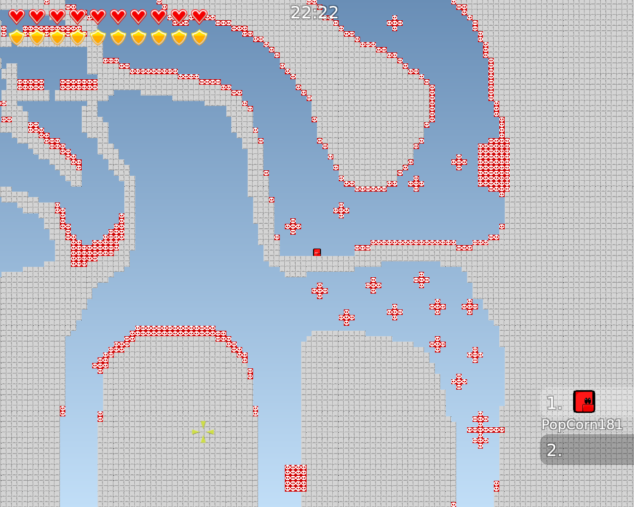
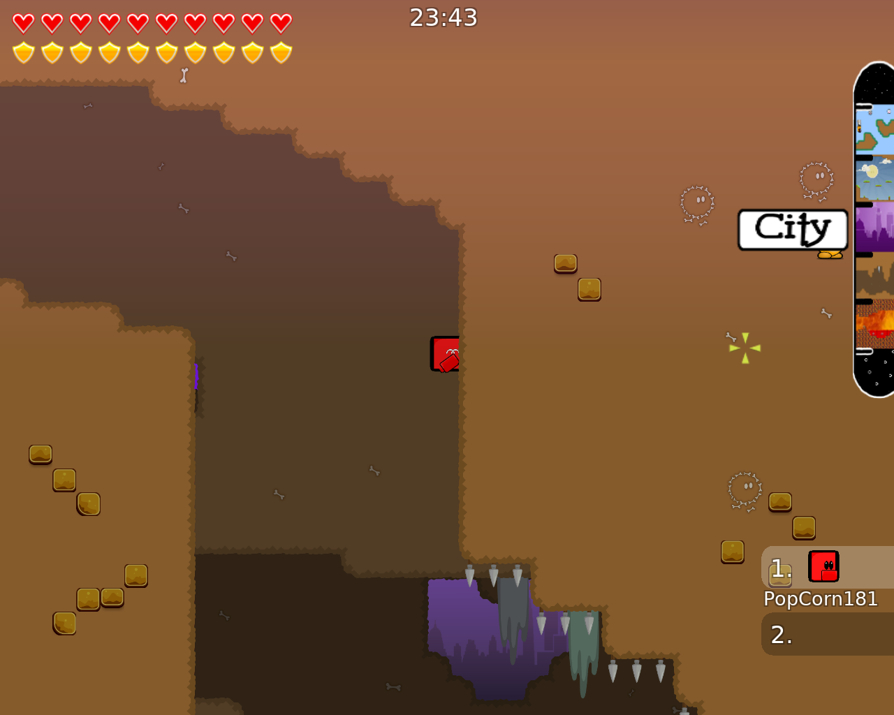
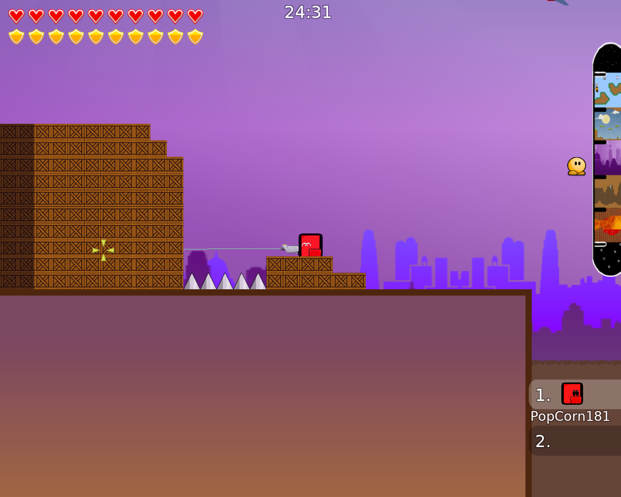
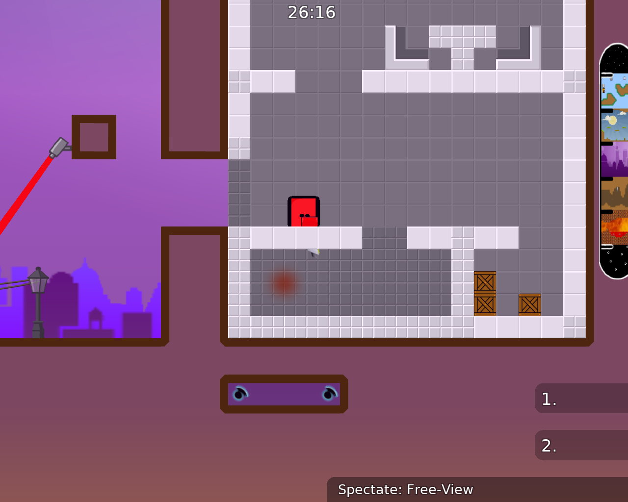
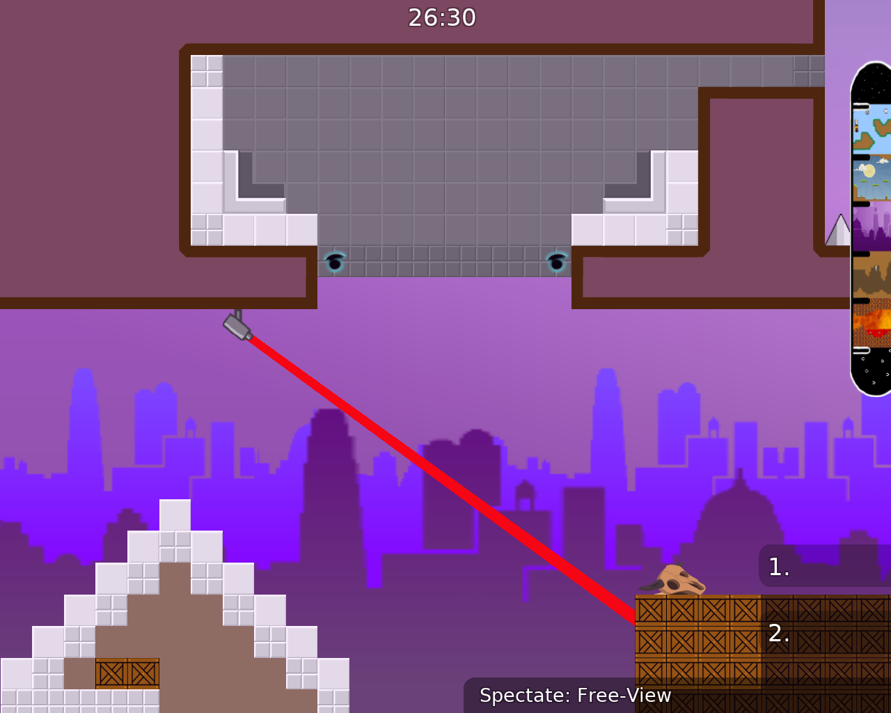
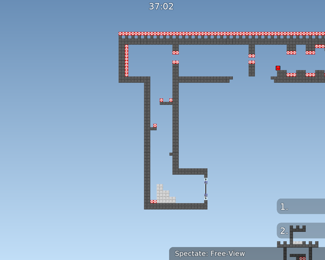
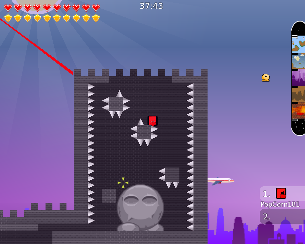
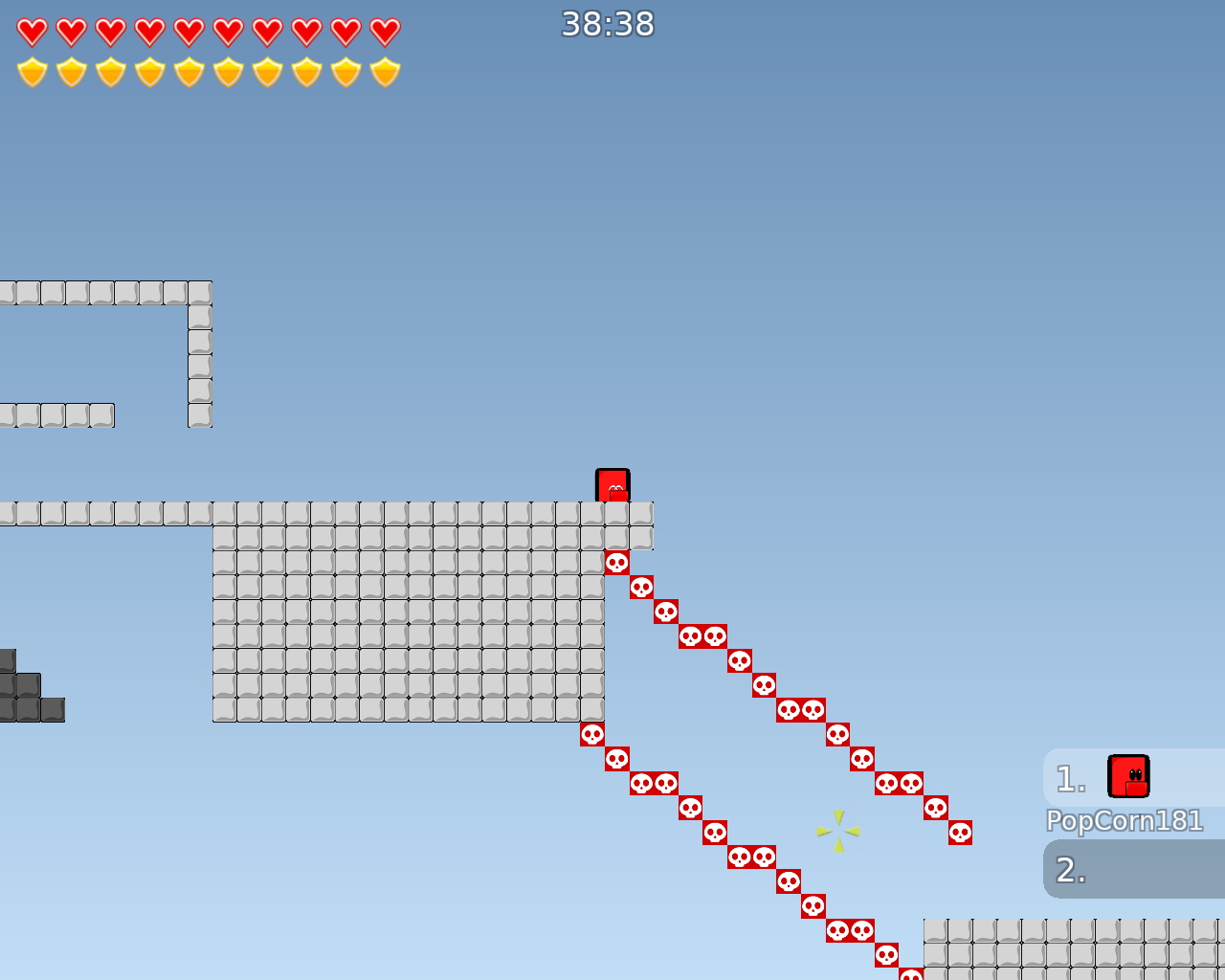
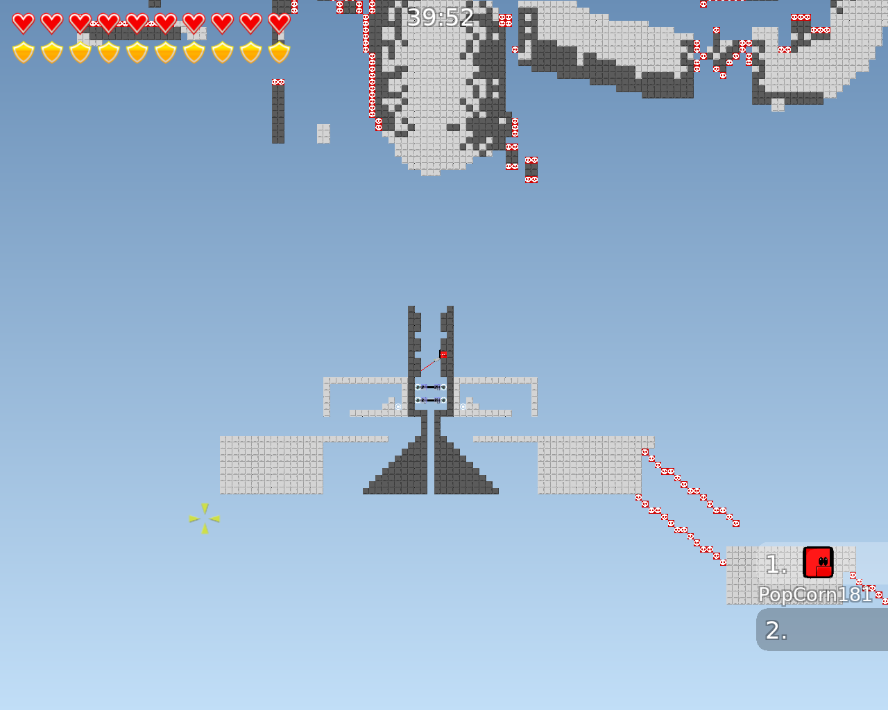
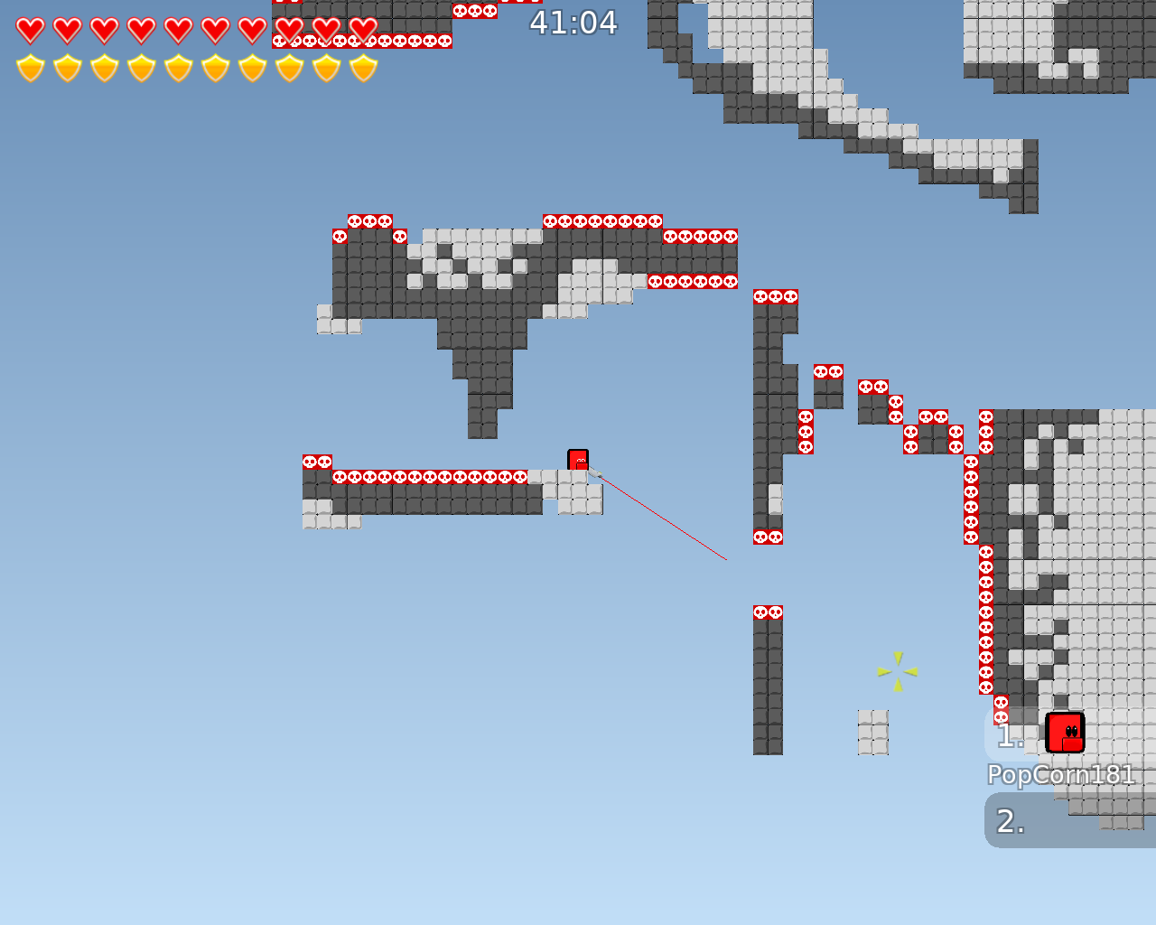
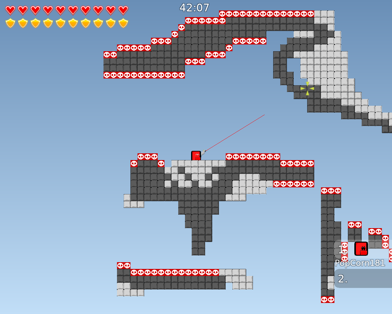
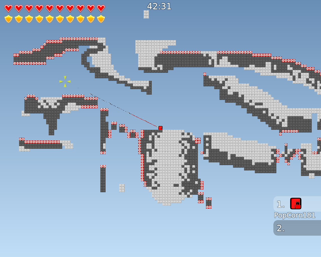
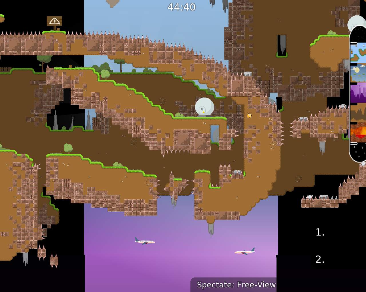
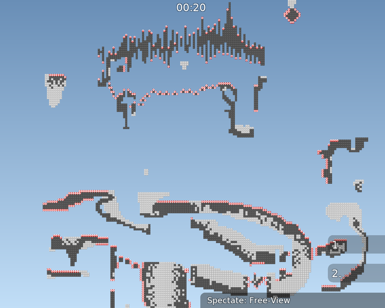
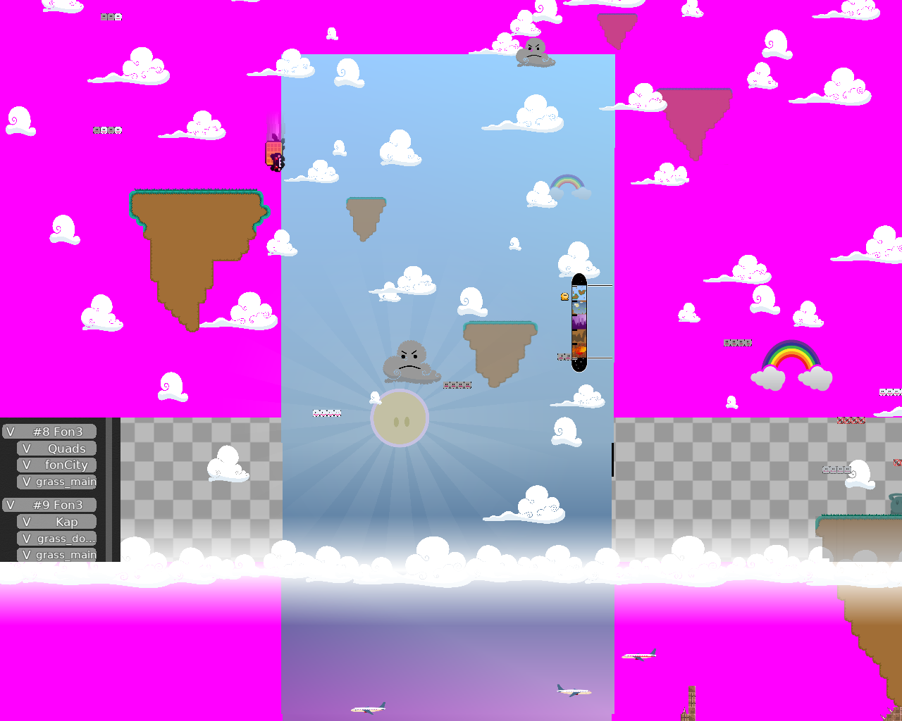
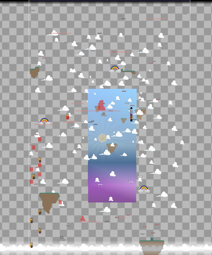
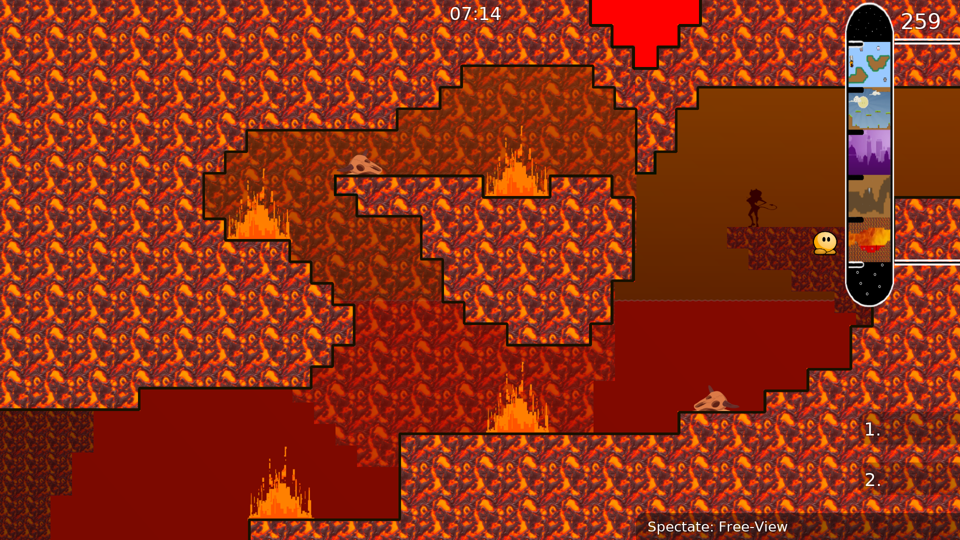
this is your map's testing channel! Post map updates here and remember to follow our mapper rules: https://ddnet.tw/rules
presentation:
Wow
w
t
f
👀
what have you used for creating this map
Looks epic from the screenshots. Not a pipou design but it has soul
quite an artwork map
very fun xDDDDD
ideas are cool but simple . also some parts are hard some to simple . some parts are annoying . design is cool .
upper - harder ig
I tried to fall asleep with this video and came up with an idea https://youtu.be/NDfF_XwNtIw
The map was globally made easier 2 times, maybe I don't understand the complexity of some places.
idea is very cool, design is a little questionable in some places but anyways its cool idea however the gameplay is very underwhelming
i only liked some parts in city / nature place and the rest were just rly plain imo
i dont think its releasable as it is right now since gameplay matters more
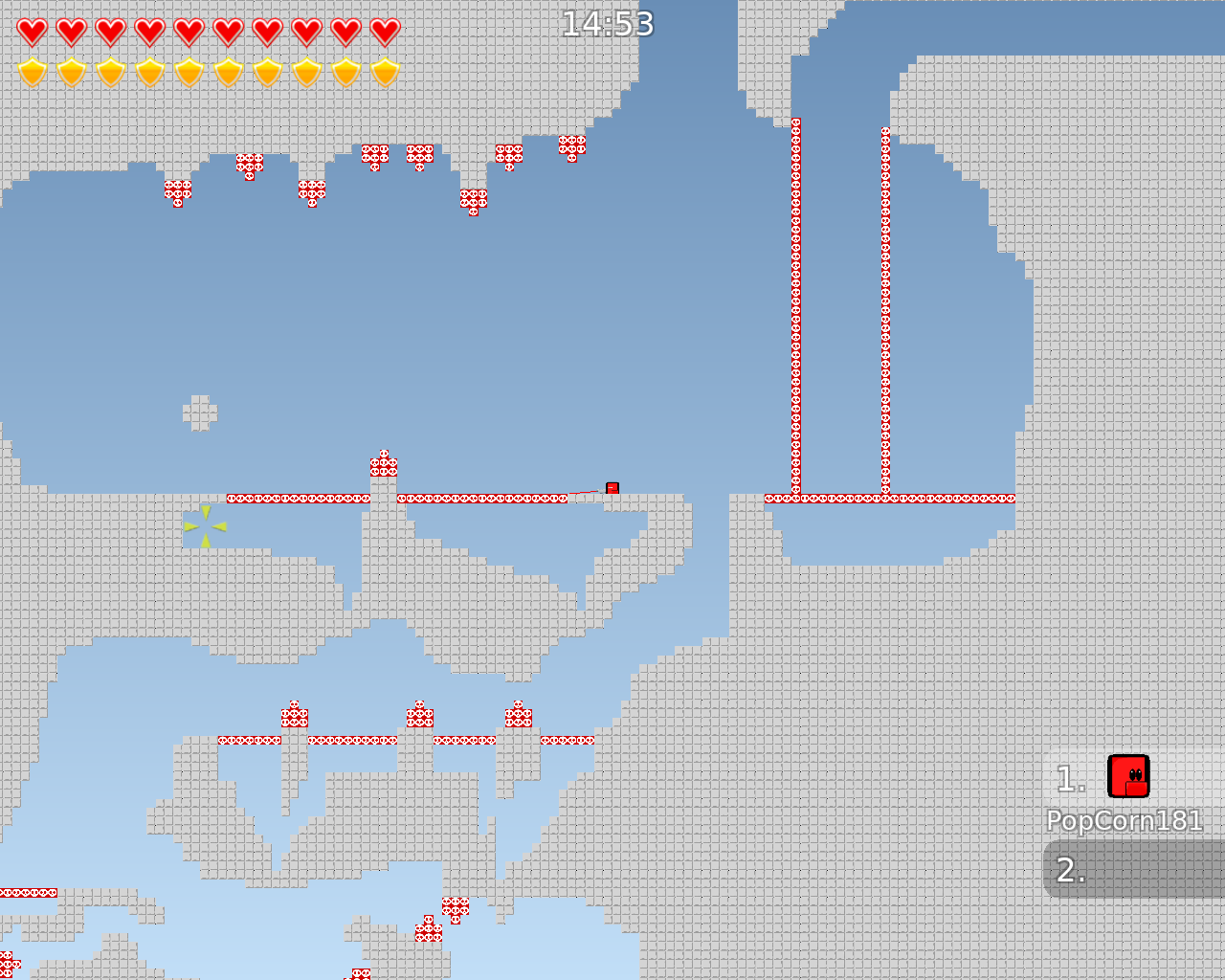
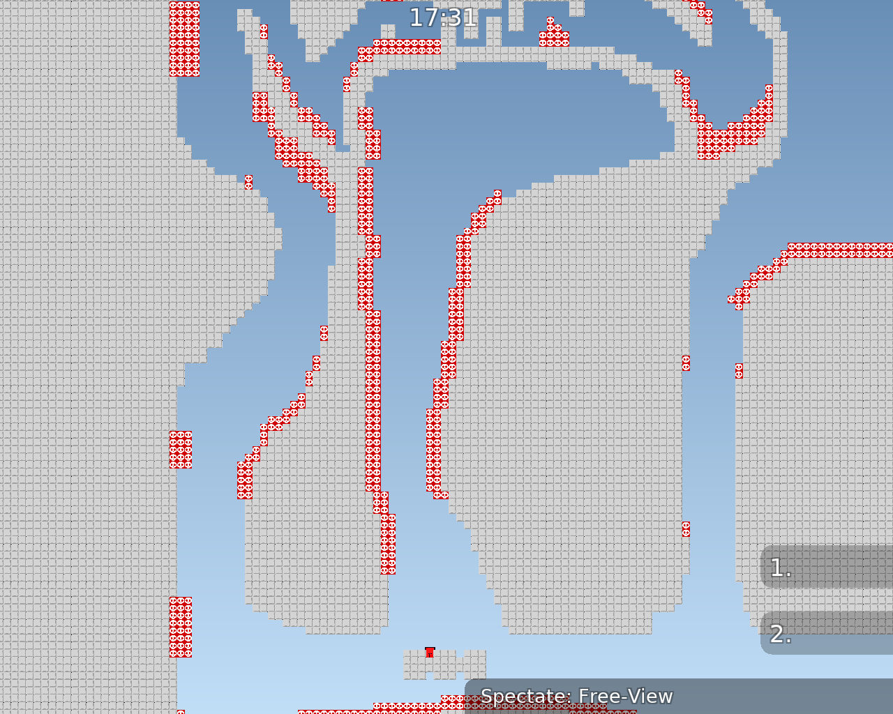
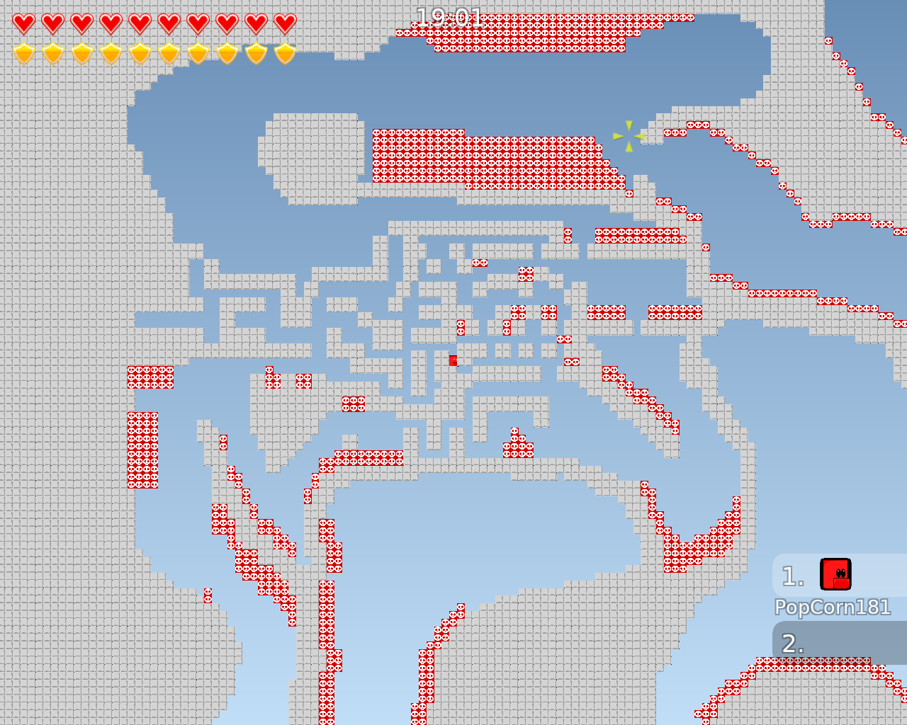
so the parts where its just basically gores but with kill tiles need to be changed imo, and u should have a neater map structure
masterpeice👌🏿
no one has complained about a bug so far, that's a good sign for this map
Louis: am i joke to u?
The thing with this map its a cool concept but the execution is just sub par
the end is skippable (either immediately go to left platform) or swing left, right, left right on last platform to build y speed
but yeah, I think the gameplay could be a bit more creative also the kill tiles are frustrating at first I loved the idea, it was so exploring. very fresh variance to most "technical" maps nowadays. so yes to the map-style, meh to the parts
I think this dude play a lot geometry dash
thats what ive been playing

Oh nonono
If gameplay of whole map is very critical, then this it's a failure again 😦 😦
You can keep the good parts and remove the bad ones, then make other parts accoring to the good ones.
I do not understand where is good, where is bad. And how to make good parts. I need help
Wait for some testers to have a better look, they sure will give u good points ^-^
and on some monitors, the sidebar goes of the screen.
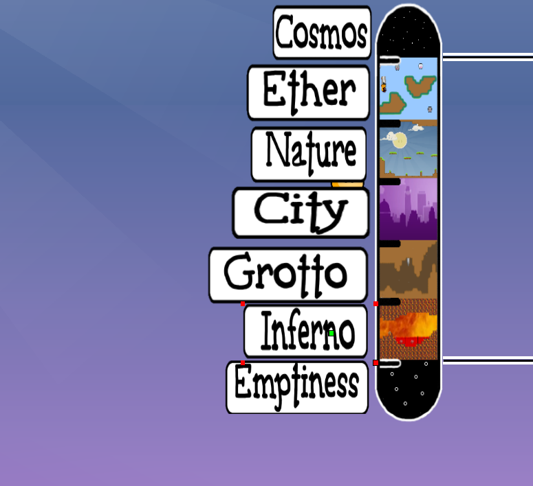
that's all i must say for emptiness
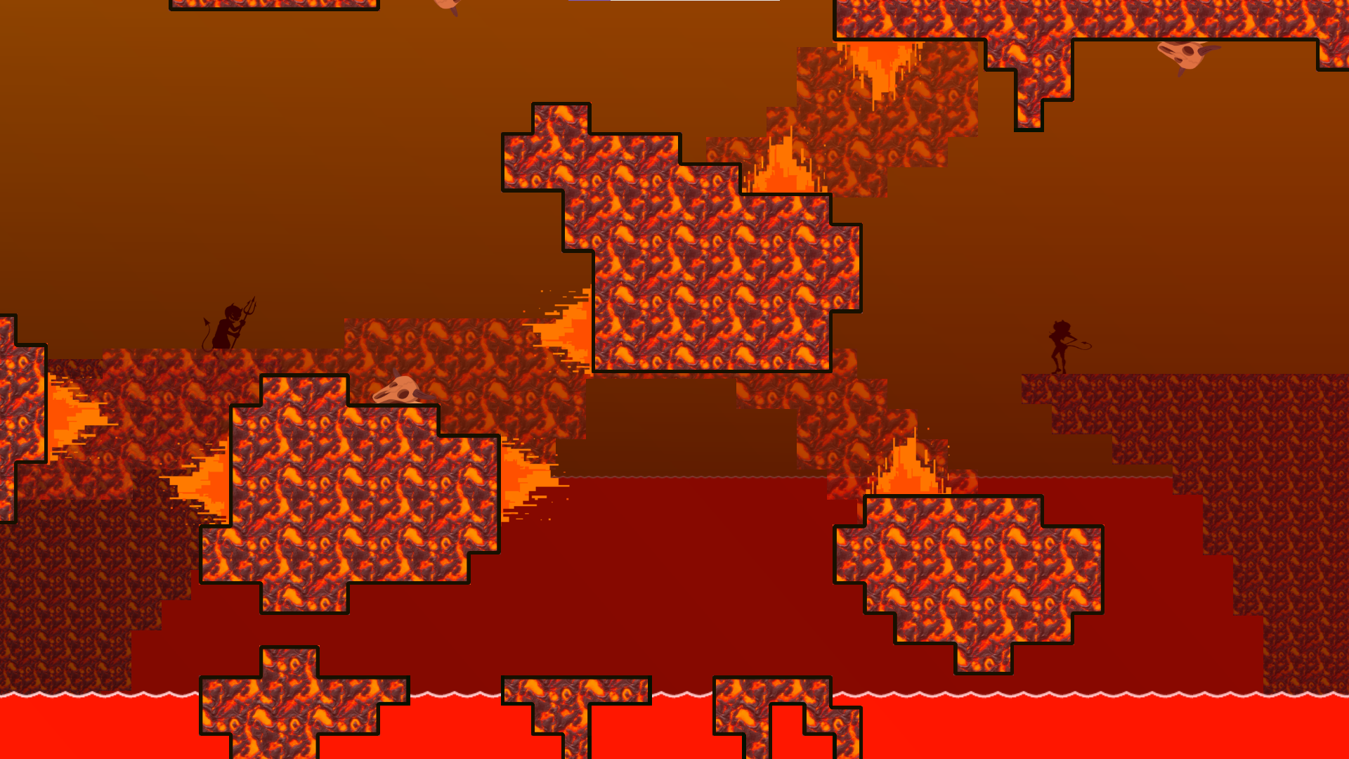
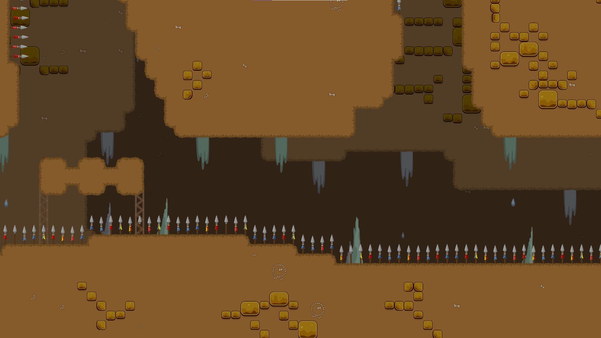
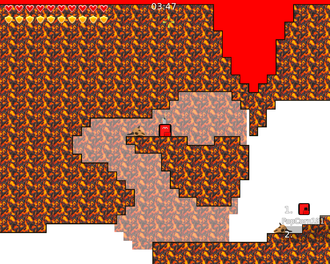
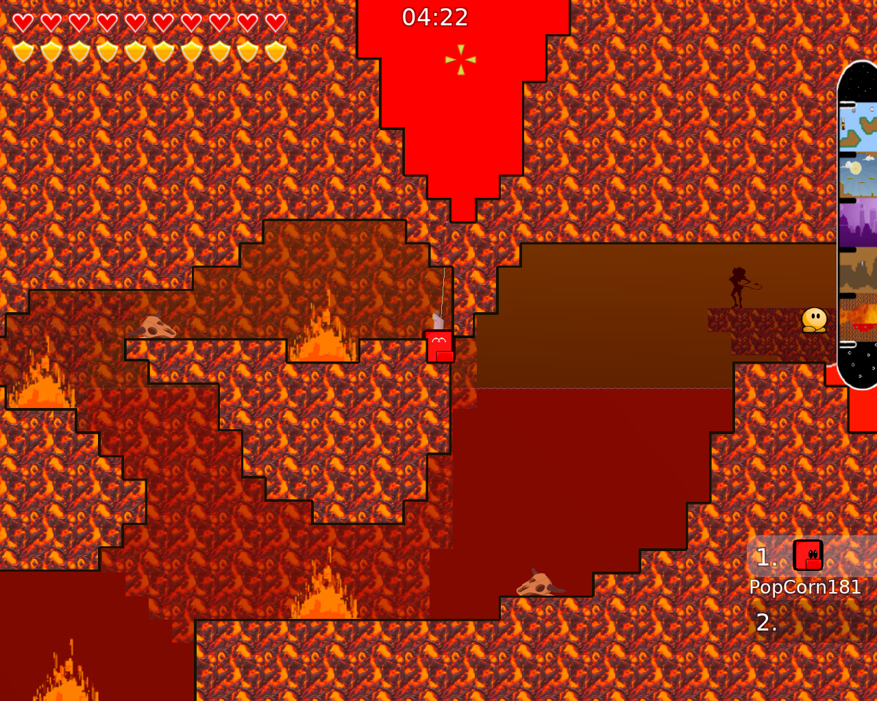
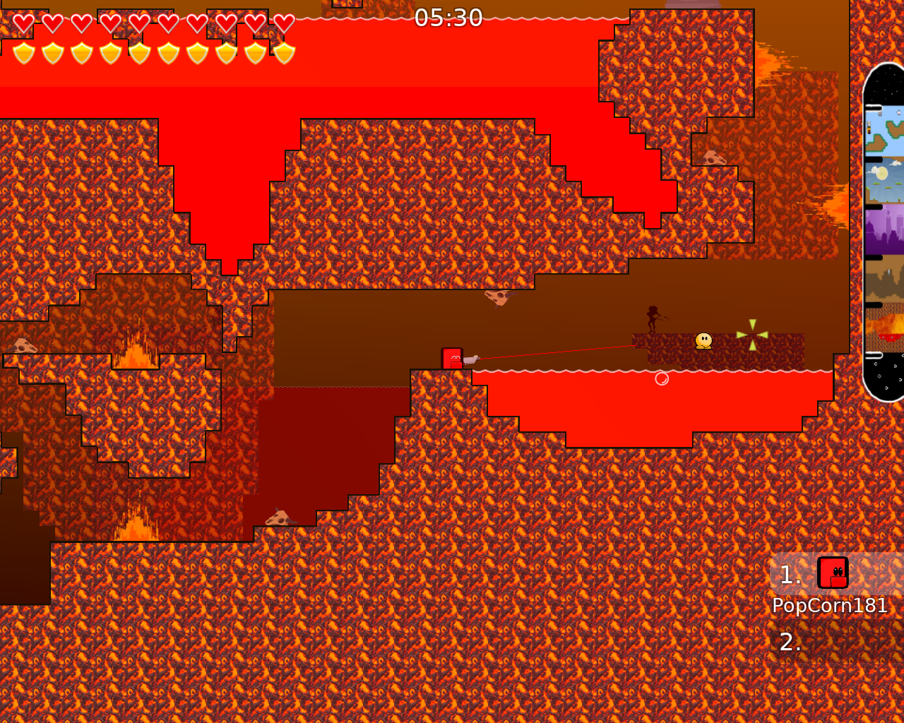
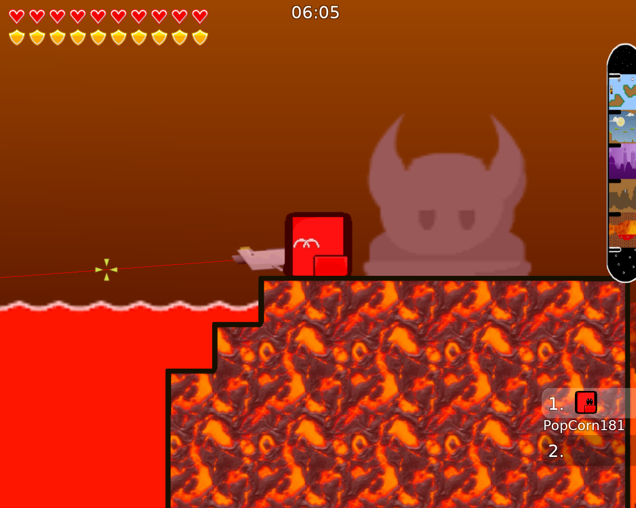
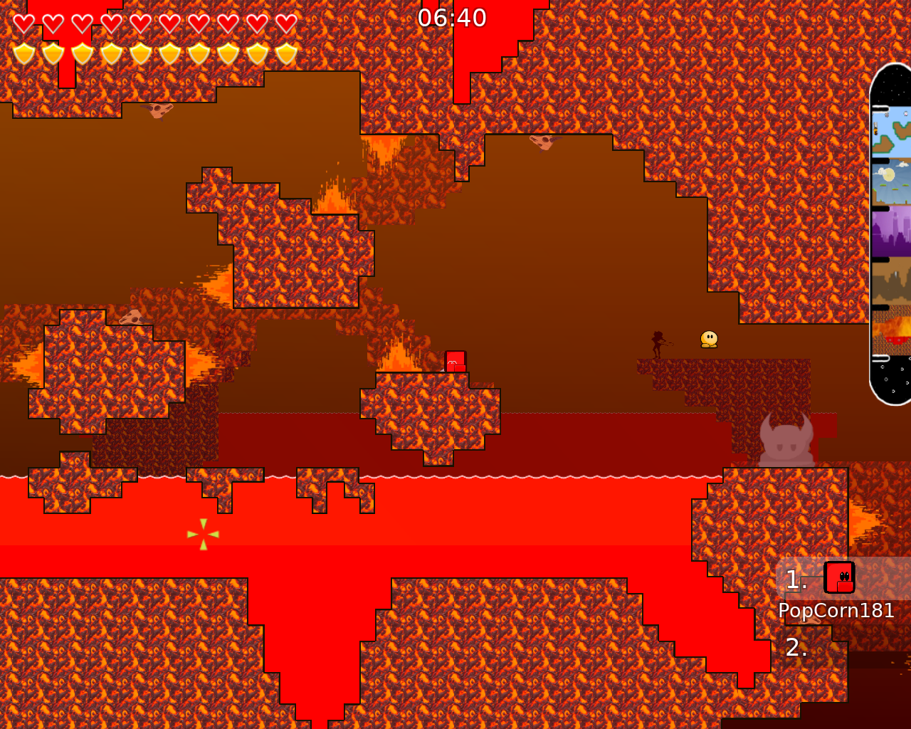
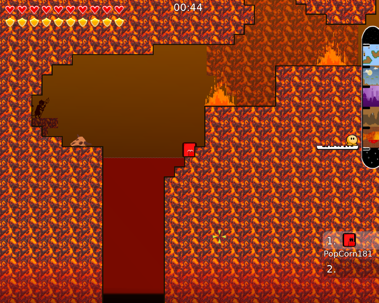
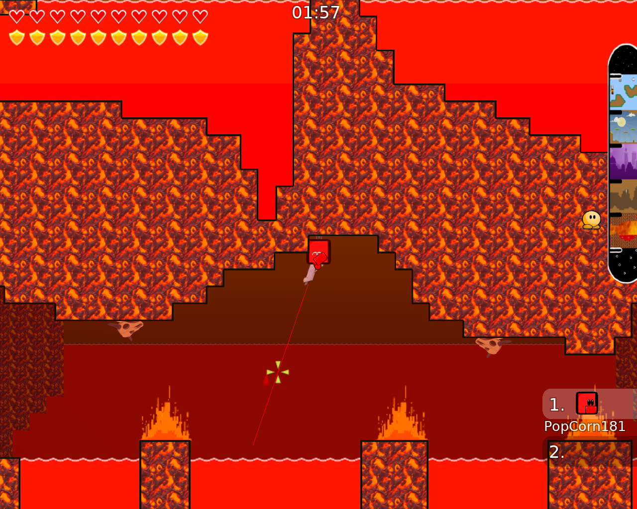
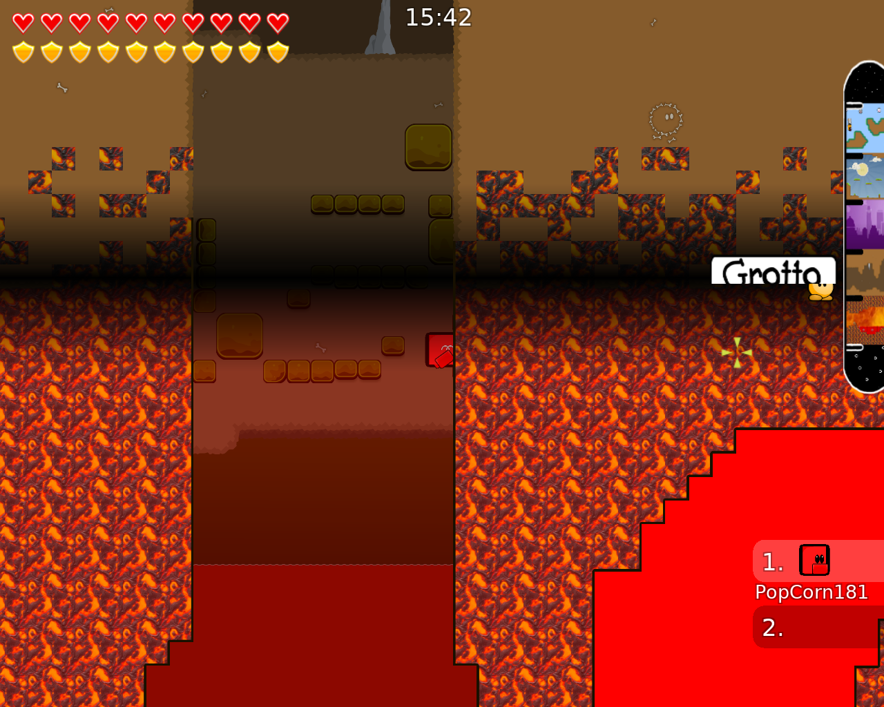
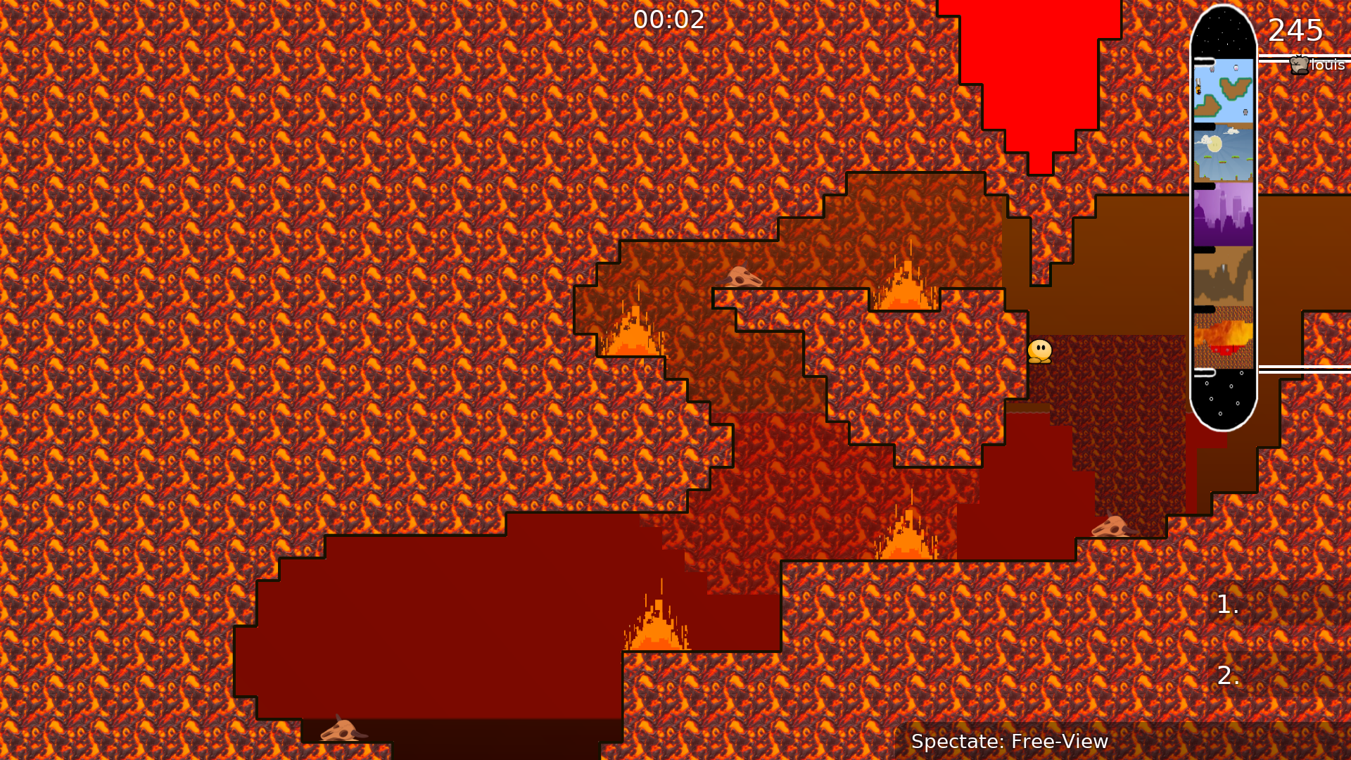
inferno looks cool! the super-meat-boy fire looks great. but i think you should use the shift keys on the envelope some. it looks weird going all at the same frame.
try to make them more dark.
this stupid jump sux
thats enough of inferno
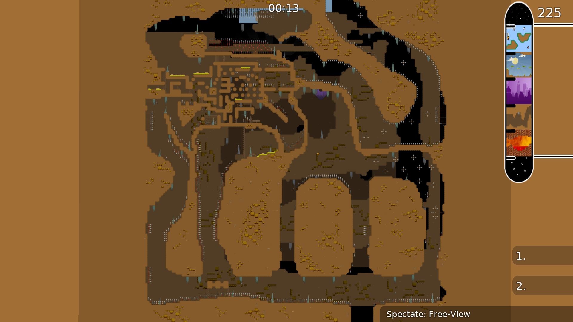
now to grotto
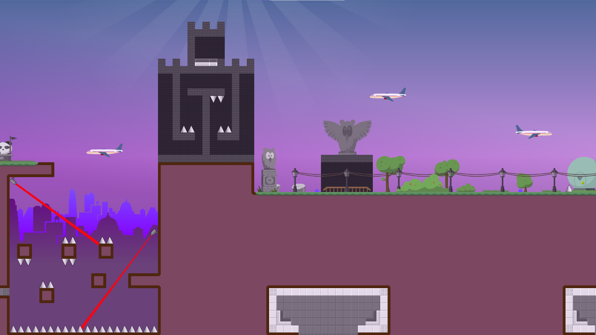
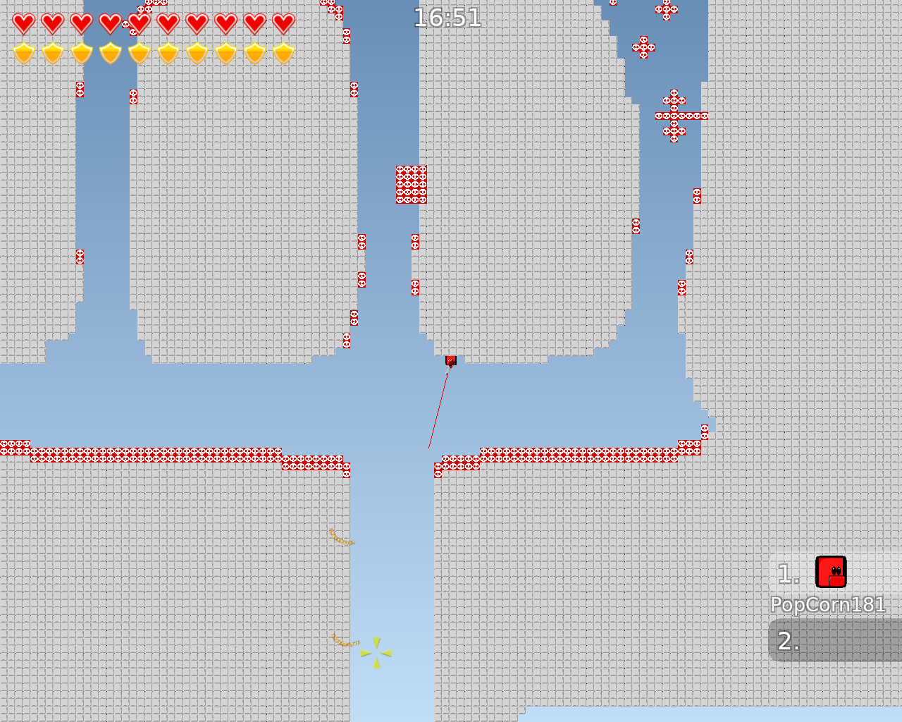
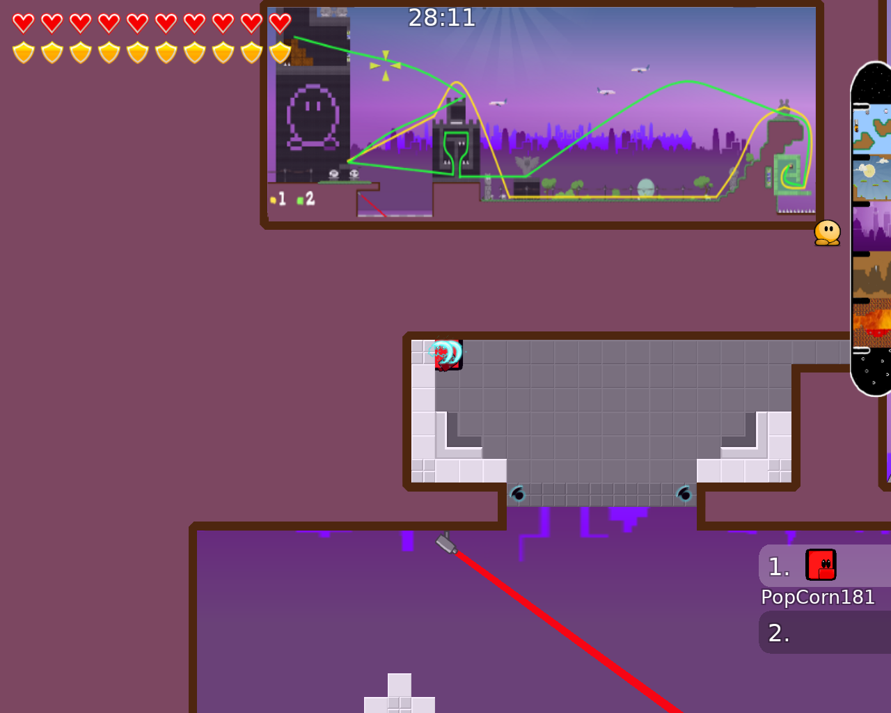
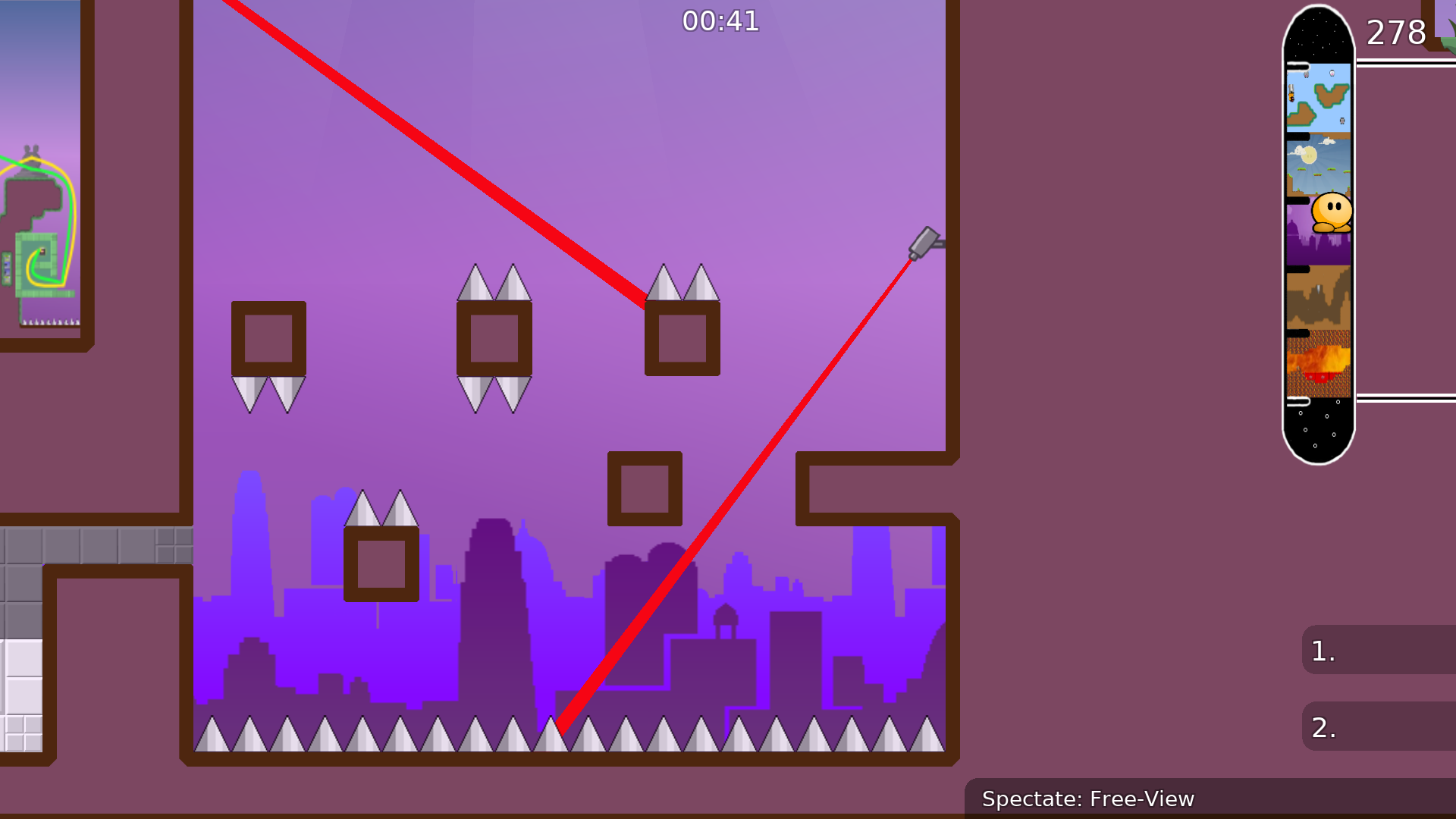
now to the city
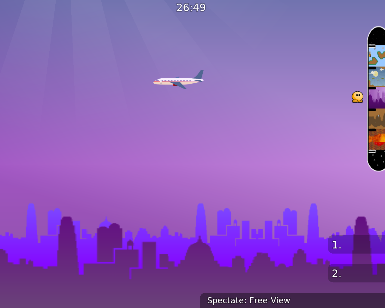
all airplanes are the same, why???????????????
the tee on it kinda looks like the one on my discord profile.
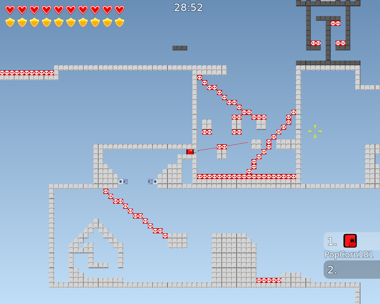
The Gores part is not hard
and last jump skippable
thats now done with the city
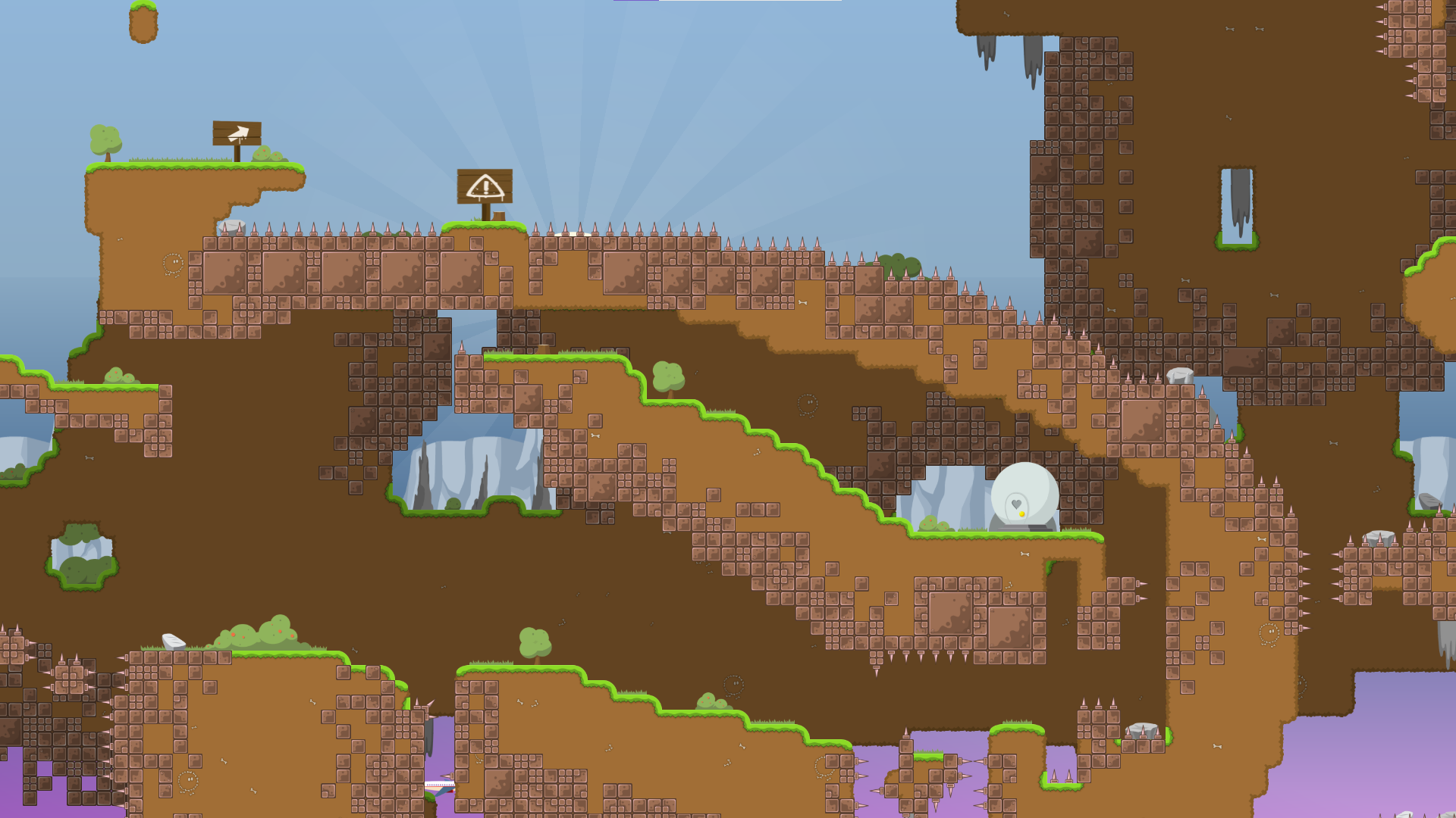
to nature
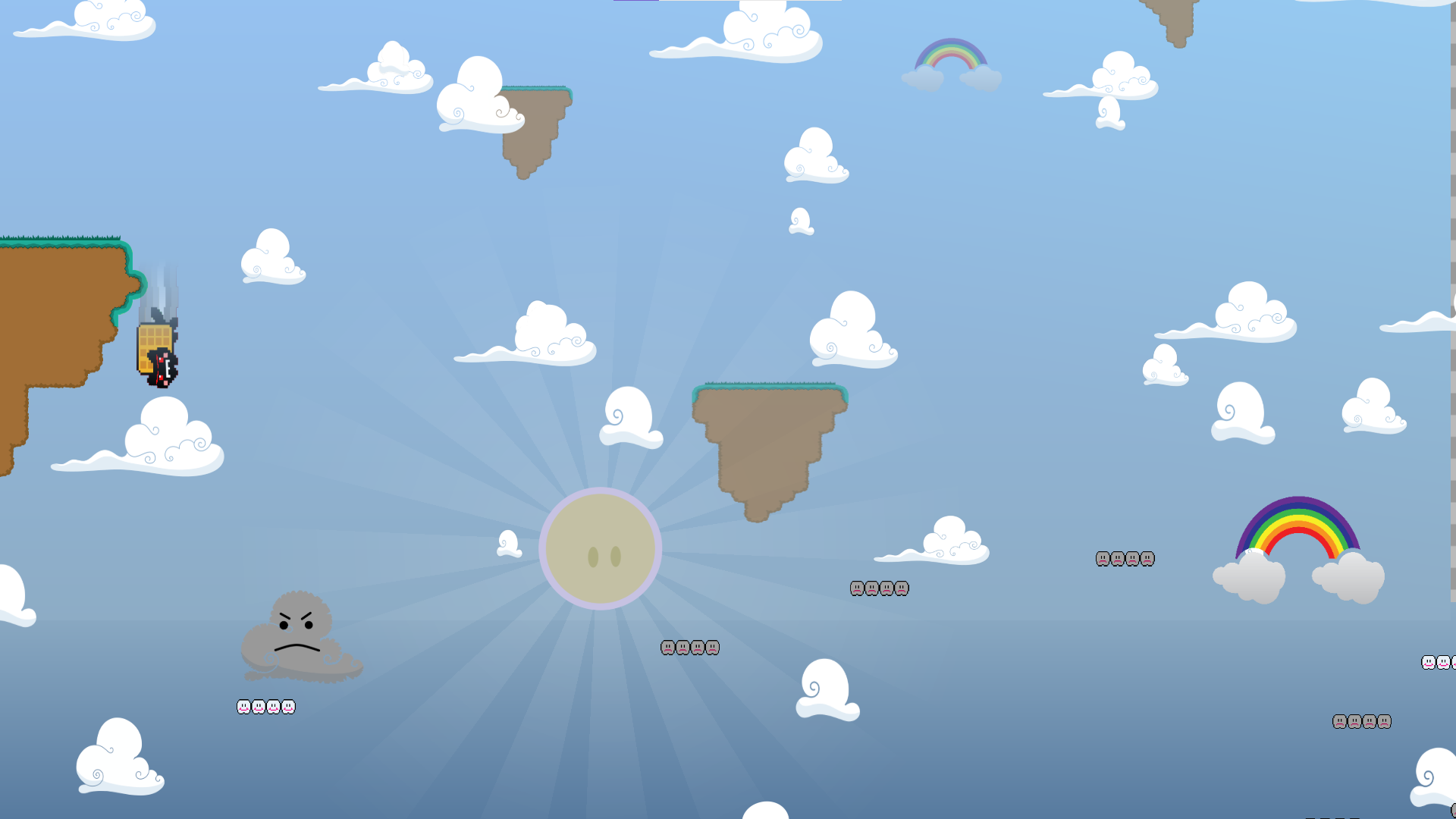
now last part!, i forgot the name
cosmos i think
its your generic solo
anyways my job here is done :D
thats all of my feedback
wait no its ether im dum
read that :]
Lmao
I care about your memory
↑
imo idk if the gameplay is good enough for solo rls. the concept is cool but the design's quality could be improved. it's really high effort, but meh color choice / contrast setting / tilesets
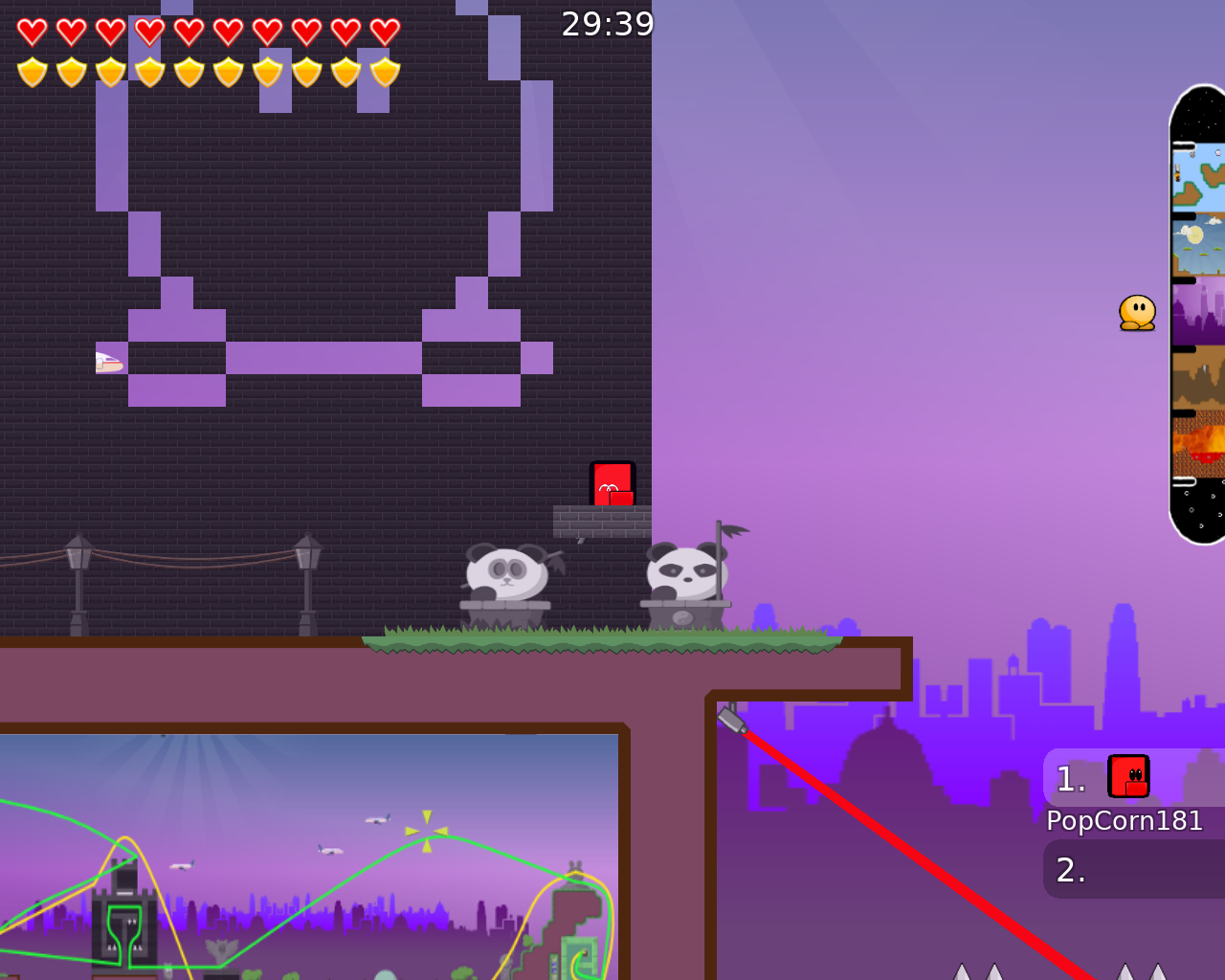
the design is just un-tee-ish in some areas
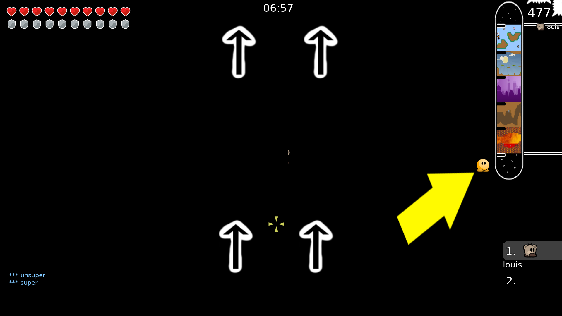
the arrows here (white and yellow) just look a little messy and the white ones aren't needed imo
un-teeish design example here, it doesn't fit tw art style

anyways, this map would need a lot of gameplay fixes and some tidying up of the design to be released on solo.
i'd be fine with a release on fun server tho, it's a good concept
but if you're looking to release as a solo map u will need to do many fixes
make yellow arrow smaller and pointing completely "right" next to the tee. And for the white arrows make it animated with alpha like fading moving upwards with you, that can be cool. If not yh as louis said, you can remove them
i dont think this map is releasable, simple and standard parts - nothing special here
Me talking about smash
🧐
So
@louis, u wanna fix it or put it on fun server
ask mapper
@BRONOOBwe can either release on fun as it is (with a few minor fixes maybe) or you can rework most of the gameplay if you want it to be on solo
According to my idea, this is an adventure map, where there is not a lot of variety in the gameplay. (after all I have problems with gameplay in maps). Therefore, the option with Fun is more like it. I did not think that with such a specificity the maps could be released there.
sounds good
$change server fun
rls
maybe post ur older "adventure maps" too they could be released on fun server if they're decent enough
A good idea
up
we discussed it and have decided to not release your fun maps. The maps are creative but their quality is not on par with modern map releases. If we release all of them we would spam the fun server with quite oldschool maps. It would be shame to lose all this amazing creativity and they really present an interesting form of gameplay, so here’s my suggestion: You take all these ideas and somewhat modernize the parts and put them all in one compilation map “Adventure_Compilation.map”. Than it would be easier to handle and improve on instead of 6 individual maps. If you want to do that, that’s a lot of work especially modernising, but I kind of hope you do it. If you need help really feel welcome to ask the community, mappers or us testers to help you while making the map. There are surely many that are already impressed by your maps and would gladly help, I certainly am. I hope you can understand the decision
@BRONOOB. Good luck to you.

$decline
mmmmmmmonster kill
u declined alot of love today


удачи бронуб :(
может их и в правду в олдскул закинуть?
По этому я и не люблю дднет. Эти карты 2015-2017 в основном, это далеко не олдскул.
15 год, шесть лет прошло
If you have a real oldschool map that was demonstrably online, then a release is no problem. But I don't think these maps were ever online. I've been playing for 13 years and have never seen these maps (all the maps you uploaded).
It's was i think on website somewhere qnd also remember i played love map was annoyed by playing so i never tryed to beat it
I don't think 14-16 is old school And so the Love card hosting on WALL - E servers
what 14-16
year 14-16
probably 2014 to 2016
all those bronoob maps were online, i played them, trust me
playing them is one thing and being good designed is another thing (specially in an "adventure map". We are in 2021, tw is evolving slowly thats why we need new "good" designs.
If you not want - not want
Begin - bad for solo server Now - design old

