#Futer
"Futer" by weaamm1332 [Moderate]
DDNet 02/09/2024 7:45 AM
@weaamm1332

this is your map's testing channel! Post map updates here and remember to follow our mapper rules: https://ddnet.org/rules

DDNet 02/09/2024 7:45 AM
ohn0_ 02/09/2024 8:07 AM

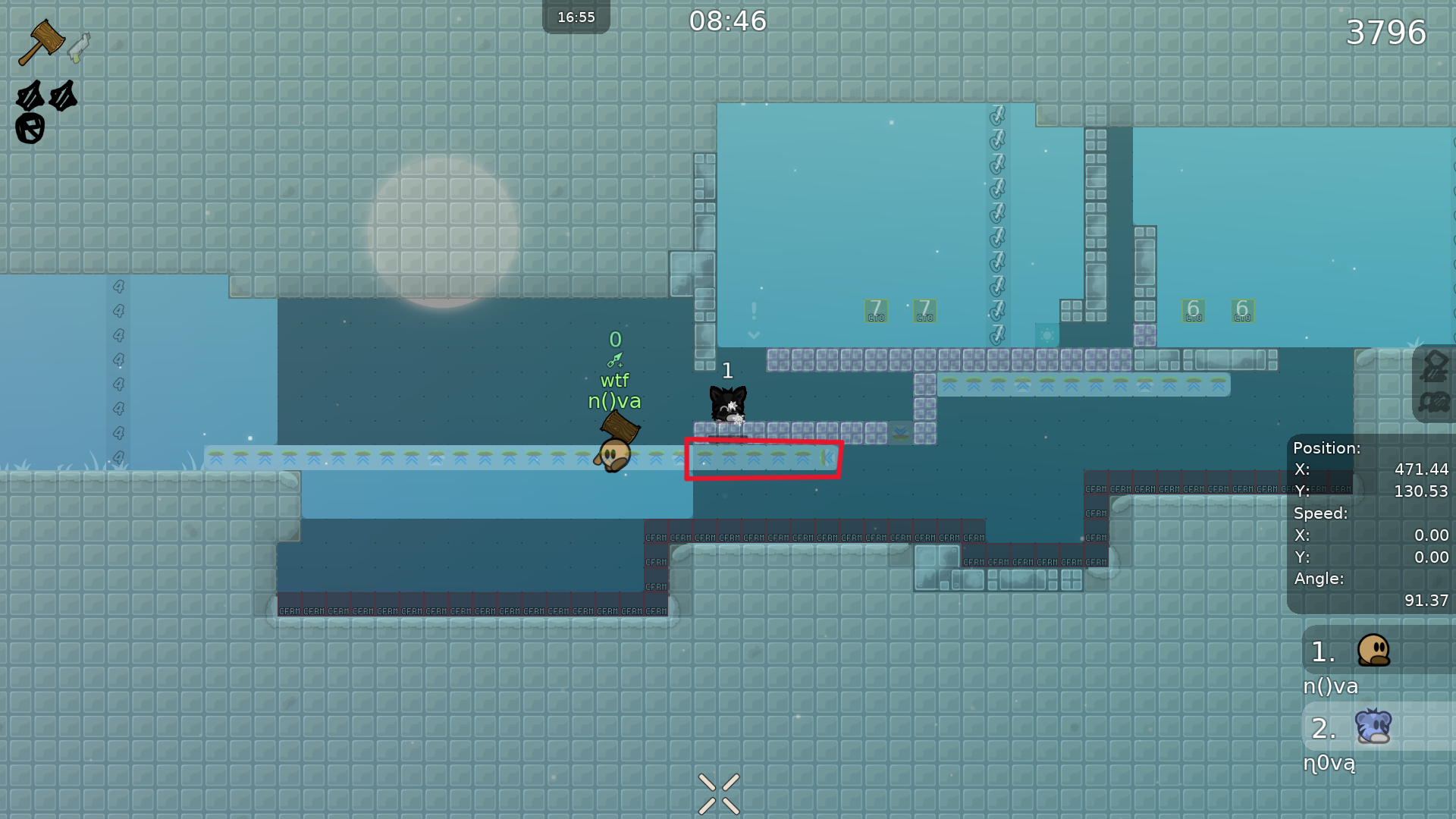
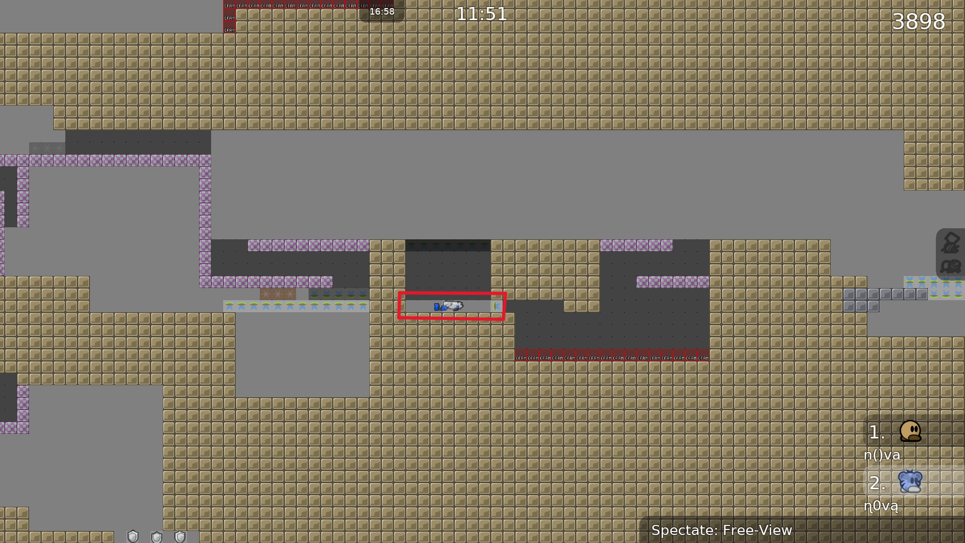
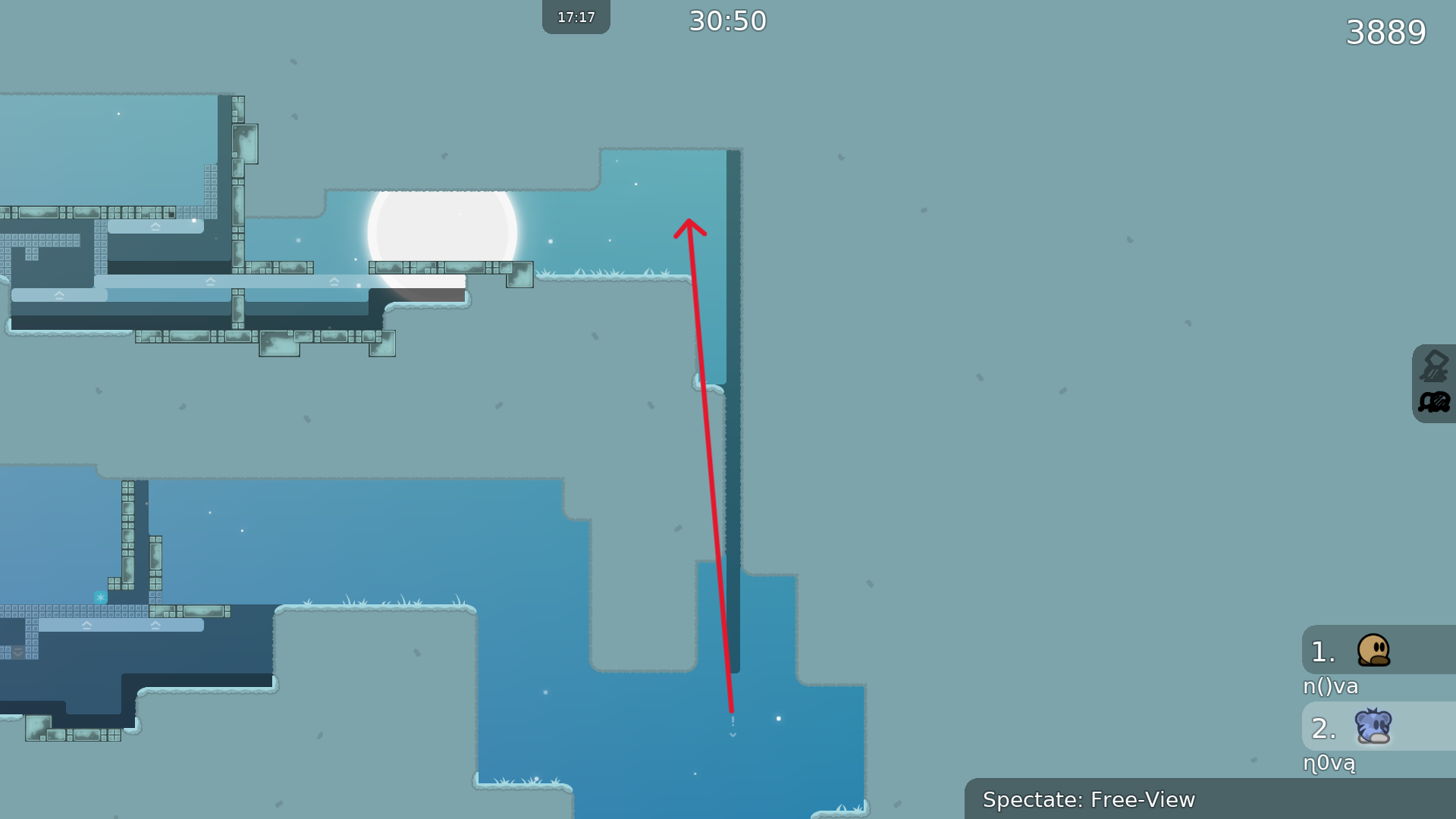
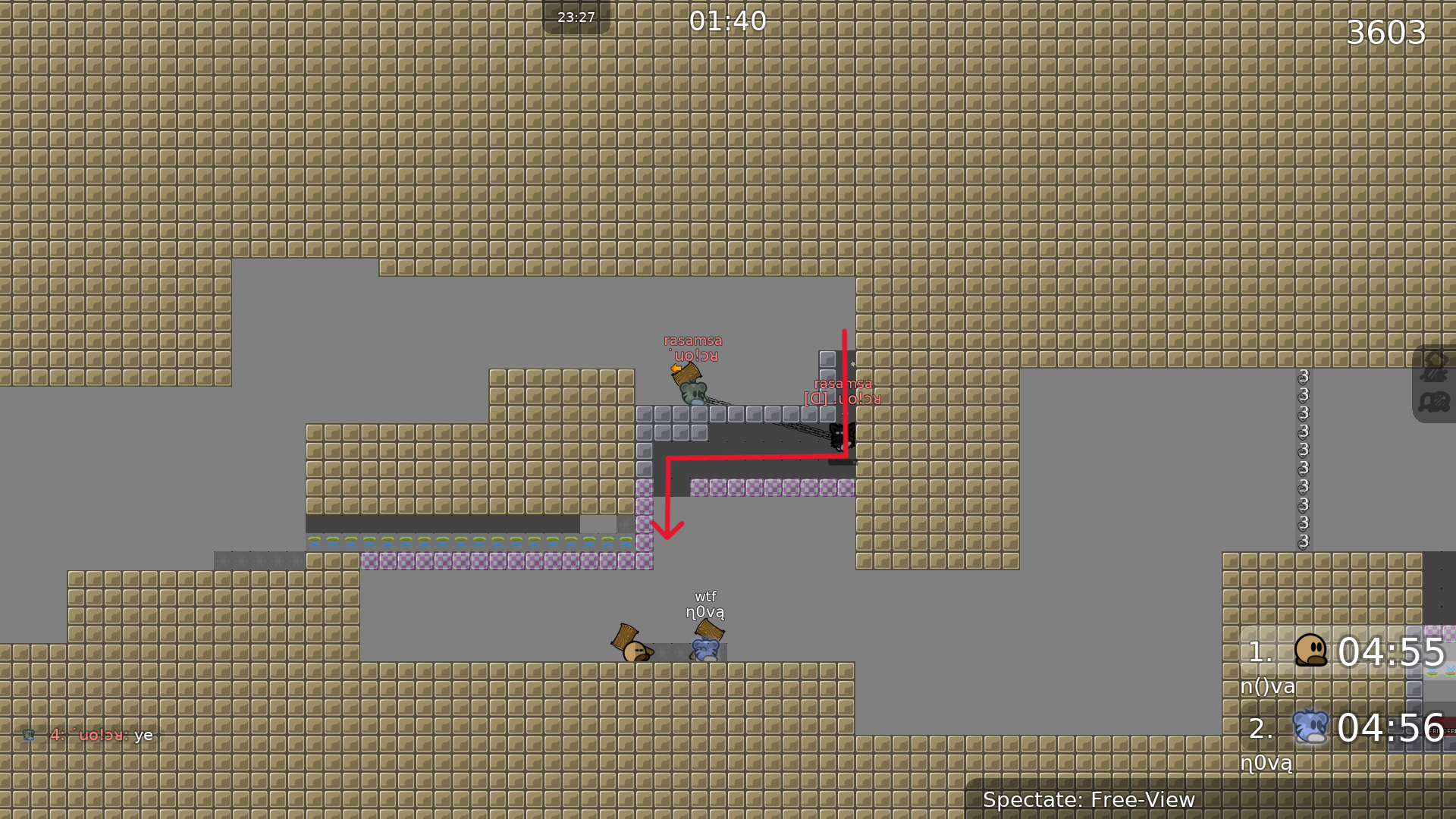
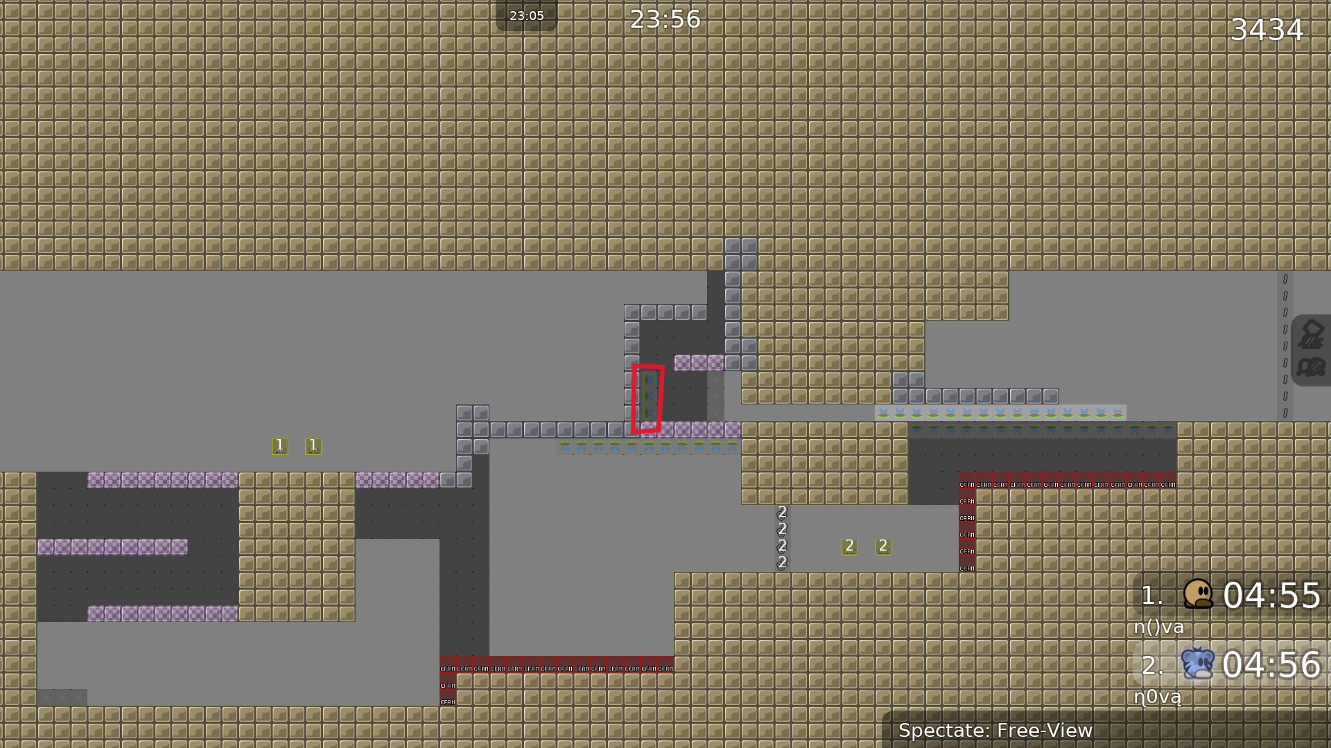
unmarked unfreeze

ohn0_ 02/09/2024 8:10 AM

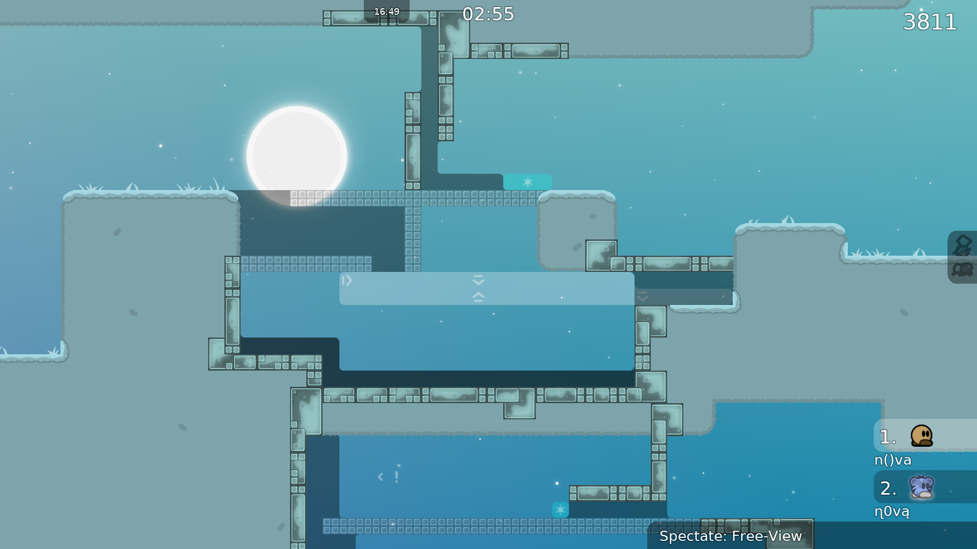
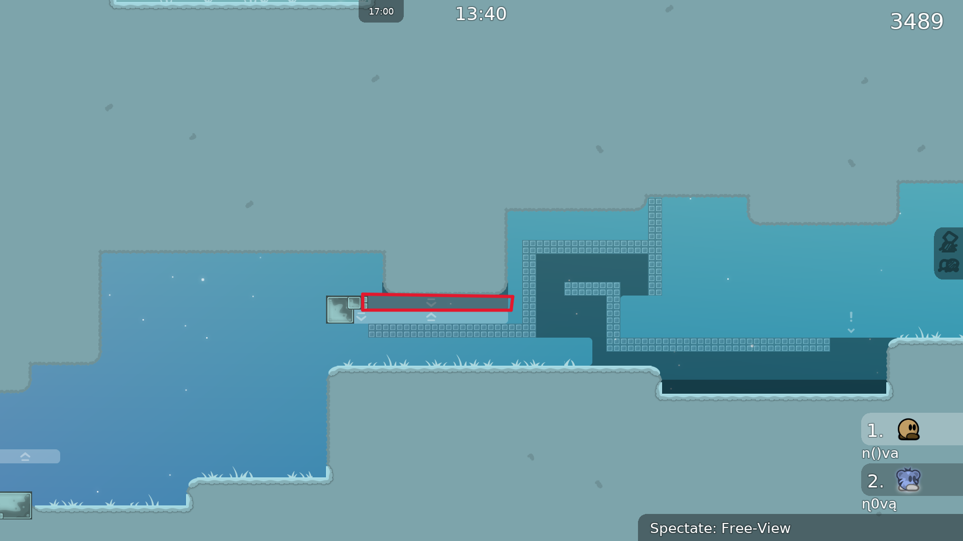
There are no stopper boundaries

ohn0_ 02/09/2024 8:11 AM

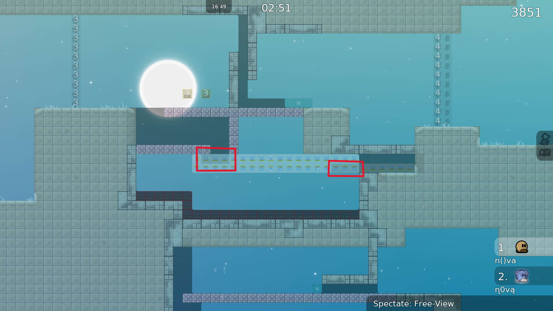
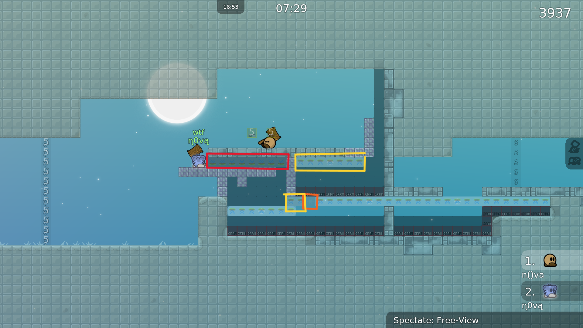
red: delete useless stopper orange: put a stopper yellow: unmarked unfreeze

ohn0_ 02/09/2024 8:11 AM

change to unhookable

ohn0_ 02/09/2024 8:12 AM

unmarked unfreeze

ohn0_ 02/09/2024 8:12 AM

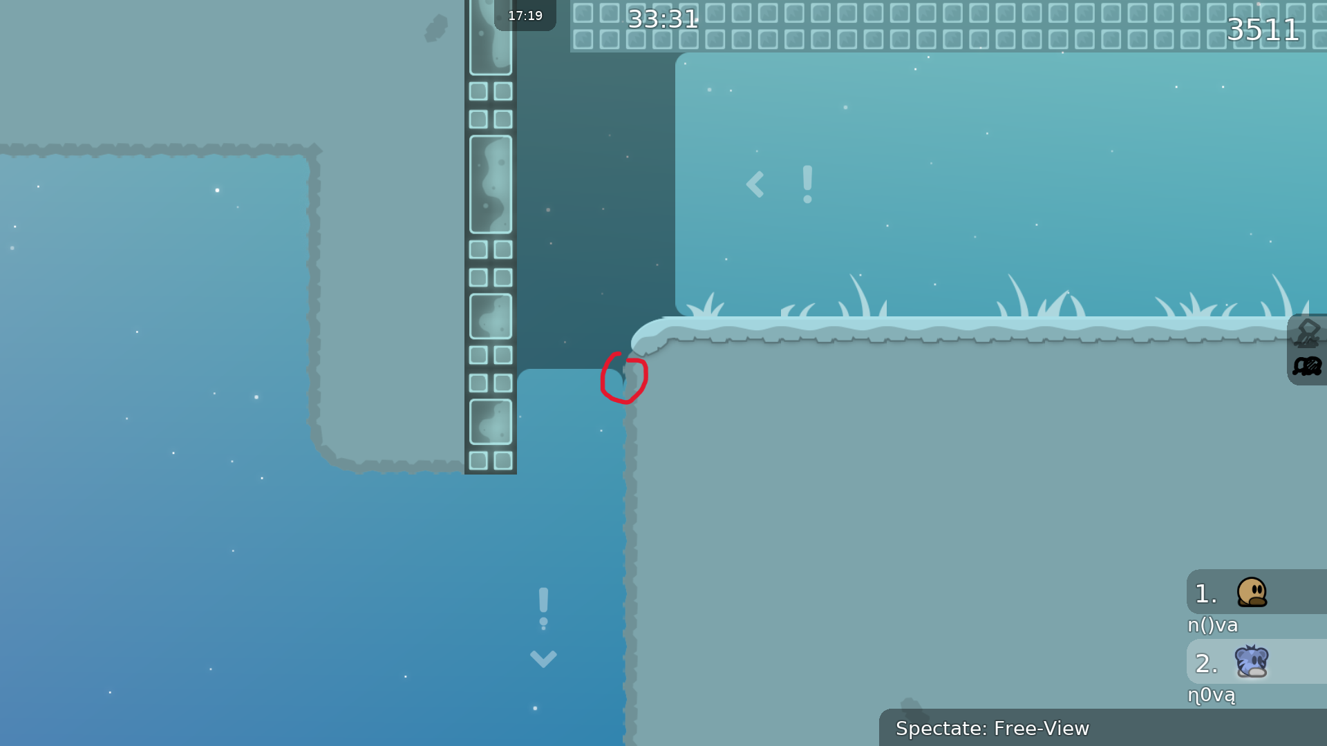
useless stopper

ohn0_ 02/09/2024 8:12 AM

delete this warn sign

ohn0_ 02/09/2024 8:12 AM

put unfreeze

ohn0_ 02/09/2024 8:12 AM

useless stopper again

ohn0_ 02/09/2024 8:13 AM

pointless warn sign, just delete it

ohn0_ 02/09/2024 8:16 AM

seems stopper is the main concept, but you need to change some stoppers to unhookable or something normal block. also map is really confusing because of overusing stoppers.

ohn0_ 02/09/2024 8:18 AM

delete warn signs

ohn0_ 02/09/2024 8:19 AM

move the warn sign here

ohn0_ 02/09/2024 8:23 AM

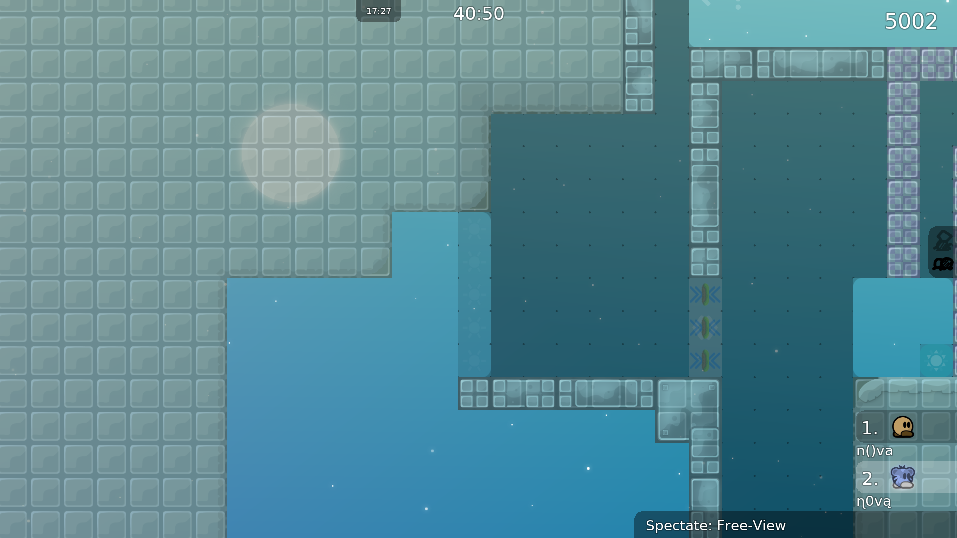
you are using 2 different corners if the stoppers are with grass

warlytoz 02/09/2024 8:24 AM

$waiting

ohn0_ 02/09/2024 8:25 AM

missed freeze corners

ohn0_ 02/09/2024 8:26 AM

missing corner

ohn0_ 02/09/2024 8:26 AM

grass is bugged

ohn0_ 02/09/2024 8:26 AM

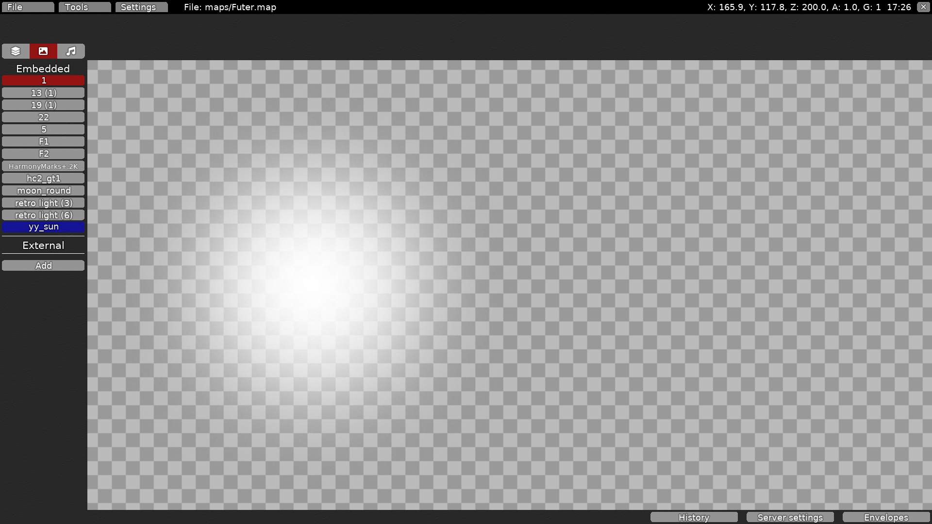
delete unused image

ohn0_ 02/09/2024 8:27 AM
ohn0_ 02/09/2024 8:28 AM

choose mark or unmark all ground unfreeze

ohn0_ 02/09/2024 8:29 AM

XD

ohn0_ 02/09/2024 8:30 AM
warlytoz 02/09/2024 8:30 AM

According to the screenshots provided by nova, there is no standardization in the way the map's corners are handled.

warlytoz 02/09/2024 8:33 AM

Try a different color scheme. It's exactly the same as NightDay.

warlytoz 02/09/2024 8:36 AM

The whole map has too many stoppers, it looks like every part is very confusing, there are a lot of unnecessary stoppers can be replaced by unhk

warlytoz 02/09/2024 8:40 AM

Logo is badly pixelated (insufficient resolution)

warlytoz 02/09/2024 8:41 AM
warlytoz 02/09/2024 8:43 AM

Recheck the grass above the meadow. The whole map has the same problem.

warlytoz 02/09/2024 8:47 AM

change to

weaamm1332 02/09/2024 12:14 PM
ohn0_ 02/09/2024 1:53 PM
ohn0_ 02/09/2024 2:51 PM

entity bug

ohn0_ 02/09/2024 2:51 PM

skip

ohn0_ 02/09/2024 2:51 PM
ohn0_ 02/09/2024 2:53 PM

this part is so monotonous and not that interesting, especially this stopper

ohn0_ 02/09/2024 2:58 PM

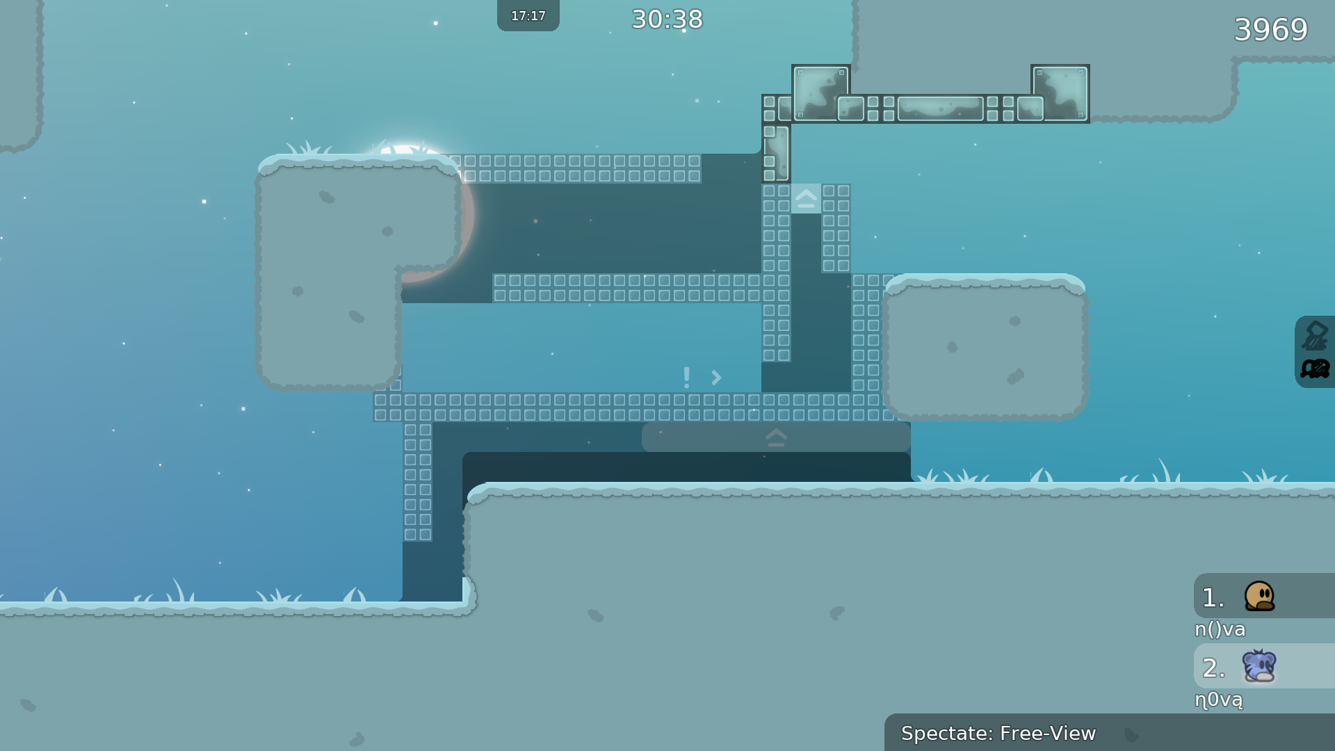
this part is kinda messy. too hard to get how to do, and it is so confusing because you overused the stopper. also, there are many stoppers but the boundaries between them are not clear. did you know these stoppers aiming up or down?

ohn0_ 02/09/2024 2:59 PM

this part is like DDmaX. not creative, and also not interesting.

ohn0_ 02/09/2024 3:00 PM

this part is messy too because of stopper. I could make the below part with less stopper.

ohn0_ 02/09/2024 3:01 PM

this part seems like DDmaX again

ohn0_ 02/09/2024 3:05 PM

every part is so narrow that I felt like this map is DDmaX. also, some part has no flow. there are some nice ideas but you didnt use the idea cleanly.

ohn0_ 02/09/2024 3:06 PM

reduce more unnecessary stoppers until the map is not confusing.

ohn0_ 02/09/2024 3:09 PM

unmarked unfreeze (can delete it too)

ohn0_ 02/09/2024 3:10 PM

unmarked unfreeze

ohn0_ 02/09/2024 3:13 PM

weird corner

ohn0_ 02/09/2024 3:13 PM

unnecessary stopper

ohn0_ 02/09/2024 3:14 PM

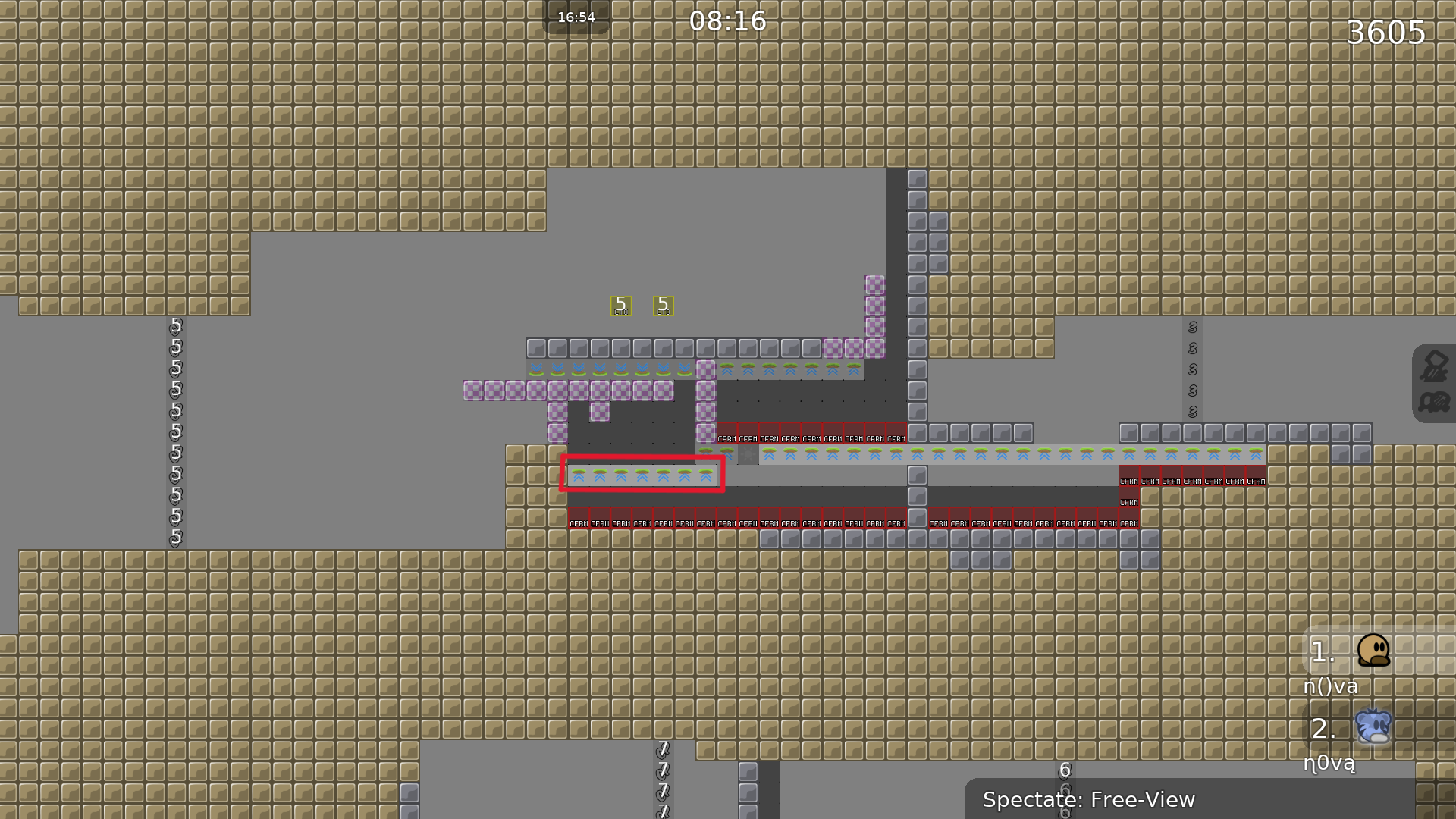
missing corners

ohn0_ 02/09/2024 3:14 PM

$waiting

coke1465 02/09/2024 4:31 PM

$reset

coke1465 02/09/2024 4:32 PM

$waiting

weaamm1332 02/10/2024 6:15 AM
texnonik 02/10/2024 7:39 AM

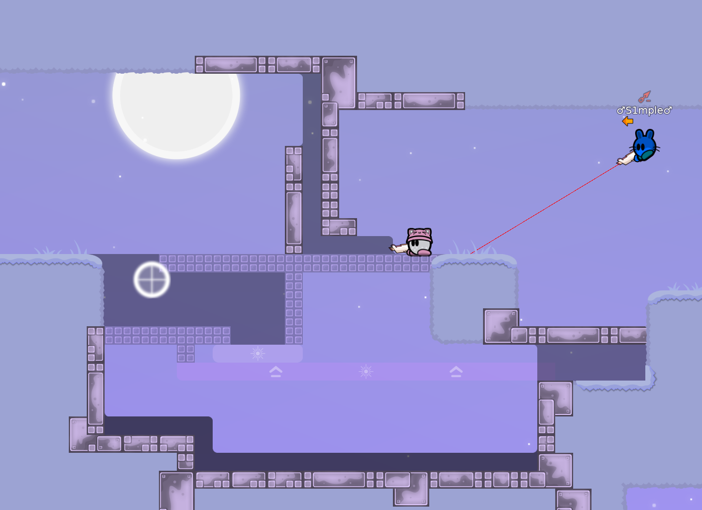
what's point of this ?

texnonik 02/10/2024 7:45 AM

big brain part

texnonik 02/10/2024 7:52 AM

the idea is cool

texnonik 02/10/2024 7:54 AM

to tight spaces 1 , 2 blocks . to simple implementations of mechanic most of parts . stoppers that are no need to .

texnonik 02/10/2024 7:55 AM

also parts are sometimes novice parts

texnonik 02/10/2024 8:03 AM

also first guy most of parts is doing more work then 2nd guy

texnonik 02/10/2024 8:15 AM

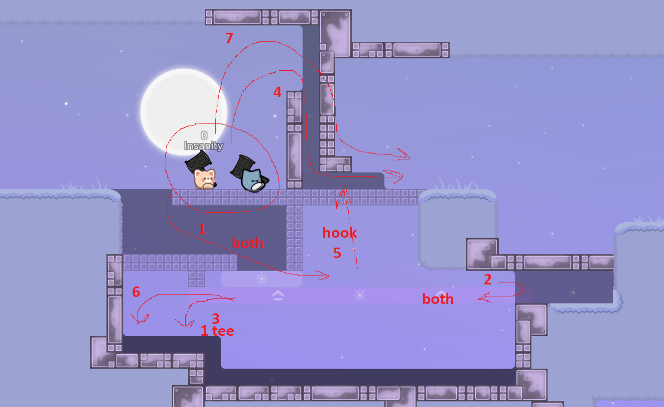
i like some of ideas in some parts . but you should experiment and go further then it's right now . i remade this part , this is what i have made in few minutes ( don't know is it working (pic 2) ) . there should be other part in tele 2 to balance player movement ( 1st does almost or same as 2nd tee ) .
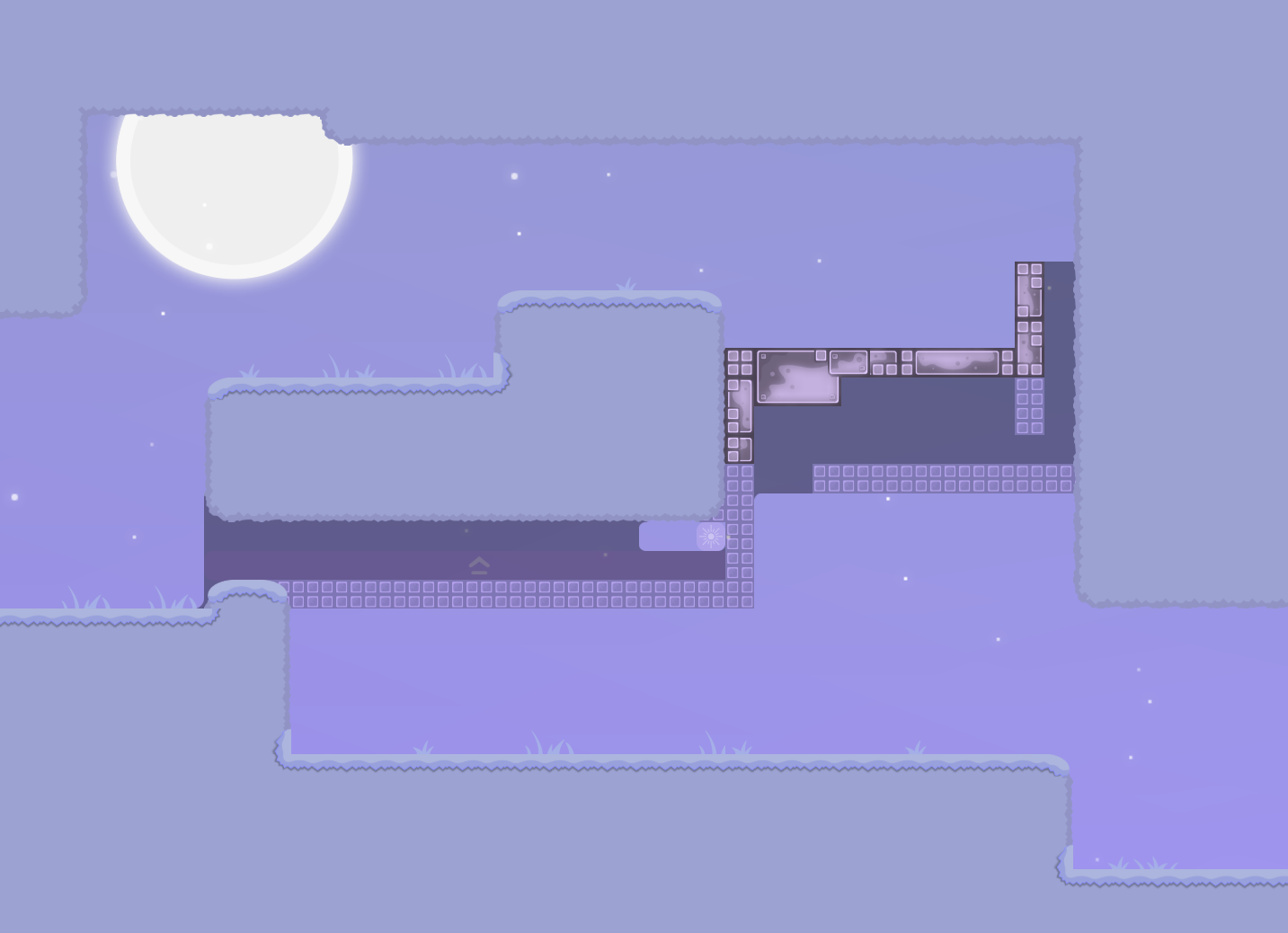
texnonik 02/10/2024 8:19 AM

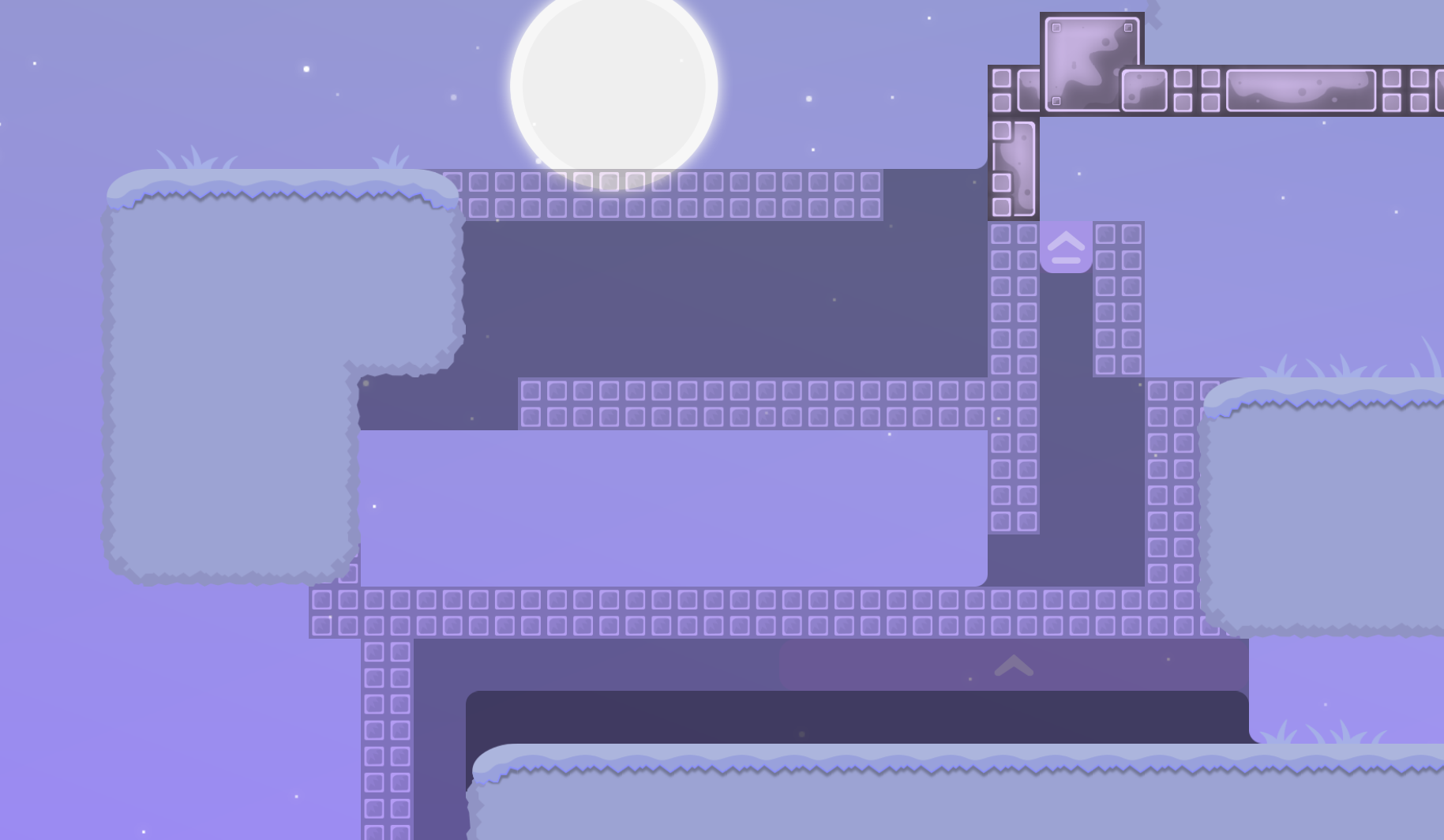
i also like this part very much ! but it's just idea of concept , i would like to see a lot better structured parts with this implementation ! experiment with ideas . part it self is badly made also small space (pic 2 ) i would try making an actual part there (pic 2 ) and trying making part a lot interesting by experimenting !
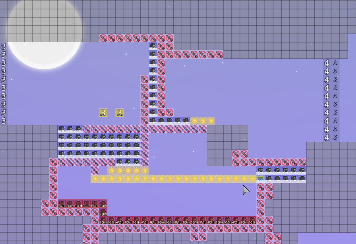
texnonik 02/10/2024 8:21 AM

for me it's decline but hope you will make good map next ! any questions related to mapping can ask in

#mapping

also can show part there and ask for opinion !

tsin666 02/11/2024 6:09 AM
@ohn0_

you ever plan to stop using ddmax name as a your pathetical explanation ? Go into editor remake the part show the mapper whats wrong with the part and how he/she could improve it. Writing ddmax this ddmax that won't solve it.

ohn0_ 02/11/2024 6:17 AM

ok I got it
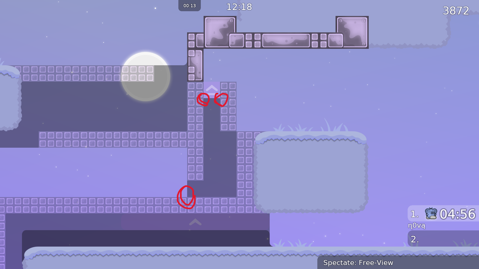
.insanity_ 02/12/2024 1:17 PM

impossible part

.insanity_ 02/12/2024 1:17 PM

not hard but annoying part

.insanity_ 02/12/2024 1:17 PM

idk if its impossible but too hard cuz absolutely buggy

.insanity_ 02/12/2024 1:18 PM

same with this. annoying

.insanity_ 02/12/2024 1:20 PM

map is a mixture of novice and moderate parts. I like the idea with the stopper but some parts feel unnecessary and too short

.insanity_ 02/12/2024 1:20 PM

not to mention the poor map design

.insanity_ 02/12/2024 1:23 PM

Better create a new map with less large gaps between parts, create some unique and not boring map design, decide if its moderate or novice, make a better flow of parts, test parts before posting. Keep the idea of most of the parts; I like them and they are nicely thought of

savalic 02/12/2024 1:31 PM

i'll echo everything was said above (mainly from Insanity & texnonik).

the main concept of the map seems to be fine imo. i would like to have a map with stopper parts in novice or moderate category. somehow the balancy of the map is kinda off, as mentioned. make sure to have your parts a bit more even in terms of difficulty.

i really would recommend you to not have some longer parts followed by "1-action-parts" where u only have to do 1 hook or something like that. you should avoid parts where you need especially need strong or weak in maps below a higher moderate difficulty. imo your map need a bit more parts that are a bit more interesting in terms of gameplay - its a bit boring rn.

designwise ist fine for me, but still looks a bit empty.

savalic 02/12/2024 1:31 PM

for now ill decline this map but you are more than welcome to resubmit it when u reworked it or created something else. gl! 🙂

savalic 02/12/2024 1:31 PM

$decline

texnonik 02/12/2024 6:52 PM

big brain part* read up

.insanity_ 02/12/2024 6:57 PM

I spend like 20min to figure out what to do

texnonik 02/12/2024 6:57 PM

have you got it ?

.insanity_ 02/12/2024 6:58 PM

no

f0rtishka 02/12/2024 7:12 PM

i couldn't explain it easier

.insanity_ 02/12/2024 7:16 PM

I guess my brain wasnt braining

.insanity_ 02/12/2024 7:16 PM

everyone I asked was confused too

f0rtishka 02/12/2024 7:16 PM

texnonik figured it in like 1 min

.insanity_ 02/12/2024 7:17 PM

big brain

.insanity_ 02/12/2024 7:20 PM

my bad then, sorry

f0rtishka 02/12/2024 7:20 PM

np

f0rtishka 02/12/2024 7:20 PM

btw map isn't that bad, it's just that idea wasn't executed properly

.insanity_ 02/12/2024 7:22 PM

and this is a problem only ppl with weak got