#HF
"HF" by PopCorn181 [Moderate]
DDNet 12/19/2020 7:04 PM
@PopCorn181

this is your map's testing channel! Post map updates here and remember to follow our mapper rules: https://ddnet.tw/rules

HF.map
690.35 KB
DDNet 12/19/2020 7:04 PM
Cøke 12/19/2020 7:04 PM

same map again?

PopCorn181 12/19/2020 7:04 PM

reuploaded GL as moderate

Cøke 12/19/2020 7:04 PM

wtf

Cøke 12/19/2020 7:05 PM

u can just ask for it

PopCorn181 12/19/2020 7:06 PM
Cøke 12/19/2020 7:07 PM

why ask there

Cøke 12/19/2020 7:07 PM

ask in map channel

Cøke 12/19/2020 7:08 PM

btw you have ur maps improved, but its still far away from a releas

Cøke 12/19/2020 7:12 PM

I think we has already been explained several times what is important

allocaツ 12/19/2020 7:27 PM

it has nice creativity and a lot more space this time. but then also the last two parts are very empty and feel rushed the parts are still very basic drag parts, but the transitions between are starting to get better.

allocaツ 12/19/2020 7:28 PM

but parts like these are very bad still and not helping generally, if a part takes 10 seconds to draw, it's probably not very exciting

allocaツ 12/19/2020 7:31 PM

i really like seeing this kind of creativity with the design and the parts have a refreshing amount of space, but for people to like something it shouldn't be over in 1 minute of gameplay, again especially if the first segment is 3 times longer

allocaツ 12/19/2020 7:35 PM

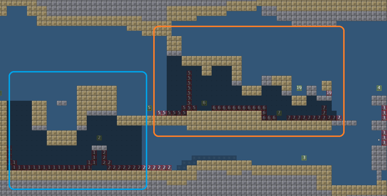
in the very first drag part, the part of player 1 (blue) is very easy compared to that of player 2 (orange)

allocaツ 12/19/2020 7:37 PM

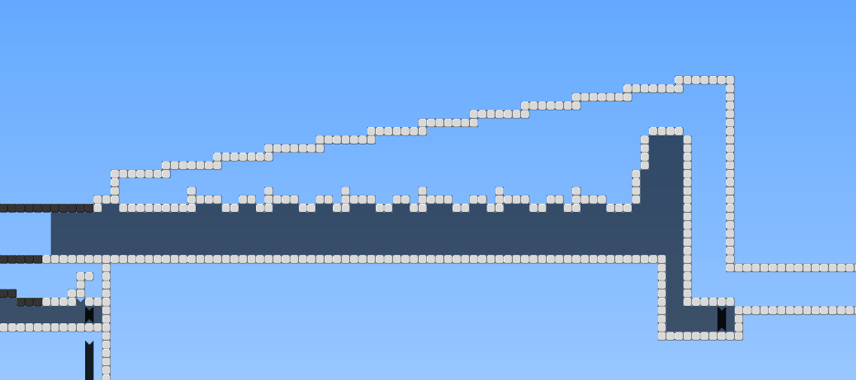
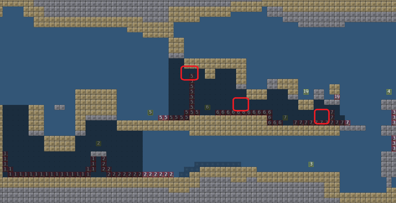
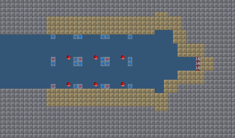
you have made more space between the parts, but your drag parts are still very tight and have many close corners. and also how you have to jump to avoid the tele (at red markings) feels very close and unnecessary

allocaツ 12/19/2020 7:41 PM

a part like this is a nice transition to the next drag parts, but having 2 ways to save people is a bit weird for such a little part. i think the part was better and less confusing if there was only 1 way to do it and 1 way to save someone, like i marked in red. (and removing the freeze in air)

allocaツ 12/19/2020 7:44 PM

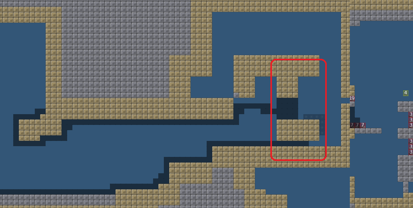
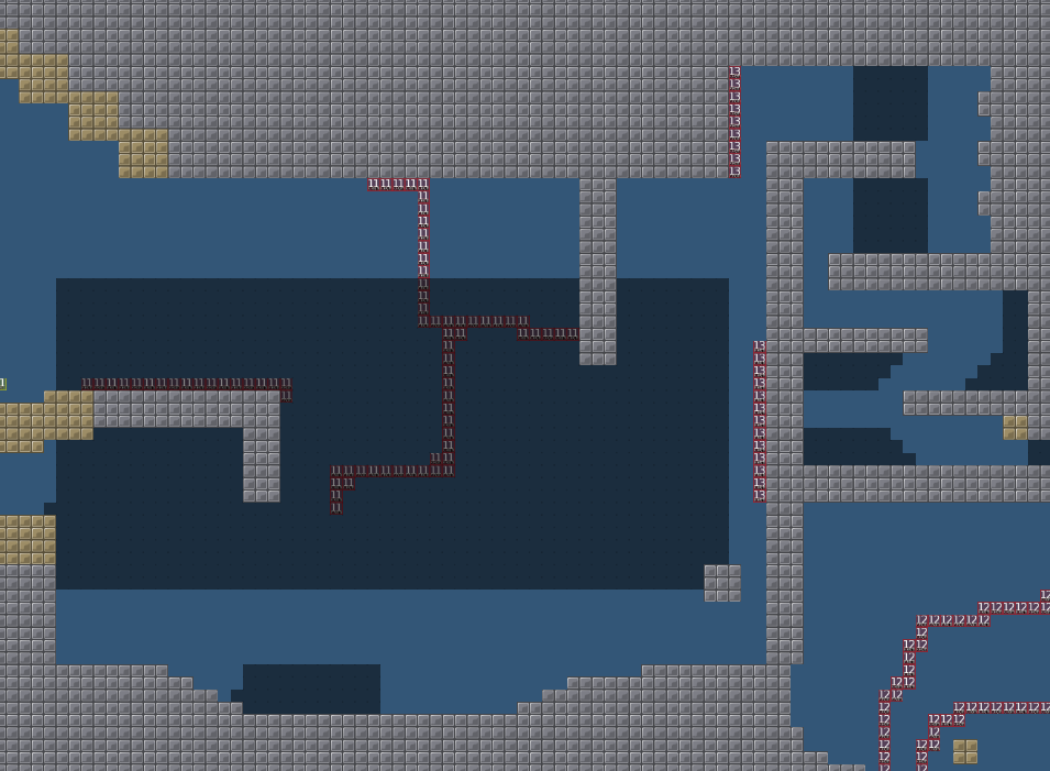
then here, there is this huge empty space, which is in general not bad but it's definitely too much here. also the part with the hook is very annoying if you tried it, very weird with the tele. why not just hookthrough instead of tele to make it more appealing

allocaツ 12/19/2020 7:48 PM

the structure is quite good, but the drag part is again too tight and close (let it breathe). and this kind of repetition of small elements is not desired. for green, just something that has more space, like imagine having a big room there to jump and swing into unfreeze, that would be something neat you could place there
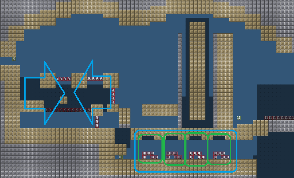
allocaツ 12/19/2020 7:49 PM

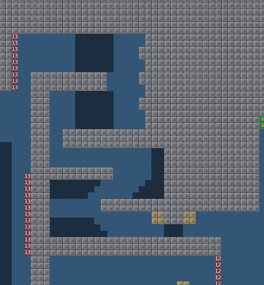
this is fine, except that there is no totele 13 tile, so the tele13 tiles are ignored from the game (you can go through them)

allocaツ 12/19/2020 7:50 PM

this is decent, but needs some unfreeze and size, try to stretch things like this by 1.5 to make it bigger

allocaツ 12/19/2020 7:52 PM

the part is a bit harder in comparison, but fine. note how blue is not needed and there is no solo tile to go through at the start of part. so unsolo is unnecessary. and than the unsolo has gaps, which is no good

allocaツ 12/19/2020 7:54 PM

just some filler, not terrible but also not very exciting. if you do repetition try to make it more interesting at least by using different objects to hook or something. and as it is right now, it's unsymmetrical which hurts my love for symmetry

allocaツ 12/19/2020 7:55 PM

3/10

allocaツ 12/19/2020 7:59 PM

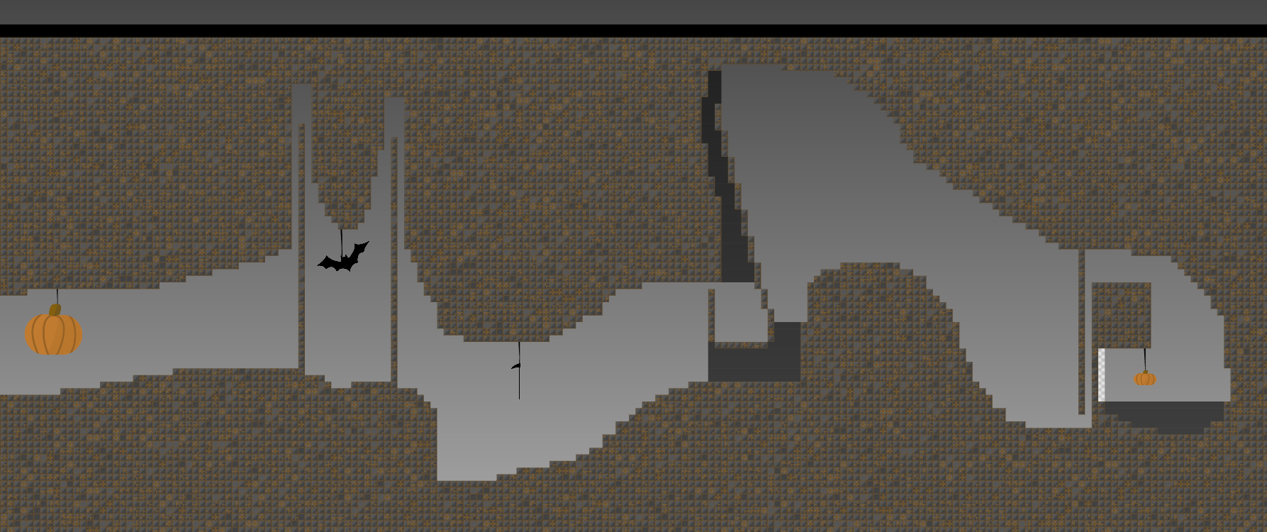
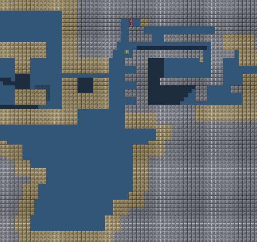
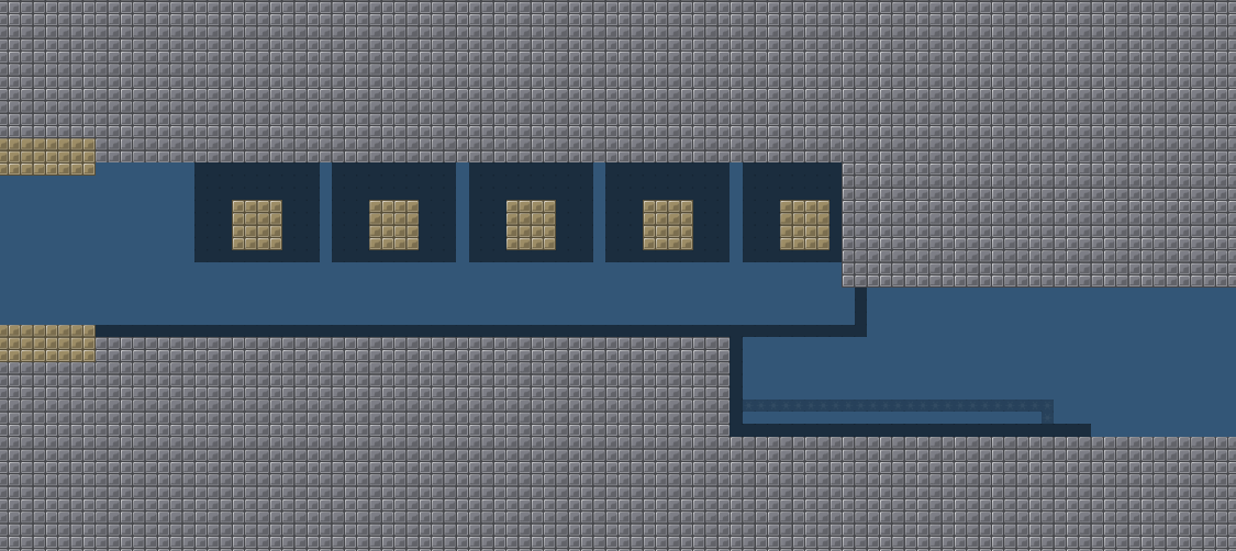
i am very suprised by start of segment 2, as it has a completely different style of gameplay. pretty awesome that you are capable to alternate quickly to different designs. and i like the minimalism here, maybe just a map like this with some clever parts would be pretty cool

allocaツ 12/19/2020 8:00 PM

but than this part next to that doesnt make any sense, you went back to the earlier style for no reason

allocaツ 12/19/2020 8:33 PM

louis made a map called scraps_I that had this kind of idea, with different styles for different parts. and it wasn't released because pulling this off seems to be not so easy. but maybe look there on the testlogs https://ddnet.tw/testlogs/show/scraps_i to find some inspiration on how louis tried to this type of map-style

I will decline this because it's not yet at the quality level it needs to be maybe you are at a point where you should finish more maps to get some inspiration and experience for good parts gl (& hf )

allocaツ 12/19/2020 8:33 PM

$decline

BlueMeww 12/19/2020 8:34 PM
allocaツ 12/19/2020 8:47 PM

it does feel bad indeed because you put so much effort into it, and you are improving. if before you were 2/10 mapper, now you are 6/10 which is a big improvement. and it's very wholesome that you listen to all the suggestions :D so keep going, sooner or later you will get to claim your first map release

FeaRZ 12/19/2020 11:54 PM

Keep it up

@PopCorn181

, don't give up!!!

Ama 12/20/2020 11:57 AM

The first part of the map is OK you can save that parts and make them releasable with some work

Ama 12/20/2020 11:57 AM

but the 2 designs after are just shit you put there to make a design