this is your map's testing channel! Post map updates here and remember to follow our mapper rules: https://ddnet.tw/rules
-Improve some gameplays -make logo bigger
-start shield deleted
-removed 1 skip
-modify entity bug
-removed 3 skip -modified entity bug -added 1 more dragging laser -make logo smaller a bit
corners
-fixed corners
-Improve laser part gameplay -added time checkpoints
-Improve laser dragger part -move time checkpoint better place
-fixed mirror stopper
-fixed entity bug -Improve dragging laser part -added unfreeze more
-fixed entity bug
-kept skip
-It is still works, so I emplace stopper 2 blocks more
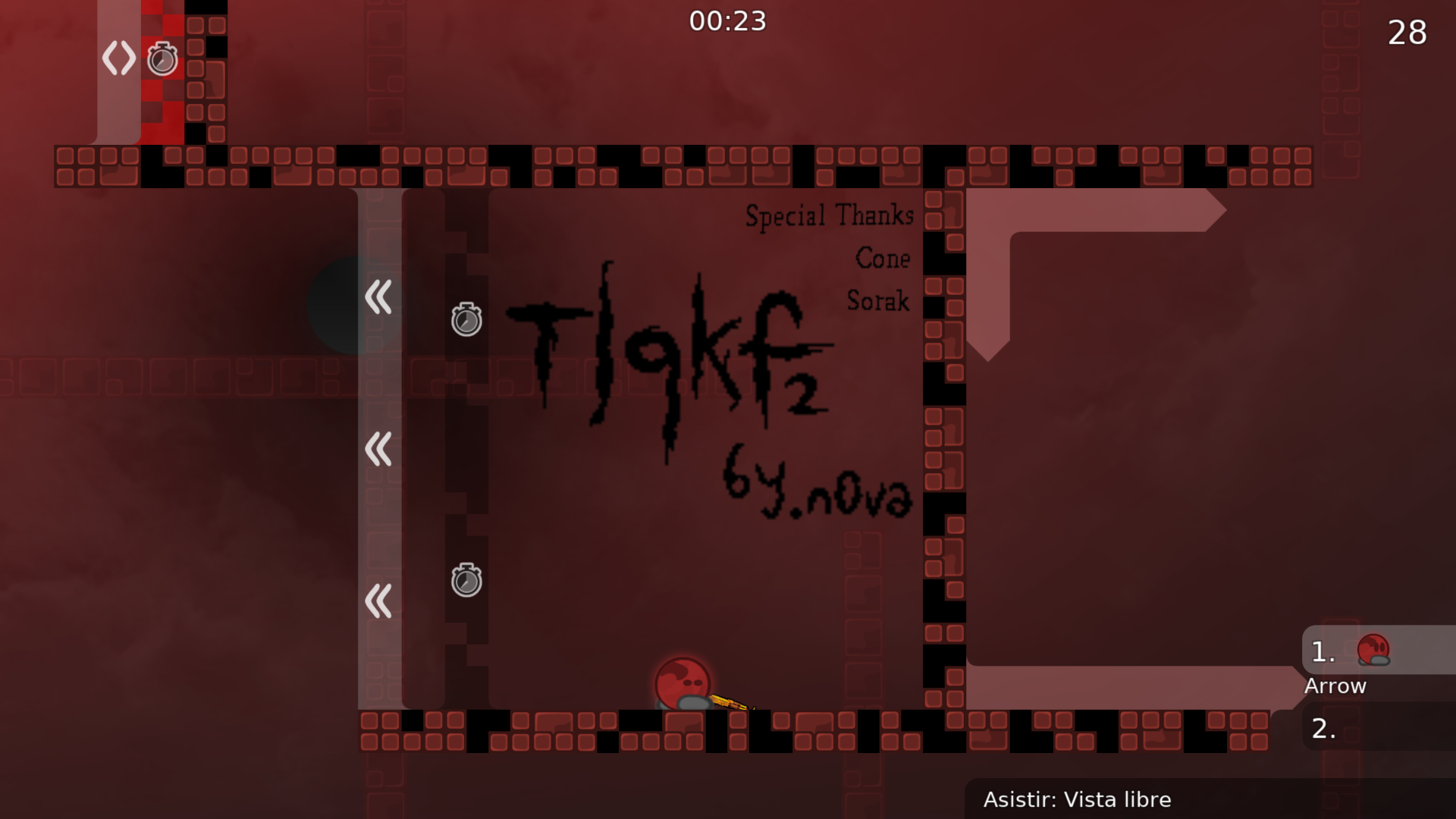
-added special thanks
Hi, try to increase the difference between the playground and background colors and details
Also, do something about those black spots
It feels like I can hook the red tiles and not the black ones
Especially when you use the same color for the hookable tiles
The black tiles appear as being another entity
Try to remove the outline of the tiles in the background or reduce it's intensity or the difference in colors between the center and the outline of the tiles
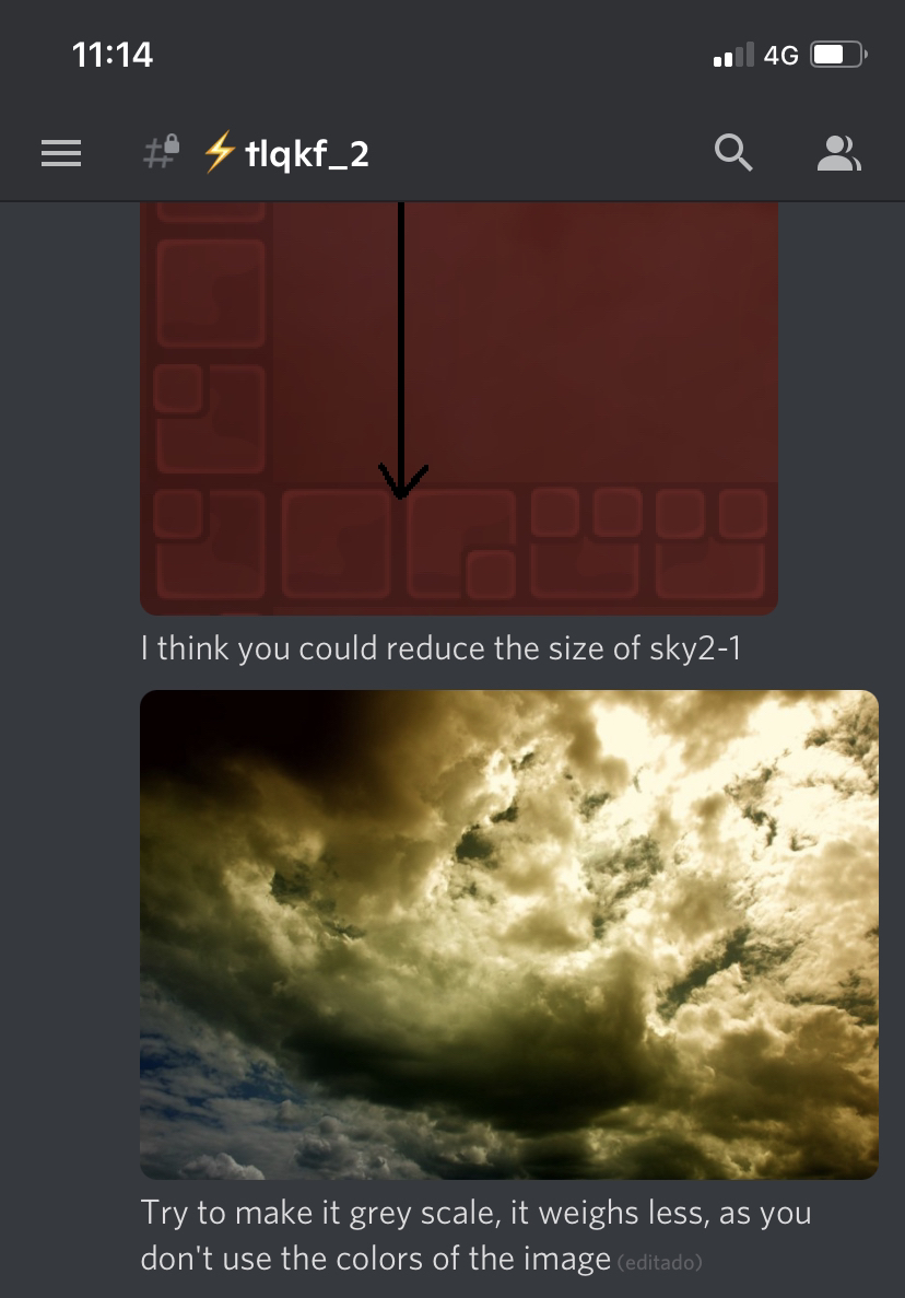
I think you could reduce the size of sky2-1
Try to make it grey scale, it weighs less, as you don't use the colors of the image
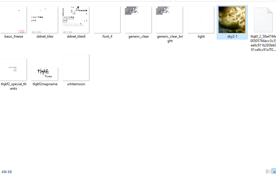
Do you use every single ddnet_tiles and ddnet_tiles6 tiles ?
If you use most of them then it's ok, otherwise try to only pick the one you use by gathering them on 1 single tileset or remove the tiles you don't use from the original tilesets
Also, I forgot about sky2-1 that you need to use 2^n values for its size (32,64,128,256 etc)
Do the same for tlqkf2_special_thanks.png, tlqkf2mapname.png and whitemoon.png
Try to make it more visible
Here is one example of mine :
I'm not very fond of shields in maps in general, there is almost every time a way to avoid using them. But I guess it's fine, that's only me and a few shields haters 😂
I think that's all for today
should I remake generic_clear to remove or reduce outline?
That's one way of doing it
Adding blur is good too
why do you think speeder shouldn't be displayed
What does it add to know there are speeders ?
Do they do anything special at all ?
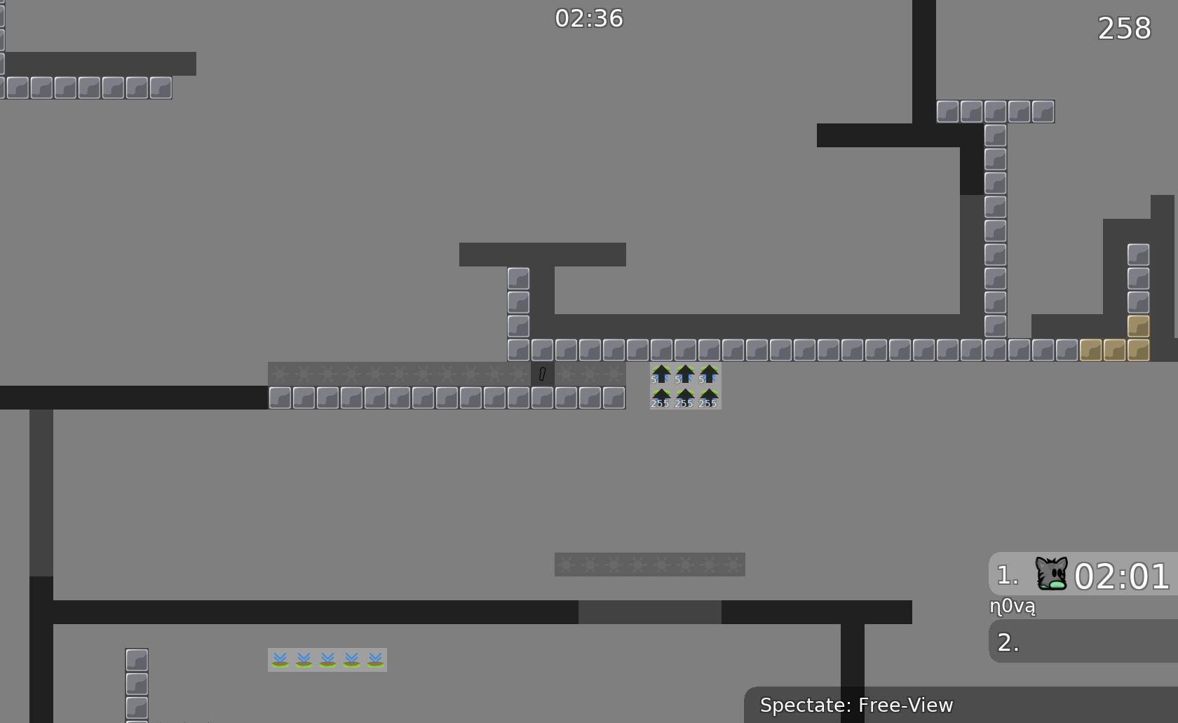
This speeder serves to help you get into that part a little more naturally
I don't have a recording program so there may be shaking while taking a video with my phone 😅
are u really want to remove speeders?
I'm not sure if they are really needed but I was talking about leaving them and not displaying them
after thinking about it, I won't show the speeder tile.
don't do anything that special
-change some gameplay to reduce some shield -added filter -changed hookable, unhookable block color (unhookable block changed a bit, added some green 😄) -added
layer, It use gray color -reduced background tile outline -changed all selfmade images 2^n size -made switch number bigger -changed image's 2nd file to watch better
-keep 1 bug
-kept 1 skip

xDD
-fixed corners
-added switch numbers
imagine crying when its been only 2 months 😂
it's been less than that if you count Papota

even with dj feel tight
$waiting
Now about the design
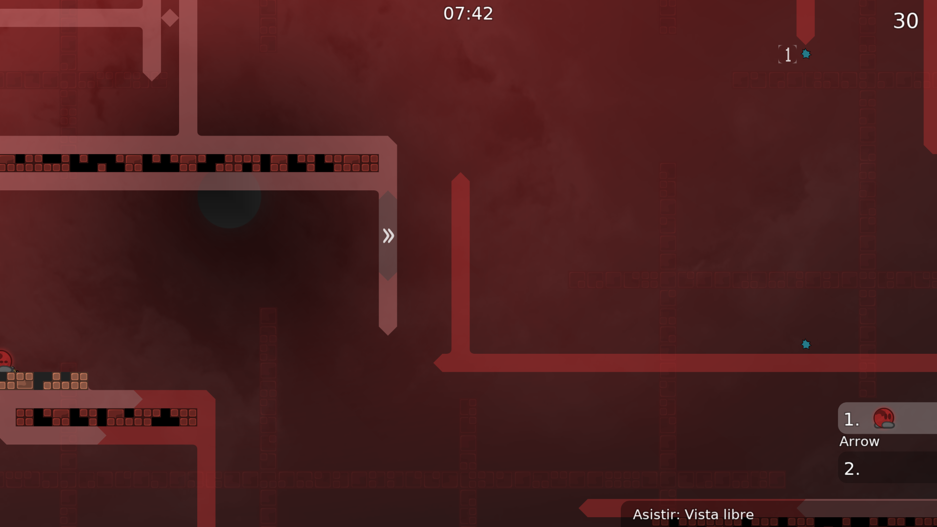
I don’t like how the unhooks/hooks looks like, the black thing is kinda ugly
But idk
I assume due this conversation that you lowered the weight that the file have which I think might be the main issue of the high mb of the map
But I think still too much, the map hasn’t that much of things to weight that quantity

$optimize
Hi ! I didn't change anything did I?
I was just pointing the conversation that you had xd srry
Maybe you could use some clouds from bit to reproduce the same effects on the bg, she doesn’t have a problem with other people using his mappres
What conversation ?
This one
Please be clearer, I don't get where we are going
What's wrong with my suggestions ?
Nothing I’m just bringing that up again so maybe
@n0vacould find a replacement for the bg, srry for not being clear
Due the image could be the thing that makes the map heavier
Oh ok no problem 🙂
I should give it a look again, to see what's been changed
Okay
besides u cant even notice the bg tbh if i didnt check the folder i would never knew
so is this like, barely visible?
the image used?
I think there's further ways to optimize the image so that it's as visible as it needs to be. Grayscaling is definitely an option, but you could also quantize the colors, too. So that way there could be like, only 16 shades of black. Since it would be super non-visible I don't think banding would be an issue.
oh nice thx, let see what mapper think 😄
Also, we could combine the logo and special thanks images, using Slice Quads to separate the two.
This map could be SUPER optimized, which is more surprising than you would think. I'm creating a optimization chain to see how far I can possibly go without it being outlandish. One of them is tackling the 17 layers.
i think its fine
better than too little layers
stopper y16 is probably to center a stopper on an even height stopper line
(for example u cant center a single stopper tile on a 2 high stopper pair without offset)
layer 9-10 could be merged the first 3 layers could be merged
6 and #11 are necessary for this argument tho
with the updates (including some layer merging) its safe to say it goes from 906 KB to a whopping 493 KB and thats not even with $optimize
906 KB -> 496 KB
what about that 3 kb
a single kill tile
XD
$waiting
that might have been my fault rip :(
it was like that b4
496 KB -> 344 KB

thats smaller than i could get. how'd you do it?
read this
Is there any change if I change it like the contents 2 and 3?
mmm i would say the 2 yes because you could do the part better idk how to express it, but it would help after do the swing to enter on that spot the 3 idk i didnt test it
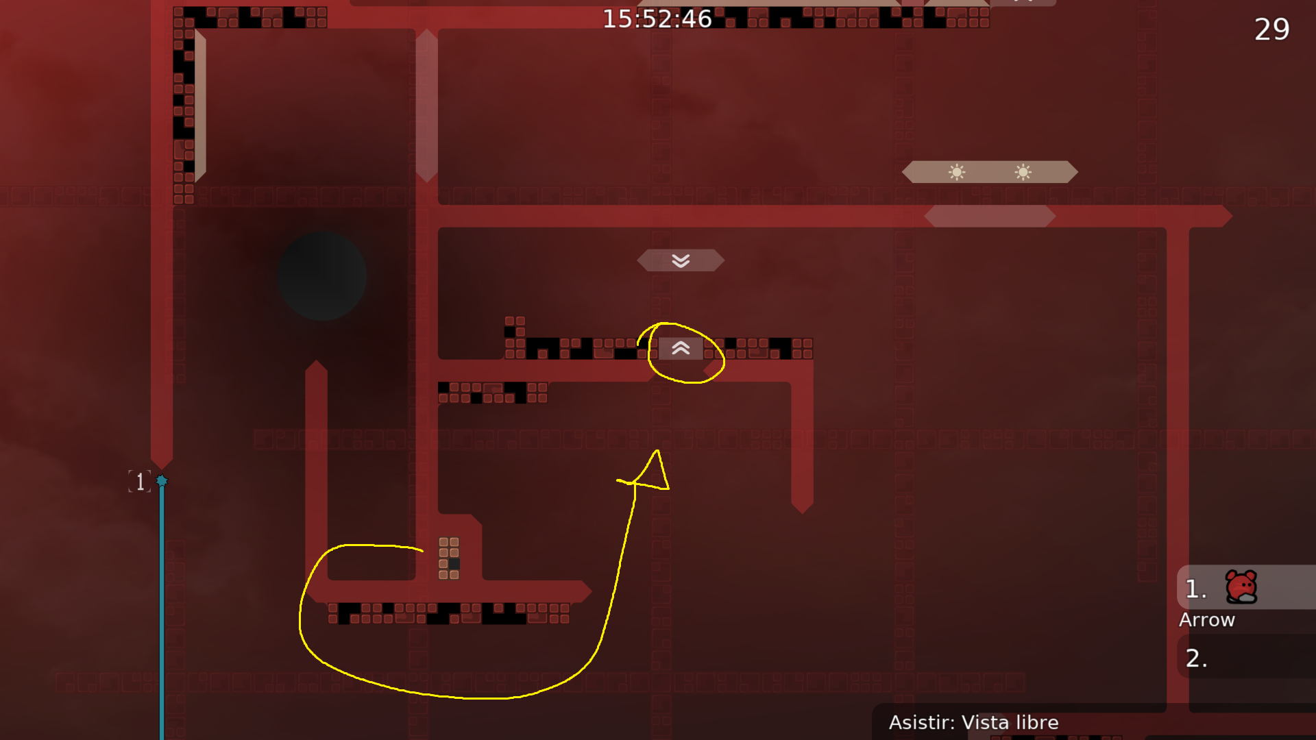
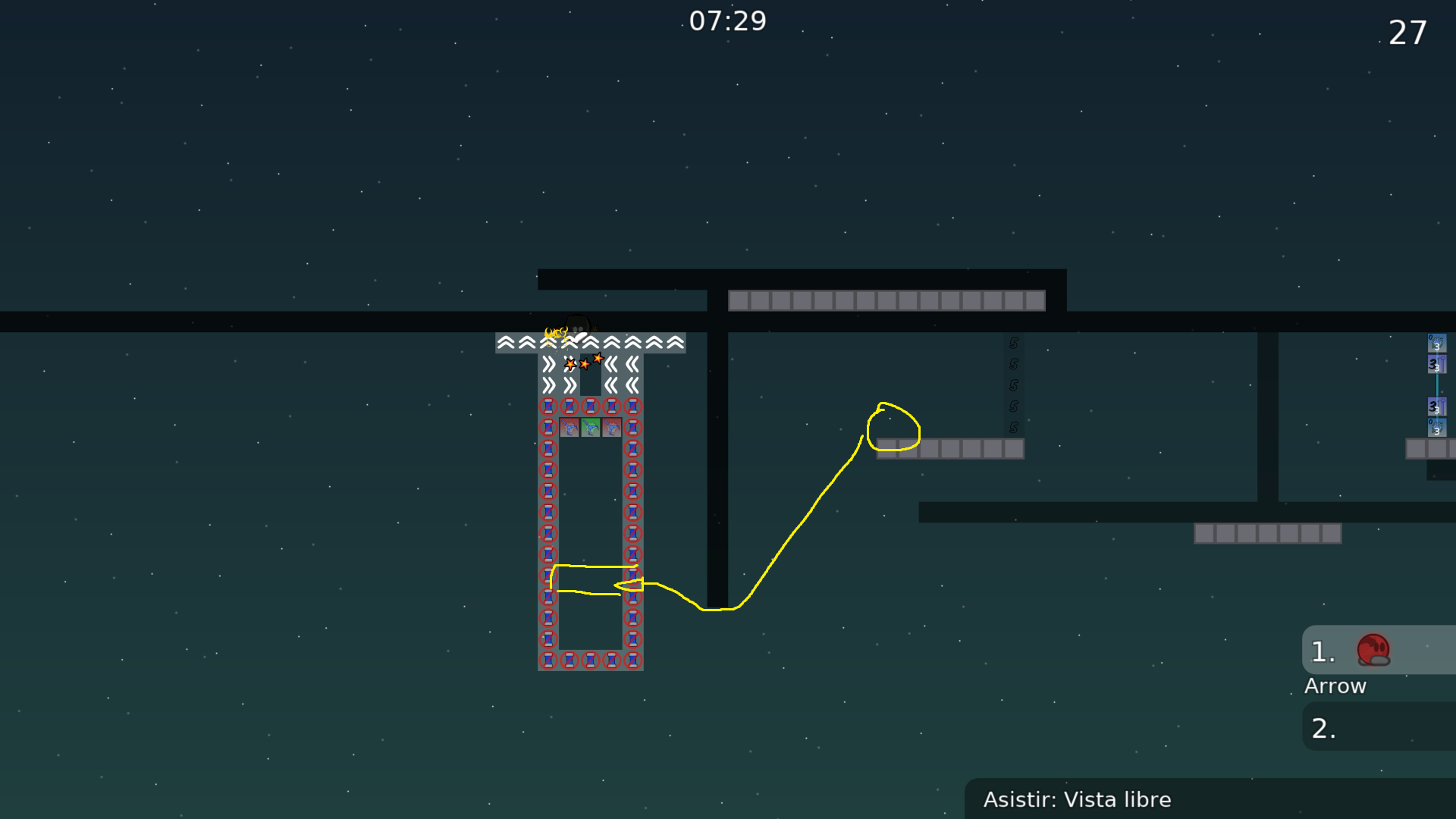
In this video, I moved my body a little to the right and prevented the freeze tile from initializing the speed in that part. And since the speed tile replaces this action, the probability that the freeze tile initializes the speed can be drastically reduced.
Putting the freeze tile under the starting part could reduce the speed initialization of the freeze tile, but the speed was still initialized when certain actions were taken, so the speed was used to prevent that small probability. In my experience, the speed is still initialized from time to time, but I think it has made a really big improvement compared to the beginning.
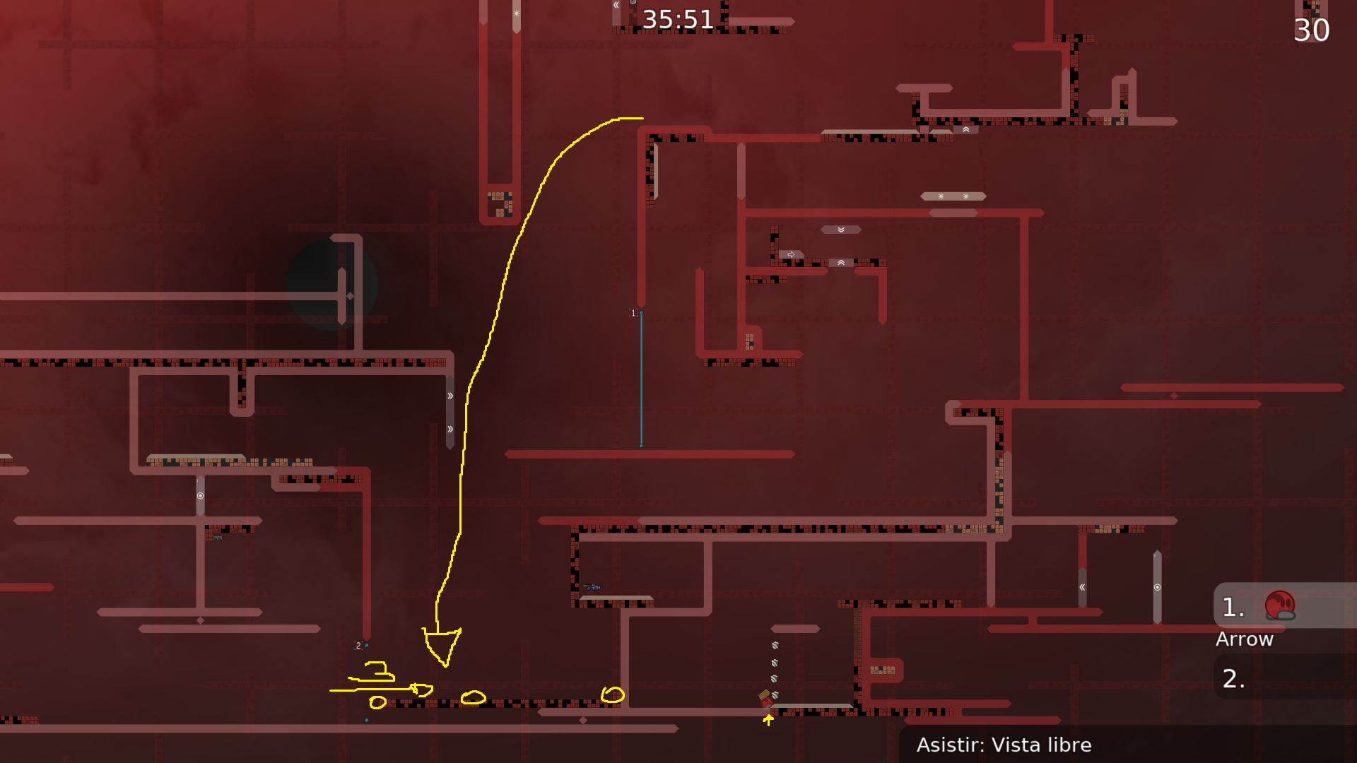
The following is a recording of a part of the map being tested.
normal (often failed)
just putting the freeze tile under the starting part (sometimes failed)
putting the freeze tile under the starting part and putting speeder (maybe barely failed)
Mmm ok also depends on how you swing and jump so should be okay
after this is ready
@n0va$waiting
I changed one of part 😅
but maybe no bugs??

what did u change
?
was nice b4
nvm its ok
$optimize
$ready 3
if someone thinks different about the rating just make the opinion 😄
sry, something need to fix
do a screenshot pls
the problem is fixed now, do I capture what is fixed?
yes pls
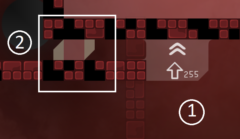
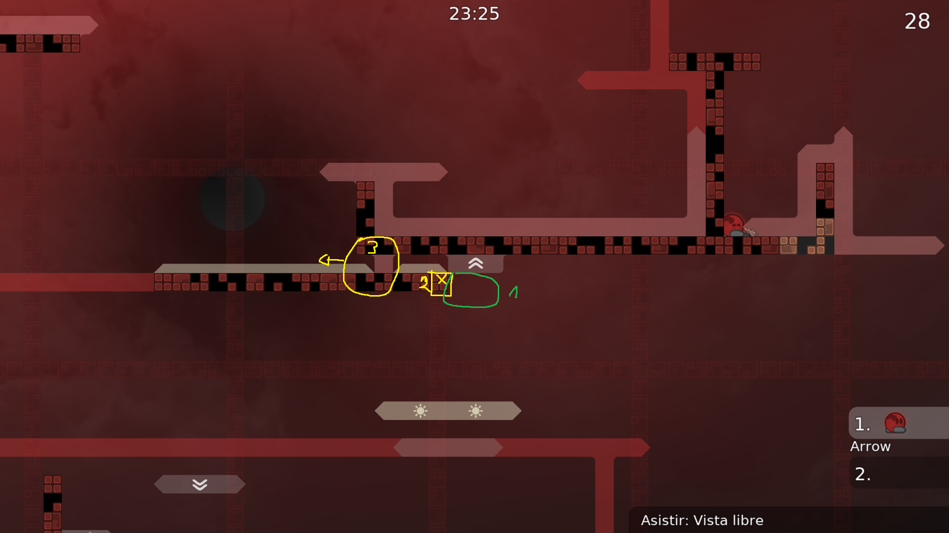
In some cases, if you turn on switch number 2 and keep pressing the jump button when moving from right to left, you may not be able to step on the platform because of the fast speed. I moved the top wall to the left a little to fix this.
OKAY
$waiting
$optimize
$ready 3
gg
4*
4 I think is too much
But if people think that way we could rerate
3 or 4
balance map pls
thx
laser part 2 hrd

