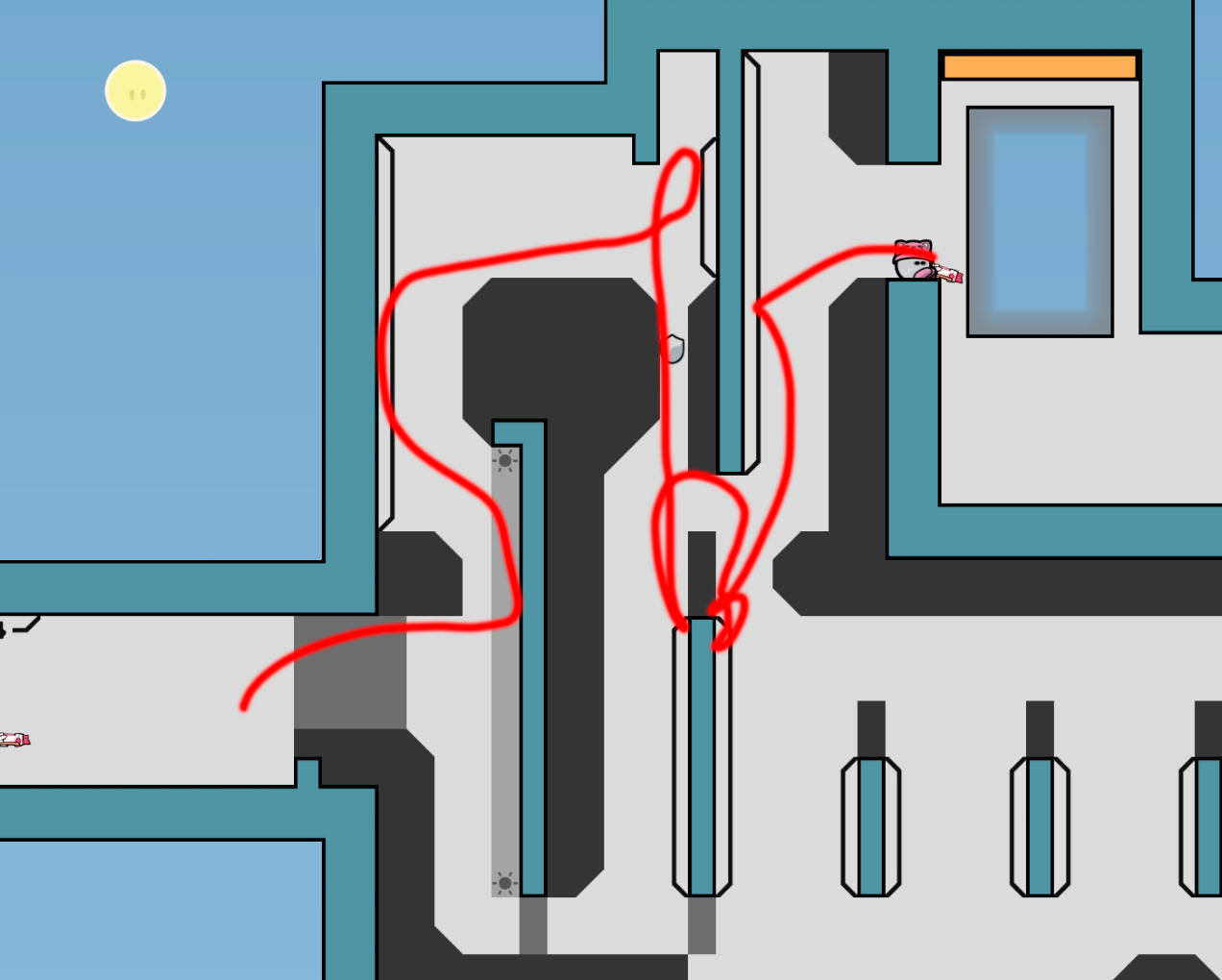
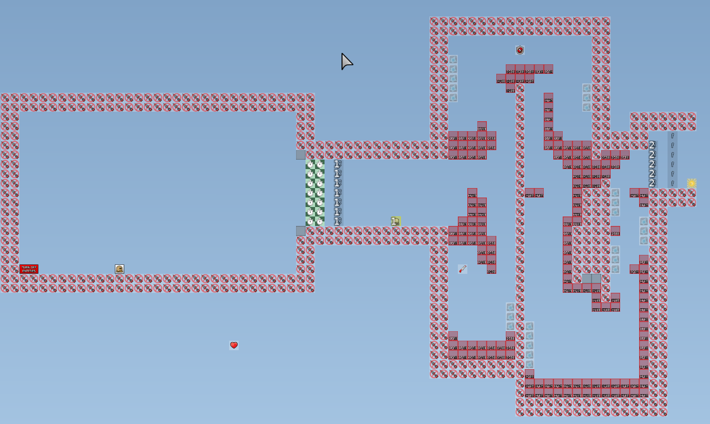
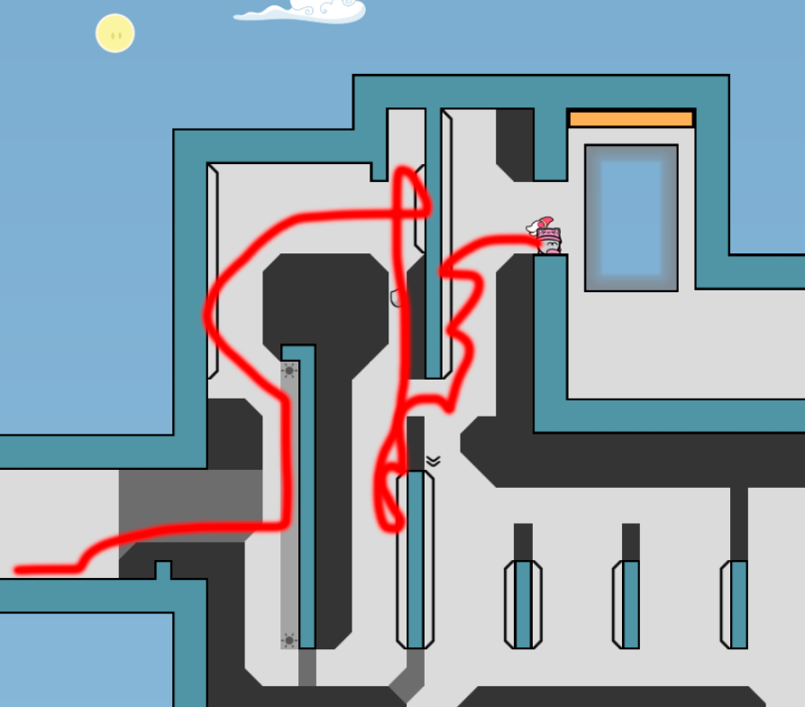
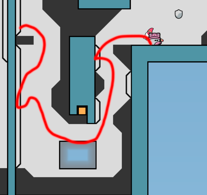
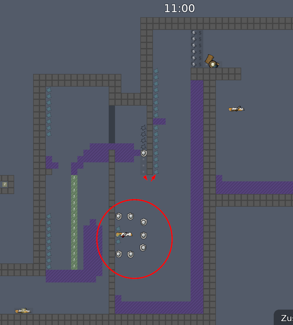
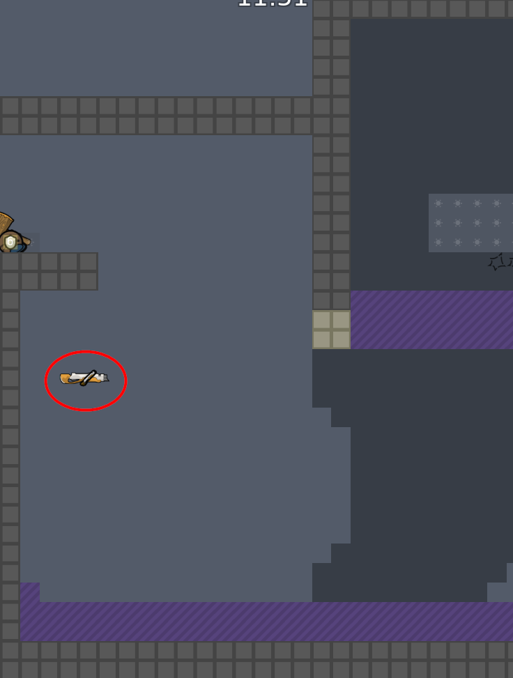
this is your map's testing channel! Post map updates here and remember to follow our mapper rules: https://ddnet.org/rules

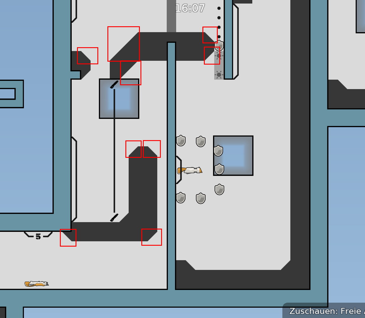
there are interesting ideas and concepts , but it can be made a lot better (improved ) . some parts are basic . tele tiles bad
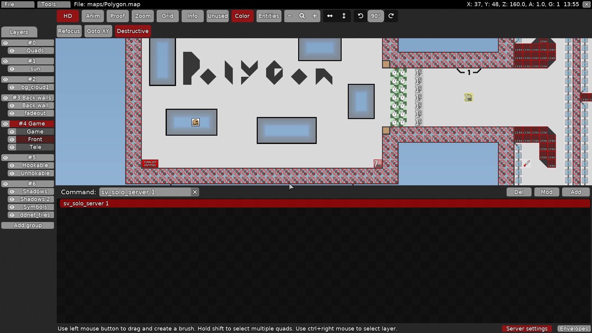
delete solo tiles make in button top down server setting this command sv_solo_server 1
I trying solve this problem now

yes
I tried to make a map for my level of playing. I'm not as good at passing this maps like Yours 🙂
its wasn't so hard

map a bit to short ( i think like that ) would make at least 5 part more .
I think there must be moments on the map that allow less professional players to at least go through the map. Whereas speedrunners let them go as they please.
but this needs fix
fix everythink this also https://discordapp.com/channels/252358080522747904/1110826862919307274/1110886135875510363
I'll try add more challengeable moments, but I not sure I can reach finish🥲
not challangeable but more fun and interesting ! Challanging is 2nd not 1st !
this is challenge for me XD
and this +-
Would it be a good idea to add teleporters to every part of the map at the start so that you can practice?
you can write /practice and teleport with /tp if this map will be released , so no , no need to .
Oh didn't know about that
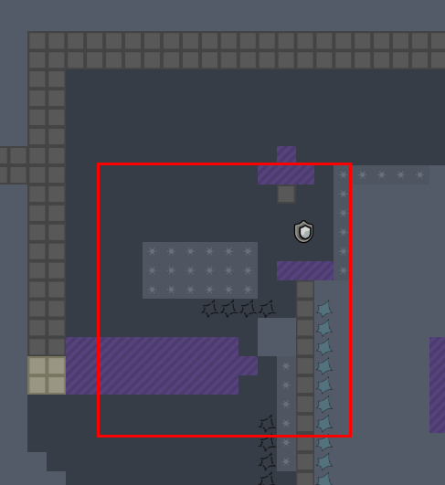
you have there upwards same part , i don't know look your self
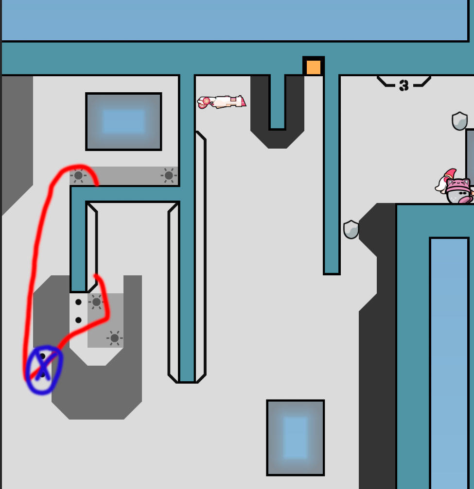
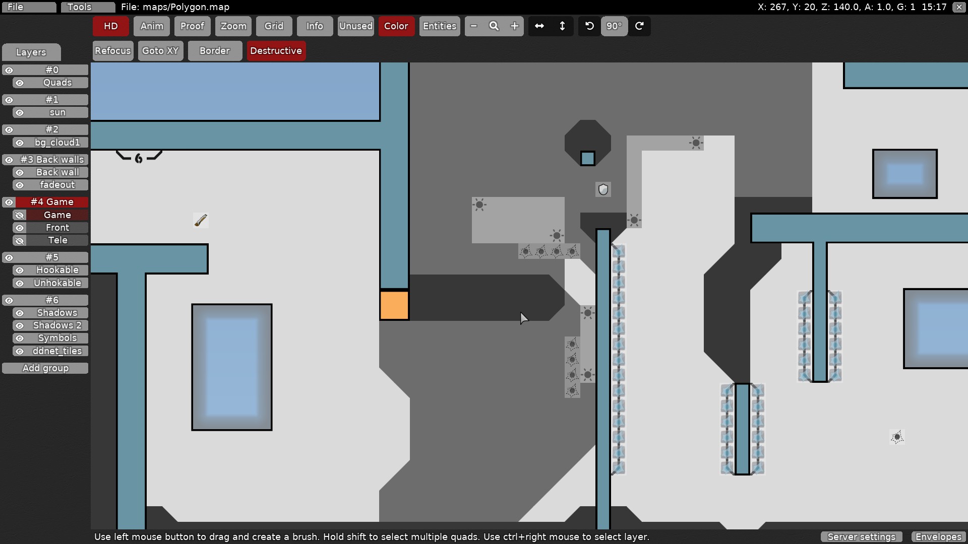
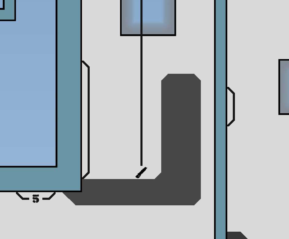
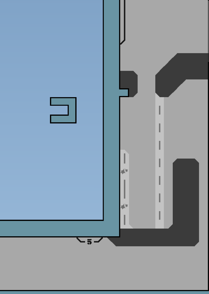
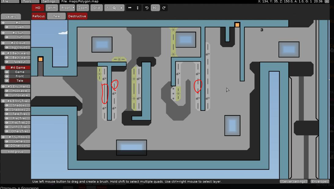
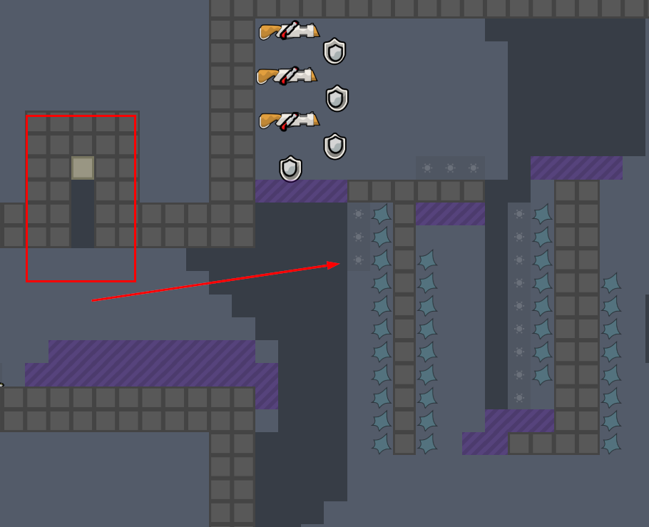
Some tele tiles are just line (design)
You mean tele tiles corners?
If you go through each moment in the levels separately, then they are all quite passable for me. But with each new complication, the cost of a mistake literally multiplies

now it looks better . i suggest add around 5 more parts . But it's not end , i think testers will tell you to change a lot in parts . (my opinion ) anyways good luck .
Should I post a new version of the map as soon as something changes / is added? Or is it better to accumulate changes and then upload the map?
Looks like design from "Exalate"
Same hookable/unhookable tileset 🙂 But the colors are different for them.
it's better to fix everythink and then post here and tell what you have changed , added or delete .
Changes: Part 1: Little change Part 2: Little change Part 4: Some changes + abuse fix (thanks texnonik) Part 5: Little change Part 6: Significant changes
I don't think it's as scary as the previous one xd
this looks very organized part , looks better then your parts before that you made . ( just looks like it , don't know how it plays )
Changes: Part 1: Little changes (thanks yubi and texnonik) Part 4: Abuse fixed (thanks texnonik)
- Added part 7
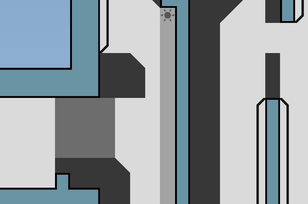
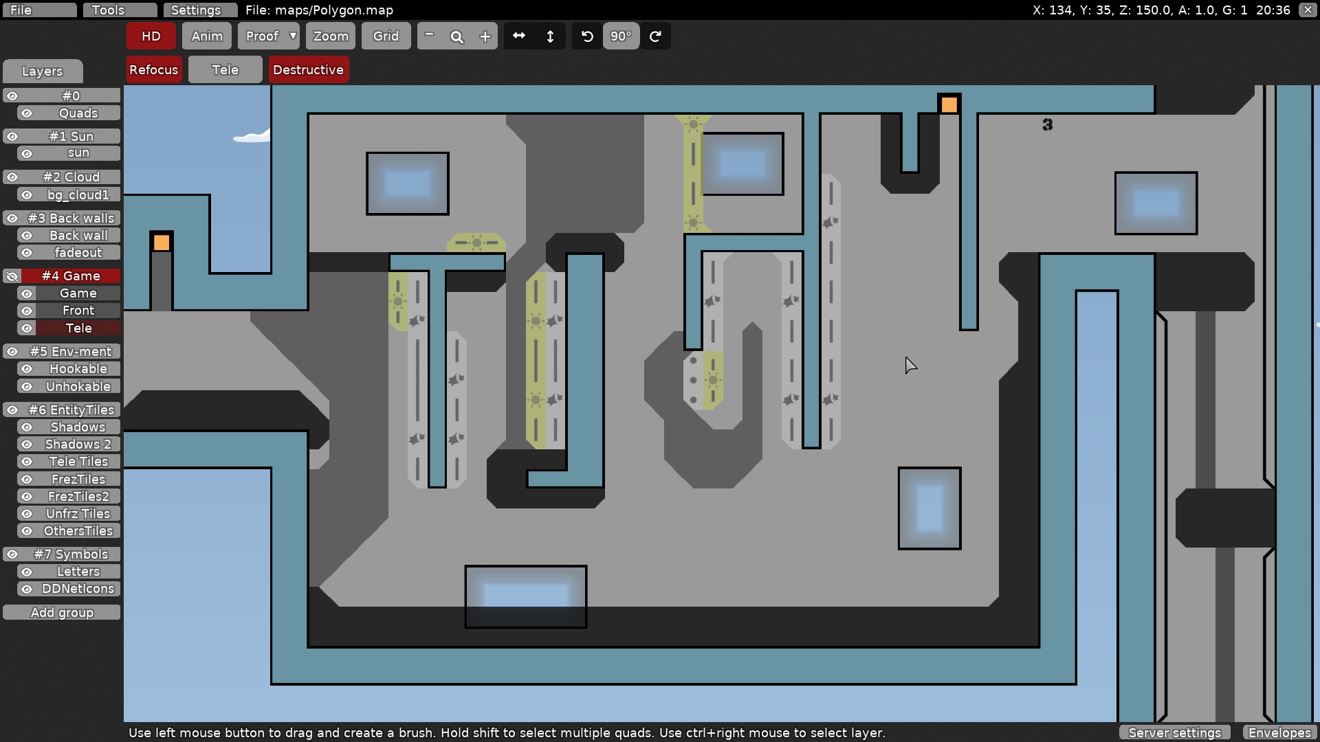
the map overall looks very messy, try to clean up the design
How You did it?

From left side
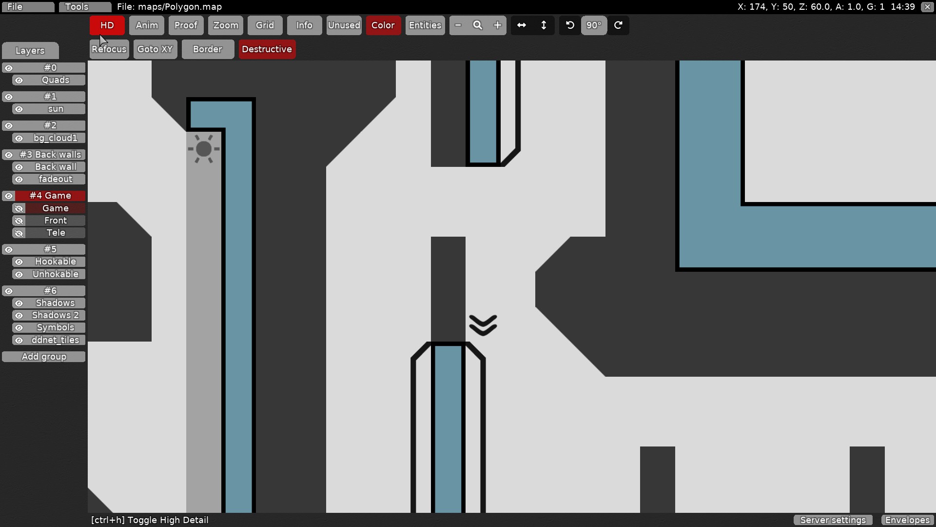
Hm the lines look messy too
yes the tileset is buggy, u can just use another
Better remove the lines, idk.. Or less alpha
yes
last part is too long compared to the others
u need just 1 unfreeze in toteles
I think the same. But parts with a grenade launcher are large by default
I don't know how to make that part smaller
Ok, ill do it
$waiting
Without walljumps it be really hard for me
last part was the best but a bit long
i think this map need a whole rework
What's wrong here?
u dont need to put so much things together
to force such a move
map feels overall too small
parts too tight mapped
Need to make longer transitions between parts?
with walljump u can build many cool things, but a whole map needs more than basic walljump parts
thats why i said last part was ok
i think its the best to try a new map actually
more space, more creativity in parts
etc
$decline
ok, ill try better in next time 🙂
i ponted out some design things too
play a bit with colors etc
try to make it more clean
there are others
but u can fix it if u want
I'd rather fix it so I don't mess around later
😦 good luck
@Nendo Galaxy.don't rush , take time replaying . Show parts in
#mapping. So people say whats bad you are doing before you post all map like that and spend even more time on it .


