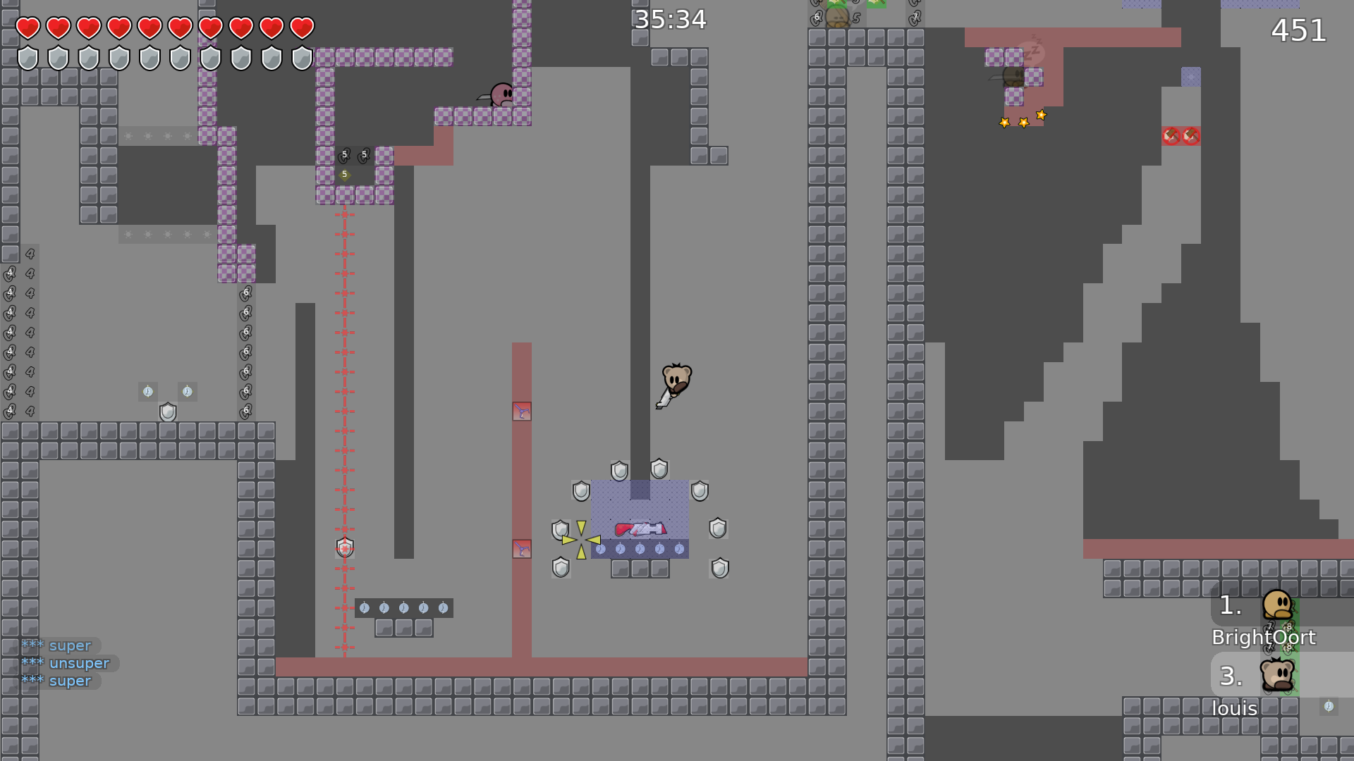
this is your map's testing channel! Post map updates here and remember to follow our mapper rules: https://ddnet.tw/rules
deleted unused tiles
not fun
u can skip
u need to put things in high detail
blue stopper + logo doesnt rly match design
it's purple

tbh this was a kinda problem in essential 1 where u dont give enough space in parts
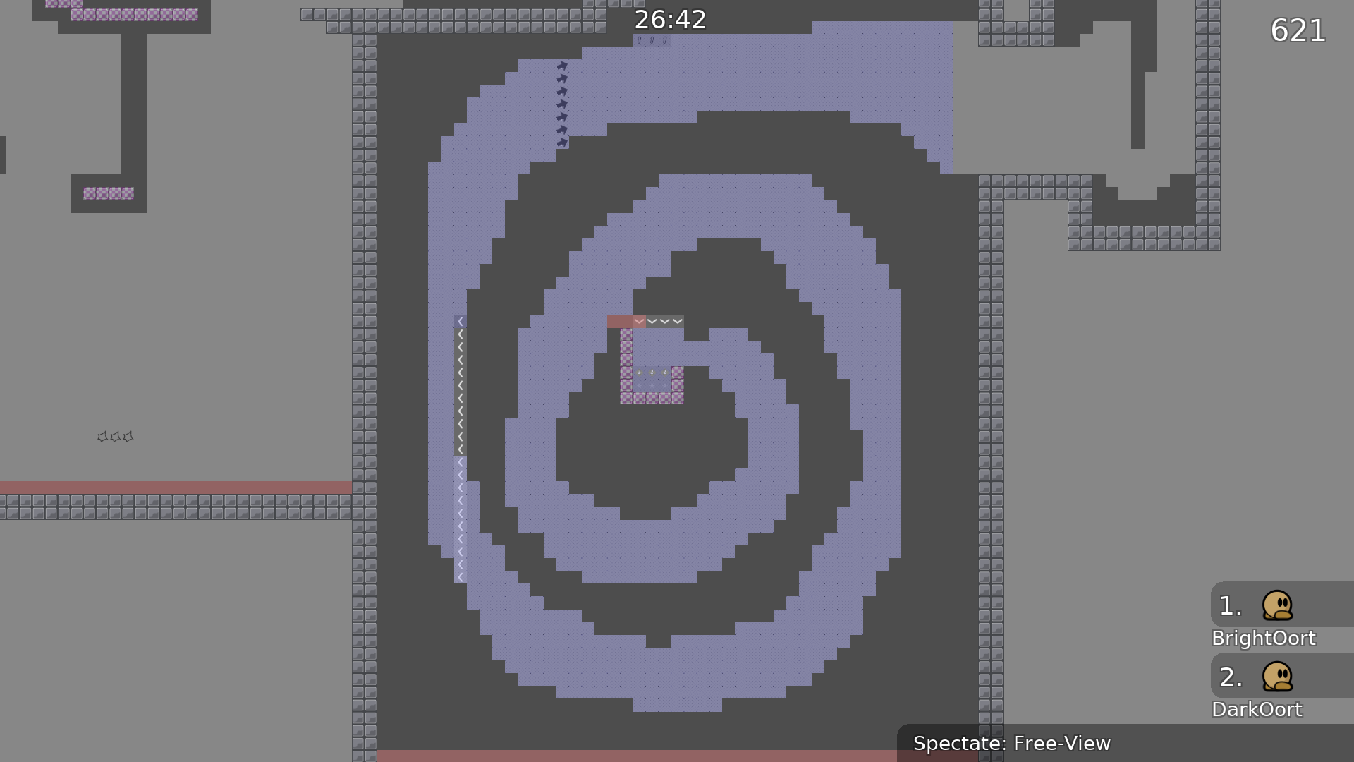
some of the starts feel p crammed
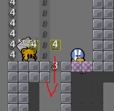
u can die here if u hook late
what you mean die ?
you go tele
yes which isnt rly fair cuz u cant see how low the tele goes when u do it
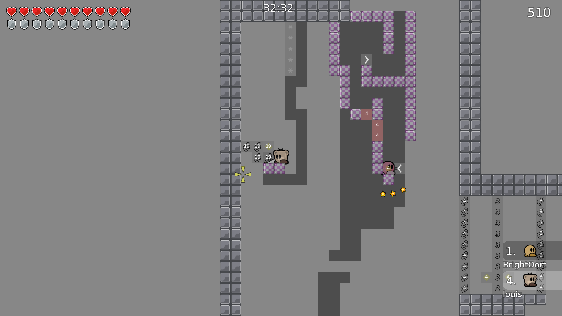
uh u can get cp 19 here without going on platform
dont need nade here
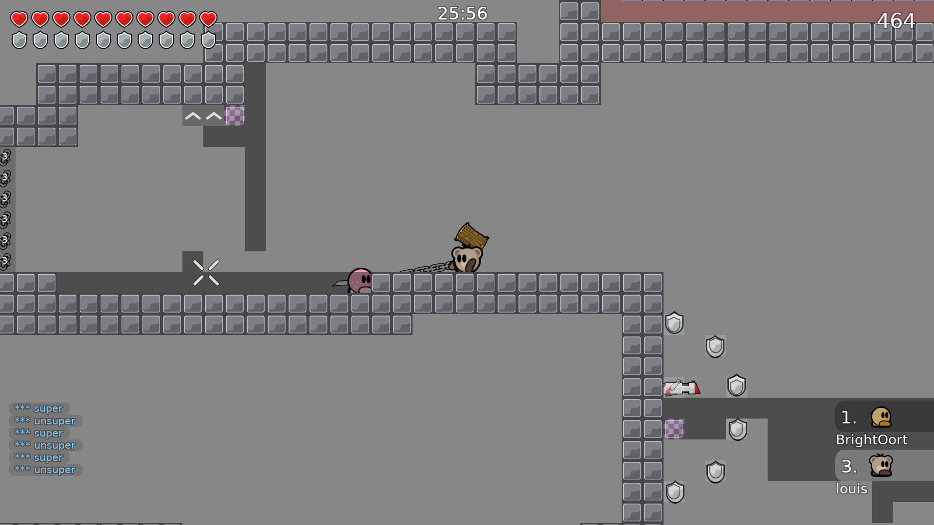
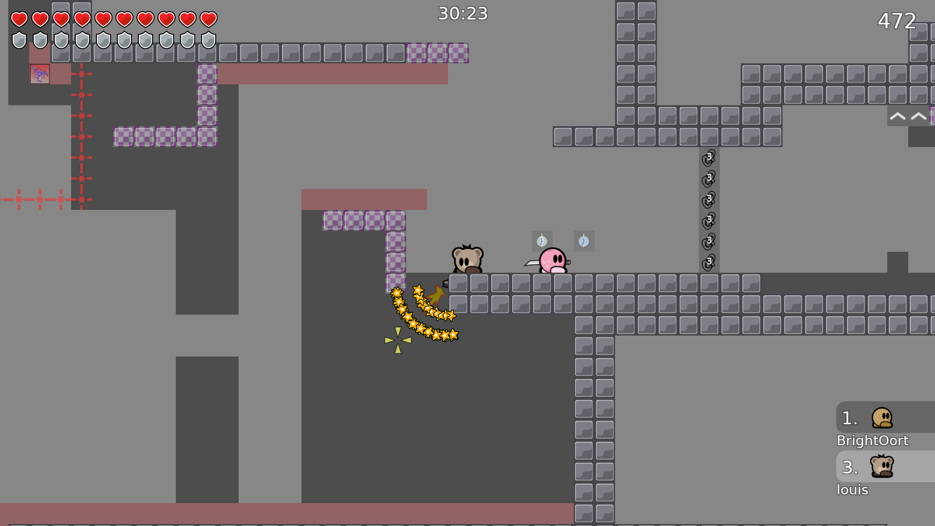
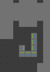
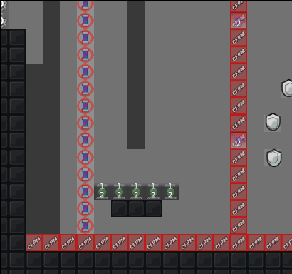
u need to mark these tunezones
coke sayd it to , but i don't know yet how :/ or should i ?
just put a border and a color inside or smth
there is toooooo much different tune zones

use icons
Map correctly instead of using 23987 tune zone and switch
haters
bruh
fixed some small design bugs , but will not upload yet
ofc
The Design feel like rushed idk colors dont fit
I am bad at it 😦
Essential 1 was fine, but genex is right this looks weirdly unmatching
you mean that design should be almost same ?
i actually really liked the design of essential 1, but its up to you. i just think essential 2 has one of these very old designs idk how to explain it
maybe just me idk
you mean 2layers of unhook ?
i could change it
no :p
when i see these desert mapres i always think of very old maps, probably just me xD
maybe you could do the design of essential 1 and make it another color?
design change
that looks a loooooot better imo
maybe 3rd layer of bg ?
like in 1st map ?
if you want to sure
fixed skips , changed parts , redesigned design a bit again added other layer of bg
Privet texonik, i tested gameplay of your map
so you want try to cheat and fail
like i did
no
i do part w/o lower tunes
?
go on test server
@Deeperyou see my server?
no
ok go ddnet test
made some design changes fixed part where you can fail fixing this skip , will take a while
this one
I don't have idea how to make it normal
maybe place the tele 1 tile to the left that would certainly make it better
$help
Use
for more info on a command. You can also use
for more info on a category.
DDNet Status ddos find Github build_status Memes angry clown drake happy ohno sleep teebob teeward Misc about avatar commandstats emojis invite time weather Profile hours map points profile total_time Votes kick No Category help
OMG i was editing and i just saw this xD
realised what's wrong
i thinked you could just fall , not random spawn fall xD
that's make it more funny
$change_name
$change_name your dummy
$commands
$help
Use
for more info on a command. You can also use
for more info on a category.
DDNet Status ddos find Github build_status Memes angry clown drake happy ohno sleep teebob teeward Misc about avatar commandstats emojis invite time weather Profile hours map points profile total_time Votes kick No Category help
$help category
No command called "category" found.
$help [category]
No command called "[category]" found.
$change_name Gravitee
$change name Gravitee
thanks
$change name cum tee
$change name jao
ok just testing

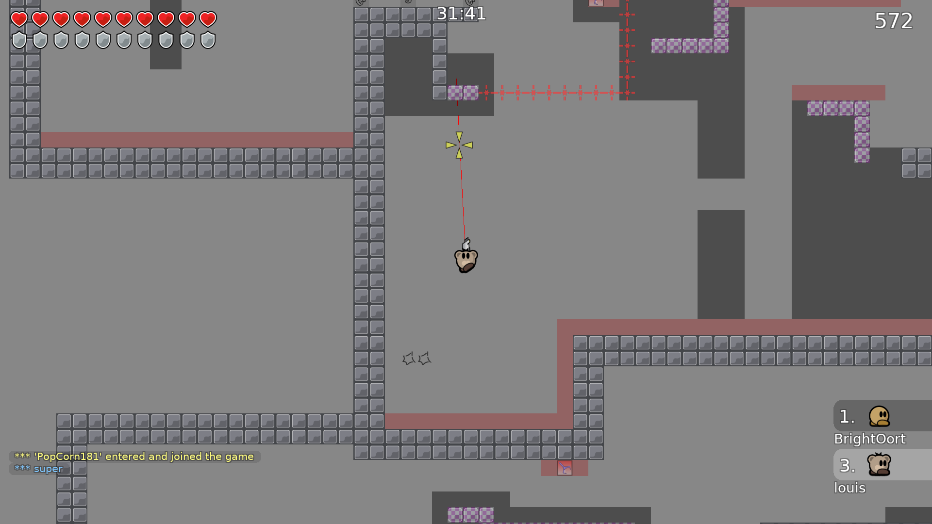
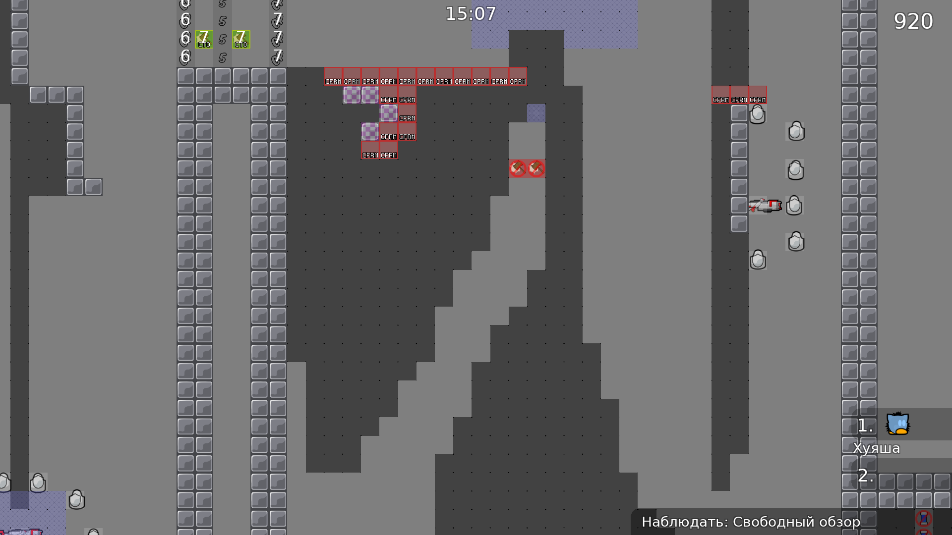
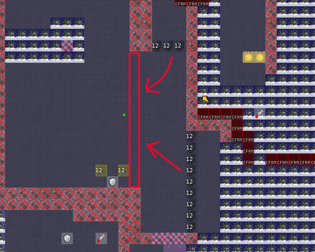
Your tune zones aren't clear, trying to work out what they do was rather painful. I didn't understand that this tunezone lengthened my hook and there isn't really anywhere that explains that. The same tune zone just below isn't marked the same and could result in a slightly late hook which would make your hook timeout sooner.

This part should be scrapped or changed in my opinion, it really isn't clear what's going on and it wasn't really fun to do at all in my opinion. The colour red here doesn't seem to work the same as it does in the rest of the map which leads to confusion. The part felt weird and upredictable but that made sense when i saw how many different tune zones it uses XD
You really shouldn't introduce 3 different tune zones at once imo as it's alot to take in, the player will have to work out how they work and then would probably assume they won't change for the rest of the map.
Rather replace this with simplier parts that introduce the tune zones that you use later in the map.

they shoot up because you are too far from tee , it's same but it's close , i made this tune zone so it would be easyer to get speed to get unfreeze and drag dummy in that spot , or other wise it's to hard to do it ... ( specific rehook and speed will only work , very hard to pull off)
workling on it , it will take a while
deleted part new part changed stuff , design change again
changed last part , logo , found some stuped freeze bugs
instead of placing 10 tune zones on each part which almost doesnt change anything and trying to make part work with them u can think how to make part clean and work without it, i dont see why u made all parts around these tunezones if u can make it work the same without
this is very big mess imo, for me its not releasable

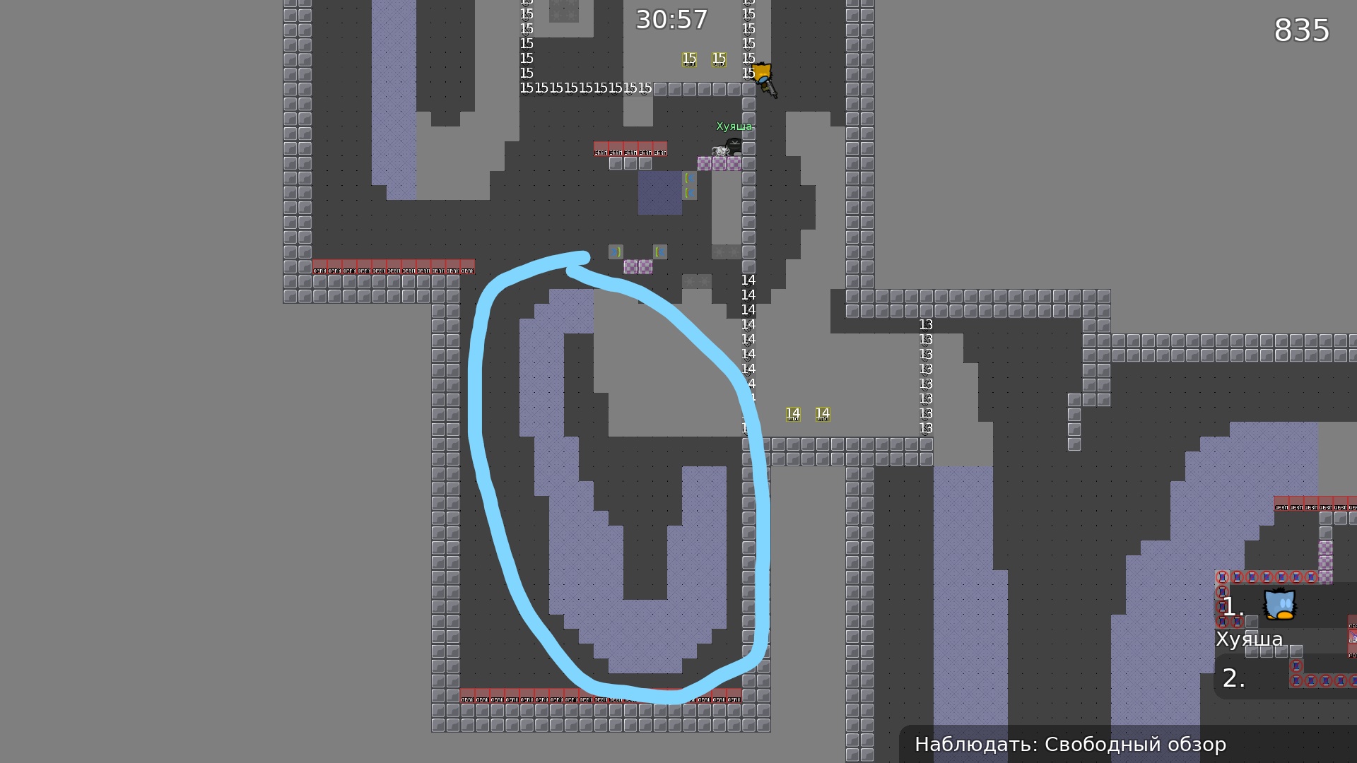
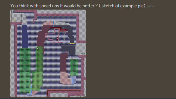
this part was with out tune zone and it's was so hard to beat it because you needet perfect 2 rehook and movement frames so you could get in right possition (unfreeze) ( 2nd pic) there are no tunezone 10 in one part ( was in one part ) yes i could make 1st with out tune zones but it's explaining how this part works . so no .
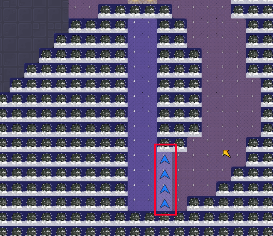
You think with speed ups it would be better ? ( sketch of example pic)

just dont focus on tune zones and switches, u should try to make part works without any complicated tiles and add switches only if u really cant find solution how to force the way u wanna. i see u are overusing them in all ur maps
3 tiles - 1 down 1 up 1 in one part push
like the other testers already said, this is a complete tune mess which is really tight and annoying to play. i dont think its possible to fix it at all because the map revolves around the tunes, which are used in a bad way. just try to map something where you avoid this many and random tunes.
$decline


