this is your map's testing channel! Post map updates here and remember to follow our mapper rules: https://ddnet.org/rules
there are a few small "skips" that are intended. besides that, im excited for your feedback and some pointless gores hate

How much of this map is gores?
Like u got like a % of the map
its a simple gores map but the actual parts combine ddrace with gores, so its hard to tell
was it declined from kog? or did u not submit there
didn't submit
ah ok
small fix
boresace
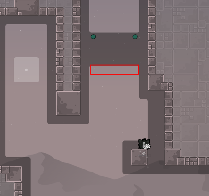
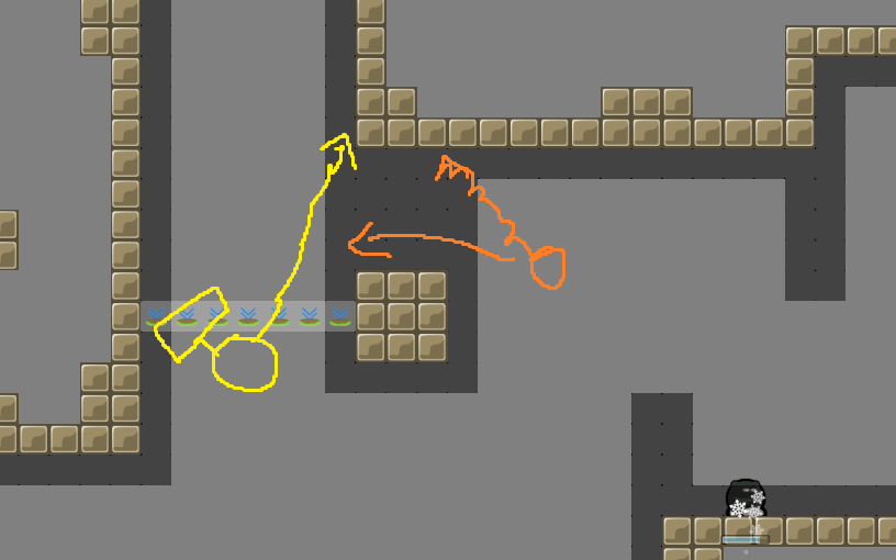
small skip, i'm just saying it exists, I don't think there's any point in fixing it
Looks intended idk
i think this intended one
Possibly
I think its a cool map ngl, gores isnt too excesive since you do like 2 or 3 seconds gores then a part, 2-3 s gores then part, quite cool, easy and clean.
idk, you need those switches for this part idea
thanks for testing!
- added unfreeze
- fixed switch
im not big fan of gores, but map feels good while playing it
it's gores + 2 player mehanics , it's called borace
small fixes
overall good map, I really liked it
$waiting
but then the part wont be as funny anymore
maybe a different fix that still requires both to be in there
but design is good enough to toggle for that 1 part imo
Can't you add in commands so that the weapon is off by default? Like you do with Open_switch. If you can then you can do that and add a timer when you are inside the box, so you still need to wait inside the box for the weapon to be acitvated? (Maybe, im not sure)
Or you can add a line of "off weapon" on the right side when you enter and just activate it inside the box
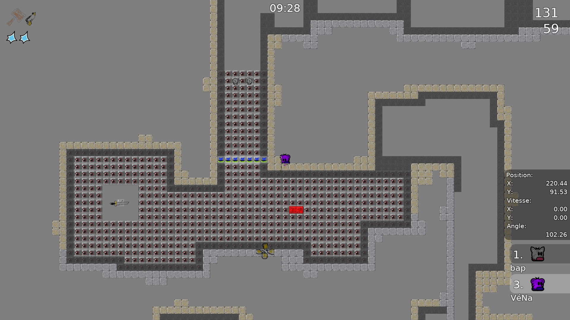
nah sadly all that works with one tee staying outside which kills the idea of both staying inside trying not to bump each other out. agree it looks terrible in entities but still fine imo, the switches are behind your tee, it's one small part and moreover you might anyway
here to understand the part.
I will ofc come up with a new part if you insist
thanks for feedback!
so should I rework the part?
No wait decline

U could make it a bit smaller idk
For me it's no problem tbh
i think its fine too
unless u can think of another way
Either find a better way or keep it like this it's fine 👍
- reworked the part after all
- some minor adjustments
Really like this map, It seems finished to me 👍
maybe make 3 row of stoppers
winner room ?
@tux314otherwise good i think
$waiting
yeah I know, im fine with it
also thought about it but I think the intended way is easier and almost as fast (also 3 row stoppers uglyyy) but im not sure about it
noo extra room, could add tele into the box on spawn but idk
sooo what do we do 😶
i think aled is easier
top guy holds dj and bottom guy can already go a little far into stoppers idk
ye its fine then just suggestion 😺
- fixed aled skip
- louis best tester, unless someone else marks $ready 😛
1 tile missing

background transparent unhookable into high_detail?
then ready
it's just that little at the spawn and actually I just added it so the logo doesn't look so random. I'd keep it if thats fine 👀
ok
$ready 5
I think its fine but doesnt it feel more generic now? Especially the second change 🧐
maybee but when spectating some tees playing I found it a bit "blocky" and unintuitive (at least for the second one). also on the first one there was no back + I just wanted to have more 1 tiler 😈
$ready 5
im not able to upload new maps for now so it will probably be the old version


