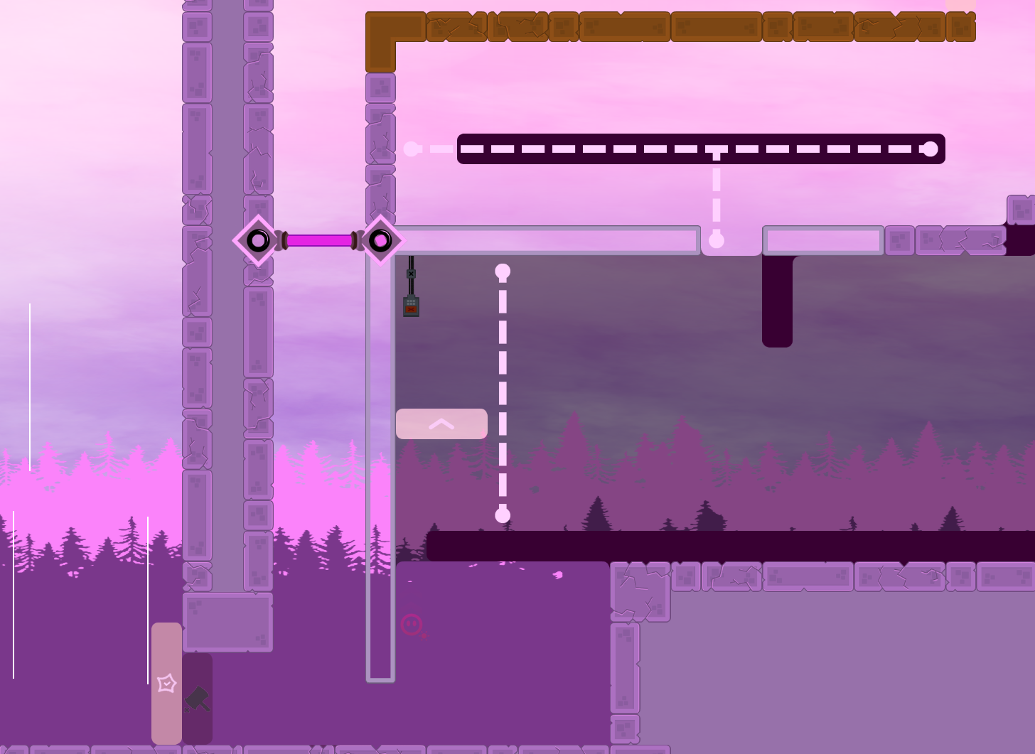
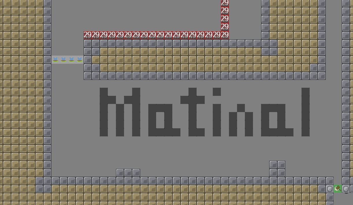
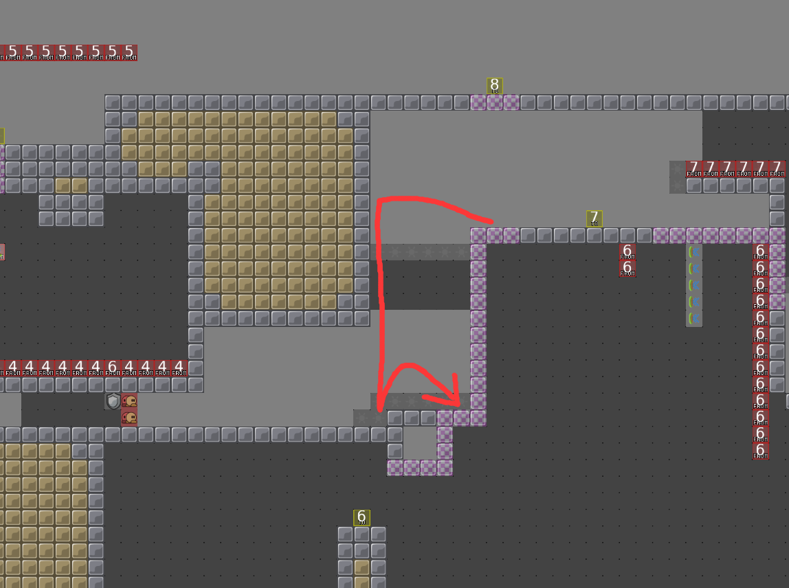
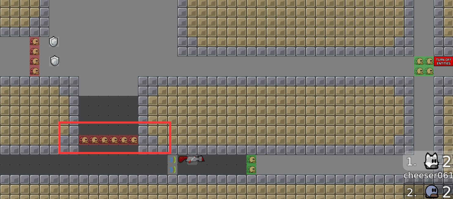
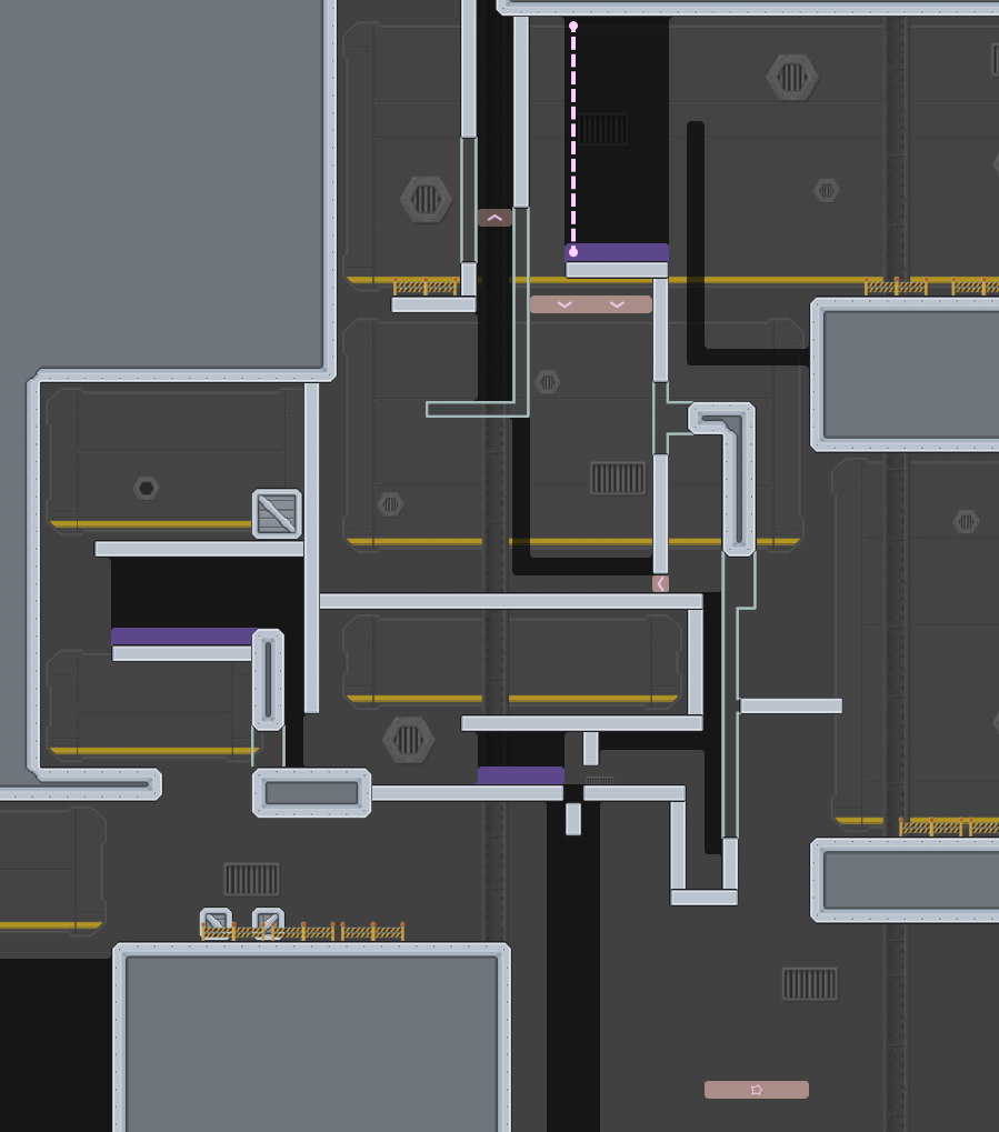
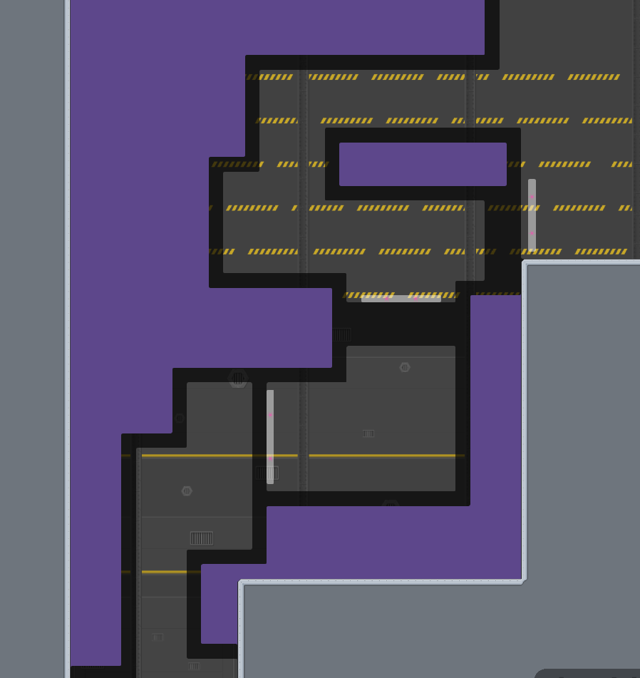
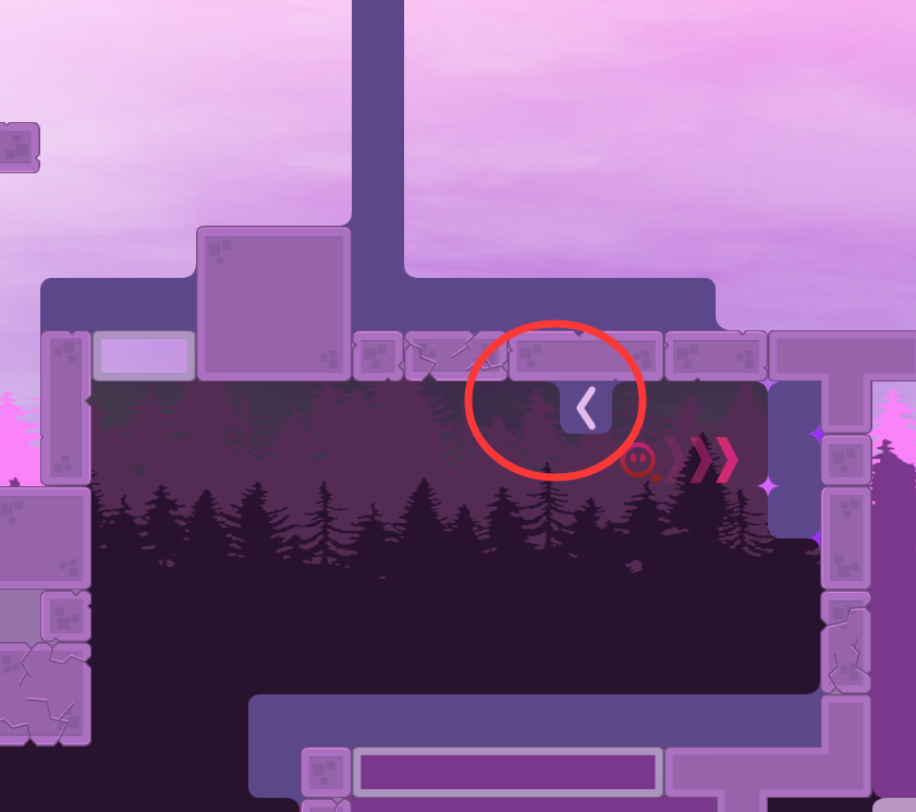
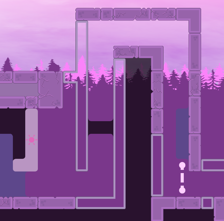
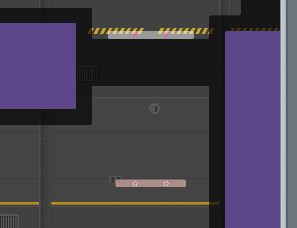
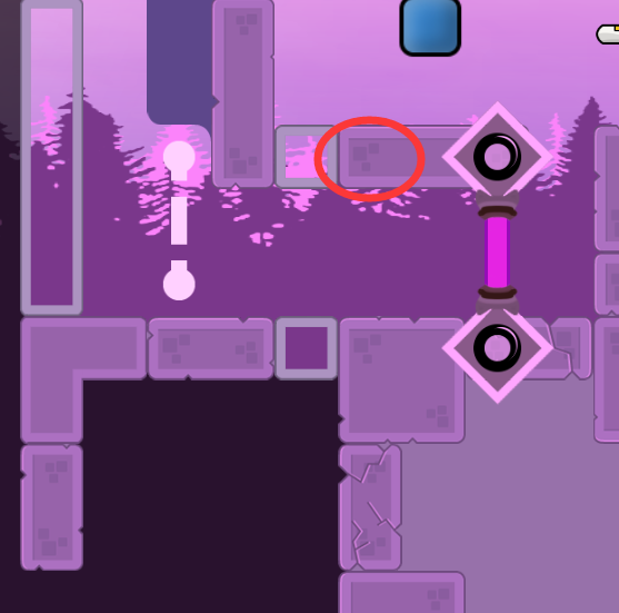
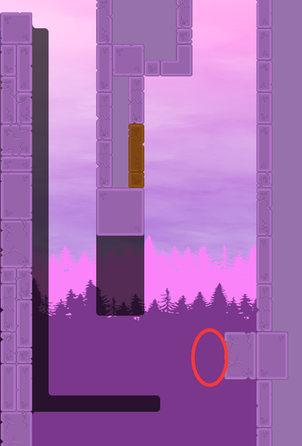
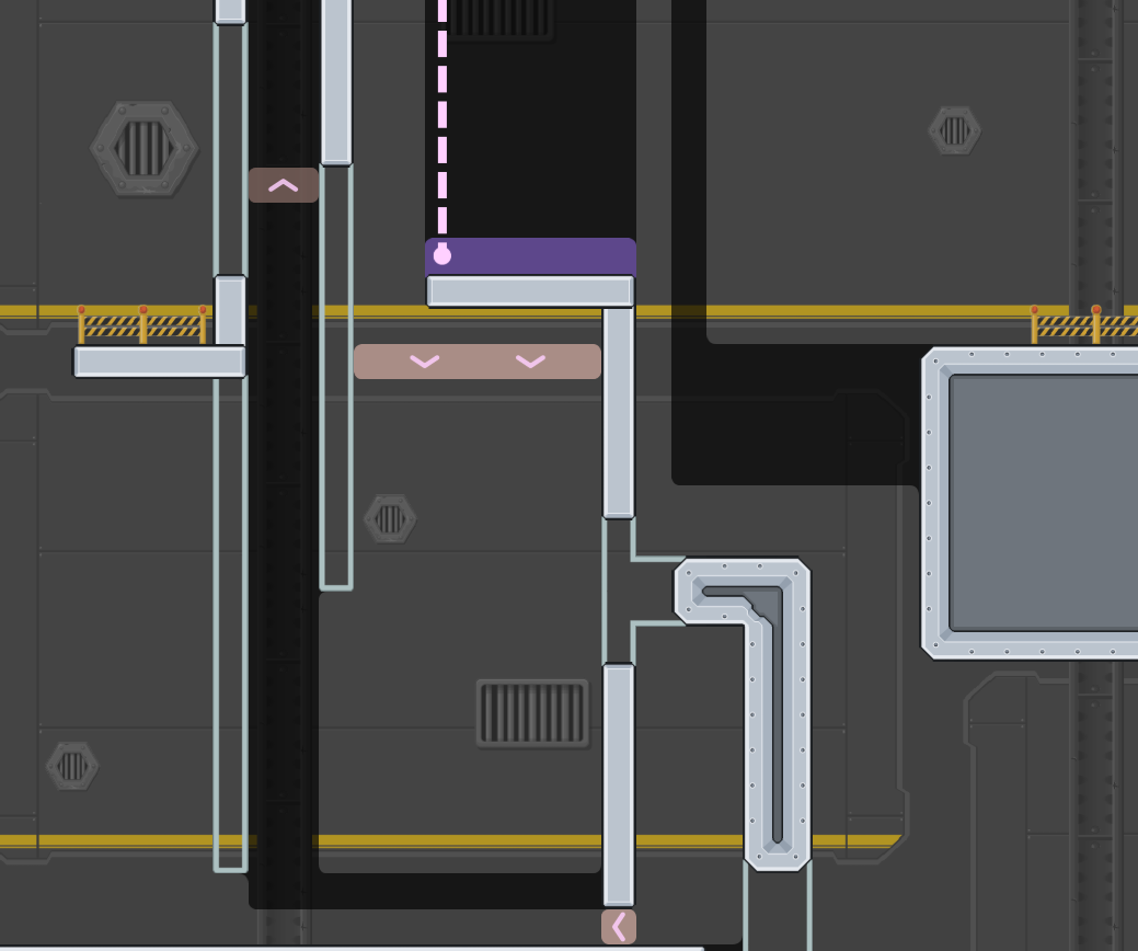
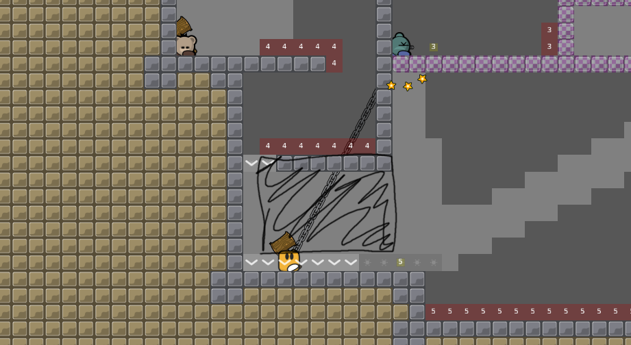
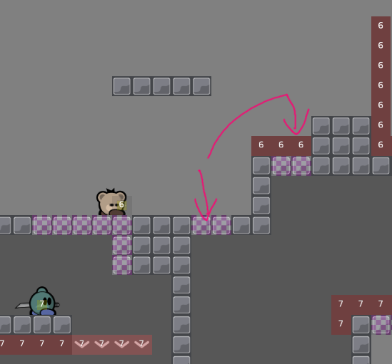
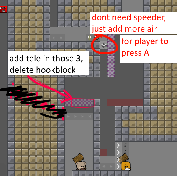
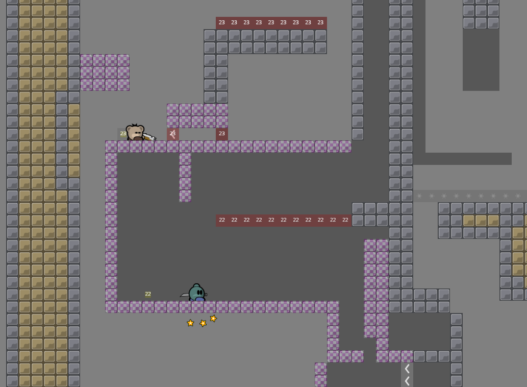
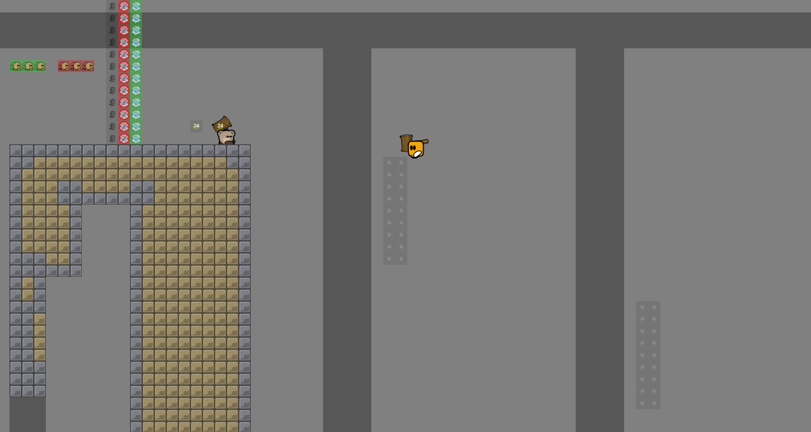
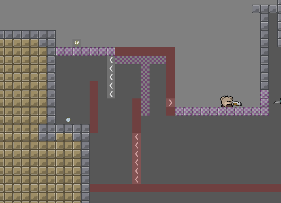
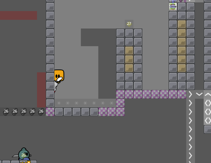
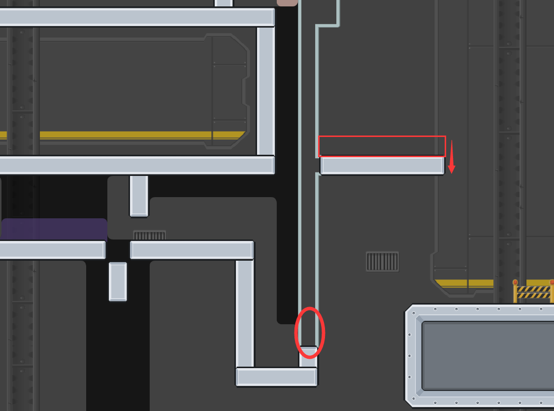
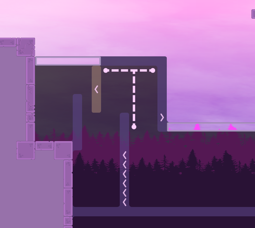
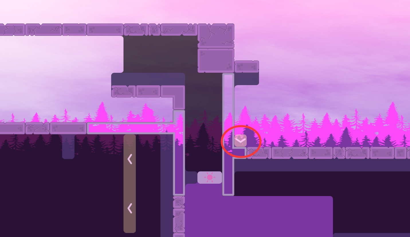
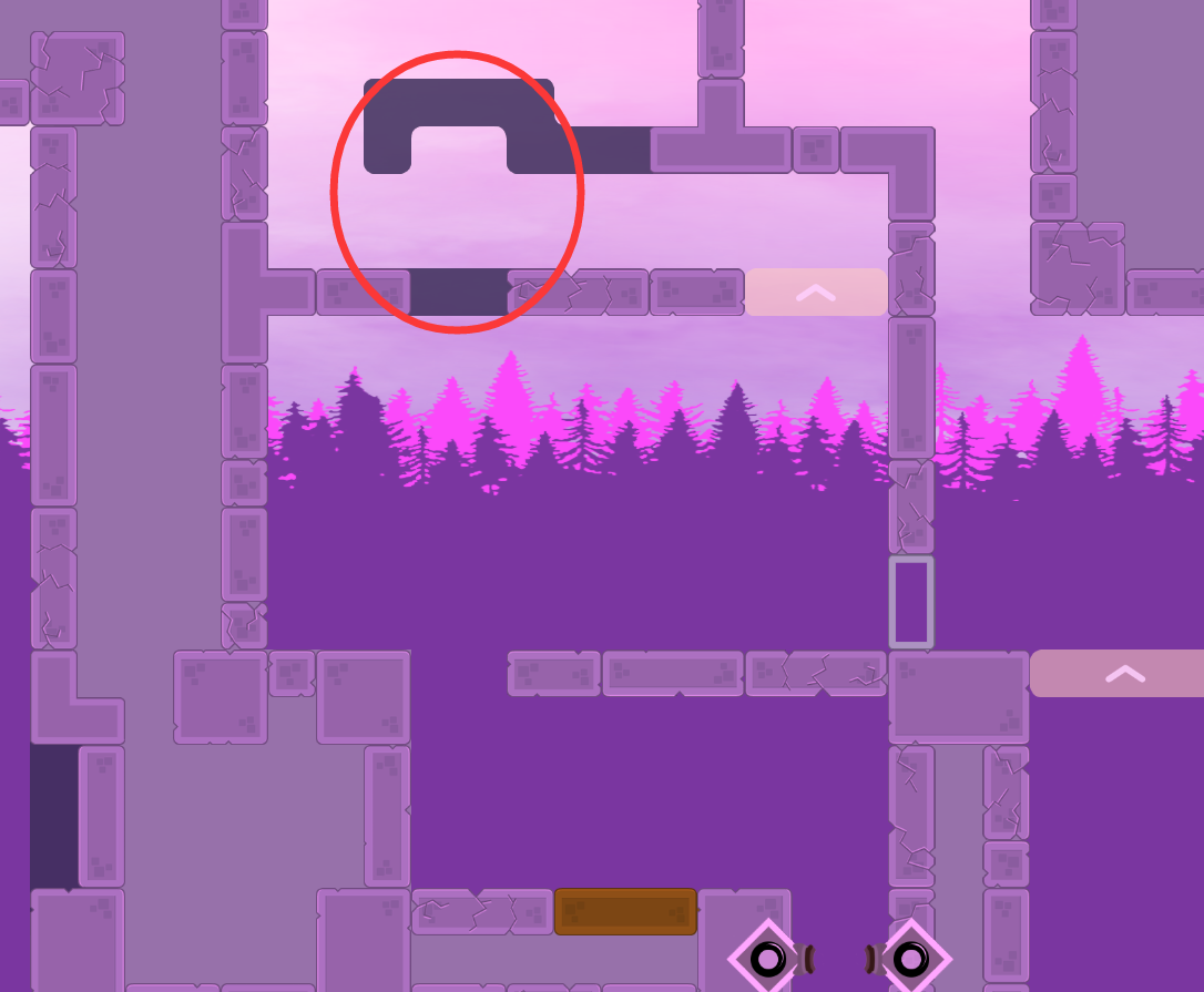
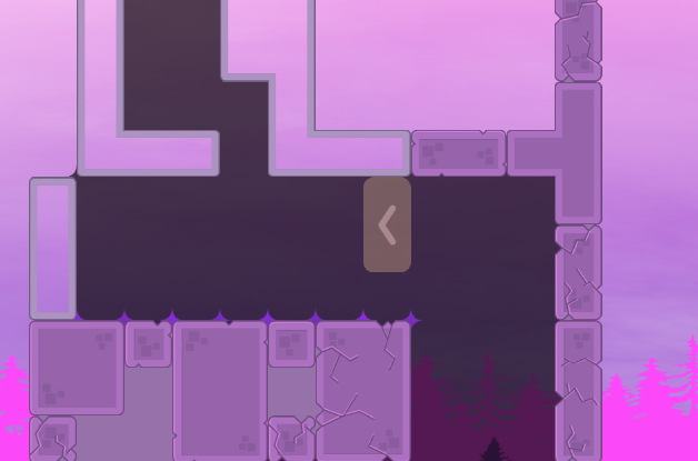
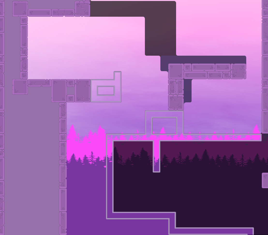
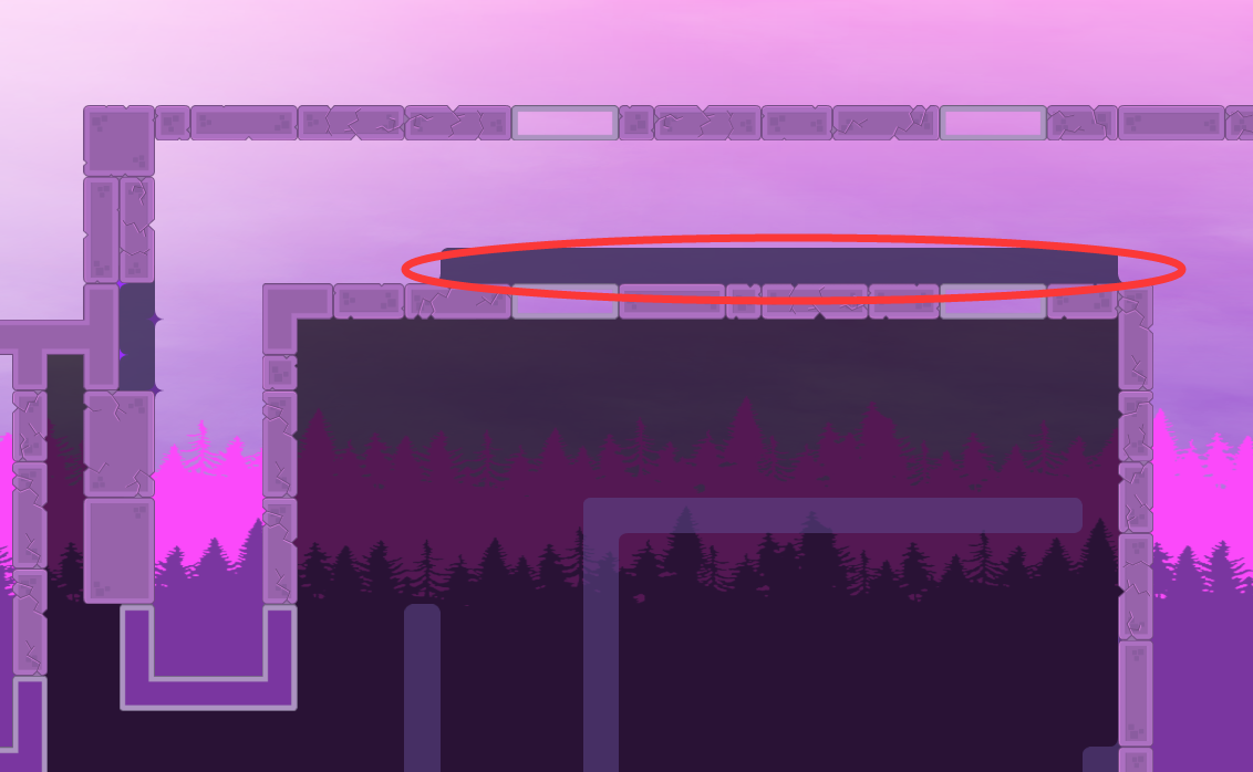
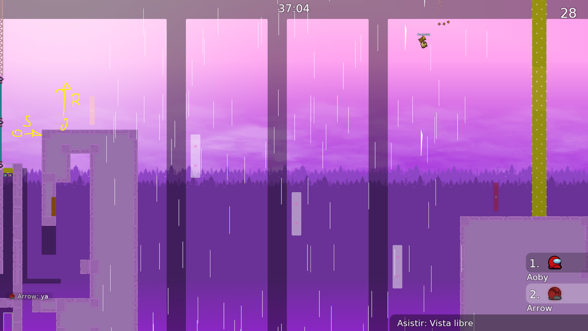
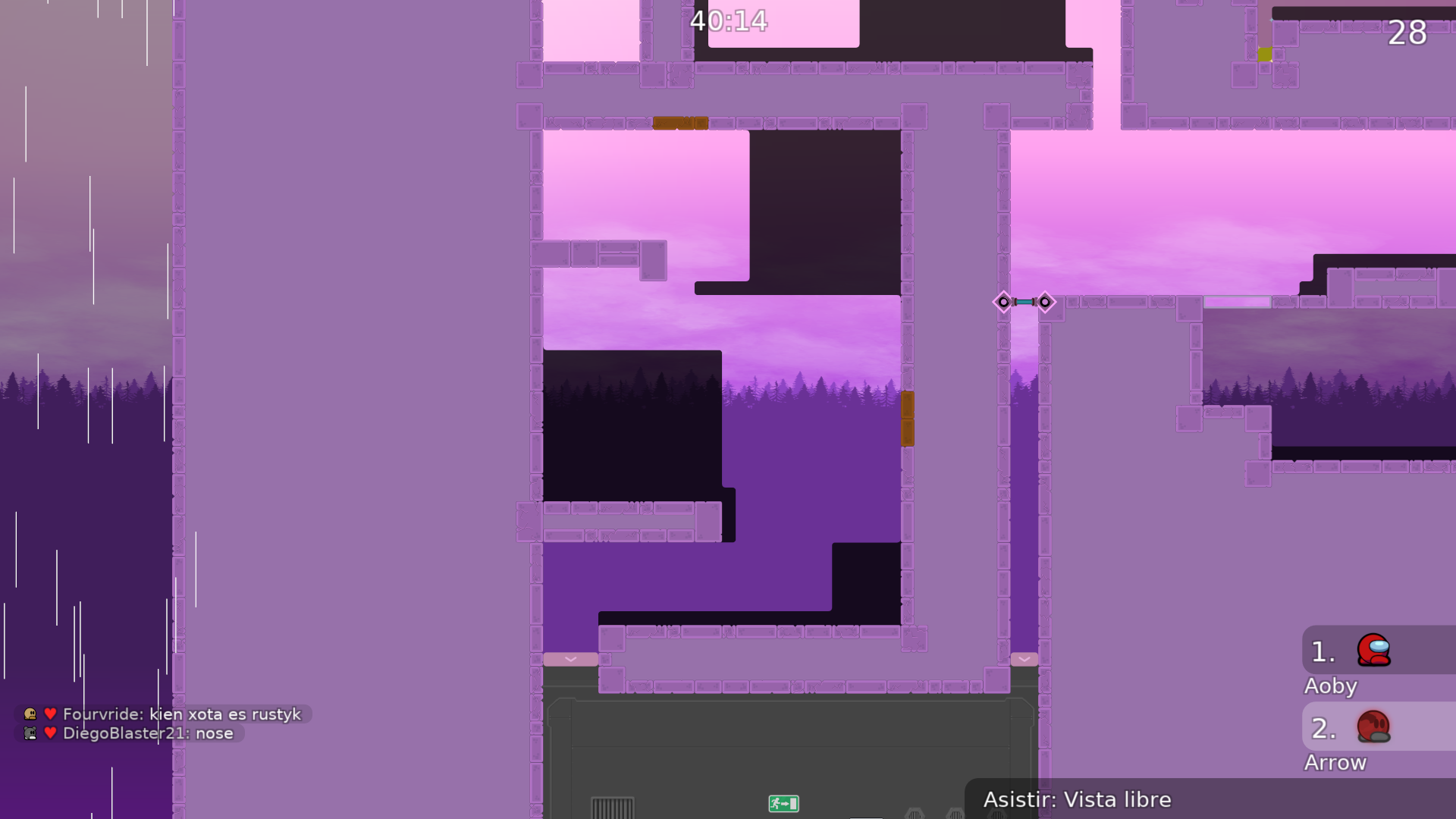
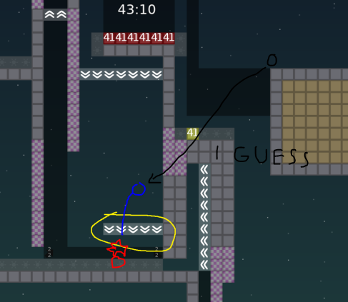
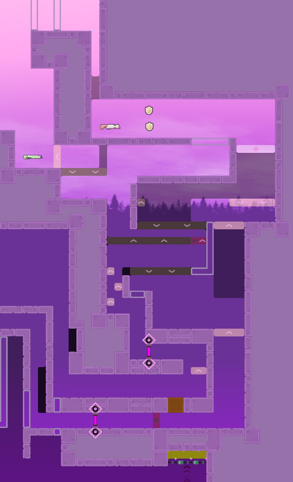
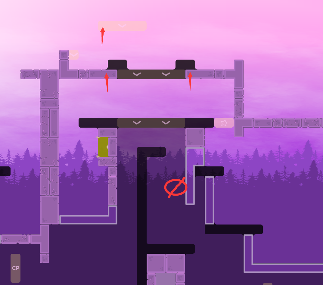
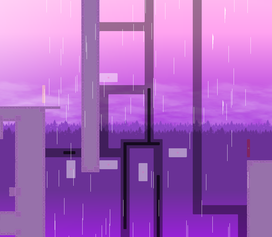
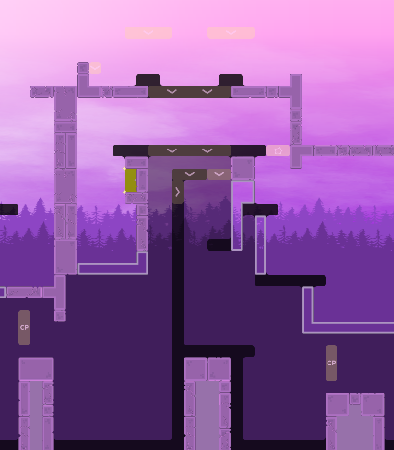
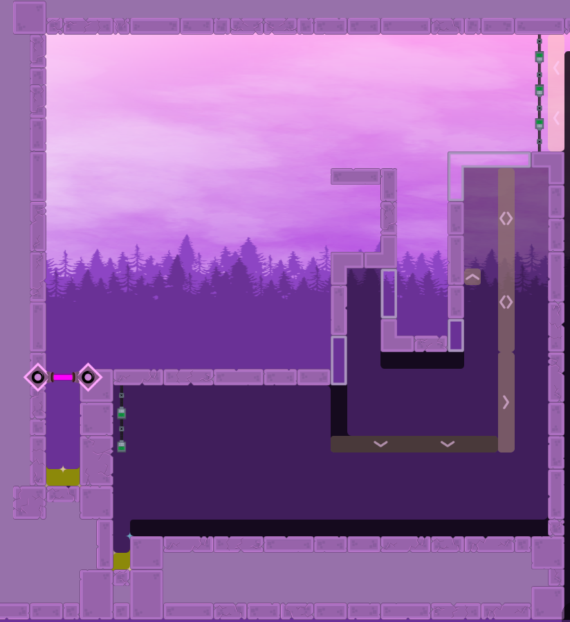
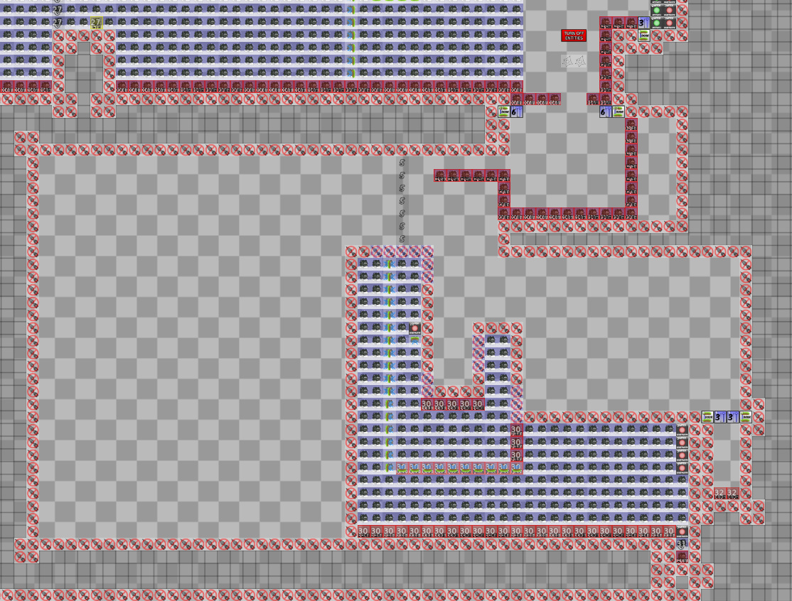
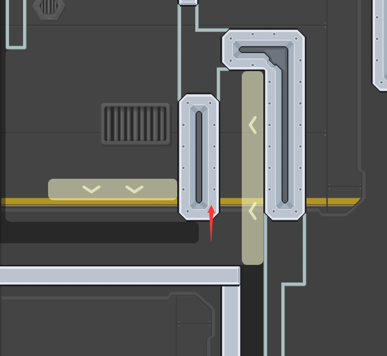
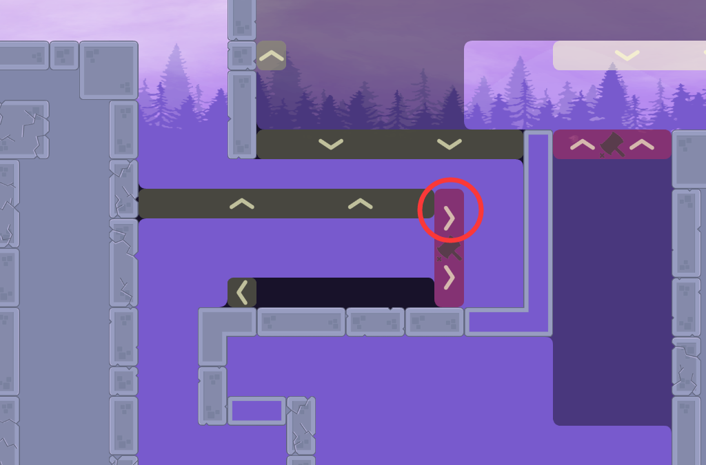
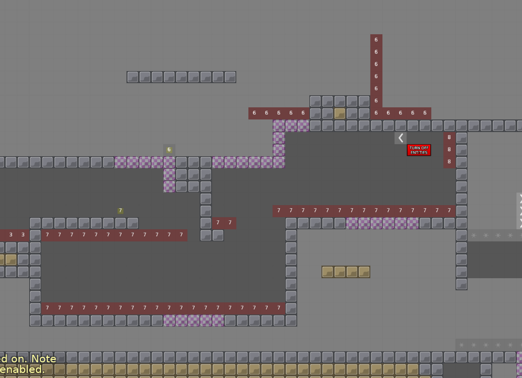
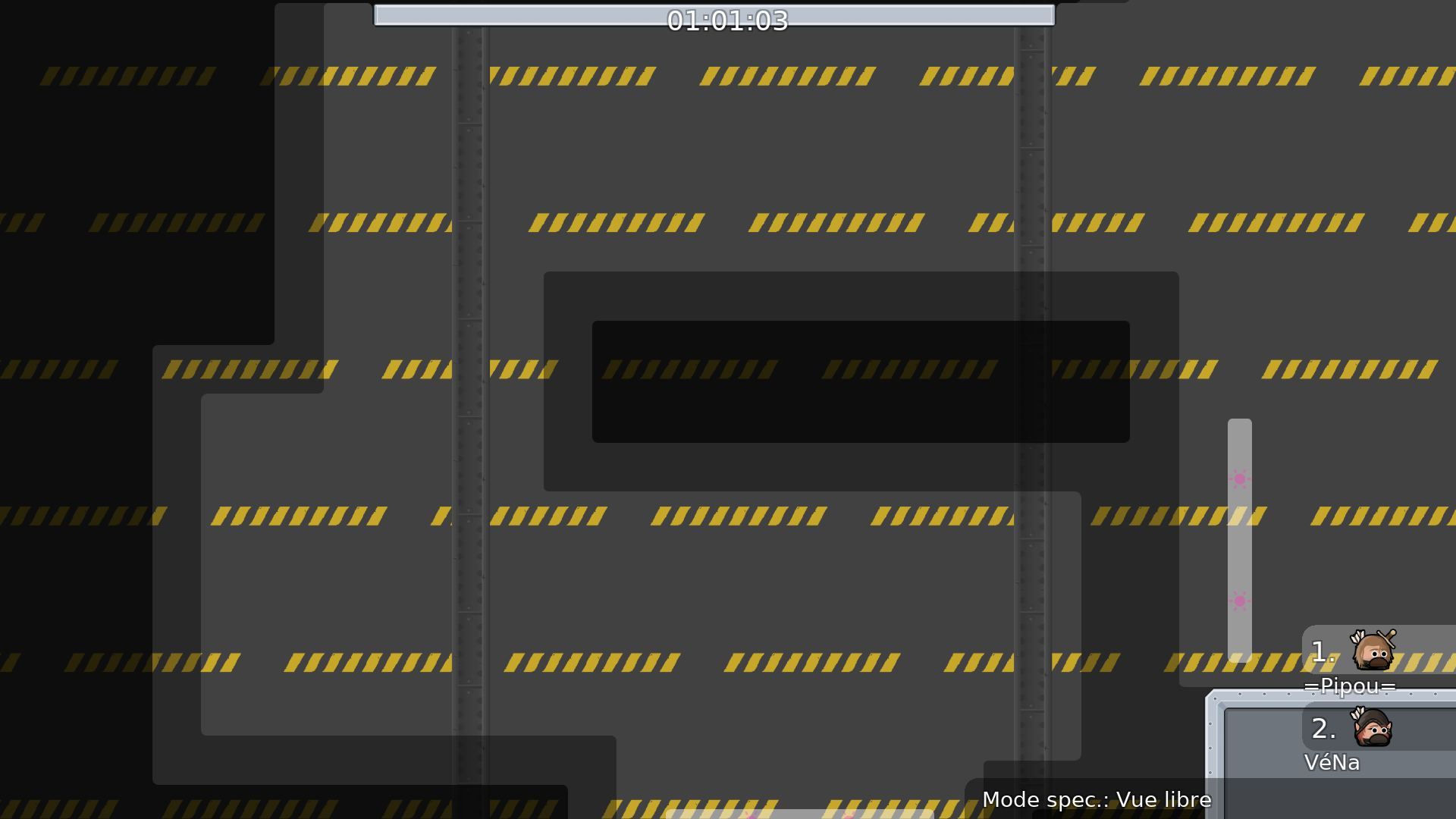
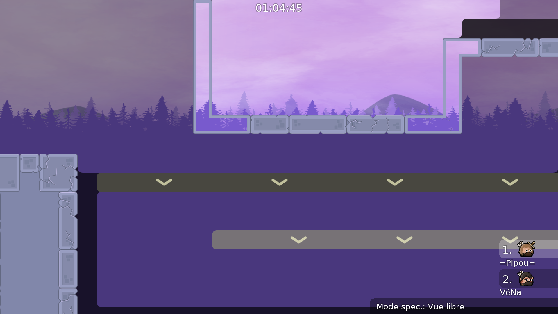
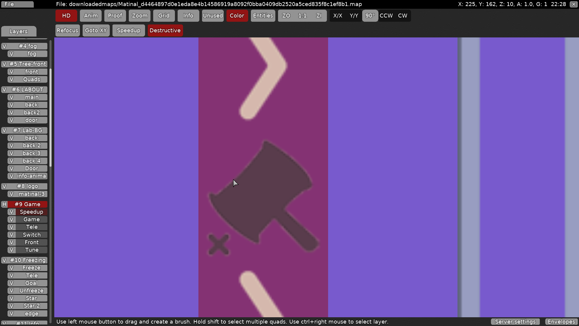
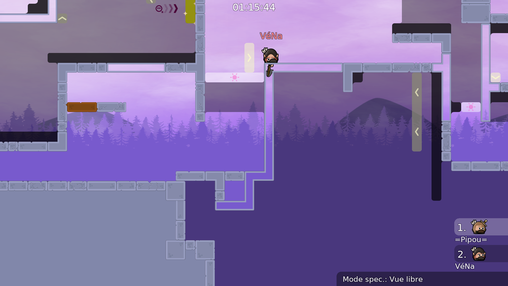
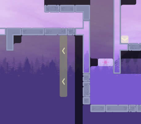
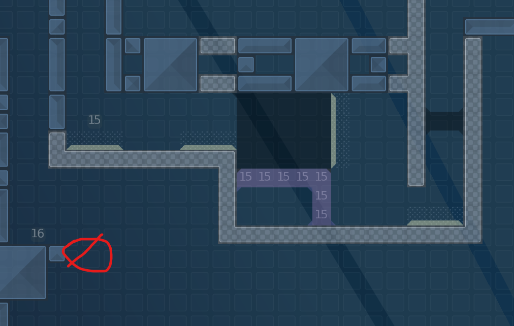
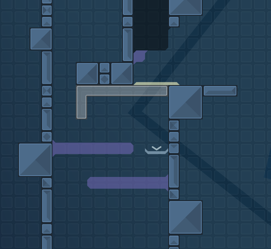
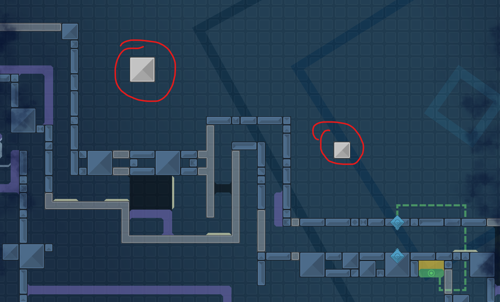
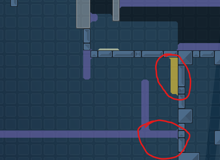
this is your map's testing channel! Post map updates here and remember to follow our mapper rules: https://ddnet.tw/rules
sorry, this is my first map, there could be a lot of things wrong
I have tried to correct some of them
didn't played it but it looks like you did put a lot of effort into it, got to appreciate that for sure
with reference to design .. less is more sometimes
thank you for your support and advice. for the design, I wanted to show a better visual effect, so it might look like I used a lot of things
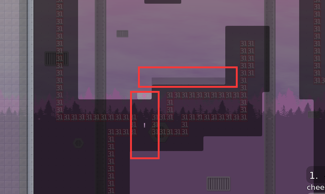
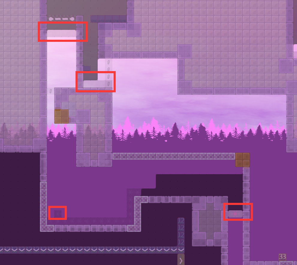
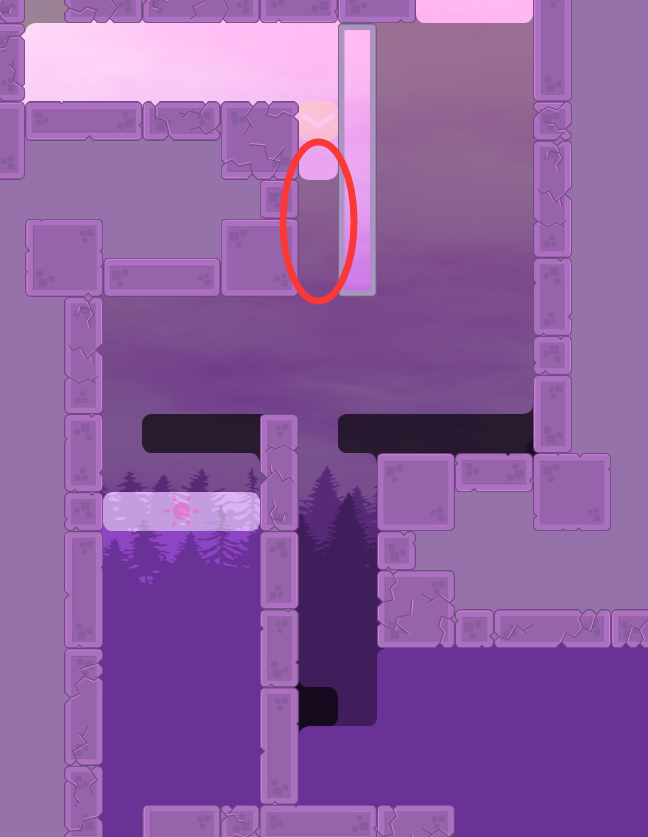
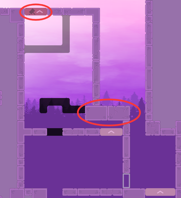
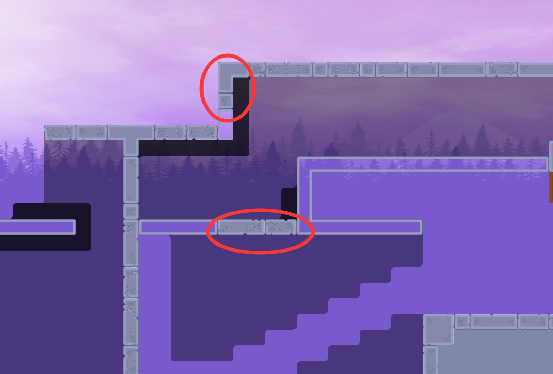
corners
fix corners, thanks to
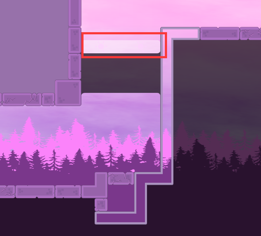
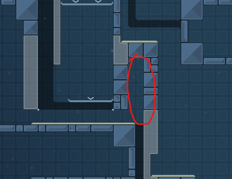
@PapotaVbut i saw corners of that "background"
im sorry i can't find it
mmm
maybe im retard
stop
stop
dont have the map with sound + team alert on an envelope
and u can change the color to match bg a little better
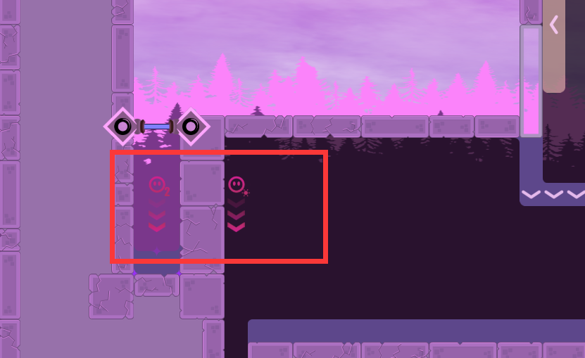
im nitpicking but the chains in spawn are a bit buggy
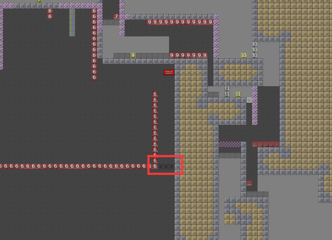
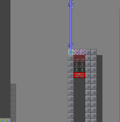
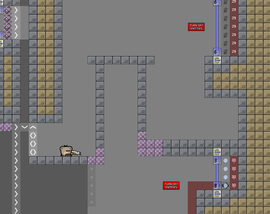
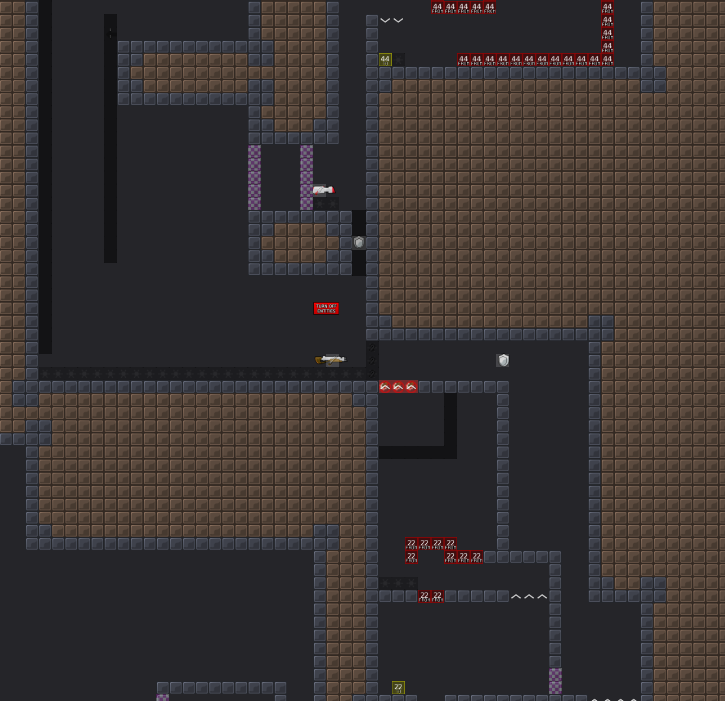
and in entities it is very ugly, maybe put only one TURN OFF ENTITIES sign
and since there are so many switches and whatnot, you can just have a single teleporter in spawn to lead to a room with all the switches needed, to the final tele spot (if that makes sense.)
however, this is not a very big deal
thanks for the advice. i'll correct these later
change the color of tips to match the background, put the dummy setup in another room, delete chains, change the envelope of mws and team alert, thanks to
@louisremove some misplaced images, add a sound effect
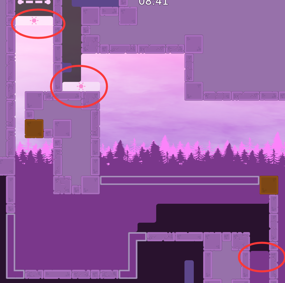
fix some skip; change the form of sunlight; add missing tile; fix the stones which not enough one tile high; thanks to Cøke
sorry, forgot some missing tile
overall the map is nice
just has to be polished
thanks for your feedback!! i ll fix these problems later
fix some gameplay or design problems, thanks to
@Arrowshould i have to remake all the parts or just some of them?
just wait other for the map test, or you can change the part if you think its not good enough
remake parts
fix corners and some design problems
fix design problems, remake part cp12
remake 50% parts
fixed a design bug
change the ahpla of freeze tile and the color of tele, make them easier to distinguish; removed the disappear cutscene of tips, player can always see tips now; put info group behind the game, player now can stand in front of the info; buff/debuff in freeze are have darker color, indicate they are covered by freeze; fix some skips and design bugs, thx to cheeser0613
most of the part still have issue of gameplay balance
consider to let the height same
$waiting
remove unnecessary tips and most faily freeze remake first part and part tele14 buffed part tele6 going from totele7 back to totele6 becomes smoother time cp is now touchable to all players except dummy moved unlimited jump behind the totele fill switch6 make tele21 drag smoother make the tile under the freeze darker make the unfreeze sun lighter
fix
since you cant pass the map when your team is less than 3 tee, better remove this otherwise the teamrank system will buggy and no one gain teamrank
same situation on other place, you should check again
removed some useless entitle tips
delete command: sv_min_team_size 3
rearranged part of HD
U should try to reduce the file size it’s way to heavy
the music actually makes up more than half of the file size, and i don't want to get rid of them for now
i reduced the music size as much as possible when i added them
when you place the time cp you should also consider the scenario about what +- will they saw when they swap place for second run
same situation happen on time cp 7 12 13
location of time cp in this version is almost the same as the last version, bcs i can't find a better solution
there are very few places in the map where two players can pass a part at the same time, and i don't think it's worth to remake parts to replace time cp
except some parts are not good enough and need to be remake
remove bgm
renumber the tele and switch
so someone could test it please
fixed switch bugs
wrong map sry
real fixed
btw has anyone tested my map already before?
Just wait another month bro you'll be fine
I love the parts, very good map
but the design is unplayable
is there any design looks bad?
tell me and i will consider to fix them
sound envelope is empty
i checked and didnt see any empty envelope, what do you mean?
wind
or sound layer will be remomve
you mean the group:Sound?
i've already added the sound
close to time cp 3
sry i did not hear it, you are right
its ok
maybe force getting speed like this a little better
or u could perhaps make less space to force them to use that one tile gap
for example, making all that hookable
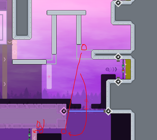
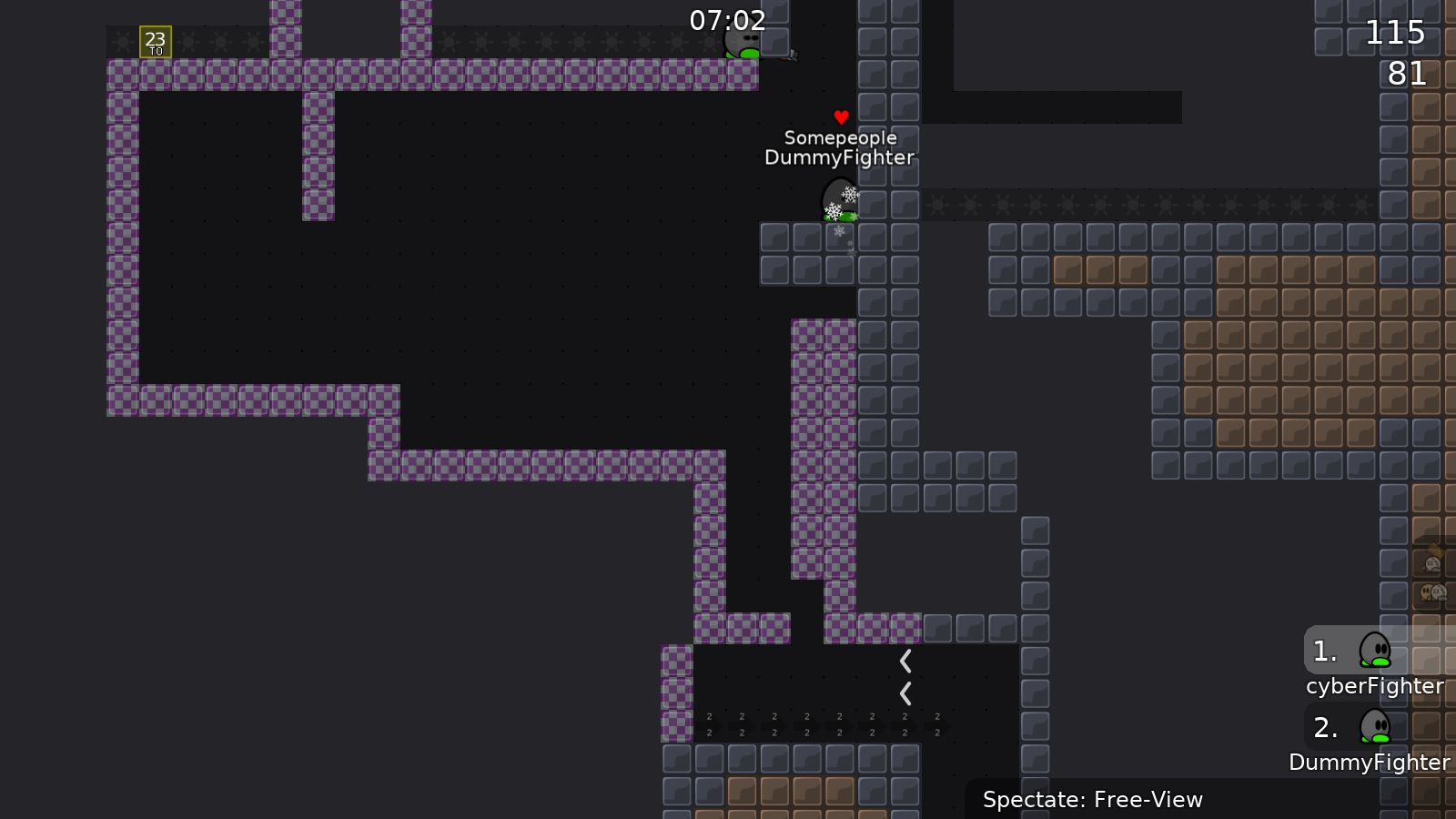
maybe add some space between these 2 hooks:
shotgunb isnt rly needed here since speedfly is easier way imo
raise the bottom by 1 so u can hook from top?
also that part is kinda hard compared to others
its not soloable right? so you can remove solo/unsolo
part is nice but would be nicer if u can do it without hookblock
try to give more speed for dummy to go > of stopper here
give more space to get speed
make dis part a bit easier
maybe just the top platform a block or 2 less high
and can you change markings for dummy and player thruout the map
hard to tell them apart here, just a change in color would be good
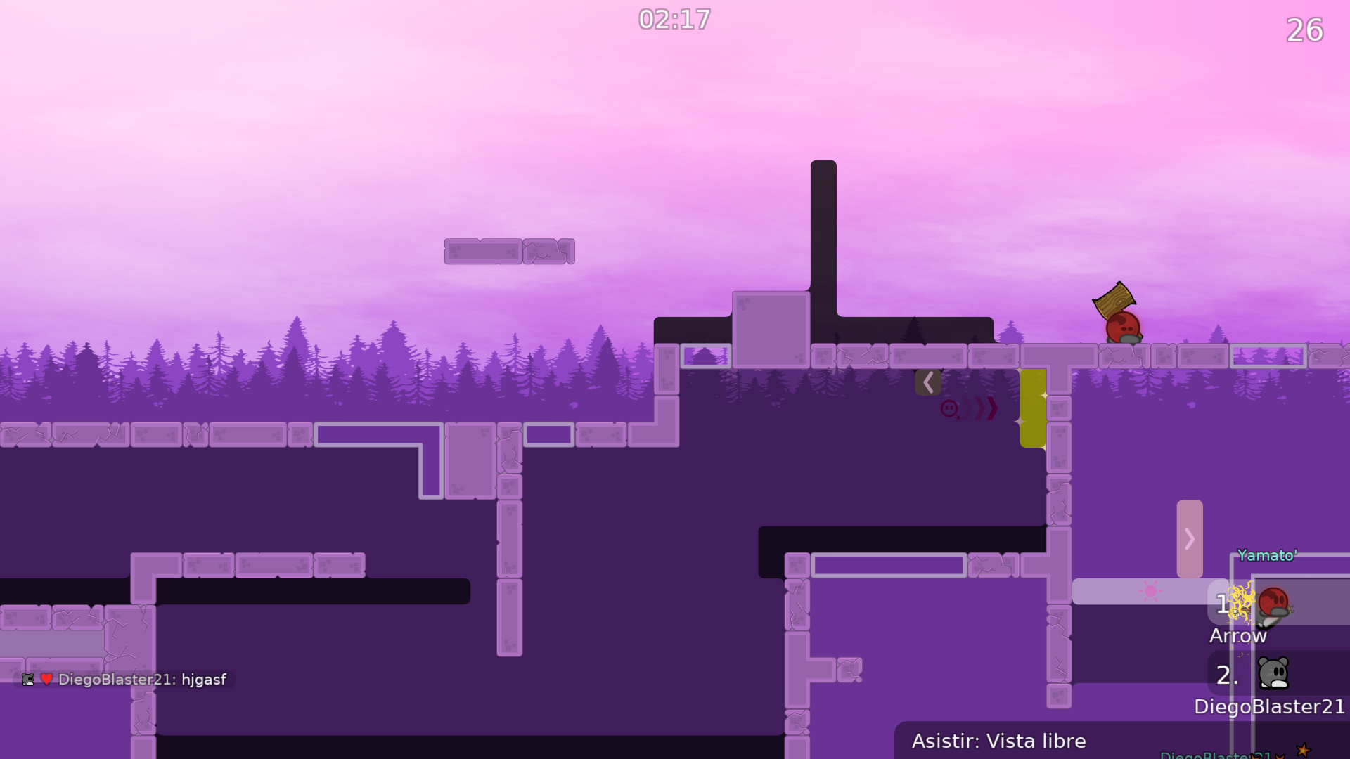
player color - pink, it can stay
dummy marking - dark purple
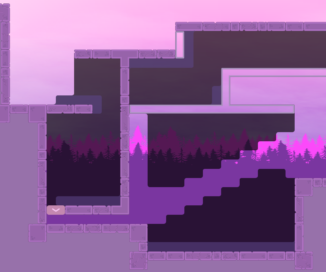
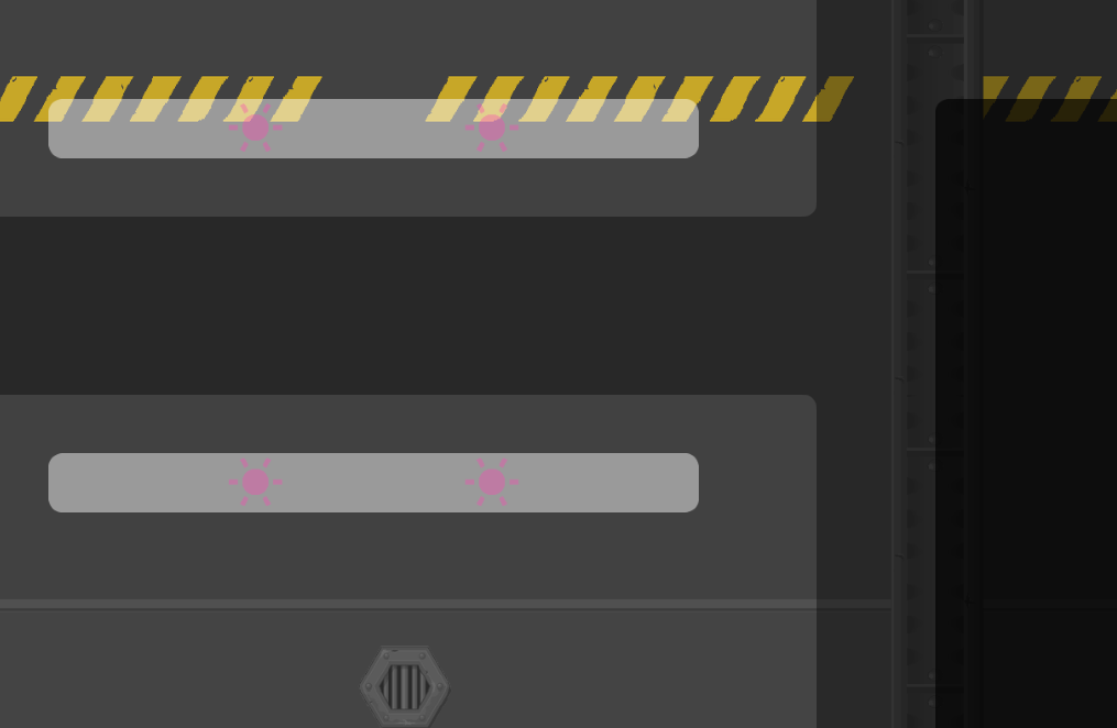
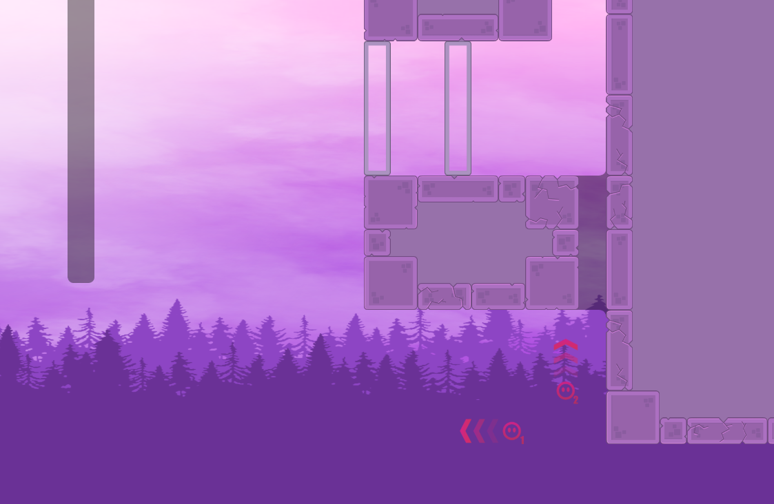
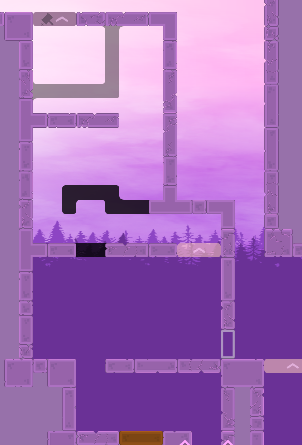
also background of design needs to be less saturated
and tree colors for the 2 paralax bgs should be more similar to both eachother and sky
maybe make 1 of those blocks on the edge a hookthru to make this hook a bit easier
this was kinda annoying to set up every time i failed it
good map i enjoyed it
$waiting
its good
and the last, im not good enough at art to adjust a comfortable color
this is the best i can do
and fixed a lot of design bugs
fixed bugs
i think this color is still not good enough, any suggestions?
change animation for fog
fog is moving faster now by animation
just as cold as it is here
remake part cp 19
map now has no hookblock
really no hookblock on the map now
change the color of tele
changed representation of tele when overlapped with stopper
thanks for helping!!
really good map
cheat here
cheat?
the rest of the map is real good
this is a bit harder to do and its fun to do so i think its fine to keep
idk what intended way is i just did that and went on

u just throw teammate to other side lol
oh
or hammerrun
this map is good af
cant wait for rls
ye its fun
thanks for helping test, and i would like to explain the issue you pointed out
i had fix the problem in the first video. in the second video, as louis said, I think any ways can be kept as long as it can used to do that part
ohh
i did from right side
lol
or just brute force

there are some minor issues with the map that need to be fixed and i may not have time to do that until a few days later, could testers put this map in waiting channel?
$waiting
fixed all the issues cyberFighter pointed out
that would do it
maybe this way is bad way to try to force the part but idk its just an idea
removed unnecessary speeders
fix corners
if you allow dummy get a finish as 3 tee finish record, then you can keep it
i still don't know how sv_min_team_size command works. someone told me that i need to add this command to limit the minimum players in team
should i delete this command or make dummy pass the finish line then kill it?
no the command is sv_max_team_size 3
min_team_size is that people wont get better teamranks when they started with more people to skip something and get better time than legit 2p teams
oh wait
u dont want less people than 3 play this map. But the map is designed that u can only finish with the dummy right?
then u dont need to add that minimum size
yes, in my opinion, dummy is the key to make players pass the finish line, and dummy wont get any rank or points
Yeah then u dont have to add that minimum size. Other 3 or 4p maps dont have that too
ok i get it, thanks
delete command "sv_min_team_size"
reduce the size of fog
moved the tree
moved the tree again and i try to add some mountain
the mountain looks bad, i give up
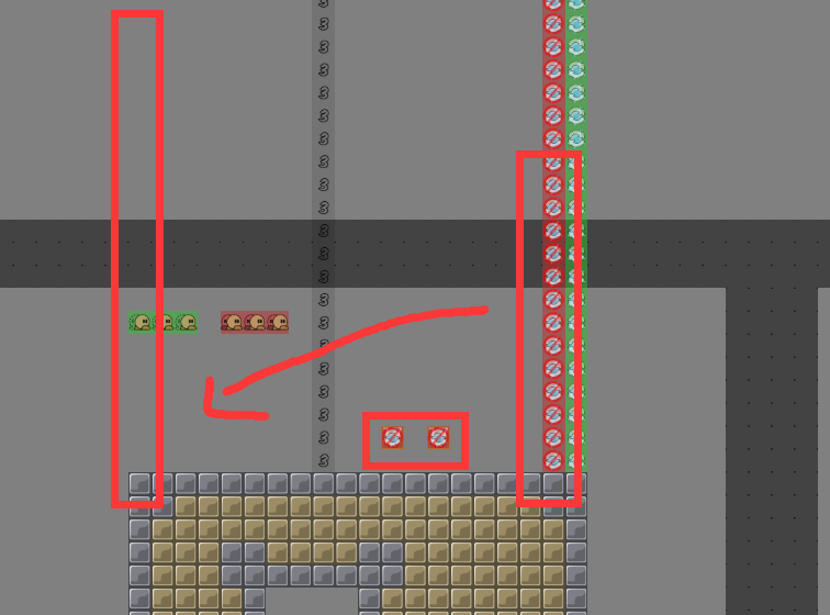
its to stop a cheat


i dont get it what you mean can you explain?
red is not deep blue is deep
and black is the other guy
and that would be the chote
so basically is to force to take speed from the player instead of the dummy?
yes
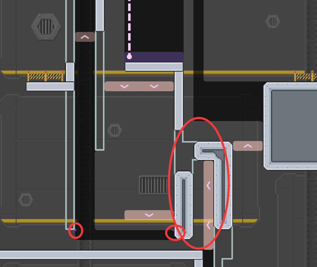
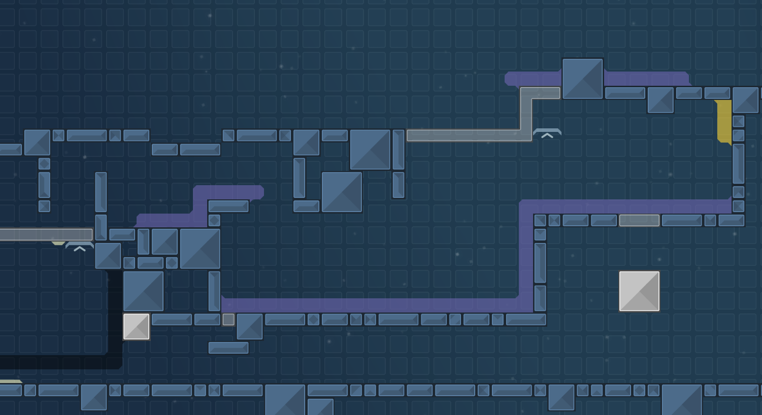
not deep keeps hooking deeped guy which is on the top left stoppers
ok
in general try to improve the tight parts so the flow can be improved + the other things
$waiting
could you explain when your gameplay gets weird in these parts? so i can rework them for the situation
and these stoppers work just as cyberFighter said
i meant the parts are tight i cant flow well bcs of that
for this part, i have no idea to improve it. i think the gameplay is already smooth
i tested with my friends, still a lot of bugs, moved this into waiting please
$waiting
just make it with more space, that would make the part feel better
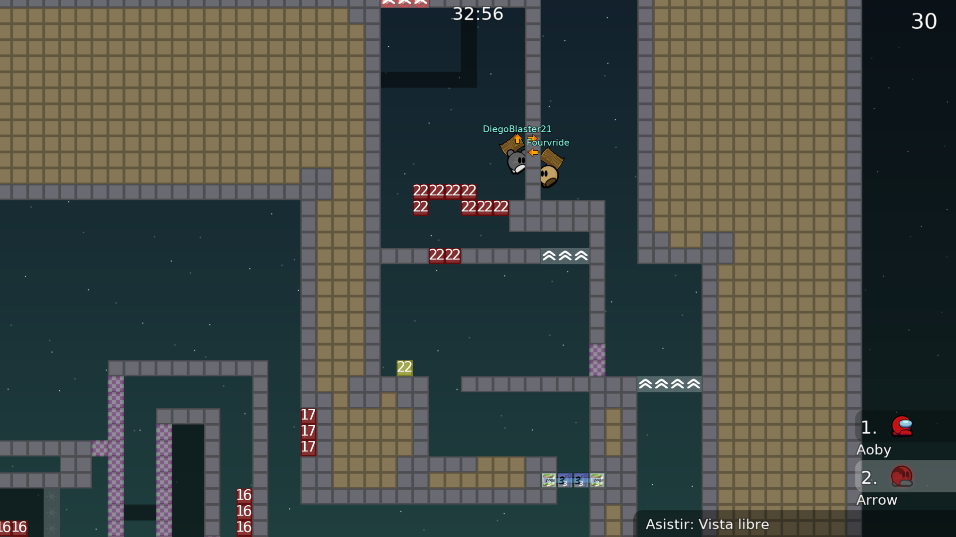
reduce laser_raech from 1500 to 800
Intended way
$waiting for changes that we talked on the sv
Sorry i have thought a lot but still cant understand what you mean to this part. If i change the location of gr part to the right, then the part on the top will also be changed, and if i change it then i have to change all of the previous parts. The other thing is: i still didnt get why this part gives a bad feeling to you. I posted a video before which doing this part and i think the timing is perfect, and there also have enough space to let the player moves. i would like to ask others who had tested this part and give the idea what you think. if this part is bad enough i would like to remake it.
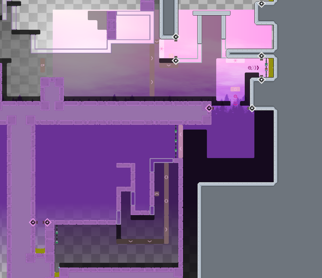
here are all the changes and ideas I have made so far
in generally
that could work to
mine was a suggestion
at the end you have to figure
I actually prefer not to make the change for this part
and if change, then i will remake this part
The shield return
The shield fade away
fix design bugs; players can not use /spec now
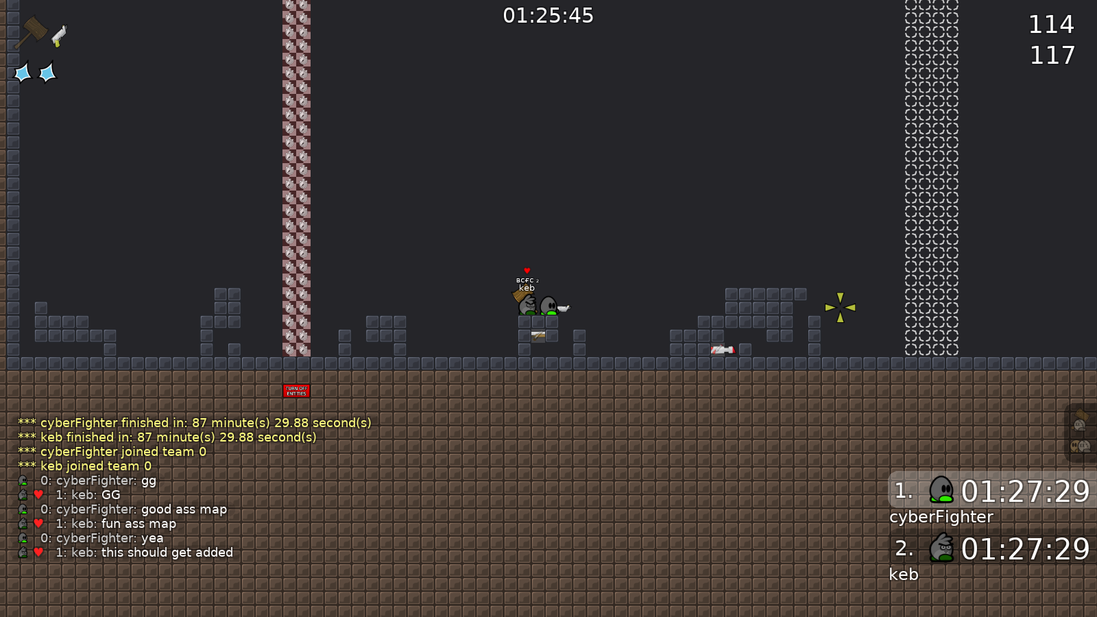
fun map, i played through in 1h 30m 55s (cheated a little, so i didnt earn a rank)

Happy half anniversary, my matinal
has it really been that long?
when rls
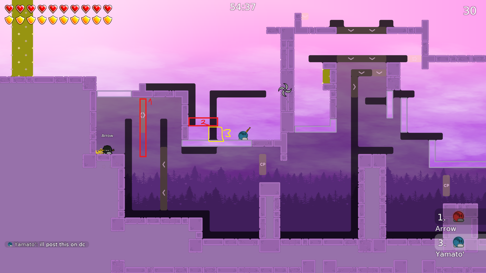
top guyd ont need hook here
this part hammer kinda tight ngl
idk
btw is speeder here needed
also whats with the troll grenade 0.5 lifetime
how do the first part of this part
we did stack +nade but its rly annoying
1 shoots you with sg and the other just rocket
bottom dude can technically solo this
idk why u have weird tunes for sg and nade, but dont use them
fix any cheats using some different way
I ll fix what louis said later
As you said, I used those tunes to prevent cheating. The grenade tunes prevent double grenade in somewhere, and the shotgun tunes prevent laser which bounced from an unexpected direction. Anyway, I delete those commands.
and this part just like arrow said
gameplay of the second part is worse than previous one, I need to think about it again.
I personally feel much better
what does lower player do
on the 2nd part
you mean this part?
the 1 part that keeps getting changed
xd
to prevent someone get in to tele with holding space (jump).
same situation in tele 44
design bug fixed
maybe i need to make an animation hint for the umlimited jump part?
added some animation hints
And I plan to make a new animation for the logo
new animation for the logo
details update
waiting for pipou to test this map

so..
So what ? There are many maps to test, you can help as well
minor change
That map has some good parts but it's definitely not moderate
It's quite unbalanced
And you often have to wait and do nothing
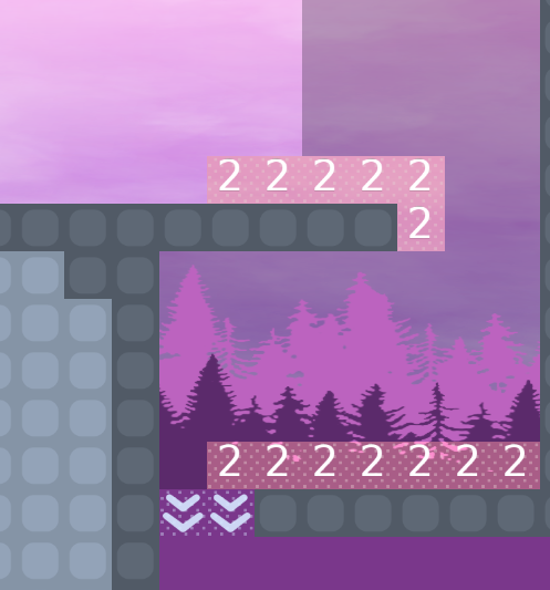
The choice of colors is very questionable all over the map, especially for symbols
Keep it simple, it's obvious that the dummy has to go there
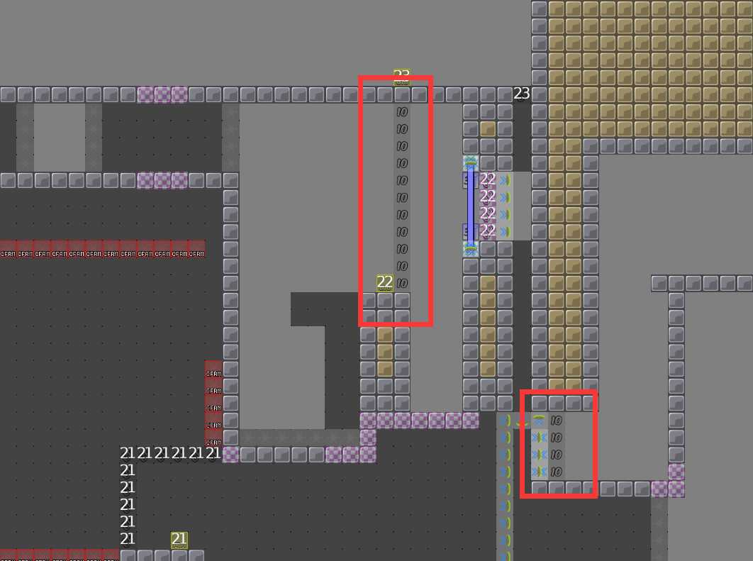
TOO MANY blockers, there are blockers everywhere for no reason
Too keep sliding everywhere
So, you need to make your map clearer, with less entities
And the bottom hook is just weird, why a such setup
🔸 I can see that you were very involved in that map, there are nice parts and ideas, but :
🔹 Your map is not moderate but brutal. 🔹 Too many design problems (game design and graphics) 🔹 The map is unbalanced (too much waiting) 🔹 Trying to make an advanced design is not easy and that was a good try, but there are too many problems 🔹 You use too many entities for nothing (example below)
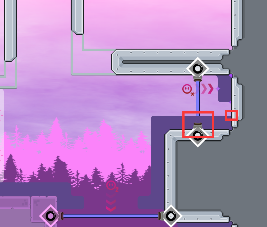
That's just an example of what I meant earlier
Make your map cleaner, the parts design and the graphics design
$waiting
Thank you for testing, I will try to change the design style completely
👍
Try to make it clearer
You can make a prototype and ask before doing a full redesign, not to waste time if there are things to change
got it
how many stars if brutal
how about this
Looks good to me, need to see it as a whole
Okay, I'll finish them all
This is no longer matinal, I want to rename it "Distance"
$change name Distance
thanks
Completely rework
move some effects into HD
Alright, I'll test it today
bug fixed
bug fixed *2
bug fixed *3
Reduce file size
reduce again
fixed design bugs
fixed design bugs *2
add secret
optimized the unlimited jump icon
Personally, I think this version is stable enough to test
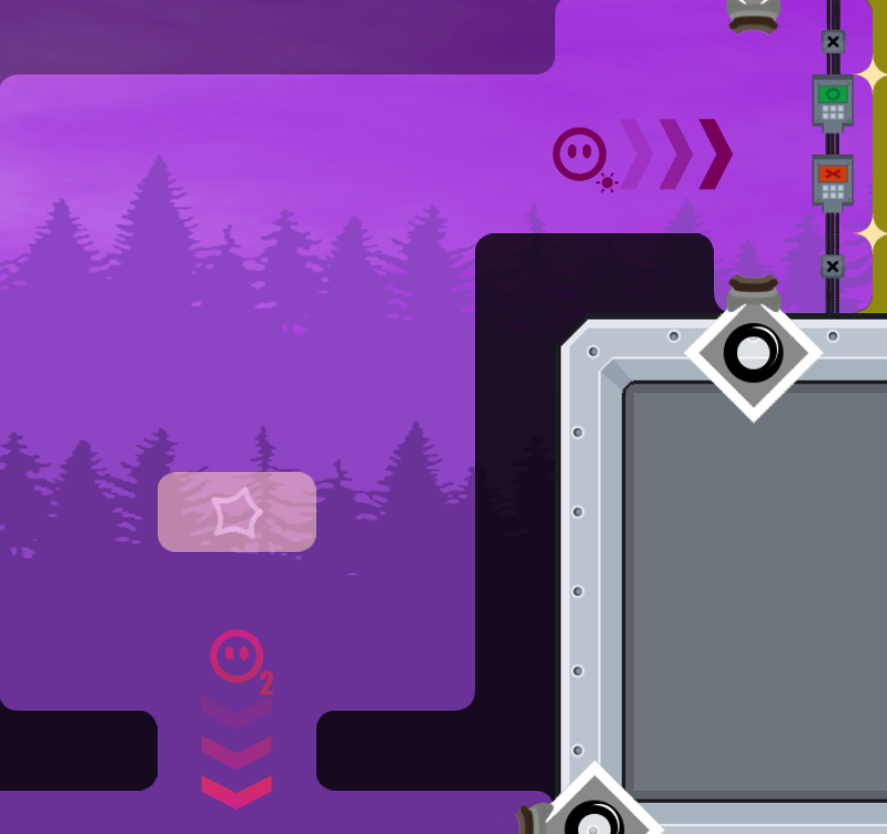
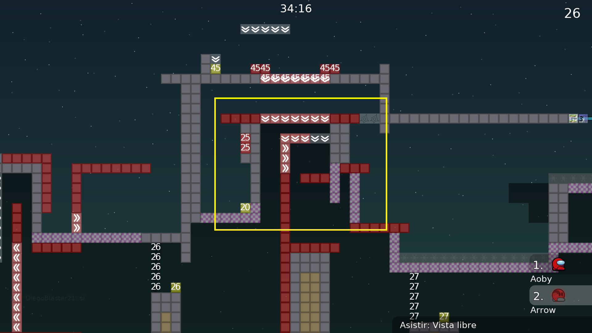
that sign doesnt look like infinite jump, actually looks like a enter to a solo and jump refill
Ok I will try
as you wish
i should really try making my own entities signs things someday
oh I`m sorry
what
I just did what tester wanted me to do
ohh hey dont worry about it!
yours is perfectly fine!!!
should have specified it would be for my own thing, not yours
ok you are the best

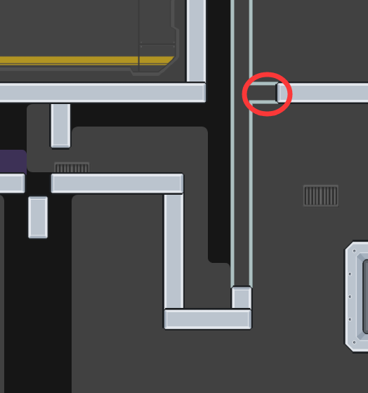
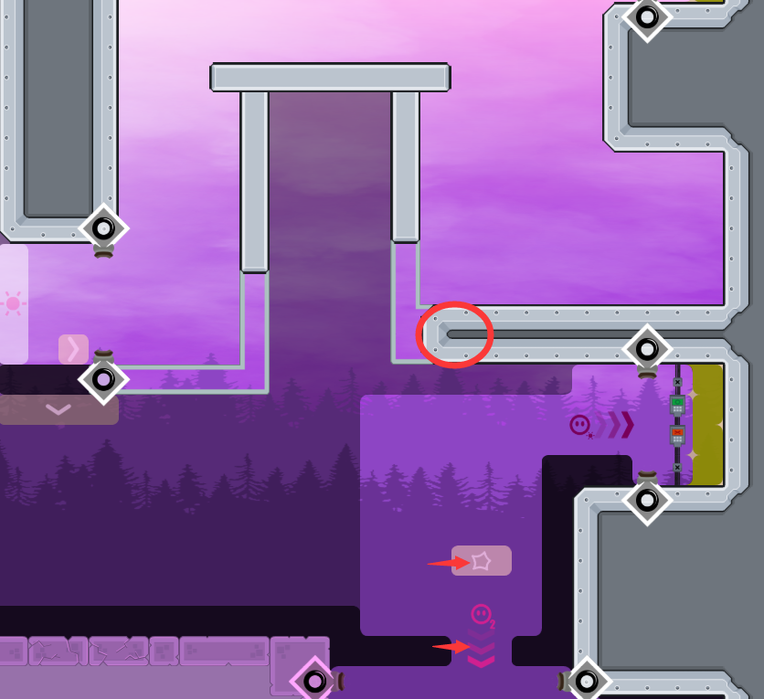
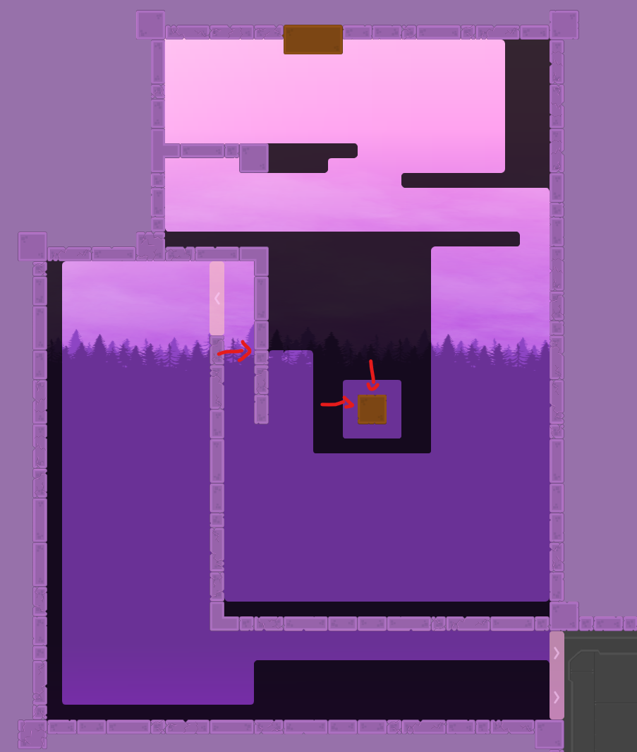
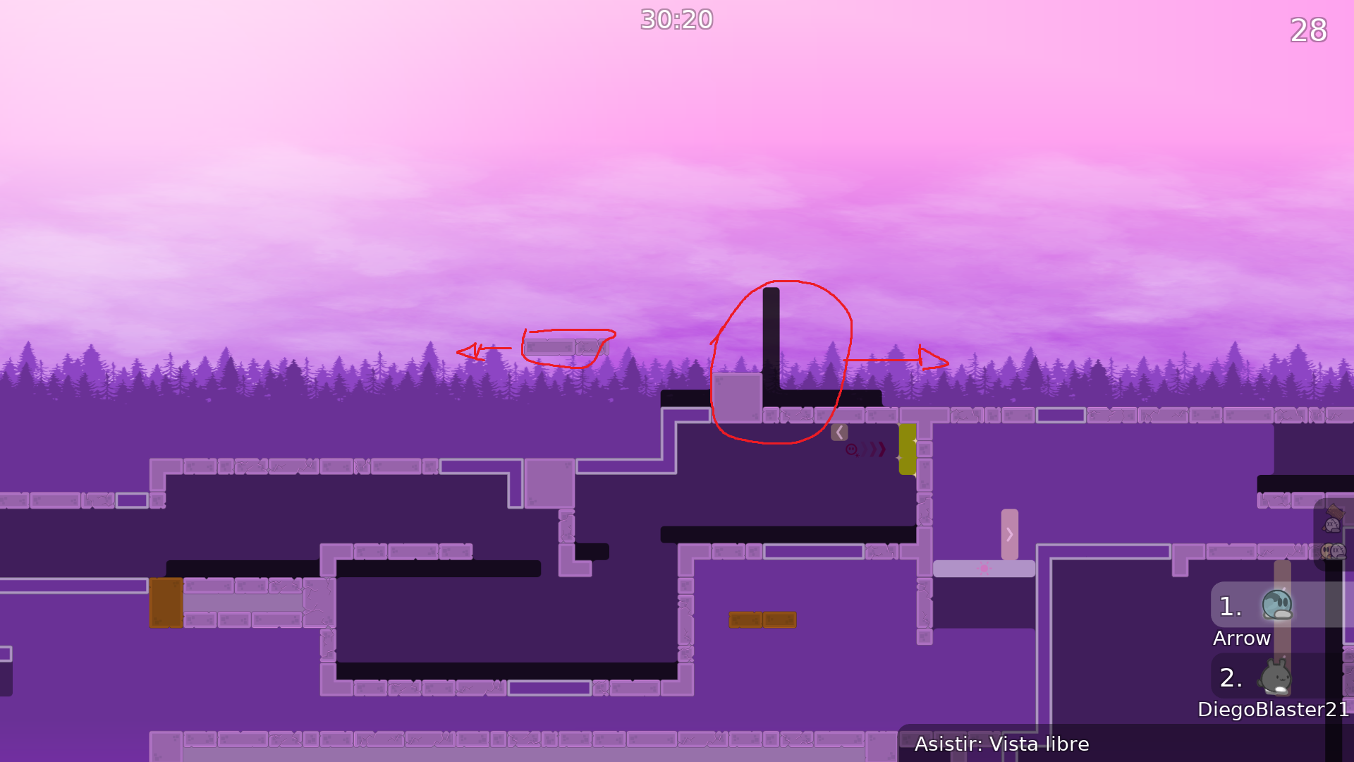
Is there any way to avoid this?
I noticed it before, but I couldn't fix it
oh wait
i guess i find the way
that should work
Maybe I don't need clipping
no clipping version
fixed design bug
fixed design bug *2

fixed cheat and design
fixed gameplay bugs and design bugs
test when 🥲
payment when

Is it like that for everyone???
No, actually people have to wait way longer. Be patient please :-)
It's been seven months. I'll try my best
I genuinely think this has to do with the map being 3p
I'm willing to help test it if you hop on a test server
Also, I think the future of testing is through video playthroughs, but that's just speculation
Thank you for your willingness to help me test my map, but my connection to the test server was very slow and ping was very very high.
all good, we testing with friends right now 🙂
ok cool!
i really liked your map idea and admire your perseverance on it—hope you get published!
thx for test!

Ill do my best!
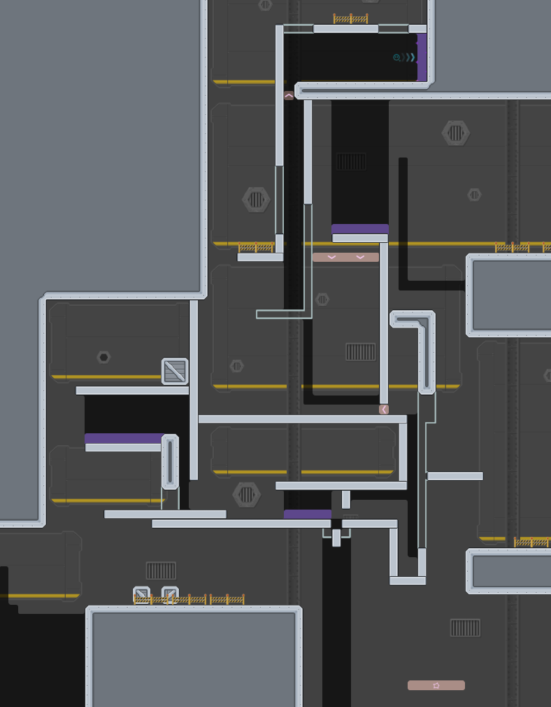
I really enjoyed the map, though I do have some suggestions. The beginning parts all feel very well thought out and creative, though once you reach the weapon parts, things get much more complicated and harder to read. Certain parts become almost unreadable, and I feel that is mostly due to the lack of space you have given yourself. Everything is super compact, but in the case of this map, it almost feels claustrophobic. I understand that in order to be able to pull off certain parts all 3 tees have to be close to eachother. My advice: try and add variety to the "bigger" parts, and the "compact" parts. Specifically try and stagger the parts that have "symbol overload"
All that being said, I think the map is great 🙂
petition to add "colored gates" so that mappers don't have to draw lines to show which switch opens which gate
good idea, lets give it a try!
Ralgo and I just beat the map. Very fun, I think it's around 4 star moderate (or 3 star, but kinda long) We didn't find any major issues.
its 2p dragging a deep
what I meant was that it takes more than just one tester to test it
most maps you can do with just you and your dummy
In fact, a lot of people used to think that my map space was too narrow. I've changed it over and over again, but every time someone else thinks it's the same. Yesterday I thought about how to expand the space without changing the gameplay, because I want to retain the current gameplay. Unfortunately I didn't come up with it, so I don't want to change the game space question for a while.
👍
, that map needs testing
fixed design bugs
played this as a normal map in team, was very fun occasionally parts are a bit confusing but not too much, nothing took us more then a bit to figure out correct way and proceed pretty creative moderate map, hope this gets released :)
played the map with :0 the concept is really innovative and I liked it a lot 🙂 we found some small skips/non intended solutions and told them the mapper all parts are somewhat equally hard to figure out and not that hard gameplay wise, which results in a quite good puzzle map
when release?
remove the black fog, add some stars
if stars are also not fit the design, then ill remove them
if this map releases i will literally be so happy
very good maps haha
<33
fixed design bugs
fixed
be release as soon as possible
gonna prank when this map gets released
okay 👍
Thanks Pulsar for the help
fixed
$optimize
$ready 4
finally
Good job!
thanks!
thanks to everyone here!
this took almost 1 year ?!
some maps take longer
how is that possible I would assume max 2months if everyone is busy and map has lots of mistakes
4k took few years
but 4k is just diffirent
have you seen how many maps are in testing?
cannot even fit it in 1 screenshot
and how many testers are there?
i should be tester again
im not a tester how would i know
13 rn i think
11*
that is few considering how many maps get submitted
well the testing team could easily test all maps so that there would be no maps in testing left
but its all voluntary work and everyone has a phase
true
but still there could be more people that can volunteer, of course after doing an application for that
everyone is free to help the testing process of a map
but you don't know who is experienced & whos not
they could give wrong advice
that has never been an issue. 99.9% of mappers can understand if something is a good change or not, otherwise a tester can just step in
yeah that is fare
u are missing a huge part which is mappers activity and reactivity
not saying its the case here, but if mapper takes 2 weeks to fix something everytime testers ask for a change
it can easily take 6 months
yeah that is true too, same case with testers
every 3 or 4 days someone look at my map then vanishes xD then I wait for few days waiting for someone else
but I am benefitting sometimes from this delay, it gives me some fresh ideas
are you ready?
SIIIKE $waiting
pranked
$wating
xdd
Is it still possible to change the map?
I think I found a bug
yes
thanks. I think I found a serious bug
where
ping me whenever an update is ready'd by a tester again please
Can I put the logo in another place? This might make the preview look a little nicer
go ahead
fix what u need then will take a look
ok
and changed the position of logo
$ready
ty
HELL YEA
GGGGG
lol, they don't know how much there were before, 20SCREENS?>????
$released
$released
in first play
i mean it doesnt affect gameplay at all

this is unacceptable, thought that testers would at least look at the map before release and notice this critical error
how could I have made such a mistake

Is there any way to fix it?
We should remove all the ranks and the map from the servers After you reworked it maybe there is still a chance we can release it
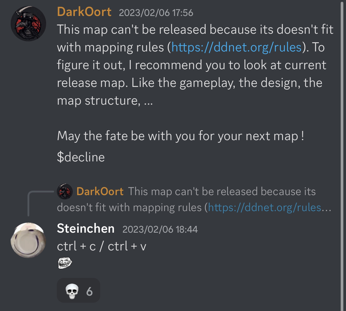
This map can't be released because its doesn't fit with mapping rules (https://ddnet.org/rules). To figure it out, I recommend you to look at current release map. Like the gameplay, the design, the map structure, ...
May the fate be with you for your next map !
$decline
U guys should have waited my test..

why?
ure a very unfair judge

