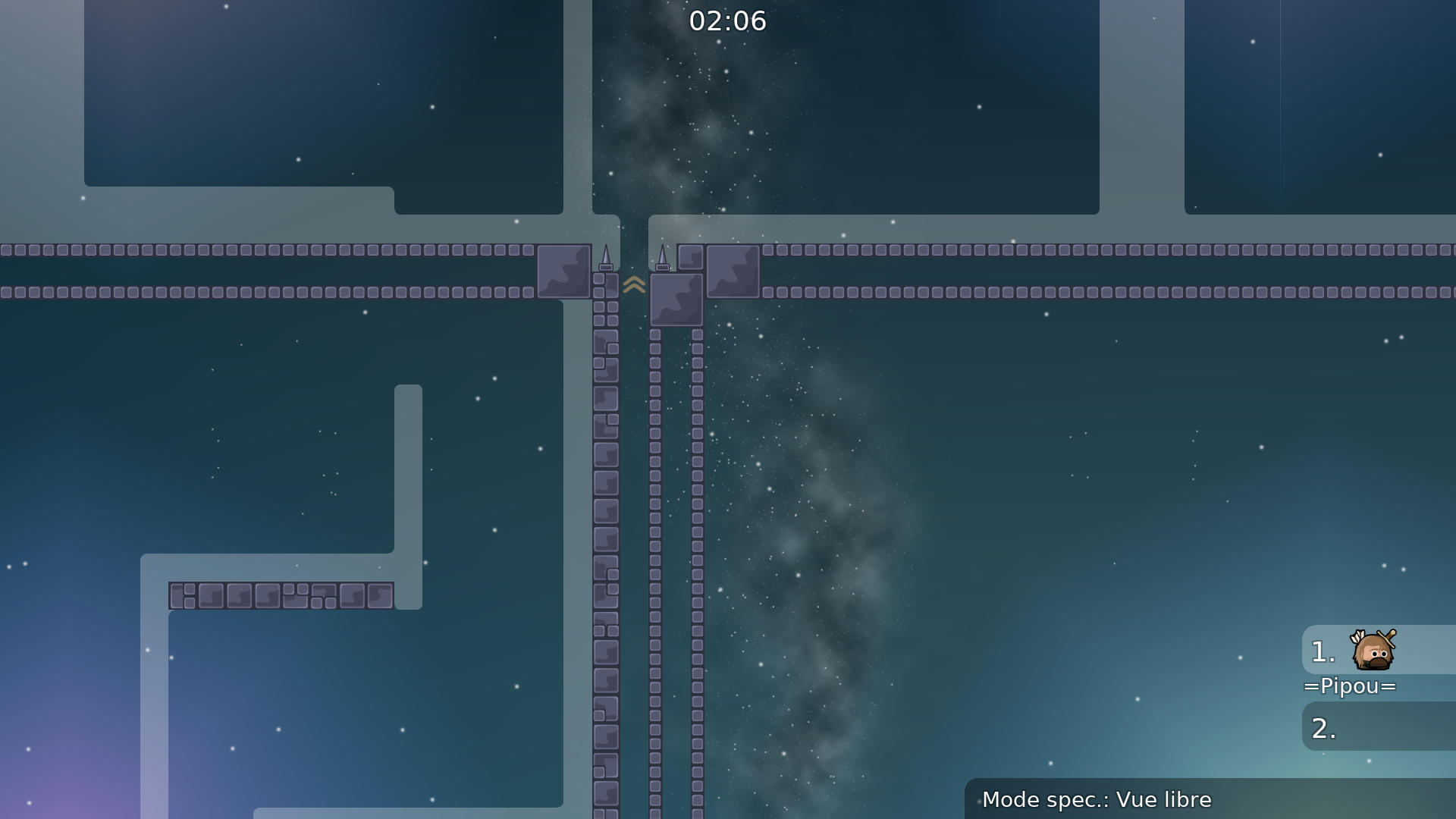
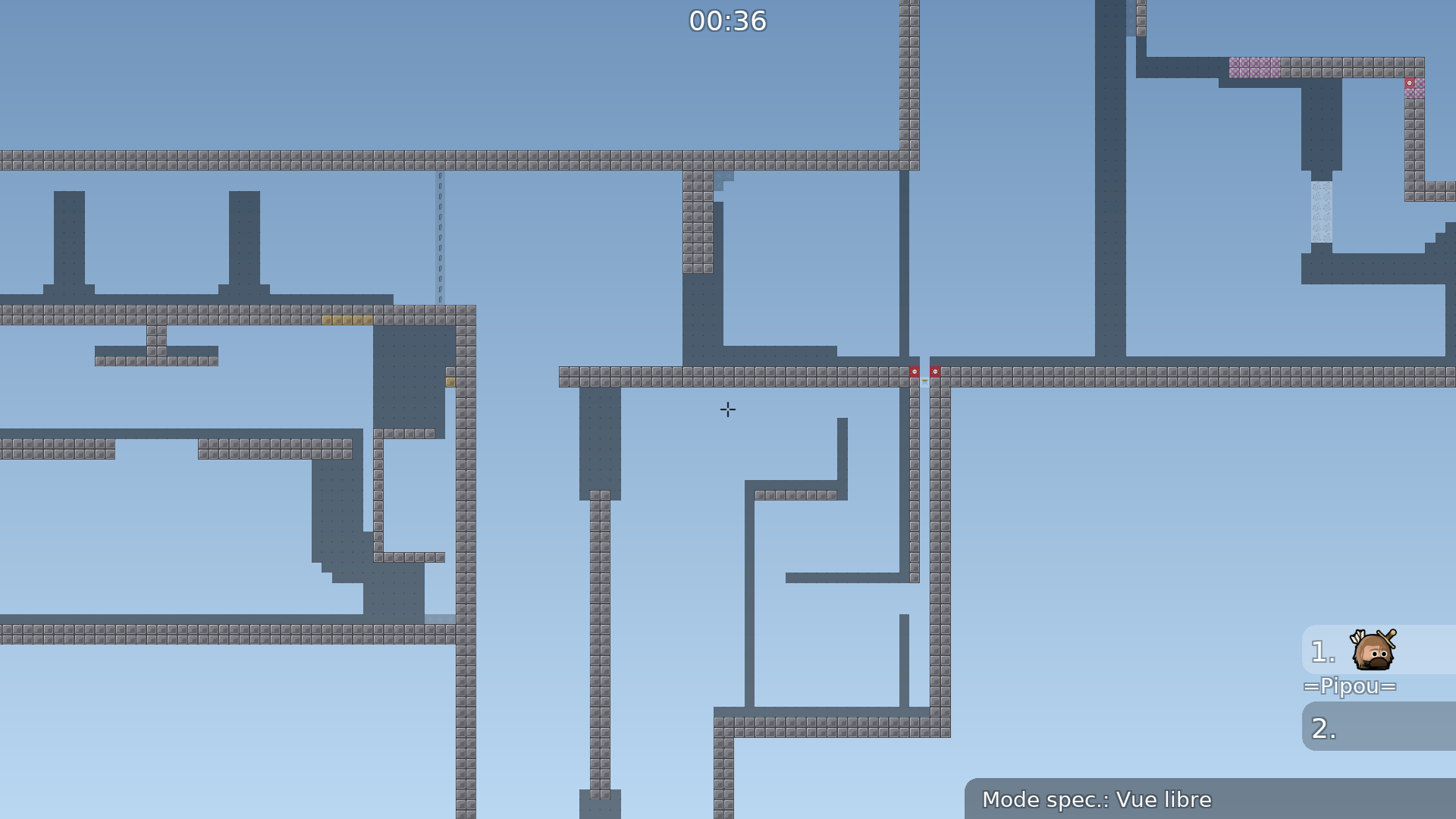
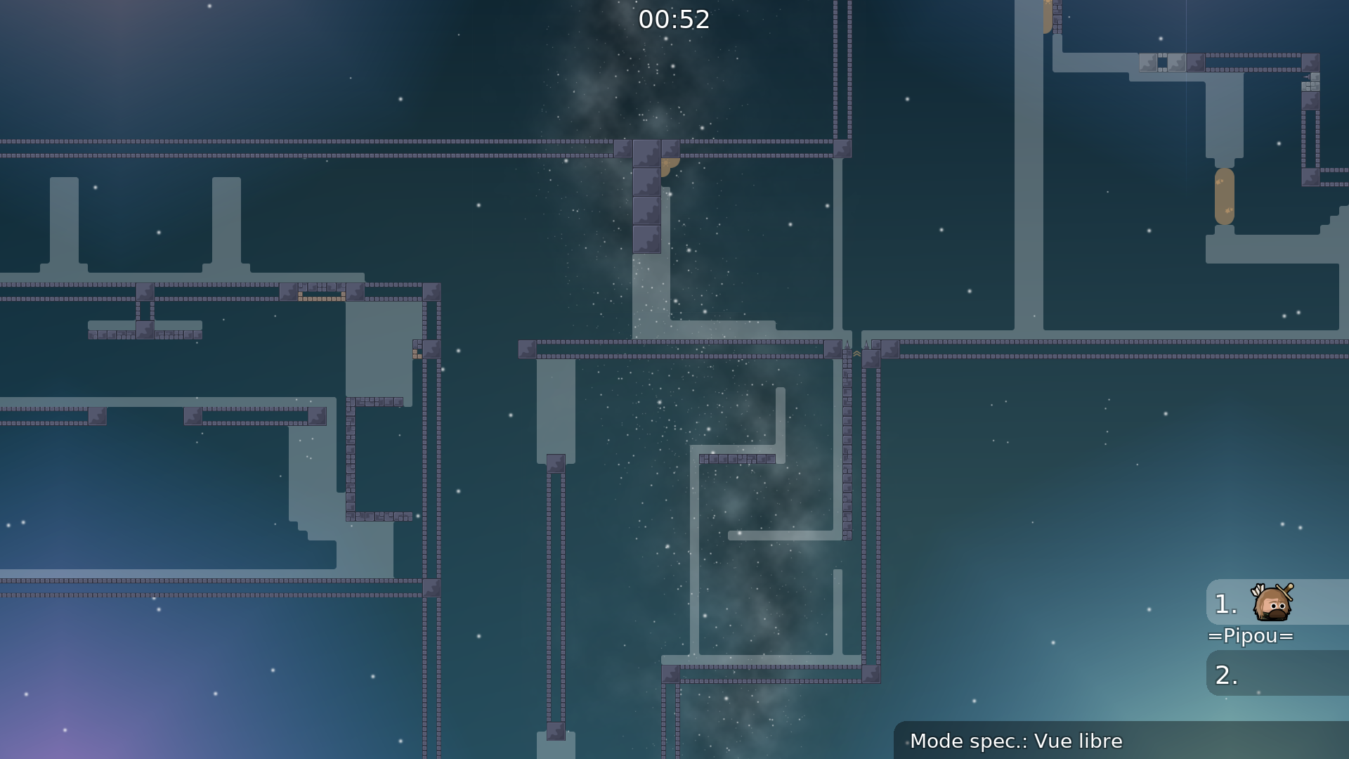
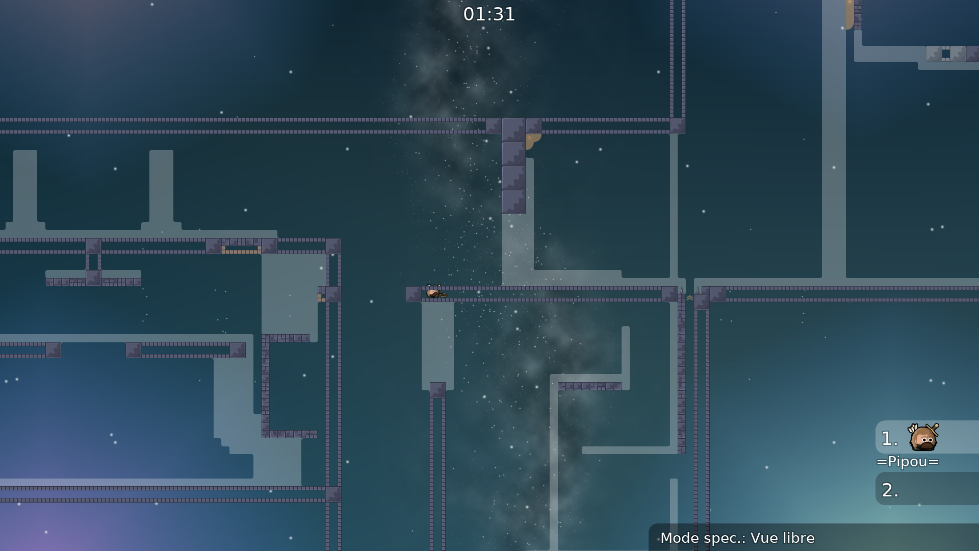
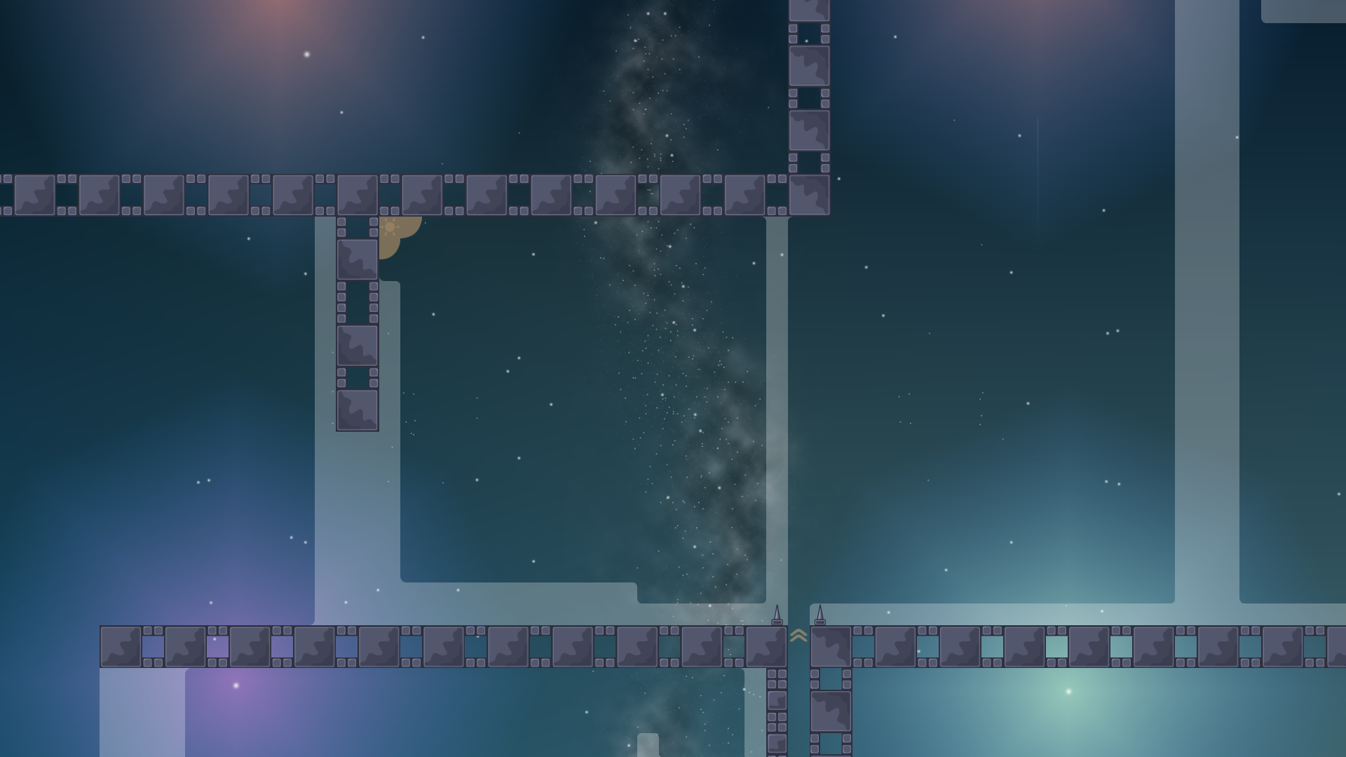
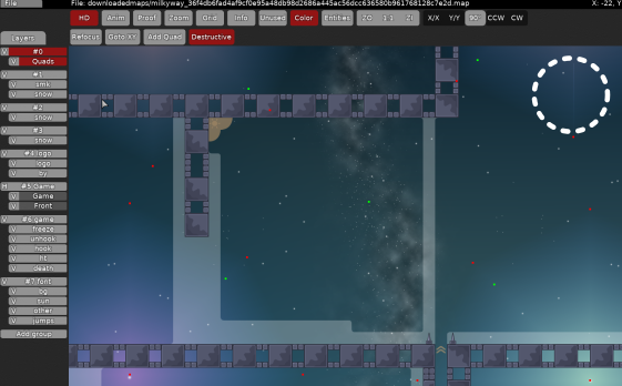
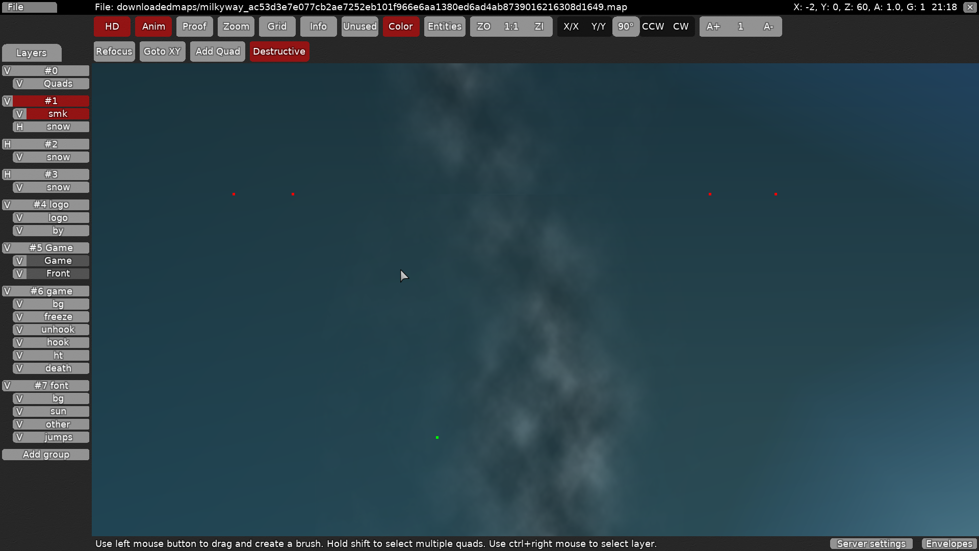
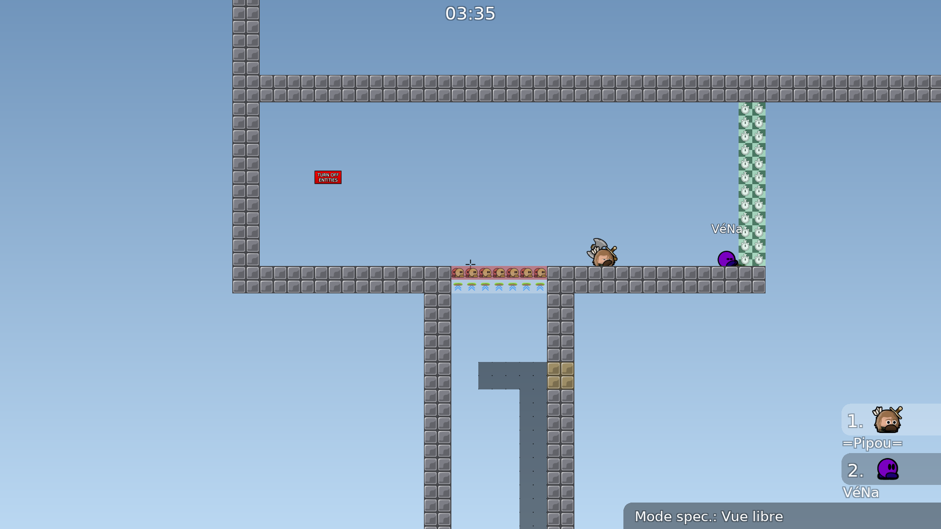
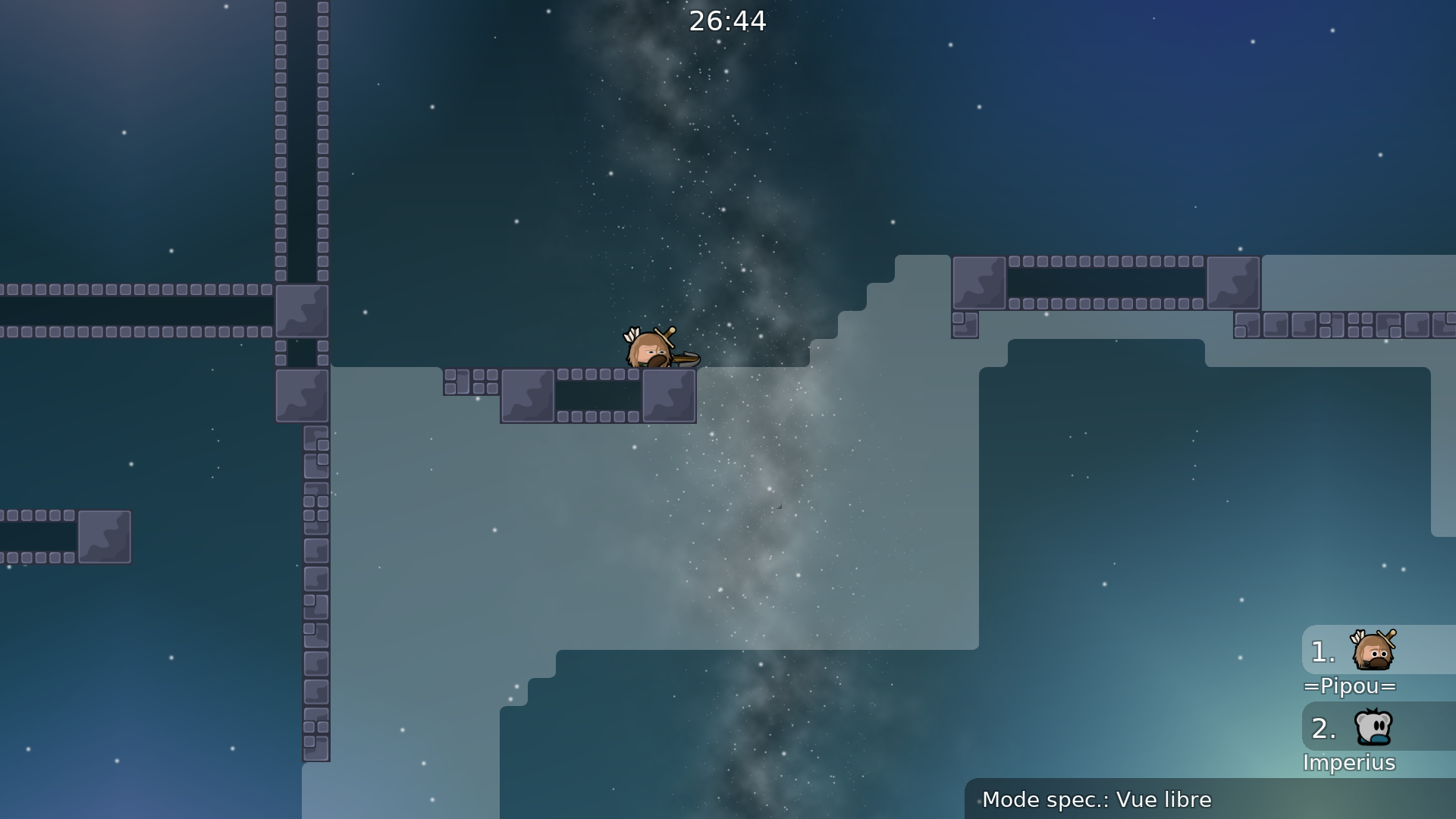
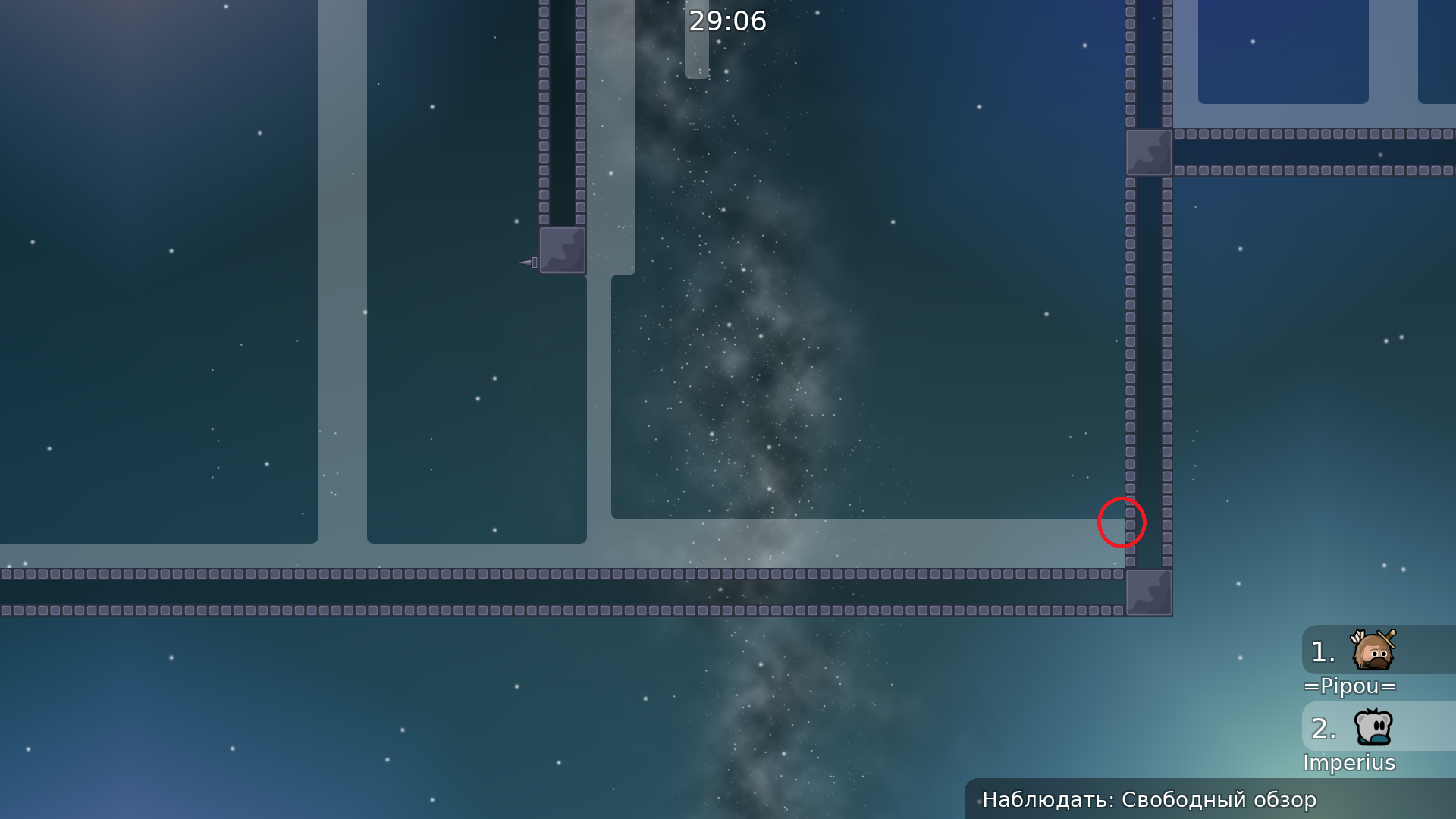
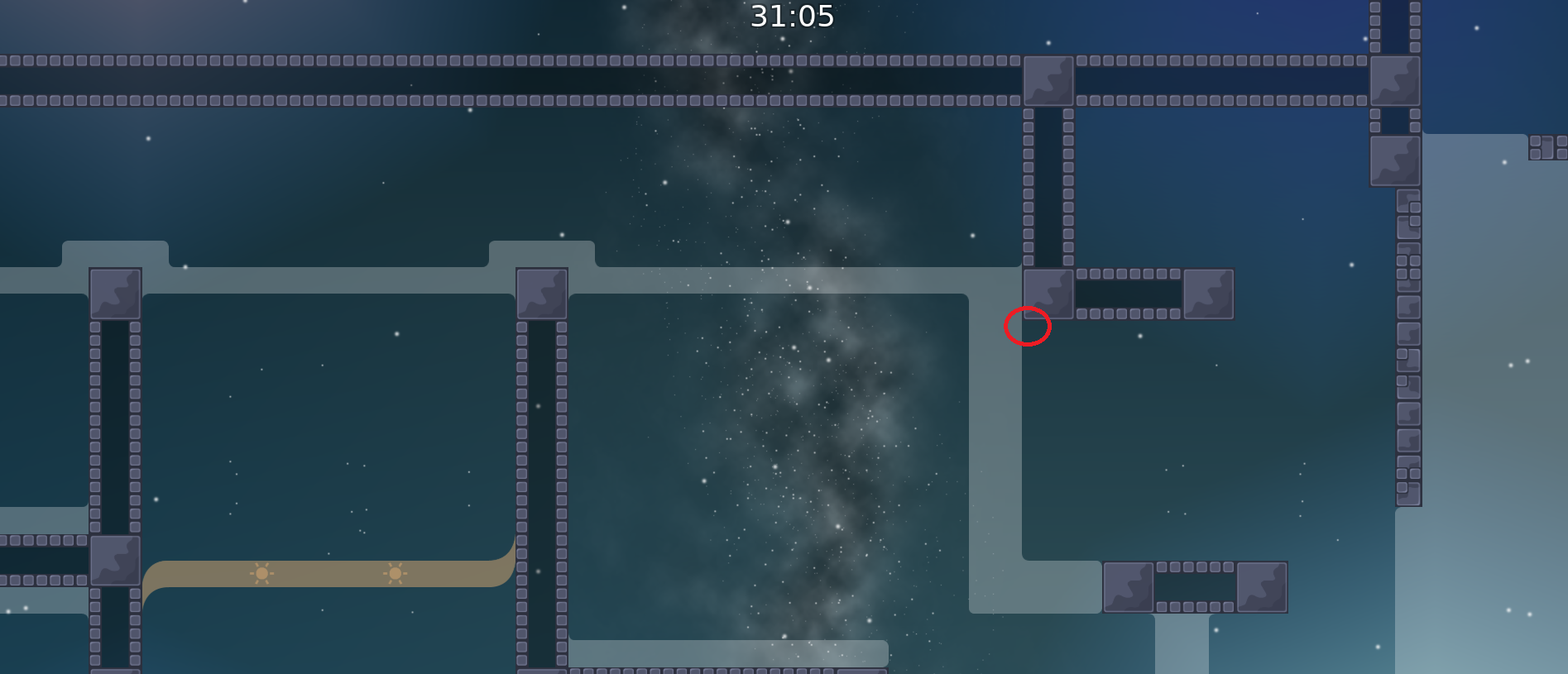
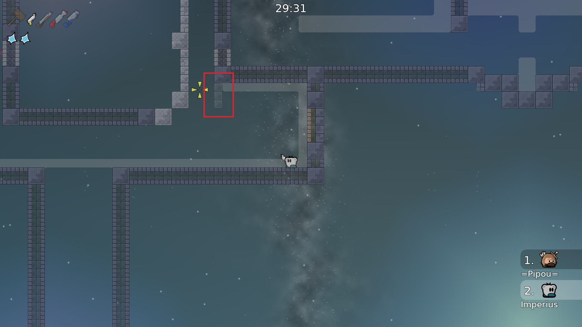
this is your map's testing channel! Post map updates here and remember to follow our mapper rules: https://ddnet.tw/rules
3h gameplay lesssgooo
1mb map
Pog
reduced the size of the map
unfreeze to
maybe make snow in bg small movement ? because otherwise looks like picture that just stands in bg
fix
non-gameplay related layers (background layers) should be set as detail: yes
the filter feels awkward and inconsistent
About half of the map is hhit/hfly filler that I've played in 20 maps already.
Some bits feel like they need more space, and others feel like there's too much space
The actual parts themselves are interesting, I just think a lot of the "in-between" flying and hhitting could be cut out to make the map more solid.
That being said, I think it is a good map 👍
upd
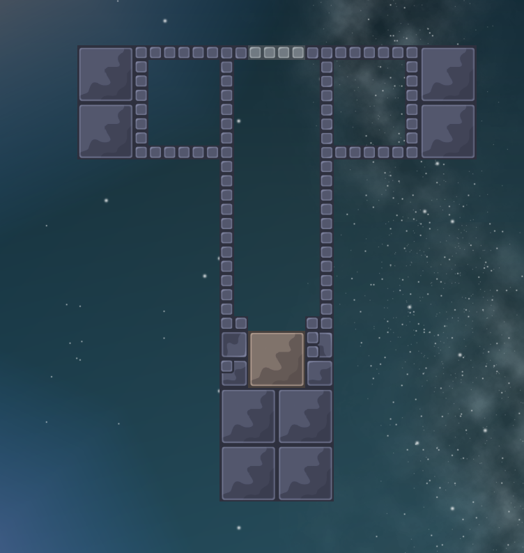
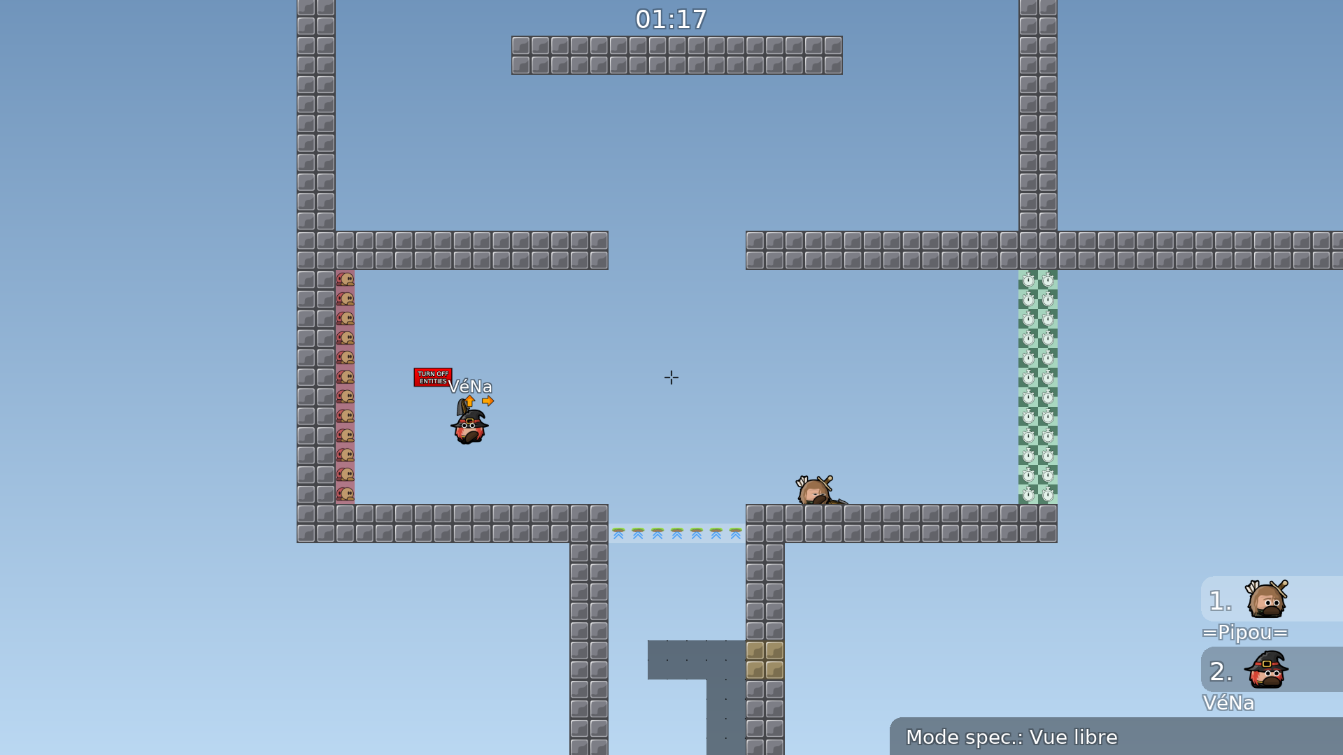
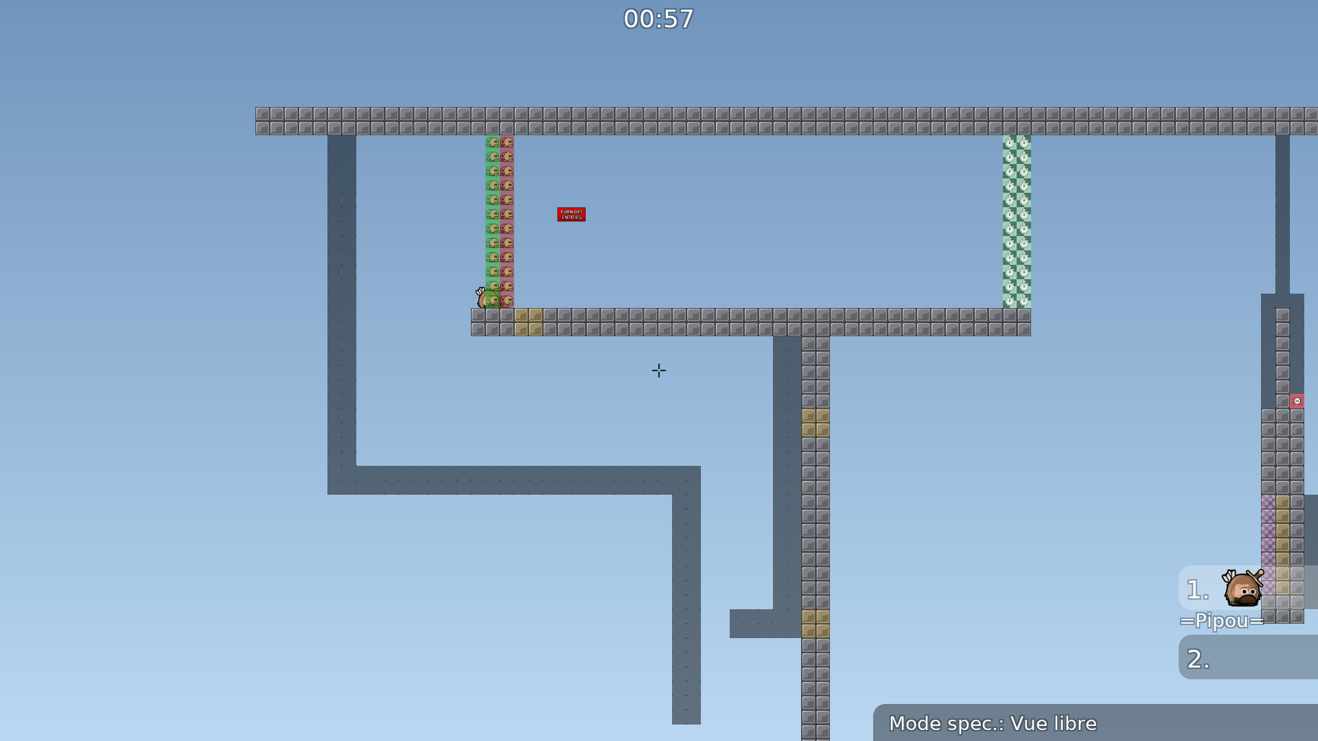
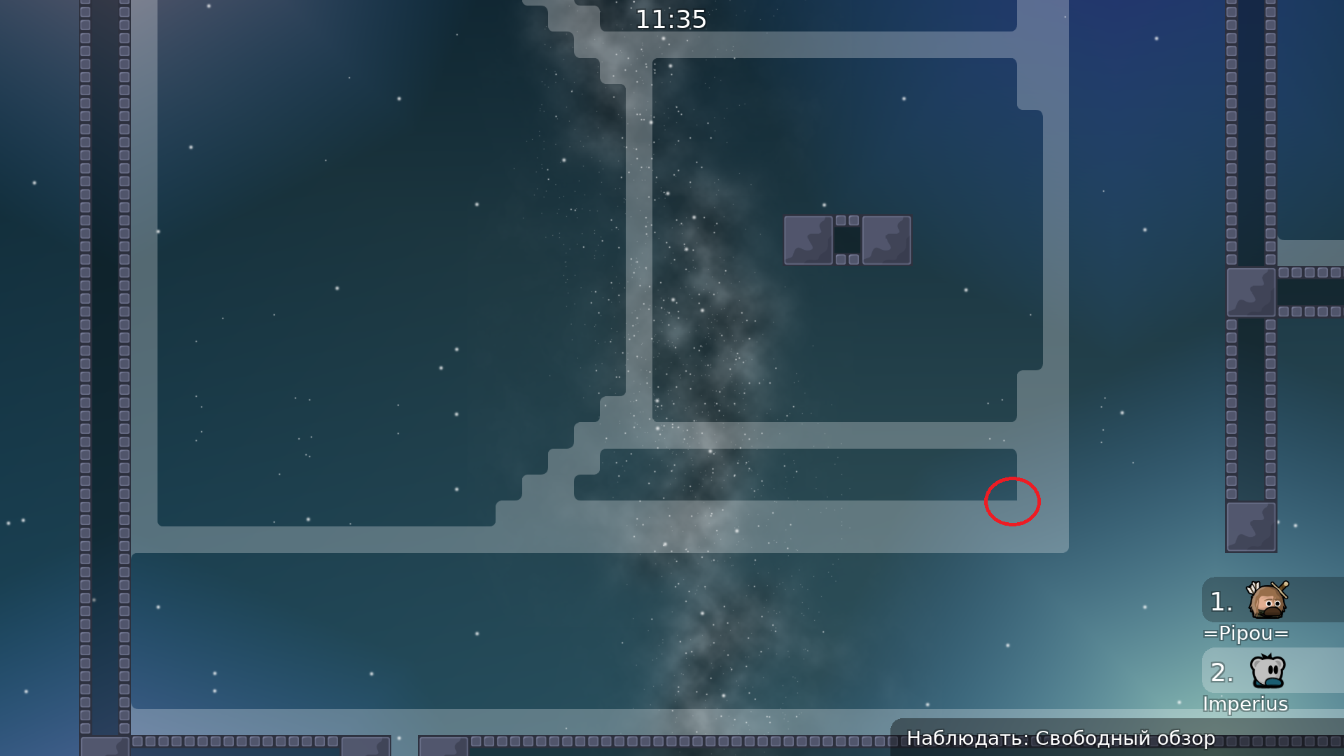
The design makes it very difficult to play without entities
I will test the gameplay tomorrow if you are interested in joining
$waiting
Why "waitng"?
@PipouDo you want to test together?
i dont get why "waiting" if mapper wait testers. status waiting only if tester wait mapper no?
Oops, too many maps to test at once
I was waiting for a reply about my comment
The design is an issue to me, I will discuss it with other testers
can u say which one? i didnt see.
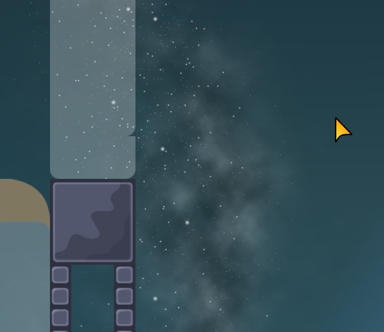
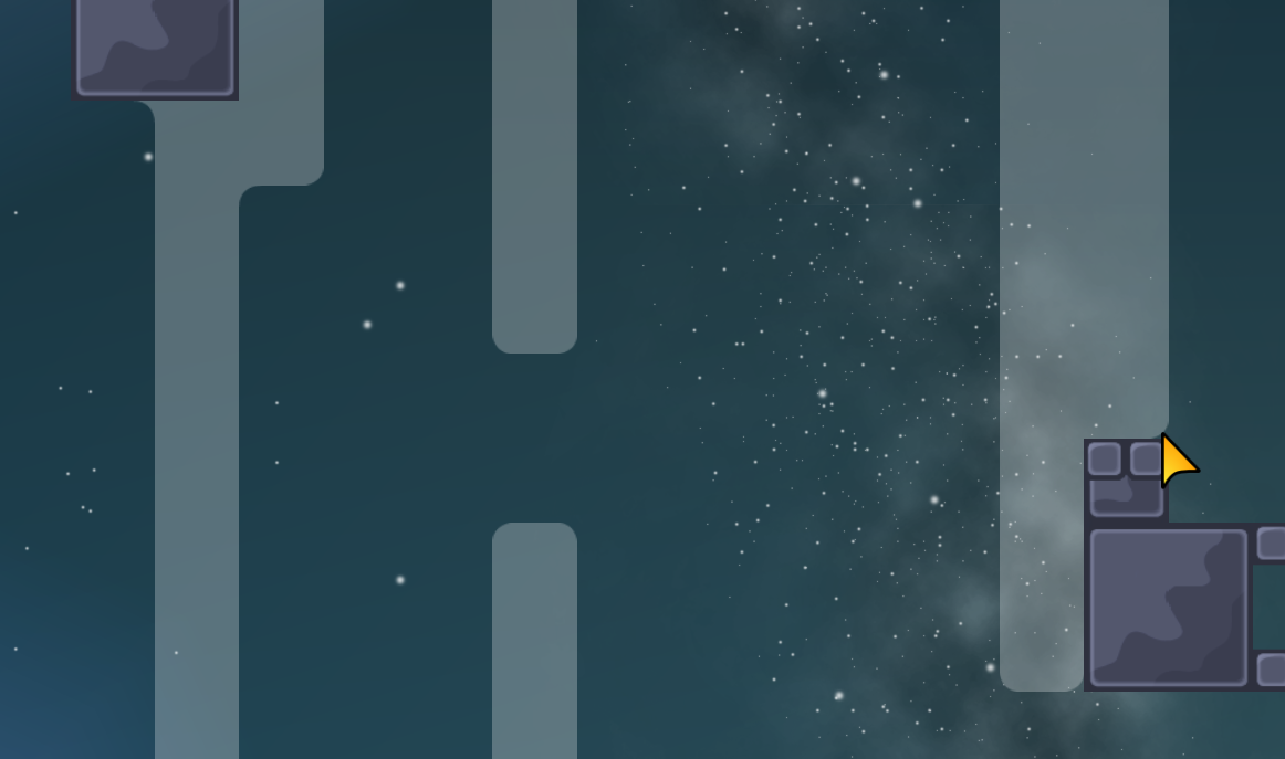
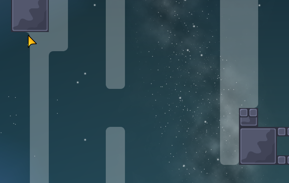
"The design makes it very difficult to play without entities Too many spaghetti walls, I get lost and don't know which spaghetti I can stand on"
"Too many spaghetti walls, I get lost and don't know which spaghetti I can stand on" u mean too much useless walls?
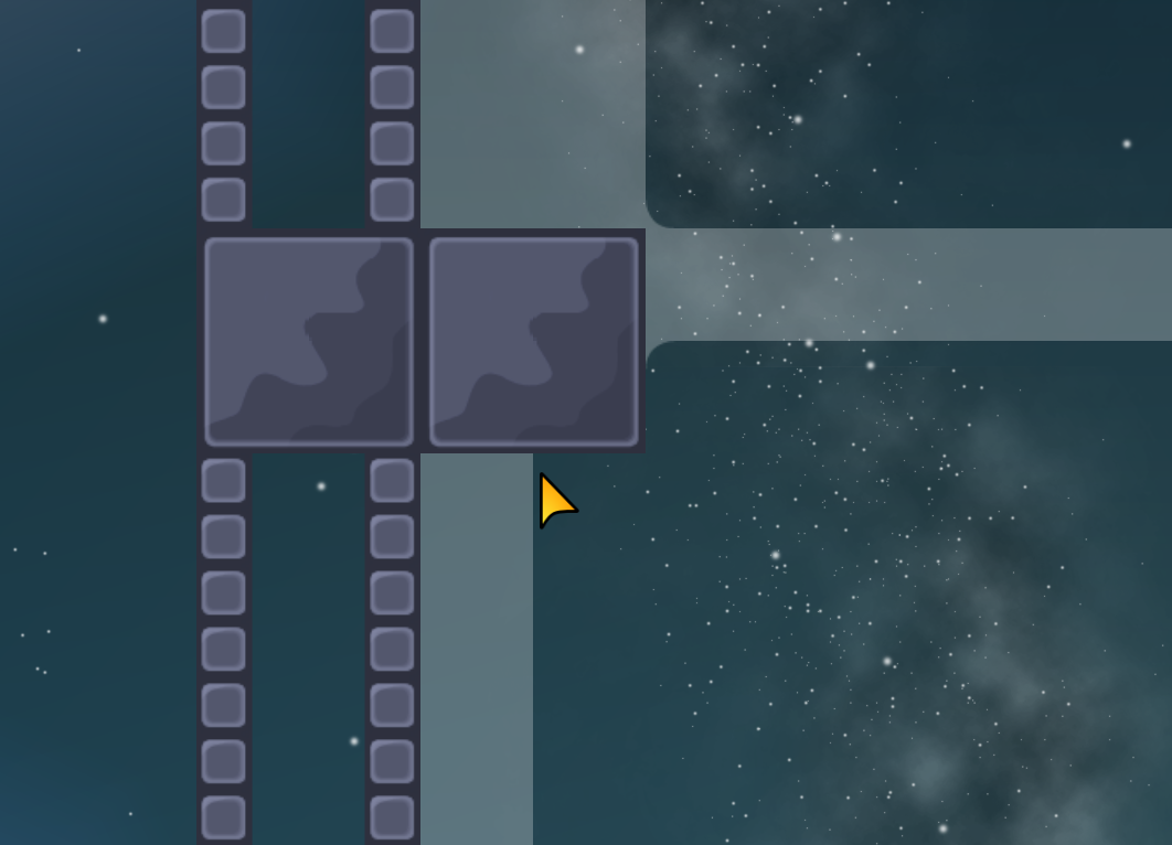
I mean that they are too thin and at times it's confusing, you can't tell if it's the outside or the inside of a wall
u about design, right? u dont like 0.5 tiles wall. or u about entitties structure?
i think i got u. u mean outside wall need "mark" more "massive" like they carry all wall inside.
It's fine in entities
Compared to the design
It looks like I could be there
upd
Please
^
😤
Use grids...
$waiting
made the background #000 0.8 removed the intersection of quads
Resize the images
Look at #deleted-channel for a tutorial
$waiting
changed the size of the images.
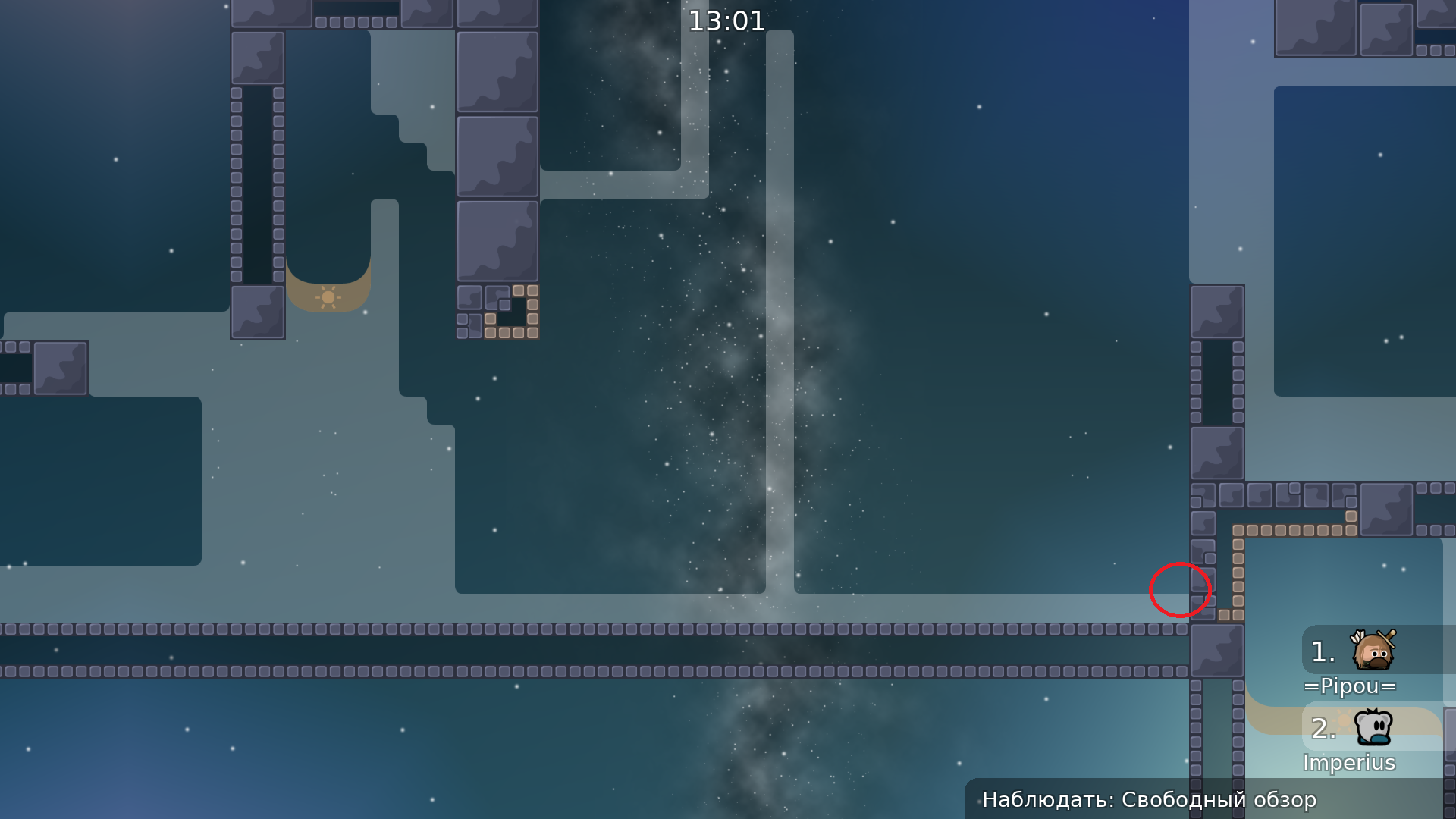
There is a line
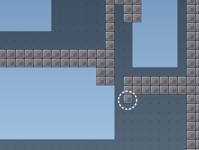
That tile is annoying
$waiting
updated "smk". moved unsolo. deleted tile.
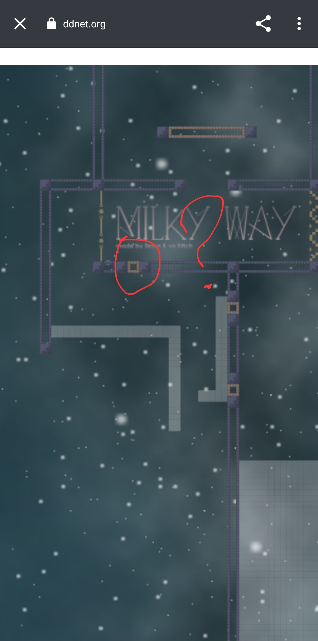
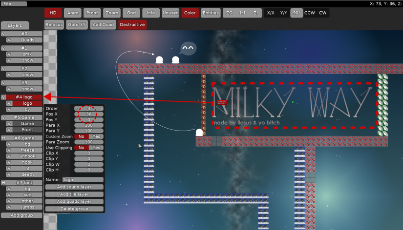
I understand that you can't have it on the right either because of the logo
Why won't you make something like that instead
So people come from the left to the right
And they can get back in solo if they want to
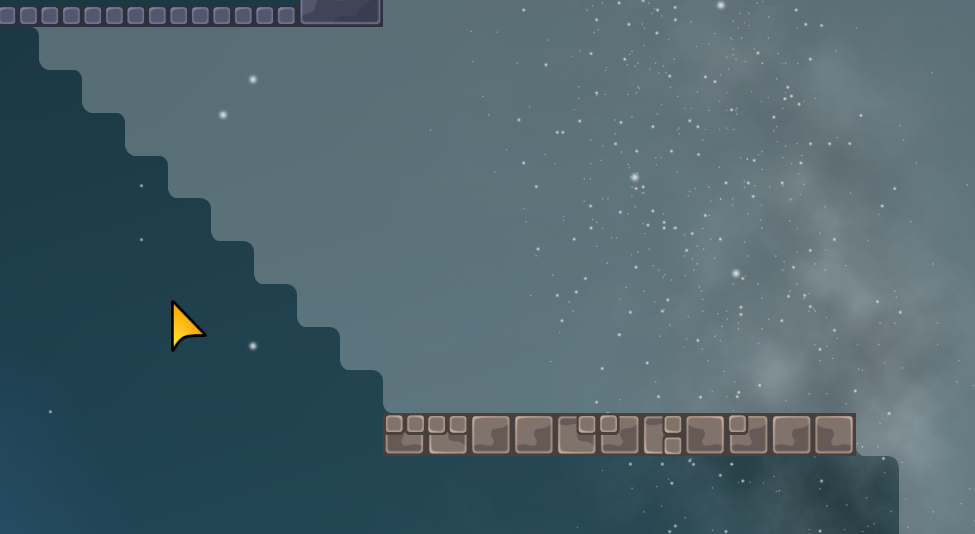
It feels awkward to arrive and to struggle on that blocker, then to have to go left and right
upd
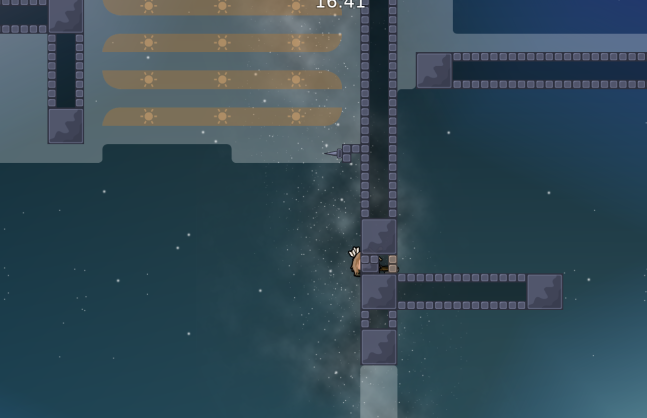
The last hook is annoying btw
$waiting
Yes, we all agreed that that hook is just annoying, it breaks the flow
Compared to the one I suggested which is smoother
made your version
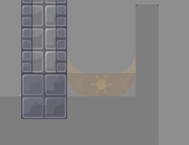
yesterday we thought maybe you could move the unsolo tile a bit more to the right so people can stay there if they wish and not add solo
It would also be cleaner to make the playground like that
(without a wall so it's easier to go there) Also center your logo group between the unsolo and the start line
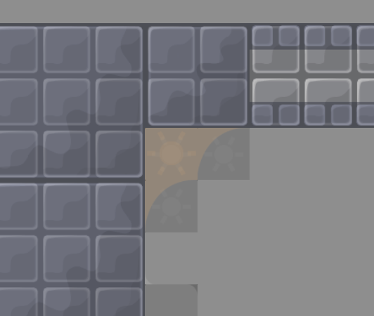
Flying corner
(center of the screen)
$waiting
fix corners. upd start.
yes
yes
$ready 3
can someone set it as uploaded
$released


