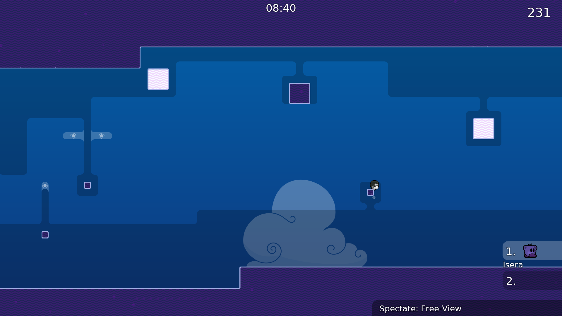
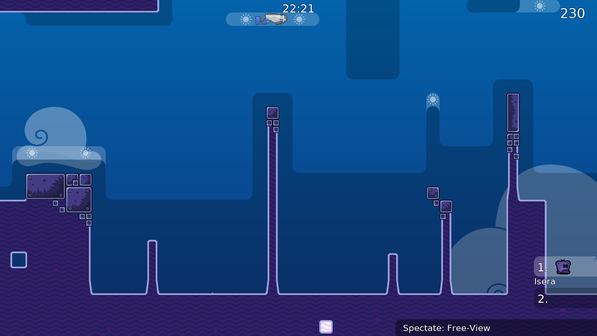
this is your map's testing channel! Post map updates here and remember to follow our mapper rules: https://ddnet.org/rules
Pog
$optimize
now 310
intentional, but i suppose since i only put one in it ends up looking like a mistake
oh, yeah i missed those oops, will be fixed in next version
this seems slower and harder and less obvious so i'd say it's fine, if people want to do it for style points they can
try to do something like this
At all map so small but funny
Why would the first image be needed? It's a 100% consistent jump
I don't know, I would use this option as it does exactly better
in most cases, the option with deep is chosen.
i don't see why the first one needs to be changed to deep/undeep, map isnt long and it's not late into the map either, and I don't think it's that difficult compared to the rest tbh. If DDNet wants me to change it I'm down for it, but I don't personally think it needs to be changed. It's more elegant design-wise without deep anyway.
The proposed part to replace the ending freeze jumps does seem cool though, so I'll keep it in mind at least (crediting if I use it)
it's your choice and your map, I have nothing against it, the main thing is that it works
but I advise you to make the start more spacious and comfortable, as well as change the last part. I have no more complaints about the map as it is small.
yeah making the start room more spacious is reasonable
Cool map. Lenght is ok i think
Changes: • Fixed corners (freeze and unhookable) • More comfortable start room (more space, larger hook surface) • Made ending room 4x4 instead of 3x3 (less risk of bonking on the wall, and player can no longer reach the finish line while still frozen) • Removed the time CP1 tile that was in freeze (players that hit this tile and survive are still losing time to being frozen longer) • Decoration tweaks (added two more 1x1 holes behind walls) • Moved logo to its own group • Improved logo kerning • Sorted Game and Front layers to top of Game group
Not yet implemented:
- Changes to freeze jump sections (still weighing advantages / disadvantages of changing these)
- Moving all visual tile layers to new group (this interferes with my mapping workflow, as it prevents me from selecting all tile layers at once)
Thanks! I'm wondering something though - does the length being 'ok' mean it seems like the right length, or is it just 'close enough' to what you think it should be? And if the latter, would you rather it be shorter or longer? I'm just trying to judge whether or not I should make more changes to the map or simply wait for more responses
u dont change last part, im still can't do it
it's definitely on the shorter side but since nobody has said anything its fine
zap 2
What's bad about a difficult ending? Many maps have challenging endings, even Zap does.
it is possible to pass this ending? xd
I'm not saying it should be easy, it should happen. I definitely don't understand the last part so I can't get through.
It is definitely possible, though you need good timing and you MUST headbonk on both exposed ceilings if you want it to be consistent. The timing is tight but I don't think it's too tight for people to hit consistently. You have the duration of a laser bounce to let go of jump to avoid double jumping early, and you need to hit the ground after (or at the exact same time as) firing laser but before letting go of jump.
(huh, demo recording has a visual bug at the end that I think I fixed in my current version of the map, guess I did this between previous edits of the map. either way, route is still the same as in the current live version)
i have some ideas for gameplay changes / new parts, might adjust the 2 end freeze jumps a bit to compensate for added length. Will see how it goes, but I won't be able to work on the map until later tonight
Changes: • Some new challenges have been added part way through the map, extending the map overall slightly. I didn't change the ending because the map is still quite short. • Fixed a couple corners that were overlooked in the last update.
Made a tweak to new part that I was finding to be too tight while trying to get a new demo of the map
oops, ok this should be last one for the night. Added additional time checkpoint since map is longer now, I forgot to do that before.
Cool idea cool map but i expecting a bit more in end , looked boring to do same over and over again , reminds start of map . (It's only my opinion just by looking at video)
I like them near the end since it’s a short map. Makes finishing it that much more satisfying
Like, if the map got a lot easier at the end it’d be pretty lackluster imo
Idk tho that’s just my opinion
i think more of the players who fail at the end just disconnect
xd
yes, finishing is more satisfying that way, but only if the part itself is not faily lol
but i can agree on the short map argument
i personally dont like it to put the hardest faily moves b4 end
that's definitely fair, I'll look into moving the final jumps closer to the start and putting a final part using hook near the end
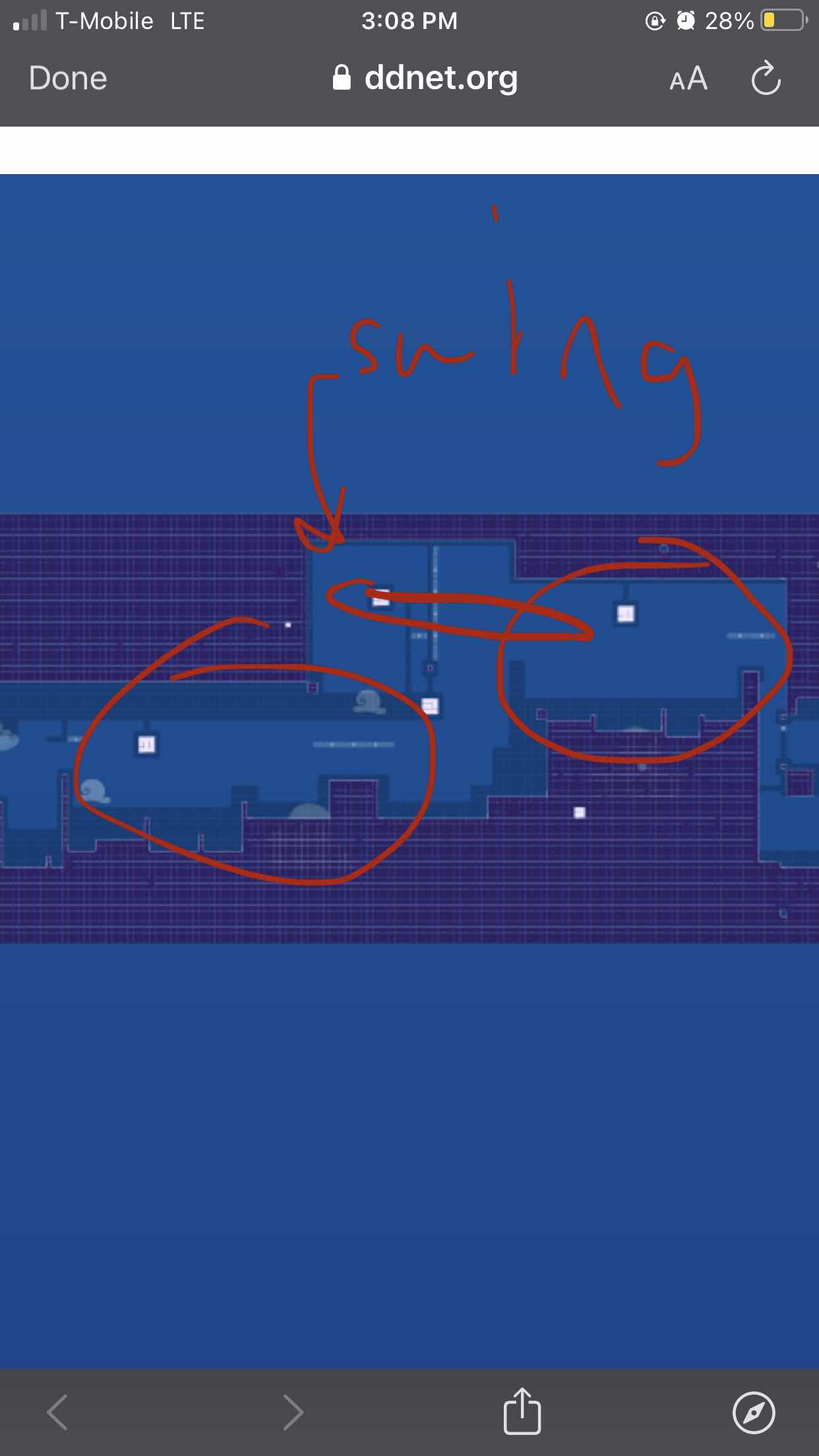
moving one to the beginning as it is kinda messes with the flow of the map IMO if it isn't balanced out by adding another swing to the beginning. So i've come up with a design that does that
But the new design is significantly harder, despite only having a single laser freeze jump instead of two. The slow pace really helps with them by allowing you more time to focus on the hard jumps. I'll experiment some more though, but I'm not sure yet how i'll move them earlier without negatively impacting the map in other ways.
nvm i figured it out. currently just trying to come up with a new ending that is hard but not annoying or excessively faily and still different from the rest
Changes: • Moved one of the final two freeze jumps earlier in the level • The other final freeze jump is now easier (you no longer need to save double jump to be able to finish) • New ending section involving one more hookable block. • Decorative unused platform after the second swing is now under 2 rows of freeze instead instead of one, so that players will not mistakenly think they should land on it. • Some other minor decorative changes have also been made that do not affect gameplay.
Changes: • Edited the time checkpoints, fixing one and removing another. Now there are 4 time checkpoints instead of 5. • Filled in some missing (non-gameplay affecting) entities so that the visual appearance of the map in entities is consistent.
Hi, you can improve this part by adding unhook tile upper to unfreeze over it, so chance to lose second jump a bit lower
I decided that having a swing into it wasn't as important to flow as I thought it'd be, so I just put the freeze jump without a swing as shown here and it's back to the difficulty it was before. If testers think I should add a backtrack method I can try to come up with something but I worry it might be difficult to come up with something effective.
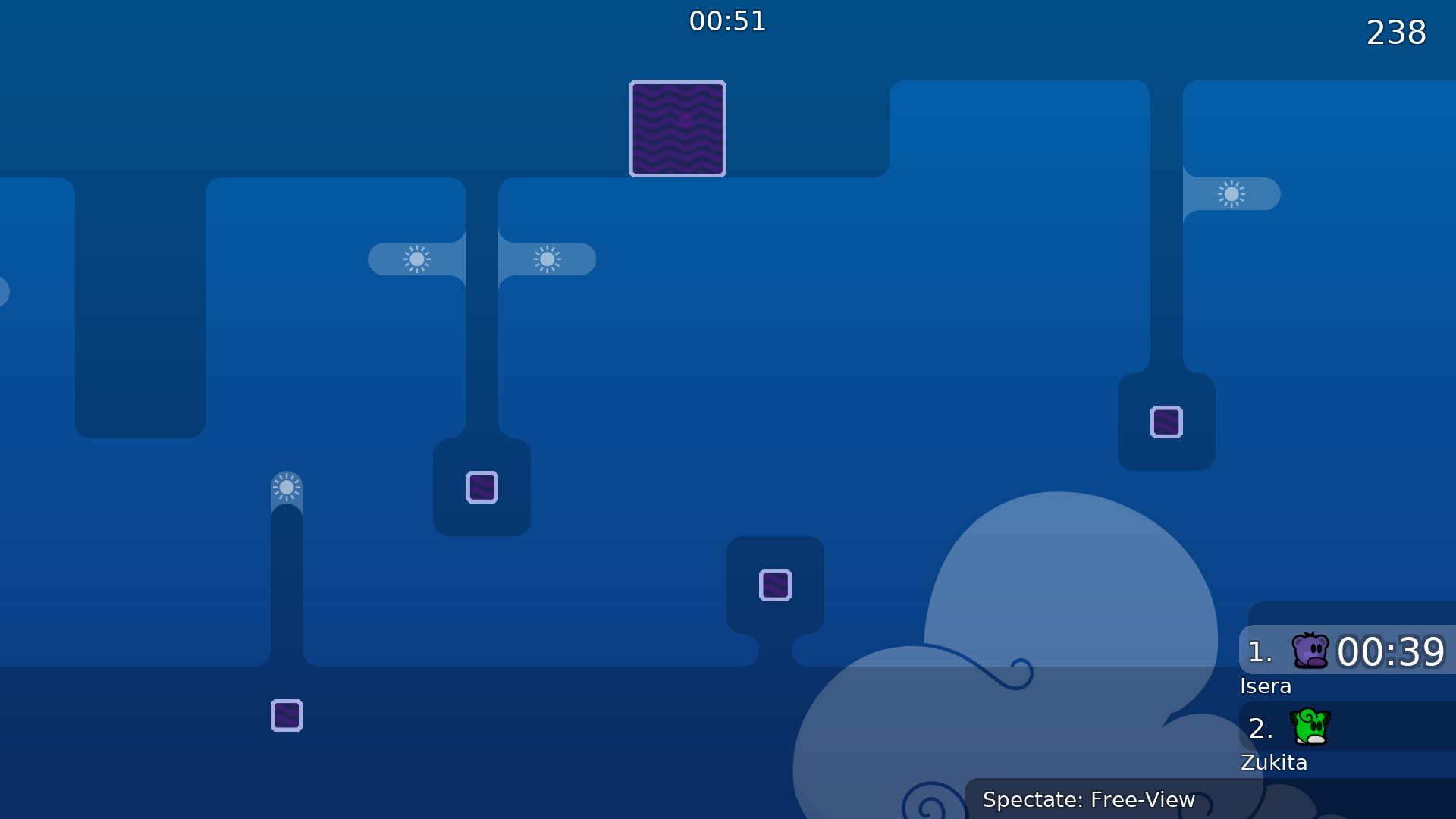
feels better now 👍
since Zap is 2 this would be 3 ?
acutally for me Zap was more 1 , would rate this between 2-3 more 2*
$optimize
the visuals arent the same and the gameplay is very different? I can change the ending if you'd like
there is zero use of hook in Zap and it is used frequently here
also the mechanic isnt unique to Zap to begin with, and i dont think making a tiny 15 second map that is solely one mechanic means you get to own that mechanic forever
I made this map because I considered the skill gap between Zap and Vagrant (the other solo map with this sort of gameplay prominently featured) to be way too big
Top image is the only sus one imo, left one is just a basic move in this kind of map and right one is literally a small gap into finish - nothing unusual
I agree each thing on its own is nothing unusual, but everything all at once makes it clear that it's a copy of zap
I want to make it clear I'm willing to try and resolve disputes with this, but it does feel like youve focused on a small part of the map and haven't play tested it by saying that the entire thing is a copy
I showed several things that are exactly the same as in zap, if the map is so different then there should be no problem to change those few things
That's why i'm saying I'm willing to change #1 and #3 lol
If you wanna make similar gameplay that's fine, but then don't also copy the way it's mapped with 1x1 blocks connected with freeze, and also make finish identical xD
rabies
im sorry u tried to make a fun map pls change everything
guys he's just being protective of his work. I think I get what he's saying now and I'm working on addressing it
there's more to the map than the 3 screenshots tho, it's just that the things that are copied are very obvious

Changes: • Initial redesign to differentiate the map more from Zap, based on existing design motifs within the map when possible. • There is now an ending area instead of simply ending at the finish. • Extended one of the unfreezes by two tiles to prevent accidentally jumping over it while frozen.
u could try to go for a style between the square ahh zap and the more messy vagrant style maybe
also i like the 2nd half of this map
the first half is a good "introduction" to the map
but the middle seems kinda plain imo
which bit?
sry im on phone
the big swings seem kinda awkward
hm
240p quality
the first of those definitely feels weirder to me now after the changes to alter the freeze jumps, and I can see how the last of those might not be so interesting after having just done the rest
the 2nd one u just lose a lot of speed so its kinda annoying
how bout instead of swinging under u make them swing above
and remove the freeze wall near the top only
just a suggestion, idk if it will work well
you don't really lose much speed if you swing like this through the unfreeze, but if that's too annoying then yeah I can look into changing things
cause I definitely get that if you miss you have to catch yourself and redo the swing
I'll look into redesigning the tileset and adding some more decoration variety
oh i see i didnt think hitting the unfreeze was intended
makes more sense now
it originally was kind of an accident, but it worked so well in testing I just went with it as the intended way if swinging into it didnt feel natural to me or if you had to lose speed with the swing I would've changed it 100% cause i agree doing it without the extra unfreeze sucks
cool map
really like the tileset
Unsure how I feel about how these tilesets work together, but this is mainly a proof of concept update for a design concept I had.
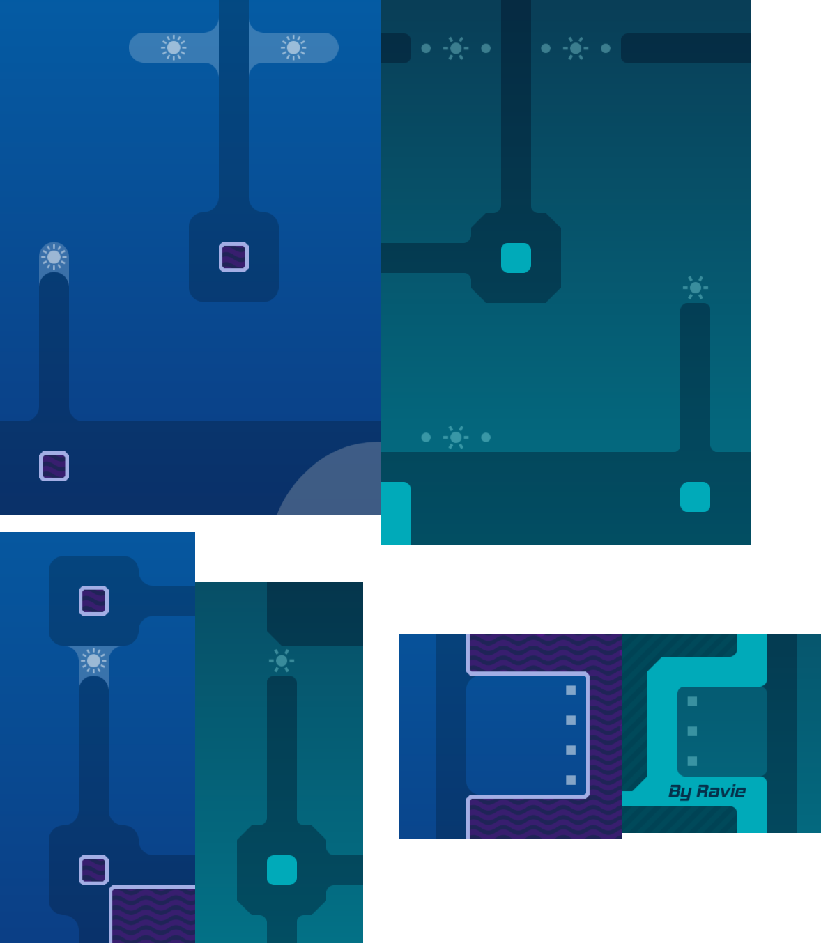
Changes: • Fixed some corners that I missed before. • Added new stone-type tileset (wildest_unhook by mind on skins.tw, but I've tinted it purple) for the top surfaces of platforms. • New tiles added to wave tileset with slightly set-back edges, for better aesthetic interaction between them and the new stone tileset. • Slightly tweaked the coloring of the wave tileset hookable / unhookable. • Added a note crediting mind for their tileset.
Not yet implemented: • Near-background decorations to complement the existing design and add depth.
Might revert these changes if I decide I don't like them, but I figured I'd share my progress on this.
yeah, I think i'll spin up a custom tileset instead for this that fits with the existing aesthetics better
Cool blocks 😍
i think you could also work on the background to make it more fitting
yeah
Write when ur done with the map
I played yesterday trough, was already ok for me
is it not okay for women


🪩
I think I'm satisfied with the design now. So unless there's any mapping mistakes I've missed or changes testers would like to request, I'm calling this done.
Changes (that I remember): • Replaced 'wildest_unhook' tileset with new custom tileset designed to match the map's aesthetic better while retaining familiarity with traditional teeworlds stone tiles. • Removed quad crediting mind, as their work is no longer present in the map. • Changed cloud size / parallax / position, sky coloration, added additional color filtering quad • New background terrain / decoration • Added a couple indicators in entities for the later freeze jumps to clarify the intended route. • Placed game/front layers into their own group separate from the rest.
oh oops let's fix that (even tho they don't do anything anyway)
actually i have a bit more i wanna do real quick
Changes: • Added some variations to the small background tileset to tie it in further with the foreground tiles.
mb reduce alpha for bg tiles
and fix stones
amazing design
Personally like the lines like that
Not real problem, not even problem. The testing section goes up in weirdness
Who the fuck gonna check that in 10x zoom? U mad bro
it's like that because was designed in vector graphics software and the sections meet at a non-cardinal edge rather than overlapping lol i'll agree that in some contexts it would make more sense for that line to not appear, but considering that in this context those are supposed to be separate pieces of stone, I don't think it's really a problem
To be fair to them though, it is visible at default zoom at 1920x1080 resolution, so players will be able to notice it.
My eyes ignored dat graphical thing, and even when
@yāccreshowoff i dont really see it ingame
I feel like I always notice small bugs on maps whenever I see them once while playing on zoom8
Changes: • Fixed 'seams' in stone tileset. My brain still thinks they're there though, even though they're not. • SLIGHT change to bg tile coloration (changing this too much leads to its colors clashing with the rest of the sky, and they cannot simply be made partially transparent)
looks great
i love it
$optimize
$edit --shrink-layers
$ready 3
fair point, I'll see about creating some visual indicators for the regular view
Changes: • Added visual hints to go along with the entity hints at the two laser freezejumps. This ended up using a new group/tile layer since these were placed behind the game layers. • Simplified symbols image (I had to add new ones to it anyway for the new indicators, so I figured I'd get rid of the load of extra symbols). This reduced the file size considerably.
This update is purely a visual / housekeeping update, no gameplay was altered.
I'll give it a look soon
$ready 3
snail you made a mistake in the events and it turns out that it will come out in 7 hours. It should be in 19
right, fixed
live version isn't the latest version posted
doesn't matter gameplay-wise since last update was purely visual but the indicators may be helpful to players
u can do it if u want
eh i'll leave it as it is so that speedrunners' time checkpoints don't get messed up


