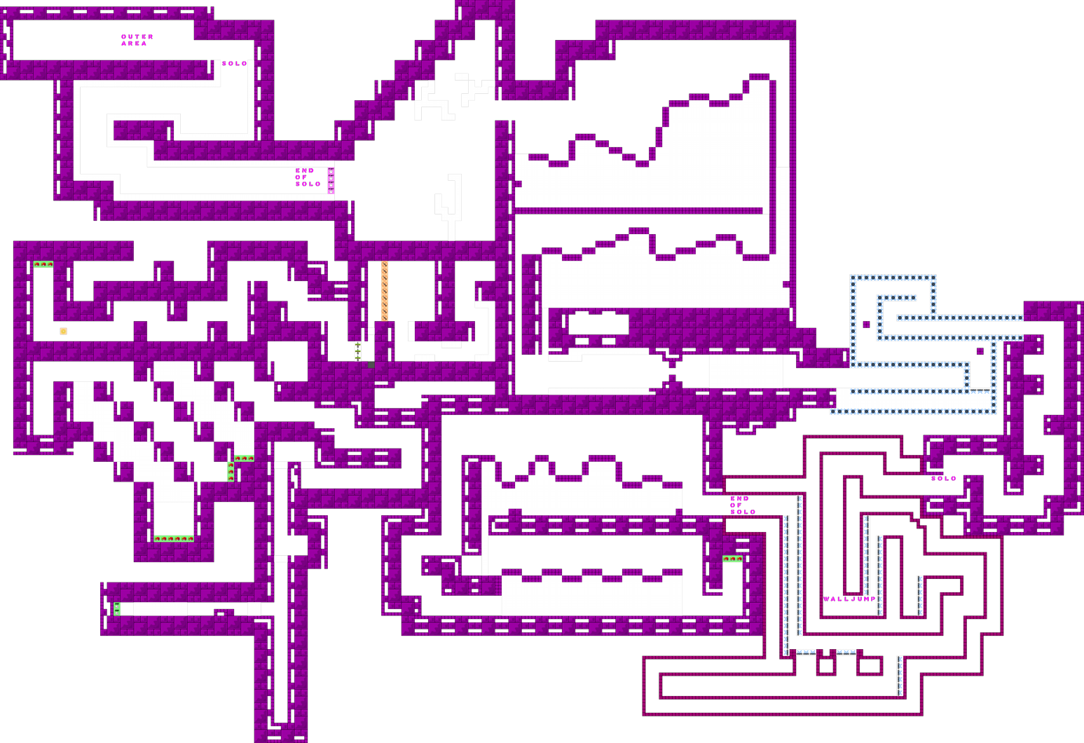
this is your map's testing channel! Post map updates here and remember to follow our mapper rules: https://ddnet.tw/rules
I tried harder on this map than my previous maps.
it looks like u put more effort, i'll take a look later
still needs work, but you're definitely improving

It looks better than your latest maps, but - a good map isn’t done in 1 day, building a map with good gameplay needs time. You should start testing your map over and over again (show some friends or so), get some feedback before u submit it to ddnet. Those parts are outdated, nothing new, nothing special, nothing unique. I would recommend you to take a look on newer maps like sunny side up or linear to get the feeling of how maps should looks like nowadays.
Hey there, great improvement! It still needs a lot of work. Here are some things which i trying to follow when mapping novice(just my opinion, maybe you would find them useful):
Design The design overall is better than on previous map, but i'm not a fan of bright colors like pink one. For example, i never used colors which are toxic, such as bright pink or bright red. Instead, i try always to follow colors which are eye friendly and im sure they won't hurt players eyes xd. Block, tiles or whatever you call them can be improved too. There you used only one for block and only one for freeze. Usually i love combining grass + something else which can be considered as unhookables or hookables, giving them colors which would fit each other. On your case, you can take a look on one of new novice maps, Oreon, it's a great example for that kind of design you choiced. Aswell don't forget about background!
Gameplay Nothing much to say, I usually avoid mapping parts with million rehooks doing same and same over again, I find them really boring and outdated. Don't make parts too tight and give place for newbie so they can watch "pros" doing parts so they probably can learn. Don't put hard gores on beggining of the map, it's a novice server, and I hate such noob filters xd Mostly newbies would ragequit and leave the server because of such gores on novice maps. All parts where pretending to be a rehook+hammer are same, and feels for me space filling. Try to go more creative over the parts so maybe it would turn better.I still don't think the map would fit on current standards, maybe everyone has different opinion.
(This are just my opinion and I can be wrong )
i agree with useless shit. the map is better, but still not really good enough. everything is still tight and it doesn't look like you thought alot about the parts. novice players need some space to train the basic movements, that's why space is needed especially in these maps. the parts are nothing special, ofcourse novice maps don't need to be super creative, but the parts should be well mapped. as suggested before, play some of the recent novice releases and try to understand why they are mapped how they are mapped etc. i hope this helps you to grow as a mapper.
$decline
Yeah, I think this map is really better than last maps :D Good job, keep trying and you'll be a nice mapper (Imo ur better than me now)
