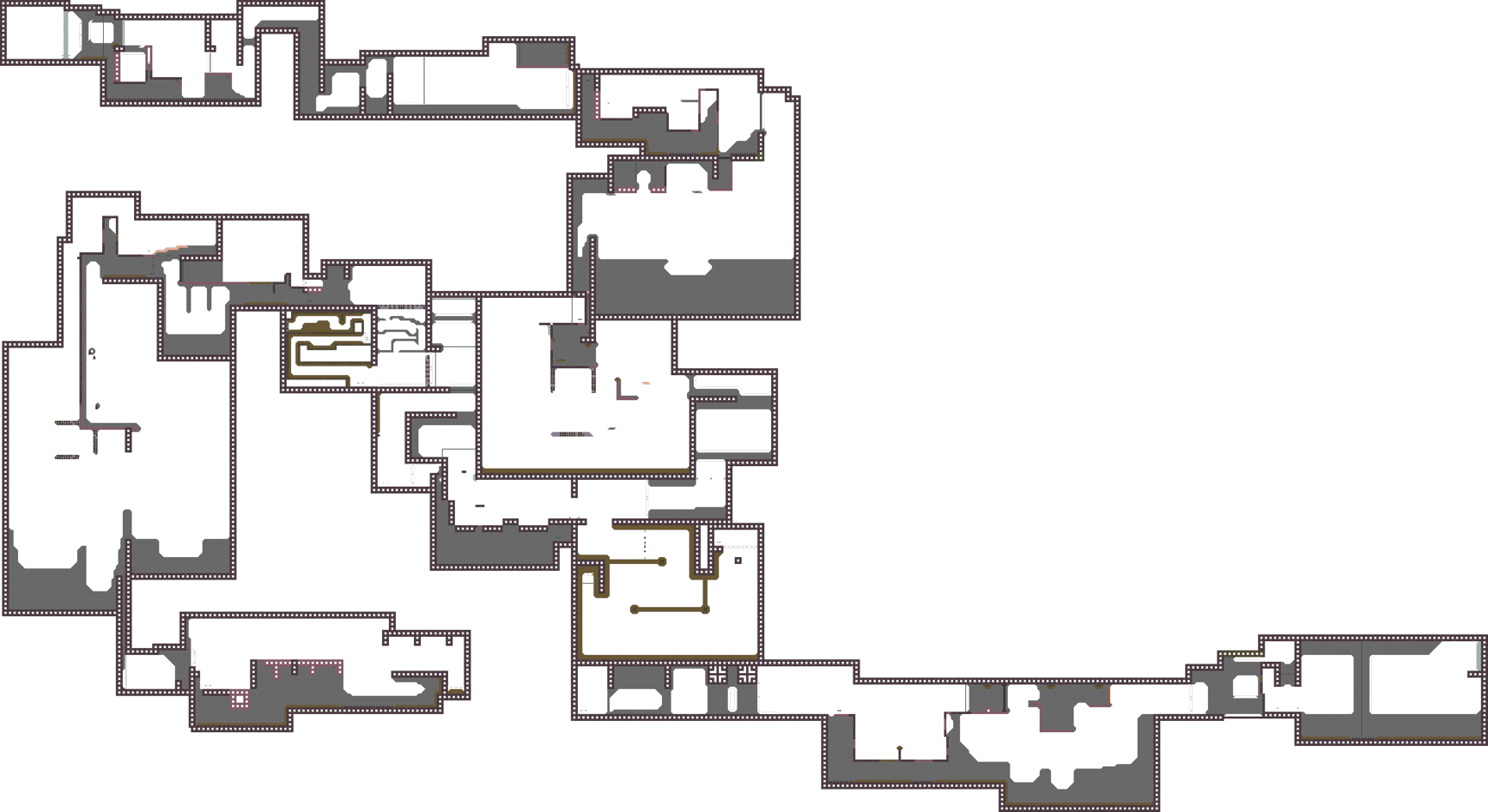
forgot to add logo xD
Your sky layer is not allowed to have transparency, vanilla client doesn't handle that too well
Well then they should play with ddnet client xD
~Mapper Rules
Yeye okay xD
fixed BG thx Ravie
$rate balance=5 flow=5 creativity=2 playability=3 fun=0 design=0 bonus=0
can you explain why pls ? 😃
I will link you screenshots as soon as my internet problems are fixed. For now you will have raw description of my rating.
Balance: It's okay mapped, you drift sometime's really far off when it comes to brutal difficulty.
Flow: Flow of individual parts is not really good, we don't think you have put much work into this map as it seems to be made in a rush, at least certain parts.
Creativity: Some parts are having a nice concept but are very badly brought ingame in my opinion, some parts also just appear very boring.
Playability: Some parts are straight up too faily. We think when it comes to parts where you put the time for players to complete it especially it shouldn't be that faily. 1 part is really long + faily, you basicly have to spec really far foward to know how to complete it since there are no marks whatsoever at the end of the part and could easily fail one.
Fun: As we joined the server we would have liked to leave immediatly again, the map is not inviting at all. We felt like parts are appearing twice, they don't really vary from each other. (deep parts)
Design: You used colors that doesn't fit together.(at least for us) Therefor it's a result of an ugly design. But not also colors are not fitting, but CP / TP / FREEZE / TILES got put very awkward. Maybe it's just us, but we have a very different taste of things and still think it's not fitting at all. We also first thought it's an design bug but then saw it on everywhere so we excluded it.
We assume this is your first map, therefor very good try.(Better than other's first maps) Maybe lack of creativity or time could be reason of it's finish. As points given for design were 0, we think certain parts + design got built in a rush. Whatsoever to improve your map we suggest a complete re-design, and overwork certain parts. To mention screenshots that are following since I have internet problems they are delayed but to give you some spoilers, you sometimes didn't mark extra dj / hammer / freeze
PART 2/2. Kill tiles at the very end is not very beneficial, and you can skip grenade deep part. For your understandings: By draggin the deep player to the end of the part since you put the timer at the end and complete it.
is their first map
thx jao
Oh my bad then i thought raywyn was just from syltoox
mapper doesn't want the map to be released anymore
