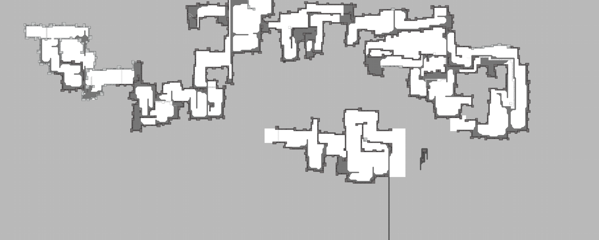
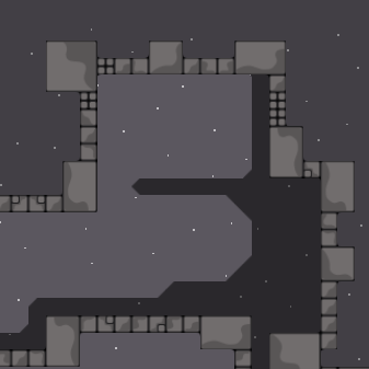
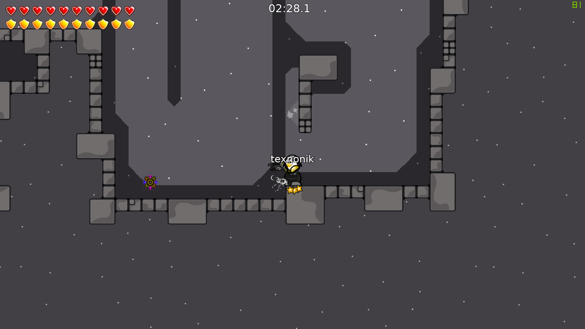
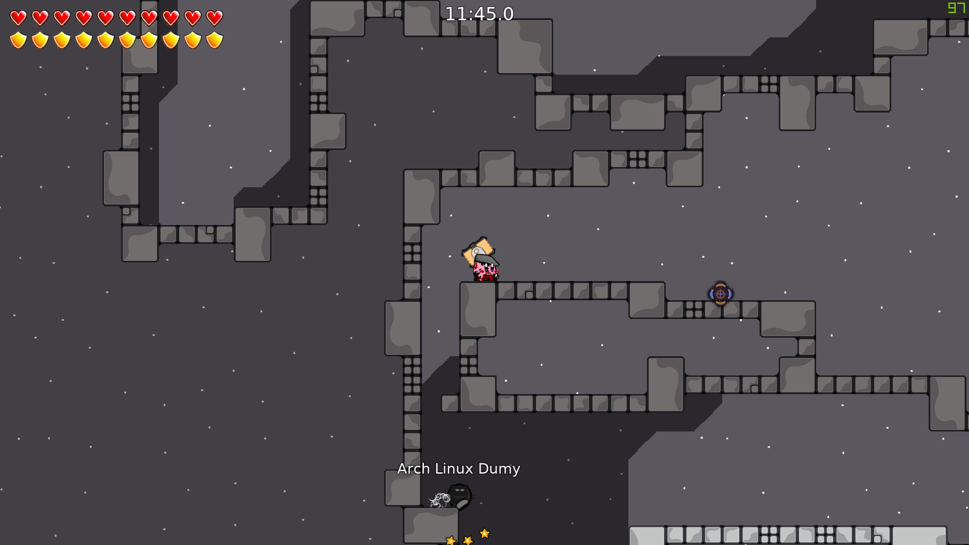
"Allstar" by Im 'corneum
Hey now
fuck off now for not giving me the automapper
The one that is not 100% finished and doesn't even work with your tileset?
idk u didnt send it
So why so salty
cause u acted like u didnt know what im talking about
I made several different ones but by the look of this map i know which one
you teased me with a screenshot
and if you look at it again it does only default rotations
anyway offtopic
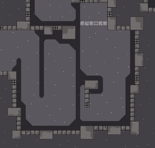
hook and hookthrough marking look the same
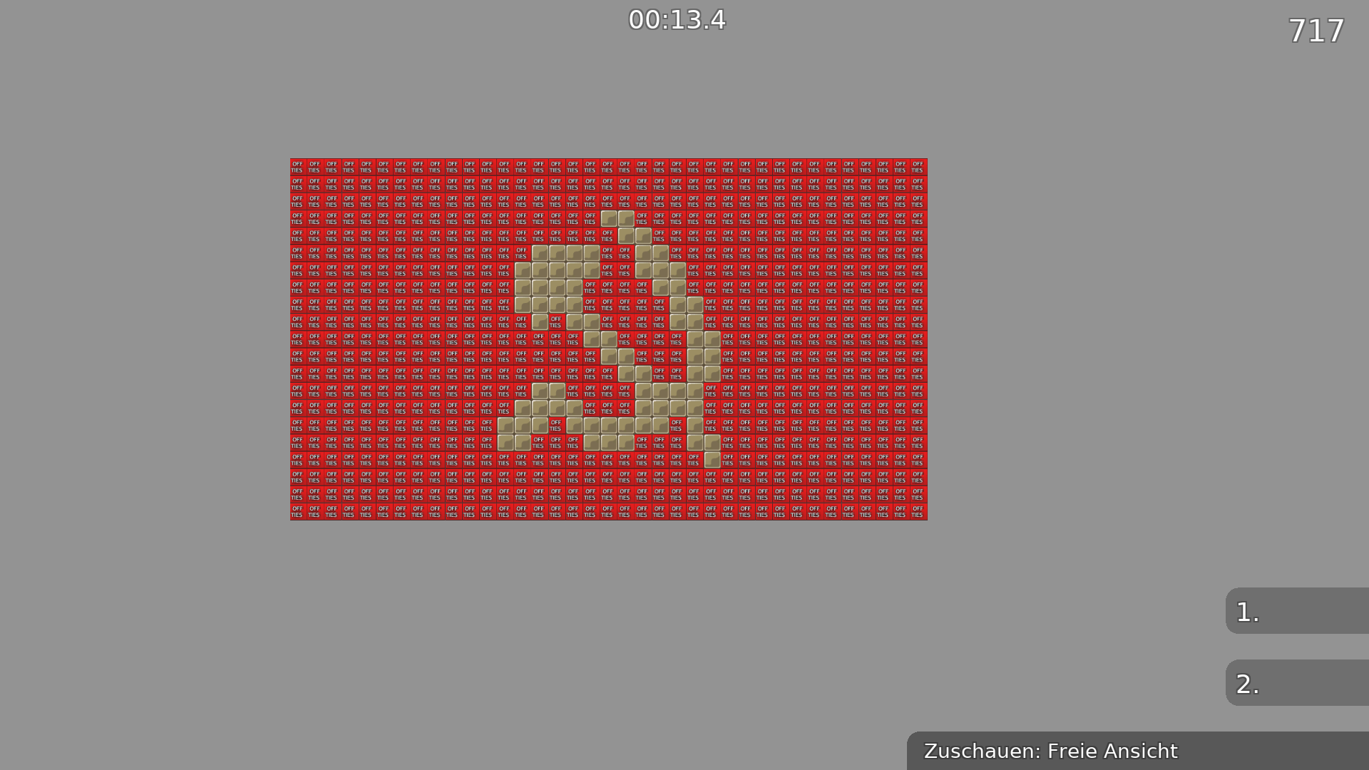
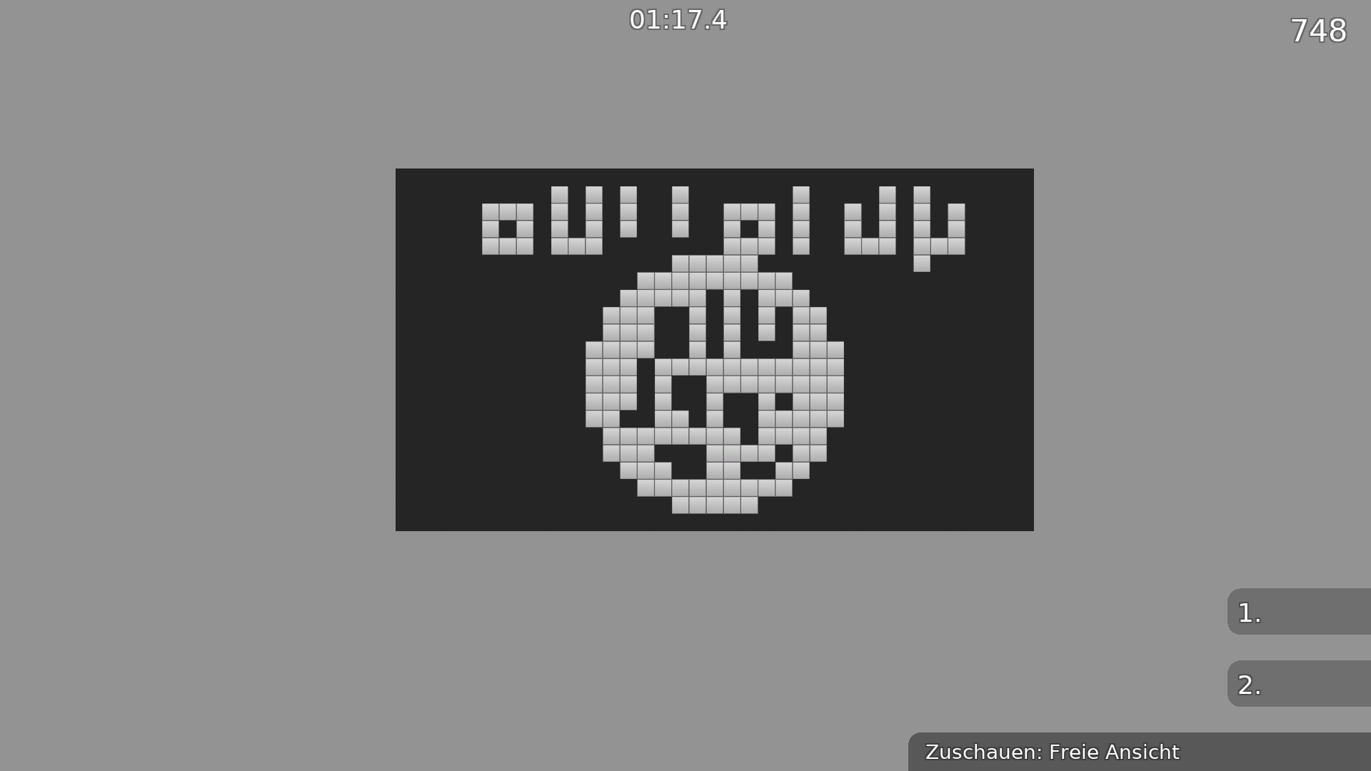
first nazi symbol, now anarchy symbol

next allah symbol
im corneum the socialist

changed alpha of hookthr.
allah symbol 4 the win

with 69.69kb


$rate balance=6 flow=5 creativity=5 playability=5 fun=2 design=1
first, laser pull, and double hammer parts are cool, rest are lame known parts with a minor twist.. don't take it personally, but your brutal maps are your worst
I dislike that it's made like a 2p map with standard parts (parts you could use in a team 0 friendly map) - not a good combination
I would decline this one, really not one of your better maps
I have to disagree, cool map imo definitely worth releasing
seems like we need more opinions 😉
would rls as 2p force but change the last part(unfreezehammer at wall)
if u miss it, its fail
its too tight for t0
and u can skip most in t0
ye it kinda would have to be teamforced
which would also in turn make it way less popluar
most of parts just weird + map is rly tight
bad calculated parts
such faily awkward tight 2p maps are never popular
decline
Barren tier no ?
And Barren is quite famous
is barren awkward tight or faily?
barren isn't similar at all
Idk the map tho , and ye Barren is quite ankward
I'm just saying this about what ppl said
barren is literally open to one side, there is no tight spaces whatsoever
you should look at the map before commenting about it 😉
this map is not tight for 2 players (which to me looks is how it's meant to be played)
referring to these
for 2p it's not too bad
really awkward to play
people will either rq at the first or second screen
I would change the first screen but rest seems okay
btw need a bigger start room or start in solo
and should remove filter if you teamforce it, otherwise that will contribute to people quitting too
yeah could replace the whole filter with a nice big start area if you add teamforce
The first screen is the greatest one imo
And now i remember that i had test this map long time ago xd
I remember disliking the map because of a lack on basically everything, not gonna test it again to remember the reasons, but well, -1 for release, since you asked for opinions...
still in favor of declining this. he has way better maps I don't see the point in releasing this one. probably wasn't much effort either
+1
It's a nice simple map with some cool parts, just needs teamforce
+1
With Ravie xd
tested with ravie. made some parts easier with jump refill and other fixes
still don't like it
and if you need refill jumps everywhere, that kinda shows it's not well made in the first place
Too short for 2p map :/
even Dark depth is longer then this map . Even here is faily parts its too short !
@Im 'corneumready declined 6*
deleted
archive 3*
ready for delet i post a better map if this goes to archive
go ahead
