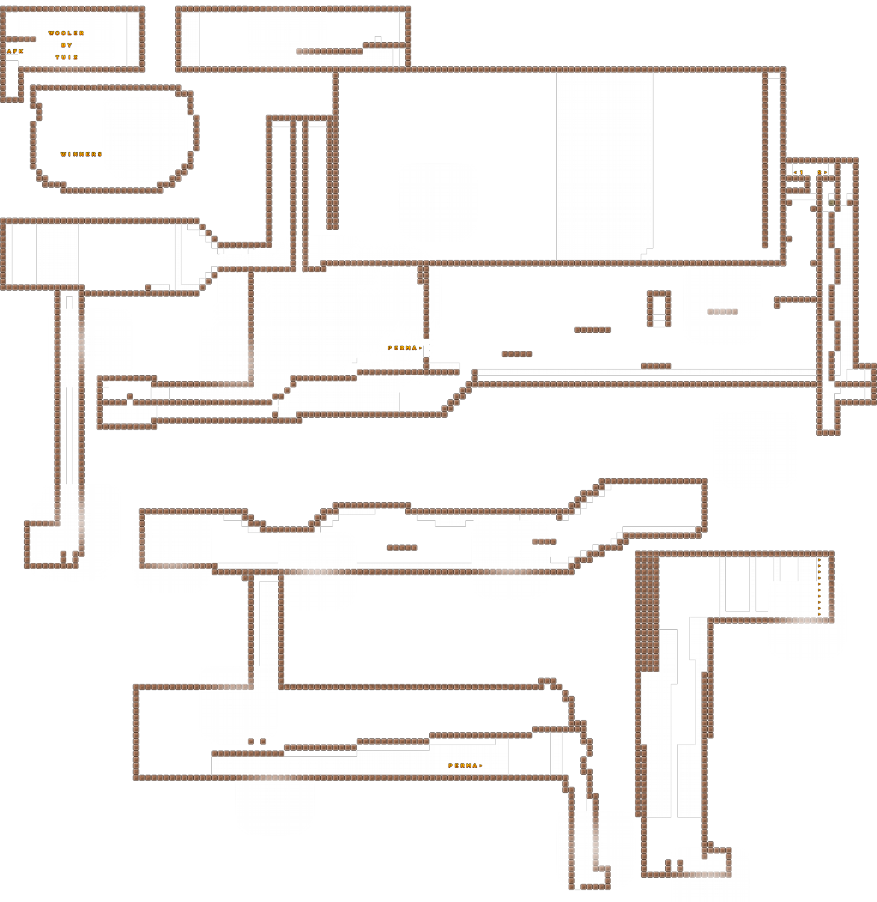
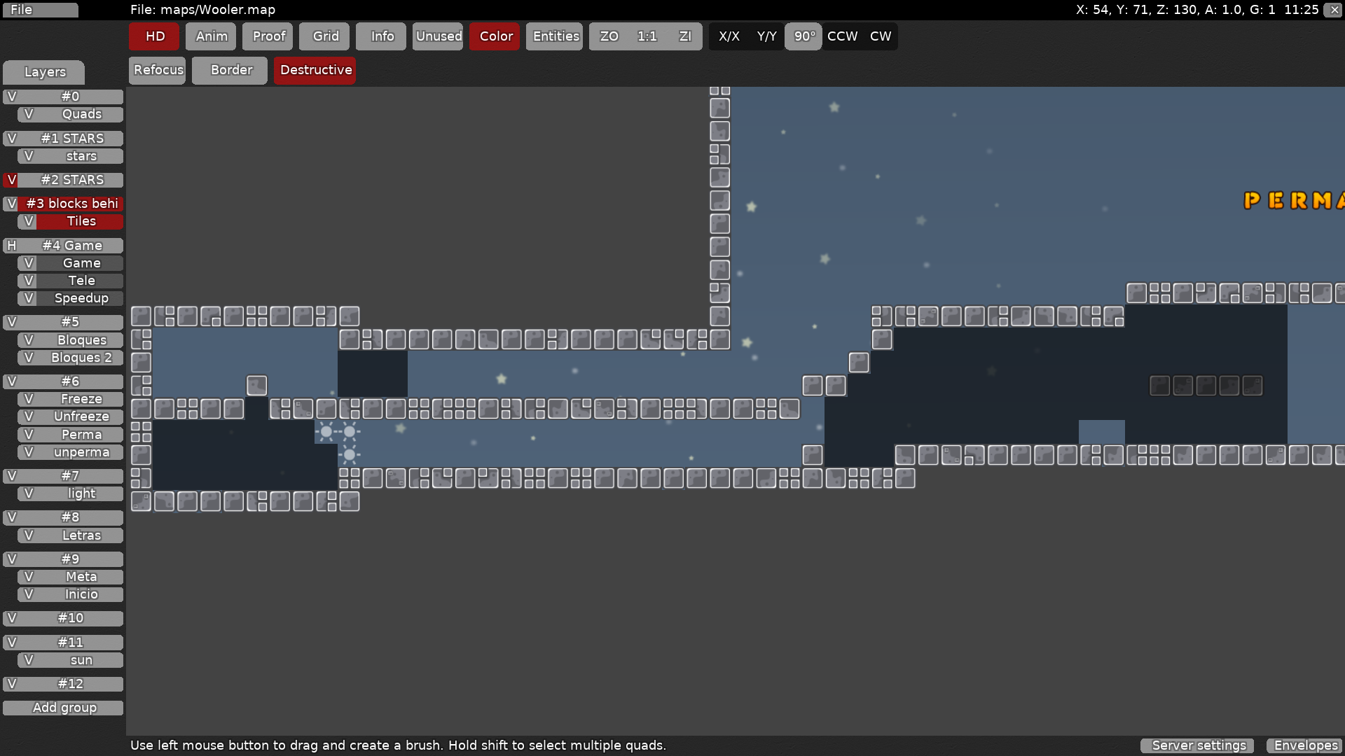
this is your map's testing channel! Post map updates here and remember to follow our mapper rules: https://ddnet.tw/rules
Hi, this looks like one of your first maps
i don't like to say this, but it doesn't look like this map is good enough to be released.
i think you should try working on a new map with some of the following tips in mind:
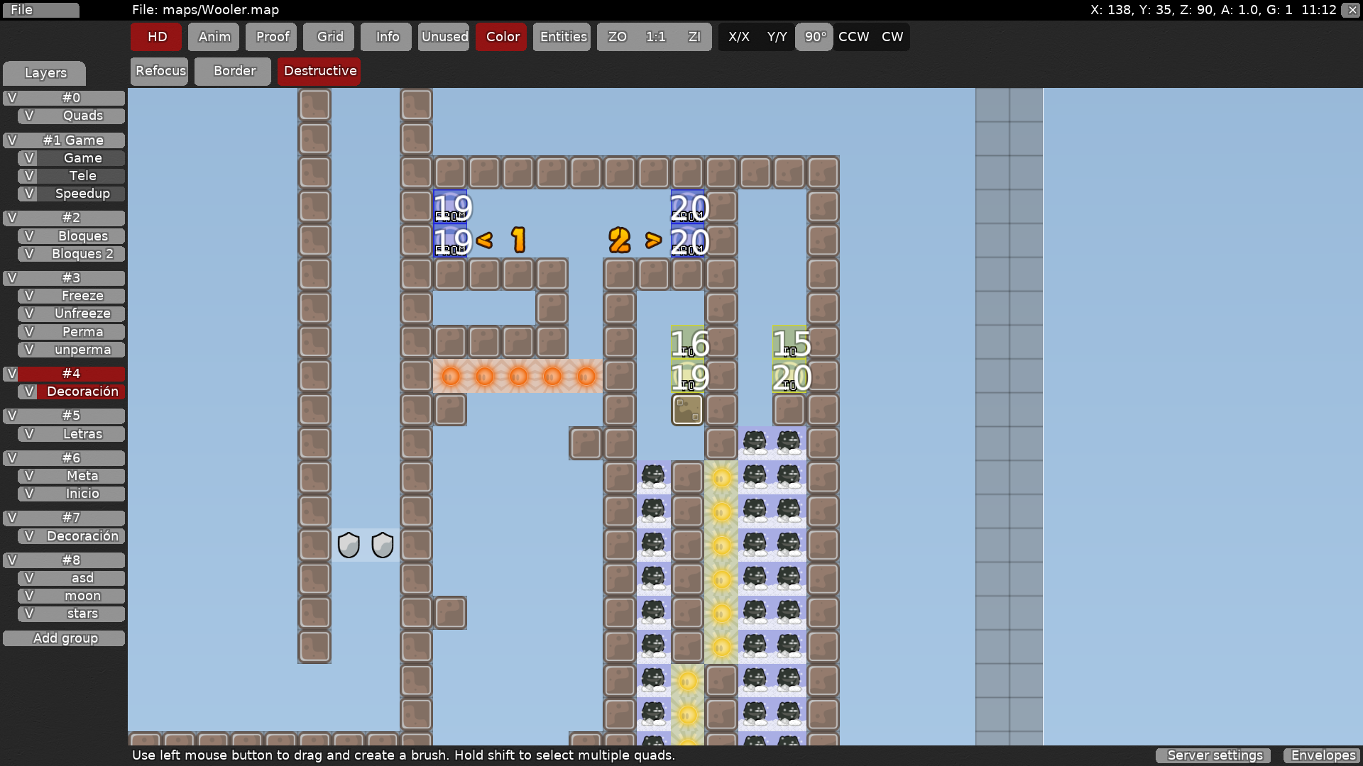
try to make your map structure make more sense. as of now, your map has a lot of teleports going to different places. it makes more sense if a map is linear and you can walk to each part rather than being teleported to who knows where.
a lot of your parts are too cramped.
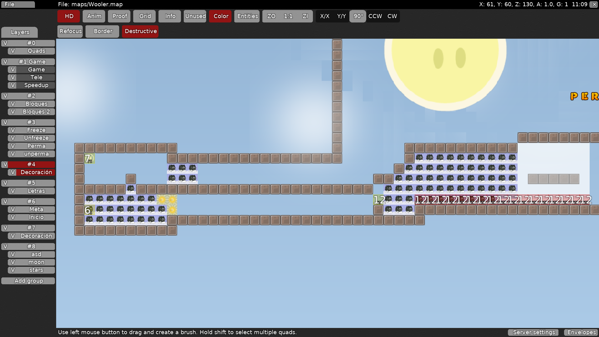
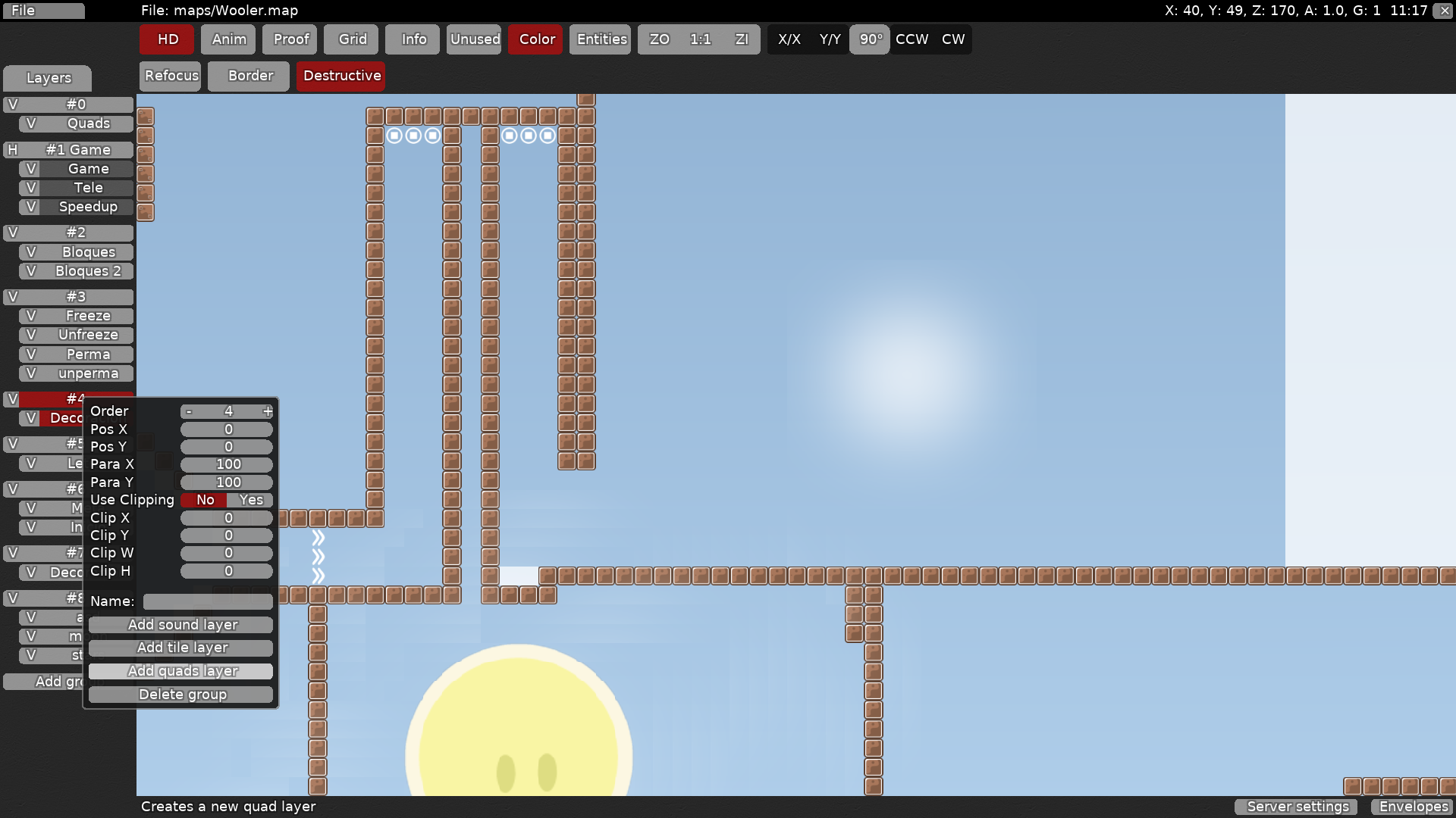
for example, this part is very cramped. parts can still be challenging even if they are not cramped
you should give your map more space for players to breathe. making parts less cramped helps people move around, and it also makes sure that people playing in team 0 do not block eachother by getting in the way.
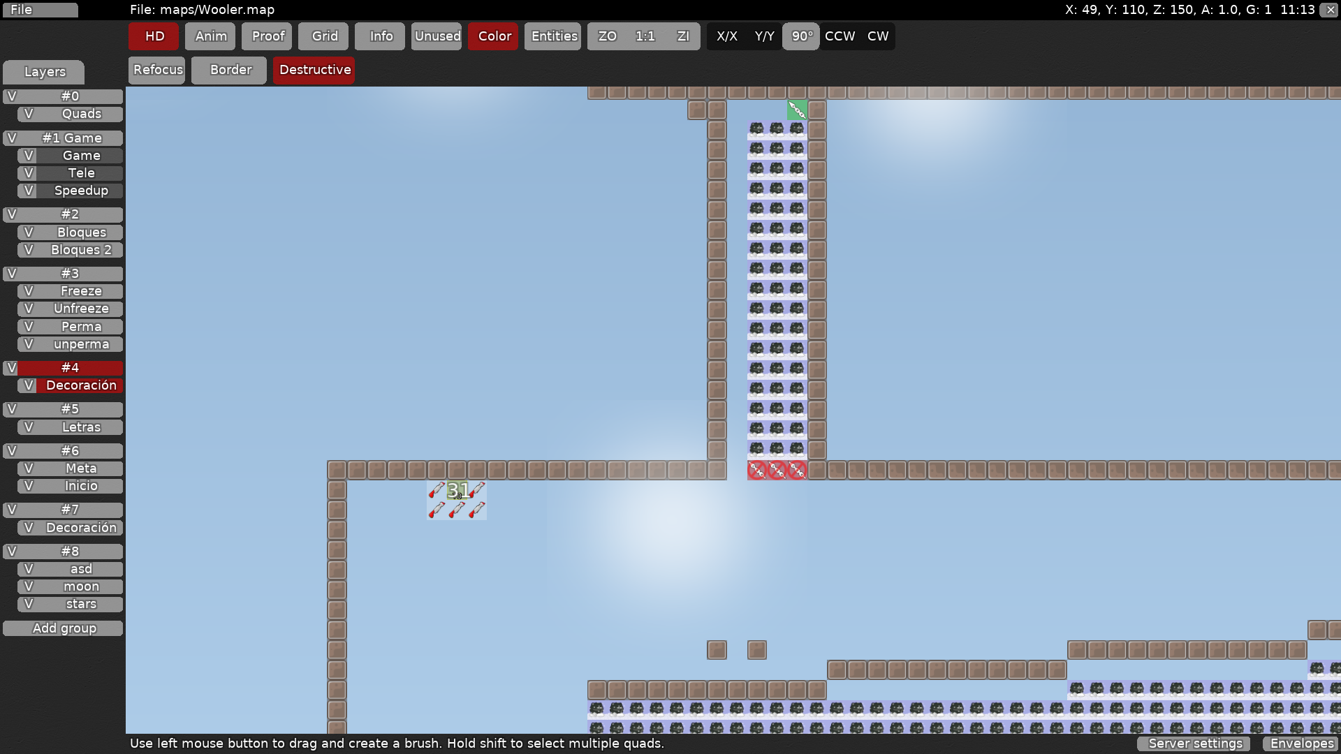
you should generally avoid troll parts like these as players may think that they need to unlock something before they need undeep (they might not see the real undeep at the end.)
you also need to make sure that even tile in your design lines up to tiles in your entities. you don't need the border tiles either
Oh
Thank you
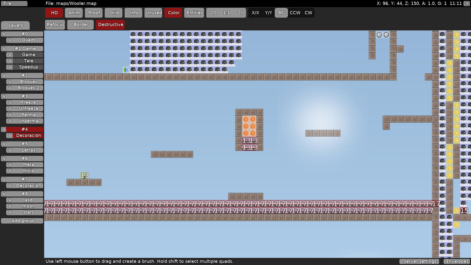
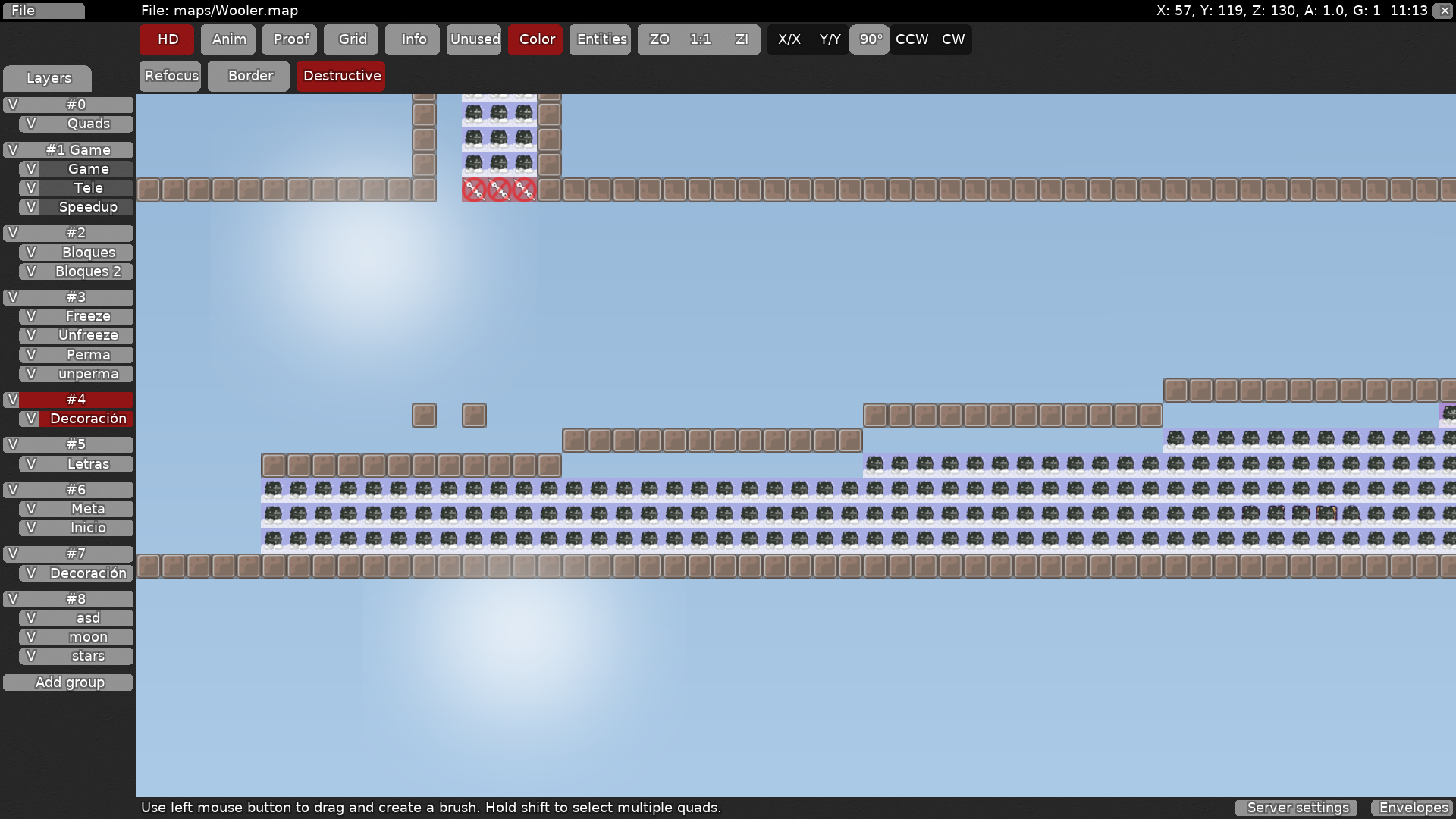
also make sure your parts are balanced- a hammerfly part like this is quite hard in a novice map, especially when all the other parts are much easier
try to avoid repetition like this - after a couple times this move gets a little boring
try to use different shapes and different tiles to make an interesting part
i also want to give some tips on design
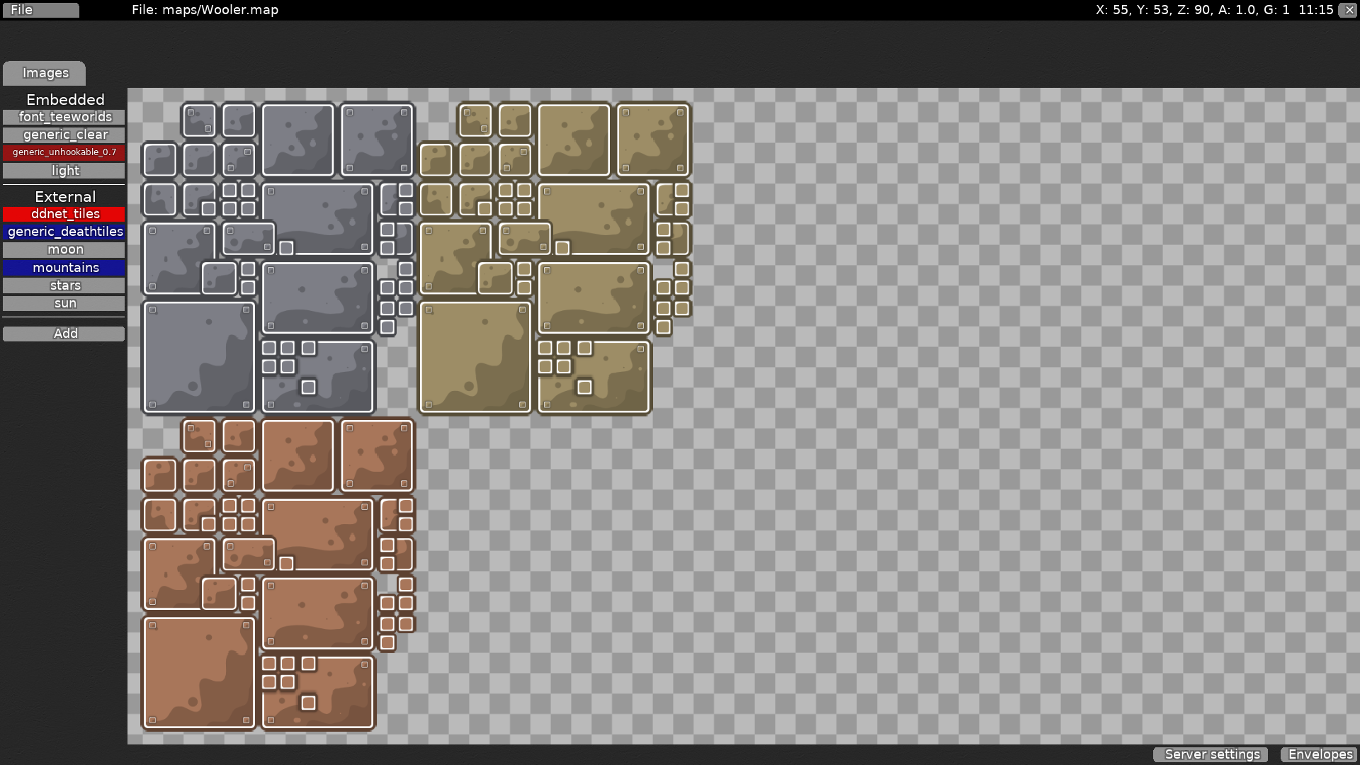
when you submit a map, make sure you have no unused images (they are highlighted in blue)
Wow
also, only default tilesets should be in externals. ddnet_tiles is not a default tileset, so make sure it's embedded
I think it can be a novice
Lol
Im gonna make another one
ok
just a few more tips
Ok
it can be, but it has so much issues
your decoration is a nice idea, but it shouldn't be randomly placed in the middle of parts like this
xD
also, try using your decoration as quads by creating a new quad layer and choosing the light image. this makes it easier to work with
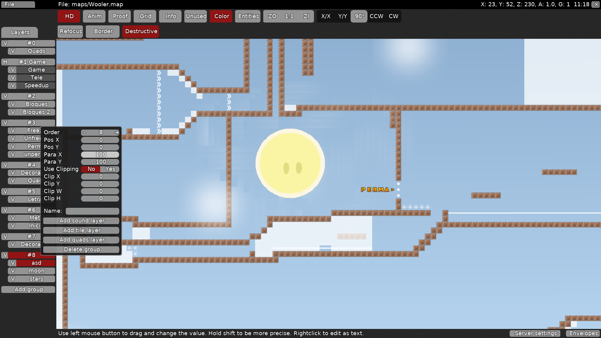
for your sun, you can change the Para X and Para Y values to make it move along in the background instead of staying in one place - use this because it will look a lot more natural
(also, use a quad layer for the sun too)
Ok
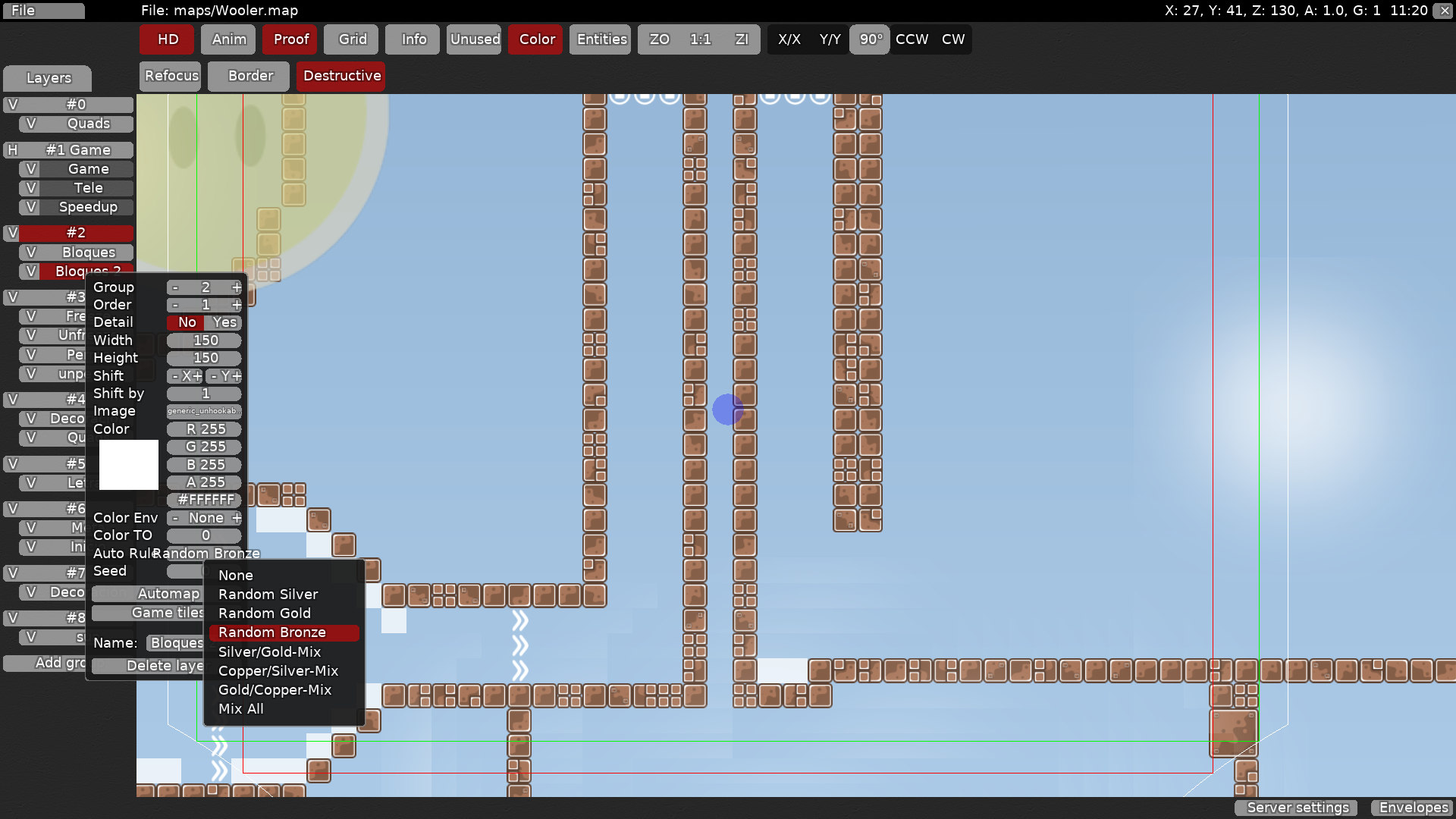
u can make ur blocks look a lot better by using an automapper (press auto rule, choose an auto rule, then press automap)
Automapper'
?
Oh
I see
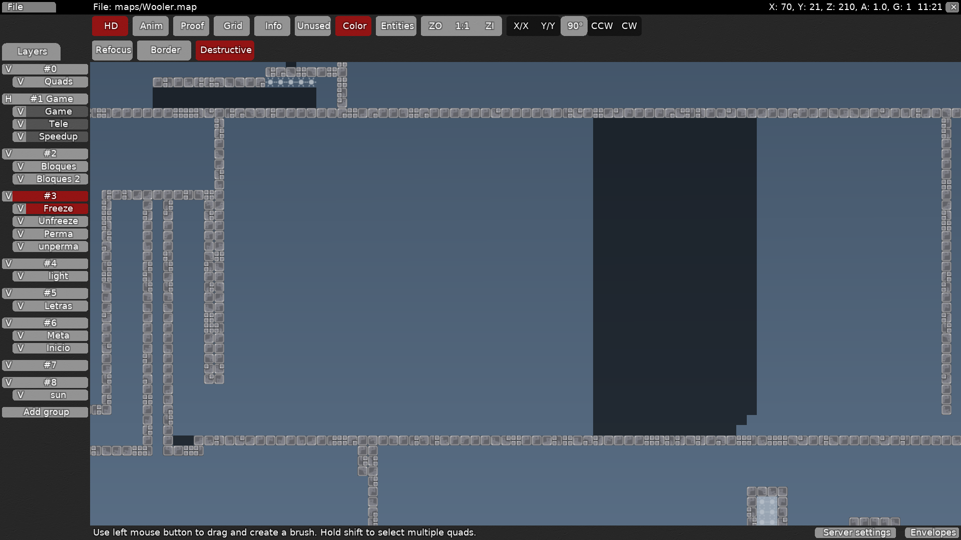
you can also change the background color if you'd like. here i chose a darker shade of blue but you can choose whatever you want as long as it's easy on the eyes
freeze should generally be black with transparency added
How i change the background?
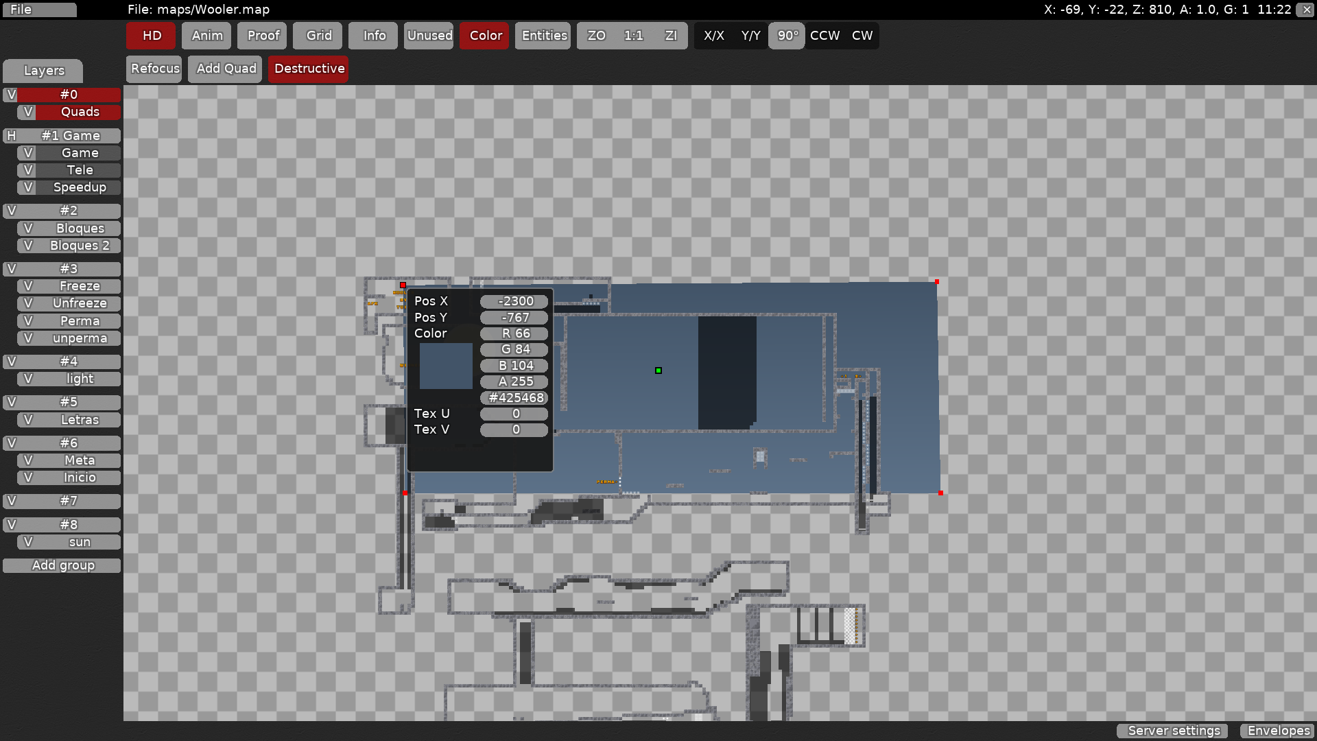
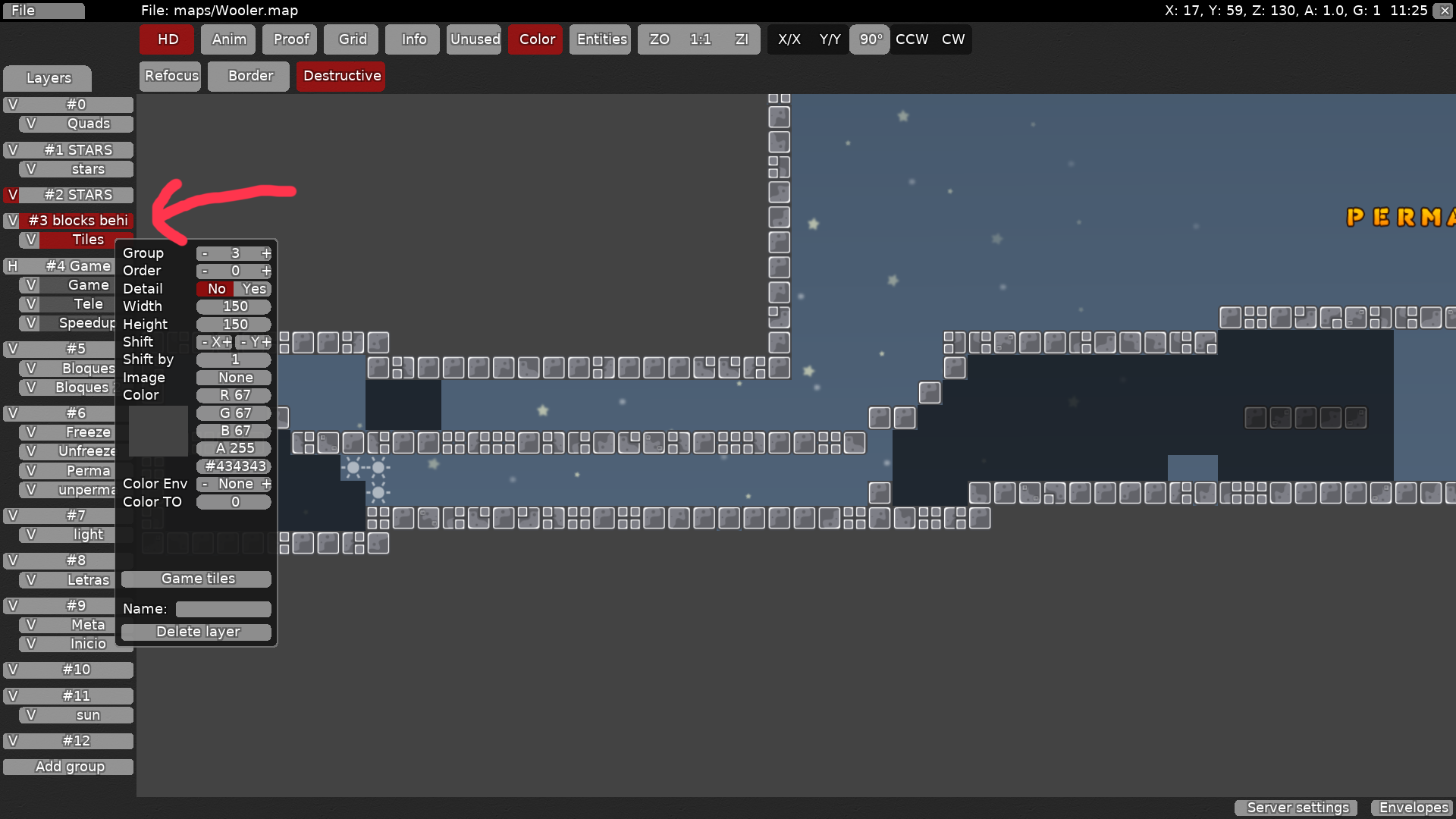
select the first quads layer and right click the corners
Nice
But i have a problem
I dont have ideas
you can get inspired by other maps, just dont make identical parts
Thanks
Im gonna play a bit and take some ideas
How i can do that?????
you can also add blocks behind tiles to make the map seem more closed and not just tiles floating in midair
Duuude
That was so crazy
create a tile layer, make sure the order is less than ur game layer
and fill in the tiles where there is space
i added stars too
So... i need to create another group, put a tile and...?
those are Lady Saavik's stars (i believe), you can just download the stars1 map and go to file > append on your map and choose stars1
you change the tile to a dark grey color and just place tiles
Ohh
Waoh
u can also add doodads
what's that
doodads are an easy way to give your map some decoration
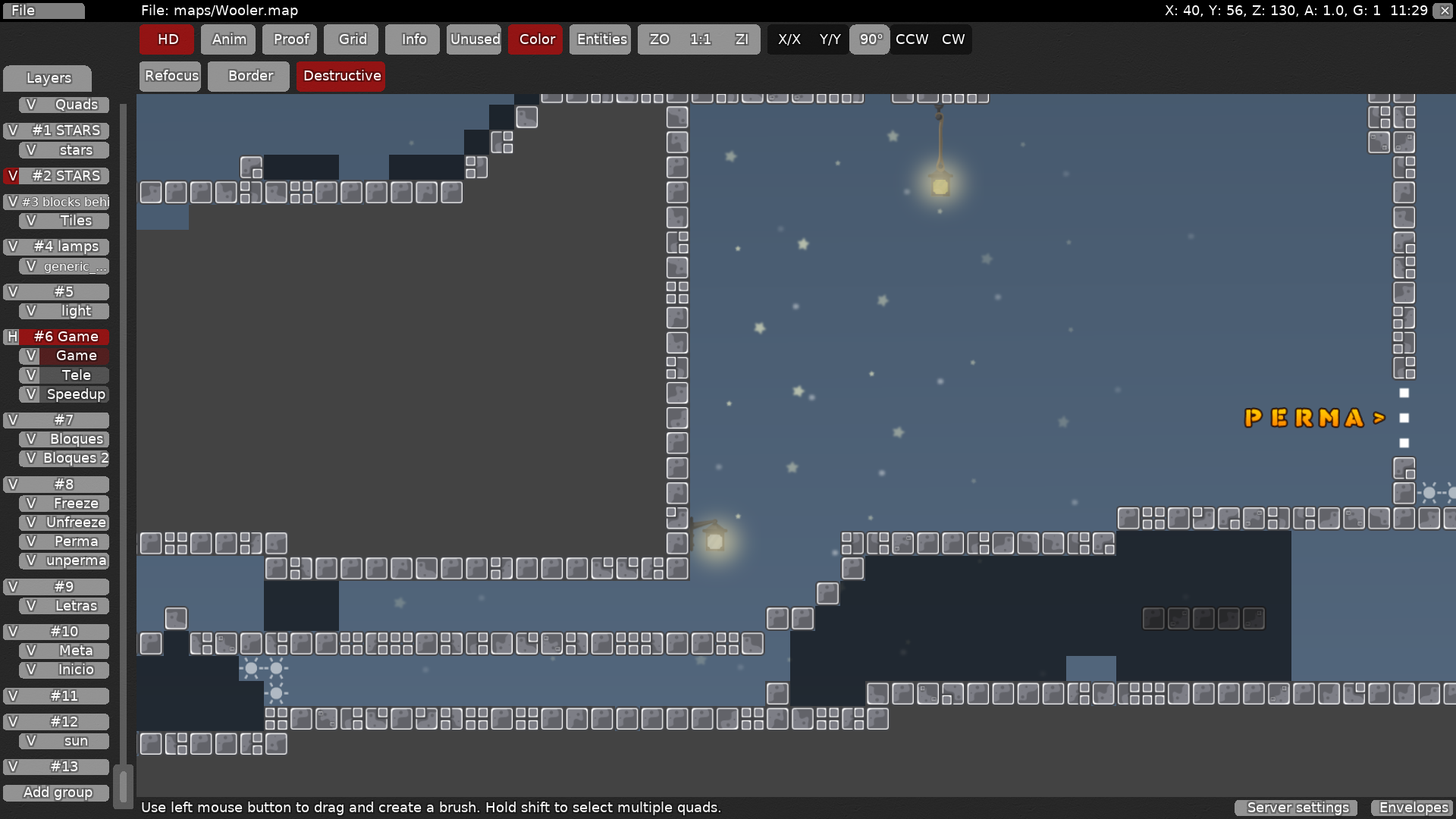
here i added some lamps
you can add lamps by choosing generic_lamps and embedding the image file
i also added lights around the lamps by creating a light quad and putting it right above where i placed lamps
that's all i had to say
Tysm
try to use these tips and think of something cool yourself
you can use different tilesets if you want, just experiment with what looks nice to you
maybe it might help aswell
https://forum.ddnet.tw/viewtopic.php?t=722 aswell you should give a look to it
Since this map needs a rework and you seem to be making a new map, i'll go ahead and close this channel. if you have any questions don't feel afraid to ask.
$decline
