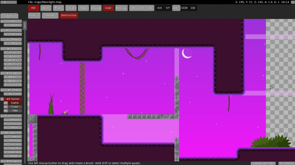
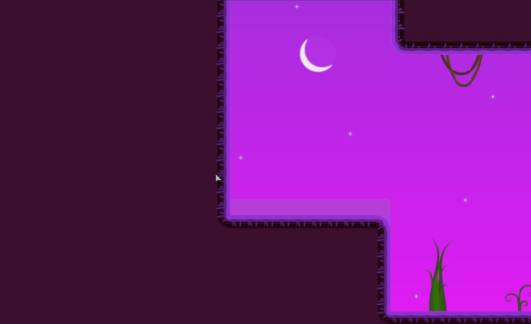
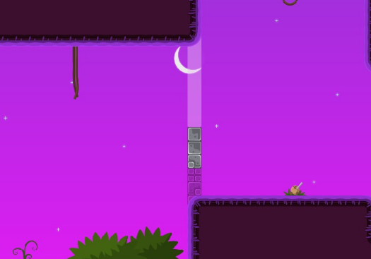
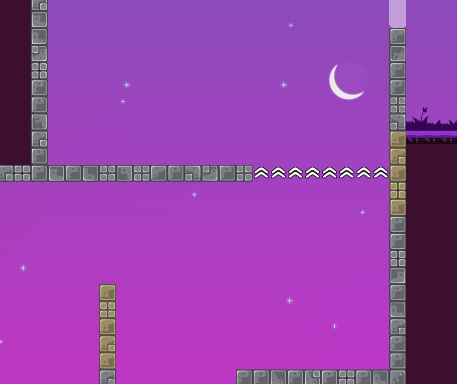
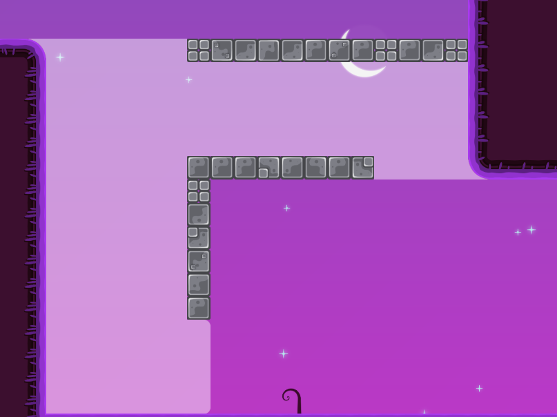
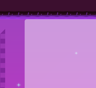
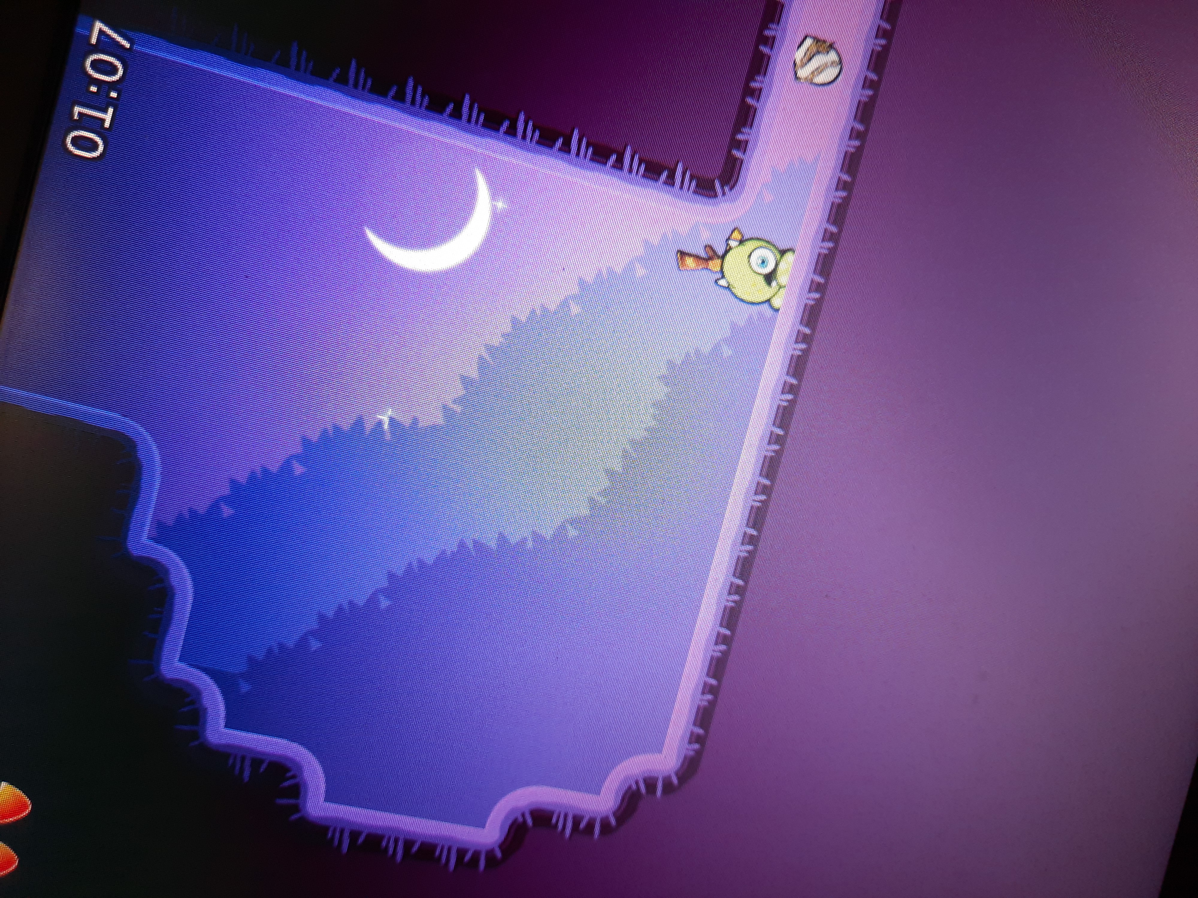
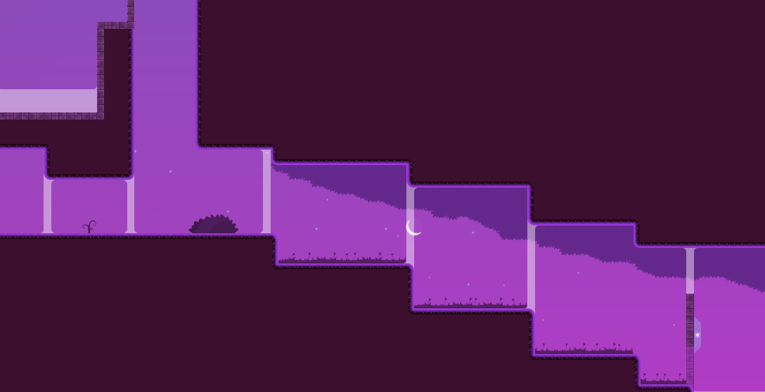
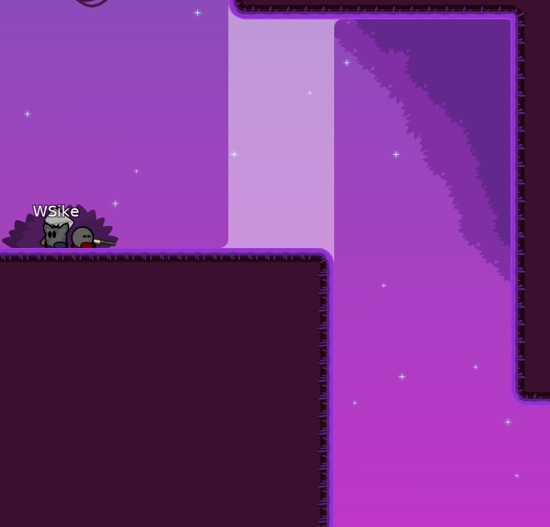
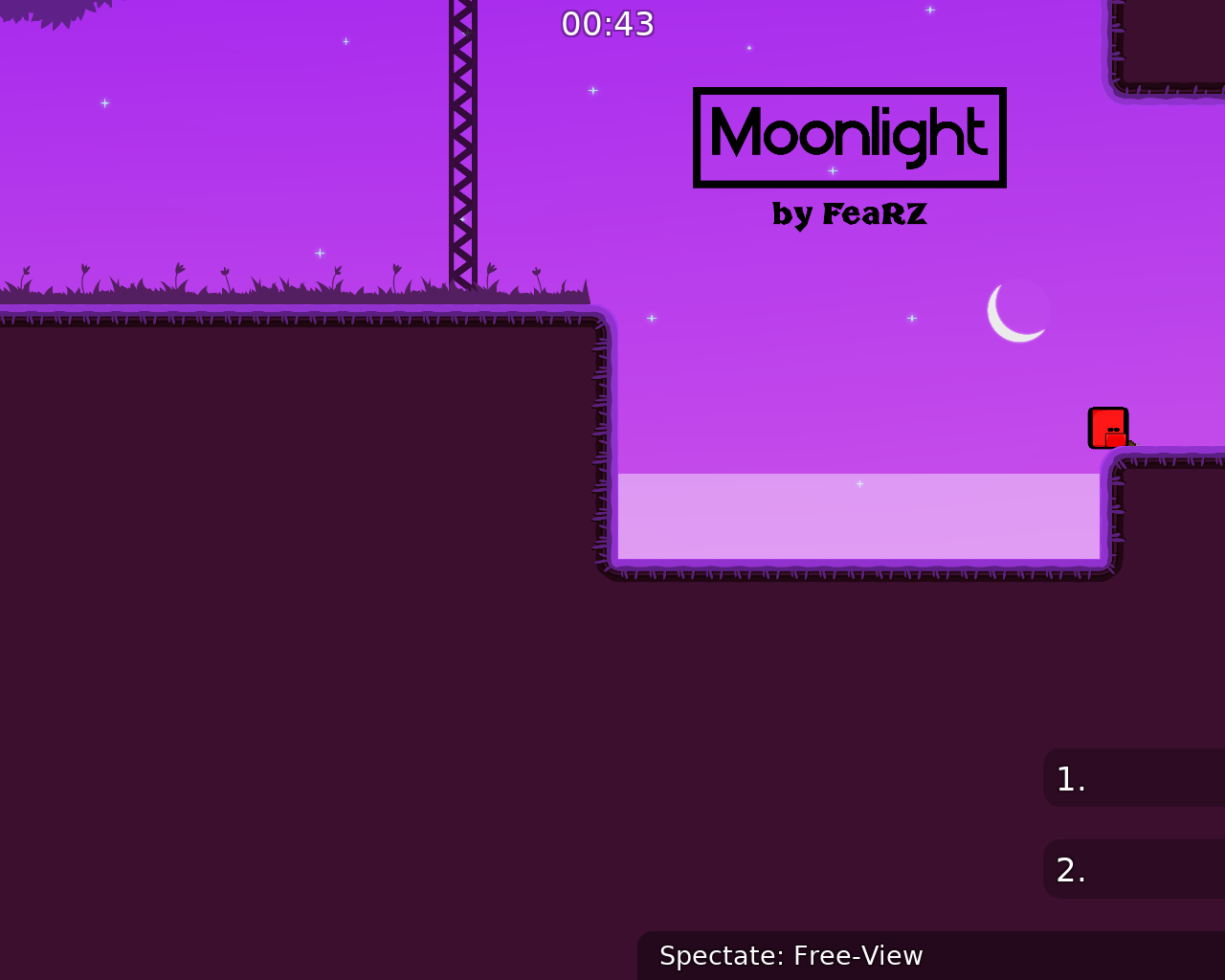
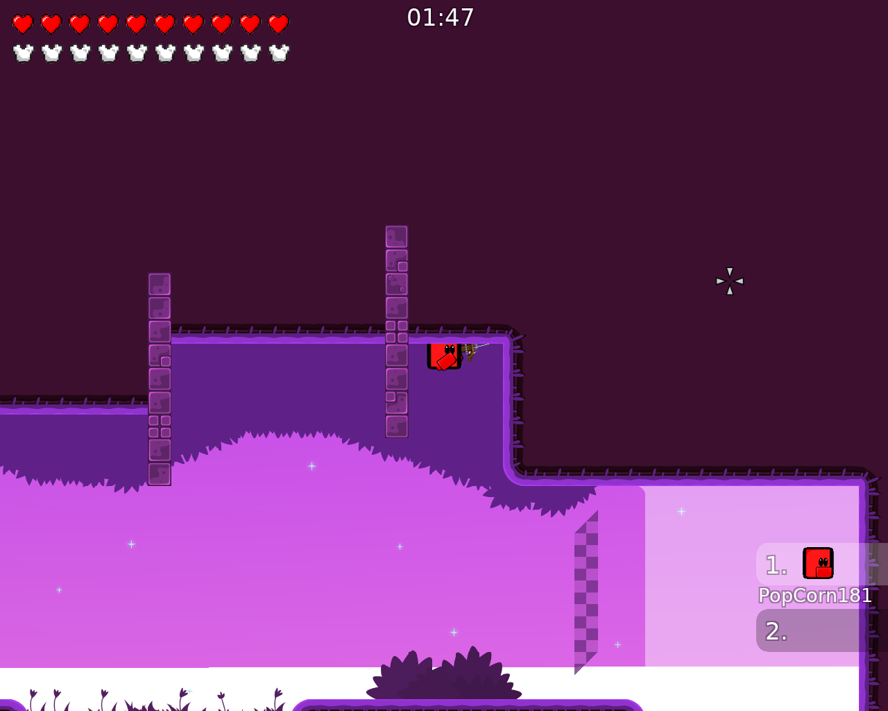
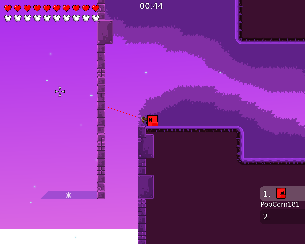
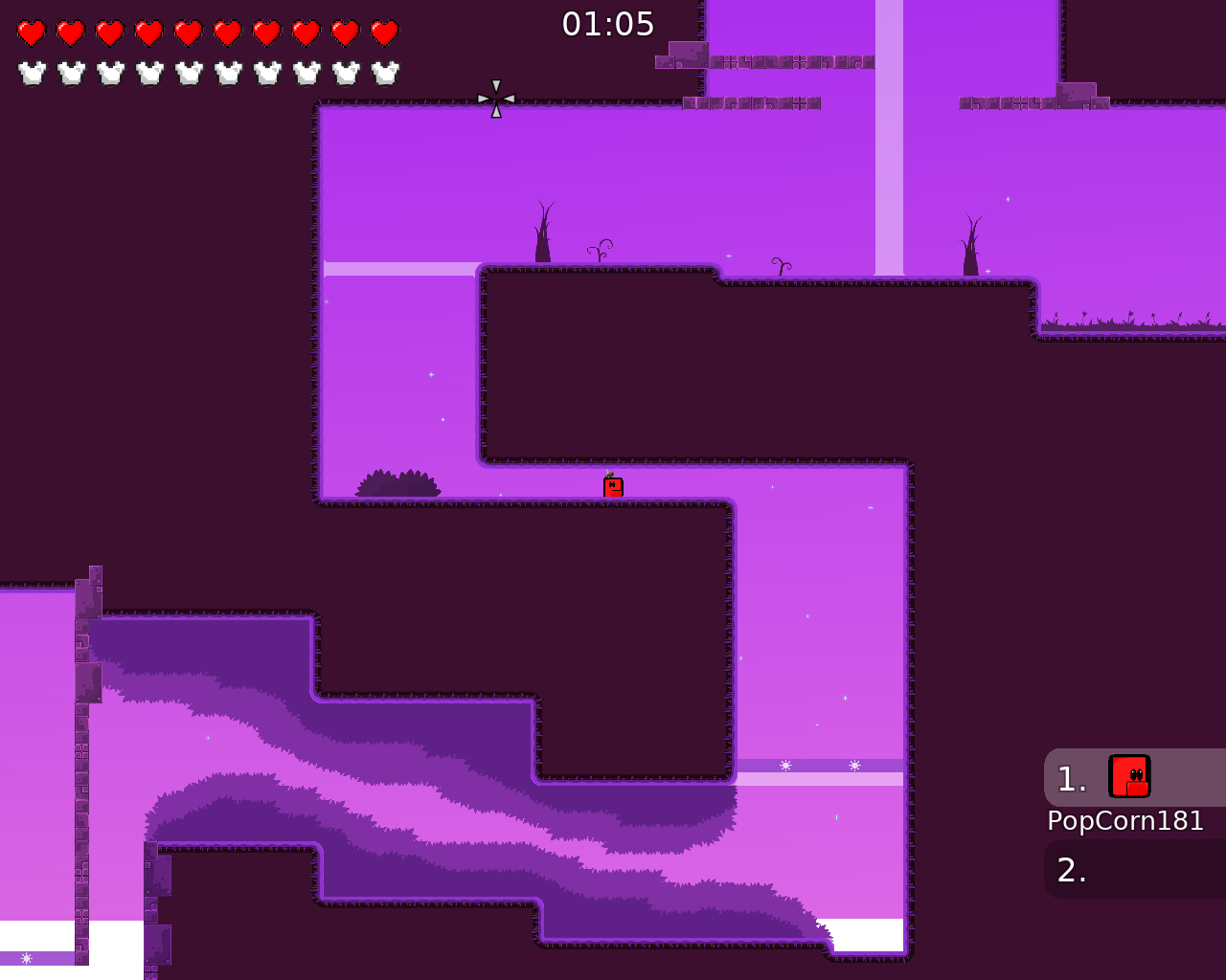
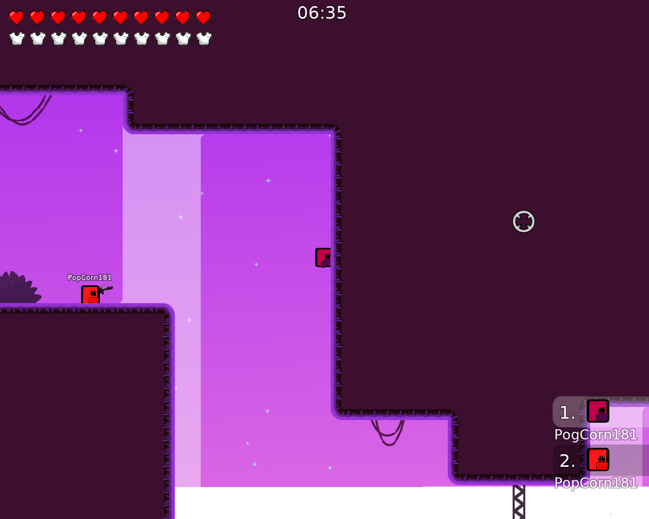
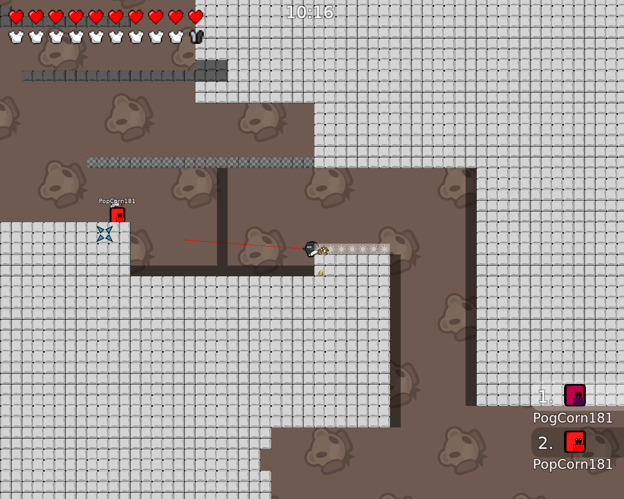
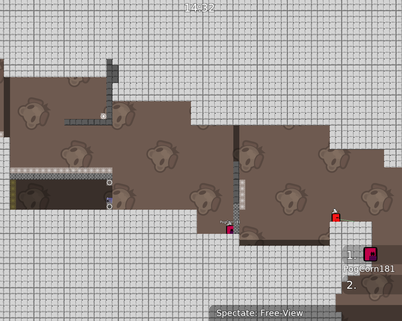
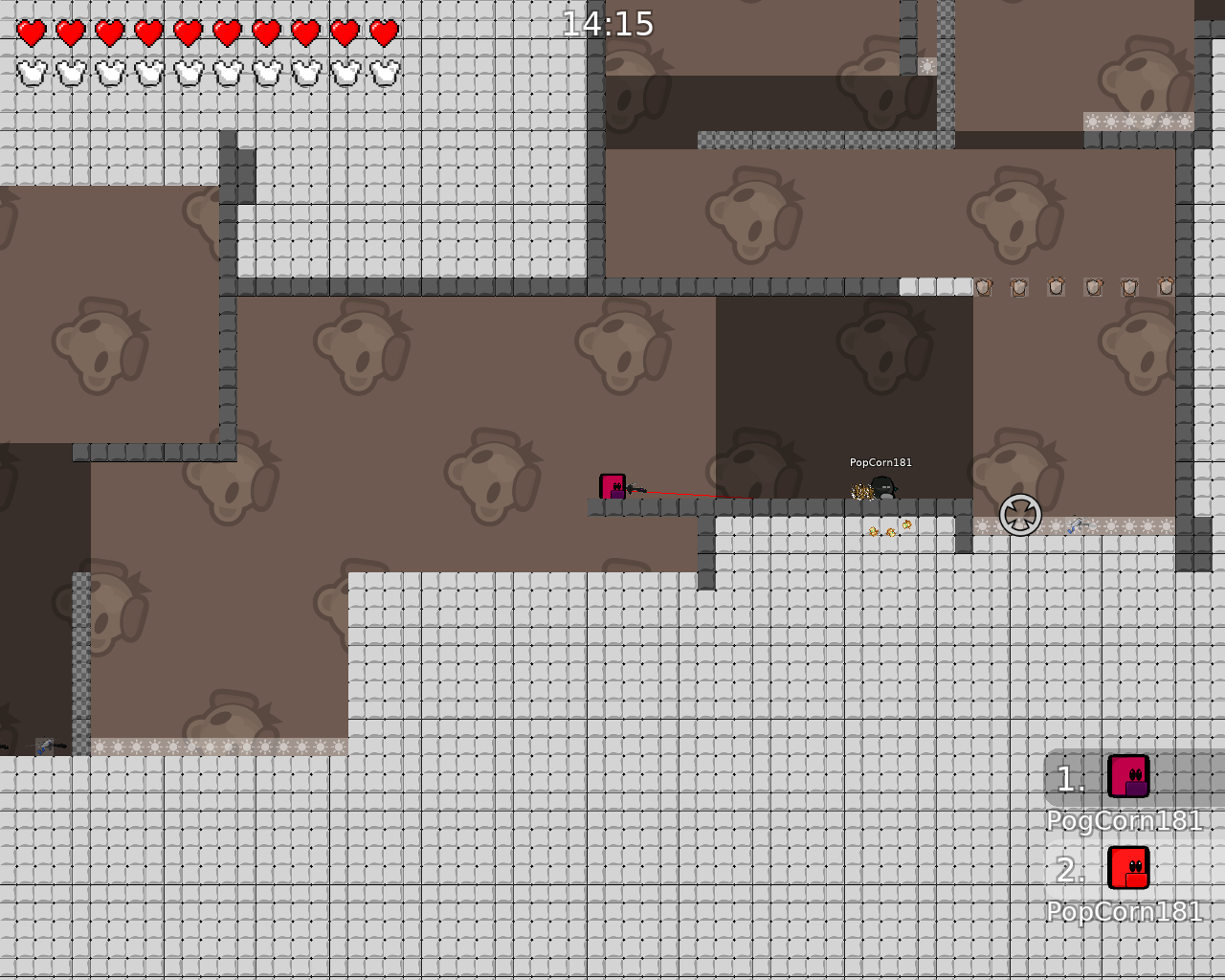
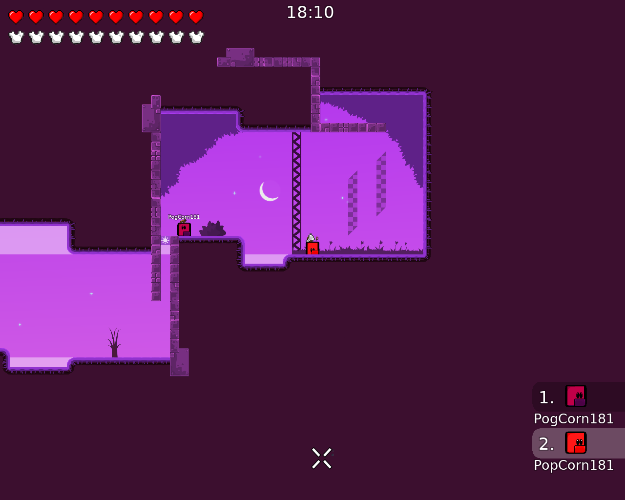
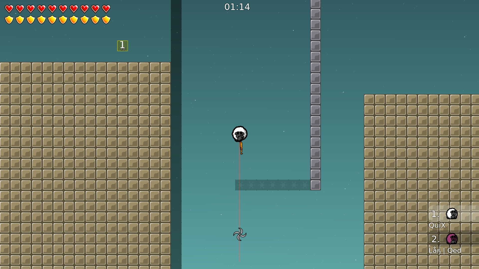
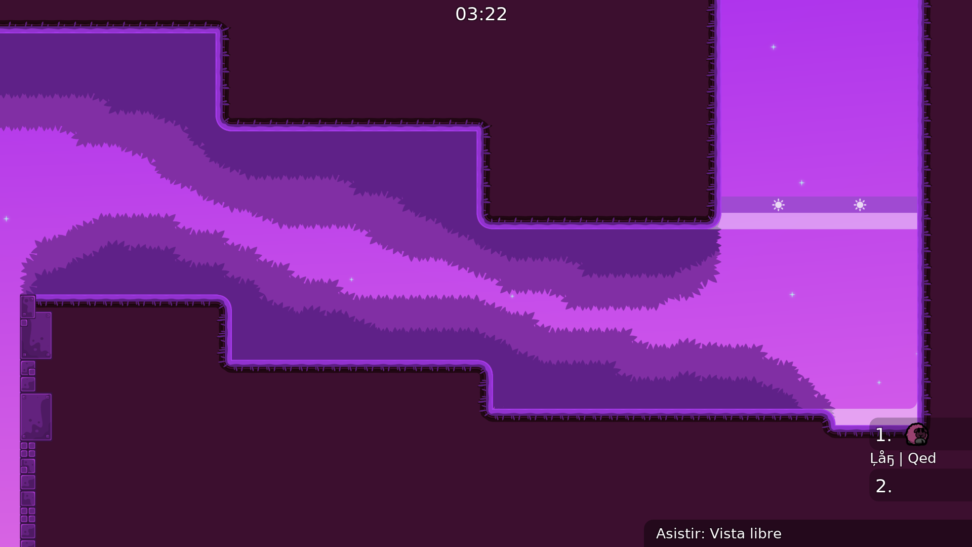
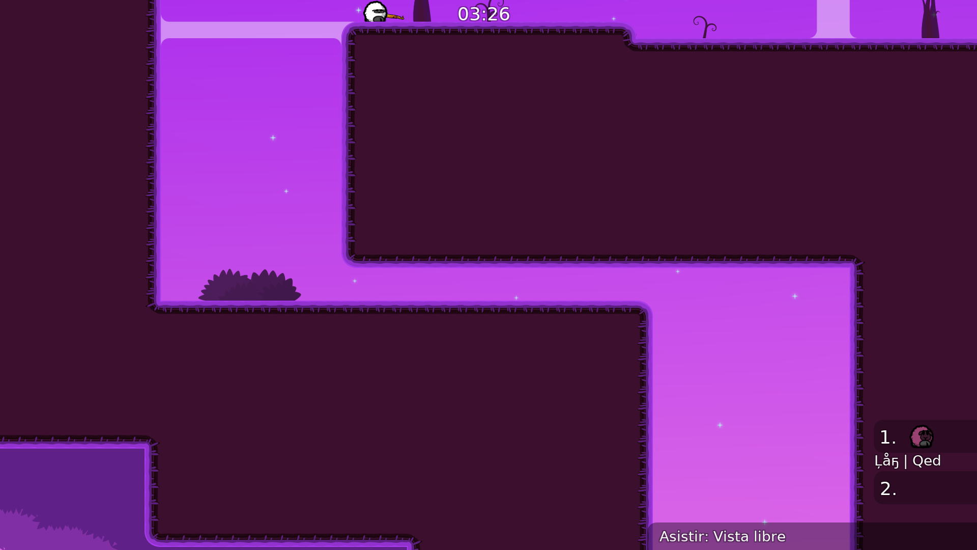
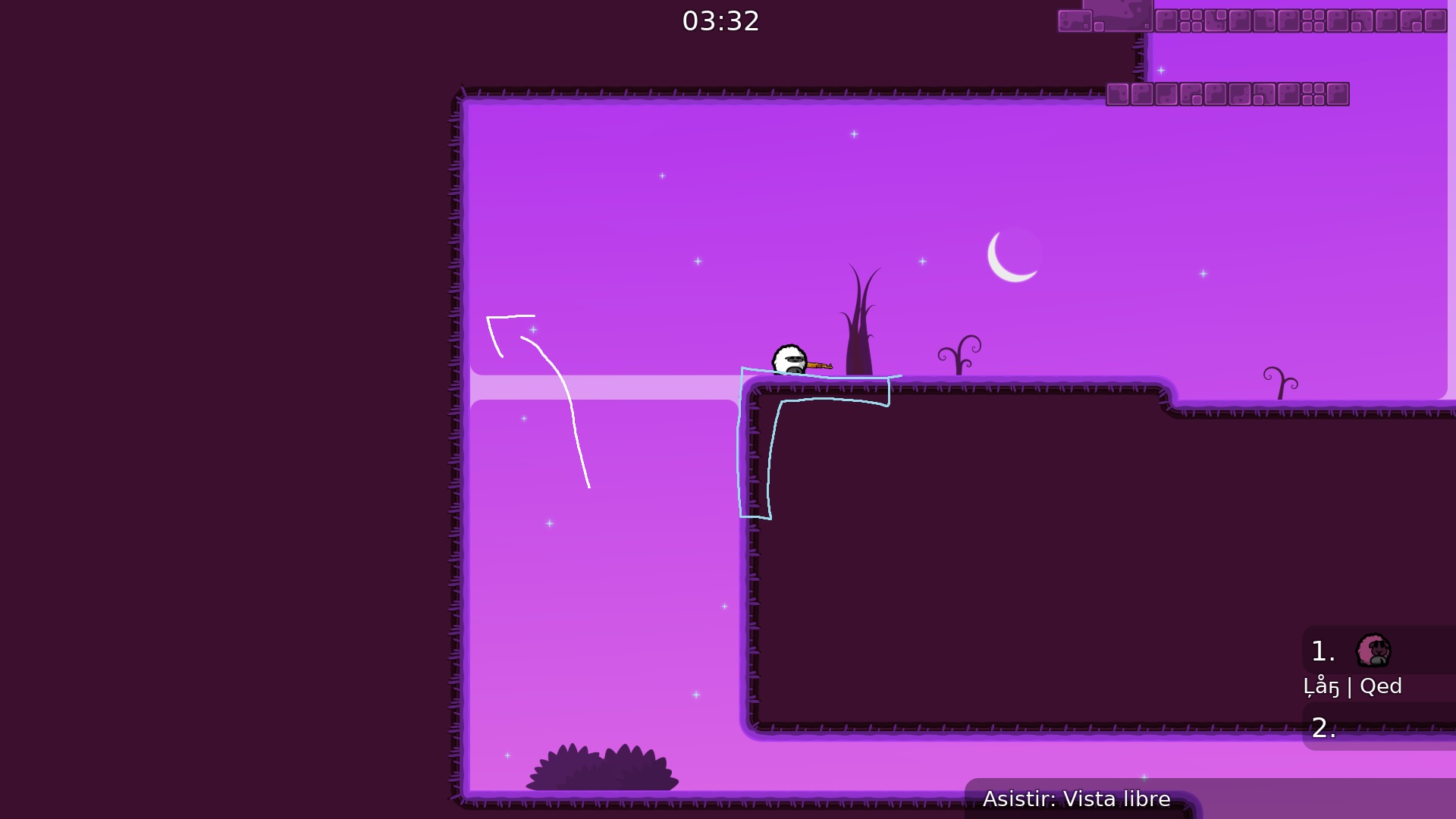
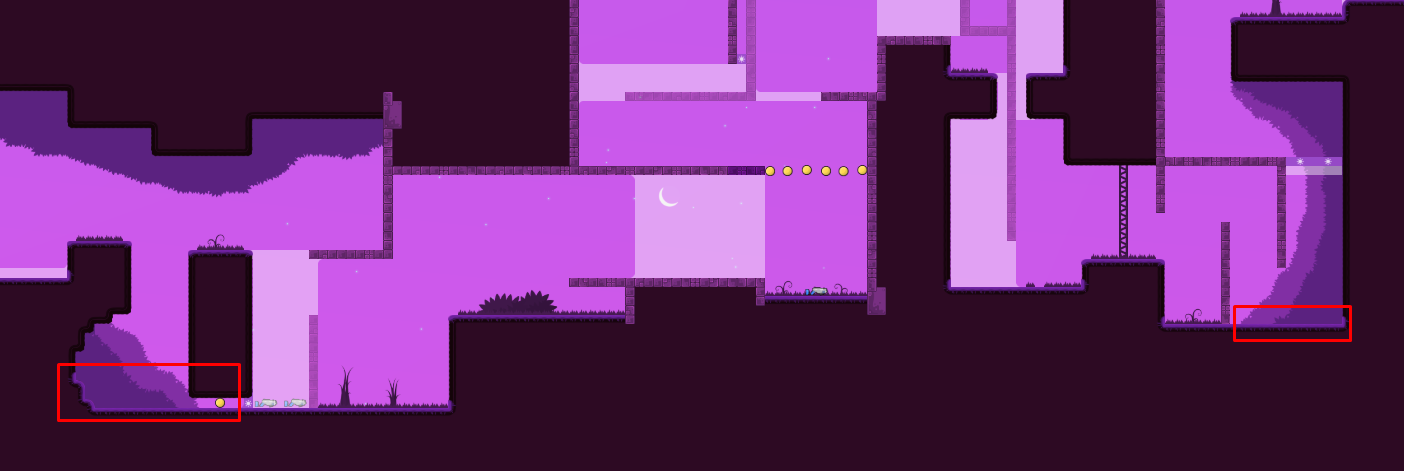
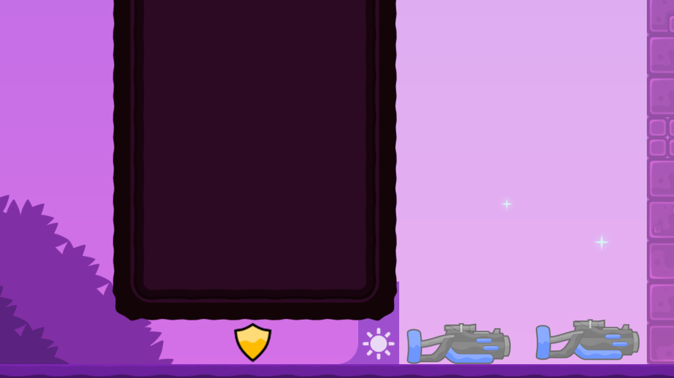
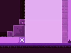
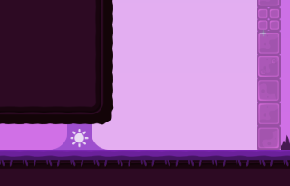
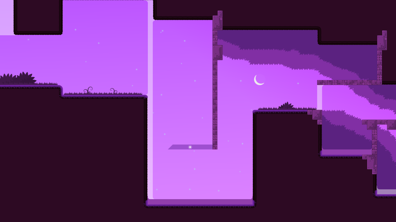
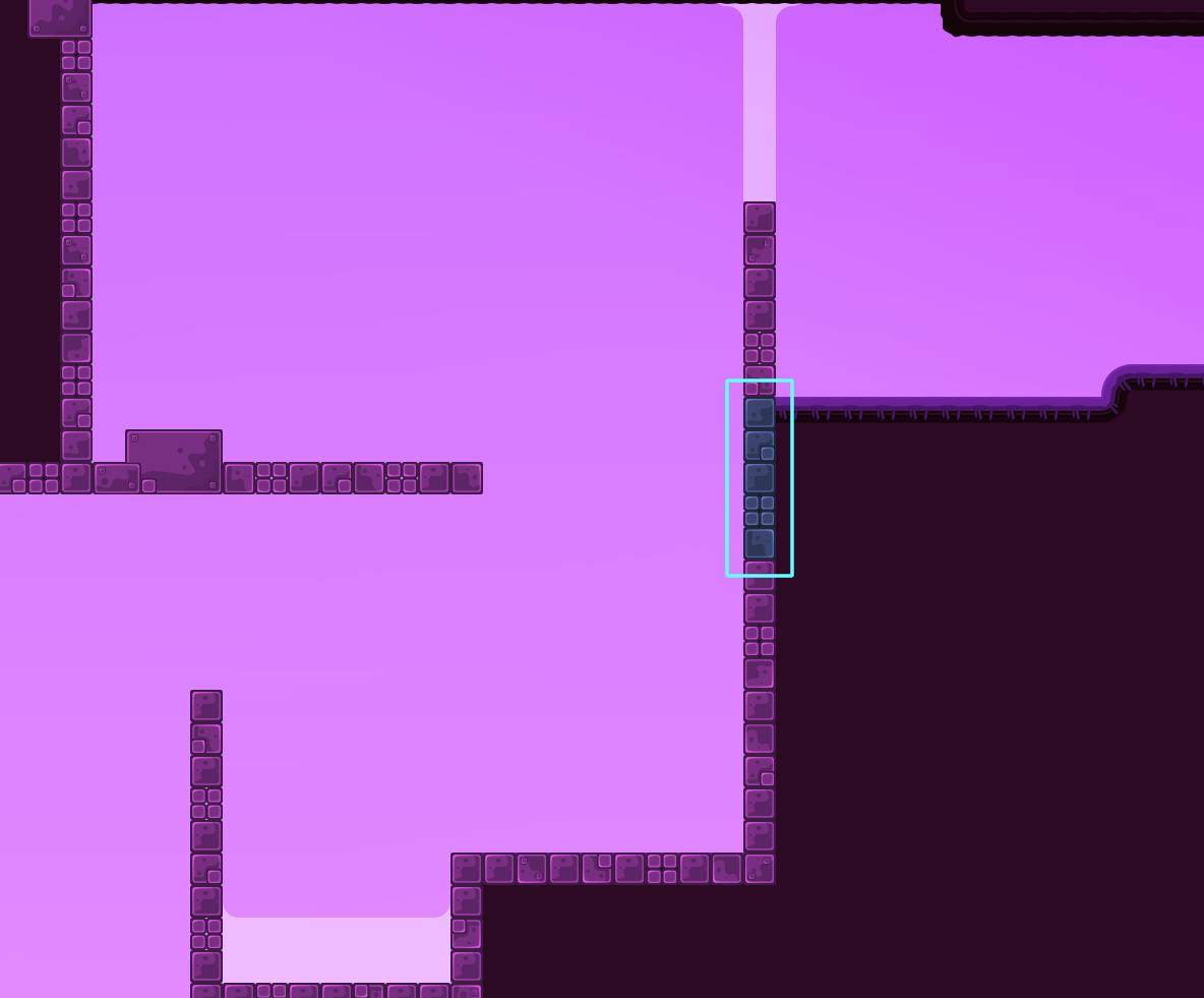
this is your map's testing channel! Post map updates here and remember to follow our mapper rules: https://ddnet.tw/rules
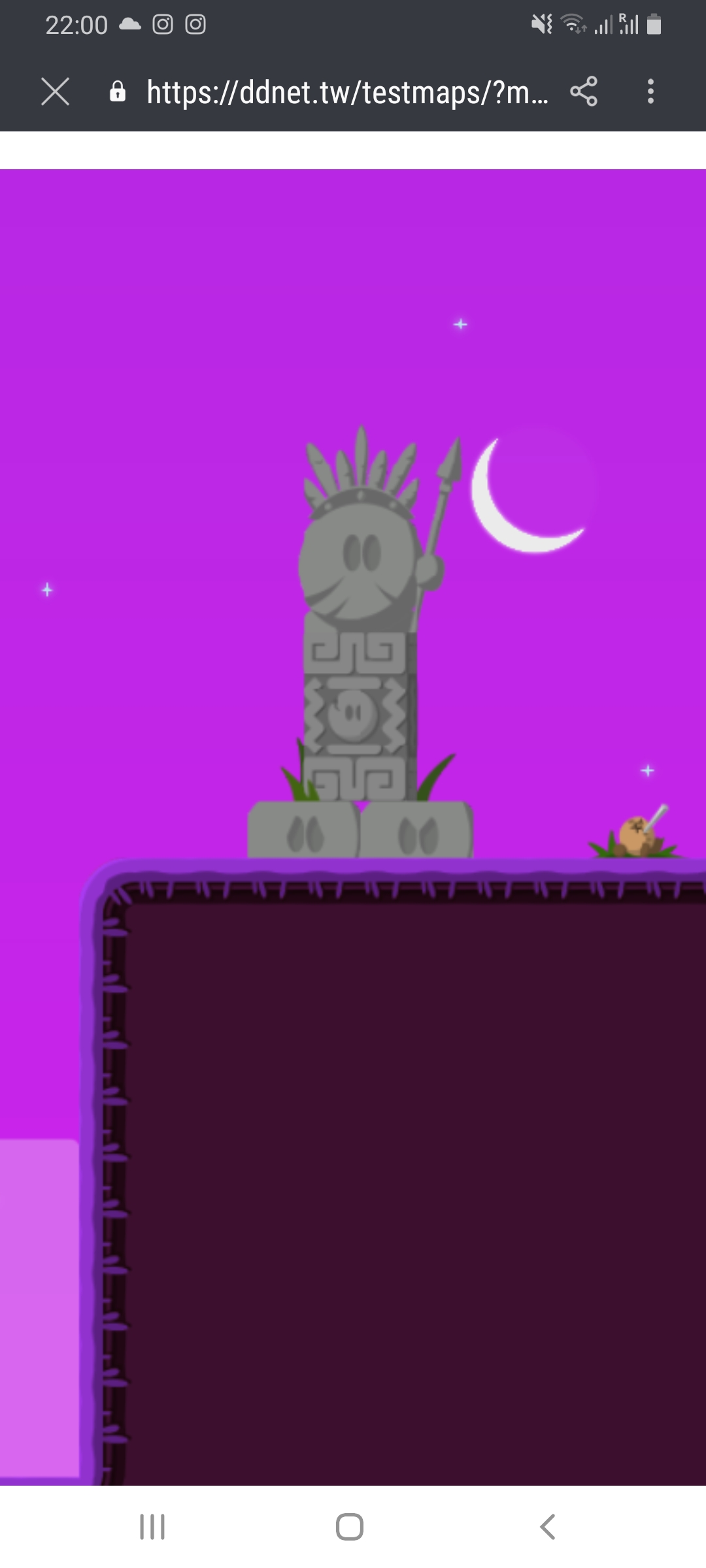
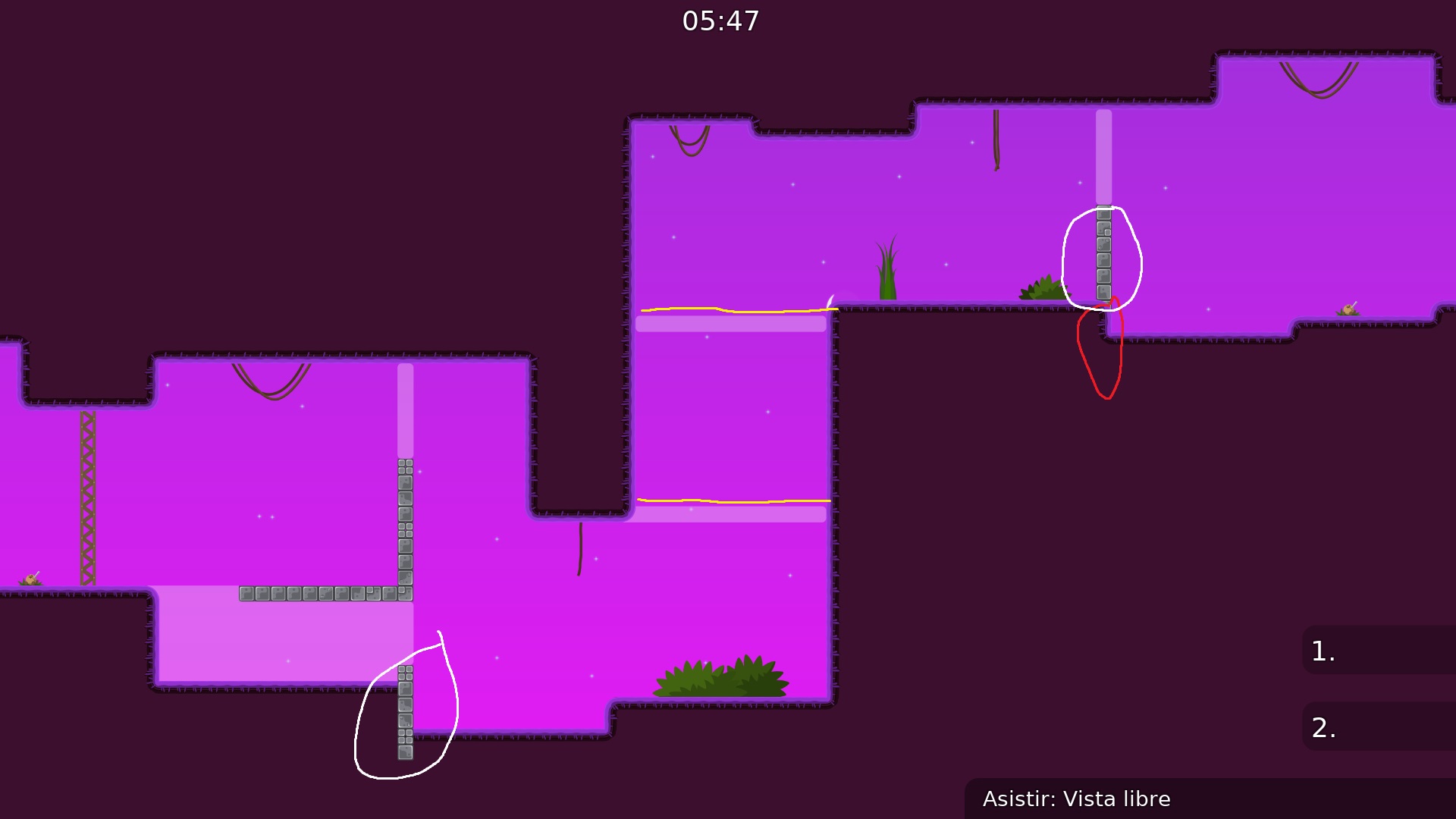
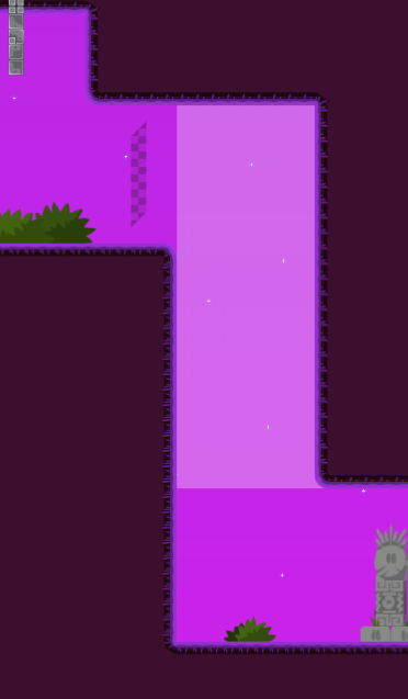
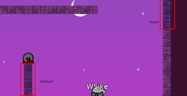
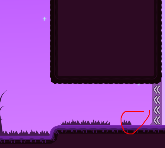
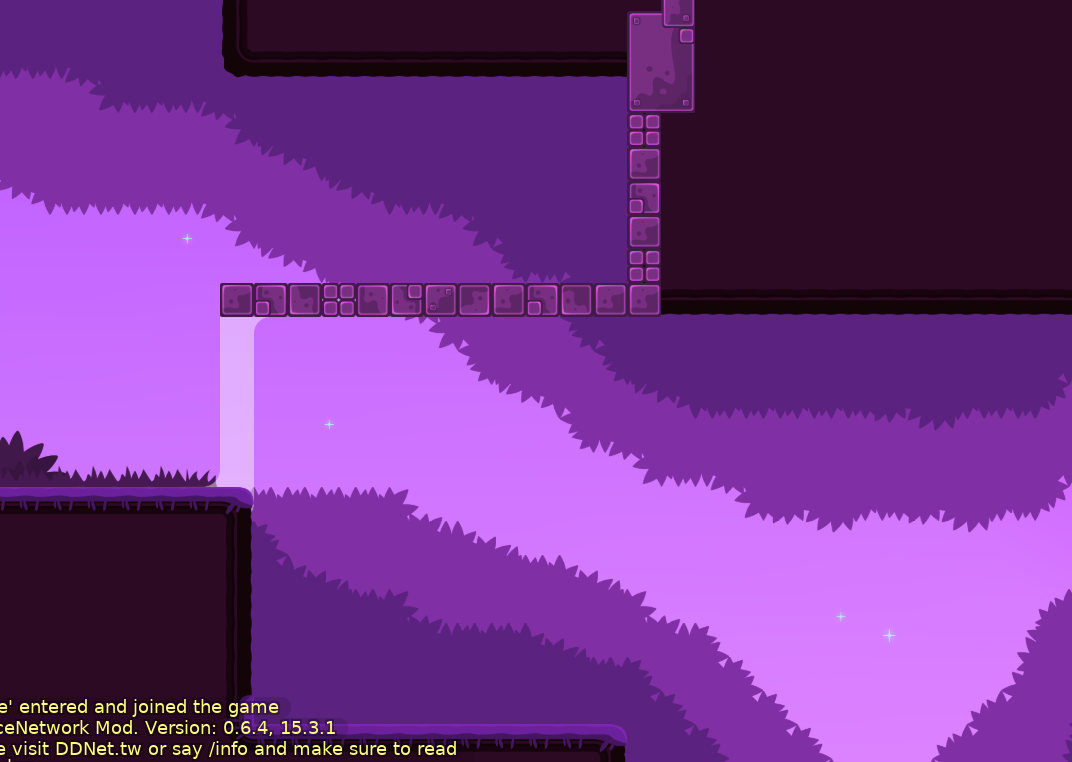
Pls delete penis Tower
Omg
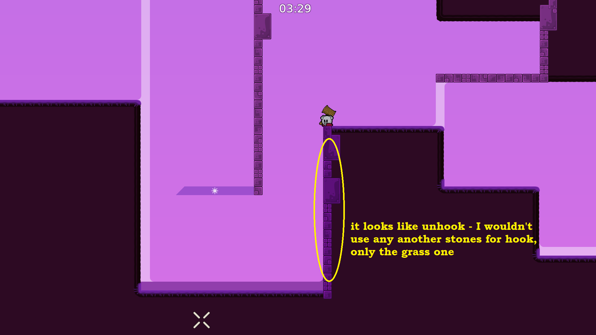
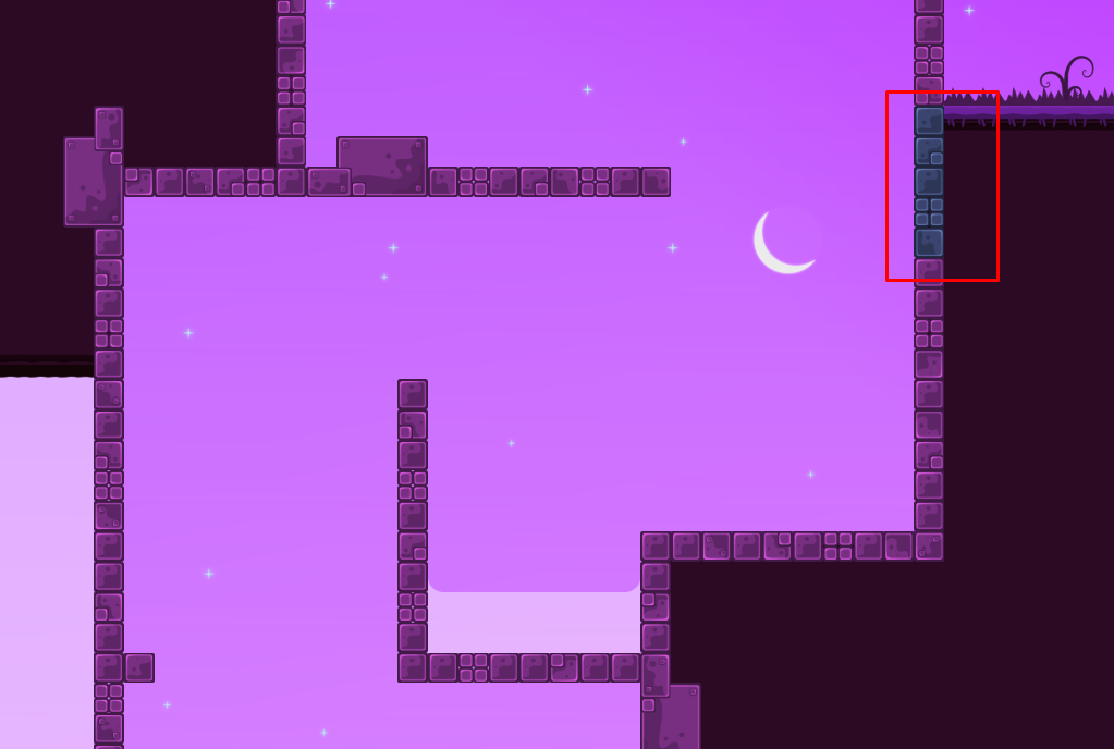
I make all that unhookable?
in this part yes
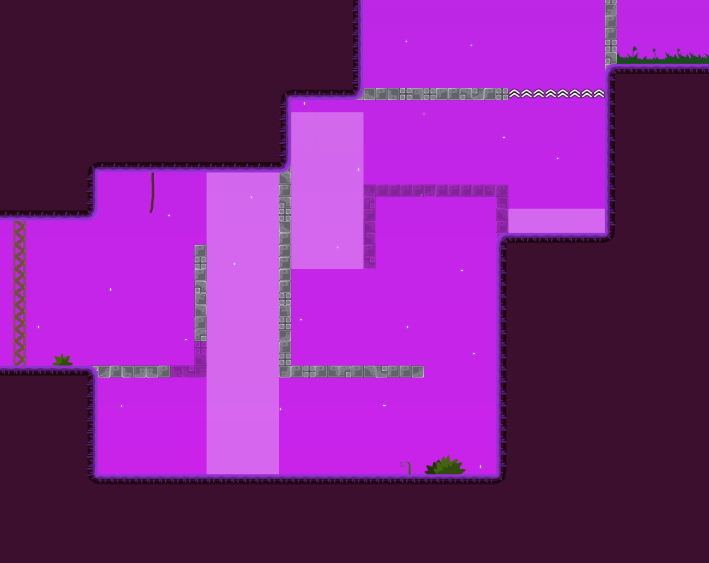
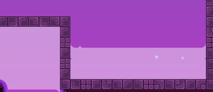
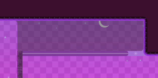
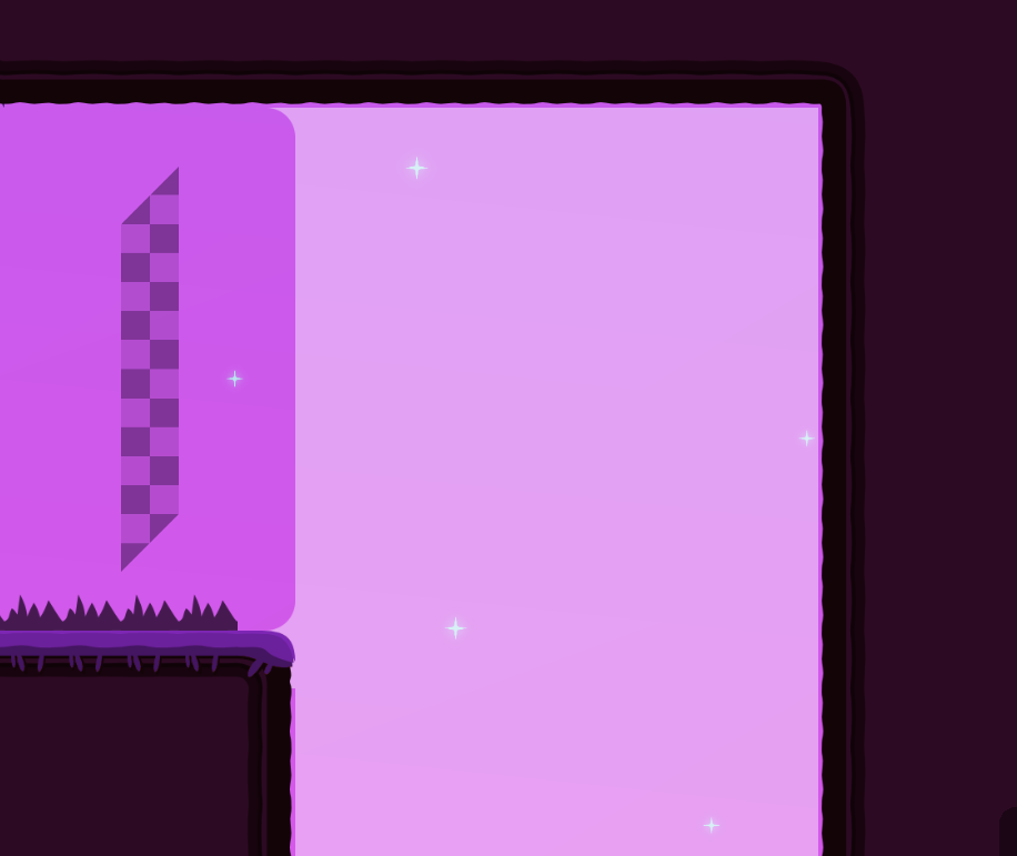
Please Change contrast of the background
It hurts my eyes
Map is not bad, you really need to change design of almost everything.
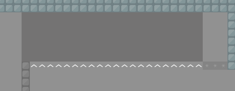
Freeze has to be black with Alpha (transparency) (most maps use this , but you can try different colours ofc) but you cant make it same colour as bg and if u want to make it white make it brighter.
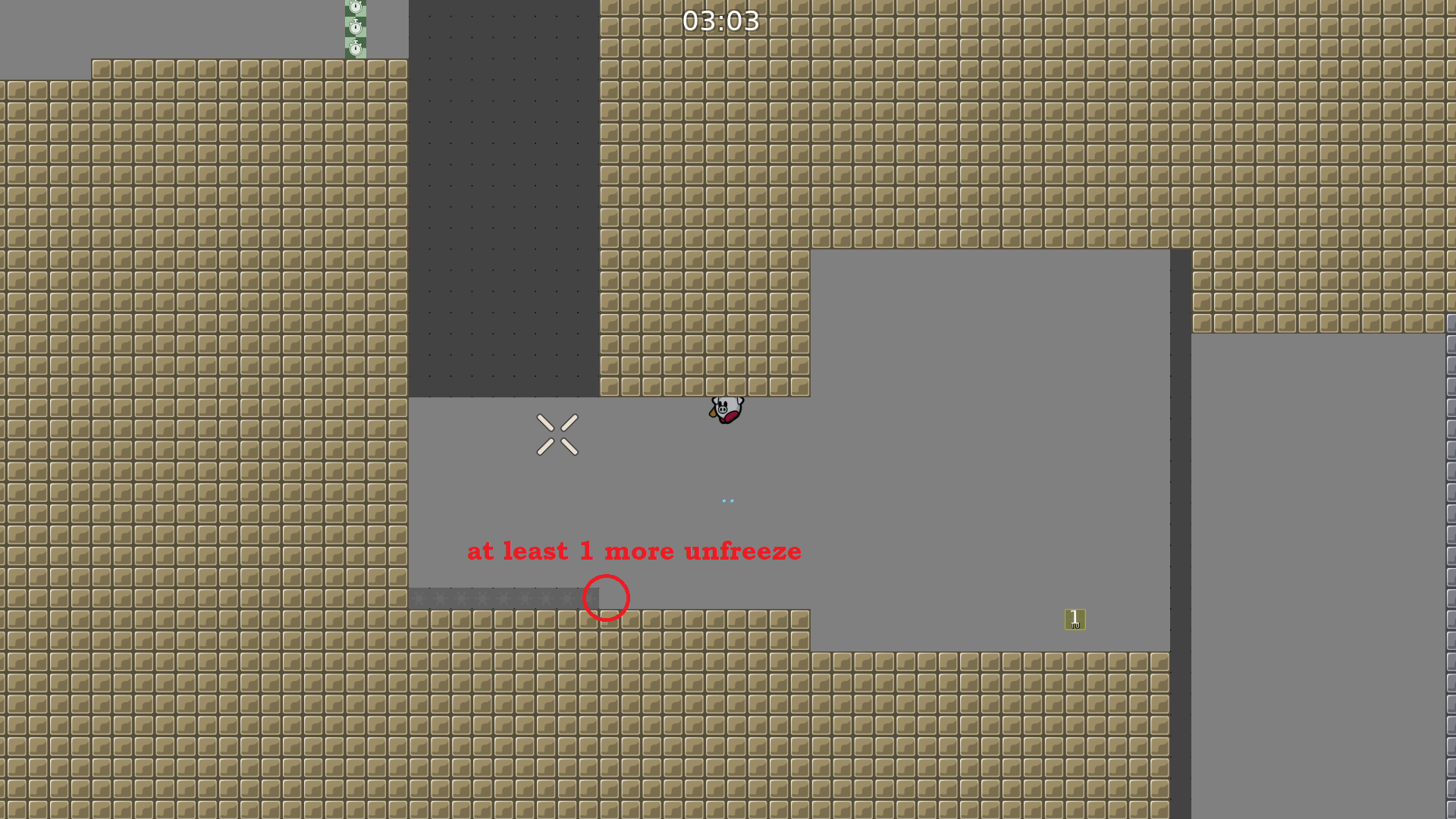
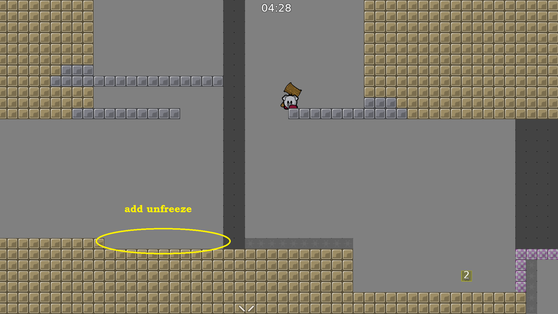
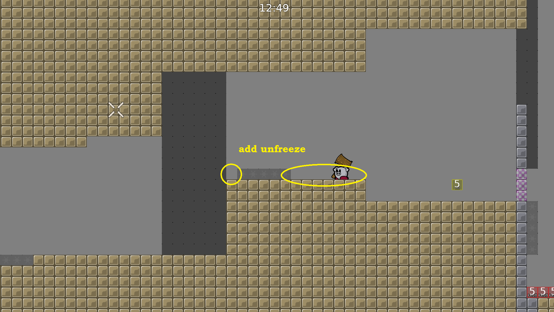
Unfreeze has to be marked as i mentioned. The important ones.
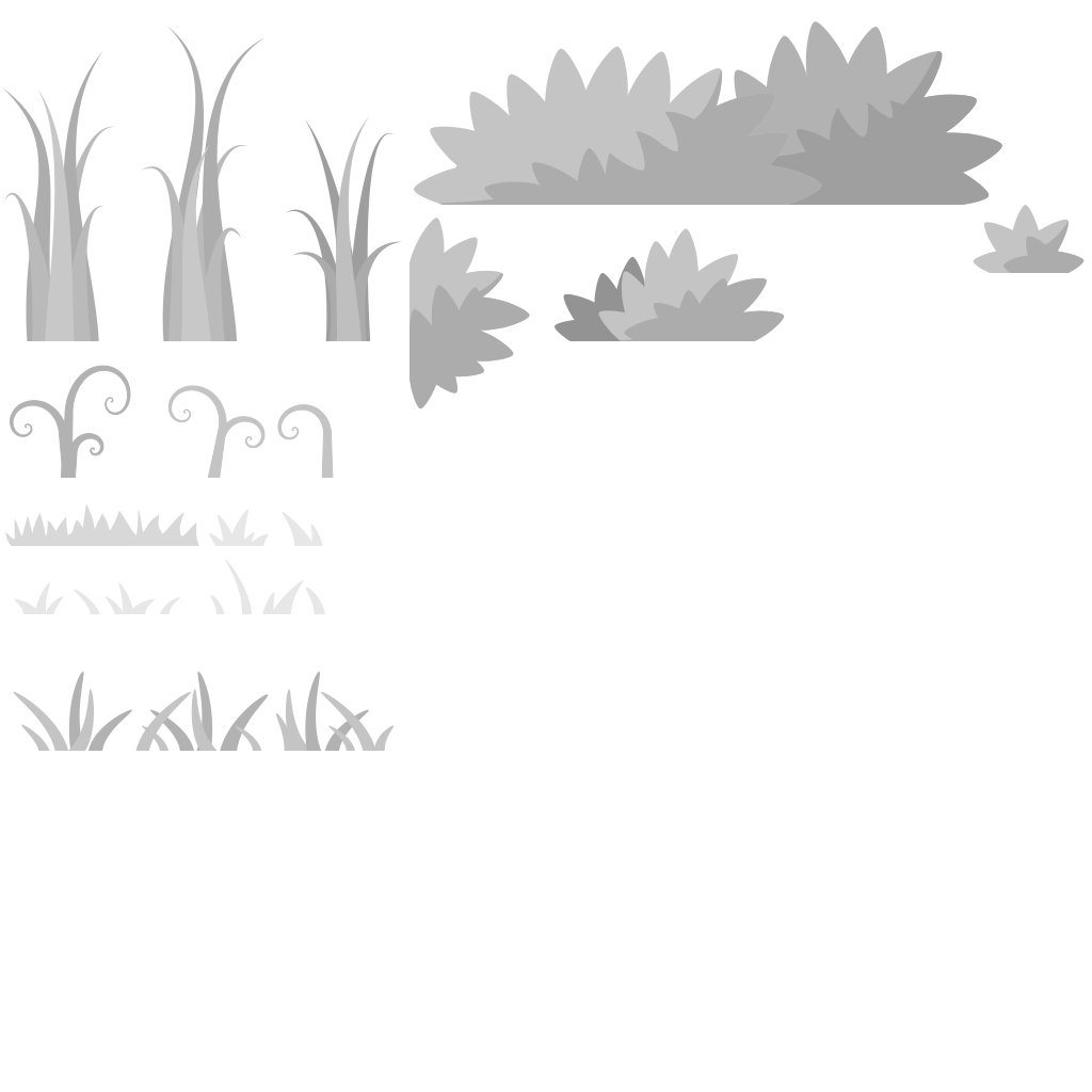
Doodas (decoration). green grass here doesnt really match, try different colours see what fits better.
Also, you can map with only 1 type of unhooks with same colours.
Gl on the changes ^-^
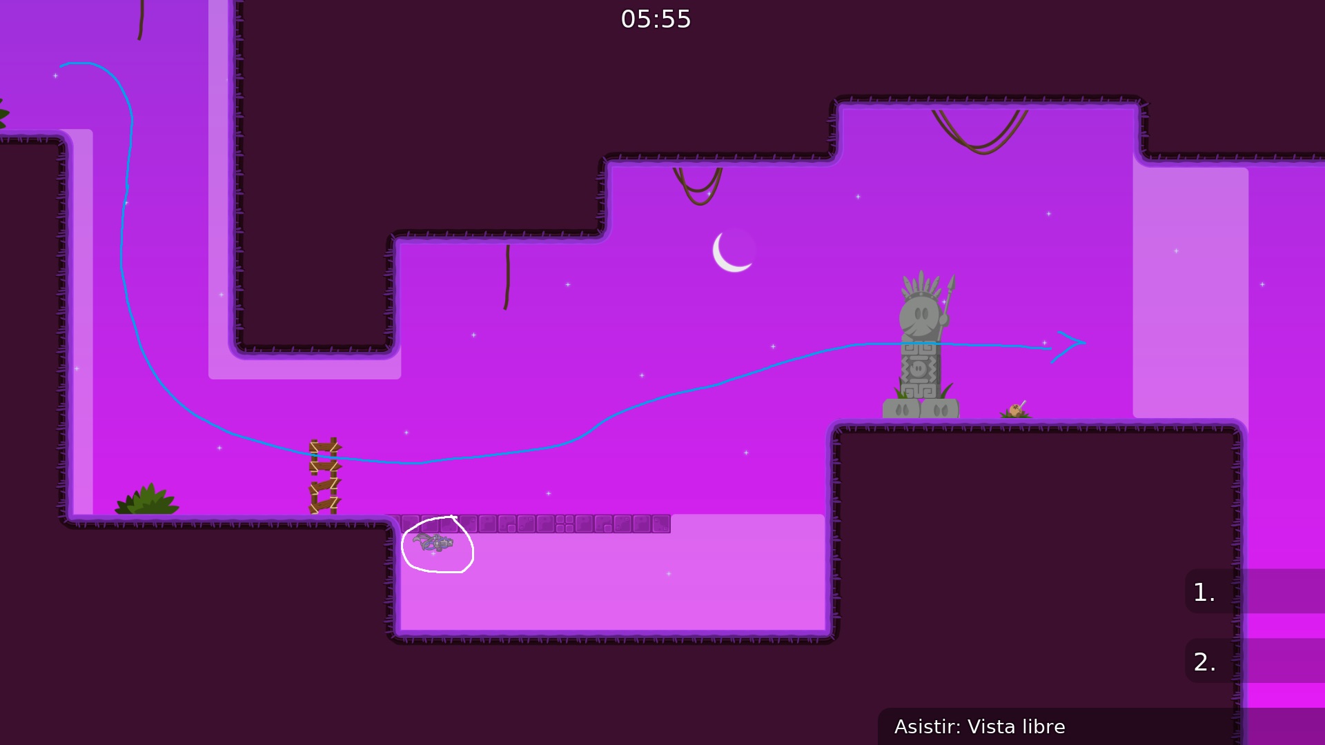
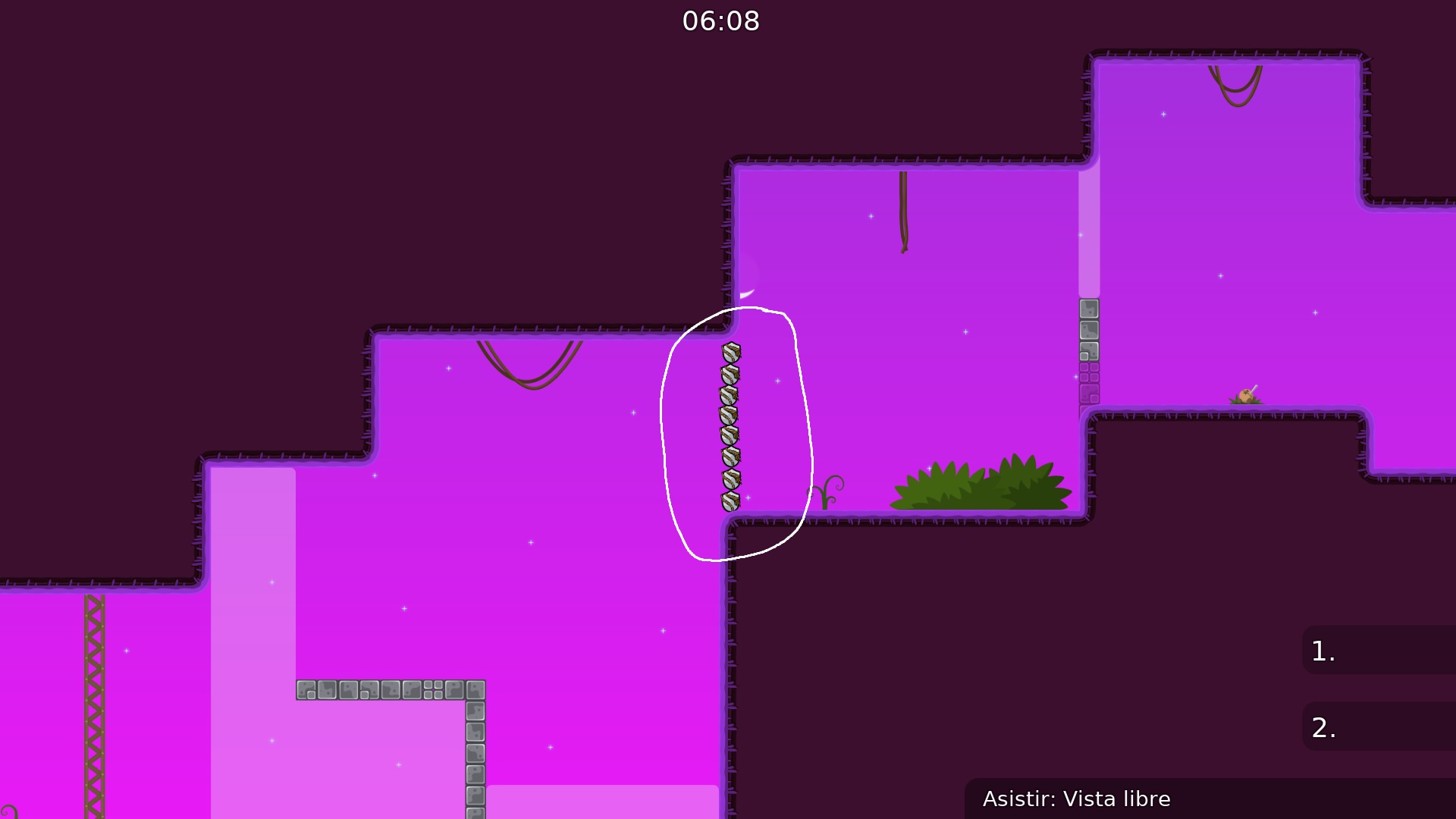
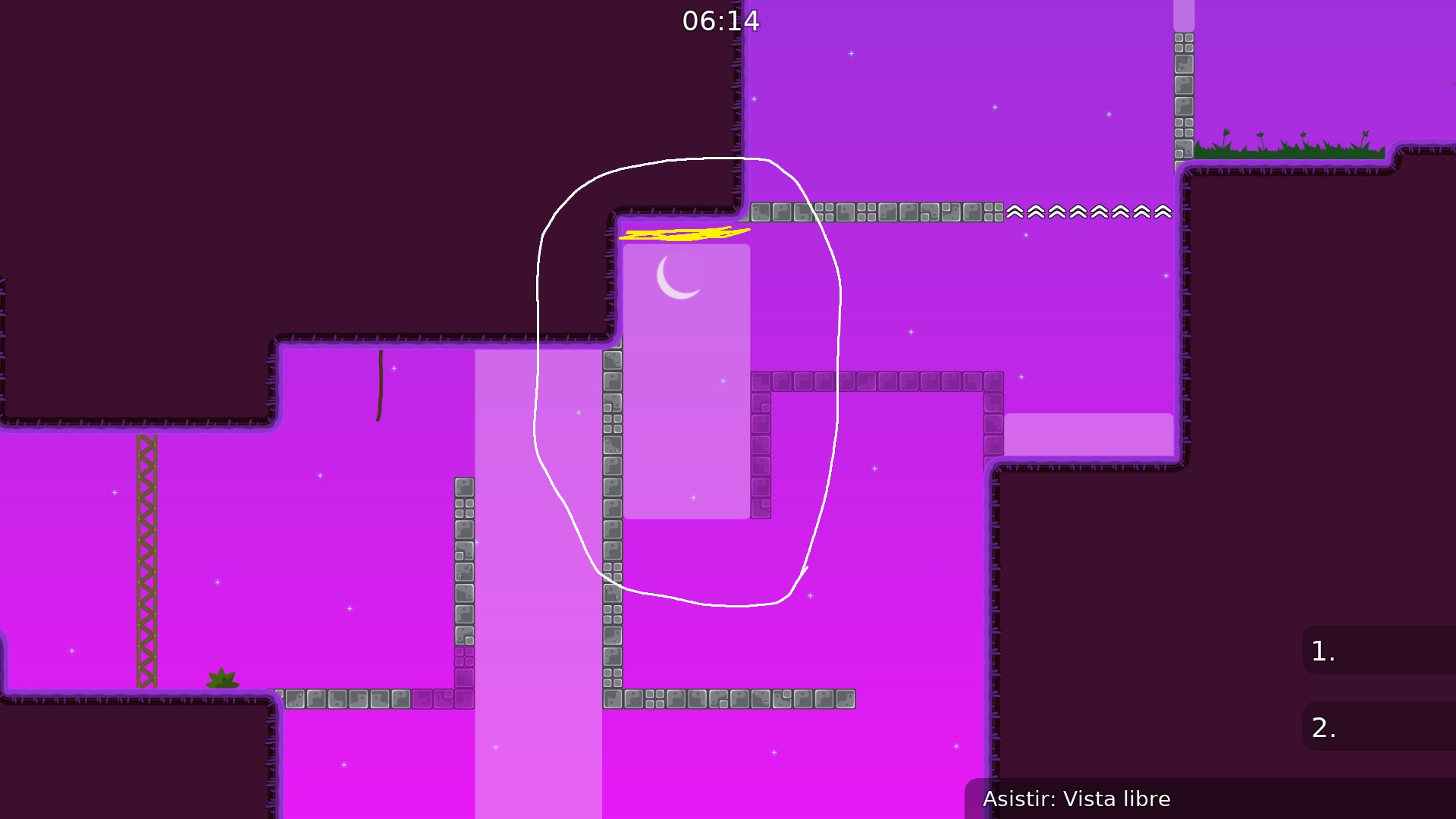
Come up with someone else because we have seen it before
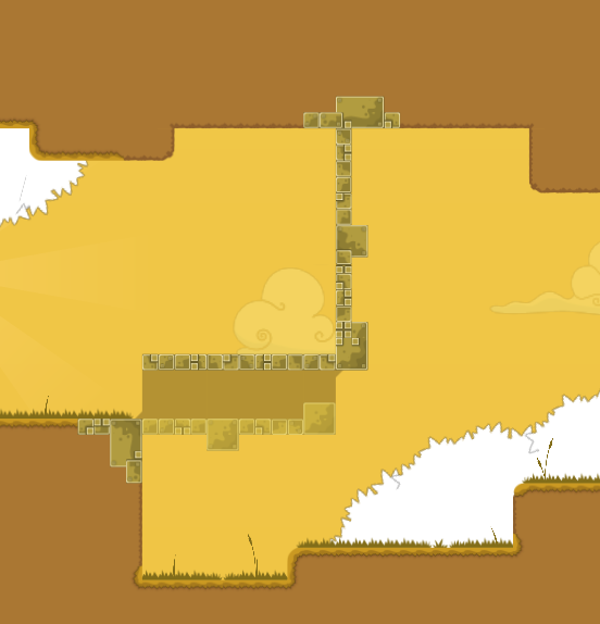
its ok to take inspiration from other maps and parts can be similar, but if it looks and plays almost the exact same then its not ok because then players will feel like they already played the map before. also, i get it, it's novice and novice parts are all pretty similar, but u can at least have some originality and not make some parts almost exactly same as another map
😮 good spot louis, agree too then. You need change them abit then
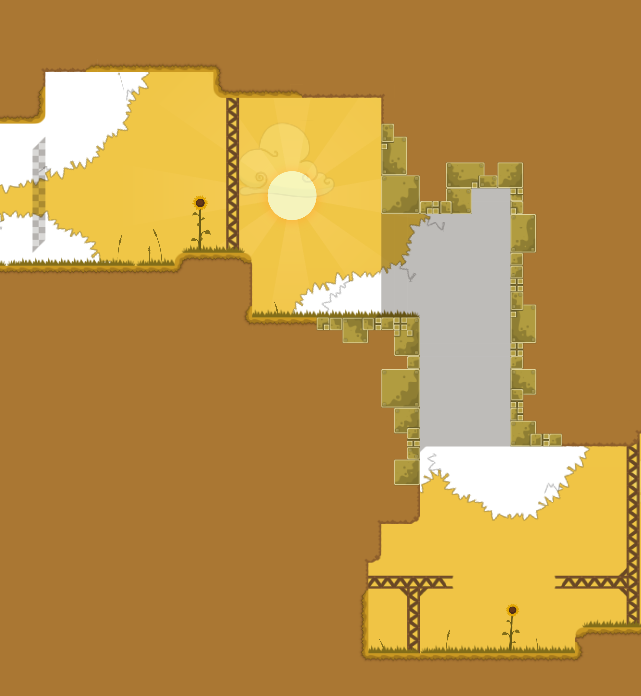
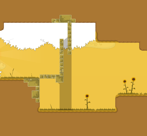
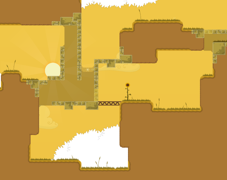
This is a bootleg sunny side up ngl
Yeah, I want it to make the map like sunny side up, that style. Later I'll change all that
Thanks for feedback
Only I had to change the white circle or the whole part?
only white circle but as Louis mentioned, the part behind it its similar so maybe you should change whole part
Oh right
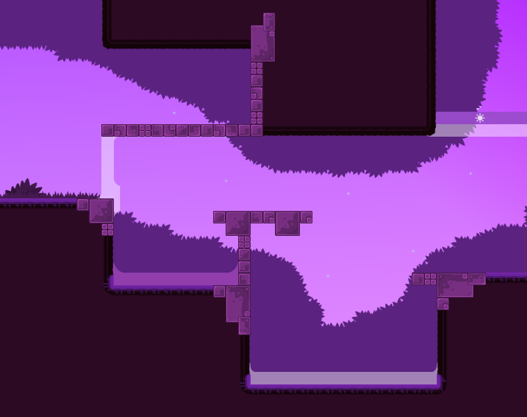
This part that can be skipped, I change it?
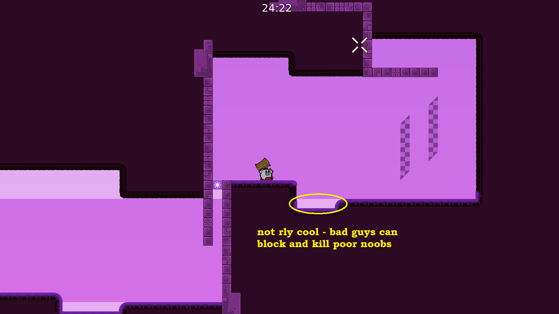
i dont know, up to you and the testers 🤷♂️ but i know some nobos wont stop at that and they will continue passed it so... idk
green grass doesn't really fit in current design

Lol 50% of the map is copied
Today I'll send the map with all changes
no need to yet
@FeaRZwait till some tester check it, imo its not releasable, too basic, boring, unbalanced and half of map just rip off of sunny land
someone other from testers will explain u better
dont waste ur time on fixing all QuiX stuff mentioned
Only I made different parts
Maybe with the new parts that I made, probably will have another look
everyone putting hate on that map
id suggest you to decline this and rework it as good as you can and keep in mind what others adviced you would be nice -background doesnt fit with the freeze color -takes into account the size of parts -don't map repetitive stuff (jump trough freeze into a unfreeze, thats overused) you have the capacity to do better, do what seems best to you with what I proposed 🙂
Thanks
@ReZee.but, if I already made changes on the map. Can I send like and update of the map here?
definetly edit: but keep in mind what ReZee said
yeah for sure
Map update
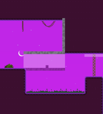
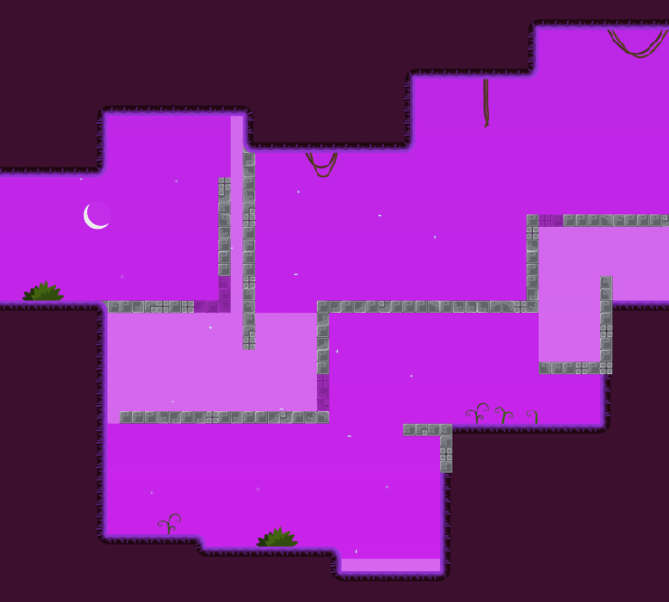
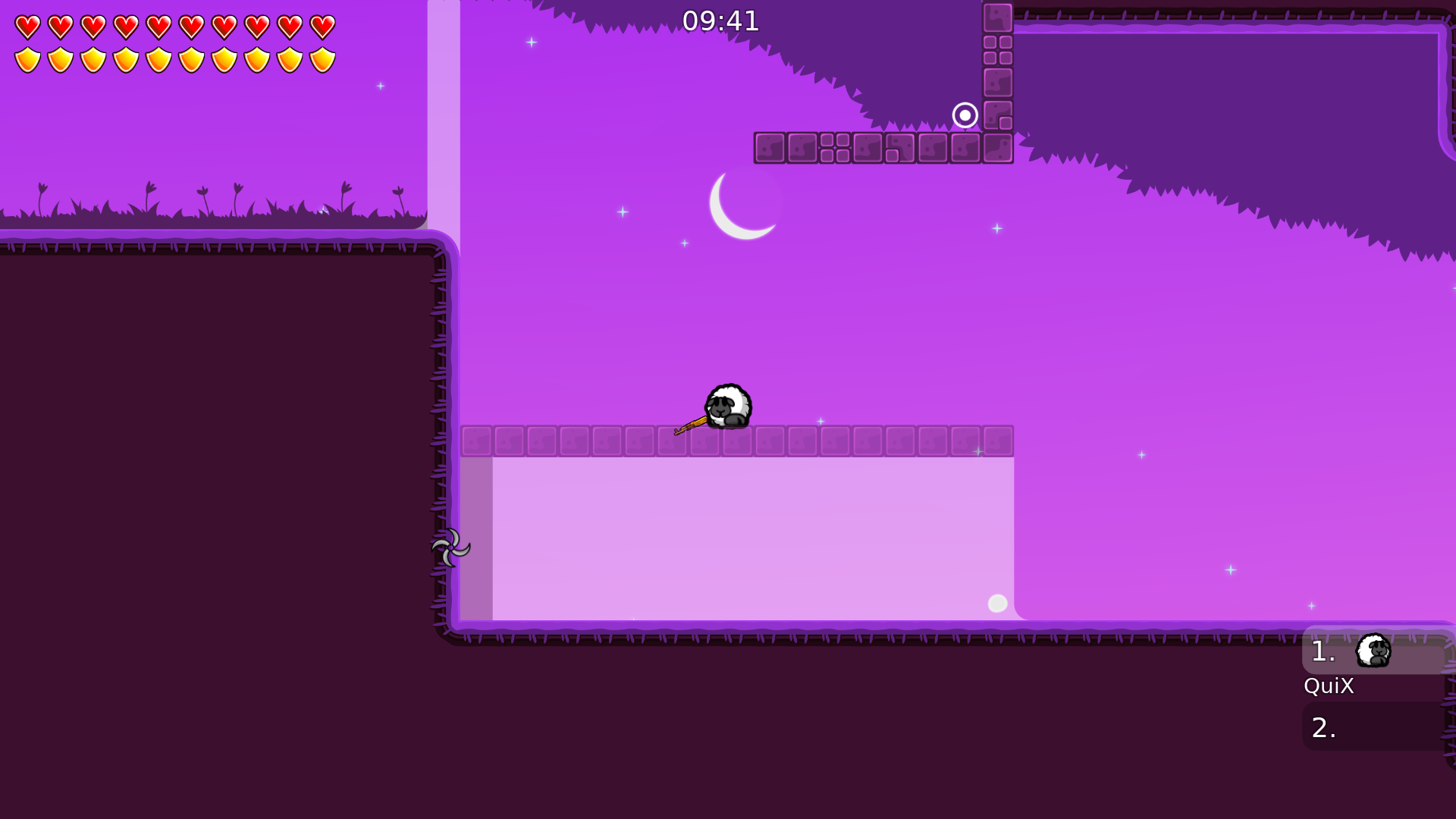
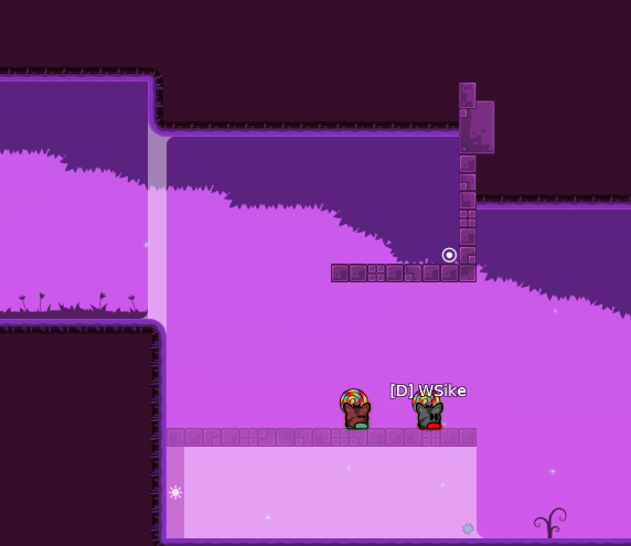
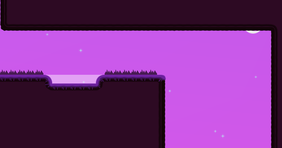
-Changes in the bg, added more stars -Changes in the color of green doads and deco stuffs -Similar parts to sunny side up mapped different -Added more grass deco
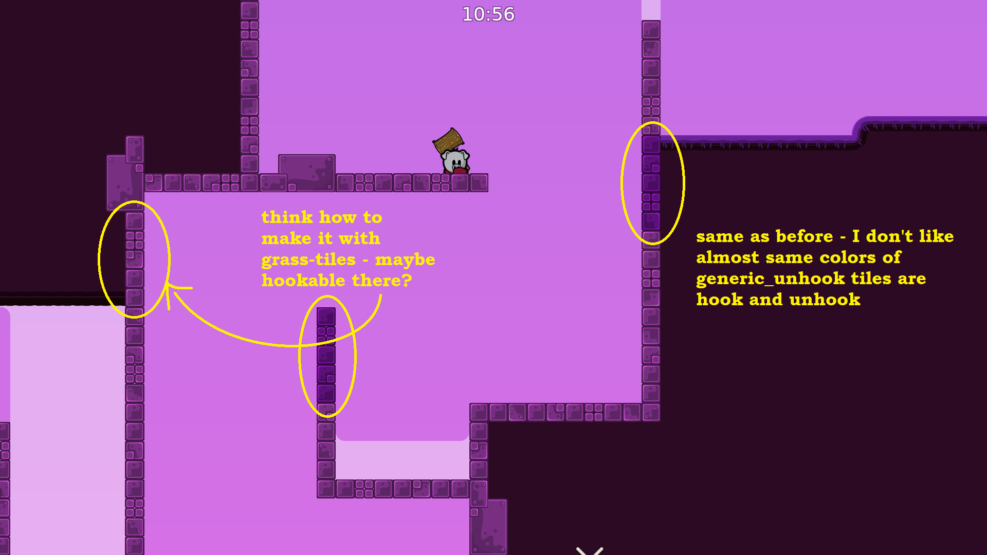
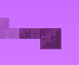
undeep and freeze should have different markings and not same
current generic hook and unhook doesn't really fit in map atmoshpere, i would play a bit with colors so they can fit in current map pallette
whats undercover for stoppers
prob like design behind them? or smth
yeah
xd
sorry my english sometime sucks xD
i like changes tho, the map feels better comparatively to previous version, for me atleast
x2, still need to be pulished abit
but yeh, nice improvement
Big thanks!
Looks good
Make them in more random patterns but yeah
Map update
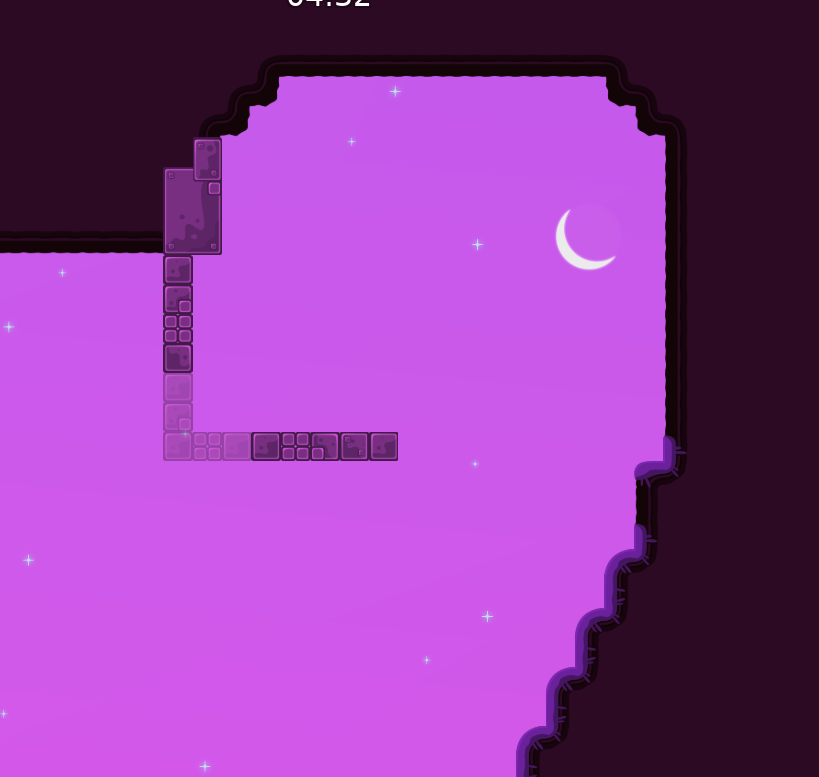
-Changes to the color of hooks and unhooks
-Added other type of grass and deco
-Changes in the color of grass
-faily parts saveable
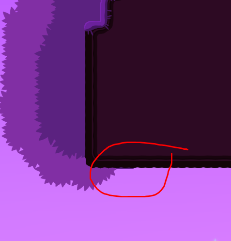
-Changes to all freeze corners
-Design behind stoppers
dont really focus on design 😀
Parts are better, game play is decent for me as a novice, it has a chance for release, so why not? 😅
you also could also put unfreeze under them so it would look cleaner in entities
also the new design parts looks amazing, would be cool if you add like those to more places, because some of them feels really naked :D
Alright
Well, some corners are intentional
Idk why when you guys send screenshots it looks so bright. Now the hook its like the same color of unhook
don't use same stopper markings for every kind of stoppers xD
The opposite, you should use for all stoppers same marking but use "arrows" instead of a line. Cause u dont know the direction its facing. FeaRZ
well i meant that he used same kind of stopper design everywhere, meanwhile there are parts where might be confusing for other players. The places where he made stoppers with same design aren't even needed, i don't think the line is a bad idea for marking stoppers xD
i would put stoppers and unfreeze design in front of tee to make it look cleaner
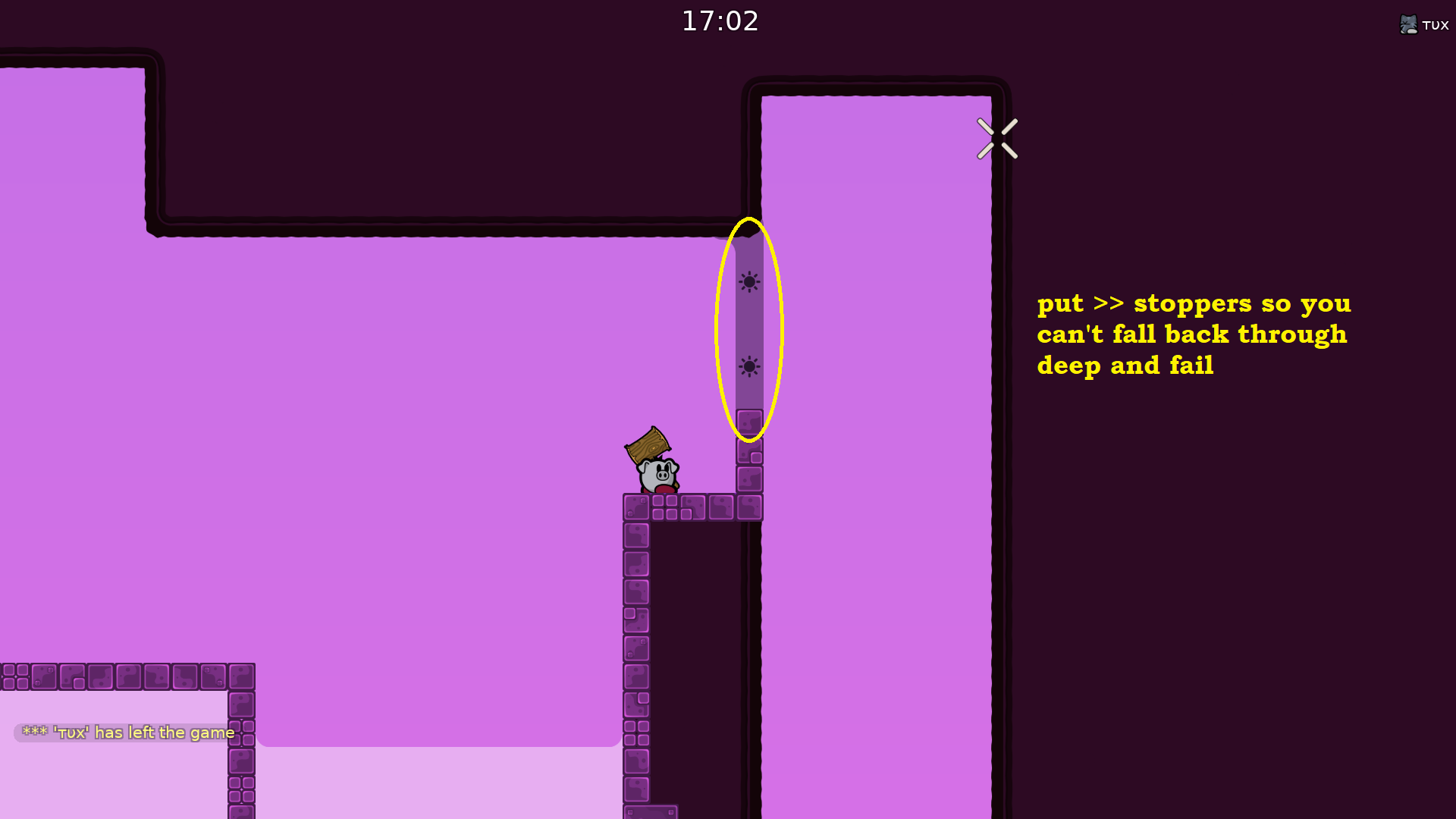
stoppers at next part aren't needed
also in this spot unfreeze corner design is missing, same as in last part, if that's intentional then ok xD
Well, for stoppers I would use same marking so people will know what it is
if you do, use arrows instead, but you don't have to spam it
Okay
tu mapa este no es malo 10/10 de que lo aceptaran confiemos 😄
Te quiero <3
Jsks
this map is good man
i loved the design
gameplay = 9/10
design 10/10
Thanks
@JoaoGardaHomemWhatsappneed to pulish some things
ye
aguante fearz
Aguante deivid!!! Aqui tratando de sacar el mapa
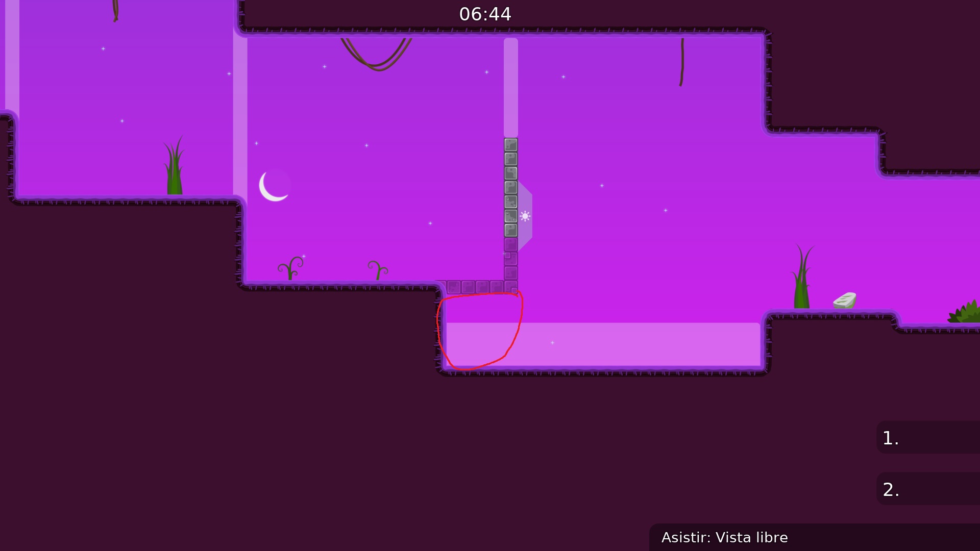
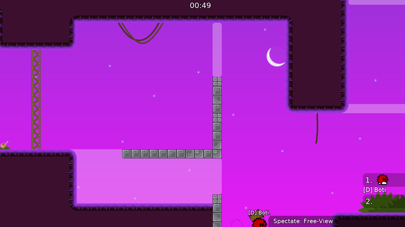
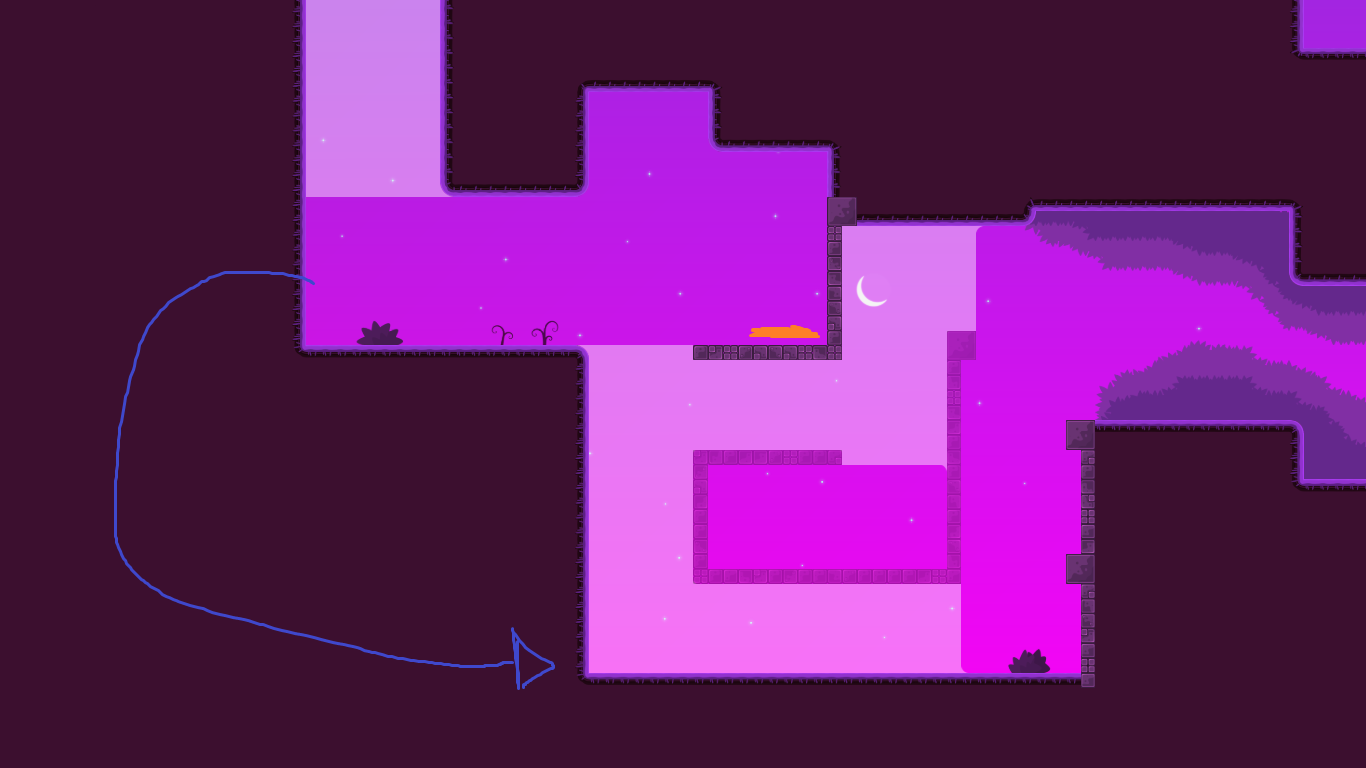
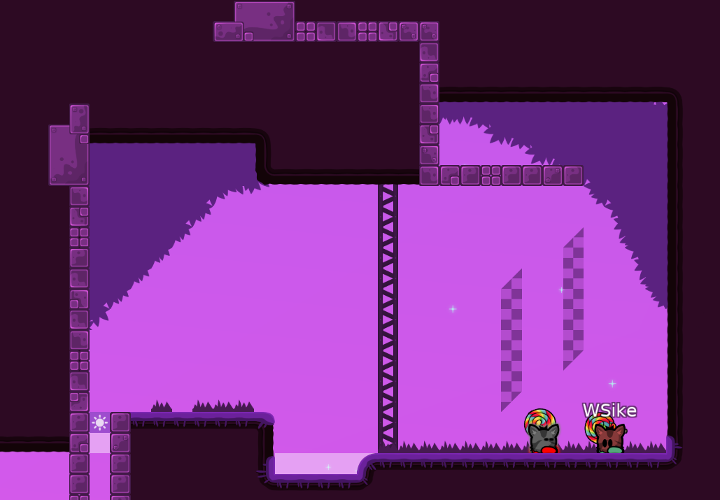
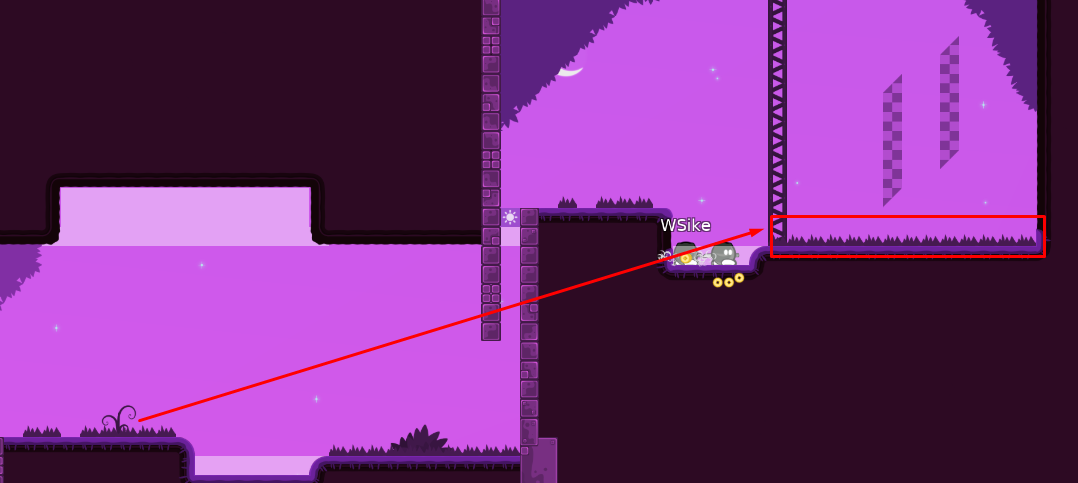
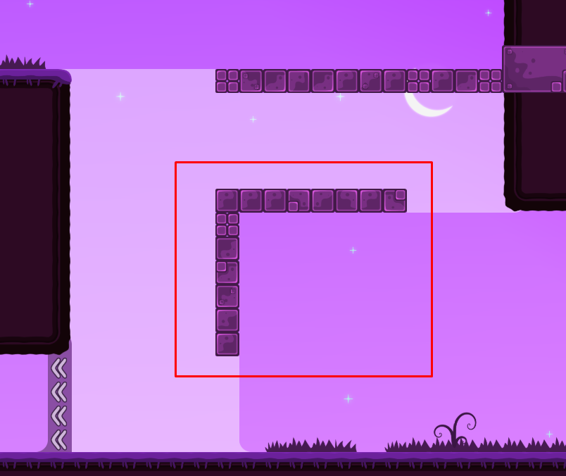
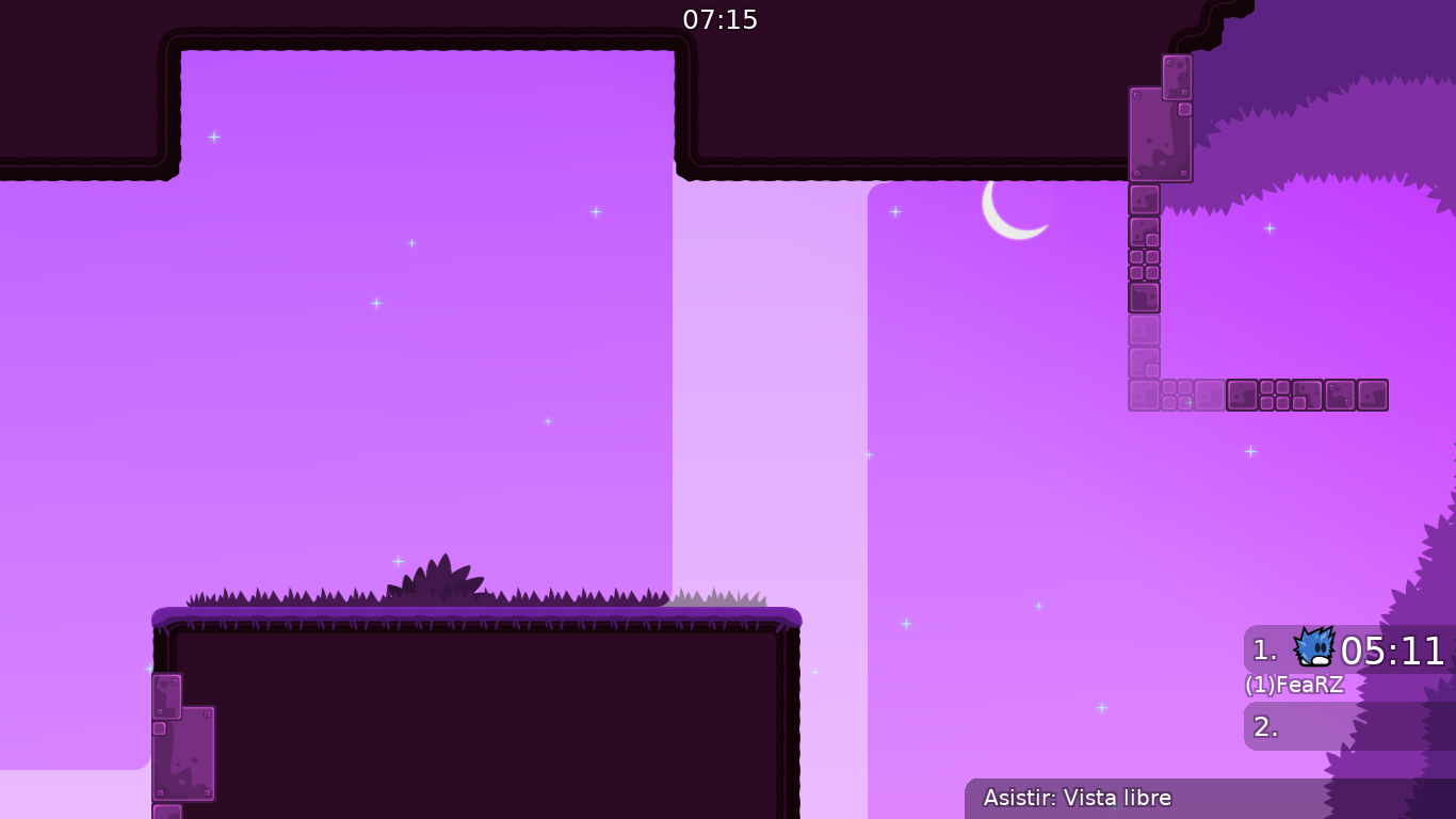
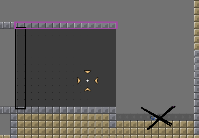
i think the first part you chose is pretty bad for this map, for three reasons.
1) i can see many newbies just blocking and falling down there. 2) you made it so that the wall stops before they fall down (orange) and there's potential a lot will pile up here. 3) you can't get people from blue to fall down left (even with hammer and holding)
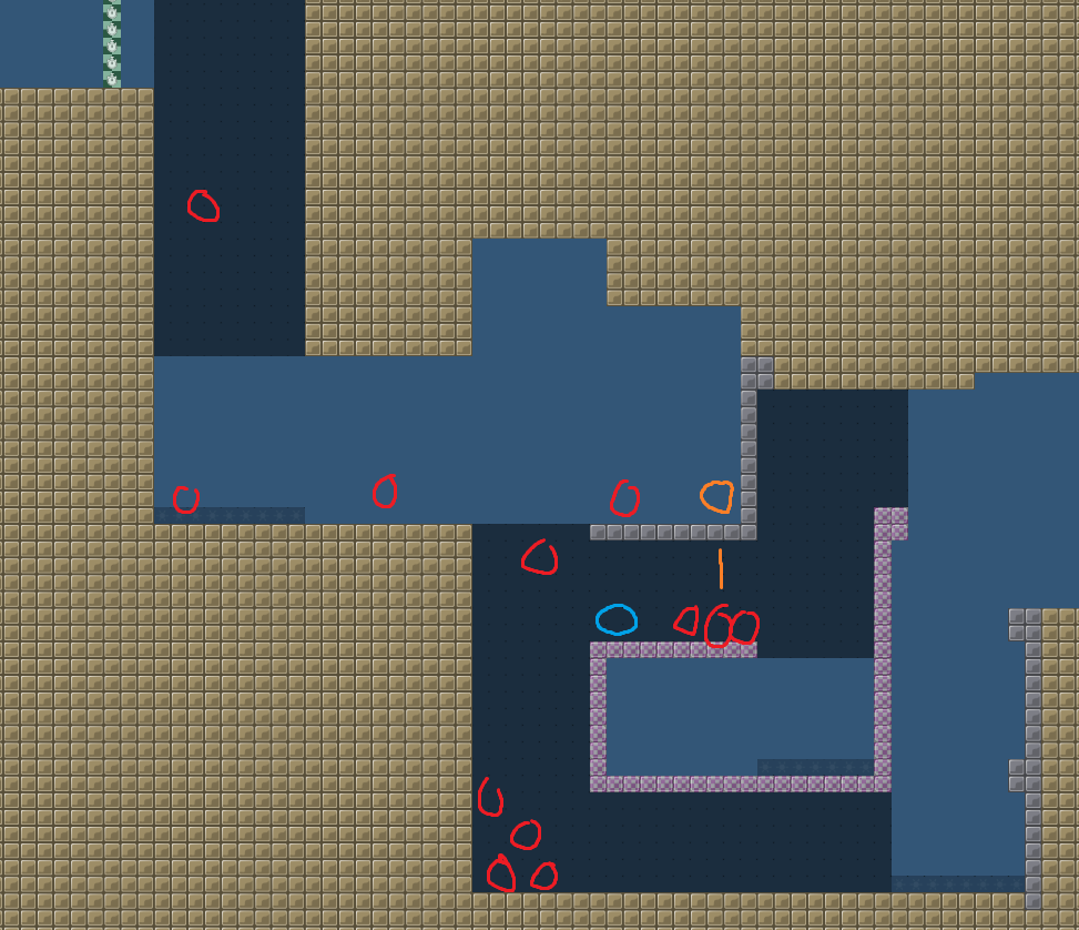
and putting this part at a later stage seems to faily for 3-4 stars, so I'd just get rid of it replace it with something more appropriate
the map style is like that of Sunny Side Up, Harvest &Co. so you aren't adding anything new, instead you want there to another kind of this map. there will be a point (or already is) where we are saturated with this style of map so any new submission should add to the experience (quality map) instead of just being another map. I think you do you know what you are doing, though and this has a good potential to be released but I would like to see quite a few more parts
yep, couldnt agree more with ReD :), i went yesterday night with him over the map and also told him to change most of the parts, he is working on it.
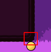
If you do, it will be blocky af
Just change it xD
Change the colors too maybe its so annoying pink & purple
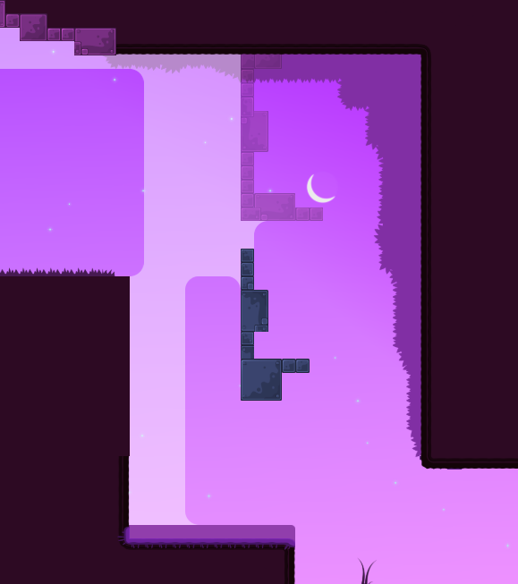
It would be better with a Night bg and blue tiles and Yellow hookthrough
--Map update__
-
Changes on most parts
-
Changes on colors of unhook, hook and background
-
Changes on desing a bit
hook and unhook blocks are too similar
cool bg


the map start is able to be done solo, so make it a noobfilter or smth
using hammer throw
no, why? its just design looks cool
i liked the 2 endlines
its cool
q qde tu map fearzz
indian people be like
Como
@frunaxd?
sbdvsbdbs ojala quede tu map fearzz
mapaso
What is ht?
hookthrough ^^
O
Do you like newest parts
@Gato Cosmico? Haha
Yes, map is improving. Needs a bit more pulish but yeah going well ^-^ keep up.
I disagree xd they can throw, they can jump by getting speed from ground
At some point it opens multiple ways of doing it and not just by a simple jump. It also might be very annoyng for speedrunners.
Nice xD a 2* novice that they have joined the game will know how to throw GG

it was just an example that it isn't useless.
Thats from the view of a good player. Novixe you should see all the possibilities and what they do the most. And they always hold their keys, hooks and jumps.
that doesn't say that you should make for that part only one way, and the one which is a jump xD
But that doesn't mean you have to make it a throw or hooking ground for speed
Its a 2* map
i play mostly novice servers, and nobos actually use such spots to training their throwing skills lol. atleast i do force them
i didn't say that he should make only those ways, that fix is just unnecesary in my opinion xD removing unfreeze from there won't make it better, why not just leave 3 ways so nobos can also practice in such spots xD
I didnt said remove unfreeze
it basically means that it should be removed because it's useless
Ofc its useless cause you don't reach it at all
atleast that's how i got it
No hahahah
It means just useless cause you don't use it. Therefore you do what you prefer.

sure
putting a throw or a hard movement right at the beginning of map.

xDD instant chaos.
-
Throw is the hardest movement for noobs to do. You have to aim, grab tee. Precisly move so he gets near you, while keep holding hook. Hammer at the right time and then release at the right time. While other nobos doesnt know the movemnt to and start moving which makes it impossible to throw cause they move and dont wait.
-
The hooking ground for spee too. You need hook down, move left, then get the speed, release at the right time and then jump at the right time to not get freeze.
if they wanna learn that they can go on novice 5 or kobra as they all do rn. They have those maps to punish themselves and play for 2 h to finish and not enjoying the map. If u wanna make it good then think as a noob and try make the throw or the speedy thing look like it so they know they have to do that.
and trust me i know this cause even on my map "firewatch" at the beginning of map is just 1 small hook
1
xD and they couldnt do
maybe GER players yea
but i went on chinese srv, was a disaster xD
-
i didn't says to make it isntant throw, I do agree that it's one of most hard movement for nobos, it was just an example why it's not useless as you said, since it opens more ways to do the part.
-
This argument is nonsense to me, i played with a lot of newbies which first time opened game, it's pretty much a 2* novice movement for me and that isn't something hard to learn, as the ones with who i played seemed to learn that pretty quick.
Newbies aren't only players playng novice maps, a lot of good players does too, some of em trying to teach them some basic stuff, and this part fits perfectly for that purpose. Removing a part of "useless unfreeze" will not make the map better and will just annoy most of the times xDDD
every map can serve as learning purpose, you shouldnt be forced to go playng annoyng maps like kobra to learn something
🤷♂️ he do what he wants, but that part is bad executed. Testers decide i just give suggestions
i kinda agree with that, it doesn't really fit to be a first part especially when it feels blocky
i think the unfreeze is placed correctly
he can make throw parts but maybe mid map or smth, and make it look like a throw so they know what they have to do or "learn"
its not a throw part
it is place correctly agree but it looks like a normal jump so i just said make it just jump and a reaction to jump down cause thats how it looks
you can hook the ground and get extra speed
so speedrunners have to run slow because its a normal speed jump
that was one of my points which was ingored
:")
and you cant do it faster
guys is 2 map not 4-5
what u will add for 4-5* novice maps. No tele all faily? lol
so? because that's a 2* star map other ways shouldn't be executable?

yes ofc!
nobos still will do the part as in intended way, the players who will try to speedrun will feel annoyed bcs "usless freeze" was removed and they have to slow down to fall directly into freeze
agree
but dont make the jump for nobos also annoying, just add 2 more unfreze to the left
as i mentioned u reach only 1 tile (on the 1/2 unfreeze)
everything else keep it what i just said its useles for nobos not for spr xDD
make part cleaner
tha'ts a better solution than removing half unfreeze bcs nobos wouldn't reach it xD
xD
i still think that the first part needs a revamp xD
maybe add ht down so if you fail hook you can still hook the other
just do something so it's doable as intended, it's fine imo
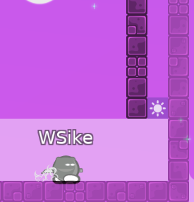
Hmmn, but ppl can stay on edge right there
change the background, it's too bright and too pink, make it softer
f3
Wait
I'll send another update today
I forget something
Okay
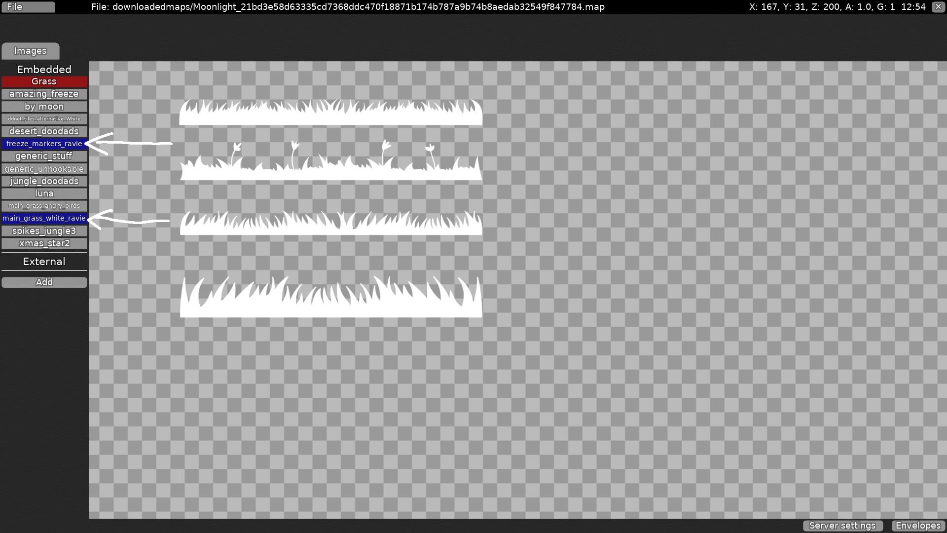
also it's kinda strange that map is 1.16MB for nothing really. you have a lot of bushes in mapres and you don't need that big variety
my suggestion at reducing map size if you do care about it, otherwise you can just ignore that
- remove grass (i think default grass would look better)
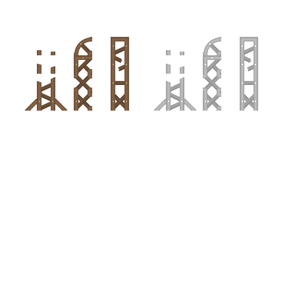
- remove desert_doodas (not worth because it's used only for balks and 2 nodes/ropes in design)
- remove jungle_doodas (i think this one is useless, not worth it)
- remove bushes_small_white (idk why you need 2 mapres with bushes as it doesn't really gives a big impact in design)
- replace desert_doodas with simple generic balks (only use of desert doodas i see in map is because of balks and 2 nodes/ropes which is just not worth)
- replace grass, jungle_doodas and bushes small white with default grass edited by mind. All of these three basically serves as one purpose, but you have 3 of them because of variety which doesn't really matter.
you can just do trace new mapres over old ones, and after you're done just remove the 4 mentioned above.
won't removing external mapres and replacing with embedded increase the file size
all of his mapres are embedded in editor, and as none of testers mentioned that i guessed that they have some changes


Fixed everything, finally I just use two Tiles of deco, 1 for the behind and the second for the front. I delete one type of tile that was useless, thanks
@wsikushkafor the advice!
and to the grass main, I reduce the color a bit and the background I make it more softer. idk if the colors are good for the background or nah, because I want that the top was a little purple and the bottom a little pink for the background
I add grass decoration behind freeze too, idk if it looks good or bad
okay
balks would be fine imo
yeah, that was intentional
Well, fixed all cracks and deco
Maybe a half freeze
O
Wsike typing
Ye just put rounded freeze
But when I put round freeze doesn't fill at all. I can see the background. A way for a solution that I found it's creating another tile layer with the same color of freeze and add it behind, so will fill all that. idk if doing that will consume more mb
Ill show you in some hours a example, i don't have acces to pc yet
And no, you can try. It wont consume much
You can also fix it by adding 1x4 unhokable tile + 1x1
I like more thiss
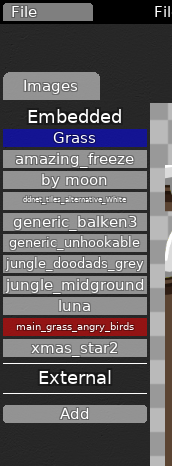
"generic_unhookable" and "jungle_midground" images should be External, not Embedded
Why
@Lady Saavikbecause these are default images downloaded with client
it only makes your map size bigger
wait with uploading new version of the map, I will post more screenshots to fix
Though if he embeds jungle midground would it be visible for 0.7 players as they don't have it shipped to client?
really? it's never embedded
i mean if making them external, i fk up a bit
XD
it's always external
oh my bad then

sorry for occured confusion xd
played through it quickly
seems like a gucci map
:)
qwea tu map ya lleva mas de un mes XD
esta casi ya, estoy puliendo ultimos detalles
vamosss!
idk if doing this will look cool
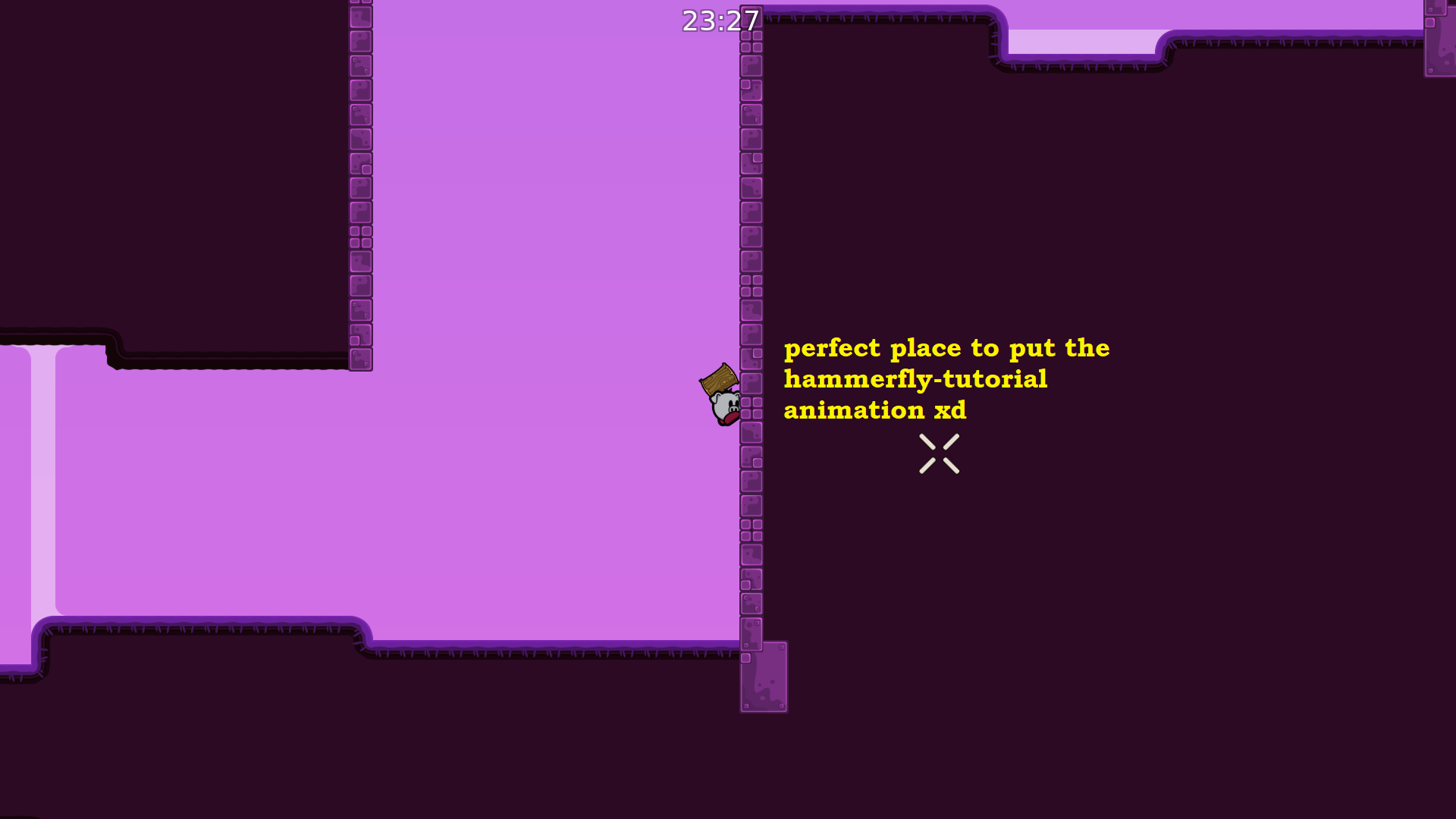
I can try but, I need that animation
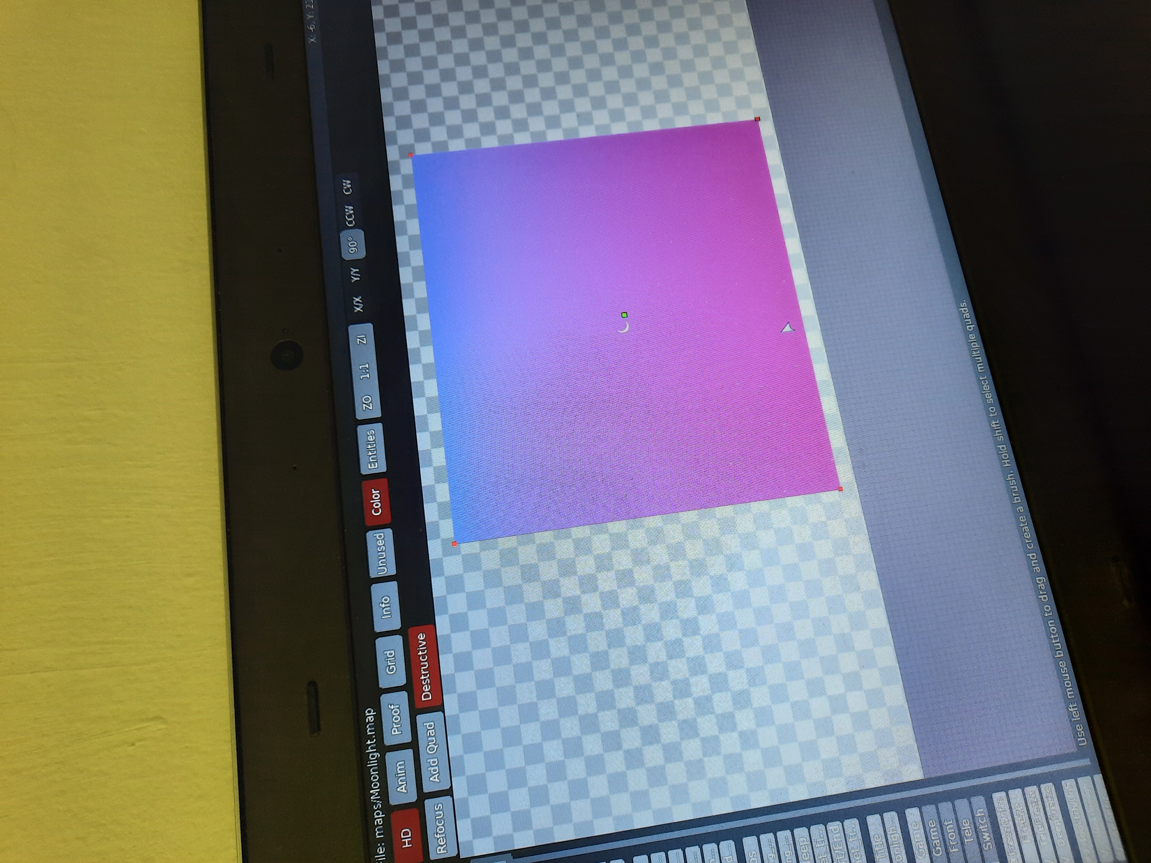
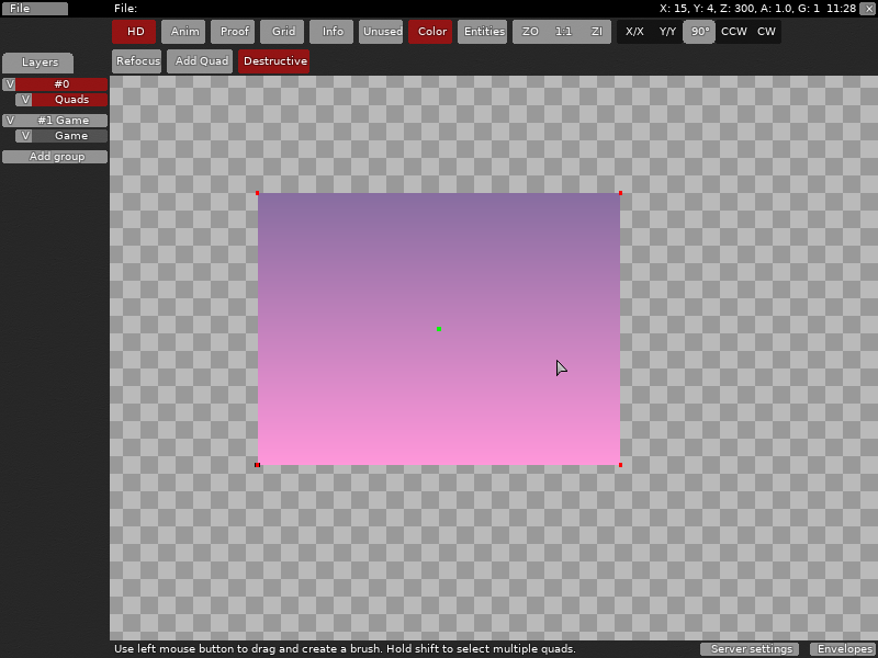
Need a bit of help with background, I want to make it whit this two colors (Purple and pink) but i can't make it more softer
ok
I'll send map file in dms
gonnacheck it
Add a white quad in the background and change the opacity of the one infront
Should get a softem color
ok, ready
Looks good
And the 1 grass tile I put it there, it's for another type of decoration. But if it feels out of place I remove
it kinda does for me but up to you
Alright
Ready
I can try to come up with an idea if u want to

)
suggestion 1 regardless this part:
-made it a bit more interesting, so it's not one jump = one unfreeze
- restructured a bit.
- feels like same part but with + extra movement
- you also can make the freeze to be aledable to annoy speedrunners like i love to do XD
- tried to balance it a bit to fit and previous parts
- tried to clean up it a bit
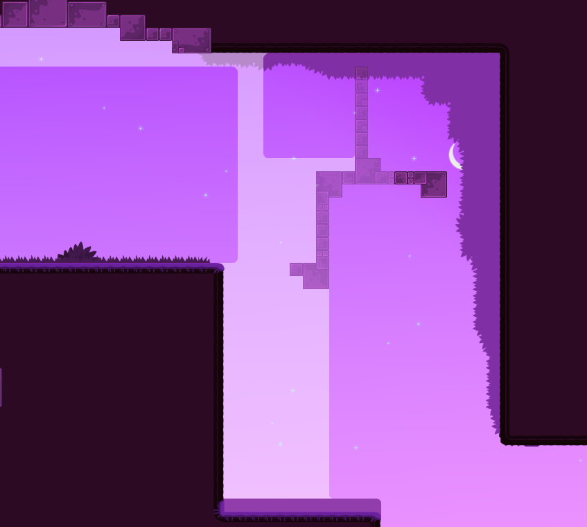
a bit sad that you din't wanted to change third part of your map but eh :D
Hmmn? How, third part
third part xd
that's all i have regardless to this map ^^ good luck with it, p.s sorry if i turned to be annoyng while testing :)
But this I change it
In the update, that part
well it's not changed in current version, thats why i asked about it
Lol
Well, bug
Today I'll send again
Thanks for your feedback !
Map update, hmm I modified a bit the part
:p
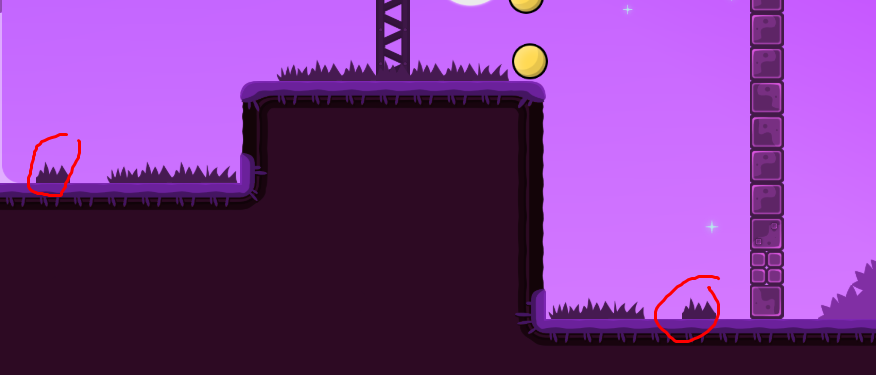
in some places grass is still cutoff
mostly at near end
also consider adding 1-2 toteles to each spot because one totele might still cause a lot of bounces, and considering it will be played by a lot of nobos will become kinda blocky
xd
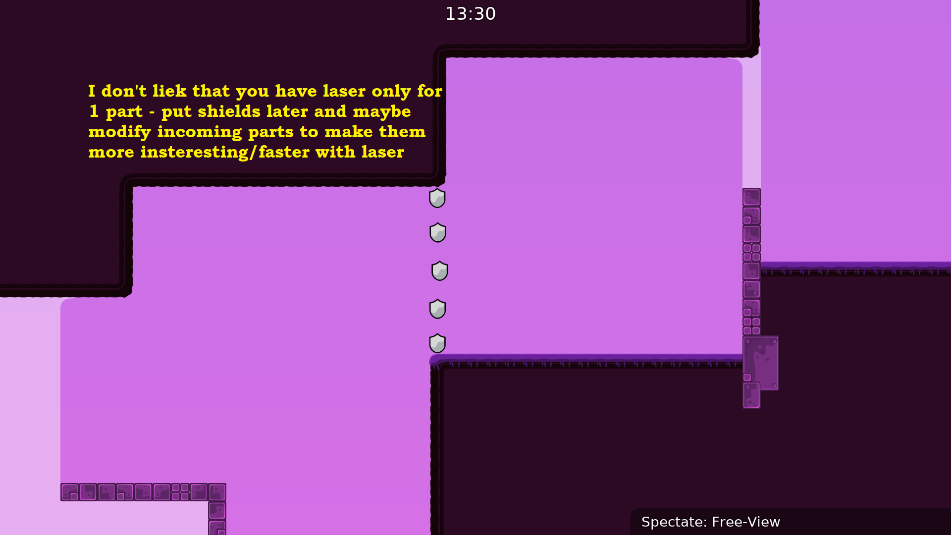
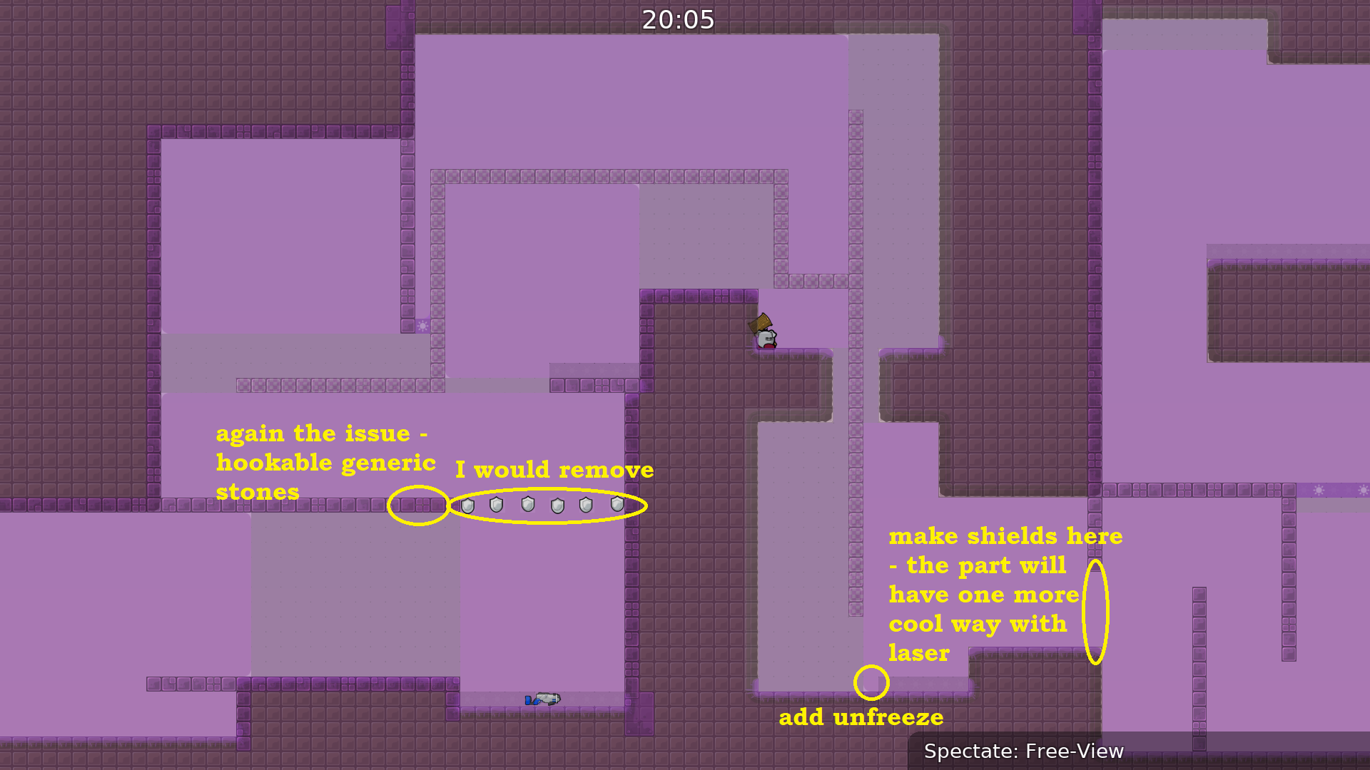
I modified the laser part, I mapped different, and fixed some small bugs
Hello and what happened to this map?
grande fruna

I need to put some stars, and idk what other fix need to make
I thonk stars are fine, and probably even ready in my opinion. Just need a real tester to take a look on it :)
Nice
Well, a tester can confirm it if it's everything ok, what left, what I need to change??
I disagree, i believe that on novice parts like these leaving laser is better, as their movement is unstable and just by leaving it it's safer, considering that the map is 2-3*
u get laser on the left
One tee might skip it, or if you want to remove it so badly i believe that making unhook wall above into ht is safer.
Because removing one freeze wall wonxt help thst much as he still would be unreachable if he is braindead and don't press jump, which happens often in novice parts like these from my experience
if you remove that freeze and he walks in u can hook him from the right
which is why the freeze should be removed
he would be reachable then
Makes sense, but the laser was placed there still for a safer save, and if they will try to save, while they hook they most likely will get into freeze, bcs when hooking someone, in that case u can get a bit to < by holding him turning into fail, which happened to a lot of nobos i saw. I'd say making upper unhookables into ht to remove laser is better rather than removing one wall of freeze, but that's just my opinion regardless to 2-3* novices, so

better

there also many corners missing in design
u should check again for corners
$waiting
uwu
that fall
If you want you can as it will be blocky at beggining but still can be keeped
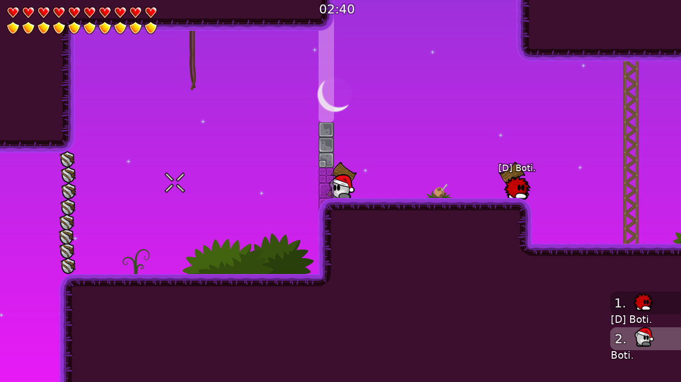
Fixed corners, first part mapped different and little changes on design. Some corners are made intentionally, corners of the freeze in spawn and some corners at the end
Looks bad?
oke
$ready 3
Gratz

NICEEE
WENA FEARZ
Felicidades Fear
Gracias amigos🎉 🎉

Thanks guys for the help in testing, I've learn a lot from mistakes!
wena fearz dsp se topea
justamente👀
xd

My nickname in-game is FeaRZ, it can be changed when my map is out?
typo
sorry fixed
ty for ping
Sorry forget ping, thanks!
Hey, can you Fix R in my nickname pls. in moonlight, mapper name
will do so now

