
this is your map's testing channel! Post map updates here and remember to follow our mapper rules: https://ddnet.tw/rules

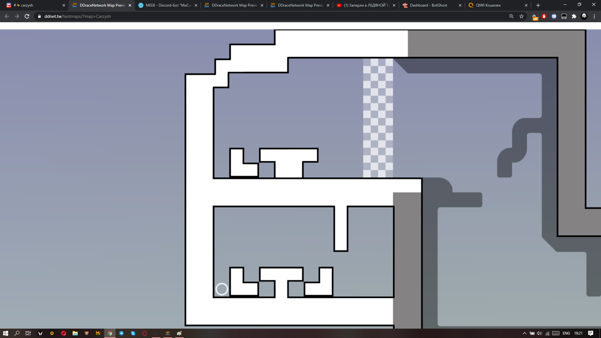
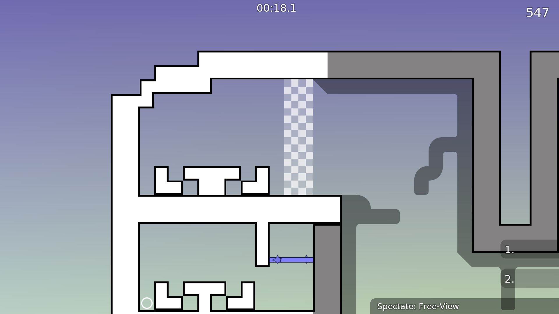
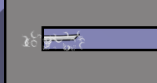
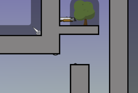
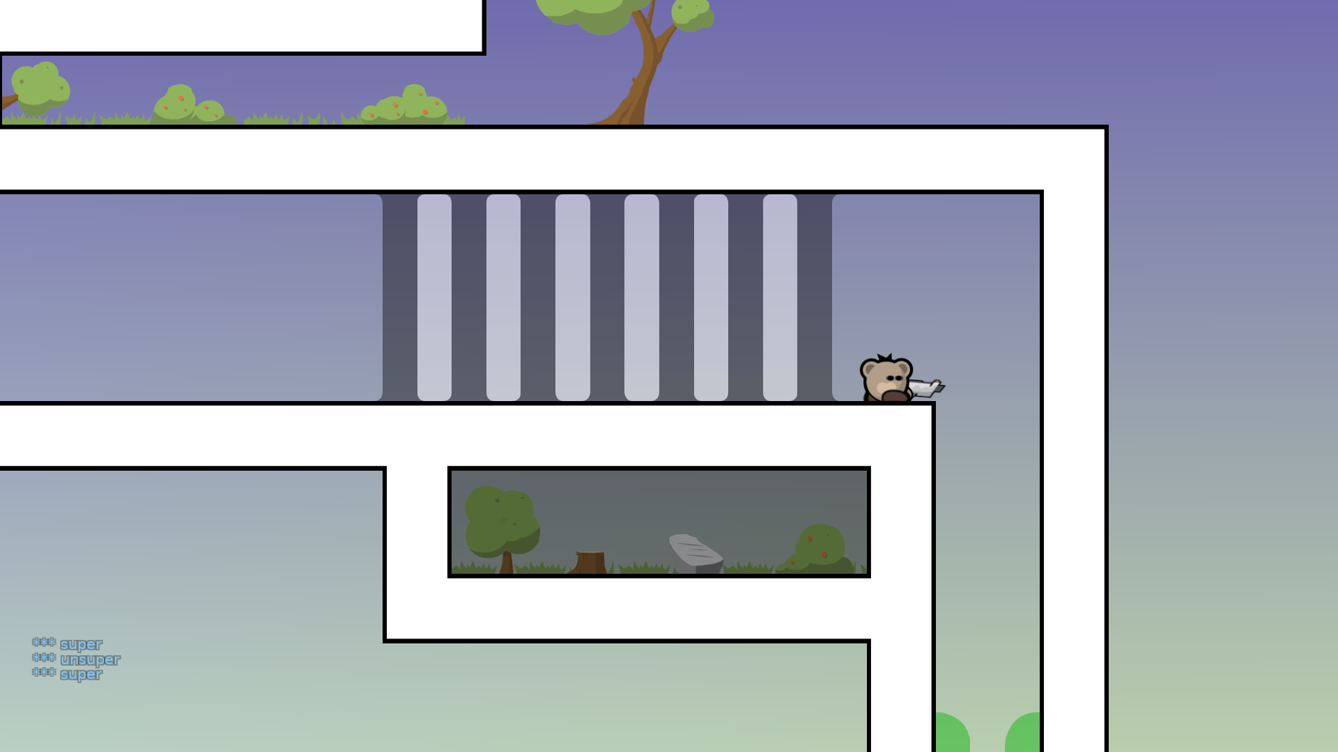
weird locatian a idk where to go first add maybe arrow
or numbers left 1 right 2
looks weird also
Why up miss chair
что? Я знаю ты русский xD
а ок
ну вообщем с дизайном как-то страно что-то
Хз,впервые попробовал в 2 блока xD
Ну хотябы оригинально
Опять же этот переход выглядит нереально странно
блоков
Я незнаю как сделать его более плавным
🤔
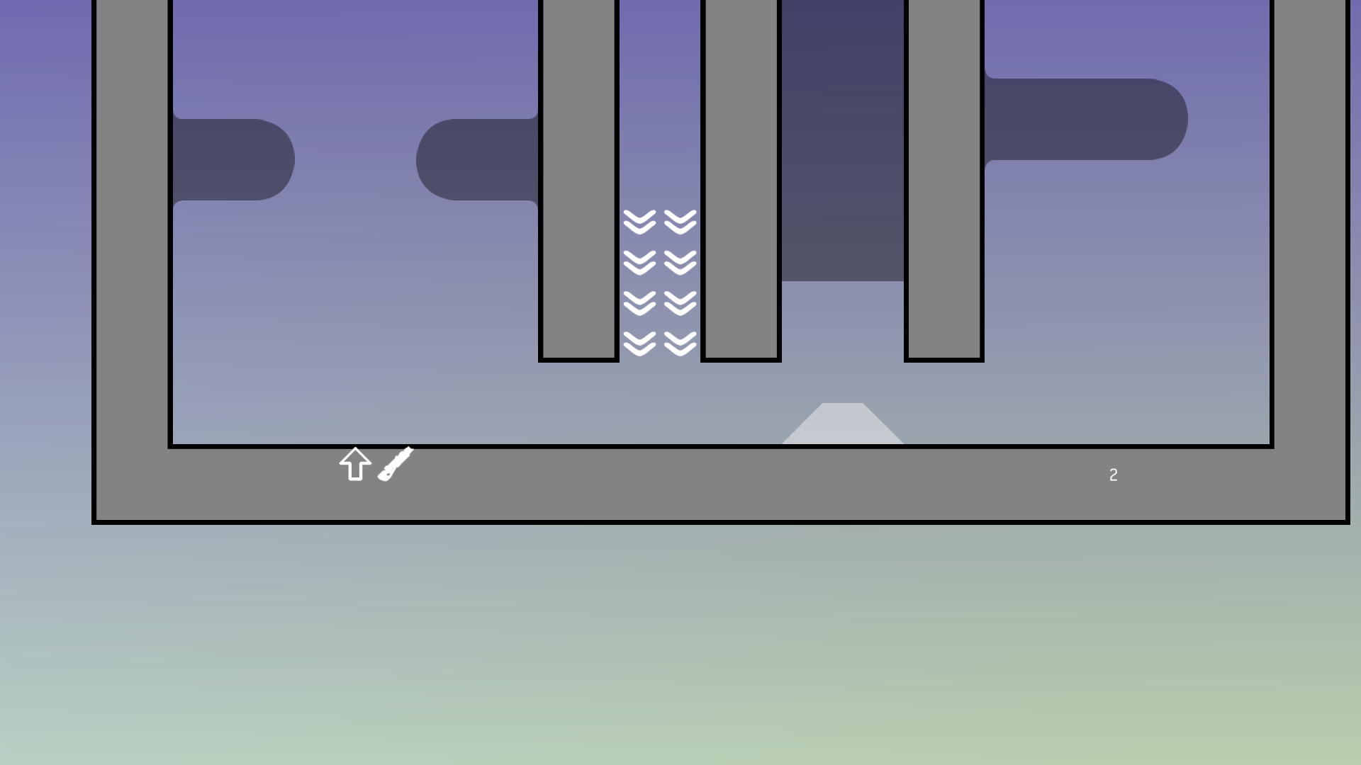
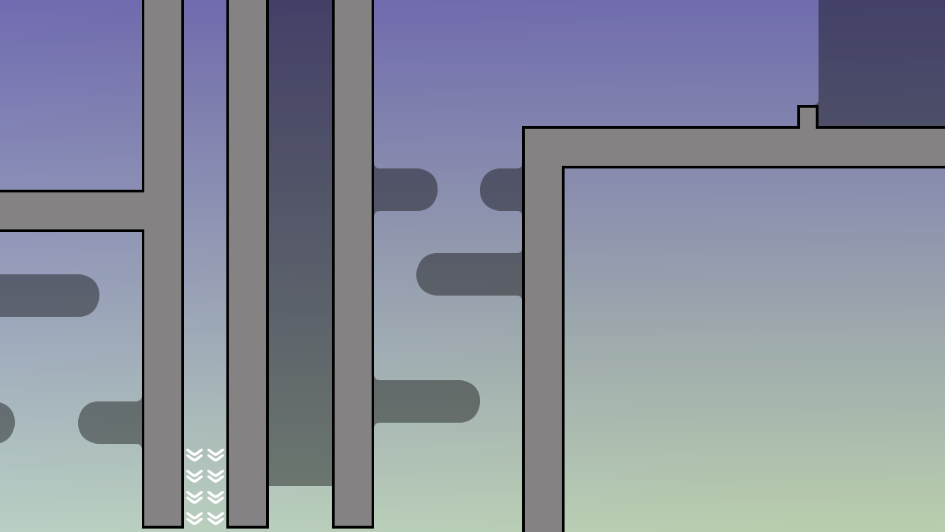
ну как минимум убрать отттуда эти 2 блока
зачем они там
они практически не помогают в хуке
и просто выглядят не красиво
Хмм,завтр уберу xD
Сегодня я уже в тишку не играю
E,thb n
Убери тут 1 слой блоков фриза
очень раздражающая тема
Ok

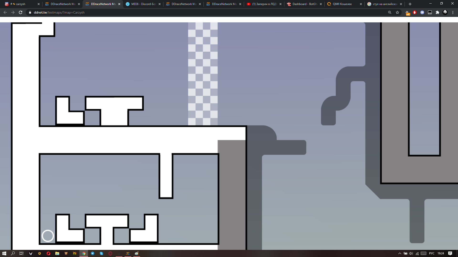
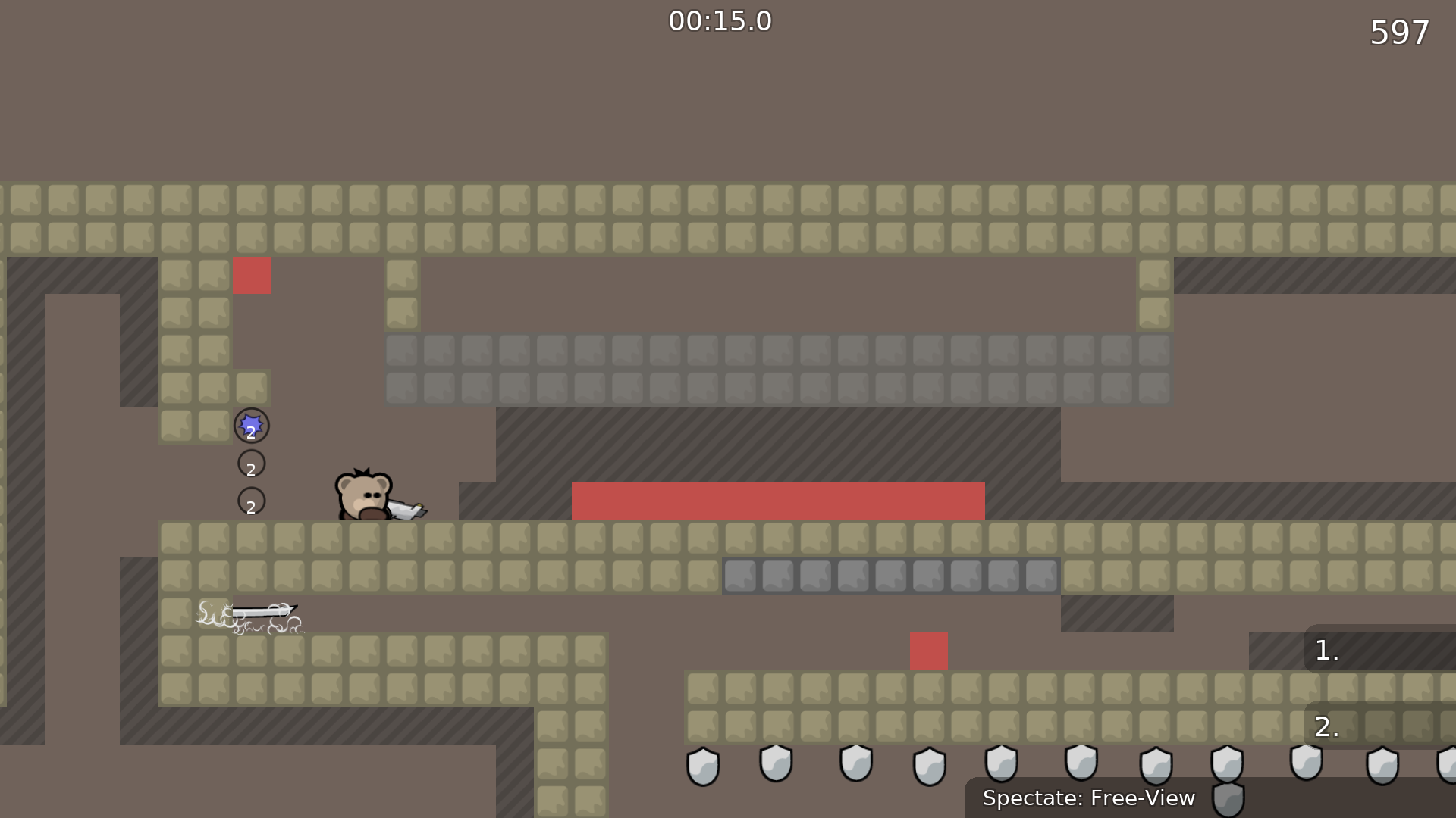
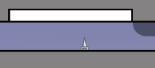
bad spawn start, its a little annoying since u have to jump out of the chairs
just remove the table and chair for the start
xd
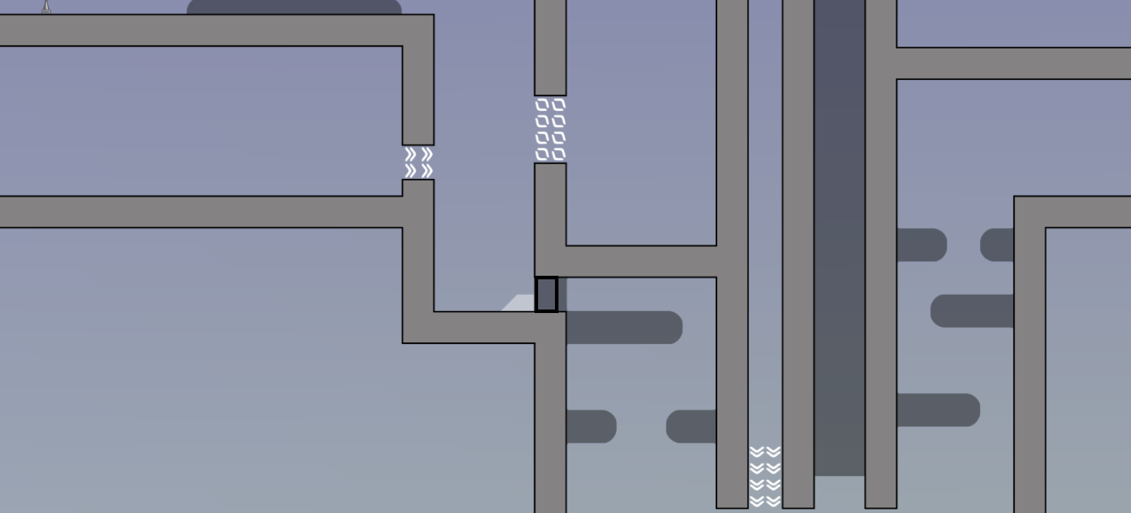
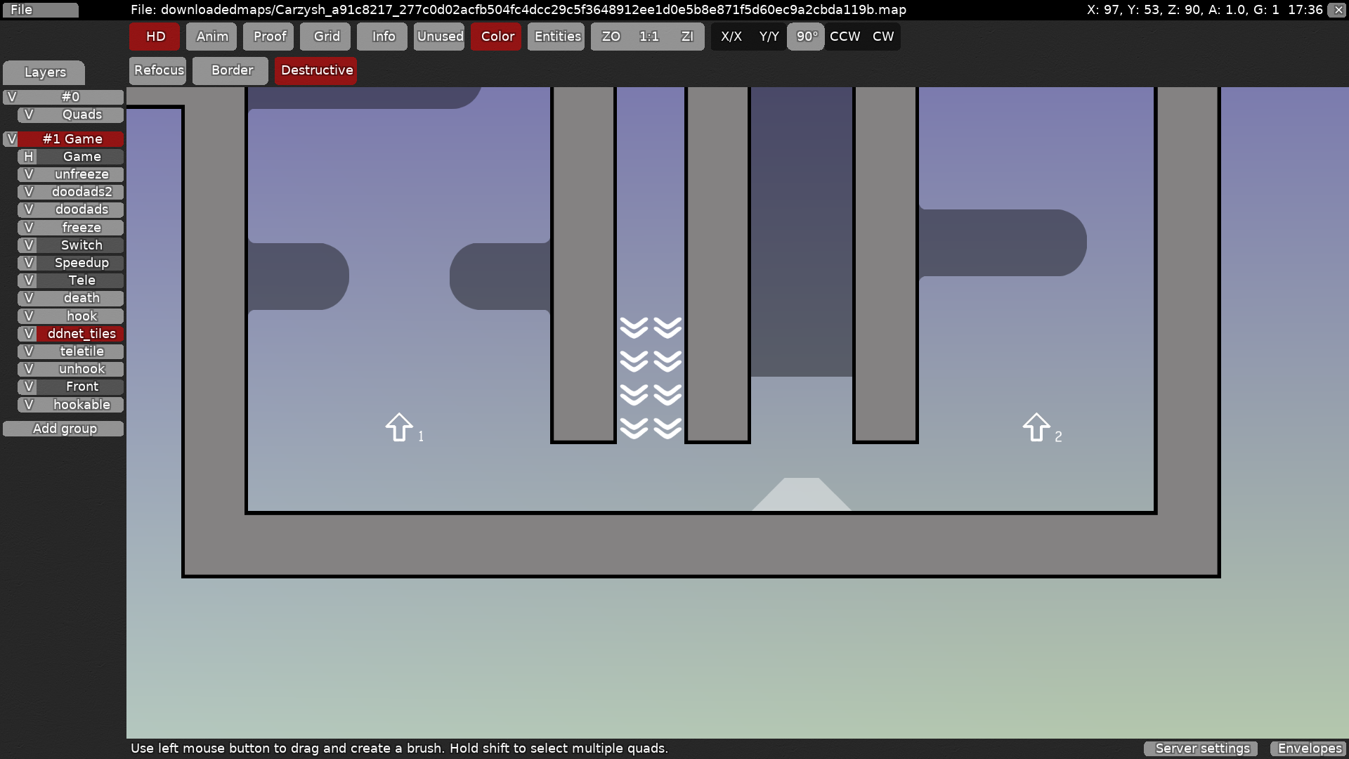
entity bug here
u have the front entity placed but not the game one
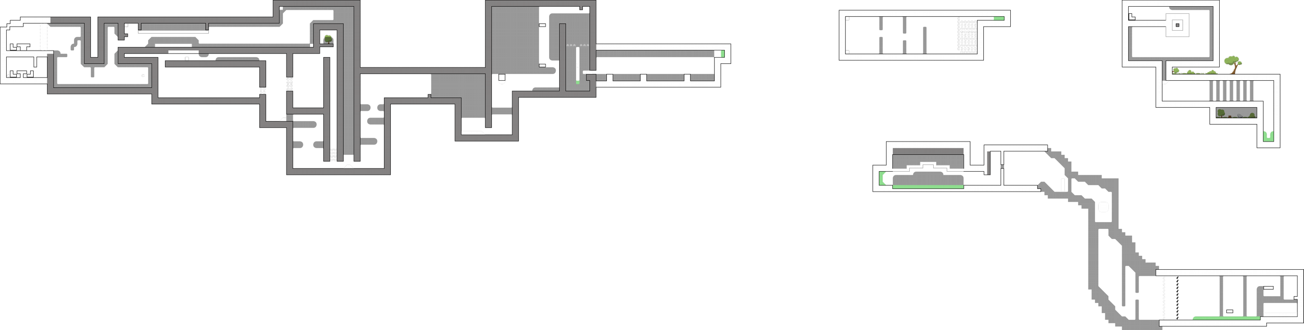
i dont think this map is releasable. You have some good ideas, but overall the map is too tight and unbalanced.
$decline
i'll point them out so you can see what i'm talking about
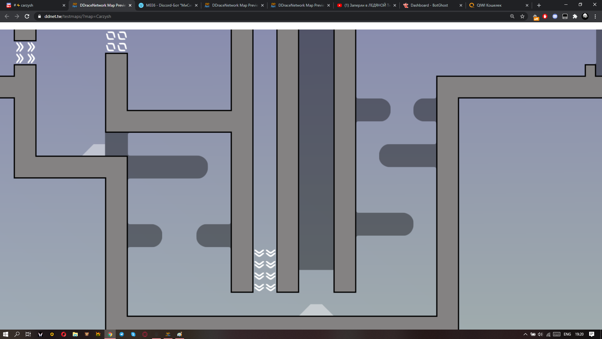
parts like these aren't very fun because it's just the same hook a buncch of times
u could try making it a little different instead of just a straight line
this part isn't a bad idea, but it is a little messy.
this might be personal preference, but it's nice when you can see the whole weapon instead of having half of it in a block
this jump actually wasn't so bad, you removed the ceiling so they had to use hook speed from the floor to get over it. variations like these are nice to see
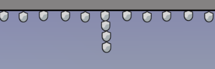
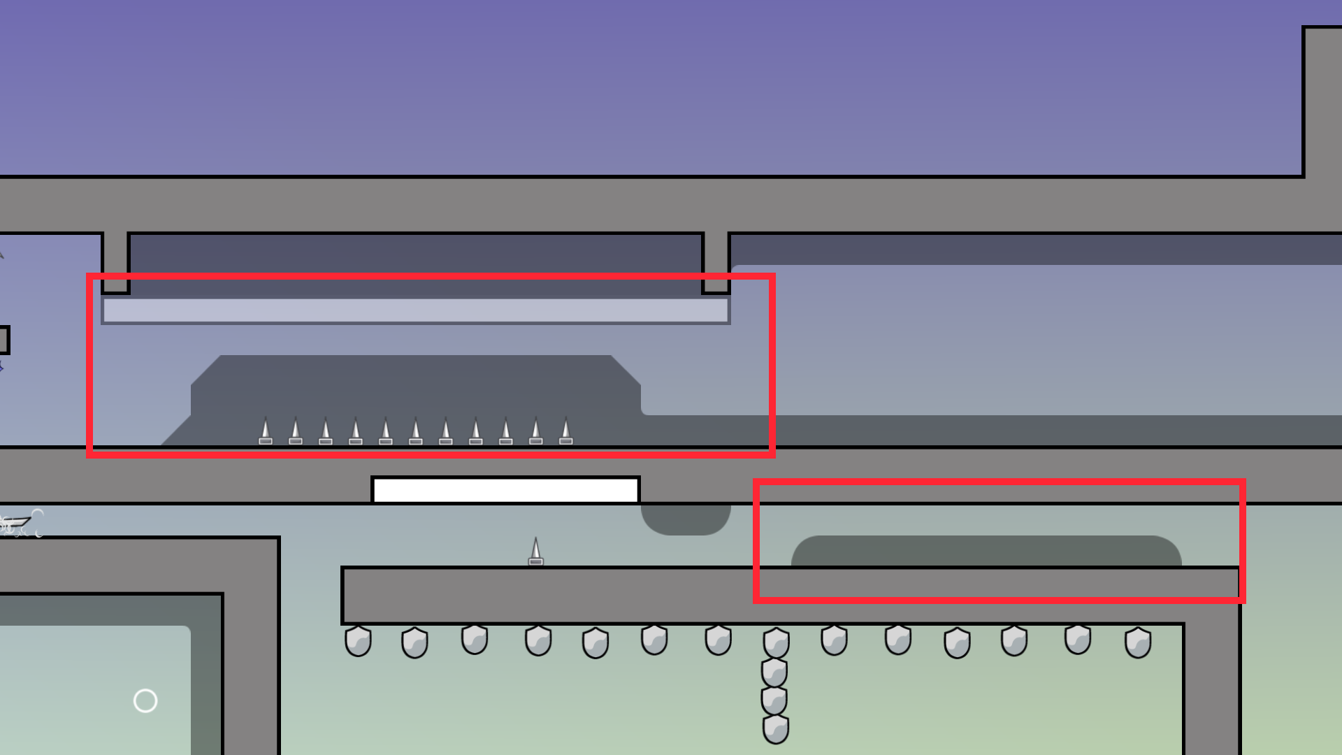
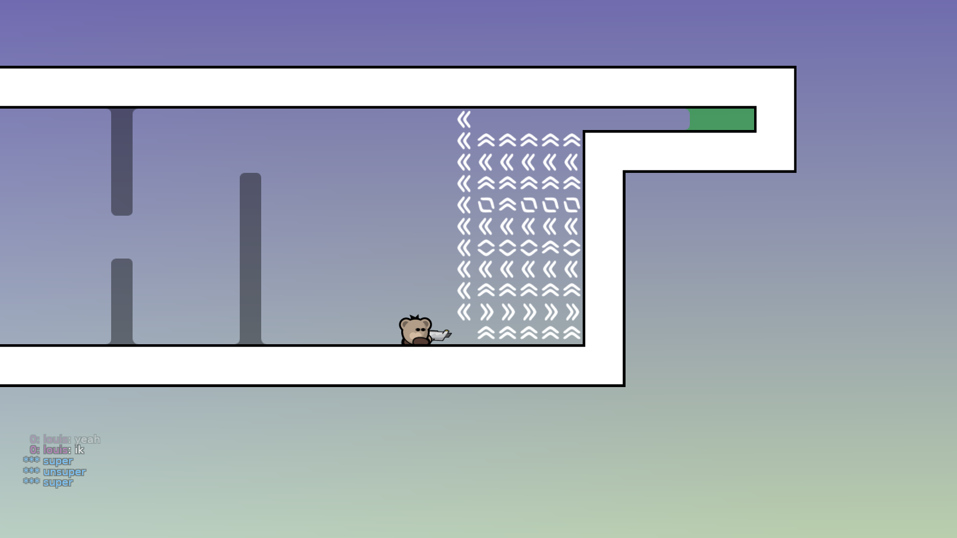
you don't technically need 4 shields here, just one every other tile
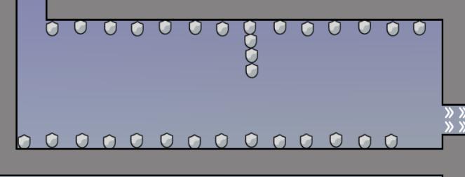
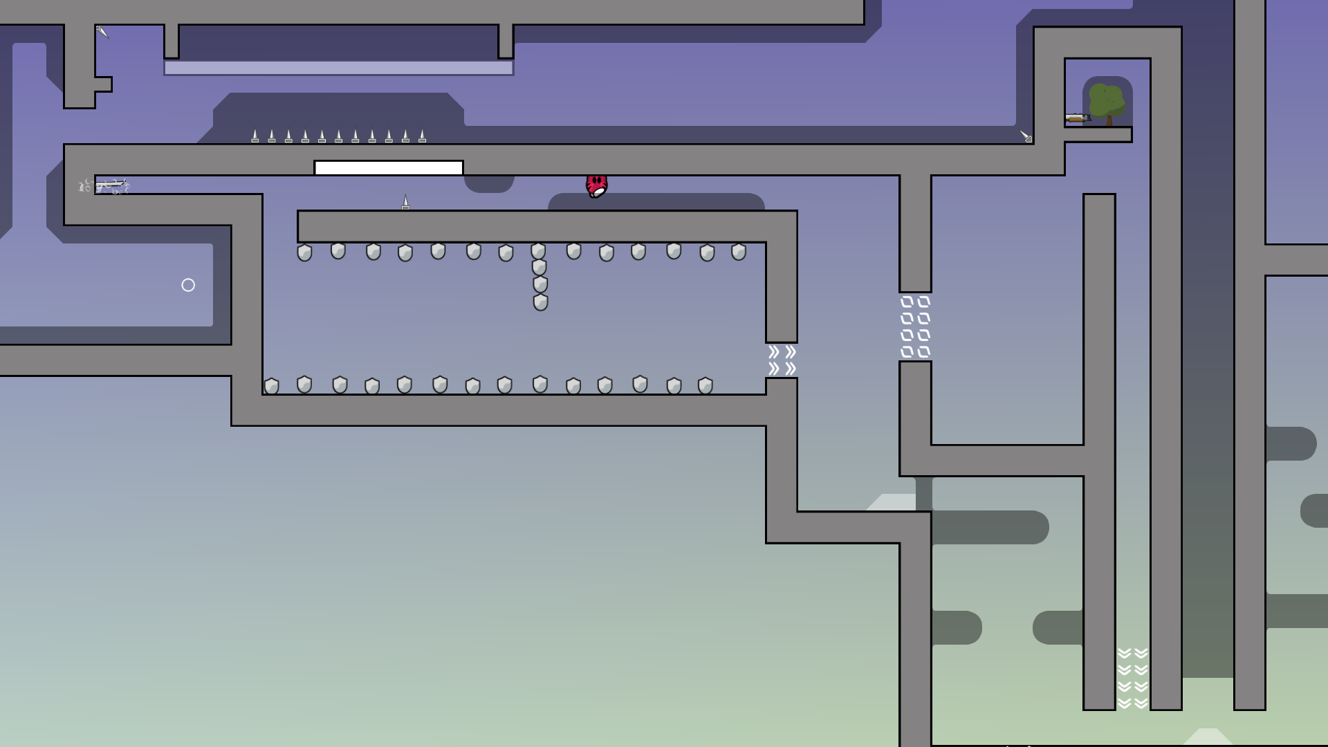
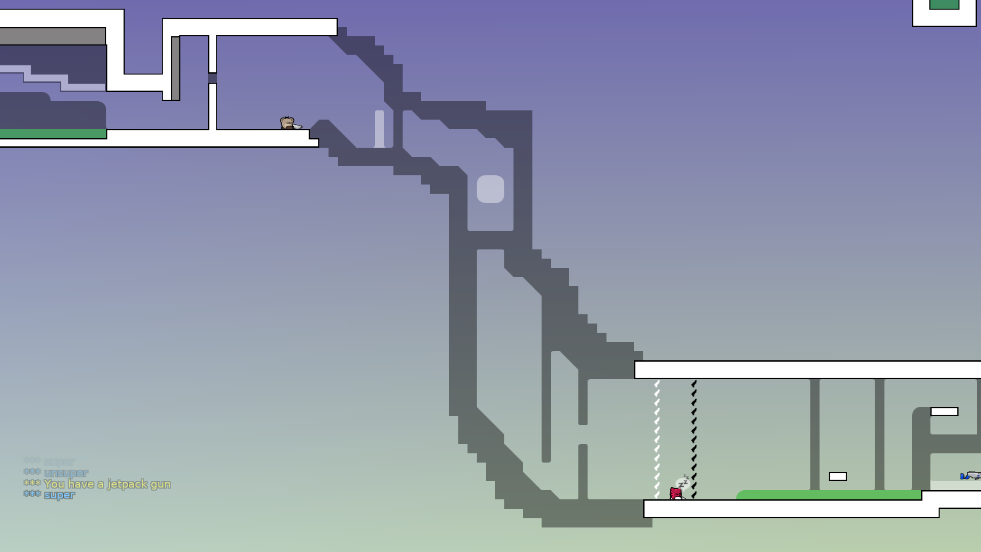
also this felt very linear (you just go from left to right). maybe put in some turns so it's not boring?
u dont really need the armor behind walls here
u can just put it in the middle so it's more visible
these markings on the left and right could be improved (and you also should put a turn off entities sign in the entities so people can see the marking)
something like this probably looks better because it's clear they have to go left first
im seeing a lot of these types of parts in this map - maybe try changing it up a little bit instead of having things poke out from the wall all the time.
the stoppers here can just be replaced with tele or unhookable blocks
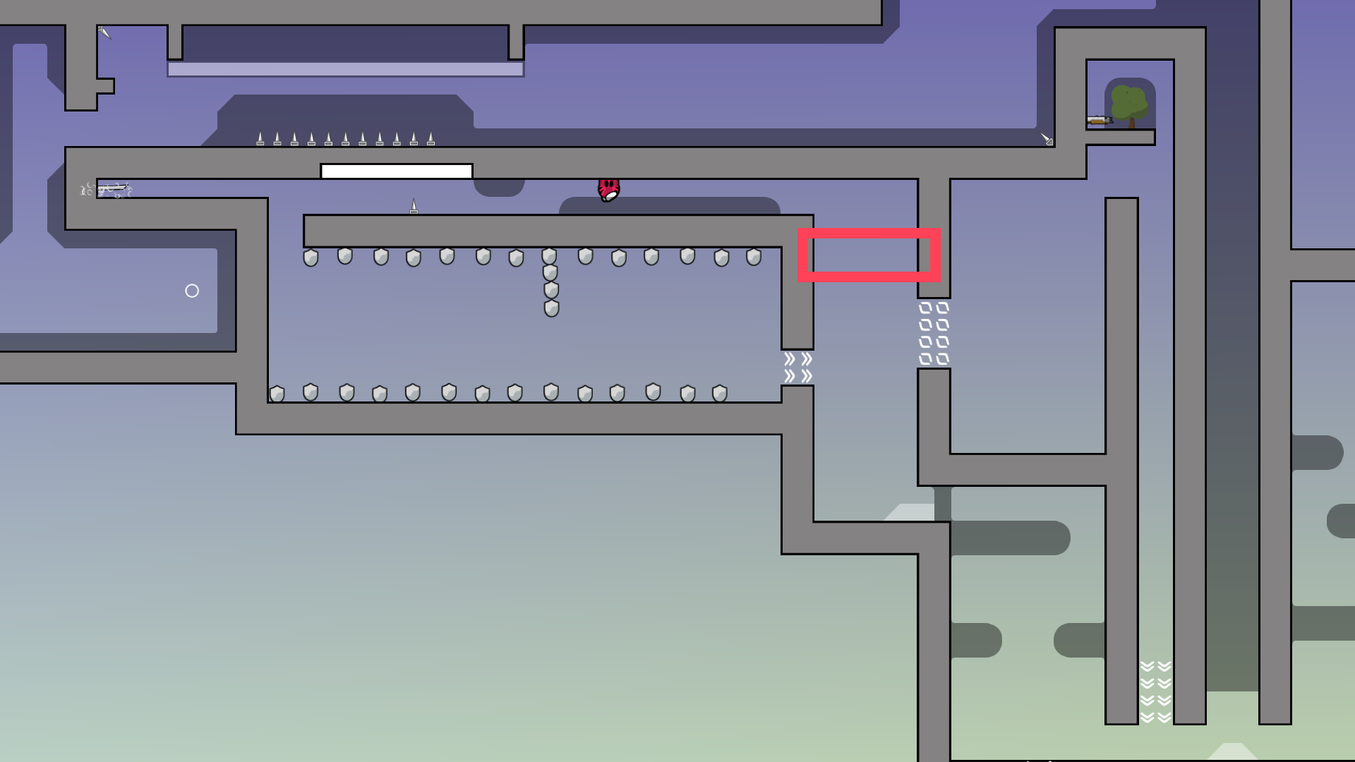
add shields in the red box so u cant take ninja and skip the shotgun part
this part is pretty confusing. if you wanted it to be a confusing part, you succeeded, but i'm not sure if you need this part.
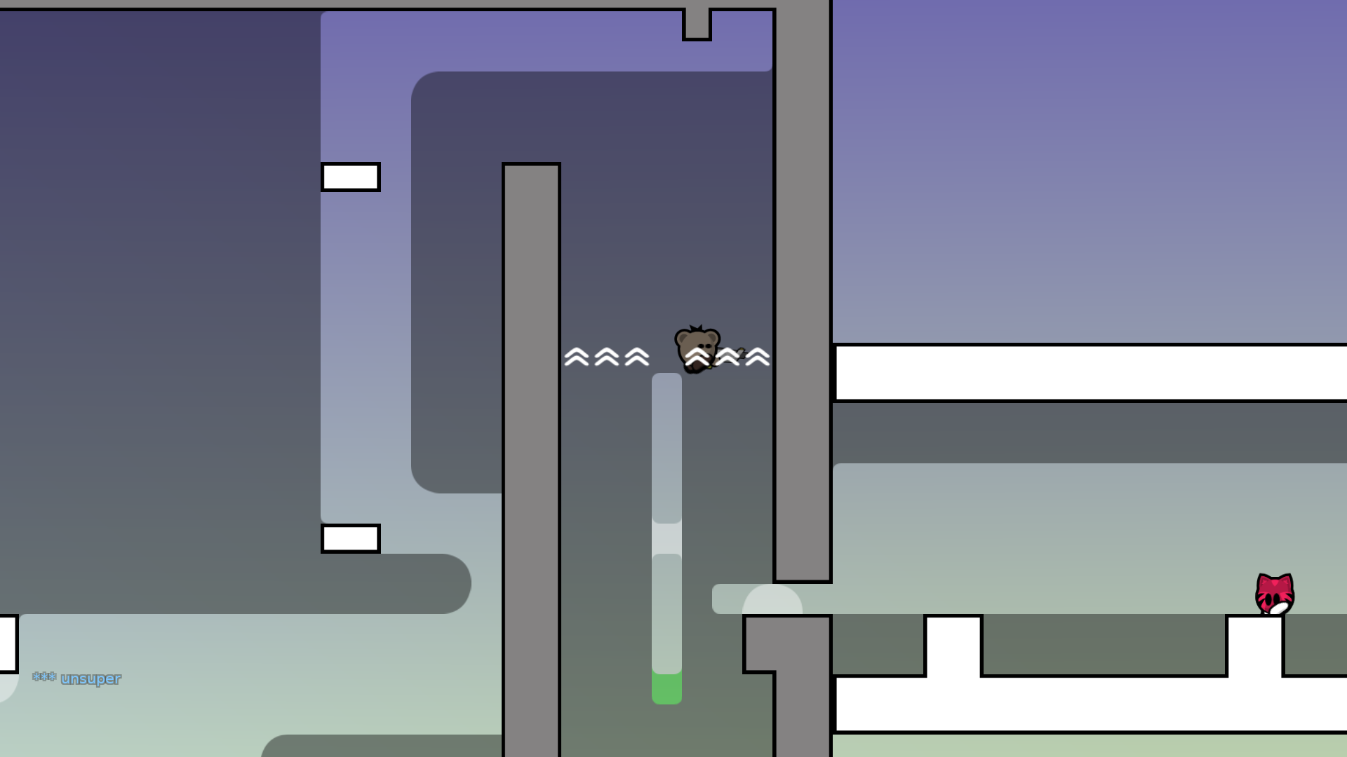
this part isn't bad but its a little tight (1 hookable block + low ceiling)
should put unfreeze where i'm standing
also the box has freeze in design but no freeze in entities
the design + entities here just looks a little sloppy
try making it square if the rest of ur map is square too
but the laser part wasn't bad
okay thats all i had to say
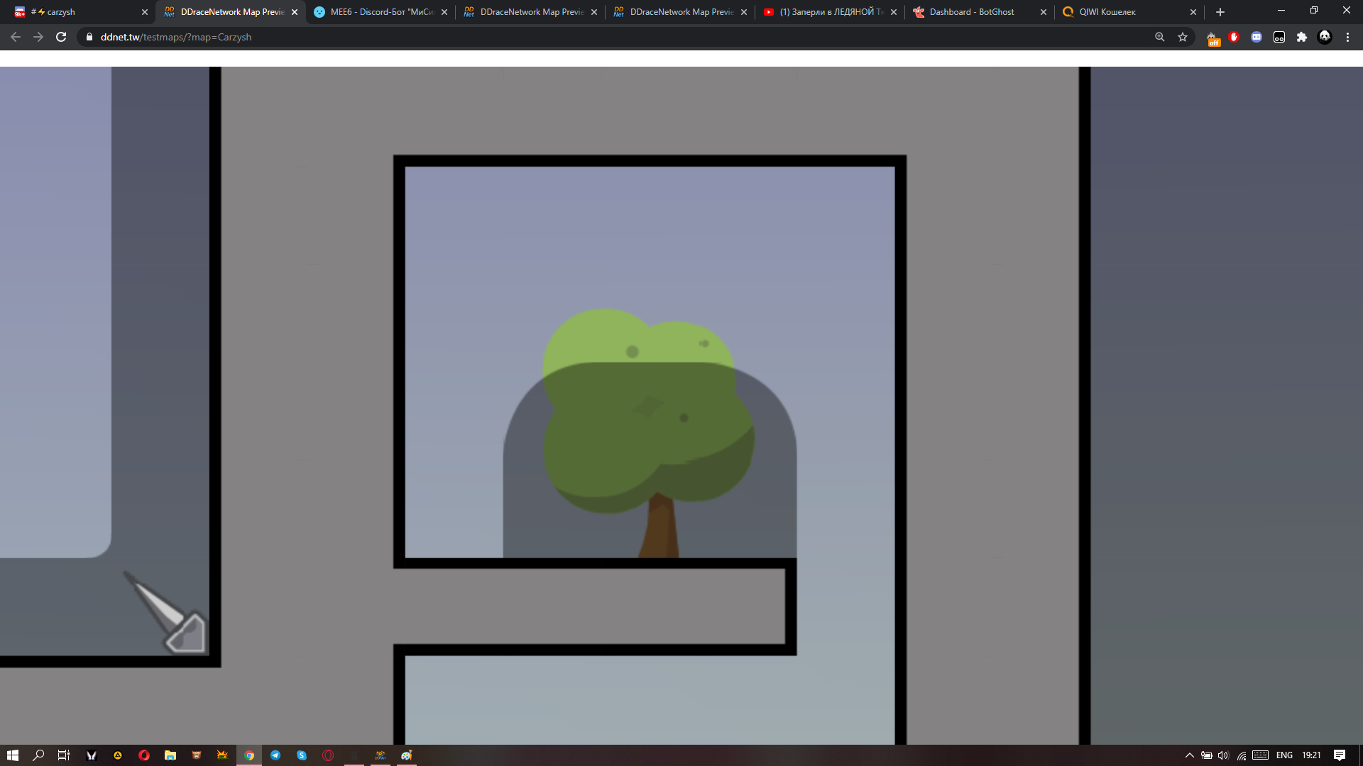
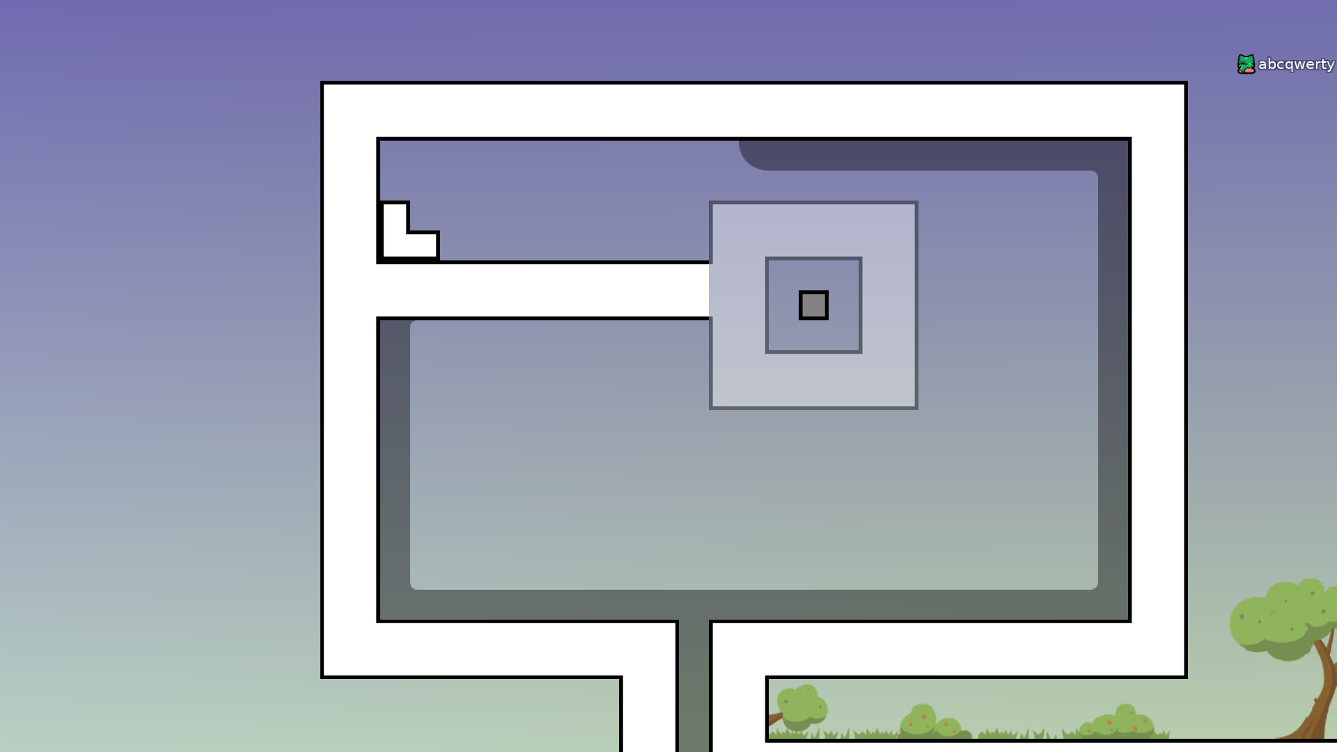
oh u should also put a little more effort into the design of the map
ddnet walls + grass doodads aren't the best combo, maybe try using the grass_main tileset so it matches with the trees

you all need to put hookthrough on the blocks that are hookthrough
ask here if u have any questions btw
no need to put it around
:0