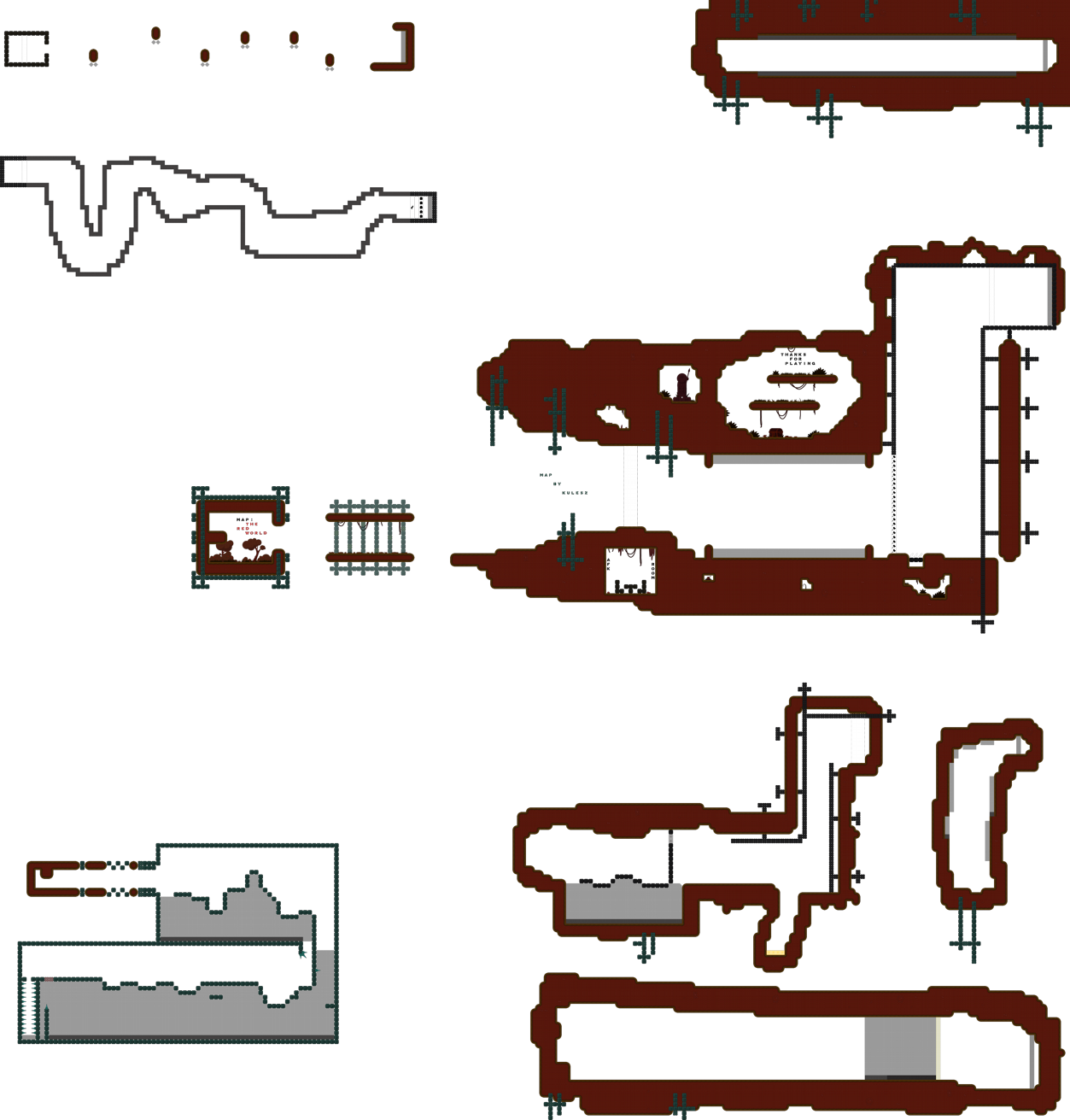
this is your map's testing channel! Post map updates here and remember to follow our mapper rules: https://ddnet.tw/rules
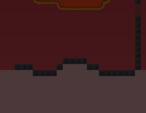
the design its very old , and kind of ugly
well, while I was playing, I saw a lot of mistakes and stuff, I'll tell you what I think.
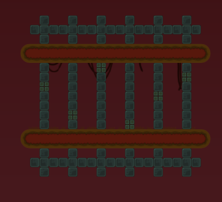
- The map has an old and ugly design.
-
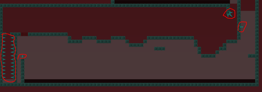
The map is very small, make bigger maps for the player to have more experience.
-
What should be an effect, this is at the beginning of map, and the whole map, is poorly made and very strange.
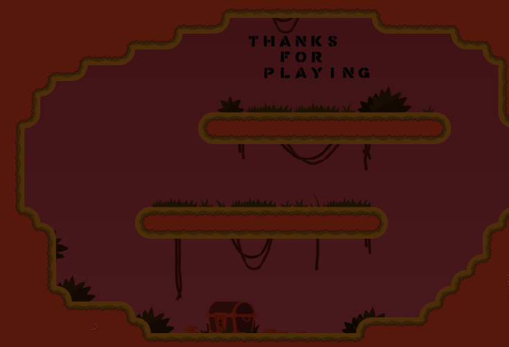
- The "secret" place, has a strange and poorly planned entrance.
-
The map has a messy difficulty
-
And map is quite buggy.
-
Play new maps in the novice style.
-
Well, I think it's your first map, but it's time to fix your mistakes, I see it started well, using teleports the right way, and a lot, knowing how to put weapons, well, you can improve a lot more.
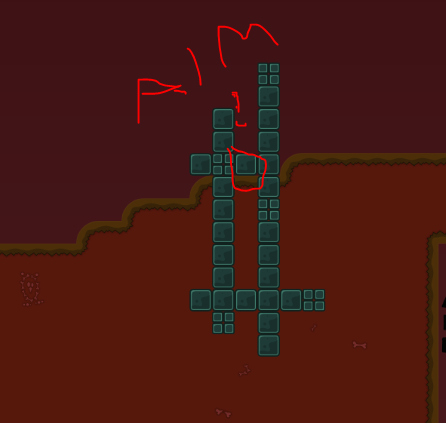
look
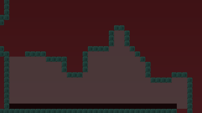
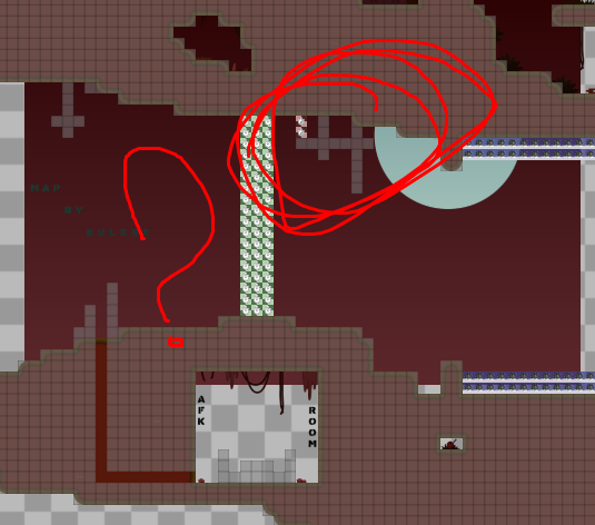
the freeze is very strong, it is difficult to see my character inside, try to reduce the A to 100 or 120
read this
and in all the drag parts, or those that freeze you and you come back in the teleport, put unfreeze where the person will be teleported, it is horrible to have to wait 3 seconds to continue the map
I see the channels my self, please stop tagging me (or any other tester)
when u trynna make a map which is relying on team work, aka novice's, moderate's try to make more team gameplay, as rn 80% of gameplay is solo parts and 20% actuall teamwork, should be opposite in most situations
u shouldn't make such things

nonetheless, great improvement from your last map :D, though you seem to repeat same mistakes you did last time, still not enought to reach a release.
should make map where you can't see finish but there is

lol u dont need double freeze xD
I do this to make it easier for the guy to understand zzz
yes but it feels you are waiting for new mappers maps to say ugli design

as your 90% of feedback mostly is about design xd
I like to use newbies, it's cooler, after I want to see them do better projects, with more quality
yes and design isn't first what they should be taught with
I talk about parts of maps that are not good either.
i only saw "this part has ddmax design"
this doesn't really explain the issue
I analyze the design, and if the map is cool, the size, and if it’s too boring or not
but I have more fun analyzing the design

i don't think pointing 100 times that design sux in one analyze helps somehow
nah the design its a littler help
90% of a map’s quality relies on gameplay
And saying “ddmax design” doesn’t really explain to them how to improve
I help some to understand in pv zzz, because it literally takes a little text
well this subject ends here
100% relies on gameplay
The design is something that can be changed without any problem
$decline
map is too basic and doesn't meet the quality of what we are looking for try to have a look at recently released novice maps to see the gameplay and design that we look for. this map is pretty tight, has "basic" parts, and needs some more creativity. if you have any questions/need help, feel free to ask in
#mapping!
