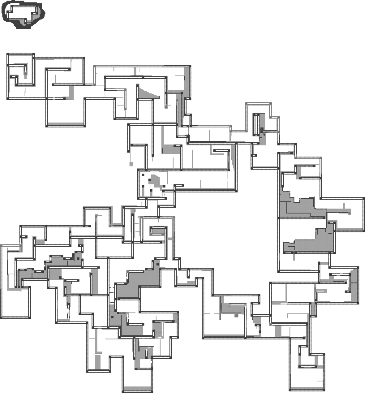
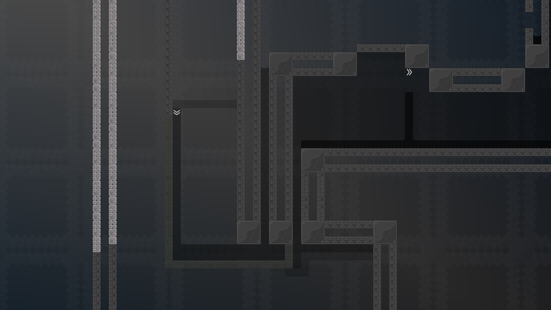
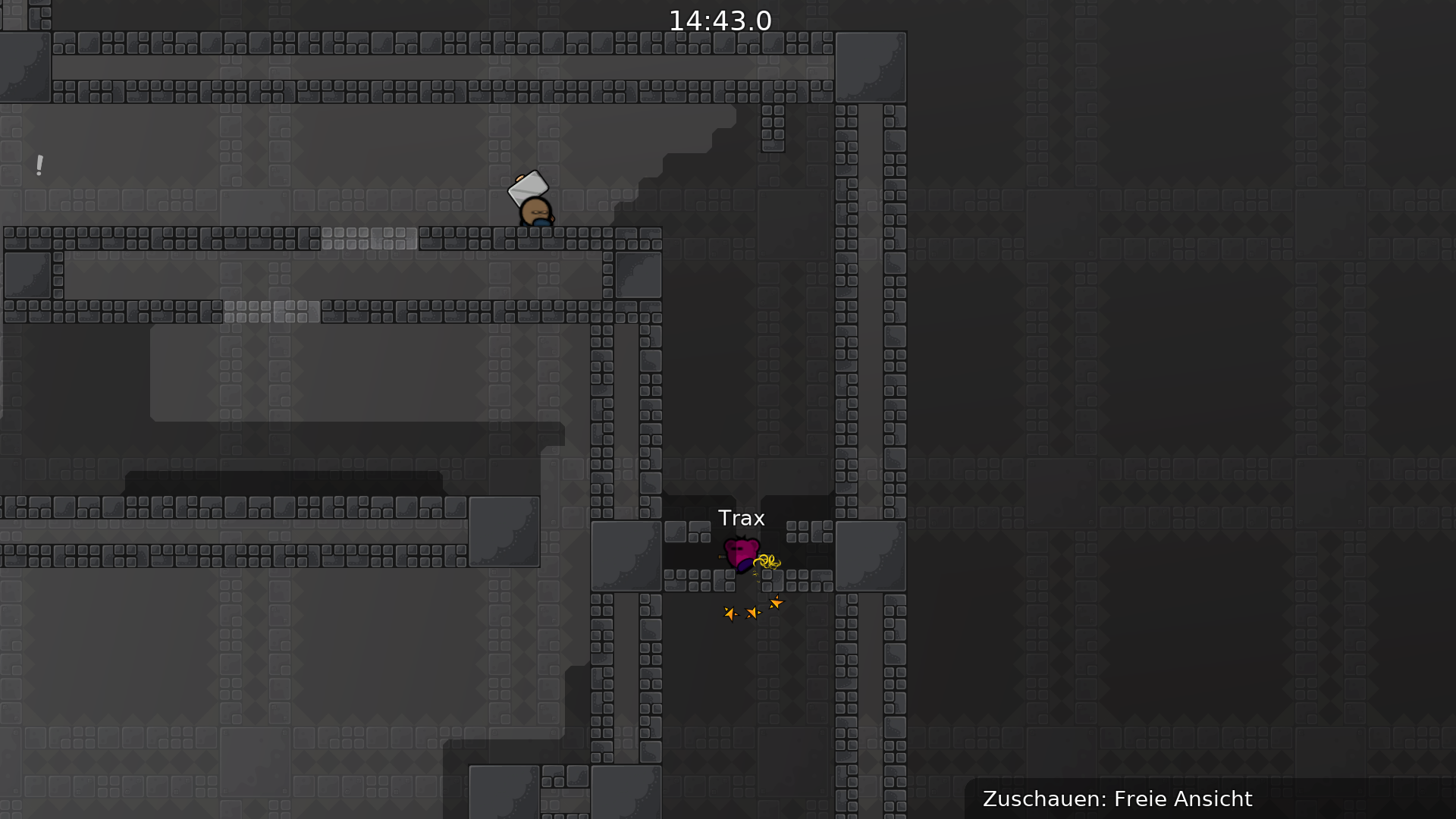
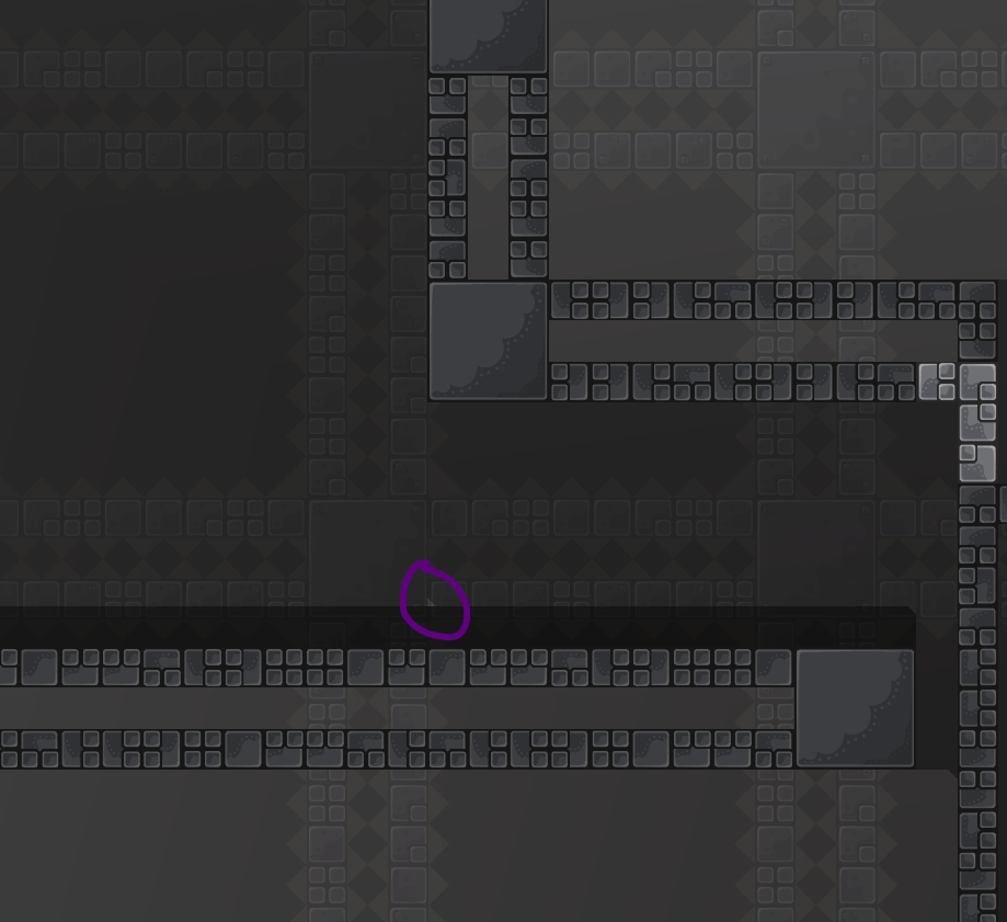
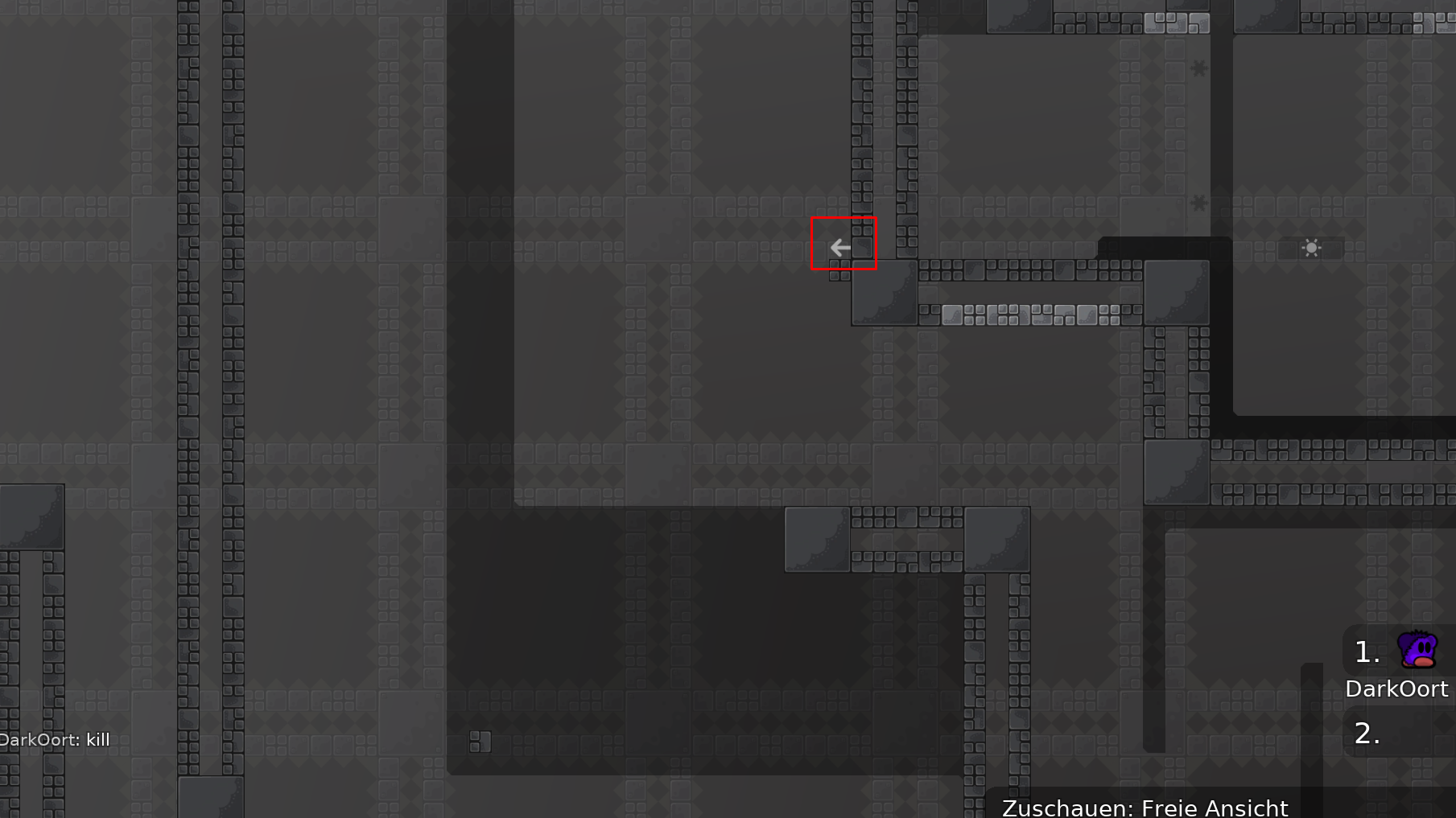
average brutal 1 gameplay, nothing special but still fun to play, like it a lot
its a good gameplay for players who start playing brutal
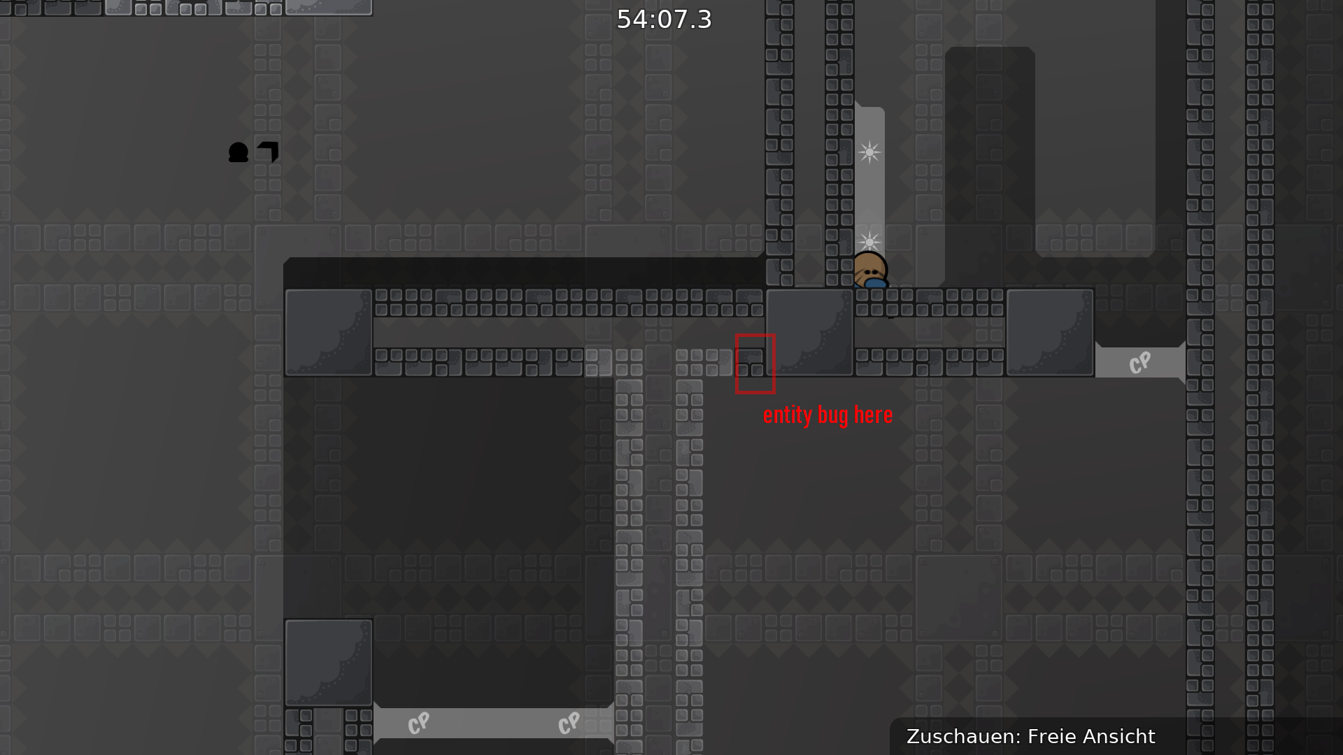
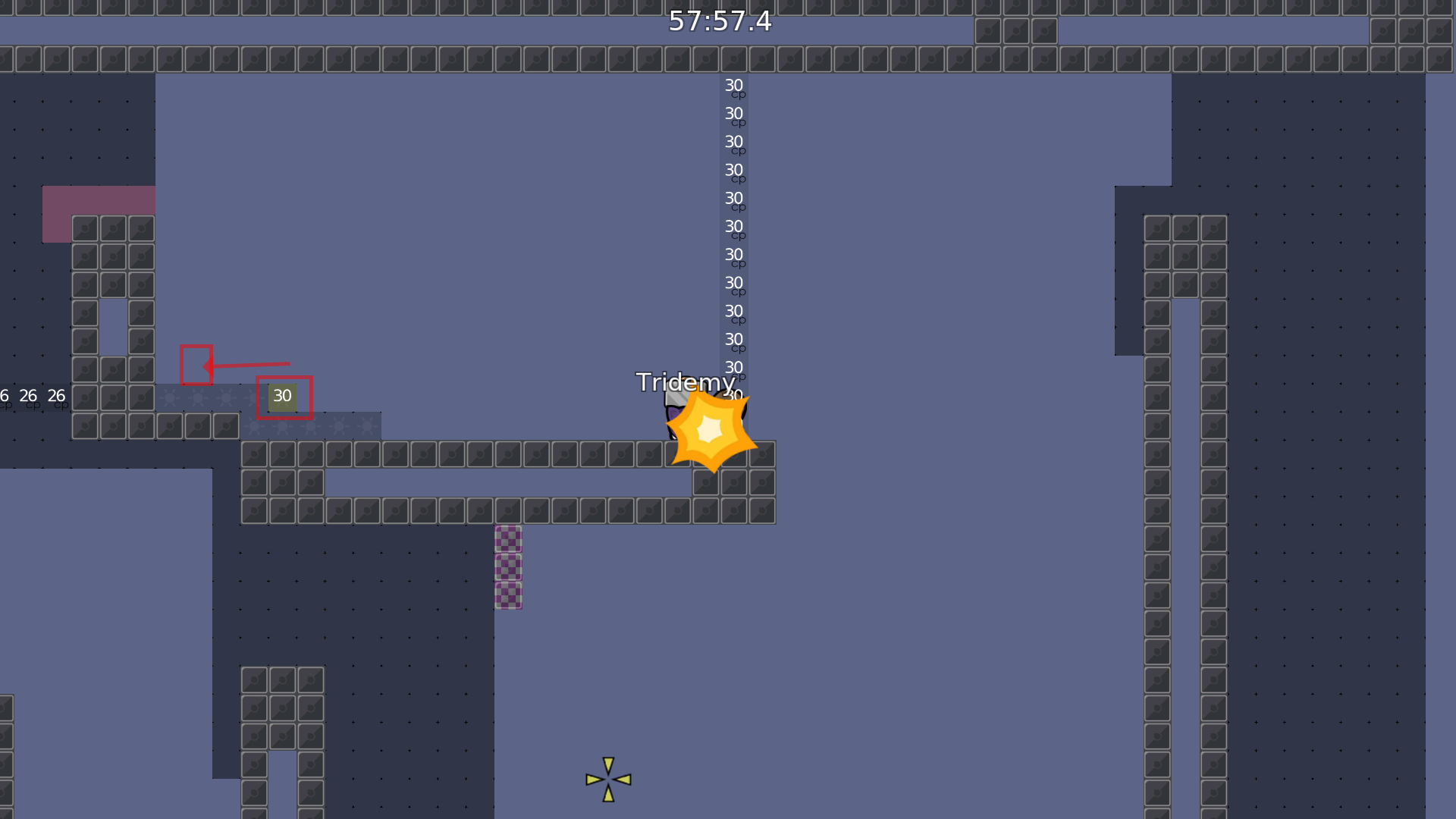
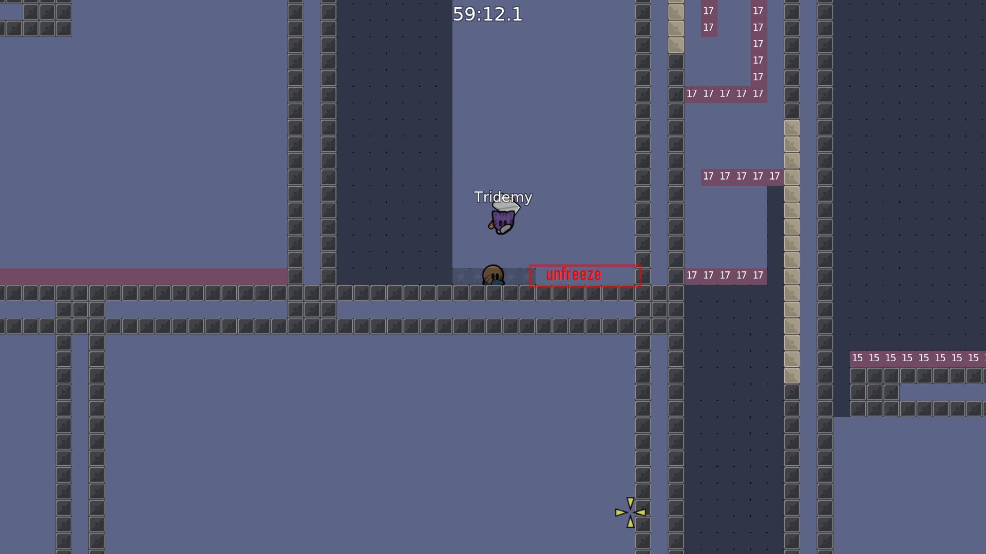
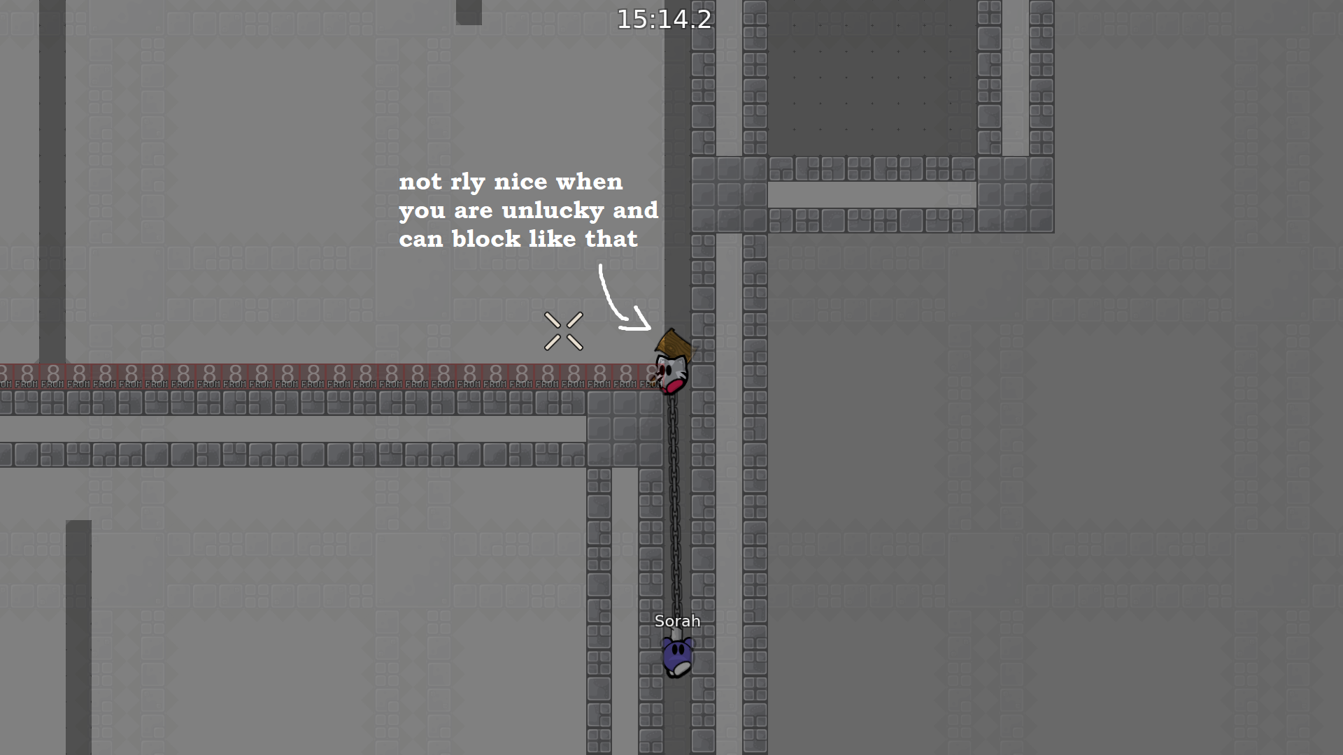
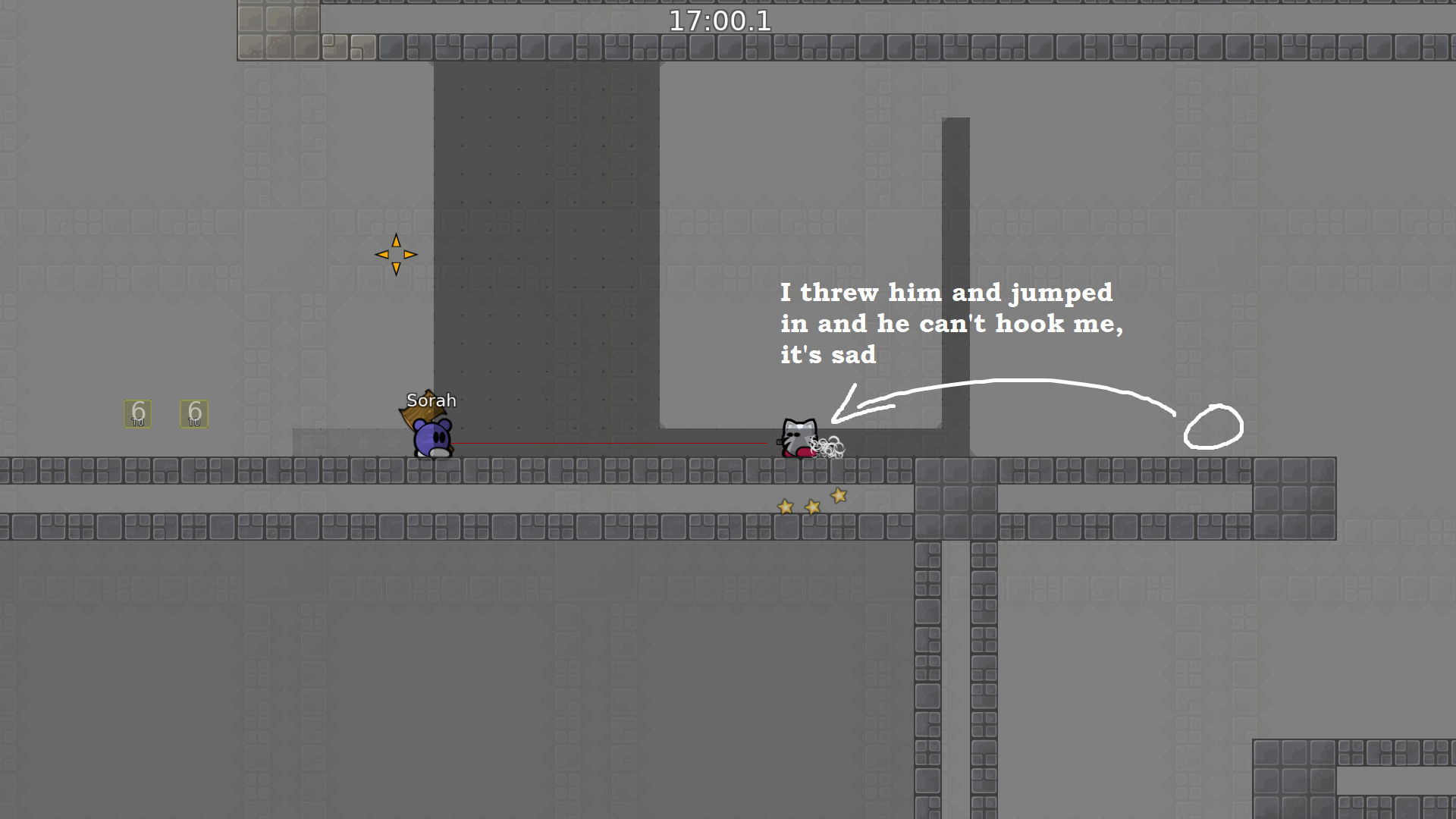
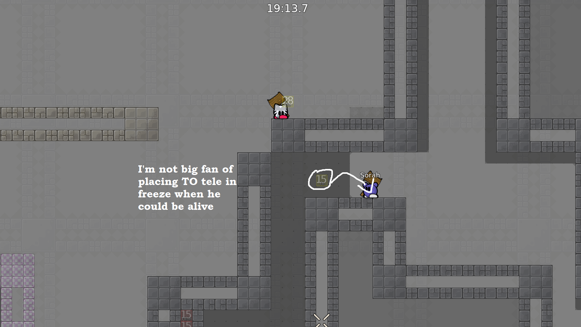
there are few things i notice
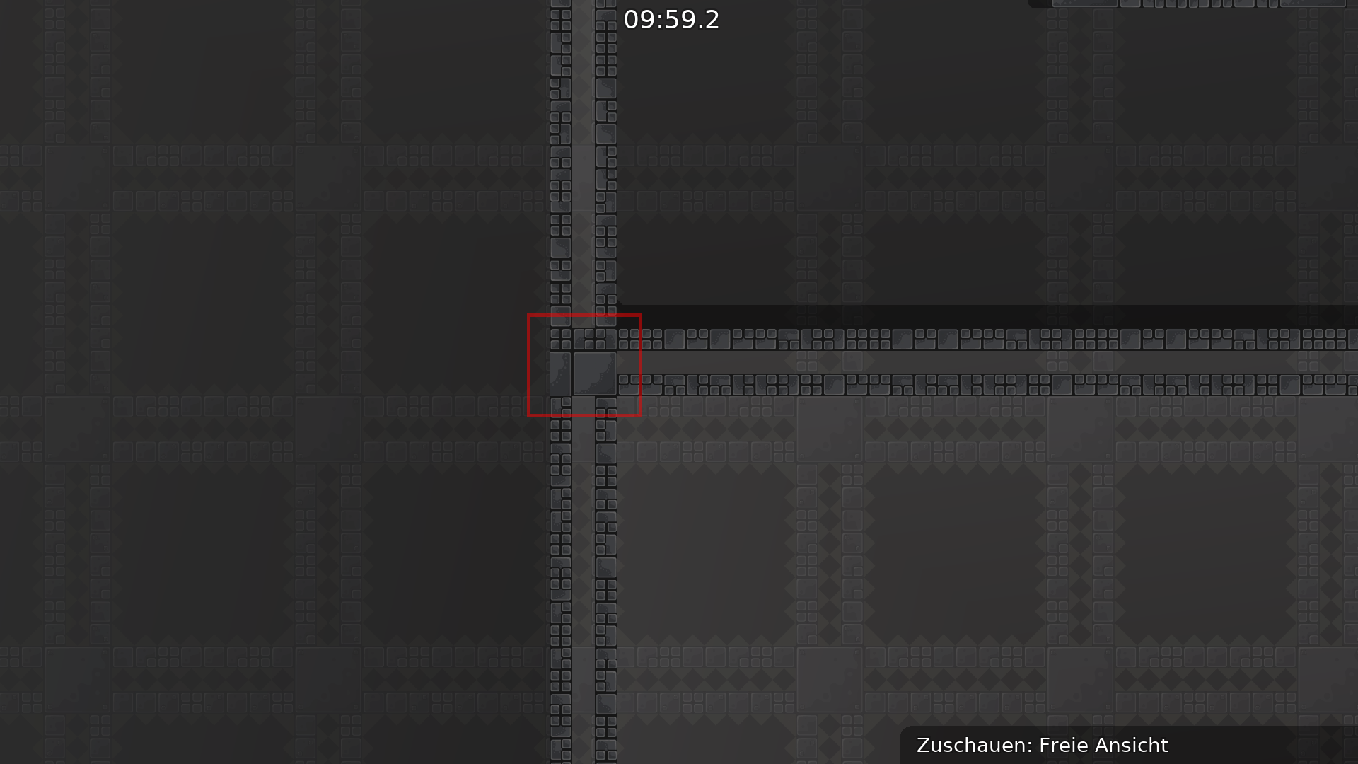
first of all design issues
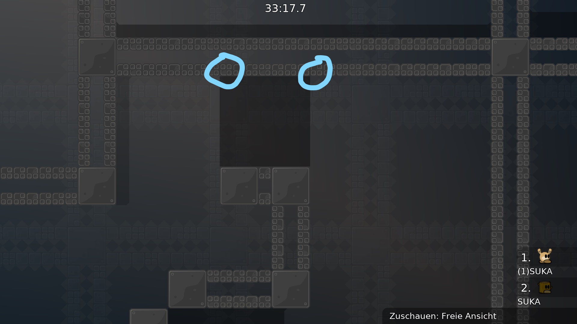
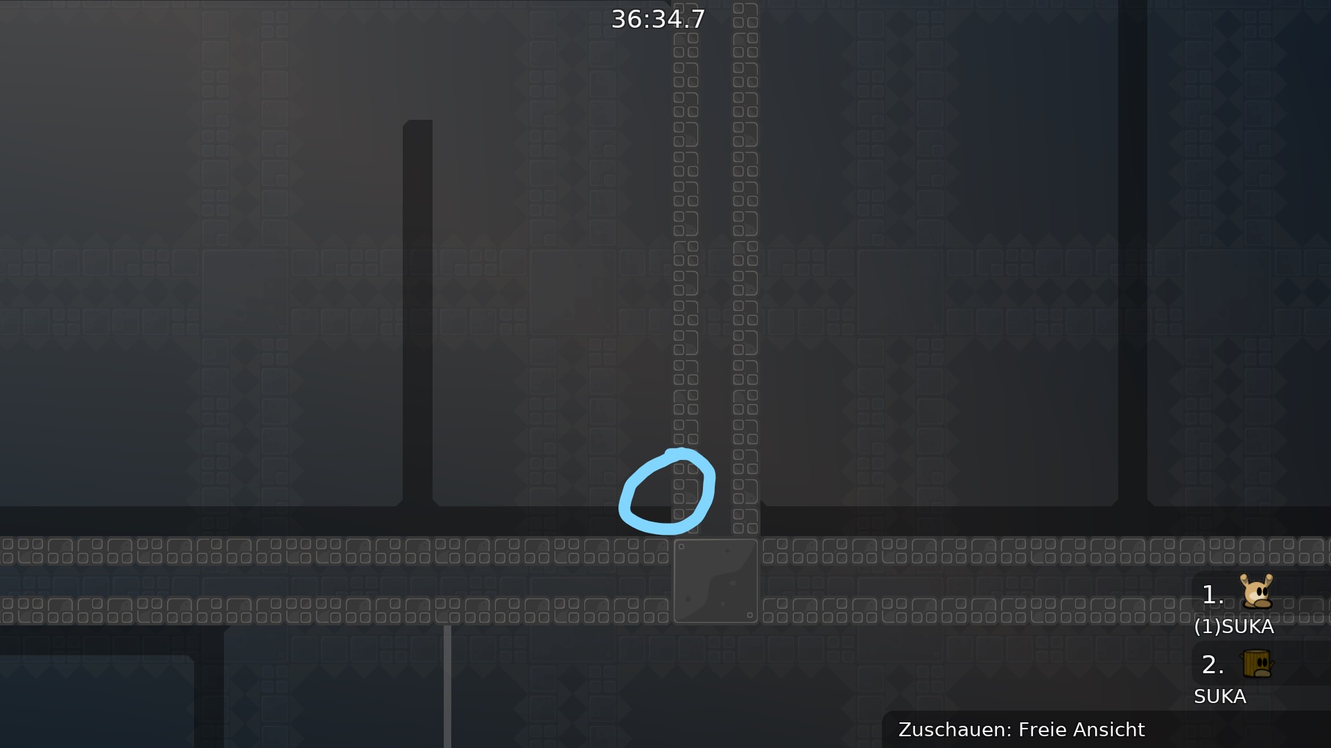
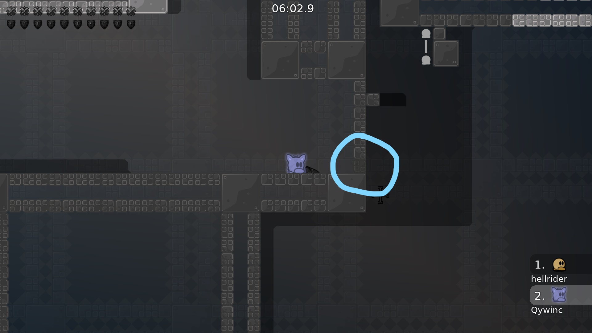
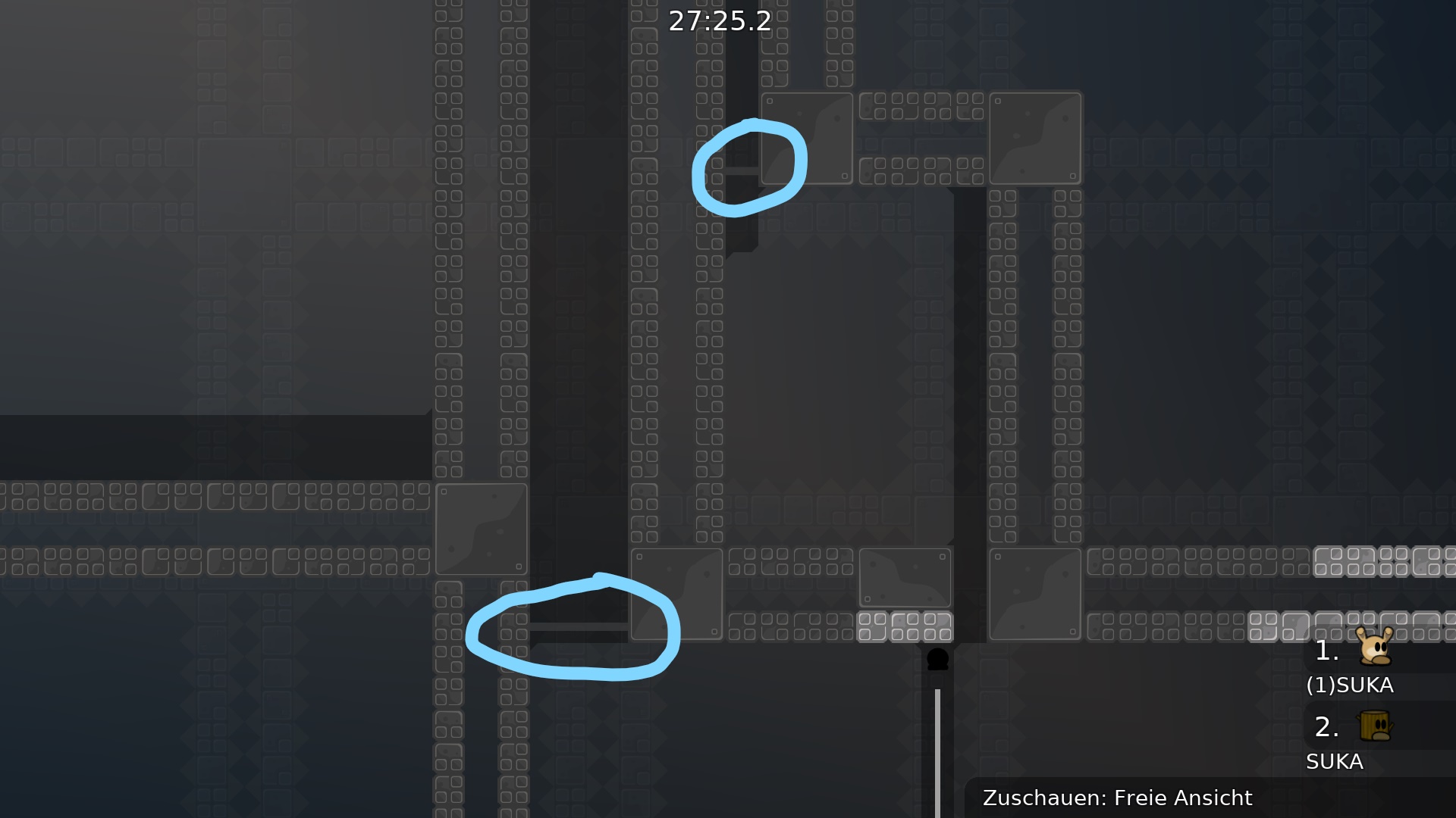
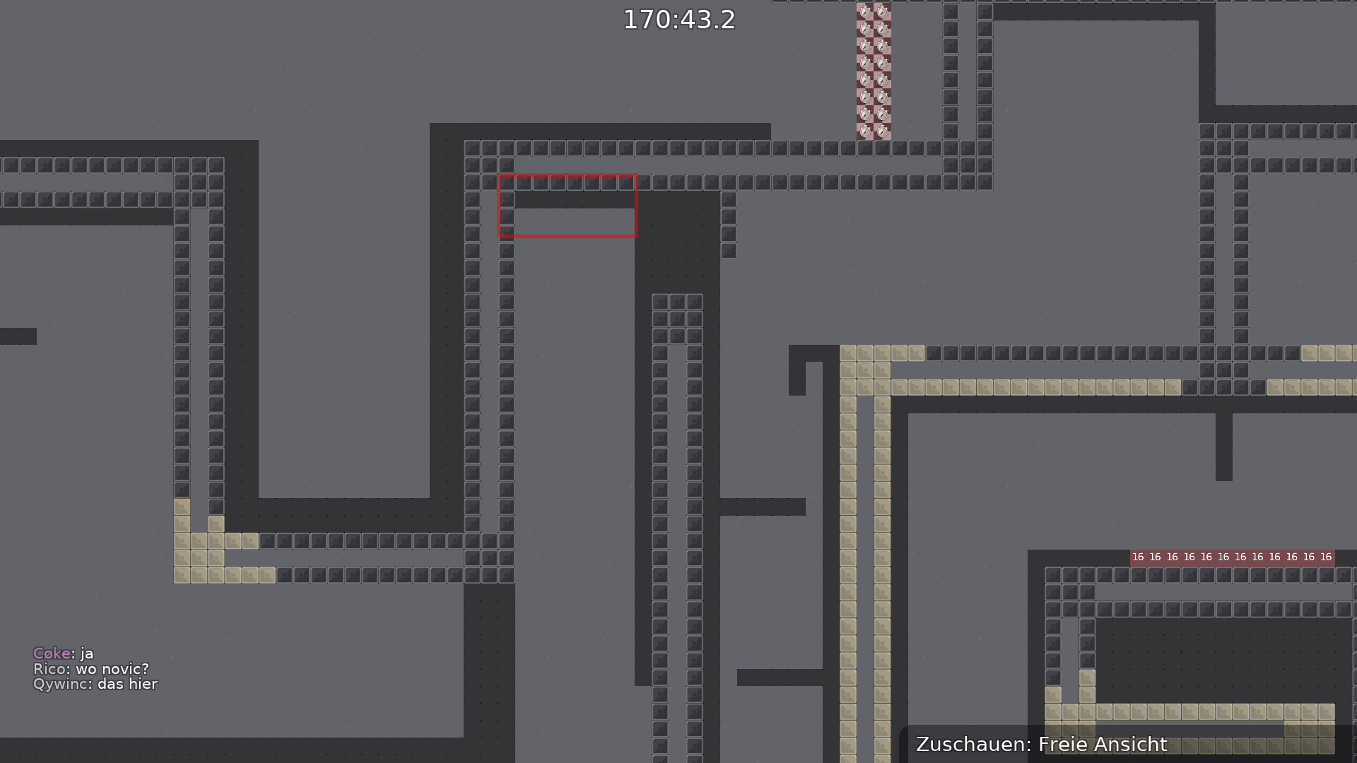
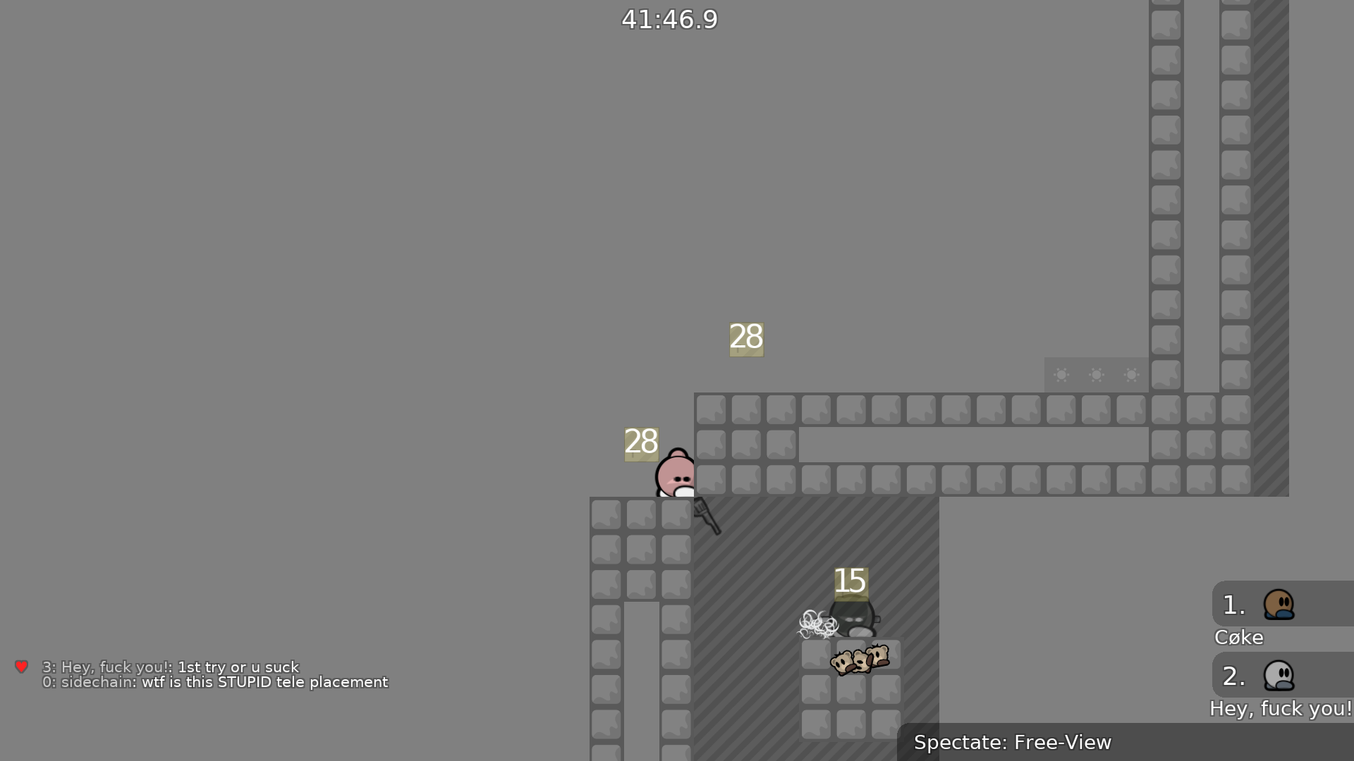
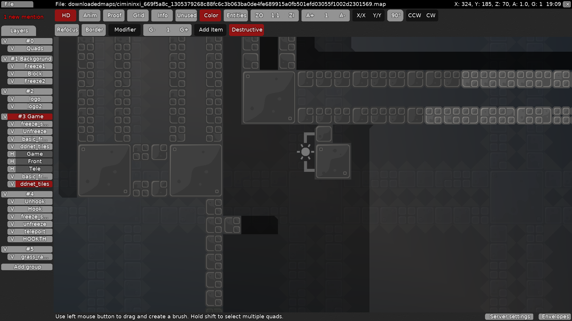
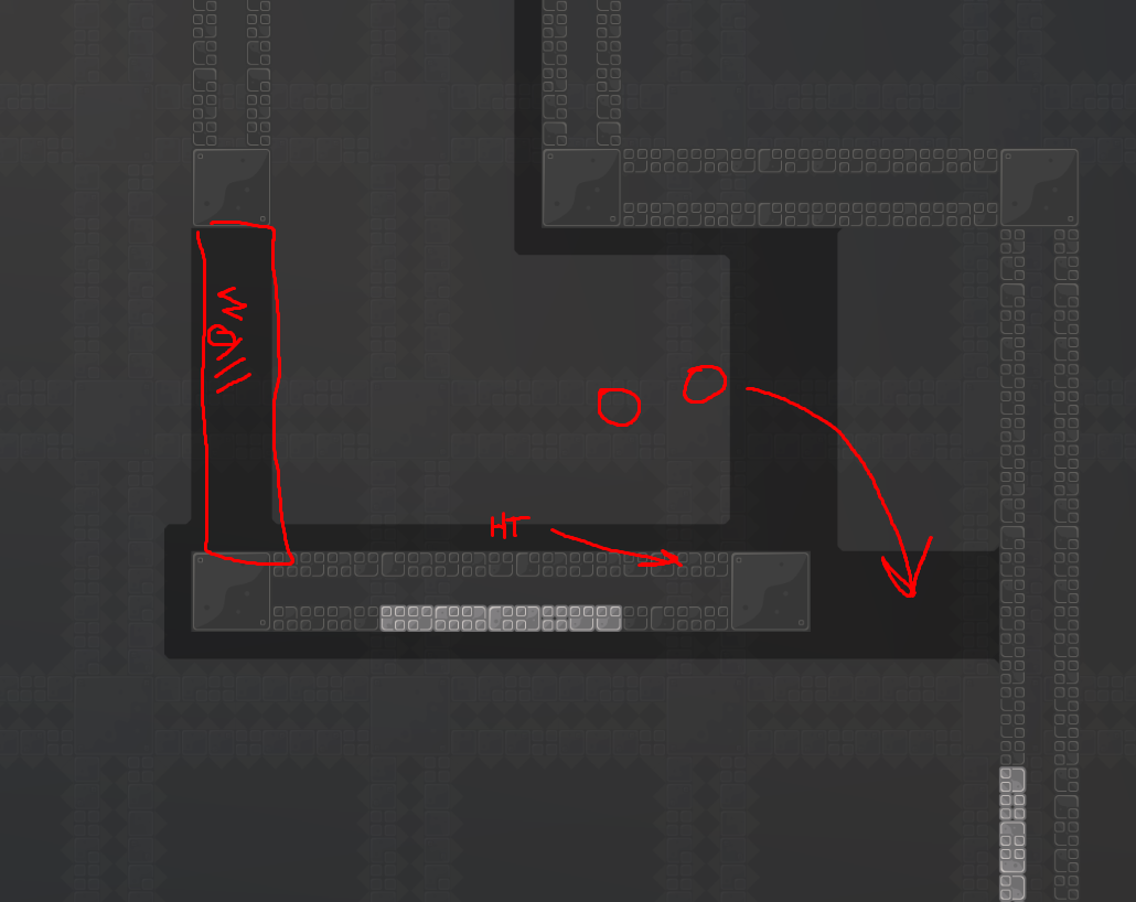
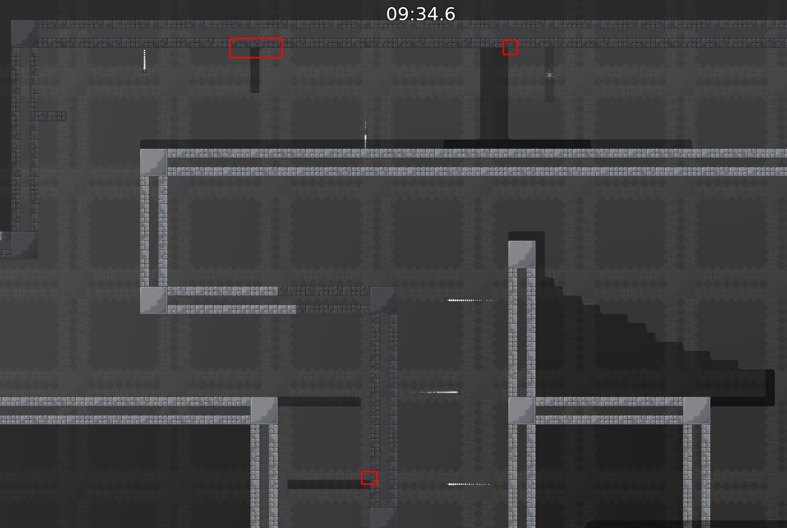
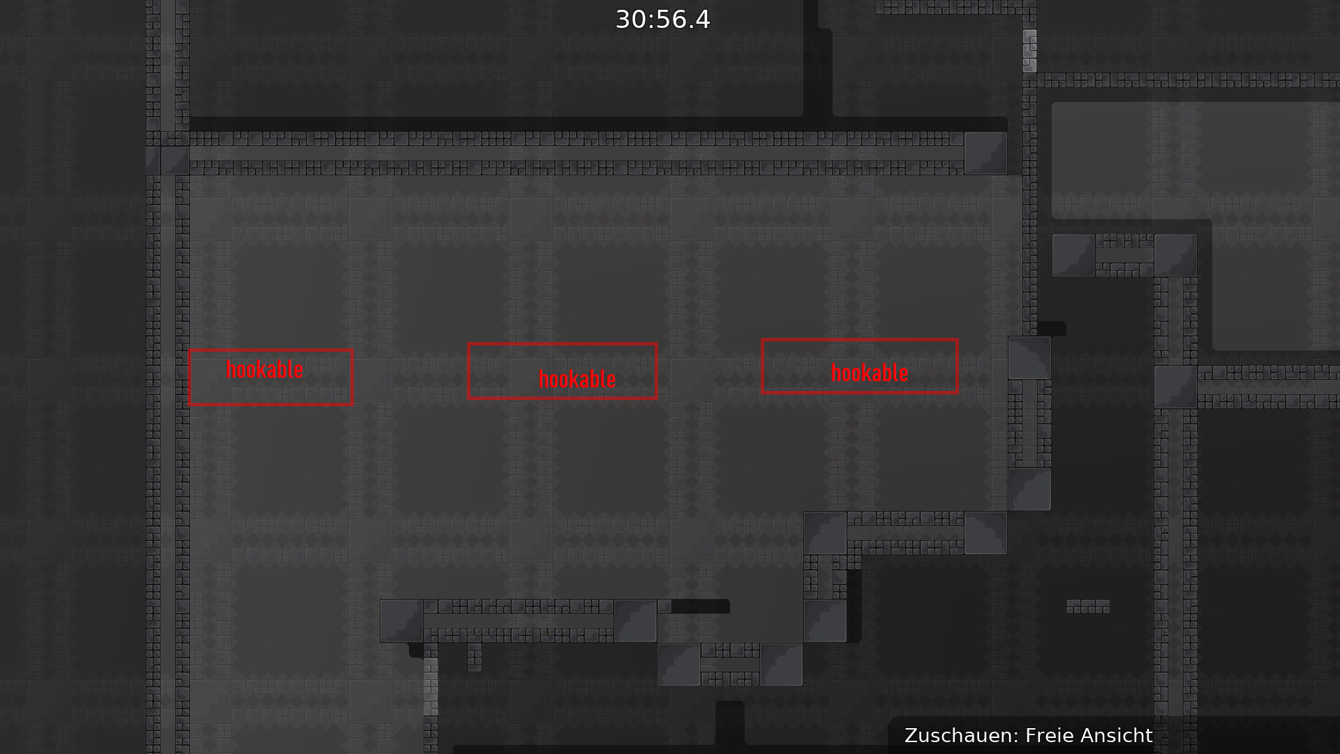
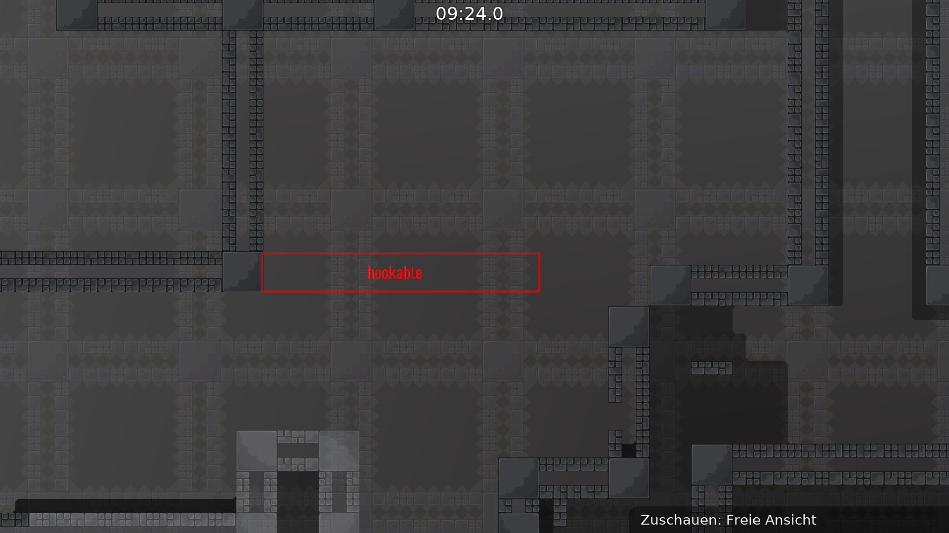
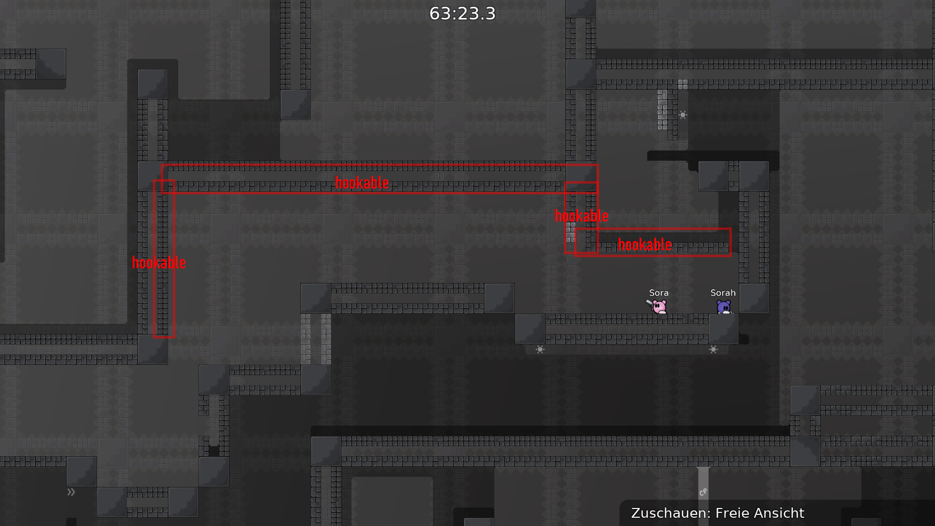
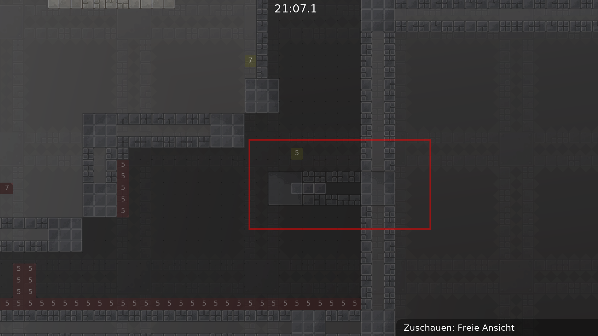
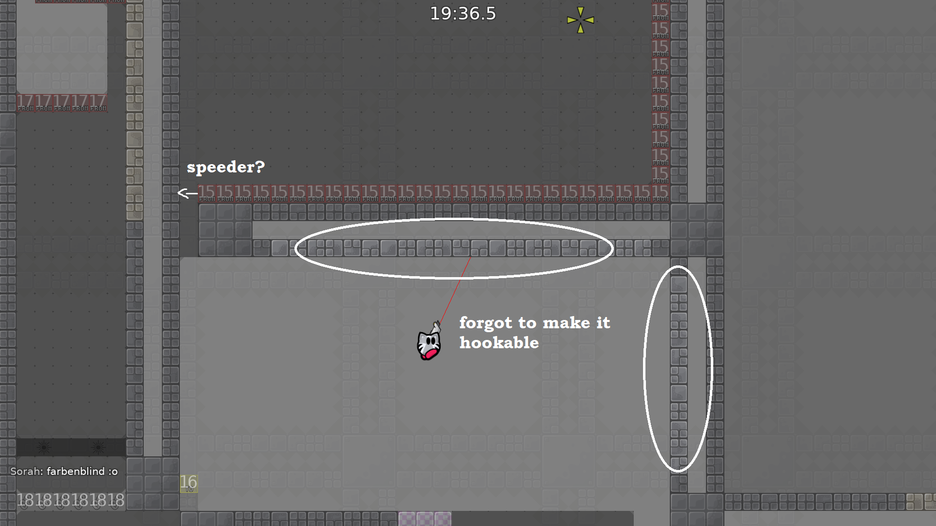
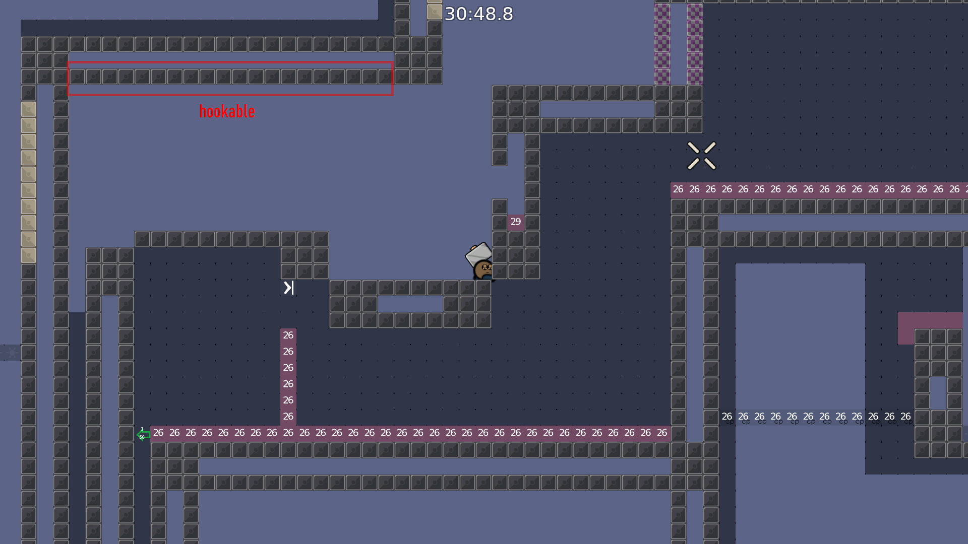
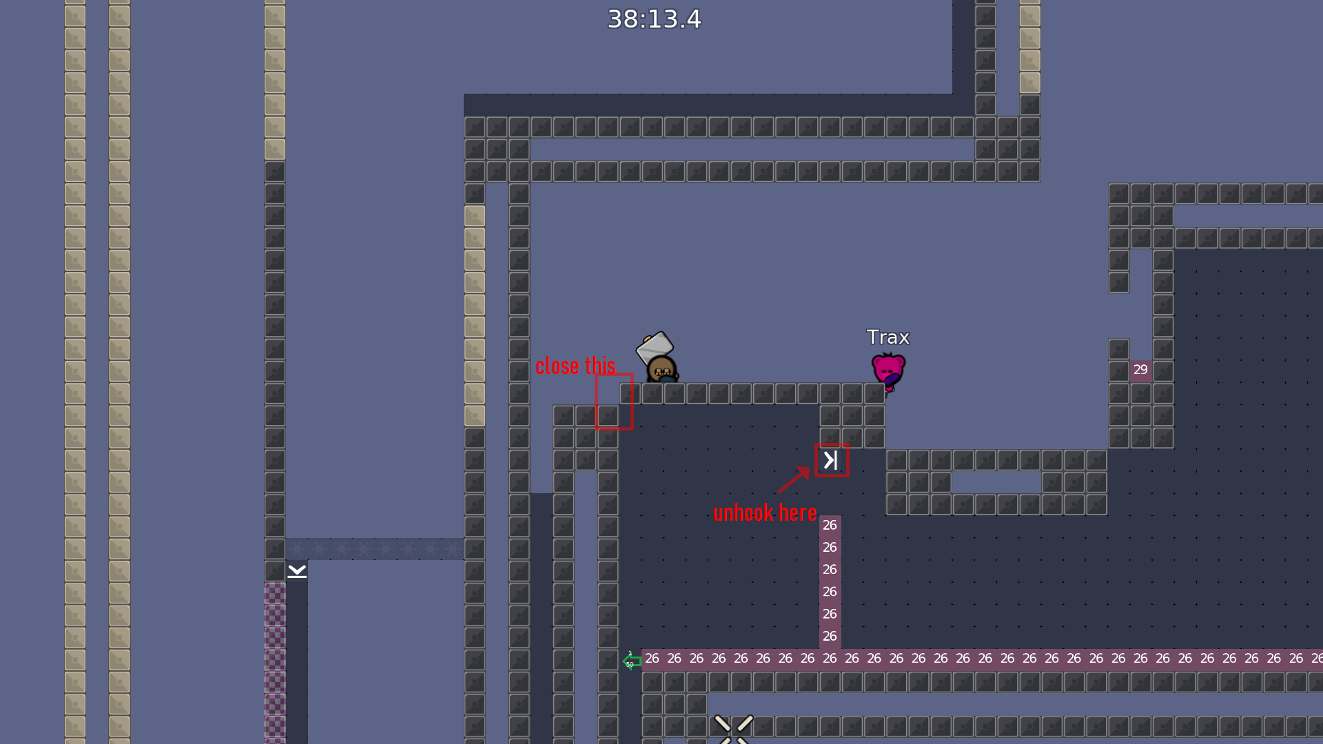
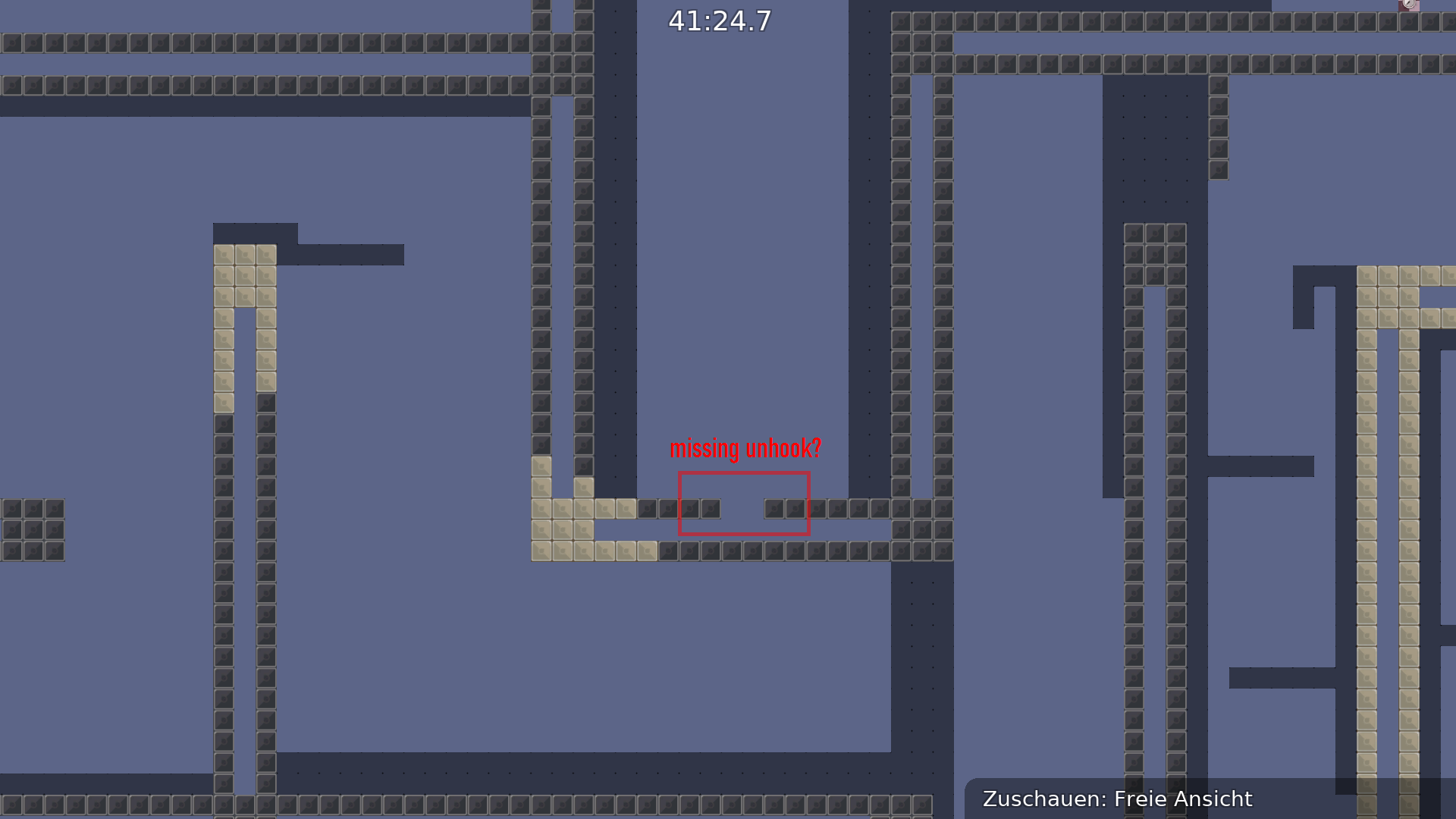
hookthrough isnt good visible to unhook, iwould change that
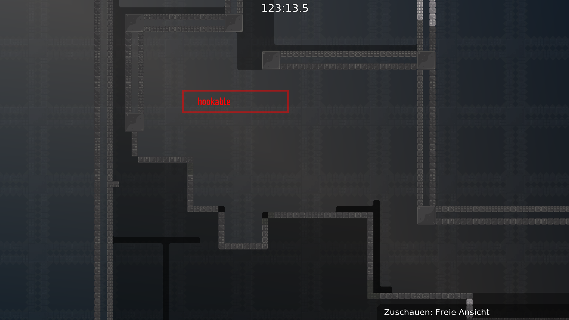
u can skip this part like that, but we think its a better way to do it, just delete this hookable for dummydrag
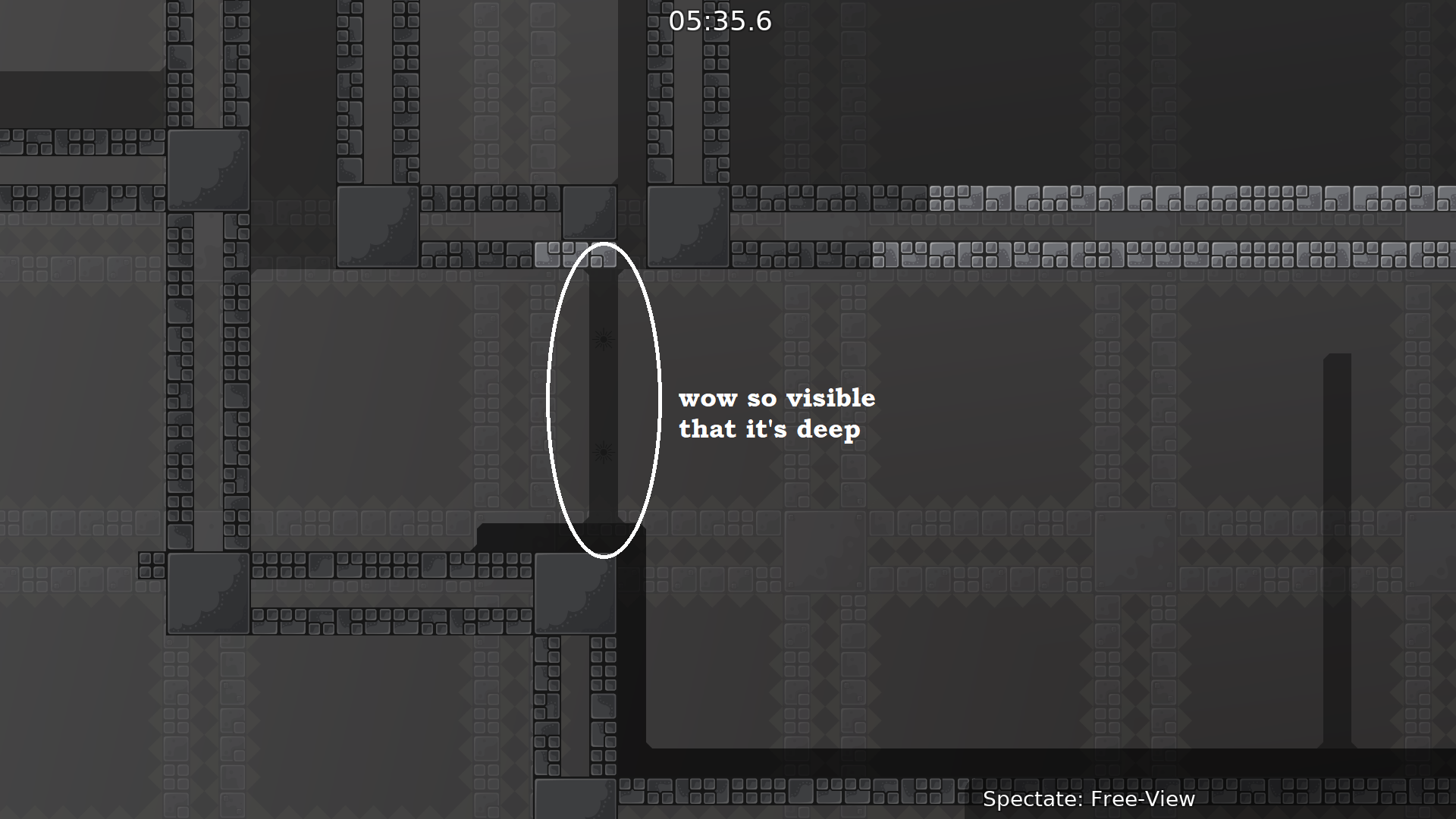
deep looks like solo
same problem in other parts
or delete it, idk
tested with
@DarkOortand
@Qywinc, not harder than brut 1*, could be mod5 except for 1 part
imagine voting this using /map
"/map cinimimxi?"
"maybe /map cinminimxi?"
ok anyways some actual feedback from me:
noobfilter should be harder
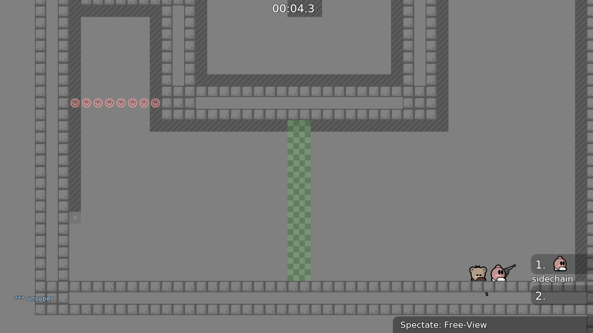
startline doesnt rly fit design
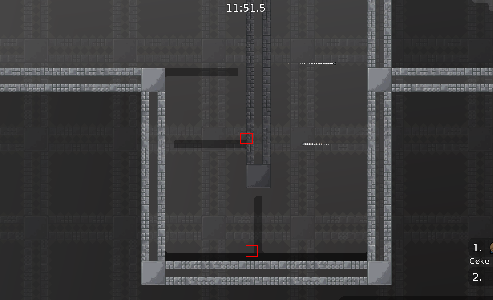
u dont need as many spawns in ur starting room
either make less spawns or just move starting room like coke said
tp 1 doesnt need to be a tile off the ground since its solo, can just be 1 tp o nt he ground
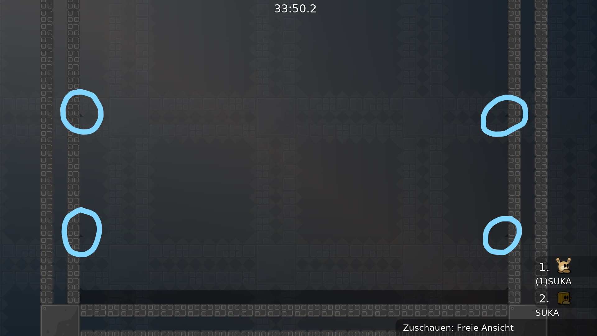
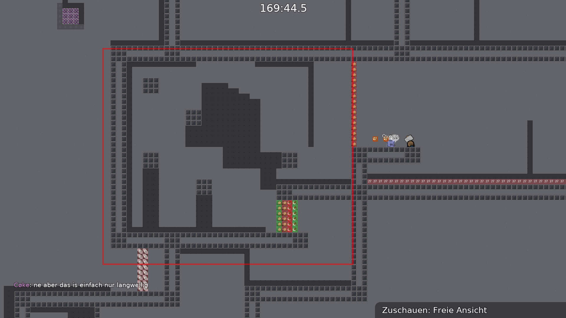
if u just remove all the freeze on the ceiling here and just start the freeze on the right side, the startline will look better in entities
brb eat
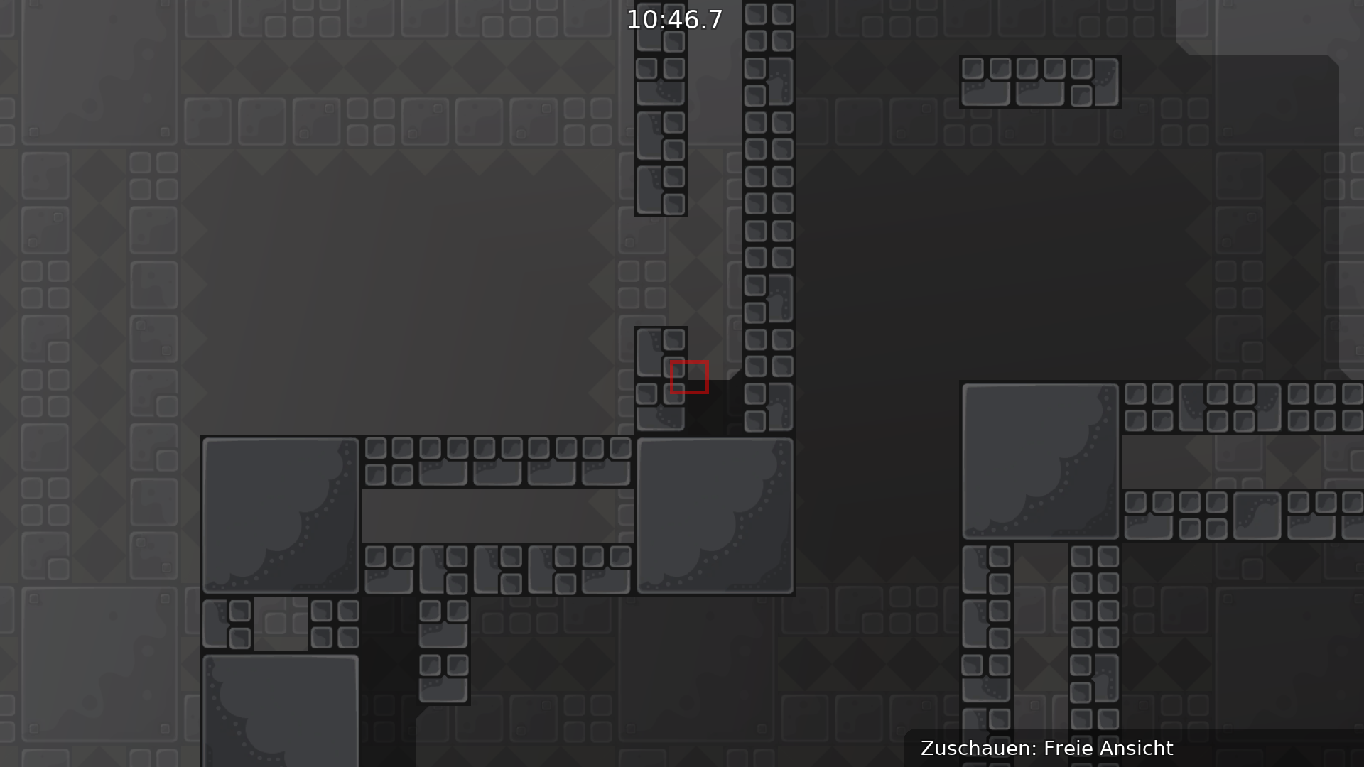
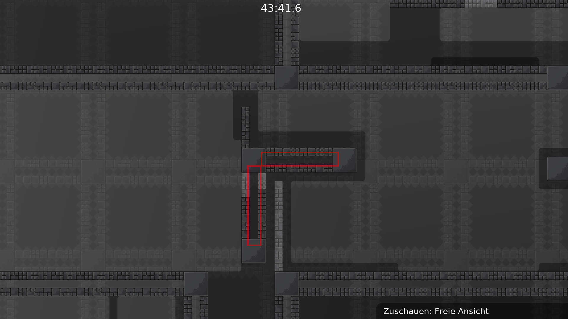
freeze in between cracks of blocks
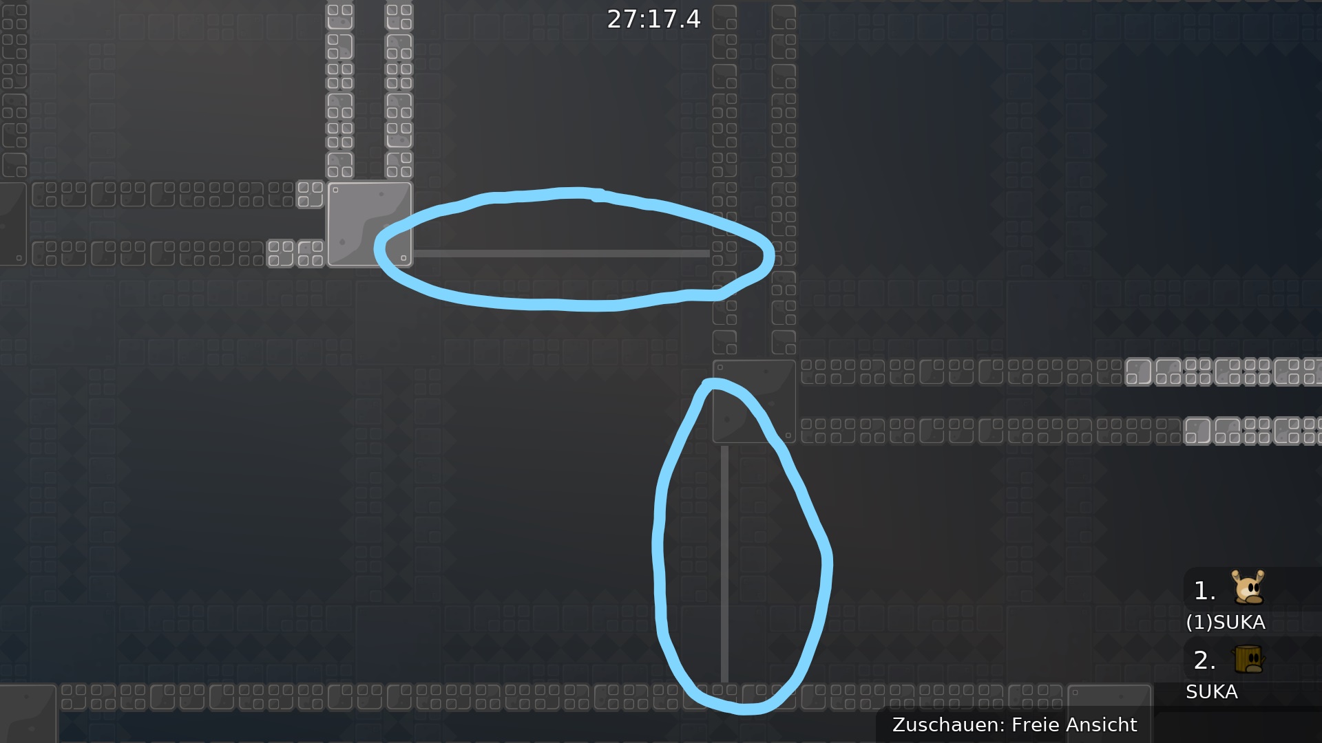
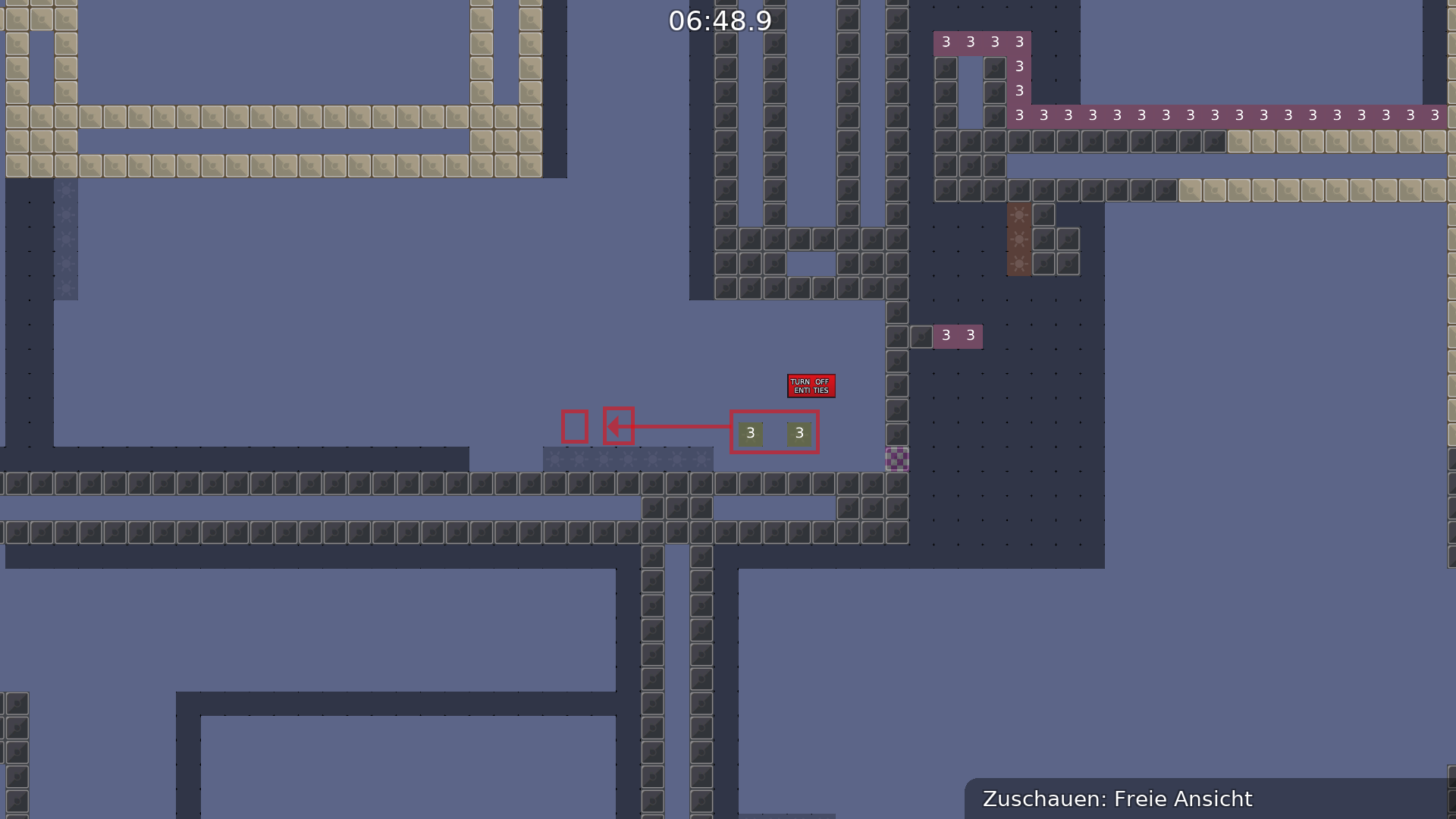
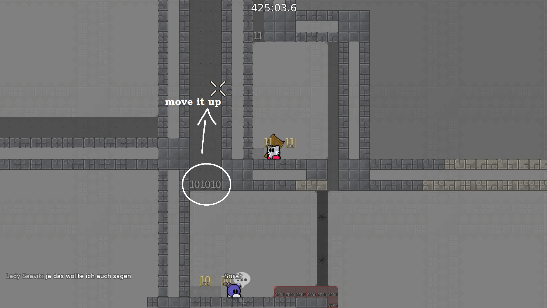
move these solos one up (for top) and one to the right (for the right)
so they are:
- centered on blocks
- you can move the unsolo with it in entities which will look better
doesnt even have to be solo btw
a solo after 1 part is honestly pretty dumb
and it's not like people will be caught up in t0
so better to just change it up
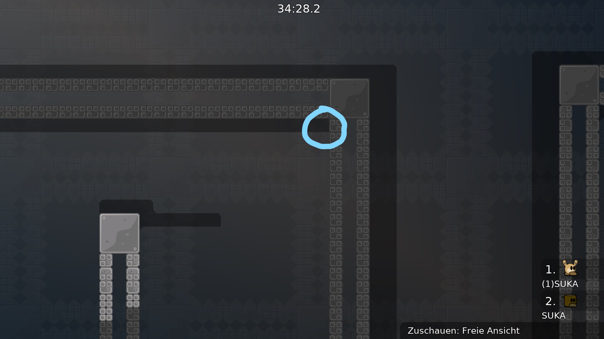
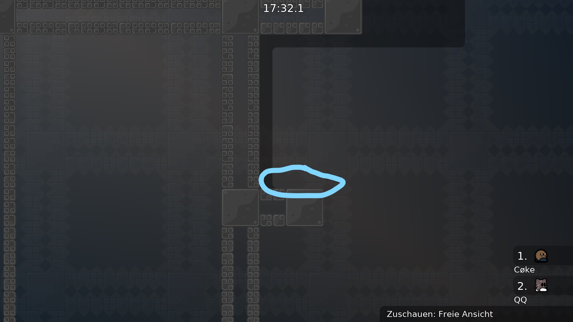
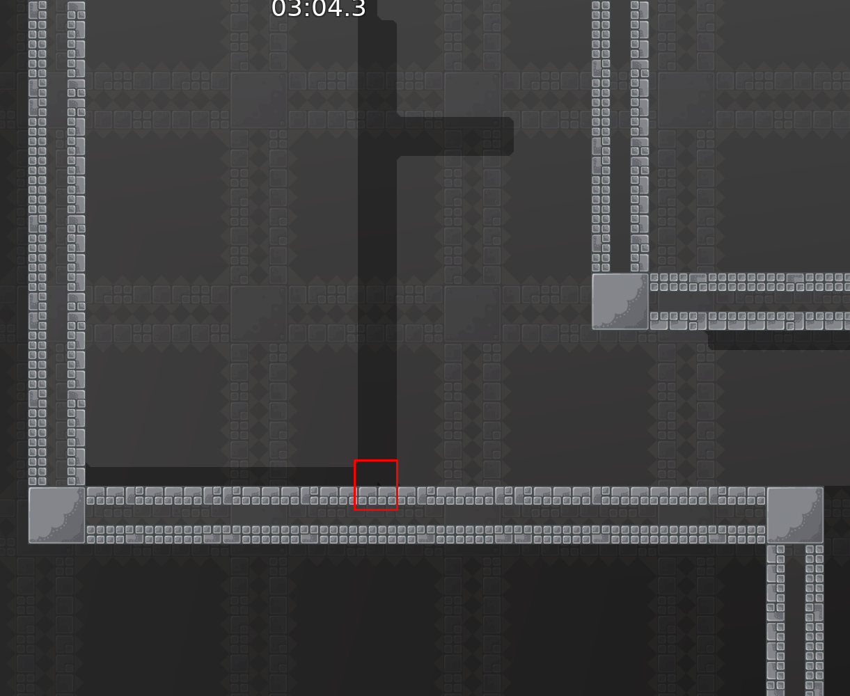
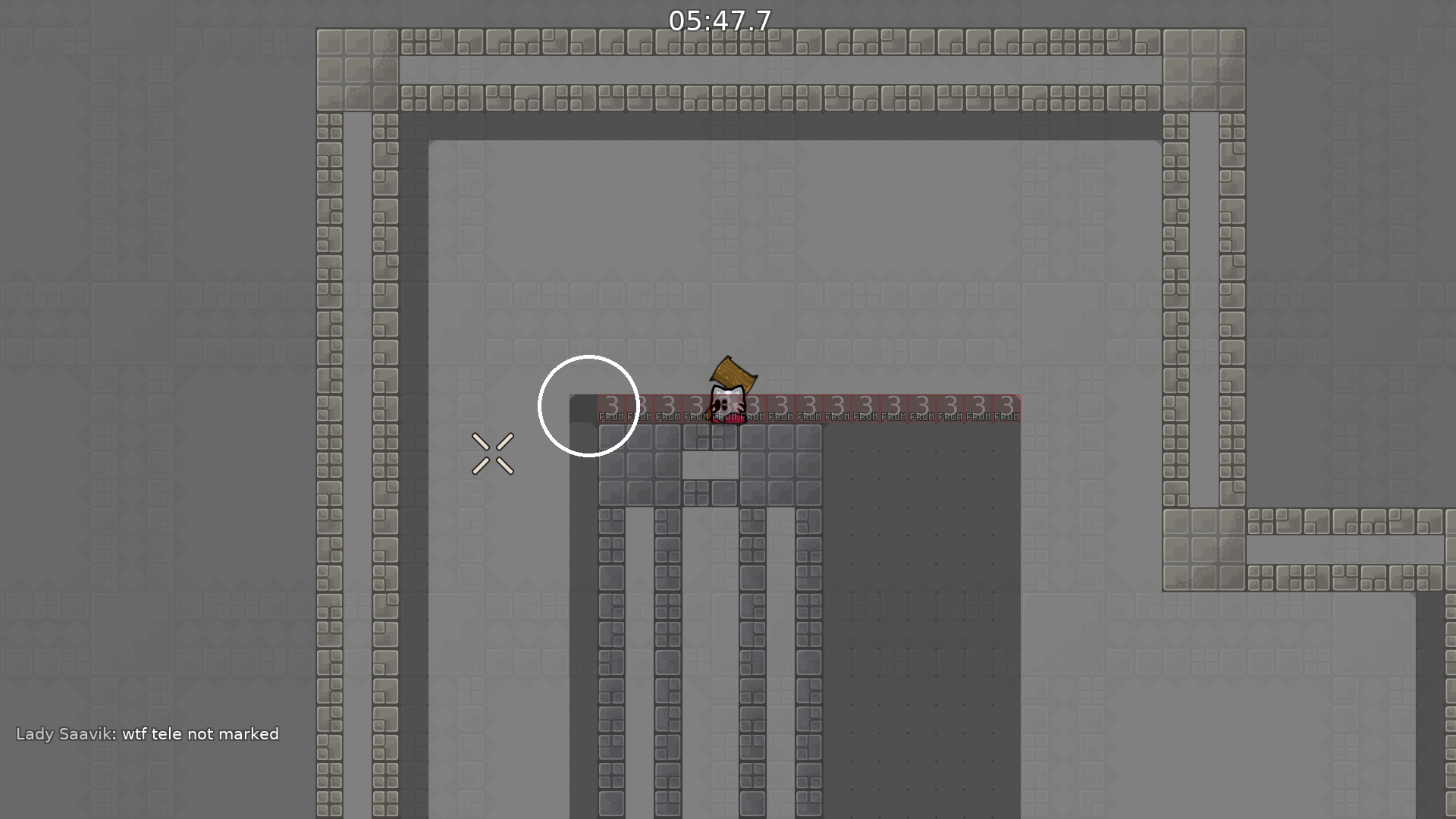
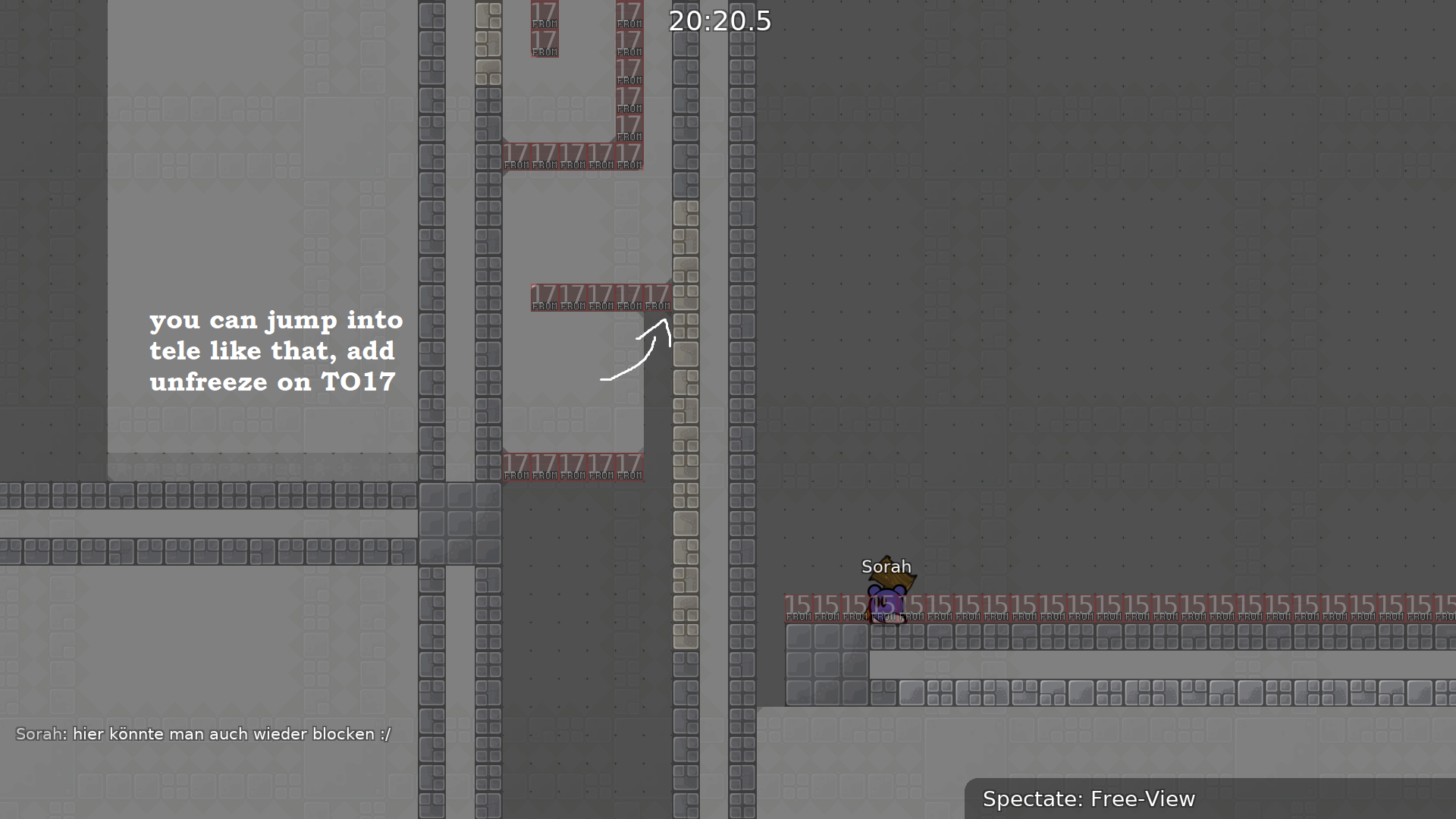
plz tele on edge
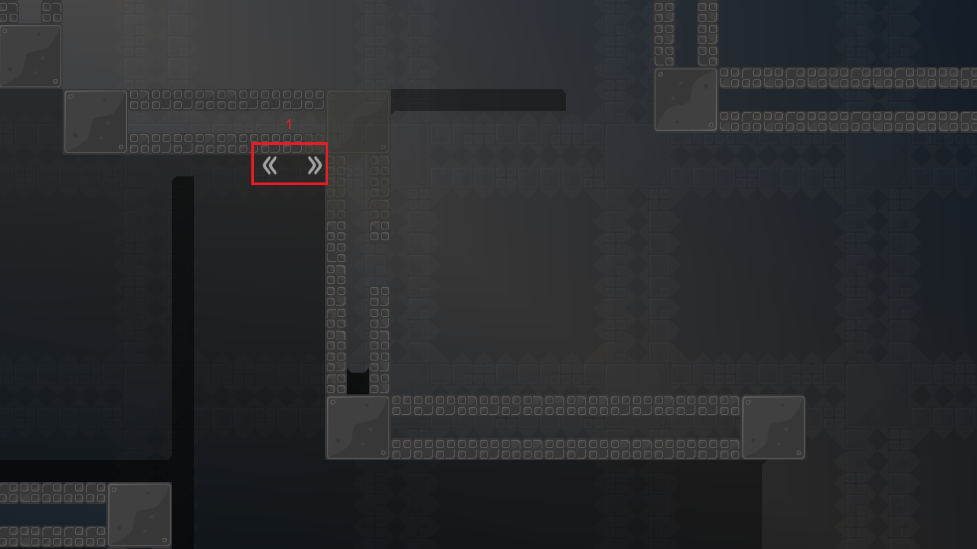
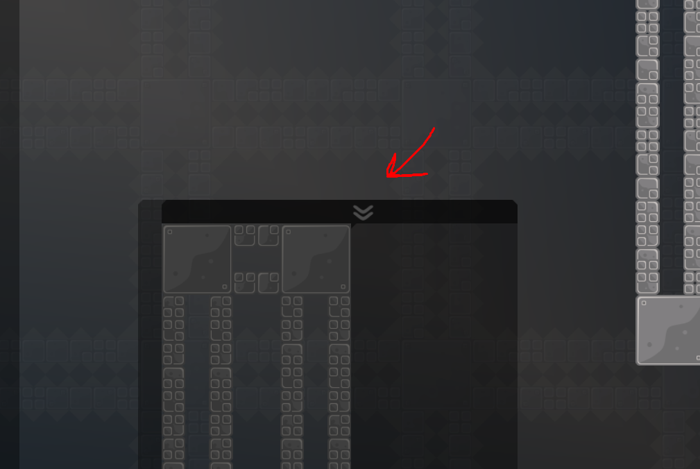
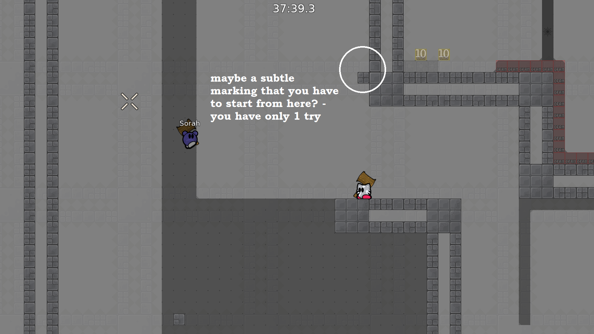
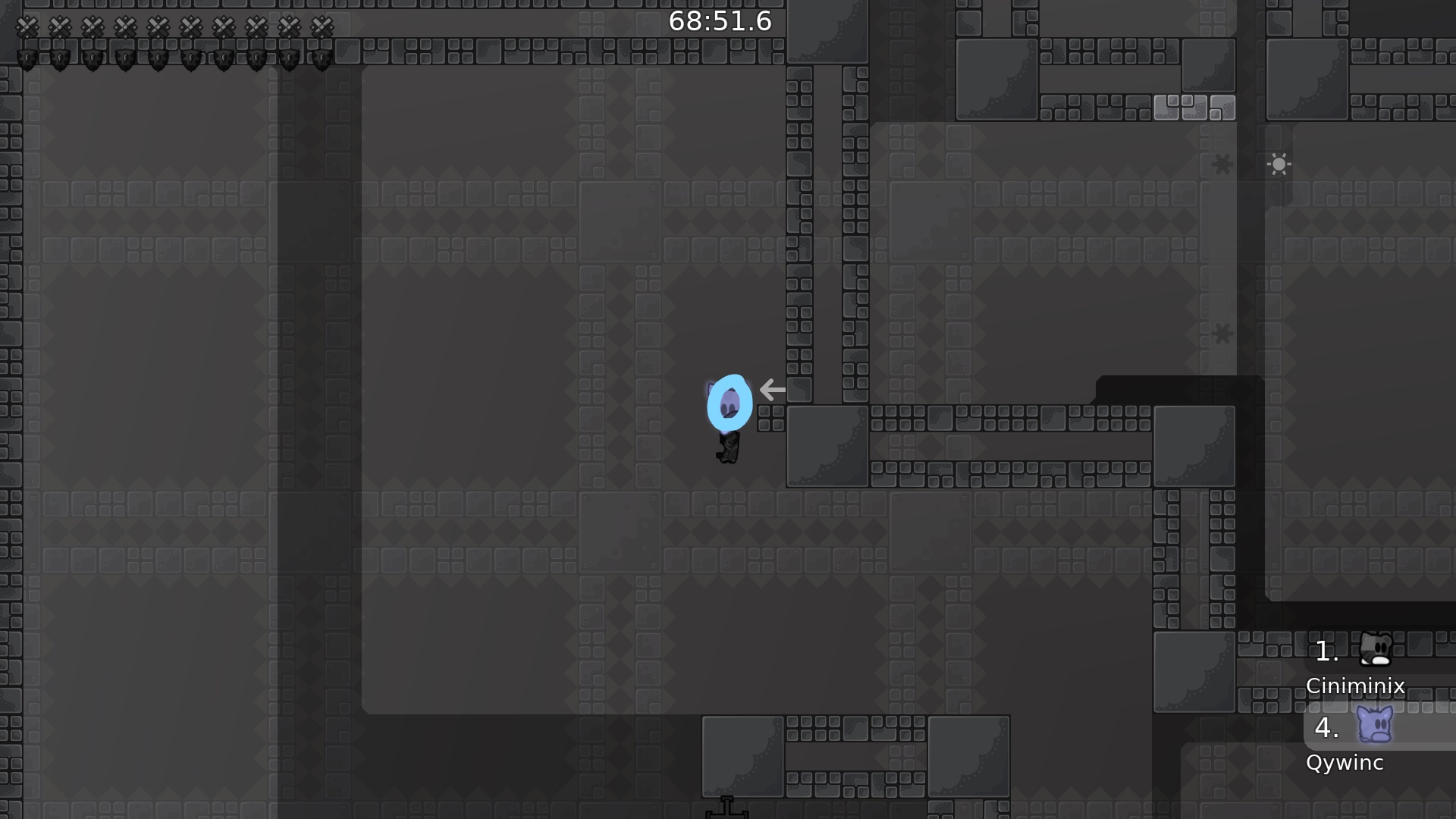
some ppl are gonna not look ahead cuz this is brutal 1* so idk make sure u like mark it with a ! mark in no entities and maybe have smth similar in entities i'd say
pointless hookthru if rest of map is faily tbh
also u need more contrast damn
make the hookthru lighter plz
u can do shift enter so u dont have to spam maybe
https://discordapp.com/channels/252358080522747904/712424701682647110/713173696726040599 disagree thats not a reason to mark smth i guess
its their own fault
u have notifications on for this channel or smth? lmfao
f4 Qywinc, u cant expect everyone to spec ahead on a fairly simple map like this
part is unbalanced/needs fixing
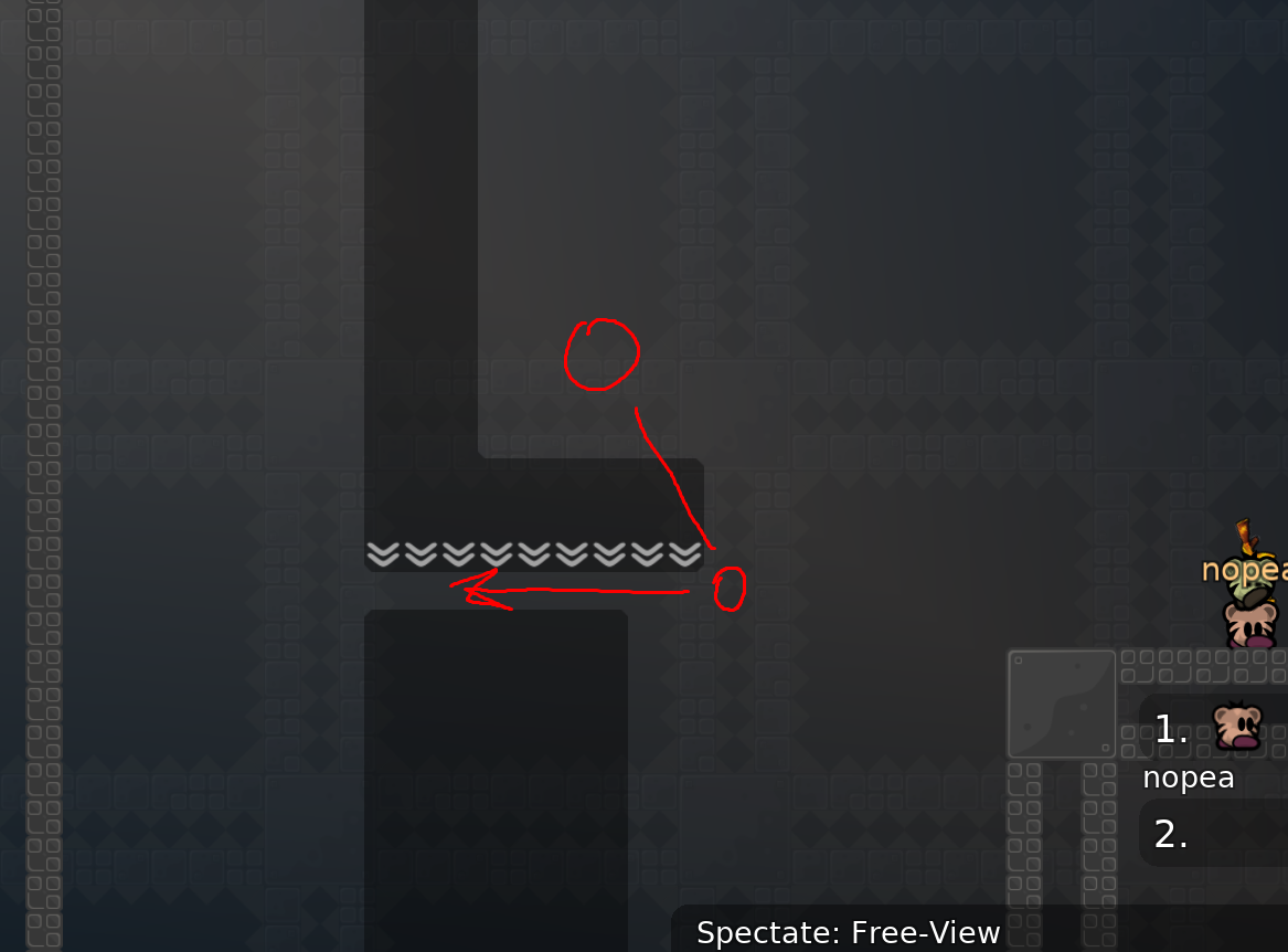
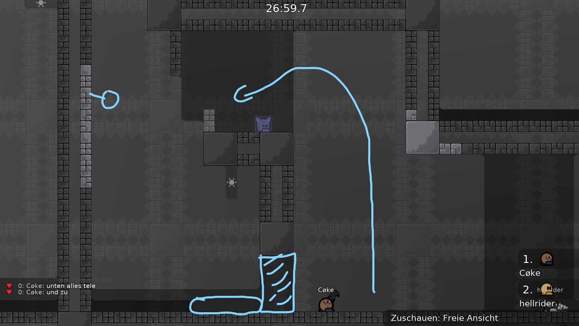
either remove the freeze on the top so the player who gets hit doesnt get frozen
or add hookable plz
so the person who hits can easily go left
you know what they do if they see the mark? They spec the map! So its kinda the same thing <.<
yeah so if u add a mark they will spec the map which is goo
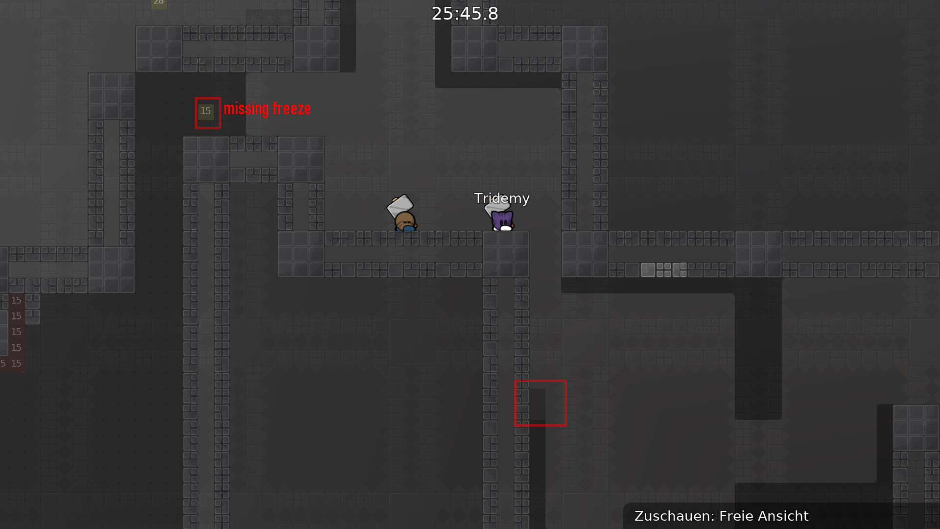
design broke
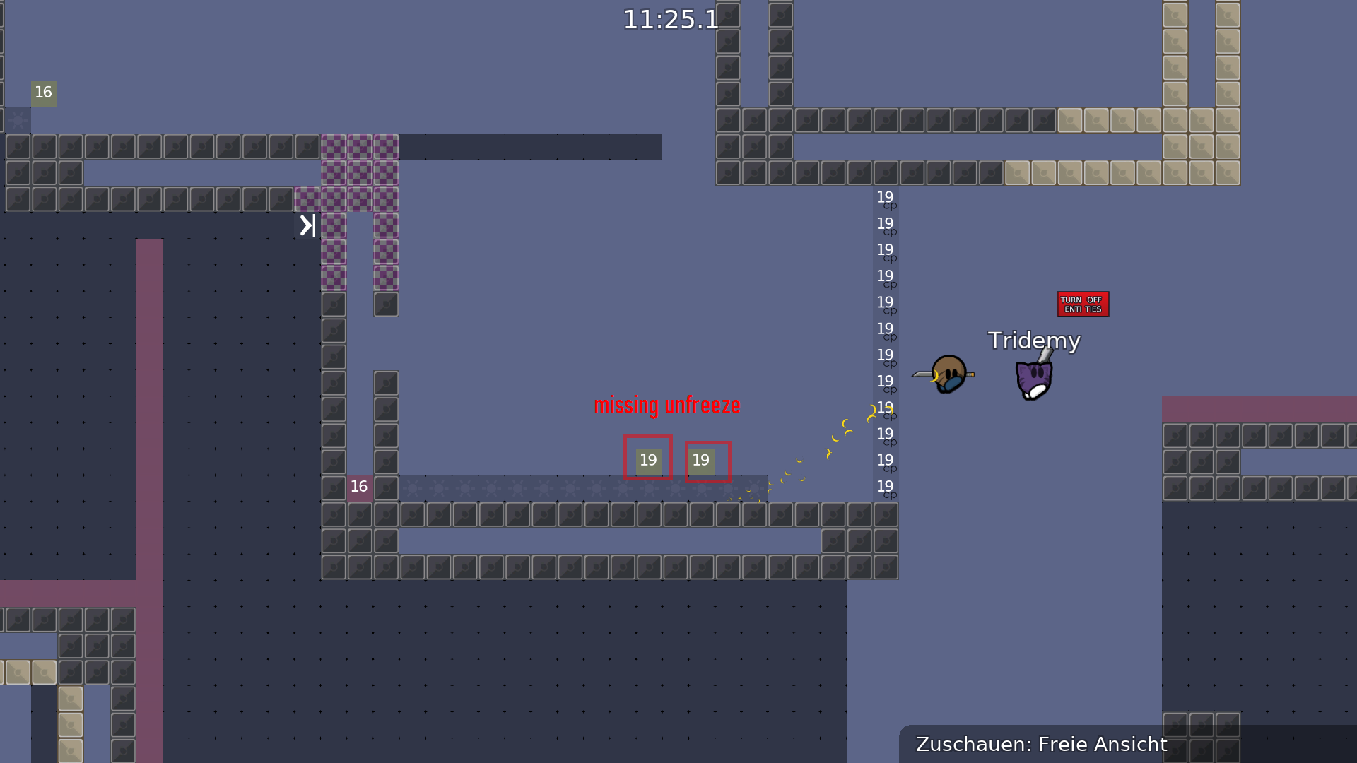
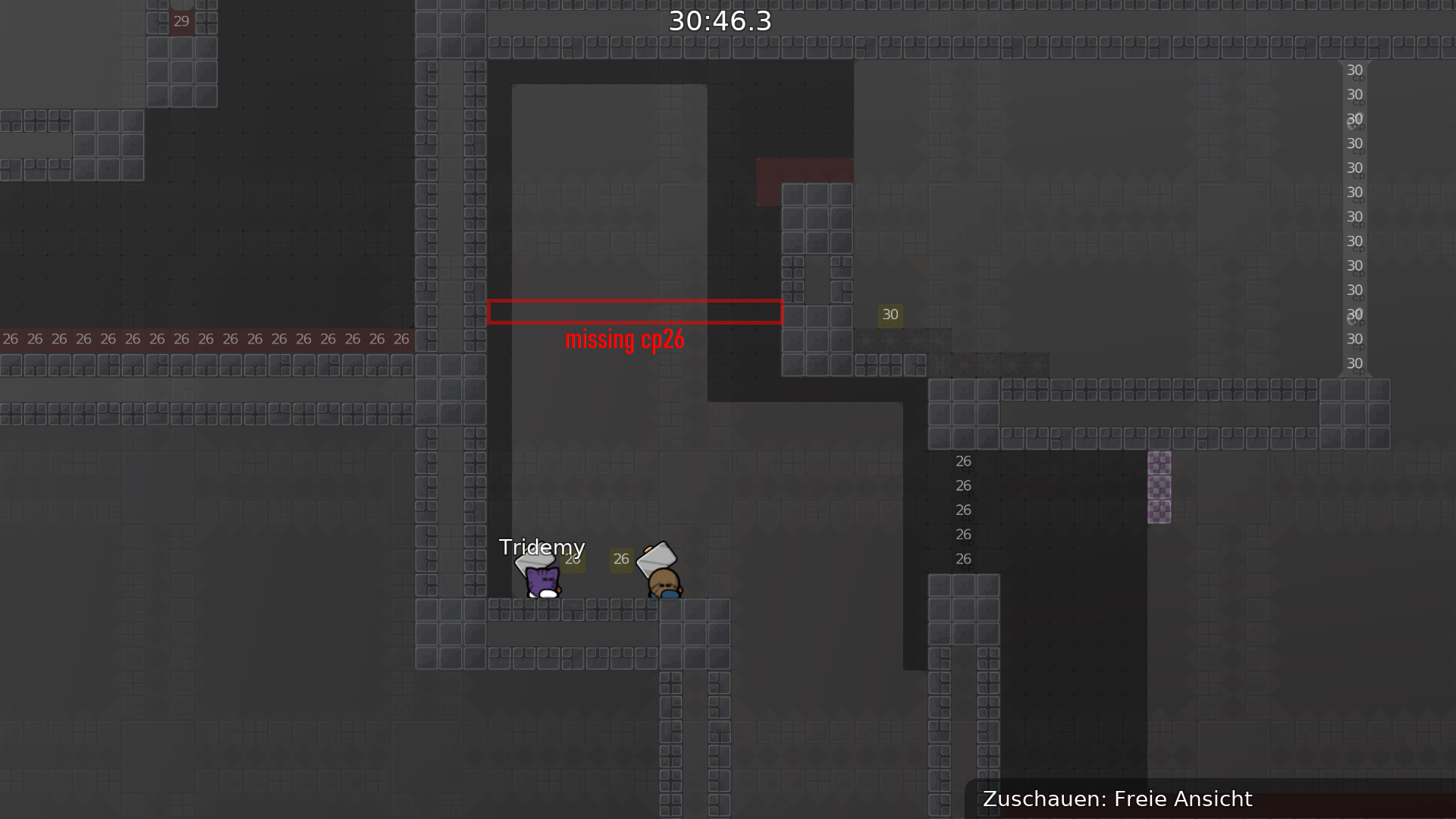
cp 19 is kinda tedious cus it teleports u all teh way back so maybe add cp 20
change cp 19 to cp 20
and change tele 20s to cfrm
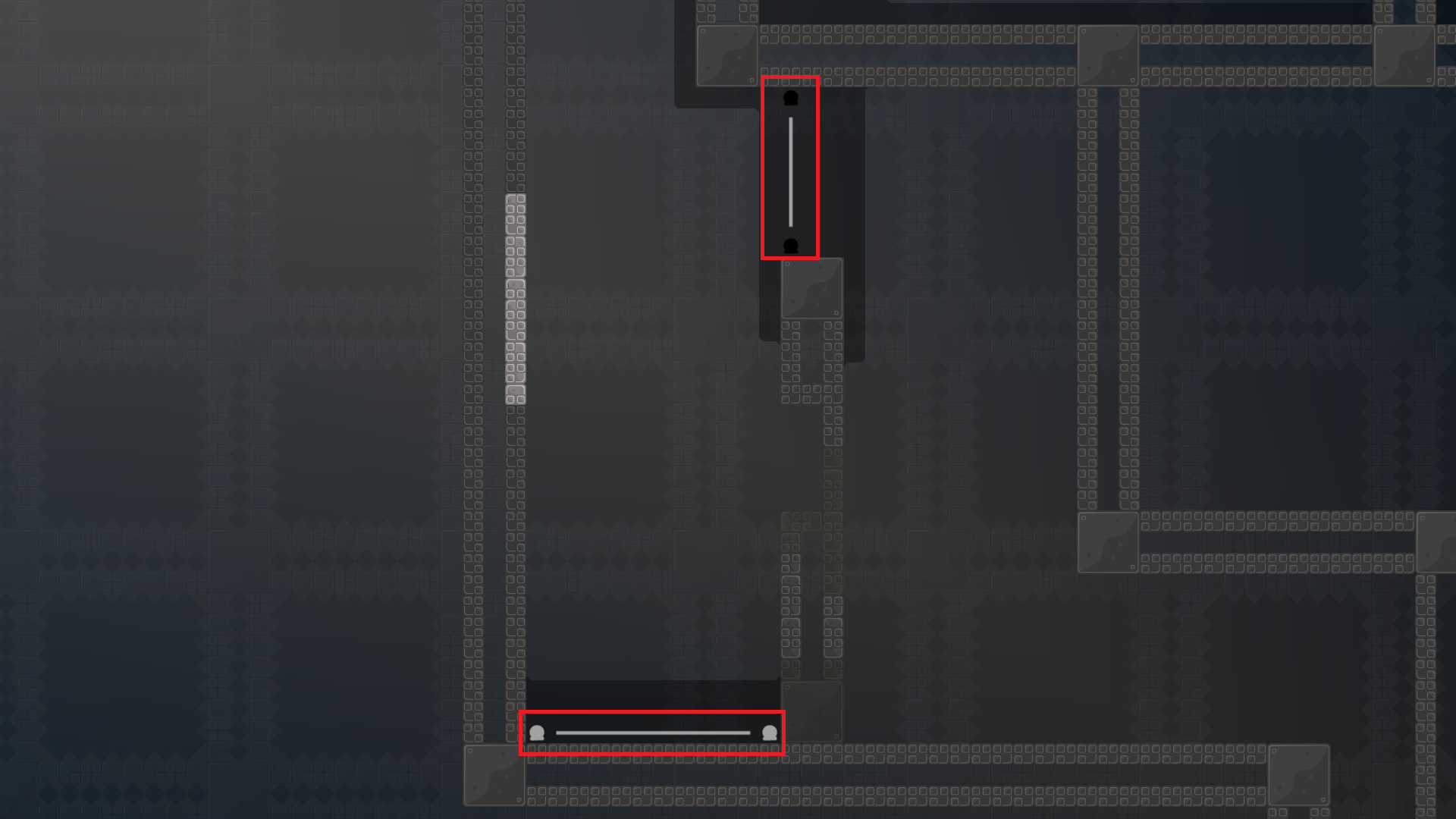
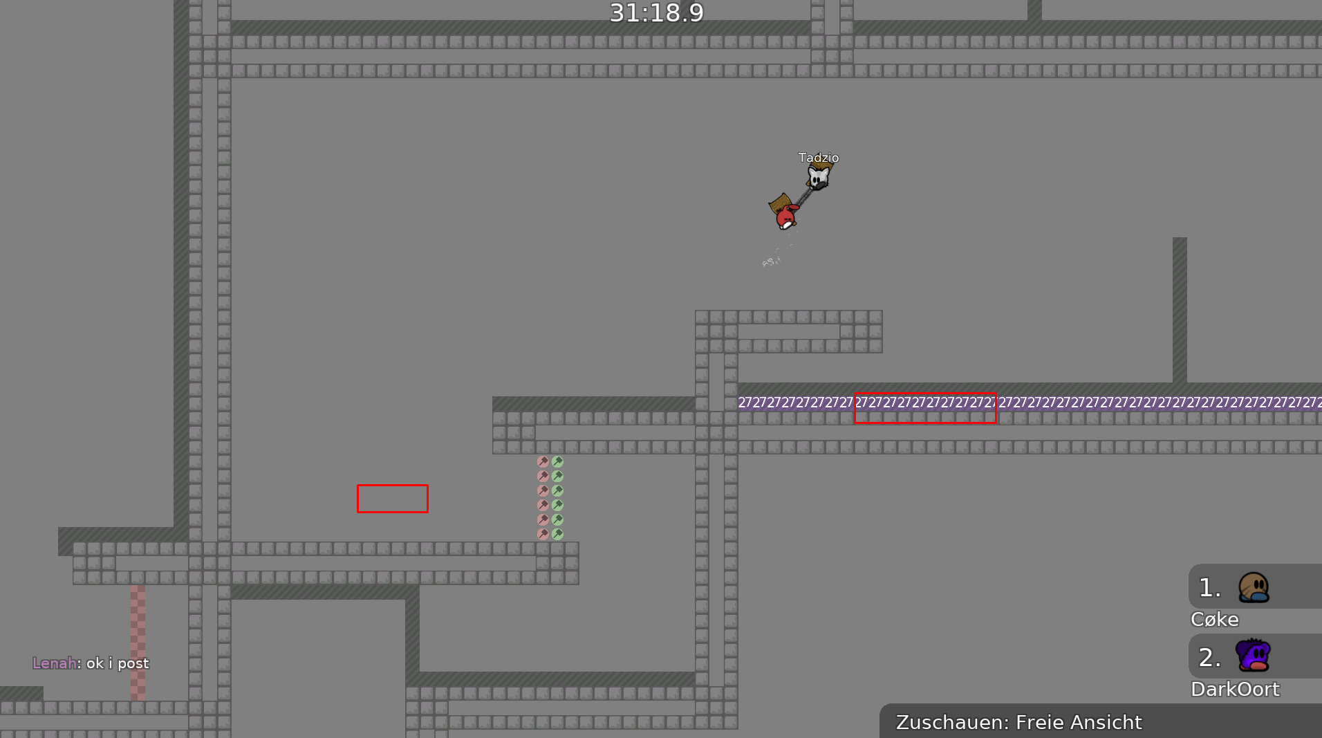
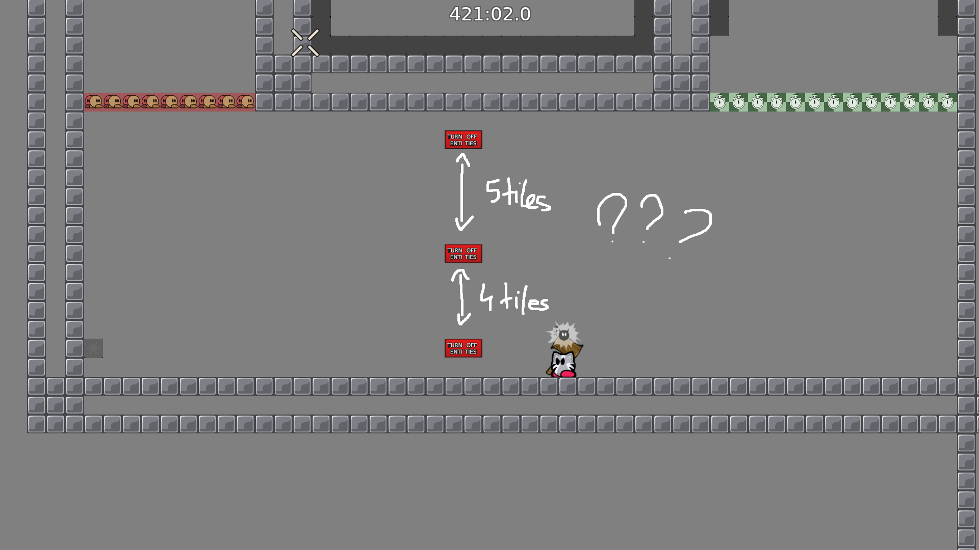
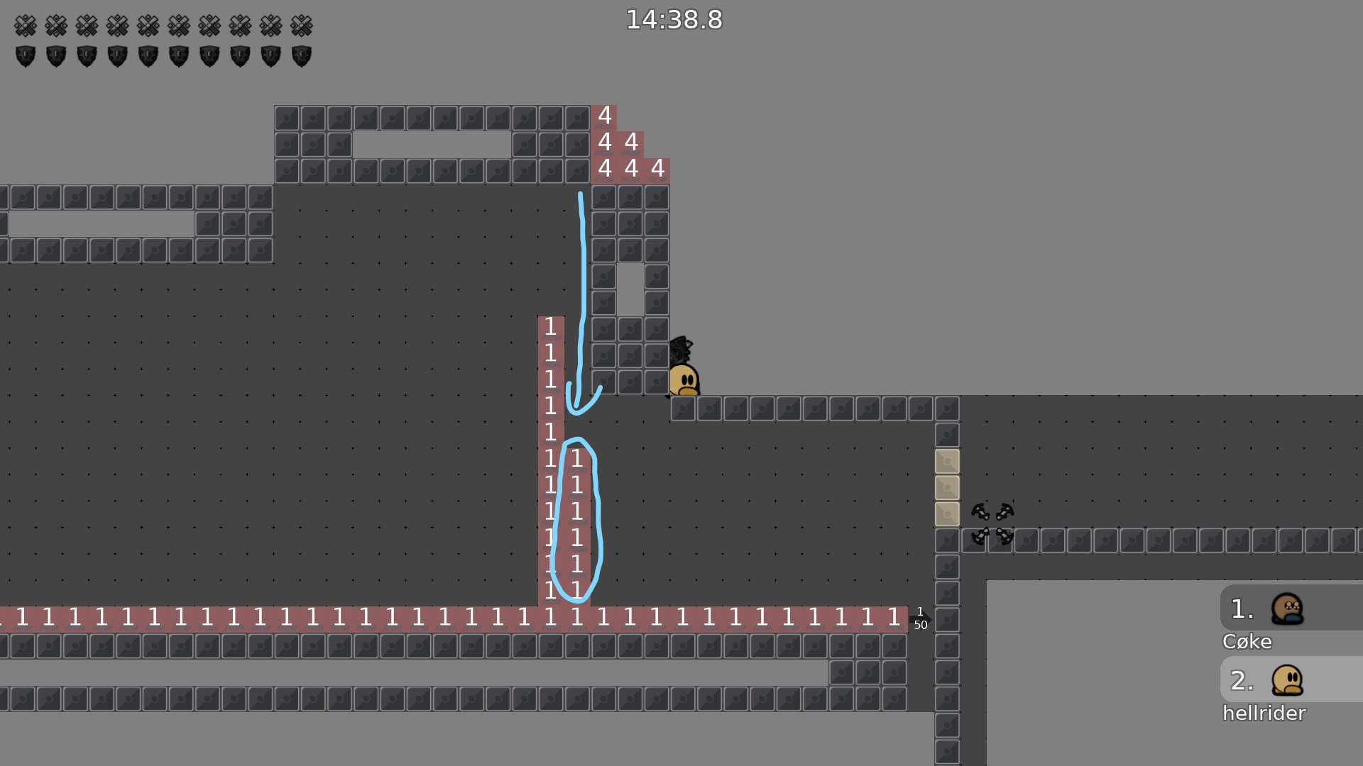
just use one tele 28, not like 2 people will go to the back tele at the exact same time
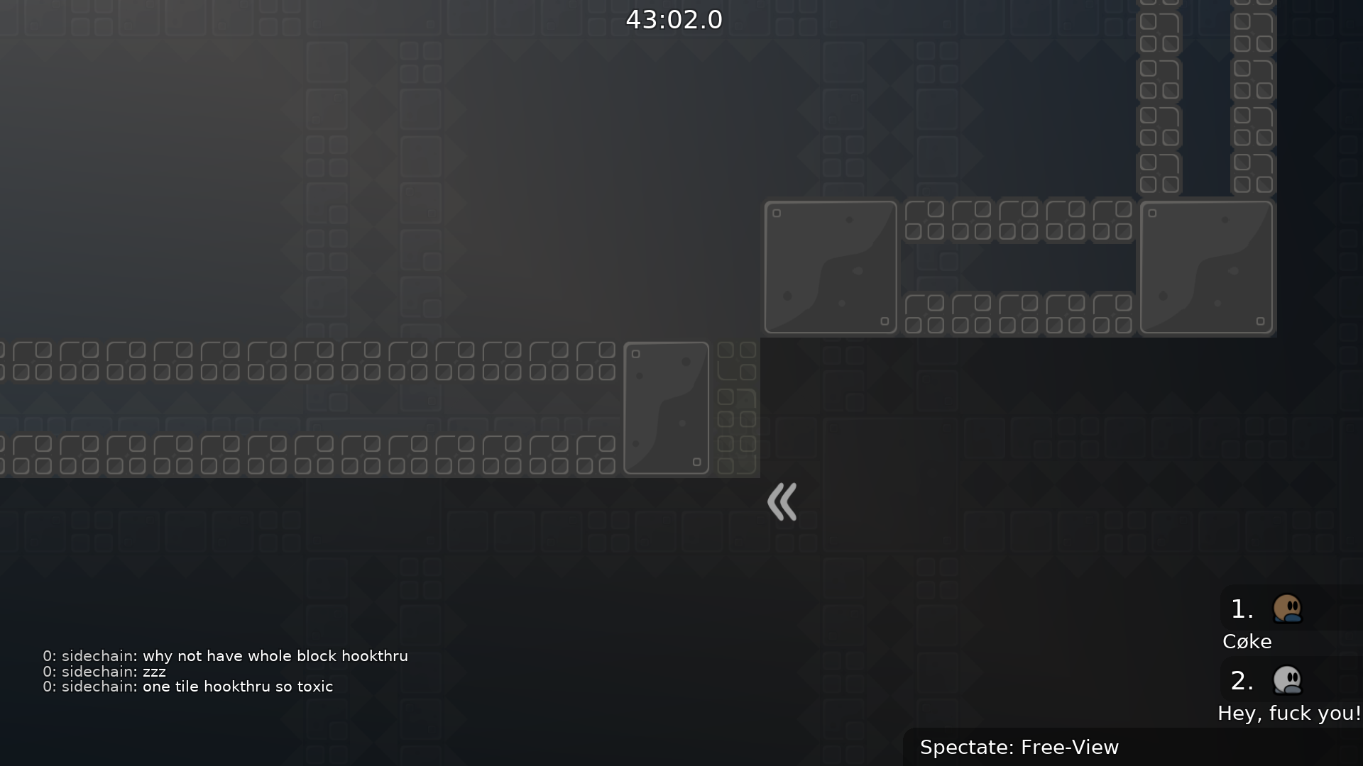
toxic hookthru imo
better if whole block is ht
another advice: if u have 5 suggestions for every part maybe test with mapper directly so u dont need to spam and mapper doesnt have any overview of this
no thats too much effort
again, only 1 tele needed
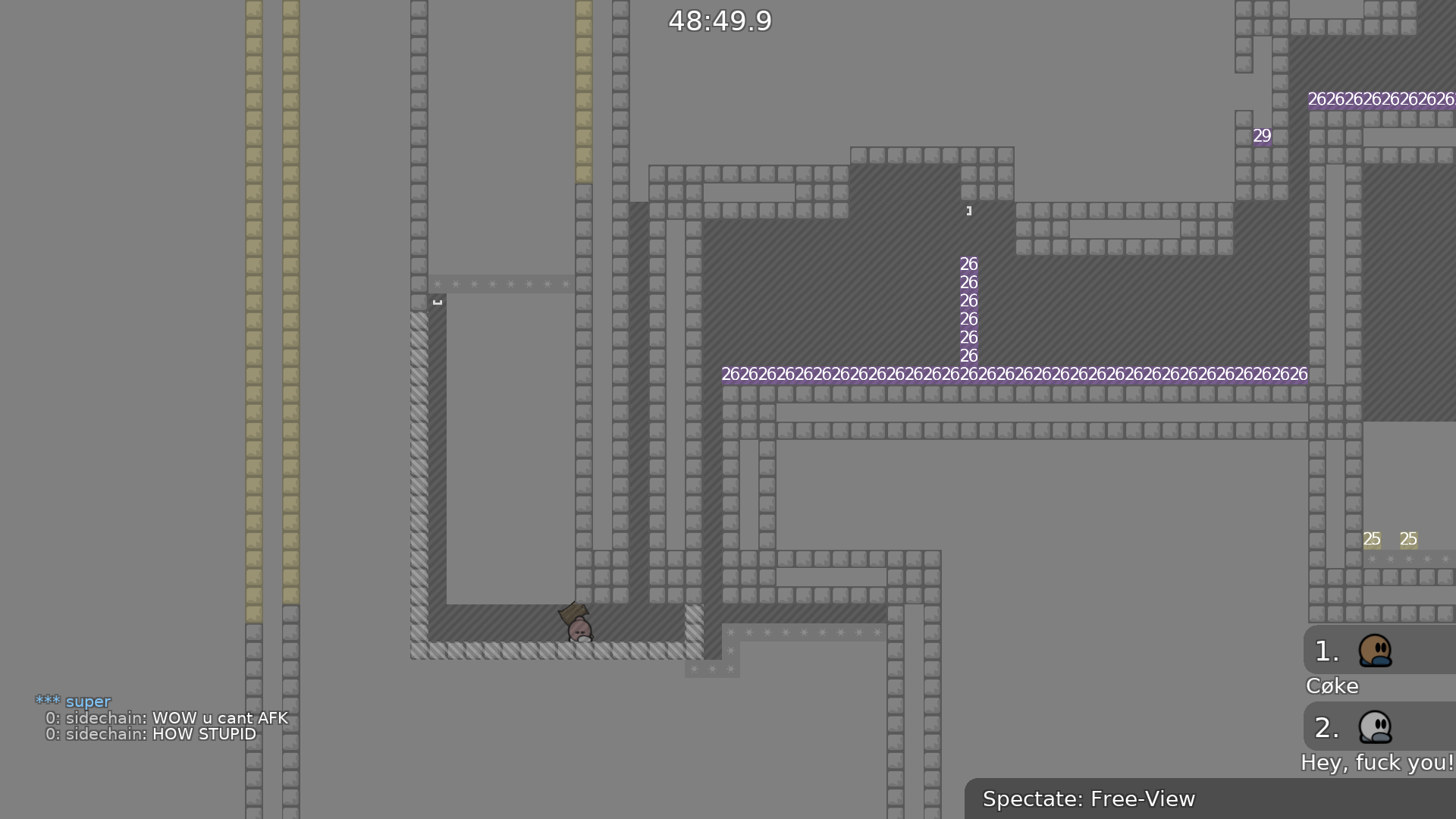
reeeee antiAFK
u can just cheat this part in 20 different ways
2*
walling and just hover hook ur dummy under the freeze column thingie
ok rest of map is good
design problems too tho
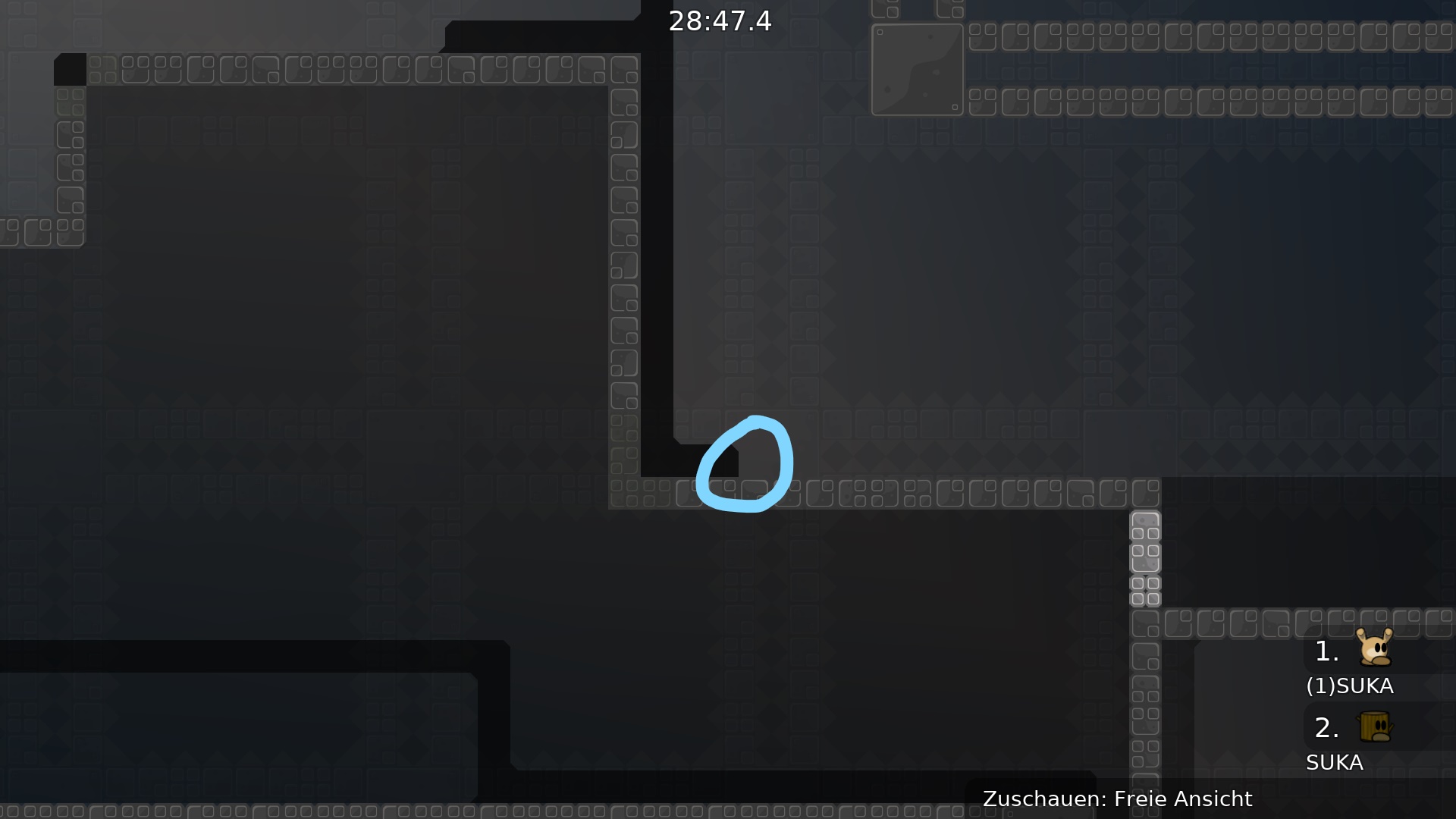
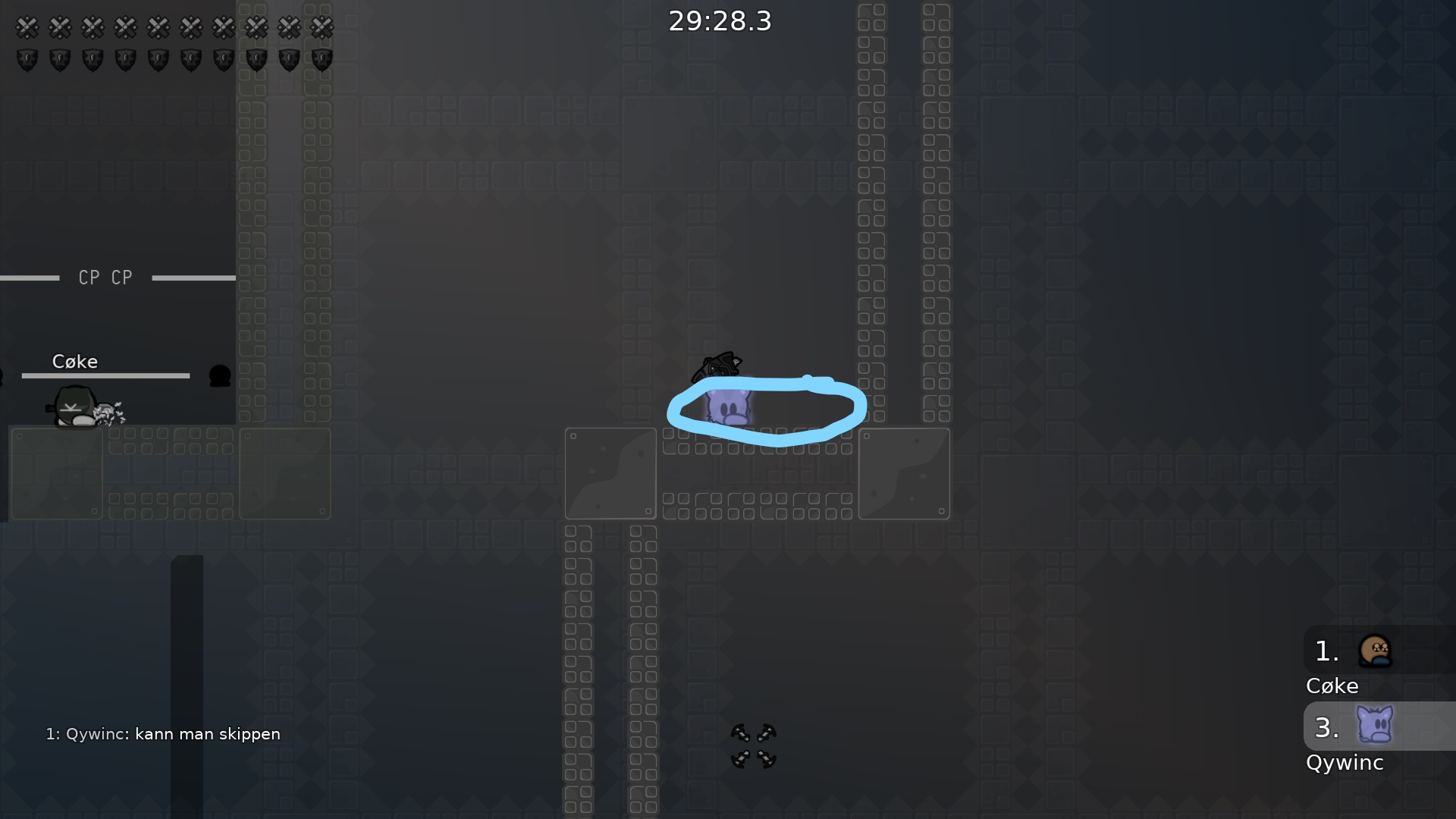
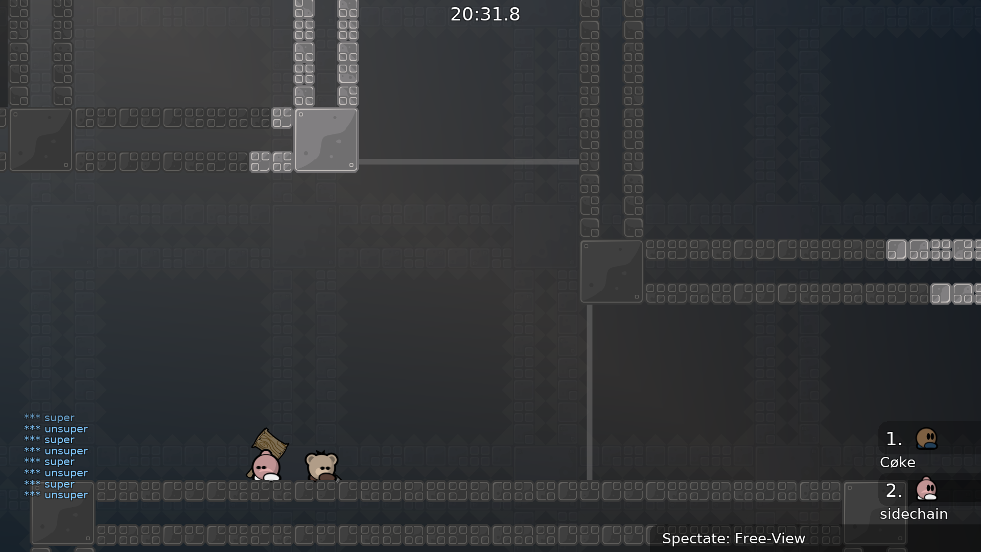
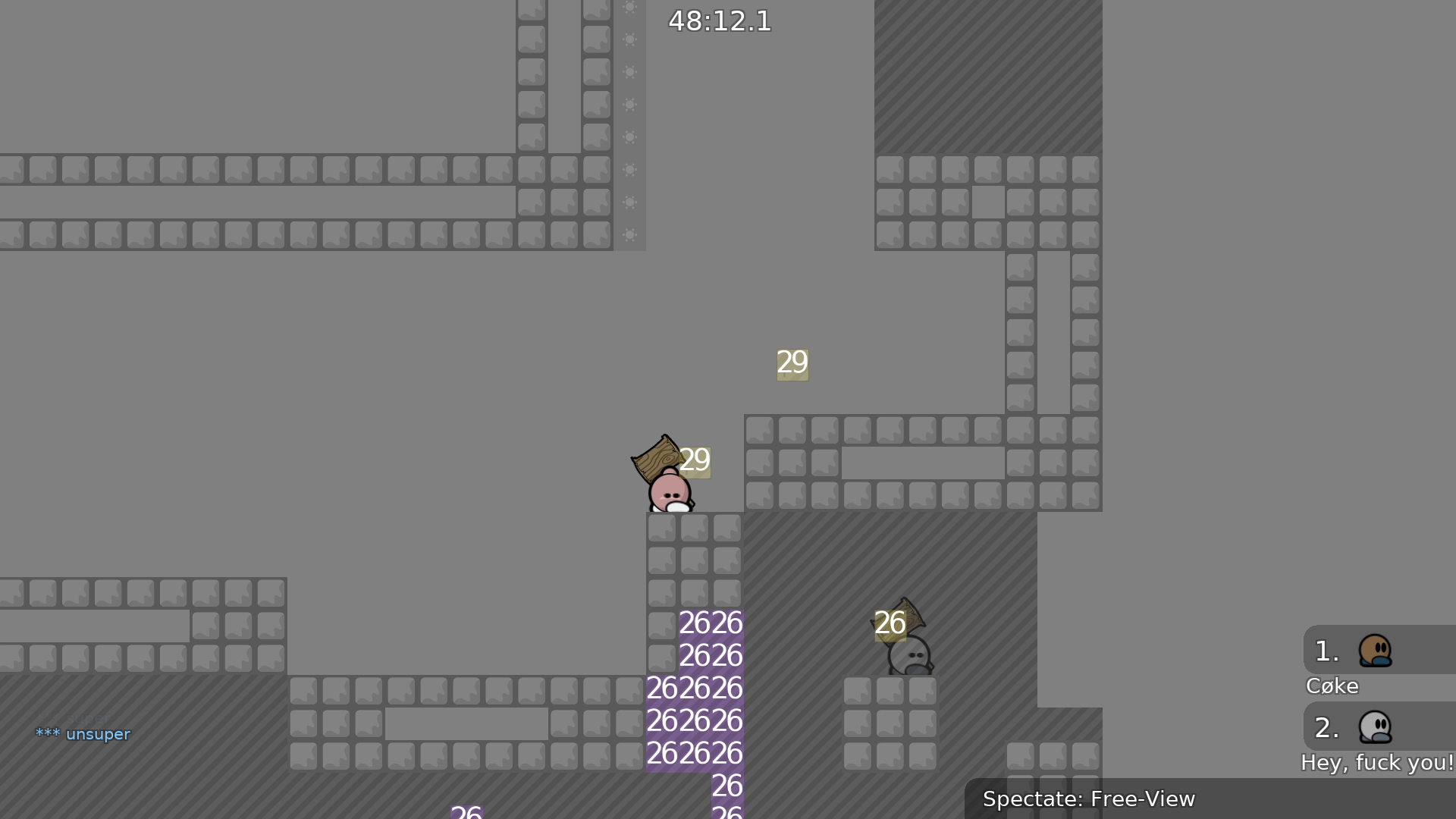
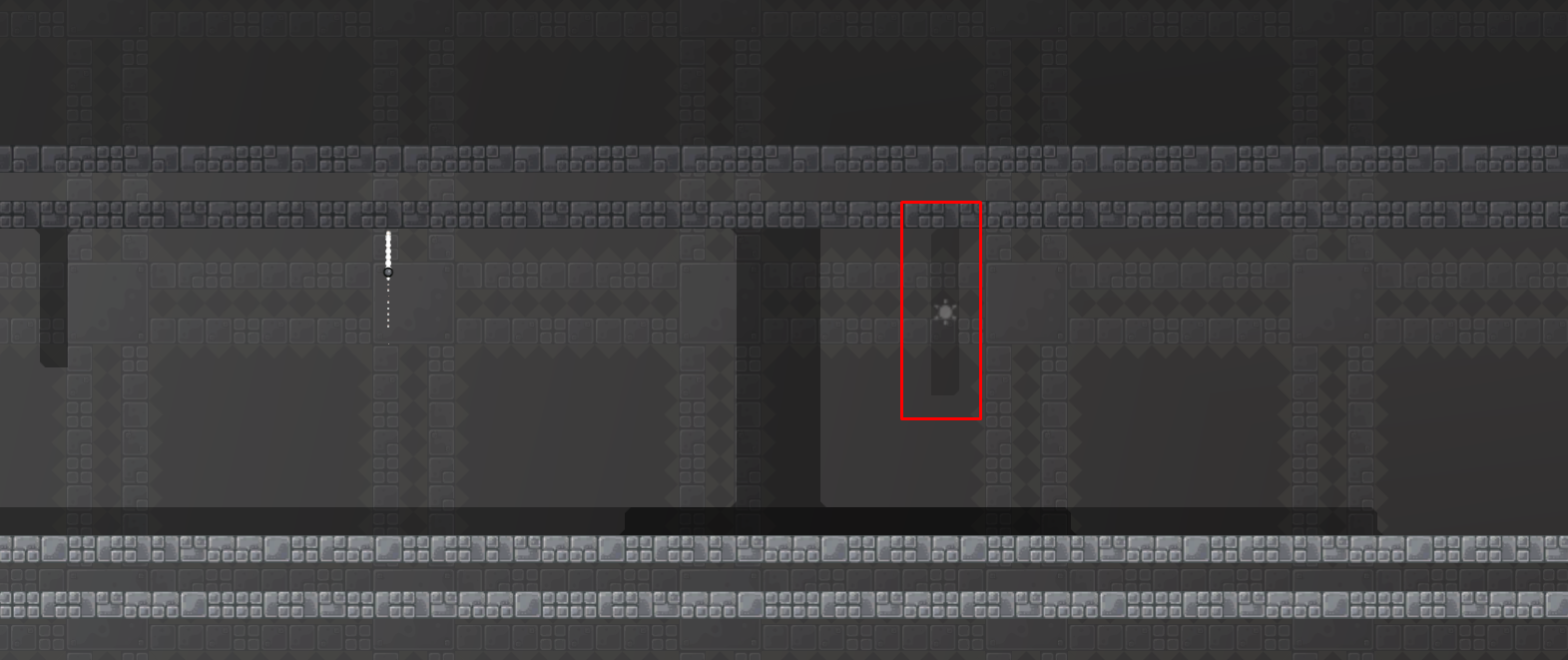
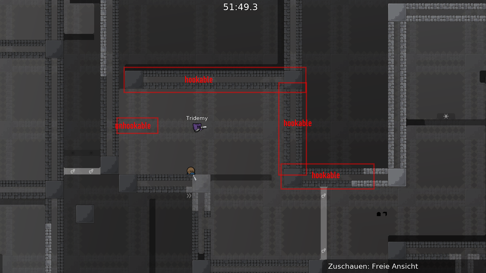
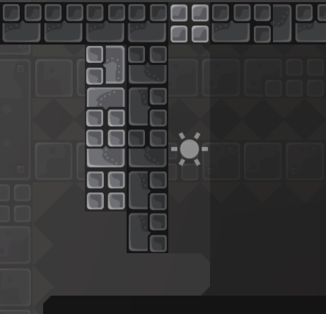
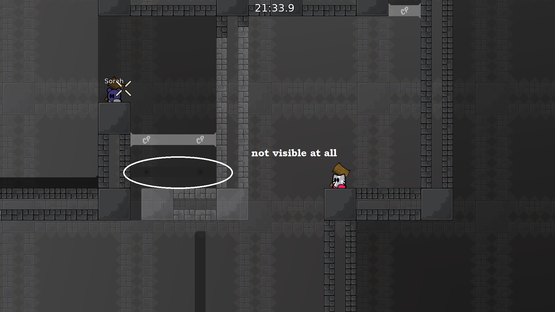
imo the unhook is a little too bright and the hookthru a little too invisible / dark
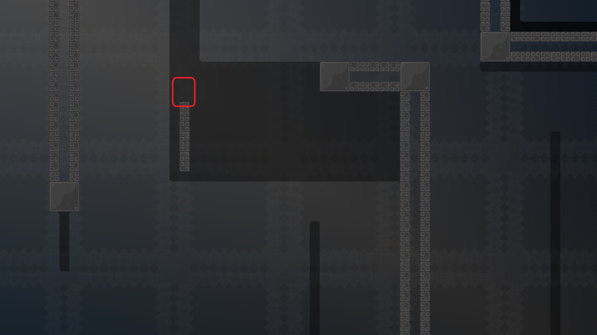
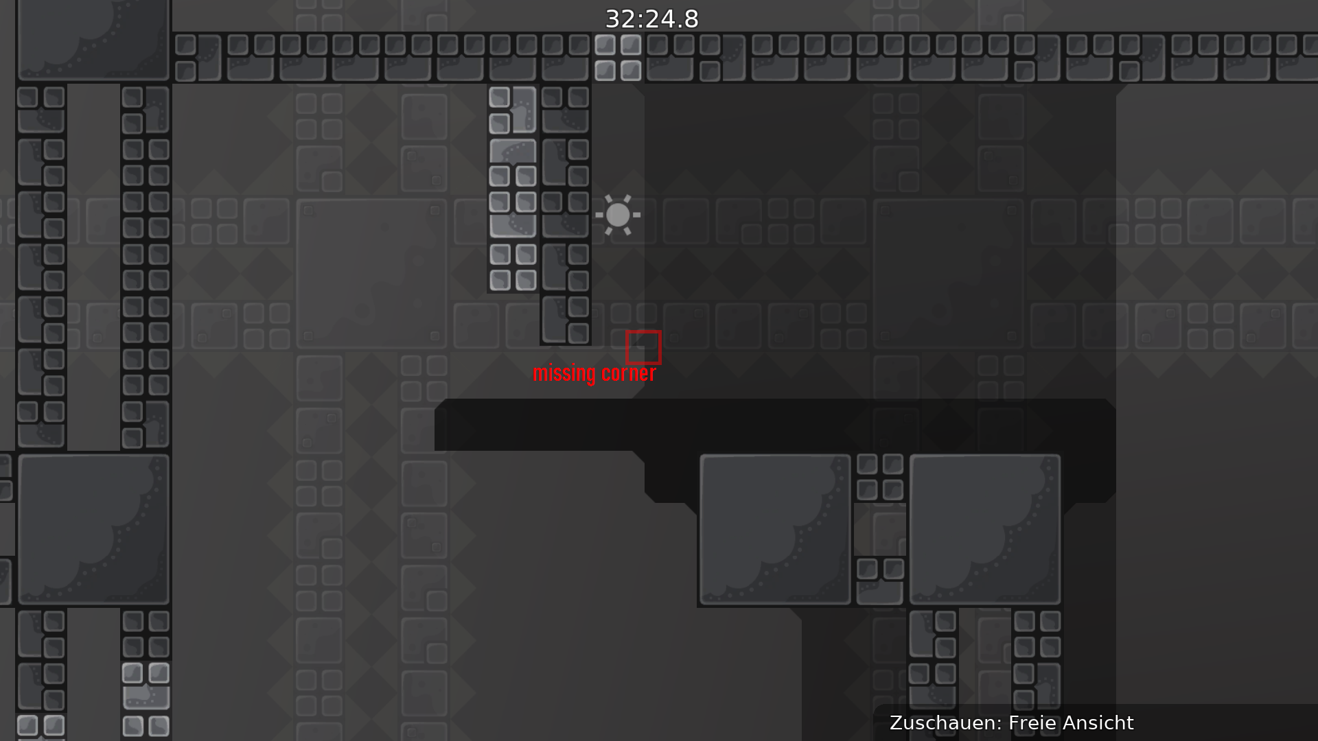
also i think you should put freeze corners on ending freeze pieces (not sure if it was intentional)
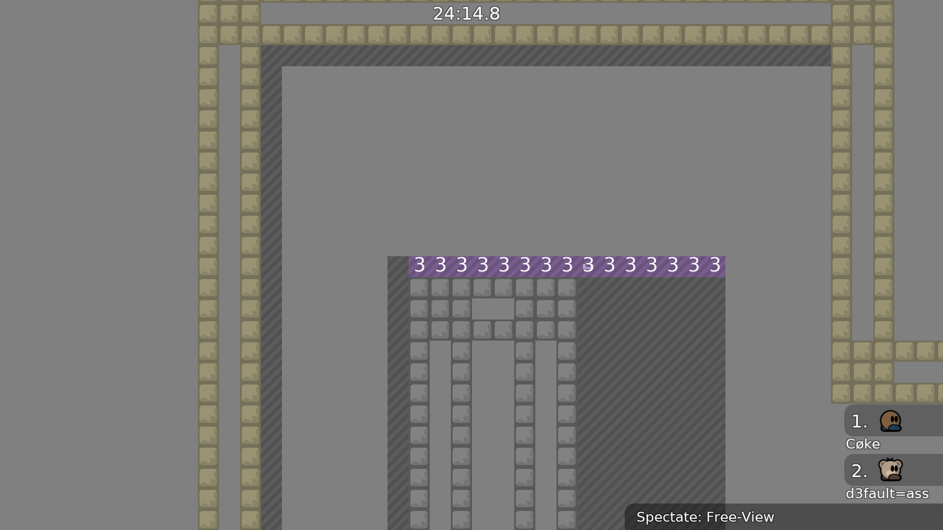
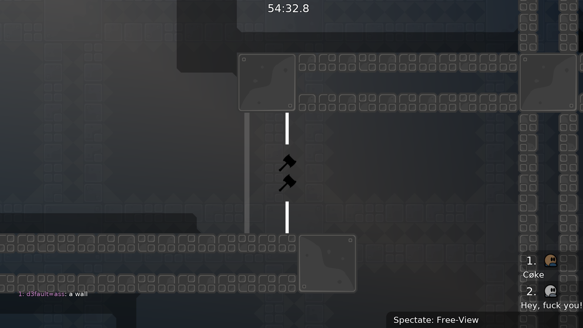
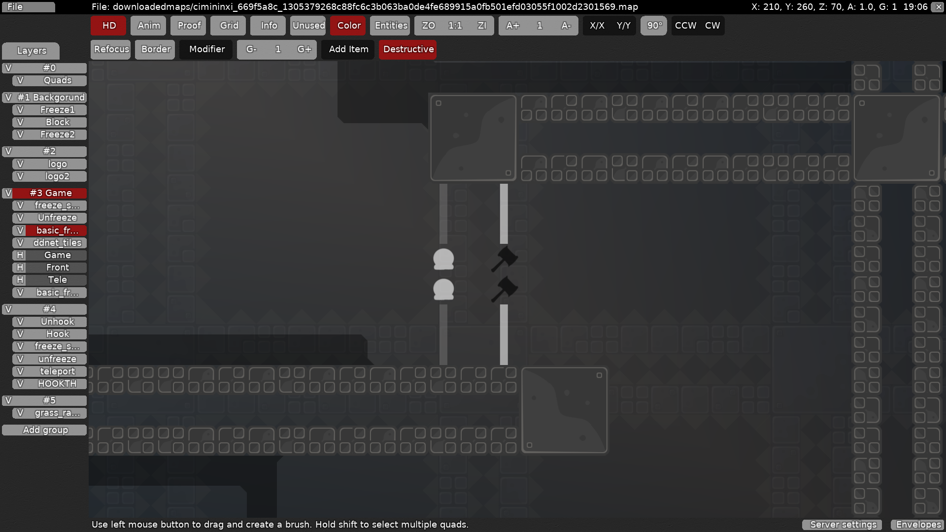
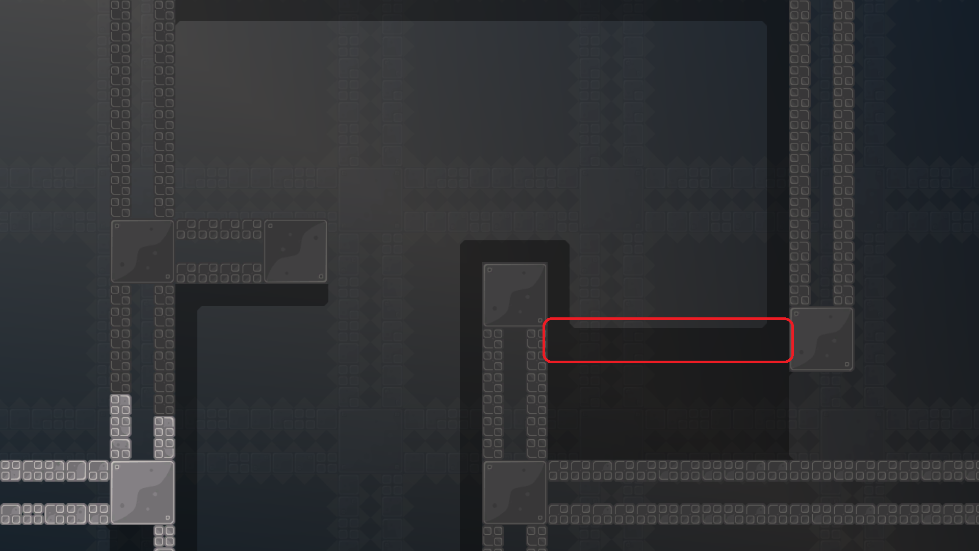
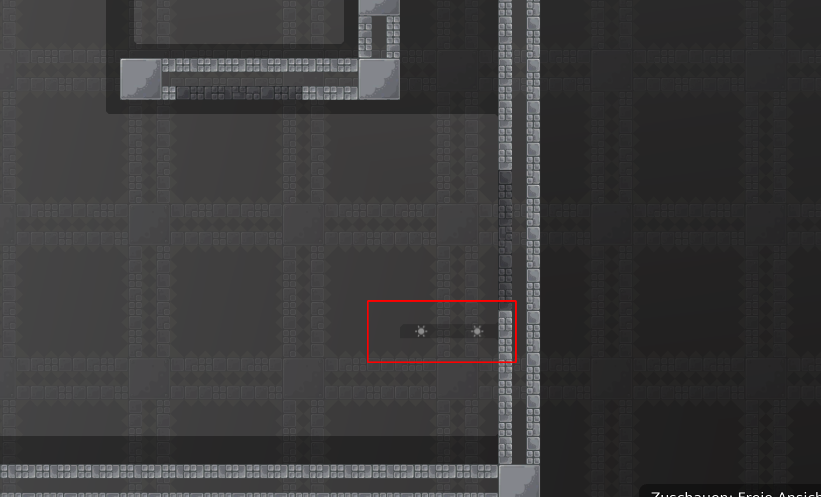
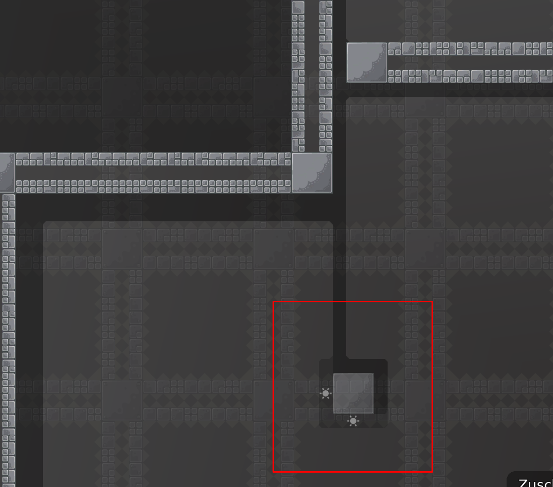
this marking is too bright
needs transparency
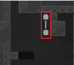
maybe an outline around the hammer?
like:
solo could be a bit more clear too btw
idk
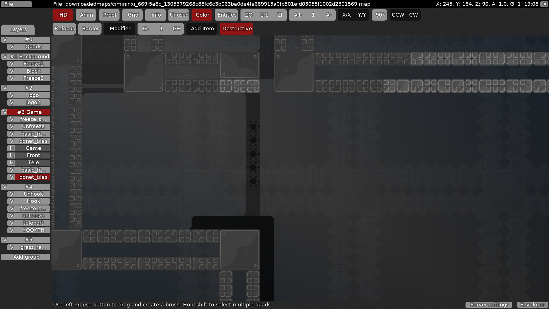
example of unhook having a little less brightness ^^^
i think deep would look better like htis
undeep
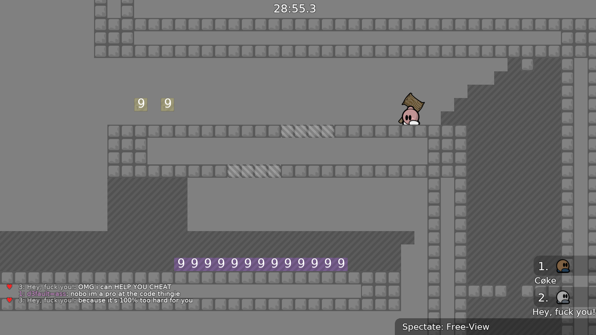
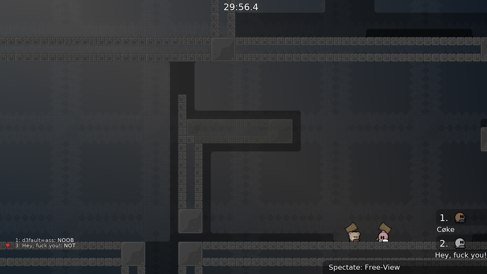
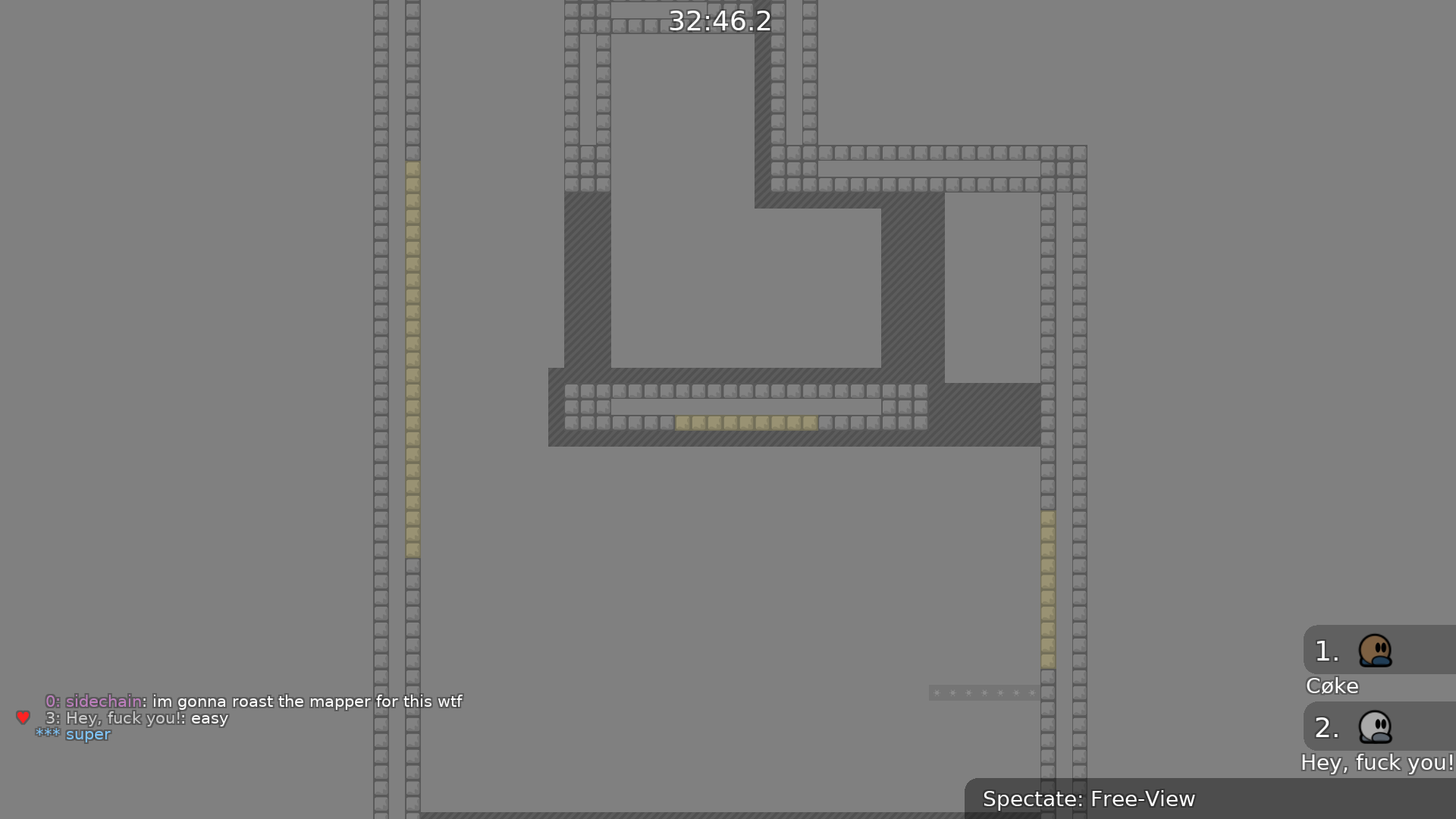
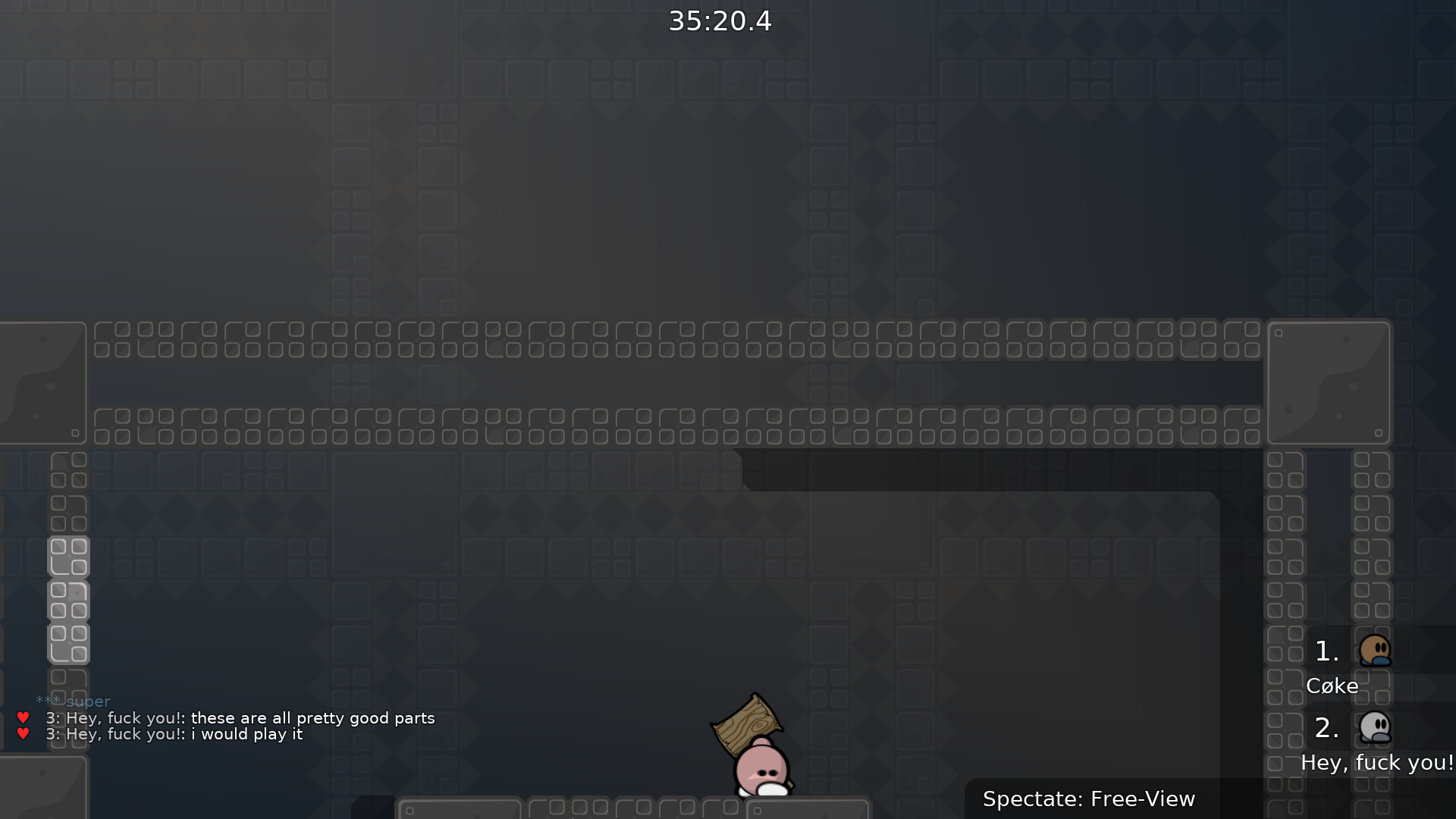
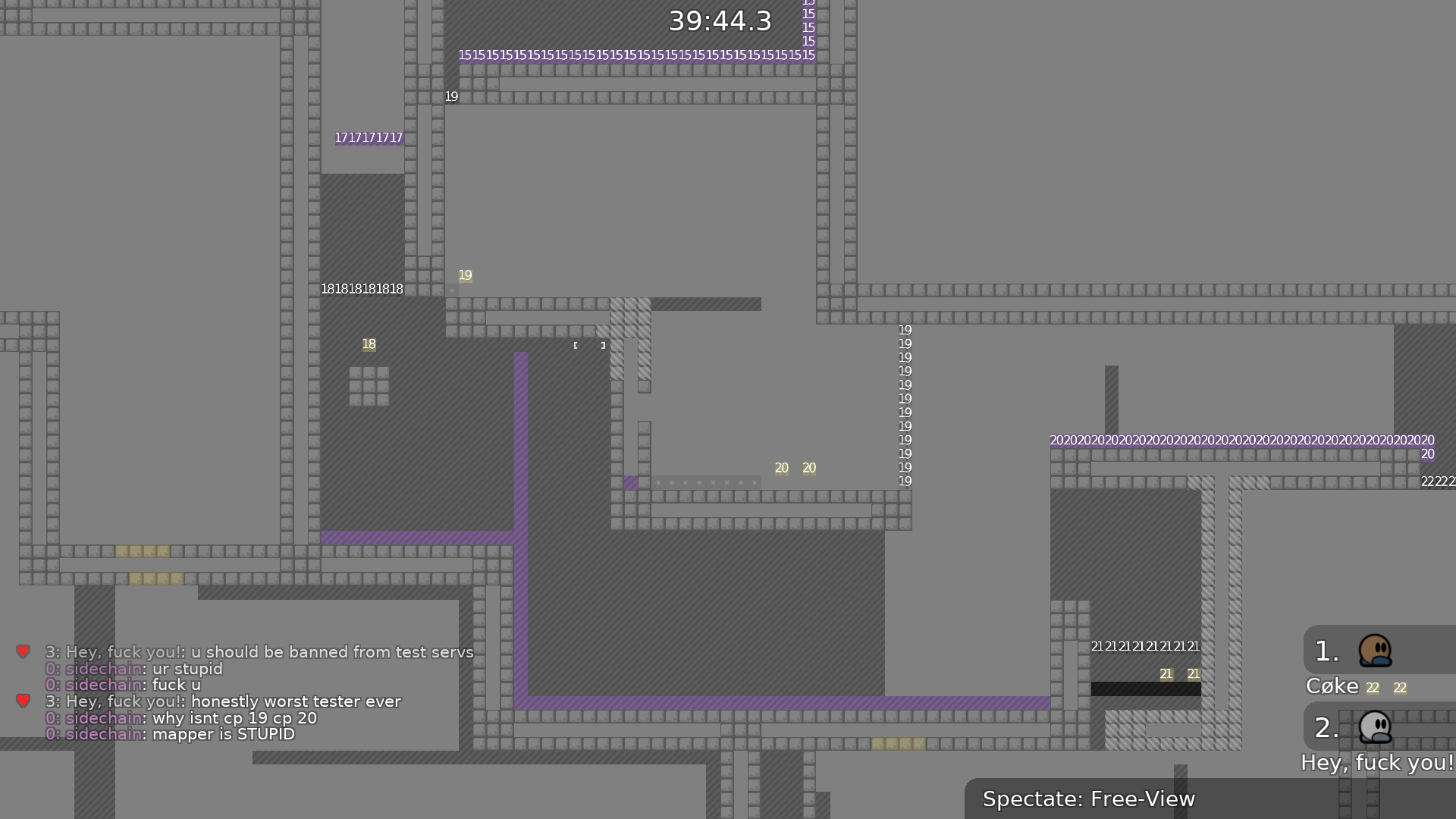
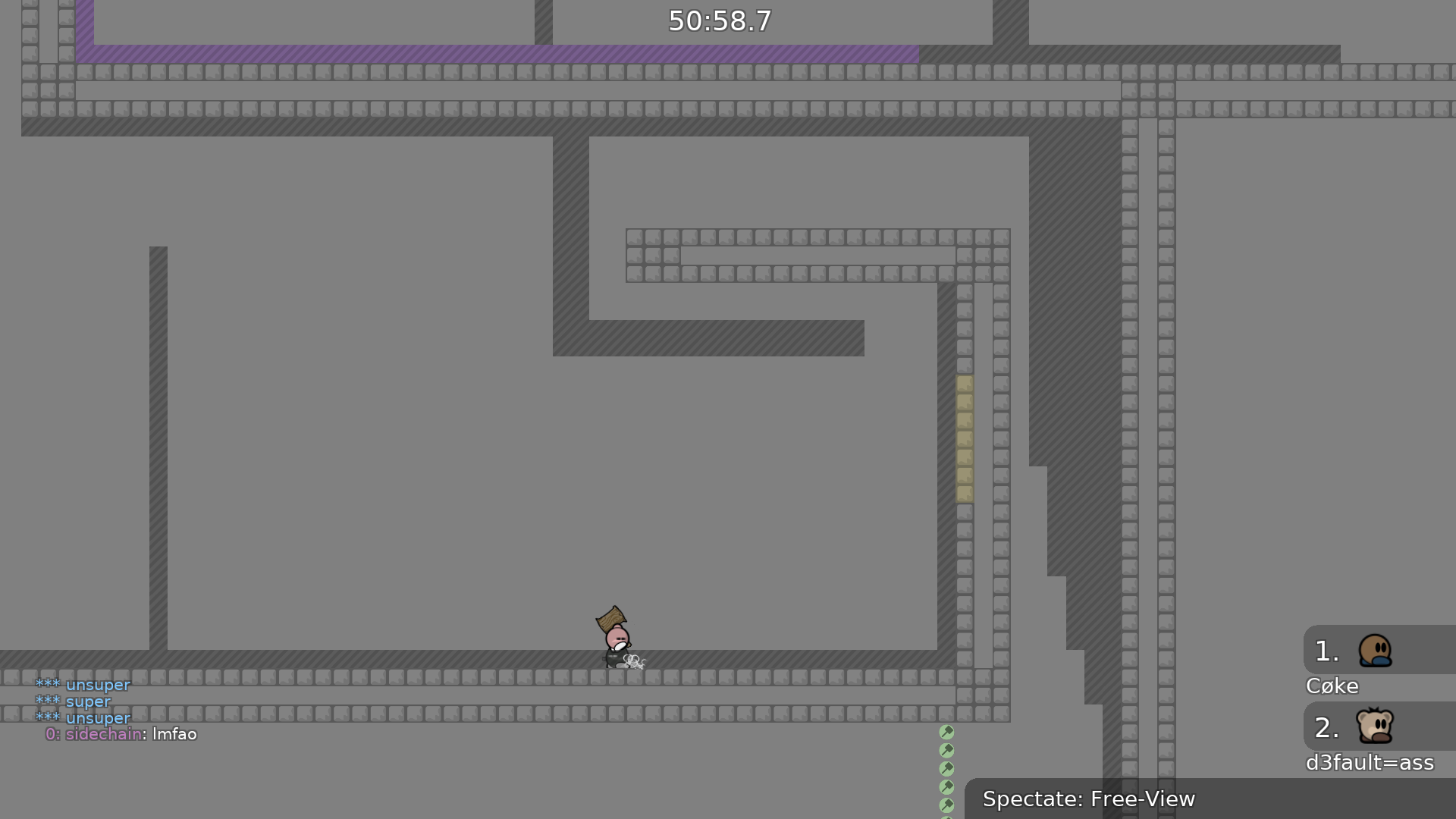
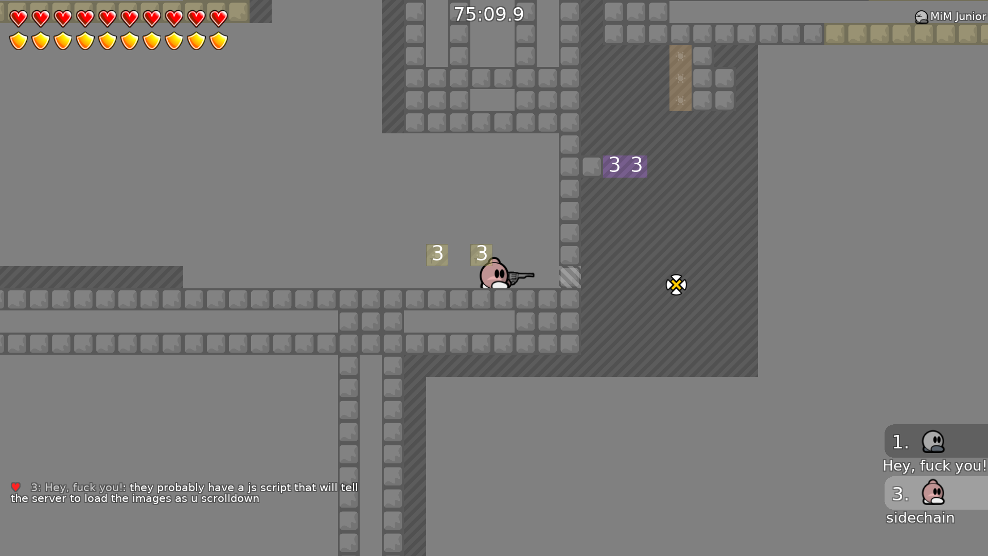
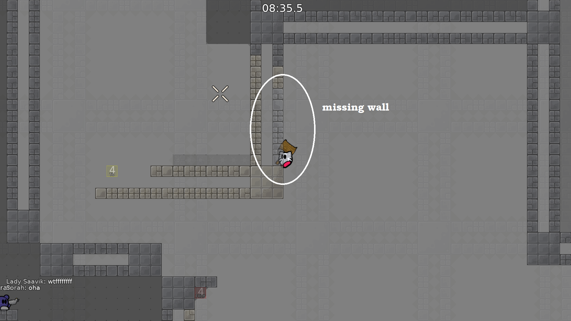
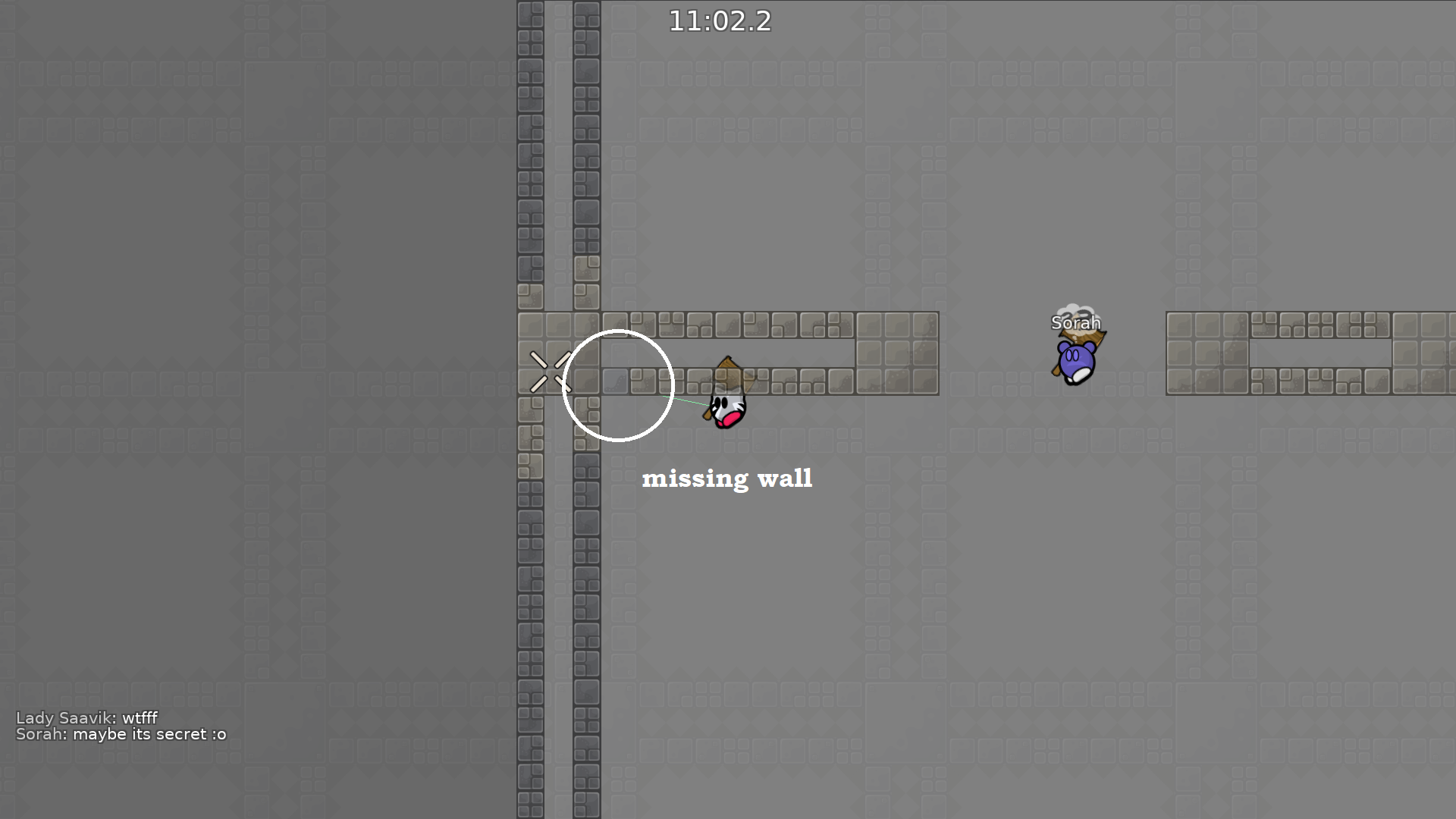
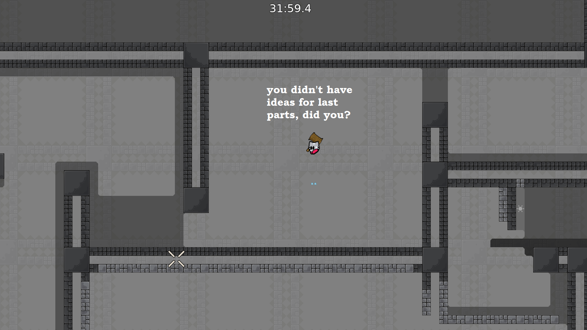
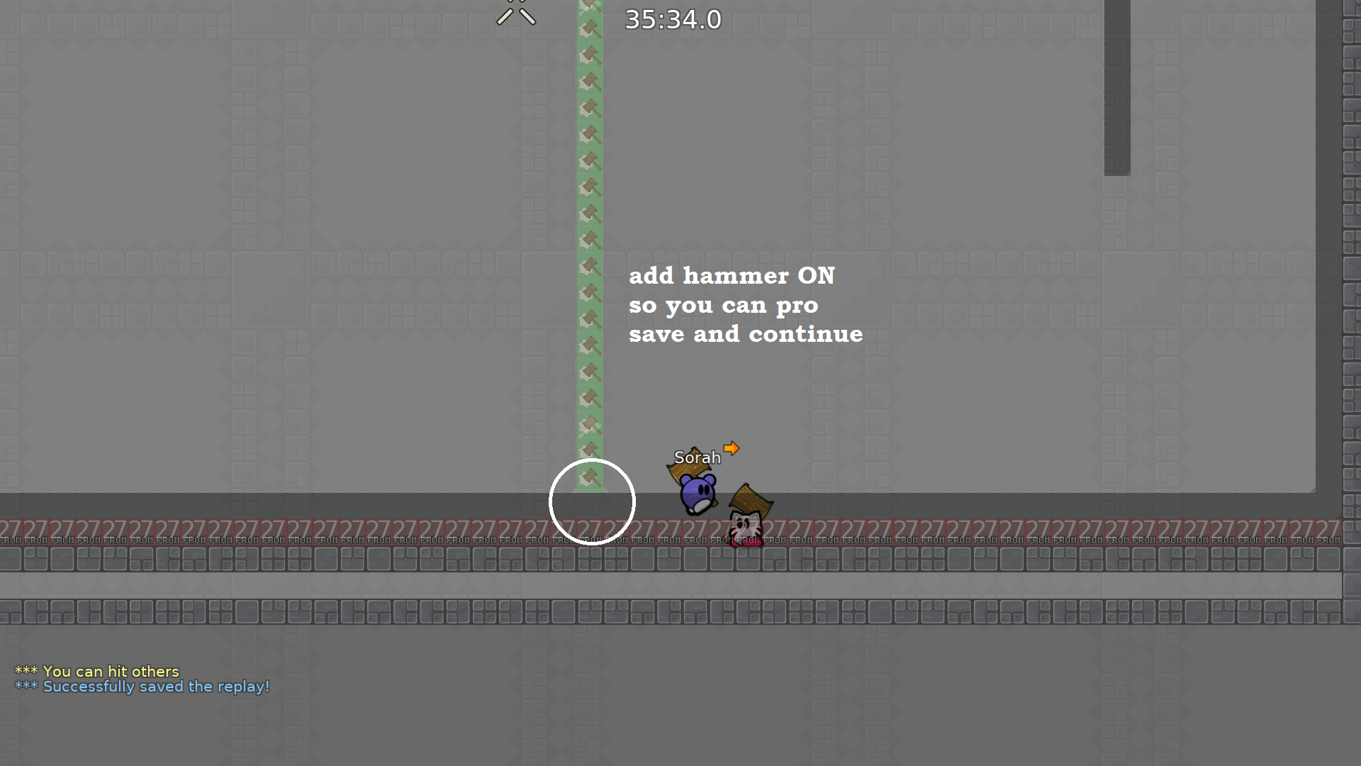
btw. if ur reading the chat in the screenshots above its all just jokes so dont take the chat seriously lmao
also its a good map i had a lot of things to say about it but otherwise i think its fine
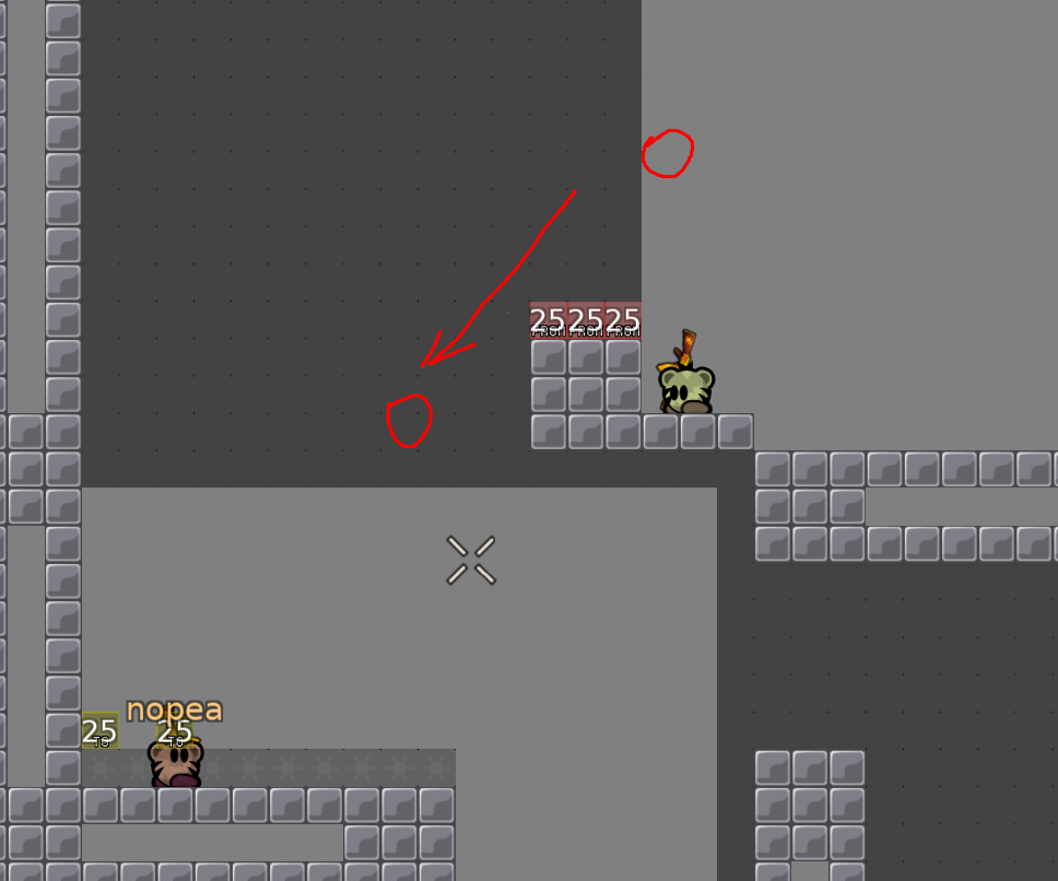
also uc ant rly see the bottom here from default zoom
so might be fail for some ppl if they just bring the tee left
First of all i looked at every part. Rated it as i thought would be the difficulty for part itself, summed it up and took the average number. In my perspective this map can be rated as MODERATE 5. In the upcoming posts i will have suggestions i made for some parts and also some questions, too.
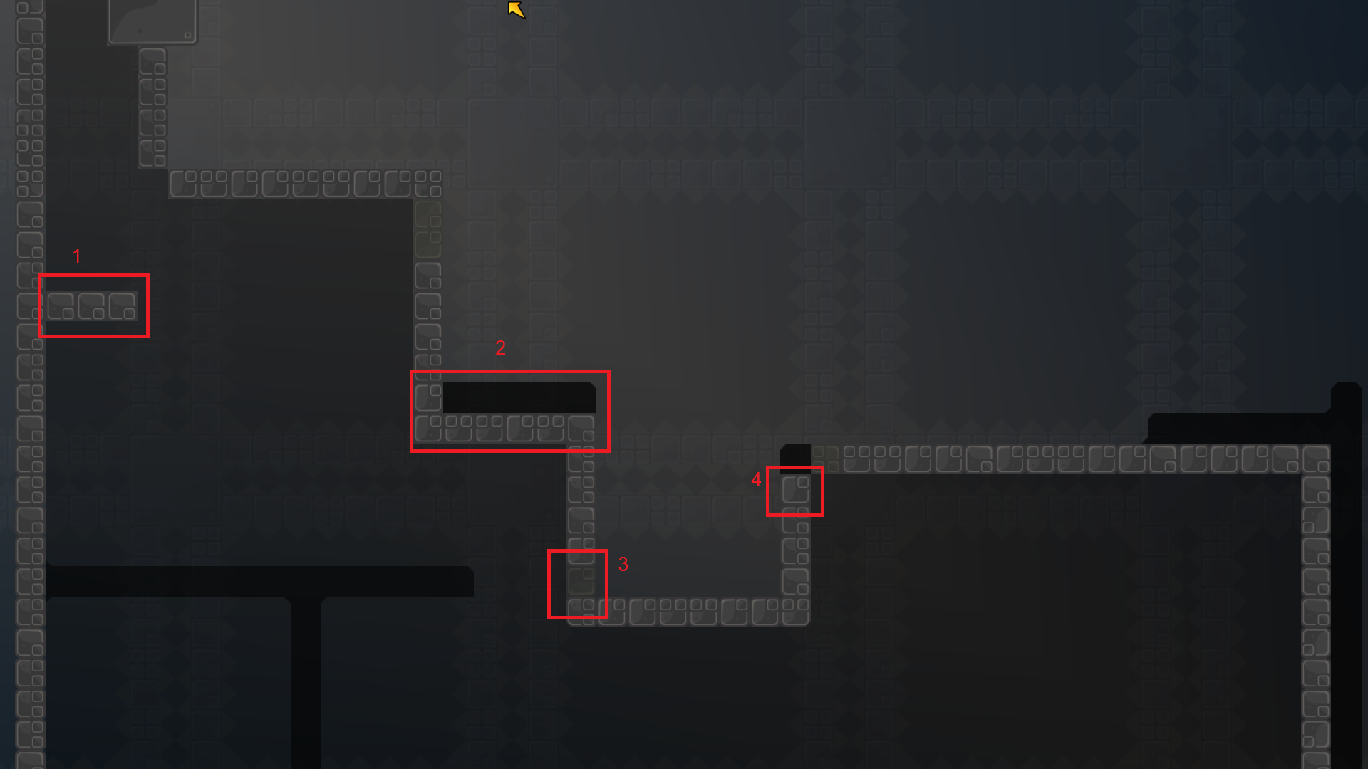
1: To make it T0 friendlier put 3 blocks instead of just one. So that more tees can stay there without bouncing out of another. 2/3: THe corner hook doenst fit the style of the map in a weird way. Therefore Tele on spot 2 and a hookthrough on spot 3 could make a change in that. 4: Since u dont need speed to cross over the tele on the right u can delete that one Thruhook u had there.
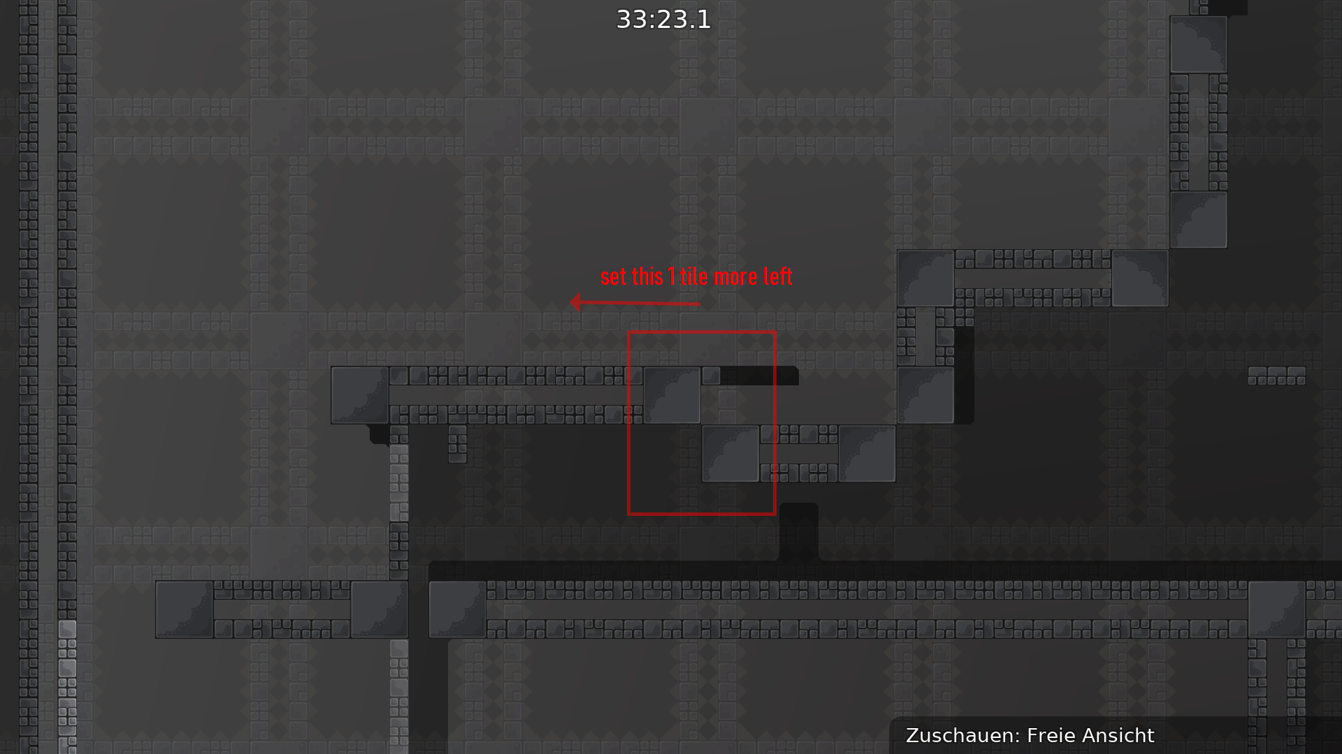
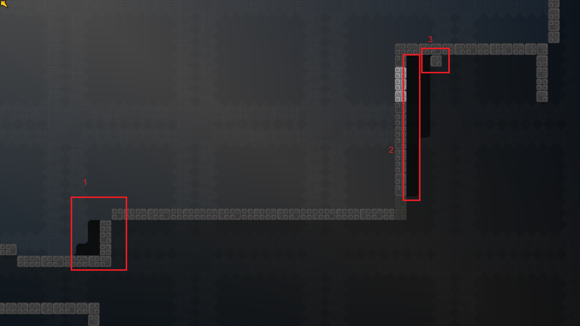
The stopping part is kinda rough with an upcoming full stop move down ahead or a jump into normal hook. 3: A suggestion would be putting stopping block there. 2: Therefore making it not possible anymore to throw the tee up again. 1: And lastly, since you need to be more to the right in this example, moving the normal hook part one tile to the RIGHT
no please make fhis brutal 1 its way too faily for a mod 5
ur method of rating by taking the average difficulty of each part is also flawed
you have to take into account where each part is throughout the map
for example, a faily part near the end of the map would add a lot more to the difficulty than one near the beginning
i think this map does not fit moderate 5. it should be fit to a brutal 1
Imo your Method in looking where the parts are located Haß flaws too. E.g. one rly faily at the Part shouldnt make the Part from brutal 1 into brutal 2 thats somehow a ridicolous thought.
I see your point and i consideres how many faily parts there are and how faily they are. The location is more a matter of the map Flow in General IMO
For brutal 1 the parts are too easy if He balance them out. I cant See it in brutal 1 for that reason. Y its faily but its Not as faily as brutal maps are imo
mm i think faily parts definitely do add difficulty because it turns into a part where you can only do it once. This map is wayyyy too faily for a moderate 5. Usually moderate 5s dont have this type of failyness. Also, this mapper aimed for a brutal which i think he should edit the map so it fits that difficulty. I think it's in between a mod 5 and a brutal 1 but it should be revised to fit brutal 1
it will be done the improve soon,but some things i dont understand
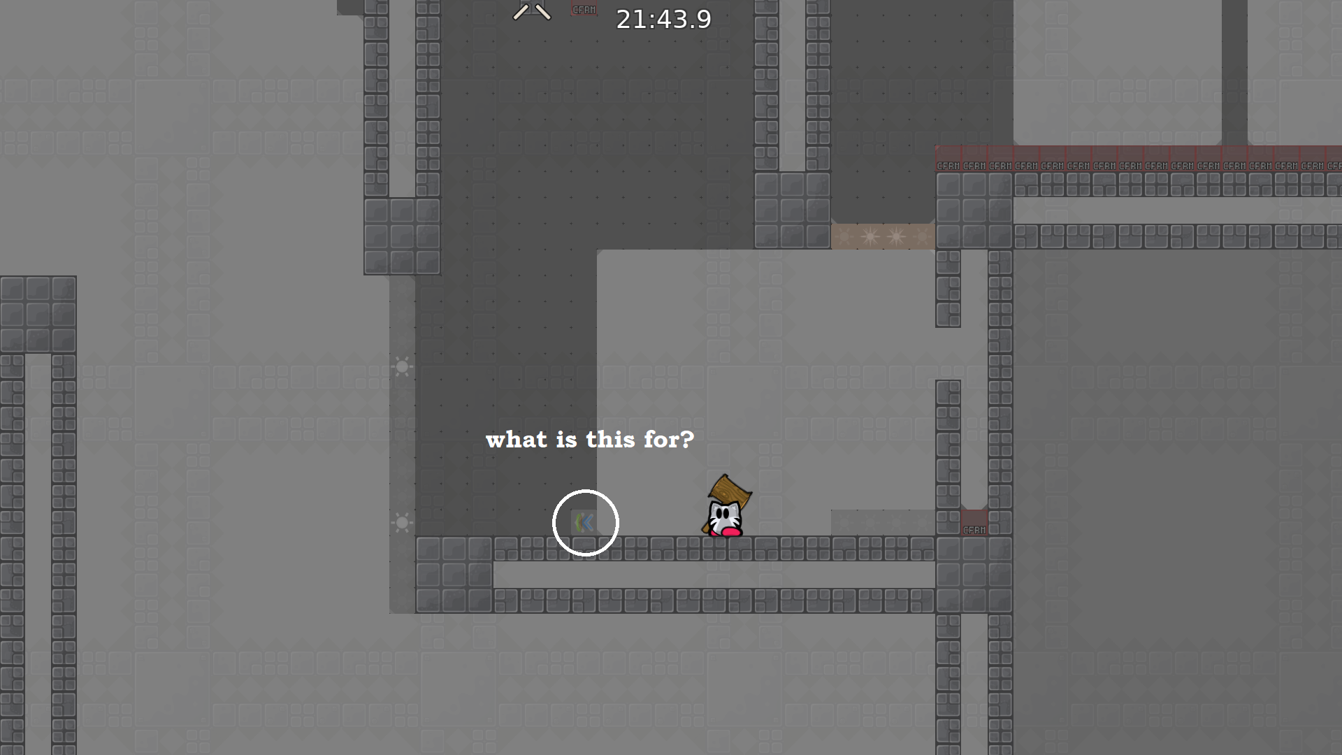
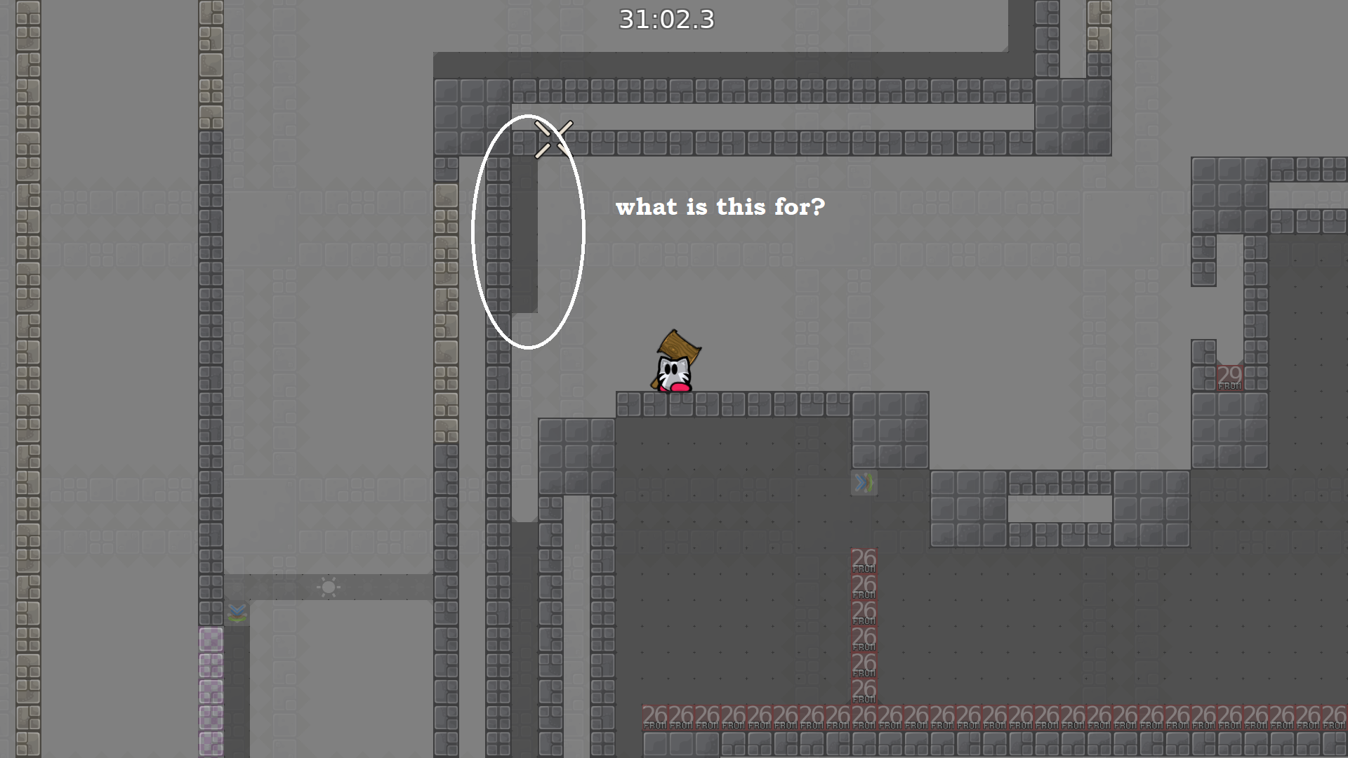
what is the antiafk? https://discord.com/channels/252358080522747904/712424701682647110/713178642179686410 where broked the desing?im blind https://discord.com/channels/252358080522747904/712424701682647110/713175391430377492 why useless the stopper?this just stop the dummy,if the player it hits very high and dont teleport back the dummy,or i dont understand and im stupid xd https://discord.com/channels/252358080522747904/712424701682647110/712962331952414730
and thanks for all the lot of help,i have a lot to learn xd
its very unlikely that you will need it,
and
@louisjust cause a map is faily doesnt make it brutal, there are even novice maps where you can fail. This map is defently not Brutal, expect for 1 or 2 parts. If this 2 parts get more easy its a Moderate map.
If you make marks which puts attetion where you can faily its very unlikely that you will fail there
antiafk - tee who is getting dragged cannot afk cuz they need to drag the top tee once the part is finished or fail design broke - all the individual unhook tiles are the same tile
bruh but theres different levels of faily qywinc
this is a pretty faily map
more faily than any novice and a ton of moderates
i dont think a faily map like this should be in moderate
moderate is about refining skills you got from playing novice imo, not to just fail 200 times
i really dont know which map you played but this isnt that faily as you describe. The really "hard" parts are with teleport
please go on a empty server and vote for a moderate 5* map
then you will see
this map has quite a few faily parts.. it also is built like a brutal maps so i would say to just make some parts a little more hard and it will fit brutal 1*
read old massages before posting
Everything is done, I hope I didn’t forget anything.I changed a little a bit some part,and now harder than before.
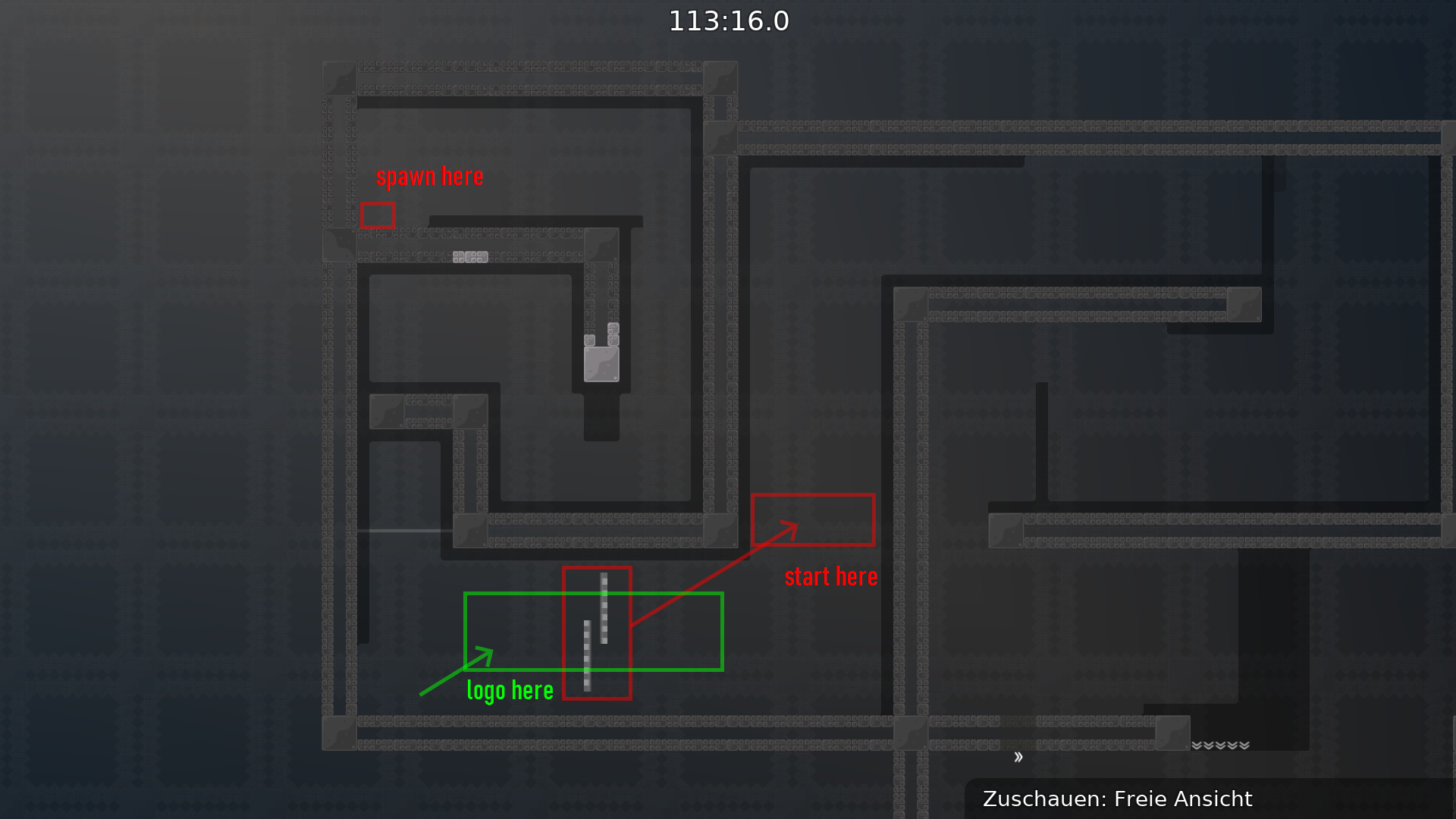
Aaand the new logo is coming
And little bit changed the desing.
I accidentally uploaded an older version, when I get home I upload the newest...ah shit,sorry (I had to hurry)
its the good version
fixed design
brut 1-2, if u play with 4ppl+ it really gets easier so dont know what to give this lul
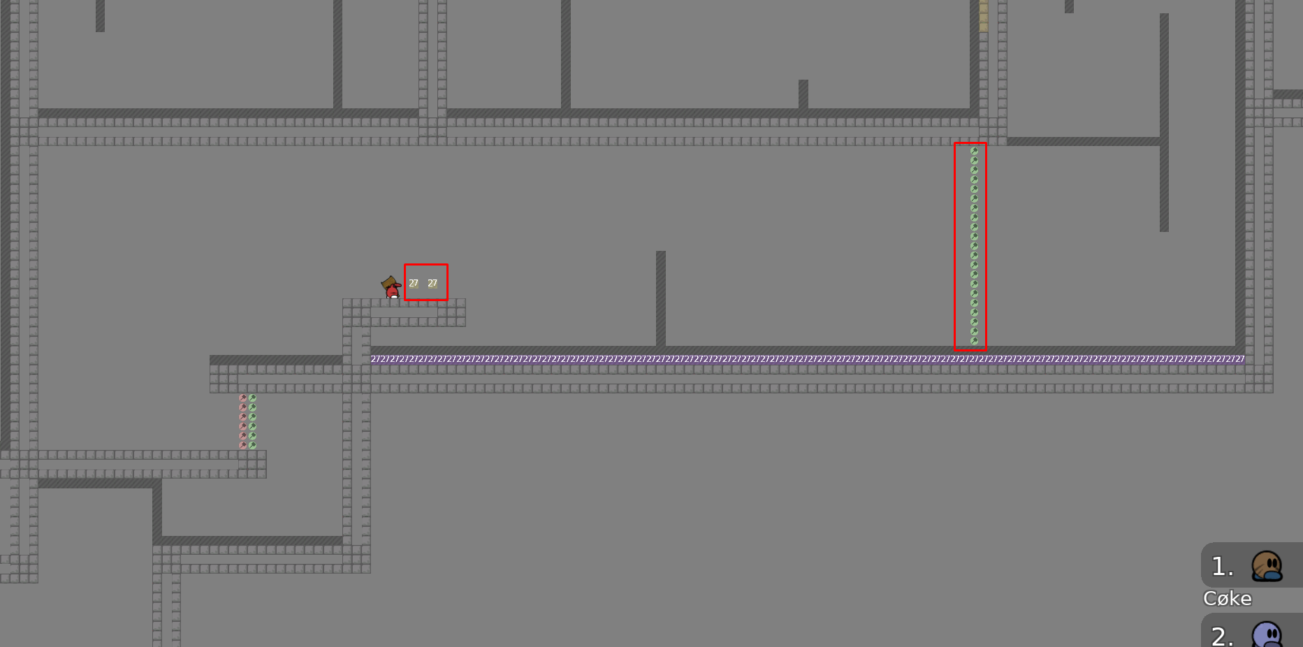
to tele 27 fix
did u even read my message? 😄
bruh :x
will fix it, its ok >x>
Corrected
Done,thank y
@CøkeAdded new logo
what r u doing btw
fixed logo,and new spawn
Thank y
😁 👍
tested it, the map has an extremely good flow. we made some minor changes imo its ready
good map
will post some bugs AND CHEATS
- more incoming
both can go upper way and cheat
I tried this its rly hard and not worth
IT'S REALLY EASY
ah with checkpoints?
and upper way is faster and easier
- without deep both go faster to the next part
lel
@Lady Saaviku brain
i tried with unhook before the other tee gets in deep
there is undeep on CTO10
and it's not far so if you fail just restart
+
this is kinda ok and a bit risky
so it can stay
but you could add unfreeze
this is cool
this is not cool
best last part
just try map again?
WOW
😄
- think about adding speedups on the corners where you can fail
whole map isn't very faily
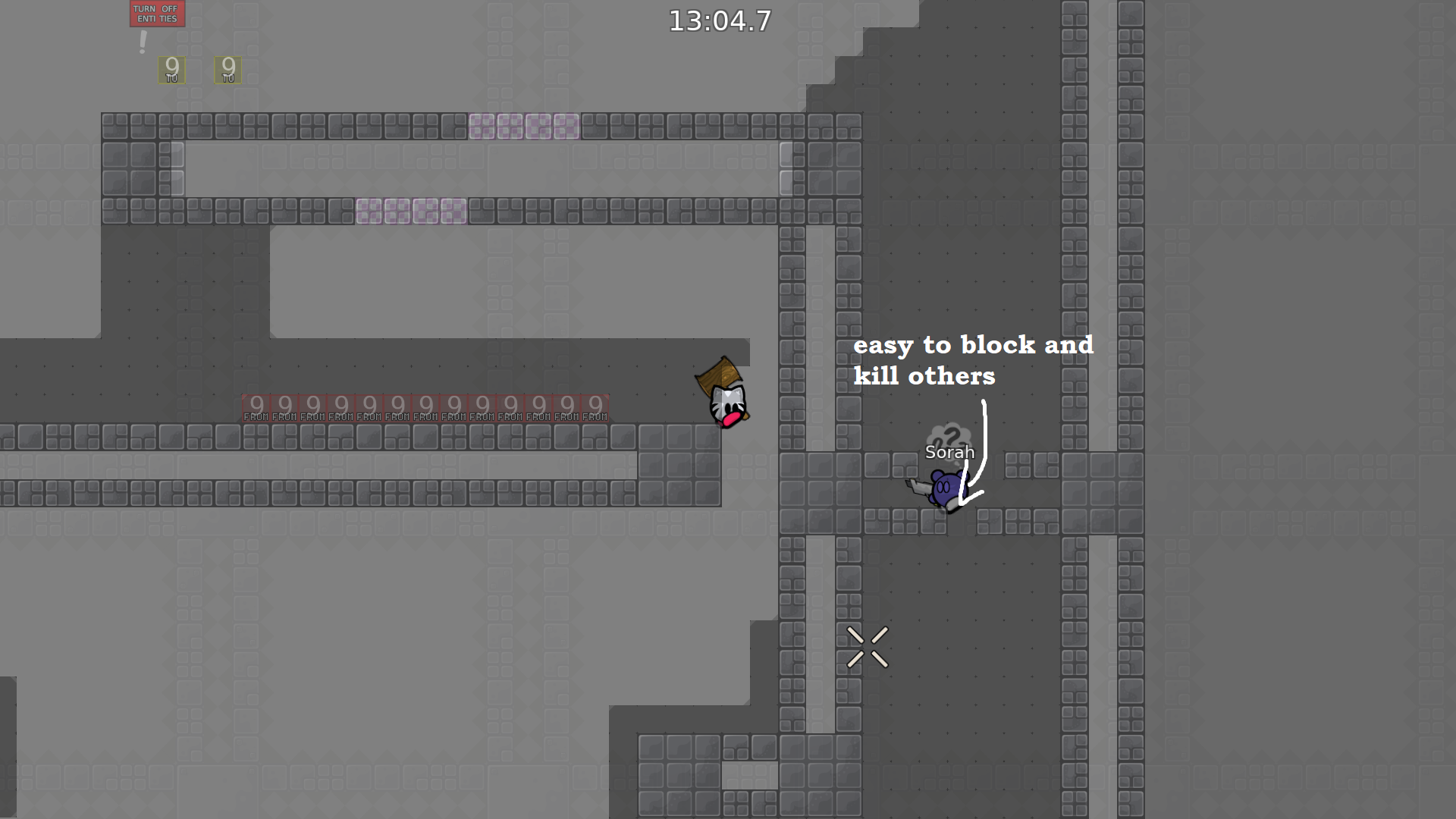
and it's not team forced

so you can block others
and kick vote can fail
But weve a lot of active mods
not you
for example on TELE 3 you can save so it's ok
and tele 5
(layers can be smaller)
ah and you can add more spawns
the last part is already fixed, it just didn’t got uploaded by the mapper.
ok ready for me
I hope part with CP 10/11 isn't cheatable anymore
I found the first one more interesting because it's not just a trow
https://discordapp.com/channels/252358080522747904/712424701682647110/716752980661108786 I think the freeze should be longer rather than shorter, btw this was wrong way
i think its more interesting than this edge hook
The Deep is still cheatable.
Thank y
@Cøkeand
@Qywinc@QywincThe Deep is still cheatable.
I tried to do that!
its ok now
but I was too bad
$ready 2
2*?
didnt seem that hard
Also I would consider this map like
@louissaid as brutal 1. There are only 2 parts which could be called brut2 imo
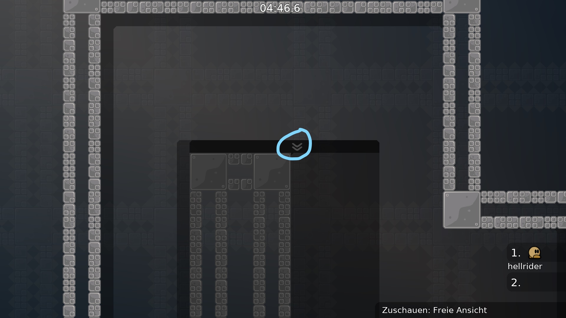
for the last part, I suggest putting a "!" instead of the arrow
I suggest dont put any sign 🙂
there are sign on other faily moves
fix : - two corners problems
- one design problem
added the "!"
