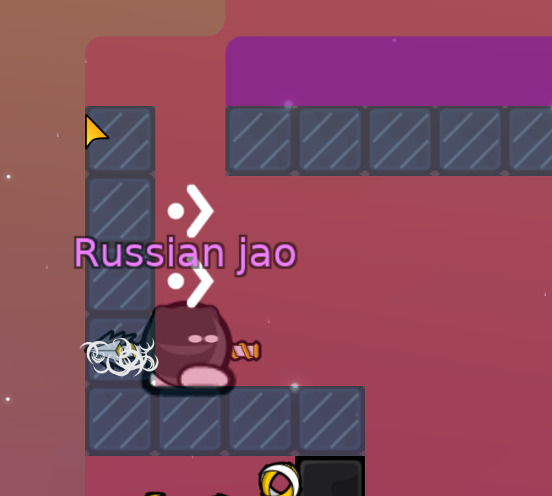
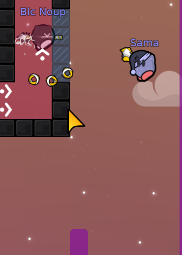
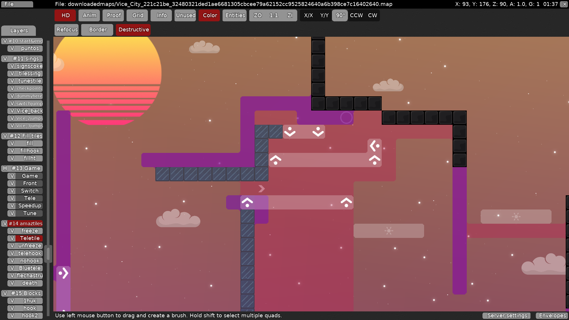
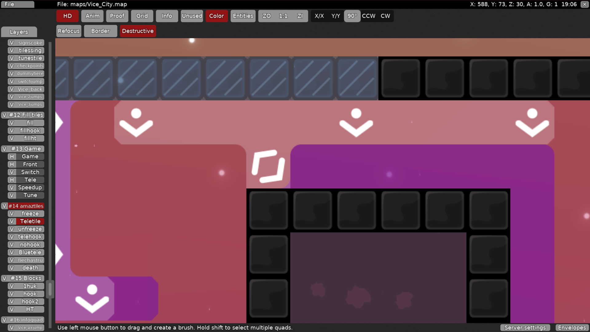
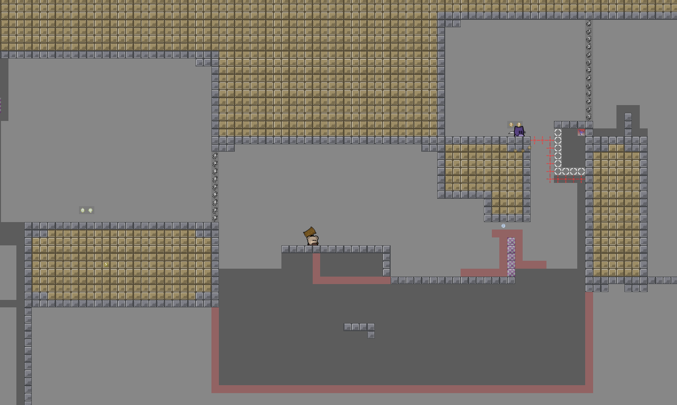
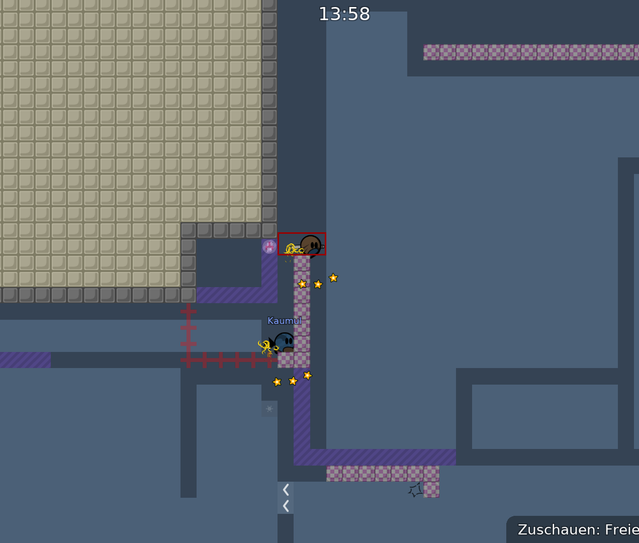
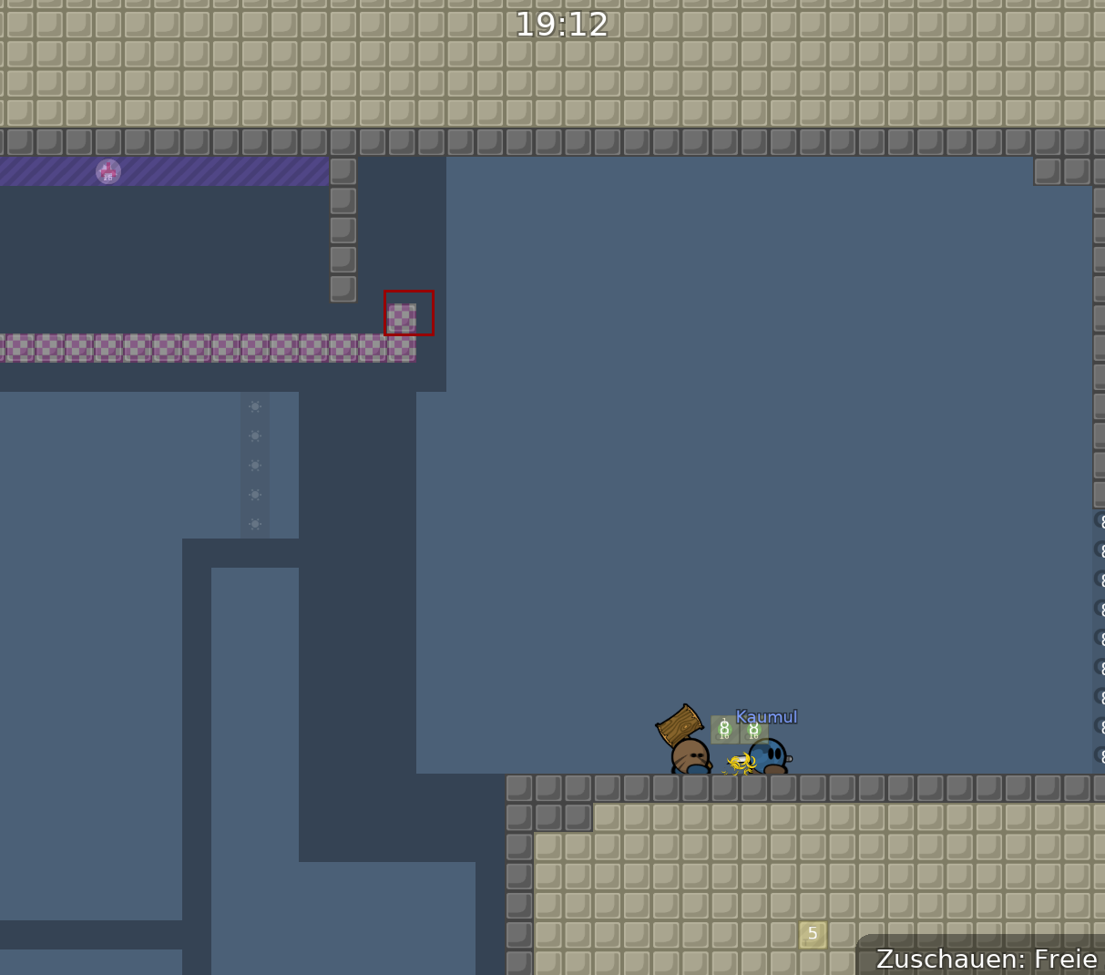
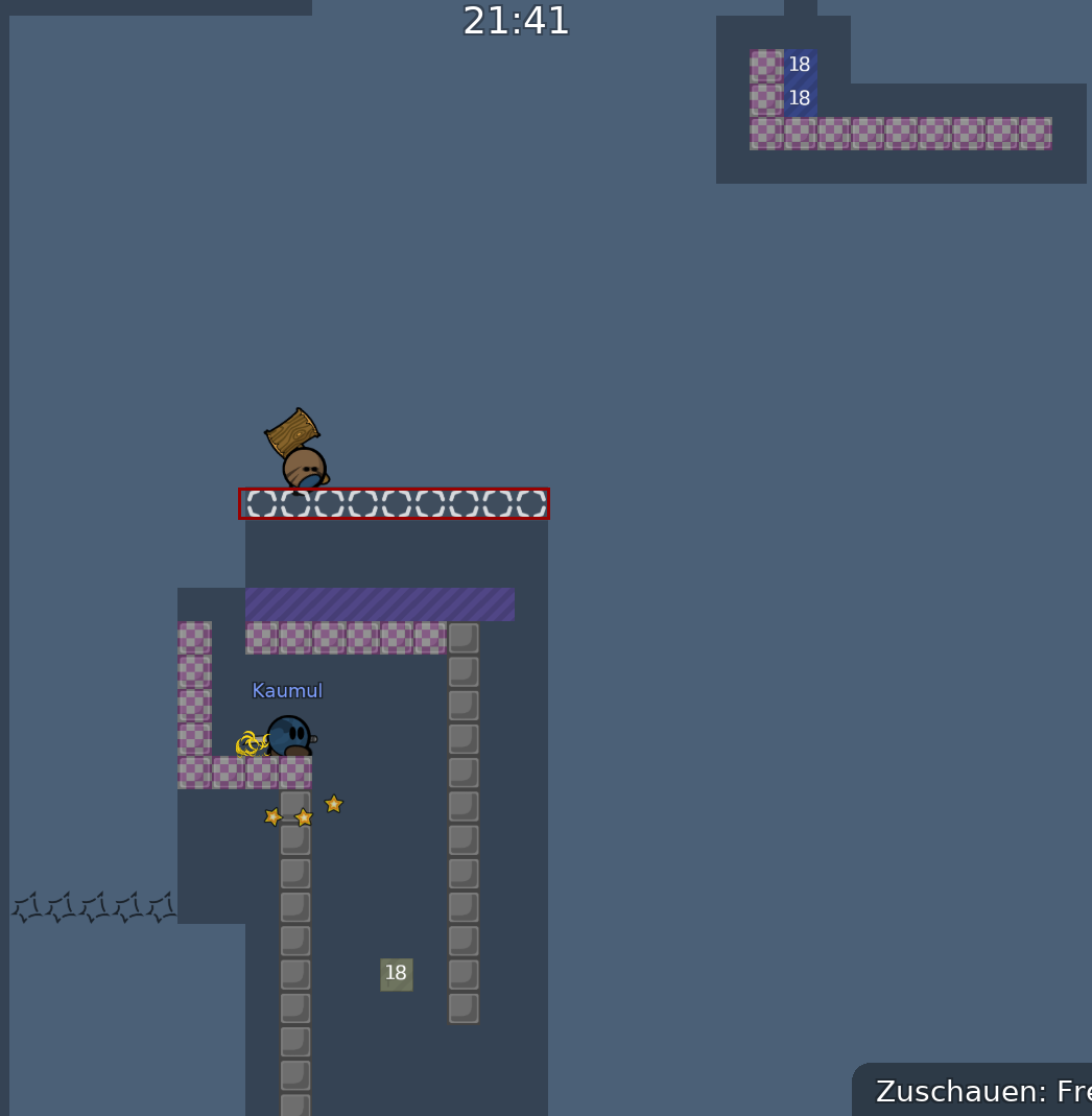
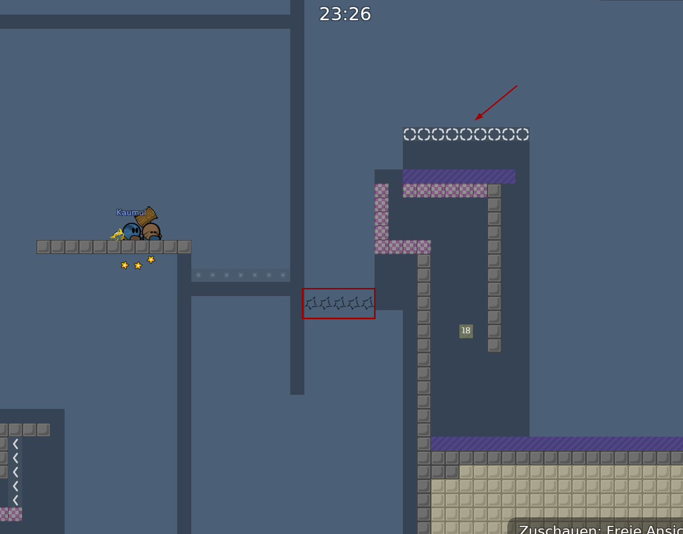
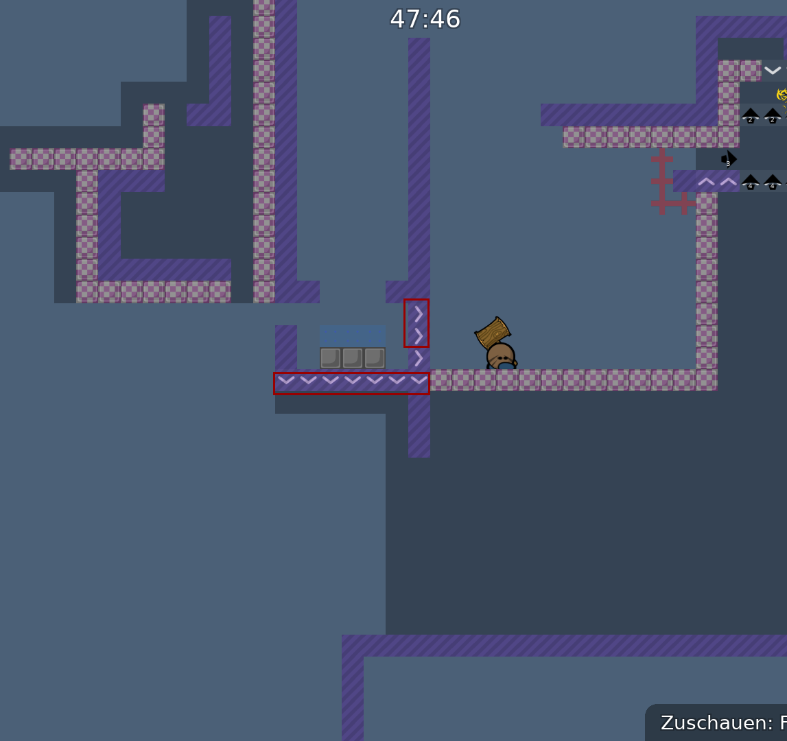
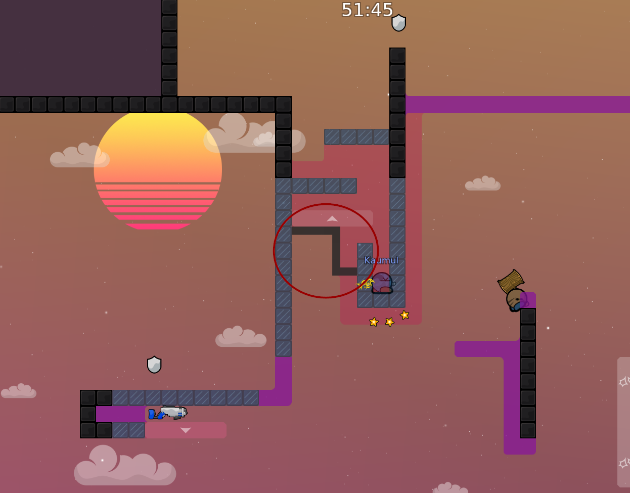
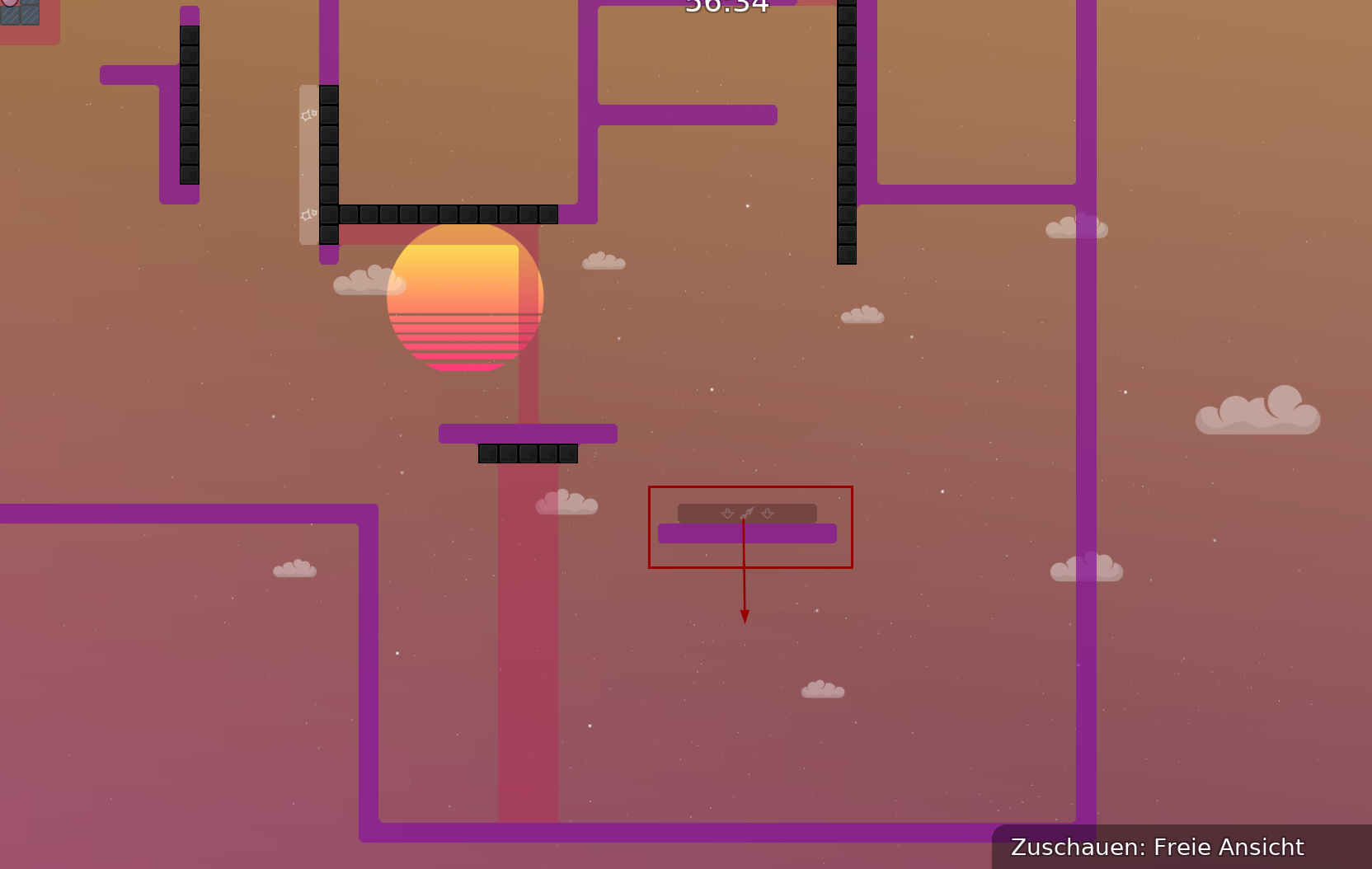
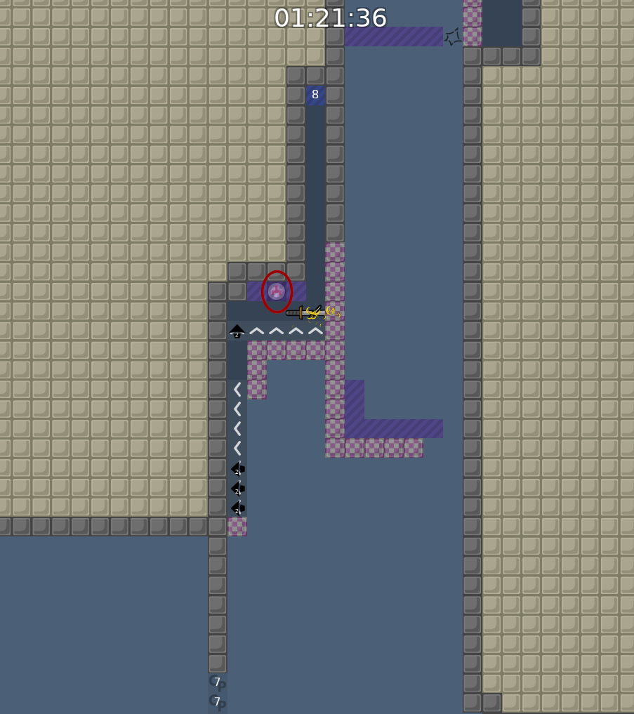
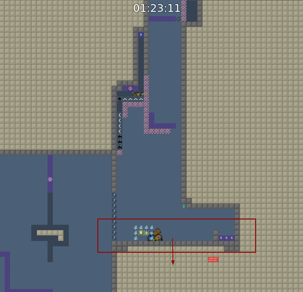
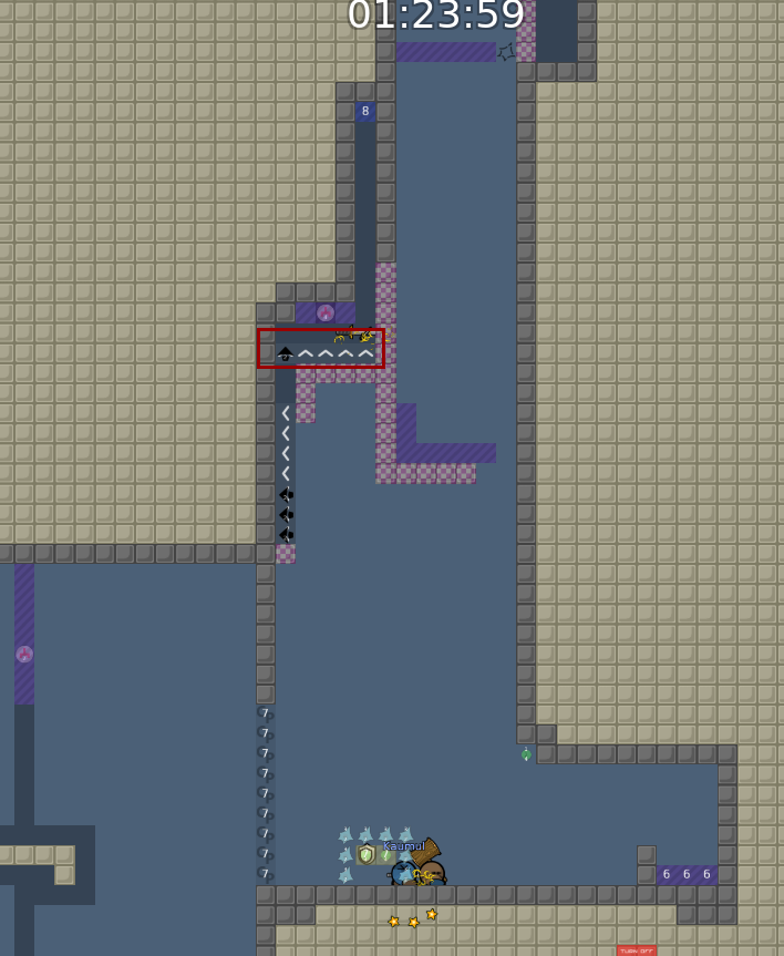
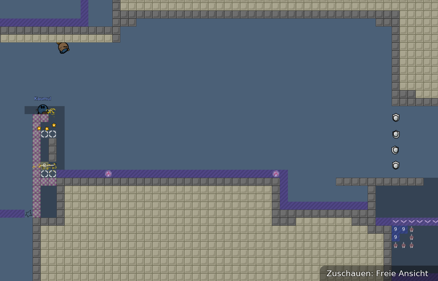
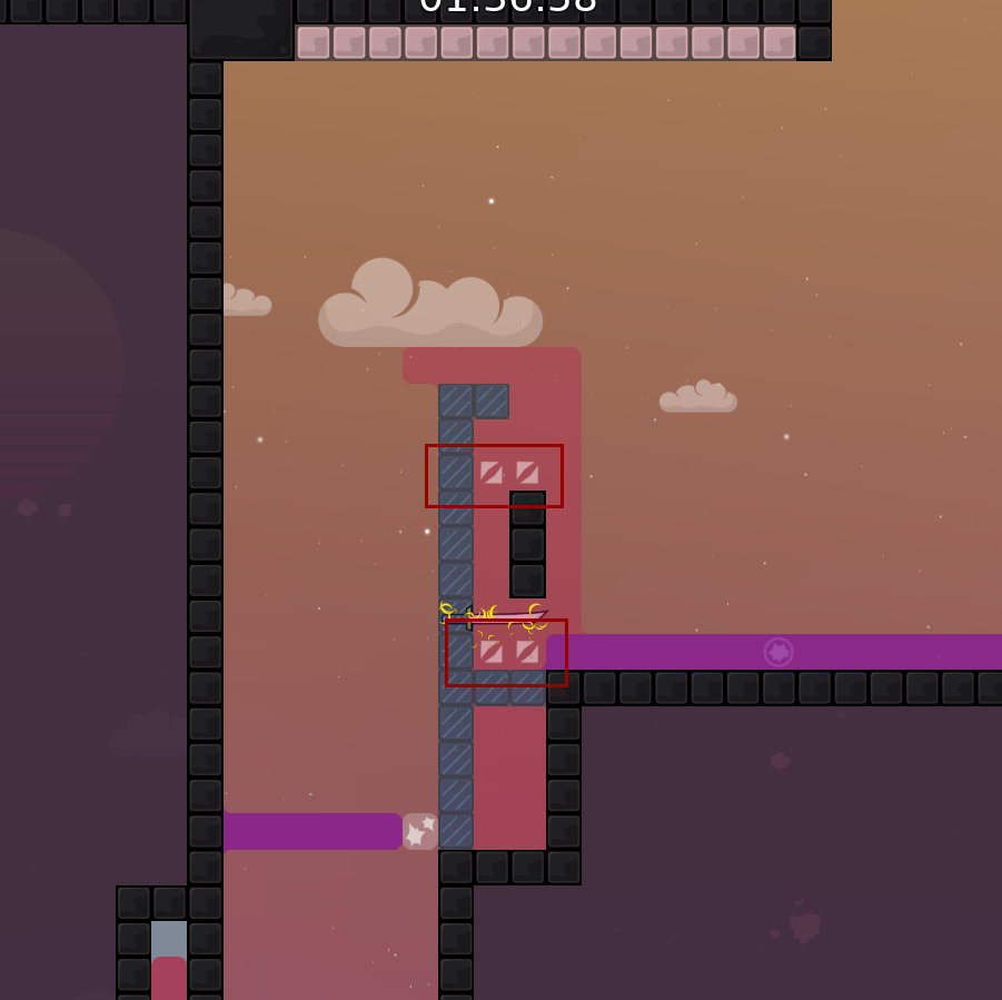
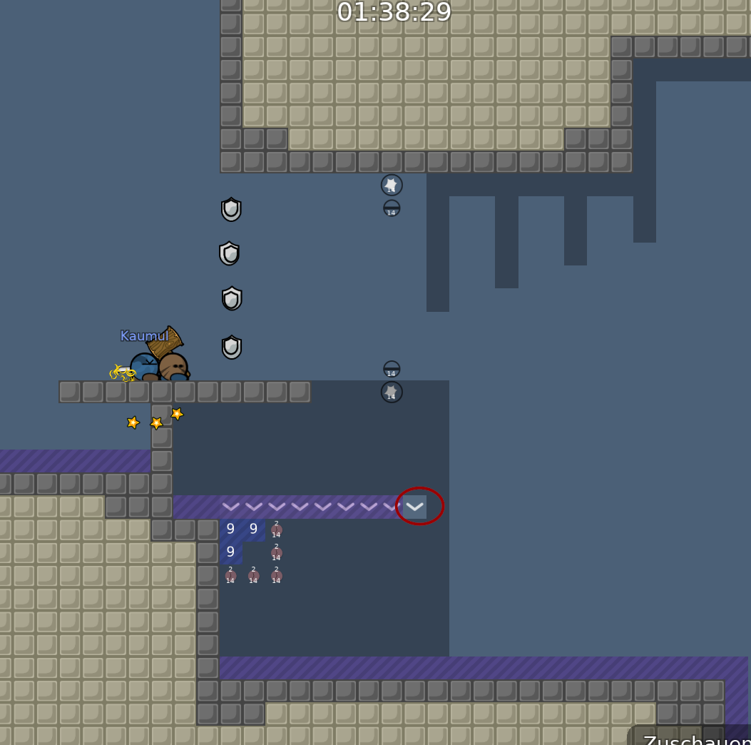
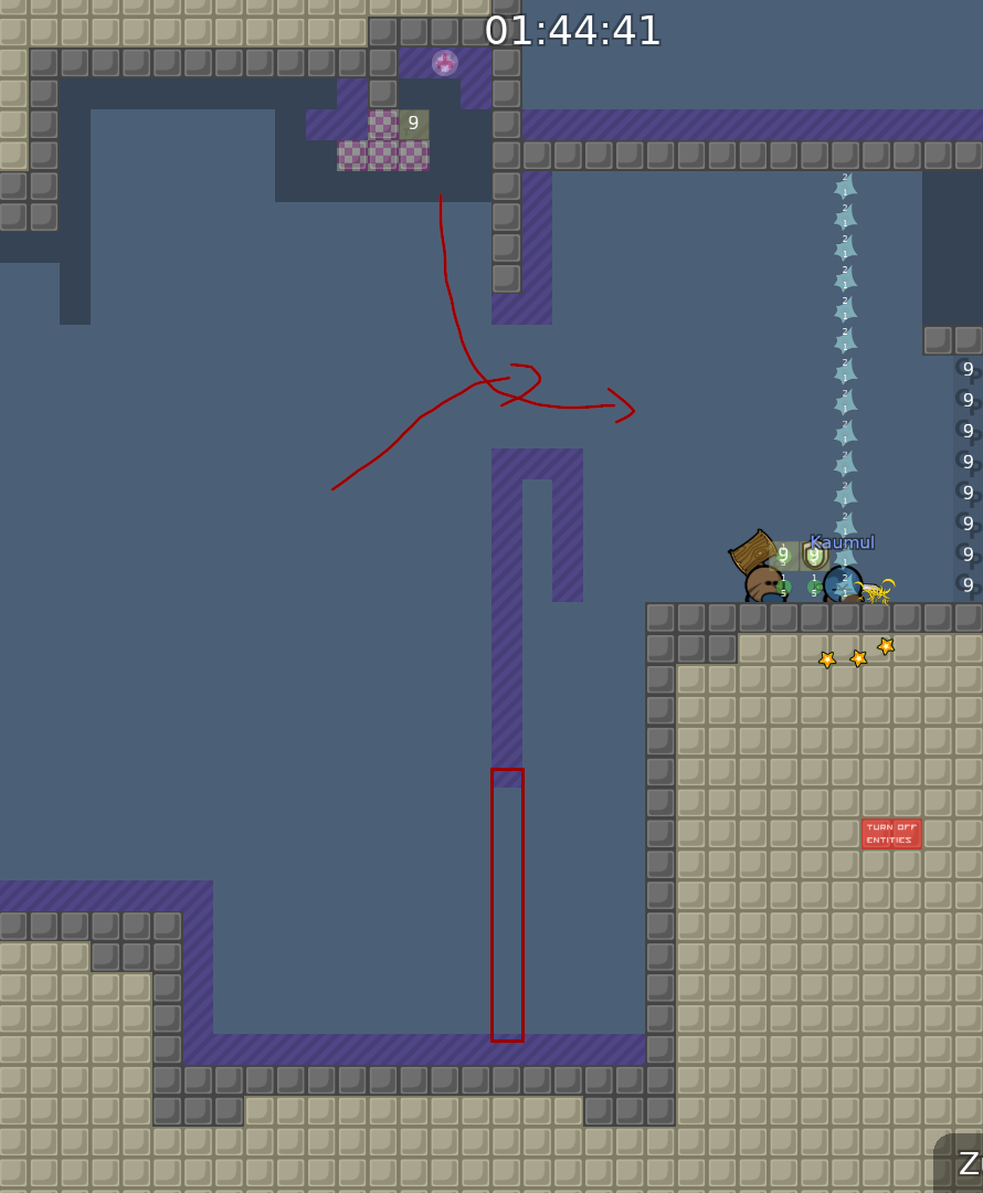
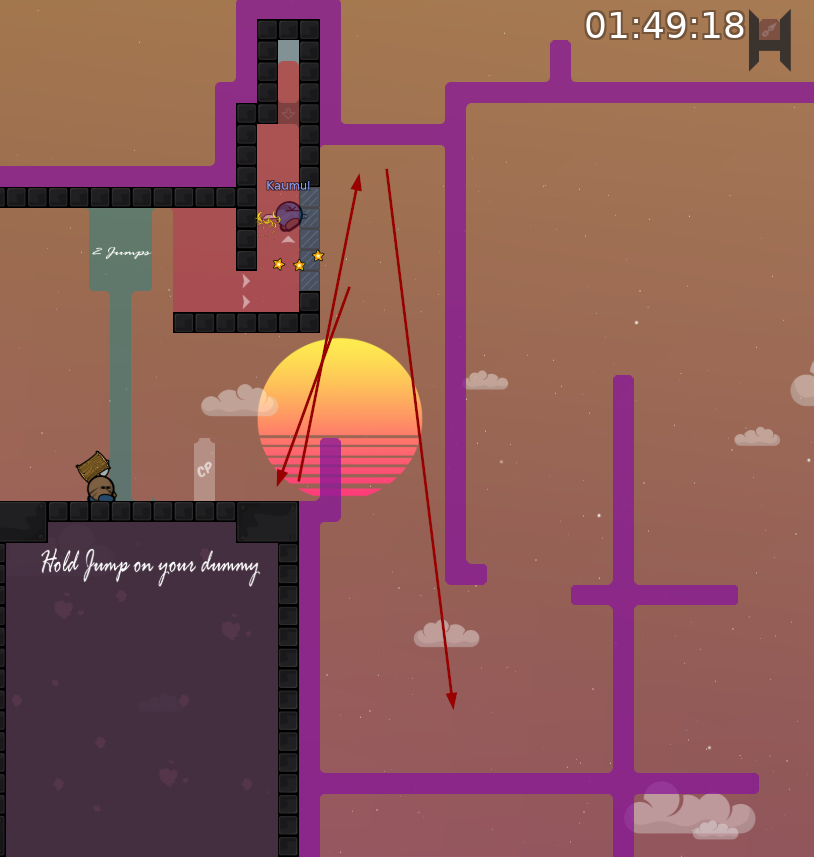
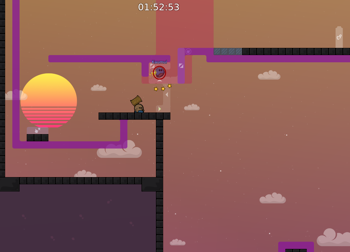
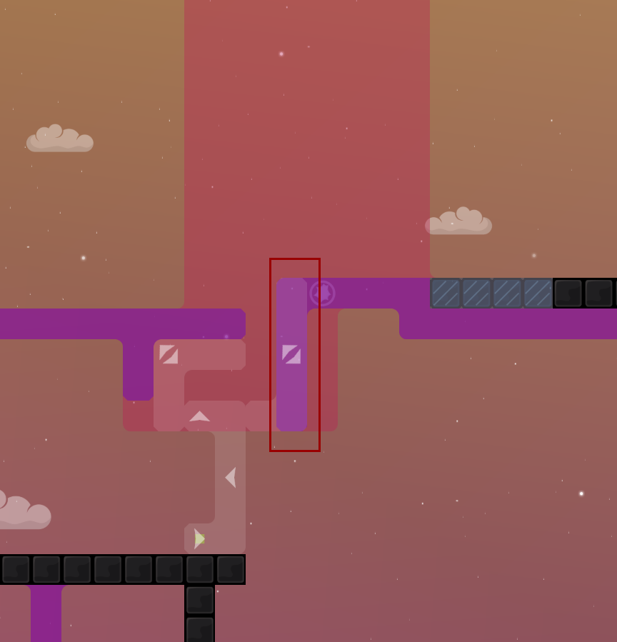
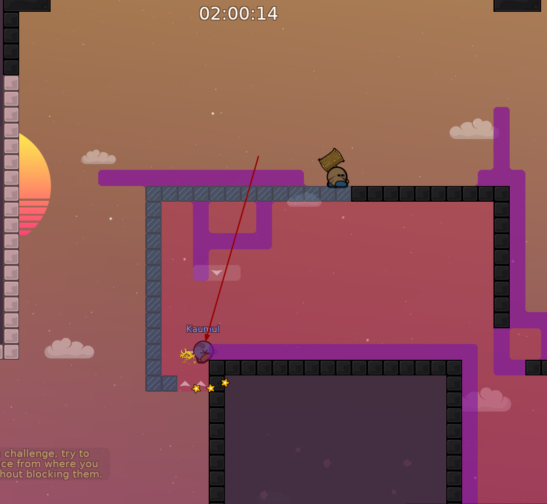
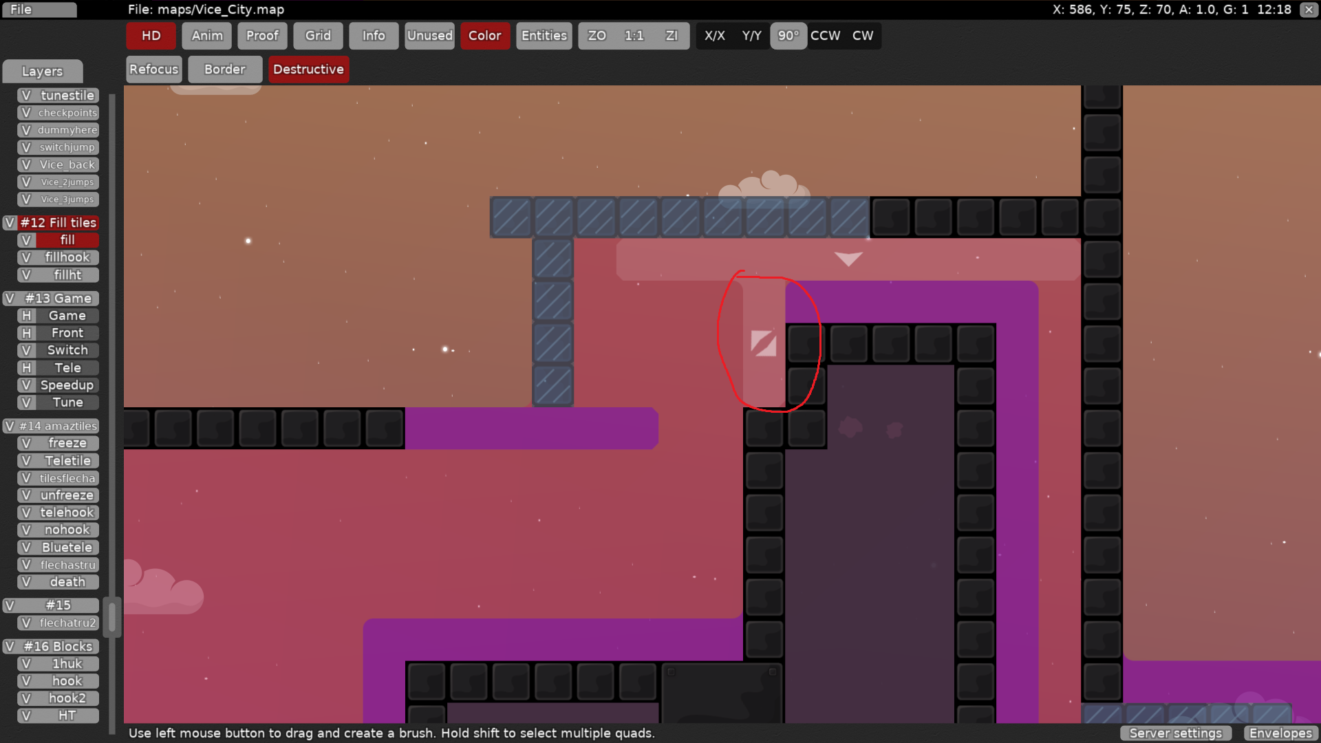
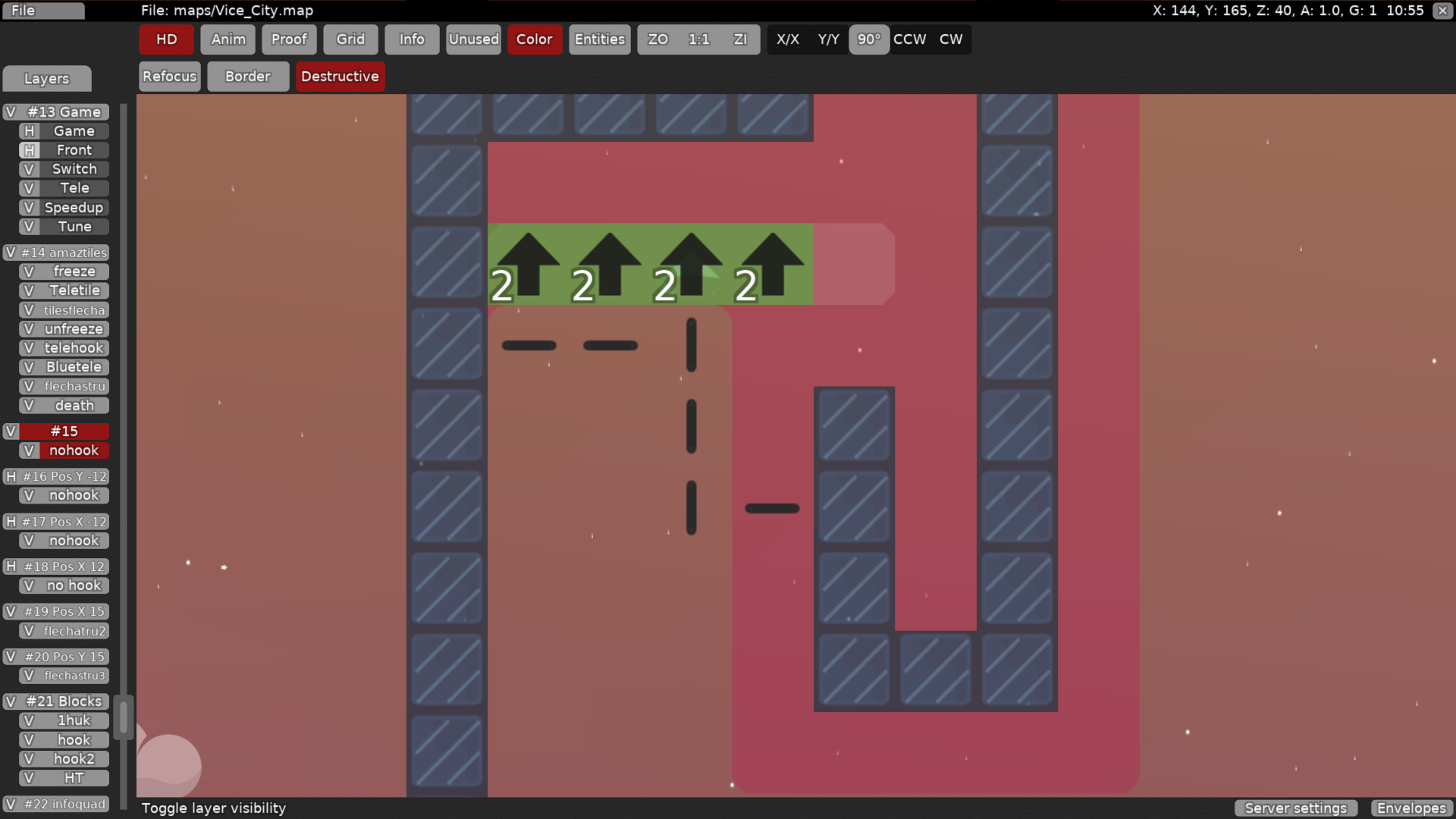
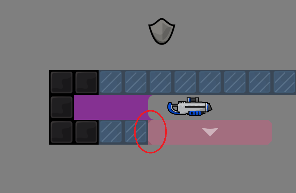
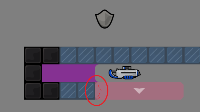
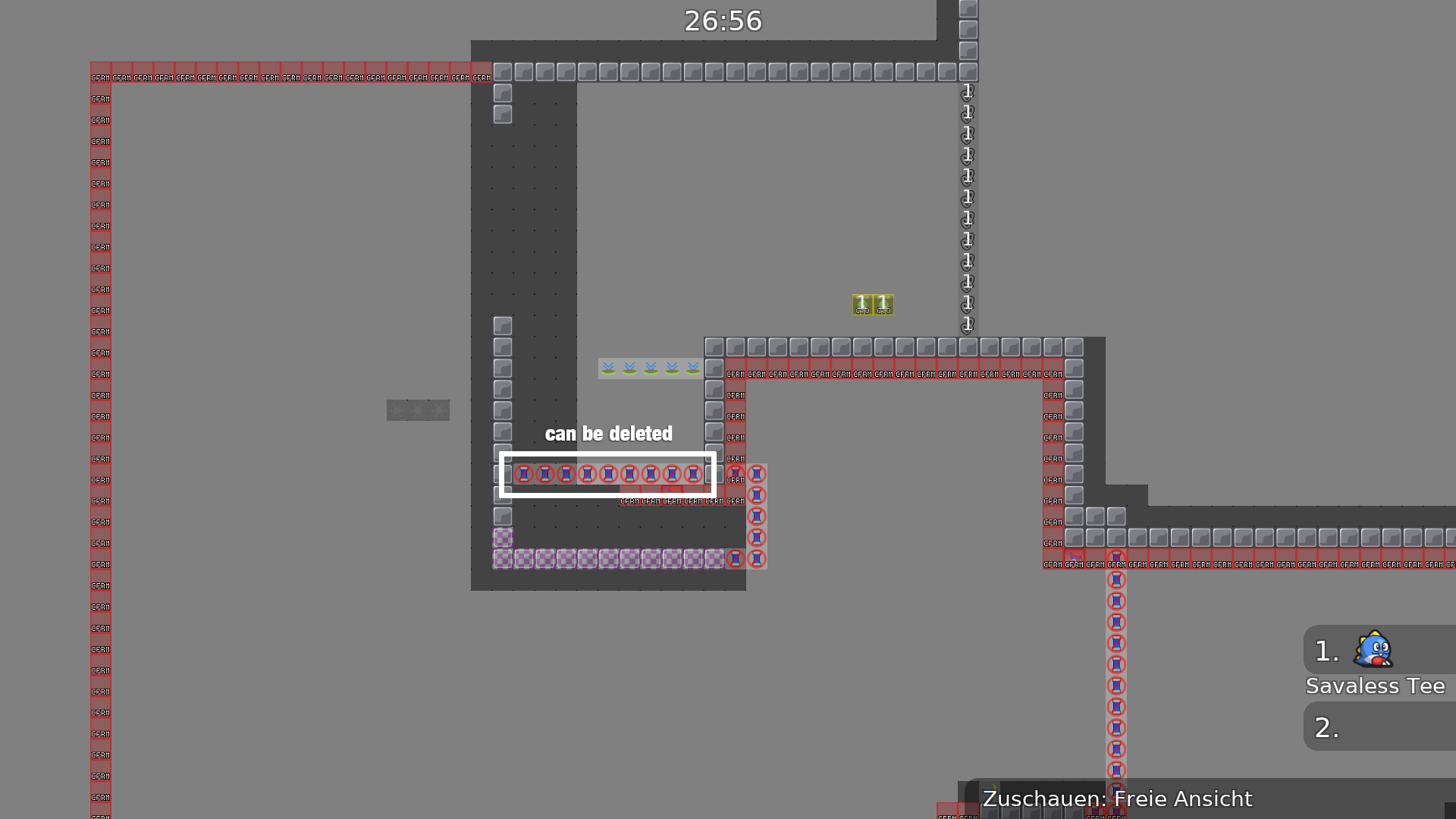
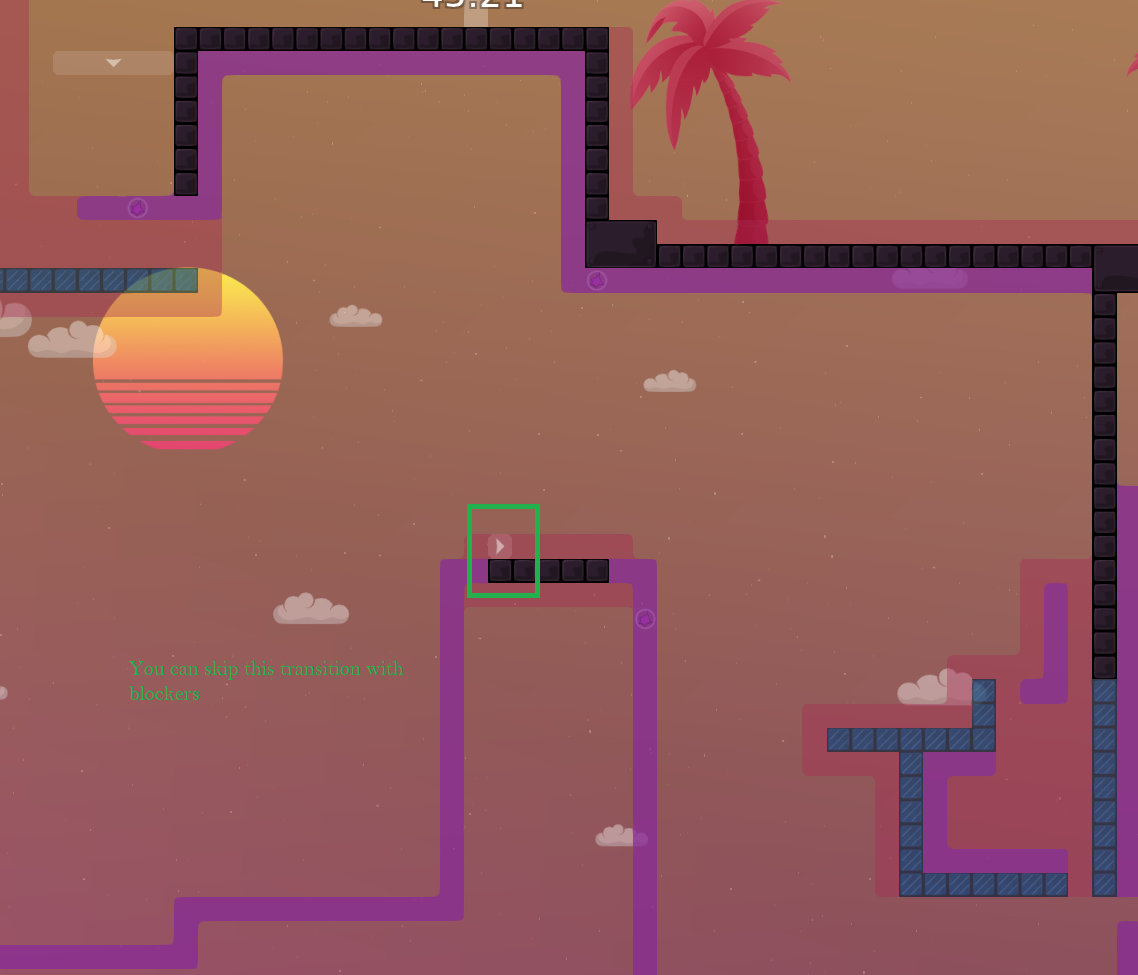
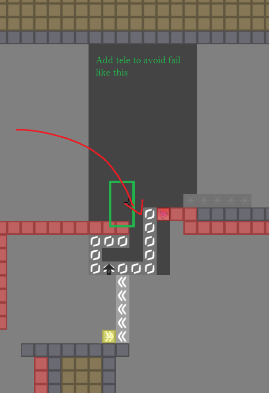
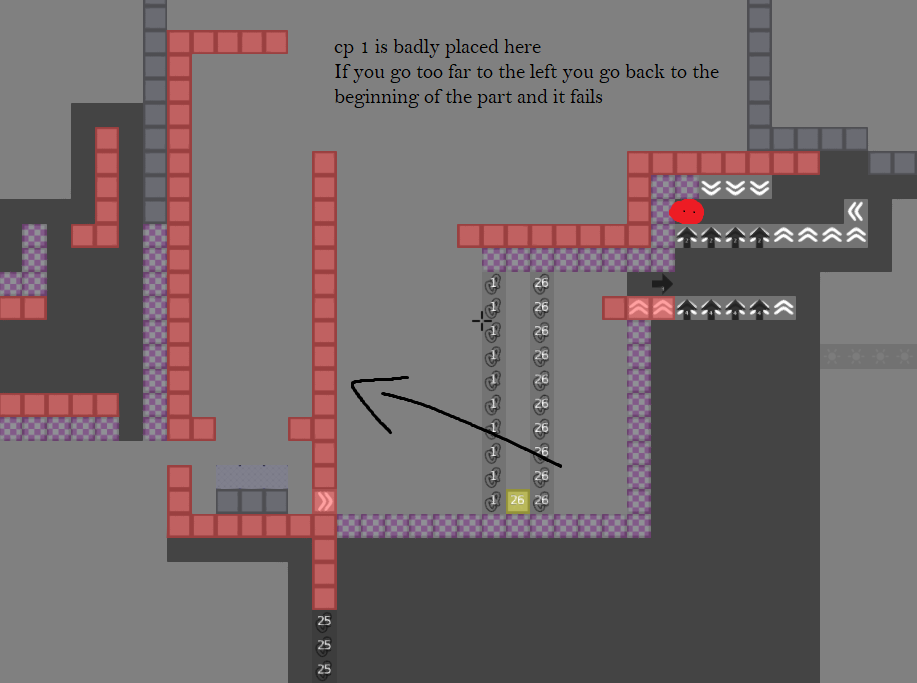
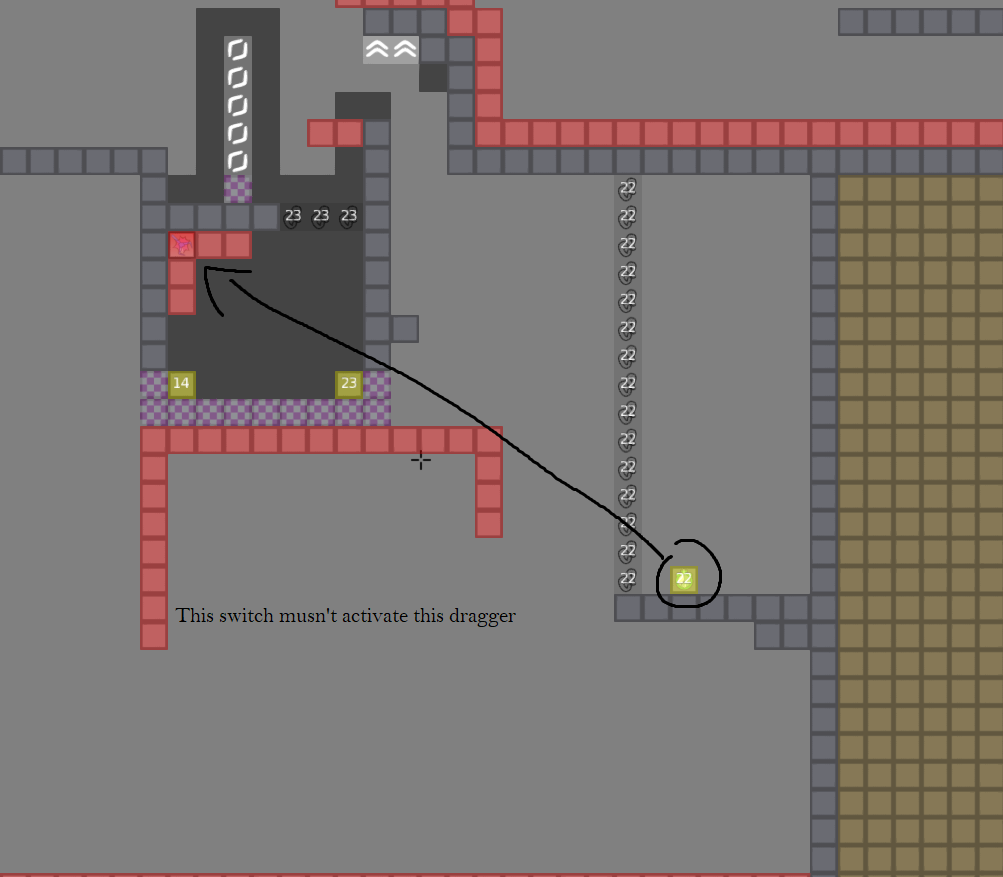
this is your map's testing channel! Post map updates here and remember to follow our mapper rules: https://ddnet.tw/rules
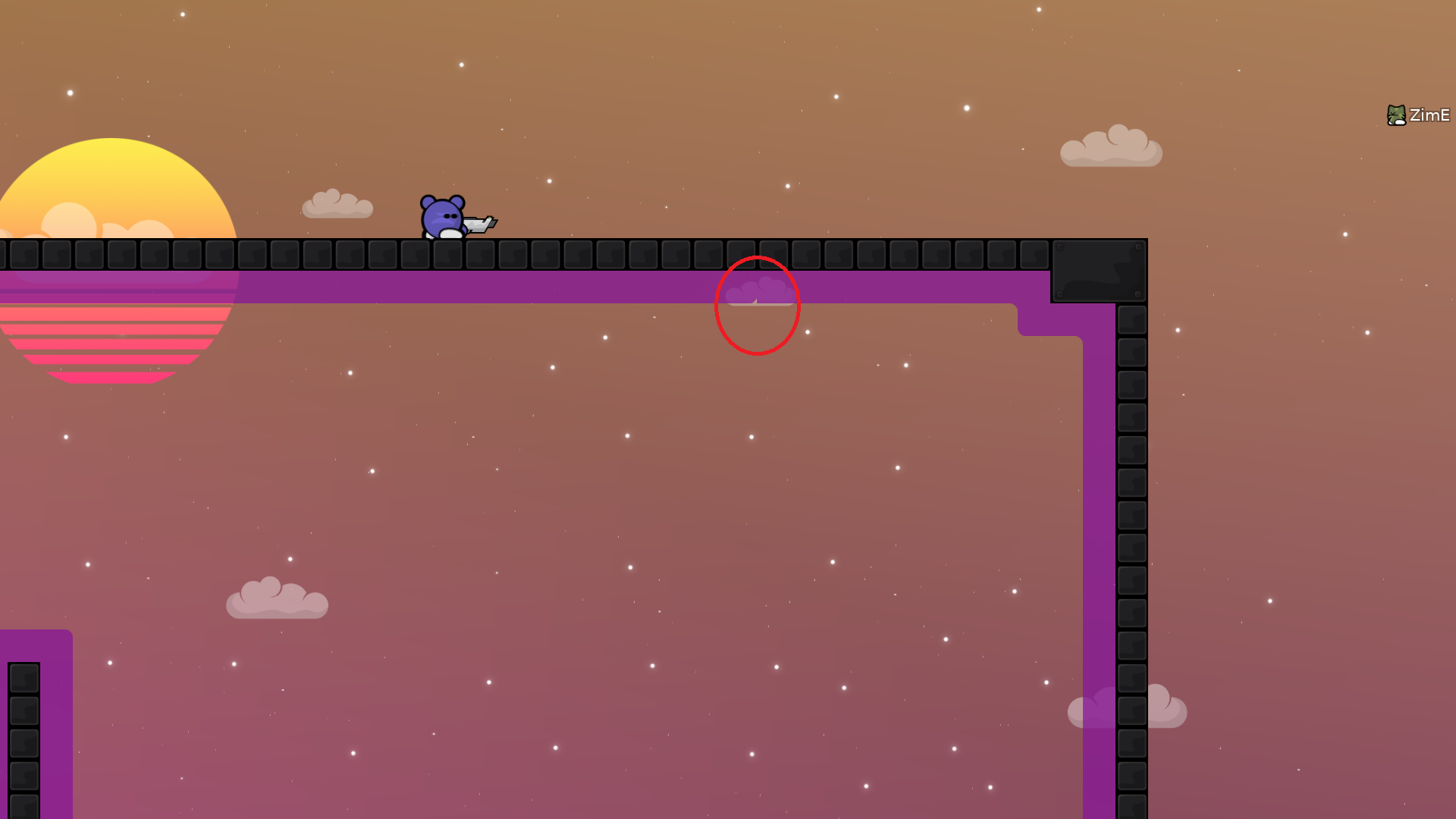
start is too far hook i think , good map over all ! waiting fixes
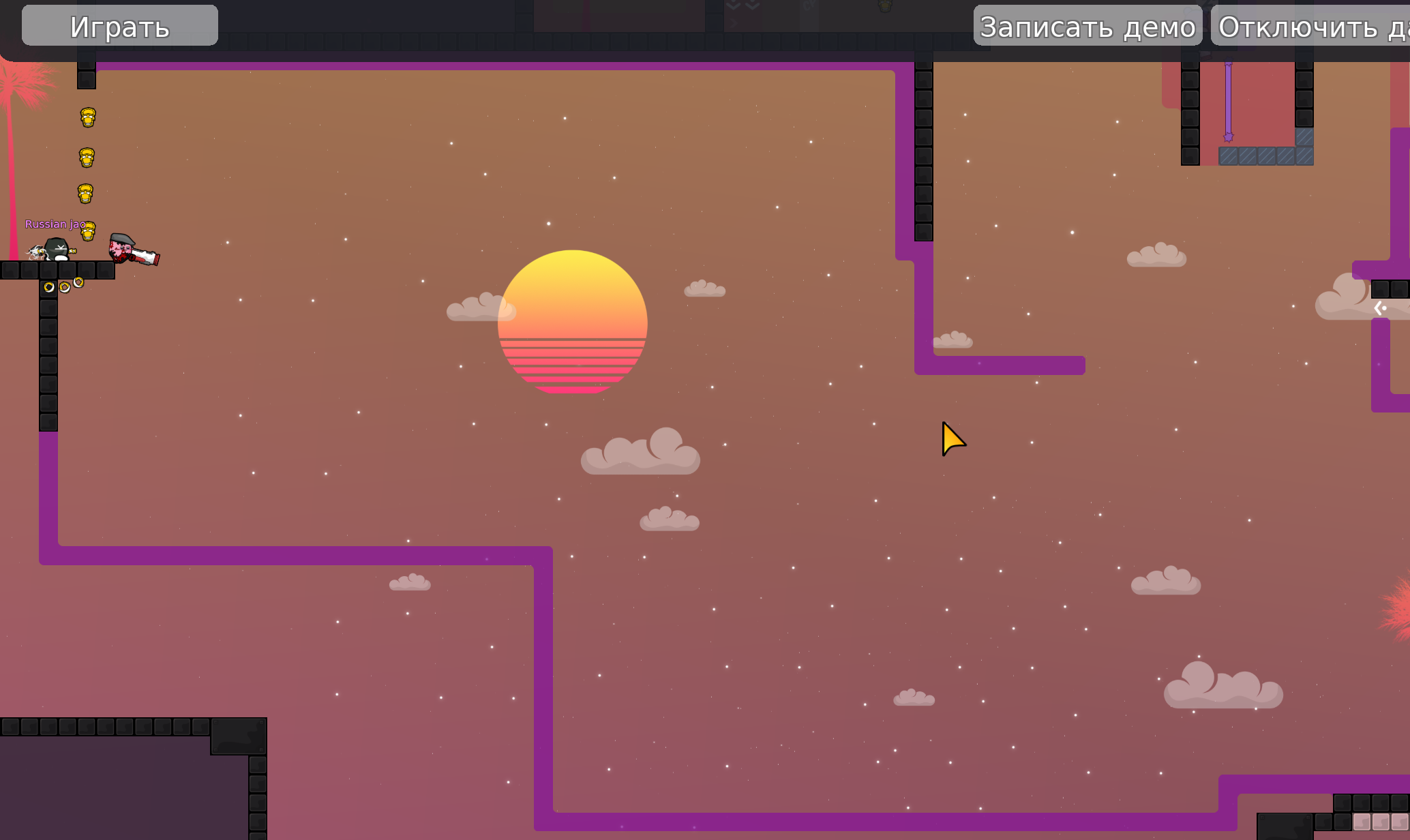
Wow, cool design

thx uall, fixed, reduce the weight
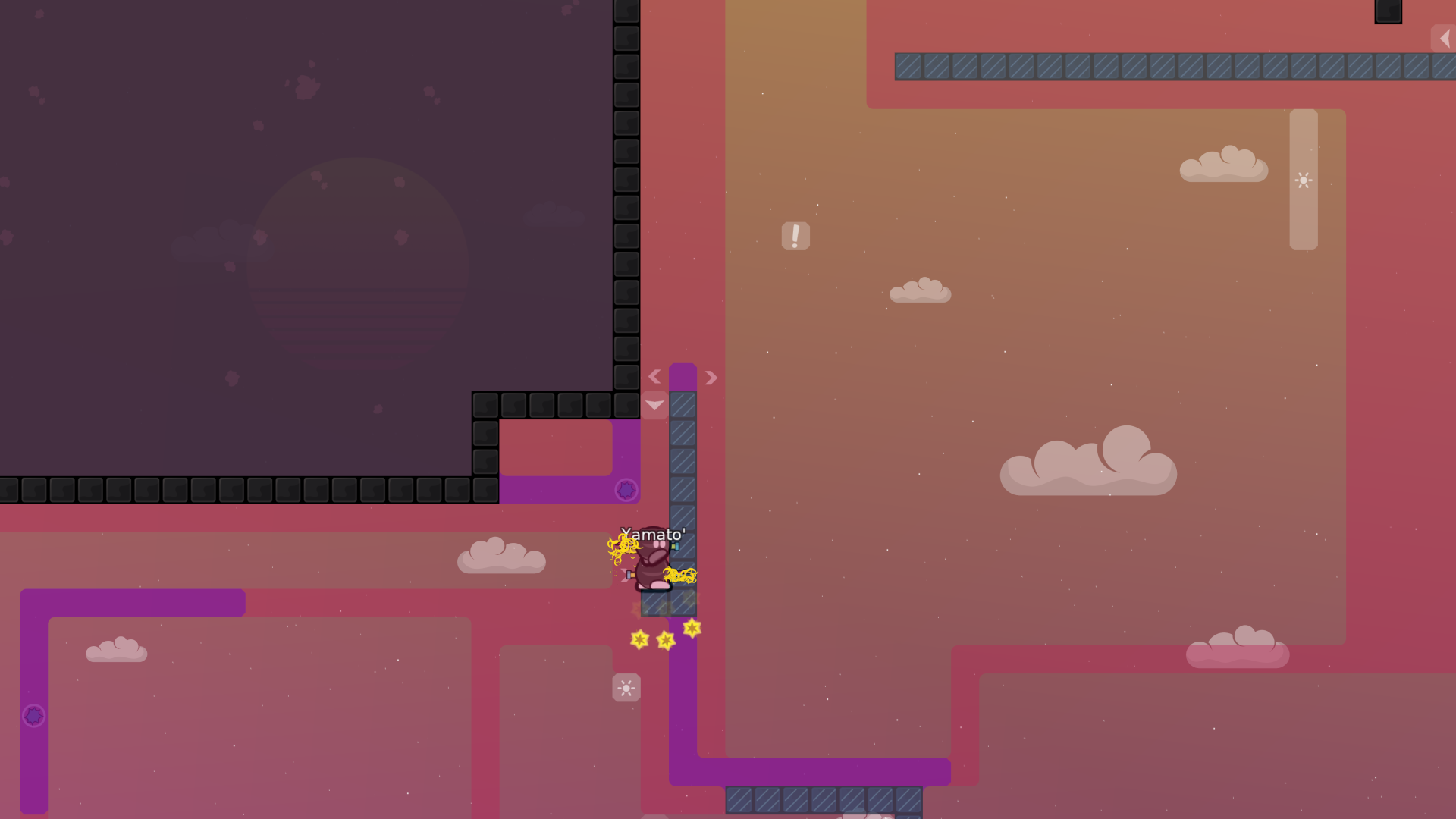
its to see the sun
nah, but for real there is not too much to see either
i mean empty space no challange
ye u'r right ill put more obstacles
imo got more challenging
Wena arrow, new map!!!
Todavia no lo pruebo jejej
fix some stuffs, thx to qed
wena wena, esperando el feedback
i change the stars

https://www.youtube.com/watch?v=Gj-LJWTpo2w here is a Playthrough
ta la raja wn
ta weno
the map looks pretty nice

next gen mapper? 😮
That ninja fly part where dummy uses ninja
I'm seeing it the first time
Looks cool
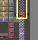
cp 8 further left so u dont accidentially touch
playthru vid same music as mountain silence one

huge improvement from last map tbh
thx, fixed and also i fix a stupid death
what a cool map
now make the san andreas map
i added a logo
change some visual thing thx to Coke
other visual change
another one
some quite lil changes
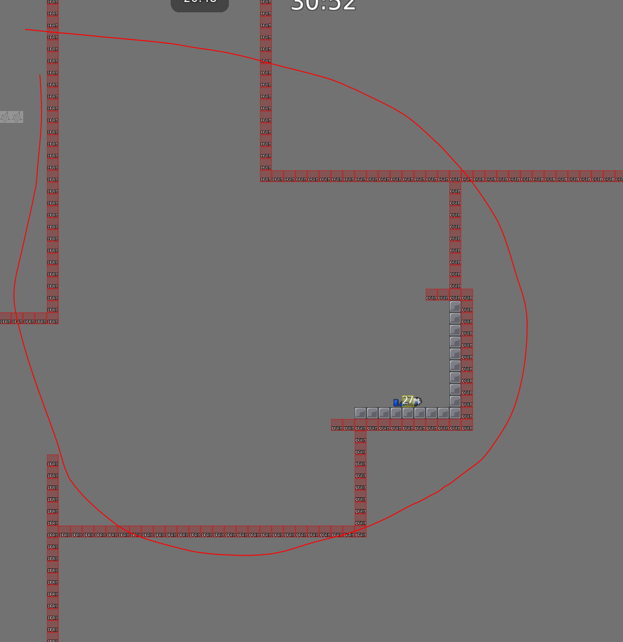
but then with a cp at the begin of this part?
ok
ye its okay, then u have to use the edge anyway
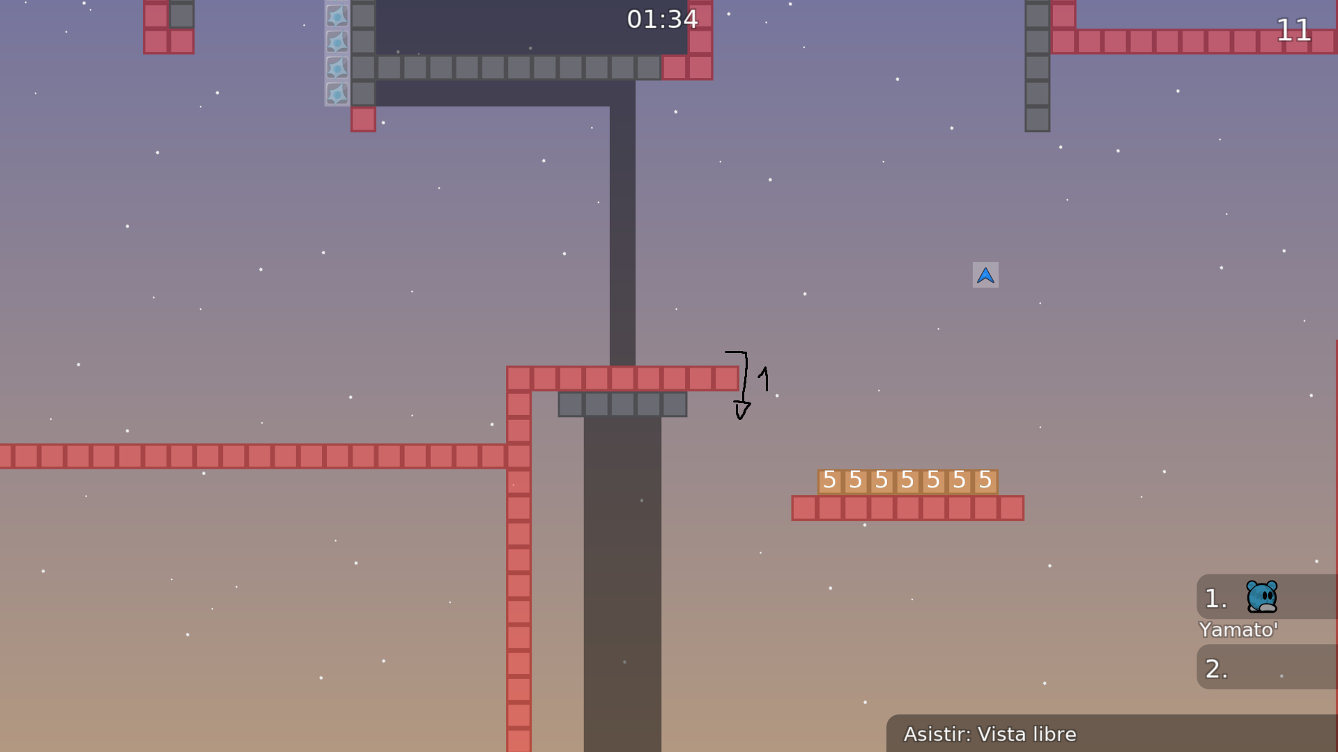
yes use dj, hook dummy and go to the platform
ye, but you can't finish the part u know
i can
i said it bcs u can finish the part like this
fixed, cp7 got more annoying, but its short so...
Deleted the door in cp 13
sun = 150 alpha looks good
idk how to make this better 😄
maybe with switch
this should do it
i added a stopper in case you get in some position when you hook him too hard and touches the speeder
forgot change the blocks layer
i added a tune zone in cp 9 to make it more comfortable
i moved the cp 13 4 tiles
oh its always the wrong side?

maybe use it without changing pos
its in the middle i guess
yes i did
like this, put it in the middle?
ah
well i thought it would look better that way
bcs of this
so if its not a problem i would rather let it as it is, due its not confusing and messy
let me try
i could do a 180º of it so in that way would look different
2 layers or make new tiles extra or i make it ?
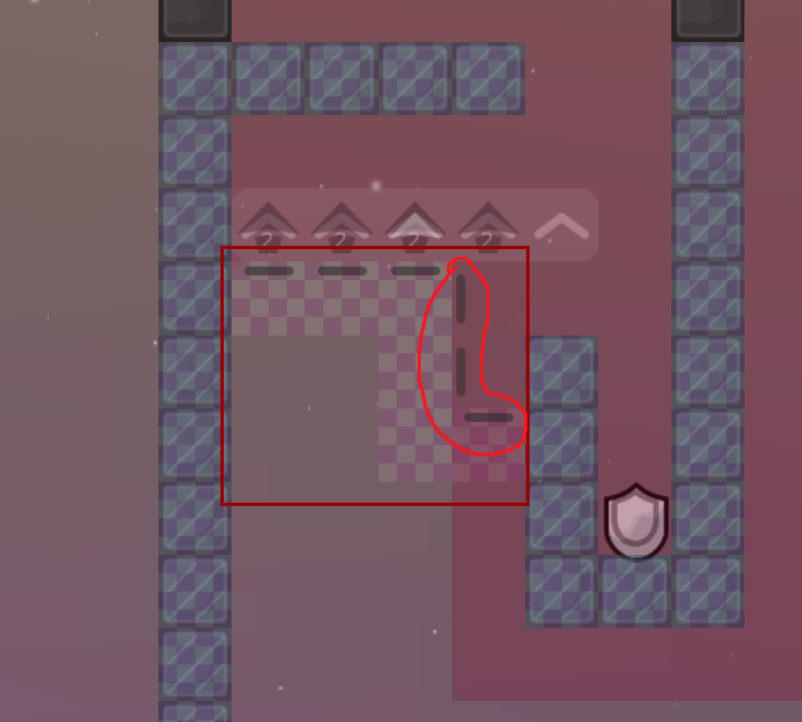
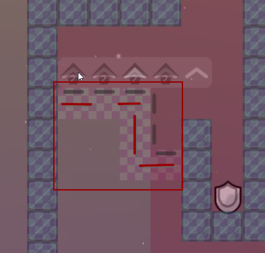
you mean the inner tele corner or the freeze corner ?
its fine, if u see the map, i never used freeze or tele bg with the same corner for both sides when they are in that similar position, only for info sings and for the stoppers
aaaaa,okey
added an intro song at the beginning and a shoutout
rather delete the song, and deleted some stars
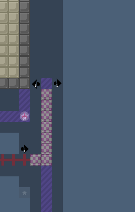
i fixed things in: cp8: fixed a cheat cp9: added shields to prevent keep the rocket, also another line of tele to the left of no hook cp13: fixed some stupid deaths i remade the logo, putting a neon style
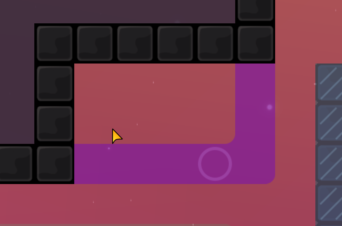
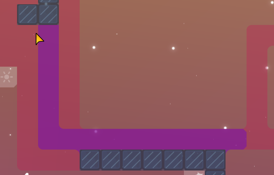
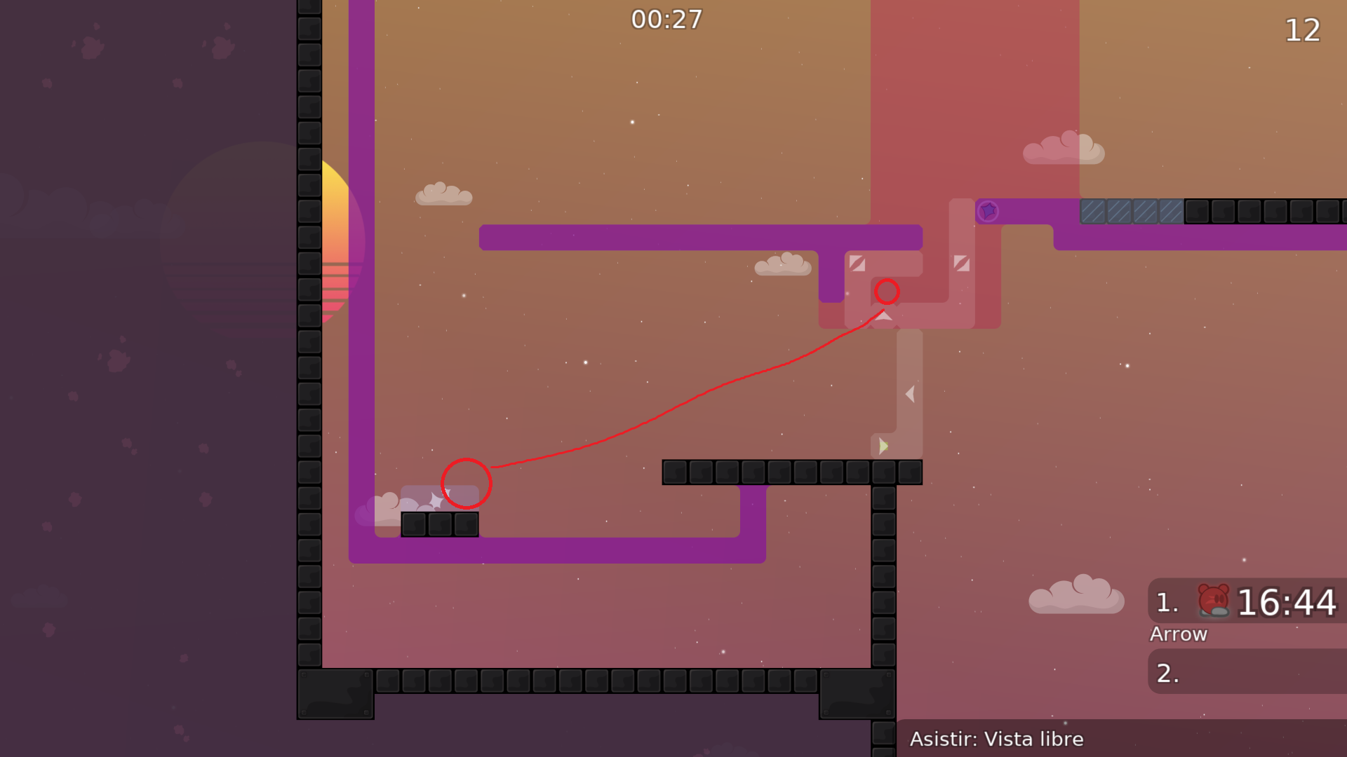
Cool map, but some stuff destroy's the flow if it... check my screenshots 🙂
hook blocker its to prevent that you can hook too early so dummy doesnt touch the speeder, so idk maybe with the stopper its okay
i deleted that freeze bcs you can die there
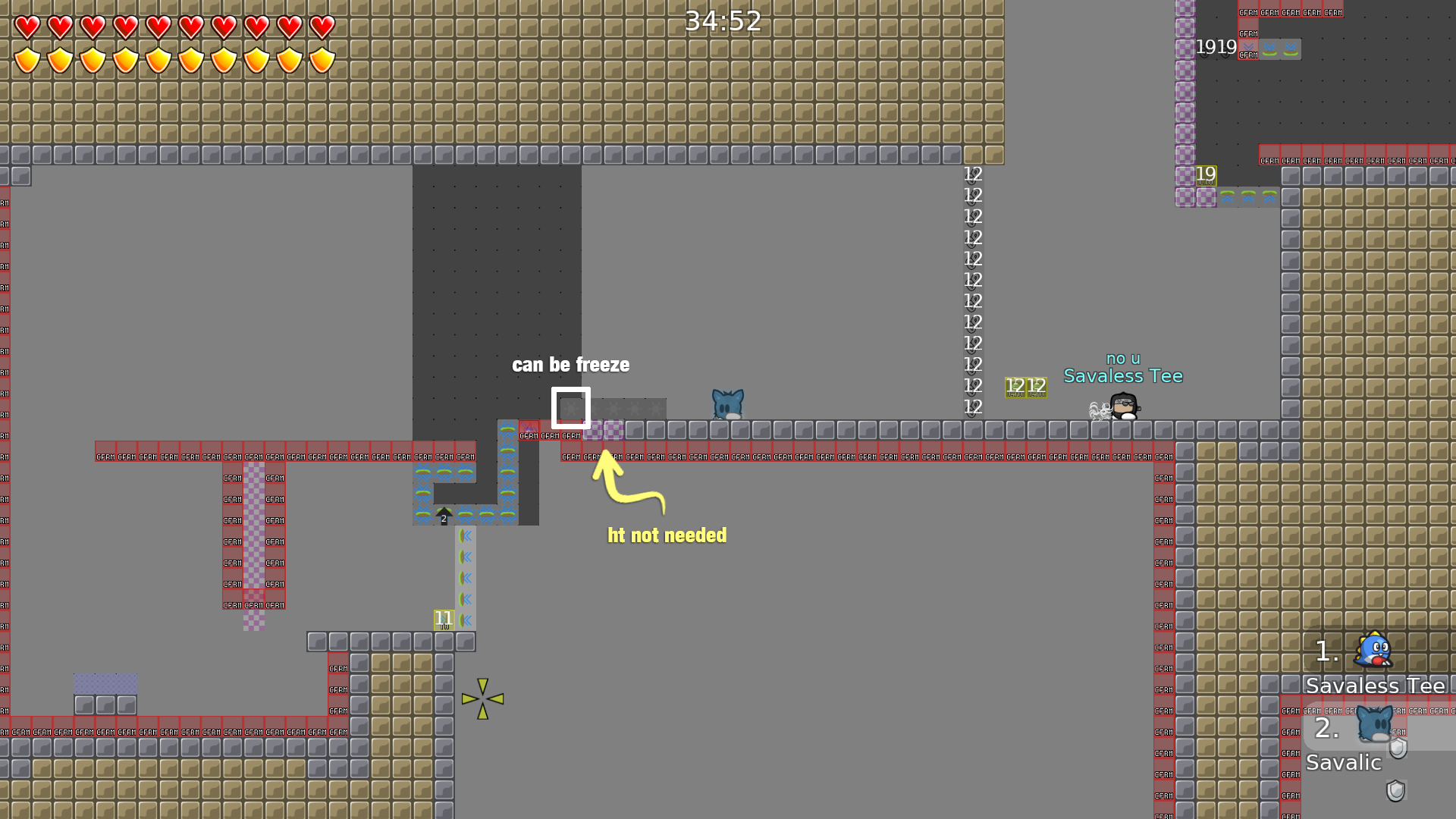
about the ht it was just to make it more comfortable but ok
I would at least change one of it, it’s just a hook. (Freeze or HT)
Just remove it, it makes no difference
ok
how its not needed?
imo its okay, Why you shouldn't watch the part before starting it? besides the part isnt faily and its not annoying
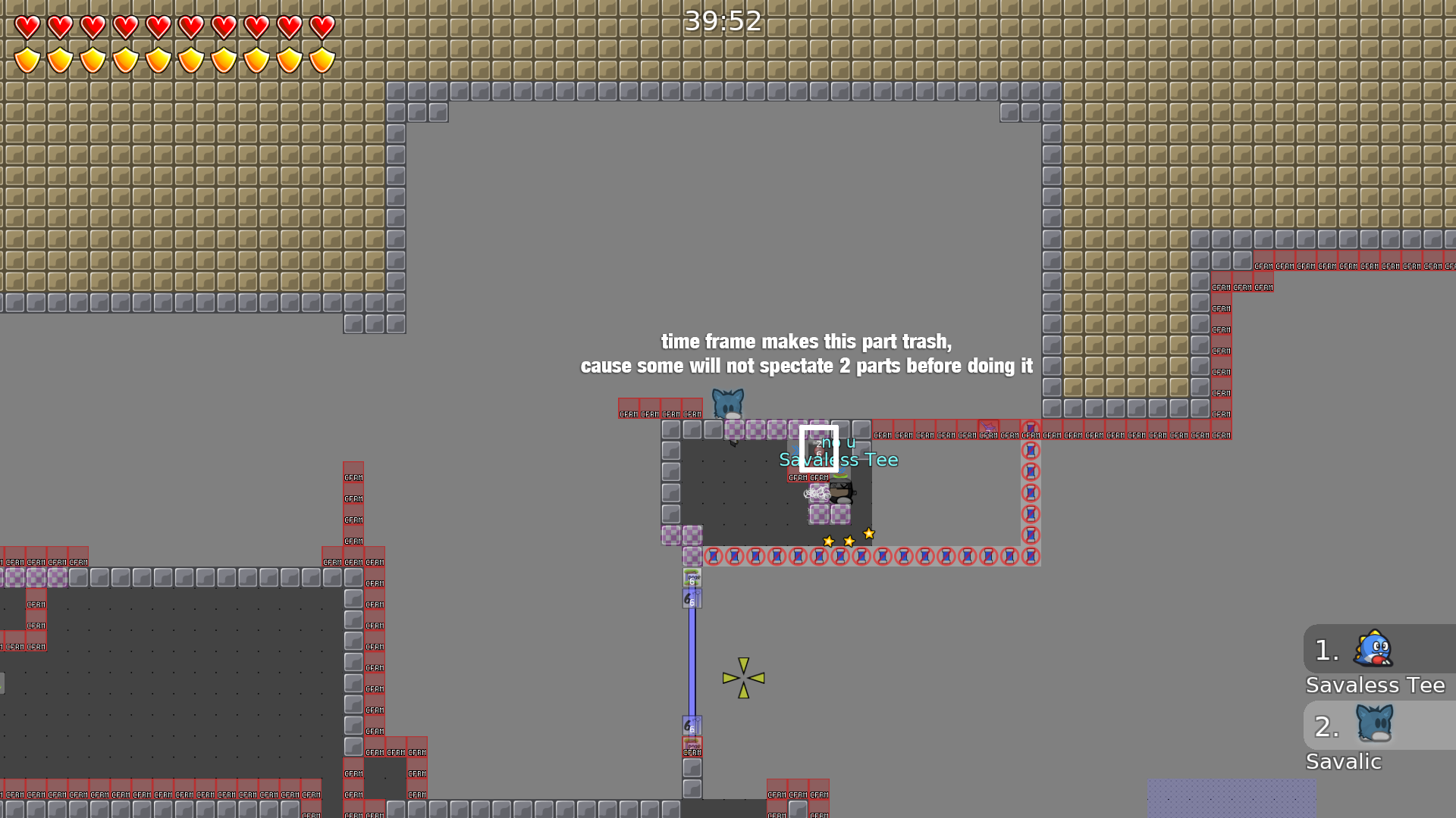
i mean everyone specs parts before doing it
i chenge: .- deleted the switch at te beginning, also the laser blocker .- reorganised the freeze at cp8 .- HT to unhook
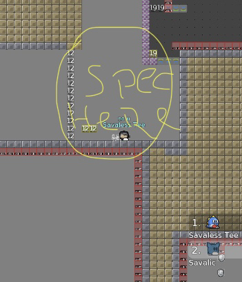
i spectate right there where i was standing... when i did, the door was closed and i had to redo the part before
you can play this part in a way that your dummy falls first and you drop on top of it - so you don't need it
This way much cooler
I would keep it
Ill keep it as it is bcs its more creative
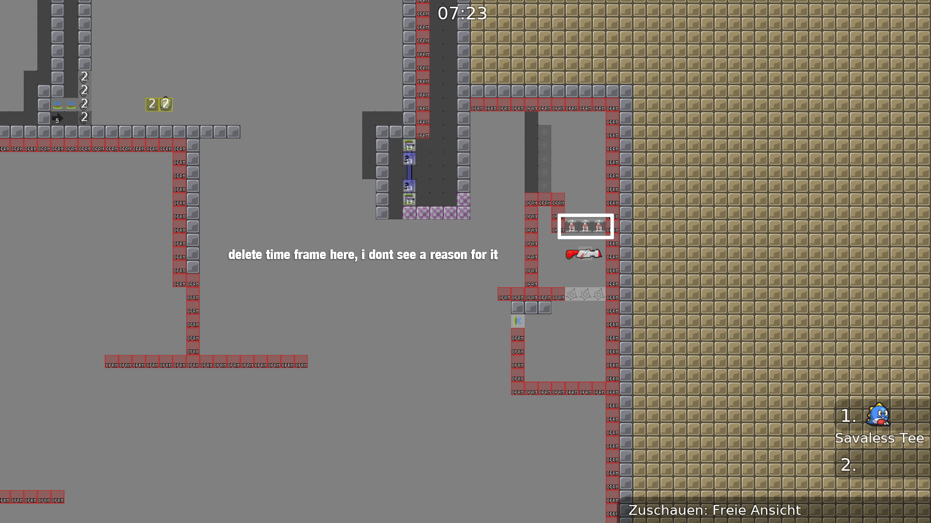
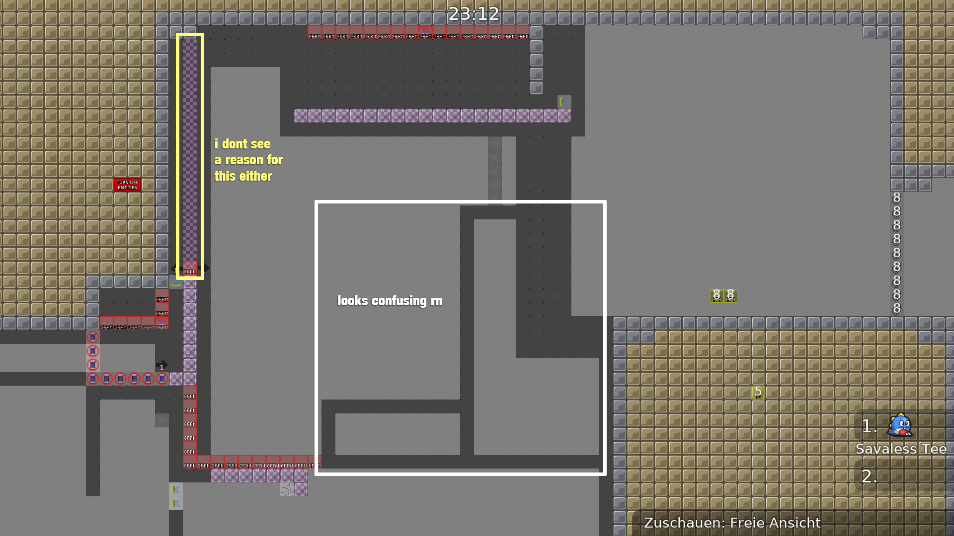
I didn’t say u have to change it, I would just change the time frame
That the door won’t close
ah okay, now i get it
changed from 2 scnds to 5, and i think its okay now
minor changes about what
@justFlipposaid
Ok, I have some problems with this map before ready it. Gameplay :
- There is unbalanced between short and long parts (For example cp1 and 4, in comparaison to cp21). I think you should think of modify parts a bit Design :
- I think your tree are not vectorial images. Ddnet mapres needs to be vectorial images to respect teeish standard
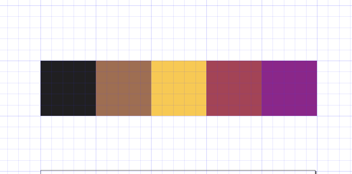
- Your colour palette is not 100% clean. Some colors don't fit with each others. I'll post the colour palette of your map after this message
- Solid elements don't have to be transparent (think of Layer#17 -> hook2)
- Less important because it's only a personal opinion but, I don't think that the trees fit with the rest of the map (this is not a beach or something like this)
with modify you'r trying to say that i should put cp on the half parts to not to be to long? about palms i don't understand what you mean, it is about that it doesn't fit with tw? about colours y tried to be consistent with the vice city game, but ok ill try something else hook2 it doesnt impact 100% on the gameplay (just 1 part when i use telehook) and its more like something visual, maybe i should change the name of it same here with the vice city theme, i wanted to create that environment with the palms and not just use the name because i wanted, u know?
I tried to balance the parts with cps trying not braking how the parts are done, so i would like to hear some opinions about if its okay or if i should change it, also i changed the palm trying to be as "teeish" as possible
Trees are much better now
Ok for this
fixed, i rather put a back on top in cp 26
to me colours are better than before so i would like keep it as it is now
@DarkOortColour looks good for me now, let me know what you think
its ok for me to
if u fail you dont need to rewind everything
told me that i should "balance" the parts, and i didnt find a clear way to do that without braking how the part is done u know
ah
fix some corners that were missing
$ready 3
$optimize
Congratulations
Ty
gta
there, it'll show up on the search now

