this is your map's testing channel! Post map updates here and remember to follow our mapper rules: https://ddnet.tw/rules
$decline
$decline
$decline
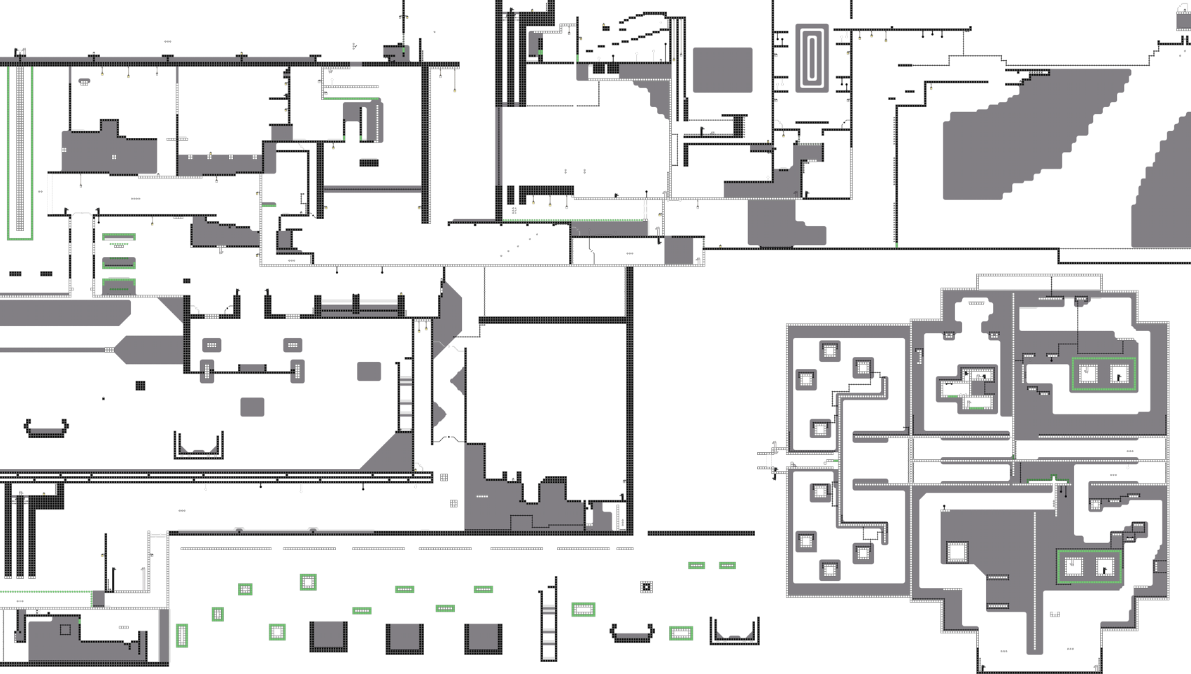
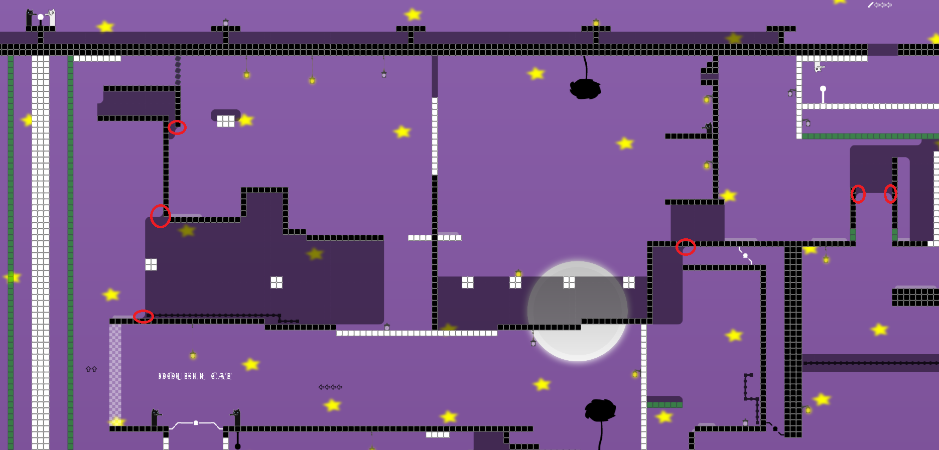
also the filter is kinda weird, it's hard to understand where you have to go, I had to look around for the startline and reverse engineer the path from there
dont even need to fly up you can just hook up
ya but idk if u reach, didnt try so I figured Id give the benefit of the doubt
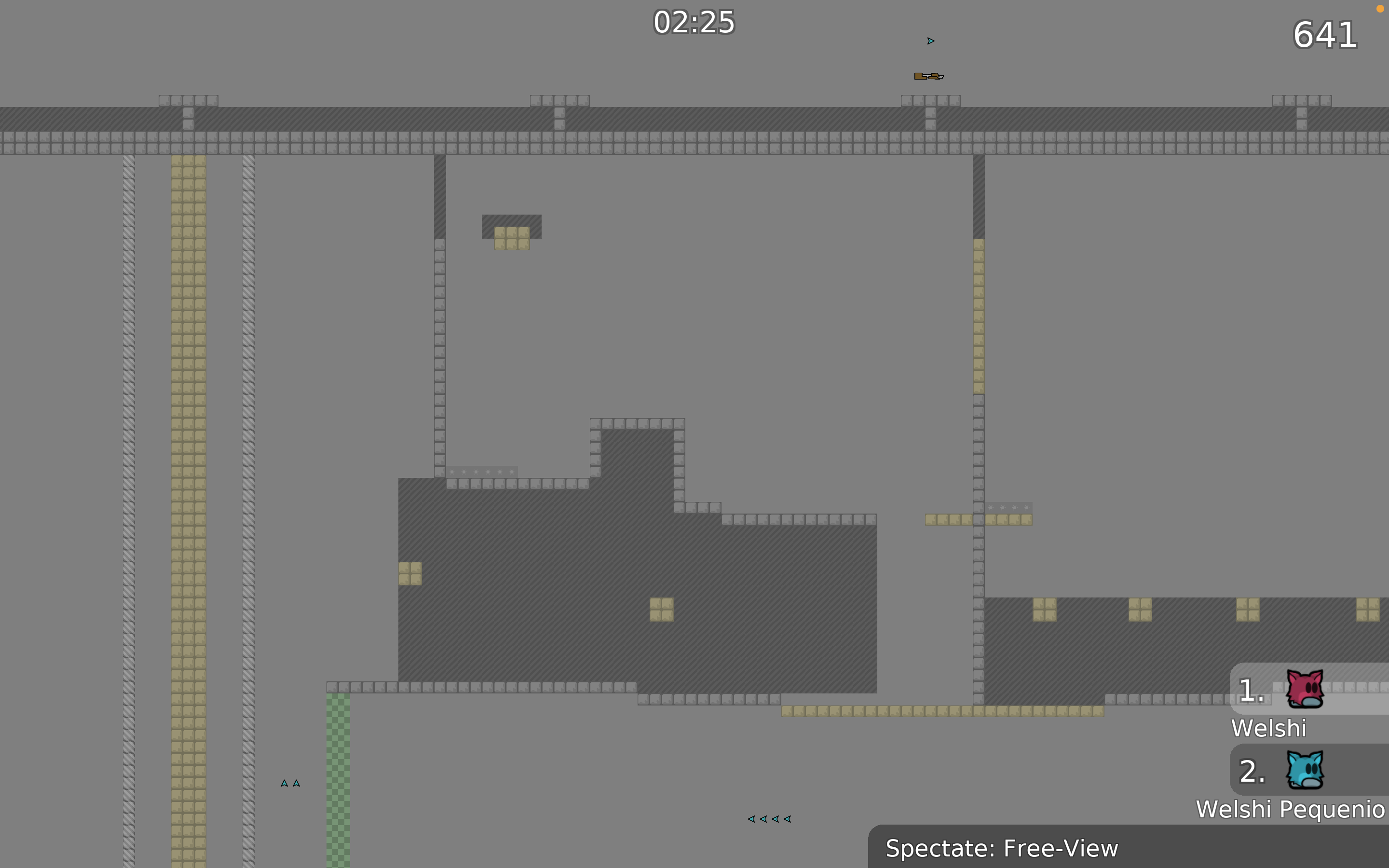
I do like the shotgun part tho, i think it's nice. would be nicer if getting the shotgun wasn't some repetitive jumps to the left for which u have to just repeat to the right to get back
the part also seems more like a moderate map, in comparison to some other much easier parts in the map
(Im assuming u run left while hooking ur friend)
well my uneducated opinion (im not really a tester nor do I have any maps in the game) I like the ideas, but the map feels wonky and weird, the entities suck, and I recently just automapped a map and submitted that so u know it's real, try fitting these ideas into the style of a map like harvest or sunny side up
agree with everything welshi said
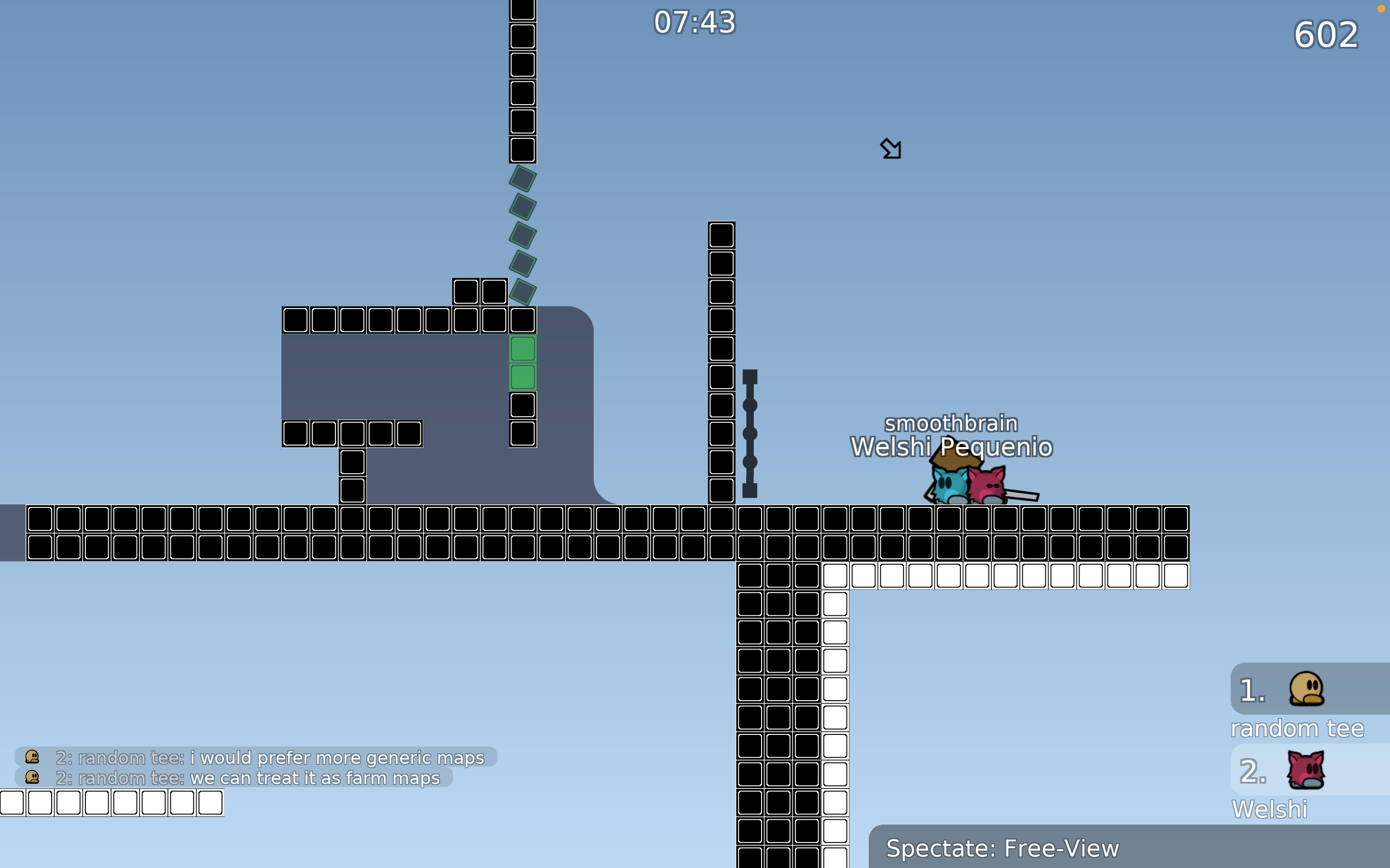
also I understood the drag, the block to the right is too close and u cant go left
for the parallax, when you set something to (0,0) you are essentially sticking it to the tee permanently
for your values, I would make them much higher (95/95) and (90/90)
I am assuming you made the values 0/0 because the trees ended up moving off of the screen. If you want to avoid this, you can make a blank tile layer that is the same color as your tree quad that extends downwards infintely (you would also need to add more tree quads on the left and right)
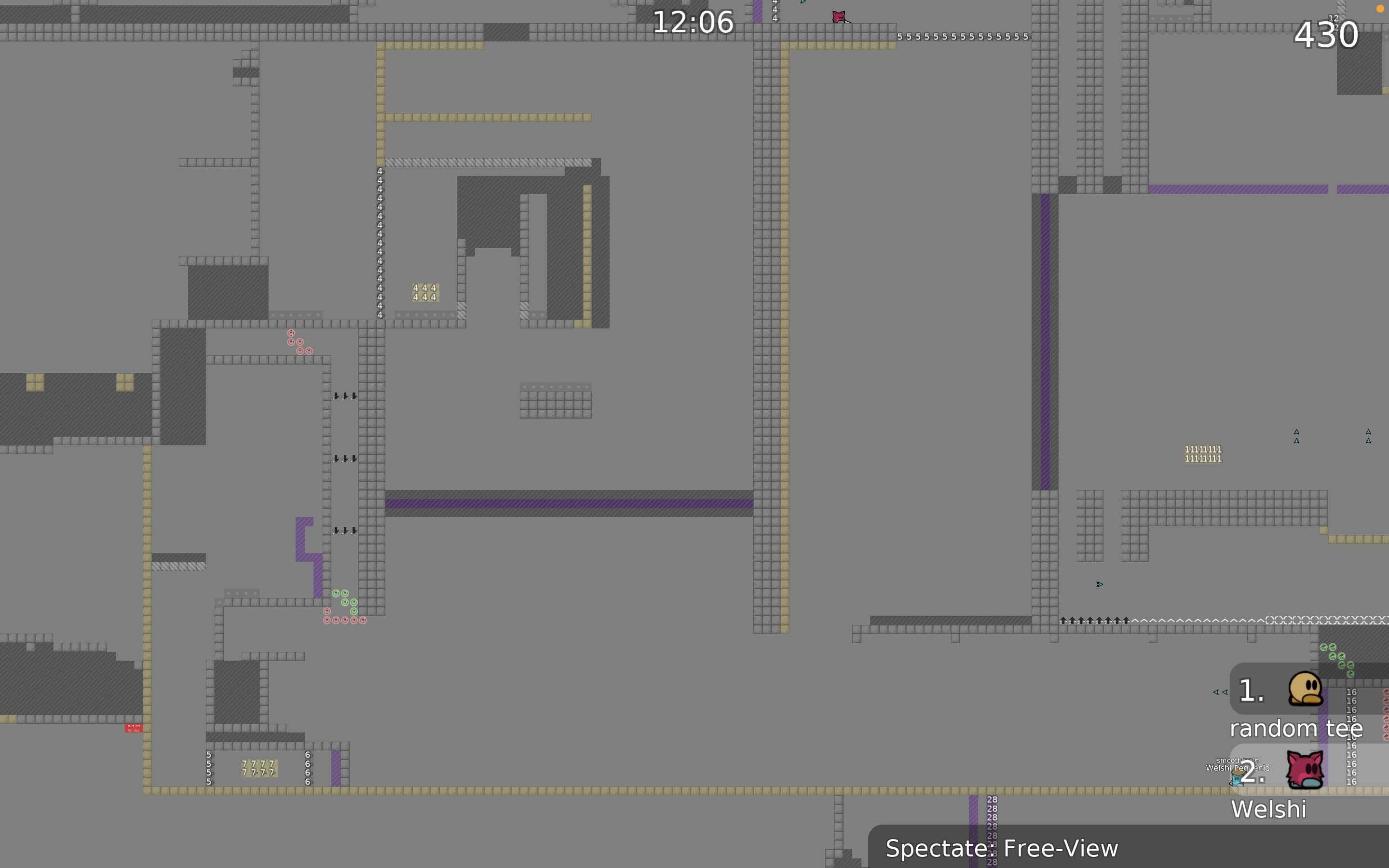
The map has some good ideas, but right now it feels like an oldschool map with a lot of the same parts that have been made already. I would recommend getting inspired by newer maps that are scratching the surface of new mechanics. Your usage of live freeze, for example, could be expanded on, as it is a relatively new mechanic.
Values of 0 were used so that the trees were stationary and not confusing. Now a lot of players play without textures and one of the reasons is a para x/y
As I understand it, many people lack inscriptions and arrows to better navigate?
about live freezing..there are ideas on how to reveal the mechanics, but this is not for the novice map. I didn't want to complicate things here
Changed the first desk and added inscriptions. Now there will definitely be no doubt where to go.
Maybe someone else wants to express their opinion?

do you suggest adding more corners or removing them on the contrary?
your map so totaly your decission. From my point of view you need to make a decission if you add corners then do whole map if you don't add corners then remove them completly from map ^^
However I have no idea how ddnet staff looks on map without corners (if they care or not) =]
we didn''t force mappers to add corners everywhere (as it was on ddmax), but it should be consistent on whole map (you can even have crazy idea to add corners on freeze, but make unfreeze and tele without corners, that's fine)
and mappers are free to use generic_unhookable for hookable tiles xd
Hi, in general the map can't be released bcs has to many flaws to fix, for example unbalanced, weird mapping overall 1.- You have a whole part of gores which besides of being hard for novice is not fun 2.- The filter is way to big for the main purpose of what is a noob filter 3.- The live freeze will be really hard for novice player bcs they will not know what to do between other things The other parts are really faily for novice players and not creative at all therefore not fun to play
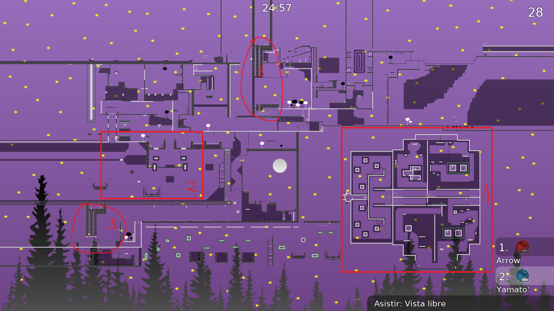
i agree with above ^
feel free to ask any mapping questions in
#mapping$decline
