
this is your map's testing channel! Post map updates here and remember to follow our mapper rules: https://ddnet.tw/rules


- The background is too detailed and the playground not enough
- tele need to be transparent

race

 1
1
awesome gameplay, however design elements need more contrast/recolor and the background shouldn't be in front of the tee

try putting mapname and all credits in one area
logo should not be in hd
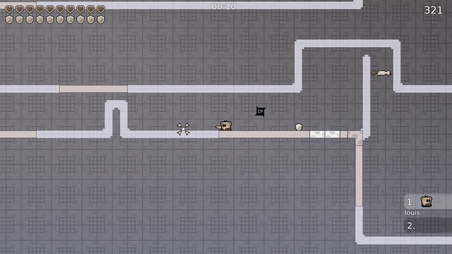
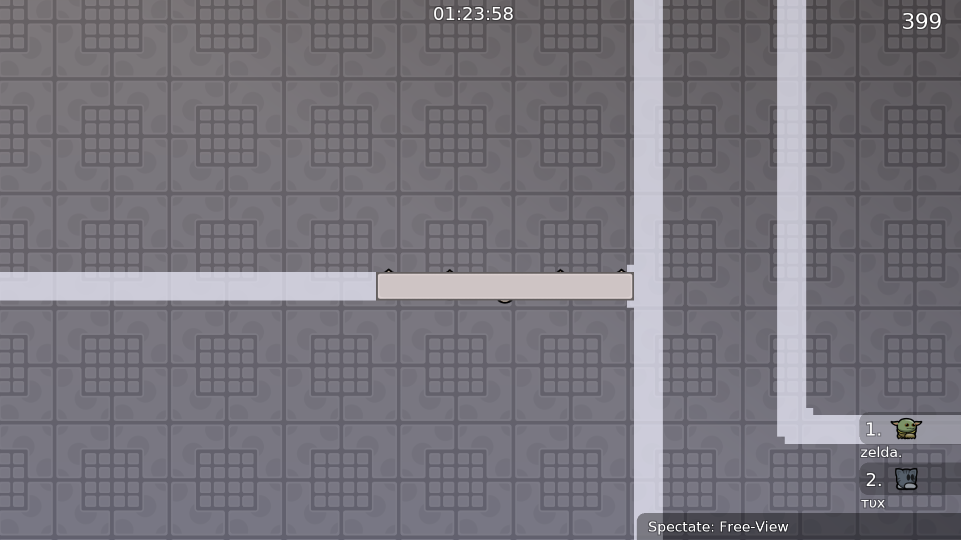
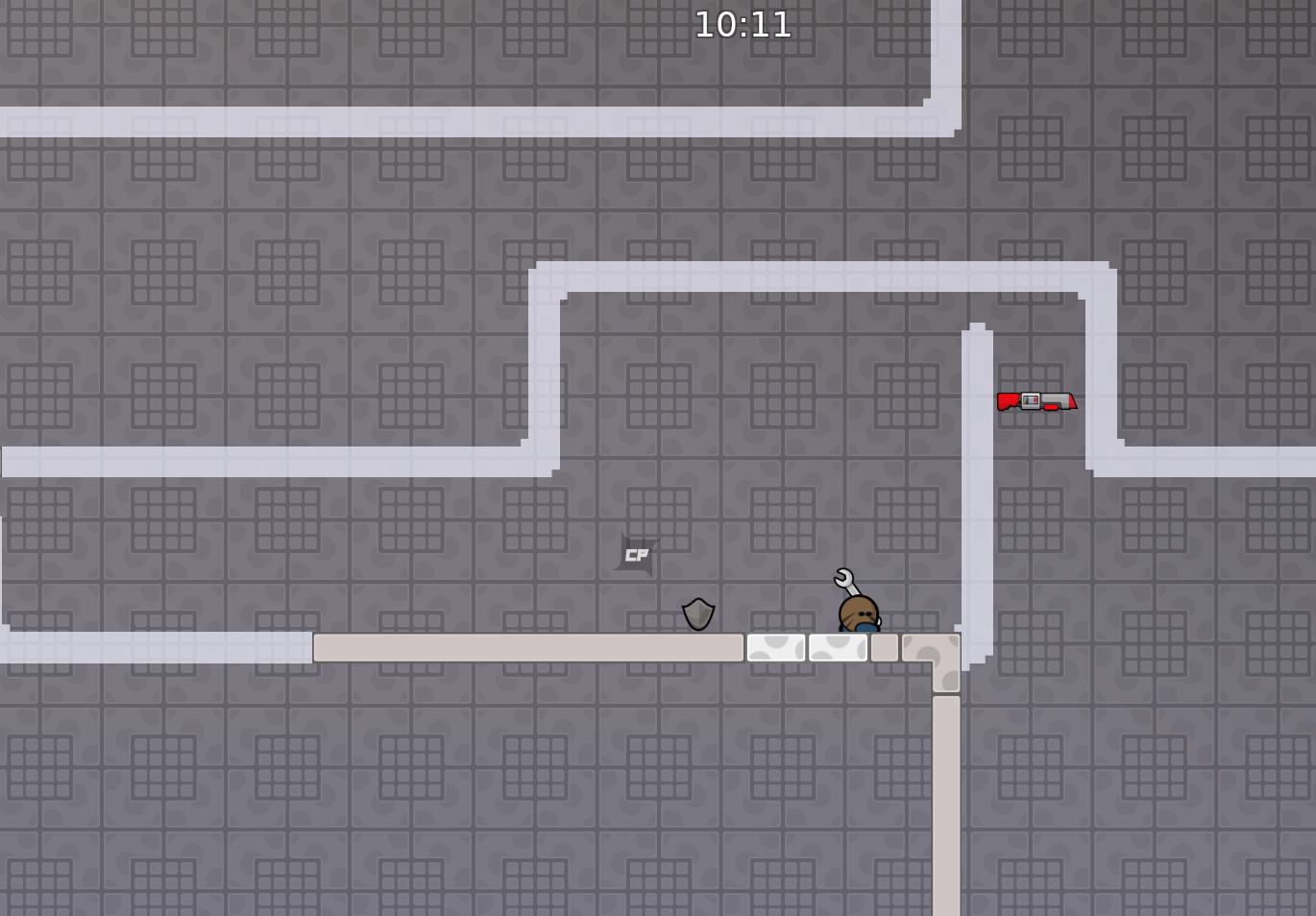
extend this platform a block or two < maybe so u dont have to use dj to get to it all the time

xD

Nice map, I enjoyed it
 1
1
Cp color need less alpha 😁
cp2 and cp10 destroys the flow, the rest is nice

yes cp2 and cp10 is worst for speedrun especially cp10 is super annoying to get
other parts nice
cp2 would be nice if you could nade right away with your speed
cp10 is just boring finding the angle
imma make it better
but cp10 idk i have the angle kinda quick
i like cp10
@Kicker
best map
1
just cp10 kinda hard
when rls
I really enjoyed playing this map, well done marcell
1
just the design is nothing for me personally
i dont like cp10
@Cøke
cp 2 and cp 10 are fine honestly, i mean cp 3 is also kinda flowbreaking like that but they're all good parts
the one i didnt like was the airnade
btw if u zooz out too much the background cuts off
Tbh everyone has their preferences and which part they don’t like
meh invisible armor (kinda)
Coke asked me to reduce bg
Same here, Coke asked me to make it like this
troll
You can still zoom out quite a bit
it makes the part better
and because of the background, it was too big towards the bottom and too small towards the top, you could have just made it centered idk xd
Should I make it bigger? xD
i just said its too big towards to the bottom
u can, but center it pls
I mean it is already centered
Every way if you go to the edge of game layer in default zoom there are 6 tiles more
idc but u can make it bigger for louis zoom
u can make it ht, so ppl can see it in design
might look worse
idk its fine
I think it’s fine like how it is
its now ht in design, but still unhook
and why the minimalist logo hd? xd
?
problem is I can't put unhook, ht and armor in 1 tile
u can just revert back to unhook, it doesn't matter too much
i think u can do it with switch layer btw
I will just make it unhook then
Make it with switch layer
Shield is a tile in switch layer
put unhook again and its ready
or use switch layer for shields
Imma just make it unhook, people could be confused Why it’s ht for No reason
3 min
Oh I’m blind 😅
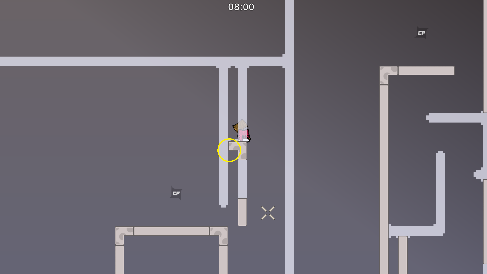
reason for this shield?
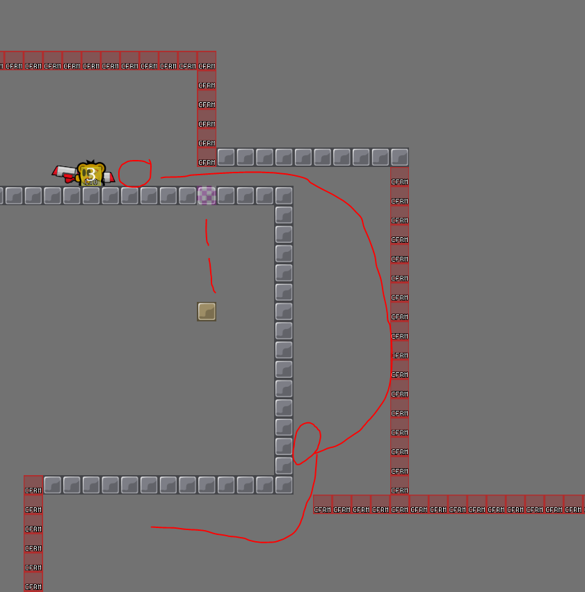
So you have to use dj in the part
u can put this in the stone if u want
but its annying to get over it with dj xD
i think its not needed
Alright Imma remove
ur choice
I’m also checking again for minimal design bugs
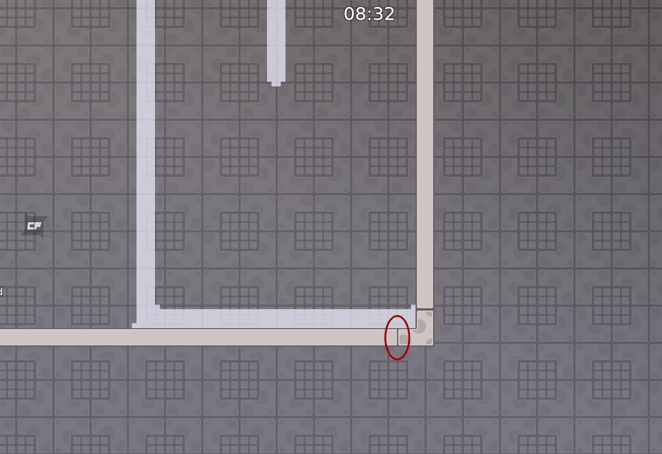
put this thing 2 or 3 tiles more down? when u got a good double u go always in tele
Alright
and here, remove the unhook and add just tele, remove tele at the bottom (X), u can do a instant double then

thats all
You need the unhook to get high enough
Normal double doesn’t get you that high
To get over the tele on the right
he means just remove tele at bottom
so u can prime the double when falling from last part
Oh ok I thought he wanted to remove the unhook
u can test it
how much unhook is needed
sry i mean not the whole thing
$ready 3
 4
4


no, its 2 star xd
It’s rather low 3
u cant even finish it
 5
5
Roasted

2.5

make logo non-HD
there is no such option "sv_teams"
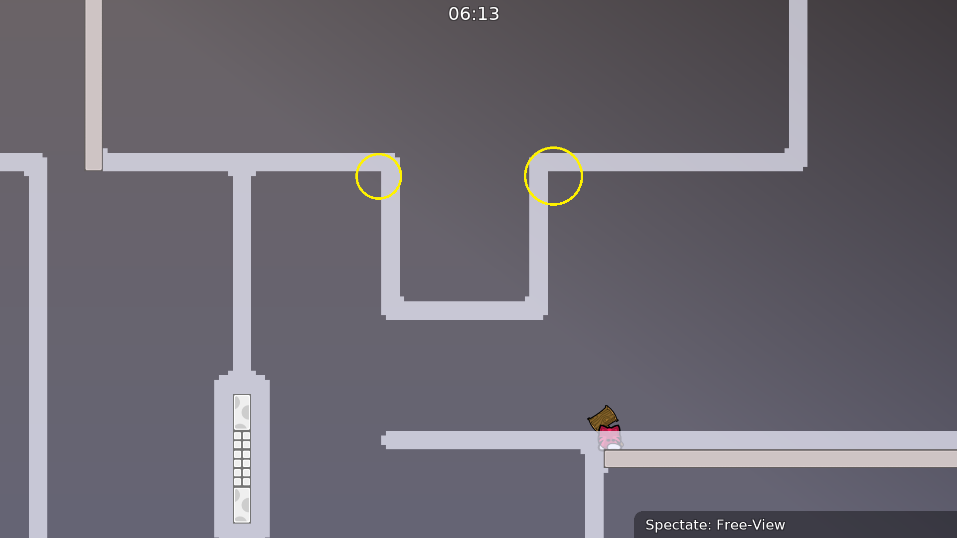
missing corners
what about time CP's in race maps?
still $ready

$reset
also specify what u mean by this, just saying "logo is HD" can be confusing
I mean logo is HD
and I report bugs
Should be ready now
nice timing xD
$ready 3
3
I think unhook should be just a touch darker, 190 190 190 looks good
$ready 3
please change mapper name to Marcell and rdy ^^
Marcell & & reeze
$change mappers Marcell rezee
hm maybe wait a bit
isnt it rezee?
or idk xd

it is
reeze sounds better
xD
$change mappers Marcell rezee
rezee deleted

$ready 3
?
When I looked mappers, rezee was deleted

Yes yes I know, nvm, it was not refreshed I think
$reset
u can skip airnade by just getting a little speed from that corner
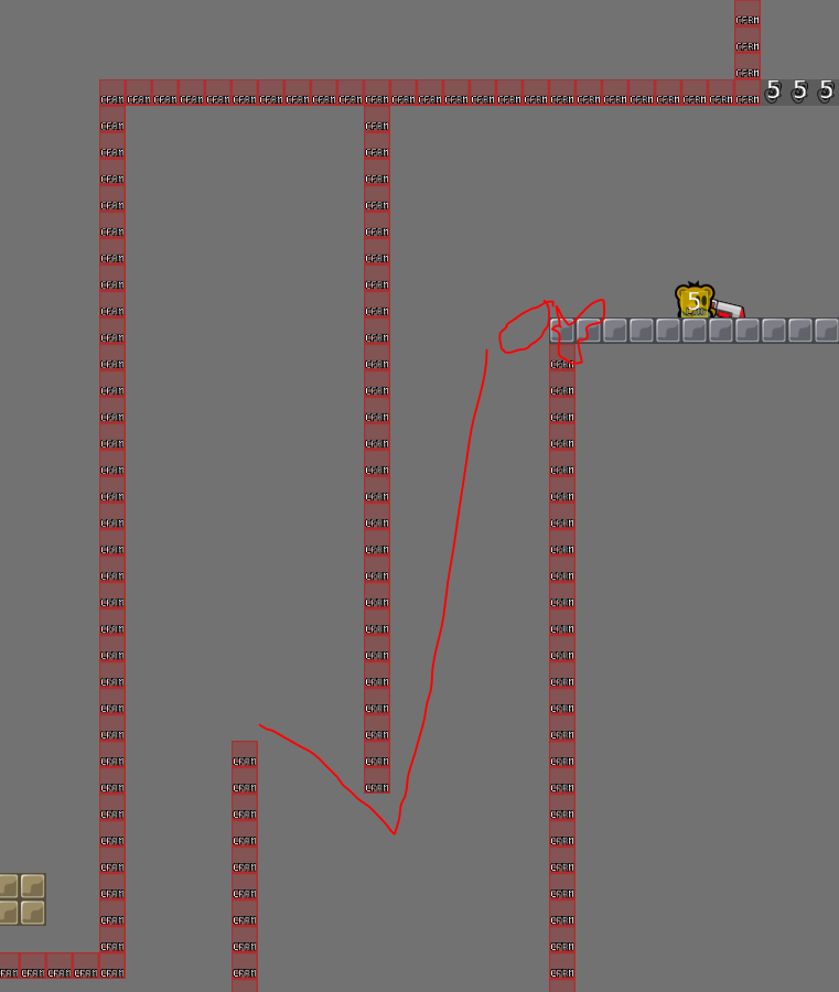
should also fix that u can just not use the doublenade


$ready 3