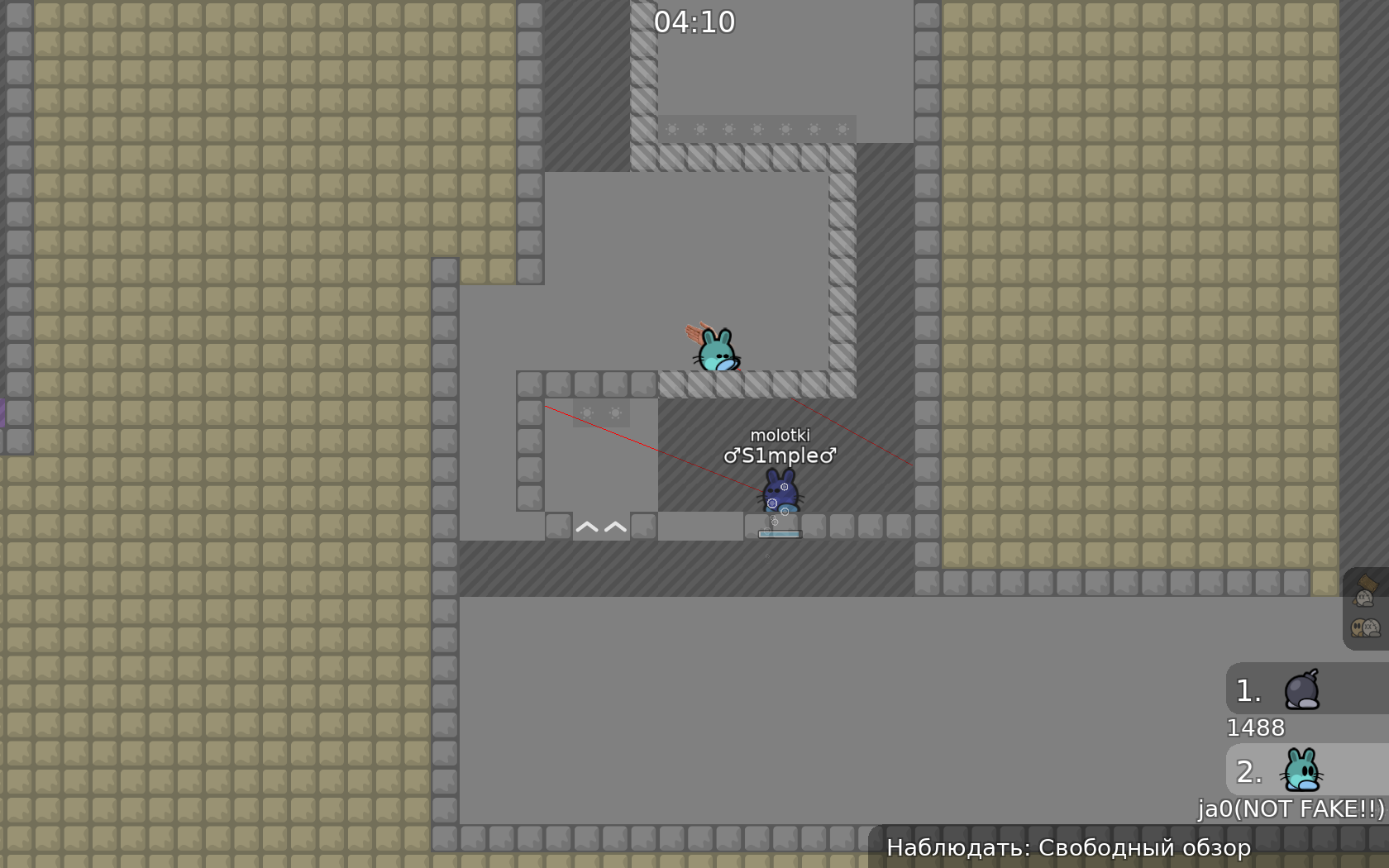
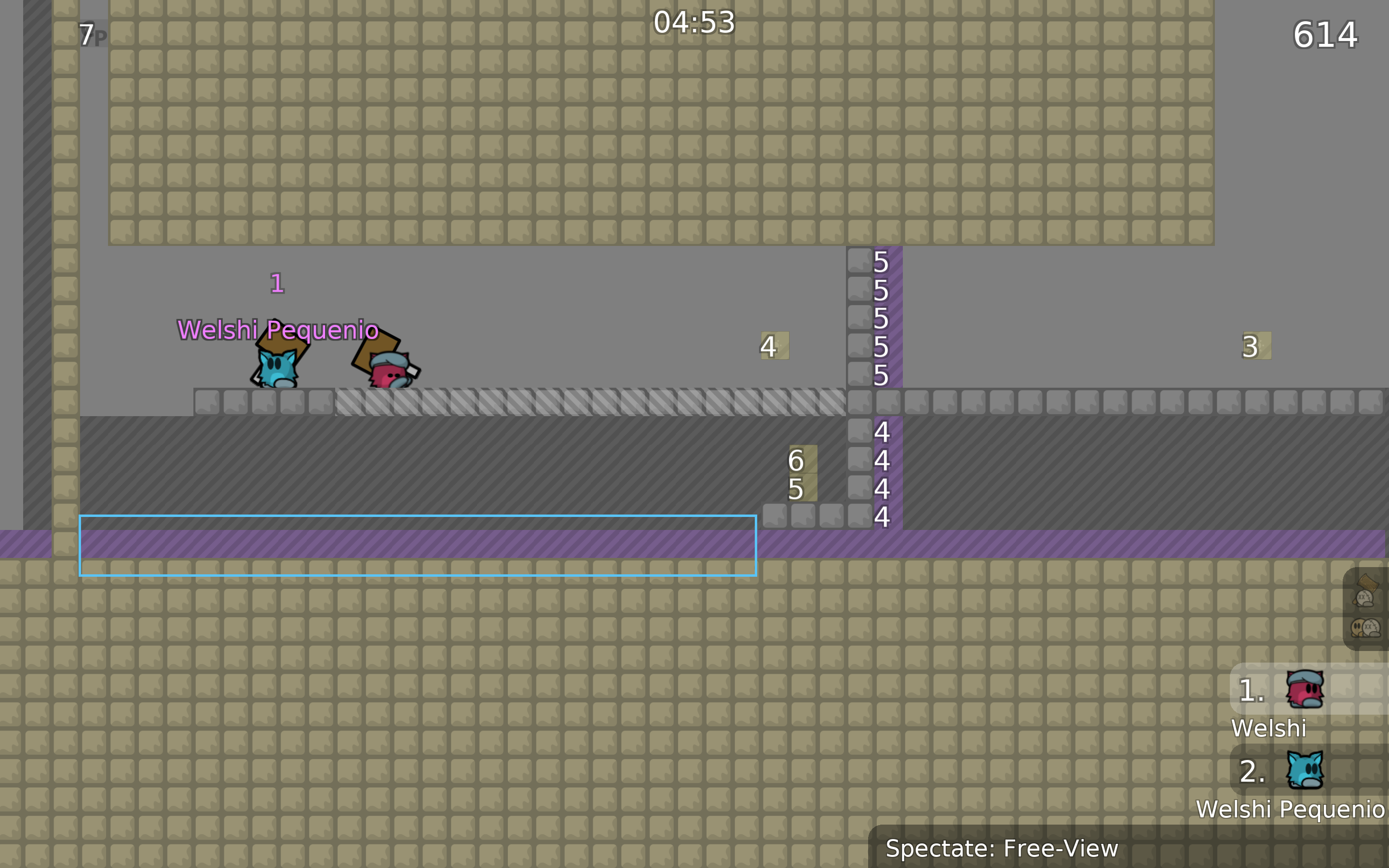
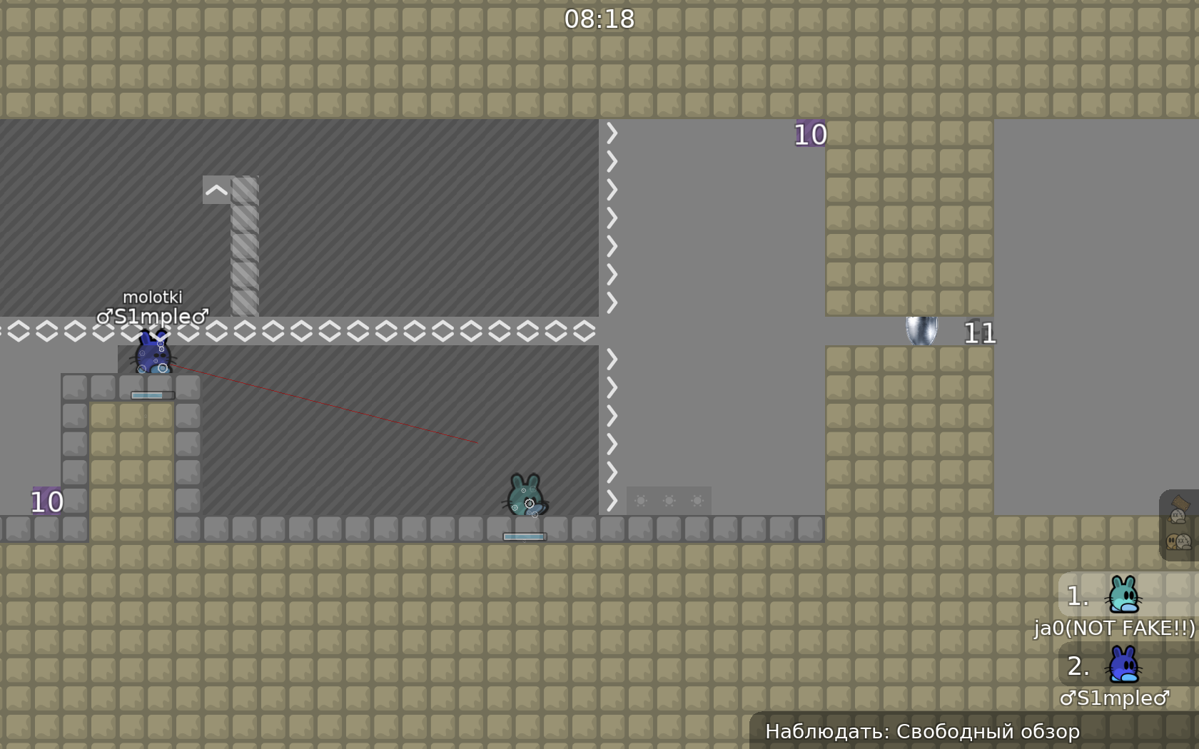
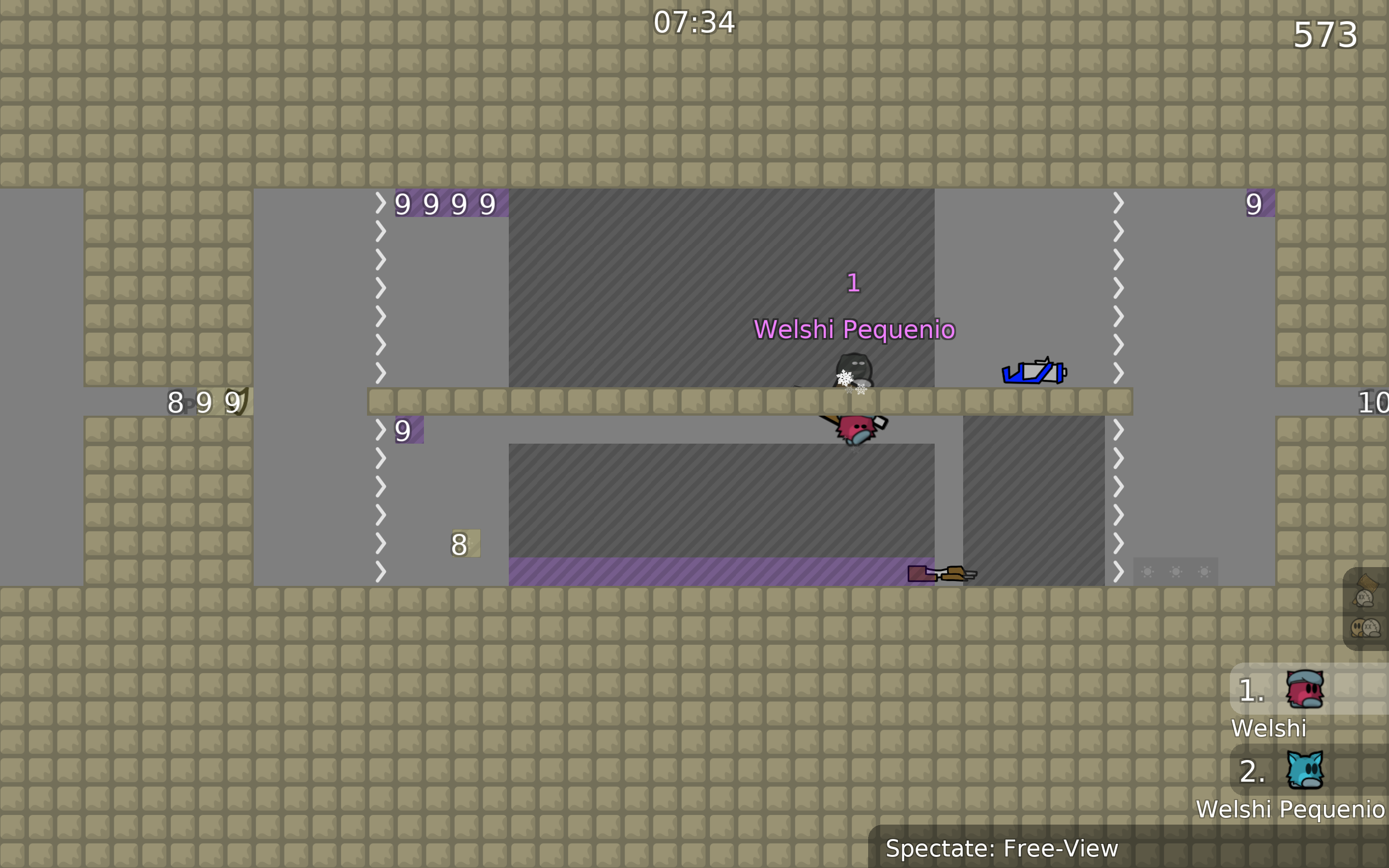
this is your map's testing channel! Post map updates here and remember to follow our mapper rules: https://ddnet.org/rules
^ was having screenshot of this part but nvm, this part feels really boring
review whole map again for corners, i see so much of them missing
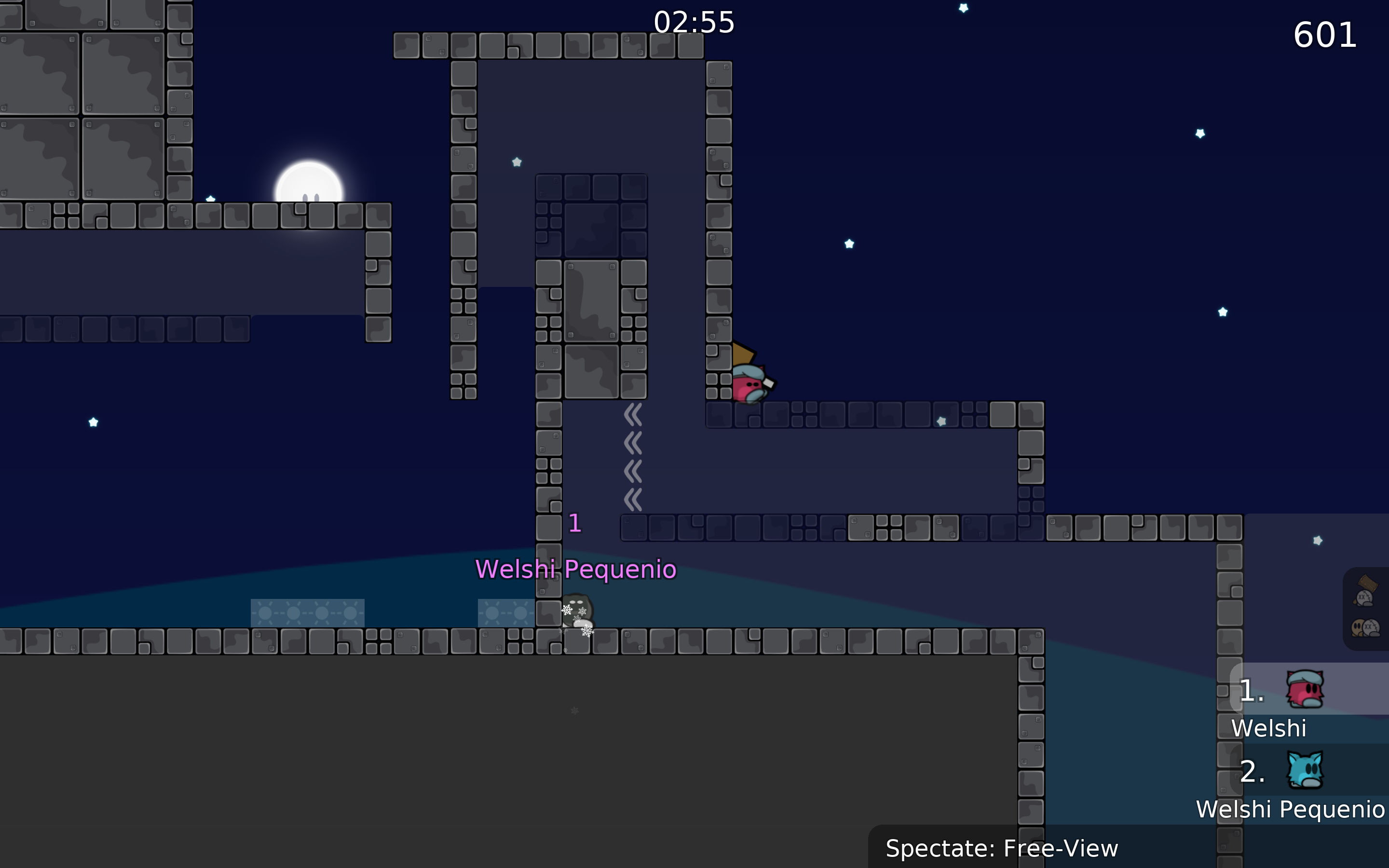
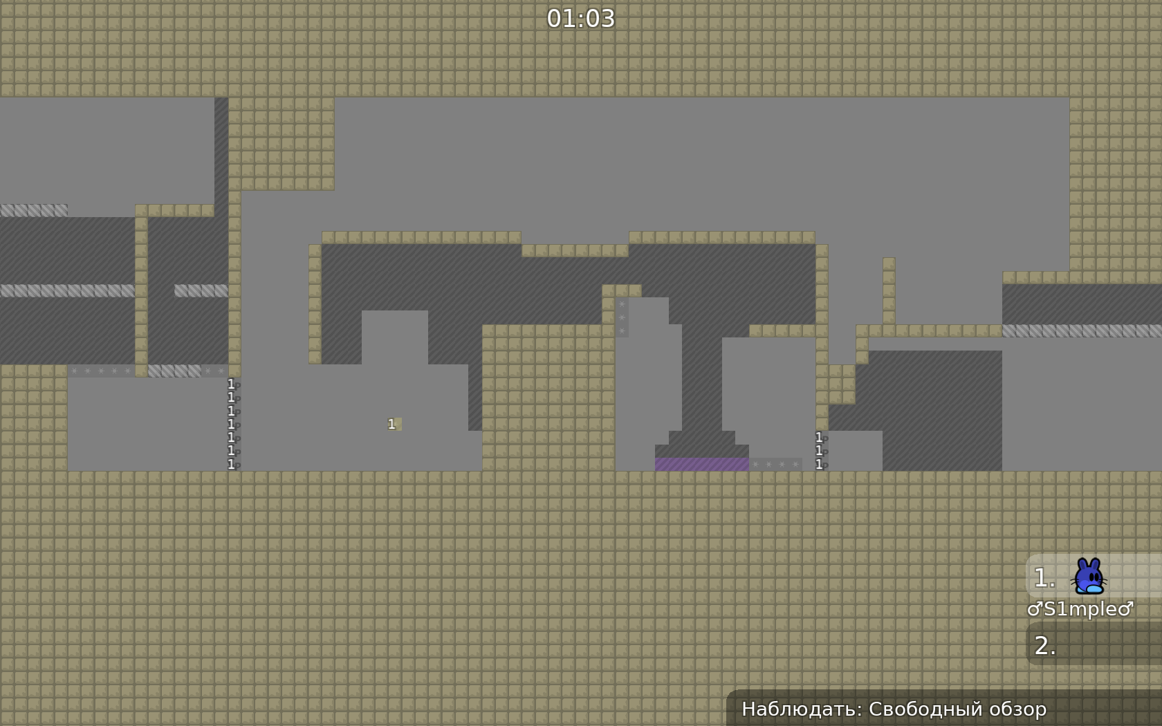
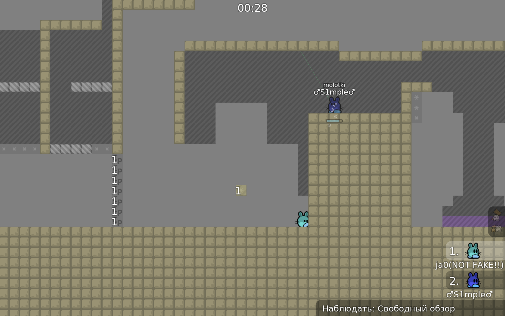
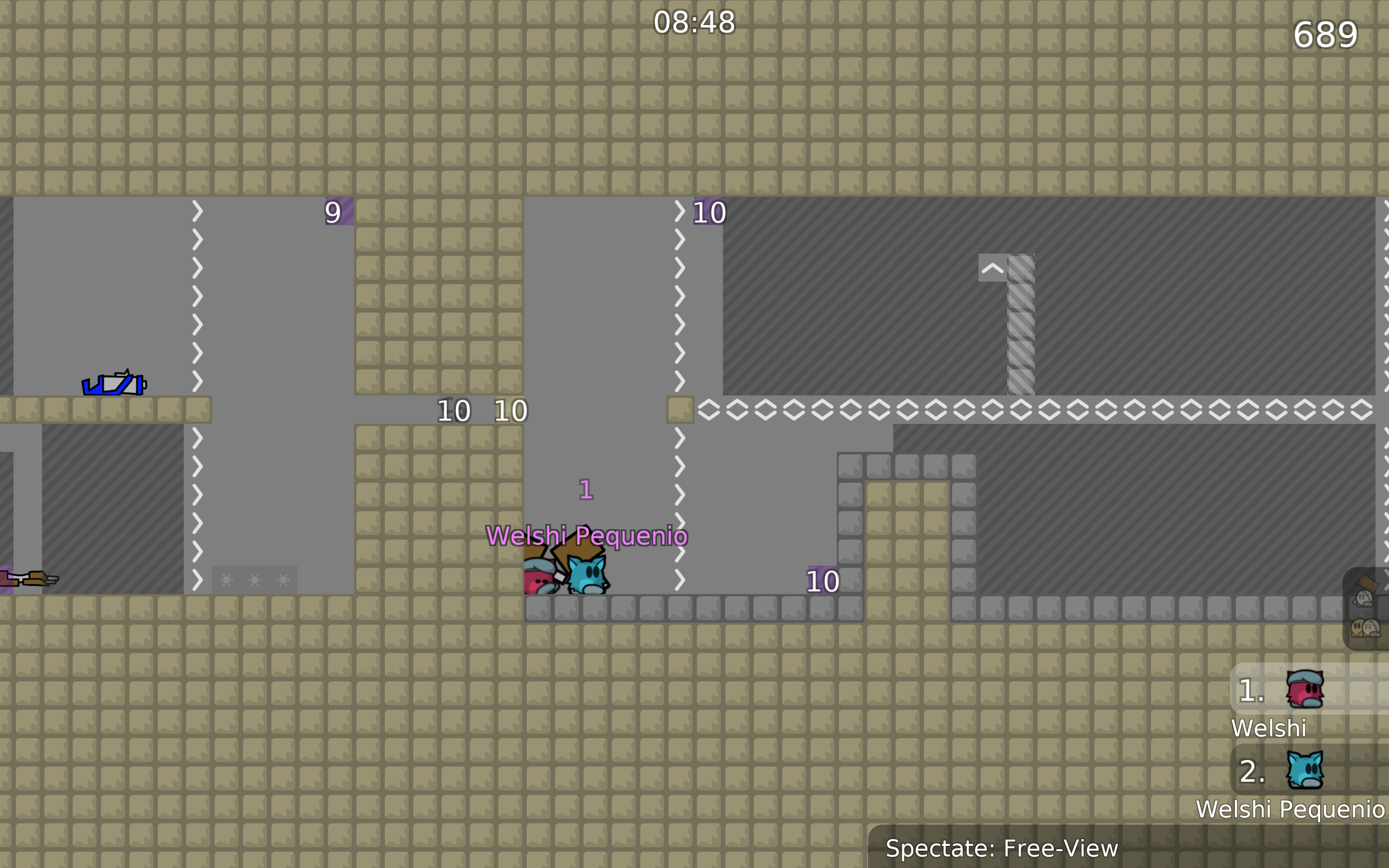
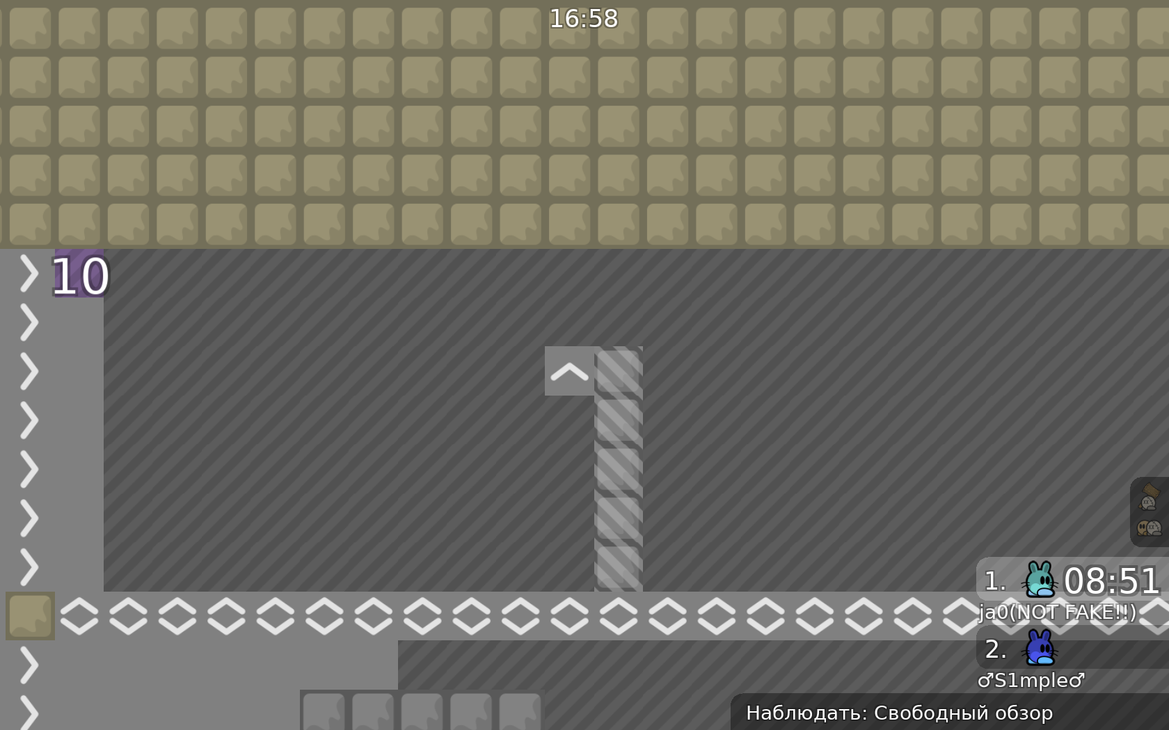
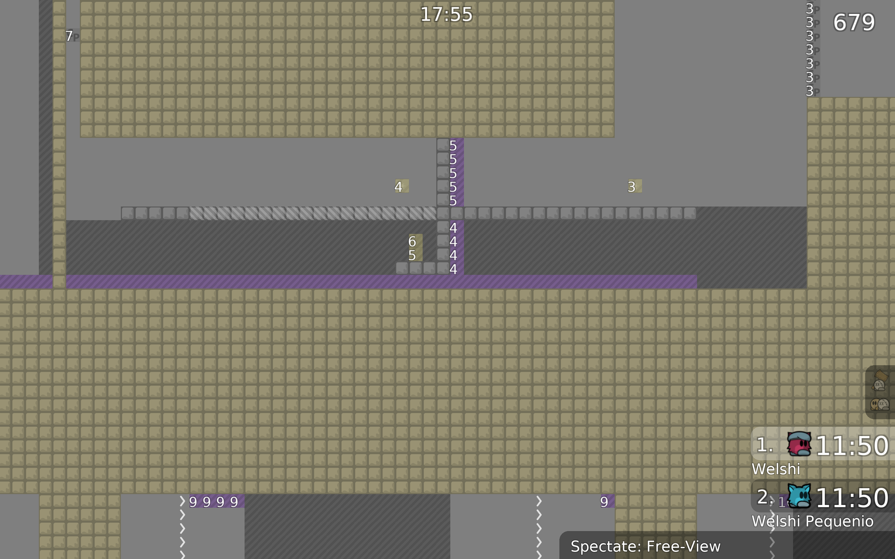
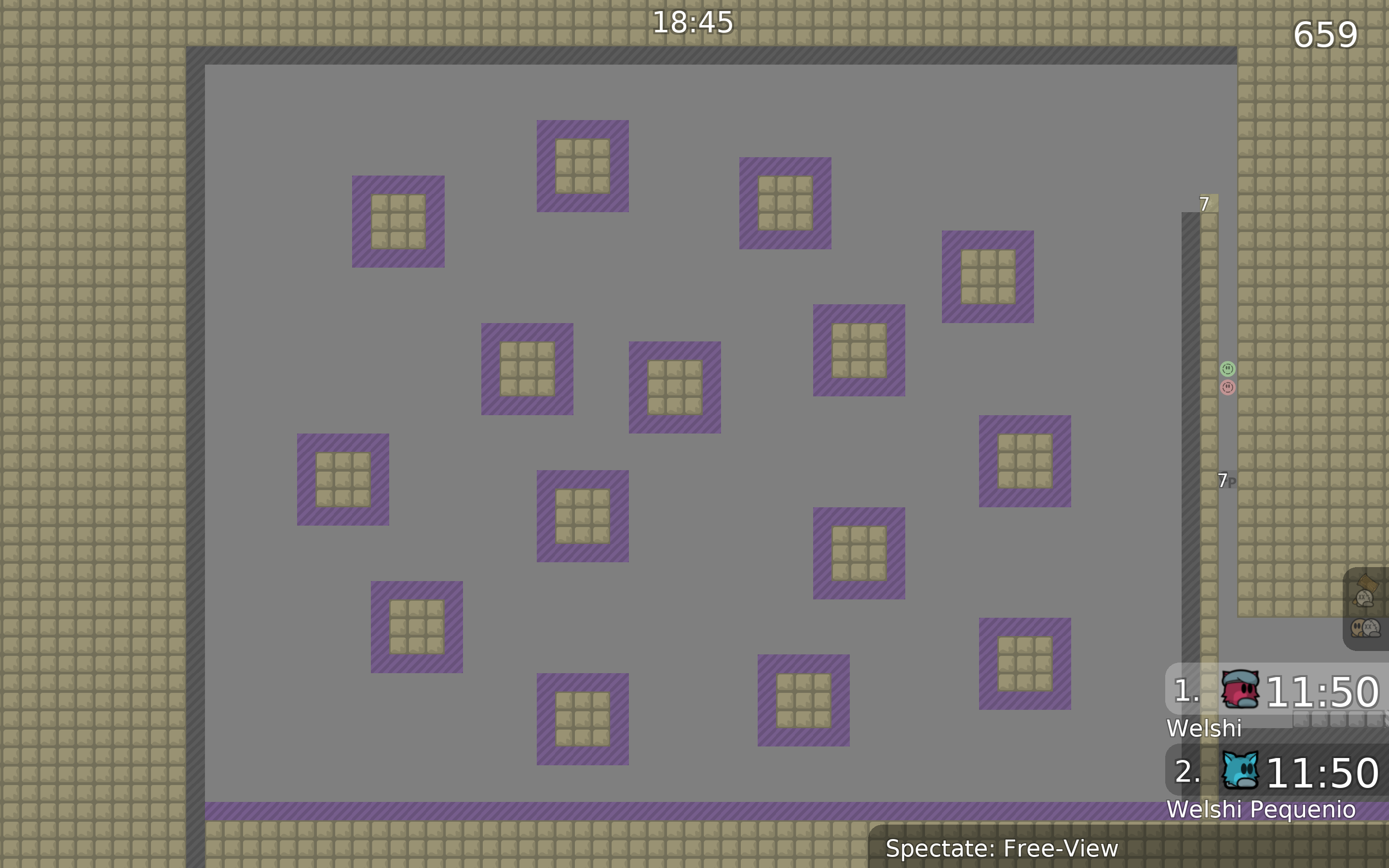
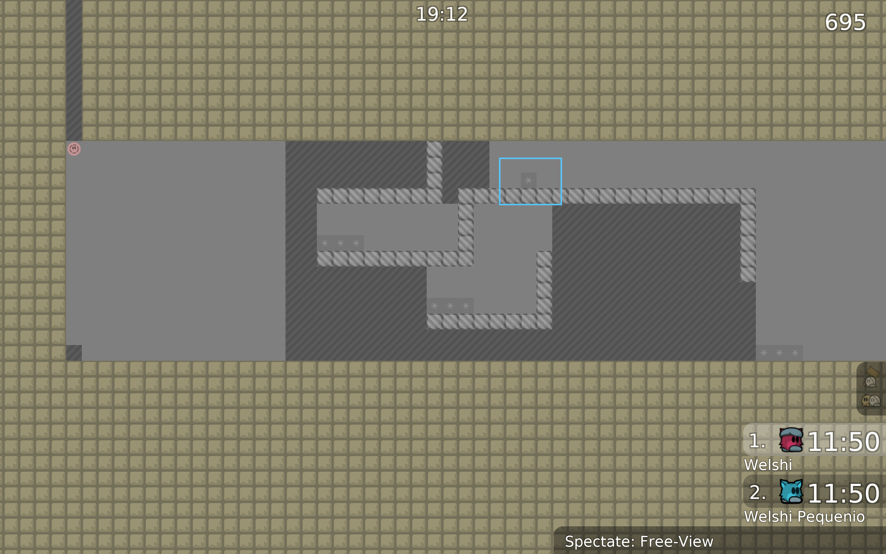
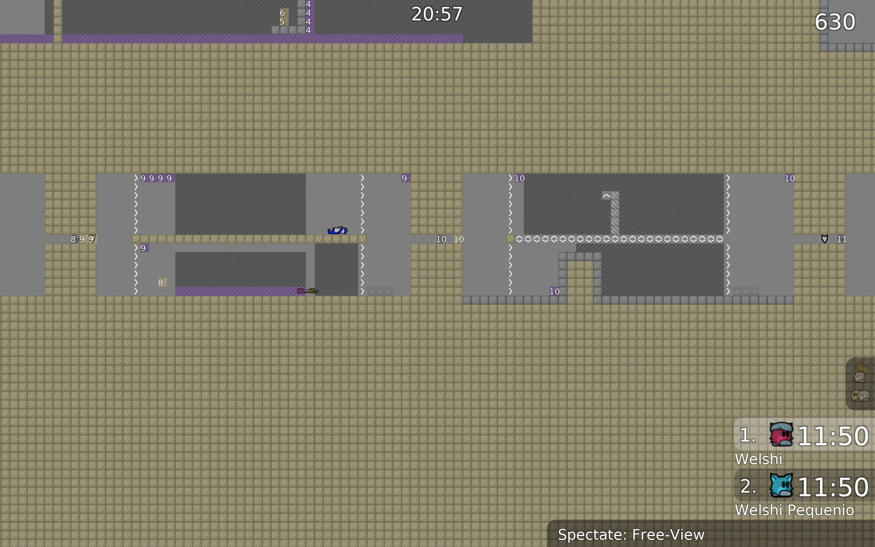
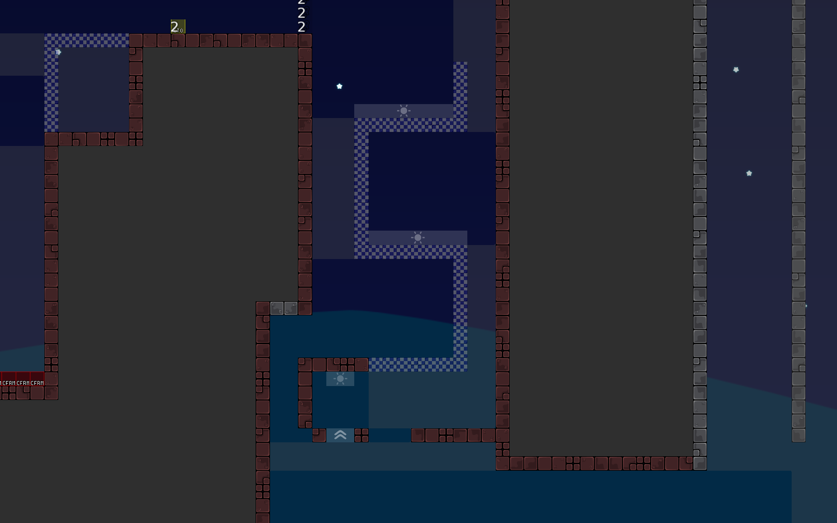
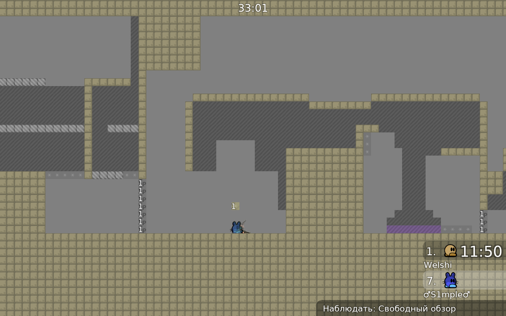
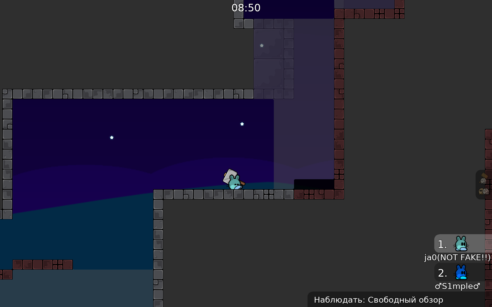
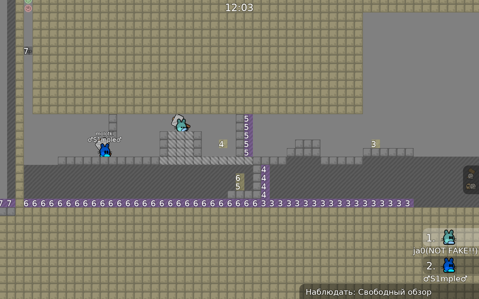
I do like the idea behind most parts, and agree with what simple has been saying. Some parts (the ones attatched to this message). i think you could achieve these ideas better if you made the entire map just bigger, it feels very cramped at times. I'll try to go over the parts now I feel are weakest.
that'd be my first thing to change. I won't talk about the design here cause while I'm not a big fan of it I'm not good enough at designs to know how to improve it or really know what is wrong with it
great map tho, it really did feel thought out at times
right - how it is rn, left - my example
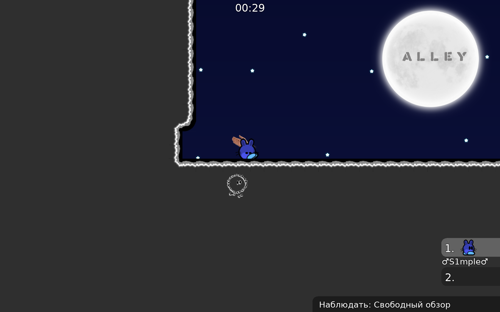
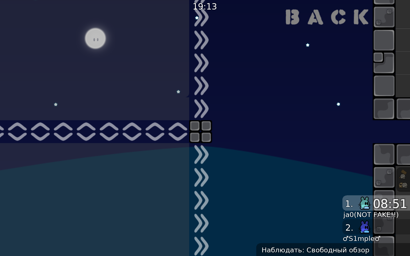
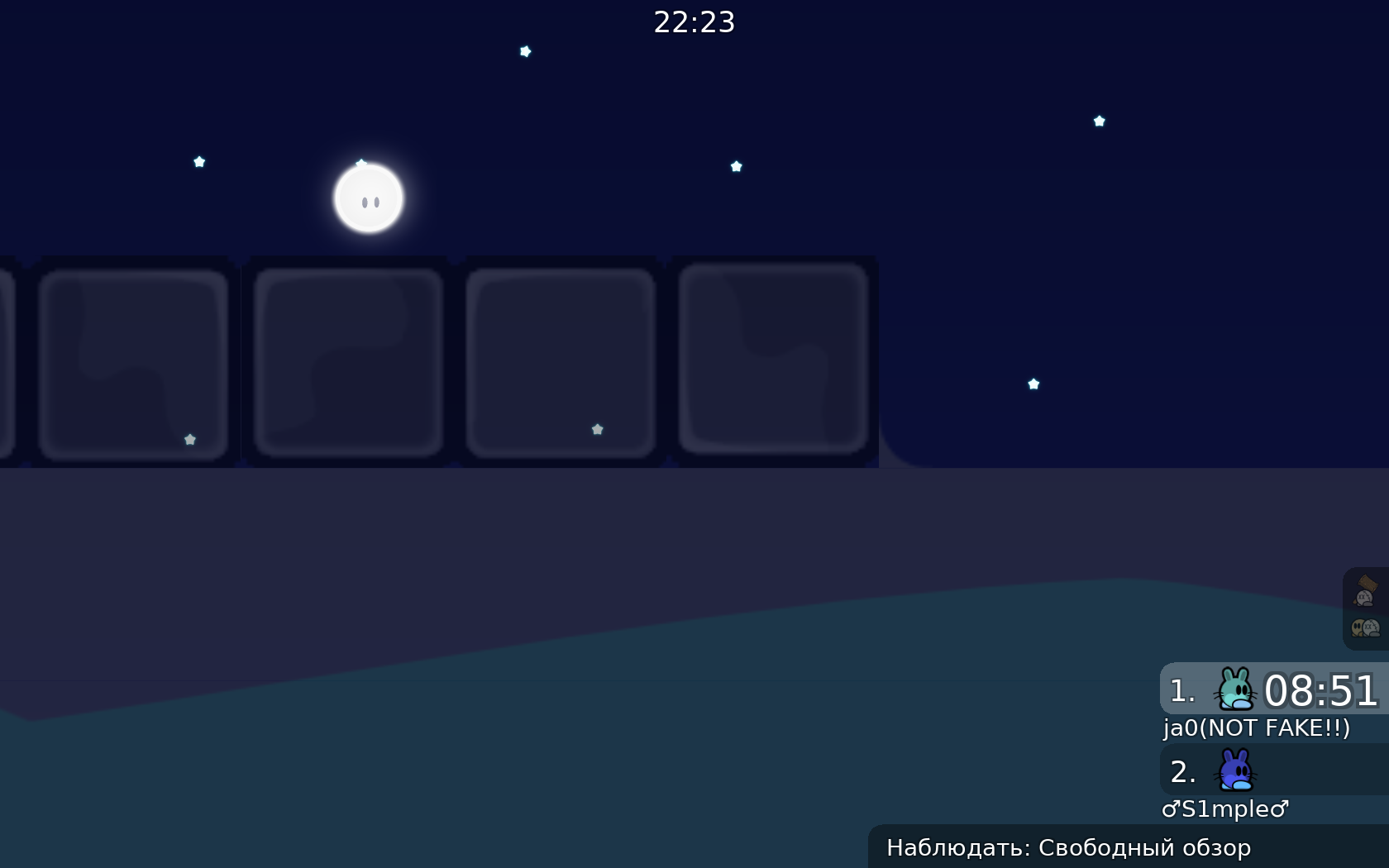
weird parallax on stars imo
i think that's all for now on
€waiting
I saw my mistakes, where it was part of the level, and I have a question, I see that every day they post a level, it's many people who have such mistakes, and they are not evaluated, or only me? This is to let me know, am I the only one building like this, or not?)
¥waiting
if you mean that only your maps got declined, consider looking at this ones #deleted-channel <#1108499445814931508> <#1108500359938330695>
the backrooms my map)
motivation is disappearing more and more, I think in a week I won't learn how to build like a mega pro
you have seen every mistake
fix em and be good
Learning how to map is a long arduous process. I don’t think anyone can go from their first map to being a great mapper in a week. I’m sorry if any of my criticism came out as harsh, I really would love to see you make a map that just blows me away, I’m not trying to say your map is bad, just giving opinions on ways you could improve it to make an even better map. If you’d like I could give you a few more tips on how I make maps, but I’m not great at mapping myself. If anything though keep at it. Don’t lose motivation and don’t take anyone’s words to heart. Make a map you’d enjoy playing and build based on that, and if it doesn’t get accepted then make another one that’s better. I believe in you, I consider this map a major improvement over the backrooms.
Some tester should put this map on waiting

$waiting
remade
this is necessary so that tee does not take another weapon
Why not use one weapon type?
the more diverse the map, the more interesting it is, the more difficult it will be to create other tests for one gun, because you can cheat and go through another, not where it is necessary
as Welshi said this parts are very weak any way and you can make more creative parts
So I redid
The way to add interesting parts is not to add many different block types and entities but to do something with the ones you are already using :D
we are not talking about blocks, but about weapons. weapons add personality, that only you have it, and you should not hope for another who does not have the same weapon that you have
remade
maybe you'll add time cps one day?
Aaaaa
still not fixed
either use tileset without this gaps
still not fixed
and also abit harder than the rest of the map
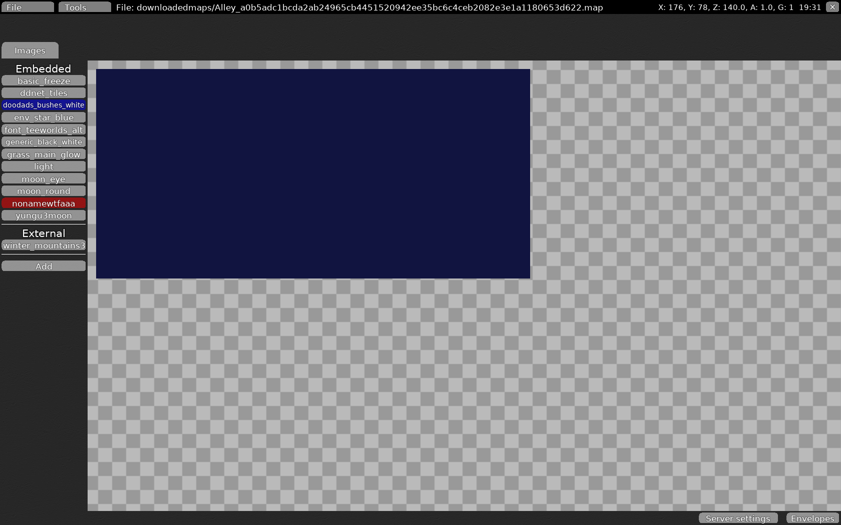
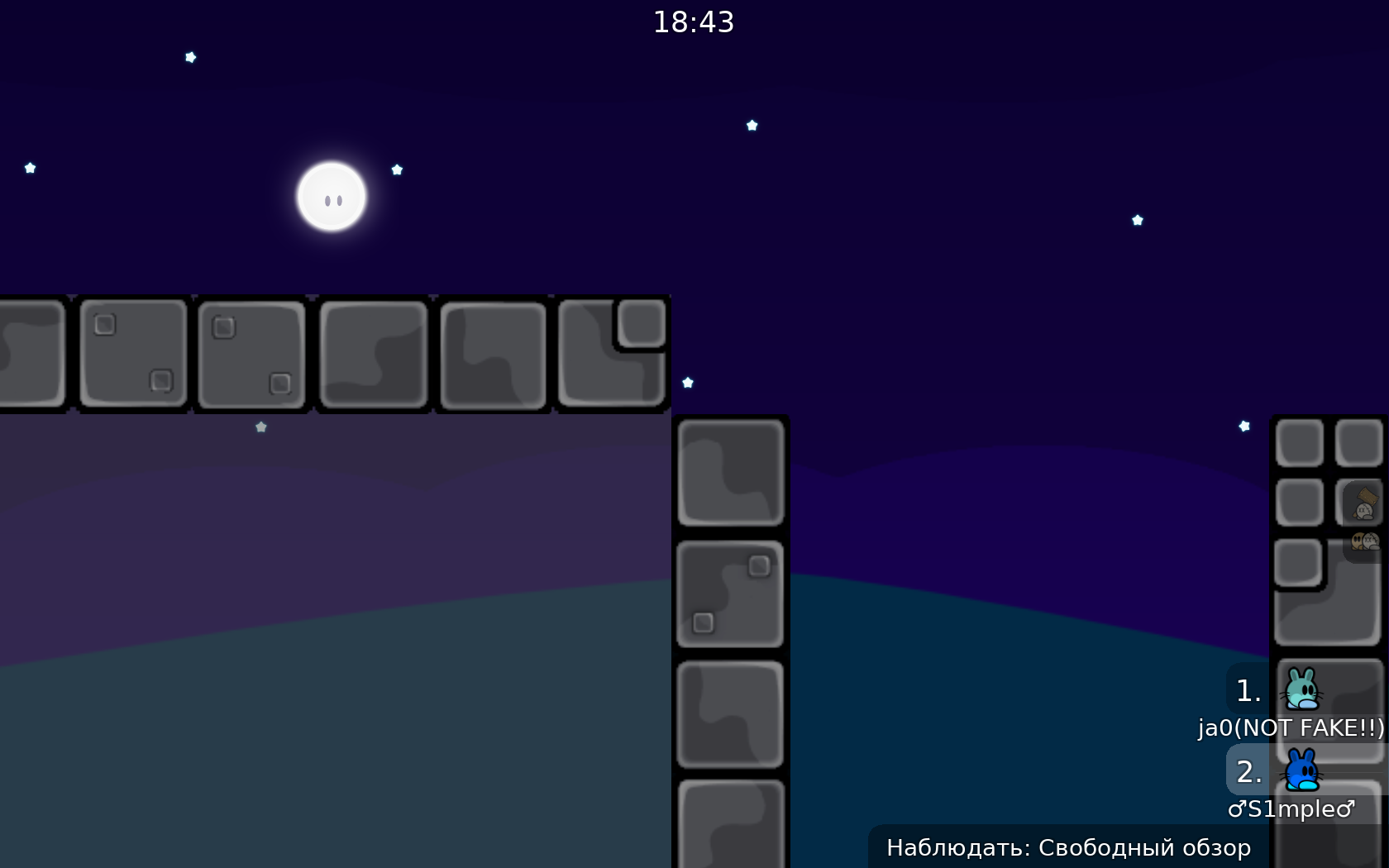
imo 3 moon images is unnecessary
you can reject the work, I won't finish it, I have mistakes in some places, but I don't want to continue doing this because of various quibbles about the type of unused image, thanks for the advice
$decline
$decline

