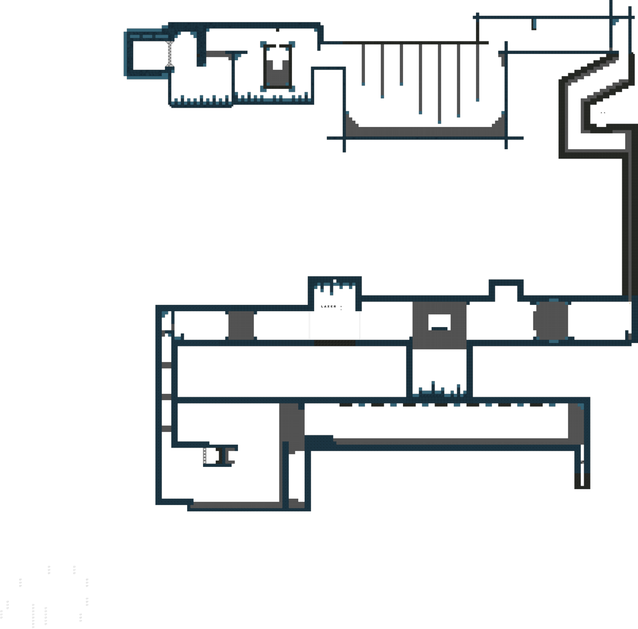
this is your map's testing channel! Post map updates here and remember to follow our mapper rules: https://ddnet.org/rules
Update added time checkpoints
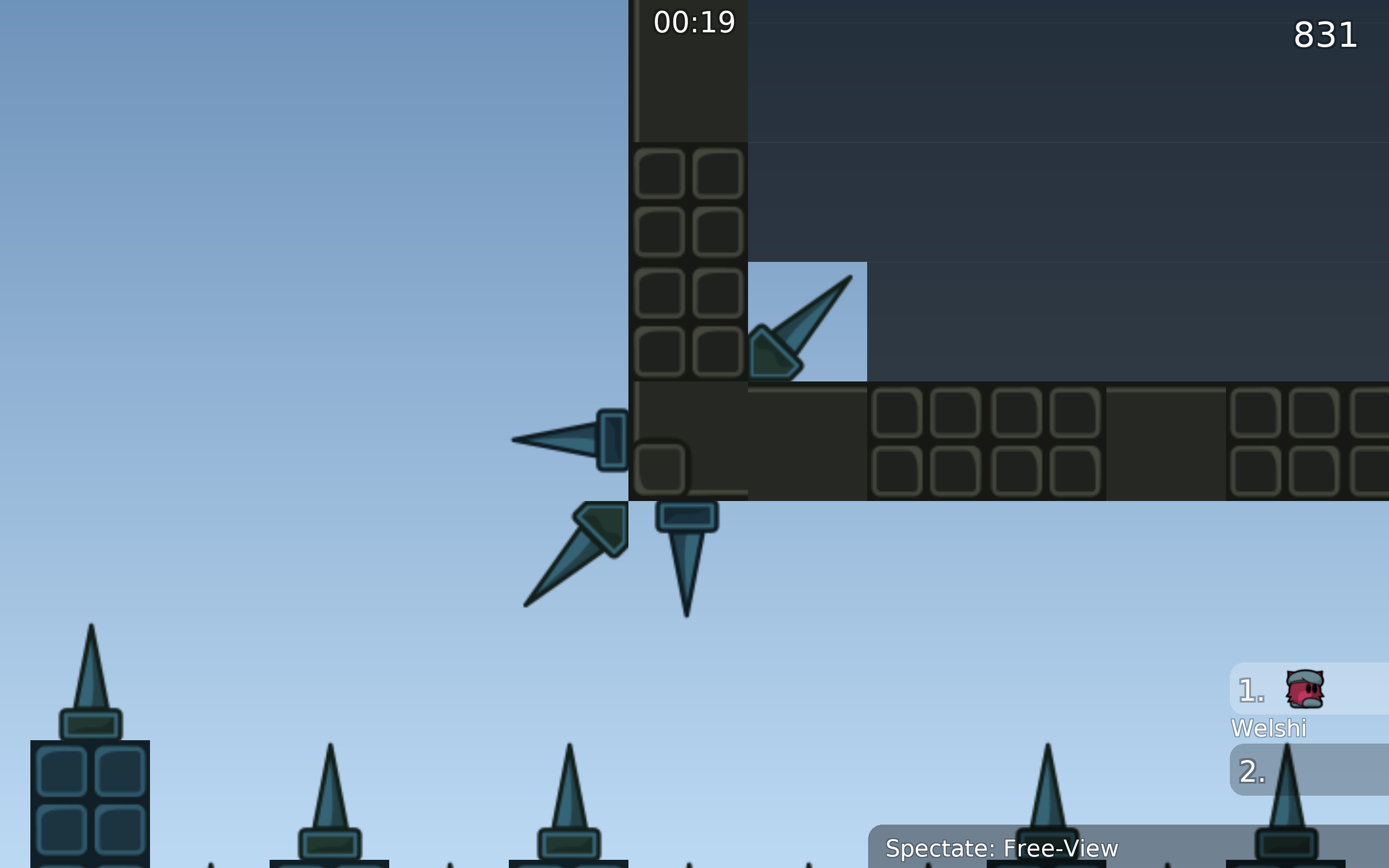
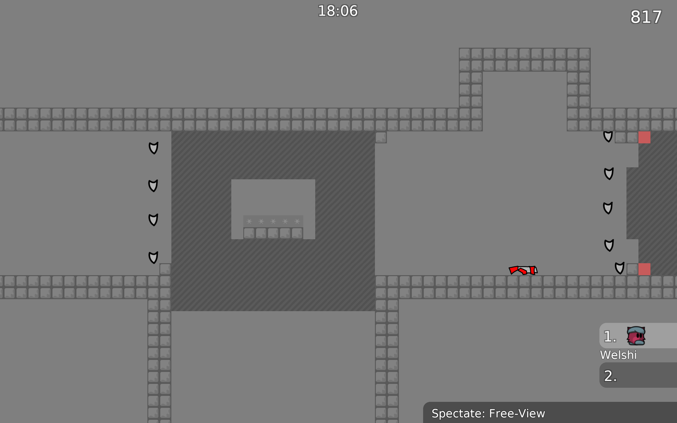
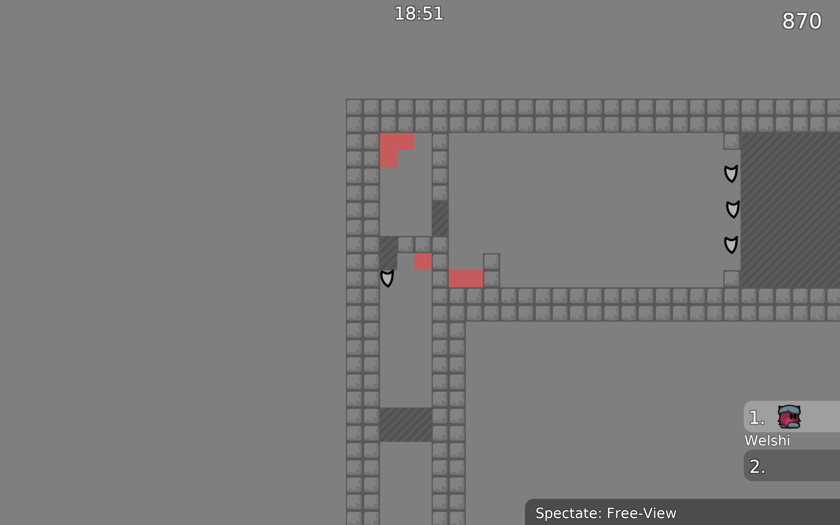
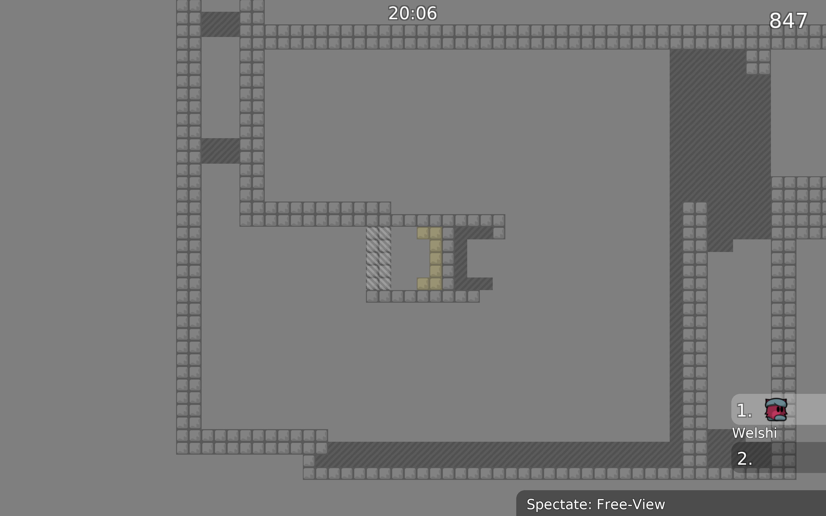
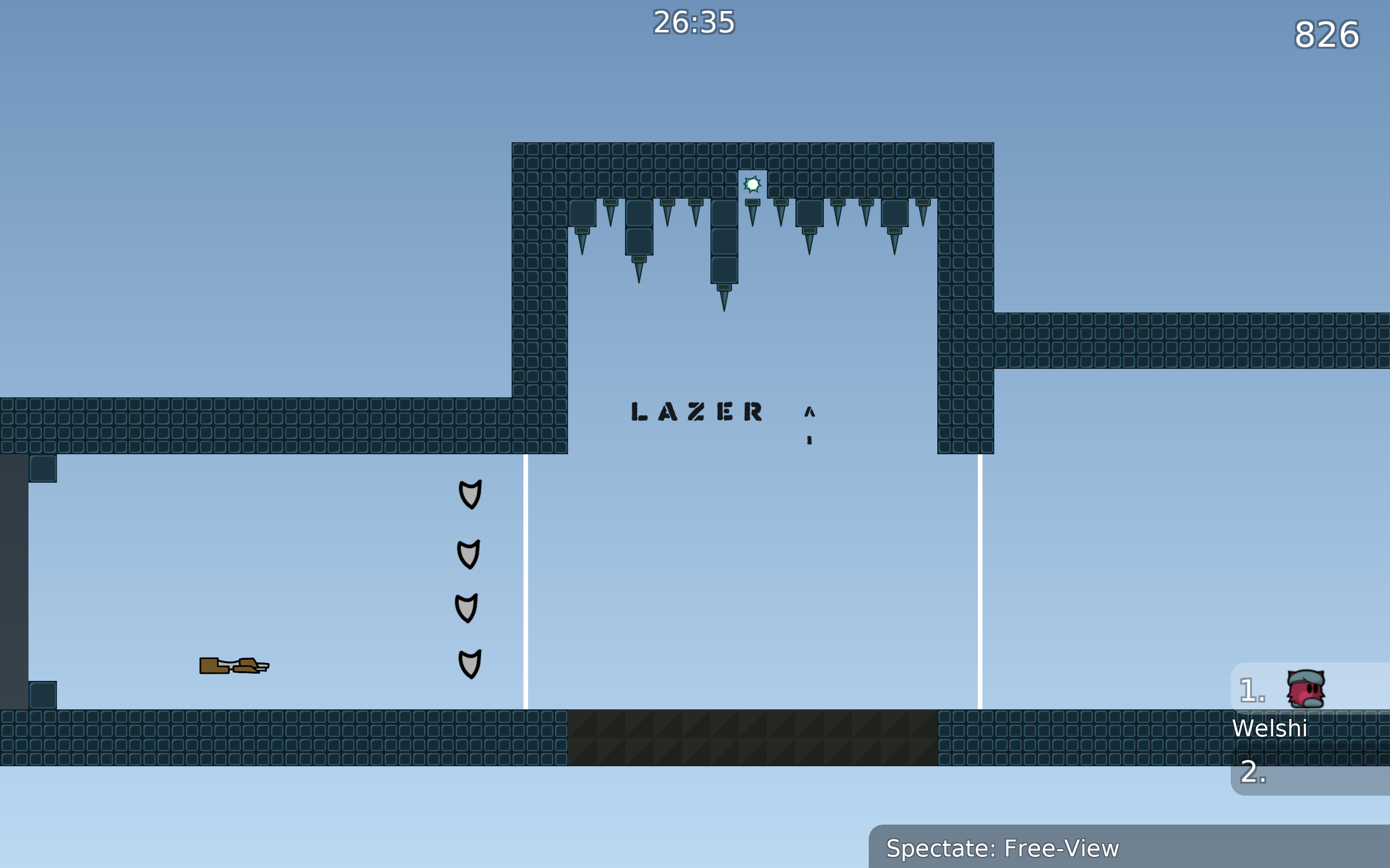
the background clashes a lot with the color of the blocks, making it hard to see whats hookable and what's unhookable at times
the bottom left corner spike there doesn't connect to the blocks correctly, the hookable tiles don't line up correctly, and the other tile just made the freeze around it disappear
not to mention the corner spikes are a different color from the side spikes
From looking at that picture I can already tell the design is broken, u tried to use a 2x2 or 3xe tile in a 1 tile
Outlines are telling u already something is wrong
I recommend using this website https://coolors.co/e54b4b-ffa987-f7ebe8-444140-1e1e24 to find a nice color palette to use
alright, just ran the entire map
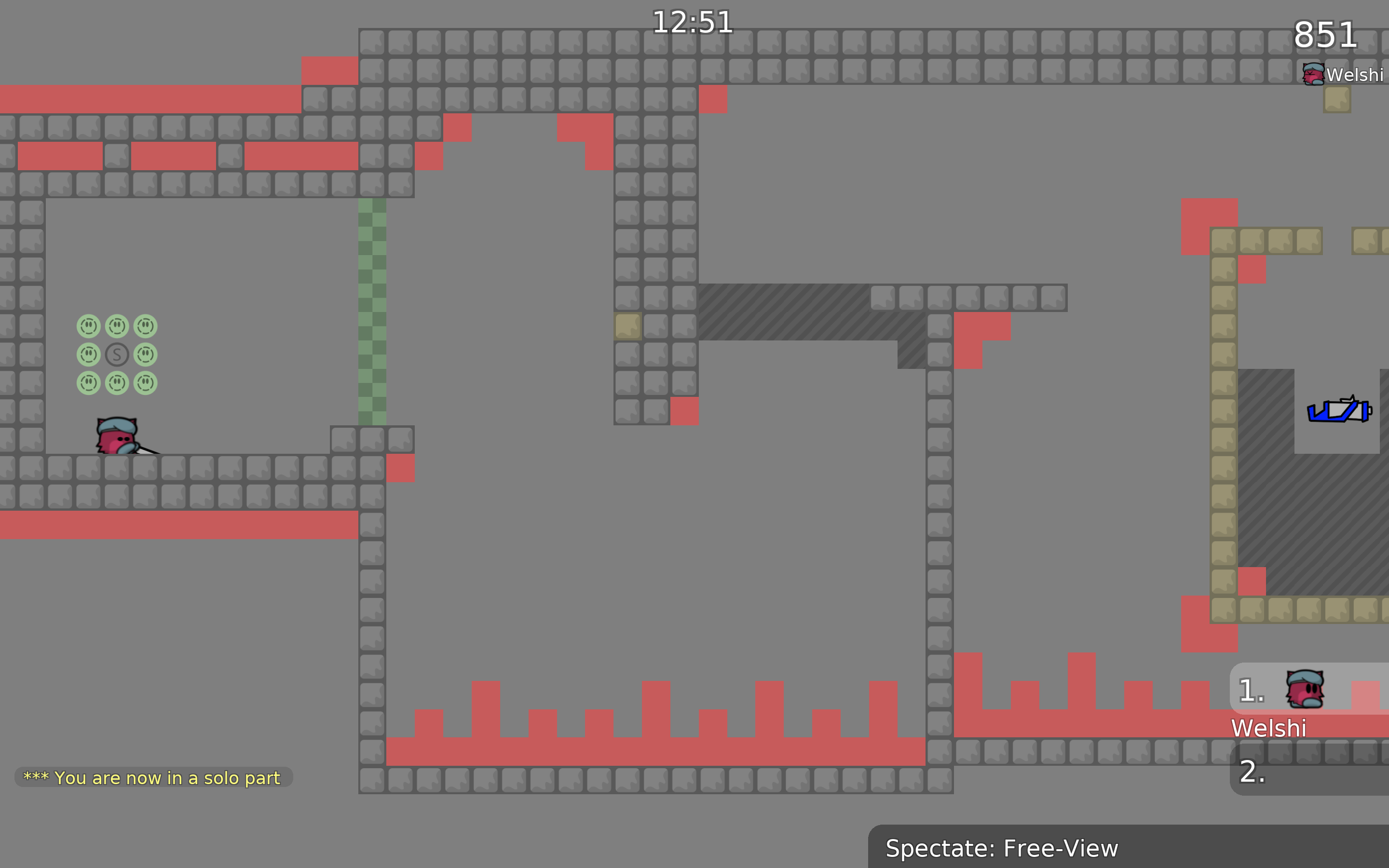
Don't use weapons only for 1 part then take it away it just looks bad and is annoying
I'd say try focusing more on the gameplay before releasing a map for testing, try the map out yourself and have others try it out as well, focus more on what feels nice rather than what sticks to the difficulty, and try adjusting the difficulty afterwards, also try your entire map from start to finish, not part by part, that way you can see what parts mesh together well and what parts don't
ok
🙂
What I can add to that is, try to look at other solo maps how they look, how weapons are utilised, how parts flow etc. For now this map just doesn't fit to be released
For now I'll decline this
Feel free to ask questions in
#mapping$decline
I don't want to delete this part, what I can do is lengthen it with the same theme
I think maybe if you just make it a shorter fall
ok
I think that part could use a little more going up and down, but if u plan on leaving it like that I'd say no tp
I'm going to lower it a bit more, anything else to add? 🙂
This is intuitive for someone who already knows how to play and use the entities or knows how the game goes, don't you think?
Even if its intuitive its needed to be placed
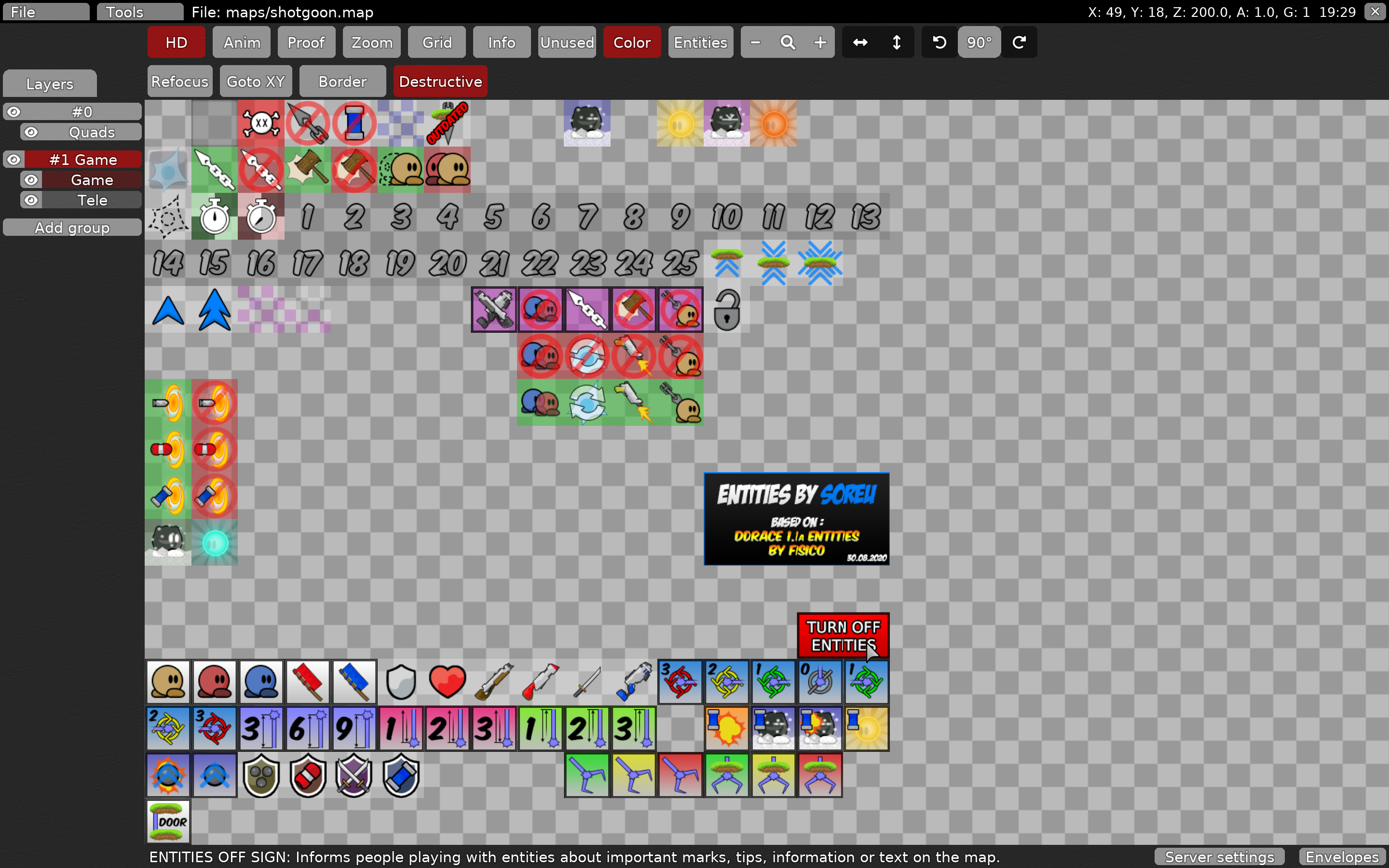
Whenever u put any text u always put turn off entities sign
ok
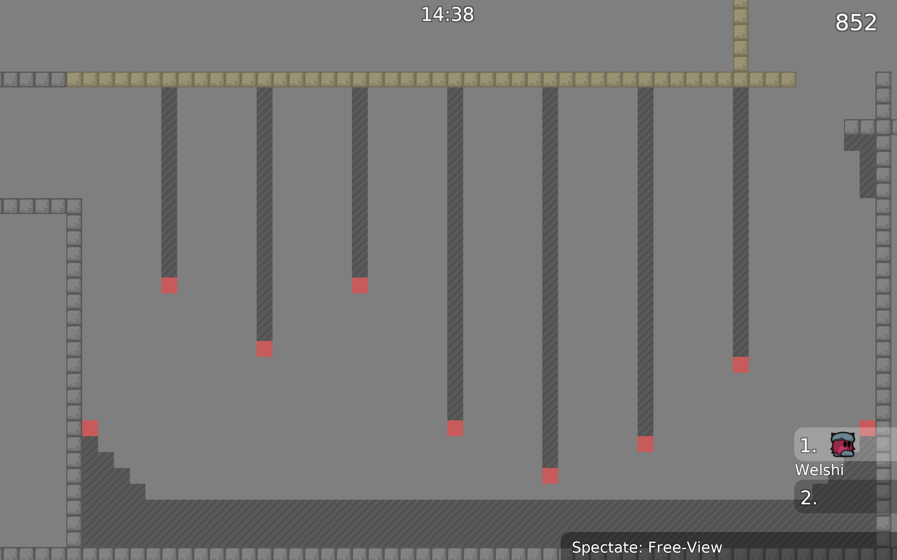
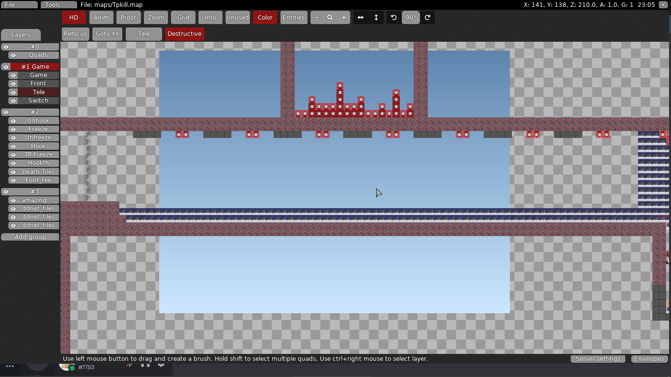
This part is just too simple going while hooking roof few times isn't hard at all and it's boring
Same with this, so many in 1 place and small amount of room makes this part feel uncomfortable and boring
that part is already
ok
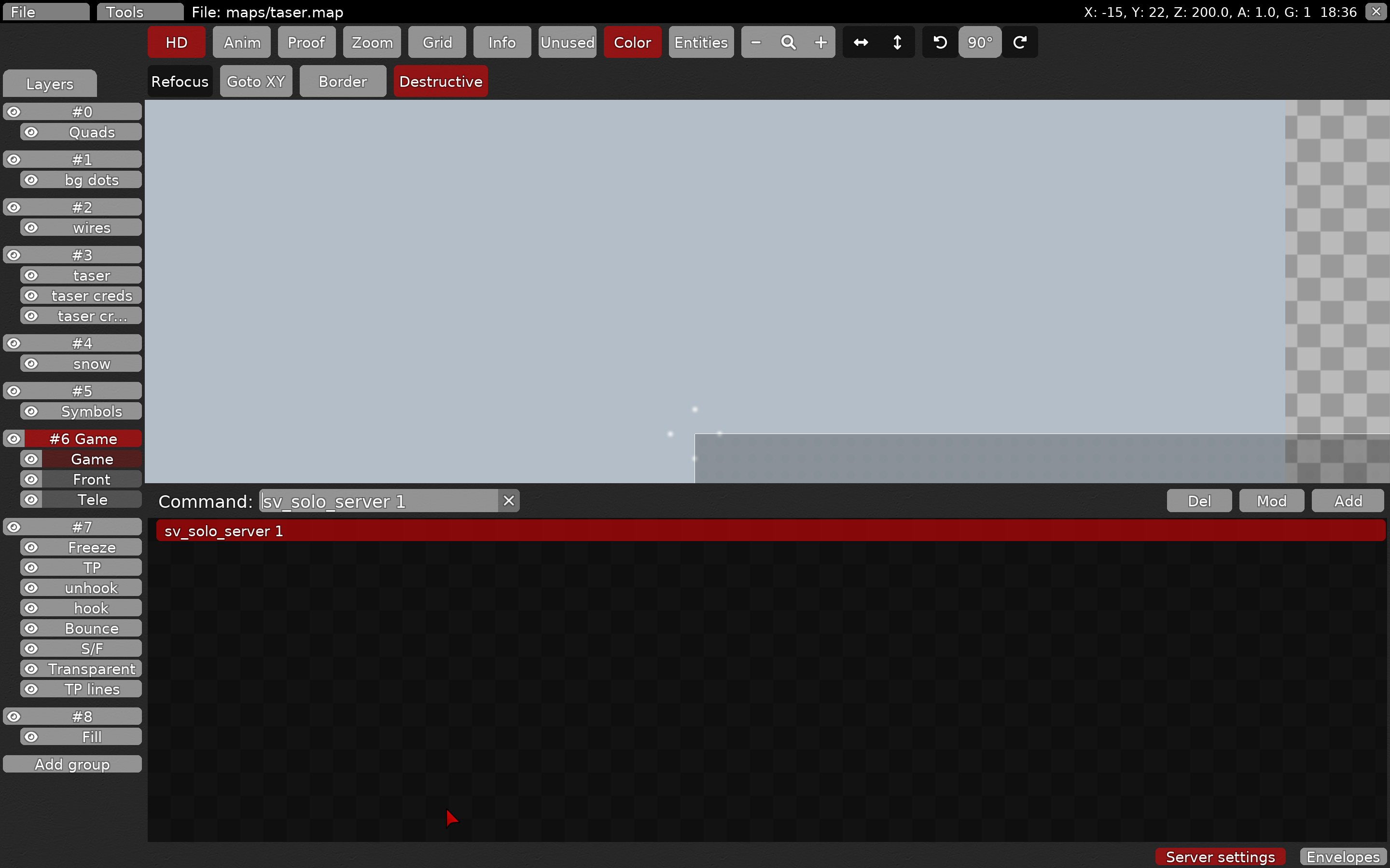
where do i find the off entities sign?
game tab
mouse is over it, red 1x2
ok
thx
Done, just need to change the background
and the last part of the map
Hey I have a question how can I change the background?
Update
¯_(ツ)_/¯
Have u read my feedback at all ?
yes
Take ur time reworking the map its too short and parts aren't that intrusting compared to other maps
Take a look at other solo maps how long they are, what they include etc.
I know this is probably your first map but don't give up, maybe u can do something better next time, not everyone's 1st map gets accepted
If it's my first try, my map is rejected, right? I'll improve it and see if I can get it accepted 🙂
I hope u understand what I wrote, I rejected it not because its your first map but because gameplay is not intrusting at all and lacks quite a bit compared to other maps
yes yes I understood
