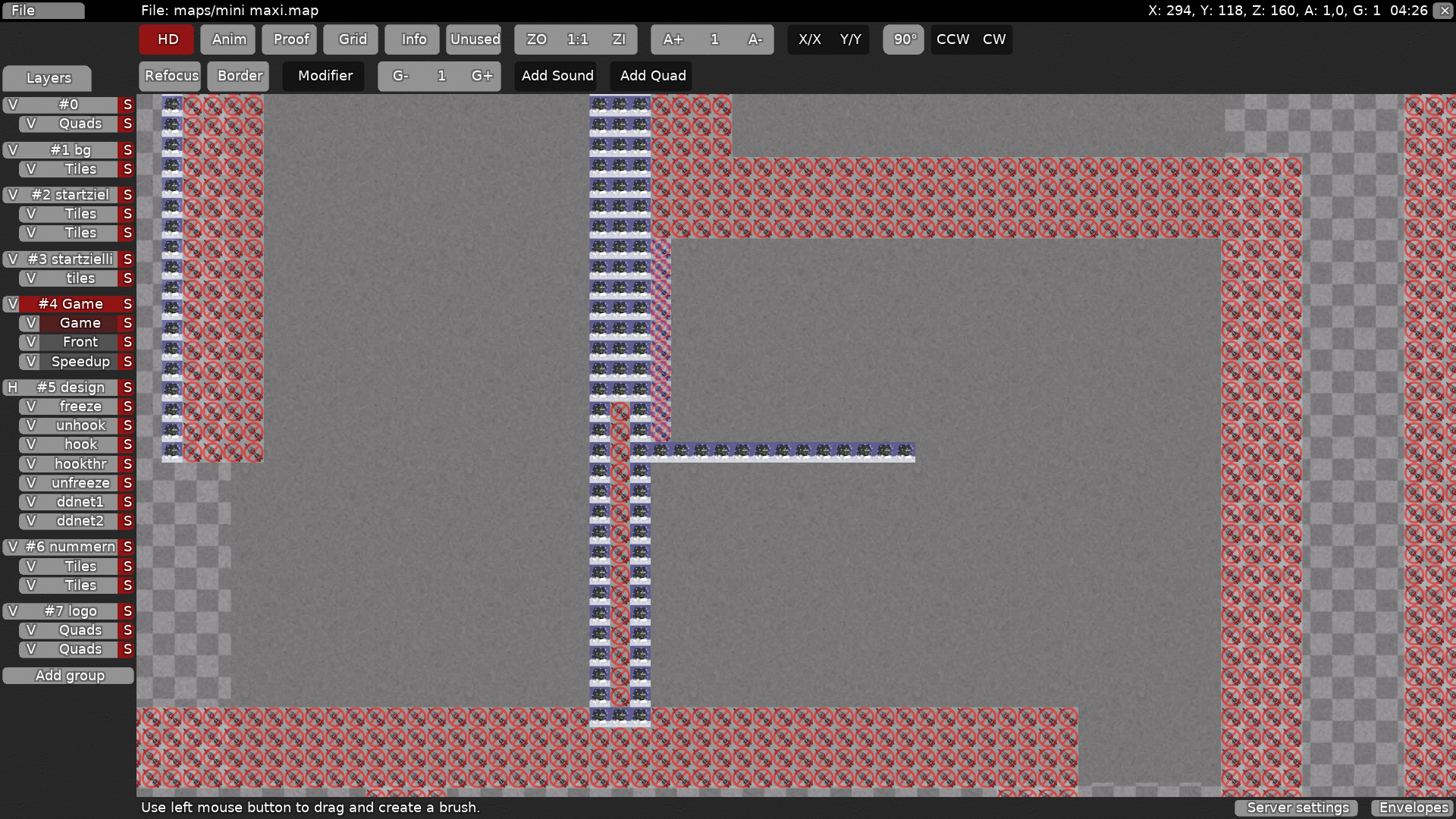
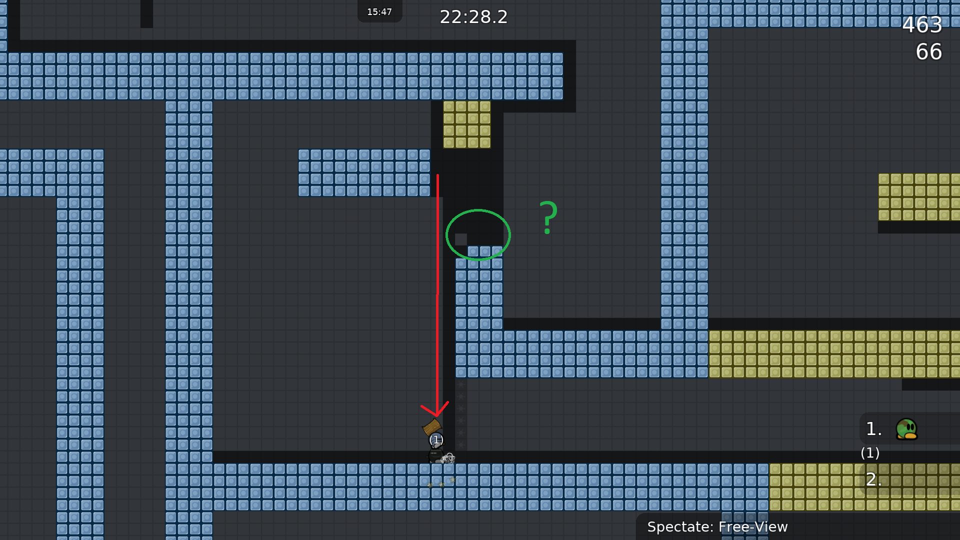
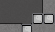
ich hab da ma ein alternatives design gemacht....
schit, nicht embeded
I just played this map, and even so I like some part I think the map should be designed to be more enjoyable for 2 player, I dont mind faily part but some part are stupidly faily part for 2 players and others break the flow a bit
on the others Hand the map would no be a real challenge in team0 as fail are too easy to save and most tee behind waiting to be carried would never be usefull because parts are too easy and not punished enought for big team
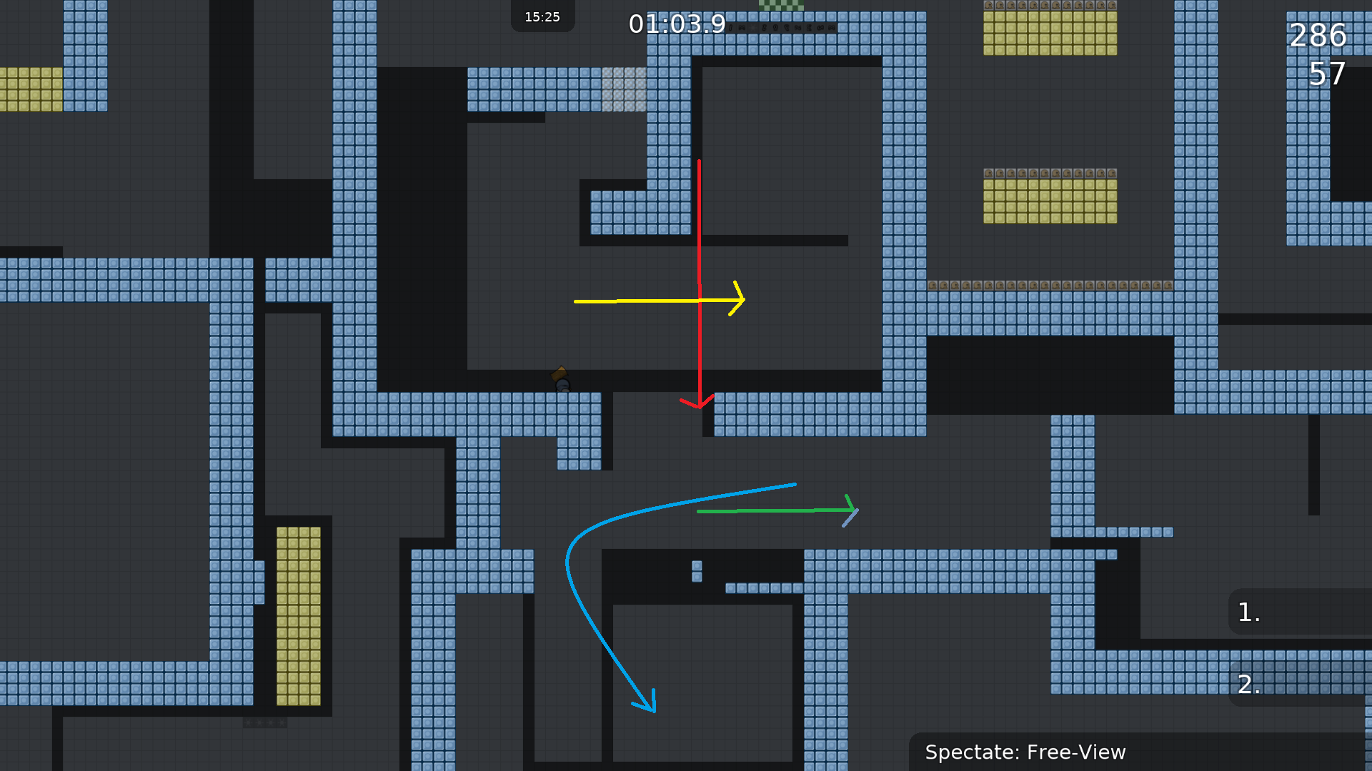
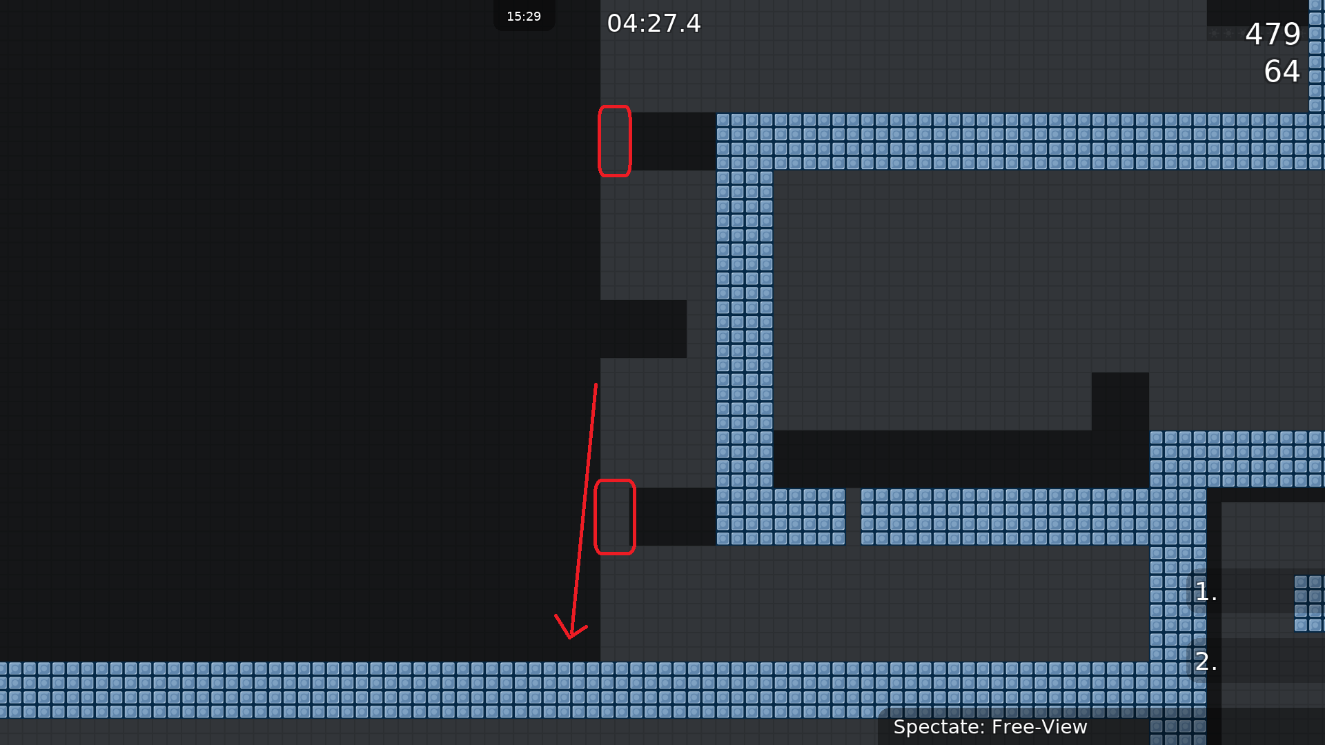
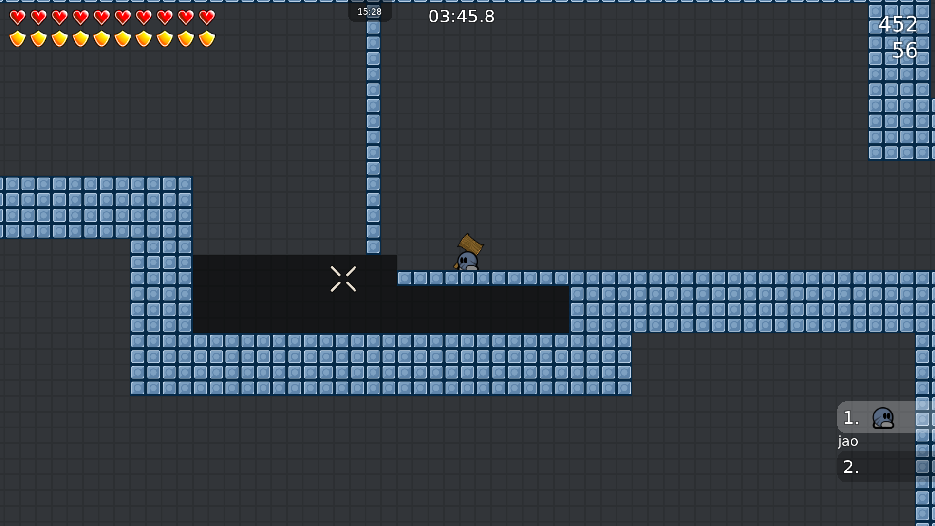
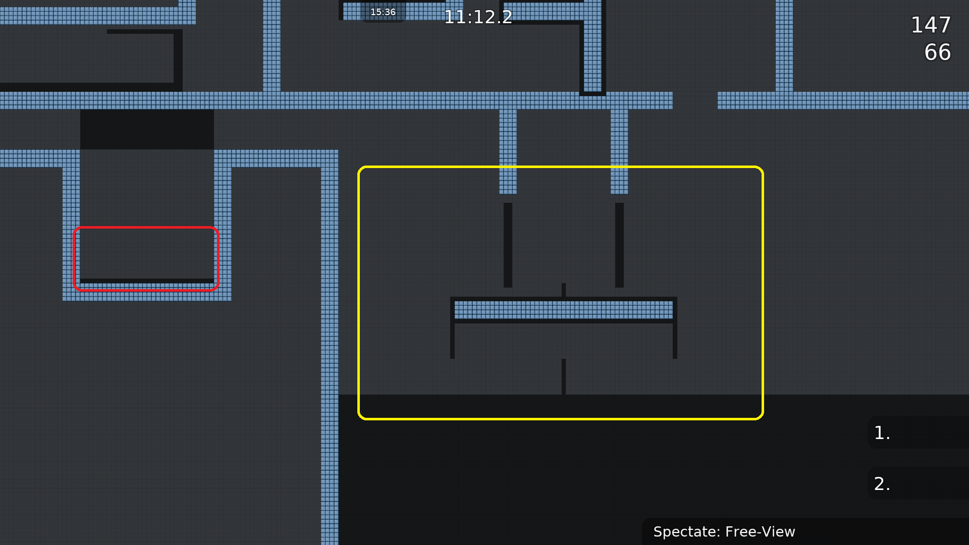
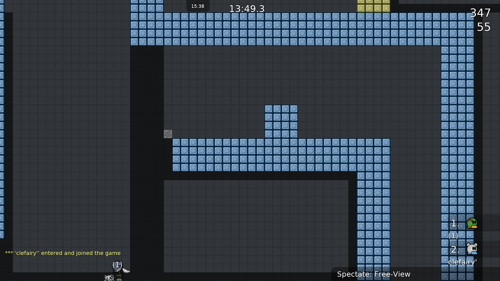
some screenshots :
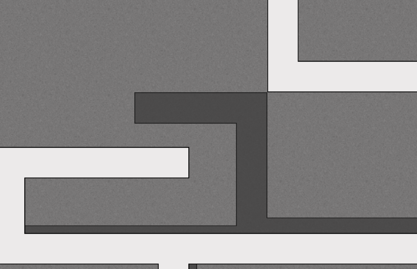
2p free restart :
hey thx for testing, i made these demos to maybe clarify the part. that edgehammer might be too hard it we want to make it a 2player map now. i can add some teles throughout the map
thats the old version of the part
i think adding teles on the 2p free restart part would suck, it ruins the "concept" of having no tele + it makes it a pain to rescue last tees in big groups
u should just make the ground non-freeze and add 1 or 2 more freezes above (imo)
some parts are kinda stupid as 2 but thats the idea of the map so for me thats fine (except the one showed by amu)
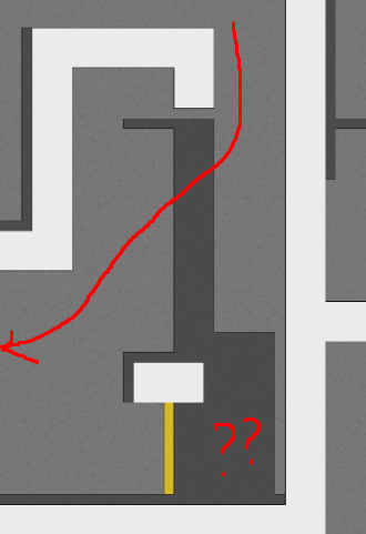
first of all, thanks for testing.....please keep in mind that i tested everything with dummy. so i dont really know for sure if everything works out for 2 players. i managed to do all the single parts but not in a row. if you could point the said parts out with screenshots, it would be really enchanting. 😃
what about
@Amu~Cookies screens?
i fixed one part and i explained the other two. i didnt really get what snail meant so i didnt want to post a version with one fix
maybe you can clarify what you mean
what do you exactly mean with the 3rd screen?
that this novice part looks hilarious to me 😅
aint bad to have some less stressful parts once in a while:D
fixed all except last screen. im okay with that cut ( icouldnt do it with dummy)
spawn is in the middle of the map
the first part doesn't really fix that you have to cross ways with others and can easily crash there
the part you gave instructions for doesn't work if both start from where the tune-zone is + I still don't know what the jump refill is for 😄
you removed the logo (I guess by accident)
lets have a look on it together later when i am home
I'm here now
give me a minute
Tested with Tropo:
The map is very unbalanced. It starts of as a mod 2ish map and exceeds till brutal 3ish. If the map should have constant linear improvement in the sense of difficulty thats fine for me, but since it goes exponentionaly up and down in terms of difficulty its not quiet fun and it disturbs the flow heavily. On the other side i like the design and color contrast with the though- and unhooks also with hookables. If you can manage a good balance with each part it would be much appreciated!
$rate balance=5 flow=6 creativity=5 playability=6 fun=2 design=1 bonus=0
this map was made in a rush. since a lot of people pointed out which things are wrong with the map and it would be too much work to fix it i will take the best parts from this map and put the fixed versions of these parts into my new map which i started some time ago. @jao delet this map.
meh
well your decision, but please don’t waste our time with maps that you know aren’t well made 😪
thats funny because sometimes those are getting released really fast
XDD
aha, map was declined
don't be released!

