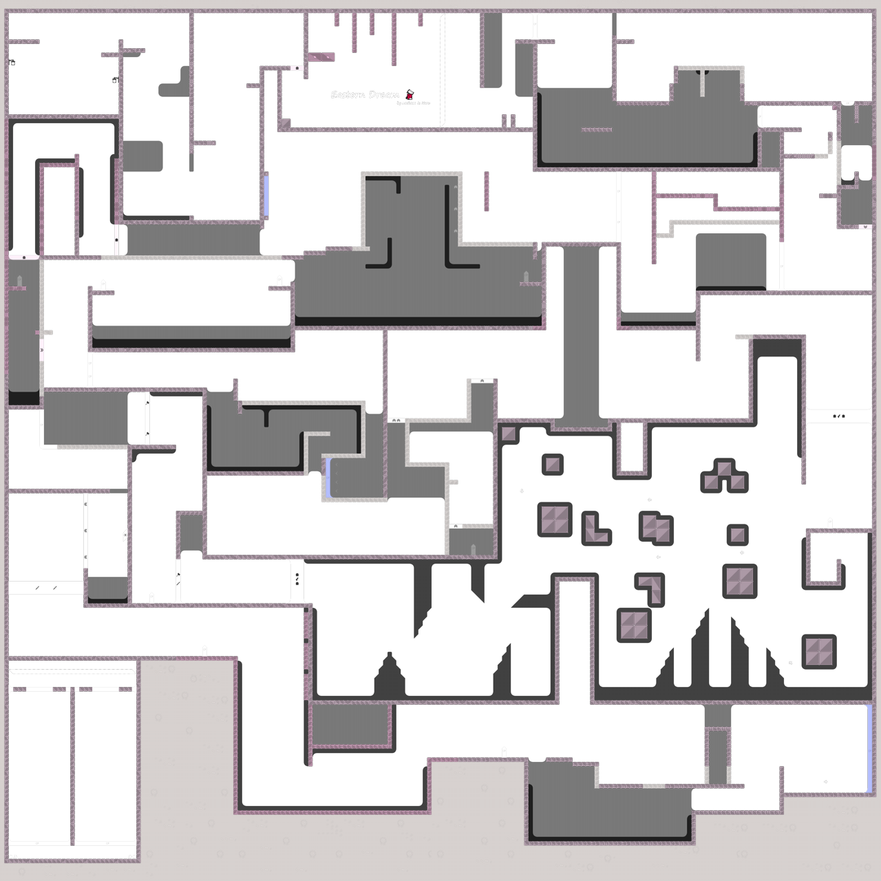
this is your map's testing channel! Post map updates here and remember to follow our mapper rules: https://ddnet.tw/rules
😱
👍

im sorry to say this but i will send a pre decline
$decline
out tester team will send what/how to fix the map
it can take 1-3 business days
thanks for your service again and hope you do something better next time!
just dont give up!
yooo, observation of mine (not rlly sure if it matters and it would prolly be like a HUUUGE pain if you were to go around changing it)
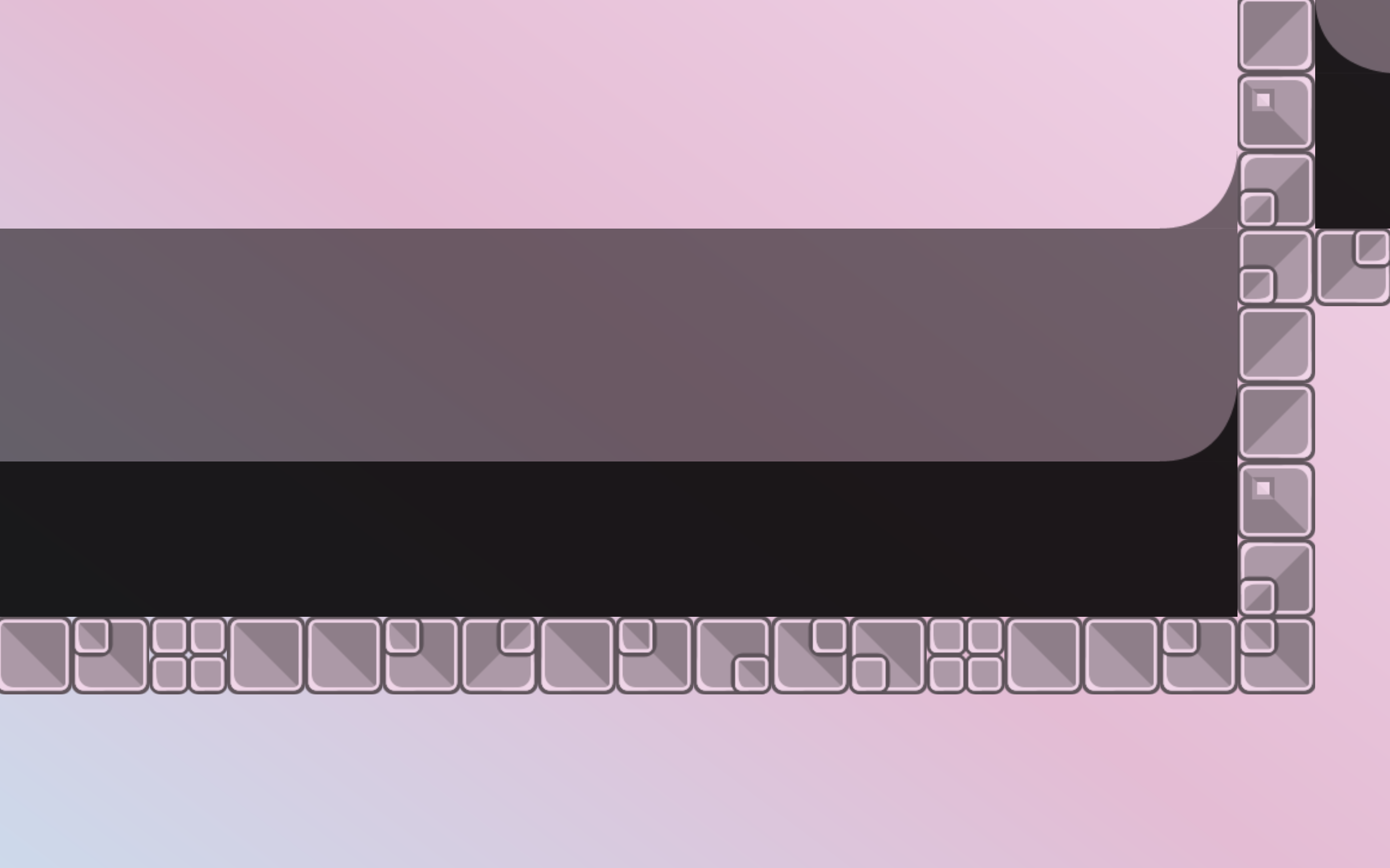
there's holes in the corners of the blocks tileset you used which makes freeze and tele next to them look kind of weird without filling those in (at least to me). Here's a picture so maybe you can understand what I mean

Das not saying the tileset or the map is bad just that I ntoiced those spots and now I can't like, unnotice them
do keep in mind I'm not a good mapper this is just like, pet peeve
other than that is cool map I like
Hi there.
Upfront... before you send in a map make sure you are totally fine with it... So you've tested it atleast 10 times (maybe get a some other players to test it), searched for every bug/cheat/... that you could find. I have a feeling, that you don't really did this. There are several problems with your map...
About the whole gameplay: 70% of this map is moderate in difficulty, 10% not well mapped for more than 2 tees, the remaining stuff is propably okay.
- The first hammerfly part can only be played by 2 players at a time. Thats annoying for everyone who has to wait and a it's a golden moment for blockers.
can be skipped. You can just drag the other player on the second part through.
way to hard for novice.
to tight.
can be deleted, there no reason why it exist somehow.
also way to hard.
also way to hard.
- The hammer between
and
will never works for a novice players. It's even hard for moderate and some brutal players
Check your editor (images). There are planty of unused stuff which can be deleted (everything which is blue = unused). You don't have to use freeze (gamelayer) when there is already tele. You don't have to use
in your map at all, normal tele is fine here.
About the design...
- The
you guys used in the logo is super pixelated, looks not good rn. If your using
(i'm sure it works also with gimp or other freeware) you can just create a "Greenscreen Map" that you can screenshot, so the background can be deleted/cutted off easily to use the transparent .png file with a good quality.
- The screenshot which Welshi shared above is also a design thingy which looks not that well (to say it nice). The gap between freeze and your tileset should be filled, that you don't see the background in between. Btw you didn't used the best tileset to fill the gap, because of the holes in the stones.^^
- Take a look on your startline and on your finishline - one looks good, the other not. You will know what I mean just by looking at it.
- A novice map should be readable for every new player. It's not good (in my opinion) to use different types of corners, yours are sometimes round, sometimes those 50% tiles and sometimes there aren't present at all.
If you want a detailled version of this, just dm me, we can walk through your map together. But for now it's a decline.
$decline
BUT I have to say, your map isn't that bad as it might sound. If you keep going im sure there are some cool maps coming from you!

So don't give up.
dont think you get paid for that!
i like to tell the future to the people who i think needs it

business day xd
