this is your map's testing channel! Post map updates here and remember to follow our mapper rules: https://ddnet.tw/rules

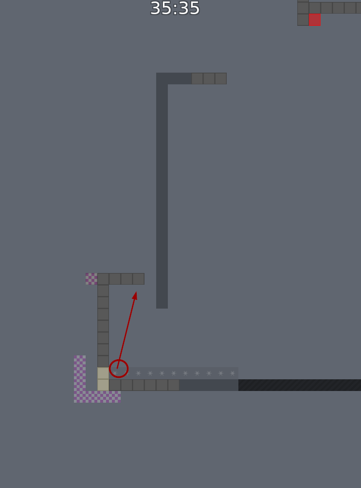
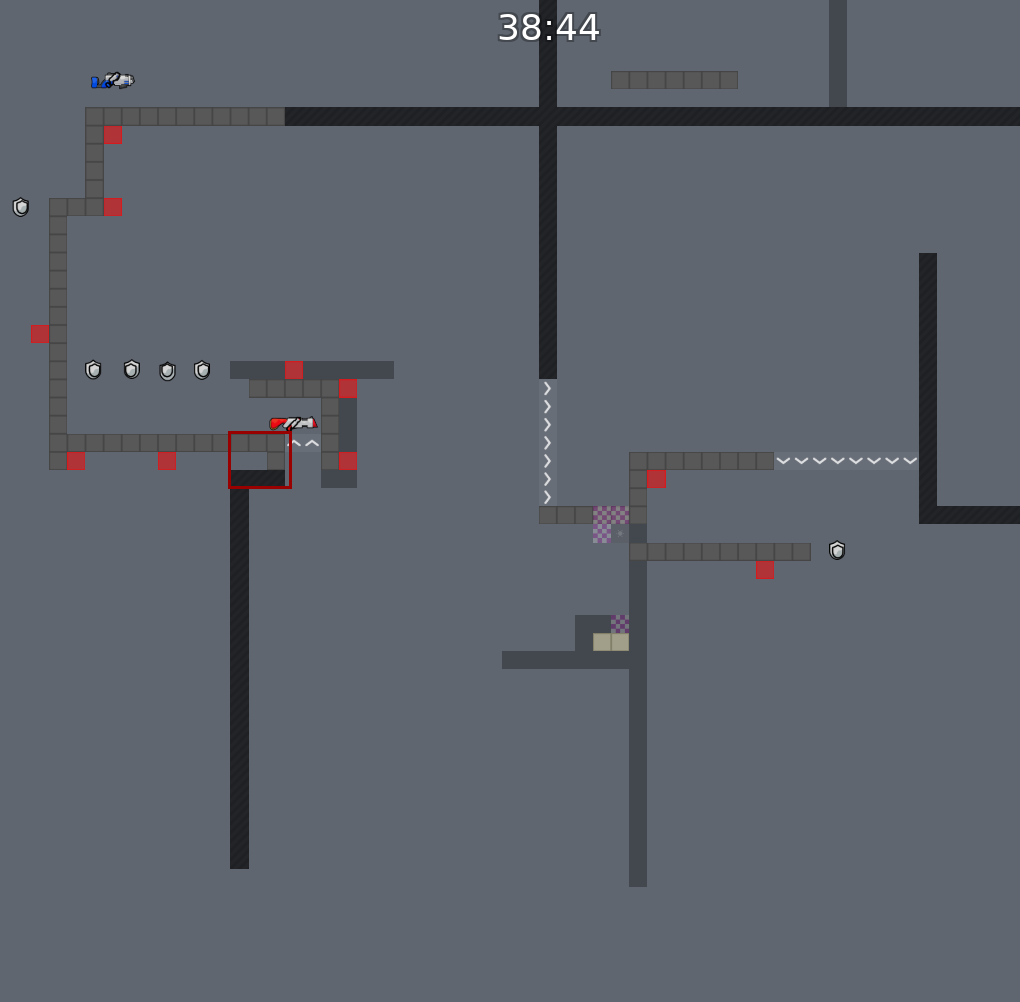
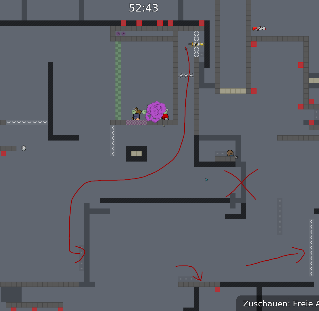
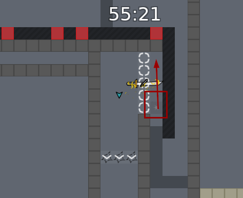
stop mirror stopper 😄
u dont need global collision and hook other off and solo on, just add this command for testing : sv_solo_server 1
u forgot also HD things (stones and moon in the background)
u said detail?
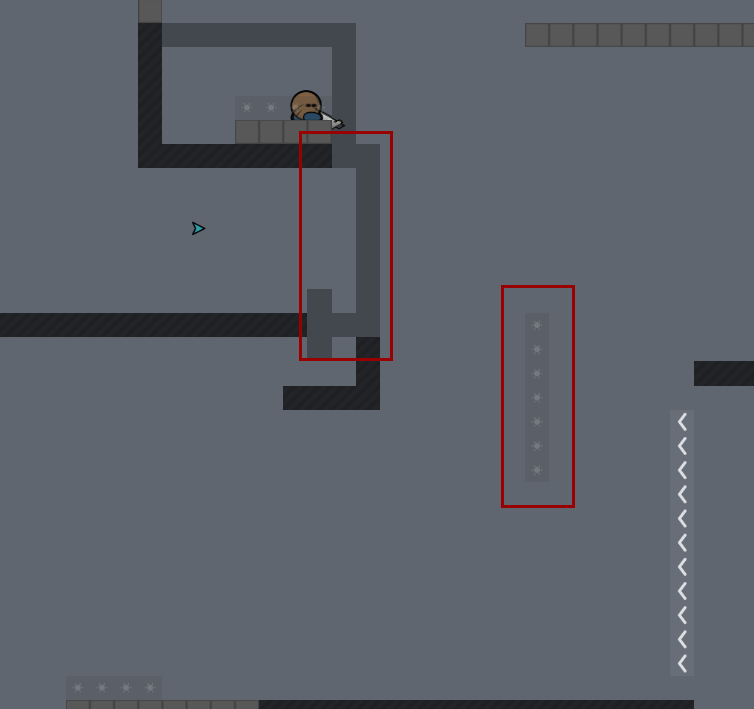
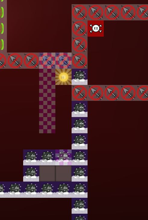
and delete all the arrows xd
hookable and unhook look almost the same, the same with deep, freeze and unfreeze. please edit it so that you can recognize everything
move logo behind the tee
cool map, i like it
$waiting
still some mirrored stoppers
$waiting
useful stopper 😦
x: 114, y: 43 just go to that direction delete the stoppers and put a new ones
don't use "N" and "M" to rotate them. Use "R"
ok, I fixed it
u have to re-upload the new version then
ok
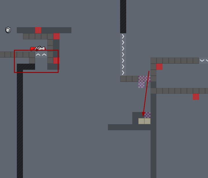
only 1 spawn for solo maps
and put it on the ground
$waiting
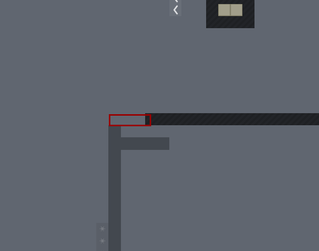
https://discordapp.com/channels/252358080522747904/913776674884169748/913896239622422549 not fixed, its not working when u hook in the middle or left
i still think you should change the design of deep,freeze and the stopper background so that you can see it better. also you have sometimes marked stoppers in the background and sometimes not. you should also make the stones in the background more transparent
oh i forgot unhook and hookable, make a clear contrast
With what I see on Cøke's screen you have to change all of the design. Colours don't fit together, background blocks are too detailed and the contrast is terrible now
yes exactly, i had said it before. the gameplay of the map is good, the design should at least be playable
still an issue
$waiting
what does the "contrast" mentioned mean? or whats the actual problem (new mapper view cant understand well). any example to understand it?
the state of being strikingly different from something else The background is confusing, cause the stones are too visible. In some places you have a lot of speed and you would think that those stones are "accessible". If you can say it like this xD
understand
You actually just have to turn down
and maybe give some other design layers adjustment that everything fits well.
Before mapping you have to learn/know the basics concerning design & graphics. There are a lot help on the web for those questions.
The problems that I saw on the design are :
-
The background is too flashy, you need to desaturate the background (Converge colours around grey and not flashy red or black). Avoid this kind of colour is general. With this, it will be more relaxing for the eyes.
-
The foreground (physic tile like unhook, freeze, ...) need to be little more darker than the background. This will help player to see what is relative to the gameplay and what is decoration
-
Avoid black outline on decoration design
-
Reduce details (like shade, outline) on background's images. You can make them little more blurry
-
The more the decoration is far of the tee the more it have to be a lighter colour on your palette (Refer to the dash 2)
I have generalised a looot but I prefer to keep it simple for the moment (it's already a lot of work), and as always there are a lot of exceptions...
That's really better ! Now the moon/sun is too black, too saturated
$ready 3
$optimize
gg
!
!
?
wow same name
👏
gg x 2
