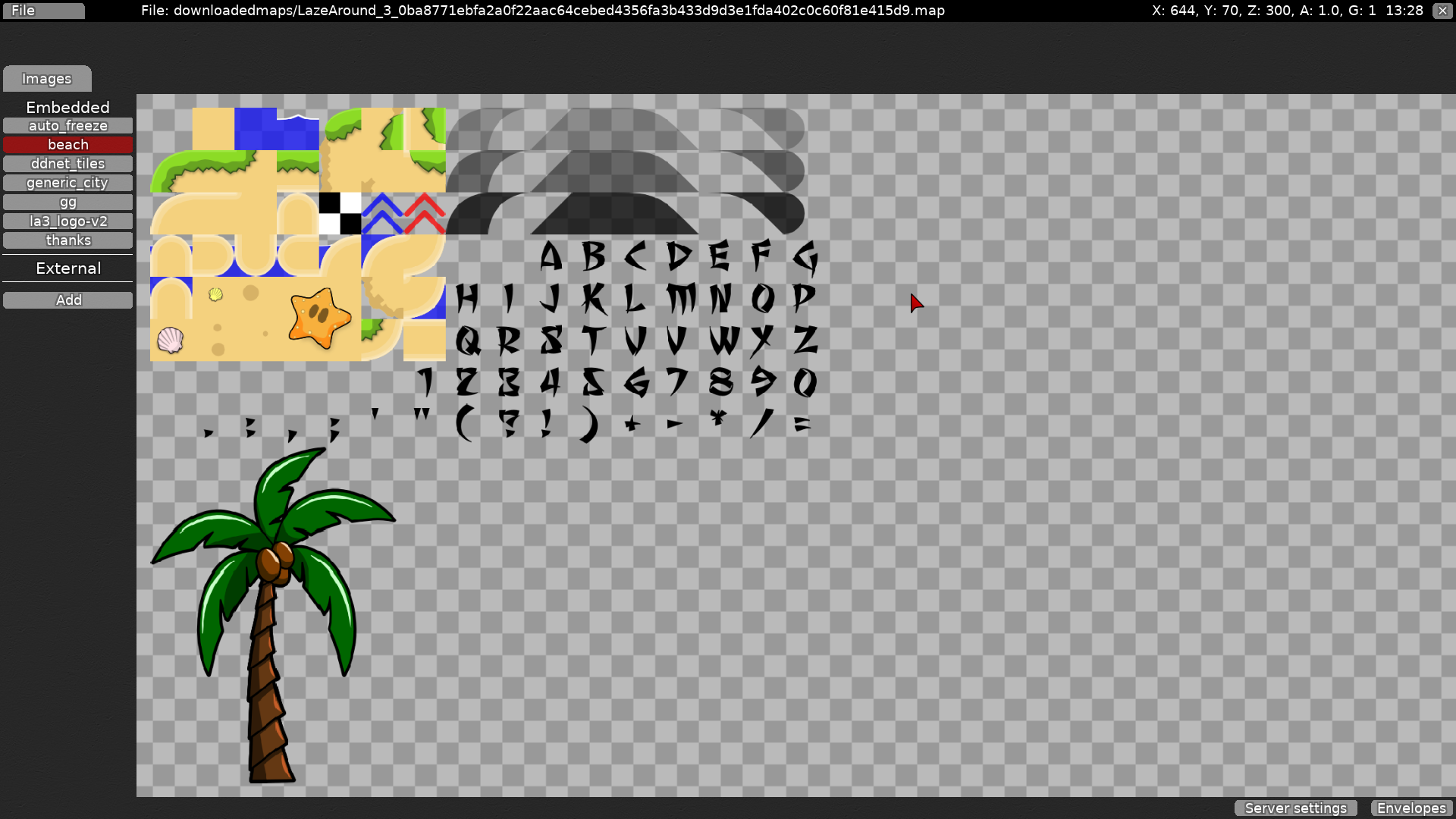
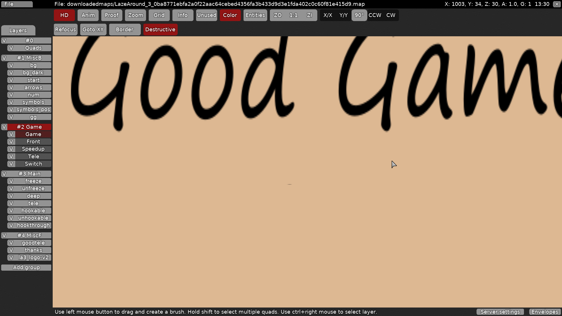
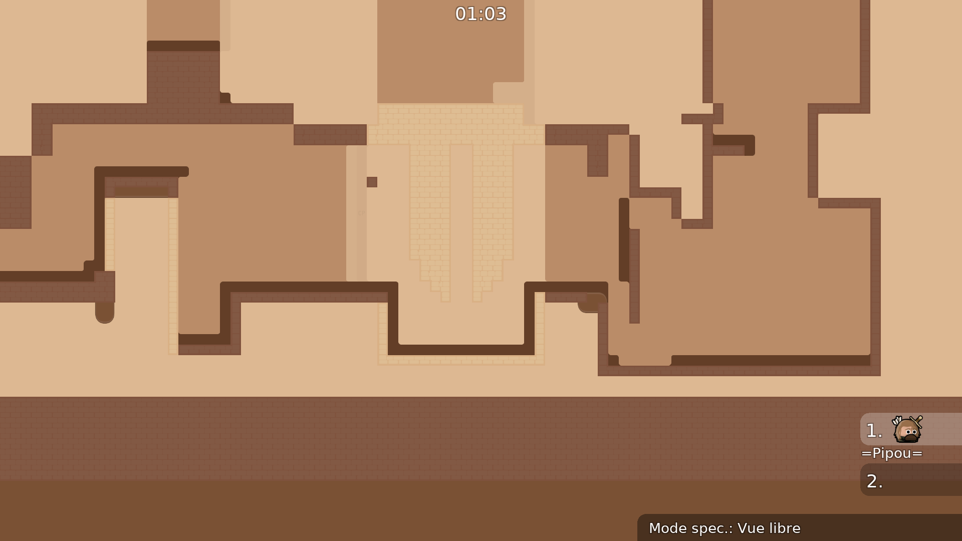
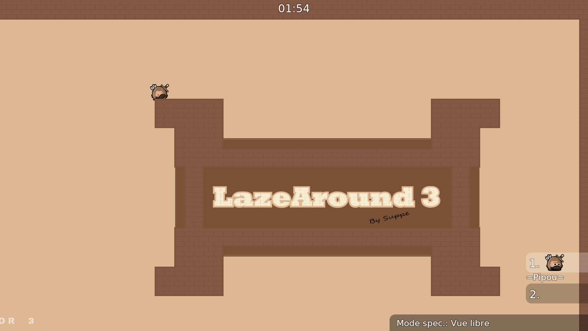
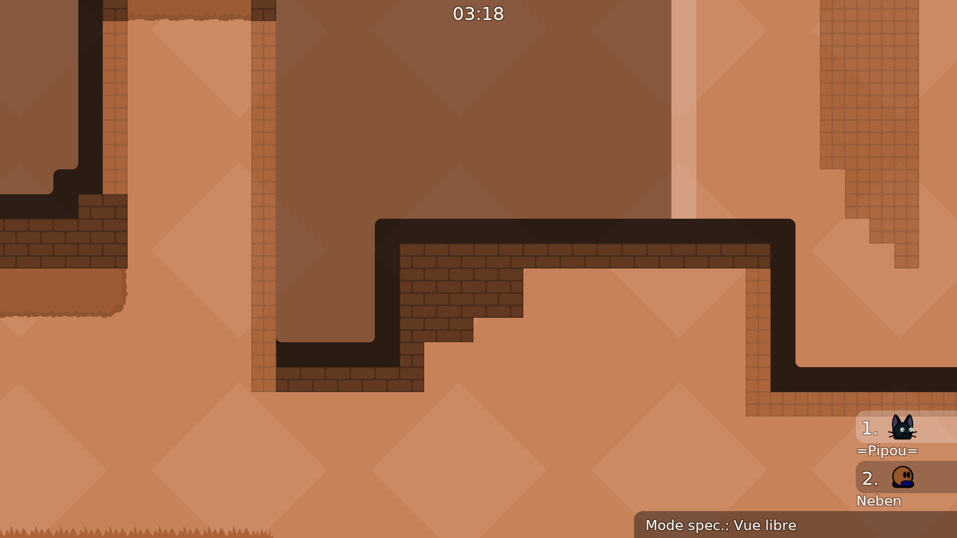
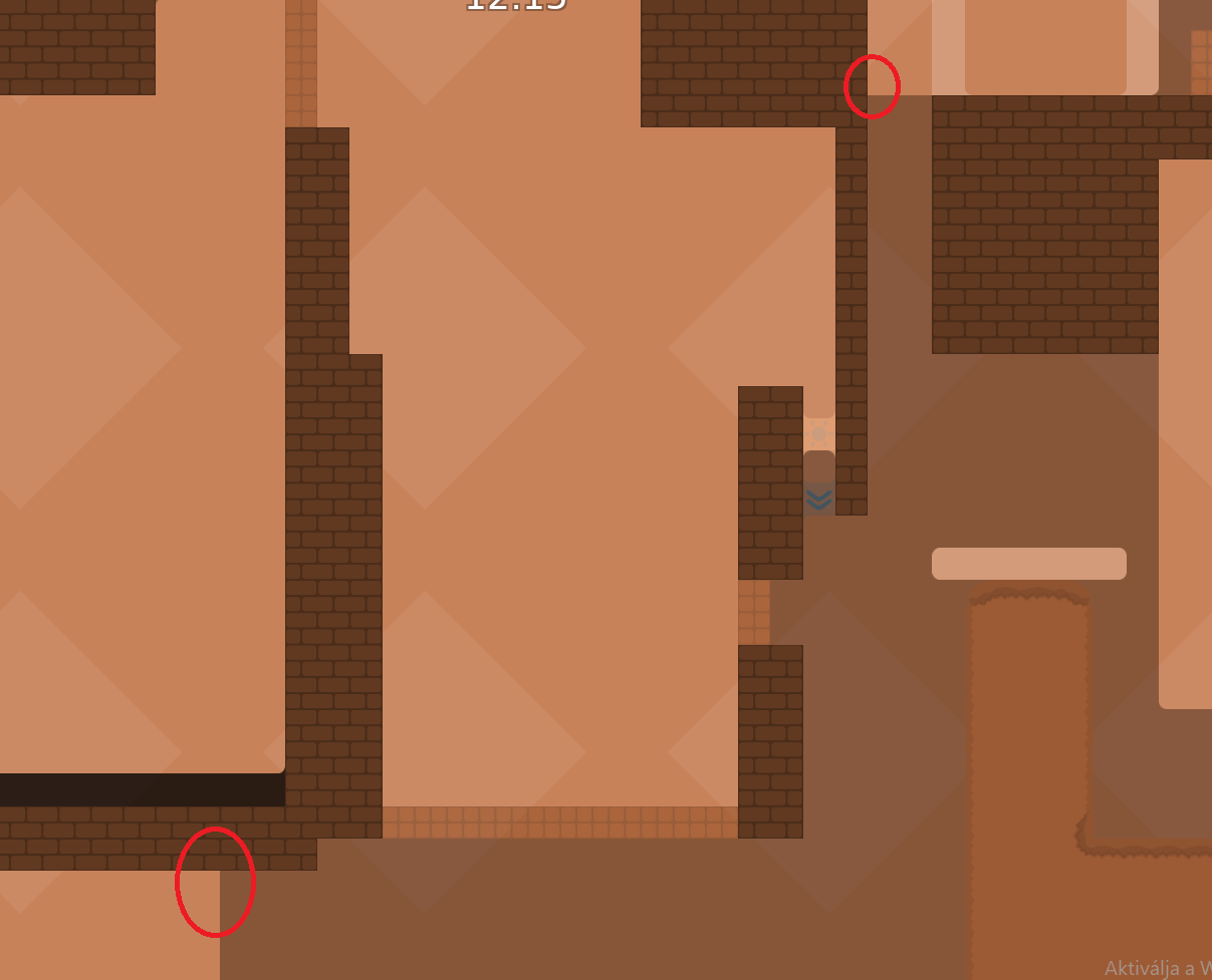
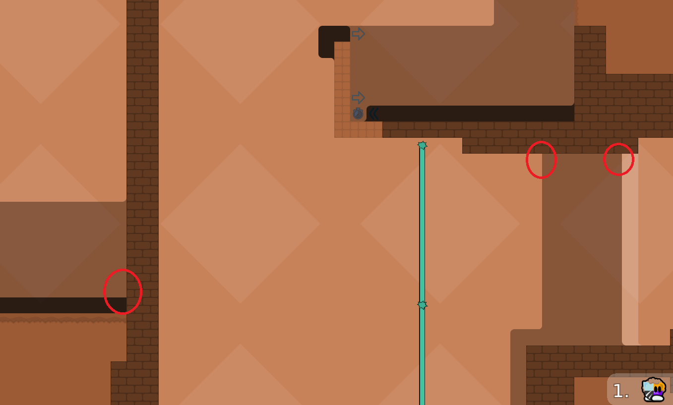
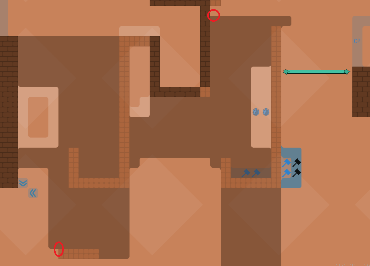
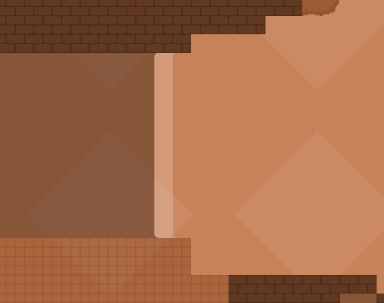
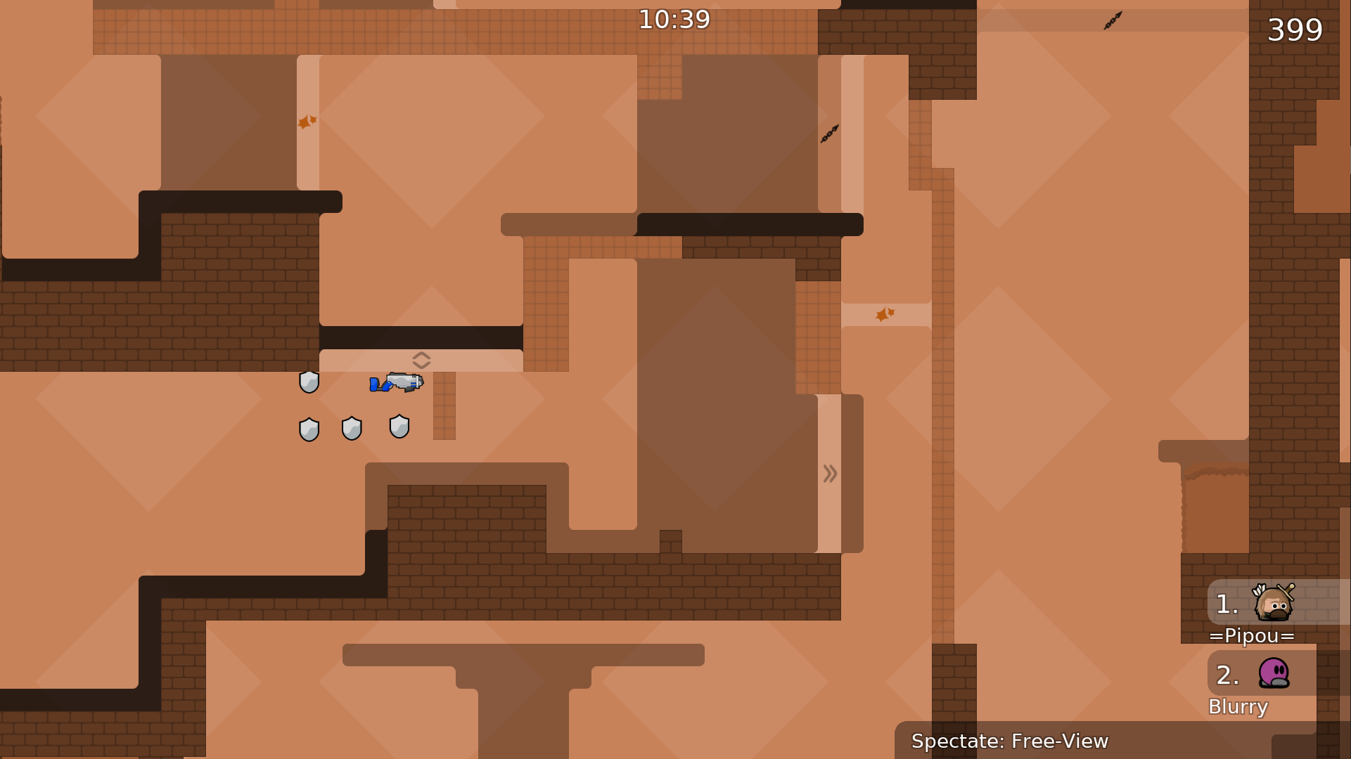
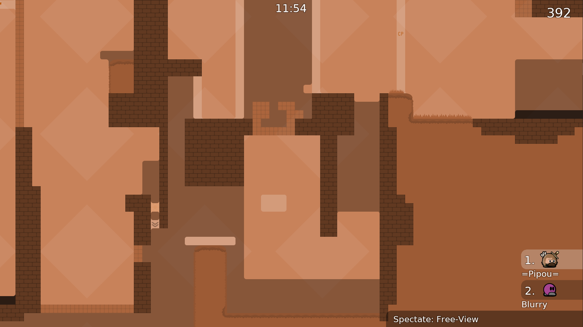
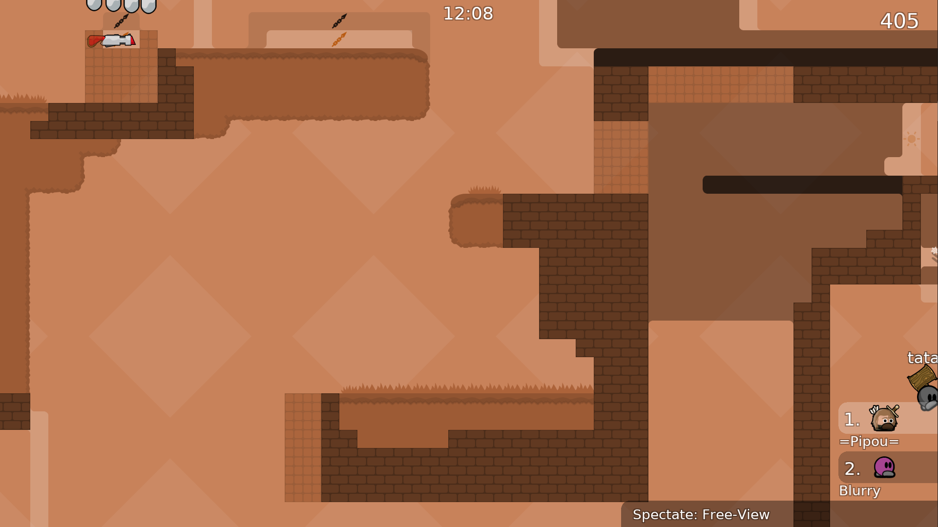
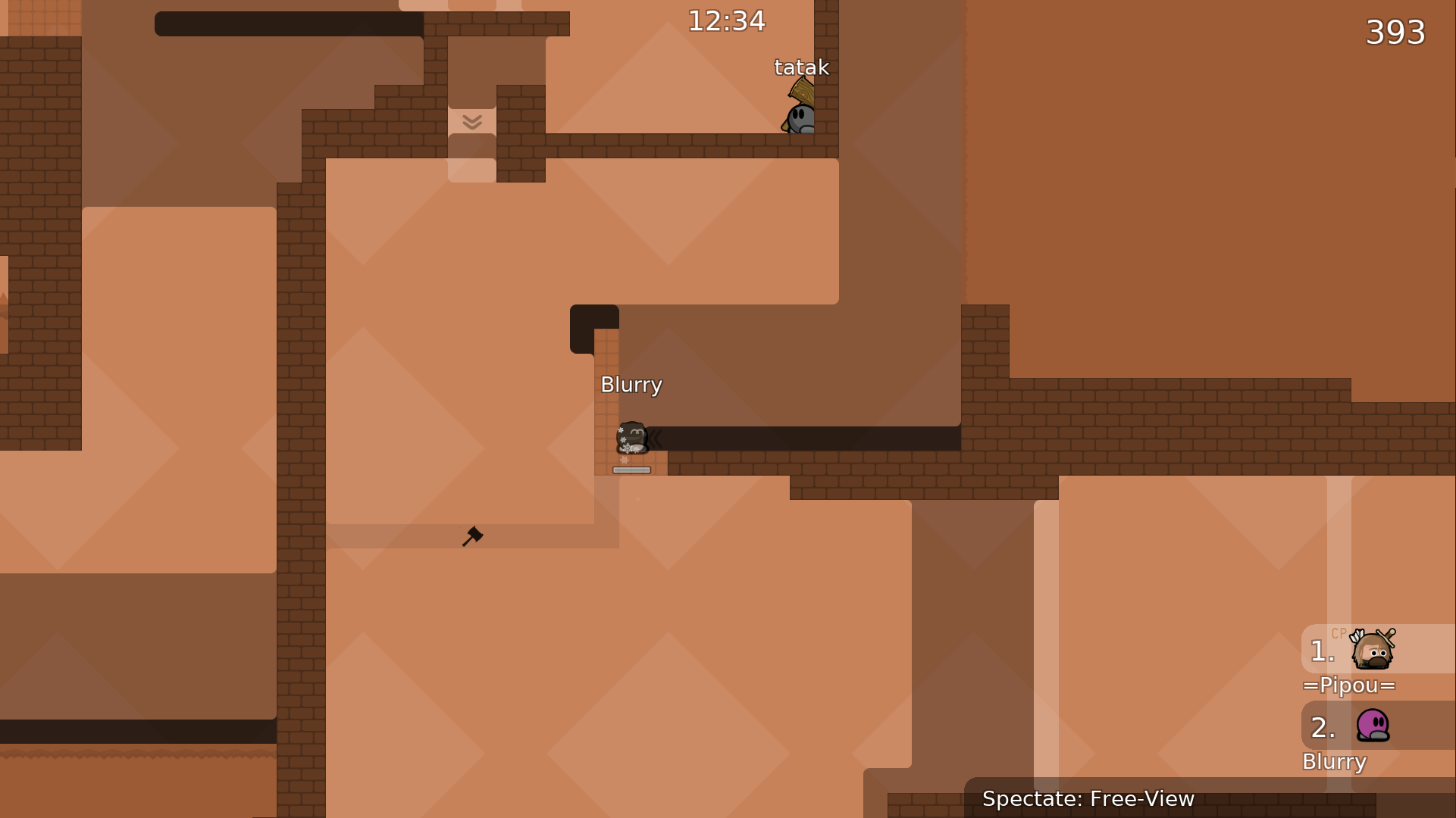
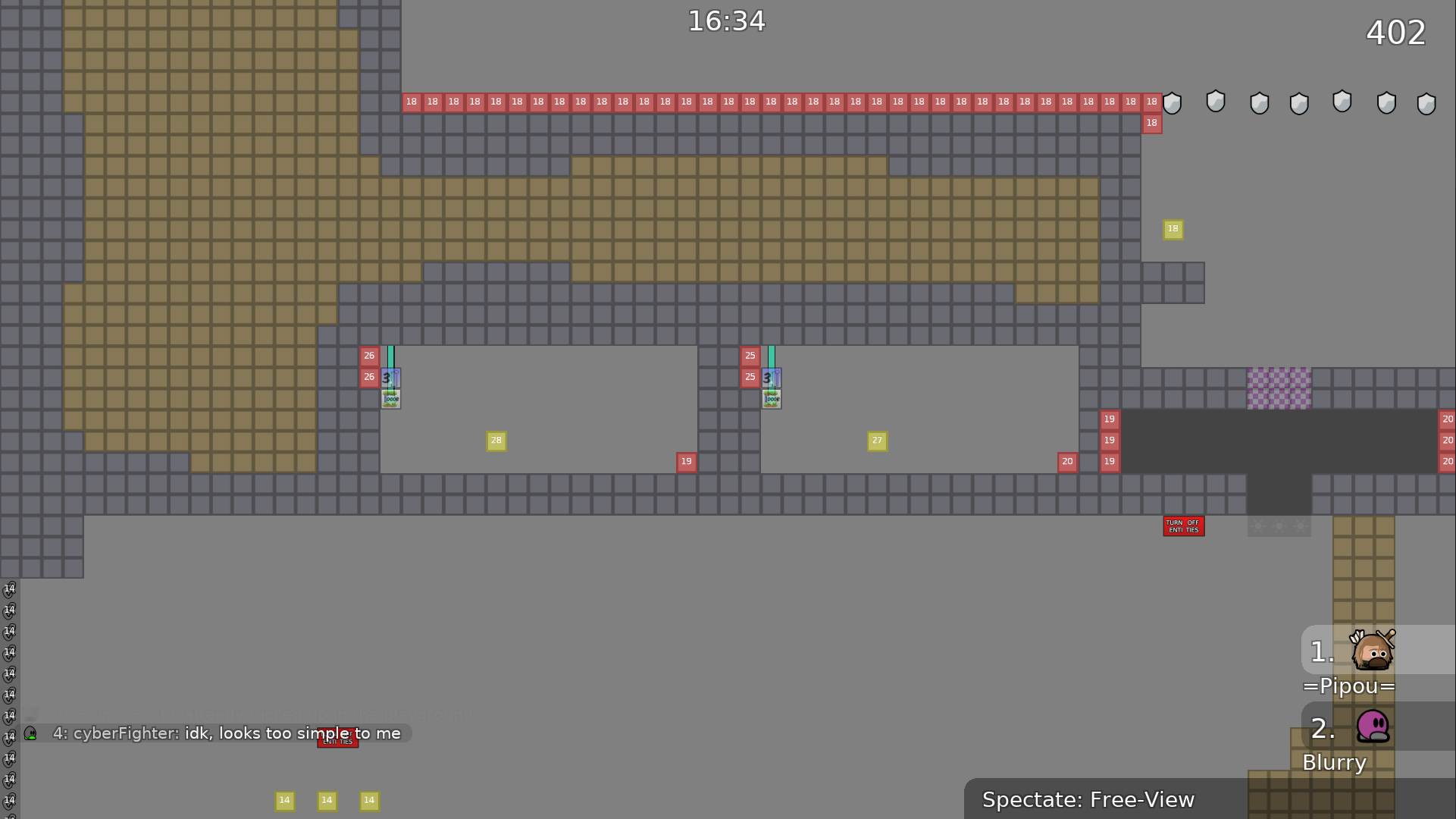
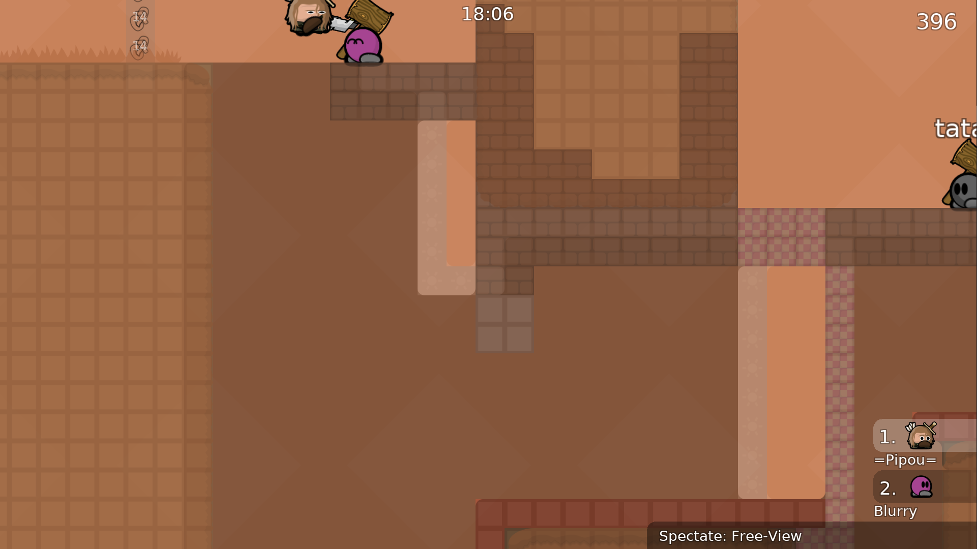
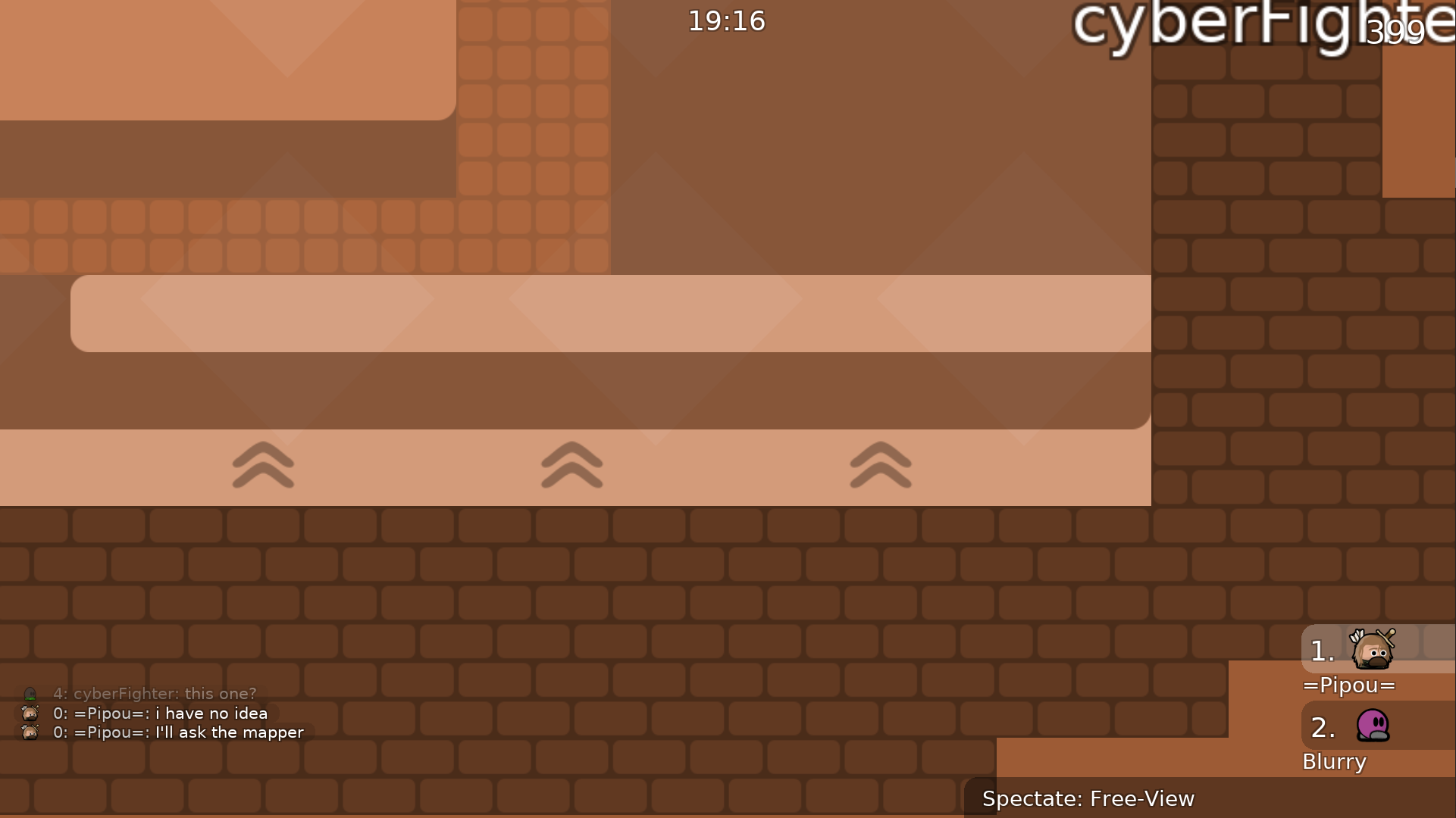
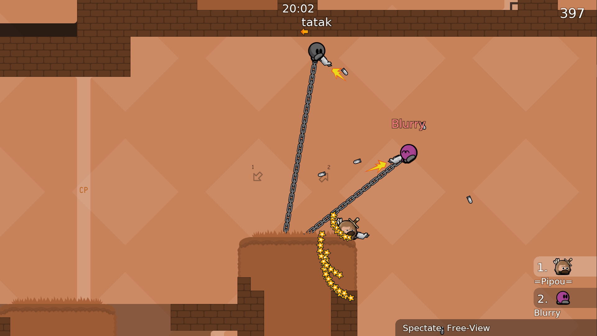
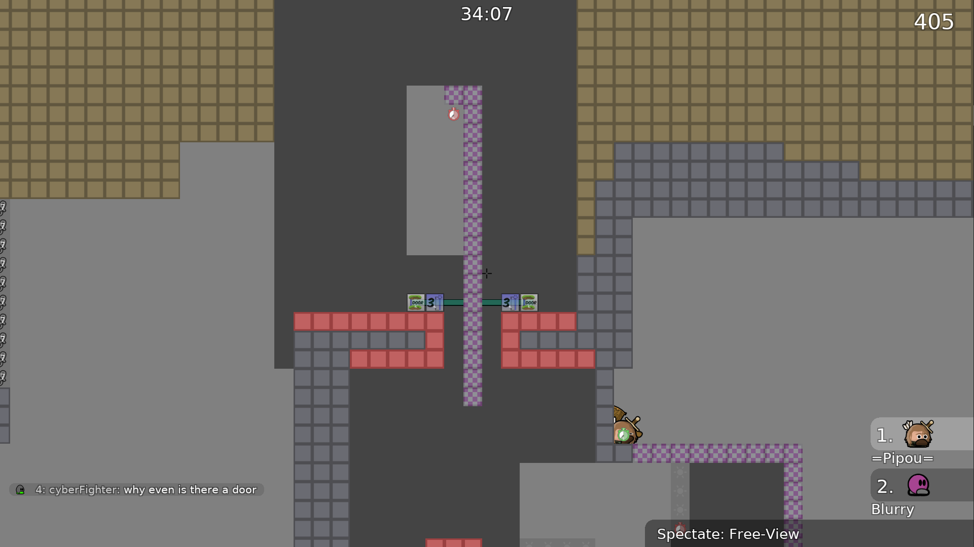
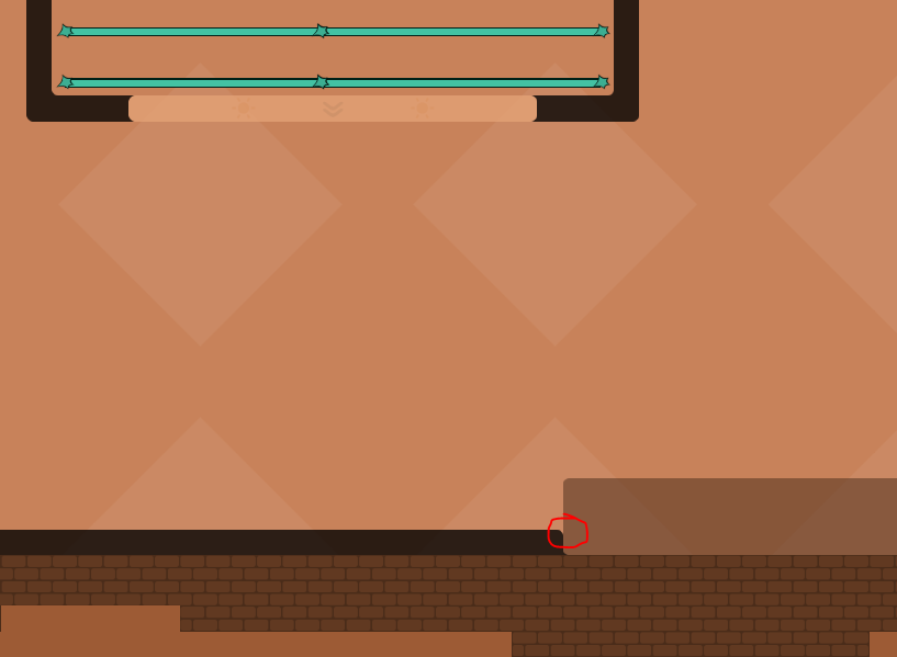
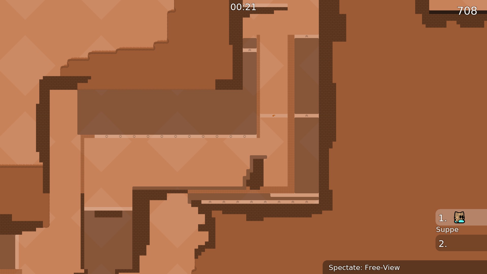
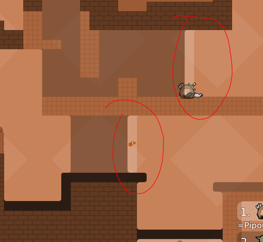
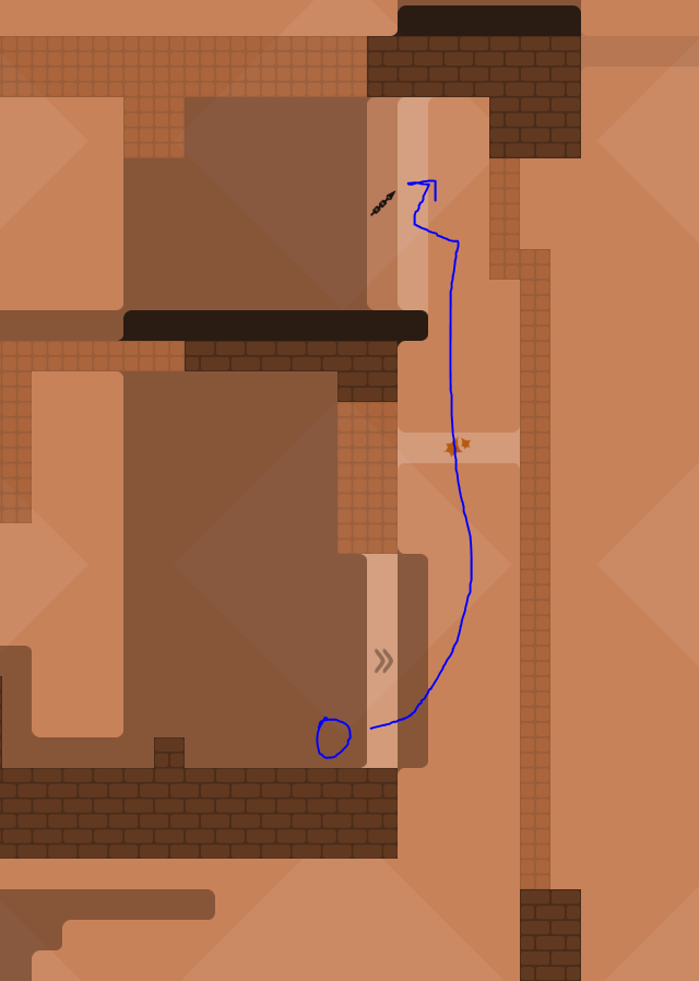
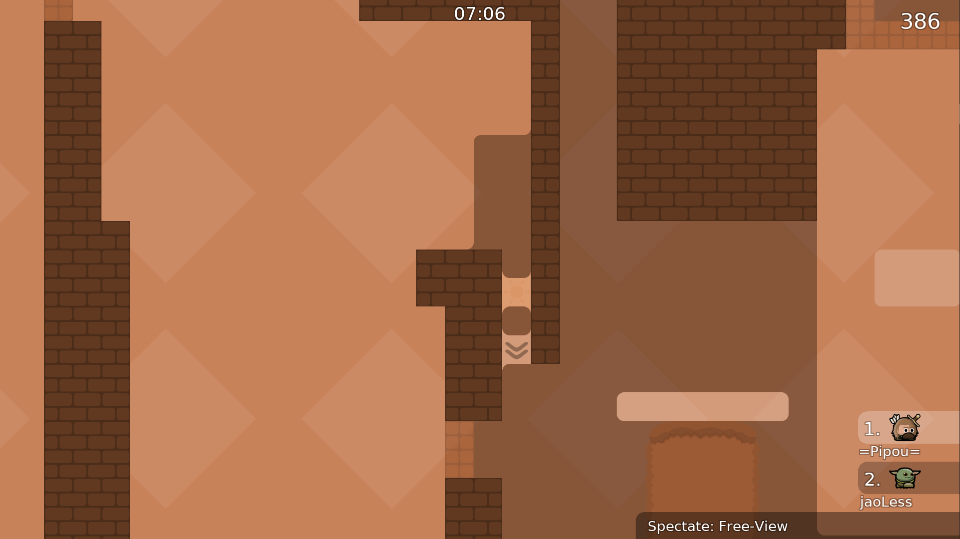
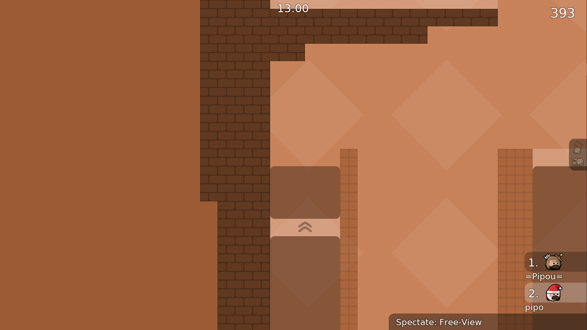
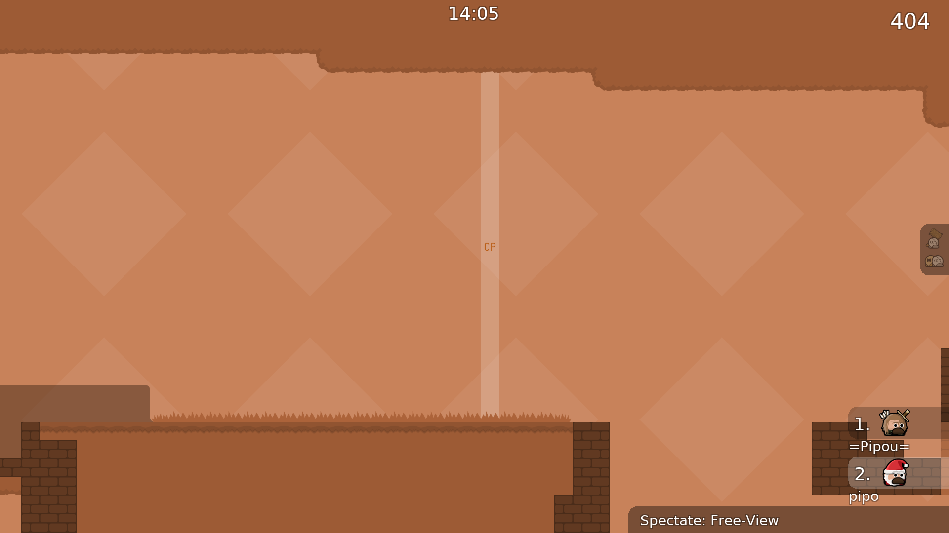
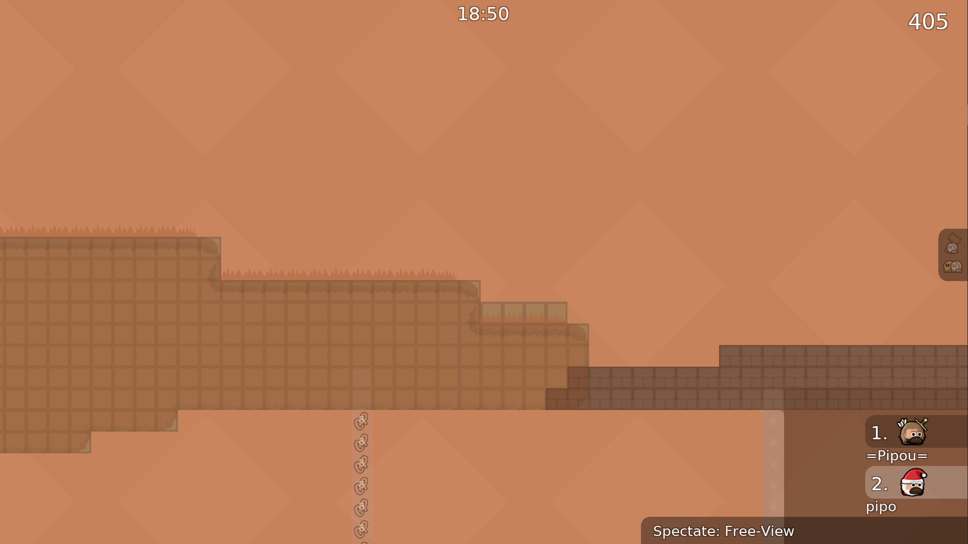
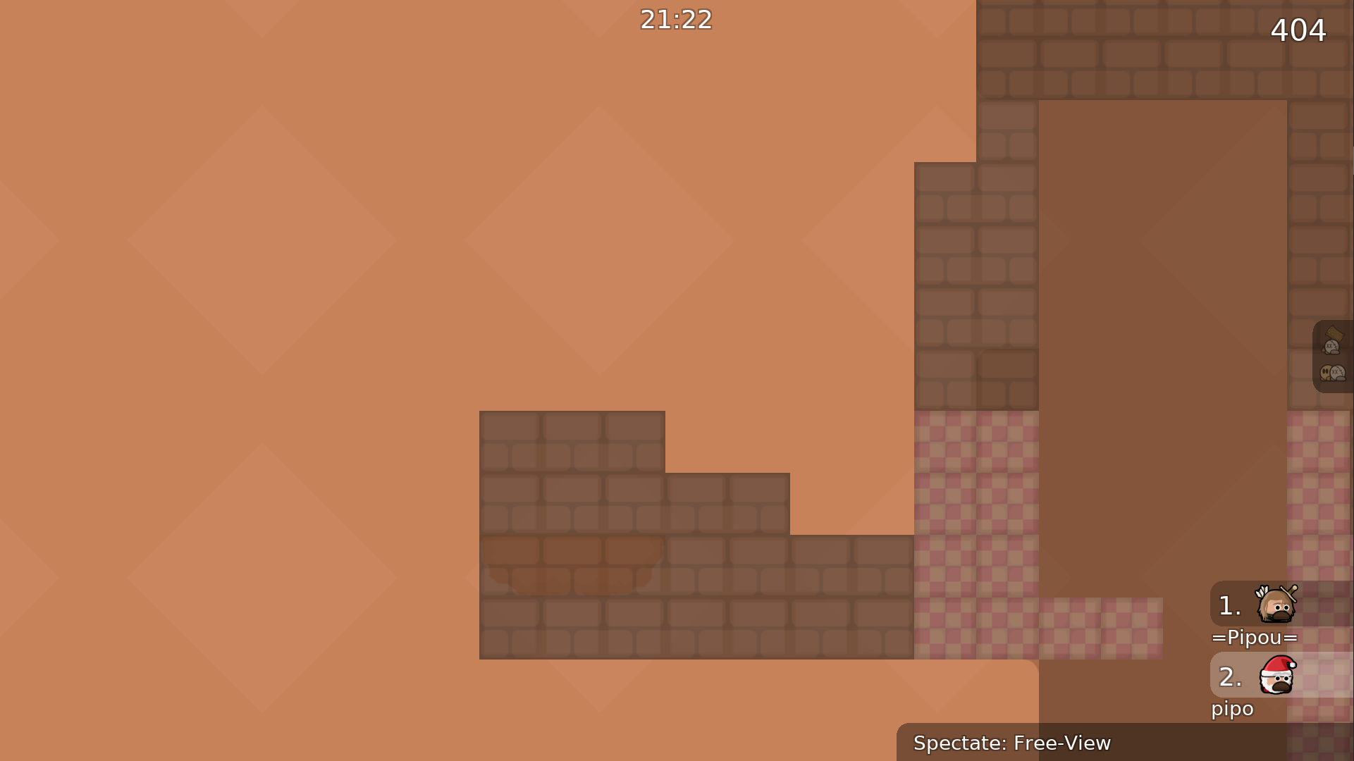
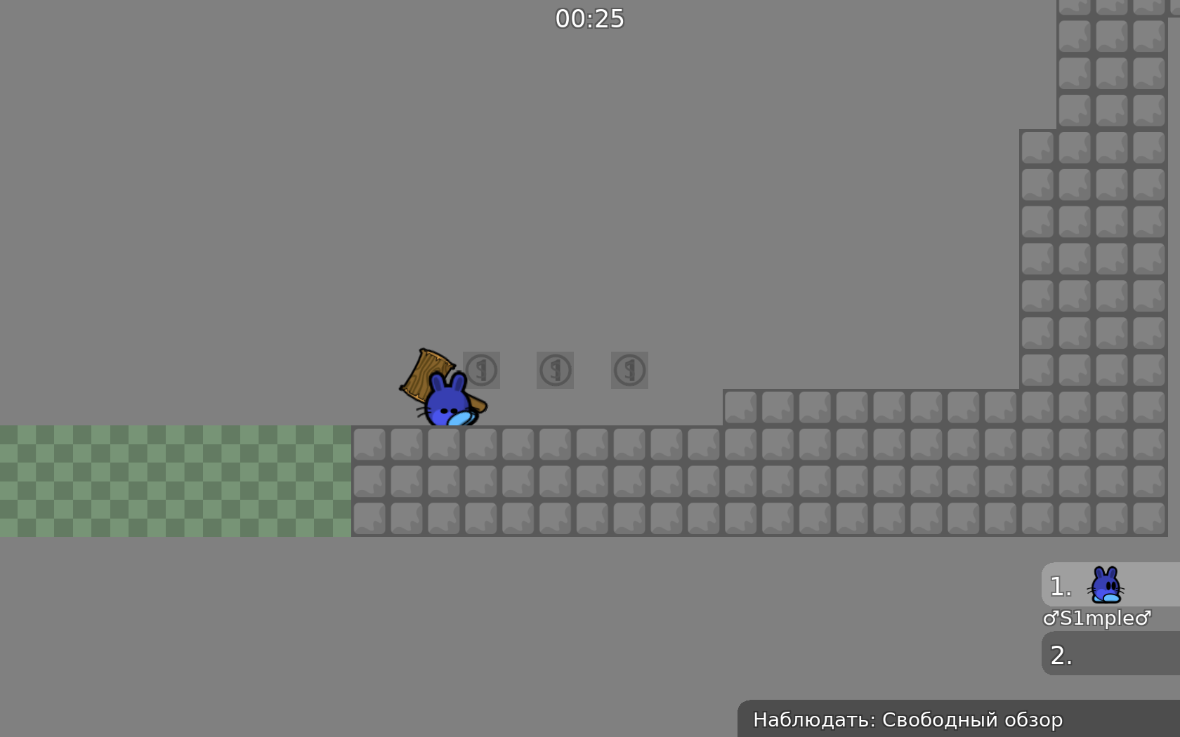
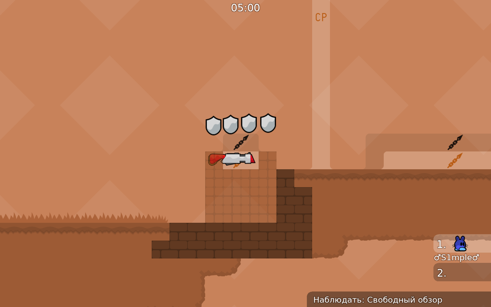
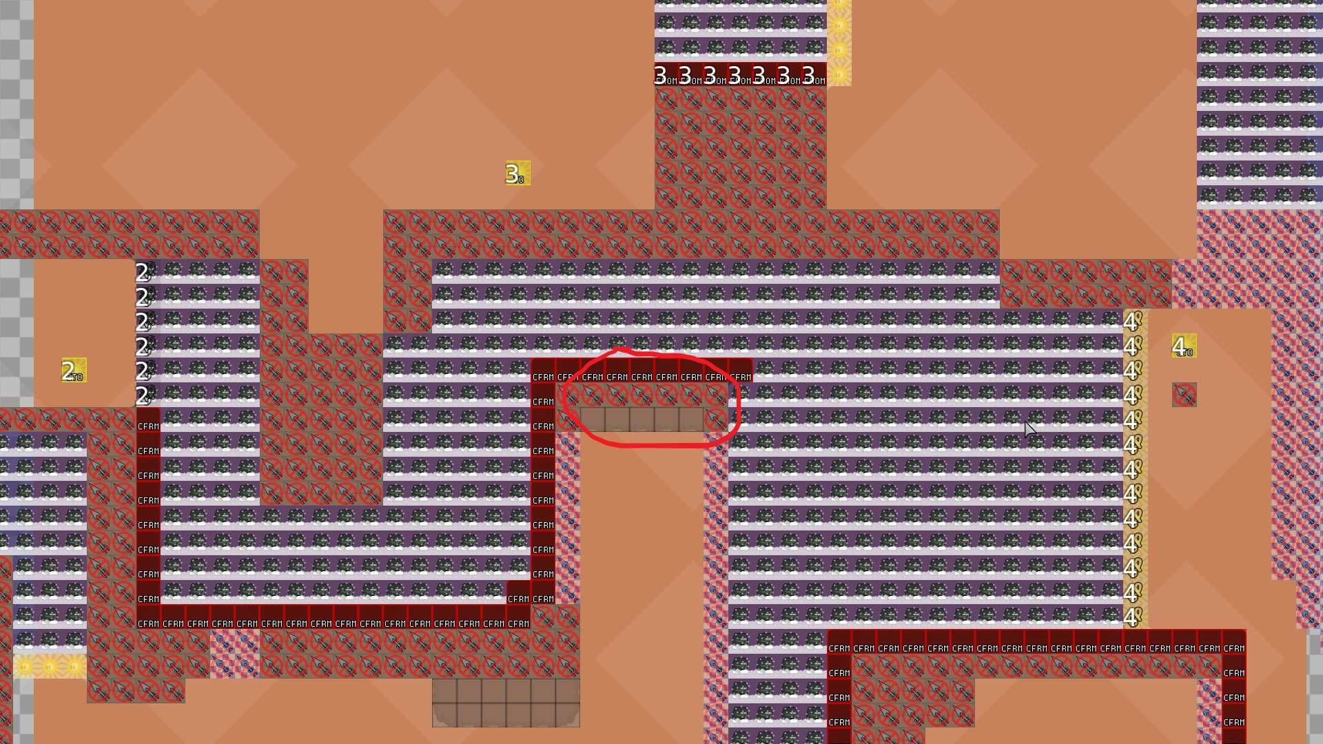
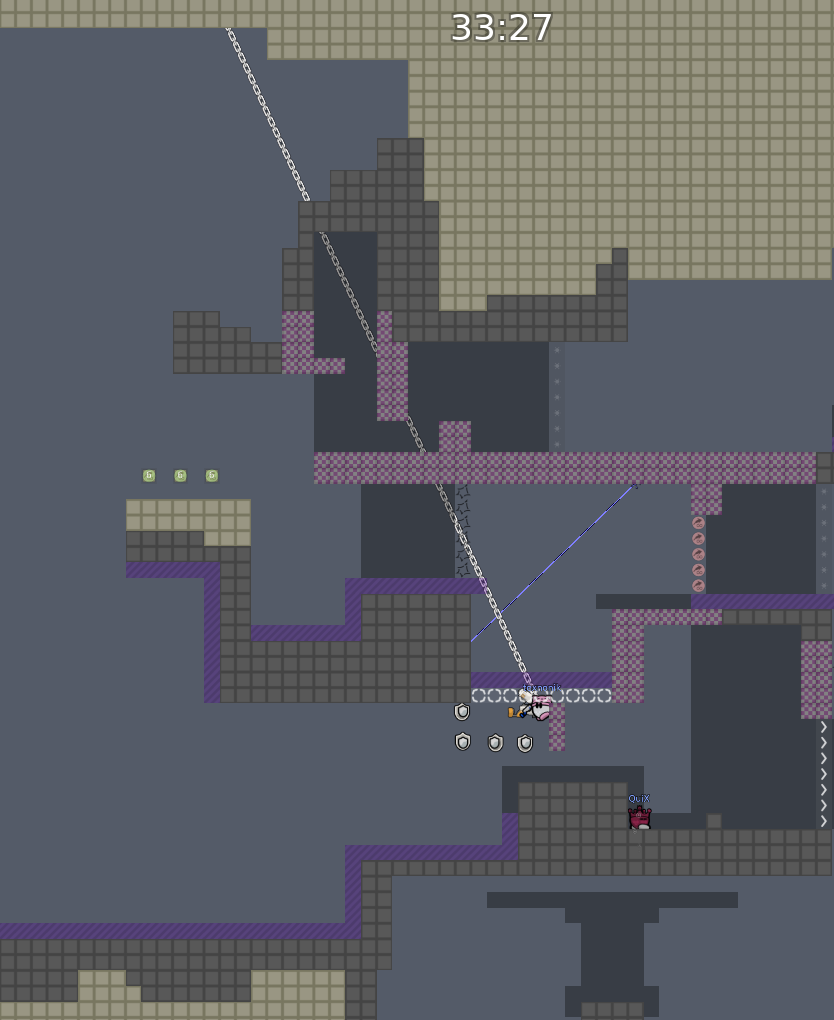
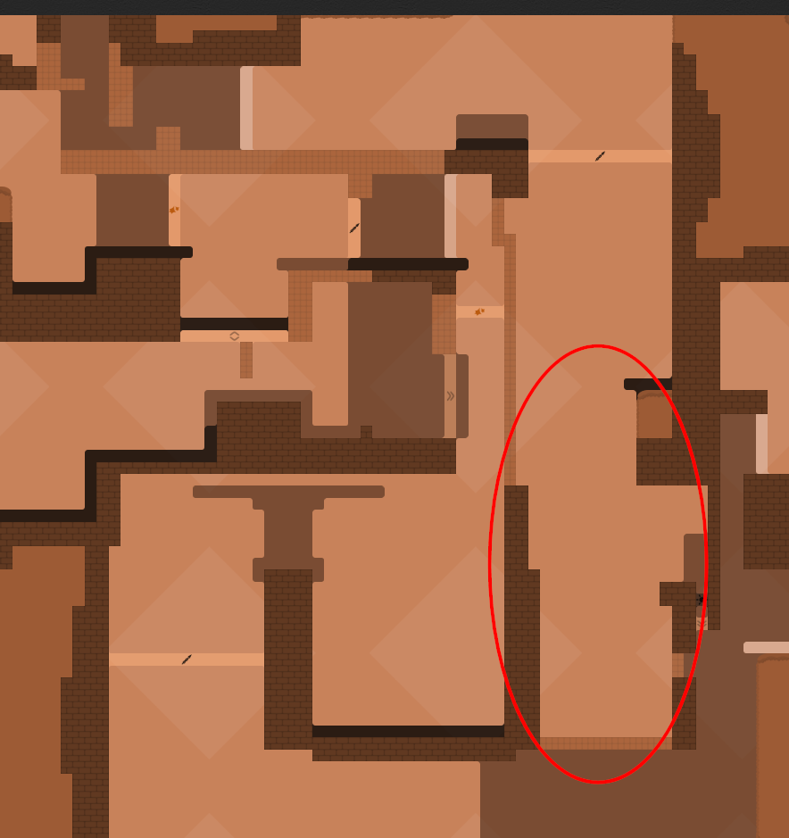
this is your map's testing channel! Post map updates here and remember to follow our mapper rules: https://ddnet.org/rules
Gameplay: https://youtu.be/2-9DjKIEi8g
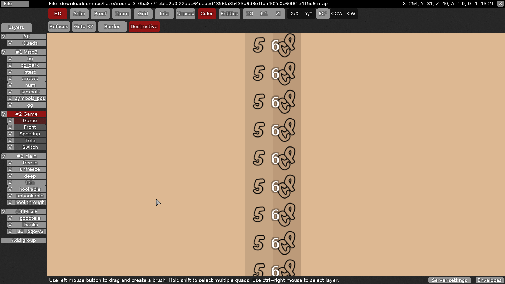
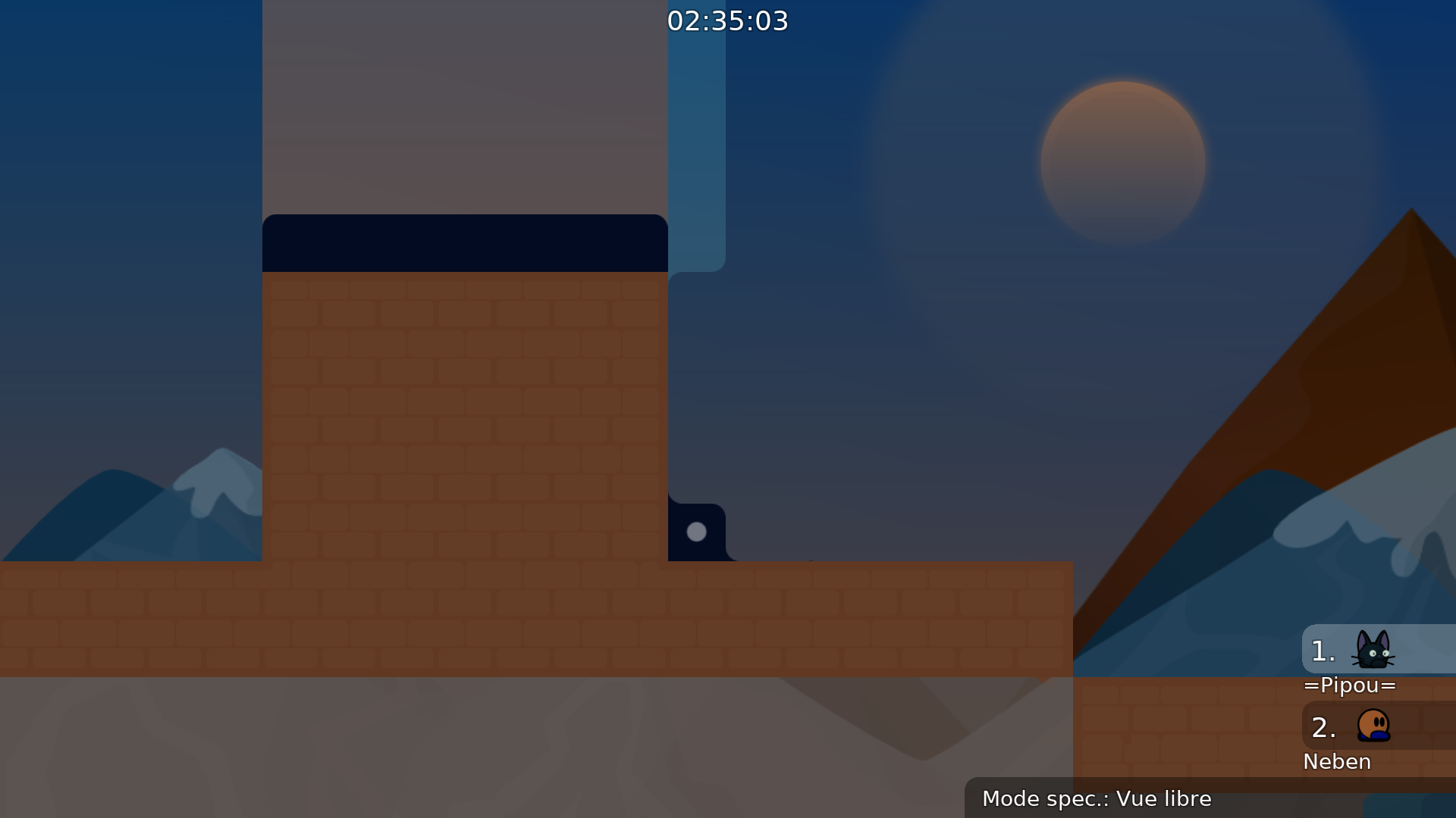
nice and simple I like it =] hoooooweeeeevvvveeeerrrr after some time of your gameplay background seemmms toooo simple and starts to get boring. Everything else is nice ^^ please think of making some tinnny change in background
yeah I'm terrible at bg design so I figured I'd go for a very simplistic design so it won't look like ass. but true, a bit more complexity would def look nicer
why u named it lazearound 4?
well I figured since it's basically a completely new map I should consider it as a separate entity
but I'd have no problems changing it to 3 since it's unreleased anyway
i would just change it back to 3 xd
i saw some part ideas from 3
yeah I can rename it, 3 is a nicer title anyway for a 3 player map tbh
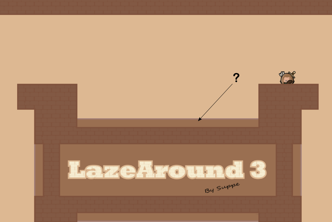
$change name "LazeAround 3"
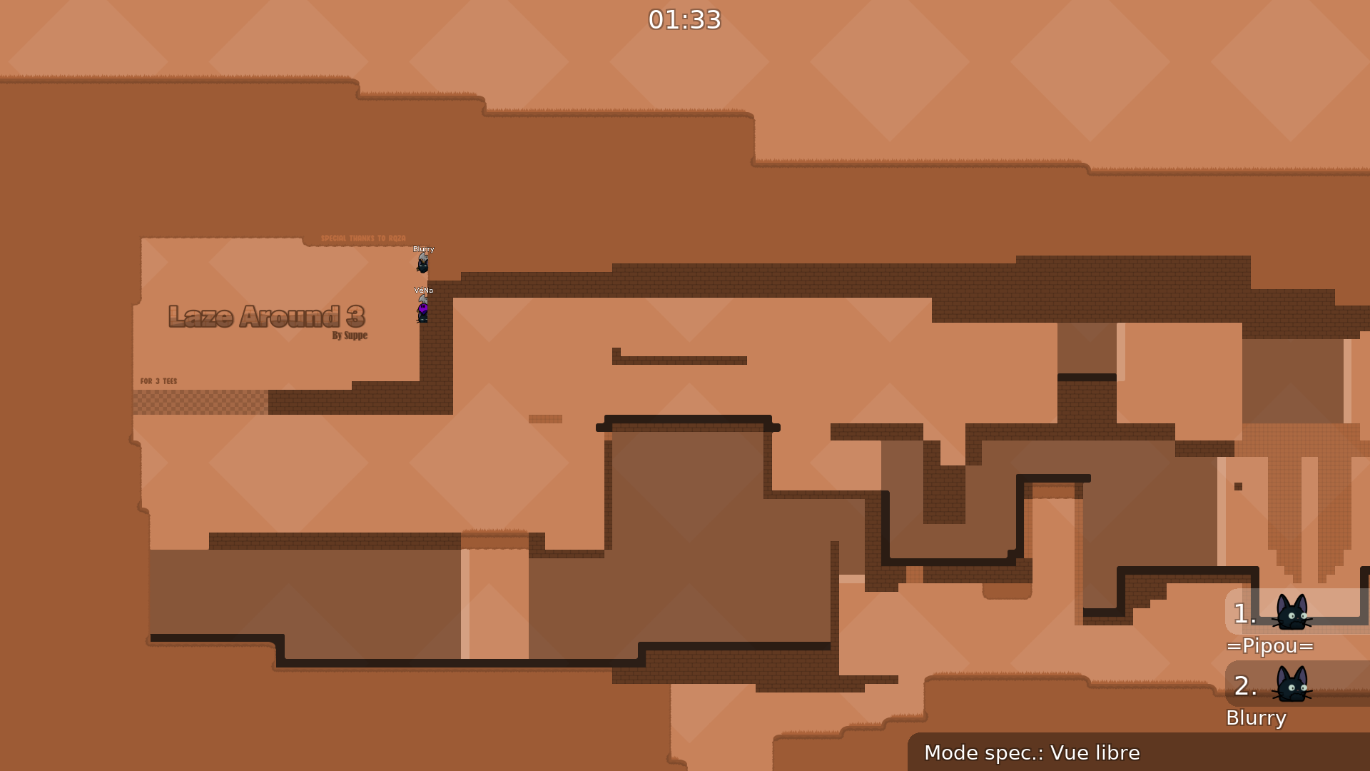
changed logo from la4 > la3
$waiting
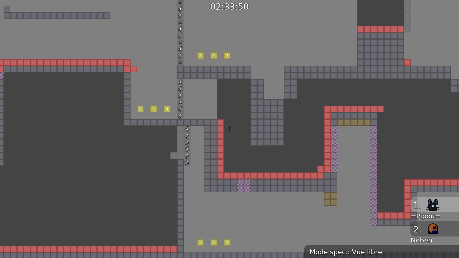
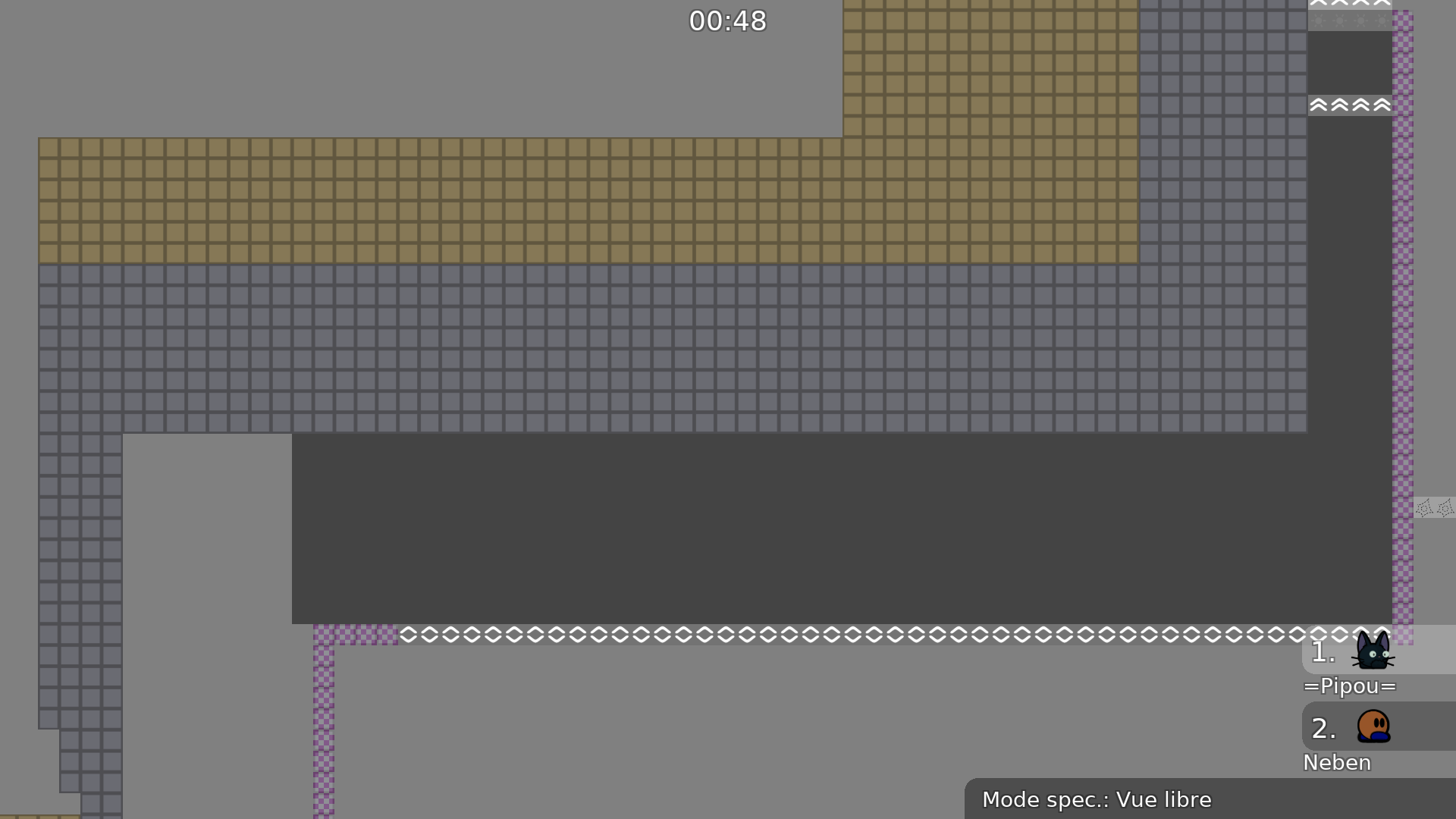
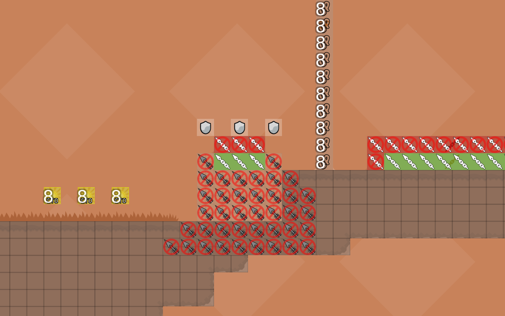
- made hookable more distinguishable from freeze
- changed / adjusted time cps
- cut down the unhookable tileset to necessary elements
- changed to-teles to an amount of 3 where suitable
- added some text to show in which order they have to use the teles
- made hookthrough clearer to see
- added a text that you need 3 players for this map
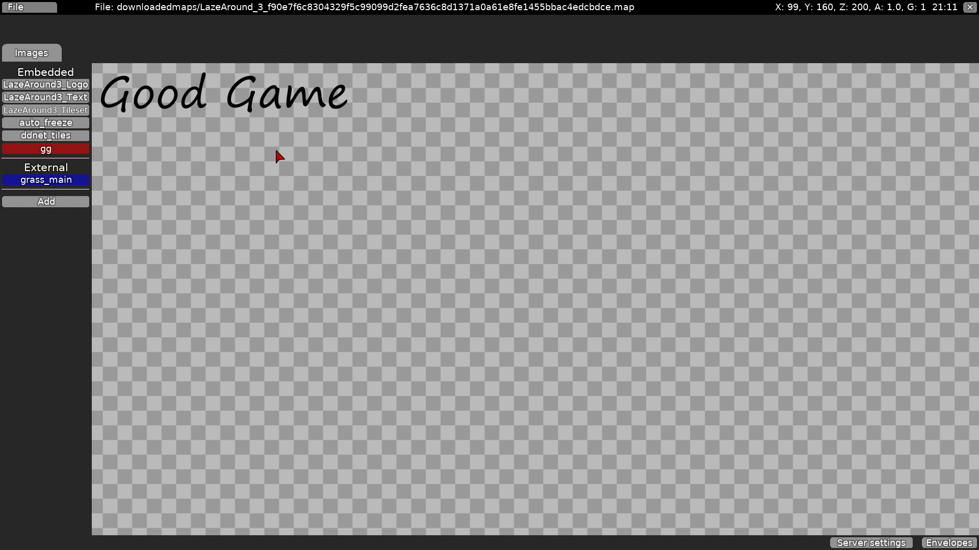
- I'm not sure about your last screenshot but I guess you didn't like the "gg" quad so I deleted it
oooh I see sorry, re-added it without the bugged pixel
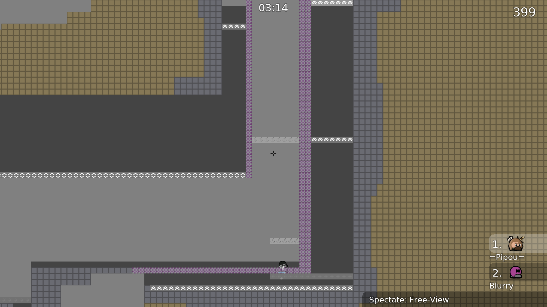
I can barely see the cp and the hook through tiles
The hookable looks like teleport
$waiting
louis map
adjusted the design to distinguish tiles more easily
fixed a small bug
The colors are still a problem, I'll see what I can do later
You should opt for a background and maybe change your tilesets, they really don't help
$waiting
Sorry but could you elaborate a bit on this? Do you want me to change colors + tileset + background or a subset of them? I also would be thankful if you could specify "the problem" and what the tileset specifically "doesn't help" with so I have something to build upon
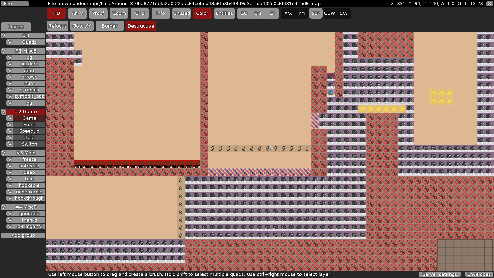
I asked more players and the main problem that occurs is that the bg is too plain, which makes it hard to play with design on because you can't tell the difference with hookable/unhookable/freeze...
You could even make a very minimalist repeatable background with parallax, that would be enough
Or add a texture like grain, paper...
Alright thank you will do
Let's do that for now and we'll see how it looks after that change
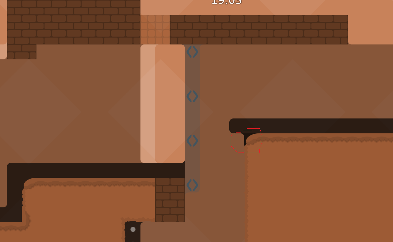
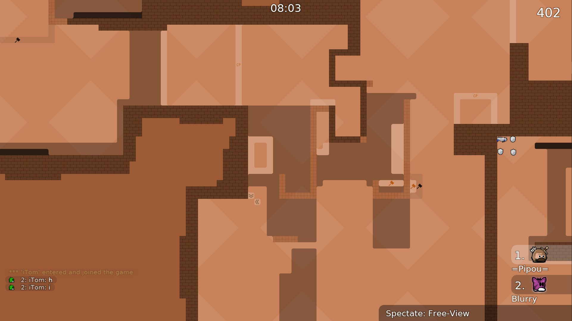
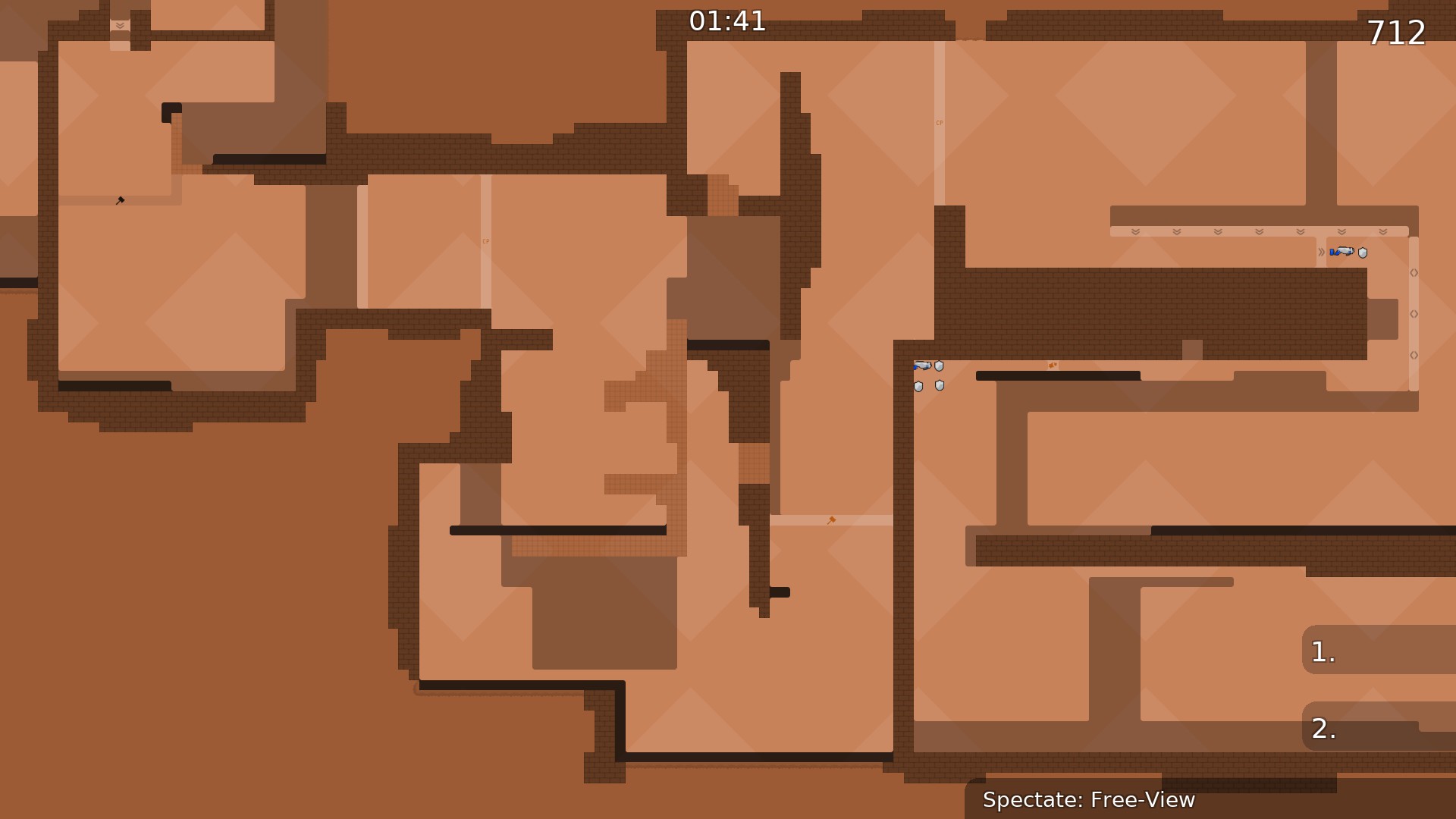
so would something like this be an improvement? I'm not 100% happy how it turned out but it certainly improved visibility, since I could find a lot of new corner bugs which were basically hidden before
This is a good idea for the penultimate part
- in penultimate part have skip
what's "goodtele" layer for ?
Goodtele shows teleporters which are not supposed to be a hindrance but rather be convinient or necessary to progress. Cp 2 is only there in case a player manages to fall in Tele again somehow but is not really necessary
I've just noticed that I shouldn't use goodtele in that screenshot though since it kinda implies you need to enter this tele
I think it's better
yeah it looks great
thank you that you put so much effort into that, that is very kind of you
No problem 😄
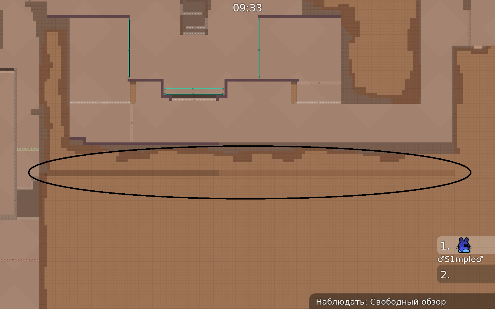
As you can see, add texture to the map as I did
With the grass
The pit
Make it look less "linear"
Don't mind the blockers and other layers I didn't change
Redo the entire design by adapting the new design
I'll take care of the blockers and other blue layers when you are done
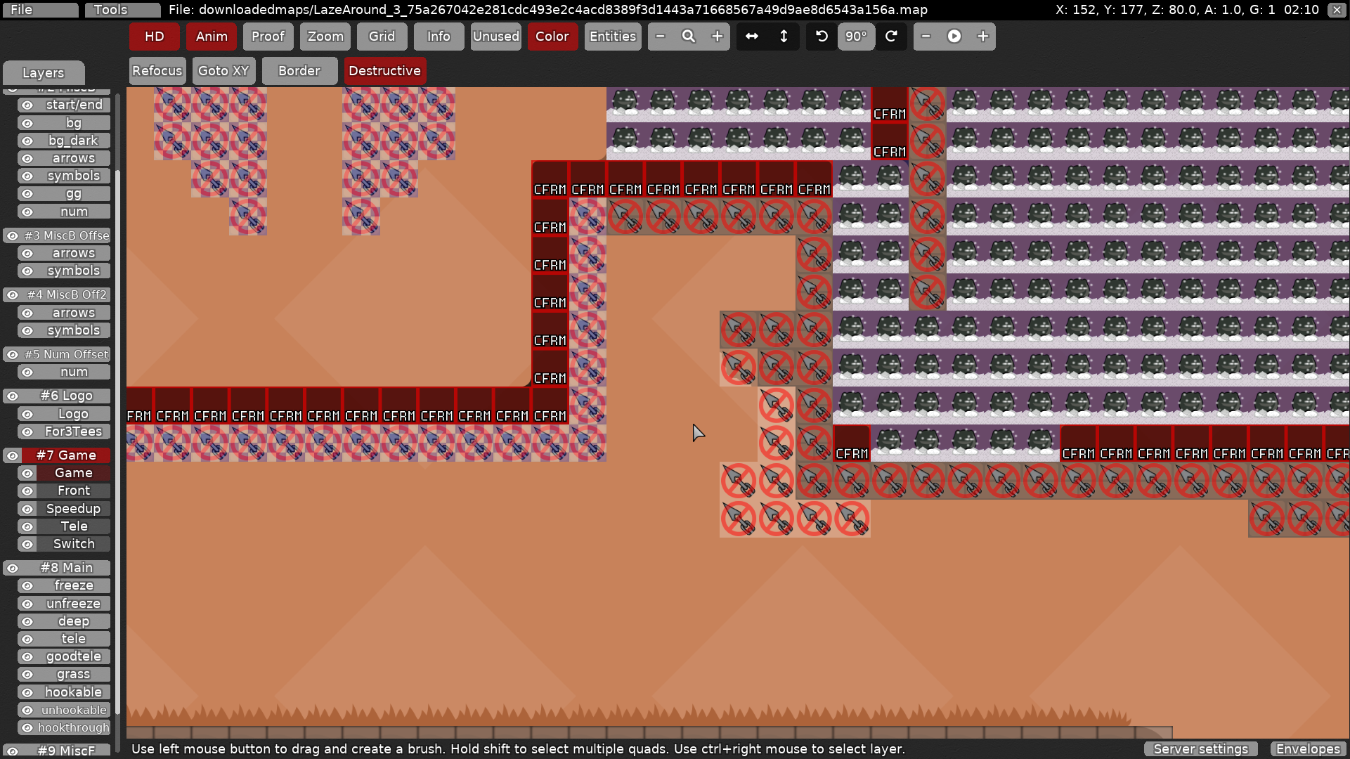
Use that rule for the grass
Also, avoid putting unhookable on walls if it's not necessary
If you are afraid people can hook from below, put it 1 or 2 tiles higher
$waiting
Put grass on grassmain, but not if there is freeze or deep (it will look bad otherwise)
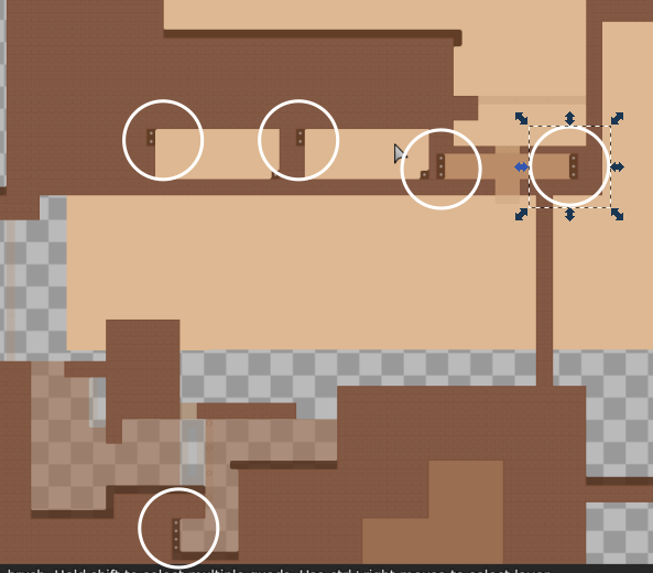
Try to make walls a bit thicker sometimes like here :
It used to be a thin wall
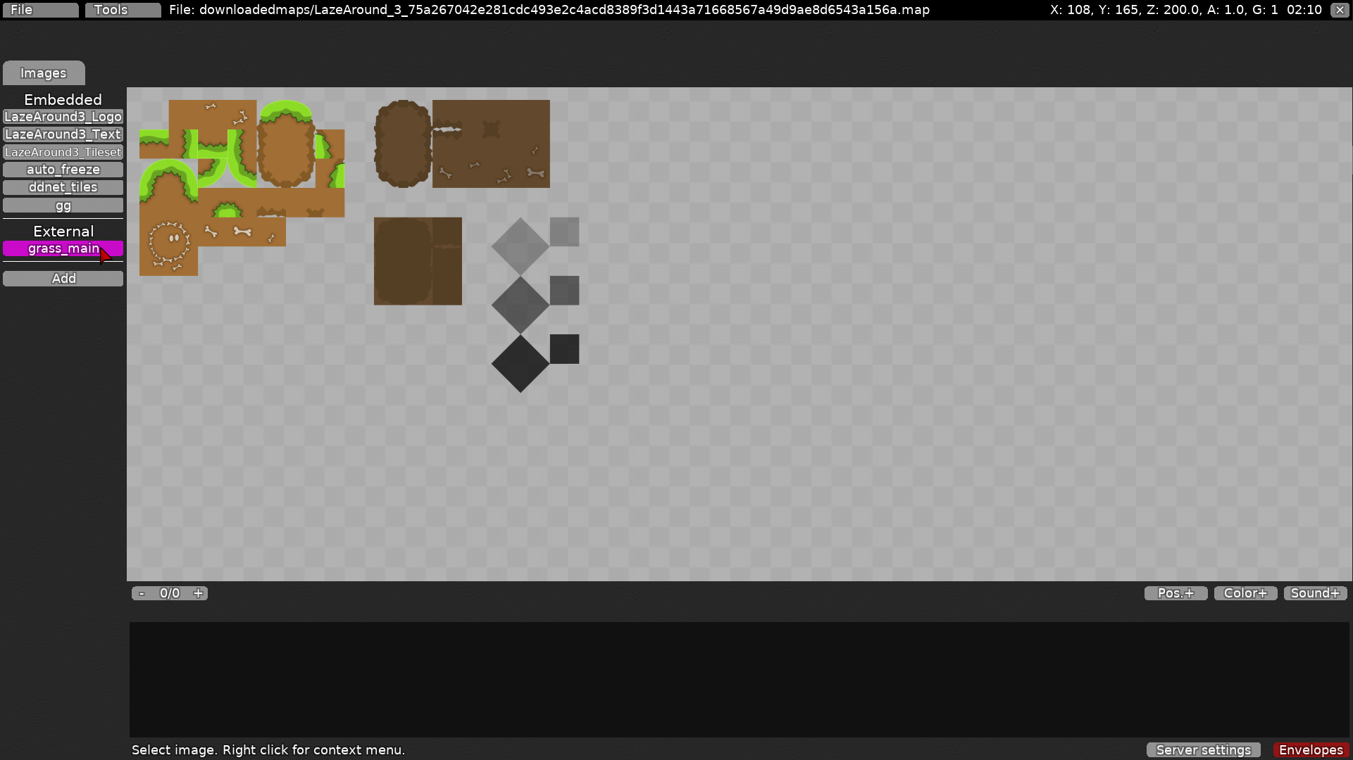
Is auto_freeze an automapped freeze ?
I'll redo good game when you are done
And I'll optimize ddnet tiles as well
So don't mind that
No freeze was mapped by hand, I just tried the ruleset out at the beginning. Thank you alot I will try to emulate the design as good as I can
👍
redid the design and fixed skips in the last two parts
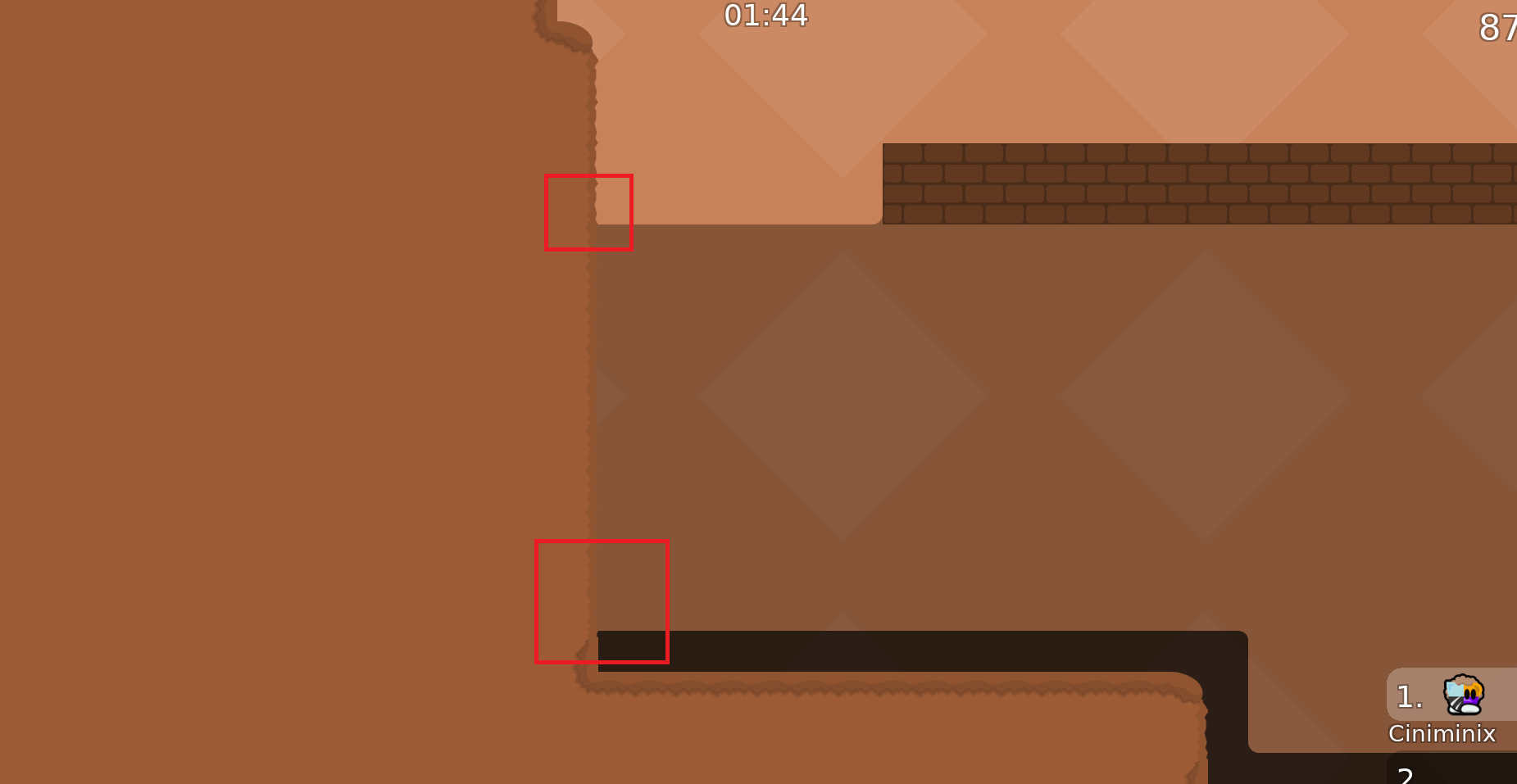
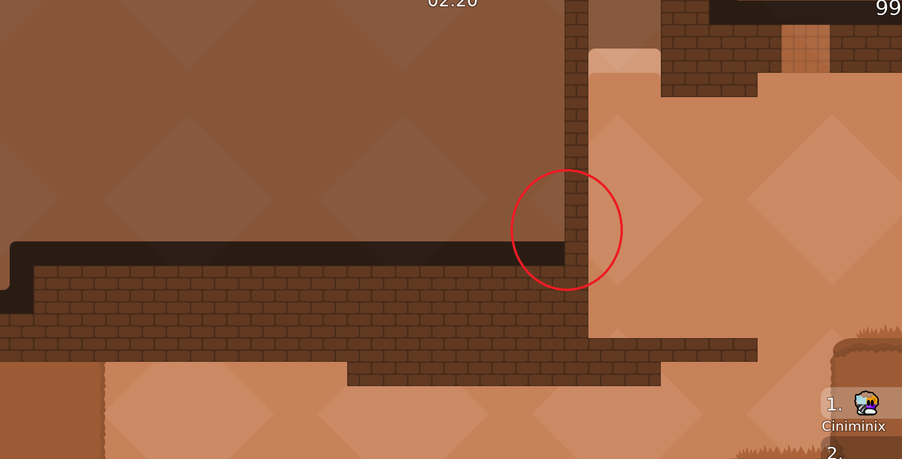
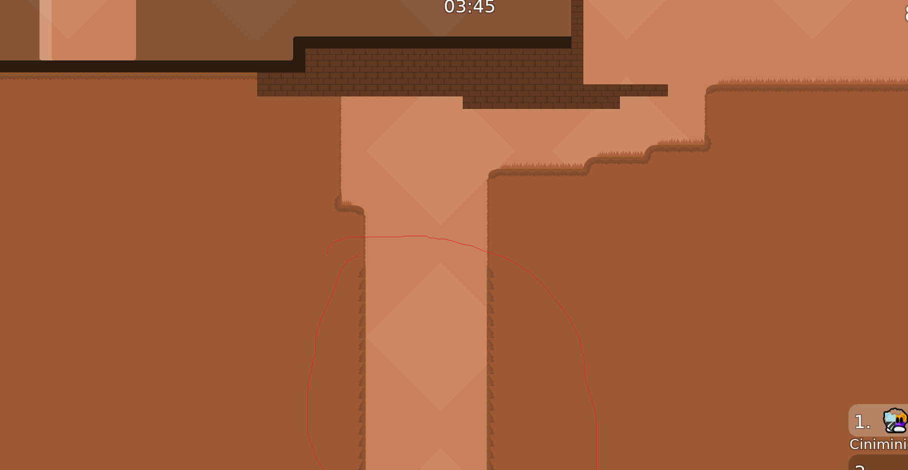
I believe it doesn't necessarily need to be rounded when it meets a wall, it seems to be done consistently
Unless it's not done everywhere (like on your last screenshot)
Yeah it's awkward
Thanks for point it out
@CiniminixYeah thanks a lot, I was sloppy on some edges, I'll recheck it. I would keep no edges on grass main since it looks weird at the border imo
went over the map a few times again and fixed the mentioned + some other design bugs I noticed
thx fixed
$waiting
thx, I fixed the first two things, but I left the third on as it is for now, since any way I tried to change it looked worse imo
Could you come to the test server whenever you have time ?
Talked with mapper in game
$waiting
-applied Pipou's design suggestions to the whole map
- various other small design changes (e. g. new "good tele" design)
- part cp 10 reworked to function without speedups or switches / doors
- part cp 11 door removed since not really required
- parts cp 13 and cp 26 now need slightly less shields
reduced number of shields in cp 15
added endless off in cp 6
much corner errors
- missed corners
- wrong corners
thanks the first 3 parts were mapped in a different style due to a redesign. apart from that please consider every corner as being put there with artistic intent, unless there is an actual relevant graphical error ofc
so it's been around 5 months since I submitted this map and I still haven't gotten any non-surface level gameplay feedback. As far as I know not a single tester has actually played this map. I'd appreciate if someone would be willing to change that so I can get at least some closure on my work
ma boy
@louis.placesaid he'll volunteer and test any minute now, what a nice lad
welp over 6 months already, time sure flies
it won't take another 6 months for louis to test it, he promised it would be tomorrow
I will test it again later today when I'm home
1st priority
bro didnt test
😭
we testers are simply following the suggestion of the map title
Tested the map with
@tatak@vena6080@_nehrGave the full feedback to
@supdefdirectly in-game
$waiting
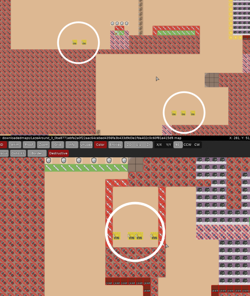
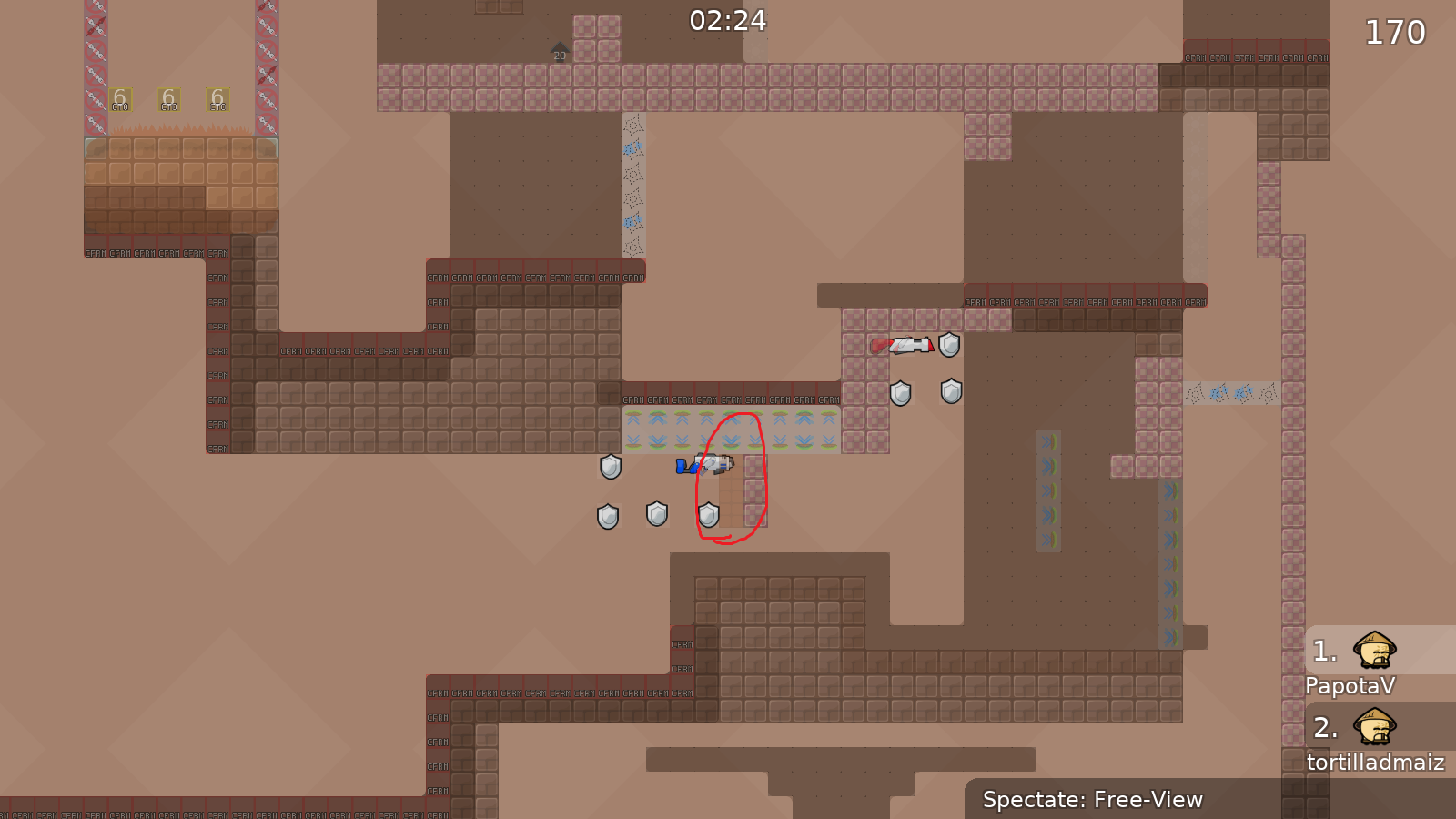
changed the screenshots + some minor stuff.
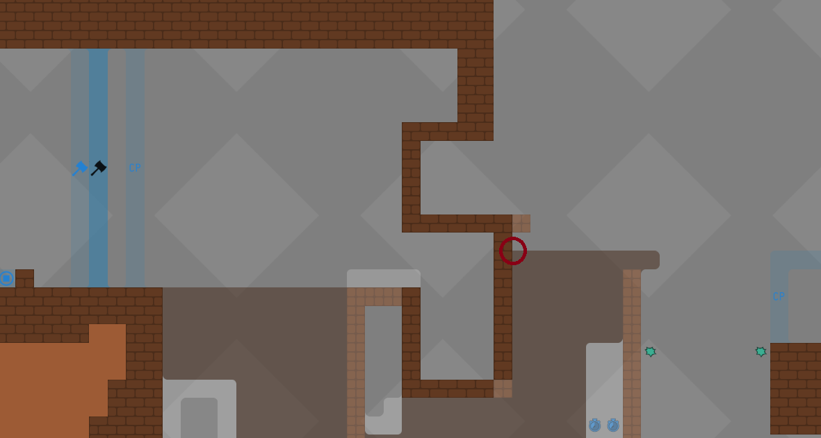
regarding sc4: part is a bit less smooth now but can be done very consistently with the change regarding sc8: didn't know what to circle here lol, unused space was filled, the left jump is shorter and the left switch is placed differently
I'll try to test it today if I have enough people
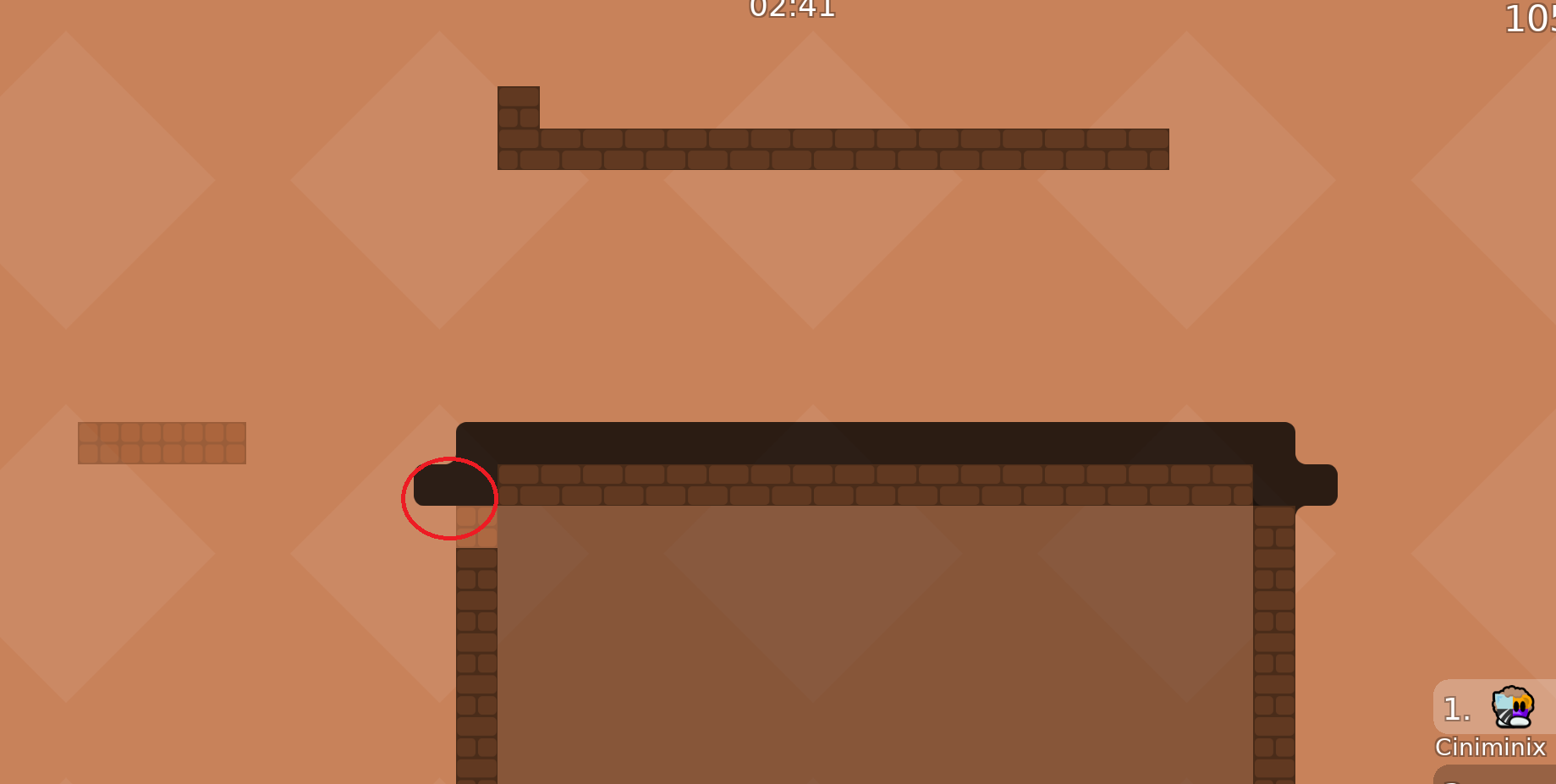
If so, you forgot to round them
$waiting
Can you give a short explanation of the skip? Because we can't find it 😅
So you'd move the left hookable more on the right?
Did you fall off or can you literally go through it? In general about that part I know it uses a lot of switches but that's kinda the point of it I guess. But in our plays the timing seemed rather forgiving, the tees don't even need the exact same height or alignment
Thank you for testing btw

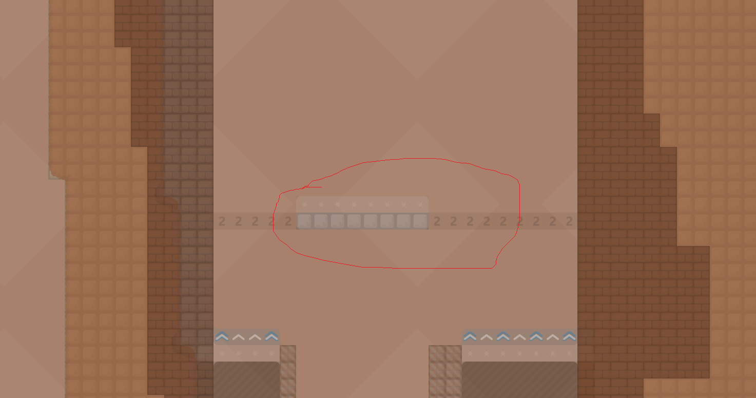
Would it be a fix if I made the middle part a bit easier here?
The one under can just fall in tele and pass the part alone and not be hooked by the one on the right
left : a bit more right right : a bit more left test it yourself until you see a satisfying swing
We did the part as intended and Blurry went through the door 5 times in a row
We even tried multiple height
It's just unlucky
Yes
Ah yeah I knew about that, I think it is ok personally, since both outer players already contribute by both having to juggle the middle one after hooking them through. But if you think that would have an impact on the quality of the part I would adjust it ofc
Maybe simply remove the teleport
You could still do it solo by self lasering you at the right wall. Also without the teleport you'd have to go down and save the guy every time you try the part which seems annoying imo
I guess I could make the freeze a bit higher and hinder one to reach the unfreeze from top or smth
That's what I meant
and it would help stack the entities
moved endless off more to the left and made the switch you fall on in the last part vertical
Updated the deep
There shouldn't be any entity bug
Look for corner bugs again
If I missed any
$waiting
- fixed everything Pipou mentioned
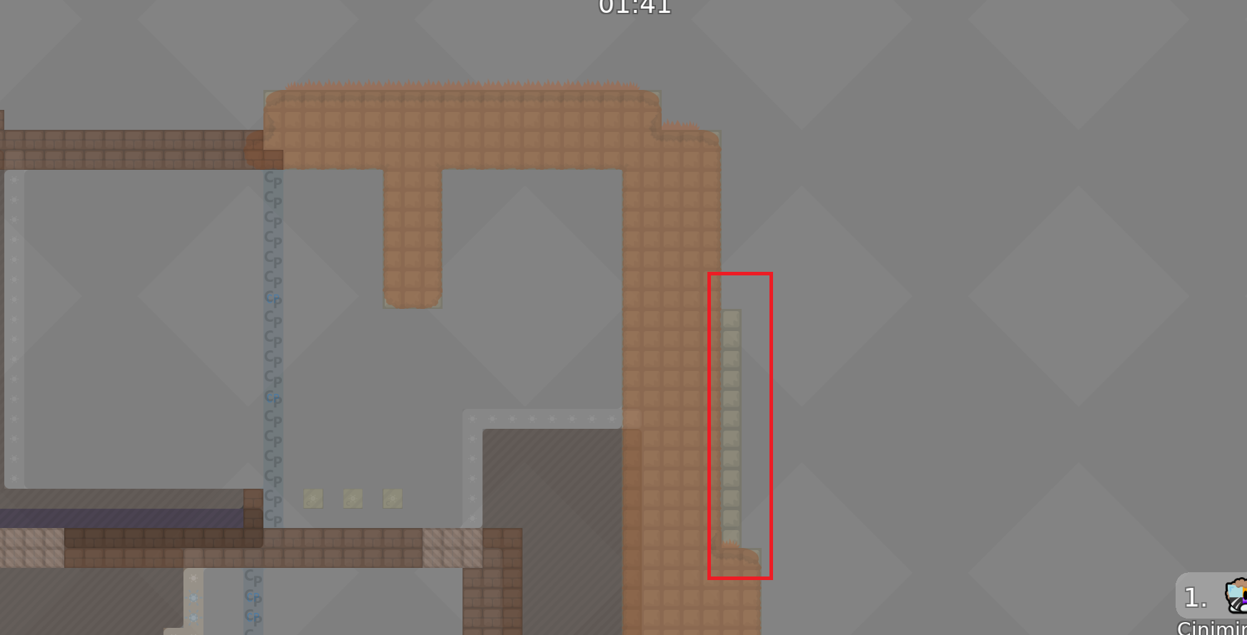
- removed any tiles hidden behind unhookables i found
- changed a handful of corners
- added a separate blocker row in the swing part since arrows are invisible in the new deep
yes you need them
I could remove one actually but that would look worse
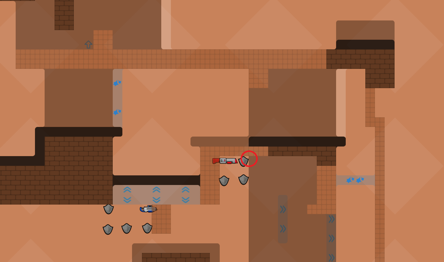
also if you do as here ^ then rocket will not be half in wall
yeah I can do that, should not change the gameplay of the part from the looks of it
- removed the fragment in the hookables
- made the grenade spot one tile bigger as shown in the screenshot
you still have those
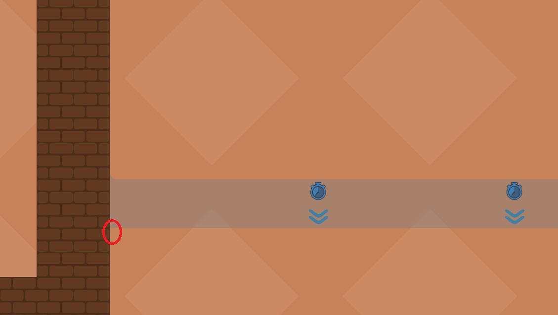
Yeah doesn't seem that important to me. Do time cps need to be placed in a strict ordering 1 to X? Cause then it doesn't seem worth the hassle to change all of them
what? just what the point of putting time cp if race didn't started yet xd
^
Reminder : Should be brutal 1 or 2
$waiting
a bit sad since I liked that part, but I replaced it with a completely new one that engages the 3 players more equally and is stylistically more akin to the other parts. also I changed the time cps
Can't you guys like just accept it at that point? This seems to be really going nowhere tbh
$decli
$released
$kick
@supdefsteinchen99#0 called for vote to kick Supdef#3035 (No reason given) — 0s left
Vote passed. Supdef#3035 kicked by vote (No reason given)
Em
Watefoc
$kick
@popcorn181popcorn181#0 called for vote to kick popcorn181#0 (No reason given) — 0s left
Vote passed. popcorn181#0 kicked by vote (No reason given)

It's been 24,019,200 seconds or 400,320 minutes or 6672 hours or 278 days or 39 weeks and 5 days Have some mercy
24,019,200,000 milliseconds

wha wtf, he is the mapper, no?
$kick
@thortillat.d.mthortillat.d.m called for vote to kick thortillat.d.m (No reason given) — 0s left
Vote passed. thortillat.d.m kicked by vote (No reason given)
a
$ready 2
Bot is broken again

$ready 2
this map bust be the best of 2023. 1 year of testing congrats,
@supdef!
Congratulations
@supdef!
the design grass and the white background things should be HD
$optimize
- Filled the hole
- Marked anything that isn't unfreeze with another color
- Added freeze in stoppers
- Fixed the deep
- Fixed a spot that didn't make sense
That map uses 4 layers for the exact same thing but I won't touch it, it's super messy
I also moved the groups, they weren't in a good order
- Fixed a few more issues
HD isn't relevant, the design is already minimalist
ty
All design elements that not effect gameplay should be hd
No
Only if it's heavy
The design is empty there
If you want less, just play with entities

We are talking about grass + squares in the back
I have already said that I always do it this way and also see it as a mistake that should be corrected 😁
In the map from pulsar and ravie too, he forgot the outside stones

I had said that the rules should be rewritten, but this was not done properly, the old ones were more detailed.
Maybe that's why we got so many bugged maps where not even the time cp's are set
More detailed rules won't help
Despite the very long and accurate message in
#welcome, people still manage to do shit because they don't read it
Also
Maybe we should only start testing maps when the basic things are done right
If the basic rules are not observed, the map should be sorted out directly and only tested when the basic things are correctly done 😁
Sometimes i do not know what to write about bad maps its just always repeats itself
True
there is a cheat at cp10, and useless cp1, if u want to fix it u can still do
yeah there are a couple more, i'll fix the most problematic ones today
- removed useless cp1
- moved the shields in cp15 to fix a skip and made the part a bit more forgiving
- replaced the timed wallhammer in cp4 since it was annoying imo
- in cp6 added the tele so you can go back as long as you didn't fall all the way to the bottom, since failing that way seems pretty unsatisfying / annoying
- in cp14 i added more unhookables so you cant hook there to make the part easier
- i moved cp 8 so you cant partially cheat that part
- removed a small graphical bug in cp11
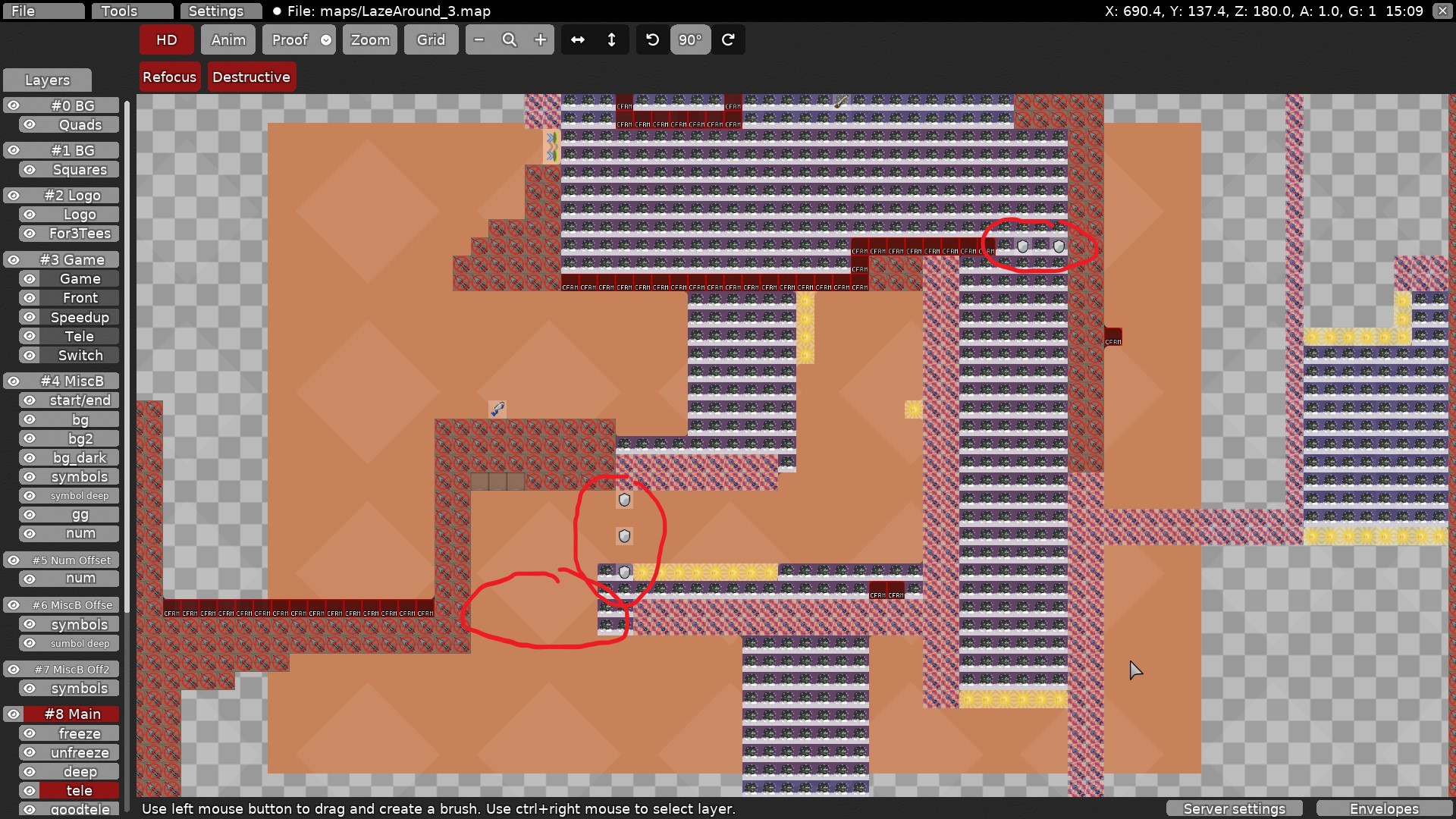
This looks okay to me since you have to drag the upper guy first anyway, right? So that would only apply to save a fail or smth as far as I can see
u can use it in the part b4
we did bcs i was right side, no way back
still seems acceptable to me as far as i understood
when will the updates come into effect btw?
I mean there is a need for a back tele
It's dumb that u can't go back if both tees fall into tele
Just wait a bit
i've already added the back tele in my previous update
though i guess you're still stuck if you fall all the way down to the bottom, do you think I should add a tele reachable from the very bottom as well?
if one tee is there and both fall back ur stuck
yeah but you can go in the tele in the updated if you at least managed to not land on the hookthrough at the bottom. though i guess it's better to always allow the player to go back
actually in the current version you can already always go back since you can just hook the left hookable
ok
$archive_imm

