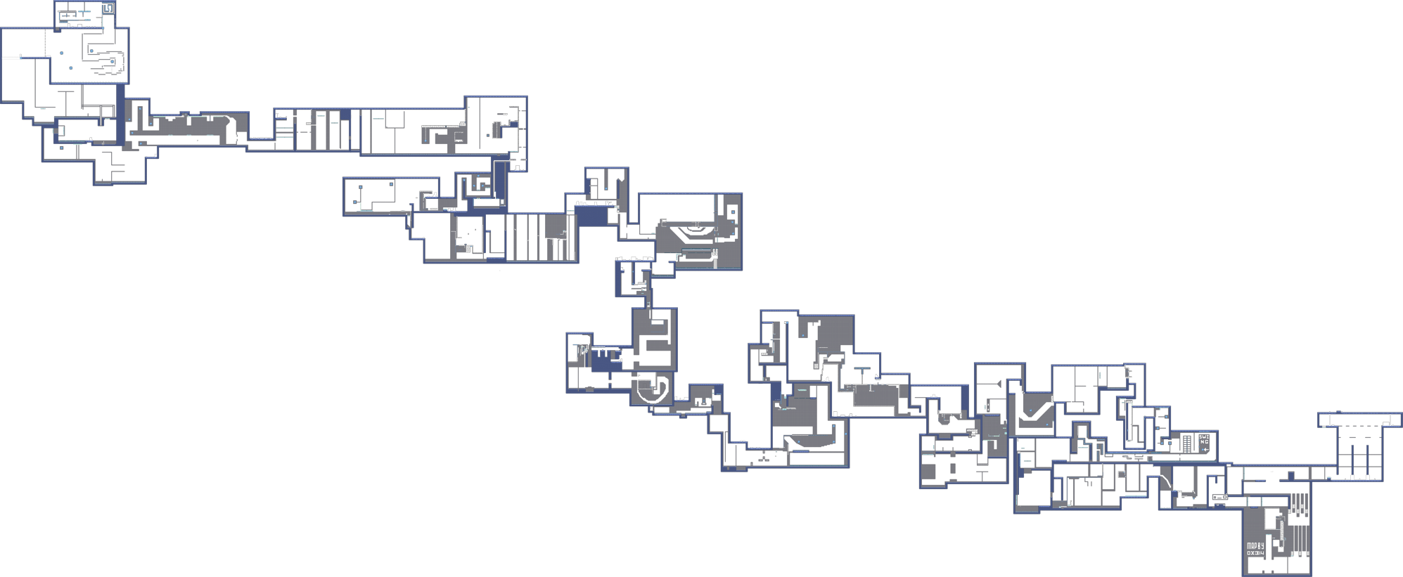
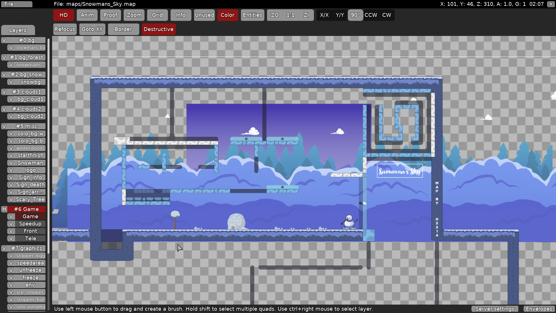
this is your map's testing channel! Post map updates here and remember to follow our mapper rules: https://ddnet.tw/rules
prev iteration: https://ddnet.tw/testlogs/show/Snowmans_Sky
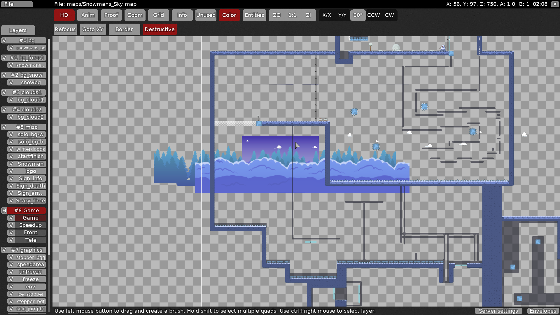
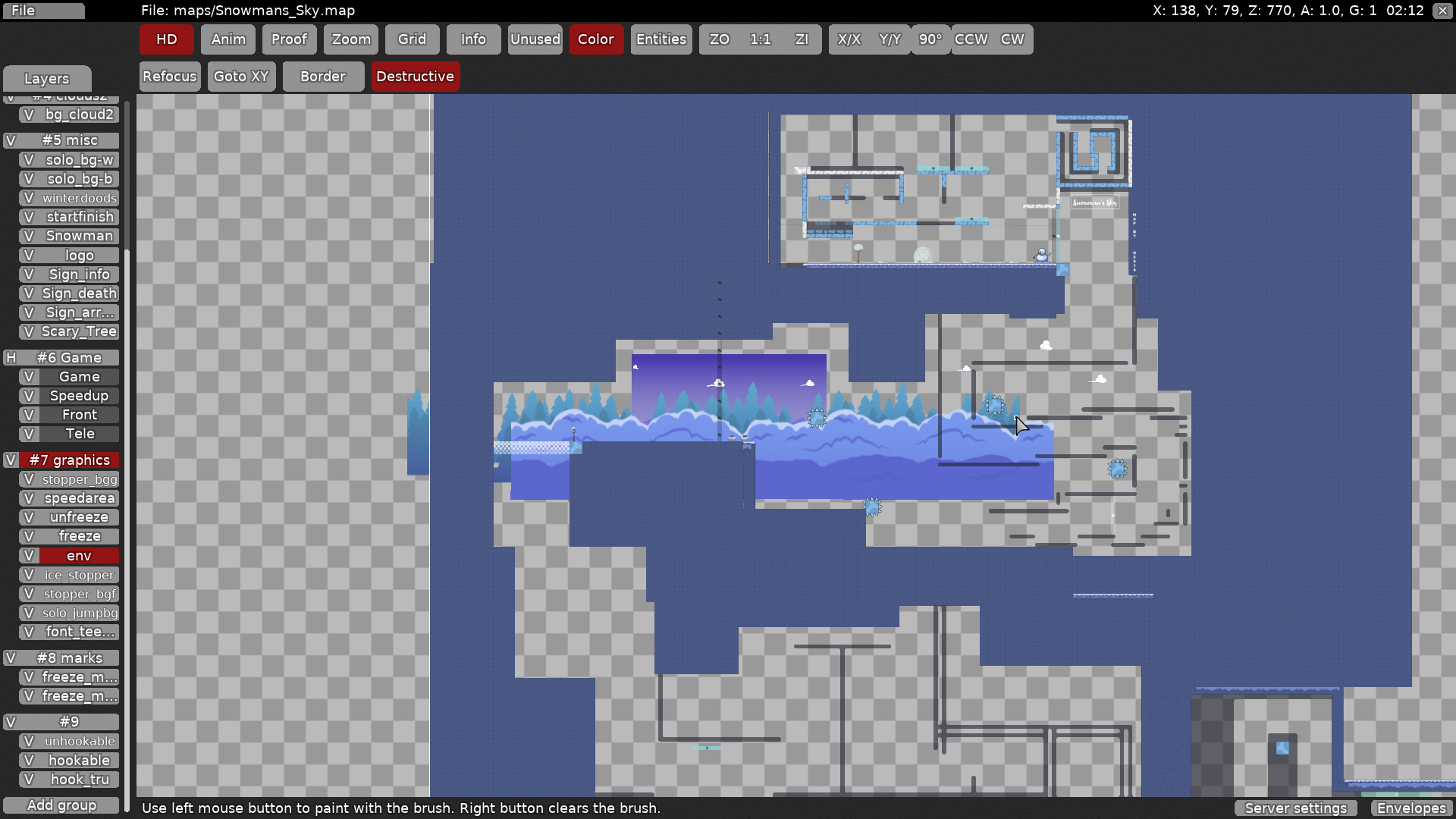
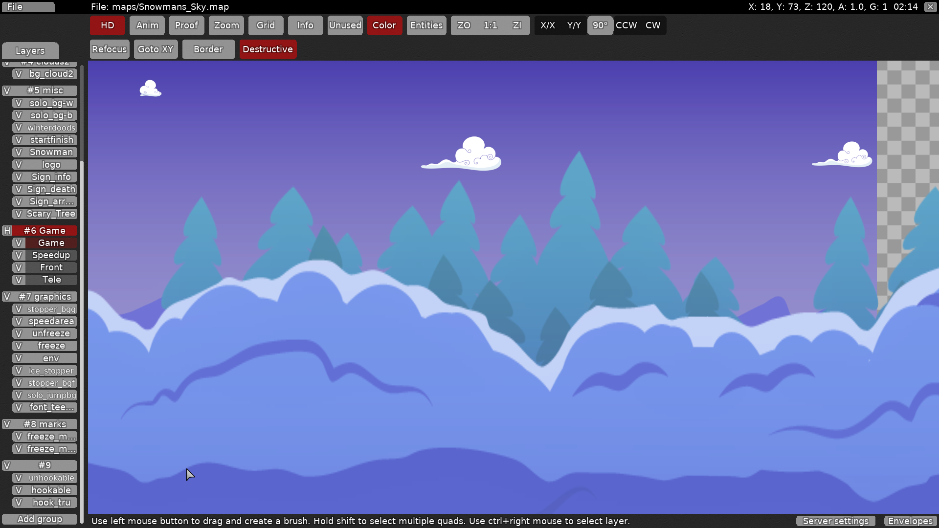
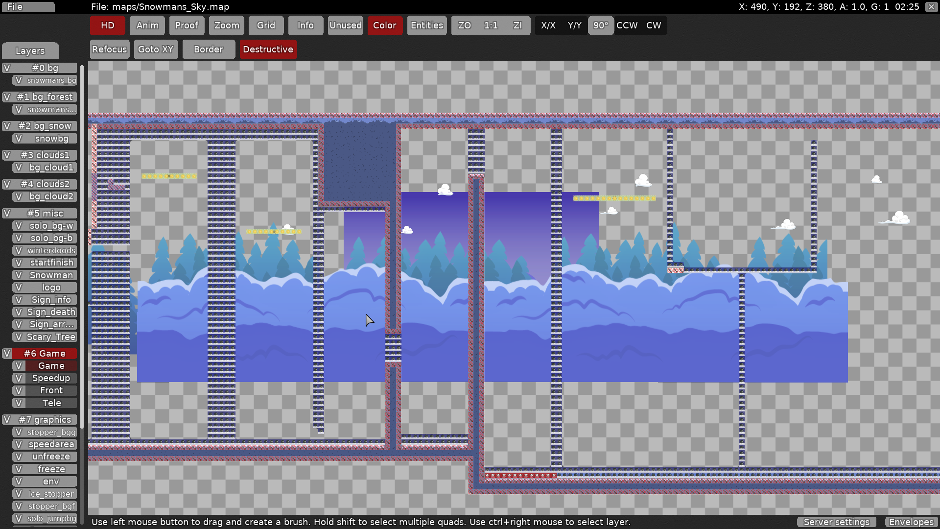
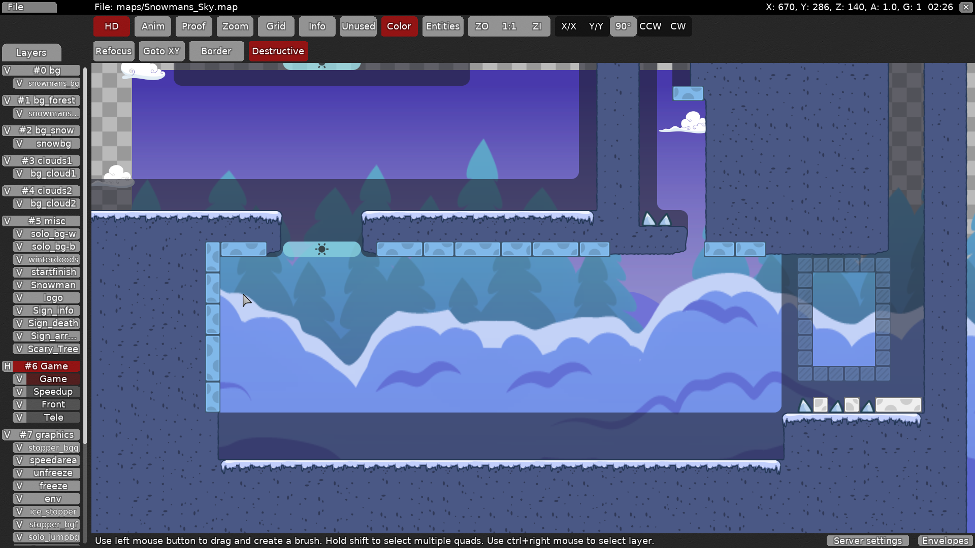
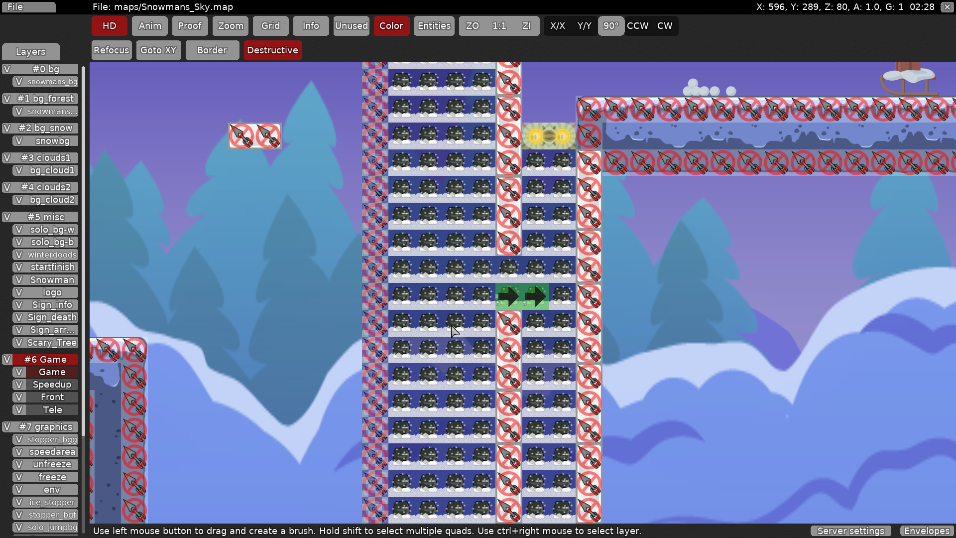
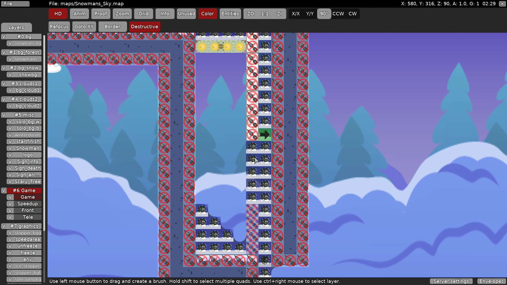
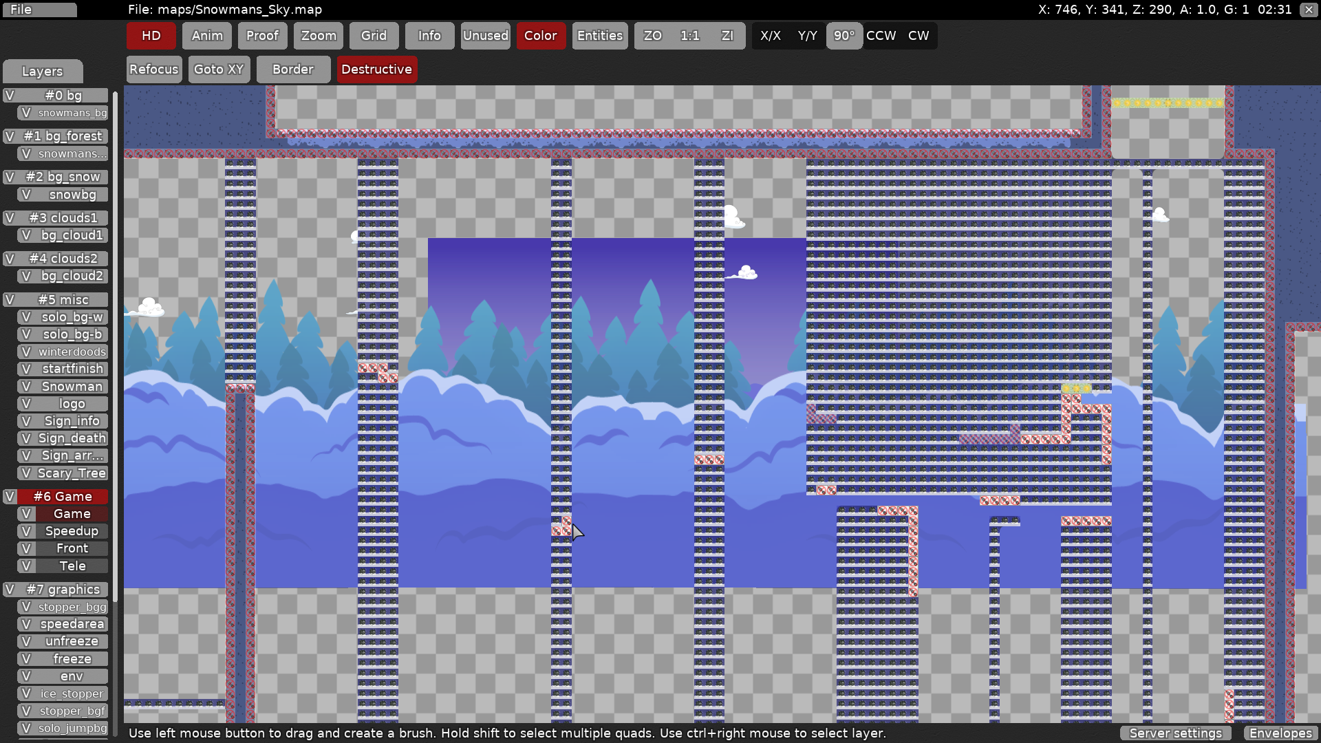
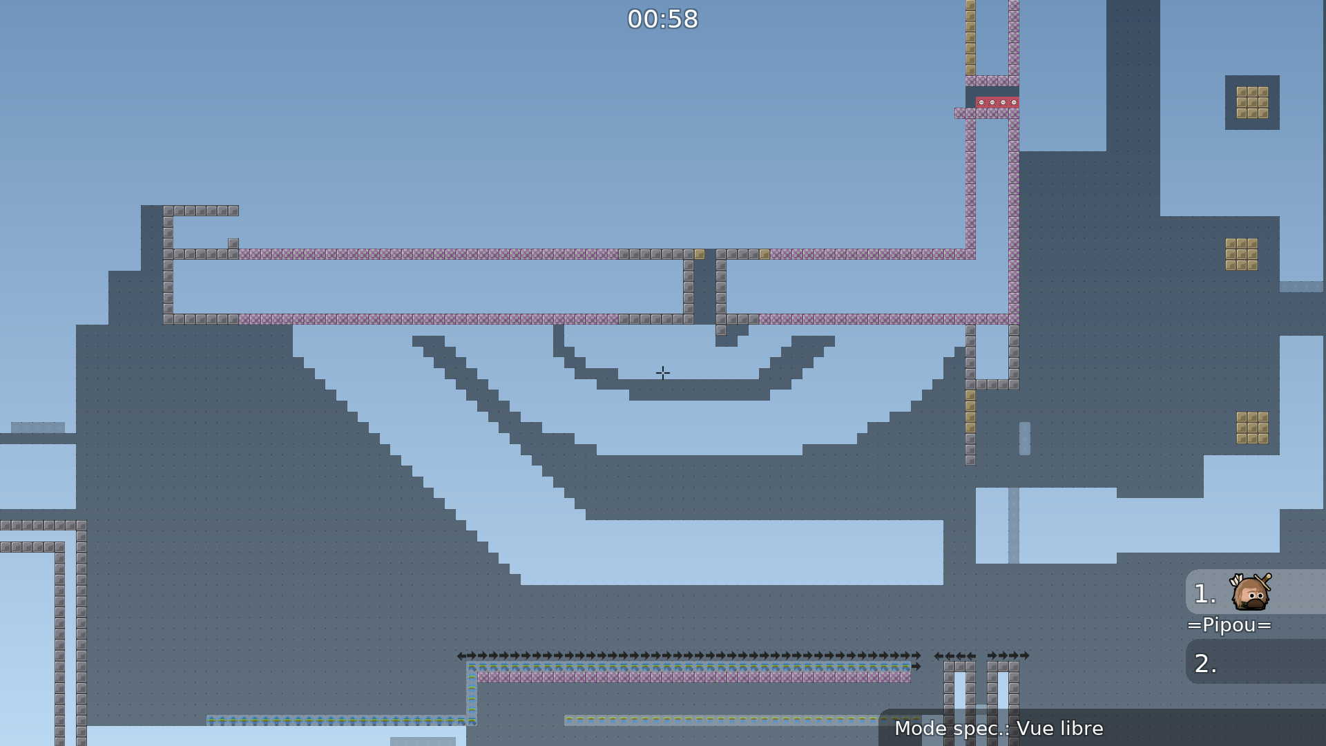
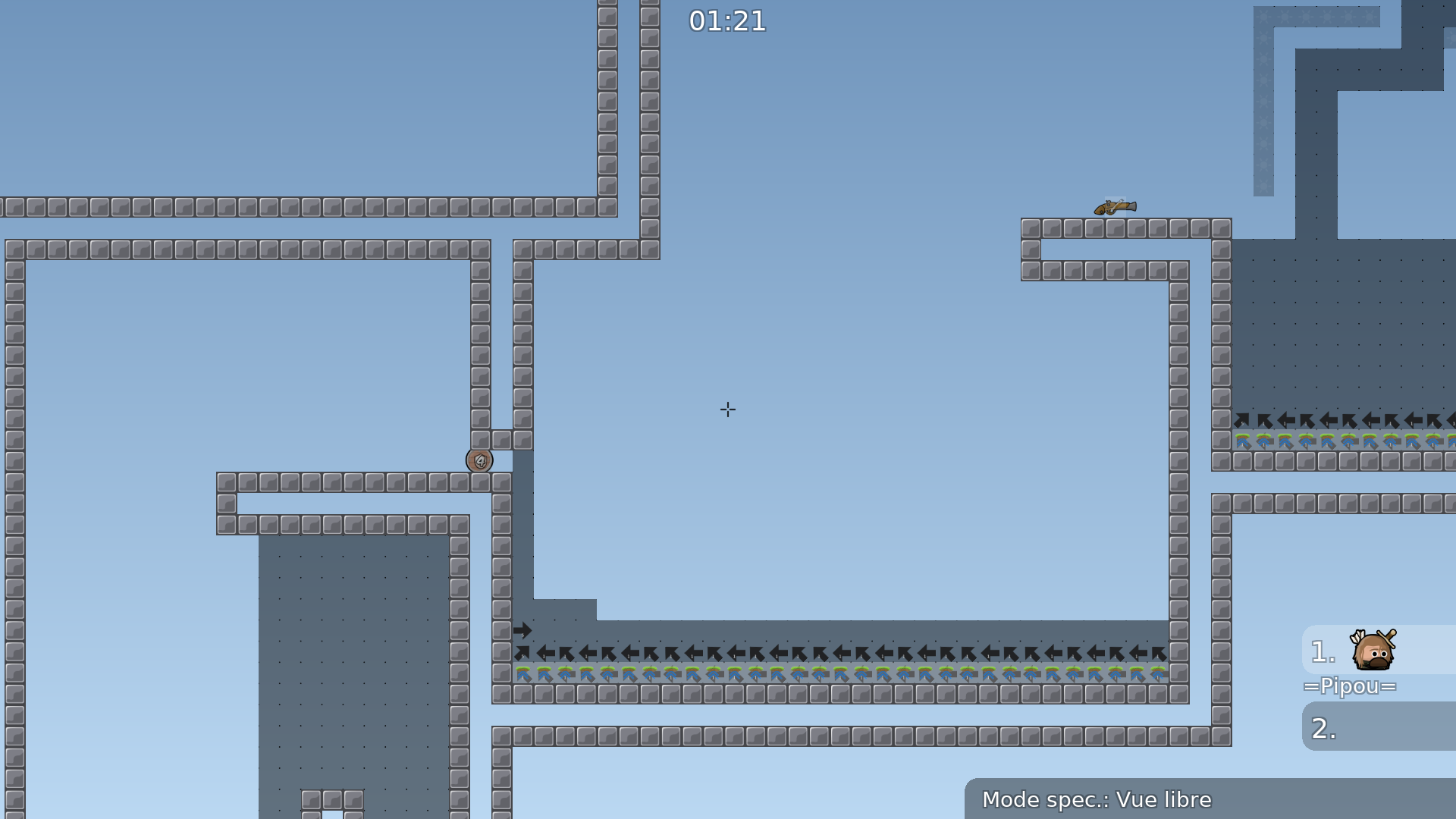
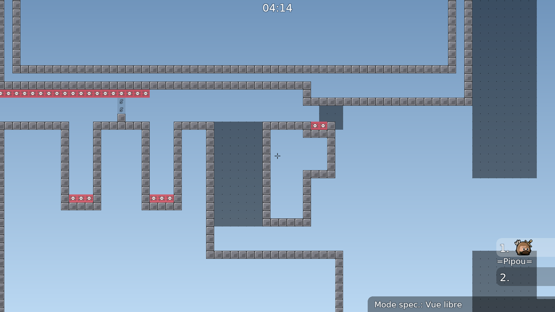
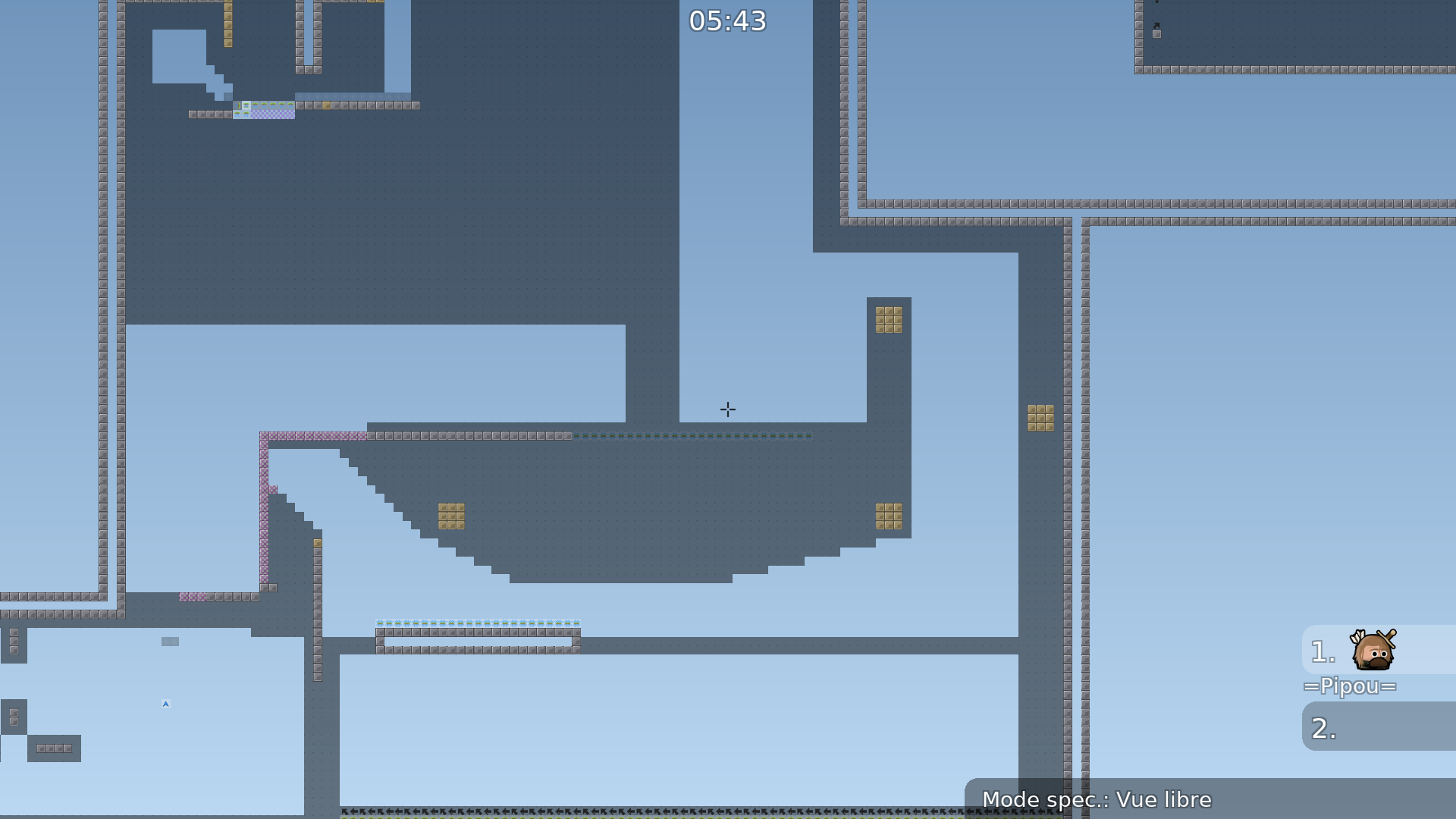
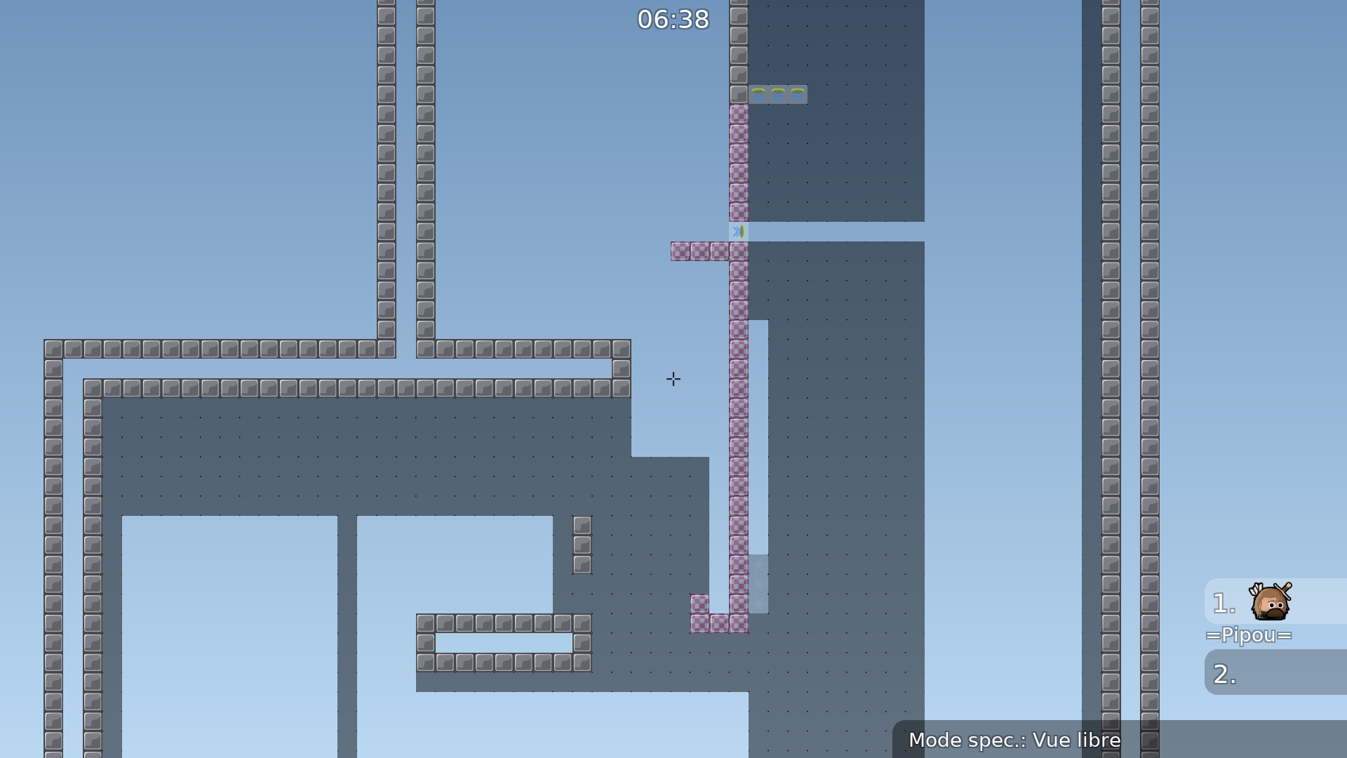
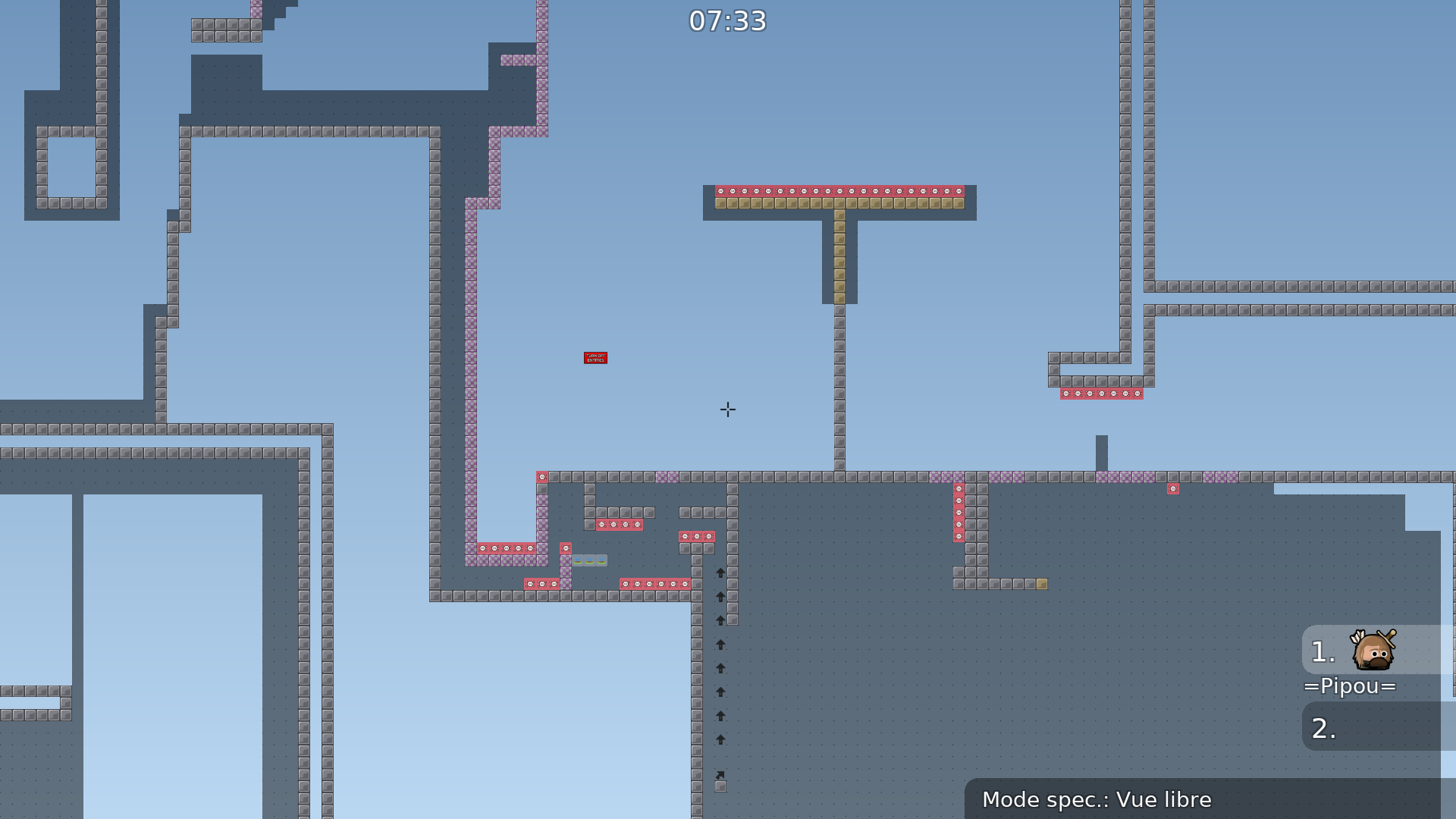
Hey, I'm back with this map 🙂 I've fixed a lot of visual bugs, I also fixed everything that Savalic mentioned prev time. Some parts were reworked to be more t0 friendly (especially early parts), hh/hf fillers amount was hugely decreased, new parts were introduced instead. Overall map difficulty was slightly increased.
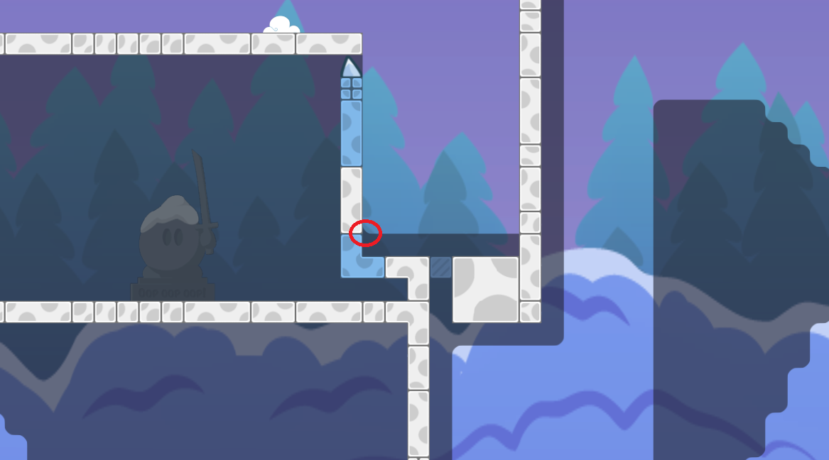
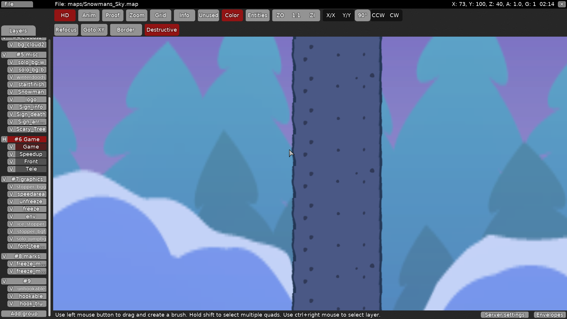
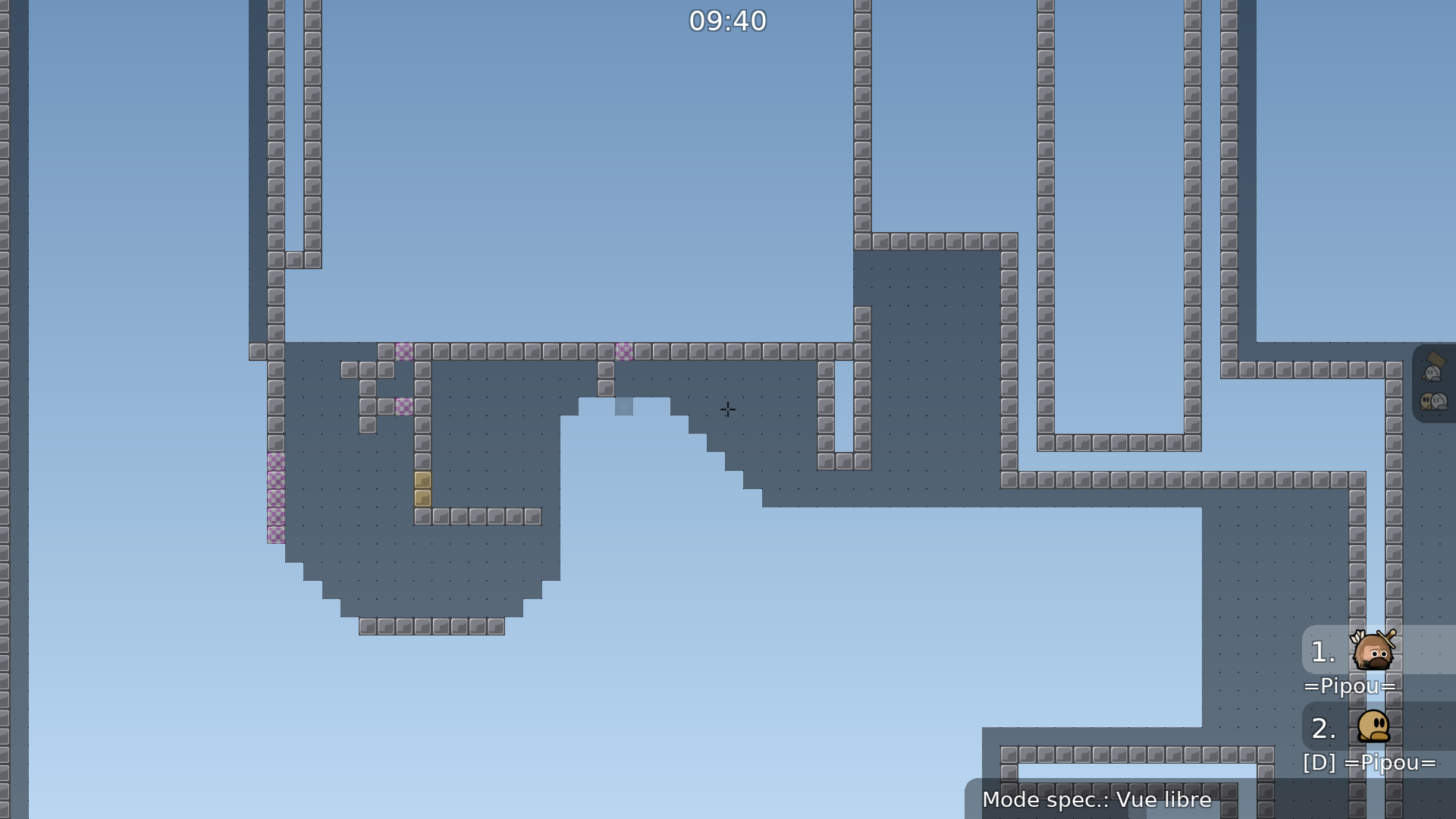
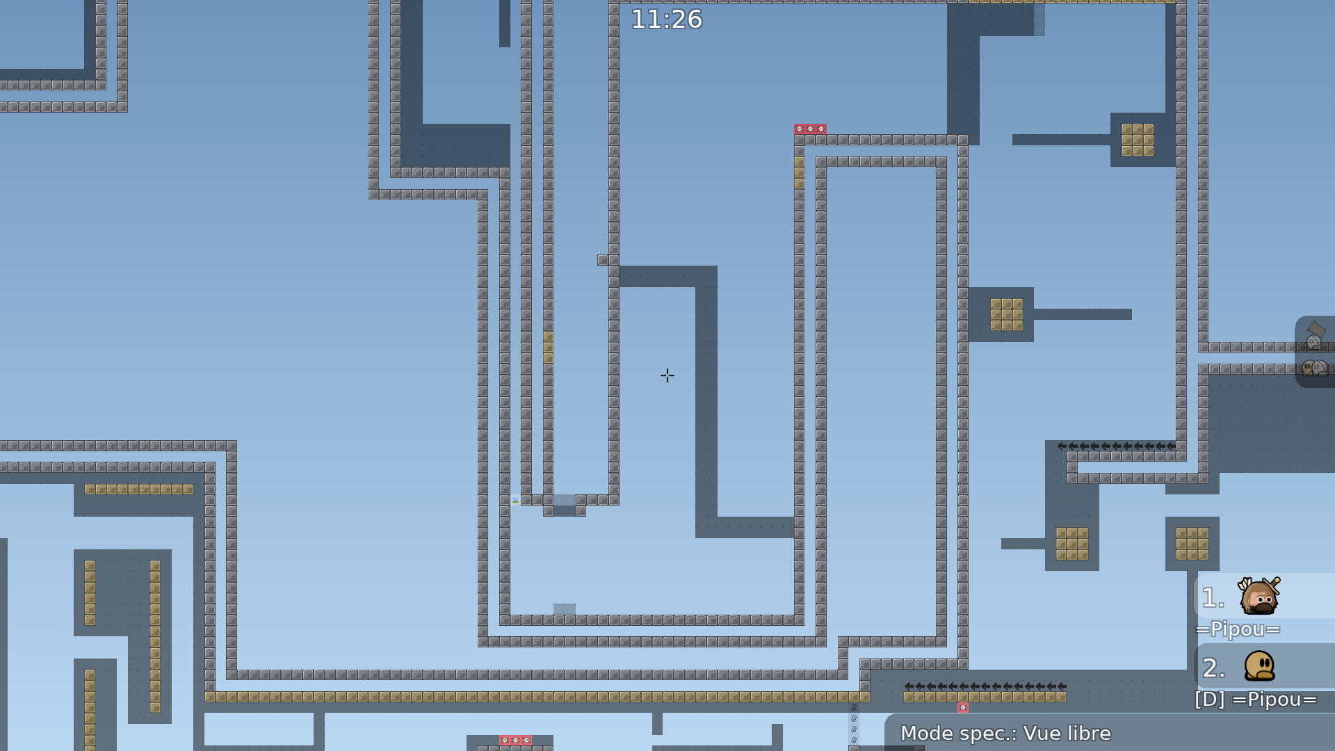
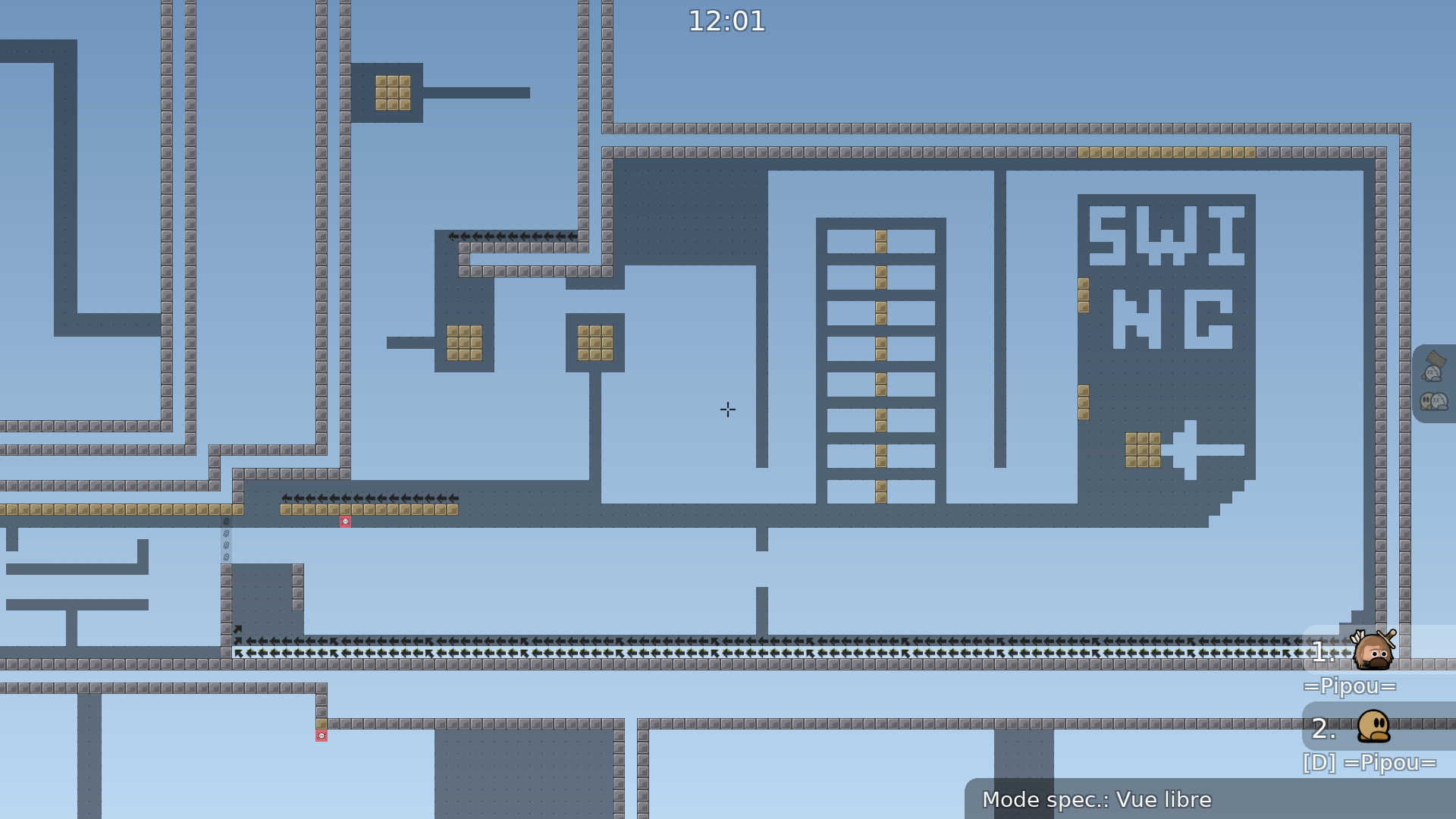
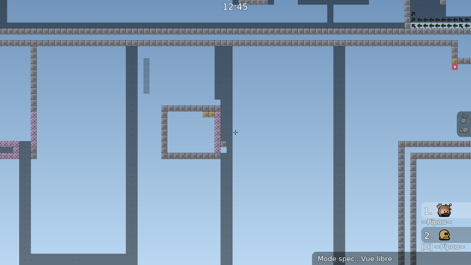
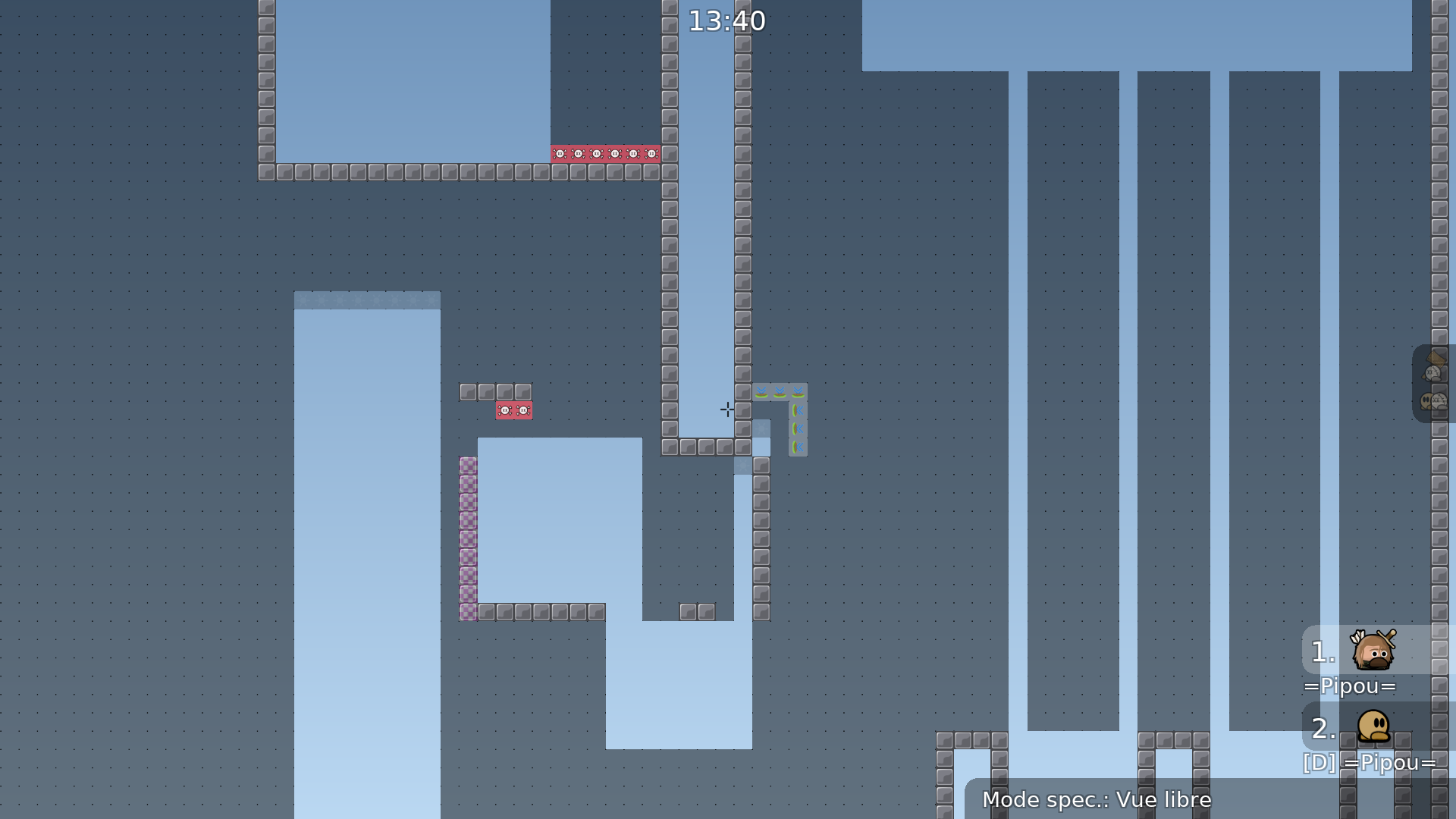
Some new parts were added, such as this one 🙂 And more others :p
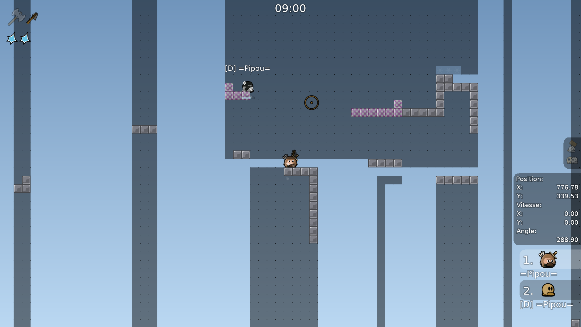
(rip dummy players btw)
I enjoyed the majority of the map, with the exception of the last couple of parts (in comparison to the rest of the map, the end felt like filler). Lots of interesting Ideas and a decent amount of variety. Not sure how I feel about the usage of stoppers on the floor (it can be annoying at times), but its definitely unique. The one thing I will say is that the design could use a huge overhaul. Good parts, but I think there is a substantial amount of filler that could be cut out without effecting the quality of the rest of the map. Cool map 👍
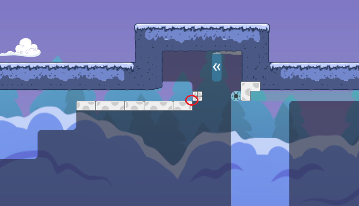
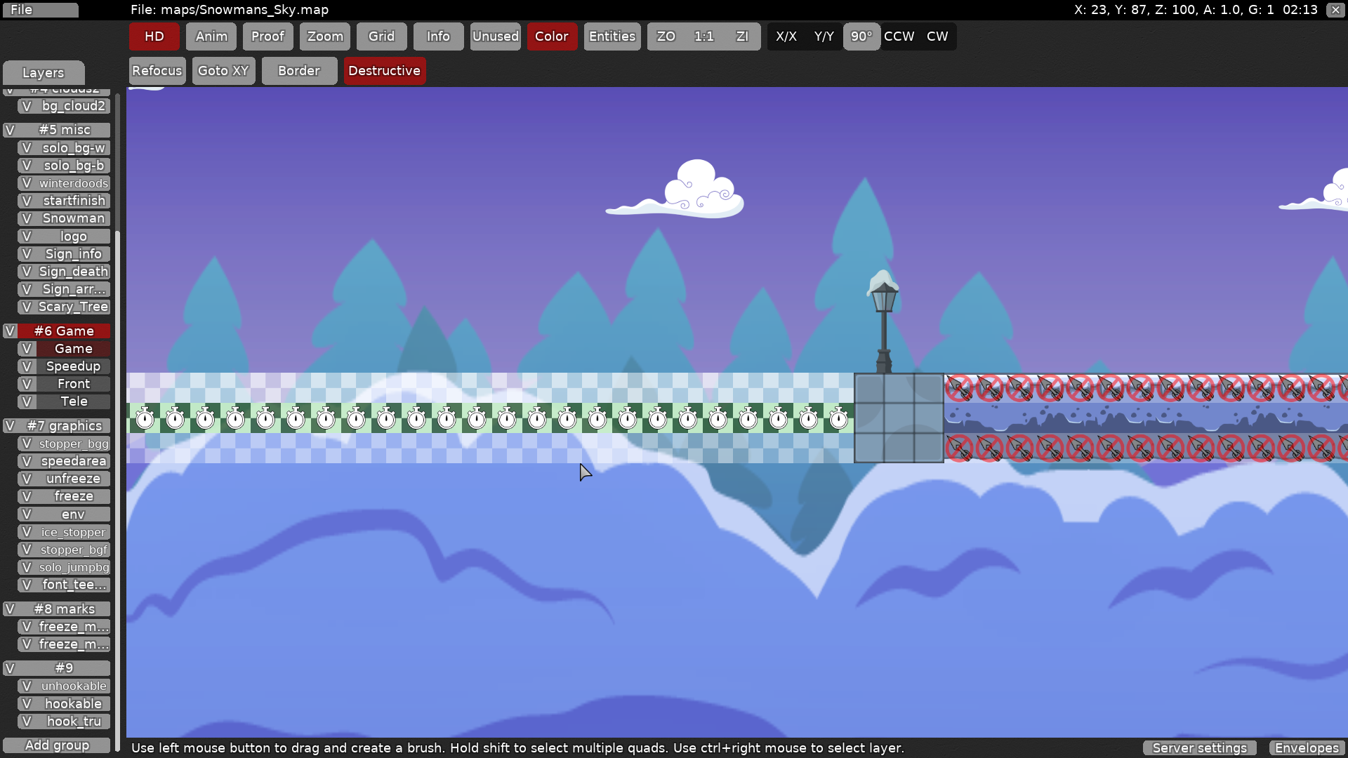
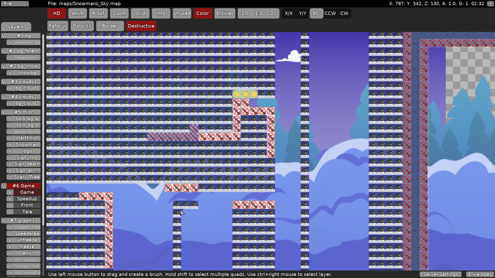
not sure about those cornsers that are attached to white wall if they are a bug or non
in many places you add them in others you don't
comparing to beginning of the map red are bugs and orange are good (but only comparing to beginning of the map)
looks better without the corners imo
you should take a look at your map once again and make a decission which corners are bugs and which are not =] (fix which are bugs etc) after new version will be uploaded I will make a next check ^^
Thanks for your feedback.
- About stoppers. At the beginning I thought it can be good for a winter map like this, but yeah I understand its annoying sometimes, so I'm not really sure now should I keep them or remove I would wait for more feedback about it, I'm fine with both decisions
- About the design rework. Are you sure its like really-really needed? 🙂 I just spent so much time on this, I would just abandon these tiles then and use something different from community, + map name change. And with this approach we don't need ground stoppers anymore 🙂 If the problem is with the background (if its distracting too much) then I can fix it pretty easy, but idk what did u mean by it.
- About the fillers amount cut: fine for me, we can remove some of them, I would like to discuss it in-game
thanks Tsin, Ill fix it later after I remove some fillers I think
I just gave my opinions on everything, it’s up to you whether or not you want to change things. Probably best to wait and hear what a tester has to say considering changing gameplay, but design is really up to you.
- all mentioned corner bugs were fixed (+some more)
Reduce the size of the parts all over the map
It doesn't have to be tight either
Your tileset seems too small, try making the shapes twice as big
Instead of using blockers for the ice texture, use unhookable with a tunezone (tweak the ground friction and ground accel for example)
The map is unbalanced, very easy at times, then hard other times
Many parts like that one can be skipped by going up directly
Your map is far from being ready
Try reworking it with all the tips I gave you. If you have any question, you can talk to me here on in DM
$decline
how can it be hard with them, those speeders are needed just for the case if someone stuck on that single block
I also have a feeling you just didnt get a lot of things/parts
I also not sure do I even need to comment things like this. How often do you see 2 tile aleds? If you see a problem here, for a t0 map I guess its each second run for you, right?
I would discuss this one and other things in game, you are certainly doing something wrong.
I also dont understand how this "tip" can help me, its just a fact, its not quite easy and so what do I even need to fix if
I was accompanied by some of the best players, I think we get how the game works
And it happened that that speeder would be barely possible to pass with weak on the left side
I was pointing out the fact that you didn't place a 1 tile wide bar, but one of 2 tiles wide, which means that you want people to actually do the part and not skip it. 2 is still skippable, that's why I said it, so you change it or make it 3 tiles wide
That's not the problem of being a t0 map or whatever map at all
It's not quite easy so make it better, not unbalanced, aim a level of difficulty
Also my tips aren't limited to that, I want you to improve your map structure
Where I have the weak hook
I dont think so
Please, why would I care about the speeders on the right side ?
Only that 1 is unmarked
Start fresh, take your time, test everything careful, if you need backup don't hesitate to ask
Give it a nice structure, a nice flow
Think it for a t0 if that's what you wish to map
Pay attention to the details of the graphics/design
Avoid using blockers
how can I understand that stucture is nice and whats wrong this current structure
Less entity = the better
I gave you an example
Of the look
For the flow, you need to imagine it, it shouldn't break
Don't make your map too big, nor too small, not too loaded, nor too empty
Well, thanks for testing
I still don't agree with many of things, but seems yeah its easier to start from 0 than fixing all of these issues
Hm... I think I want to pick some best parts of this map and compile them into mostly unfaily brutal/moderate 2p map (+some extra work ofc). maybe it will be better
Alright, and don't mind asking if you have any question
