this is your map's testing channel! Post map updates here and remember to follow our mapper rules: https://ddnet.tw/rules
Added about 6-7 seconds of gameplay
Thoughts on changing the laser tile color blue? It might make things look more complicated but I think it might be easier to spot in the moment
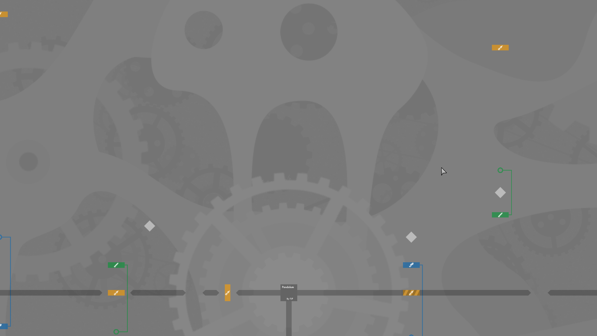
fixed transparency bug, moved BG to HD
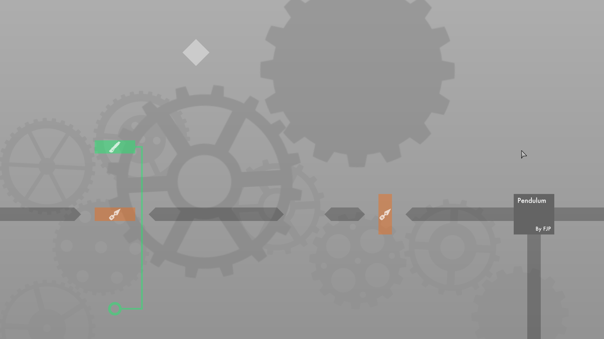
changed color of laser parts
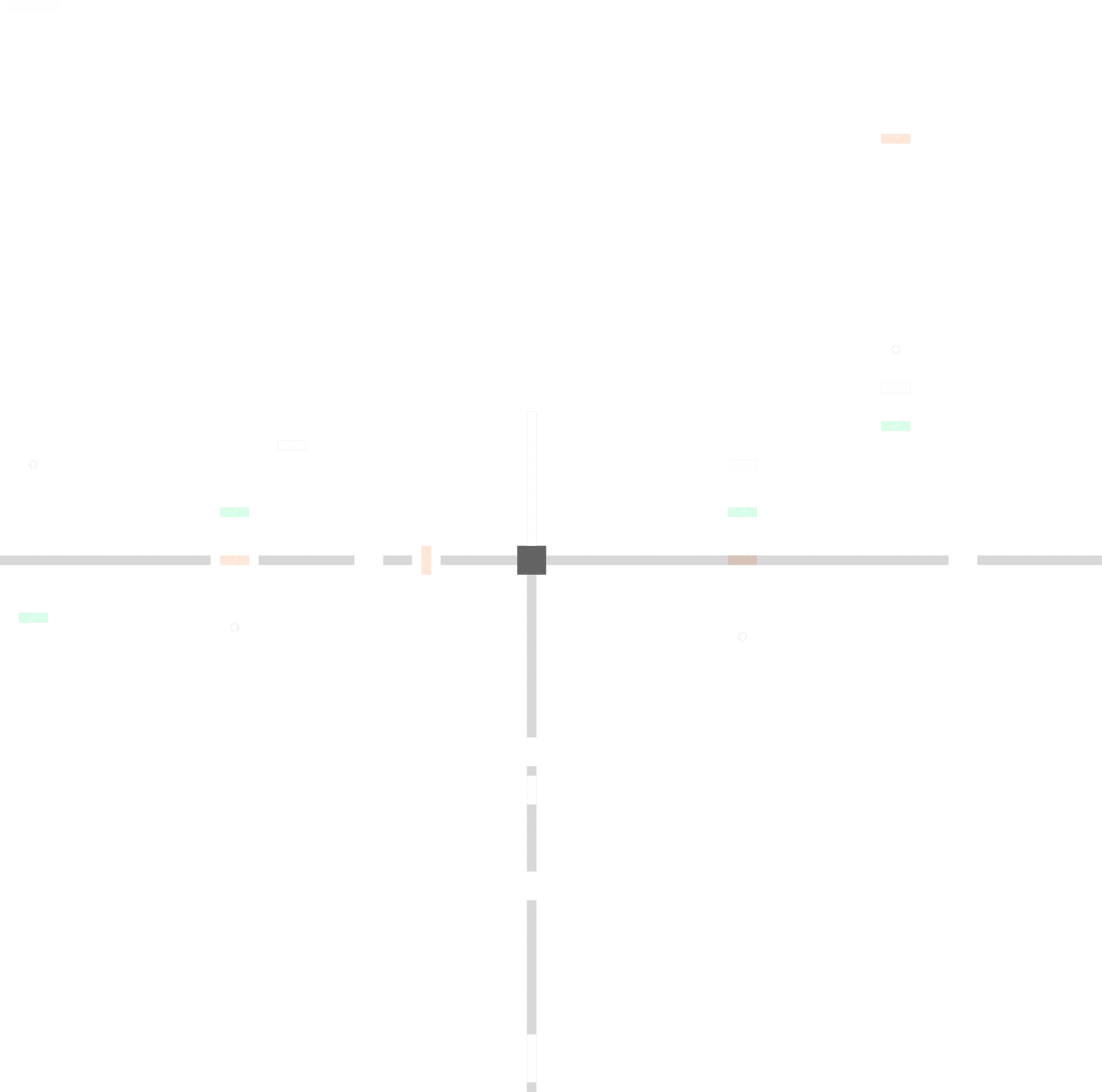
It's very hard to see in entities and in design
Make the design less transparent
Would you mind coming later today to play the map, or send a video of the gameplay here or in private
Maybe try adding details to the environment to help locate yourself when not playing completely zoomed out
Here's a playthrough video (sorry for the bad quality)
nice .mov
😄
looks cool
Here's some updated "colors" (transparency fix)
If you have any ideas/examples that would be helpful and much appreciated

To make comfortable game w/o zoom you can add path markers.
That looks amazing!
Ok, I'll keep doing it later then 😄
LOL its awesome
Alright 😄
I have to move everything so I can add teleports around the "clock"
LOL THIS IS REALLY FUNNY
😂
Mad graphic skills
@PipouWe need a last test before release
from the gameplay in the video above i wish the map wasnt so plain
moved spawn tile to the middle
and i prefer simplicity, this map seems to use lots of special tiles to achieve the movements
while the tiles may be relatively underused, I think the actual gameplay and concept of the map is rather simple to be honest, though I understand your point about the map being plain
I will upload the map, if the changes aren't ok, we can always reupload the former version
$waiting
Those changes are fine with me 👍👍
Changed my mind, reverted the moved shotgun teleport to the original, as the new trajectory and momentum caused variation in the rest of the map. I tested both ways numerous times but still found the original placement to be the most optimal. My theory is that Cireme was holding d (right) as well as shooting down throughout that section, which is slightly different than the intended method. I left the new bigger unfreeze boxes as they do not effect the gameplay significantly.
After testing again, I noticed that the former version was better too
ill just give my final opinion that gameplaywise i dont like it since it kinda abuses weapon teles and the such but w/e i mean it will probably get rls anyways
I guess we just don't see eye to eye on this one. Still I appreciate you giving your input, it gave me a different view on the map

What would you suggest ?
i just dont rly like the style of mapping
if it was me i might do multiple types of 'pendulum', each with a different weapon or idea and just put them one checkpoint after another
instead of having all in one swing thing
and i generally dont like weapon tele
That's a good idea
It's not released yet
Ooh i like the concept of single weapon stages
I just don't want to ruin your design now
@Pipou
It's not that hard to move, if you need help I'm here
Don't pay attention to the design, focus on the gameplay 😌
Ok il see what I can come up with 👍
You can do it on another map and I could put it all together
Or whatever it's fine😌
Il do it on a fresh map 😄
Make sure to use the same circle size
So should I try to fit all of the "pendulums" into the original circle
or make all of them the same size as the original
how about something like this? and then the teleport will take you to the next pendulum with shotgun or something
i mean if u want, it snot a requirement but i would probably enjoy it better
I'm kind of split between the ideas. I like the idea of having a map that's one cohesive whole with no stopping, but I also can see why you might prefer a segmented map with clear divided sections. I'll wait for Pipou's thoughts
Shotgun Pendulum (revised)
Idk if I like this one or not, but thinking of the map as a progressive easy to hard style map, this would be the first stage, then shotgun, then laser
I have no idea, I think louis meant a map where you would use walls to laser yourself or sg and so on instead of using weapon teleports
Always keep in mind to make it easy to read
yeah i guess the laser one is hard to read
I'm not very fond of teleport tiles but some people enjoy it while others don't
the idea with the weapon teleports is that it makes the aiming and movement more interesting imo
or at least that was what i was going for
Yes I see ^^
but i thought louis sounded like he wanted a checkpoint oriented map
instead of a "one part" thing for the whole map
Swings are always a pain 😄
Hard to get them to work properly
yeah
I think no matter what the hook teleport will have to stay just because of the concept of the map
but I can try to work with the weapon tele
Sure, that could be good
I even thought of the possibility of making a hub where you pick your part, a pendulum with sg, one with jetpack, one with the hook only, etc
ooh
sounds like an interesting idea
like how they did it in just every fly?
Let me check
Yes, sort of
So should I work more with the original or with the new parts?
I'm fine with either
Tough question
I would like to know the opinion of others
Ok 👍
Might be hard to judge just based off of the videos though

Il work on both for now
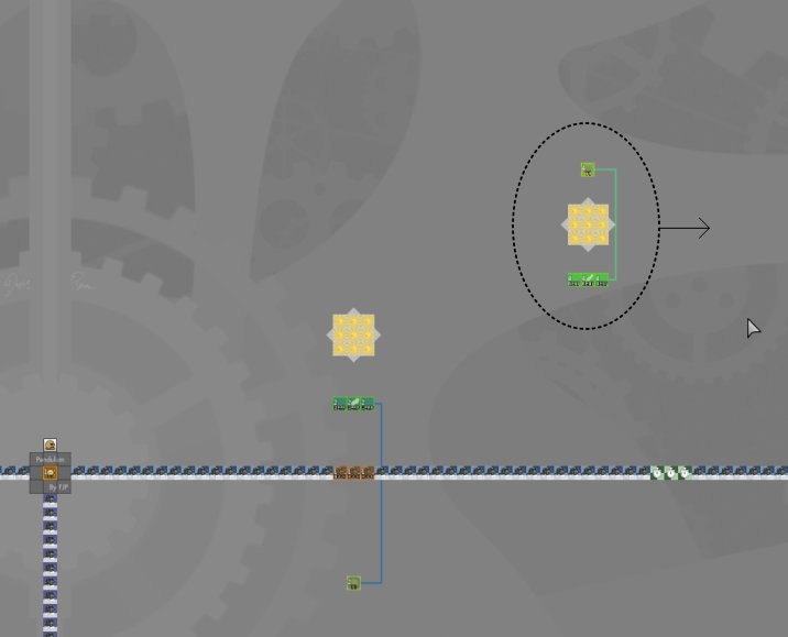
The main problem with using "blocks" is that there is no tile that you can both shoot (with collision) and pass through except hook/weapon teleport. That means that the majority of the moves I have in all versions where the tee has to go through a place where they shoot are not possible to switch without completely altering the part. Laser seems to be the most flexible weapon in terms of getting around this. Here's a small workaround on one of the parts, though I kept the weapon teleport on the right side.
The more I think about it, the more I think sticking with hook and weapon teleport is a good idea, simply because it works better with swings and momentum boosting. While I like the laser clip in the previous comment, I don't see many more possible parts that aren't in a completely different difficulty that can fit with the style of the map
That's fine, but you don't need to have to pass through them as well
You can have a wall for example
Where you can unfreeze yourself with a bounce, then swing with that same wall, catch another swing, or swing and walk off that wall to have a bigger swing
That's much more complex than what I had originally intended
Maybe we could stick with the original version (maybe some slight tweaks), and experiment with something different like louis said for another map? Like a sequel or something. I know it's simple and short but I think it has a charm to it.
Still open for opinions of course 👍
I don't think we would want multiple maps of the kind, 1 is good enough
We would need more than 2 opinions on the matter
If it should either be short with 1 giant swing and multiple weapons or multiple swings with 1 weapon each
Until this weekend, I'm moving your map to waiting
Hoping to get more points of view by then
$waiting
Don't work on it any longer
$ready 2
ok 👍
so the original will be the one?
Yep, the last version uploaded
^
Sounds good

Thanks again so much for the design and help :)))
You are welcome

Congratulation with release and cool collab

Thanks

$released
How is this releasable ?
Have you ever made graphics ?
don't disrespect the design, it's literally god tier
It's a common problem when you have a transparent background with a coloured image
Doubling the size of the image would have reduced that a bit, but it's not worth the extra kb
need dilate
Auto dilated
dilate again
It's not a dilate problem
You can't dilate twice
idk, i fixed errors like that b4 with dilate
also yea potatoco dont talk lol
It often happened to me with circles and shades of grey
I could have made it whiter as well
But it's not very important
Making it white almost always fixes the problem
Thats a very complex problem, the stake of whole Tee's World is in your hand. I think we need to take this very professionally and fix it no matter the cost.
Solution : delete the map.

$delete
Most funny is that’s Potato said it not seriously
$optimize
what a cliffhanger, I'm waiting for next season =]
Somebody just remove this channel already 💀
Was trying something, but it seems like the bot already closed the map edits 😁
just triple dilate 👍
