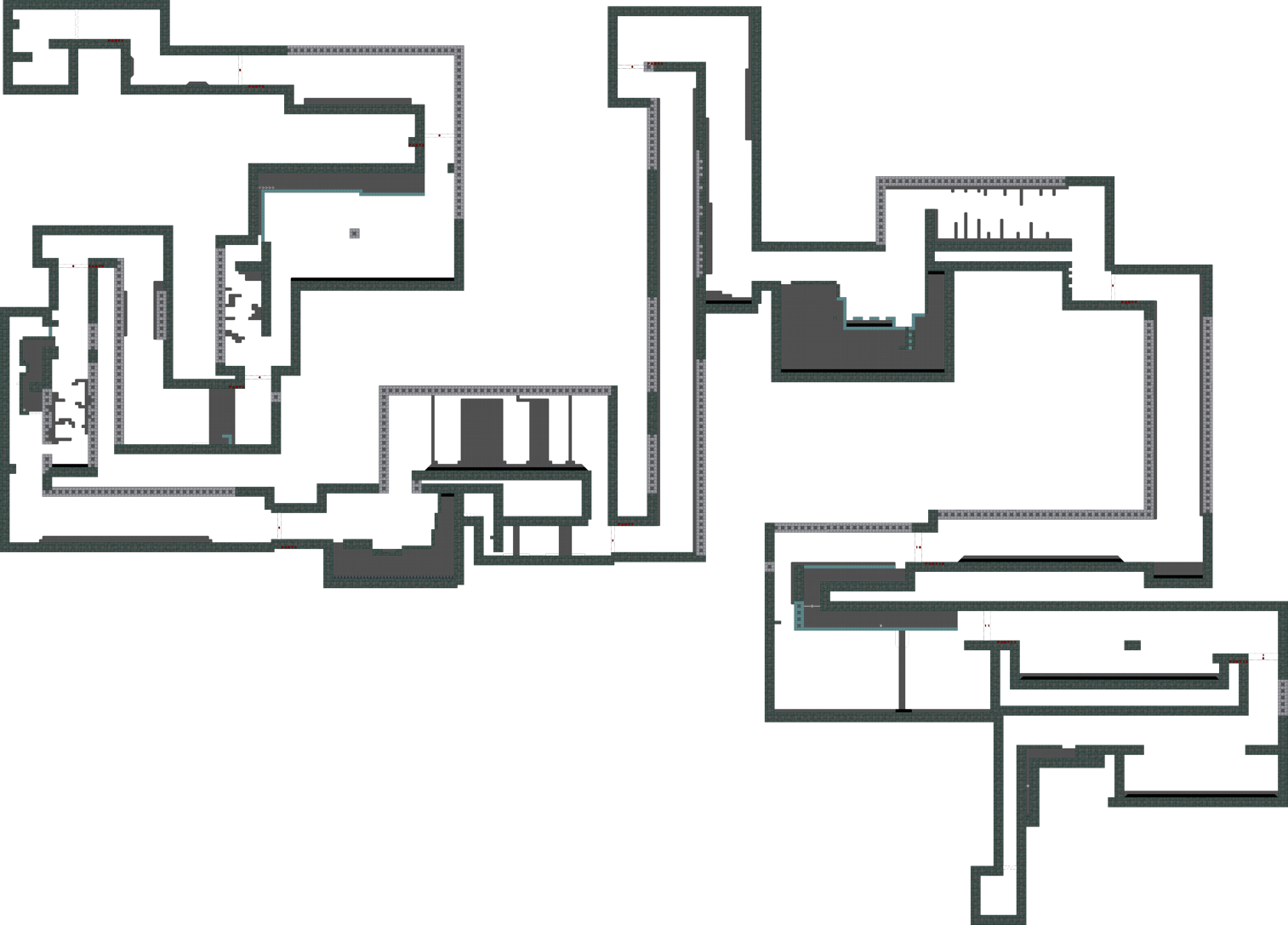
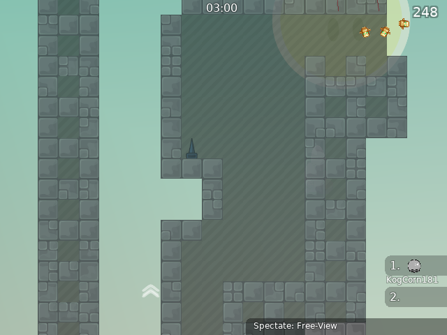
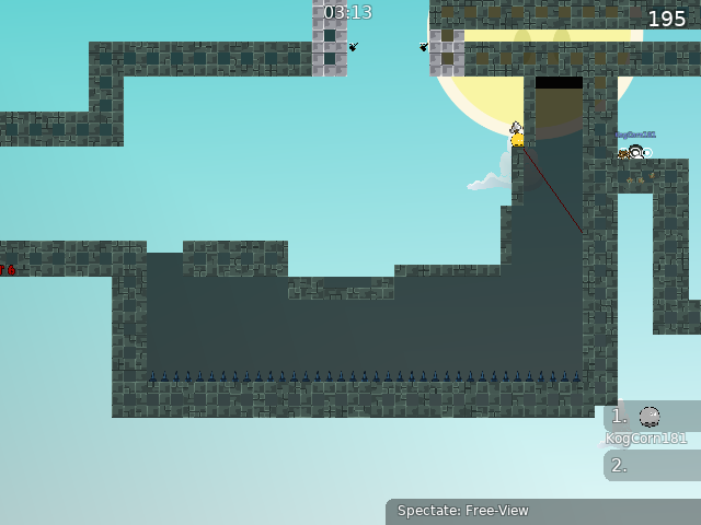
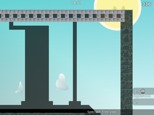
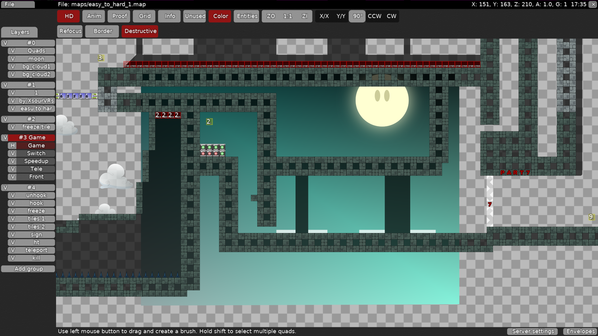
this is your map's testing channel! Post map updates here and remember to follow our mapper rules: https://ddnet.tw/rules
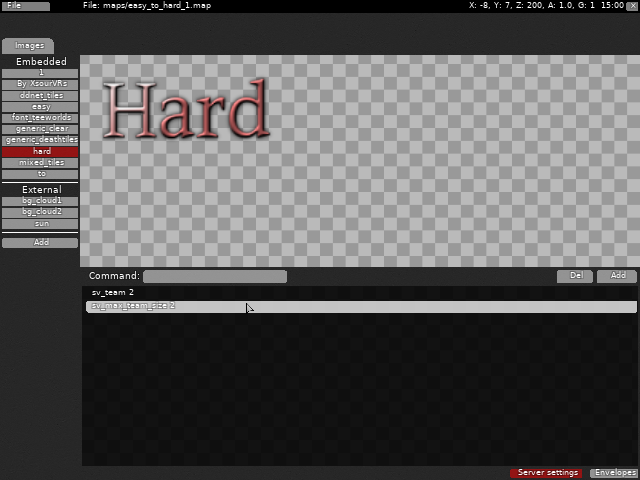
add sv_deepfly 0
in server settings
at the bottom right
Will I post it here again when I update the map?
yes
👍🏻
okey
thx
np
grenade fly should be put back a few more parts

its not that hard compared to other parts xd
It's hard for me because I can't rocket flight
oof
i can teach you it in dms if you want

I'm not that bad, that's enough for the level maps I've played
ok
I corrected what you said.
ok
ill look at that

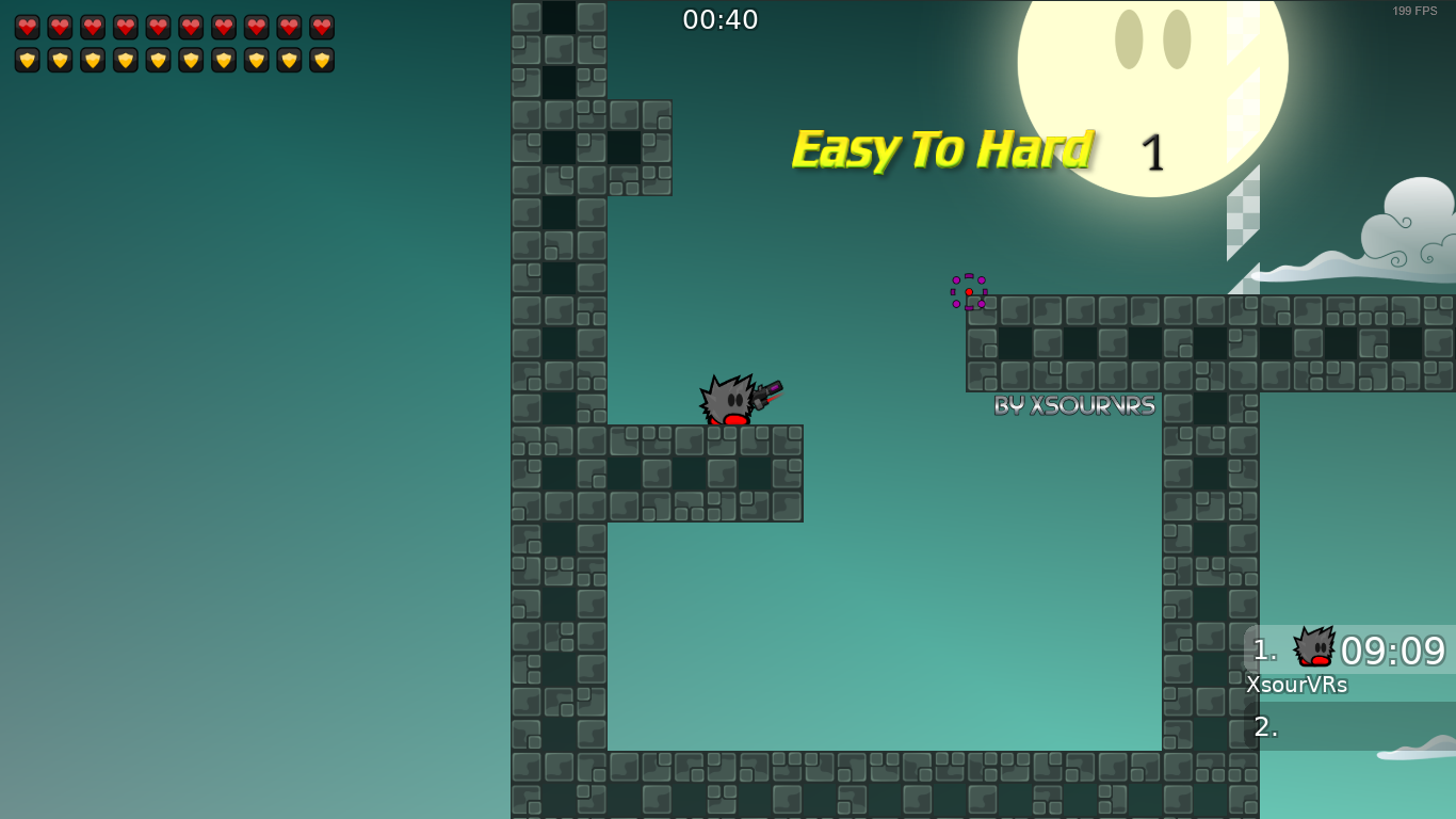
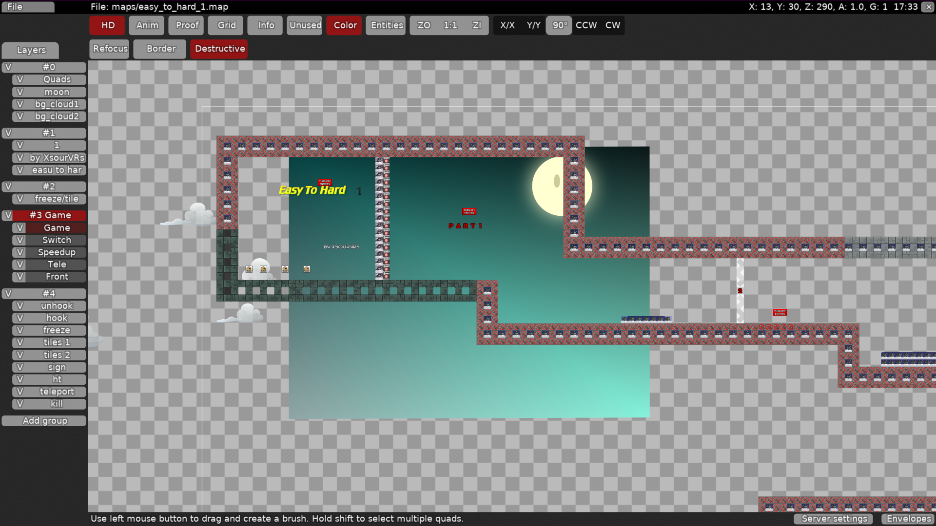
i looked in the editor for the map, i saw that you used 3 images for the logo

imo you could maybe reduce the filesize by making it one image
you forgot sv_deepfly 0
Also btw
dont put detail on logos xd
only on tiles that are unneeded
and unneeded quads
also, since part 12 is easy try replacing it with shotgun fly

you forgot to add some stuff xd, look back xd
ok
I did
I checked but I can't fly with a rifle I couldn't test it
rip
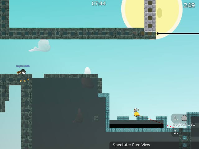
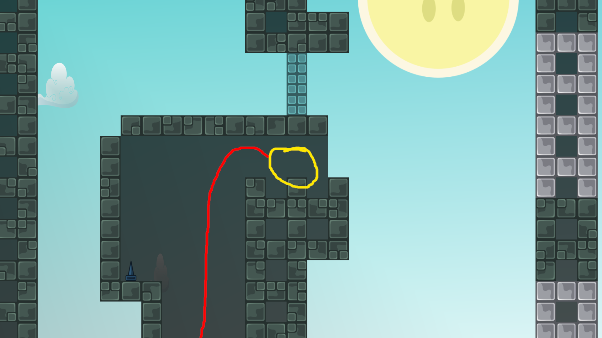
here is a skip i found
If I delete the rifle, will it be a problem if it is passed directly?
but it will be very easy
hmm
ik how to fix the part
I shortened the platform
okay

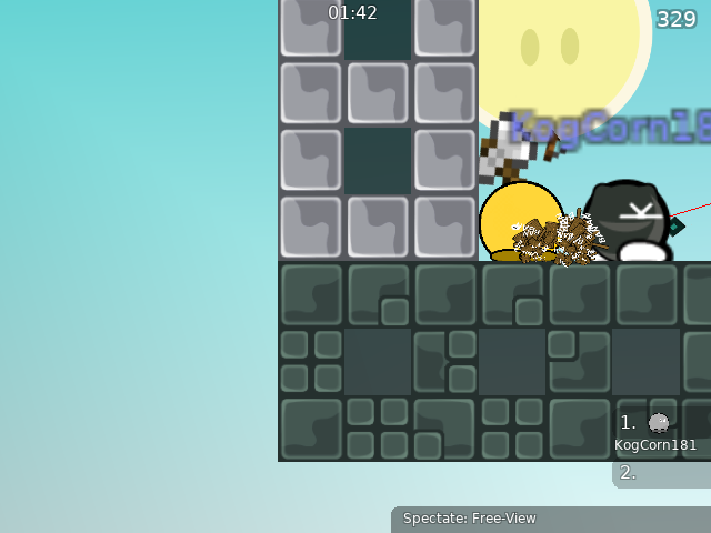
this is how you sg fly, probably the hardest type of fly in tw xd
if you want to know

Is the testing process over or in progress?
progress
still
it will be over when someone with the @ tester role $declines or $ready (number) the map

xd
my time is limited i may have to leave soon
ah ok

you can skip the shotgunfly part with just throw, same can be done on nadefly part
hh god
i overally feel like shotgunfly shouldnt be in this map because its way harder than the rest of the map
no
also some cp bugs, not really useful but still
sg fly is only a slight bit harder than grenade fly, if you know how to do it
i feel like for average player it should be harder to do than the other drags the map has to offer
xd
part 7 is 2x harder than sg fly xd
just sayin
xd
boring part too tbh
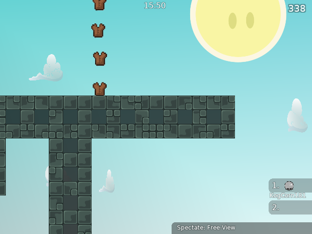
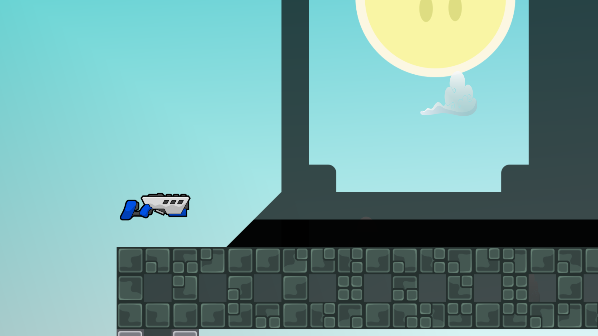
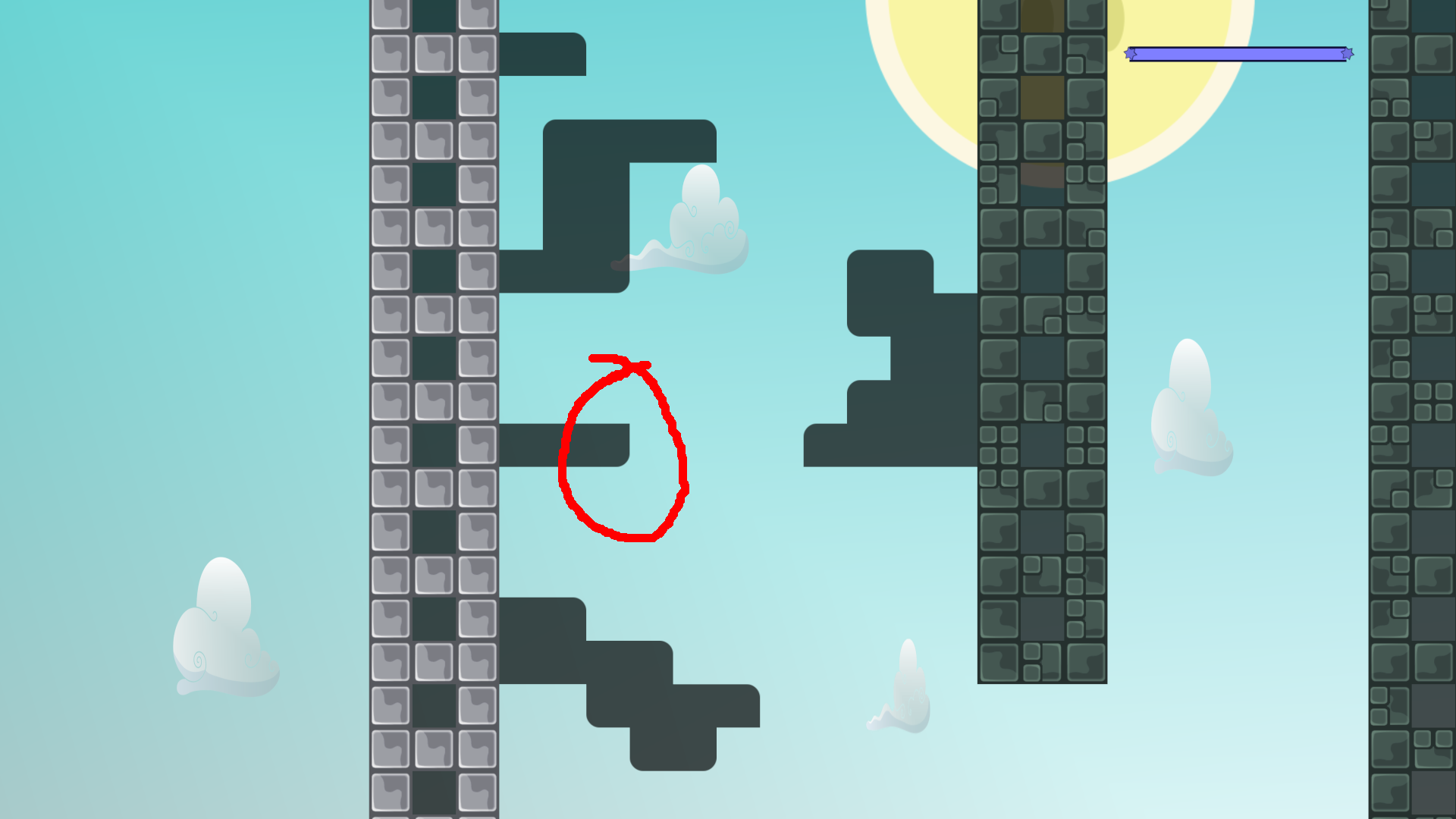
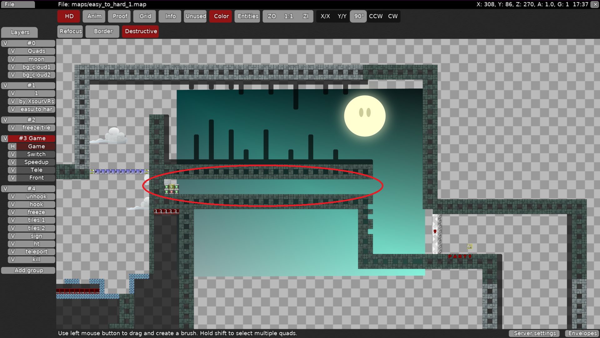
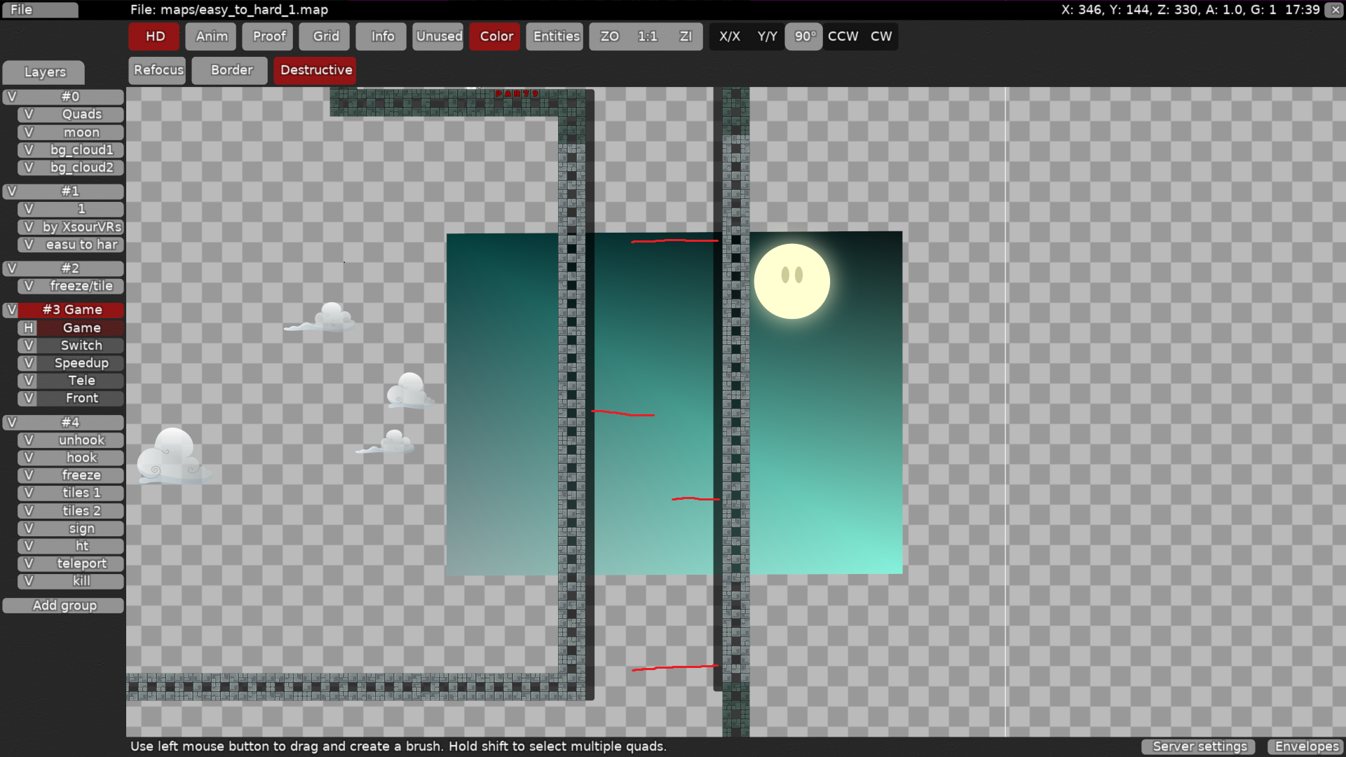
the clouds look very squashed and background color contrasts too much with the map tiles (too bright)
i also dony see why would you pick only one tile style for hookables
way better
Is there a bot or something to test these maps?
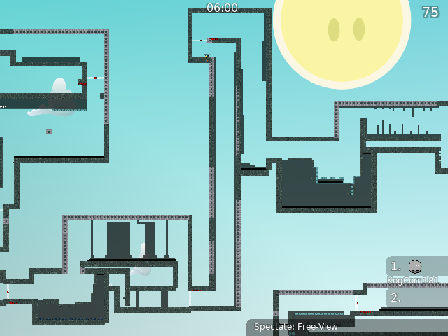
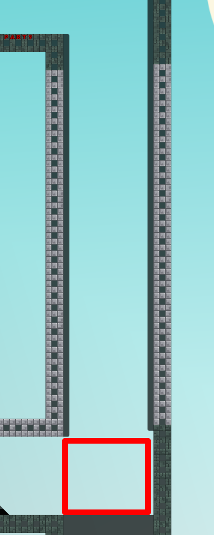
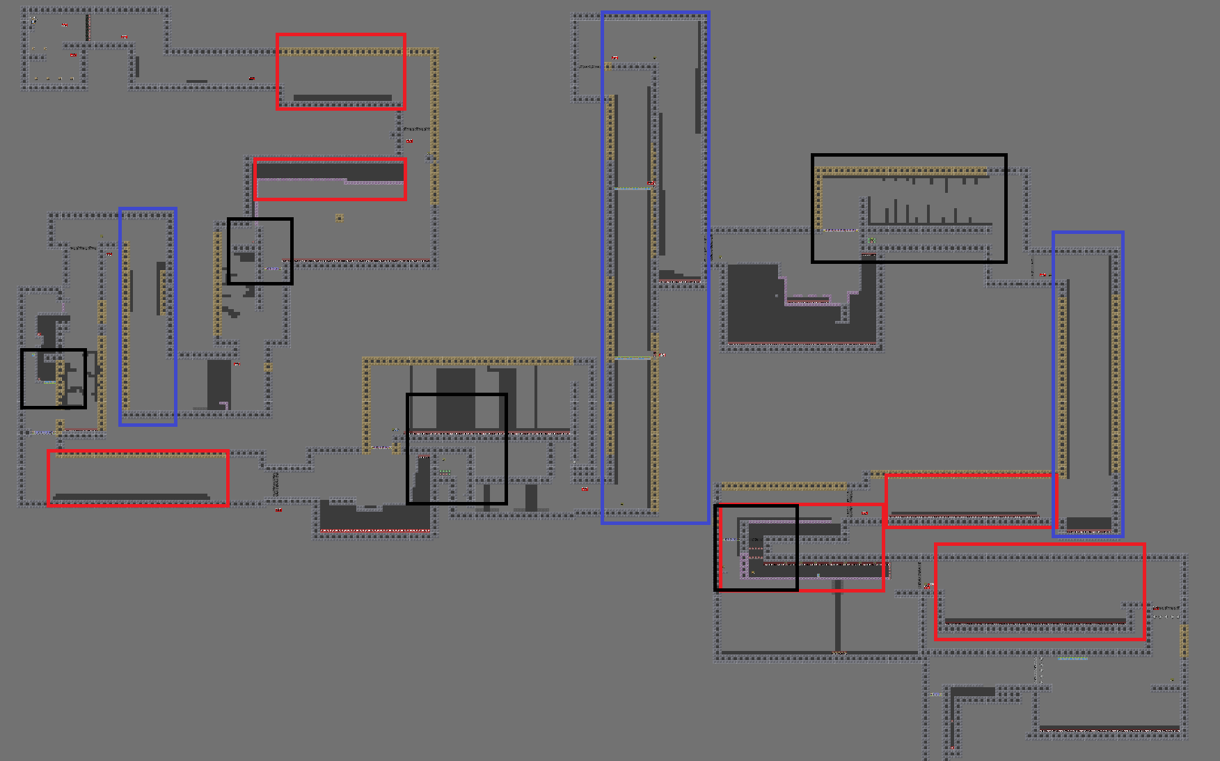
So, i marked some things on the map that seem very similar and are the reason for the decline overall. Blue = Just falling down or going up which is really repetitive and boring because nothing really happens there Red = really long and not fun drags which are repeated all over the map, try avoiding just making a straight line in a part and putting freeze under it, try to be more creative black = switches; you use switches all over the map to force your intended way which is really lazy and kinda boring cause u just lose ur dummy and have to go some place to get it again and again. the parts themselves which i didnt mark also werent the best but not the decline reason this time. you have to get more diversity in your map and not just "copy" parts and print them over your map. this is impossible to fix tho, so u would need to map from scratch to try to make a proper map.
$decline
