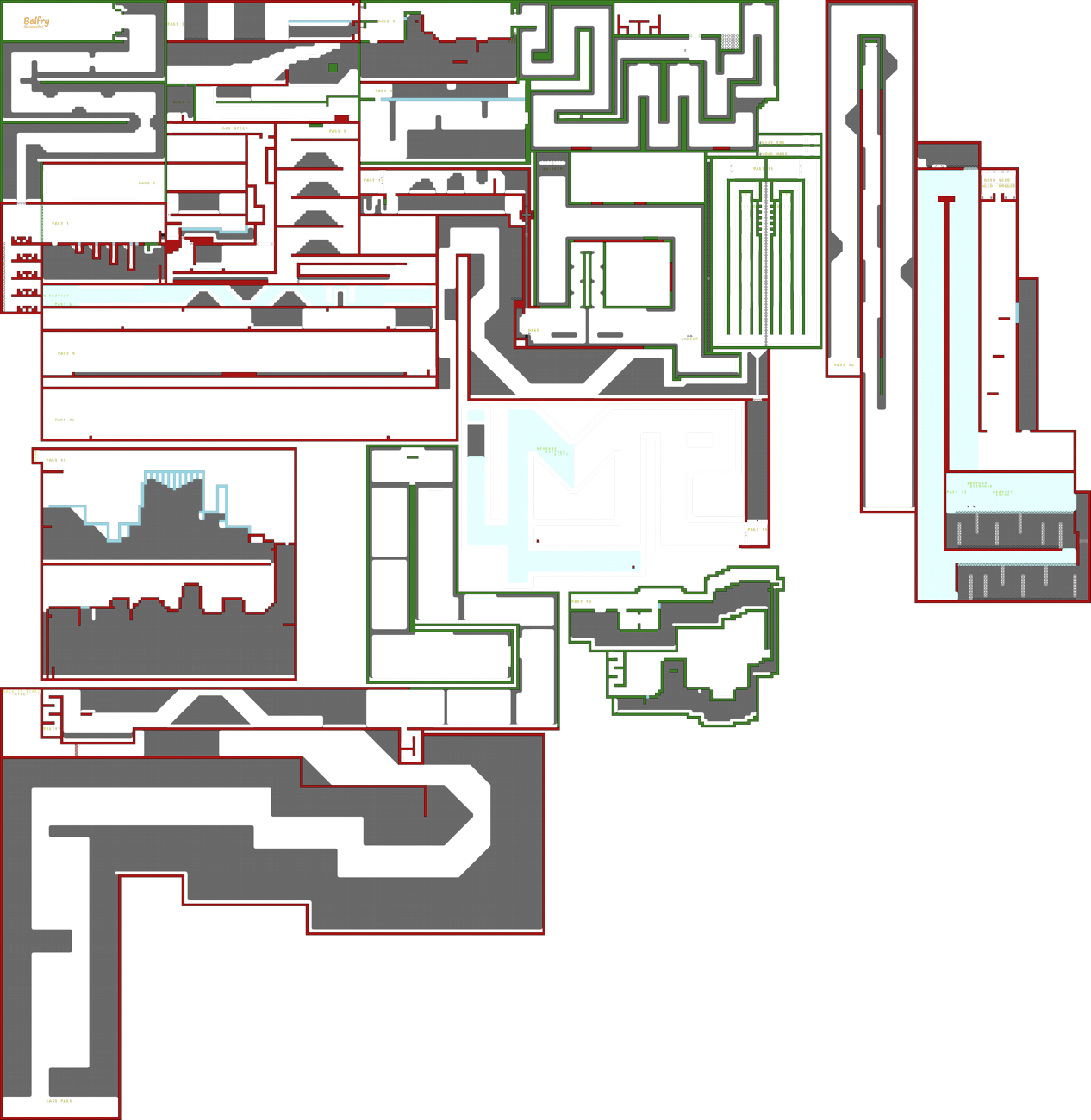
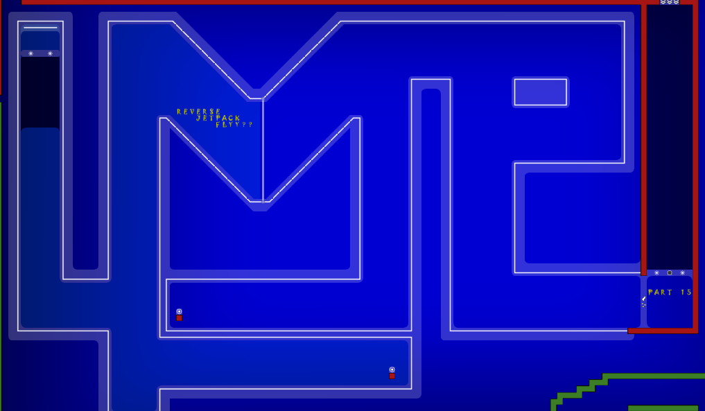
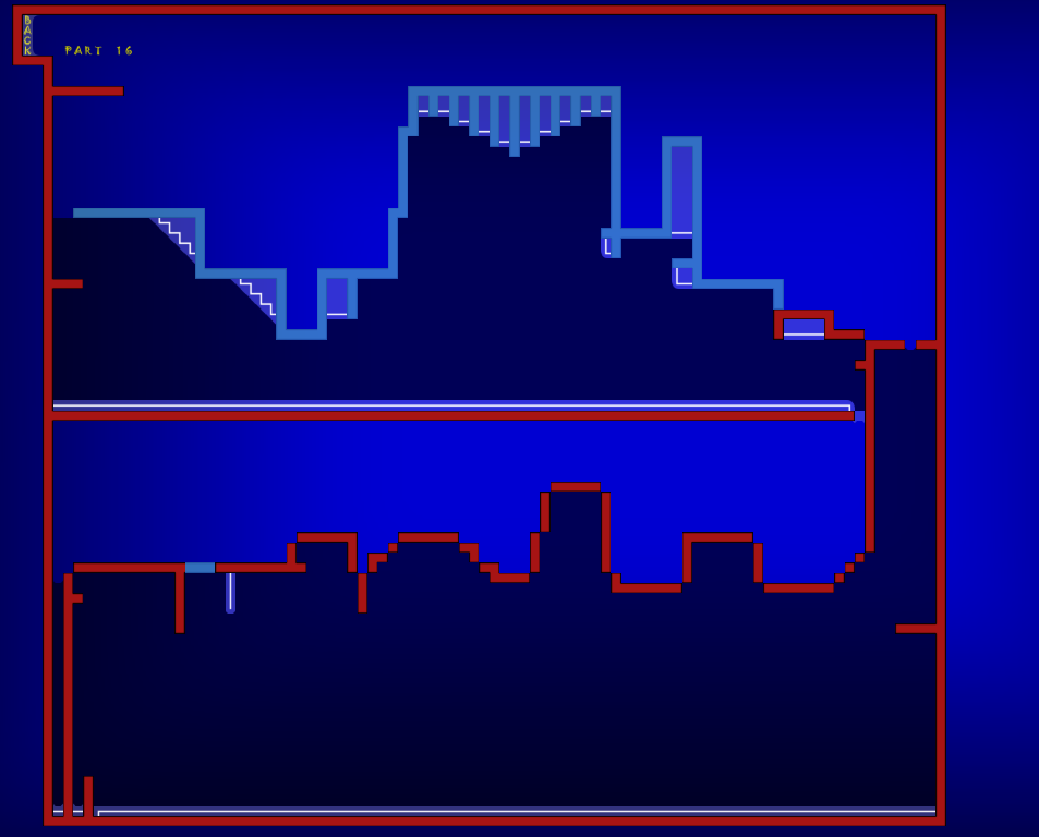
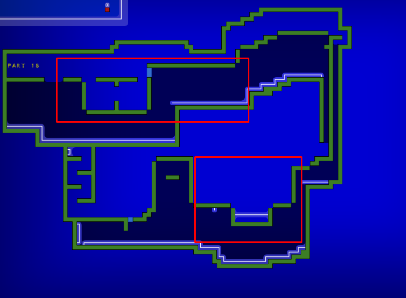
this is your map's testing channel! Post map updates here and remember to follow our mapper rules: https://ddnet.tw/rules
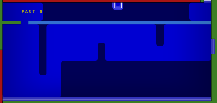
Fixes: removed some freezes from tp's Added missing freezes on part 8. removed unnecessary unsolo on part 16
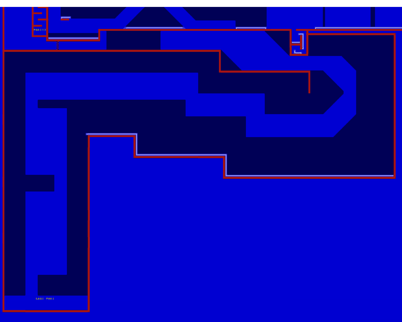
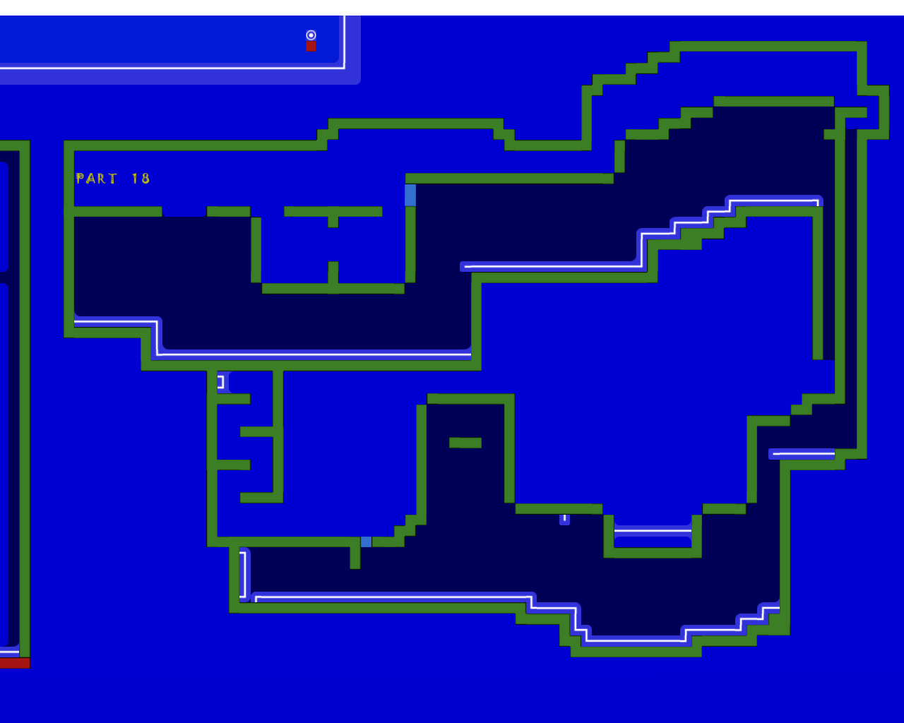
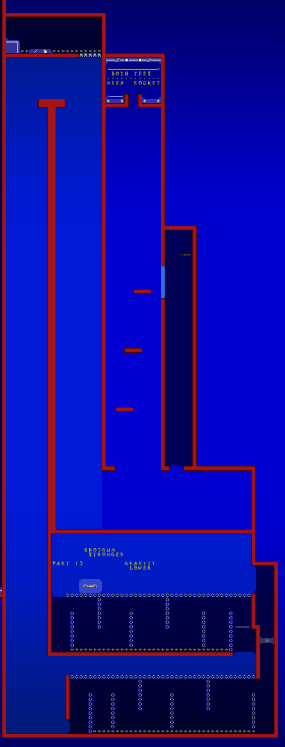
Thanks to Vloops for these: Added missing Freeze on part 13 Removed Tunezone in blocks on part 13 Disable jetpack/unfreeze moved 1 block down on part 15. Removed 1 tele on the second part 16 Added the missing tele's on part 18 Added missing freeze on last part.
now the design looks ddmax/kobra, bad design can still be releasable though if you have great gameplay like time shop imo etc.
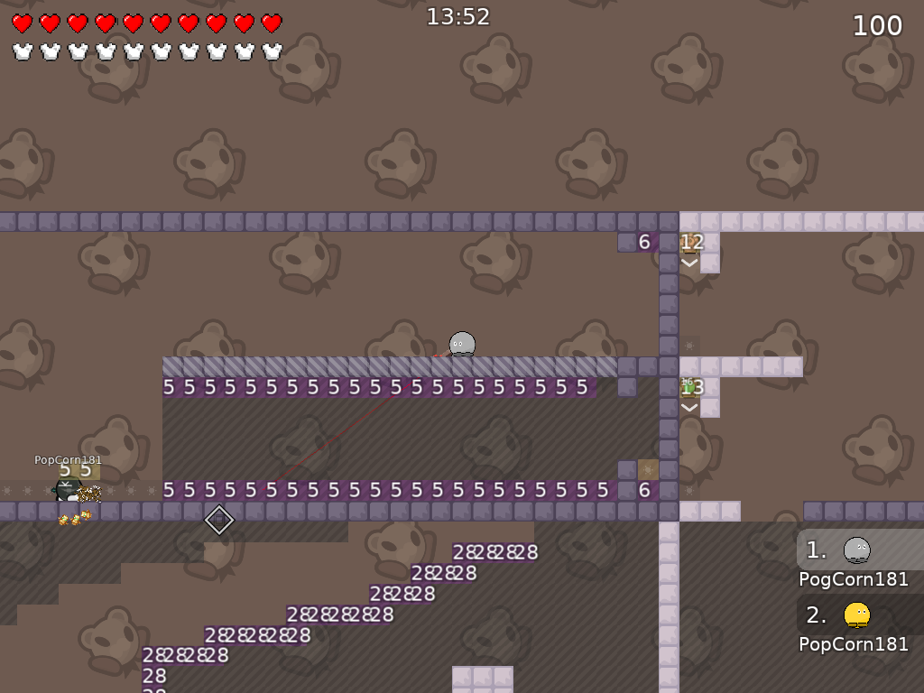
you only need one turn off entities at the start xd
noobfilter: bad, gores has been overused
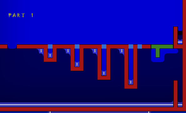
part 1: cool concept, good execution i like it
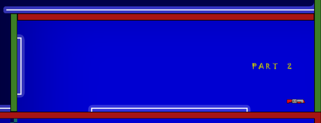
part 2: grenade fly another overused thing, keep it but dont make it over a flat surface of tele, raise the ceiling and give endless hook and.... skip xd
skip for part 2
part 3: sort of good, first wall of freeze you dont need grenade for, so maybe take away grenade on the first part, then give it back
part 4: bad
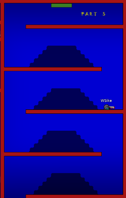
part 5: i really enjoyed playing this part tbh 😄
Thanks for the infos. i made some changes to these parts. part 2 made it little bit harder part 3 losing rocket at the start and gaining it at the socond freeze again. part 3 end made bit harder
everything coming next post.
for part 4. can u specifically say whats bad on the part? or whole part.
on part 4, the first jump with the rocket isn't very...... fun

.
i just found out u can use 45* aim angle so just a hint xD
part 4 start is not random its 45° down left and you can do it 100% of the time if you know how.
what do you want the difficulty for the map to be

"if you know how" applies almost to anything, so I don't think in that case it can work.
i dont feel like part 4 start is very hard. its just like find out how it works
he explained the part 4 "its 45° down left and you can do it 100%" so its not like "if you know how"
^^
lol? that pretty much an example of "if you know how"... xD
u will tell to everyone how to do that part?
nah but everyone to find out how to do it?
ok, first of all, this part is way too crowded, and current standards requires space so it's suitable for more players, unless you make it team force which isn't realy a solution, as most of players dislikes teamforce. If you want to leave that part, you need to try make the way of doing it visible (for example by marking), so you don't have to say to players everytime "45 degree ez" to make them understand how to do a part
imma go throught map and give my feedback as an mapper
do that. its my first map. so im still learning.
part 17 is way too long solo considering that this is a team map
In general, there's what I think:
- you have way too much gores in there. It's really uncreative considering that you could put something better. Literally 30% of map consists of gores parts, which you should avoid in such kind of maps, as nowadays standarts are kinda against that.
- feels crowded. The map doesn't has enought space for bigger groups than 2 tees, which makes it extra bocky and annoyng, which basically will force a lot of players to leave server and kind of reminds old ddmax maps.
- way too much solo parts. When you making a teamwork map you shouldn't make way too much solo parts. Currently, the map felt 50% solo parts, 20-30% gores parts and 20-30% actual parts, meanwhile the % should prioritise in actual teamwork parts
- structure. currently, it's literally - u pass part, go enter teleport to get into another part. Making the map unite smoothly between parts is always good and should be considered on, considering that it's supposed to be a teamwork map. For a example on How it should be structured in this kind of style you can check Lumine or latest new released maps, they might end into a good tip for you, so it doesn't give ddmaxy vibes. -unbalanced. The map strictly jumps in difficulty, some parts are extremely ez, some part are kinda hard. You'r map should be balanced so the players can pick based on their knowledge what difficulty they want to play, mixing hard with ez isn't a good option.
- design. The design is kinda lazy and the colors u picked, already at evening of the map, literally sayng to you: "turn on entities" xD Try to go more creative in map designing and try to pick more eye enjoyabe colors so it will be pleasant to look at, currently, i doubt this kind of design would have a chance to be released xd
Thought, really good map as a begginer in mapping :) You always can ask help in
#mappingand i'm sure there will be someone who will answer to you, so don't be afraid ^^
Also, I think starting over a new map with more experience is better, as fixing this would take way too much time :s My suggestion is to take all good parts and make into a new one, which I am sure will turn better

Took some notes of all areas you mentioned for my next map to do it better. yeah, i think a new map with my new experience and the tipps from the people would be better, then trying to fix the map.
Sounds like u want to start a new map, do u want this to be declined or will u try to fix it?
you can declined it
alright
$decline
