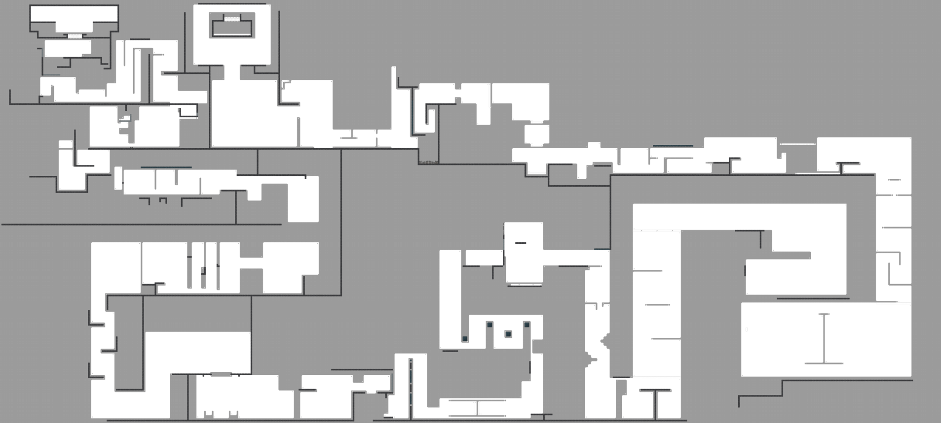
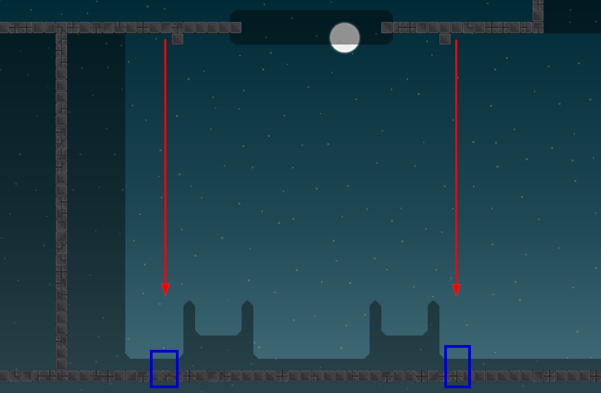
why 2 nightstar
because many people asked me when the following map of the first one is coming 😃
There was 2 channel of nightstar 2 that's why he asked the question I guess
oh, idk maybe it was a bug
had the bot running 2 times
-> 2 channels
$rate balance=8 flow=8 creativity=3 playability=7 fun=2 design=1 bonus=0
nice for team 0
^ vote again please, didn't work
$rate balance=8 flow=8 creativity=3 playability=7 fun=2 design=1 bonus=0
$rate balance=5 flow=8 creativity=4 playability=8 fun=2 design=1 bonus=0
$rate balance=6 flow=8 creativity=3 playability=9 fun=3 design=2 bonus=0
$rate balance=7 flow=7 creativity=3 playability=7 fun=3 design=2 bonus=0
$rate balance=6 flow=5 creativity=4 playability=5 fun=2 design=2 bonus=0
Remove the logo outline
$rate balance=8 flow=6 creativity=4 playability=7 fun=3 design=1 bonus=0
$rate balance=7 flow=7 creativity=3 playability=7 fun=2 design=1 bonus=0
Lack of stars at zoom = 8
should be possible to go back after finishing
not mandatory, but I would swap hammer on and off marking (white positive, dark negative)
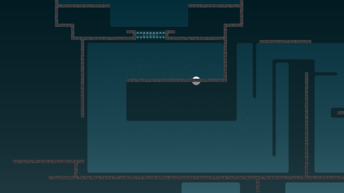
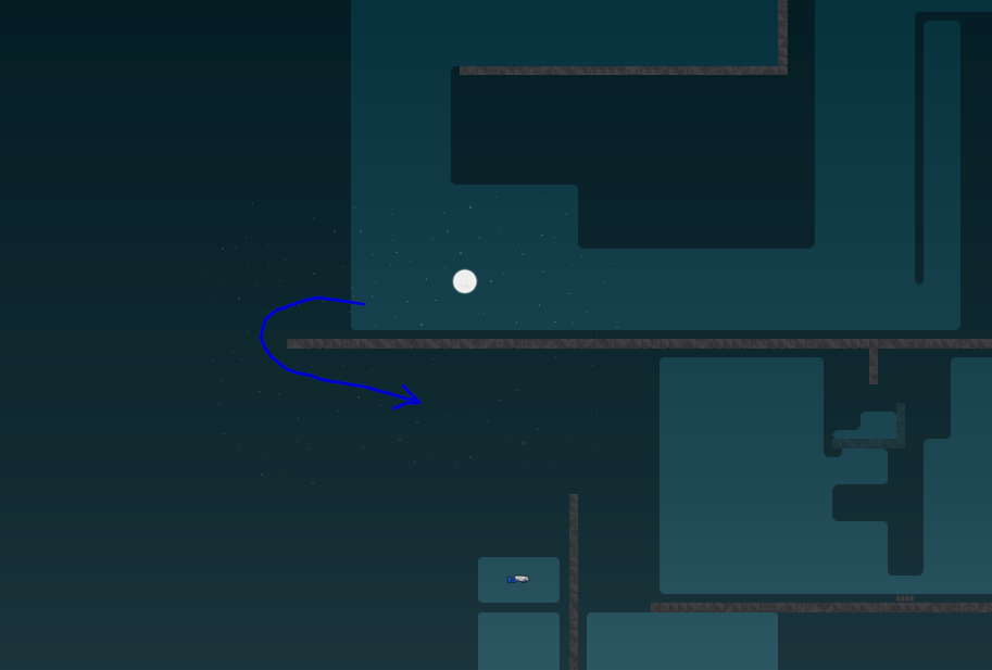
pretty sure the start will cause blocking. blue arrows show that you kinda need to cross ways a bit there. the yellow platform is small af and going right (red arrow) can be slow if you (have weak and) want to hook people to the right. that you get frozen when jumping through start doesn't help either
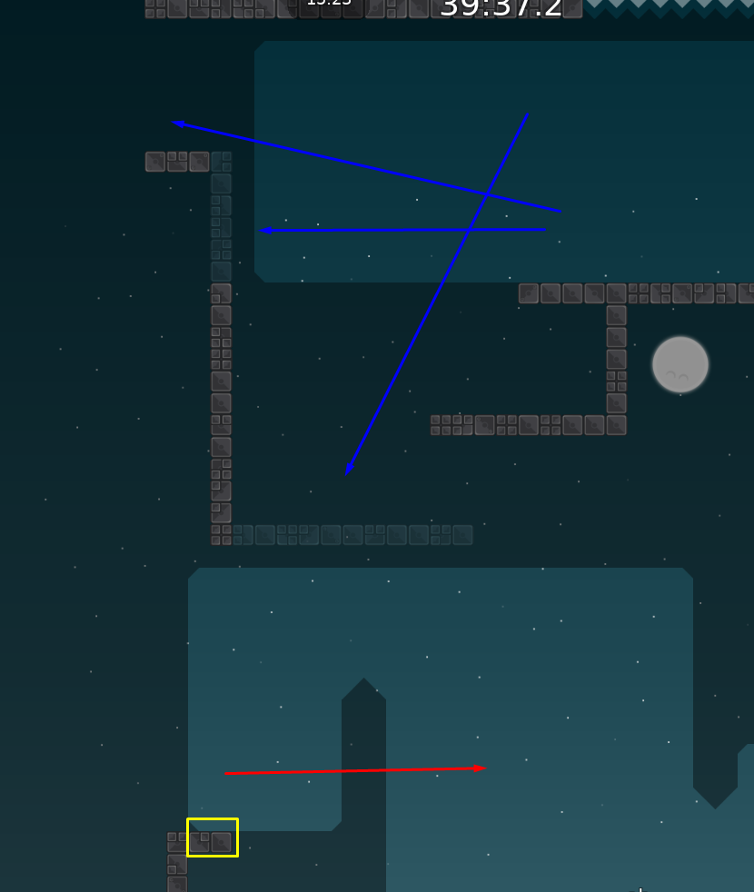
kinta as second part is also not good (espcially since the plaftorm above ends early)
$rate balance=7 flow=7 creativity=2 playability=6 fun=2 design=0 bonus=0
nothing really creative besides stopper part and deep
$rate balance=6
some parts get pretty hard towards the end
$rate balance=7 flow=7 creativity=4 playability=7 fun=3 design=1 bonus=0
Some changes 😃
$rate balance=7 flow=8 creativity=3 playability=6 fun=4 design=2 bonus=0
This map feels like a hammerfly map basically. For that i rated the flow 8 since i looked at it as a HF map. Many tight corridors and some standard normal parts proceed throughout the whole map. I rly like hammerfly maps as seen in the fun rating. Some slight adjustments in balance needed but it sholdnt be the main problem of this map. It lacks in creativity as i pointed out above. Mby rework 2-3 parts to boost the creativity a bit.
I think creativity 3 is still pretty generous for this map and flow 8 is a huge overestimation, if there was a rating for how well the map was mapped I would rate it pretty low as well
The rating system is very subjective since we dont have stricted rules to what we have to look at in each category. E.g. flow needs to fulfill point 1,2,3 and so on to rate is as a 10. For an 8 it needs to fulfill point 3,2,4. Just an example
Therefore i rated it as a 8 since its my personal taste
Do you think this map has excellent flow?
Since i looked it as a hammerfly map yes. For that matter i think so
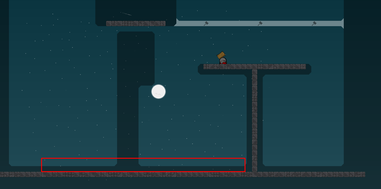
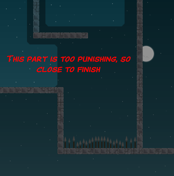
the last screen looks impossible to fail
have you tried yet?
no but such parts can be evaluated from screenshot if u played such parts a lot
but i probably should play it before testing thats why i said i evaluated it from screen
tested ingame and for me the thing next to it on the right is way failer
Few little changes, based on screens 😃
"0-3: Poor, 4-5: Fair, 6-7: Good, 8-10: Excellent Do you think this map has excellent flow?" (
@Ravie) - No, I agree that the Map Release Squad members mostly rate it way too high (also on other maps), this map shouldn't get more than a "fair" flow rating
its clearly that u dont like my maps a lot of people liking this map, of course a few not, but when u rate the flow with fair its clearly underrated, i dont say its excellent but its at least good 😃
I'm talking about the flow ratings in general and ye, I don't really like your maps
Ravie your thoughts are so stupid. Yes, it's an open map like this but creativity is put into it. Creativity is not about making some crazy parts like flux zzzz you tilt me
Point out what you find creative enough about this map to get a good rating
if your concept of creativity is creating new maps over and over again creativity will be at zeros one day
cause there are no game changes being made
don't you understand that?
creativity can stand for how parts are connected and thinked of
now only for new parts
where are these parts connected in a creative way?
"thinked of" this is literally this "creating new maps"
Creativity literally means making something interesting and new, and I don't see those traits in this map
it feels like you wanna make the map look better than it is xd
creating new maps
doesn't mean creating new parts
?xd
same parts = new map?
parts that were used before
can be used in a different way
for ravie
creating a new map
is creating maps like flux
if you use parts in a original way, it's creative tho
where you just create parts based on stoppers
and boom
TOP
ez release
he used it
in an original way
which one?
which one what
What do you think TOP has to do with Flux lel
relating ez release to flux is also really wrong xd
xd
it's just dumb to only give creativity to maps with new parts
i eman
like thjat
you wouldn't release any map like stronghold and ngithstar
because they aren't creative
?
but most of community love them
so whats the problem
u create maps for people or for urself?
for myself
😄
If someone is able to make a good strongclone, that actually has parts release shouldn't be a problem
I mean this is stupid: "it's just dumb to only give creativity to maps with new parts". if you give more points because you want the map to be released, the rating systems looses all its integrity
NOT THAT
forget
"To get released, a map needs an overall score of 25 points as well as fairly well results in each main criterion (4 points)"
seems like this map wont be released
$rate creativity=4
I think this map deserves at least fair creativity
i dont understand that logic
i know that by ur standards if there was a stronghold 3 it shouldnt get released, yet the community loves it
so what do we do?
We keep releasing strongholds until everyone gets sick of them and no longer likes them
Like aim‘s or what?
auto release for maps that get 5 fun
(such maps should get that going by that logic)
"We keep releasing strongholds until everyone gets sick of them and no longer likes them" this will never happen xd
so what will happen to this map? xd
bot
Still waiting for more tests or a decision, i think the map is on his final version... so ye 😃
my issue about the start hasn't been fixed sufficiently. also, rico's suggestion to make it harder makes no sense at all. beginnings like this have to be easy so that players are able to progress and don't block the start
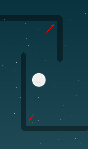
revert that one please
Start should be good now
@jao😃
still waiting for checking out the start
@jao; come on its a thing about 2 minutes xd
2 and a half minutes
I dont understand why the map is waiting just for the start that someone looked on it... o.O
Tag all testers that didn't test yet.
Your map should actually be tested since it's prioritized since 1 and a half week
this must be then
@Pipou@Kicker@snail&
@Amu~Cookiei think
scroll up before highlighting lol
3 of ur 4 highlights actually tested it..
give a rating ≠ testing
im pretty sure that meant the ones who hadnt rated it yet (and if not then its about the actual testers, not mrs members
)
then tell me who is a tester besides
@jao@snaili dont see a tester group in discord
😉
read through all of
#📌infoplease
what will u say me with this? just get the map a ready xd
the answers to your questions can be found there
and now u read what snail wrotes 😃
additional info to what he wrote can be found there too, yes
oh gosh, why u not just watch the start and give it a go, you critism the start because of blocking, now u cant block 😃
and again no response xd
still not ideal
basically the issue with the first throw is that people who want to do the part and those who just want to skip through have to cross ways. that's also worsened due to the throw not being easy and recovering your mate requiring to cross ways with others.
then if you are down and want to hook people out, it may take long due to having weak-hook. blocks people that don't want to hook someone out, but want to progress (jump to the right)
next is a hammer-hit with one hard spot which people might need to think about how to do (or which they will simply fail), which ultimately also slows people down
lastly you have a kinta-fly, where people that fail and drop down, might fall on you; also causing blocking. additionally, the kinta is also quite hard (especially the end). (as a general note: kinta as an early part is never a good idea)
the kill tiles in pre-last part seem kinda unnecessary punishing to me
the background quad shouldn't be HD
you have unused envelopes, and I wonder if
@Pipouis ok with you stealing his falling star animation
` has to be external
So; what I fixed now:
- first part (hh) ist a bit easier now -> I dont will change other parts, I will stick to them if u like it or not, I think map is good like it is as 4* Brut.
- design bug (corners)
- added hammer on hookfly part
- jungle_deathtiles are external now
- background isnt HD anymore
About the falling star; its just a falling star nothing big important for a credit or something like that xd, i can delete it if he wants it but makes for me not really a difference
The kill tiles in the pre-last part is like the falling star, nothing need but looks more dangerous If u fall in there you r death anyway, so I will not delete them
I only change bugs/design bugs for now, I like the map and I will not rework or change any parts! :) So take the map like it is or not, the map received enough points to get released like it is so i dont have to change because of your personal dislikes or whatever
& hopefully i will get now a decision if release or not 😉
& not in a week...
the kill tiles make a difference if you play with more than 2 people, isn’t only a psychological thing
will pull the results on sunday/monday btw
btw I explained reasons as to why stuff is bad, not sure how you think about it as "personal dislikes" lol. feel free to counter my arguments tho
i just see personal dislikes^^; & i think you proberbly know why 😃
well, i dont wanna change it so if u take the map, u also have to take the kill tiles on the part 😃
good to know
ye you only see personal dislikes because that’s easier than accepting criticism
no but i will give u a hint; teamspeak 😉
i can take critism but not when i no what u talked about the map 😃
"will pull the results on sunday/monday btw" - still waiting
@jaoIt's only thursday

we talked about last sunday/monday
😃
its approved, isnt it?
y
you should allow people to go back after the last door, can lead to unnecessary fails and is not really team 0 friendly
also you should be able to leave the finish room solo (not as important tho)
it's the last thing I'll ask you to fix btw
i dont will change it
i like it how it is
For a team 0 hh map there is way too little space in the first part, imagine 15 tees trying to do the first section at once, it just wouldn't go. Look at good maps of this type (for example 'Back in the...' series), there is always enough of space in the first part to disperse the tees a bit before the parts start. In the last part you should just remove the door and allow people to go back and save others, a switch part in this type of map doesn't fit in anyway.
like i said; i dont will change anything
take it or leave it 😃
xdd
Or decline it
i dont care anymore actually xd
if u take it do it, if u decline it do it^^
declining it then, it's too big of an issue to simply not care about it
xd
the map has gotten enough points for a release, so release it 😃
my map, my decisions, map got enough points for release
@jaofor what the ranking with points when u dont even care?
u literally said u don’t fix it because u don’t care and that I can do what I want
so now don’t come with complaints
because the is nothing to fix
😃
no bugs, no skips
= no fix required
whatever, no time for whatever ur trying to play here
and i will discuss becuase i said "i dont care anymore" you never cared about anything in testing xd
why? because im right?
thats true, i am right
just release it and were good 😃
... give me answers 😃
? you answered yourself
release the map
ΔWΞSƟΜΞgestern um 18:46 Uhr i dont care anymore actually xd if u take it do it, if u decline it do it^^
right; just did it the way he is acting or did u ever see him care about testing? he created a "new" testing system what is absolutly shit; even worse then the one before
map was approved, got enough points for release and there are no bugs or skips i dont fix his personal suggest because there r shit 😃
so and MY map was approved like the map is atm so i dont
@jao's "awesome" suggests xd
*fix
is there any word in the future coming from you
@jao? 😉
no
there is no point in talking to u since u will call any of my arguments/explanation/whatever shit
no matter how valid they are
i called your suggest shit
when i want a finish like this, my problem, there r a few other maps with a finish like this
shit suggest
you want that the door in the pre last part opens from the other side
shit suggest#
what r this for suggests? mate this is no reason to decline it xdddddd
for what is the ranking in testing?
if it would be a bug or a part i would disagree aswell i would change it, no problem but not in your personal suggest when the way i want it is okay aswell
You wanted to look like a cool boy and didnt expect that he will decline it
and now u just crying lol
+1 with kicker, i like the map and i think it would be a shame if it goes to waste but dont put it on jao after u said "i wont change anything idc anymore, if thats not ok u can just decline it" (which he did) ...
as
@Raviementioned switches in a complete t0 map is not common and i think it should stay like this, in general that switch is unnecessary and doesnt fit your map at all, just remove switch and map is good to go for release, and if you say you do not care whether it will be released or not we will rather decline it than release since you are not willing to fix major flaws.
Enough points doesn't mean "ready for release" it only means that MRS decided the map is good enough for release but still has to be checked by testers for gameplay flaws. If you refuse to cooperate the map might get declined. In this case the start area is a pretty serious flaw for a team 0 map
the problem is (
@Kicker) i would understand him, but we have a lot of discussions in the past what makes me act like this
i dont see the map as t0 map
But it is
can played as t0 but is better to play in team like the first version
obviously it is
All those "freeze" maps are team 0 whether you see it or not
maybe for u, i didnt mapped this map for only t0
You can also play Stronghold in a team duh
would it be game breaking to remove this 1 switch
@ΔWΞSƟΜΞ?
anyway, i just acted like this because of the past like
@jaoacted to me thats also a reason why i dont fix his personal suggest
also i think the map is good to go like it is
no it isnt, but that was not his suggest
I don't mind the switch as much as the blocky start area
he asked to make it able to go back; like a door opener on the other side...
would remove the switch completely
when i fix his suggest, like the switch door & the finish you r able to go back the whole map and block anywhere u want
so the start isnt a problem
ehm xd i think you know what i mean, just forgot a few words xd
It's not about blocking on purpose, it's about many tees at once trying to pull on the ht thing and then do the tight hh part
ye but when i speak for t0; you should have the patience to wait
because when u play in big teams you also have to wait for slower people so i dont see there a "big" problem
Nobody is gonna have patience to wait to do the first part
then they should play in team
lmfao
I know you have a personal problem with me, that's why I asked Ravie to test the map and share his genuine opinion - but instead of listening to what he says, you continued to face everything we said with ignorance
in a t0 map ?
so what do you actually want lol
wtf, i talking with him and show him my way i see it
tell me where i show ignorance omg
*im
not every discussion is bad like ours
and ye i have a problem with you, like you with me 😃
? answering with "I don't care do whatever you want" to constructive feedback is pretty ignorant
based on your answer because his text was based on your arguments
ur trying so hard to prove your point and piss me off that you even ignore stuff coming from others because they share my opinion?
whys u want to discuss now? few minutes ago you didnt wanted to talk with me
and didnt u said u dont want to discuss with me anymore?
ok
then lets end this now
but with the last sentence u wrote i agree, i did it
map stays declined, end of the story
hahahahahaha
now u cant take critism xd
I don't see criticism besides u saying I should play your ignorance game
actually no it isnt
@Raviethen why not fix it
Imo the switch is not a huge problem it just doesn't fit at all in this map but if you're gonna be this stubborn about it
because a few days ago jao was ok with the start i did it now
just scroll up and read his messages
if u don't fix it due to pure ignorance, what I said doesnt matter; I stepped back from it cause I thought it was a big deal for u
and
@Raviei just did it because the first map has it in aswell; im can remove it but this wasnt suggested yet
but since u basically just didnt fix anything cause it came from me, I won't step back from anything, doing ur brainfucked attitude a favor
was just suggested to make a way back possible
don't escalate things, he just agreed to fix the start
feel free to ready this map if u want to, I'm done with it tho
I haven't tested the rest of the map a whole lot
funny; i remember that you were done with the map since day 1 😃
but the start is the only real issue I see
ye I wasted my time testing and posting suggestions because I was going to decline it anyways

mate you know exactly what i mean
Idk what the situation between you two is, but your last 2 maps weren't declined
@ΔWΞSƟΜΞ1 one them just because of welf
second idk maybe he had a good day
start is fixed & i deleted switch
oh i remember
second was released because of rayb 😃
I could say whatever I want, you wouldn't believe it anyways
no
i would if its right
maybe
yes and what is right is what you want to be right xd
also true when it comes out of your mouth
but proberbly if u want maybe we can talk sometimes about it 😃 maybe there is a way for me to take you serious
You forgot to remove the front layer ht on the start
wtf i dont see this
i dont see it in my editor, idk why
no chance, i dont see it
try enabling info
it should show Indexes
also
lemme try anouther client
should be good now
yep
what happens now? i fixed the problems, still stay as declined?
"29/48 points map got rejected bcuz jao hates the mapper" thats why we love ddnet
@jaoit’s not declined, ravie will continue testing (soon). just forgot to send the notification here.. don’t start another drama show geez
(literally just asked an hour ago..)
1 hour and 3 weeks ago or what do u mean?
and why u reject a map before rls? i dont get it
?
read the channel log perhaps
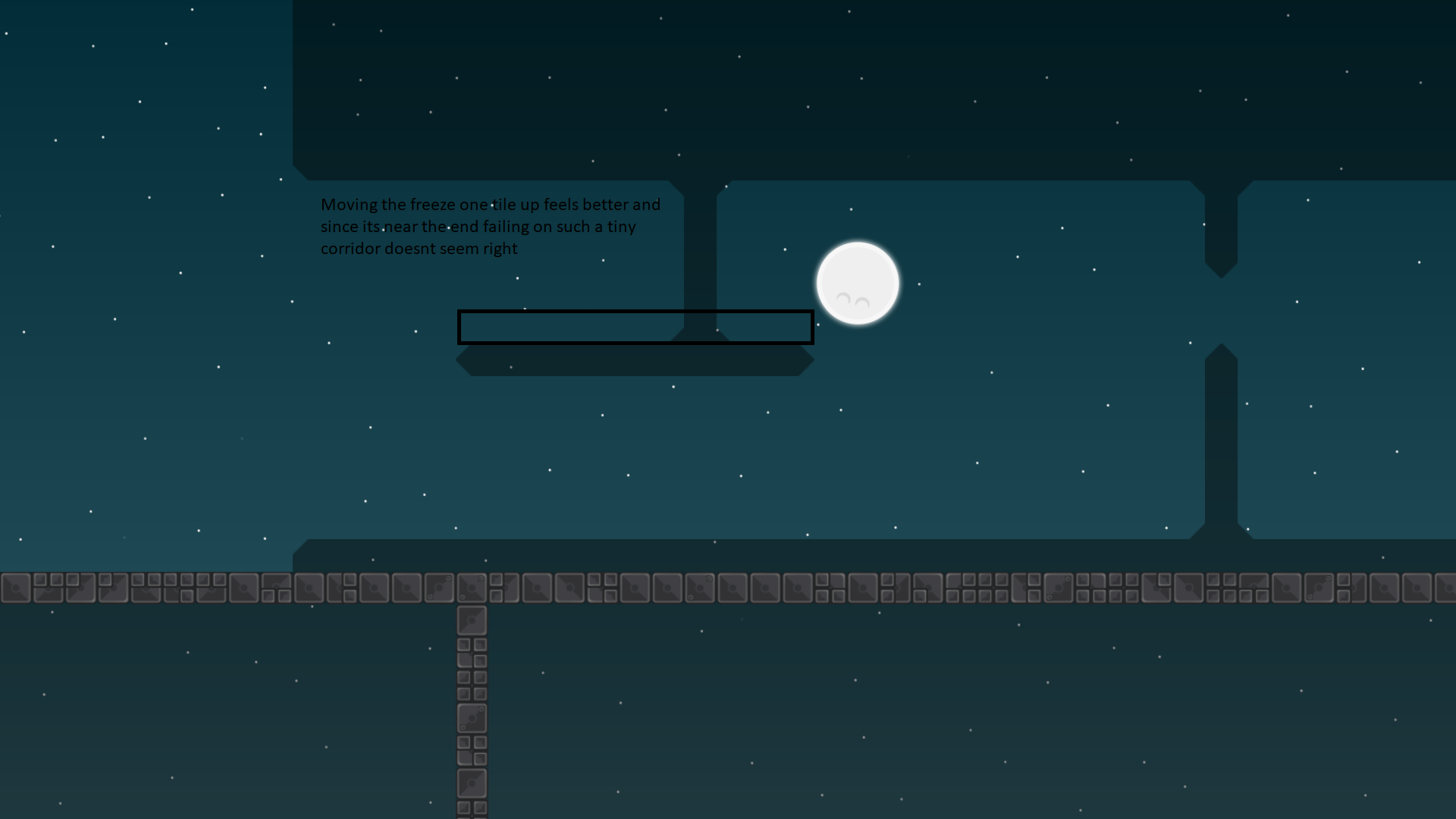
There is only 1 other place with spikes, where they don't make much sense, and design wise those spikes are unfitting so you'd be best off just removing spikes altogether
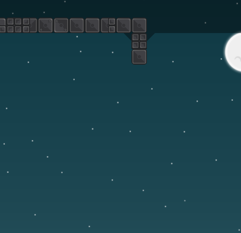
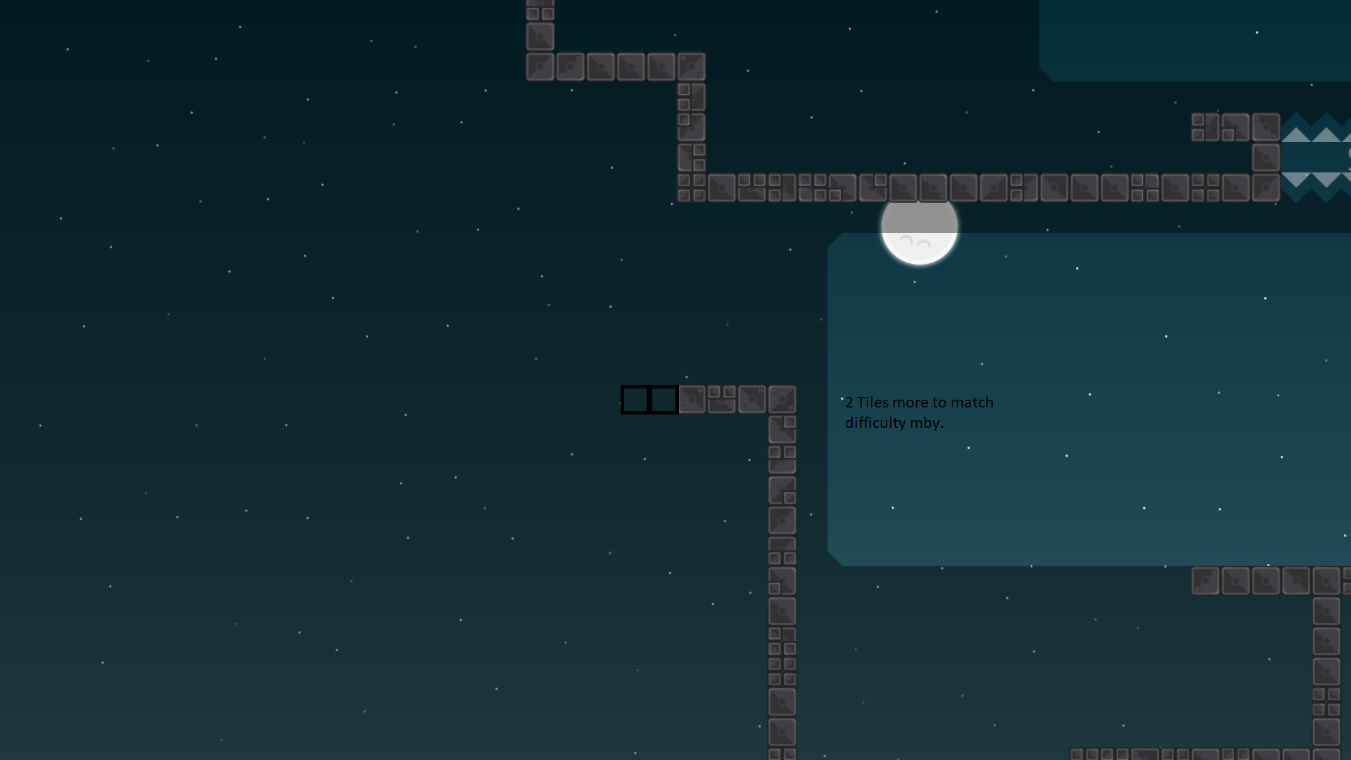
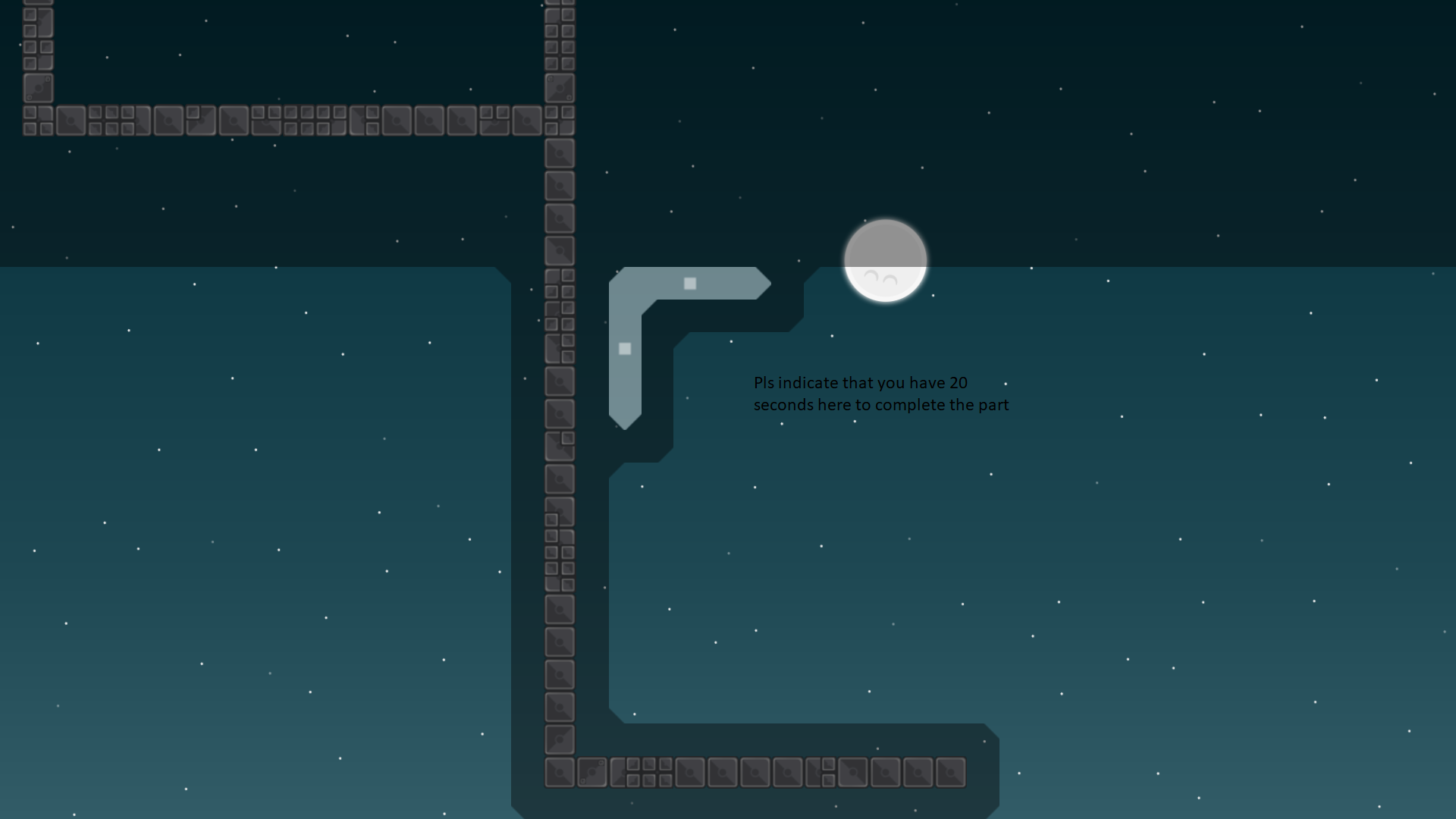
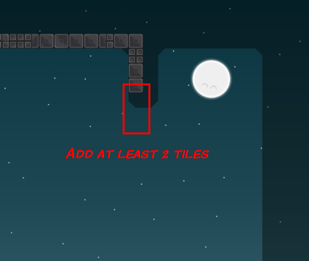
Moon parallax is weird, and there is not enough stars
Once those things are all sufficiently fixed, Ready Brutal 3*
what exactly is wrong with bg
@Raviei dont have that much experience with bgs xd
But here is the fixed version, I didn't fixed anything on bg because im not sure what you mean^^

I meant that if you spectate edges of the map you see there arent stars on the edges (should have enough stars that if you spec with -1 zoom there is enough) and the moon parallax moves only vertically
default zoom
many people play with zoom -1 or even -2
so maps should support it
k
ok i understand, I'm playing also with zomm (-3^^)
The moon is even weirder now xD just give it X2 Y2 or something like that
ok xd
Then it should be good now 😄
thats ok i guess, takes more time than the normal way 😄
agree?
I said you can fix it if it concerns you but don't have to
then u can (i think) release it 😄
@RavieStill waiting 😃
why is the map released without background?
or
@Ravie,
@Learath2whoever released it xd
without background?
it has the same background as on Ravie's last screen for me
okay 😮 for me not, i tried ingame everything but i just see a blue screen
quads turned off or something?
Are your quads and HD enabled?
yep, this was it
thx 😄
:D
