#The_Deserted
"The_Deserted" by PopCorn181 [Novice]
DDNet 12/07/2020 8:06 PM
@PopCorn181

this is your map's testing channel! Post map updates here and remember to follow our mapper rules: https://ddnet.tw/rules

PopCorn181 12/07/2020 8:13 PM

i forgot to add entities off at the tune layers

texnonik 12/07/2020 8:13 PM

looks like ddmax

Ama 12/07/2020 8:53 PM

Parts Mapped Alright

Ama 12/07/2020 8:53 PM

Ideas Ok

Ama 12/07/2020 8:54 PM

But Unbalanced and badly Mapped Transitions

Ama 12/07/2020 8:54 PM

Not thinking at all about 64 players

Ama 12/07/2020 8:55 PM

But you are getting closer to getting something useful

PopCorn181 12/07/2020 9:03 PM

added music and CP Teleport nerf at a harder part

FrosTribe 12/07/2020 10:23 PM

music has to be embedded

@PopCorn181
PopCorn181 12/07/2020 10:23 PM

oops

PopCorn181 12/07/2020 10:25 PM

fixed that

@FrosTribe
triki 12/07/2020 11:28 PM

what is this attempt to build a map? if u need help u can ask me.

allocaツ 12/08/2020 2:06 AM

props for pushing out so many maps, you will be a great mapper one day

triki 12/08/2020 3:37 AM

the quality between the maps began to grow less, I think he needs help

allocaツ 12/08/2020 3:41 AM

maybe he needs another full breakdown of his maps and learn from there, like

@louis

did on 8bits [https://ddnet.tw/testlogs/show/8bits]

allocaツ 12/08/2020 3:43 AM

he has quite the passion for mapping so he would deserve getting some advanced help

triki 12/08/2020 3:48 AM

Oh lol. so many text. thats why better show/help in game.

Marcell_HUN 12/08/2020 10:49 AM

The problem is he is a novice player so he can’t make good gameplay yet

Marcell_HUN 12/08/2020 10:50 AM

But true he does have potential

wsike >.< 12/08/2020 11:07 AM

im novice player

den pa 12/08/2020 3:42 PM

U finished supernova

wsike >.< 12/08/2020 5:22 PM

fake

PopCorn181 12/08/2020 6:06 PM

Changed freeze color, and teleportation color, kept deep and undeep color the same, and added some shadows

PopCorn181 12/08/2020 6:30 PM
PopCorn181 12/08/2020 7:04 PM

Decoration updated

PopCorn181 12/08/2020 7:19 PM
PopCorn181 12/08/2020 7:40 PM
allocaツ 12/09/2020 3:52 AM

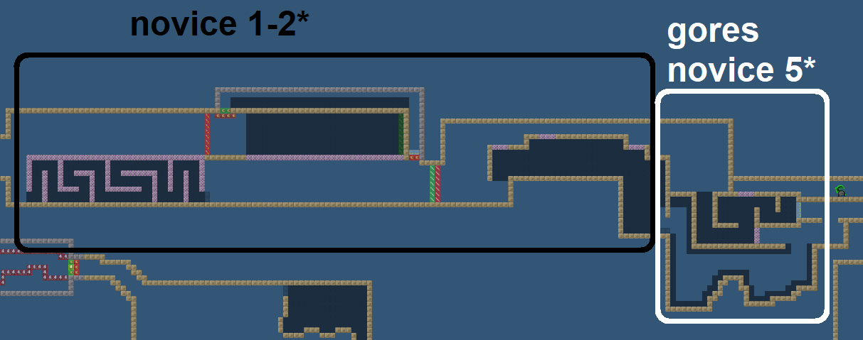
you have to work on balancing the difficulty of parts for you parts might be easier than others, but the goal is to envision a difficulty, let's say novice 3 stars, and build the map such that an average novice 3 stars player could do all parts with equal difficulty

allocaツ 12/09/2020 3:58 AM

do you really want ppl to fail here? and it's not really clear where to drop the tee, the part is just very weak. but you could improve by making it unfaily (add tele at red). (also useless hookthrough at blue)

allocaツ 12/09/2020 4:04 AM

this part is pretty decent, except it's faily at the end, which again I am just not sure about, it feels unnecessary. it's like making a drag part and randomly removing tele tiles to "increase difficulty"... so try to add tele at red (in this reverse L shape, to avoid corners)

allocaツ 12/09/2020 4:08 AM

this part with deep is actually kind of clever, maybe a bit too tight but still. I would consider adding undeep at yellow, so it's possible to go back and help your teammates

allocaツ 12/09/2020 4:14 AM

the blue part is quite nice actually :) the part on the left is a bit too hard imo, especially the thing I marked red. make it smaller, and you can also just replace the deep with freeze because your teammate is already deep and it'd be annoying to accidentely touch some deep and fail

allocaツ 12/09/2020 4:17 AM

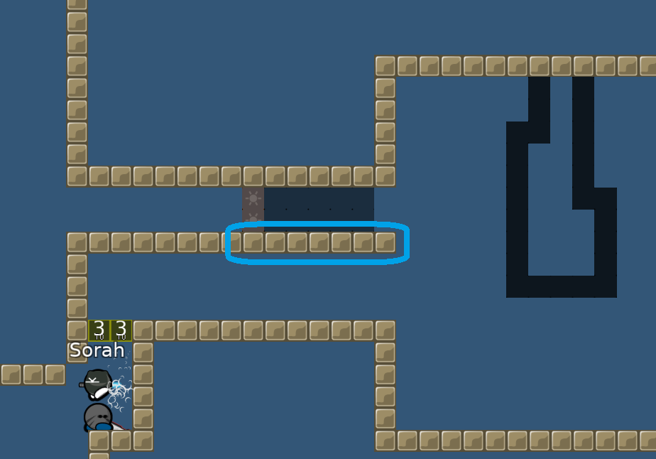
why no hookthrough here?

also pretty hard to put deep there, increase the ceiling there

allocaツ 12/09/2020 4:20 AM

you should add undeep at yellow in case someone accidentally (or intentionally) skips the undeep down there. it's important since there's a stopper and you would be fail. pretty hard to do, but technically possible

allocaツ 12/09/2020 4:25 AM

a very boring part. try to spice it up. like adding something that requires the interaction of your teammate (e.g. you hammer him into an unfreeze and he must do a little gores, where he falls back down if he fails)

allocaツ 12/09/2020 4:28 AM

the solo is tooo hard, make it less tight. weird is that unexpected drop after unsolo. you should definitely put the unsolo at blue, because you would just block each other

allocaツ 12/09/2020 4:31 AM

this drag could be good if it wasn't so tight. especially blue is quite annoying, having to go back if your mate doesn't know he must hold D there. make it less tight and add hookthrough so you can drag him back

allocaツ 12/09/2020 4:32 AM

that's a really sad deep, you can think of something more clever (and less tight.!!)

allocaツ 12/09/2020 4:36 AM

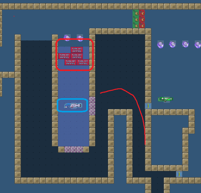
Ok, so here the turnoffentities is spam, you should make 2 grenade so you don't miss it when falling down. and make the platform where they land bigger, because most of the time the dude will just drop down right away

allocaツ 12/09/2020 4:38 AM

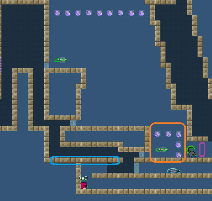
the shotgun and shields at orange are useless, just add shields at purple. shooting your mate with shotgun is sooo slow, you can speed it up by adding stoppers at blue.

allocaツ 12/09/2020 4:40 AM

that drag part is fine

allocaツ 12/09/2020 4:42 AM

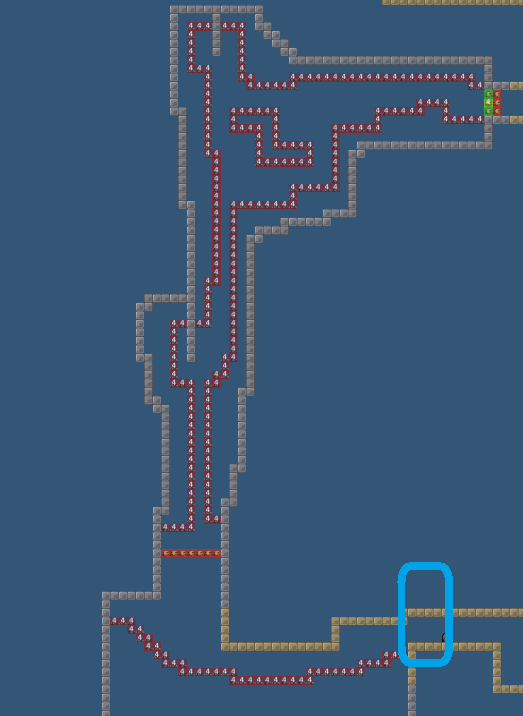
for that laser part, you should make hookthrough at blue because the alternative of jumping up and hooking your mate out is not the unfailiest thing

allocaツ 12/09/2020 4:45 AM

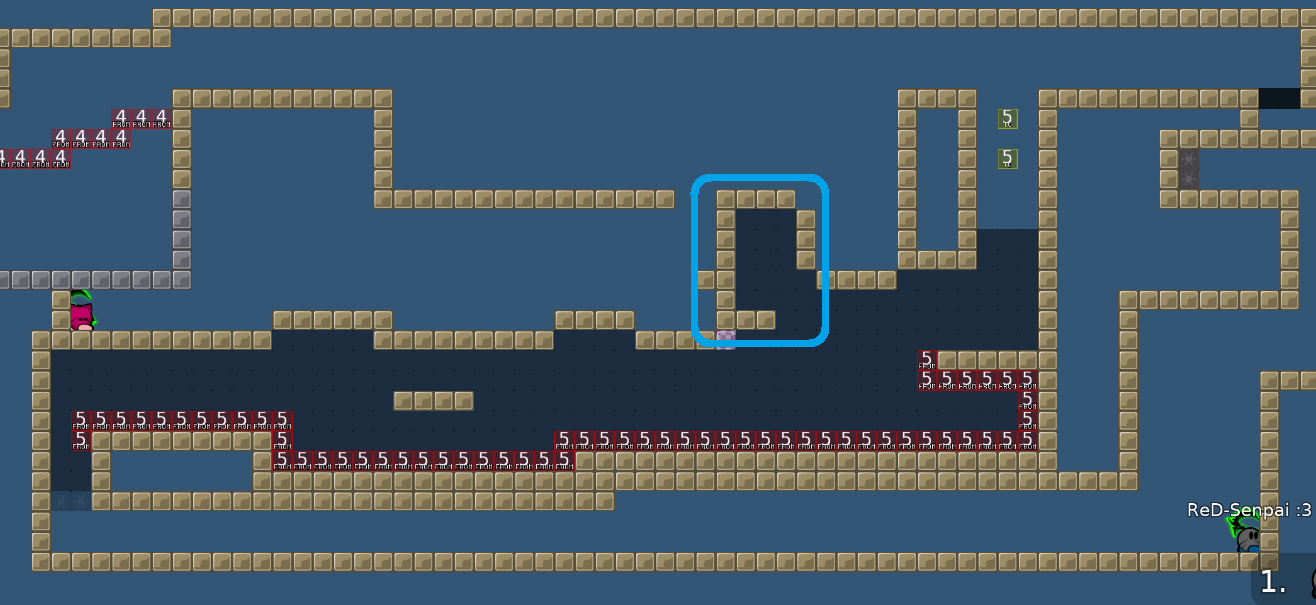
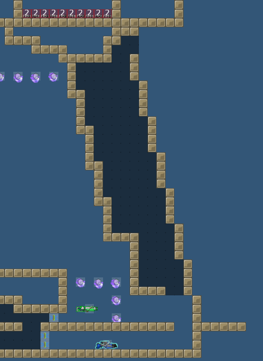
deactivating hammer here has no use at all! what's good about the part is that you can reach your mate on every pixel down there at purple. also, the spam

allocaツ 12/09/2020 4:47 AM

last part is quite difficult. i would just move the ceiling one block up for a bit more space

allocaツ 12/09/2020 4:48 AM

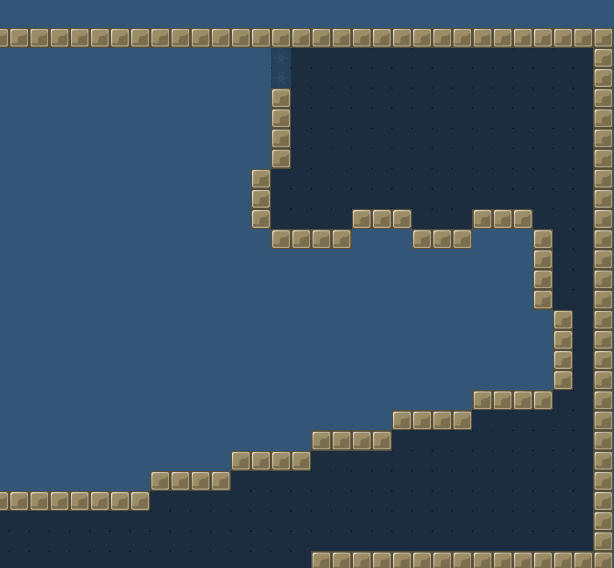
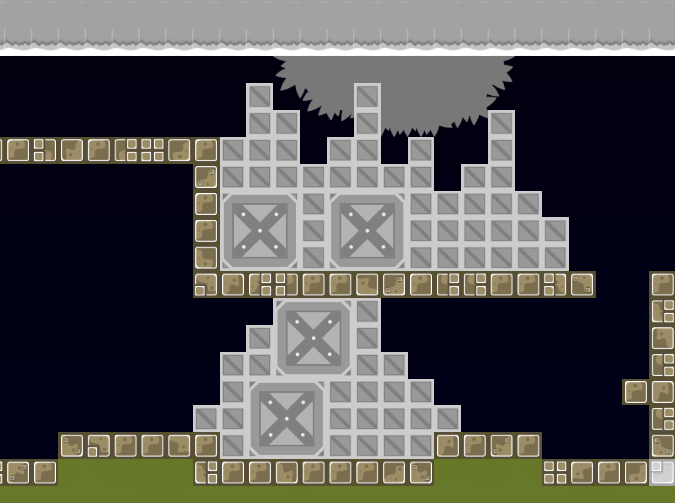
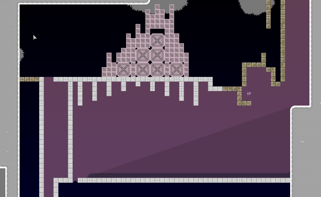
on design, these blocks look like solid blocks. you should put the transpareny wayy down

allocaツ 12/09/2020 4:51 AM

the freeze color is just not very aesthetic there's color theory which suggests using colors that either complement each other or support each other. Red tele + dark yellow freeze is not really a good combination. I personally like making the freeze a color, and then the tele a more darker version of that
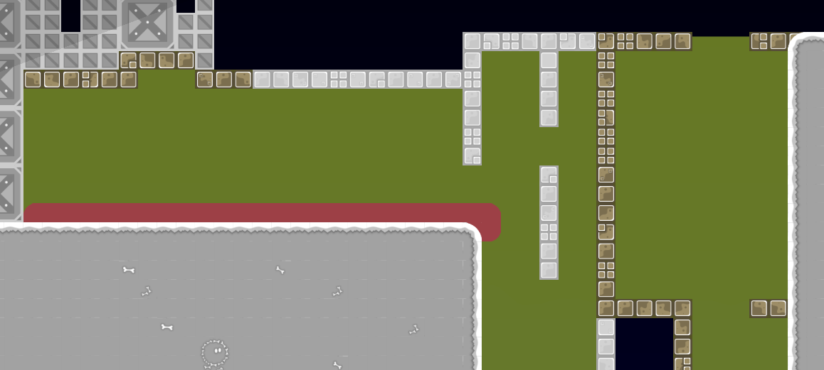
allocaツ 12/09/2020 4:56 AM

maybe something like this, as an example. purple as freeze and darker purple as tele

allocaツ 12/09/2020 4:56 AM

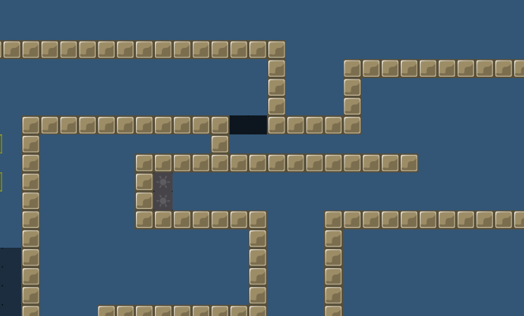
these shadows in the freeze you put there are actually a nice touch, i like them

allocaツ 12/09/2020 5:01 AM

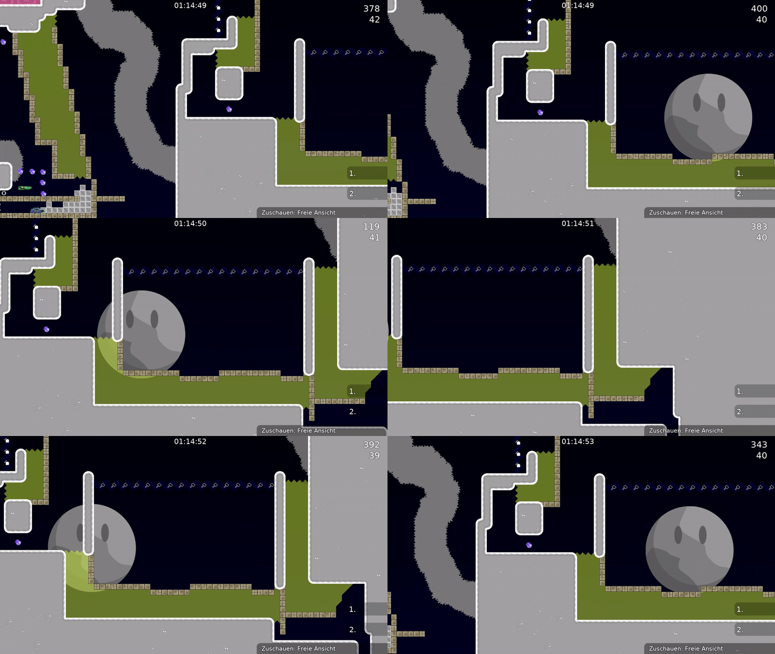
this moon moves too fast, and here it's also a bit too off-center for my taste

allocaツ 12/09/2020 5:05 AM

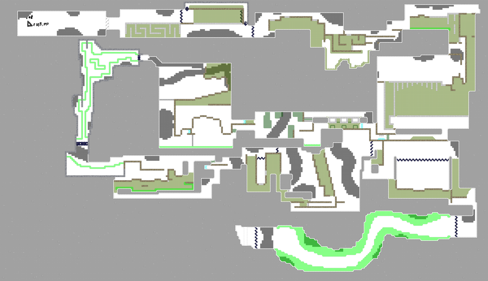
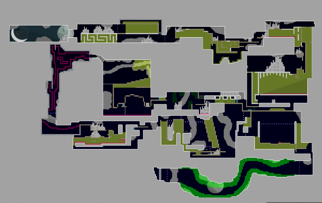
there's one fundamental problem you always seem to have you allocate space and try to fill it with a lot of content. the end result will always be that your parts are tight and have no room to breathe in

allocaツ 12/09/2020 5:07 AM

if you look at a modern novice map you will find that it uses a lot more space. it feels just so much fresher and you can develop a very nice straightforwardness / flow. you rarely really want to go backwards when playing a map.

allocaツ 12/09/2020 5:10 AM

if you would start laying your maps out like this it would be much easier to work on, because you can actually move parts around and make them bigger / smaller whatever.

i often said "this and that part needs more space" the problem with your layout is that it doesn't allow space! so how are you even supposed to fix that?

this is why you often just get to hear "try to learn from the mistakes here and make a better map next time" because it's not really saveable / workable anymore

so really, if you want to improve the next best step is to lay your maps out with much more room to spare.

PopCorn181 12/09/2020 6:46 PM

Thanks for the advice i'll fix that!

PopCorn181 12/09/2020 7:42 PM

fixed most of that

JoaoGardaBro 12/10/2020 1:06 AM

i want test 👍🏻

Boti. 12/12/2020 5:02 AM

make the deep carry part easier and the jetpack part.

Boti. 12/12/2020 5:07 AM

At the end purple or Yellow tele would be nicer i think

Boti. 12/12/2020 5:08 AM
Boti. 12/12/2020 5:09 AM

At the red stuff instead of deep would be easier with freeze

Boti. 12/12/2020 5:11 AM

And bcs of deep people could block at that part easy

JoaoGardaBro 12/12/2020 5:30 AM

the map is boring for a novice map, the newbie will get stuck at the beginning

JoaoGardaBro 12/12/2020 5:31 AM

but its cool gameplay

allocaツ 12/12/2020 7:15 AM

you fixed a few of the things, and the purpose of that was so you keep learning what small details you should notice but the map is not still not near releasable, still too tight and just too few of working parts / unique parts / clever parts. I gave you an informative description on what your next steps would be to improve on your next maps. I would love to see you rather spend time on something new, so you can surprise us on your mapping journey with your next maps

allocaツ 12/12/2020 7:15 AM

$decline