this is your map's testing channel! Post map updates here and remember to follow our mapper rules: https://ddnet.tw/rules
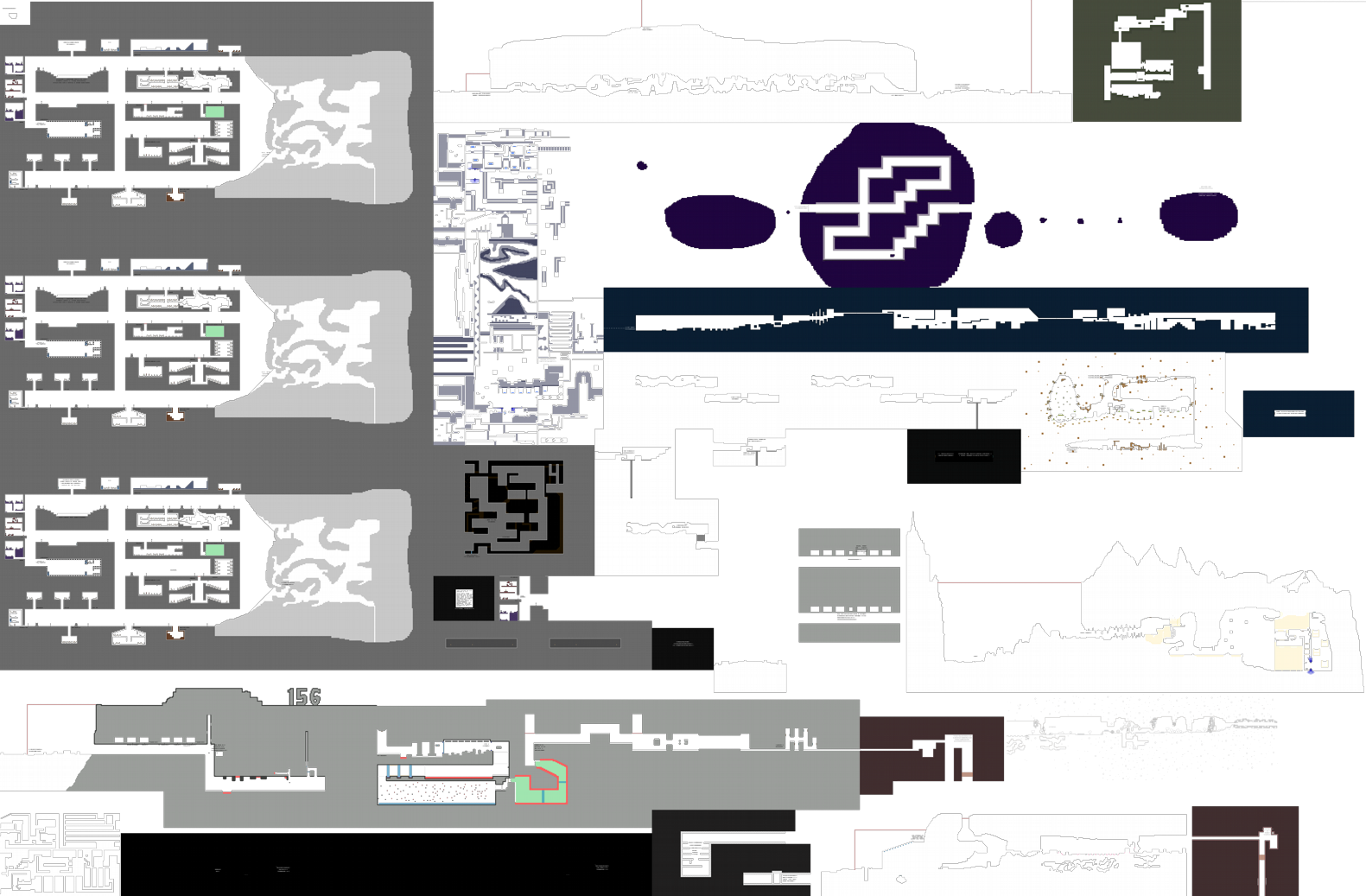
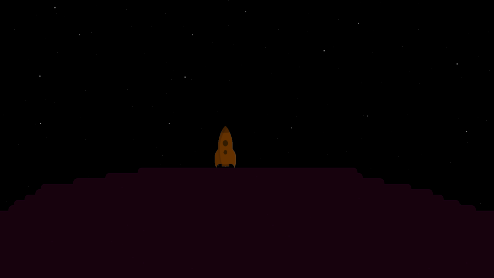
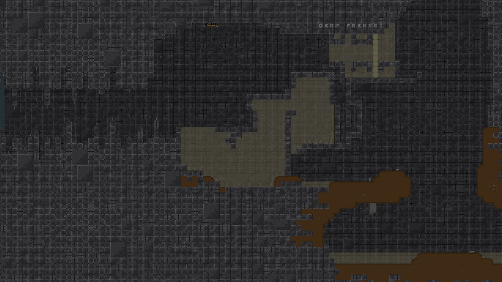
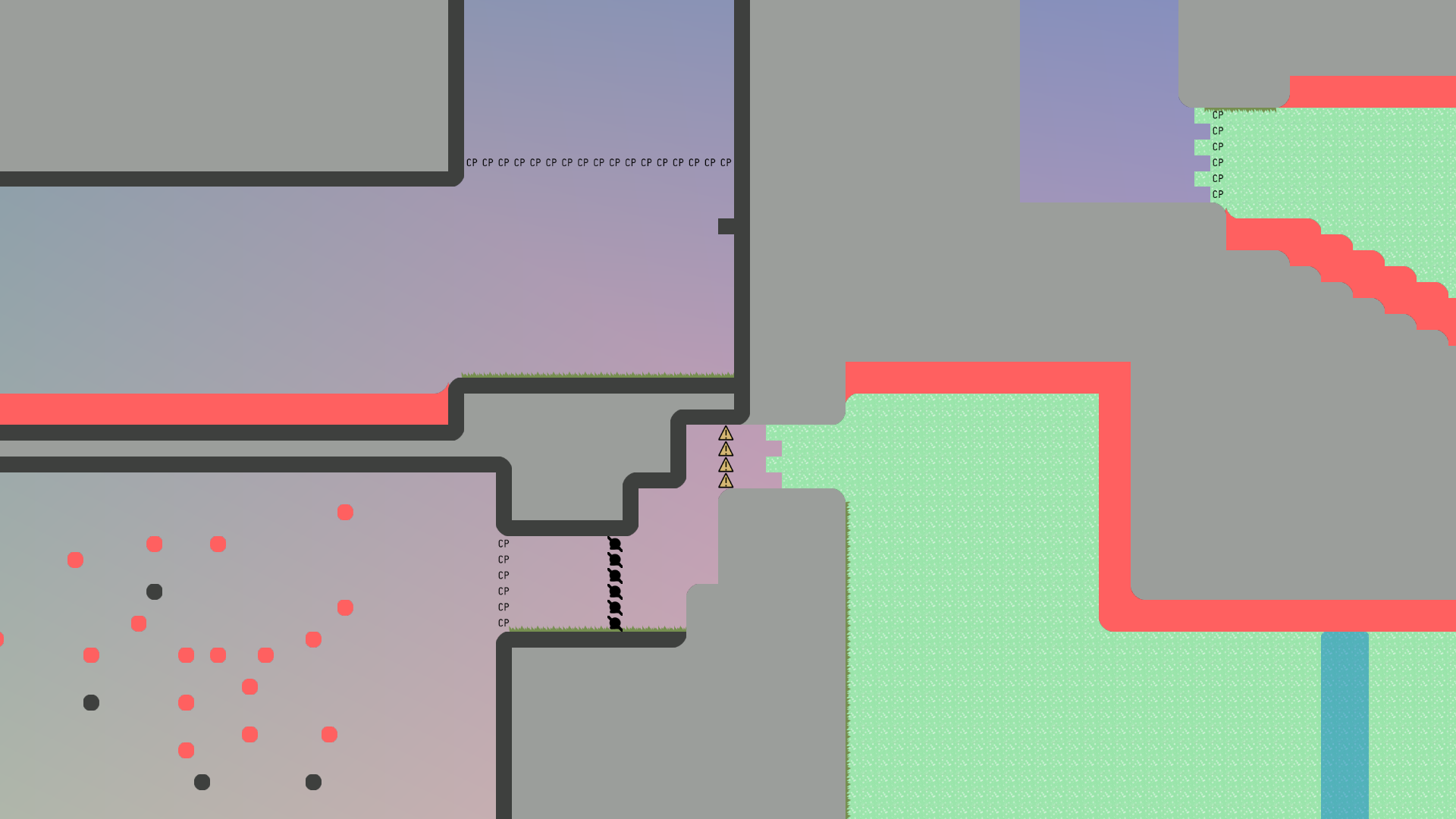
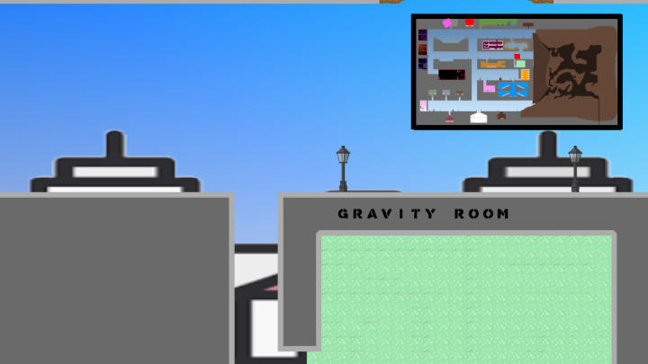
The largest map of mine. Built at a time when 0.7 did not exist (the release of 0.7 contradicts the plot in the map). Map in 2 languages: ENG and RUS.
Video trailer: https://www.youtube.com/watch?v=P6uH69arMS8
wow
cool
Wow
This is probably the most indepth Fun Map I've Ever Seen
2.38mb
big map
I can't open the map preview mode, the browser crashes XD
the bg image is pixelated, and stretched
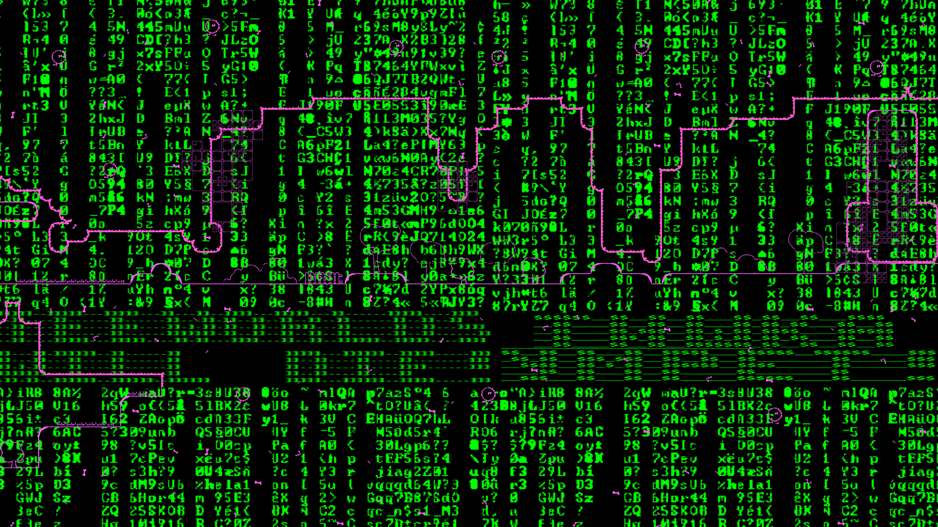
ik we dont have many fun maps etc but idk.... shouldnt we have also fun maps, mapped 2021 style rather than 2011 style? im not saying map is bad at all! i like adventures maps. Im even making them xD but here there are multiple scenarios where visual/design is kinda odd. Like the matrix one, its really hurtful for eyes making me play with entities in an "adventure" map. Meanwhile some others are nice chill bg and a spooky room those are nice yeah but others are just soooo basic. And for last last maybe update the animations, like the backgrounds with better parallax for each and other stuff. edit: forgot to mention an example for it, like the city background. Playing it for long since its kinda "long" can be really harsh. Its stoo stationary and huugeee with really low resolution. If u put a bit "extra" effort would become a realllyyy good map to play and idk maybe could be release as solo? if some parts added but thats upto you or testers (also irrelevant). other edit: also goes for theory of fail 2 (but i like that map better than this one so for the other less fixes than this one but still) ^-^
matrix part is the best
lol one of the maps im working on is 5 mb
For some kind of global story about the game, I think the basic design of this game fits with it. Regarding the bg of the city - I agree, you can fix it. This map used to go to Moderate, but it was never published. This map has a lot of textures that I compressed so that the map took up less place on your computer.
Its still bad bro imo. Design is not good. You can make better designs and animations with better and less mappres
thats why im asking the testers or mods. Why fun srv doesnt need rules

🤷♂️
$decline reason in
#❌🎉up