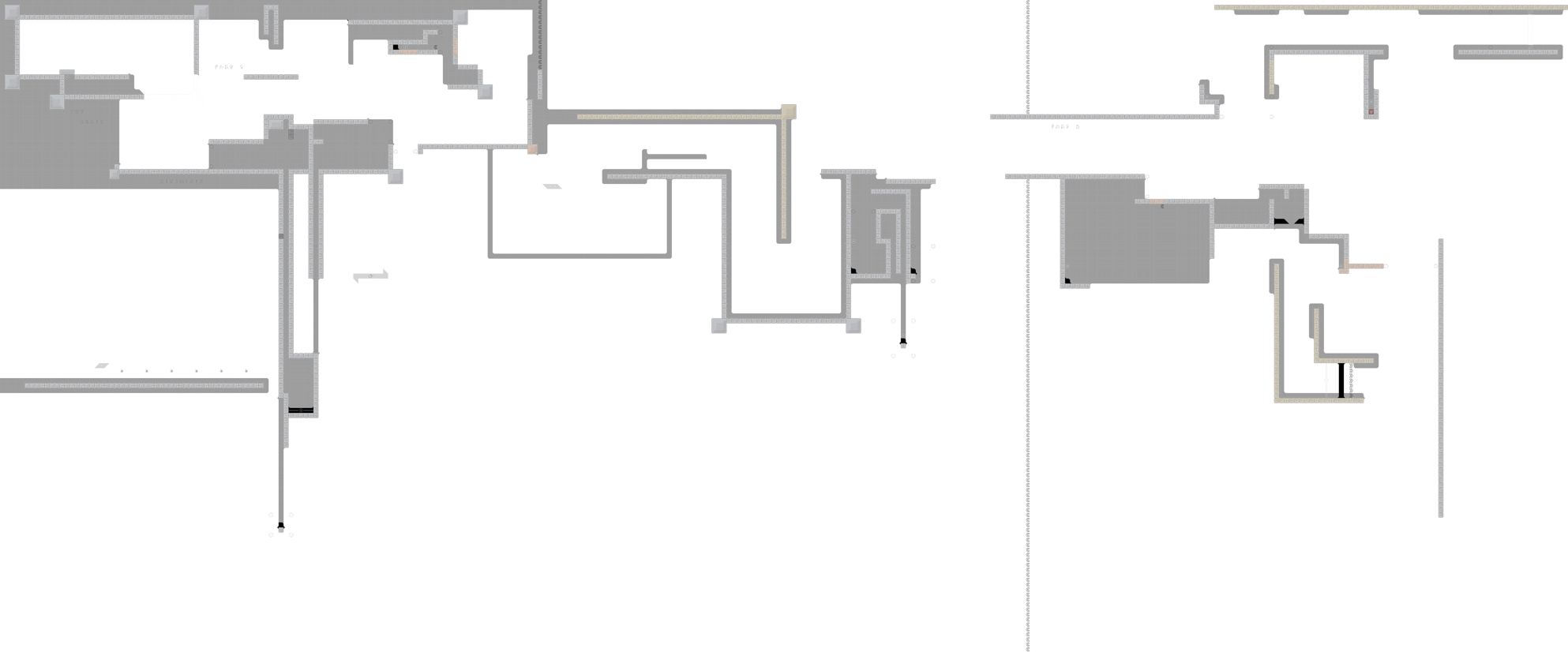
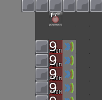
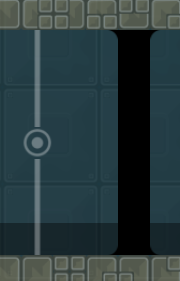
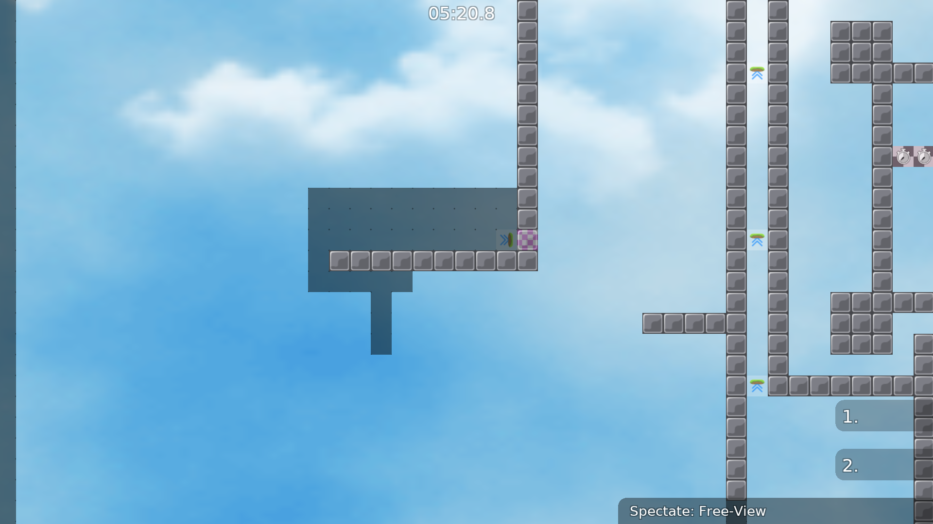
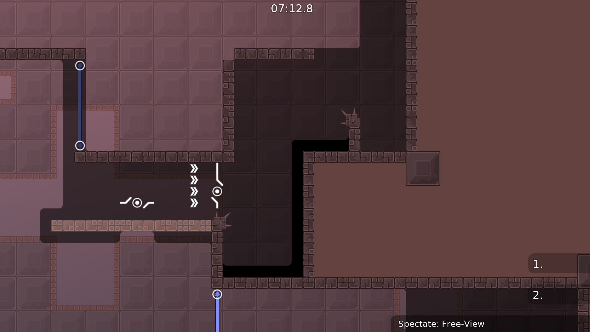
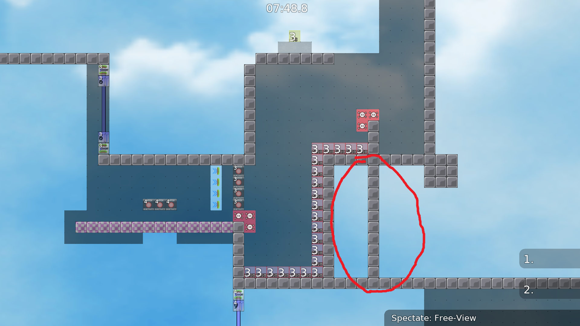
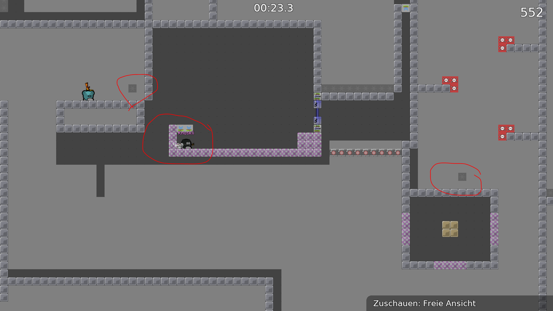
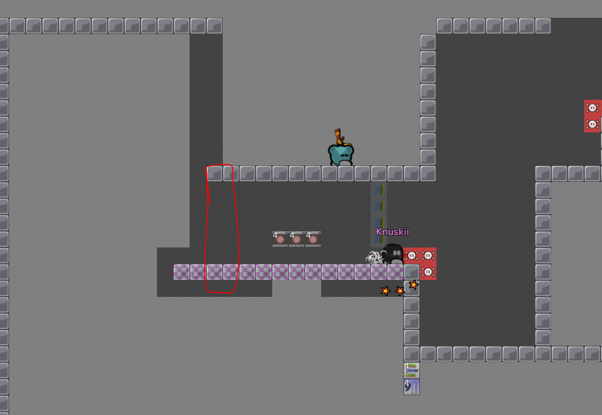
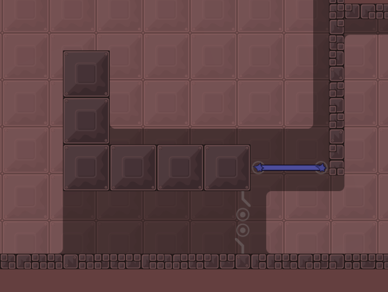
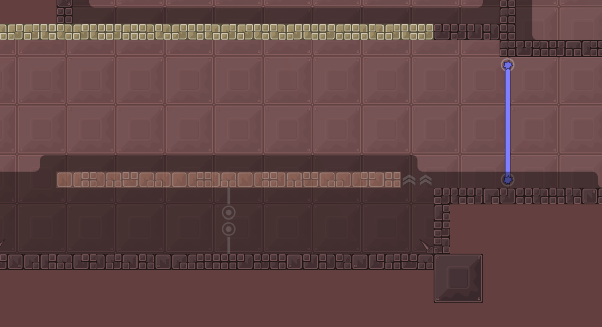
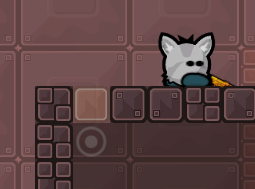
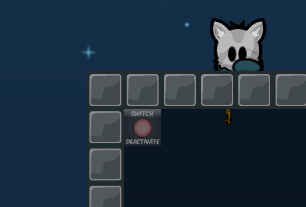
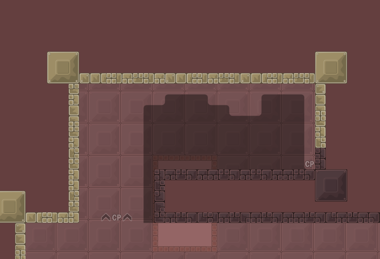
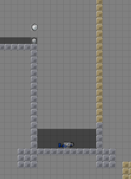
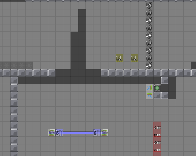
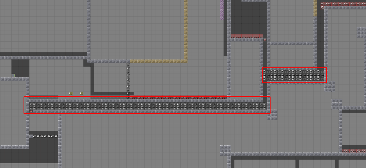
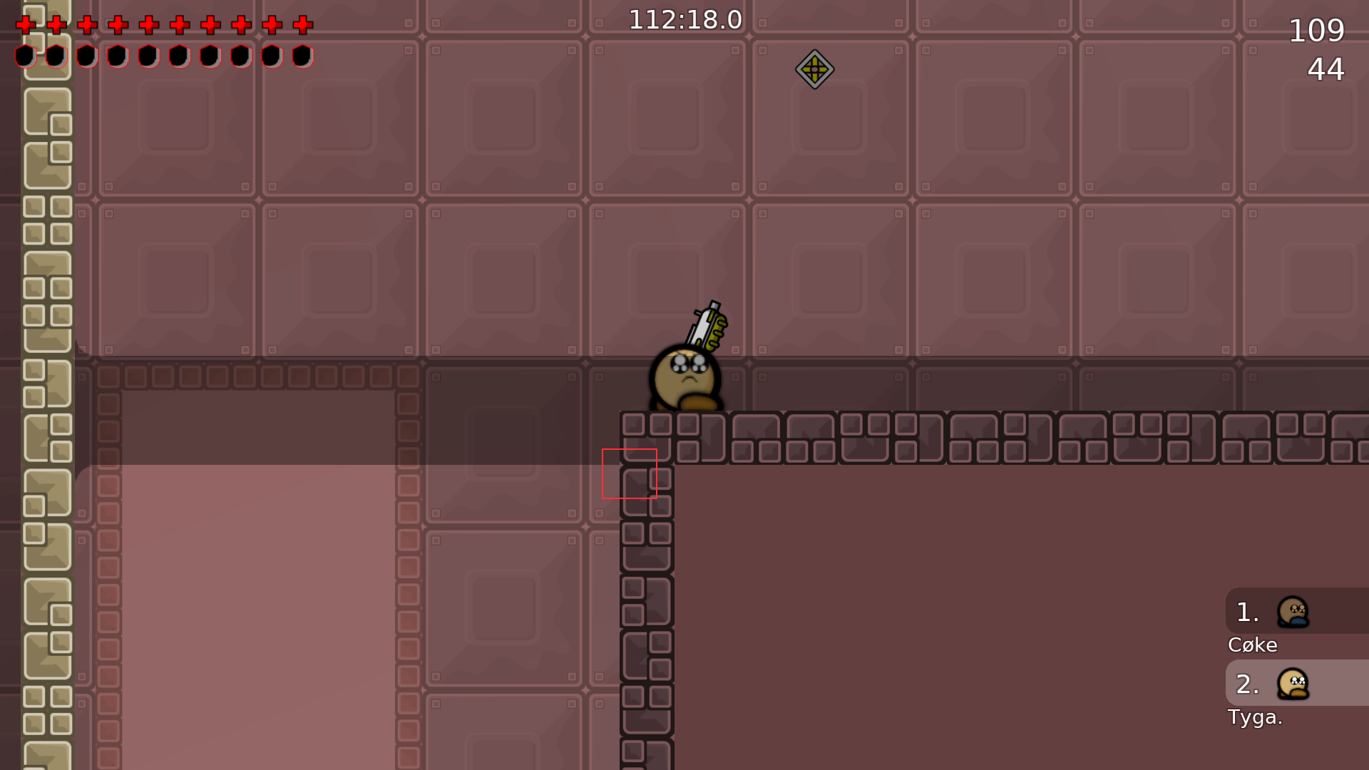
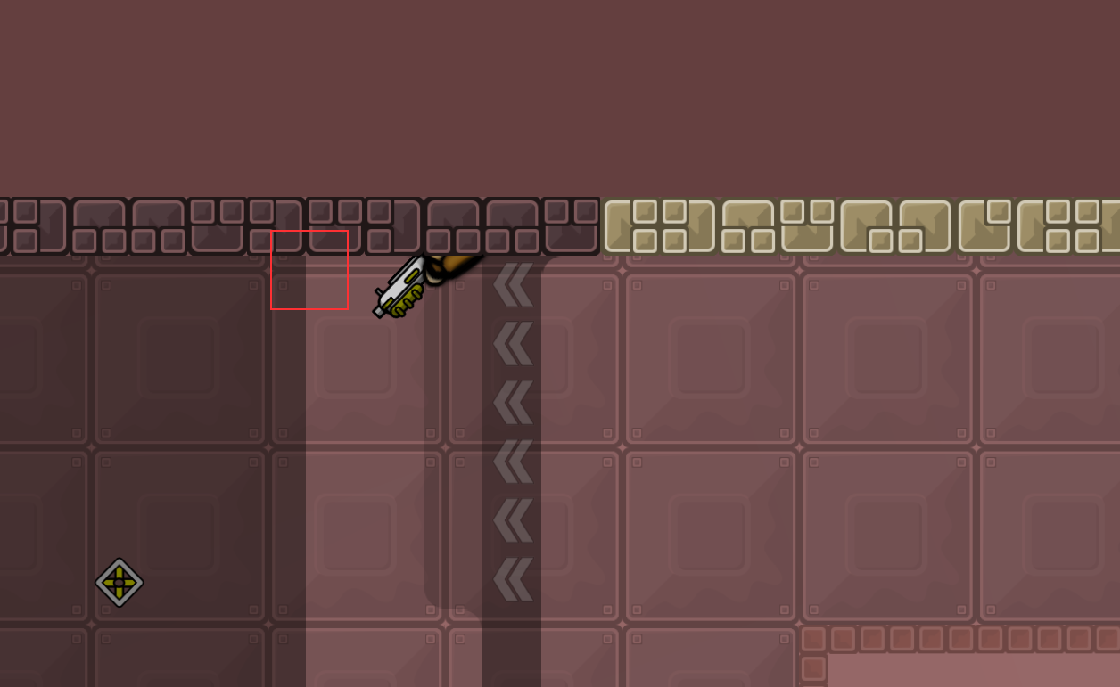
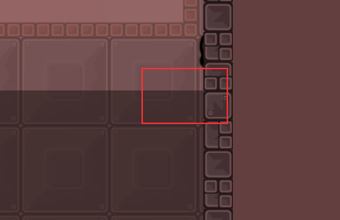
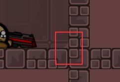
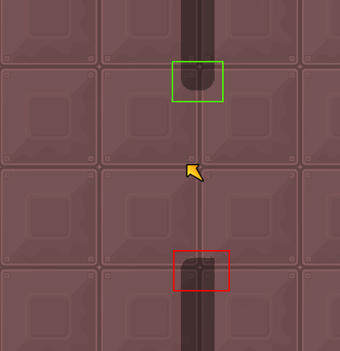
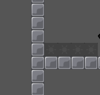
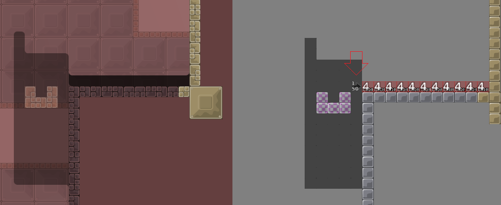
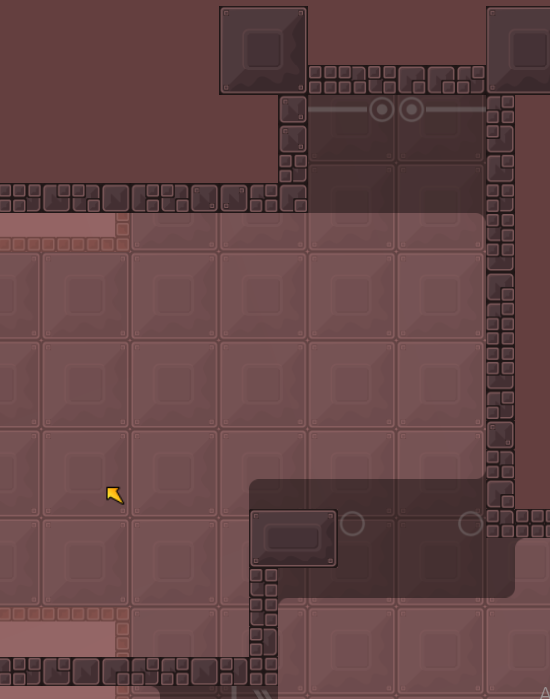
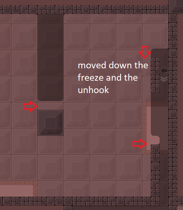
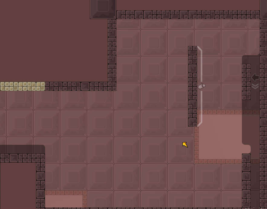
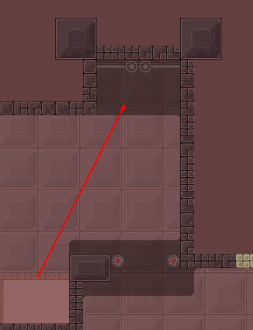
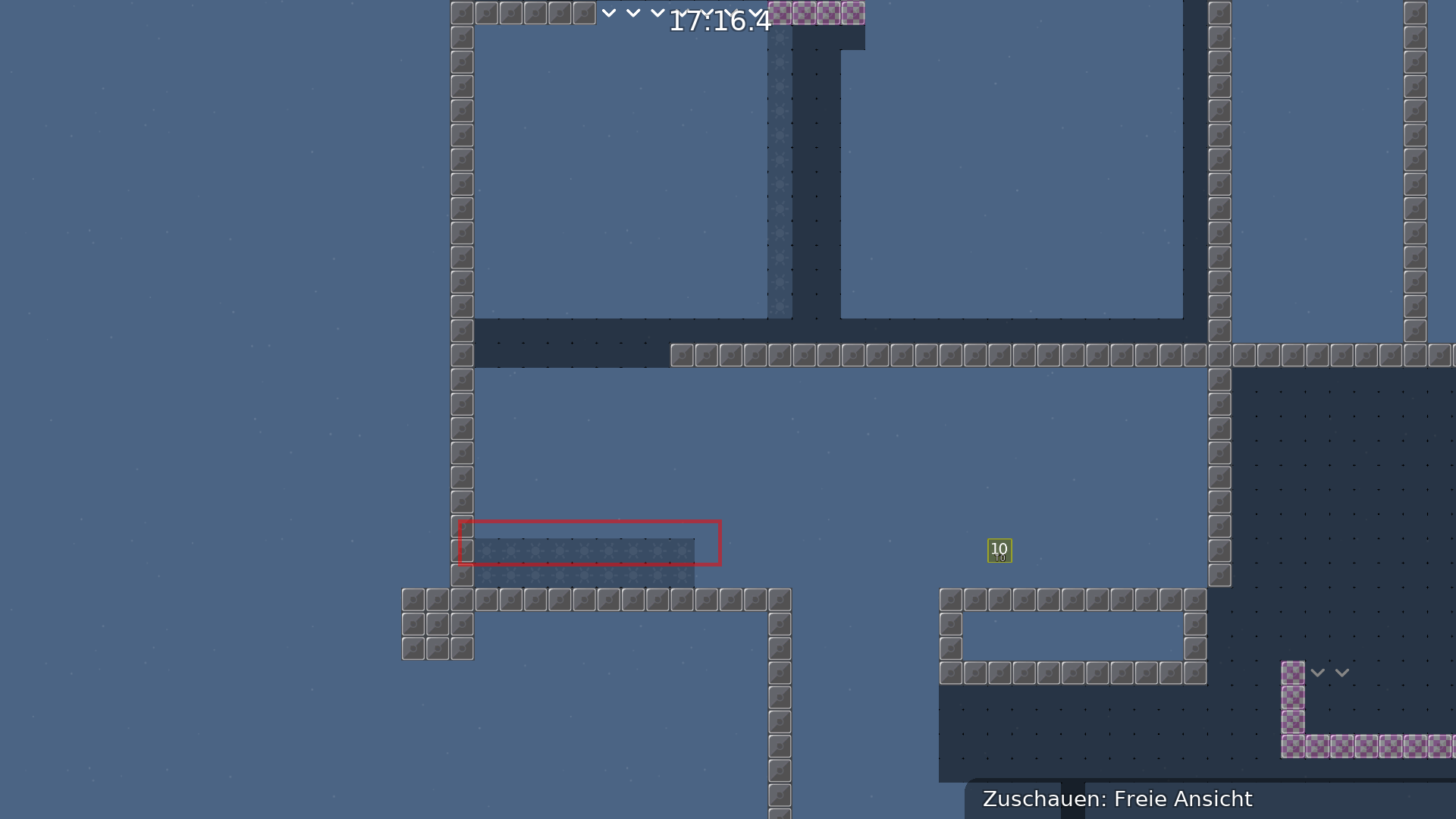
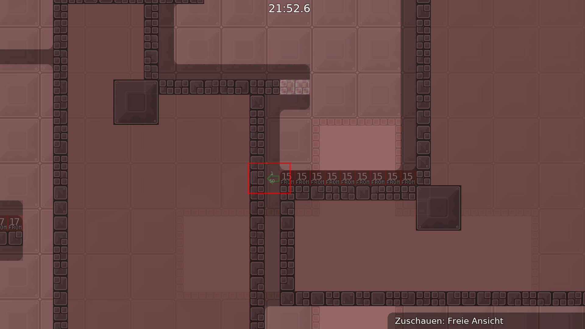
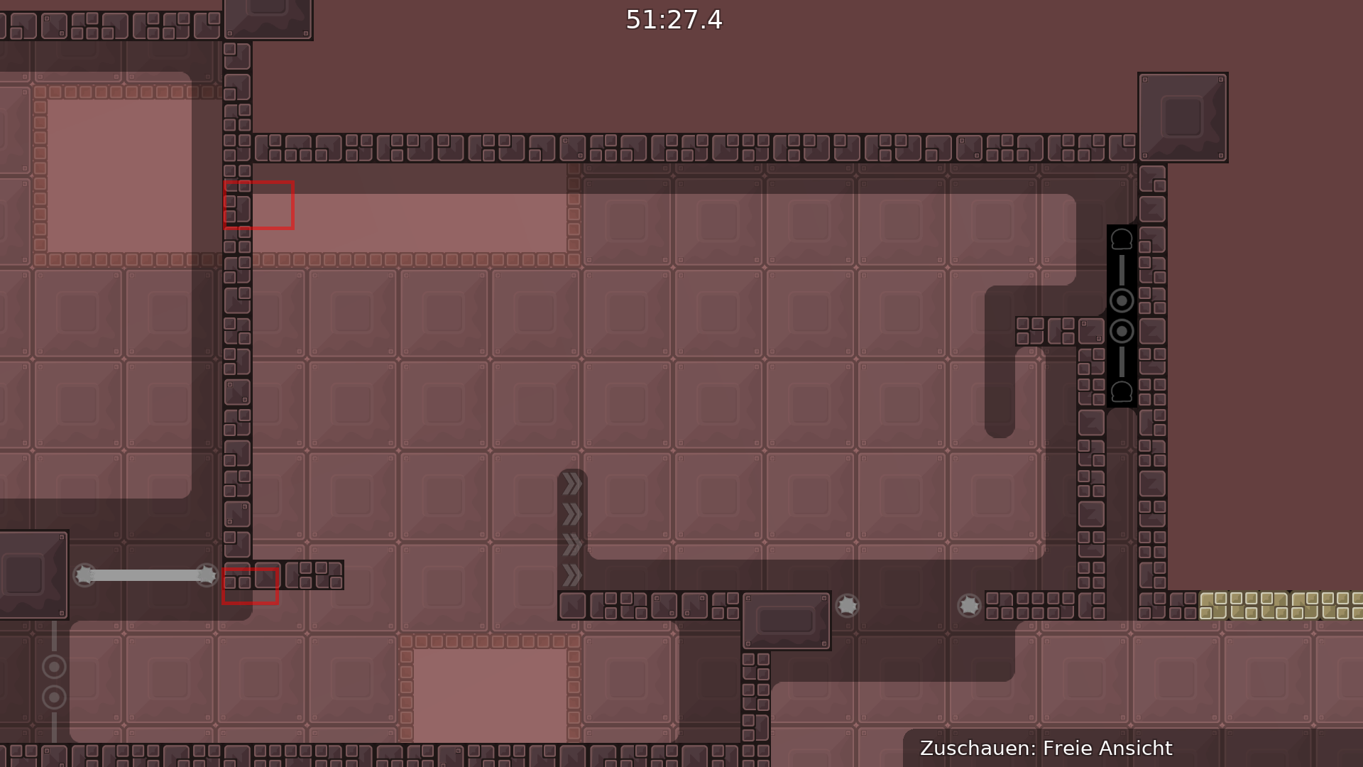
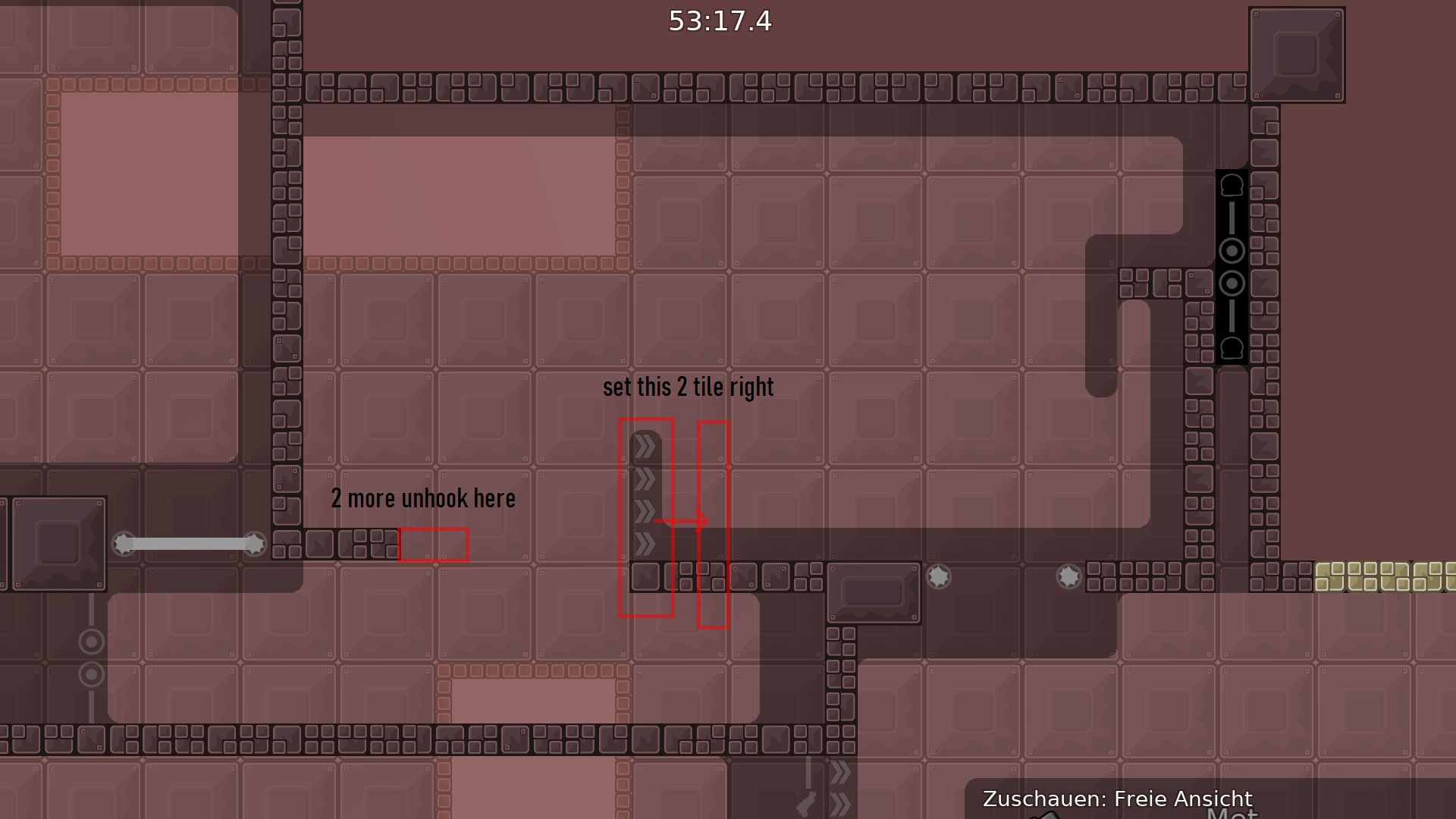
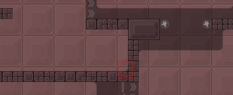
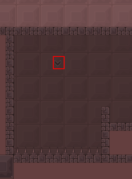
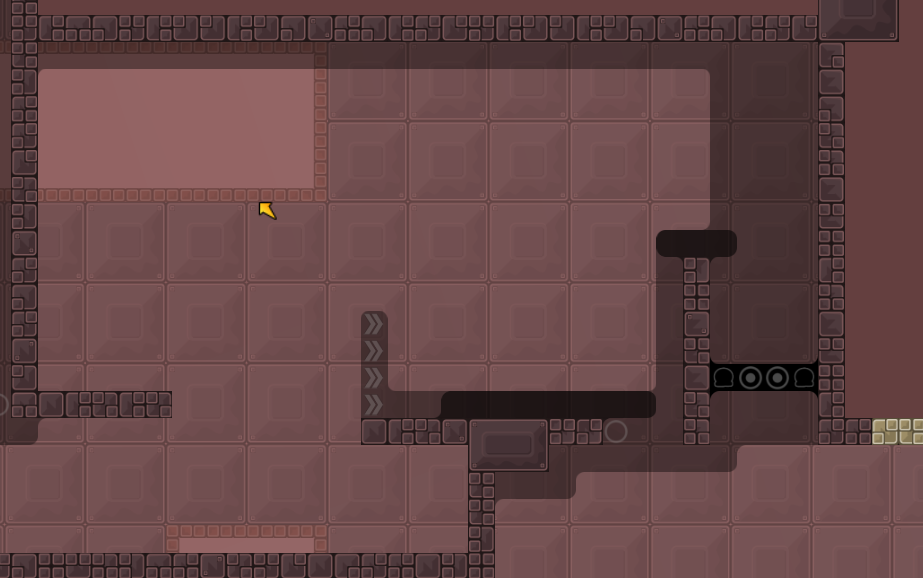
maybe 2 parts it's too short
1 minute by part
Thanks Dark
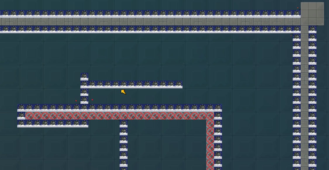
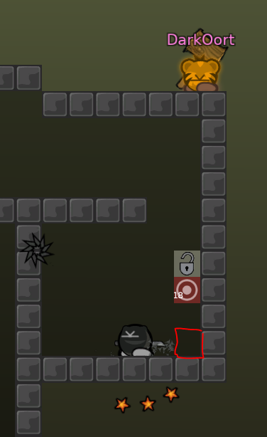
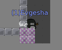
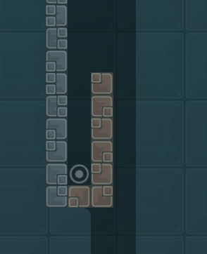
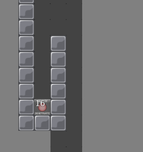
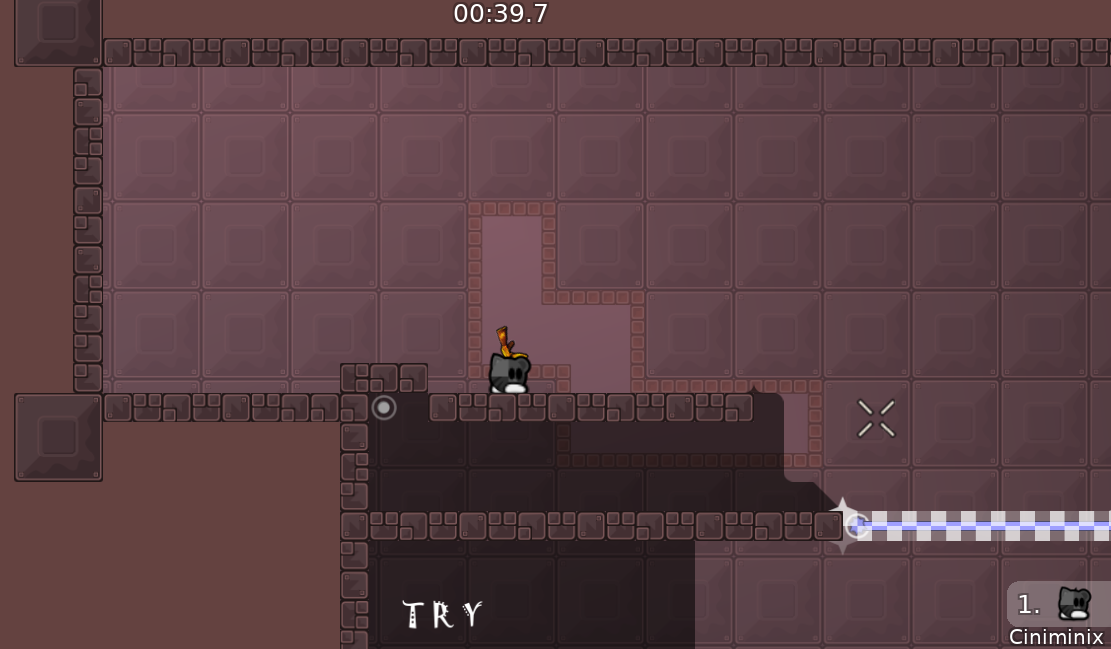
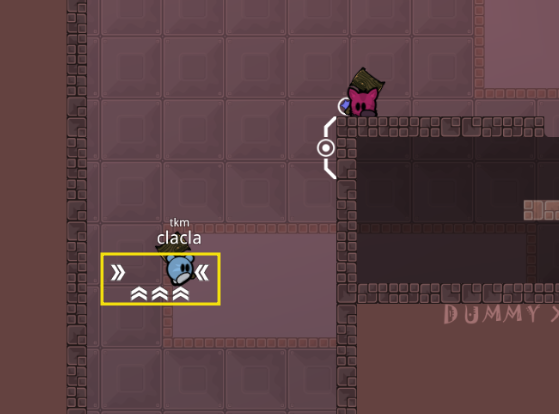
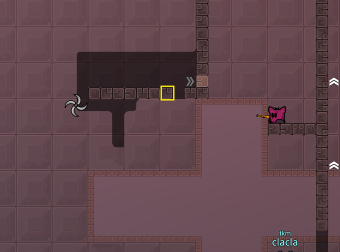
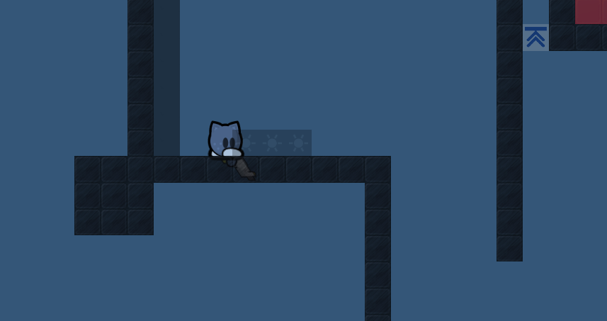
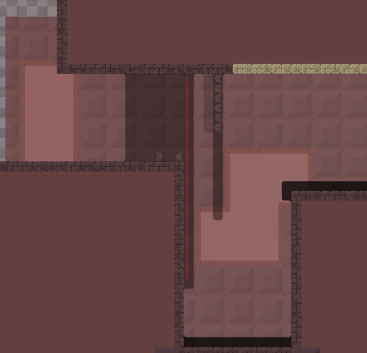
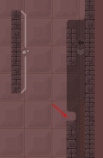
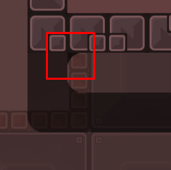
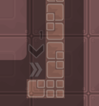
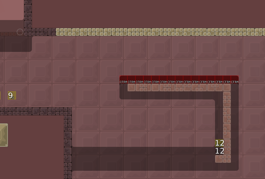
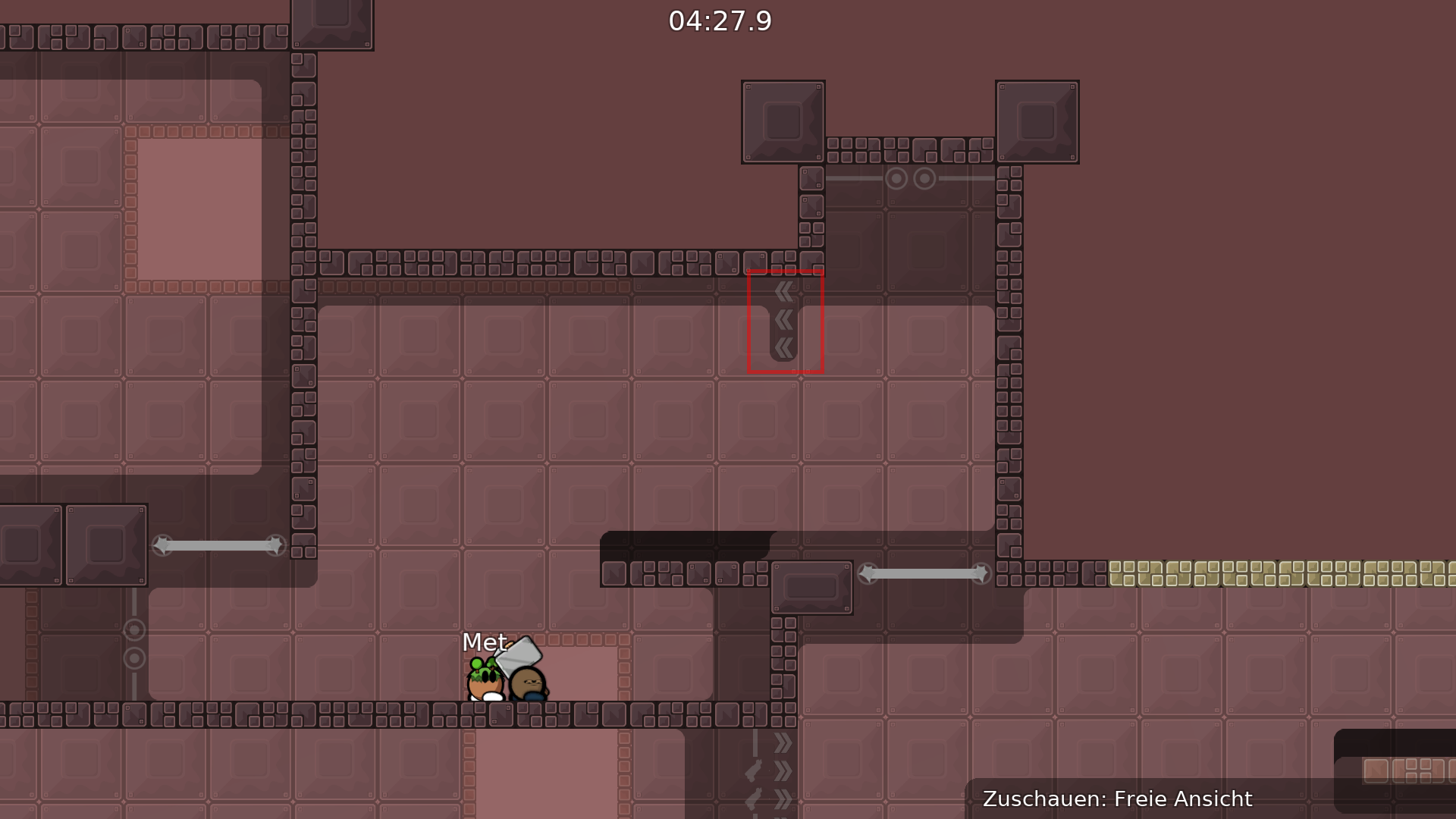
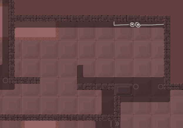
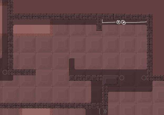
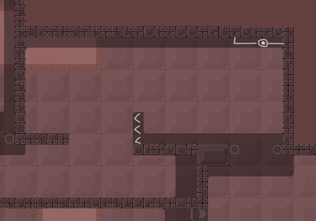
and added more hookline (photo)
Hooktrough block* (lol)
And I'm work on the 3rd part,and maybe 4th
Updated version
killing tile removed and added,and the part unskippable
Oh..I'm editing it
^ have a look at this
we figured out that the map is broken because of blocker "DarkOut" send
fix it please, or tell us that we're doing something wrong
but seems map have not another ways
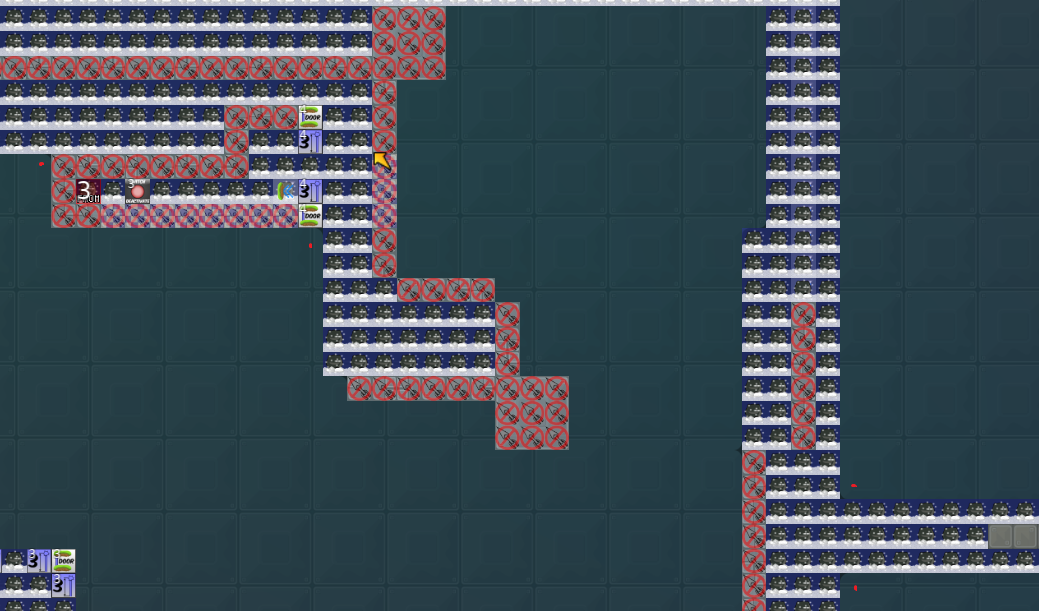
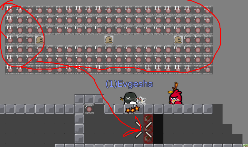
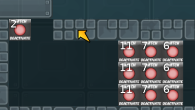
- About 2nd bug again. If you start in team0, then join team and do not touch this deactivators - map is broken.
- So, map must force player to join team immediately. To deactivate everything that should be deactivated
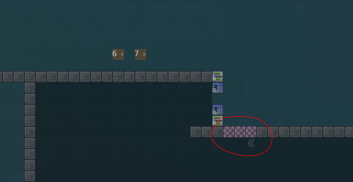
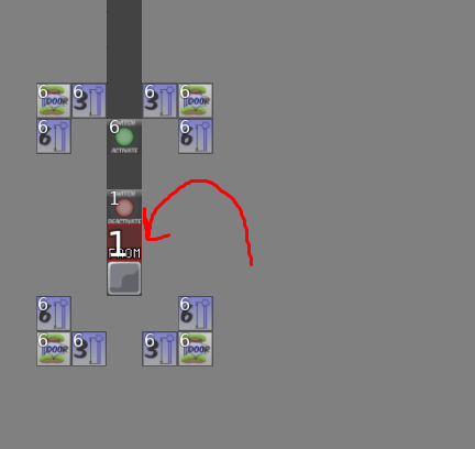
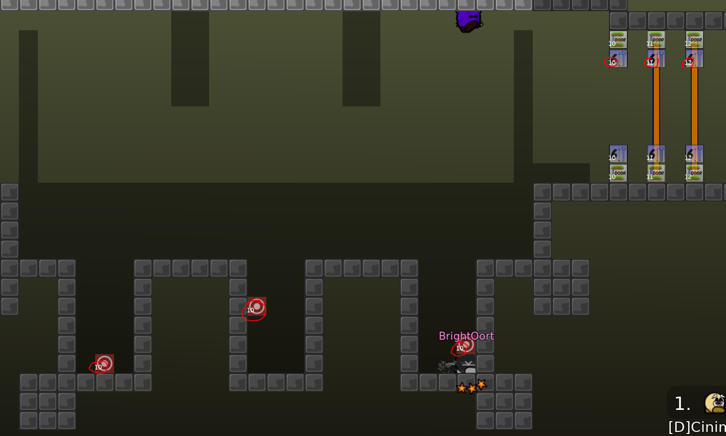
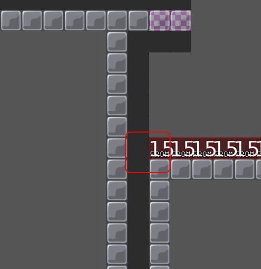
don't deactivate switches with tiles, instead use
(as described in the link in posted)
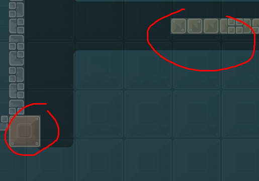
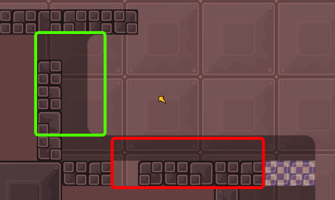
Its the same percent transparency of hookthrough tiles. Not good
Can doors switch when im toggling super?
I mean Im toggling super on, then off and door closes. Looks like..
yea
ok
after using super switches go back to their default state I think
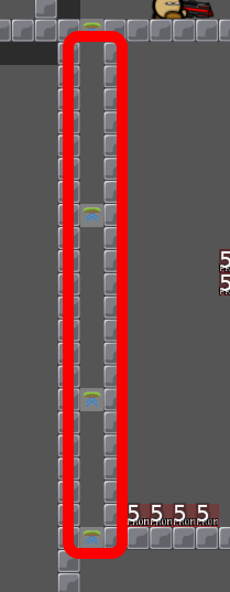
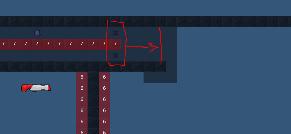
also you can place two
, to prevent teleporting at the same time with dummy. Somehow.
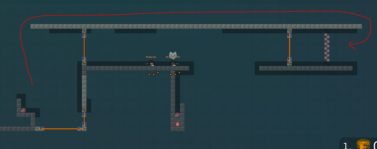
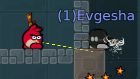
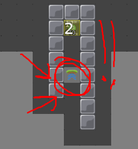
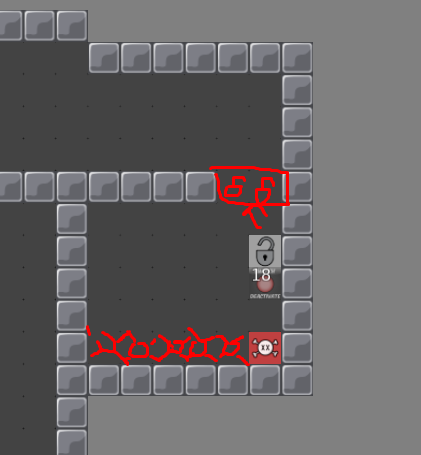
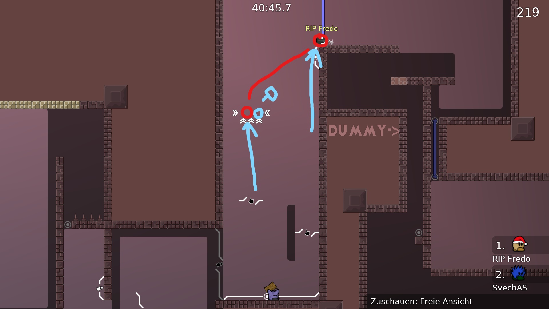
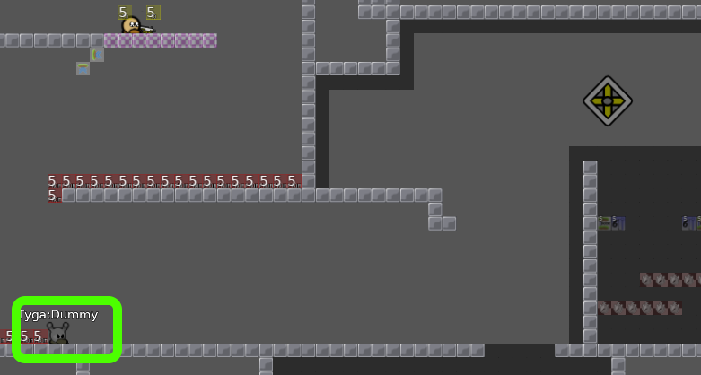
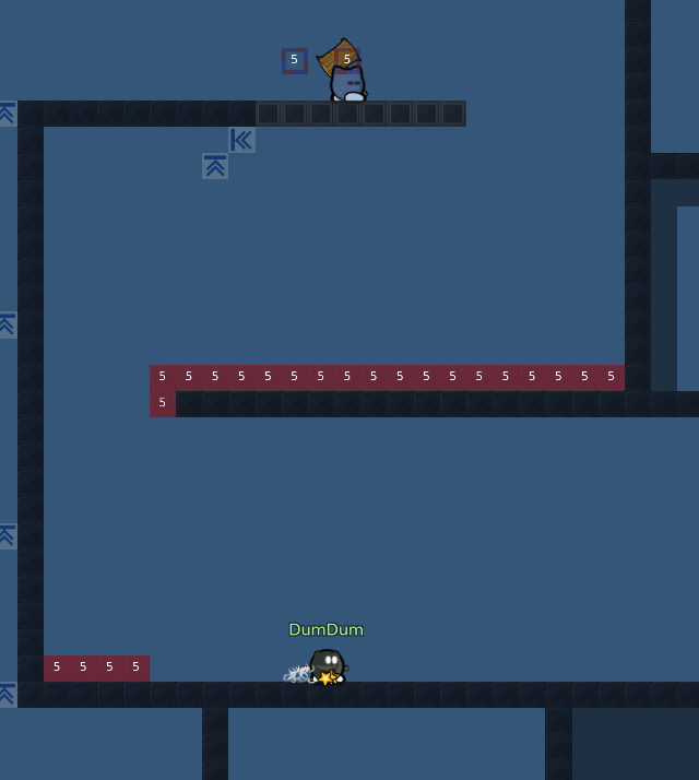
- Easy cheat with bug №4 Step 1: place dummy here
Step 2: go solo
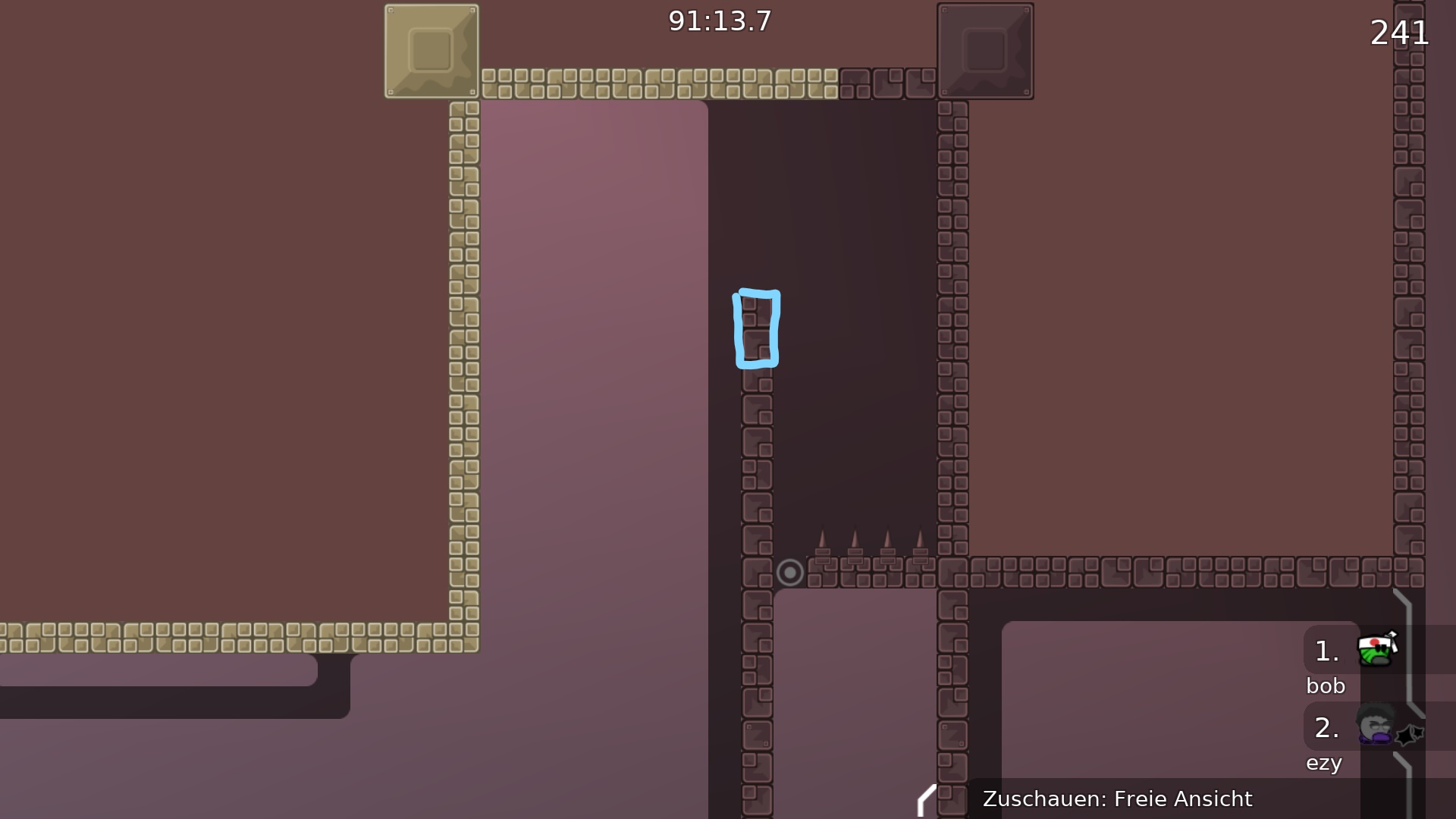
I understood what's wrong about that walkthrough (blocker)
it is meant to be reversed
Thanks for the help.But some things I don't understand.The tenth error the step 2,I do a solo part?I really don't understand what wrong this, maybe I'm stupid to do this
And yeah,i see cwhat's wrong with the eighth error,i improve.
Just leaving dummy behind and go to deactivate door
11.
Oh okey i understand.
Lol, not really design, but gameplay bug. Place blockers
- About whole map: You said that "its not braindead and force you to think", but I would disagree. Part 3 and 2 are very intuitive and easy. The first also intuitive. Map is about "Just go into the door you just opened and open another". Its OK for playstyle, but there is one big mistake. The first door you need to open in game is not intuitive and force you to think quite a lot time before doing something. And after opening second door you're just going non-stop. So, "intuitiveness" of the first door should be fixed.
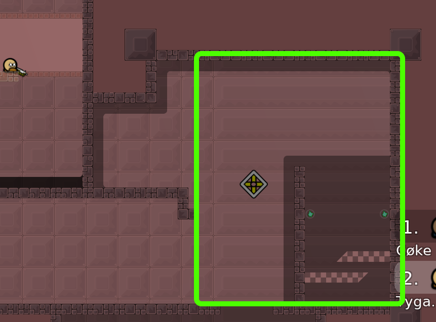
So again its about cheated top-times. You will just fully skip PART 3, finish with dummy and kill yourself
**No more big bugs found in first test. Waiting
@Ciniminixto fix all these**
After fixes will be testing balance of the map
Okey thank you,but i dont have a time now. I and my family going to holiday.
have a nice holiday then
Thank you!😌
design is insane imo
in a good sense?:D
I don't think so
Idk, ask him
if everything was true, it was done, it has changed quite a lot
Thanks Dark
if it's all true completely ready,Thanks a lot for help
@DarkOortnice
hem no >x> i never say she is ready..
there are some problem that i can"t resolve
just wait other tester opinion xd
sorry,this translater shit..xd
Oh..
XD
?Xd
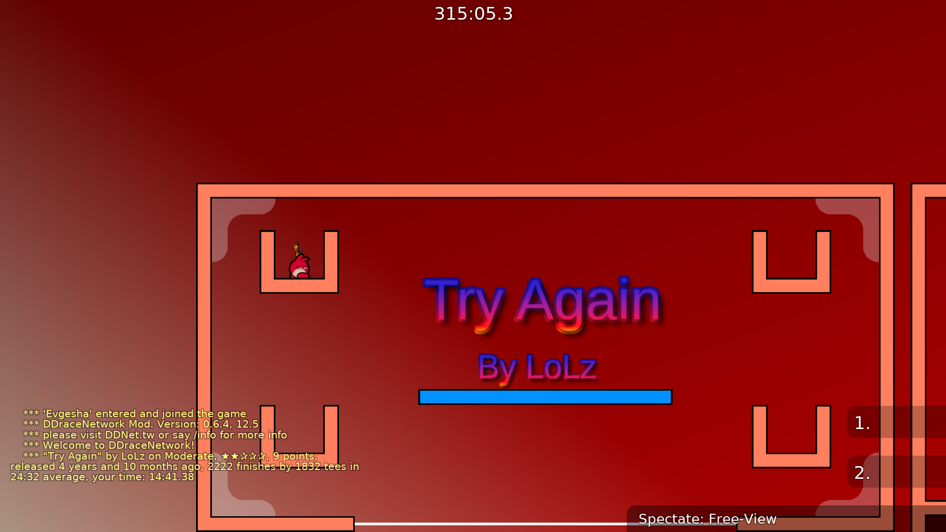
New name (Try It) Changed little a bit the design,and some part are a little bit modified
Thank you Dark
changed part's again,and the problems fixed
added new parts
problems fixed
misplaced a block
Thanks Ano
Thanks again for the many tests and help!
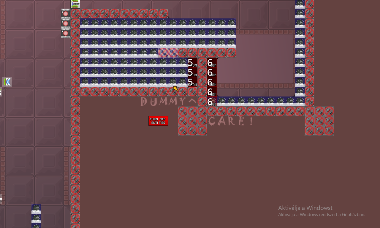
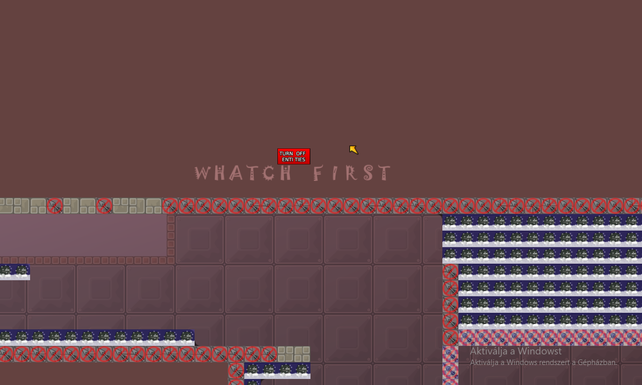
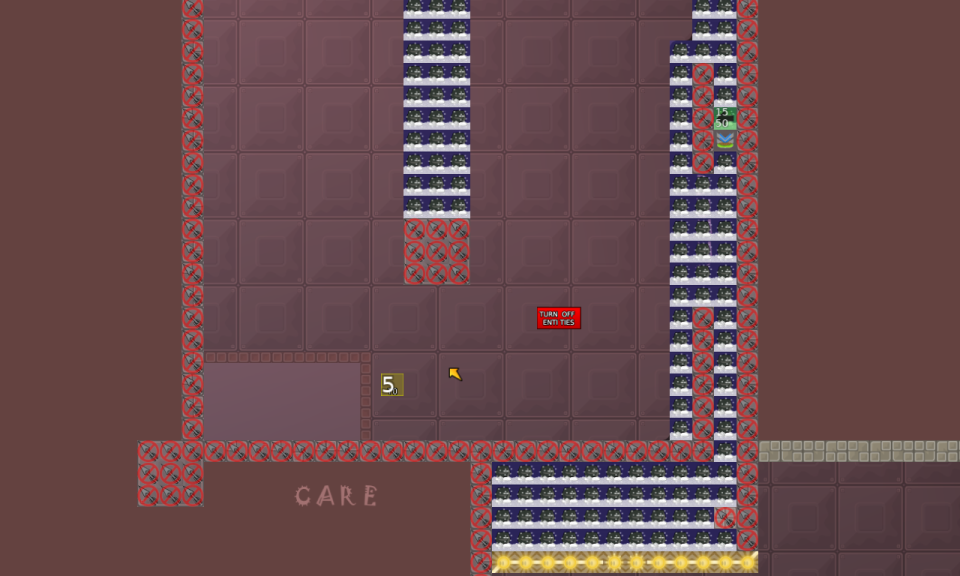
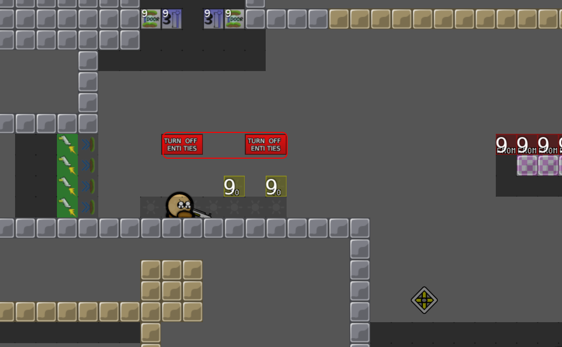
@DarkOortAdded "Turn off entites"
Thank you
@Pulsar, I changed a few things
Feels like a good map to me now
The failyness is just right
Always a bit
But not if you go with brain
Thank you
@Bacon😌
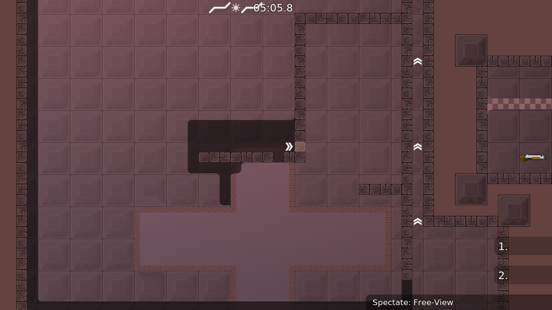
deleted the weapon "part" at the end, it's not important
if u changed name, u should change here too i guess?
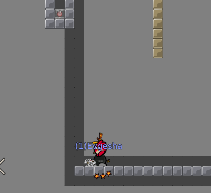
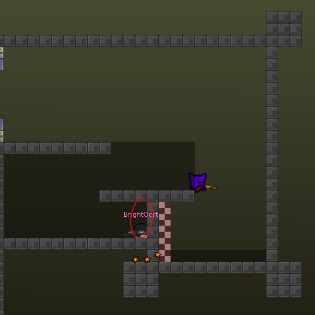
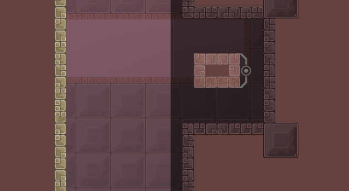
stopper becomes invisible when u put dummy on it, fix it
delete part where u changing with ur dummy, its stupid, and delete sv_pauseable after that
nice map
gut malina
Yeah
@archimede67i changed the name.But i change the file name to try_it,the bot is cant update on test server 😒
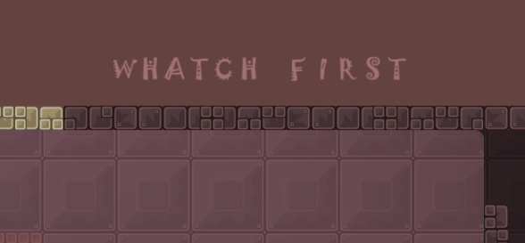
removed the block,and improve the "whatch"
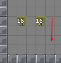
deleted the stupid part,changed some part,added new font,the arrows moved 1 tile down,and deleted the sv_pauseable
Please,decline it.
Hmm
NA!
Whamen
Done.And changed 1 part more easier.But i dont know why not update the bot.(if a change the name to TryAgain then don't work)
because the map name is Try It not try it
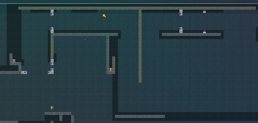
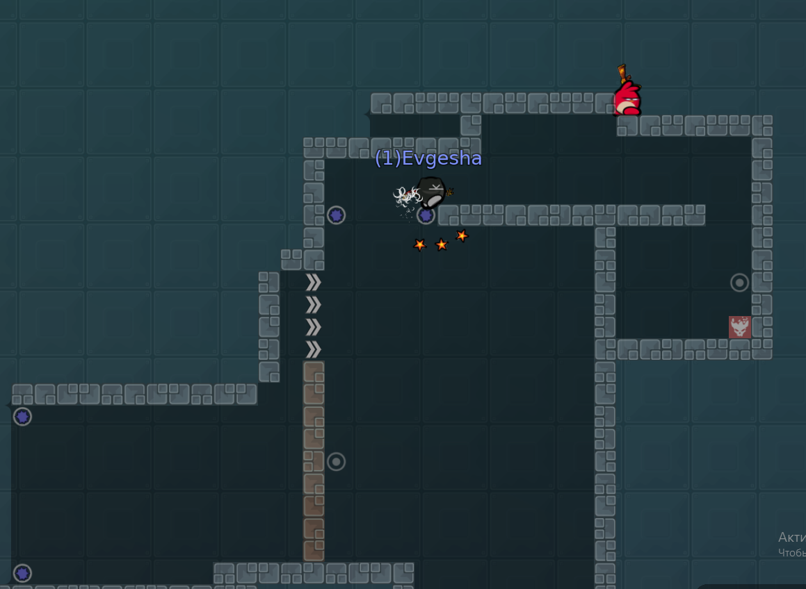
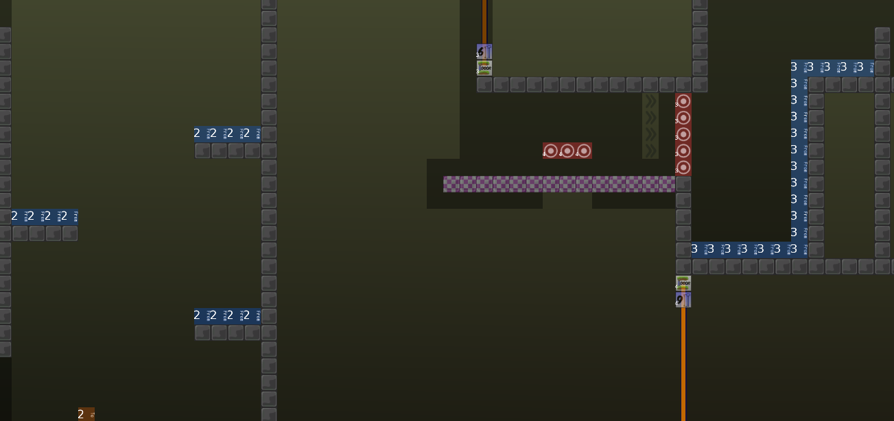
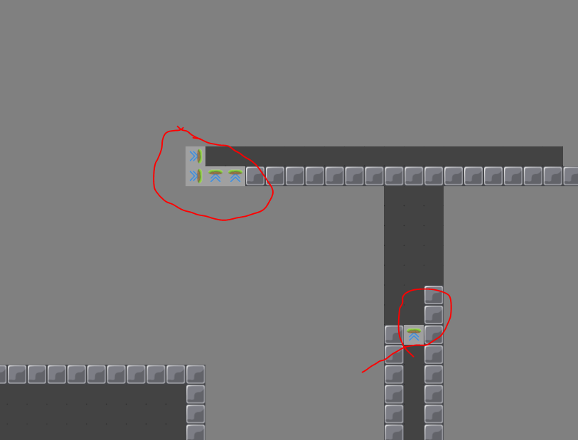
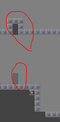
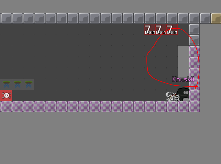
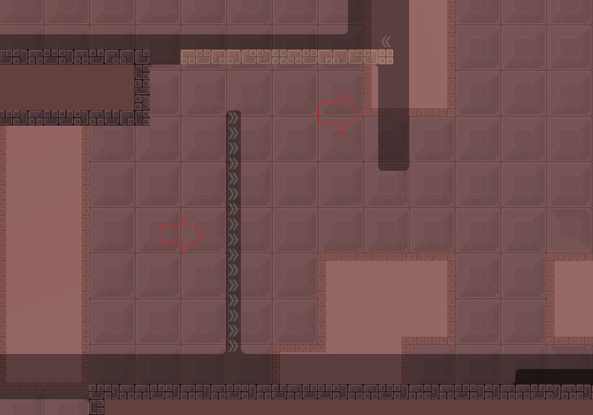
hope u understand that drawing

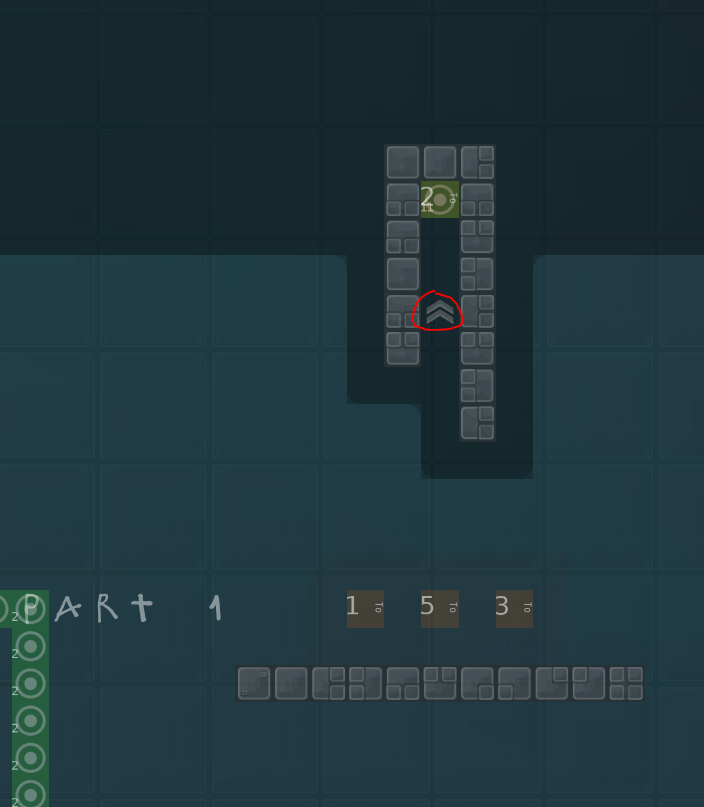
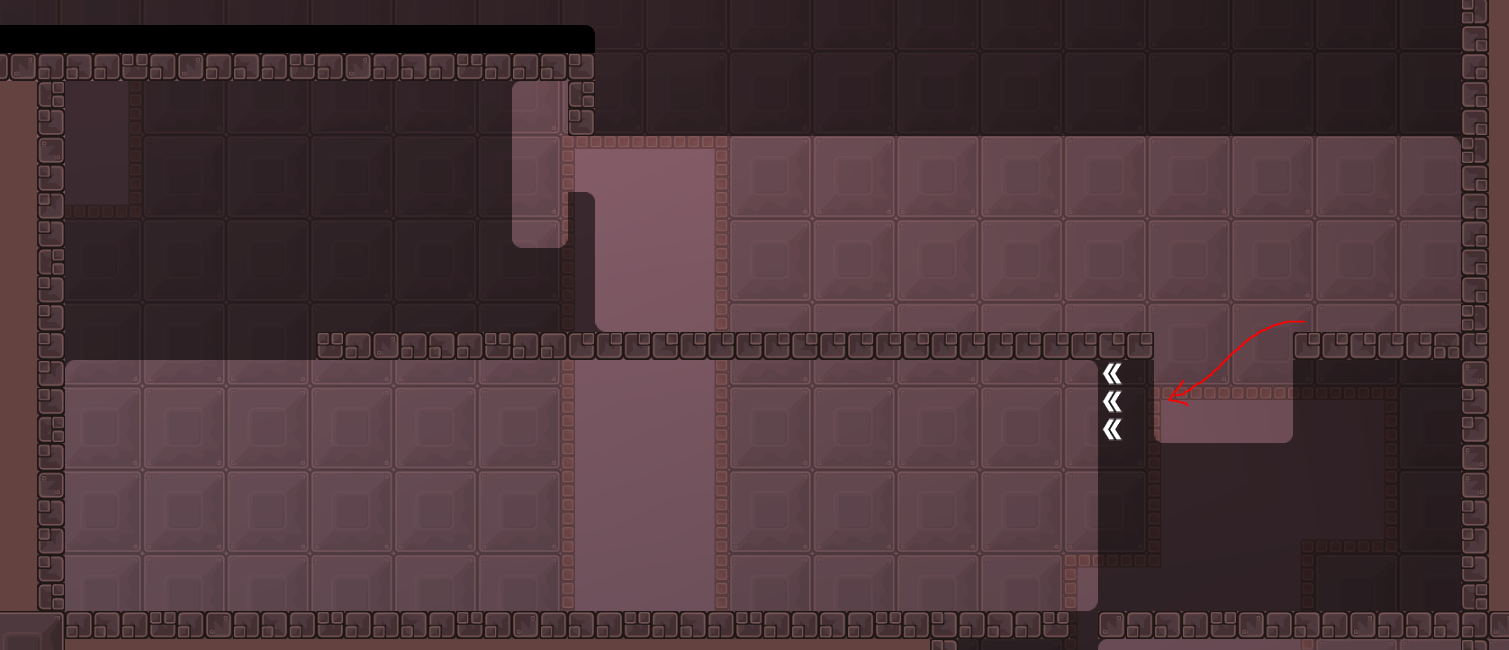
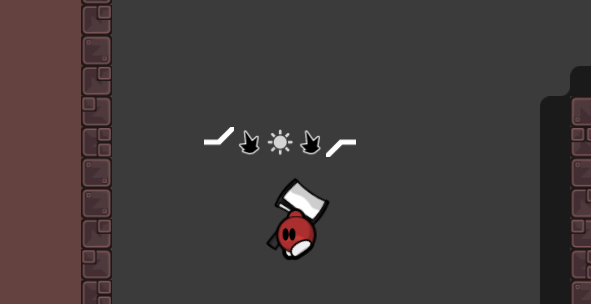
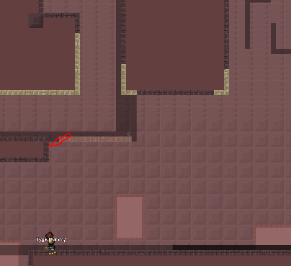
btw isnt this the marking for tele weapon?
and u should disable deepfly or parts like this are easy cheatable
even both jump refills are skippable on last screen
also i think u can remove the tele from totele 3, its just 2 super easy hooks no need for tele there
and maybe make totele 1 and 4 just a bit easier and remove teles also
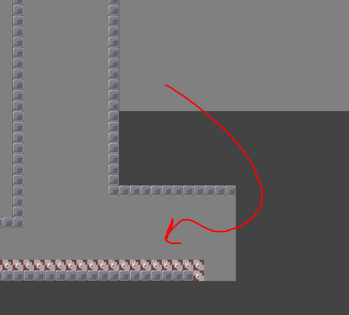
and rather put freeze behind those 1 tile generic lines and not these red tiles
at least where they touch freeze
Thank you
@durrtypurrpThanks
@Knuski*
.
i like that its somewhat fast paced but often parts dont really flow well with each other
overall it doesnt feel well done
such parts are really bad
nothing that went into it besides filling space
random kill tiles also dont make sense in such a map
in general i find parts too faily
to me its better than balega, but still not enough to be released
lacks creativity, flow and quality
(just to put this into perspective: you could easily get rid of most doors if youd map stuff smarter)
not sure why he sent this in dms
1 . Difficulty spike starts here its a lot harder then other parts before . 2 . After this part is easier part after again harder .
- After some parts its even harder .
- Design is too simple boring .
- Had some nice ideas but i would start new one and tried to replay all map instead playing parts like you did .
- Because of 5. there is probably almost not possible part .
$decline
I like the map, I think it's nice mapped
I'm not a fan of switches but I guess this is ok
Tele 6 is kind of tricky, took me some times to get it, maybe I'm doing it wrong ?
Agree tp 6 seems a bit over the top hard
bug
wut is this
Fixed
@archimede67,ty
bot is broked
nope
channel isn’t up to date
thanks for reminding tho
ahh
its definitely an improvement but still feels poorly mapped: 1) it abuses switches way too much for simple stuff 2) some parts are fast paced, others go against flow 3) some (simple) parts are totally unfaily, others are hard and faily (e.g. part after tele 2) 4) some parts feel premature (e.g. superjump part which is just 2-3 jumps) 5) some parts are random or dont add anything to the map (e.g. switch 15)
still needs a lot work
basicly what i sayd :/ except switches
Okey,thanks
New parts added,some switches are deleted ( if I remember correctly 5-6) more tp,easier parts,new end.
Graphics bugs fixed
the maps getting more ugly now
youre not doing this properly
if u want this released you need to do a complete overhaul and polish everything
no lazy fixes, no lazy switch solutions, no lazy fillers
there are way more issues with this map but since the mapper does not respond anyway this could be moved to "waiting for mapper"?
he got no ideas
there is no waiting for mapper
we should make a waiting for mapper
didnt work so well in the past
what are your plans with this map?
I will upload it tonight or tomorrow, try a lot of things and want to get the best out of it
@jaonice 👍
but take your time, no need to rush it
Everything is done, I hope you like it.(btw,i deleted some parts and i maked a new)
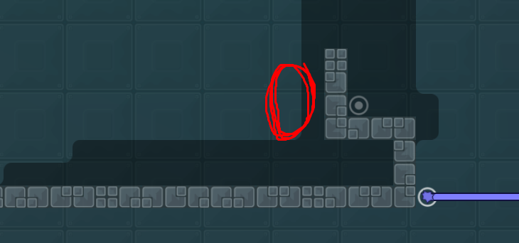
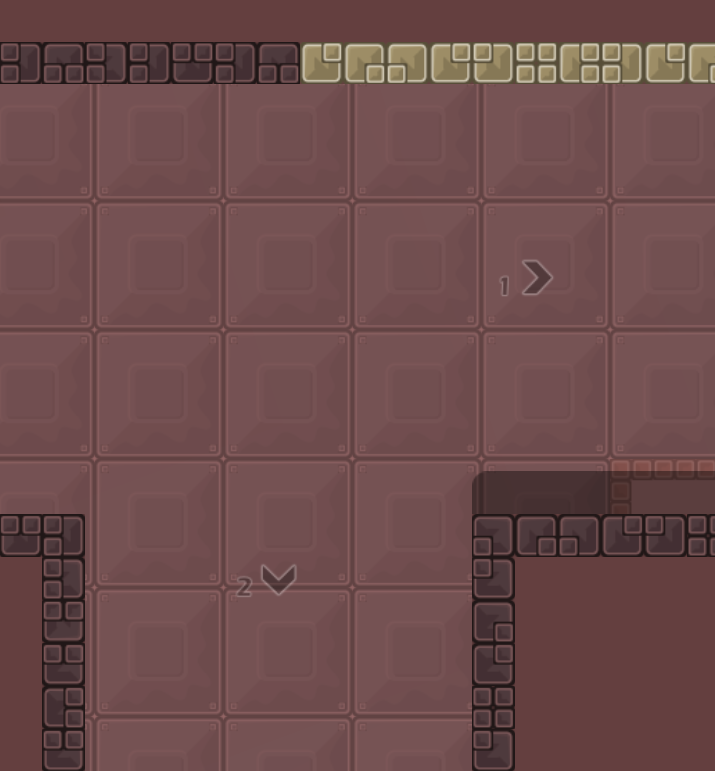
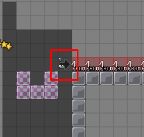
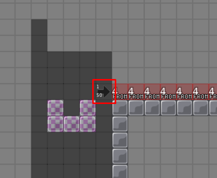
use only 1 tile to mark unfreeze, I think No. 1 is the best
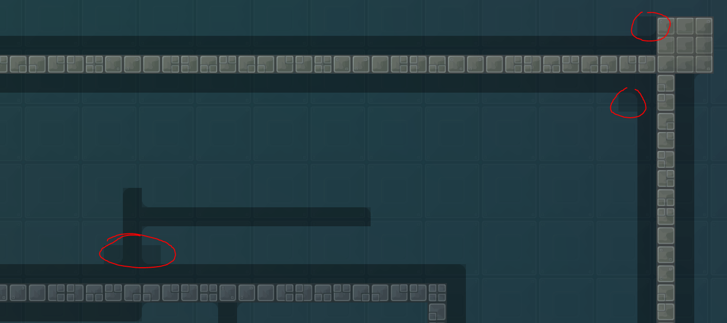
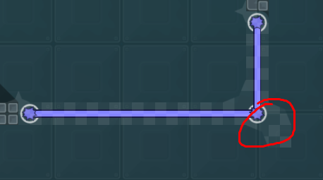
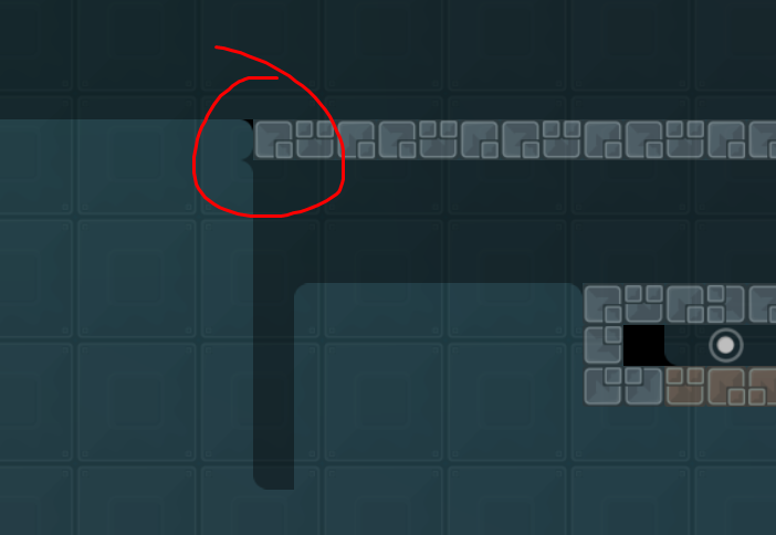
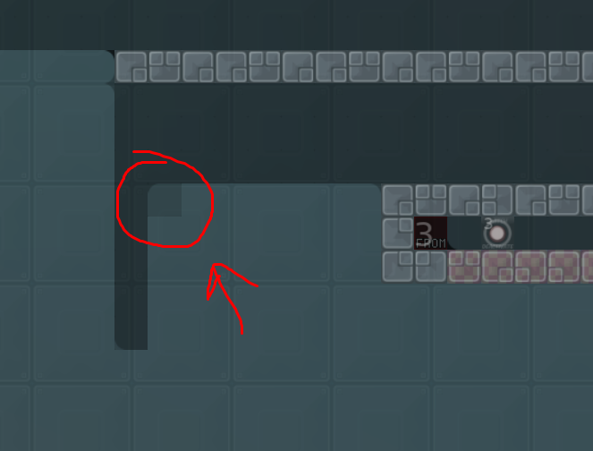
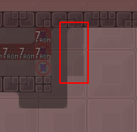
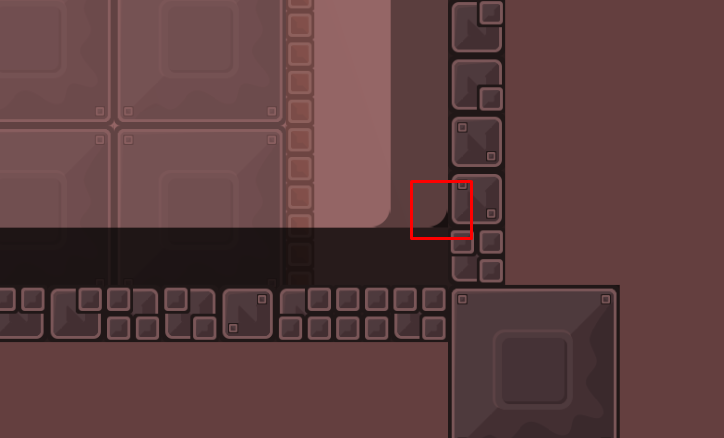
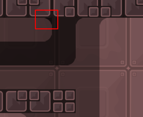
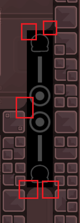
missing edge
Your map is fairly light and short. I don't quite like it because the flow is partly deficient and I have already seen many parts. With tele 6 the fetch can get a little stupid as far as I have tested it. Still, thank you for creating this map, some new players may also like it a lot. Please fix the errors and then I hope for you that this map will be released. -Tyga.-
чисто разъебал...
also please fix design nubs from Tyga
Very enjoyable map and close to ready
Ops...I'm blind
Removed all freeze from behind the blocks,and I replaced it with a darker freeze.(tele) This looks better
$ready 2
el se hiszem geci
Added "turn off entites" to the granade part
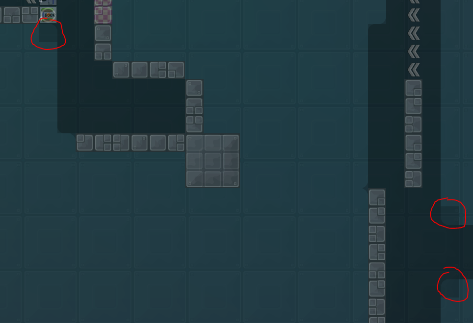
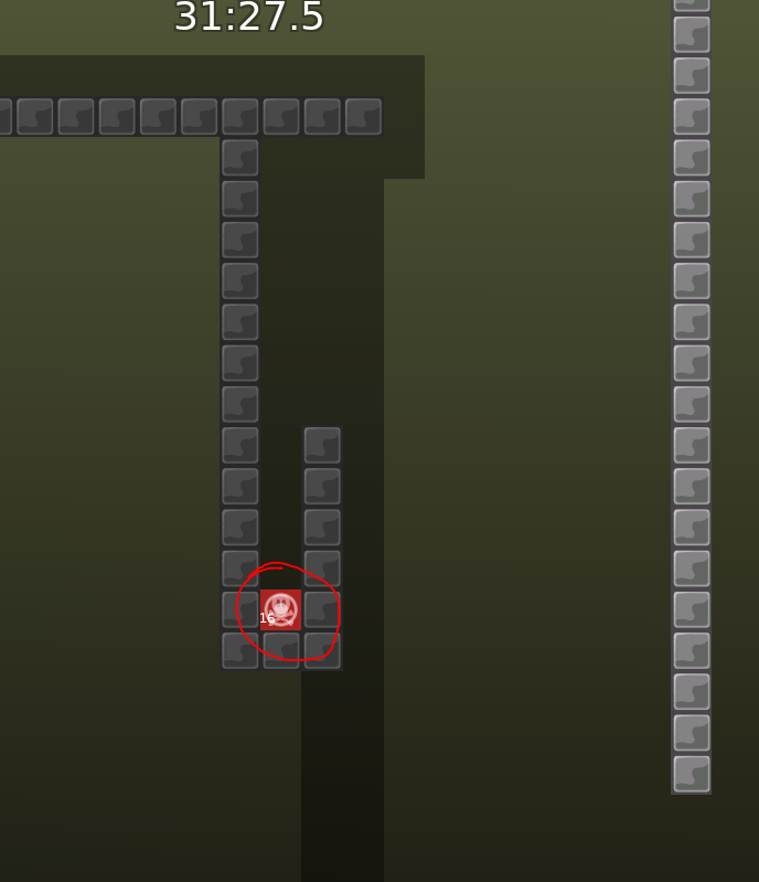
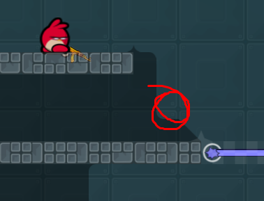
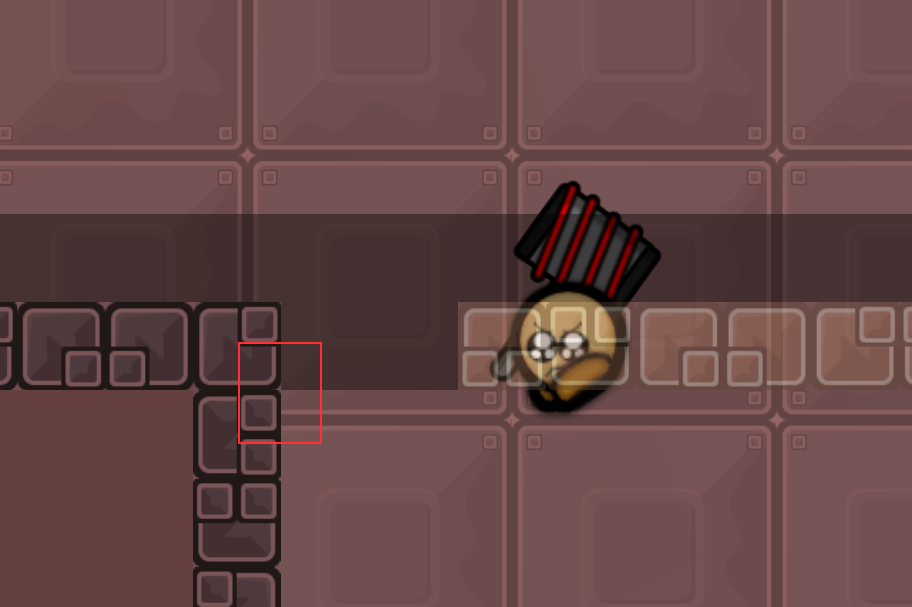
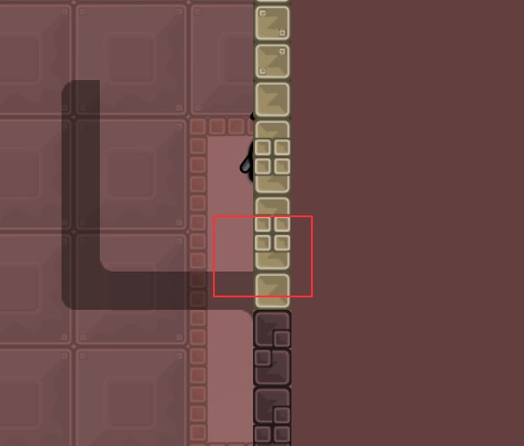
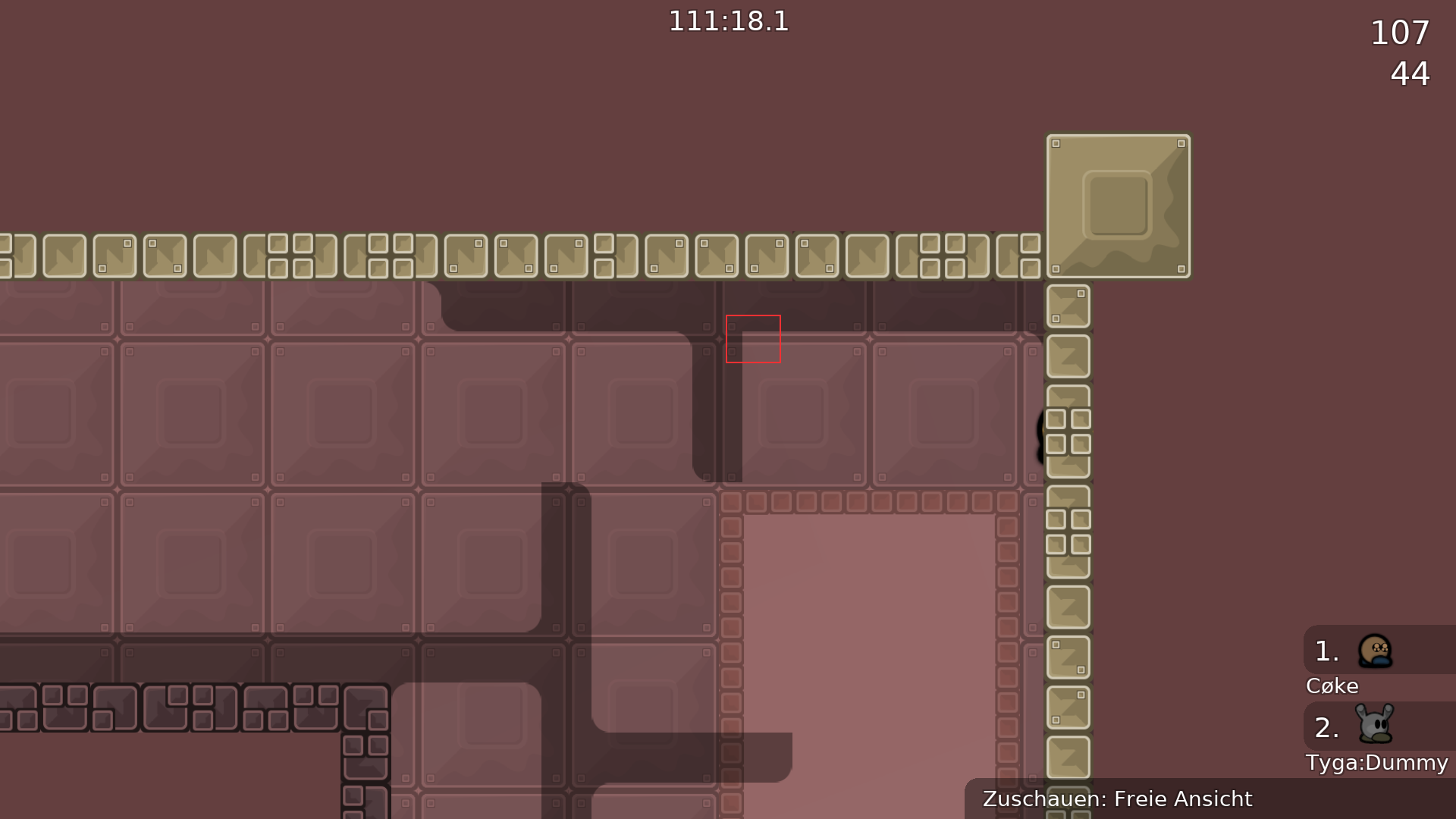
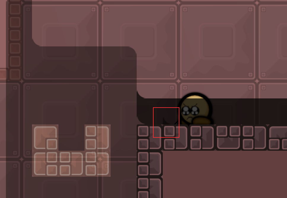
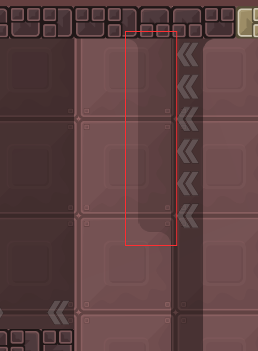
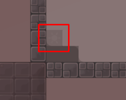
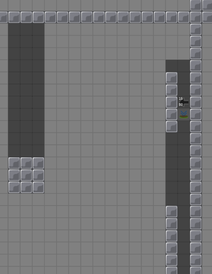
I made some changes in some parts.First pic: do not jump to the edge,Second: fix cut,Third: fix edge fail
and added cp to the jetpack part
thank you
that third pic part was very faily
maybe add sv_deepfly 0 in server settings ?
added
generic_deathtiles need to be external
metal_plated_1 is embedded twice
$reset
for fix edge fail
needs to be marked then
these are too faily
Like this?
2nd looks lame
This?
ye looks better
but can still be improved on
okey
and
@jaomissing entities off
I not really understand this,what the problem here?
there is no entities off sign
Done
metal_plated_1 is still embedded twice
generic_deathtiles is still embedded
cp9 can be normal tele
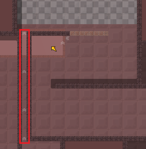
you cant use the same marking for superjump and walljump
oh there is another cp
dont change this then
I dont know,if i do the cp9 be a normal tele,and if i jump to the tp (above hk) teleports back to the spawn
wouldnt it be better if i left it like that?
yes as i said
ooo xddddddd sorry
Done everything
For first screen you're just ruining part if u remove that
It was already good before he changed it imo
nah
remove this shit or remove 1 tele at the end xd
Done xdd
the changes dont really fix the issue
make sure its less faily and a decent fix
this is a dumb fix
entire part idea is gone
The prelast screen was fine imo Its comparable to a hh which really shouldnt be considered „too faily“
too faily is related to the rest of the map
so a hh can be too faily for some maps
Obviously, but this isnt the case here
how bout u decrease the height
or like
so even if u miss the hh u can just hook him in
its kinda the same idea but u dont need to land a precise hammer
u can cheat the entire part then
just throw
from left
no wait theres a better way
just do this
looks fine
Done
The other upthrow was less faily
But part is more interesting now
y
Done
👍
I dont know how I can be a blind d.ck
ye i agree its more faily now
so it doesnt solve the issue
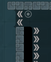
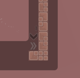
Fixed arrow
$ready 2
Thanks to everyone!Im sooo happy ❤️
10/10
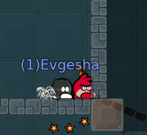
deep in the middle of dummy map
you the only one who failed there
LMFAO
