this is your map's testing channel! Post map updates here and remember to follow our mapper rules: https://ddnet.org/rules
hi I already played through the map and it is big have many different ideas and parts, but there are also some problems:
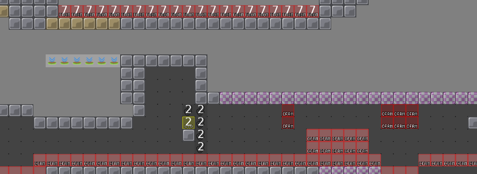
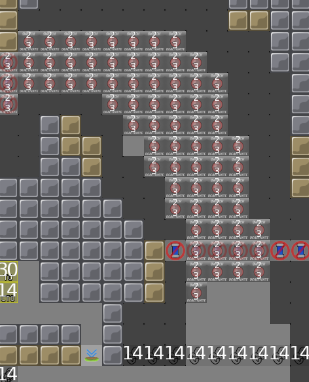
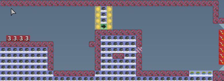
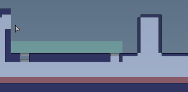
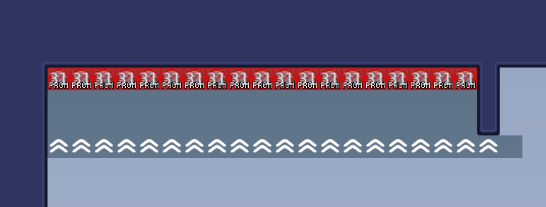
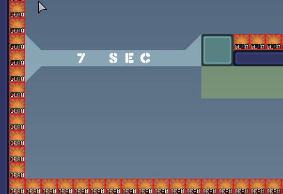
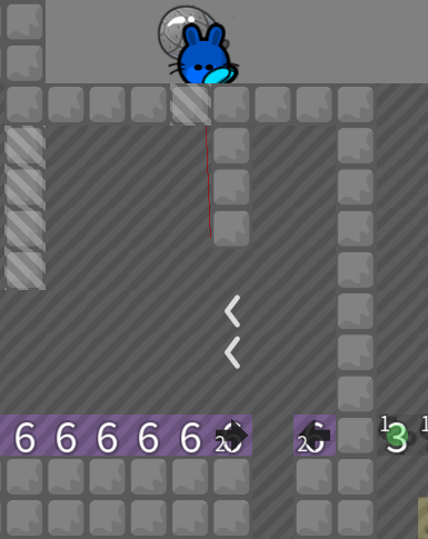
The map have sometimes the overloading problem (from the player point of view for example):
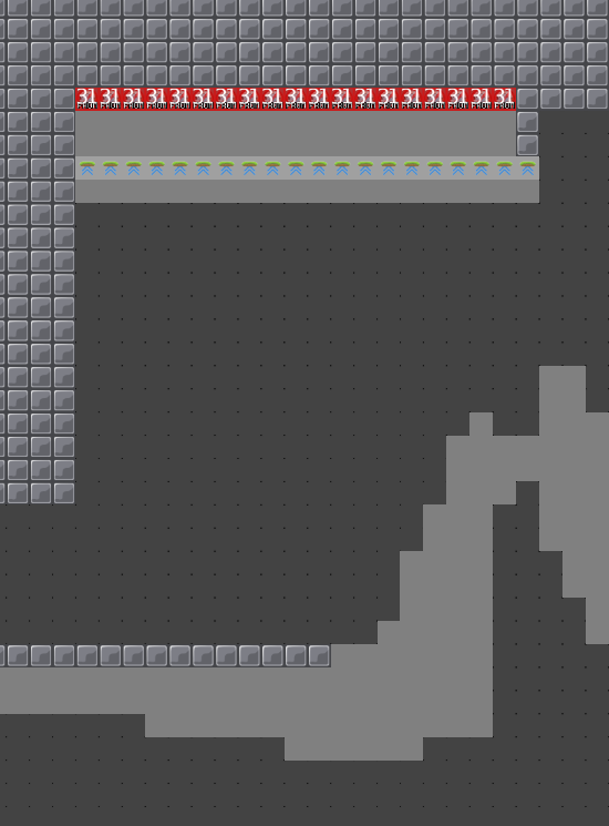
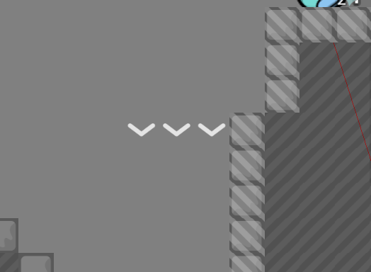
also space is sometimes the problem:
i think it say no cp when you turn entities off
gotta put a thing there
fine
so from what i get from all of this its unbalanced some missing stuff and not enough space yeah?
a decline maybe from VeNa

can fix that in an hour tbh
already said that is just some of the stuff other parts should get a rework and we will see just hope you fix the stuff better and faster befor VeNa does come (just to be save that you don't get a decline)
like the hammer hit on the
side
that long one
w
that one
that part is just harder then the other parts(often hammer with not enough space to get a good catch
I will be back later GL

ill try to fix everything
dont understand whats missing in the second one
I think that it is not so nice for the player to change how the jetpack works midfly
sad
okay
its too easy then in my opinion
but i can fix it i guess
and i have no clue what this is supposed to tell me
game tile ... invalid id 8=
?
i dont know if everything works and what to do with that message the bot gave me but i gotta go for now
heres the newest things with hopefully all the changes you wanted
omga
heh
Include a changelog after uploading map updates (preferably with screenshots).
Include a changelog after uploading map updates (preferably with screenshots).
oh and bout this
you should be able to just fire down and go right
on the right side
so i dont see the need for a change
most of my friends got this pretty quickly
fixed these two
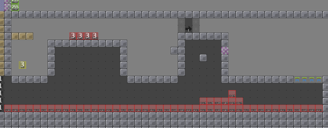
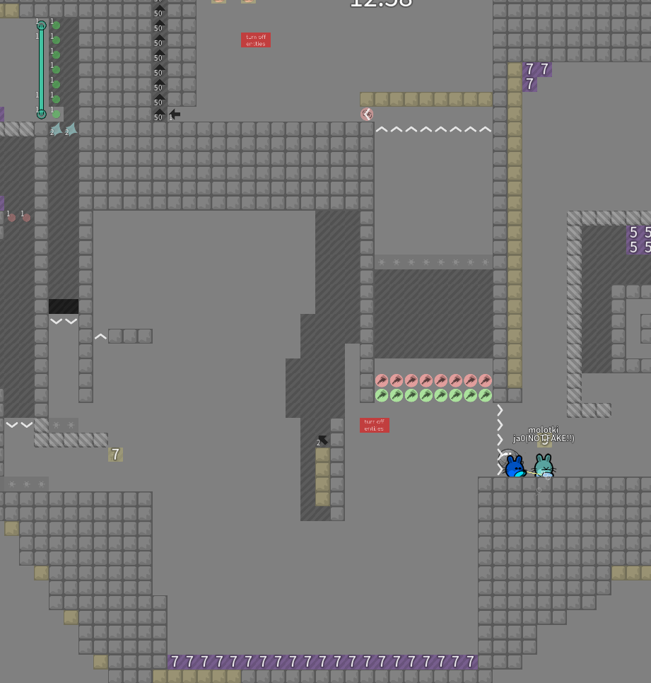
first picture(start of the map) maybe do a extra tp into a room what is outside of the map and do write like info and then a arrow pointing to the tp
also that down left feel like random stuff
down left?
and i dont really have room anymore for that info box
rough
ill try
making all of them bigger is a pain
that is why I said maybe outside of the map or atleast extra but that is something that you still can do at the end after all rework
can ya remind me?
we will see
your favourite change
Someone call me for a decline? From what i read, the screens and the preview it looks like a decline
sad
:3
we where to slow :c
oof
my mans dont even gimme a chance
But i'll check the map when i'm at home first, i have to test before, even if i already saw problems in utilizatoon of cp, space, struture...
you can still comeback after you rework the map and send the map again but maybe test more and look what could be cooler or better maybe look also how new moderate maps look like and how are there parts with space, structure design and so on
but i like my design :c
its simple
Yep, also map with more space, and not in a box
thats too late now..
you can do it in a box design but then the parts have enough space
so space is the biggest problem
but maybe you can fix problems and still have the same box for example:
so need for the change c: then just remove it? for less confusing stuff
will do
doesn't mean anything😬
but still the map need much rework we will see what VeNa will say when he comes home
if you guys can tell me what parts need rework ill gladly change them
anyways heres as much space as i could squeeze out atm
if its playable i dont know i couldnt test it myself
would be better off trying the oldest one
also i would add 1 more ht left to me
ok i checked and tested the map, too much entities and tiles are badly use overall (switch, tele, stoppers, telegun and some other tiles) clearly a decline, try to map your part first, then put then together, because currently it's like a box where you try to map inside, it's not good for the gameplay and the global structure, avoid using entities randomly, the map have to be clean and easy to understand, not with 1000 switchs
$decline


