#GL
"GL" by PopCorn181 [Novice]
DDNet 12/17/2020 10:22 PM
@PopCorn181

this is your map's testing channel! Post map updates here and remember to follow our mapper rules: https://ddnet.tw/rules

GL.map
711.18 KB
DDNet 12/17/2020 10:22 PM
PopCorn181 12/17/2020 10:23 PM

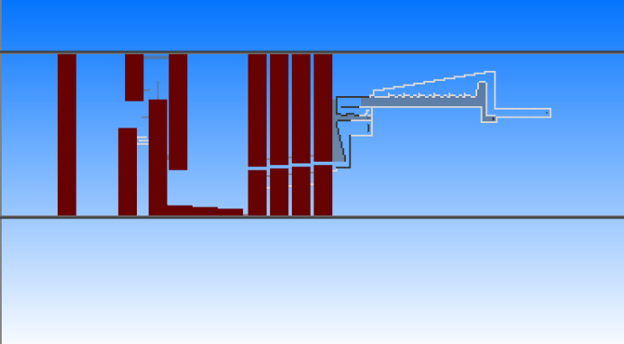
This map was an idea I got where I would make three different sections, everyone very different.

JoaoGardaBro 12/17/2020 10:58 PM

hey

@PopCorn181

you intend to have stars on the map?

PopCorn181 12/17/2020 10:59 PM

3 - 5 star novice

PopCorn181 12/17/2020 10:59 PM
@JoaoGardaBro
PopCorn181 12/17/2020 11:01 PM

found mistake

PopCorn181 12/17/2020 11:02 PM

oops

GL.map
711.18 KB
JoaoGardaBro 12/17/2020 11:06 PM

ok 4 - 5 you can

JoaoGardaBro 12/17/2020 11:09 PM

in this part , put clouds , and one sun , something like that, just the sky, nothing else is strange.

PopCorn181 12/17/2020 11:11 PM

ok

JoaoGardaBro 12/17/2020 11:12 PM

and

JoaoGardaBro 12/17/2020 11:17 PM

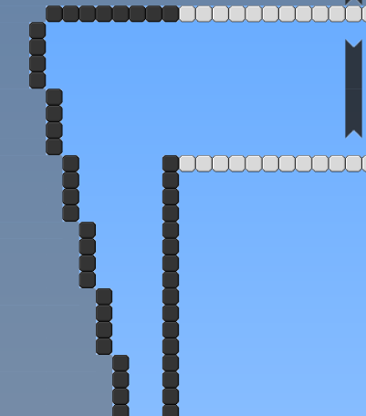
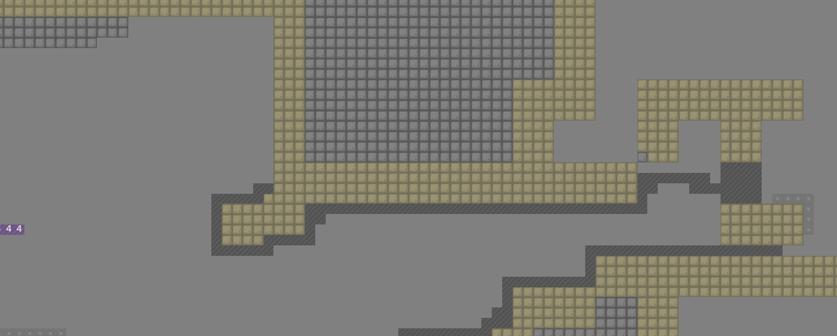
the holes in the tiles are big, and that gives a little agony.

JoaoGardaBro 12/17/2020 11:18 PM
JoaoGardaBro 12/17/2020 11:28 PM

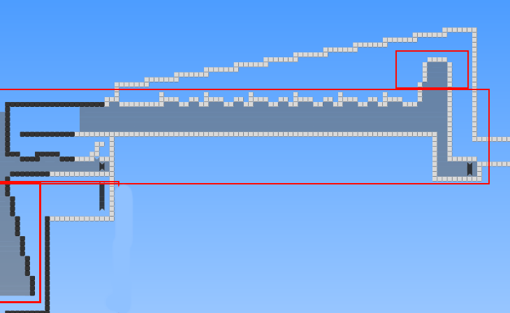
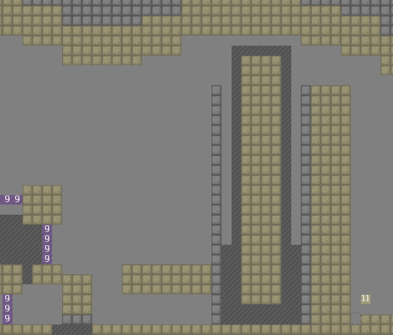
these marked parts need to be filled

JoaoGardaBro 12/17/2020 11:28 PM

I think it's a little misaligned here xd

allocaツ 12/17/2020 11:35 PM

tiles are hella trippy nice Moiré effect

JoaoGardaBro 12/17/2020 11:36 PM

optical illusion

Boti. 12/18/2020 6:07 AM

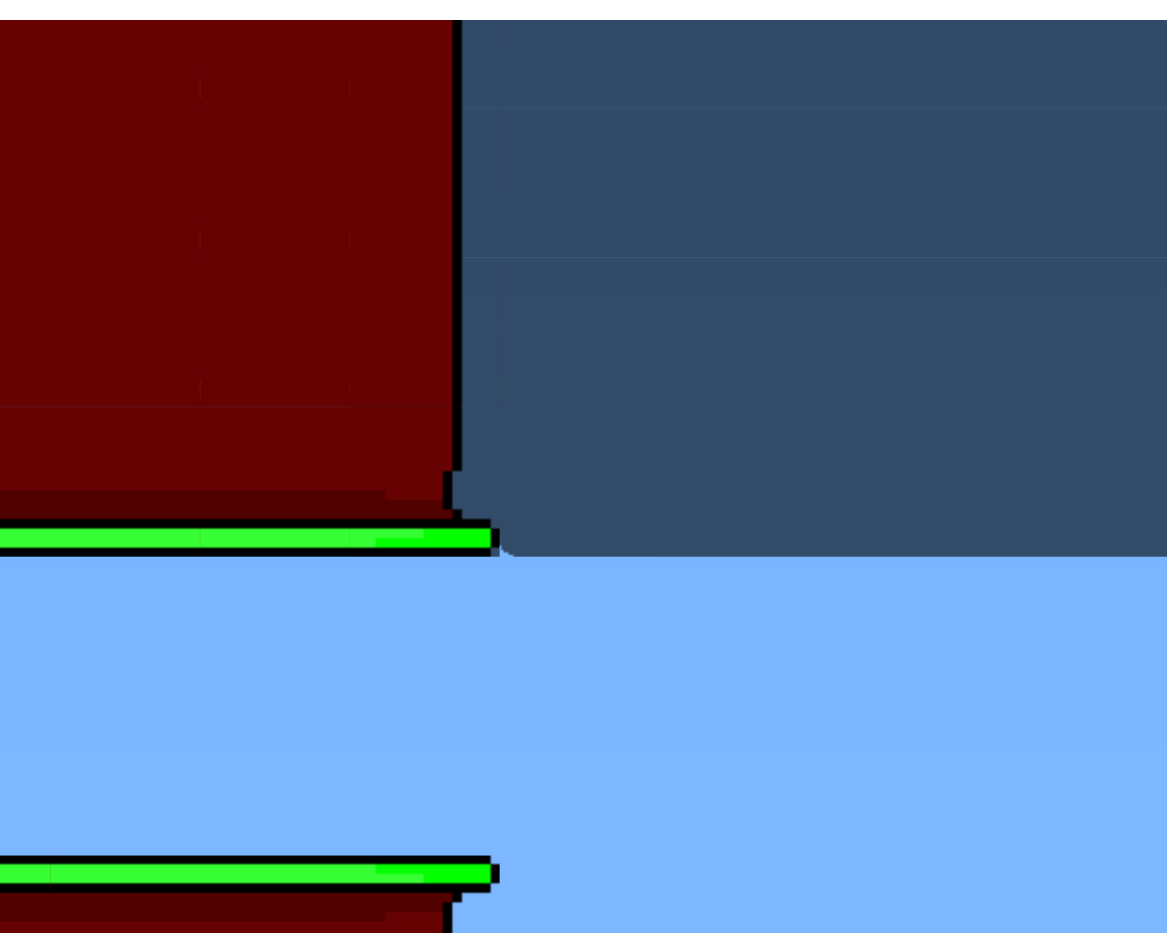
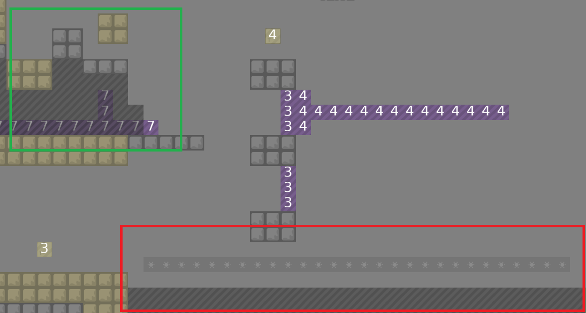
(red) remove that stuff under it and add only ninja, on the left part just remove it. (green) remove the one tele is out or add more roof

Boti. 12/18/2020 6:11 AM

remove this falldown stuff

Boti. 12/18/2020 6:11 AM

and this part is really not fits in after an easy part

Boti. 12/18/2020 6:13 AM

and the design is bad so i play with entities on

Boti. 12/18/2020 6:13 AM

last map had a nice design and i liked it

Boti. 12/18/2020 6:13 AM

but this one..

Boti. 12/18/2020 6:13 AM

unhookable and different stupid tiles everywhere

Boti. 12/18/2020 6:14 AM

and this map not really fits for novice i think

JoaoGardaBro 12/18/2020 7:33 AM

I didn’t think it was so bad just the filling he put in, the illusion of optics is boring

JoaoGardaBro 12/18/2020 7:34 AM
@PopCorn181

put : [moderate]

JoaoGardaBro 12/18/2020 7:34 AM

this is very hard to novice map xd

allocaツ 12/18/2020 11:32 AM

the first segment has like 12 parts, second has 4 parts and last one 3 parts. I think they should all have equal amount of parts, preferably all with a lot of content the design needs improvement, in the first segment the freeze is quite invisible

allocaツ 12/18/2020 11:32 AM

overall a lot more space, so nice improvement there

PopCorn181 12/18/2020 3:33 PM
@allocaツ

fixed the invisible freezes at first

GL.map
711.18 KB
PopCorn181 12/18/2020 4:17 PM
GL.map
711.21 KB
allocaツ 12/19/2020 7:22 PM

continued in

#❌🌸hf
allocaツ 12/19/2020 7:22 PM

$decline