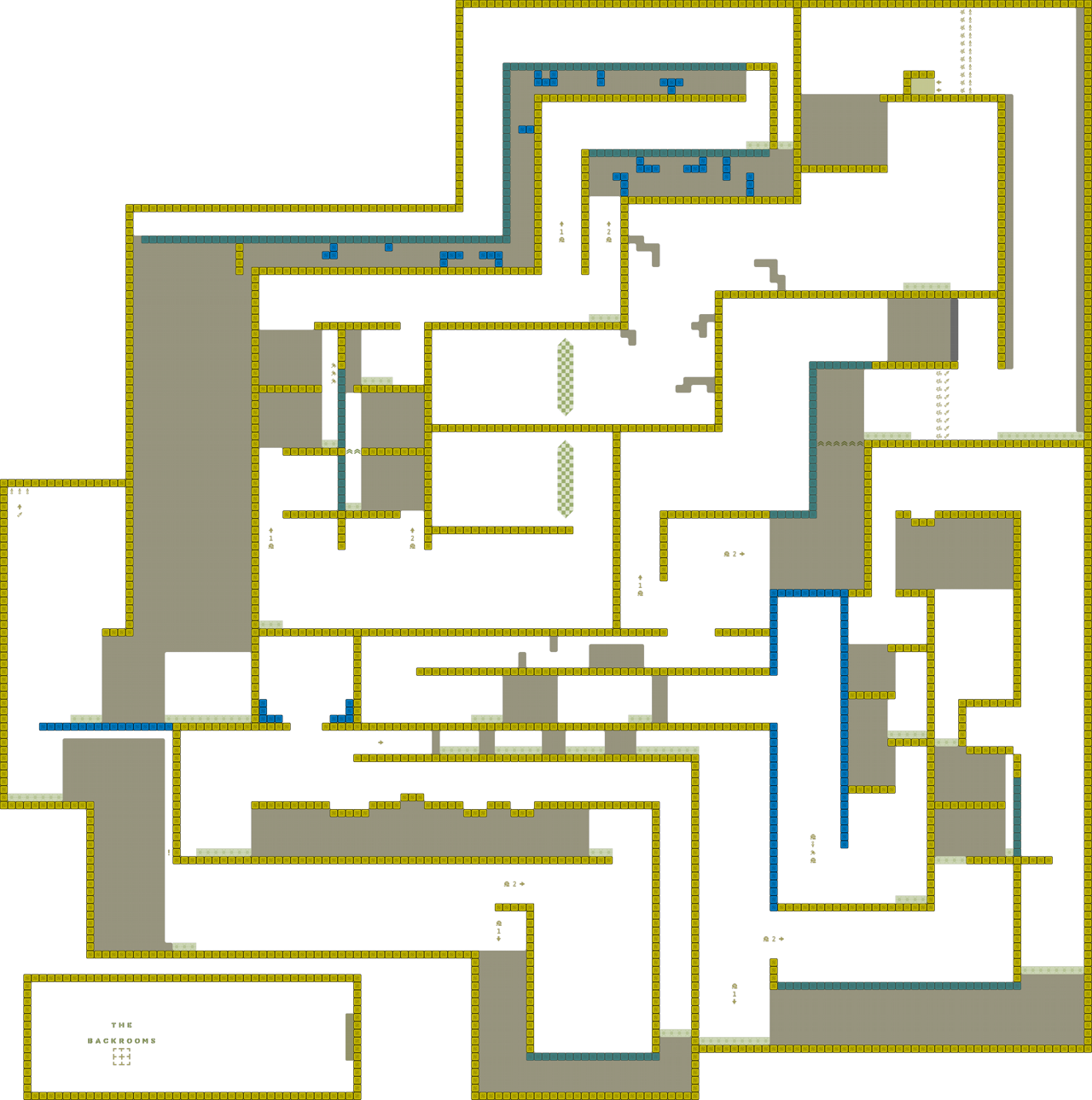
this is your map's testing channel! Post map updates here and remember to follow our mapper rules: https://ddnet.org/rules
alright, I said I was gonna test yesterday but I got high and forgot, sorry about that. But here goes.
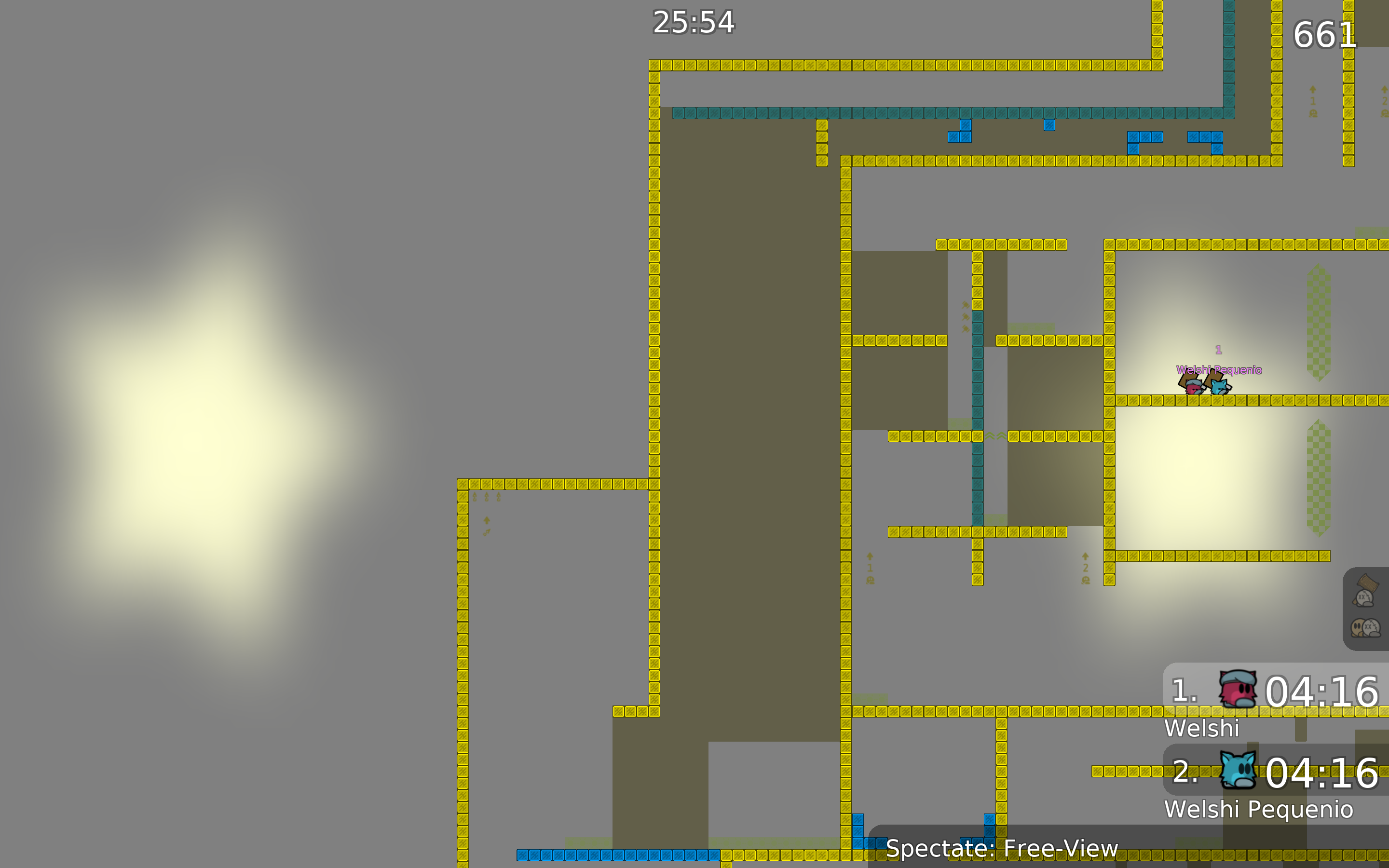
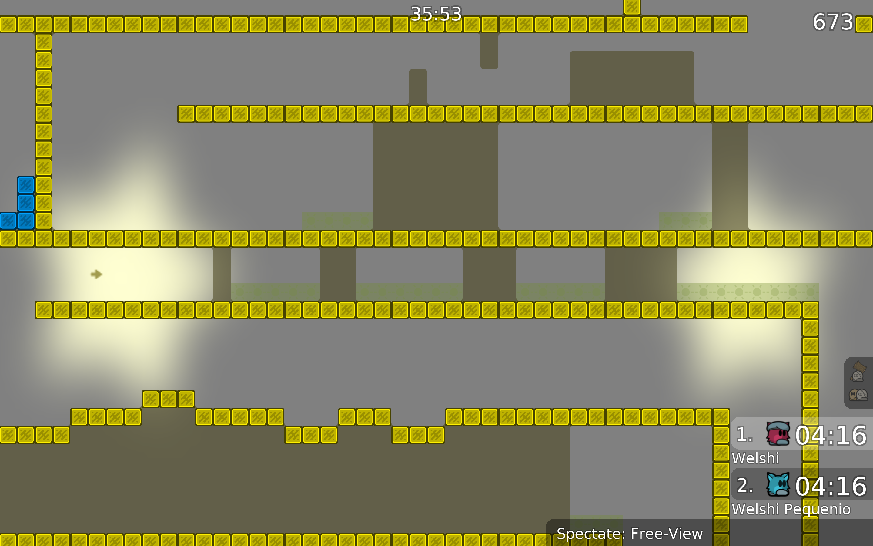
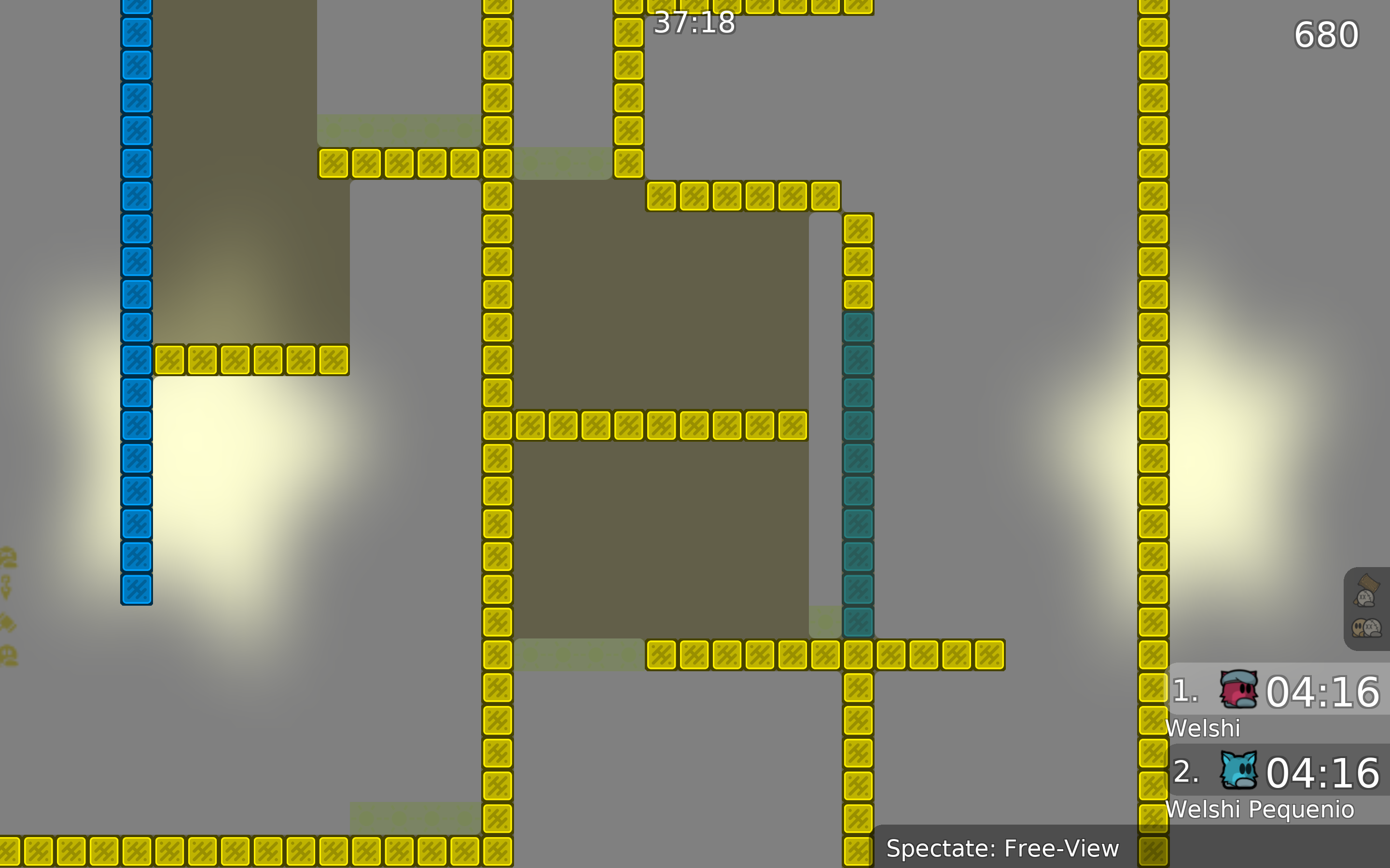
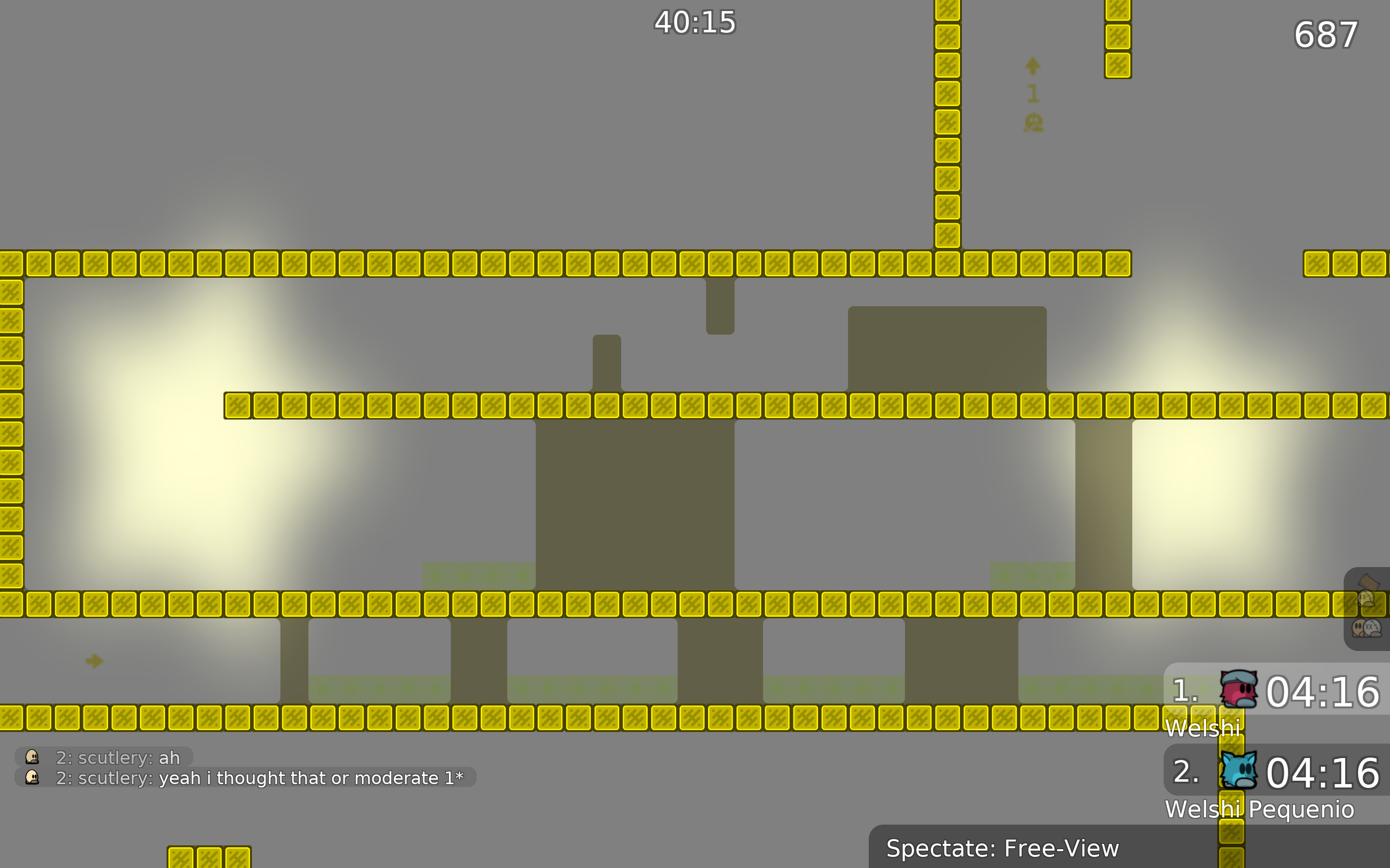
the design just isn't there, I assume you wanted to create a liminal feeling of sorts but it just feels sort of flat, the one block you use repeatedly just looks lazy not unnerving. The colors are also way too saturated, and other than the yellow I don't see how the hookthrough and unhook fit the theme. Furthermore, the green of the stoppers and signs blends into the background, creating moments like these where I can't really see the signs. The colors don't really go together either, everything clashes too much with each other, the unhook is way too bright compared to the rest of the colors, making it pop too much. Especially compared to things like the freeze. The one undeep tile you used is not very clear, I thought it was gonna be teleport when I saw it. The green of the background of the unfreeze is also too similar to the unfreeze signs, to the point where you can't really see the signs at all.

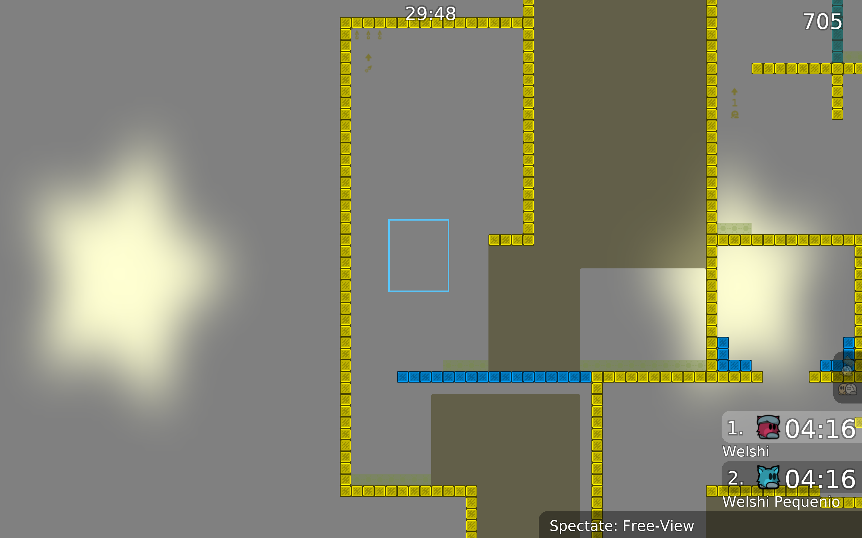
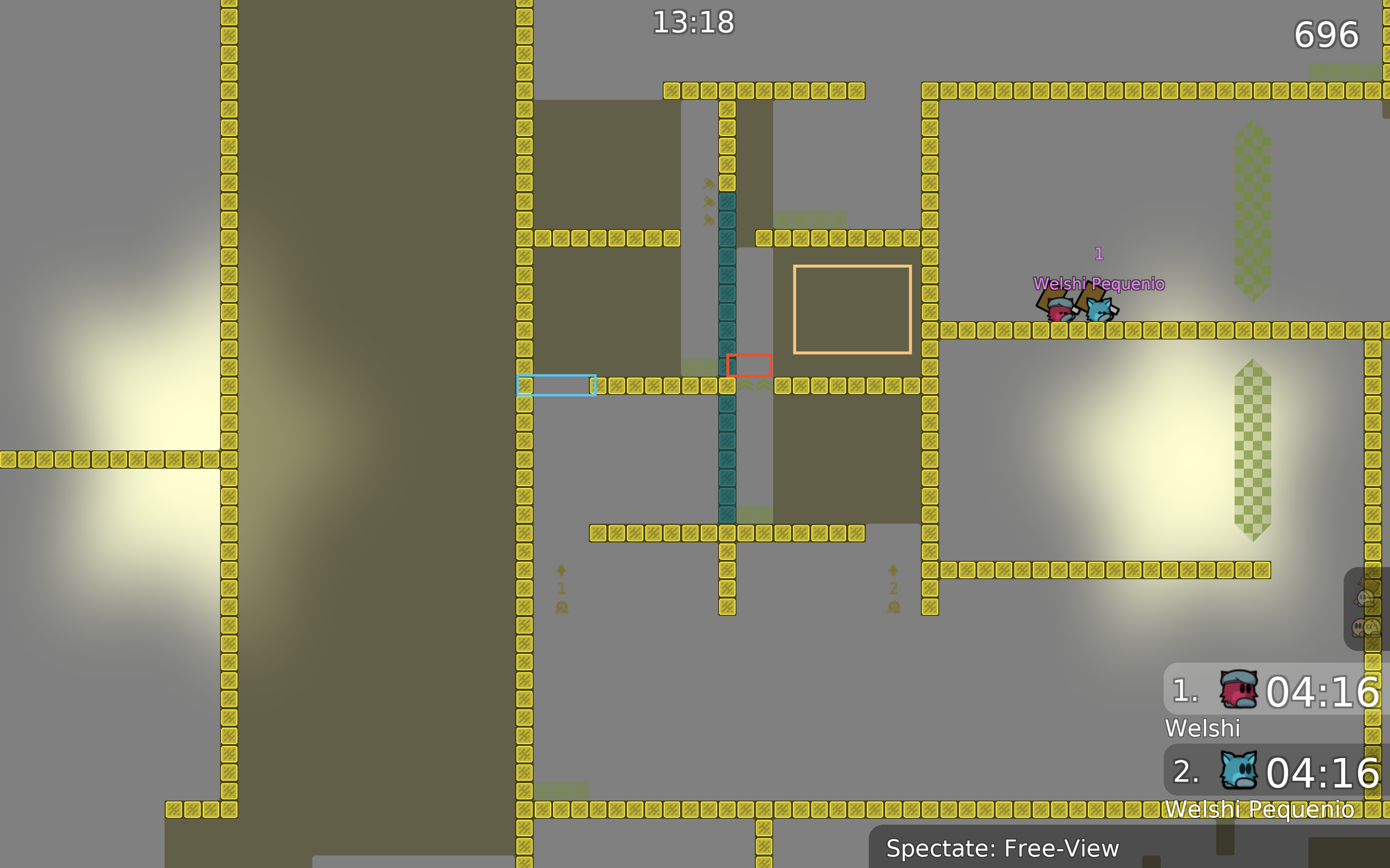
add stoppers where I put the blue square, the fall down when a noob misses the hook is annoying and frustrating because of how long it is, and I can imagine people hating it after missing it only a few times.Also add unfreeze on the red square, obviously if done right it does nothing, but by the hammer signs it looks like you're telling people to hook themselves up and hammer while bottom person jumps up, so you might as well make that way more accessible. The orange square is just there to say that that freeze does nothing other than make the part feel cramped, imagine 4 tees on that side that's annoying af, I'd say get rid of it
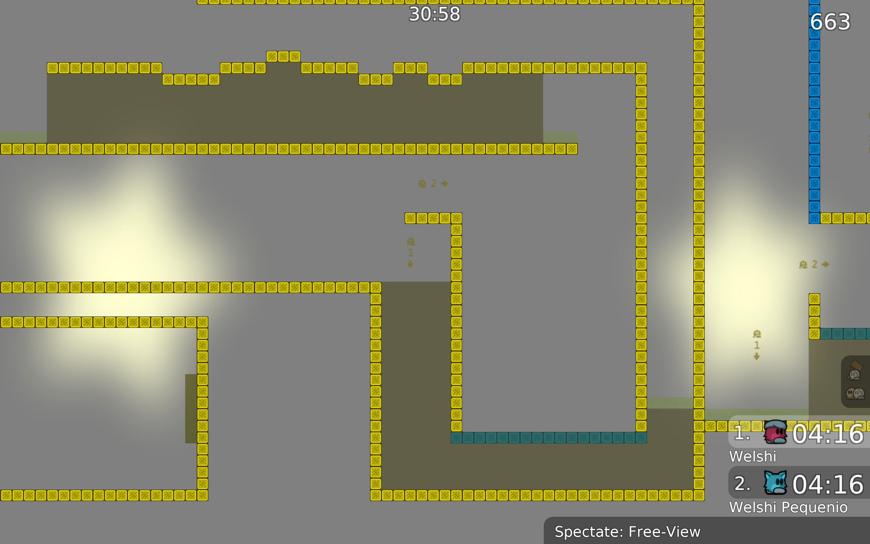
these hookthroughs are just kind of boring, they aren't really thought out much either, the frozen player gets stuck in one holes often and all it does is just make the part feel longer when you play it. Try thinking of creative ways to use the hookthrough, just cause it's novice doesn't mean you can just put a hookthrough with a bunch of random grounded obstacles, if you wanna keep it with obstacles try thinking of an ideal way to do it and build off that, a way in which a more skilled player can do the drag quickly and smoothly. The way this looks right now a skilled player will just drop the player by the 1 holes, move forward and rehook at an angle, which is pretty boring and has the player waiting even if they do it perfectly

The map certainly has personality, but try taking inspiration from newer maps, I can see some kobra and some multeasymap sprinkled here and there but those are pretty old maps by now, try looking at maps like the semang series, sketch, wtf and lavender forest, all of which have pretty creative fun parts.
DDmax:
to be honest, I did the parts inspired by all the levels, and everything is taken from there, I realized that the evaluation of the cards has changed, and some parts are not relevant. I'll redo absolutely all the parts in the level again, firstly because I'm bored, and secondly I create maps almost every day, and gain experience, if I want to make a good project, then I want to make it special, but it takes time and for this I create such maps while inspiration is on I I create a lot of maps to somehow occupy my thinking, because suddenly, when creating a map, I will come up with something original, and insert it into the project better, it's better than just sitting and thinking about each part. I uploaded the map to check what might be included in the gameplay, and when I saw that more than half of the map was no longer interesting to play, then I had to try all the new levels. Because of one color, I couldn't make a normal color for the blocks, and I had to do it in different colors because everything was merging. I may or may not redo the map, there is not enough time. Thank you for pointing out the errors and giving advice
i would suggest you not build in one "box" so parts are claustrophobic and split together. Try to make map using mapres with auto map (default or custom) so map will look overall less empty and will have a design. Test your map more carefully, as i see you make too little space for tees to play which is really unsatisfying and blend. Lean on new released maps e.g. Electric, Semang (II,III), maybe Tsunami and Sunny side up. Don't forget about the rules tho and you will grow in mapping GL
thank you for your advice, I will be the greatest creator, remember my words, see you in 5 years
I WAS HERE IN 2023
take a screenshot
Excited to see it happen 👍
I agree with welshi, he put effort in testing, I decline the map for now. If you decide to rework the map you can repost it in the submit channel.
$decline
