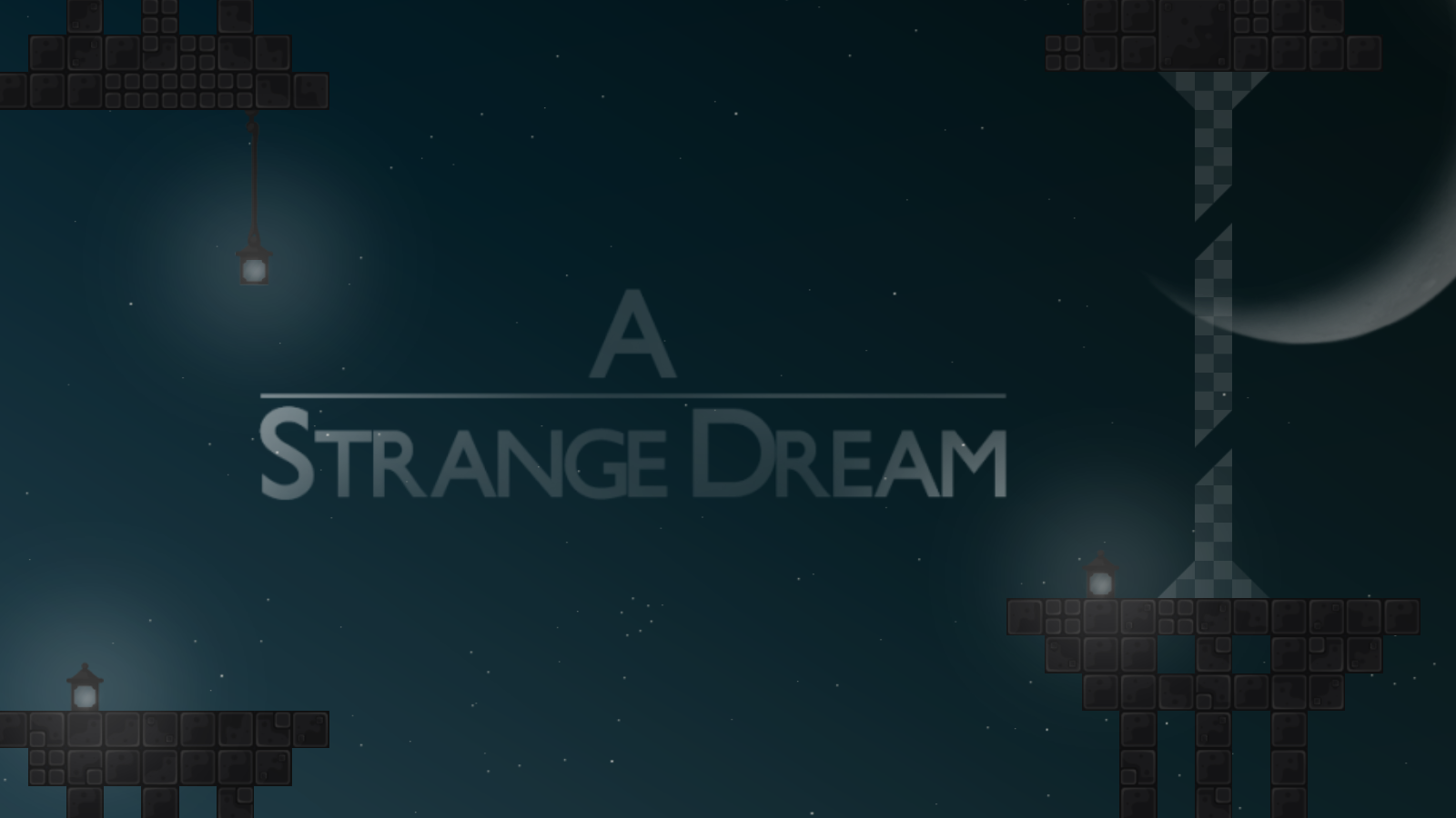
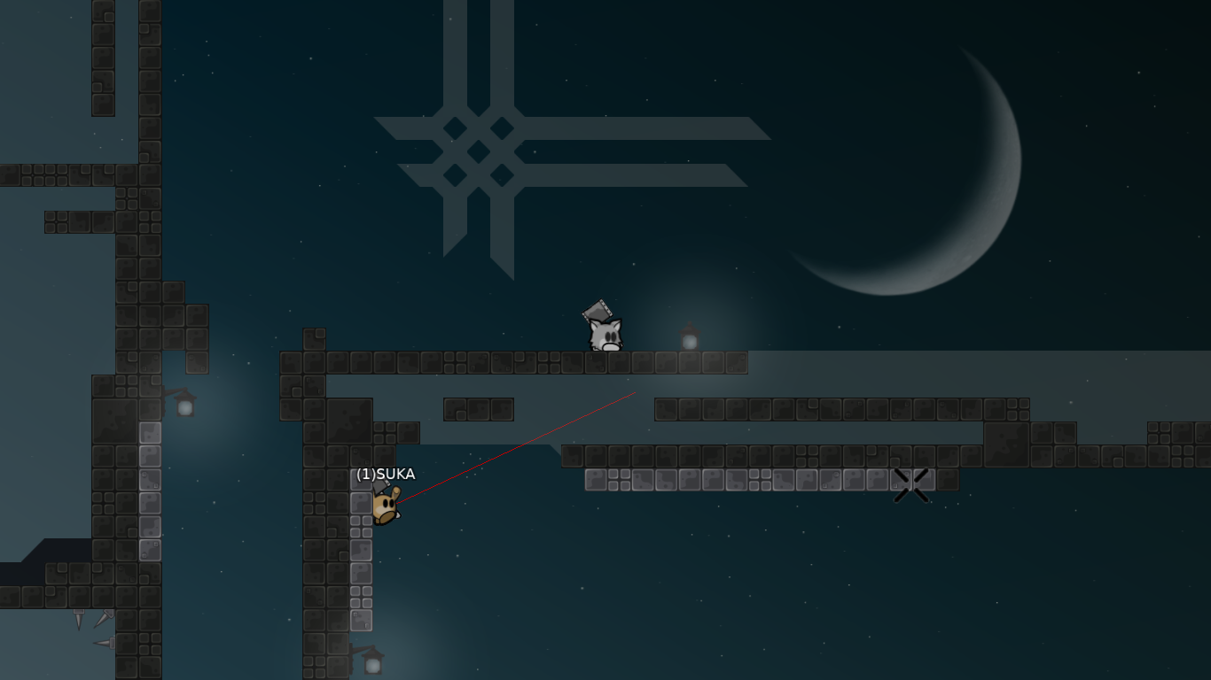
"A Strange Dream" by SUKA
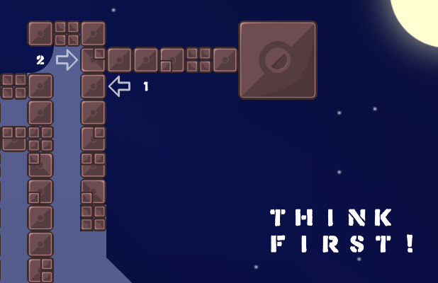
I didn't played the map but put " think first " and then explain the part looks pretty stupid but it can be false I don't see the whole part
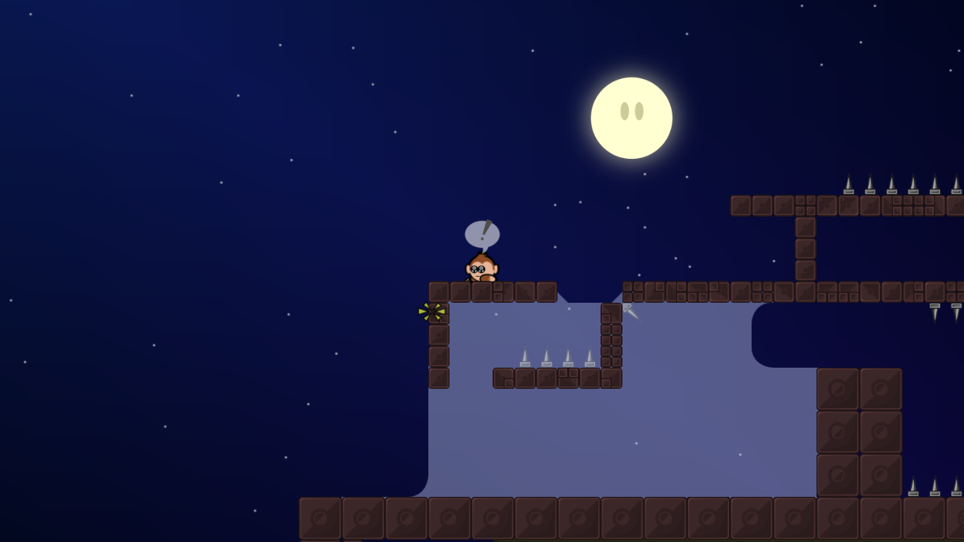
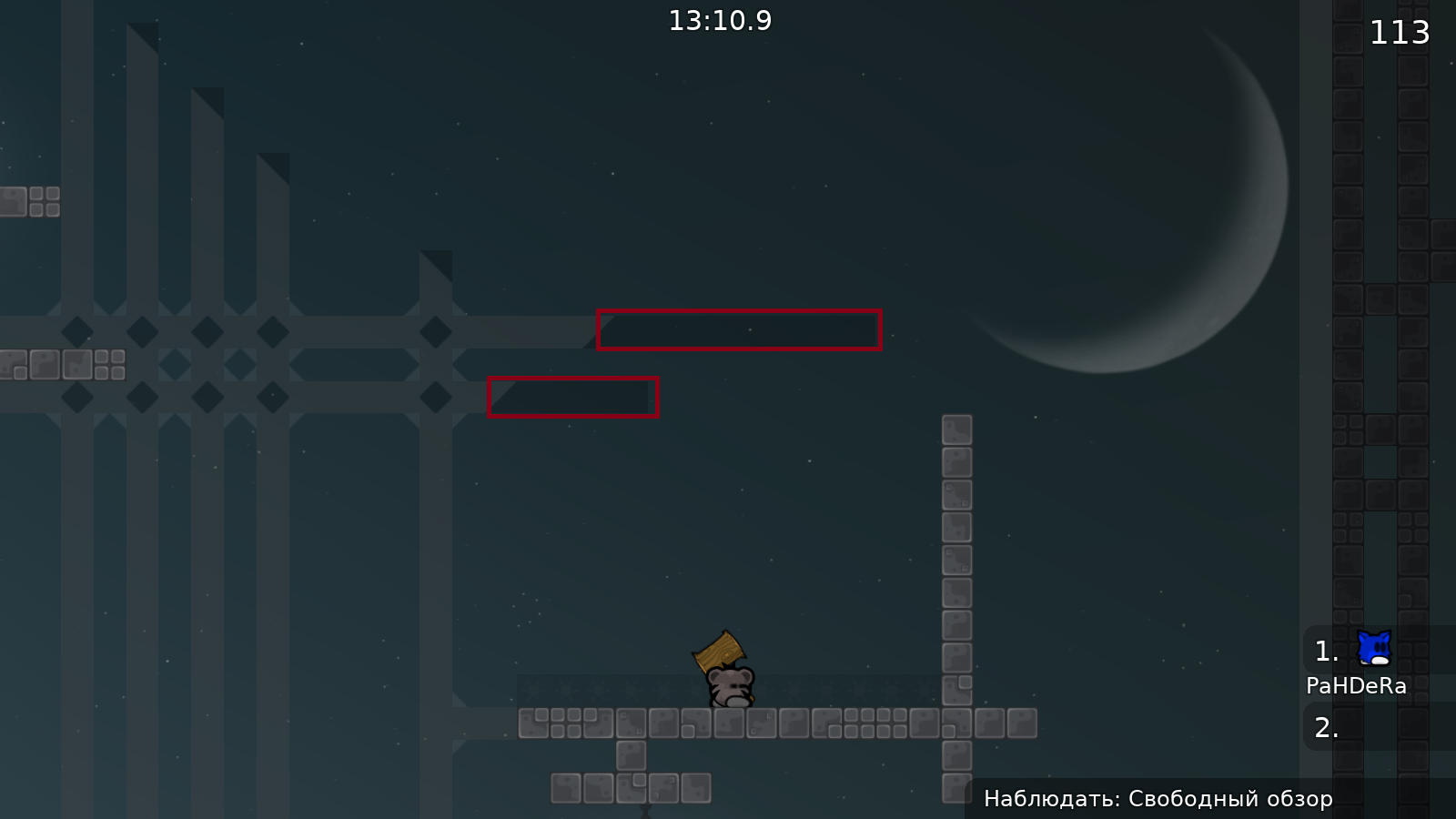
usually lamps aren't in front of tees
This part is pretty faily
what he means is that one of the markings is reduntant
you don't need to think if u explain how to do it
Hu what I said wasn't clear ?
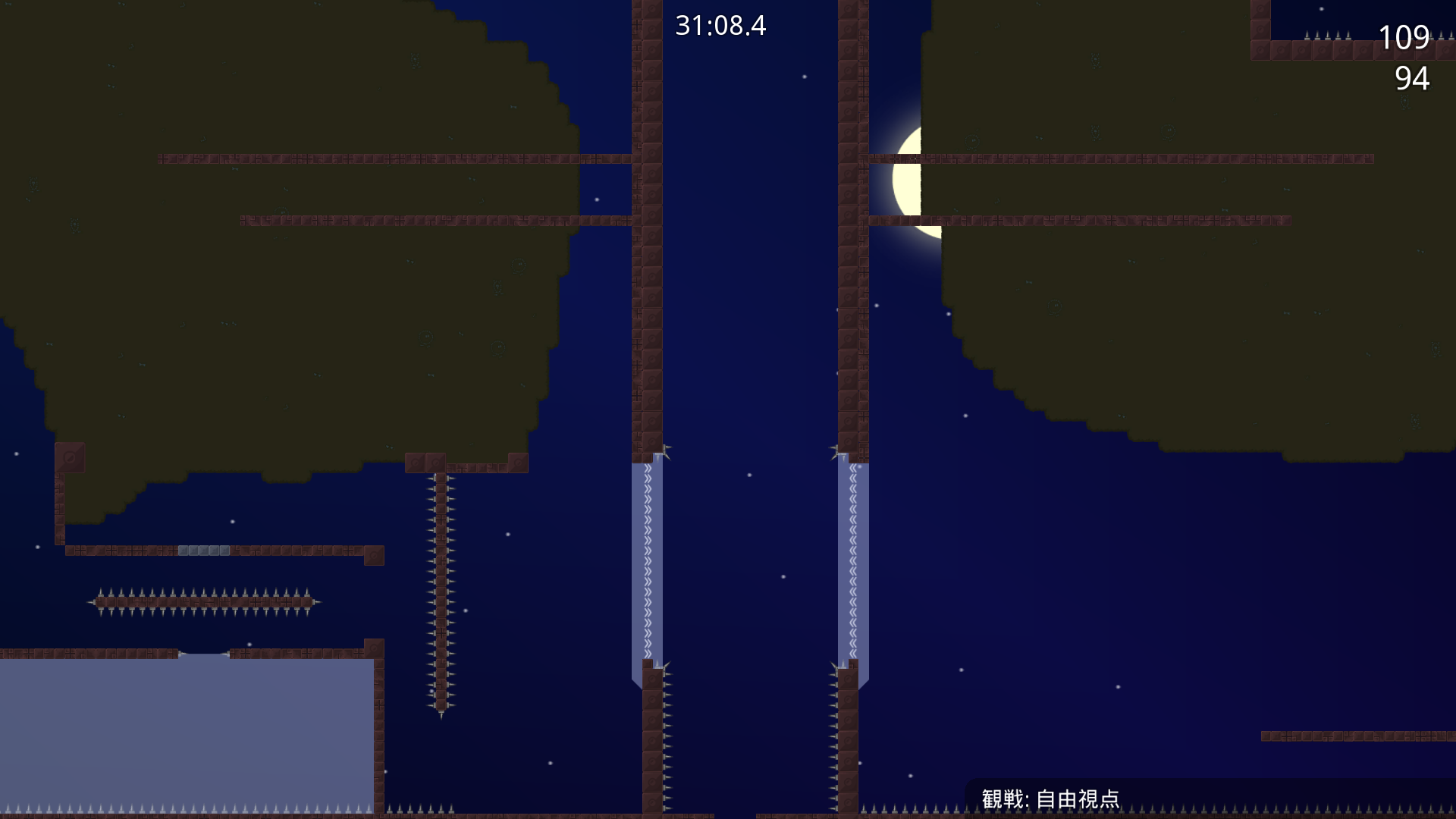
colors are not that good, grass_main is really dark while killtiles are on full brightness
unhook is also too bright compared to grass
I just wanted to use smth unusual. But this is not the best possible unhook construction
unique != good :D
Lamps should not be in front of game layer. I did not pay attention for that
Fixes
Changed colors Added entities off sign Removed "Think first" sign Lamps layer moved to behind of game layer
Remapped most of weird unhook constructions
entities
Entity bugs
remove kill tiles
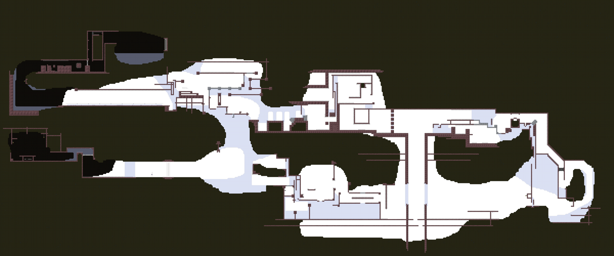
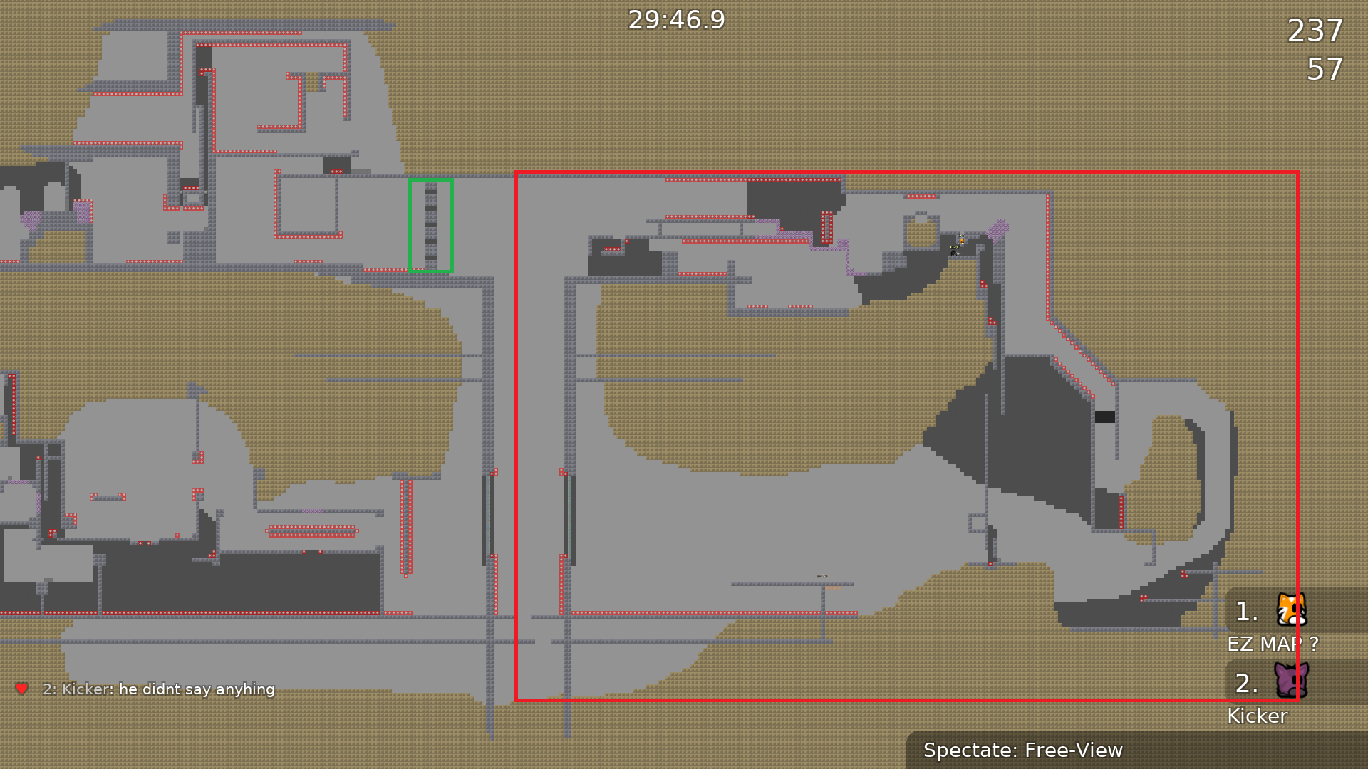
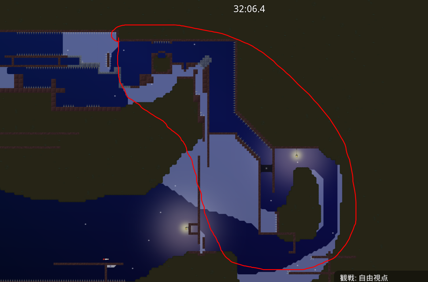
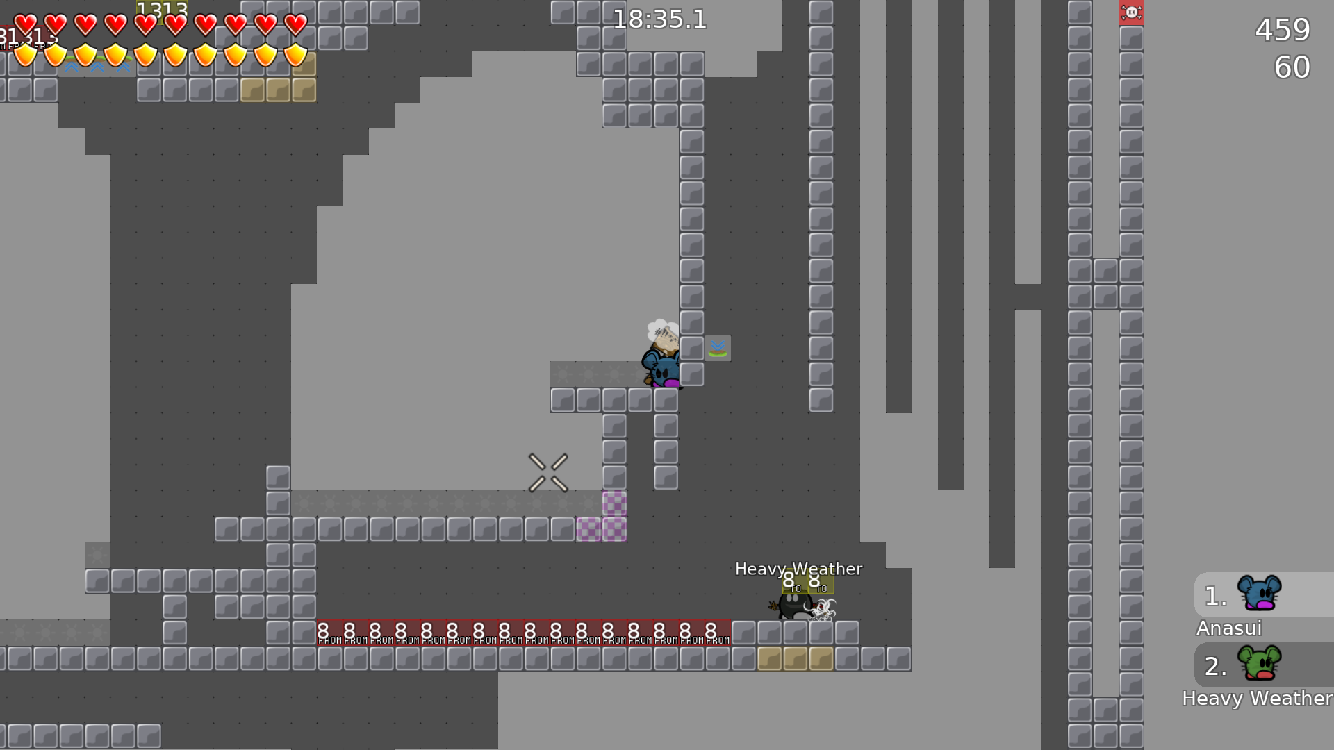
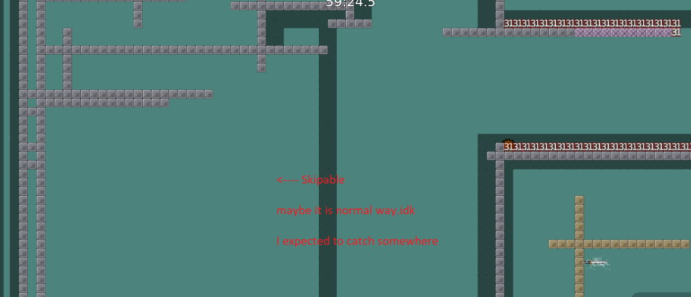
u can ship this everything, u have to change the part in the green rectangle or add team force
I agree with you. I will remap these parts
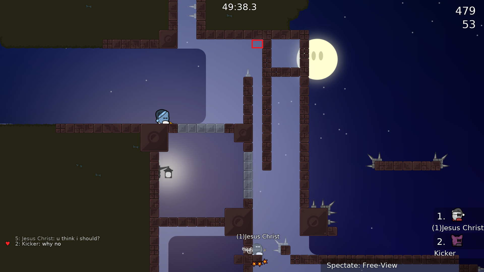
u have to fall from the highest point or u r dead
i didnt know if i should have reported it tho
I can move this wall 1 tile up
than it wouldnt change the physics of the falling?
If you jump high enough, you will not die
then make a marking of where the tee should aim on jumping
this is VERY easy solo, maybe make it not soloable it is a brutal after all
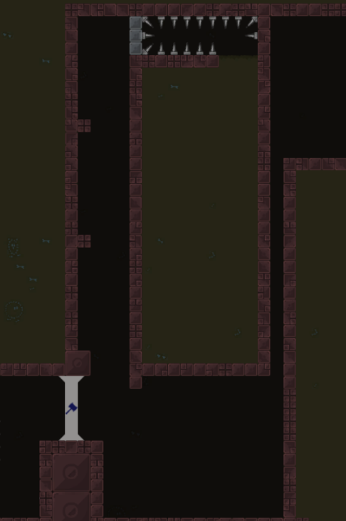
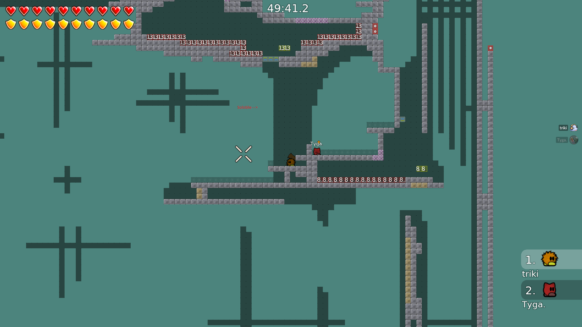
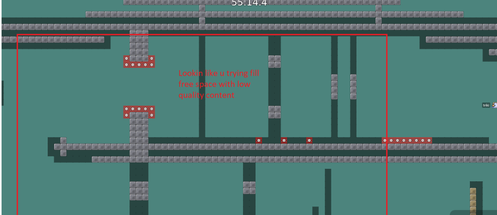
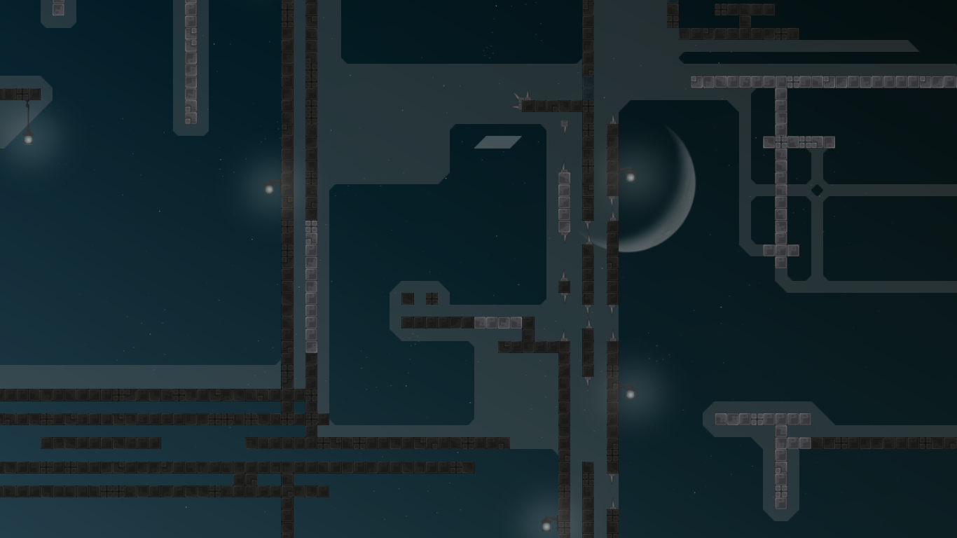
In my opinion most parts are too plain, you have plenty of room to make them more interesting like here:
otherwise i think its a solid foundation
ah and btw map isnt brutal, moderate 4-5
np
But the map "First Try" is brutal 4*. I thought my map should be brutal too because of killtiles
kill tiles doesnt make ur map harder, you can replace them with freeze tiles and get almost same result + many kill tiles in ur map is more like decoration
- first try is rly old map, back then maybe it was brutal 4, but not for now ofc, many maps on ddnet like this
i agree this is not brutal
$waiting_mapper
I will remap boring parts soon
then there is no need to move the channel away
$rate balance=3 flow=6 creativity=4 playability=7 fun=1 design=0
explain balance
please
I can fix it at weekend
It varies between novice - moderate - brutal, i think all parts need a complete rework
Send me some screenshots
Do you mean the length of parts?
In my opinion all the parts are hard enough
but I'm not able to find any novice
All these parts was already remapped
I will post new version later
maybe in 1-2 days
yes
with double hammer throw?
or speedfly
some time has passed.. no new version?
I need more time. Like 1-1.5 months
k
$waiting_mapper
so what's the current state of this one?
50%
stylecorners
not need speed to pass noobfilter
very nice map!
+
fixed
fixed design bugs
could you upload with correct name
more spawns
logo is weird lol, "A" is an article why is it on its own row
why This is solo
If I set 5 spawns instead of 2 this will be enough?
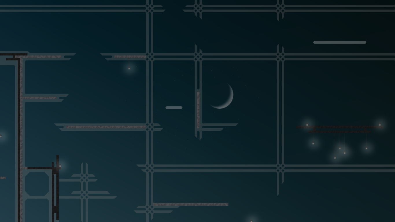
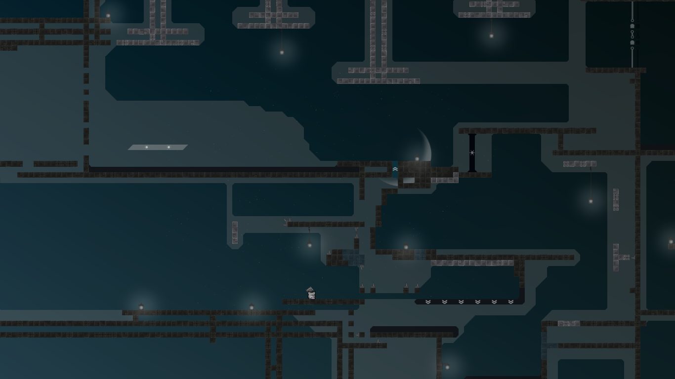
design looks like a poor attempt to copy Grim Reaper
but in none of these an article is on a single line
night theme + moon != grim reaper
@Ravieand yes 5 spawns should be enough
crescent moon + lamps + same sky color
also little lights on lamps
just like reaper
tele should have transparency
not a poor copy then This map is
grim reaper
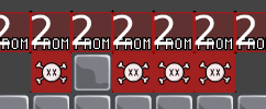
and you should use a seperate marking for forward tele
This is the only good sky color imo xD
@Raviethere are undeniable resemblances to Grim Reaper though
We didn't copy any design ideas.
wouldn't be the first time reevie copies something xd
nobody forbids you all to think so xD Maybe his nickname is a copy too Who knows xDDD
🤔
fixes all the things and some design bugs
fixed freeze under tele texture bug
fixed design bugs
remapped last hook in laser solo part
fixed entities bug at finish
You’re guys so toxic, lol
Unbelievable, I thought the community in this game is unusual friendly
It was the moment when he knew
he even don't know what grim reaper is...design on grim reaper not unique, similar design have a lot of maps
it just generic_unhookable + default kill spikes with lamps lol
NO U KICKER!!!!!!! Ravie has a patent for this design! NO U
!!!!!!!!!!!!!!!!!!!!!!!!!!!!!!!!!!!!
🙈
Opa! Gruppa podderjki podletela : D
do you realize that copying designs (and without giving credit) is not exactly nice either? 👍🏻
cmon, how is this grim reaper? this design here isn’t special at all, grim reapers is; the unhooks are mapped completely different, the things that make grim reaper unique are gears, its style and flies imo, don’t get me wrong, grim reaper still looks much better and got a really nice atmosphere, but this is really not that much of a copy..
Totally agree with u, cuz there are many similar designs in tw
Mine isn’t especial, it’s just the SKIN of the skeletal structure
stop_hate
Your words guys are not even criticism
You both, but freezestyler
lol do we really have to explain why ripping off others work without at least giving credits is bad? you should be old enough to have a basic understanding of morals..
the only thing that you could consider as copied is the background color, all others stuff is basic with basic colors (except for the crescent moon, but it’s in common use recently anyways) and i am sure that the background doesn’t use exactly the same values either
maybe you should start by explaining, why you are calling this a rip-off
I didn't
but he can't act all innocent and cry about someone suspecting that he ripped something off when he multiple times did it in the past
still same background color, same lamps, crescent moon. Even if one of those things on it's own isn't exactly like Reaper there's still too many similarities to be accidental
Prosto smeshno ot daunov
english and stop insulting
Where insult
in rus
this is so ridiculous
go jao
You forgot to mention these iNvEnTiOnS you made in grim reaper:
Thank you Ravie for great design ideas. We copied all the things. Feel free to add "Design by Ravie" and "Map by Ravie" in this map
And also add "Thanks to Ravie" near the finishline
There's no need to be

I'm just saying it looks a lot like Grim Reaper
Don't be shy
It doesn't 'look like', it's just grim reaper brutal version We copied all the things, yes
So you can also add a link to paypal so people can say thank you for your great job
kinda hilarious that you make fun of it while reevie literally copied so many designs in the past xd
but focus on the map now
instead of wasting everyone's time
2 map designes
copied so many designes

By the way you both started this discuss and now you’re saying “stop it”
Lmao
omg why is this so random buggy shit
this is not random
you wanna demo of this?
yea
or come show me
if u r free
sec
jesus's part is now easier
"This is not random"
"Part now easier"
its not random for me because I mapped it
and this part is not well known
making it hard is bad I think
because Jesus cannot do it
xD
if even god not able to do it
minor fixes
easier noobfilter
fixes
changed annoying part (tp 10) added chill/fun/blocking room (tp 32) changed part after laser solo (tp 31)
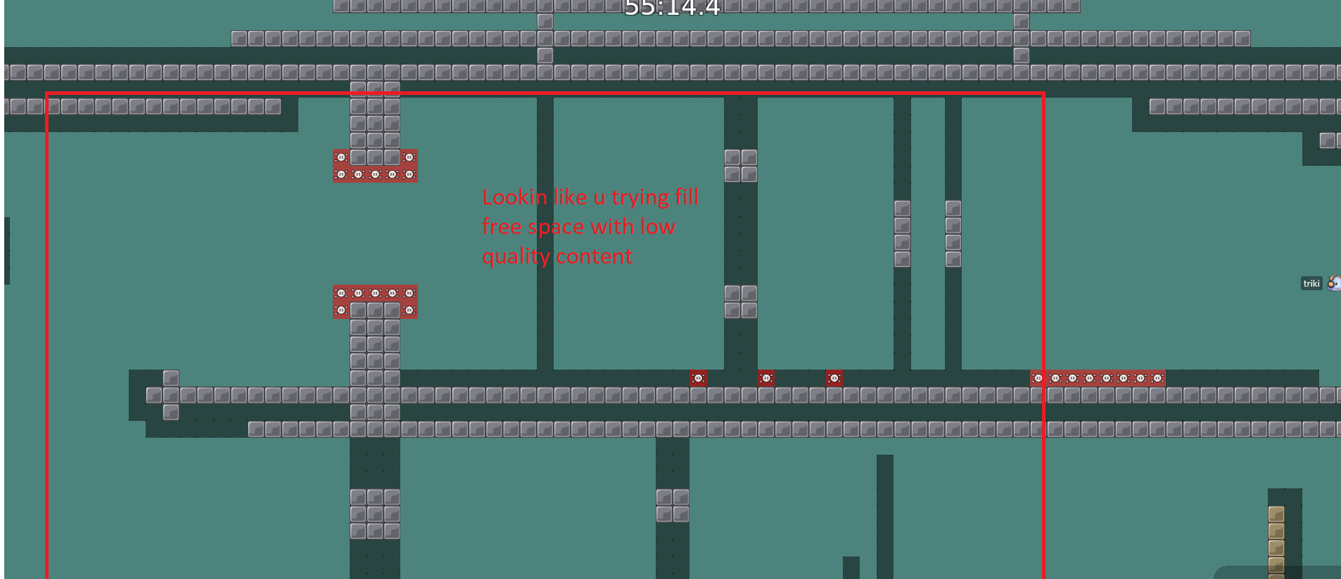
This map really good. And last one, some parts have so much free space try to fix that.
I don't want to make this map more tightly packed. There is nothing wrong with free space
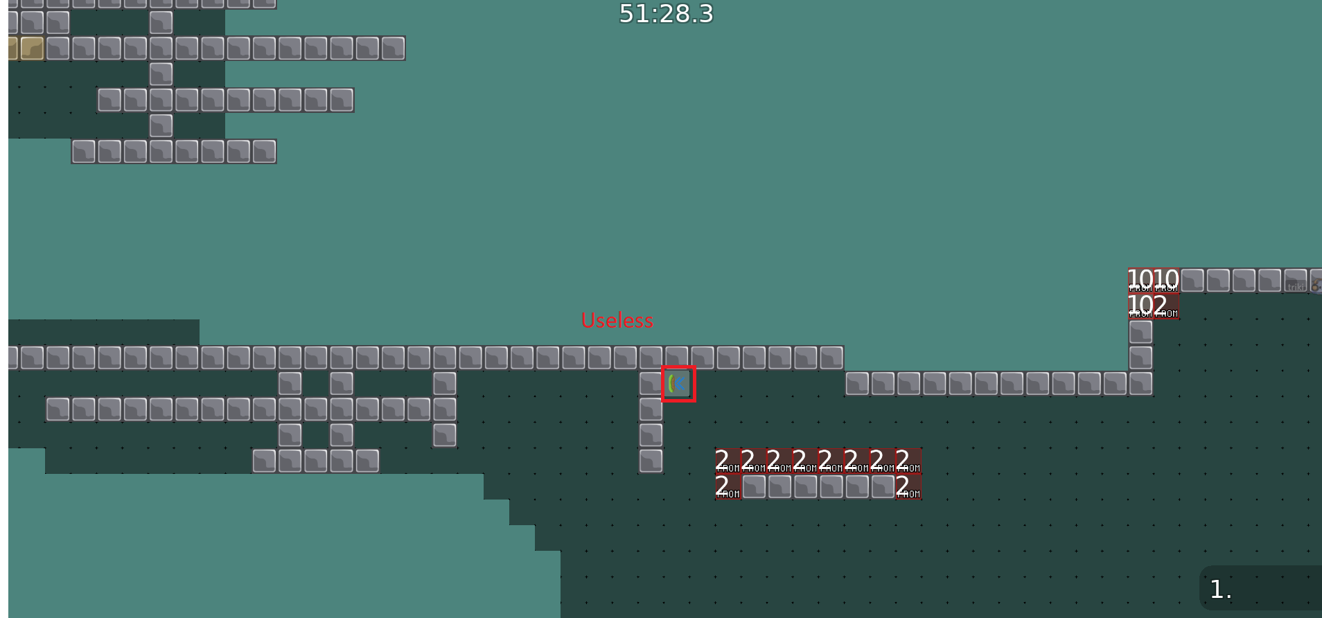
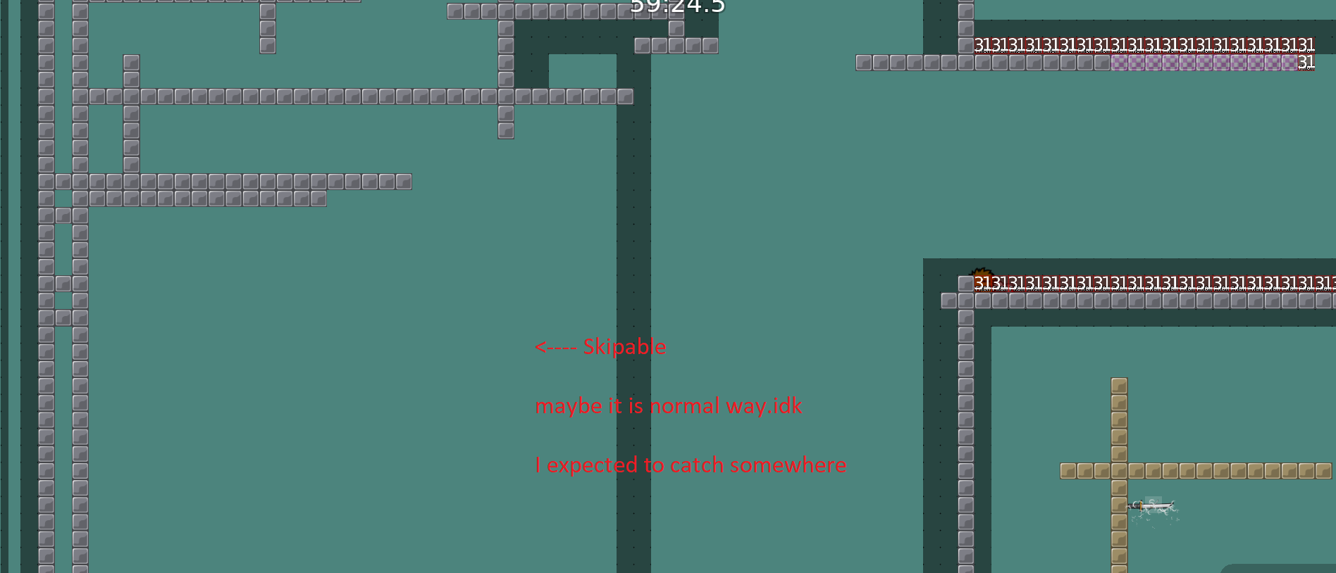
if you think that something is 'useless' or skipable, I say 'no, this is just another way to play the part'
Didn’t like THAT much free space at end too
bugfix
?
Fixed unmarked CP
minor improvements in 2 parts
less faily more fun to play
fun as tee swap ?

omg
it's not ok to map 24/7. You can (already) become crazy and spam your teeswap feature everywhere in all dc channels. Take a break
oops
#off-topichere
if map is good , you can enjoy it . For me fun is too try too understand a part if i dont get how its works and i see that almost all new maps that are posting here in discord are them ! Also i love that there is no same map as other map created by other player , all maps are very different ! Most of creators i like is
@Im 'corneumlike he creates a map always different then his previous map and he steal keeps create somethink new all the time ! Hope this map is interesting and fun to play to ! Hope it will be released too
ok
Even if it's fun
U should try to think a bit less about it
last part has been remapped
rls tomarraw
GG
plsrls
Ooops
bug
when release?
idk
My map is blu, worth releasing
blu?
Blu
what's blu?
should I rework something or it's good now?
haven't checked latest version..
😦
Am I blacklisted since I spammed BLU BLU IMA BLU
xD
@skuau
blu!
please unban me jao please unban me jao please unban me jao please unban me jao
hlep help
