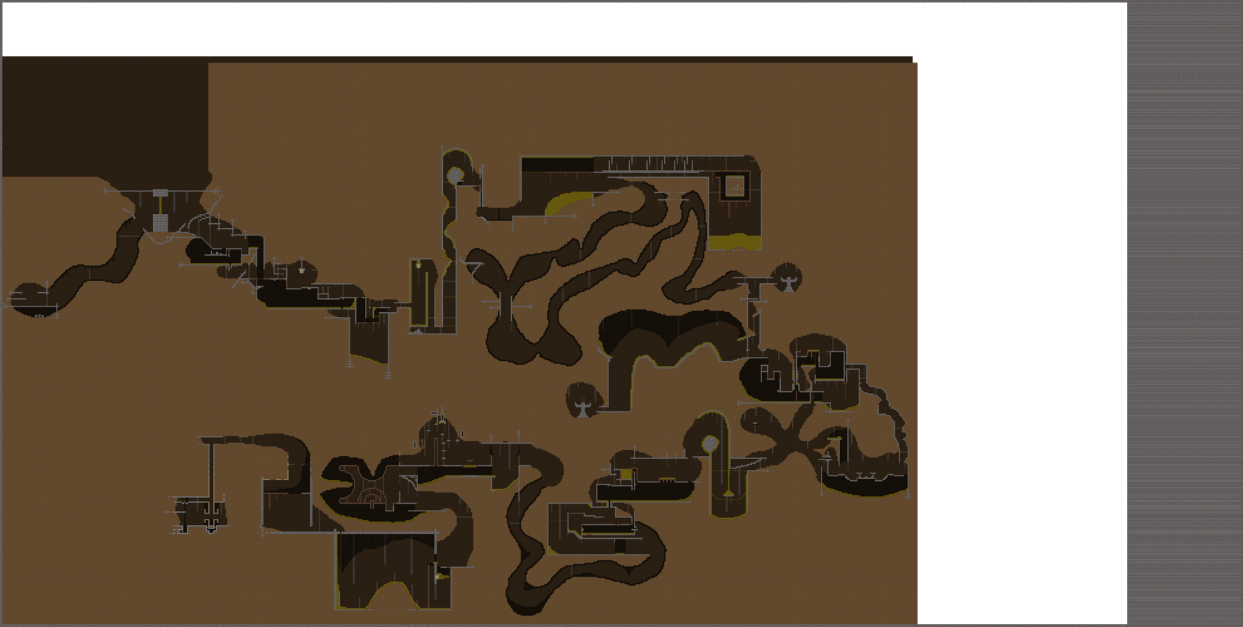
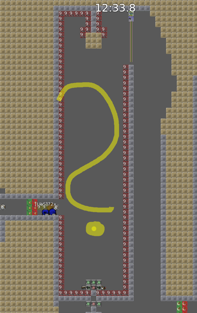
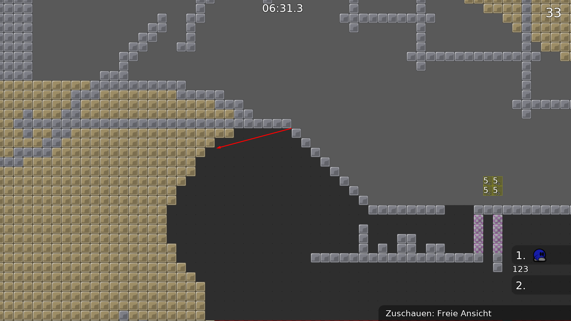
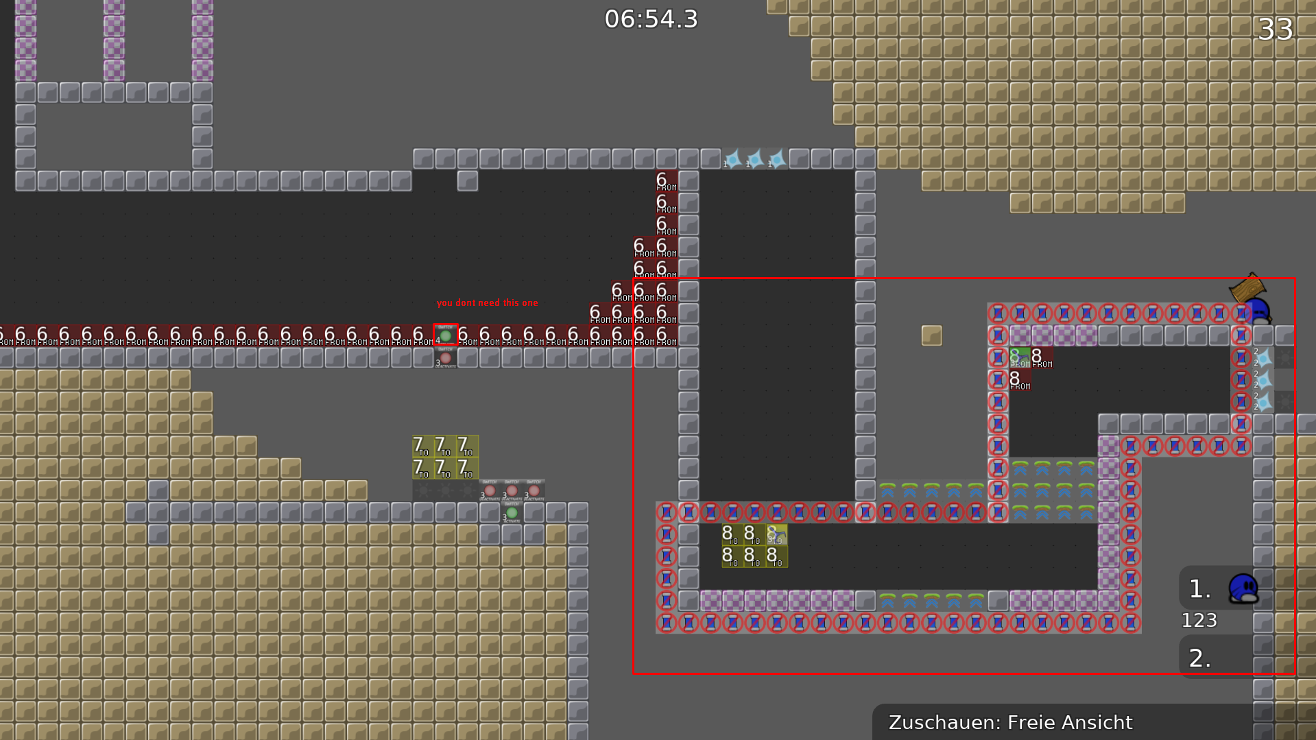
$rate Balance=4 flow=3 creativity=5 playability=5 fun=0 design=0
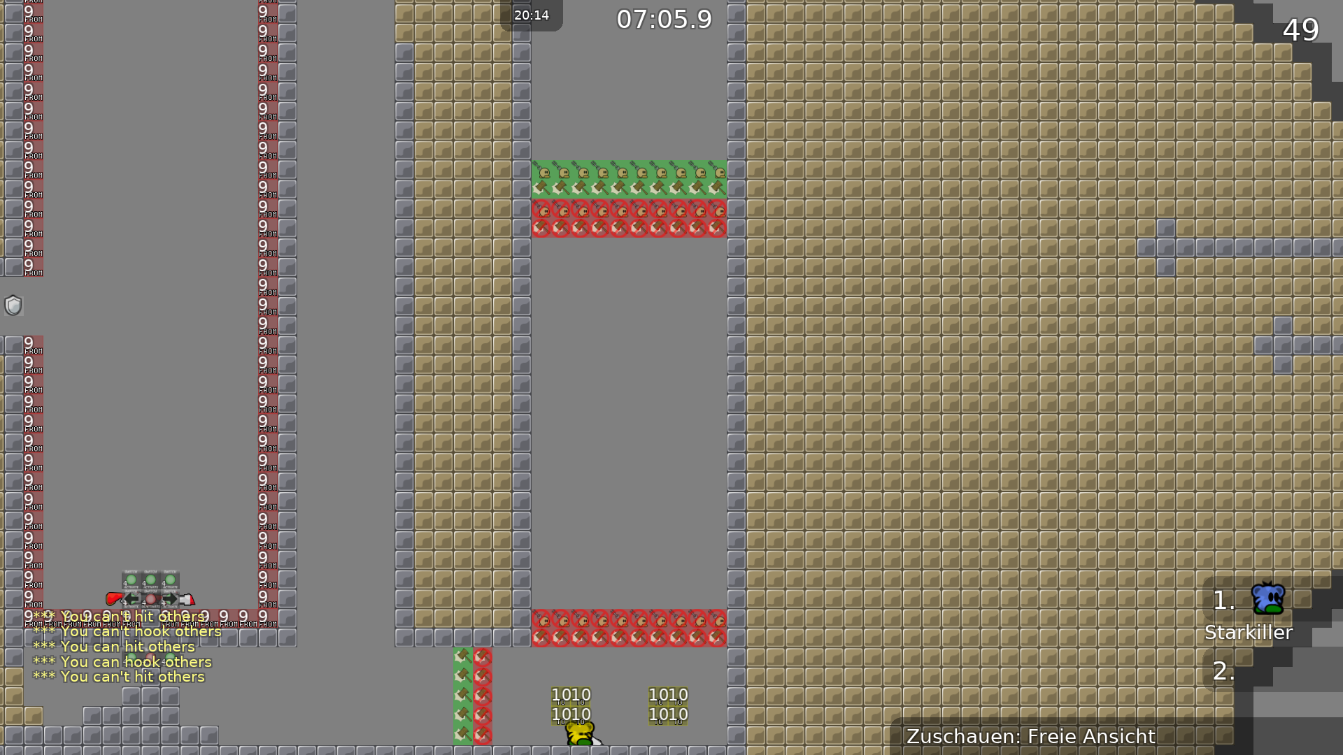
Your map starts so promising, design is super cool but that yellow teleport doesn't fit at all. Individual parts are not well thought through. In terms of creativity i just found 3 parts that were actually exciting and could be exciting for a moderate player and on the other hand there are some questionable parts. TP19 can be skipped completely?! So overall this map was (even for moderate players) rather annoying playing than fun. I can re-rate my design points if you change the teleport colour to something different, for the other criterias you got to work on each individual drag part again to eventually gain more points for release. I didn't find any bugs so clean mapping!
Hello, thanks for the detailed answer. If you have a moment, can you tell me which parts are exciting (tell by TP id) and which are questionable, please. I don't know how can we skip TP19 part, except if we're more than 2,maybe. Could you also give me advices to make this map funnier, or tell me in what it is annoying. About the teleport, i liked the mix yellow-brown, but if it has to change, tell me which colour i should use, the colour isn't a problem for me,i can change. Thank you,have a nice day.
About teleport colour you have to figure it out yourself, but yellow isn't a very good choice
$rate Balance=4 flow=3 creativity=5 playability=4 fun=0 design=0
same opinion as broke..
broke explained everything. map is really unplayable
$rate balance=4 flow=3 creativity=5 playability=5 fun=1 design=1
tested long time ago with broke, have same opinion as him
remove no hook/no hit and add solo will make the whole part much better. useless to start hammerfly
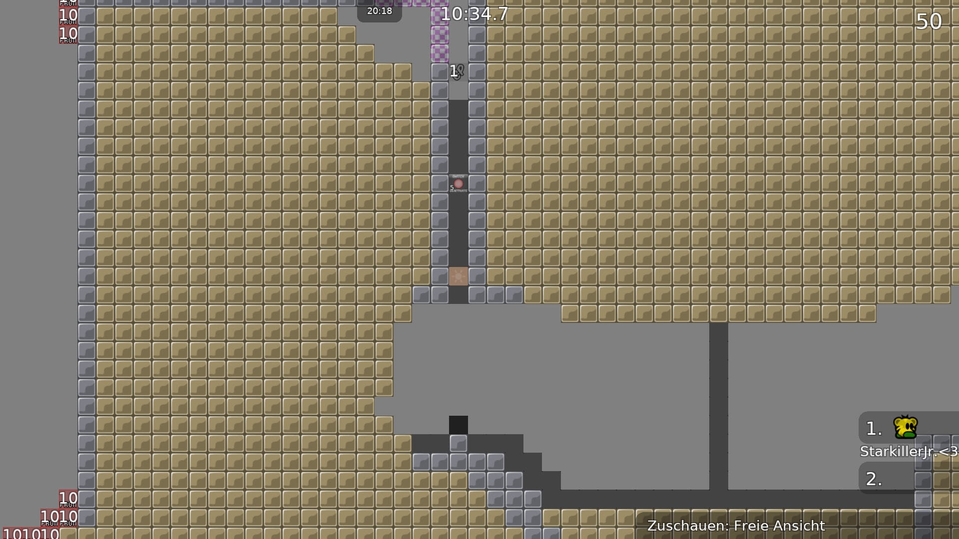
annyoing to do this that often
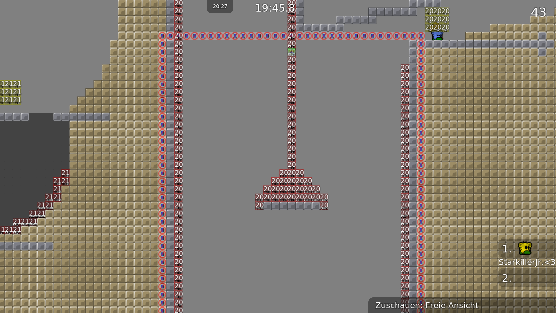
hammer your mate up and skip the part for undeep in previous screen
this is rlly annyoing...
just a boring ddmax part, a rlly boring ddmax part
some ideas of the map are..not good but "okay" but mostly bad mapped or parts are nothing special and just boring or unbalanced
$rate balance=3 flow=3 creativity=5 playability=4 fun=0 design=1
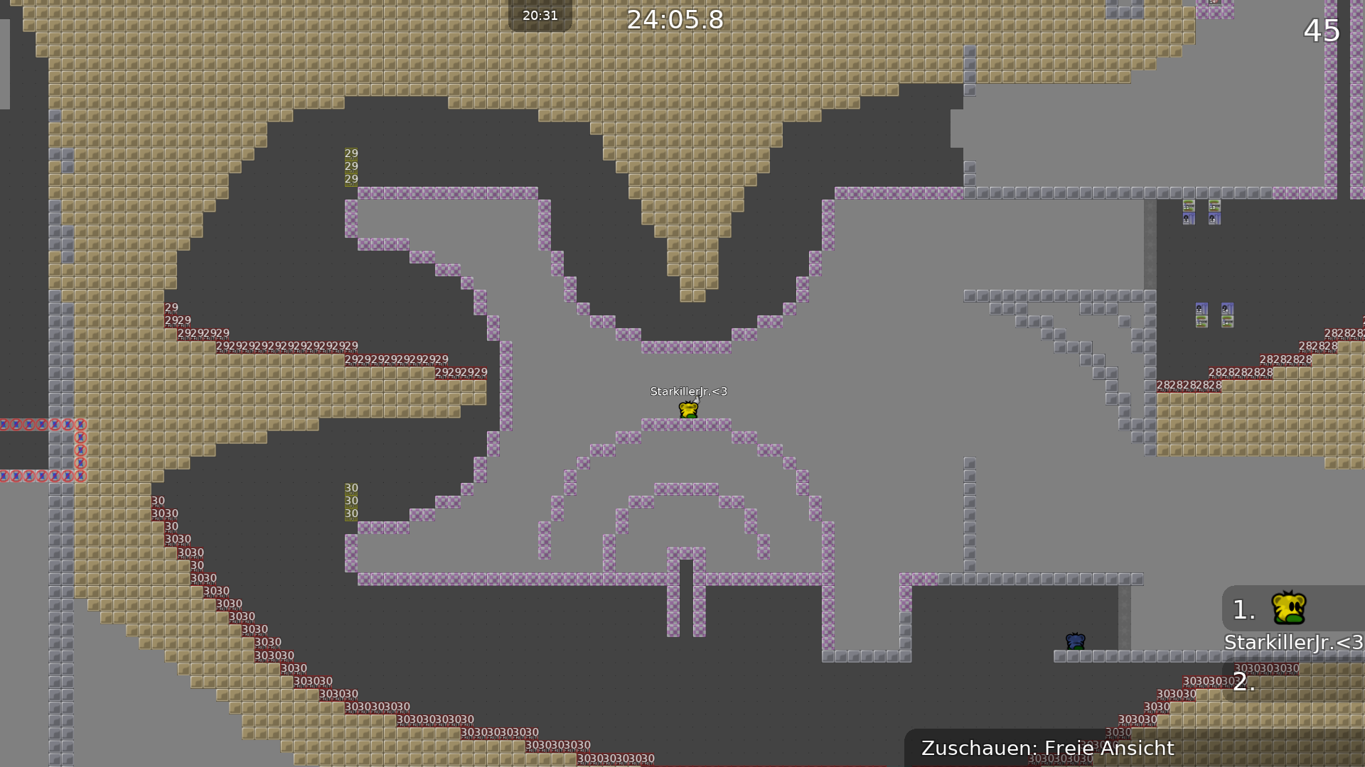
map looks intresting -> by looking only on pictures
thats what i mean. some parts looking intresting but are very bad mapped
$rate balance=4 flow=3 creativity=6 playability=4 fun=1 design=1
Overthink and rework some parts and ideas, make them more enjoyable - use them in a new map and make more interesting gores parts then you will get more points for release for sure. I think the others said everything already. (design is okay and default. But the yellow is pretty weird) Keep mapping and get better

The map didn't reach sufficient ratings in balance (6 required), flow (4 required) and playability (6 required) as well as overall (25 required) and, therefore, won't be released. However, feel free to rework it to improve low rated criteria, or simply start a new map

very intresting map also a bit anoying and inposible to clear . Some ideas are creative and i like it a lot !
U should explain what is annoying
@texnonikcant understand the part , inpossible parts and parts where if you fail you need go back ( not going in tp to get there faster )
