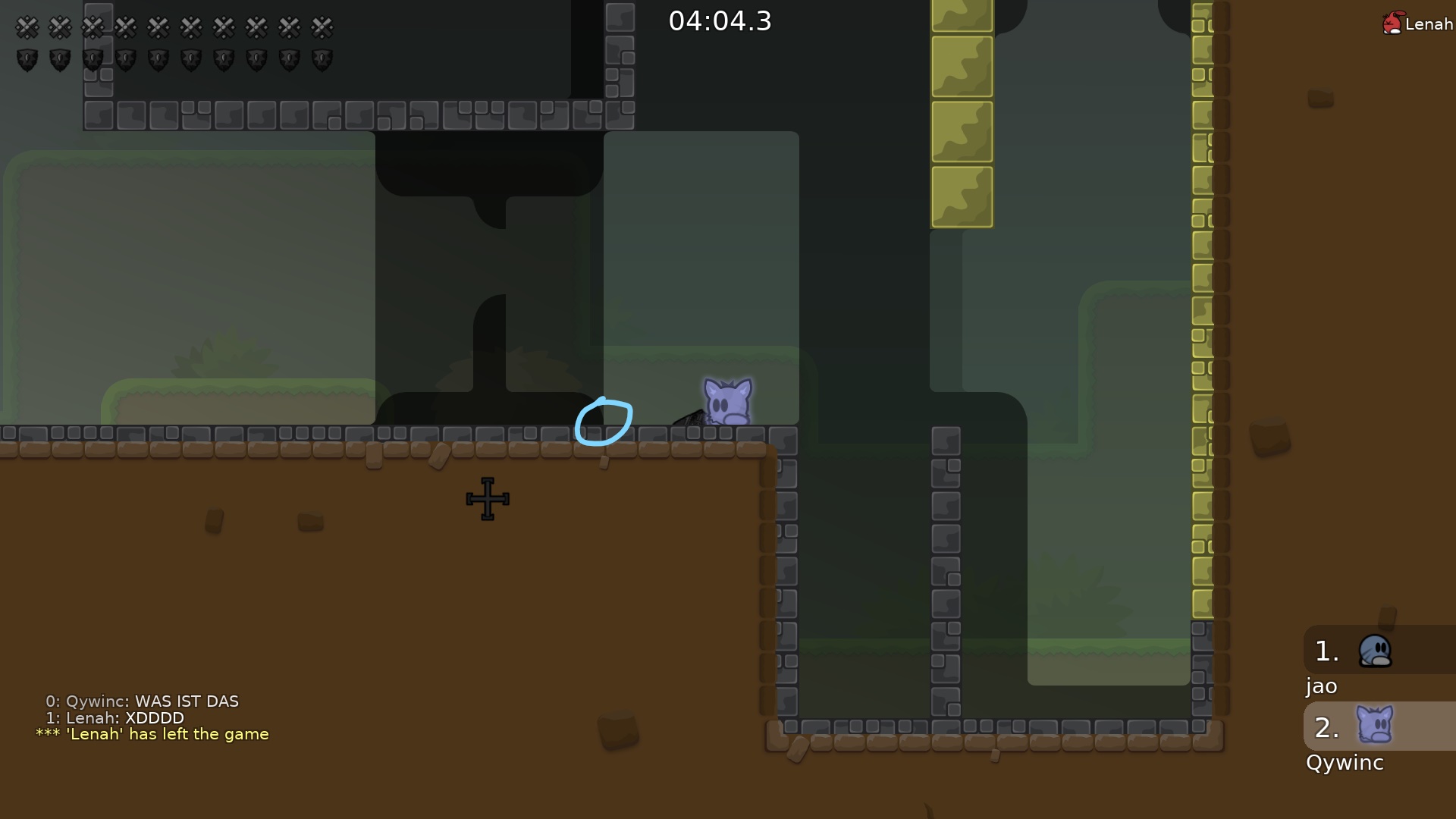
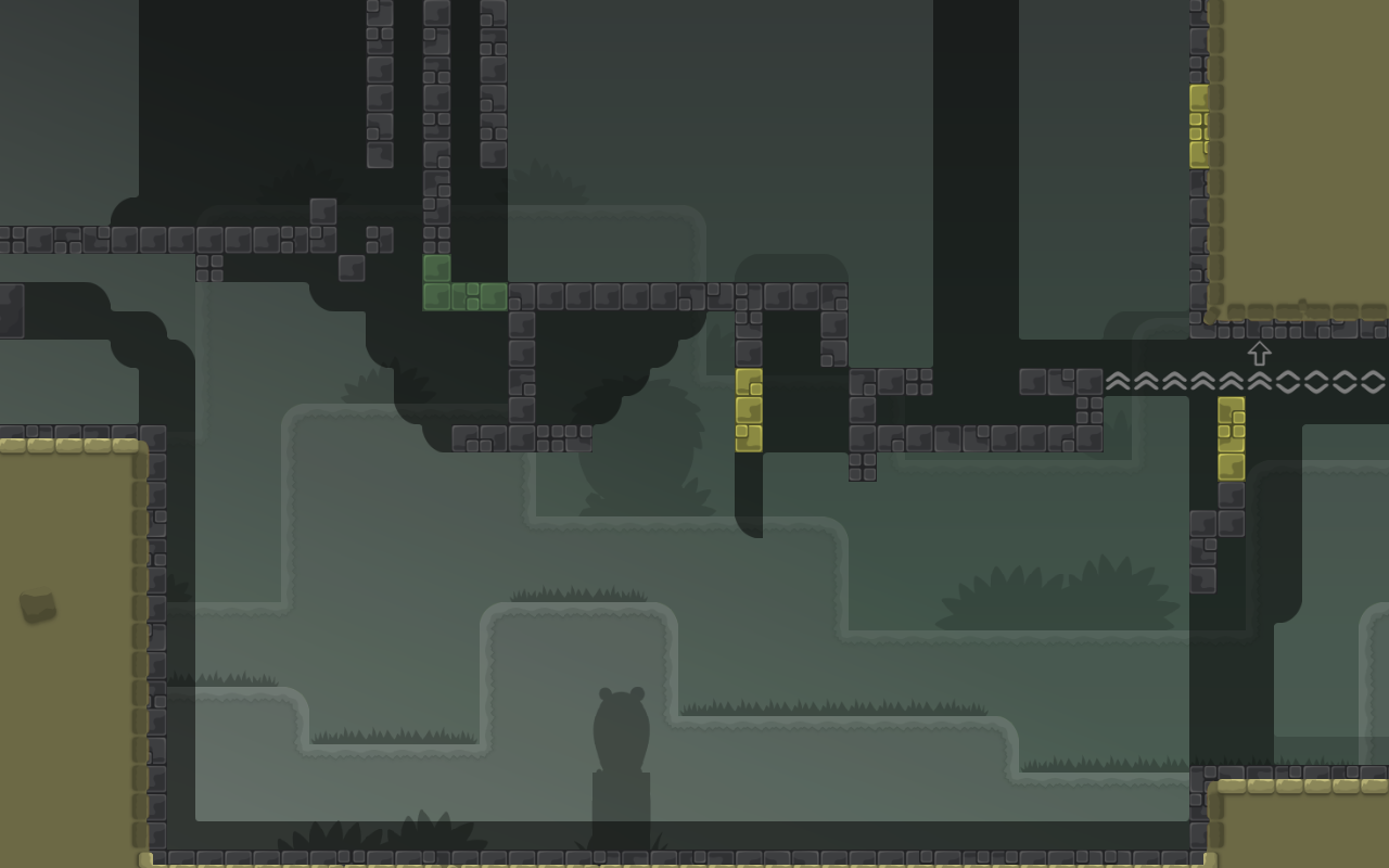
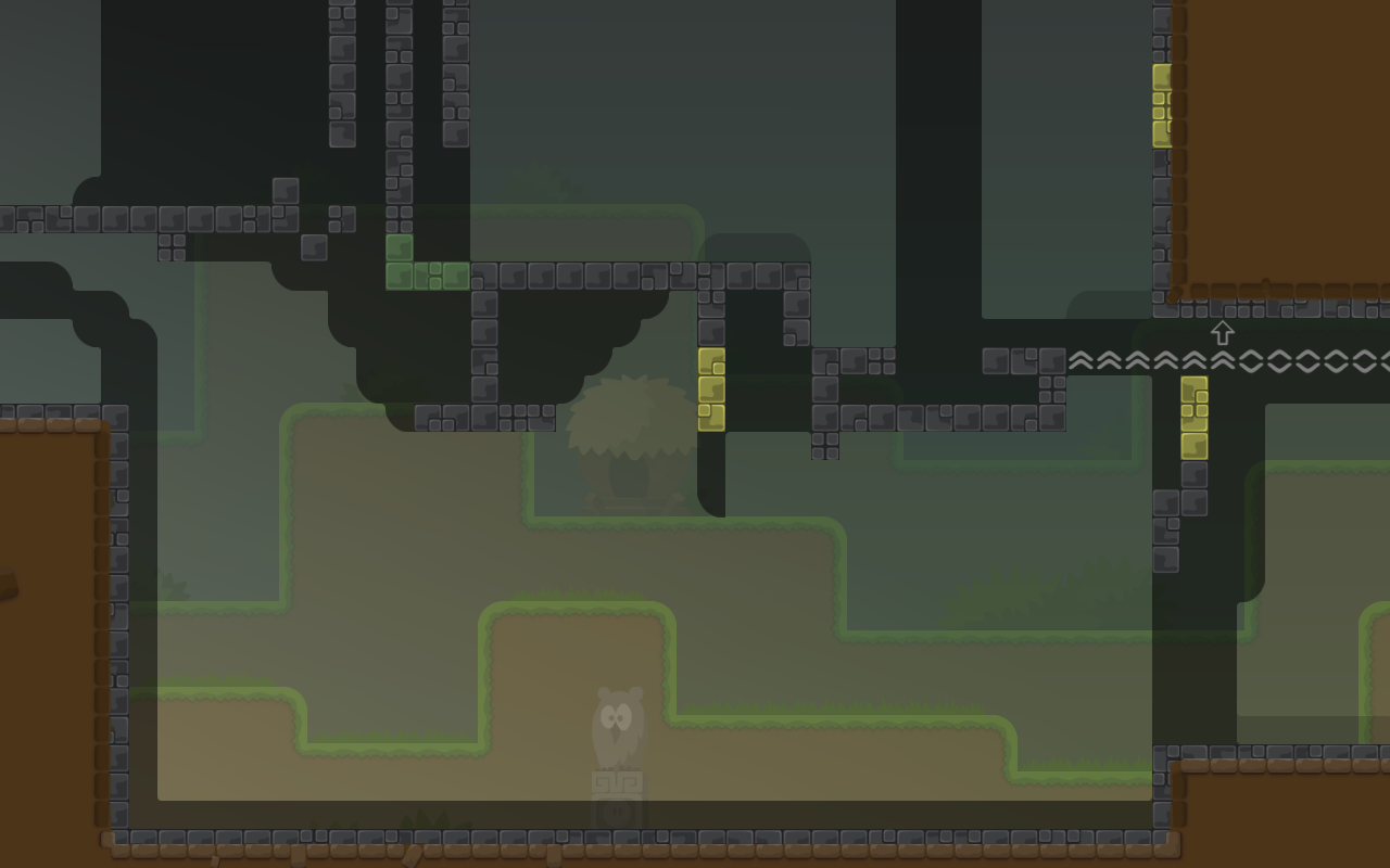
I don't see the map on test server
yea this map and #deleted-channel aren't on test servers yet
but this map is
#🆙💪onyxups fixed
uploaded both maps
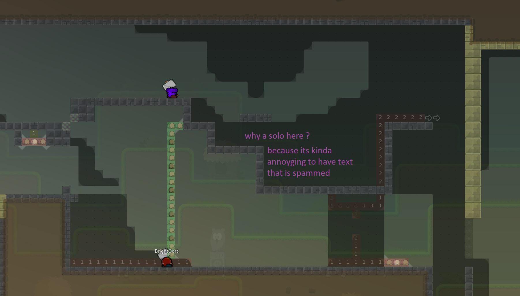
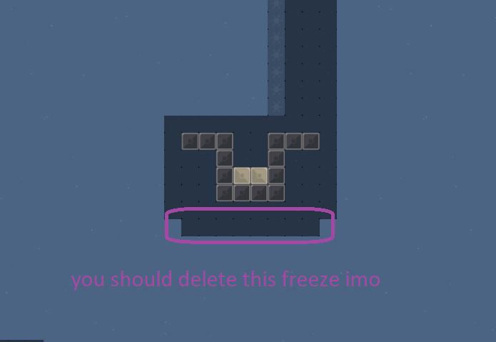
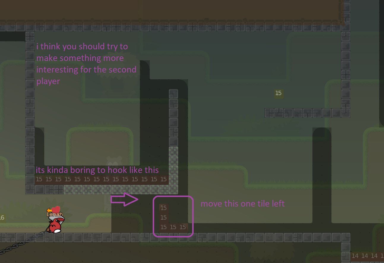
i dont like the solo part
too long
(15 sec)
Solo part is cool
imagine playing in team 0 and failing too often
this 15 sec solo becomes boring
Hum parts aren't mapped for big t0 group
I guess it's more for t4
But 15 sec isn't that long
When you look another noobfilter
But right compare to all t0 maps played it's longer
agree with firewave this is not even a t0 map
But strg is 0 sec
Back in time : it's one hook
These noobfilter is maybe too short
This one is good for me but let's see another views
back in time 2 is nice
5 to 10 sec
For t0 maps, It's too short for me
It's easy and short then tees coming fast and then it's fast full on a 64/64
I tested almost half of the map, I really like the map but some faily parts (hh) are maybe too faily for small groups.
But the end isn't work

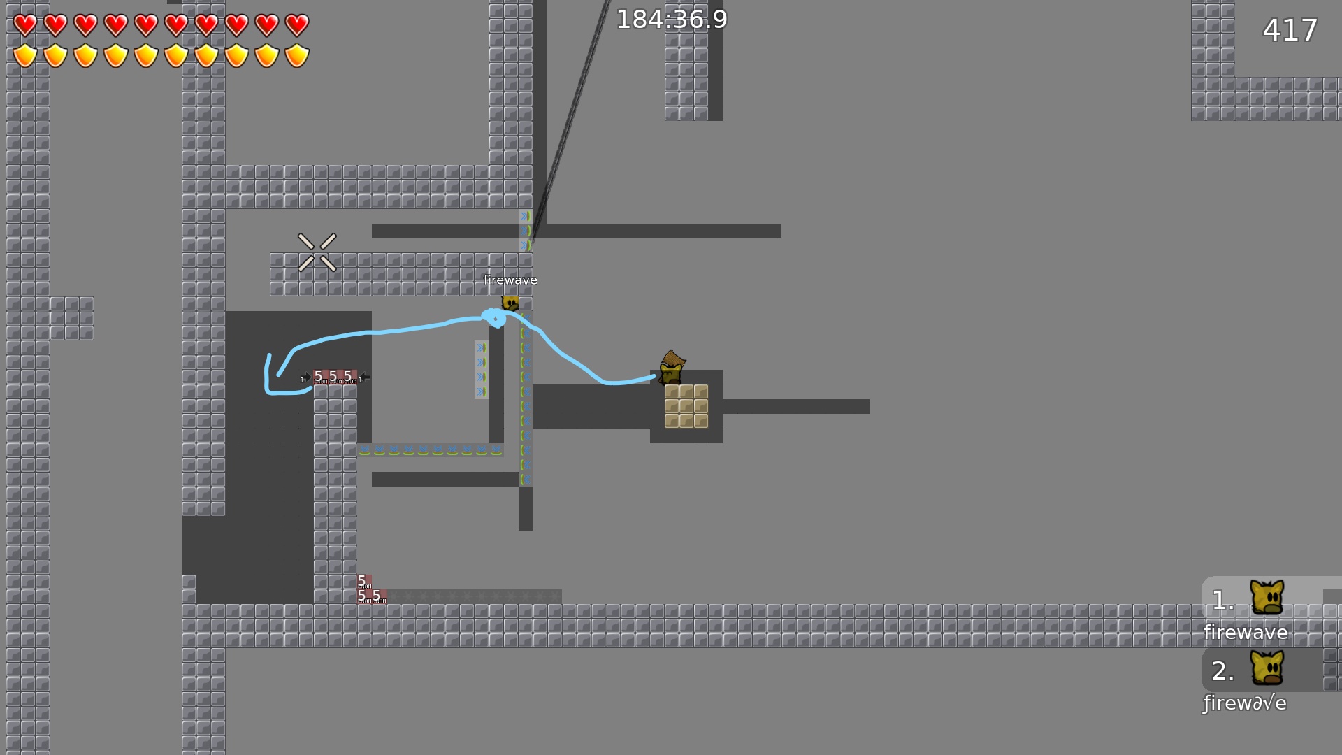
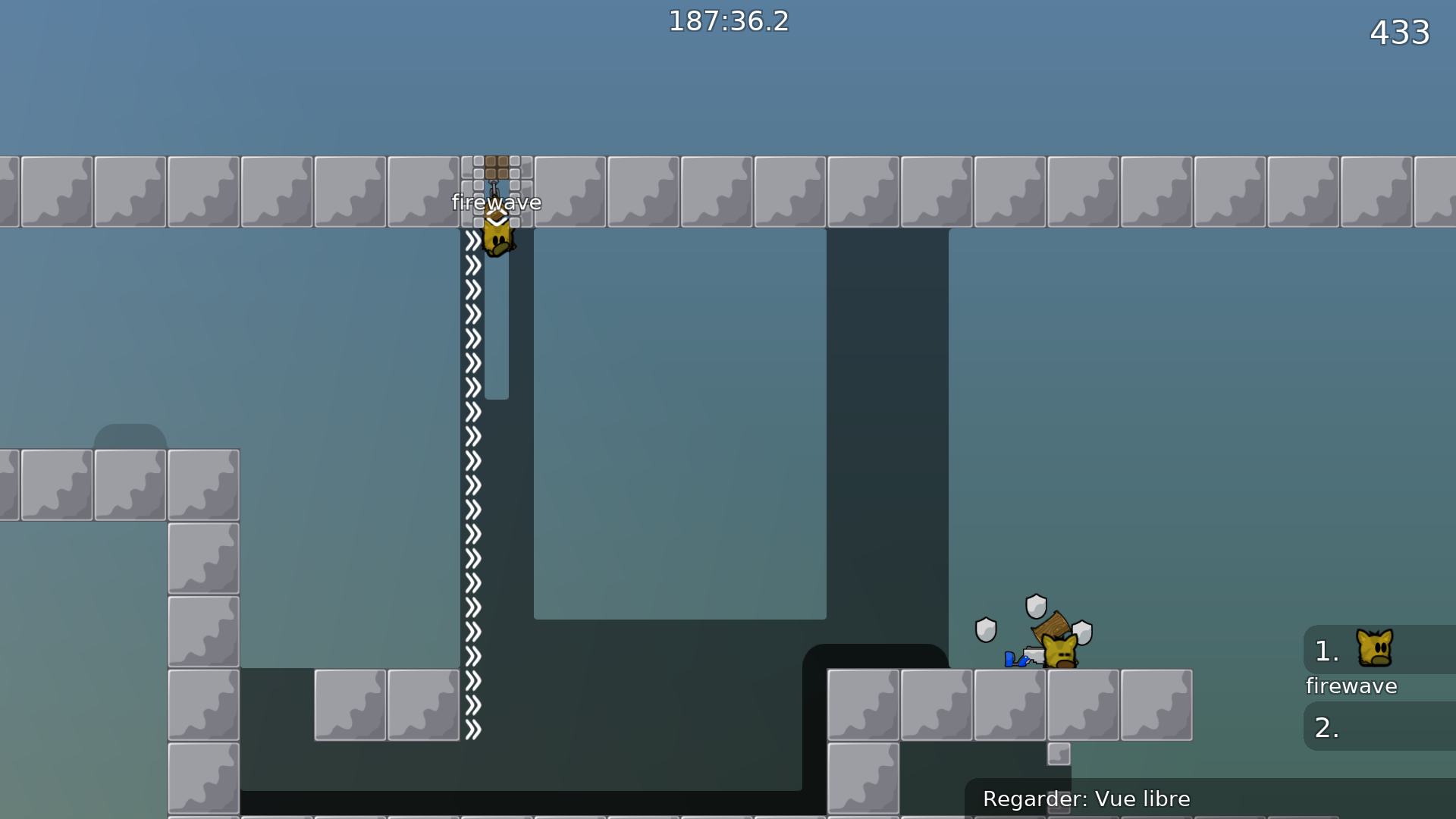
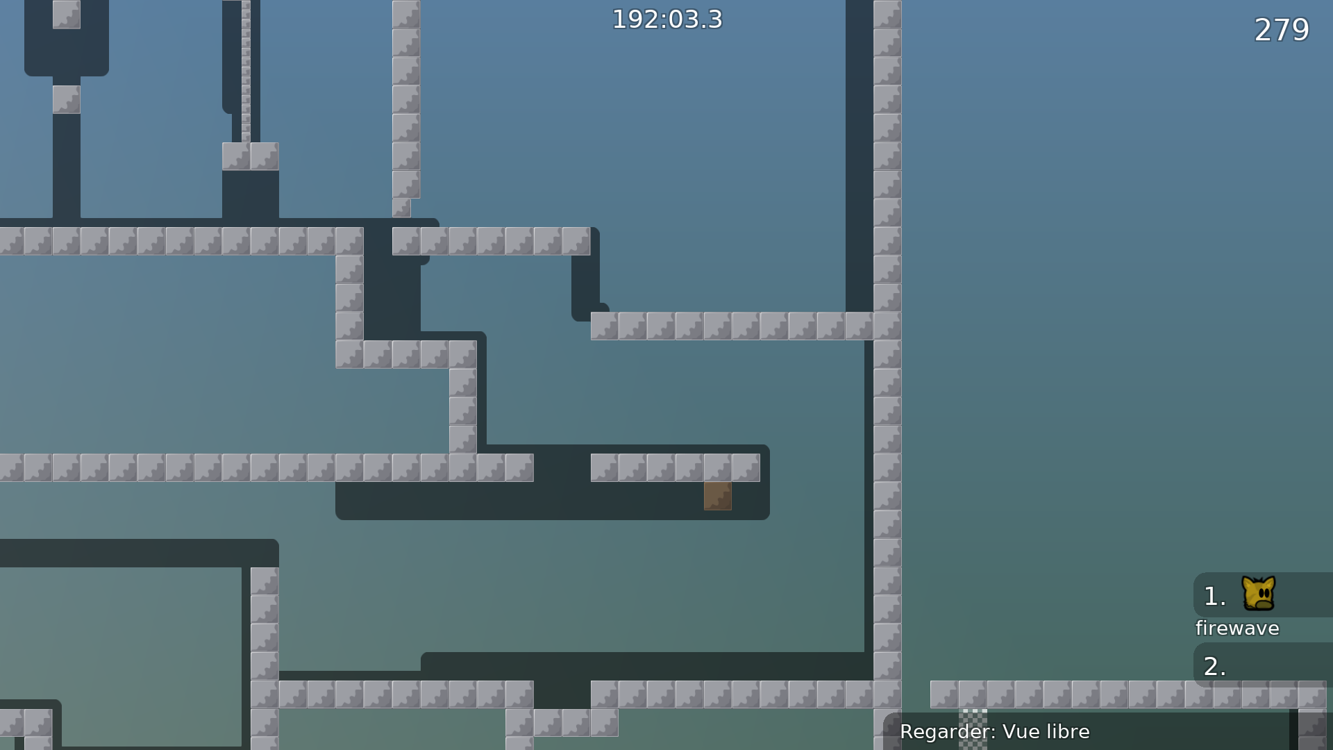
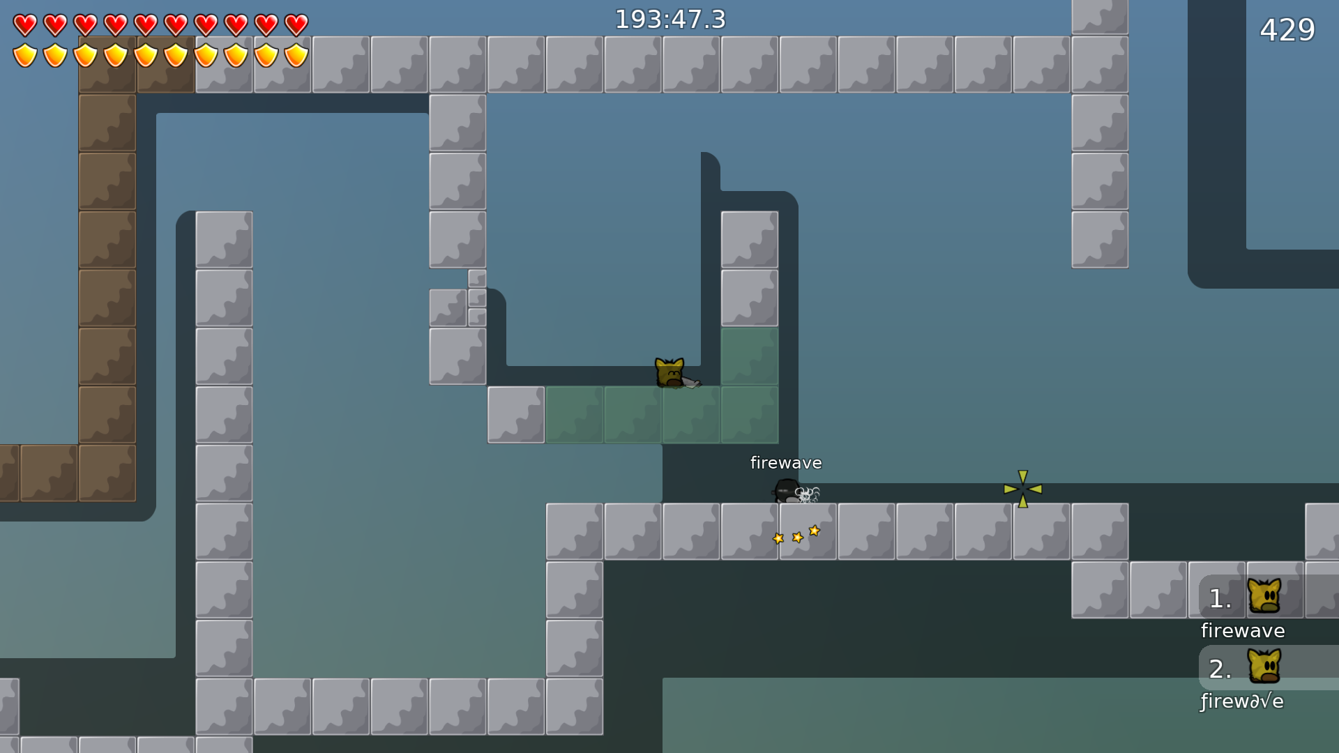
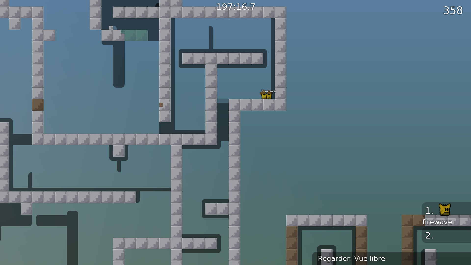
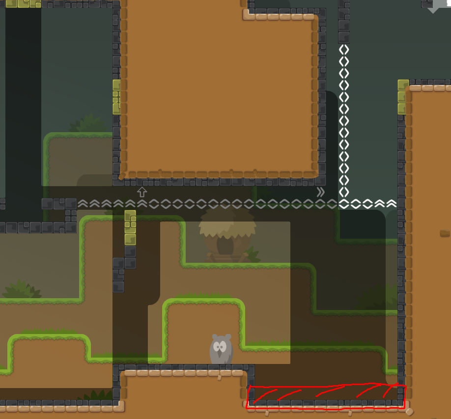
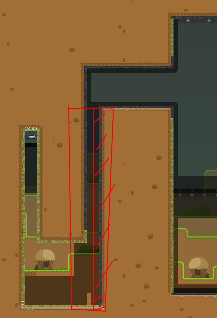
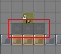
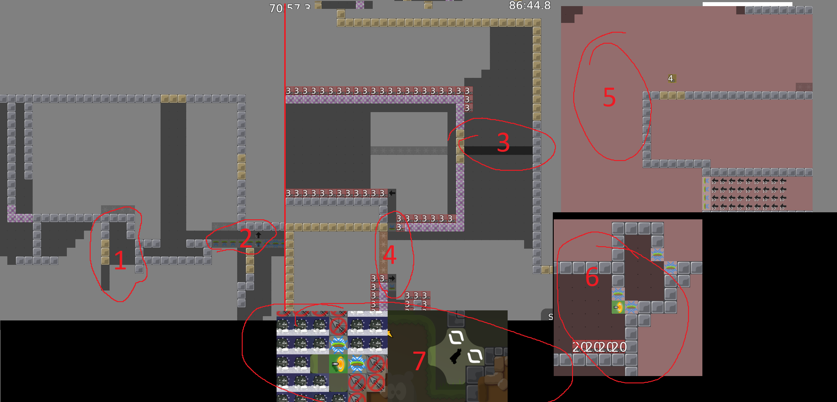
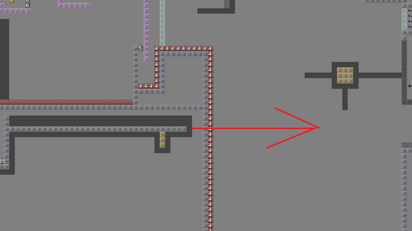
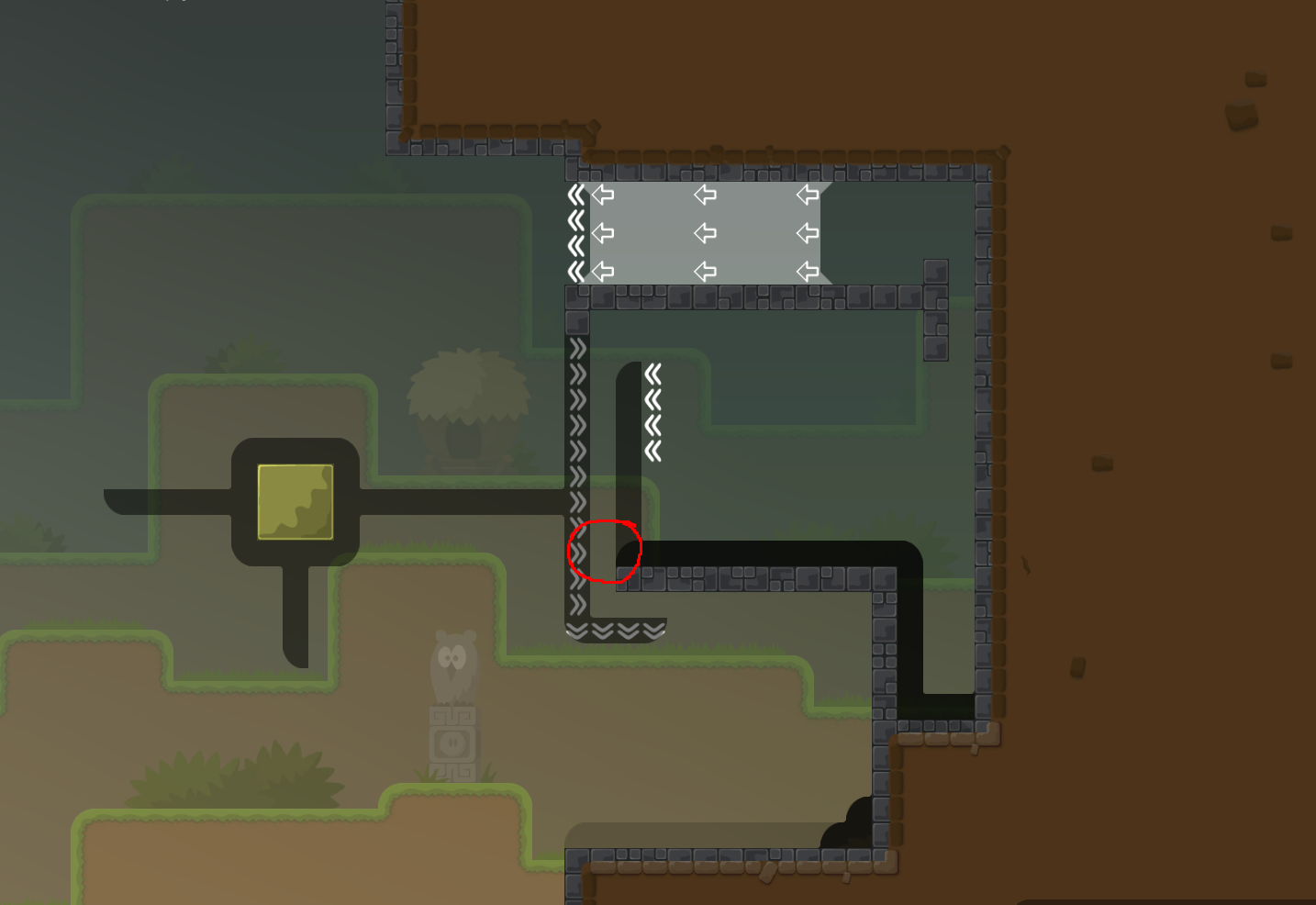
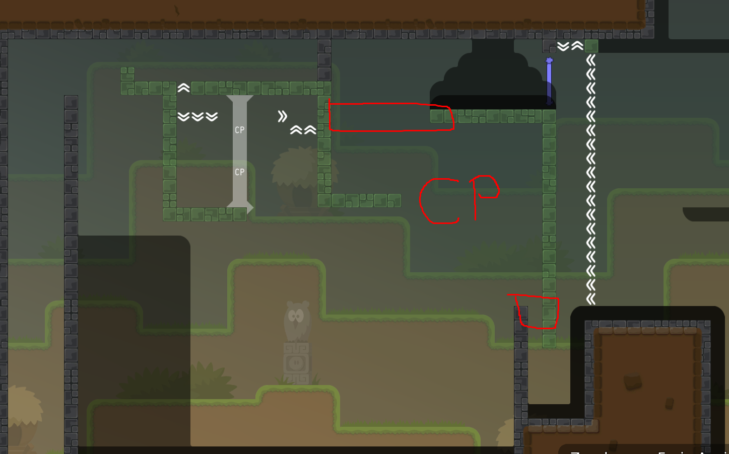
made solo part shorter made the parts from firewaves screenshots #3, #4, #5 easier to screenshot #1: you have to get speed from all the way to the right to screenshot #2: you have to swing to the right first
to screenshot #6: tower is not the intended way, there is actually a way easier method ;)
Thank your the positive evaluation though :)
I enjoy test it. I 'l lfinish tomorow but on my demo how is it work ?
Oh never mind, I understand how. Well the part is reallt nice
you made a team 0 map with 2p parts
most of the 2p parts are really cool and some of the t0 parts are decent as well, but overall this doesn't go well together at all
I'm not sure what you were thinking, but people want to play either of them, not both at the same time
the 2p parts won't work in t0 and the t0 parts will feel boring/time wasting for those who want to 2p it
you should have a clear concept for a map, parts should fit together
currently it's really half assed, so not sure if you can make something decent out of it
it's probably better to start all over again and keep the best parts of whatever you want to make this
I'd go with 2p, these parts were pretty fun imo
$decline
hope we will see a new version of this 😛

If he rework some hh parts it would be okay
no
such cheap rework attempts never worked well
i reworked some hh parts to make it more 2p friendly, I hope it gives the map a chance as a 2p map
Cor just do what they say because even if the map is good now they 'll decline it
as I said, a cheap rework won't work
you need to have a clear structure that focuses on a certain style
that's not achievable by changing a few parts
(also if it was fixable in less than 1h, I wouldn't have declined it in the first place)
imo it is really playable as 2p
HaHAxD* also thinks it's easy as 2p
nowhere mentioned anything about difficulty
My point is that the map is supposed to be a 2p map and I think there is no part where it is annoying as 2p, due to its failiness or hardness. Some parts might seem like t0 parts, but they are actually as fun, when being played as 2p.
And if you really think there are parts, that are not 2p friendly, just tell me which parts you mean and I'll change or remove them
such parts are for t0 naturally
i.e. hammer hit stuff
being multiple tees is just an insane advantage
if your goal was making a 2p map, then you kinda missed that
My goal was to make a map, which is fun as a team of 2, not a map which is only playable as a team of 2.
bad excuse
lol
argue ?
He is right, this map looks really decent for 2p
hh parts are easy for brutal
since when is hammer hit a problem on 2 player brutals?
Since tester thinks 1 hh parts = T0 map = bad map
you guys should read what I said instead of twisting my words
This mapping style is associated with t0 maps and if it looks like a t0 map it needs work in t0 as well
I speak in general, now when you make some hh parts. It's inevitably a t0 map
I speak about that
which is not true
same as how t0 maps aren’t generally bad
Before map like strong or back in time, a map with hh parts wasn't considering at t0 ( e.g aim maps)
Yea but if you want to put some hh parts with 2p or 4p I don't understand why you can't. If you want to play t0 then you are prepare to wait on some parts and if you want to play t2,t4 you know that you'll play on some faily parts for your team
"some hh parts" is an understatement
More than half of the map isn't a hh parts no ?
reworked some faily parts
so you're basically saying that nearly every map on ddnet should have never been released. Stating that t0 and 2p doesn't go well together is just an apex of stupidity, best maps on ddnet are actually a mix of both.
The rework with tele feels much better. It is less faily while still having cool 2p parts. Some parts have multiple ways to be done, but i think that's a good thing as no part is really cheatable, but you can decide which way is easier for you. +1 for this map, even though there might still be some bugs or improvements it needs (didn't check everything)
I 'm for this map too
just some minor fix
it's obviously a faceoff of t0 maps
I reworked the map and hope you'll enjoy this version more than the last one 🙂
Very nice creative and unique map! Need big brain to finish!
i'd probably rate 4-5 *?
very unique parts with telegun
takes some time getting used to it
bg is pretty meh tbh
rls

- changed graphics of some arrows
- fixed minor bugs
If you have any questions about how parts work, feel free to ask me.
please some tester look at this map, it's actually ready for release
Ill check it out if thats okay for u
thanks 🙂
!
someone test this shit
u
i already did
nice background

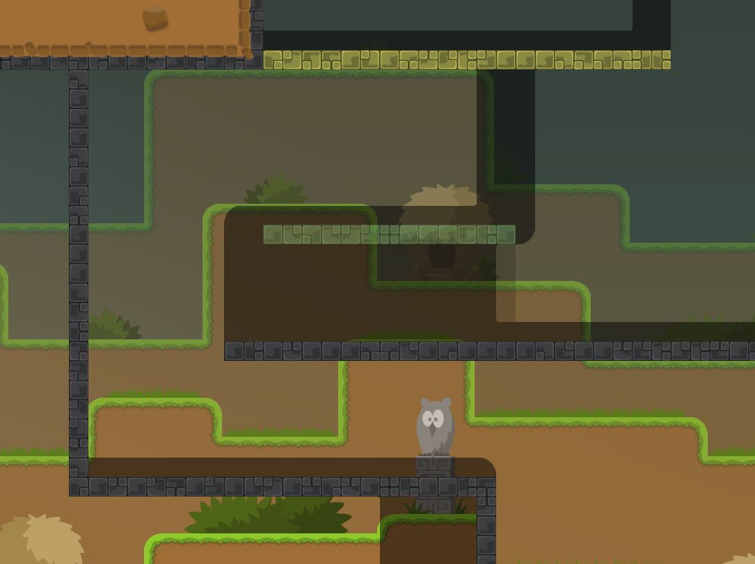
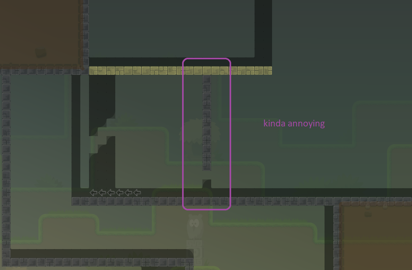
kinda weird part, i feel like it's just there and doesn't really add much
bg looks nice but is kinda distracting
it needs way more para
contrast between unhook and jungle main is too big
jungle main should probably be darker
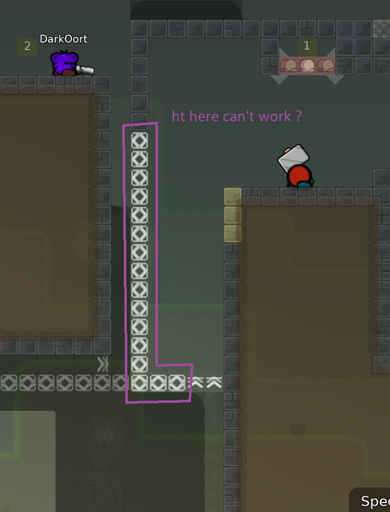
ht instead of stoppers up there?
Fixed all mentioned gameplay problems and made jungle main darker to decrease the contrast between unhook and jungle main. Instead of increasing the para of the bg, I reduced the transparency to make it less distracting. I hope the bg is good now. P.S. Thank you for liking my bg Cha!
t0 and 2p parts are mixed in a way that doesn't really work imo, also the overall mapping quality doesn't feel too high
$decline
bollocks
so I played this map before and for me now there are barely no real team 0 parts and if you want so, those few spots don't interfere the rest 2 player map. also I think the gameplay quality is not bad, some unique parts, solid playability, not too much filler/ddmax stuff. on gameplay wise it's releaseable I think. I just dislike the structure and the map and design doesn't look very aesthetic to me (markings, shapes and so)
I don't know, if you saw it, but this map is 2p teamforced, that's why there are really no t0 parts. This isn't supposed to have any t0 parts, so I don't understand the argument of 2p parts and t0 parts being mixed in a strange way. Design-wise I just don't seem to be able to create something decent, so I would be happy, if someone helped me out with it.
the farther you go, the more it becomes like a t0 map, also many parts are sloppily mapped and structure isn't good
and what I meant with t0 and 2p parts being mixed in a bad way is how you have boring freeze tunnels between complex parts with features
does it really need a full rework?
it didnt look that bad from speccing
and it seems the mapper wants to work on it
maybe it is possible to rework but idk if it's worth the effort
I think weird feature parts don't go well with hh/hf stuff
and the whole map's structure is pretty bad
he already put a lot effort into it
lets try to get it to a releasable state
$reset
It's on your hands then
Thank you jao
I think the major difference between t0 maps and my "t0-like" parts is that t0 maps have pretty much straight forward hh and hf parts, while my hf parts all have at least one twist to them, which is more or less unique. This makes them way more interesting than t0 parts imo. The freeze tunnels are meant to be little fillers to connect the parts and they my be boring at some point, but most of the times they're not longer than 5secs. Hence they being boring shouldn't do much to the whole map's boringness.
I'm not saying all freeze tunnel parts are bad, they just don't fit the other parts
the thing is, that this is a teamforce map, because the "main" parts would work terribly in t0, but the rest of the parts would be better off as a t0 map
if you wanna make a 2p "t0 style" map, this doesn't feel like the right way to do it
really cool map, there’s not much of a team 0 map anymore, easily doable in a 2-player team with some easy but slightly faily transitions, could be released imo
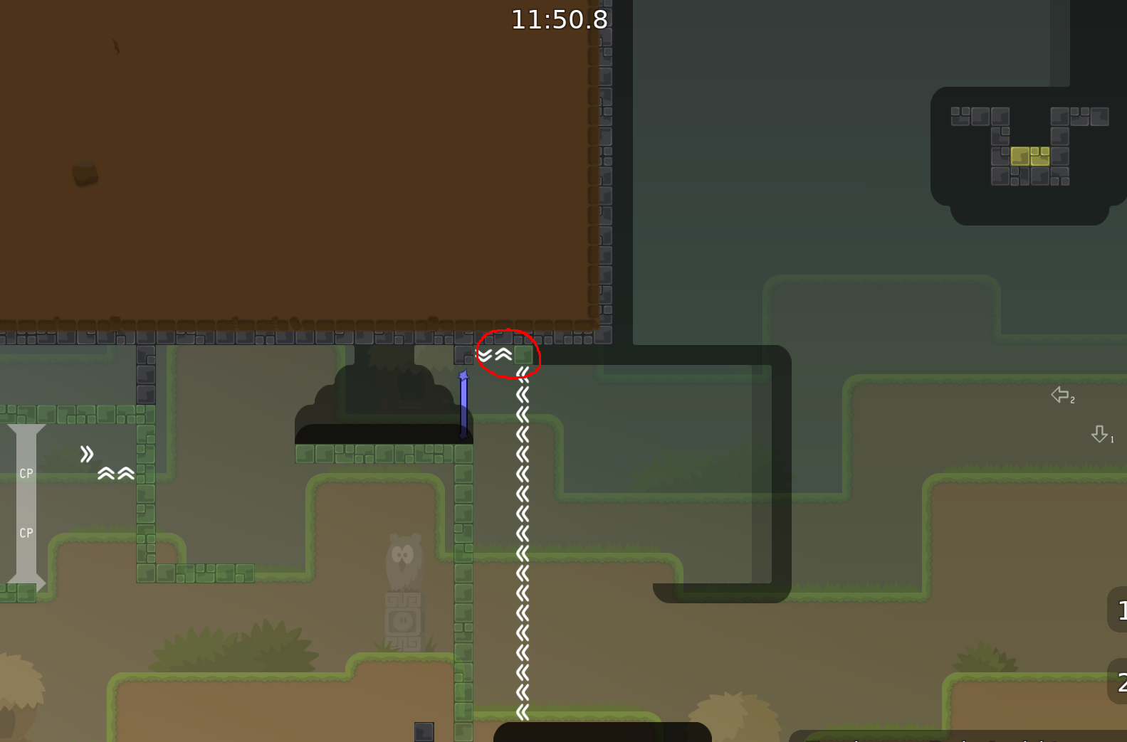
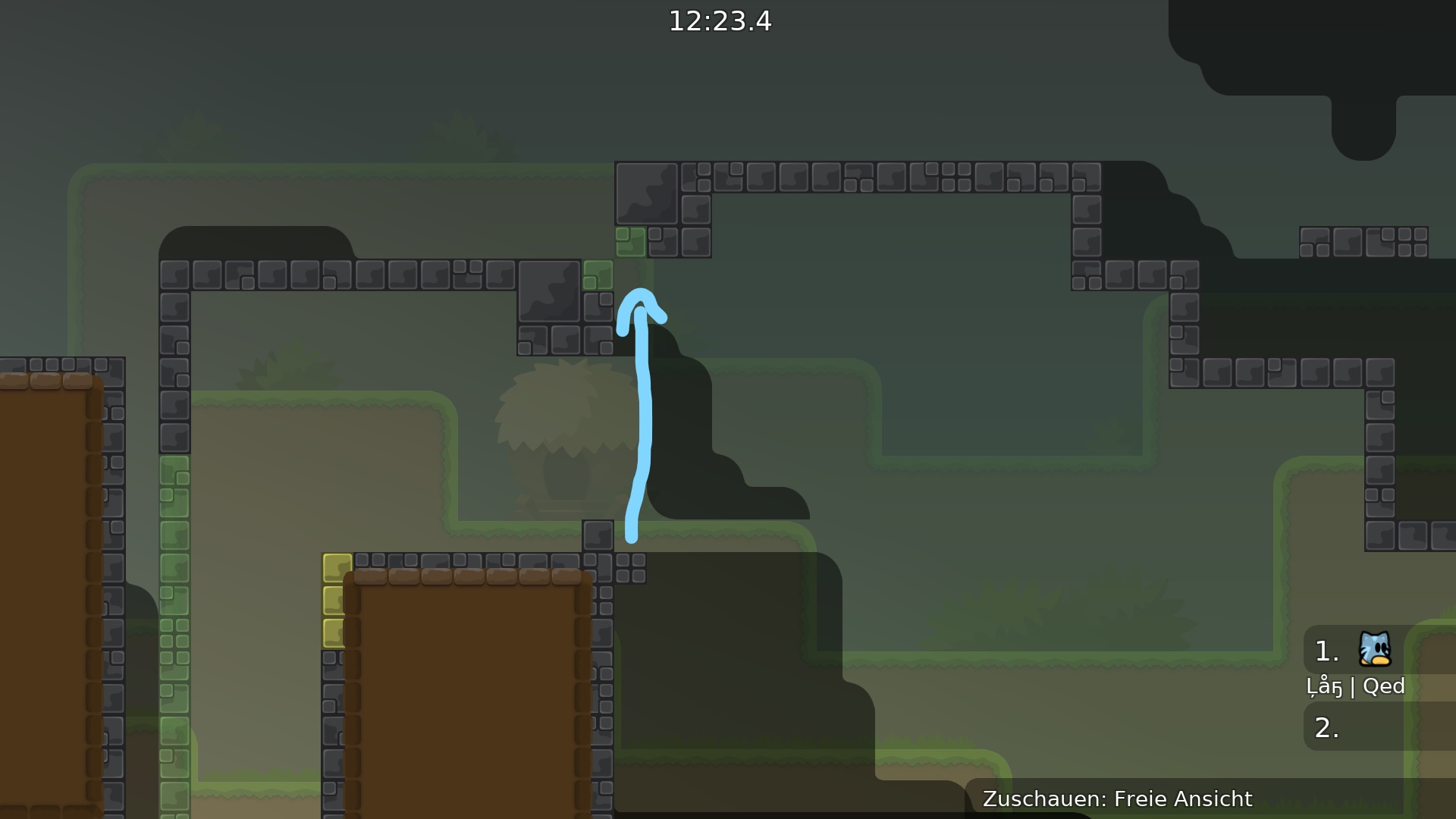
In general it is good map. im spectate about 70 min. In first 2-6 parts u use too much useless stuff and it is not clear u need spend some time to get part. sample : 1 it is possible without this edge hook. 2 if little remapped possible remove 3 useless deep 4 useless speedup and stoppers , but need littl remaped 5 Maybe add signals to know what to do first it will be save time. but all the points no big deal, first you have to try to use as few tiles as possible, and if you can't add new ones. 6 That miss more important for me cus the error of information that a person gets. a person sees one thing but it's actually another. At this moment it is harmless and will not lead to serious consequences, but such errors must be cleaned up in any case. For example, a new dummy map came out recently, and there was a similar mistake from which I died. There was a deep freeze under the switch. 7 if u do it like this, it will be good. So gl.
1 I didn't intend there to be any edge hook. 2 It may not be the most elegant solution, but it works and that's what matters most for me 3 + 4 the deep as well as the stopper assure that you do the whole part and don't skip the last bit, the stopper prevents fails 5 To me it doesn't look too complicated and also I wouldn't know what to write there 6 + 7 fixed as you suggested Thank you for the suggestions, triki!
- just one arrow down with number 1, then arrow left with number 2 ur welcome.
and that it is a drag is self explaining?
ye. u right. but ppl dont think about part. they can just ignore.
if u dont wanna give signals, u can remap for more "self explaining" when i look ur map at first time i thinking about one way. you can try lengthening that part so it visually takes up more space and requires attention. but right now it is good and not really need for remap.
@Cor\
I added arrows as you suggested + entities off sign
changed one part and prevented one skip
skip was still doable
tested map with
@Cor, good map with new features, makes fun to play. Dont think its that hard, only few parts where u rly can fail so maybe brutal 1-2 imo max. 3 +1 pls rls
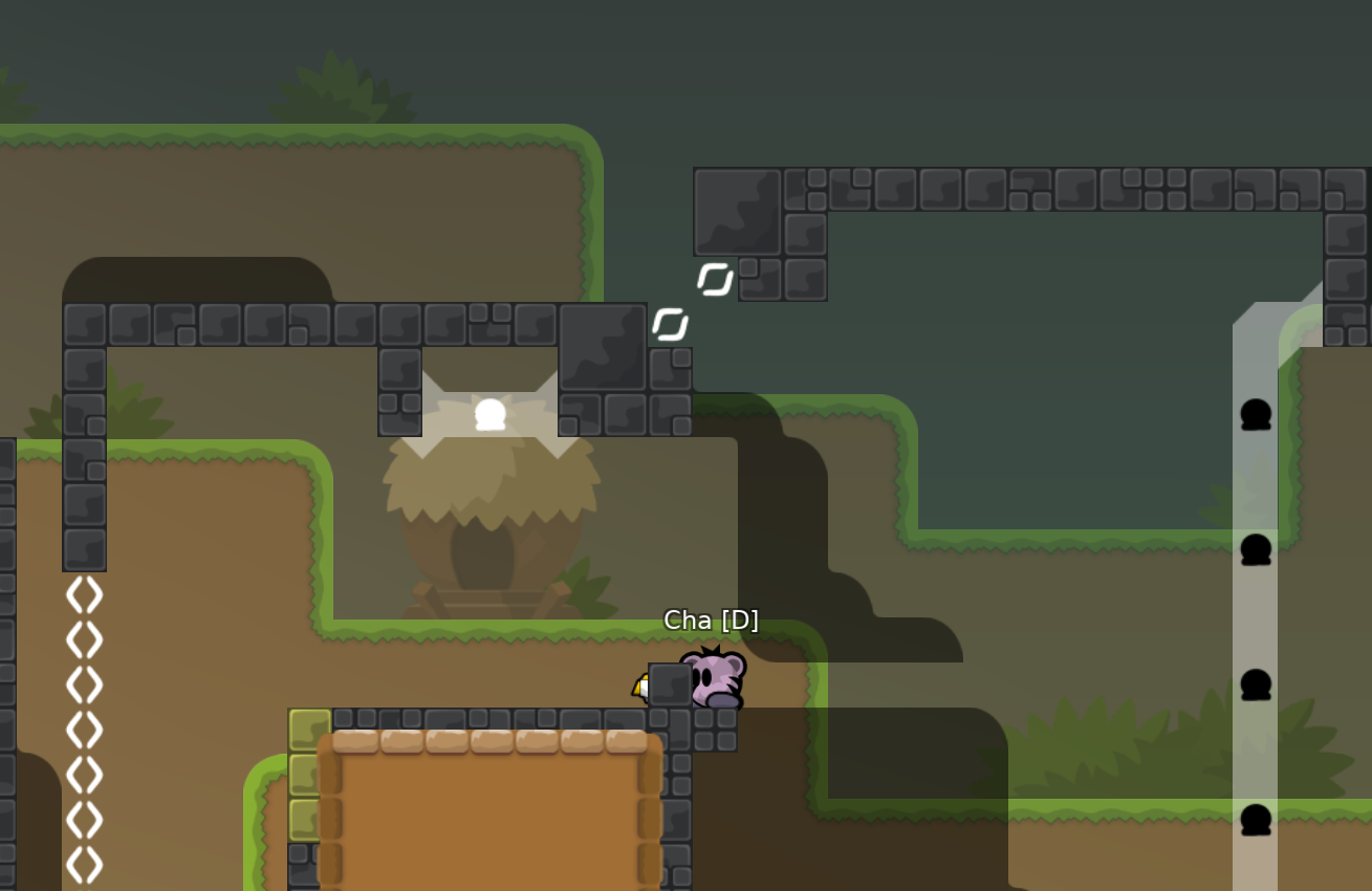
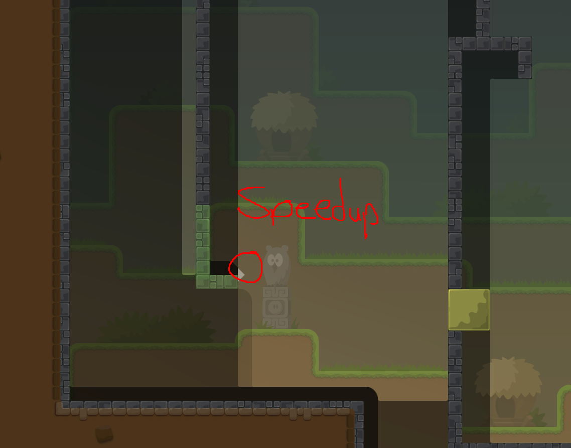
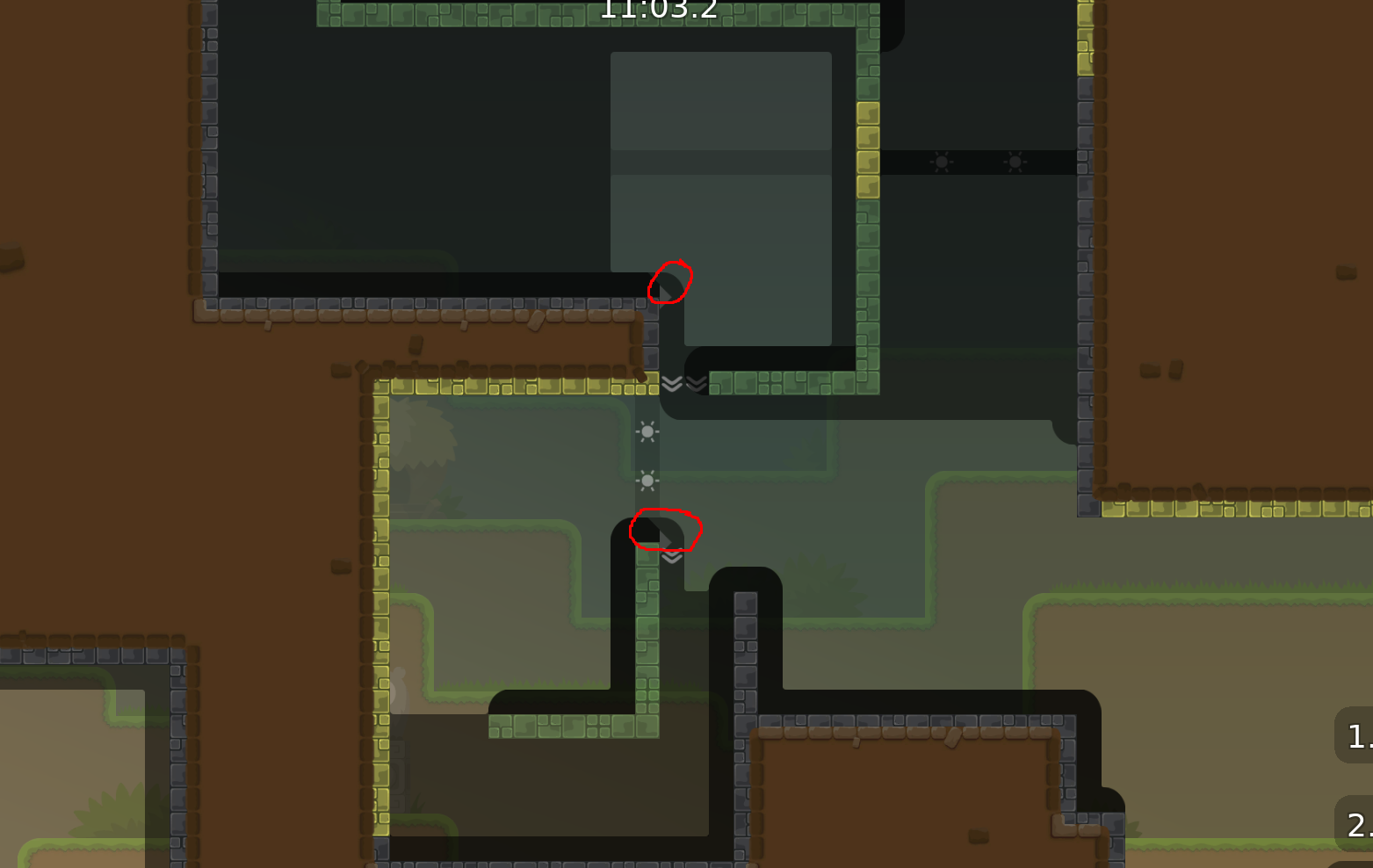
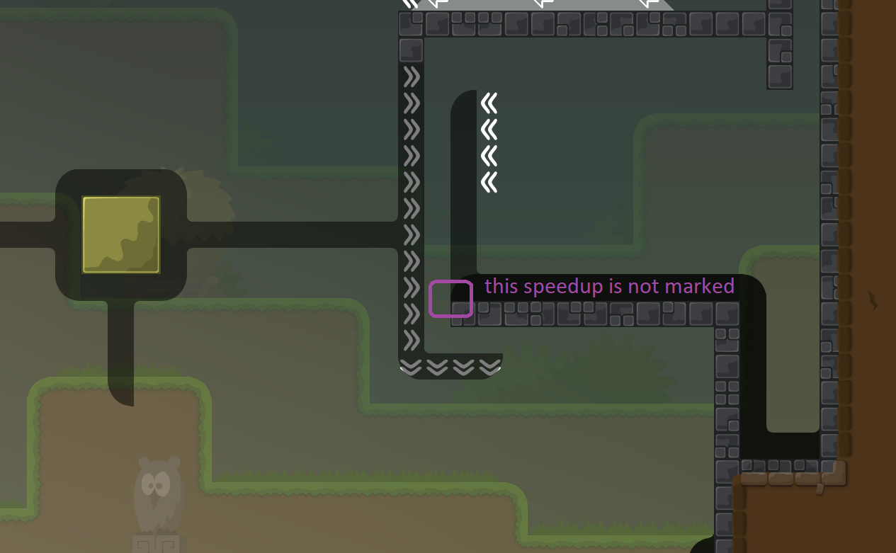
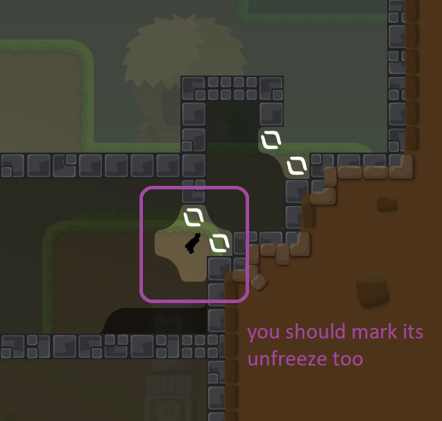
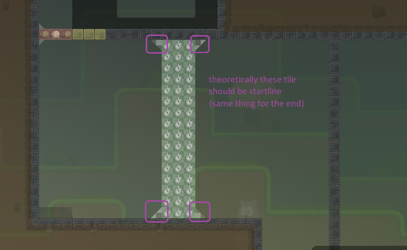
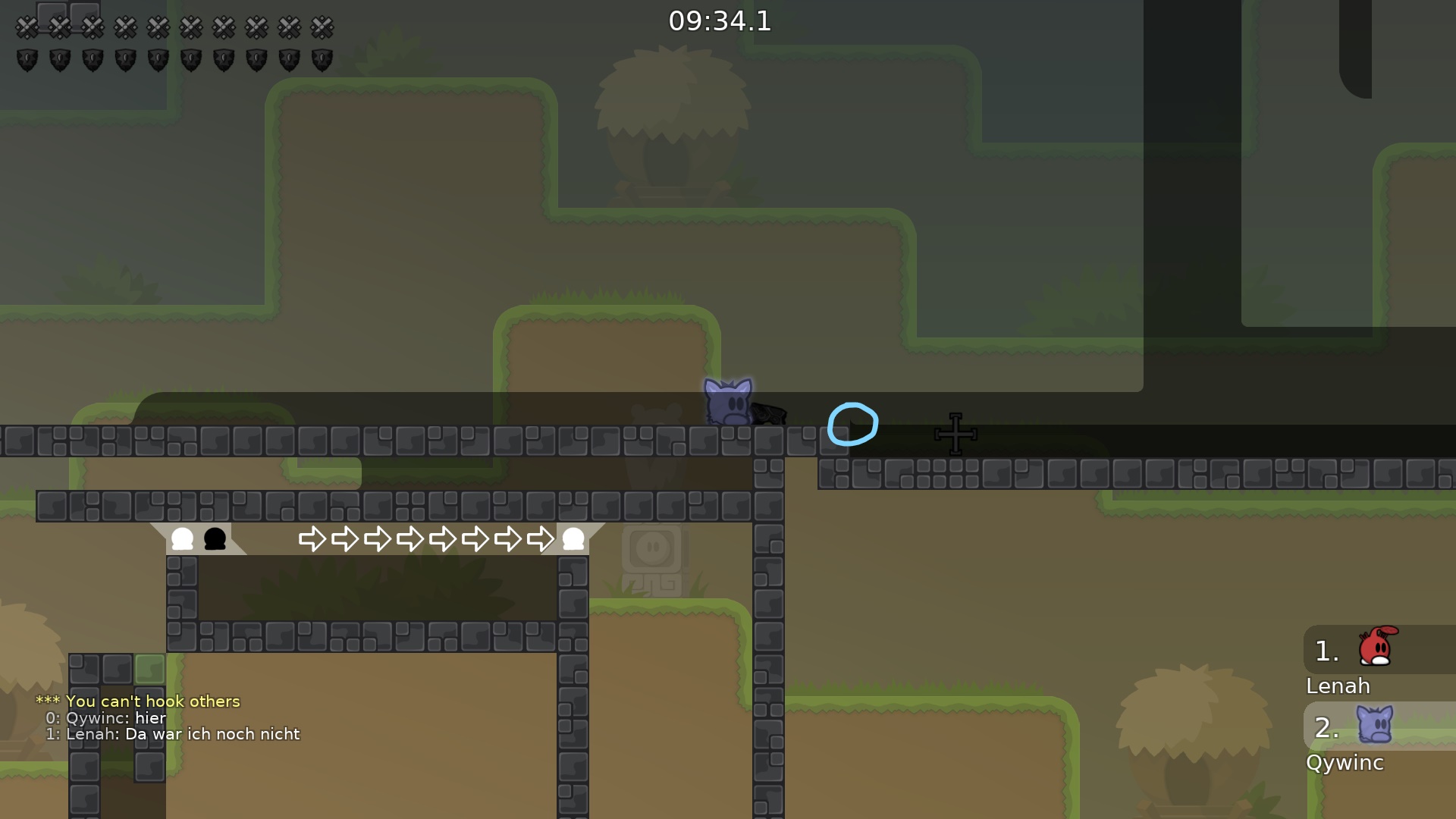
These white triangles represent speedups
i thought so but in one picture theres not even this white thing
Y I thought about every spot you pointed out, but thought it wasn't important enoguh to mark it, because it looks ugly when being marked
I wouldnt mark it too but i dont know if u need to. I think u need to mark everything with tiles but im not sure
Let's see what other testers say
I'll leave it as it is for now
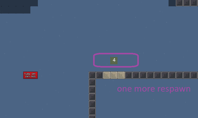
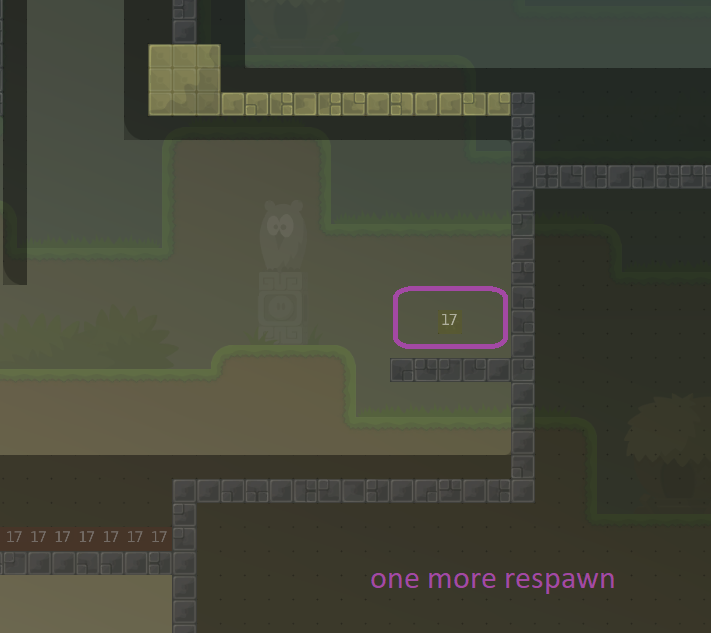
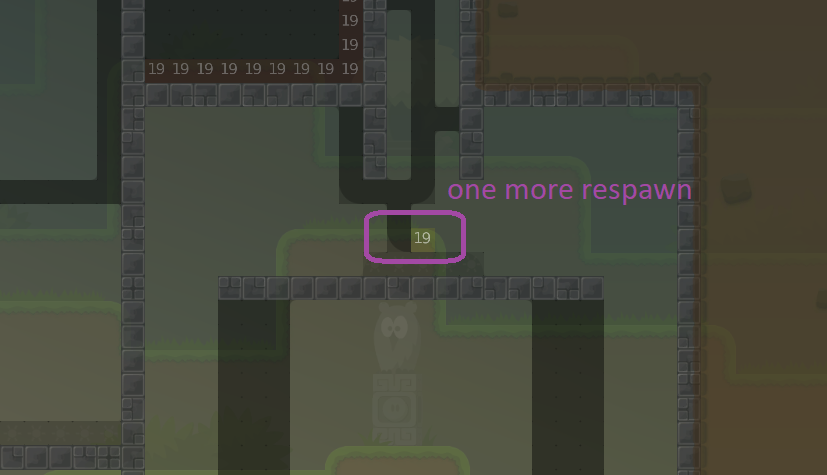
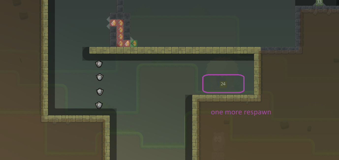
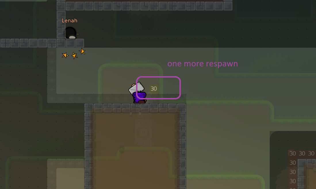
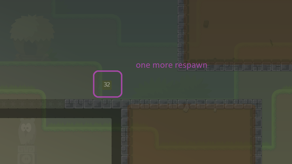
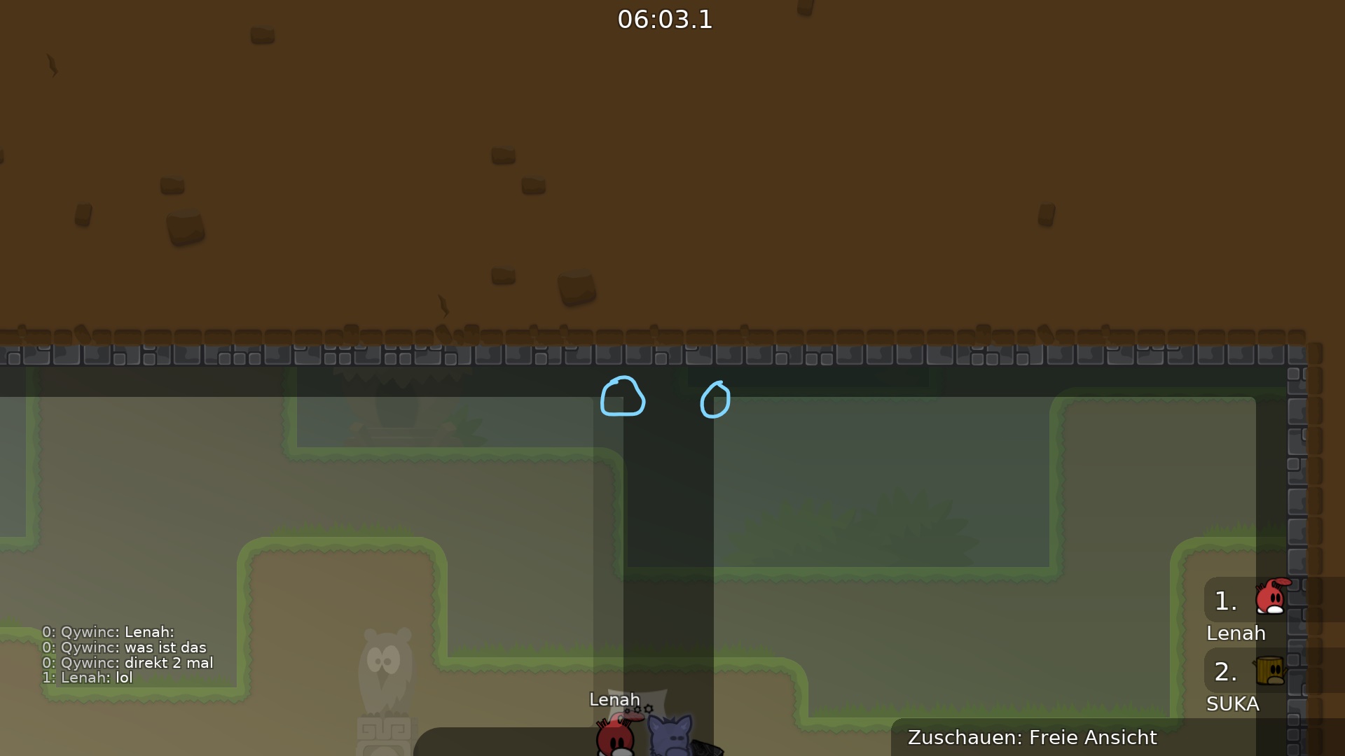
your „one more respawn“ screens arent needed. tele is random, even if there are 2 toteles u can be ported to the same totele. he doesnt need to change it
and you dont need to mark every speeder if they are trivial
Oh, okay
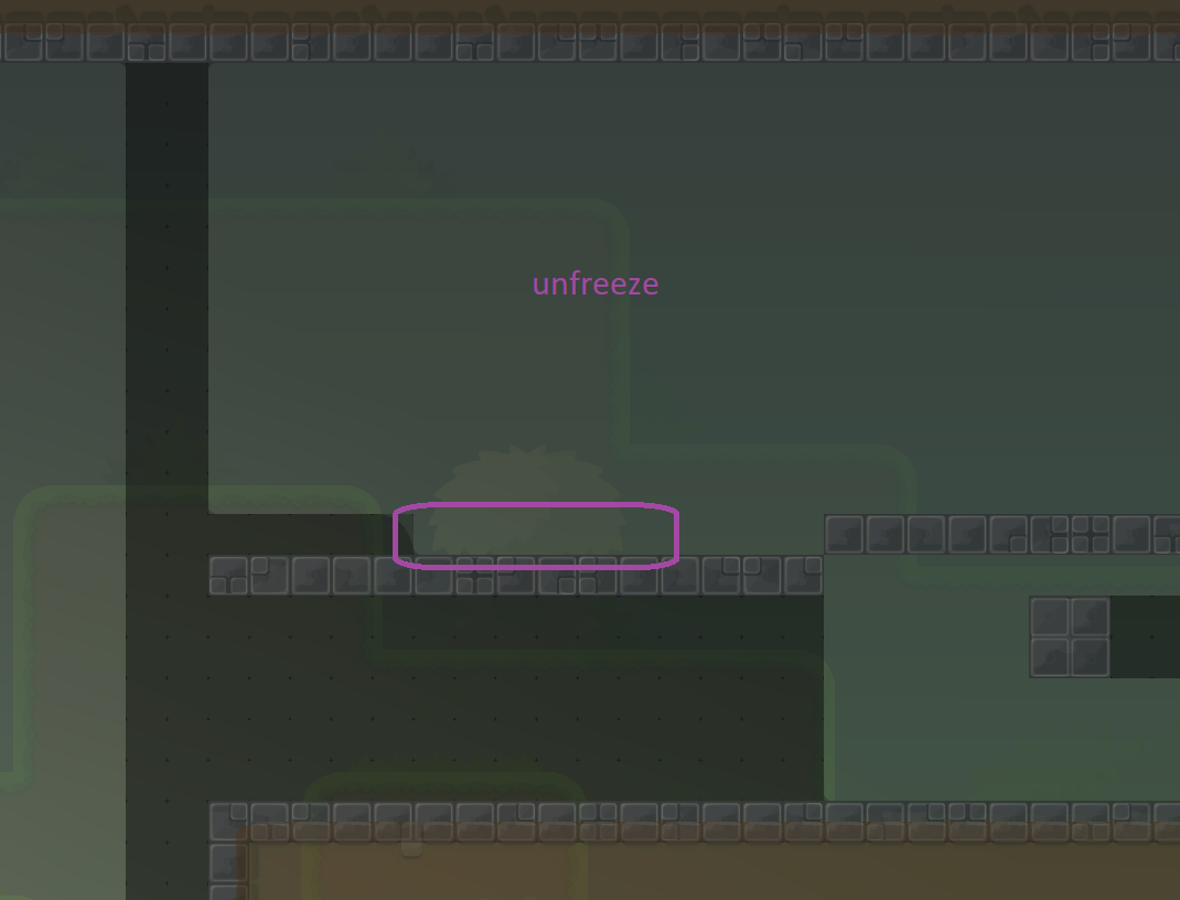
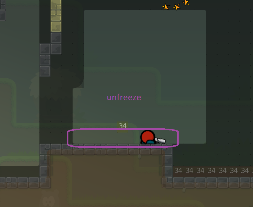
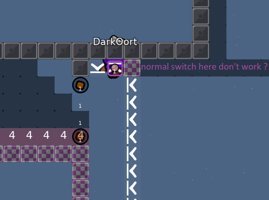
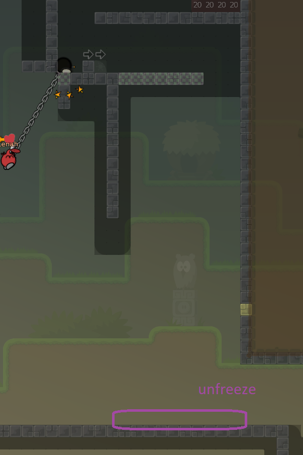
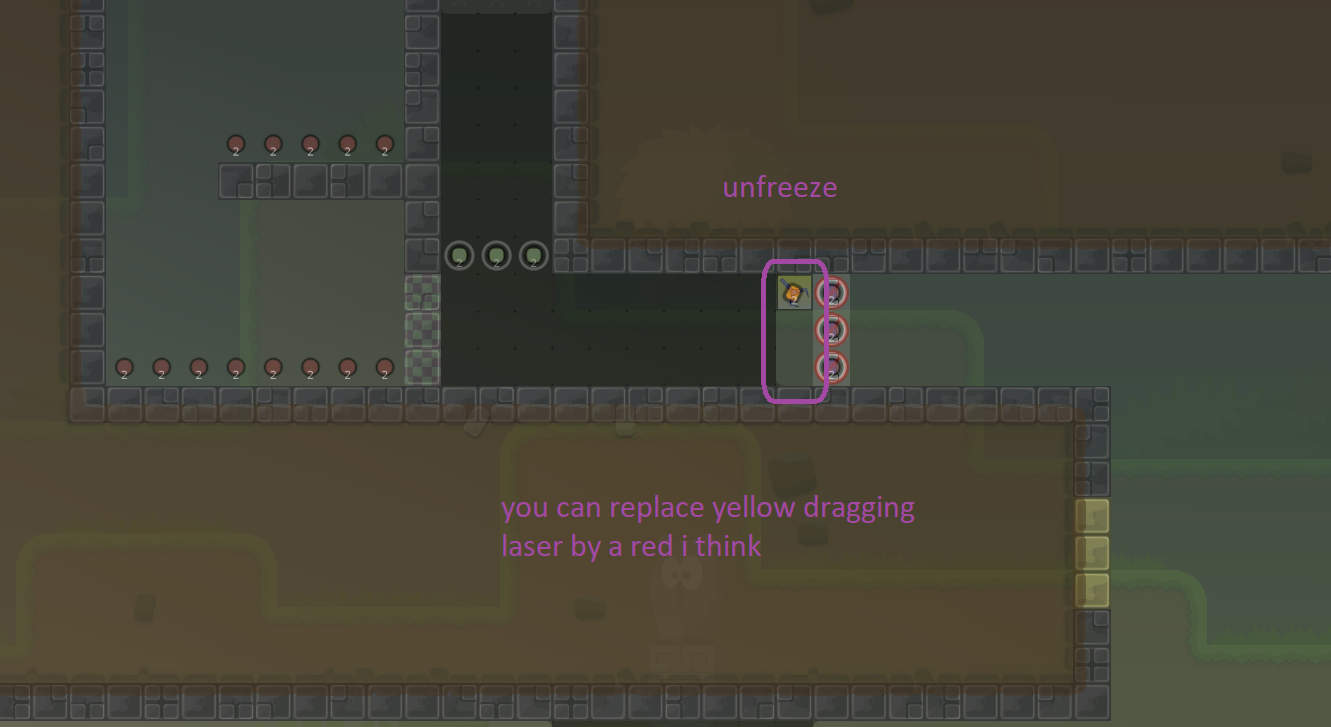
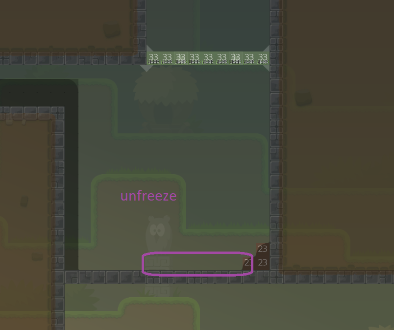
screen 10: what do you mean with "normal switch"? screen 16: do you mean i should add unfreeze?
- screen 10, nevermind
- screen 16, i think so
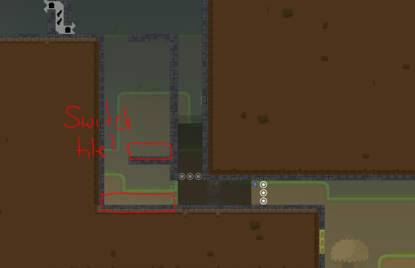
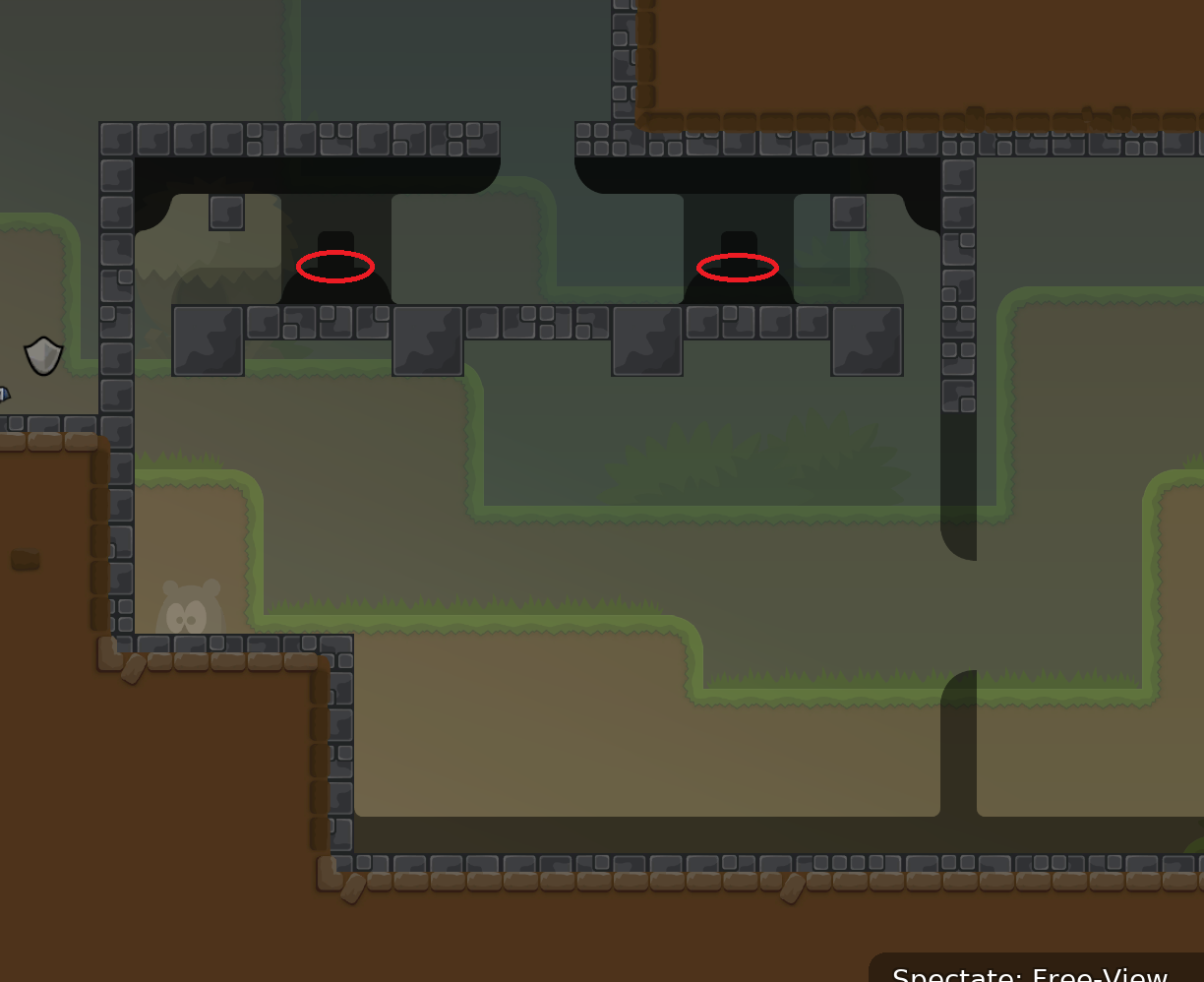
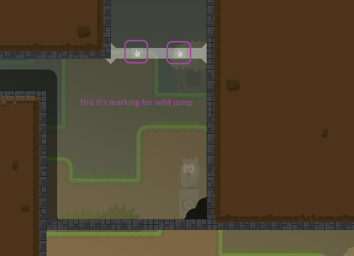
that’s a marking for weapon fire not refill jumps
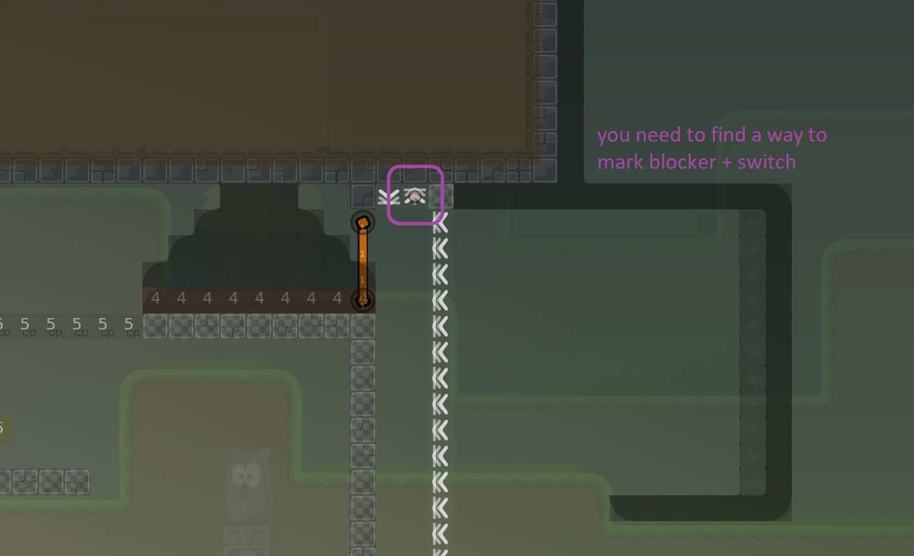
fixed everything and changed the "boring part", I didn't really know how to mark the stopper and switch together so it's kinda ugly now. If anyone has a suggestion on how to improve, feel free to tell me.
but at all a really nice map, release when?
can u stop leaking my messages ty
fixed
little design bugfixes
went over whole map, cor changed the designbugs i found, should be ready like 2* brut
This map should not have teamforce since its not heavily cheatable in team 0 or too tight/switchy. Teamforce is absolutely not needed here and should be removed
imo there are many parts that are too tight and blocky for t0
u can add an info that team is recommended
moreover some parts would be easily cheatable with more than 2 players.
- one (new)
Ok, thank you
applied new design by Greeen
i like new too
nice colors
Greeen did a great job!
I like Cor
cor looks more lively but greeen has a better color palette
maybe somewhere between?
also when is this going to be readied
$ready 4

made bg hd and removed unused tilesets

